
If you’re running a physical store and creating a website for it, many people may visit your website to get practical information, such as your address. Of course, that’s where your contact page comes in handy, but that’s not the only way you can seamlessly share contact details with your visitors. If you’re looking for a creative way to approach sharing your company’s address, you’ll like this tutorial. We’re showing you how to add a fixed map toggle dynamically to each page using Divi and its Theme Builder. We’ll start by creating a new page template. Then, we’ll include the dynamic page content in side the template’s body and we’ll add a fixed map toggle on top of the dynamic page content. You’ll be able to download the template JSON file for free as well!
Let’s get to it.
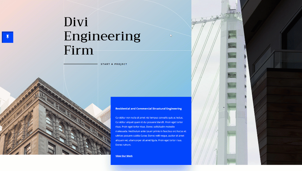
Preview
Before we dive into the tutorial, let’s take a quick look at the outcome across different screen sizes.
Desktop
Mobile

Download The Page Template for FREE
To lay your hands on the free page template, you will first need to download it using the button below. To gain access to the download you will need to subscribe to our newsletter by using the form below. As a new subscriber, you will receive even more Divi goodness and a free Divi Layout pack every Monday! If you’re already on the list, simply enter your email address below and click download. You will not be “resubscribed” or receive extra emails.

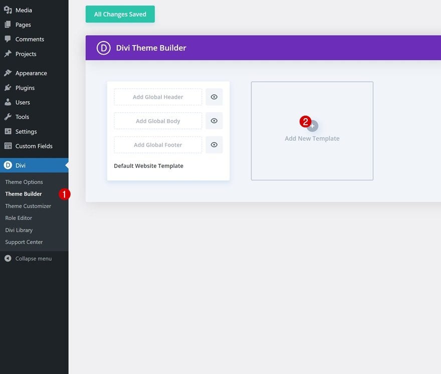
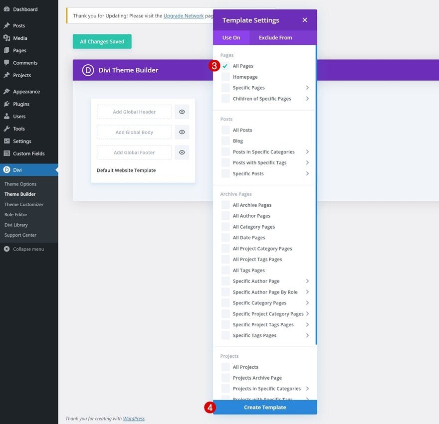
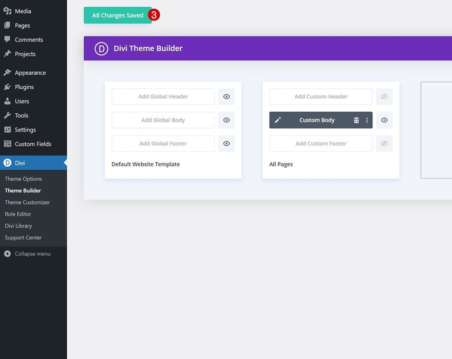
1. Create Page Template Inside Divi Theme Builder
Go to the Divi Theme Builder & Add a New Page Template
We’ll start this tutorial by navigating to the Divi Theme Builder and adding a new page template.
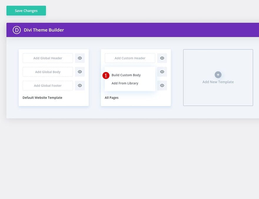
Enter Body Area of Template
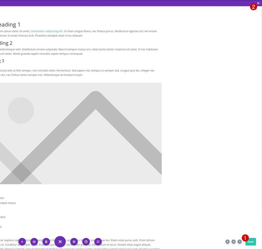
Then, enter the template’s body by selecting “Build Custom Body”.
2. Add Dynamic Page Content to Body Area
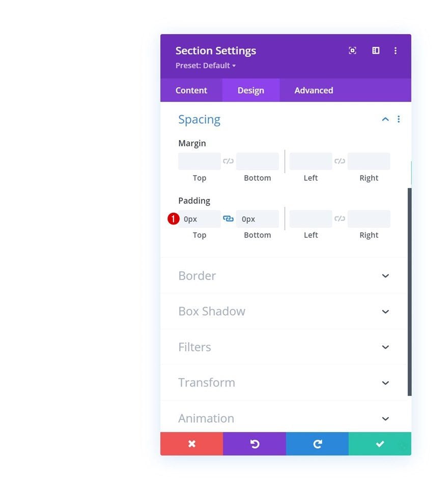
Section Settings
Spacing
Once inside the template editor, you’ll notice a section. Open the section settings and remove all default top and bottom padding.
- Top Padding: 0px
- Bottom Padding: 0px
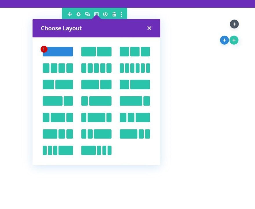
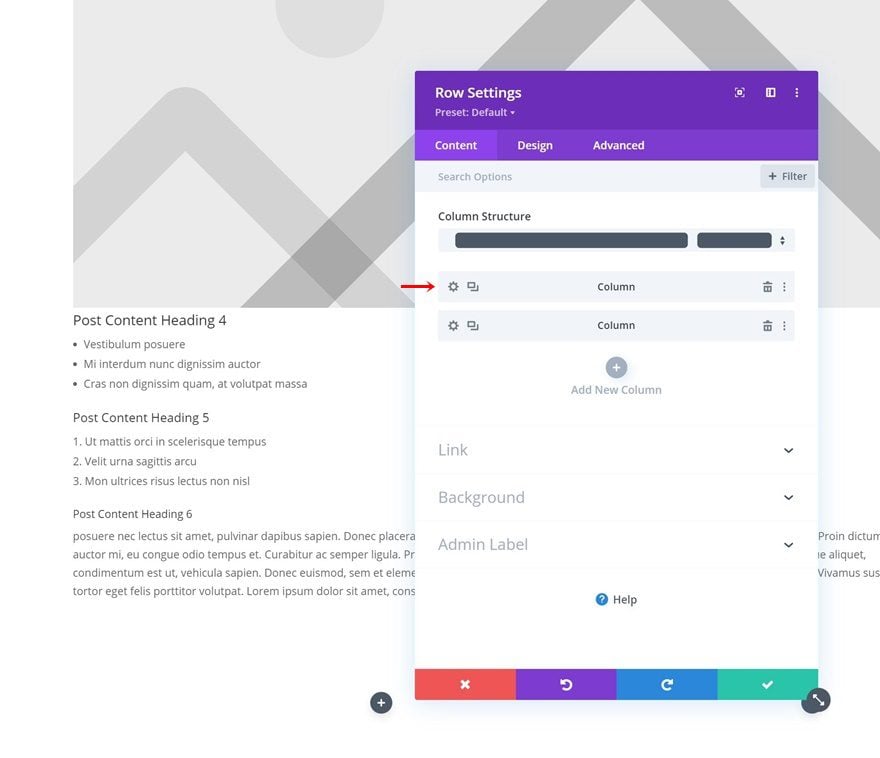
Add Row #1
Column Structure
Continue by adding a new row using the following column structure:
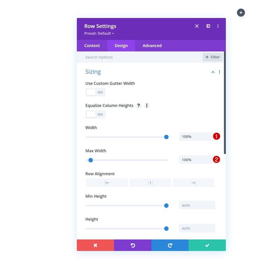
Sizing
Without adding modules yet, open the row settings and modify the sizing settings as follows:
- Width: 100%
- Max Width: 100%
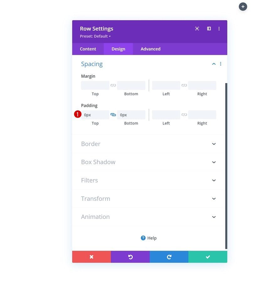
Spacing
Remove all default top and bottom padding next.
- Top Padding: 0px
- Bottom Padding: 0px
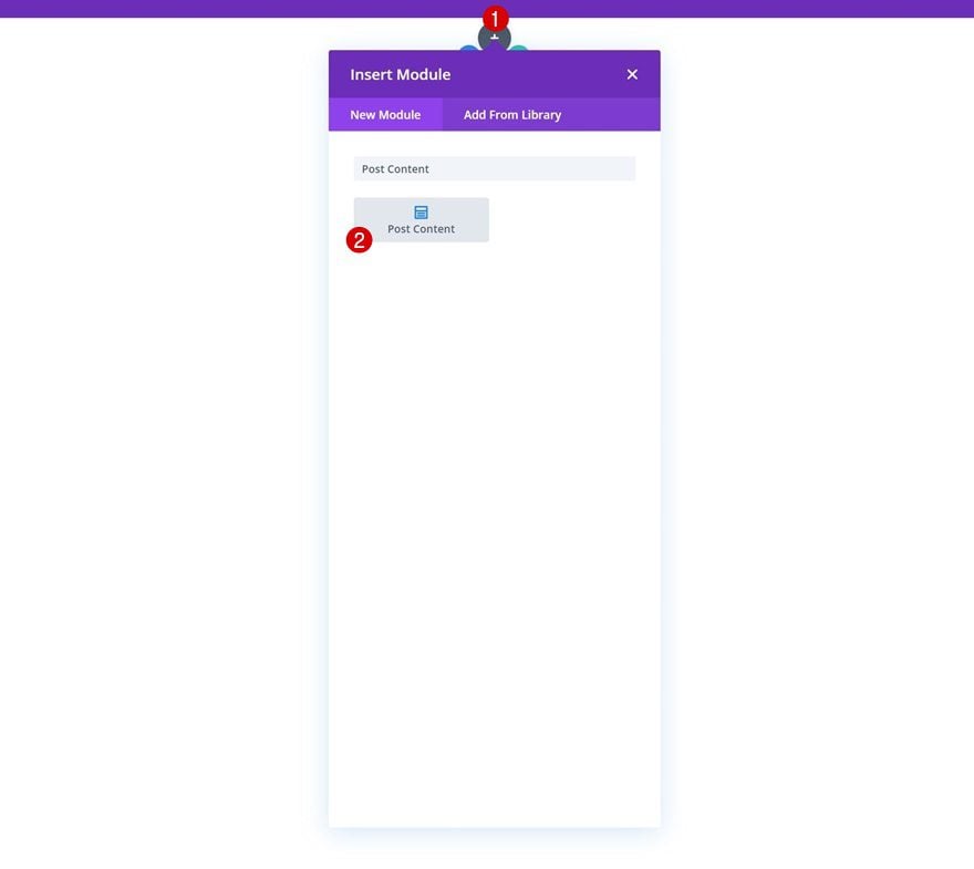
Add Post Content Module to Column
To allow each page’s content to show up dynamically, we’ll use the Post Content Module inside this row.
3. Create Fixed Map Pin Design
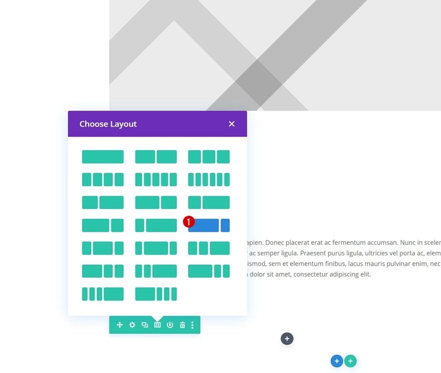
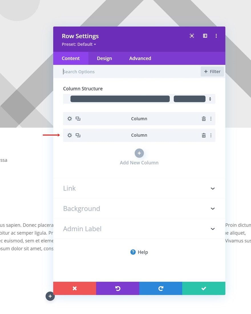
Add Row #2 to Section
Column Structure
On to the next row, which uses the following column structure:
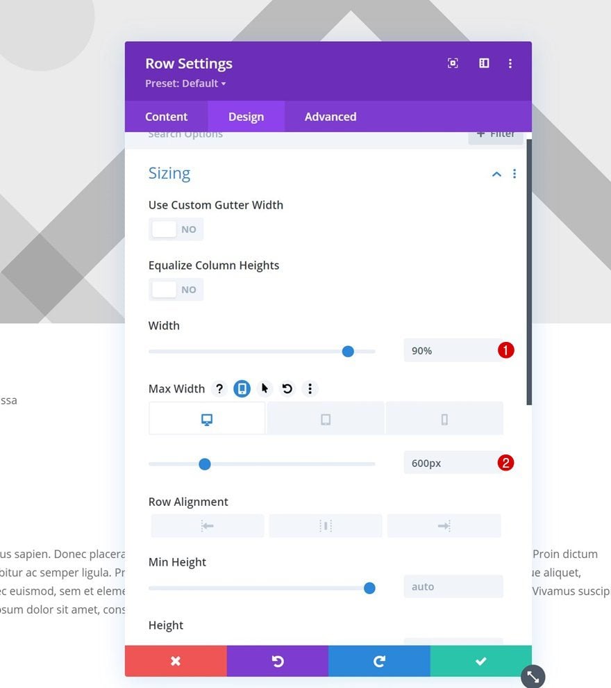
Sizing
Open the row settings, go to the design tab and change the sizing settings as follows:
- Width: 90%
- Max Width:
- Desktop: 600px
- Tablet & Phone: 100%
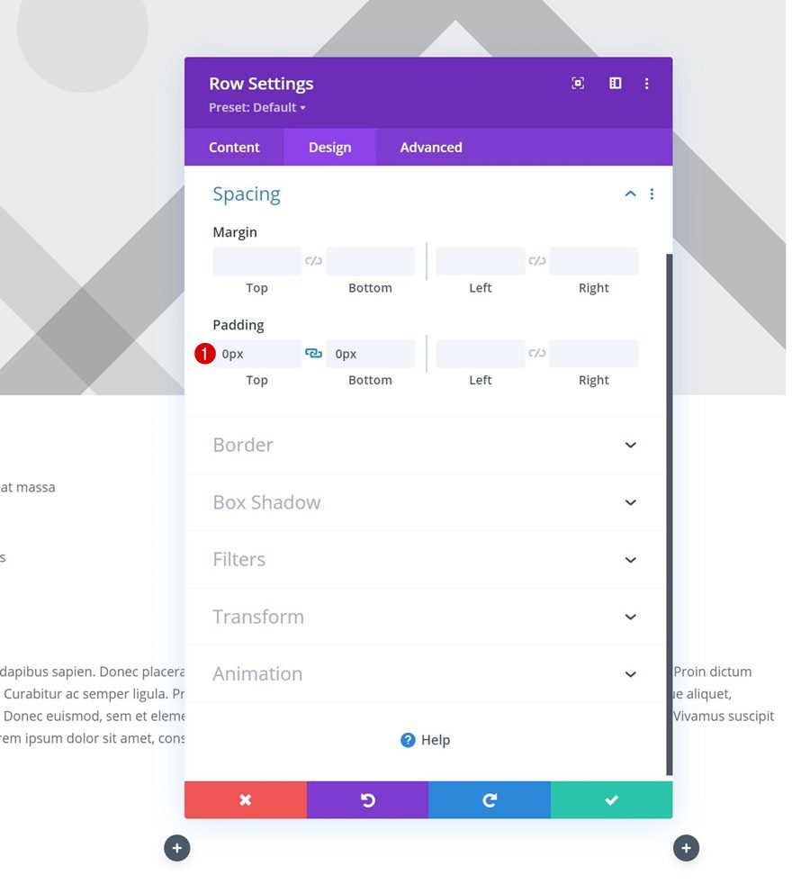
Spacing
Remove all default top and bottom padding next.
- Top Padding: 0px
- Bottom Padding: 0px
Column 1 Settings
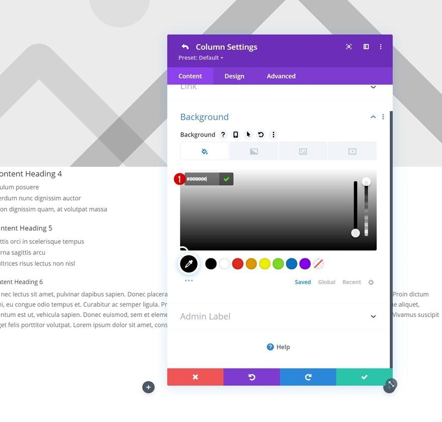
Background Color
Then, open the column 1 settings and use a black background color.
- Background Color: #000000
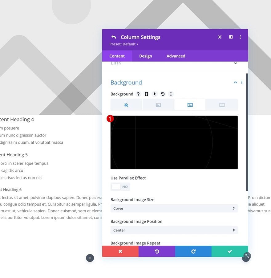
Background Image
Upload a background image of your choice next. You can find the background image in the zipped folder which you can download at the beginning of this tutorial.
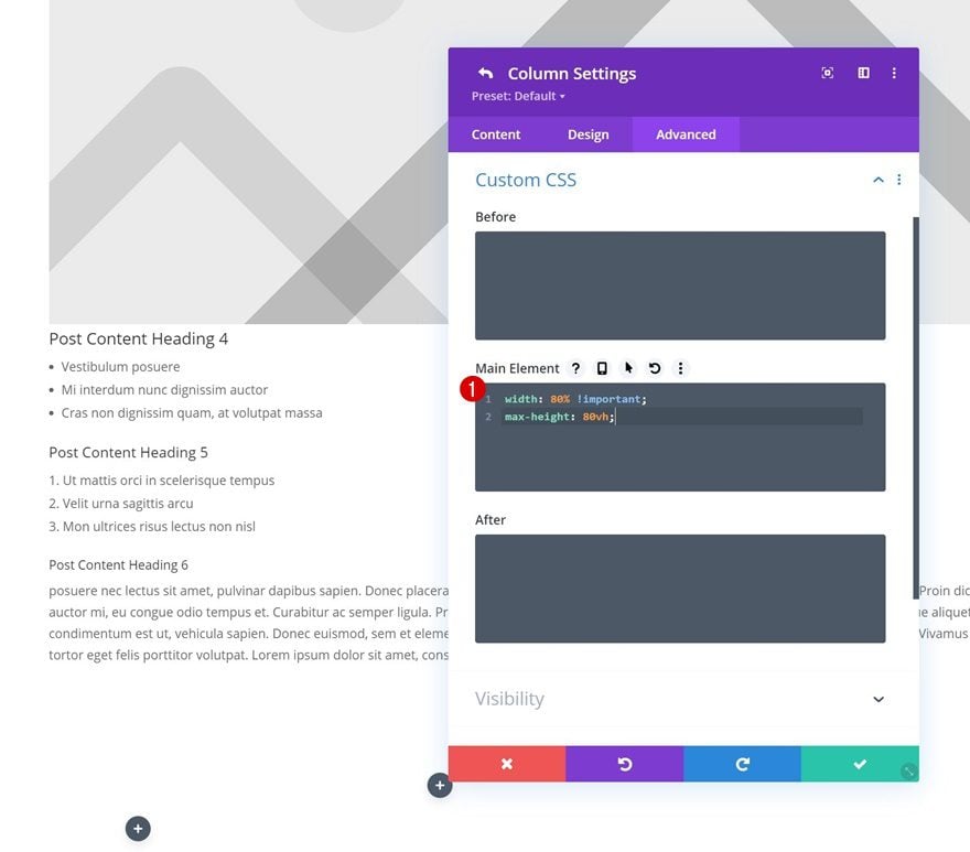
Main Element CSS
Add the following lines of CSS code to the column’s main element as well:
width: 80% !important;
max-height: 80vh;
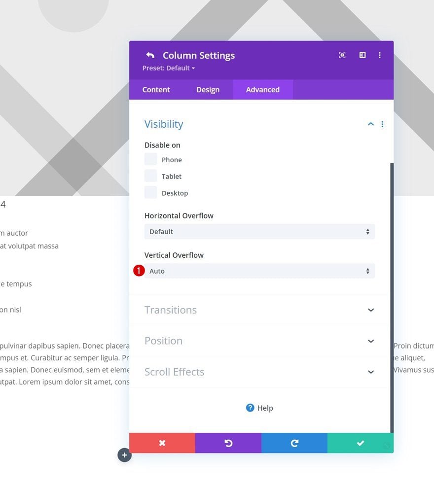
Visibility
Then, put the vertical overflow to auto. This, in combination with the max height in the previous step, makes sure a scrollbar appears as soon as the column exceeds an 80vh height.
- Vertical Overflow: Auto
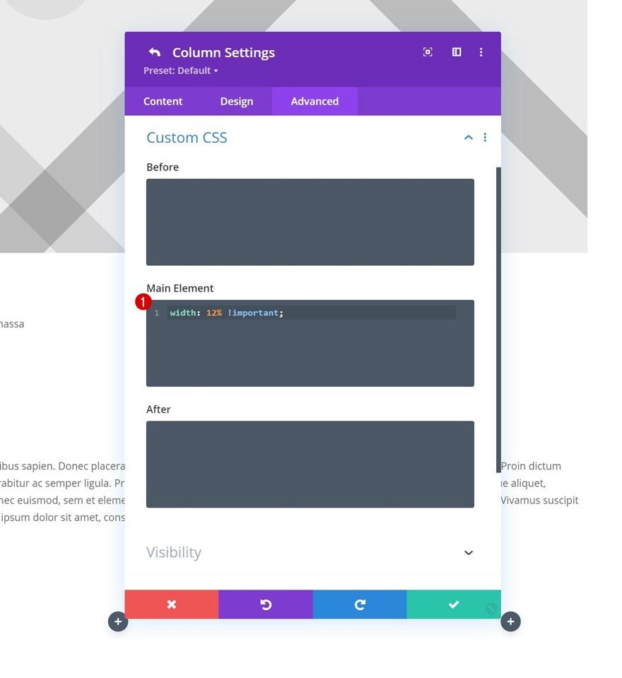
Column 2 Settings
Main Element CSS
Open the column 2 settings next and apply the following line of CSS code to the main element:
width: 12% !important;
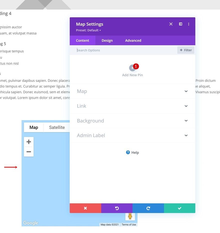
Add Map Module to Column 1
Time to add modules, starting with a Map Module in column 1. Add a map pin of your choice.
Sizing
Move on to the module’s design tab and change the sizing settings as follows:
- Width: 88%
- Module Alignment: Center
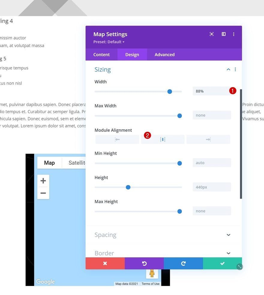
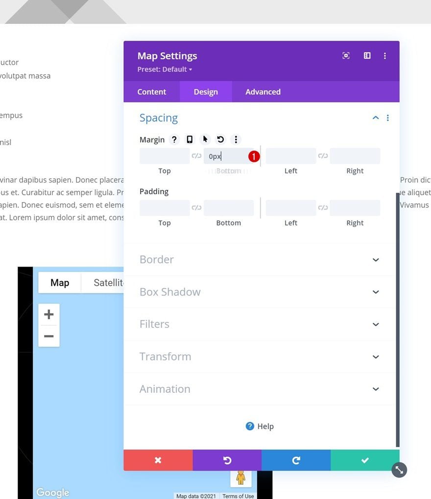
Spacing
Remove the default bottom margin next.
- Bottom Margin: 0px
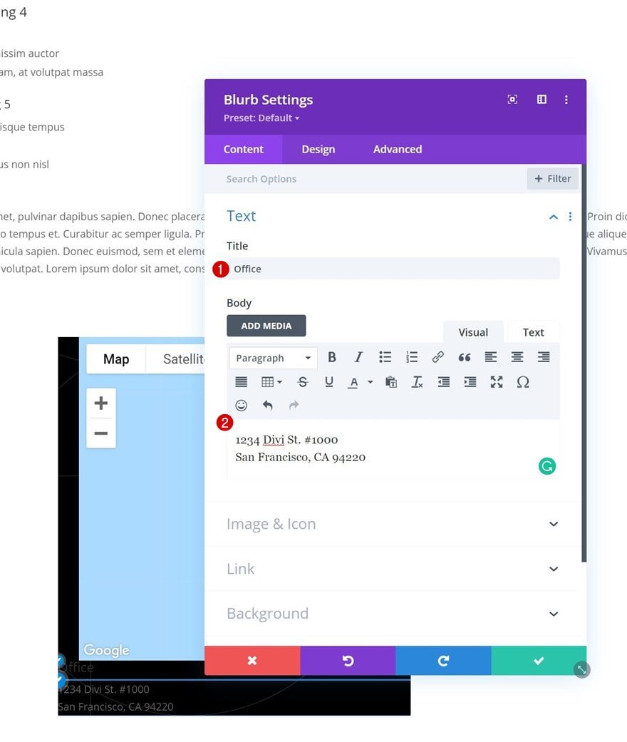
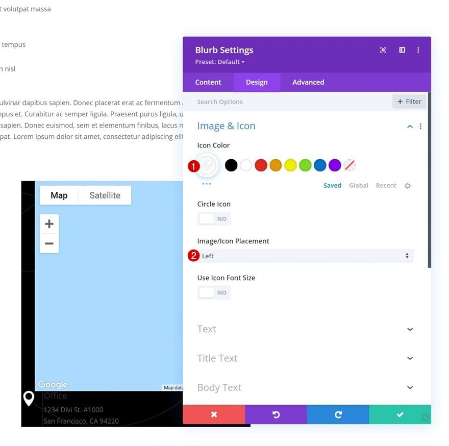
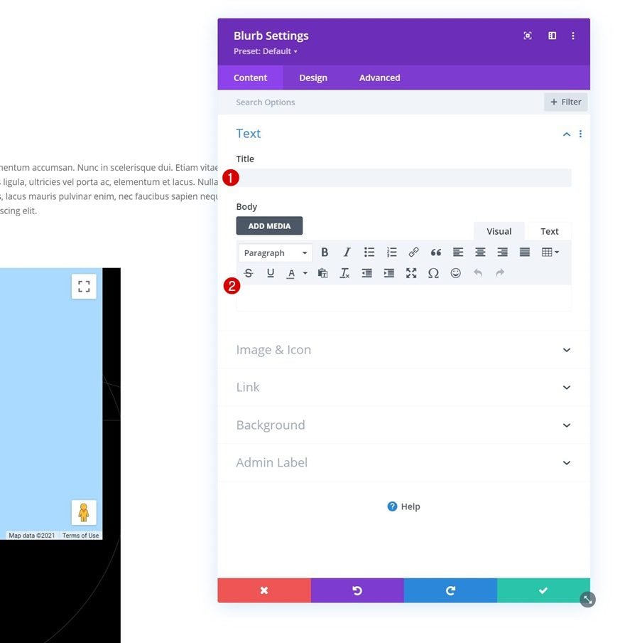
Add Blurb Module to Column 1
Add Content
Add a Blurb Module below the Map Module in column 1. Use some content of your choice.
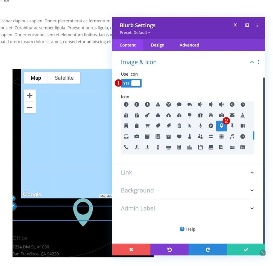
Select Icon
Select an icon next.
Image/Icon Settings
Move on to the design tab and change the icon settings as follows:
- Icon Color: #ffffff
- Image/Icon Placement: Left
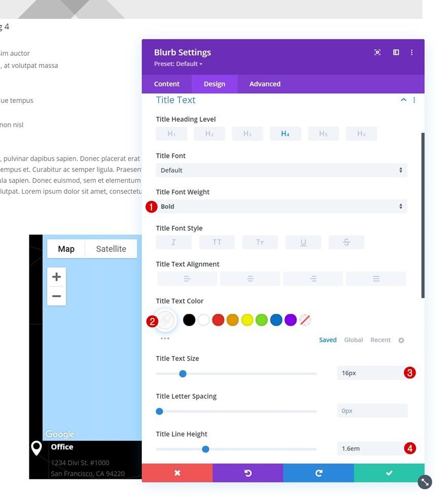
Title Text Settings
Style the title text next.
- Title Font Weight: Bold
- Title Text Color: #ffffff
- Title Text Size: 16px
- Title Line Height: 1.6em
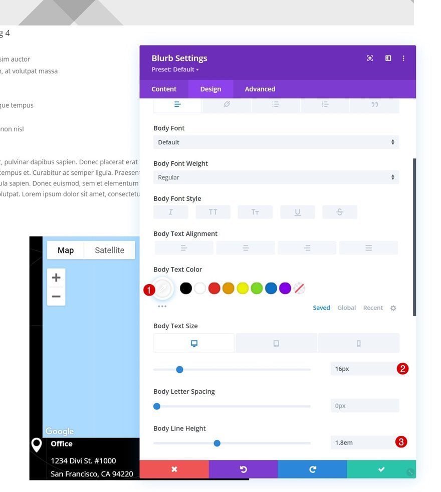
Body Text Settings
Then, modify the body text settings accordingly:
- Body Text Color: #ffffff
- Body Text Size:
- Desktop: 16px
- Tablet: 14px
- Phone: 13px
- Body Line Height: 1.8em
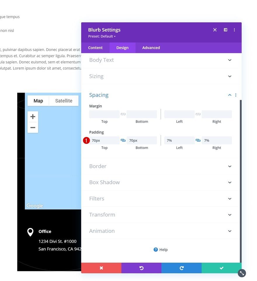
Spacing
Apply the following padding values too:
- Top Padding: 70px
- Bottom Padding: 70px
- Left Padding: 7%
- Right Padding: 7%
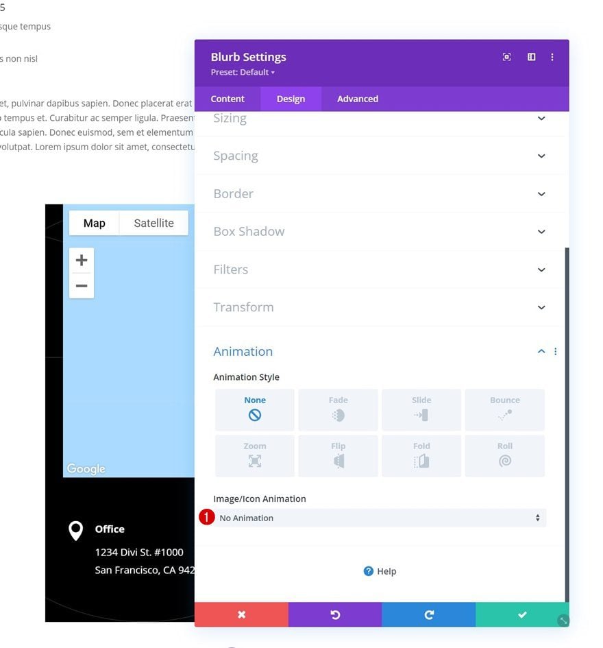
Animation
And remove the default module animation in the animation settings.
- Image/Icon Animation: No Animation
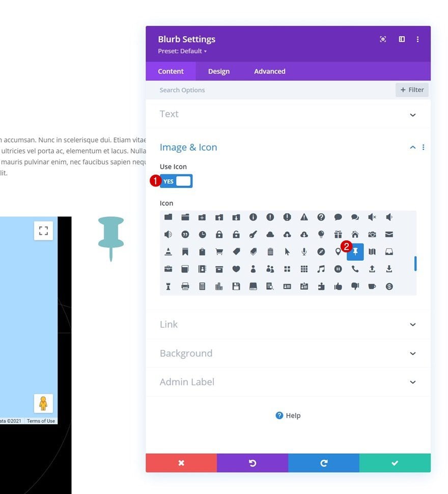
Add Blurb Module to Column 2
Leave Content Boxes Empty
On to column 2. There, we’ll add a Blurb Module without content.
Select Icon
Select an icon next.
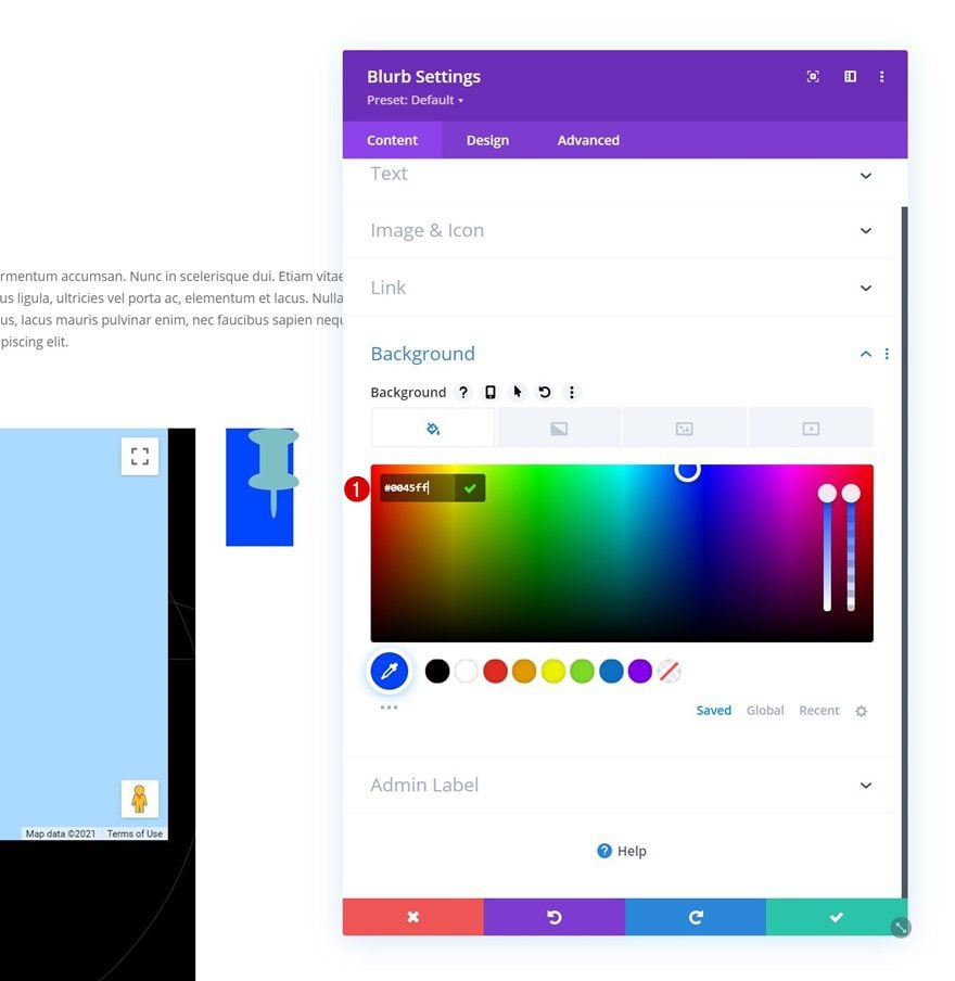
Background Color
Then, change the background color.
- Background Color: #0045ff
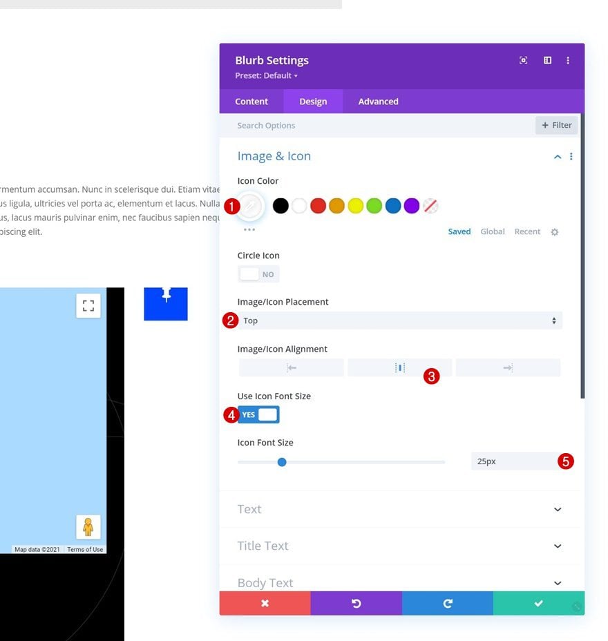
Image/Icon Settings
Move on to the design tab and style the icon settings accordingly:
- Icon Color: #ffffff
- Image/Icon Placement: Top
- Image/Icon Alignment: Center
- Use Icon Font Size: Yes
- Icon Font Size: 25px
Sizing
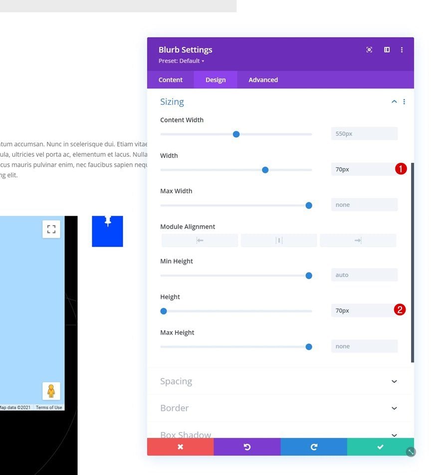
Modify the sizing settings next.
- Width: 70px
- Height: 70px
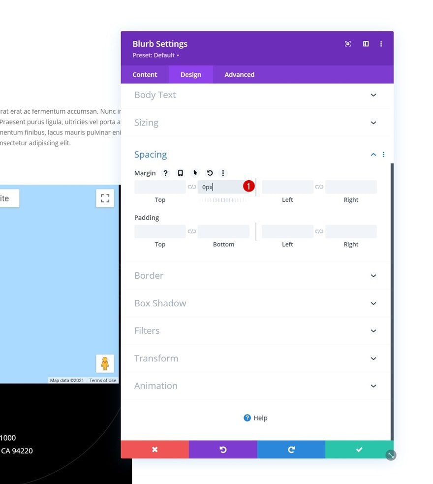
Spacing
Then, remove the default bottom margin.
- Bottom Margin: 0px
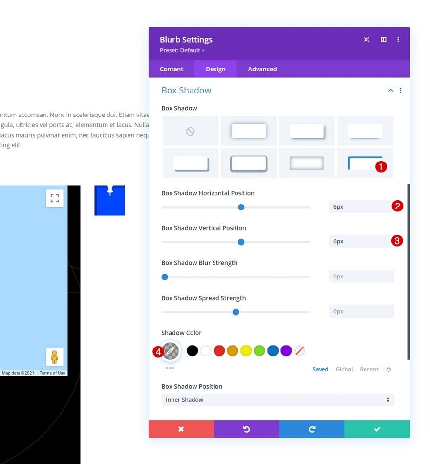
Box Shadow
Include a box shadow as well.
- Box Shadow Horizontal Position: 6px
- Box Shadow Vertical Position: 6px
- Shadow Color: rgba(0,0,0,0.3)
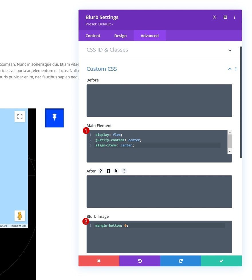
Main Element & Blurb Image CSS
Then, navigate to the advanced tab and use the following lines of CSS code for the main element:
display: flex;
justify-content: center;
align-items: center;
And add this line of CSS code inside the Blurb Image box:
margin-bottom: 0;
4. Add Toggle Functionality
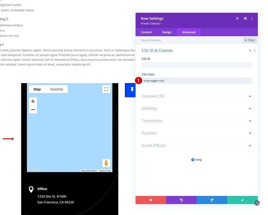
Add CSS Class to Row #2
Now that we have all elements in place, it’s time to focus on functionality. Start by opening the second row and applying the following CSS class:
- CSS Class: map-toggle-row
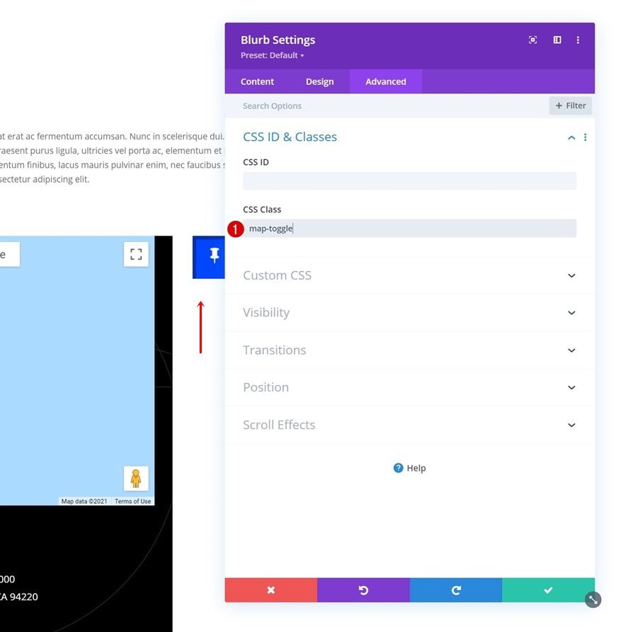
Add CSS Class to Blurb Module in Column 2
Open the Blurb Module in column 2 next and use the following CSS class:
- CSS Class: map-toggle
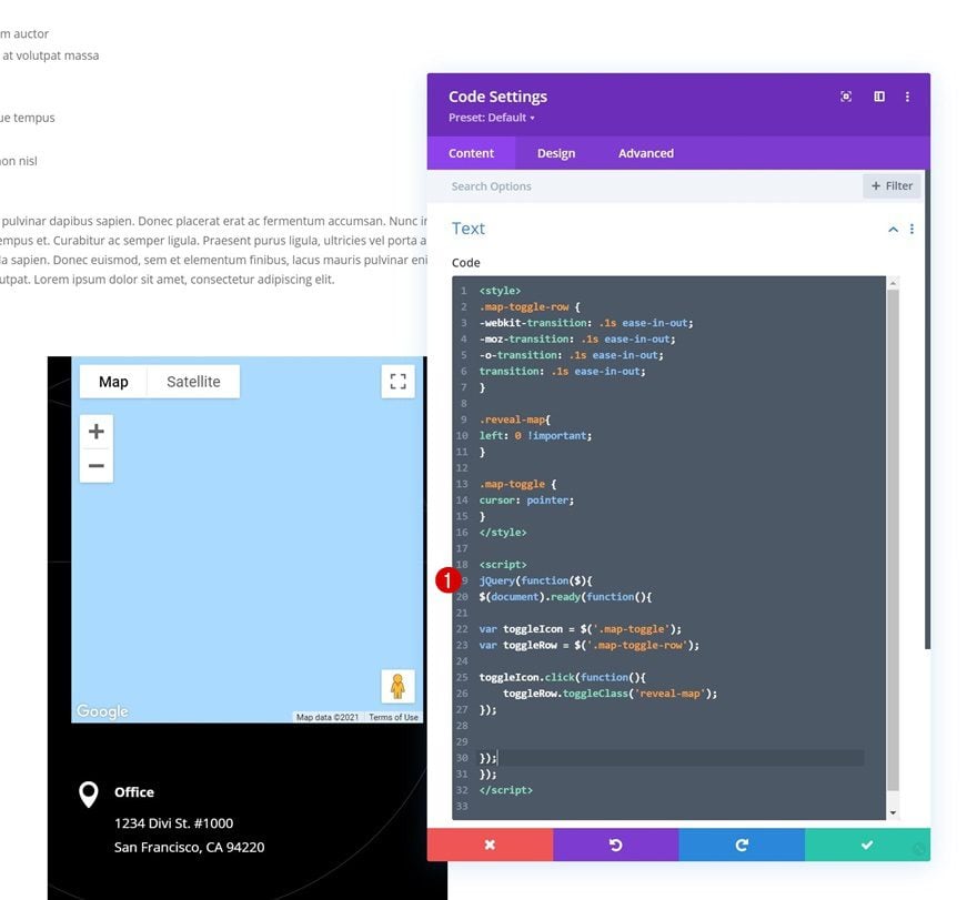
Add Code Module Below Blurb Module in Column 2
Then, add a Code Module below the Blurb Module in column 2.
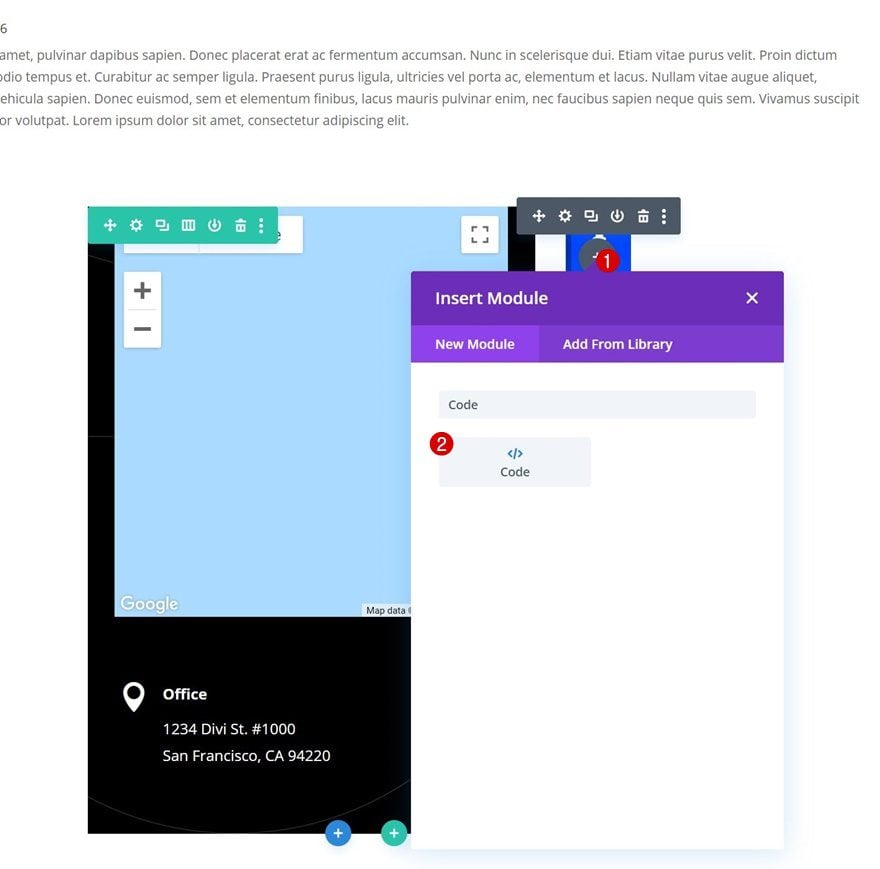
Place some style and script tags inside the code box.
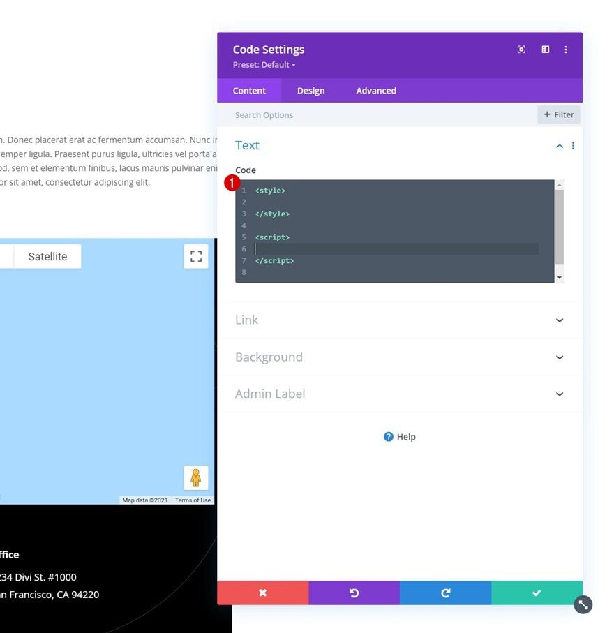
Insert CSS Code
We’re using the following CSS code inside the style tags:
.map-toggle-row {
-webkit-transition: .1s ease-in-out;
-moz-transition: .1s ease-in-out;
-o-transition: .1s ease-in-out;
transition: .1s ease-in-out;
}

.reveal-map{
left: 0 !important;
}

.map-toggle {
cursor: pointer;
}
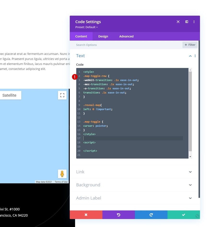
Insert JQuery Code
And the following JQuery code inside the script tags:
jQuery(function($){
$(document).ready(function(){

var toggleIcon = $('.map-toggle');
var toggleRow = $('.map-toggle-row');

toggleIcon.click(function(){
toggleRow.toggleClass('reveal-map');
});

});
});
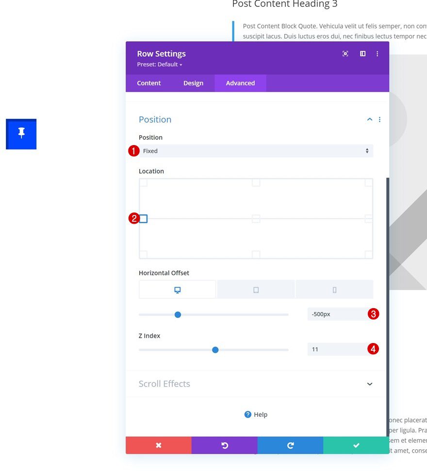
Add Fixed Position with Horizontal Offset to Row #2
Last but not least, we’ll need to modify the second row’s position settings accordingly:
- Position: Fixed
- Location: Left Center
- Horizontal Offset:
- Desktop: -500px
- Tablet & Phone: -72%
- Z Index: 11
5. Save Page & Theme Builder Changes
Once all changes have been applied, you can save all Divi Theme Builder changes and view the outcome on your website!
Preview
Now that we’ve gone through all the steps, let’s take a final look at the outcome across different screen sizes.
Desktop
Mobile
Final Thoughts
In this tutorial, we’ve shown you how to creatively include your business’ address details throughout your page designs. More specifically, we’ve shown you how to build a page template that includes a fixed map toggle, so your visitors can access your business’ location at all times! You were able to download the template JSON file for free as well. If you have any questions or suggestions, feel free to leave a comment in the comment section below.
If you’re eager to learn more about Divi and get more Divi freebies, make sure you subscribe to our email newsletter and YouTube channel so you’ll always be one of the first people to know and get benefits from this free content.


I can not do it, con in the step 2.( Add Dynamic Page Content to Body Area Section Settings) y loose it
Where I can Add Dynamic……..
Only appears. START BUILDING (blue) BROWSE LAYOUTS (Purple) CHOOSE PAGE (green) etc etc etc etc
VERY BAD instructions !
excuse me but I try and try and try ….3 hours or more
MH
Very cool functionality! I have added a slightly modified version of this to my site. I am having troubles getting the icon + the content that shows once the icon is clicked to be above my header and footer that were created in the theme builder. I’ve tried adjusting z-index value for both the section and the toggle row but does not seem to be working. Any suggestions?
Hi guys,
Thanks for this great template/tutorial. I really love it.
Unfortunately I have problems with the view. On mobile nothing is displayed and via desktop view it only works with Chrome [version 91.0.4472.114 (Official Build) (x86_64)].
Can you please help me out?
Thanks in advance.
Best
ska
This is super helpful, thank you! I am currently working on a site which uses the Divi Theme and am trying to get to grips with is. I was going to suggest a map feature would be helpful to them and then happened across this article. Hopefully showing them this will help make it an easy decision!