
The way you showcase blog posts on your website has a big influence on how your visitors behave when they come across them while navigating on your website. To help you get creative and effective, we’re going to show you how to feature your latest blog posts in a stunning way.
The example we’ll recreate will look particularly great on smaller screen sizes while maintaining a great look and feel on desktop and tablet as well. We hope this tutorial inspires you to create your own custom latest blog posts designs.
Let’s get to it!
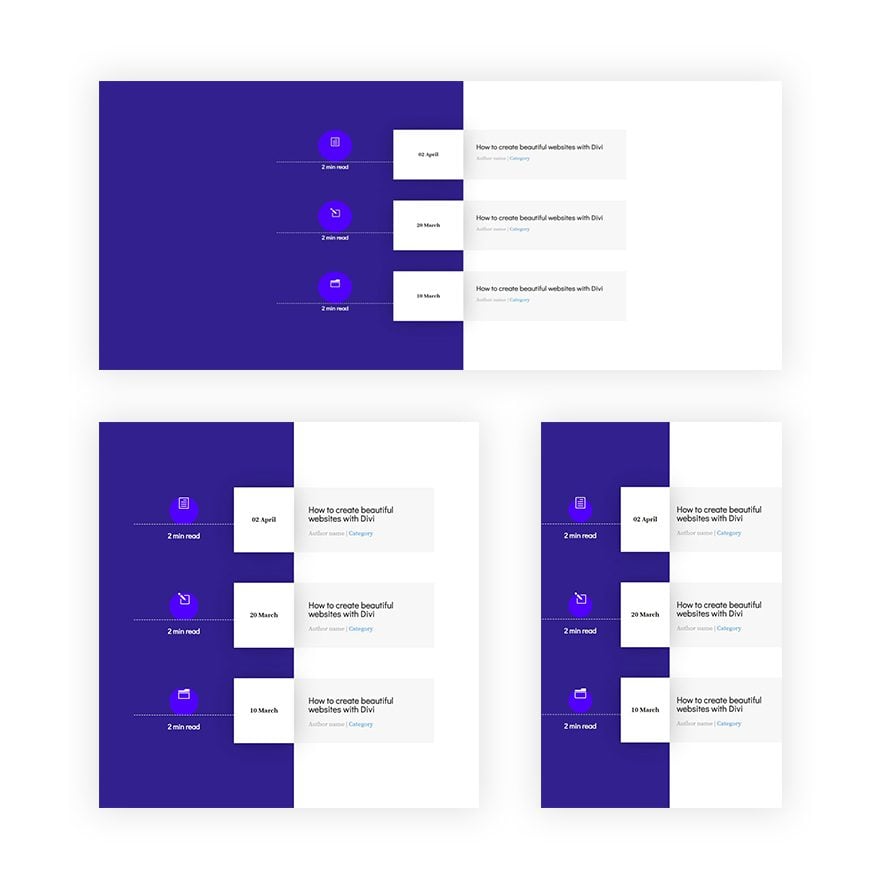
Preview
Before we dive into the tutorial, let’s take a quick look at the outcome across different screen sizes.
Let’s Start Recreating!
Add New Section
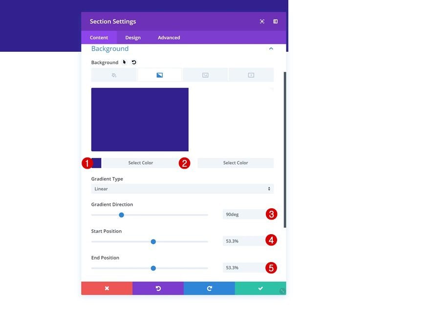
Gradient Background
Create a new page or open an existing one and add a regular section to it. Open the settings and add a gradient background next.
- Color 1: #2e1b8f
- Color 2: #ffffff
- Gradient Direction: 90deg
- Start Position: 53.3%
- End Position: 53.3%
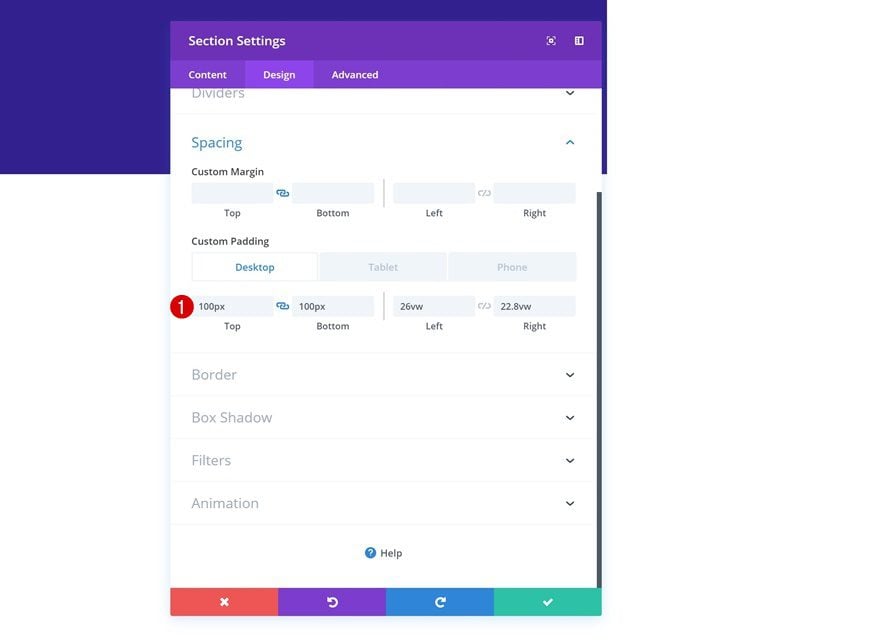
Spacing
Then, go to the spacing settings. Here, we’re going to shrink the size of the section content on desktop and gradually get rid of that space on smaller screen sizes.
- Top Margin: 100px
- Bottom Margin: 100px
- Left Padding: 26vw (Desktop), 13vw (Tablet), 0vw (Phone)
- Right Padding: 22.8vw (Desktop), 11.4vw (Tablet), 0vw (Phone)
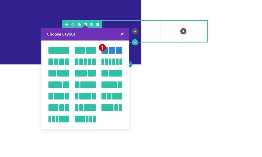
Add New Row
Column Structure
Continue by adding a new row to the section using the following column structure:
Column 2 Background Color
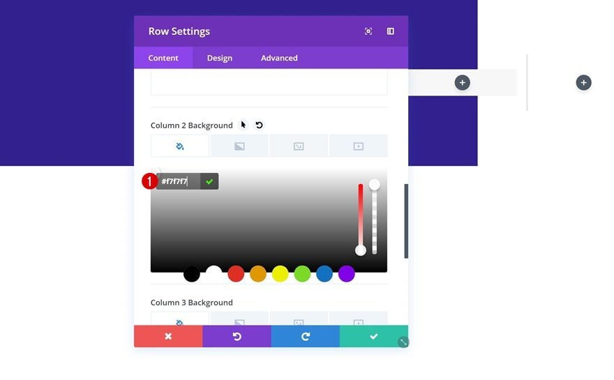
Without adding any modules yet, open the row settings and add a background color to the second column.
- Column 2 Background Color: #f7f7f7
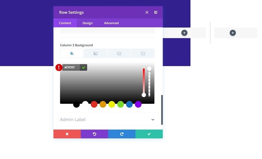
Column 3 Background Color
Add that same color to the background of column 3 as well. We’re using the same color for both these columns to connect them and make them look like one piece. Later on the post, we’ll use this to manipulate the column widths on smaller screen sizes.
- Column 3 Background Color: #f7f7f7
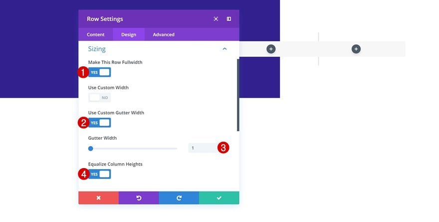
Sizing
Go the design tab next and open the sizing settings. Here, we’re going to remove all the default space between columns.
- Make This Row Fullwidth: Yes
- Use Custom Gutter Width: Yes
- Gutter Width: 1
- Equalize Column Heights: Yes
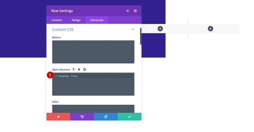
Display
Now, to make sure all three columns appear next to each other on smaller screen sizes, we need to add one single line of CSS code to the main element of the row.
display: flex;
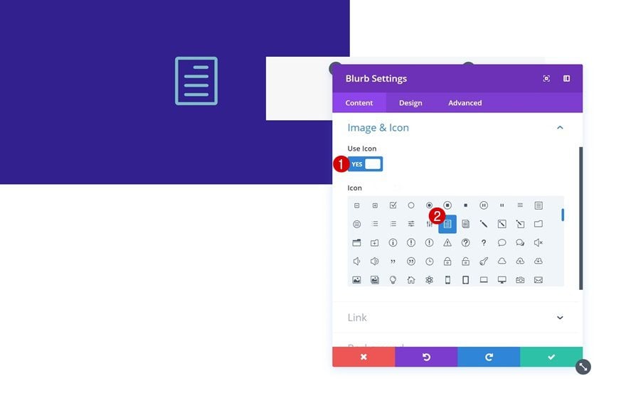
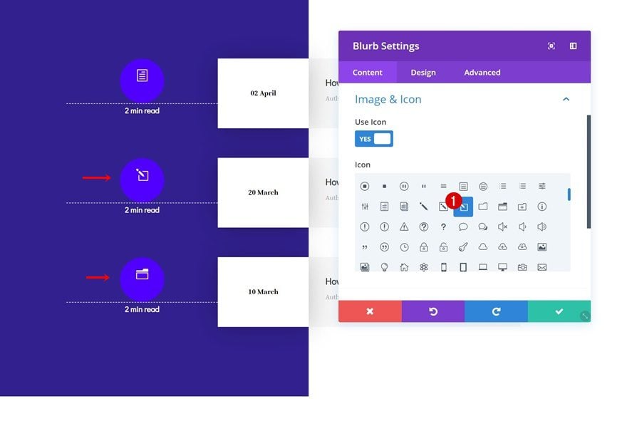
Add Blurb Module to Column 1
Select Icon
Time to start adding modules! Start with a Blurb Module in column 1 and select an icon of your choice.
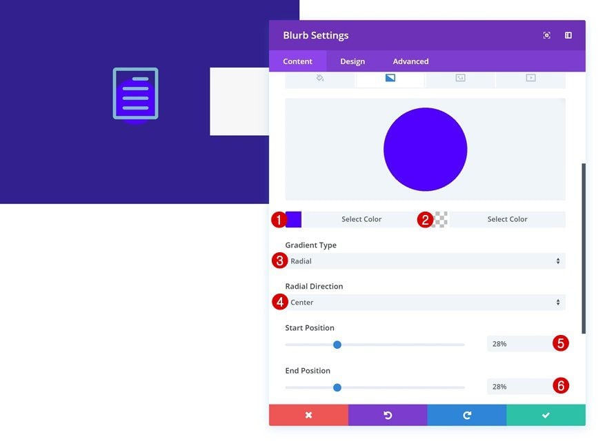
Gradient Background
Go to the background settings of the module and add a radial gradient background.
- Color 1: #5000ff
- Color 2: rgba(41,196,169,0)
- Gradient Type: Radial
- Radial Direction: Center
- Start Position: 28%
- End Position: 28%
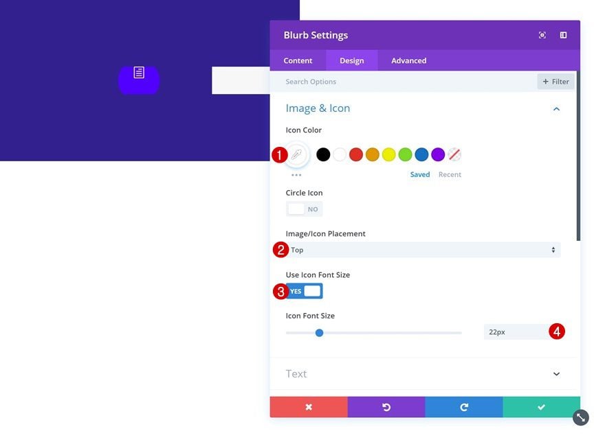
Icon Settings
Continue by going to the design tab and modifying the icon settings.
- Icon Color: #ffffff
- Image/Icon Placement: Top
- Use Icon Font: Yes
- Icon Font Size: 22px
Spacing
Add some custom top and bottom padding next.
- Top Padding: 20px
- Bottom Padding: 10px
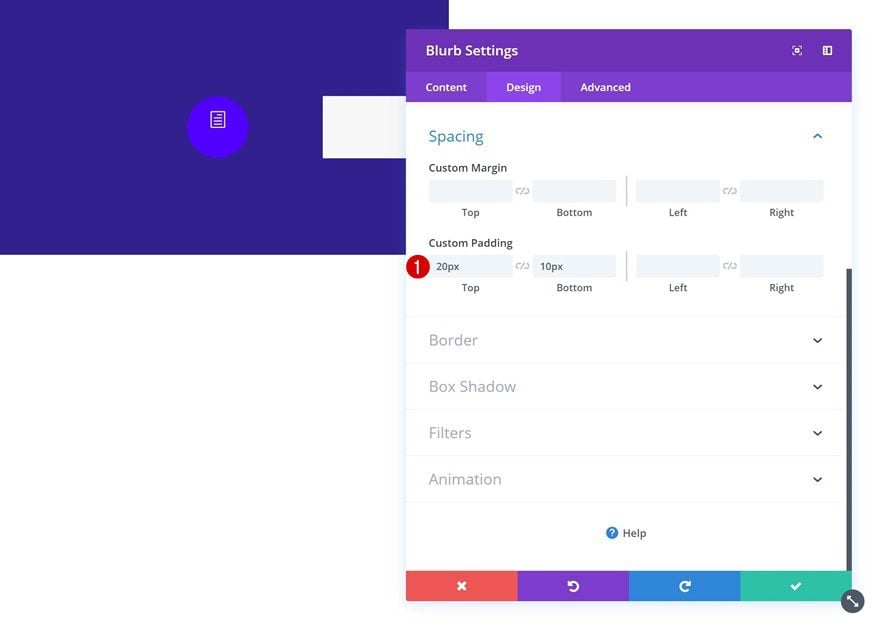
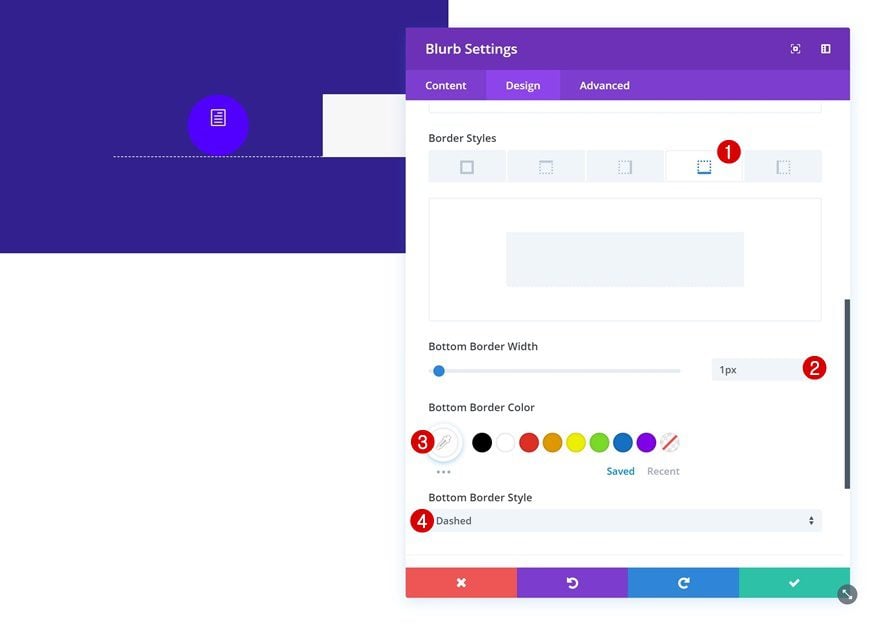
Border
And add a subtle bottom border to finish the Blurb Module design.
- Bottom Border Width: 1px
- Bottom Border Color: #ffffff
- Bottom Border Style: Dashed
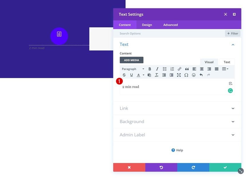
Add Text Module to Column 1
Add Content
The next and last module we need in the first column is a Text Module. Add some content of your choice.
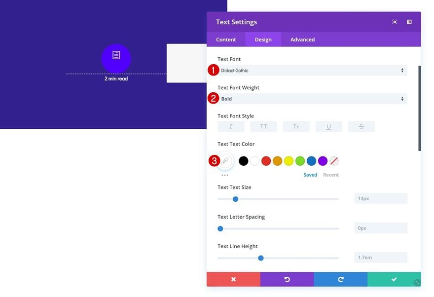
Text Settings
Then, go to the design tab and modify the text settings accordingly:
- Text Font: Didact Gothic
- Text Font Weight: Bold
- Text Color: #ffffff
Add Text Module to Column 2
Add Content
On to the second column! Here, the only module we’ll need is a Text Module. Enter some content of your choice.
Background Color
Move on to the background settings and add a completely white background color.
- Background Color: #ffffff
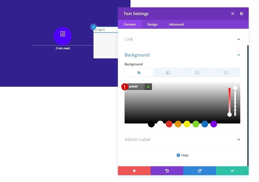
Text Settings
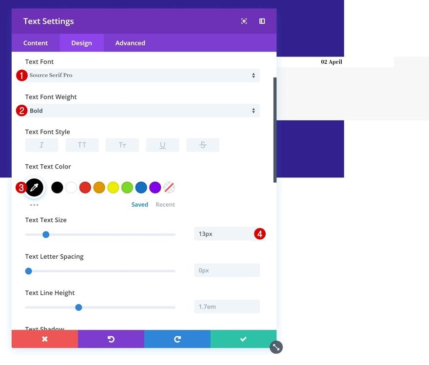
We’re also changing the appearance of our content by modifying the text settings in the design tab.
- Text Font: Source Serif Pro
- Text Font Weight: Bold
- Text Color: #000000
- Text Size: 13px
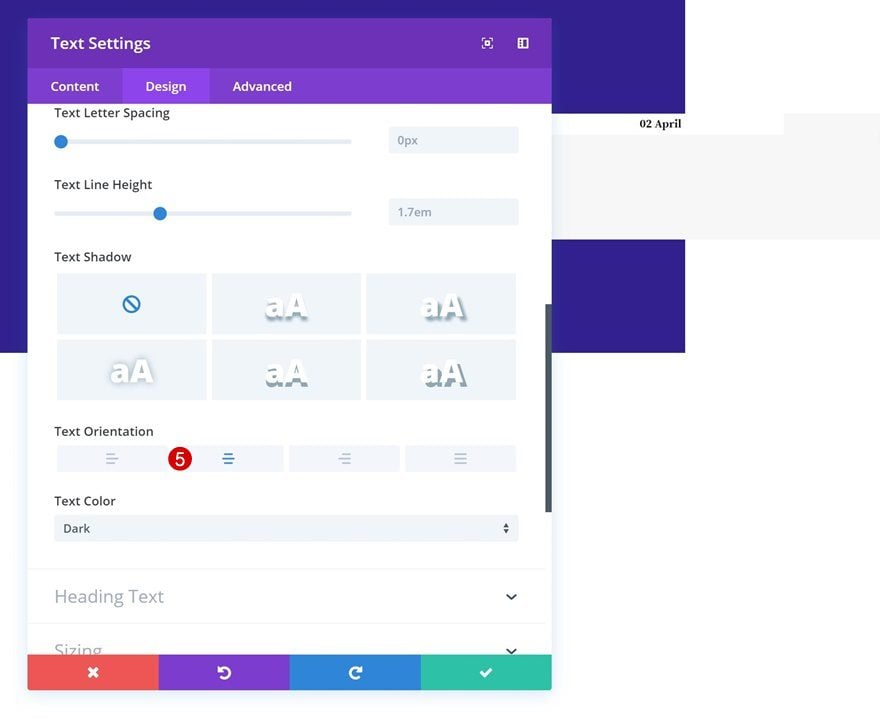
- Text Orientation: Center
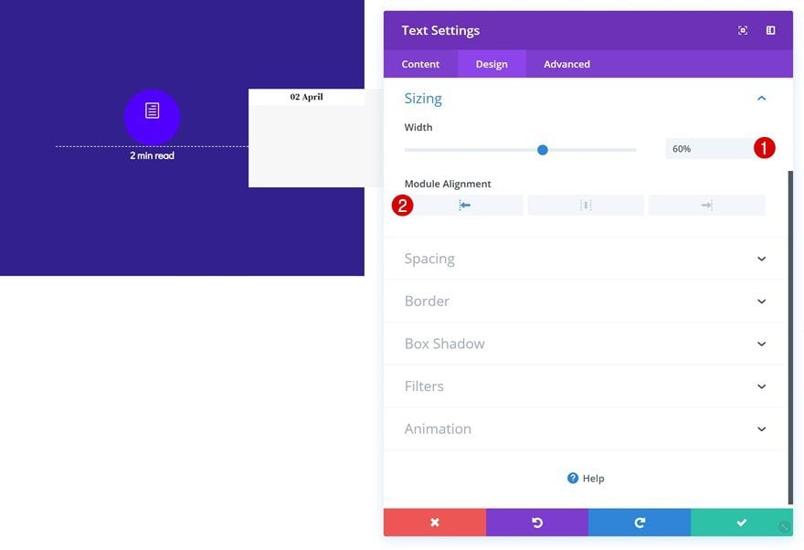
Sizing
As mentioned before, we’re manipulating the column structures to create a custom design on smaller screen sizes. To do that, you’ll need to decrease the width of the Text Module and make sure it’s aligned to the left side of the column.
- Width: 60%
- Module Alignment: Left
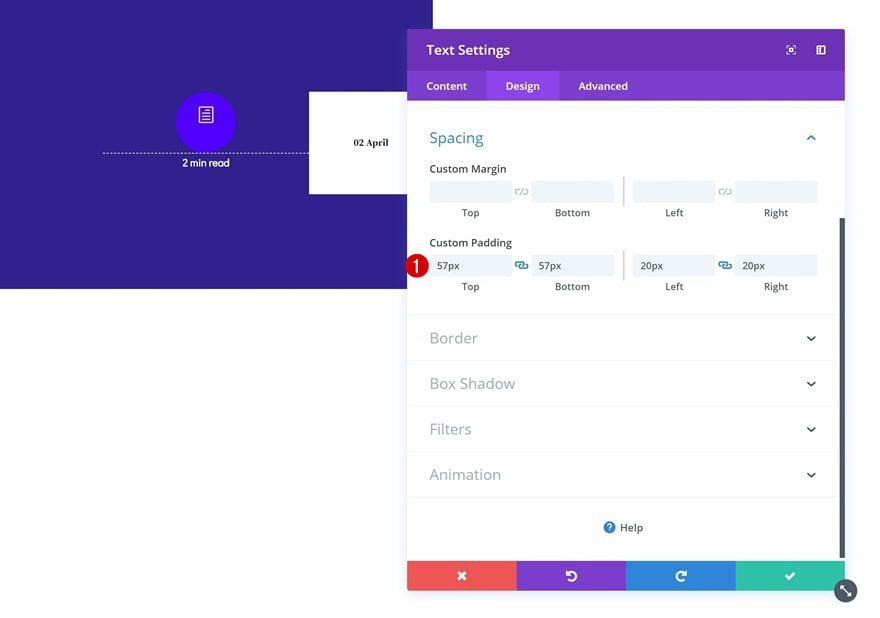
Spacing
We’re adding some custom padding values next.
- Top Padding: 57px
- Bottom Padding: 57px
- Left Padding: 20px
- Right Padding: 20px
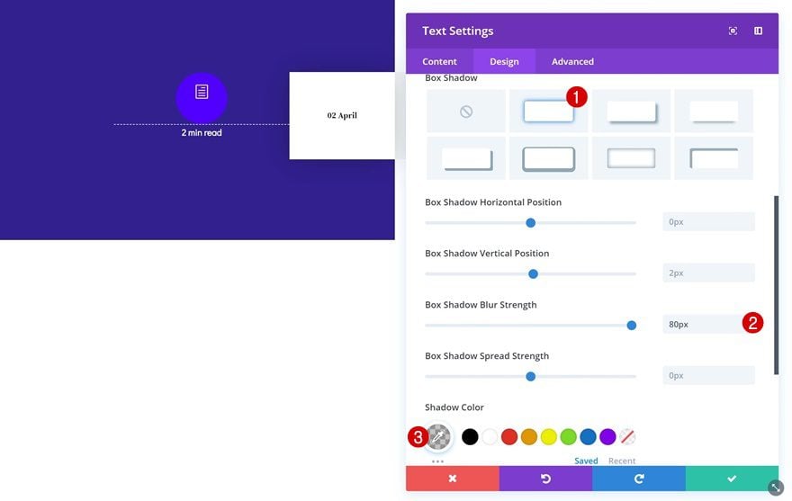
Box Shadow
Along with a subtle box shadow.
- Box Shadow Blur Strength: 80px
- Shadow Color: rgba(0,0,0,0.23)
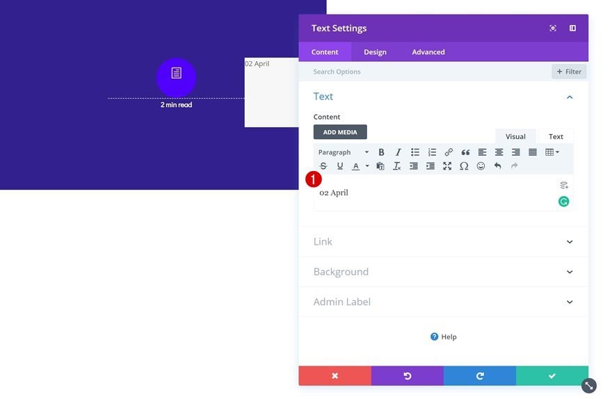
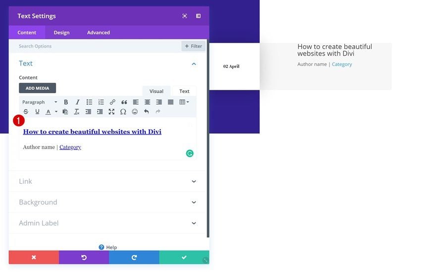
Add Text Module to Column 3
Add Content
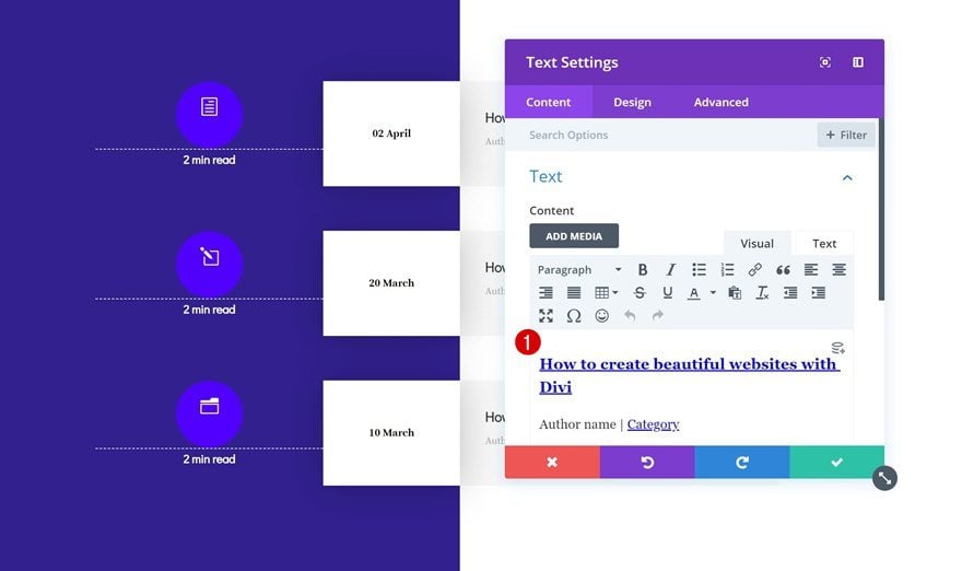
On to the next and last column. Add a Text Module with the H3 title of your blog post and a link. Add the post details in the paragraph text style right below the title.
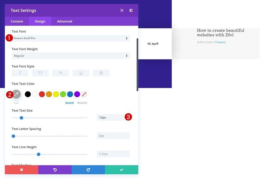
Text Settings
Go to the design tab of the Text Module and modify the text settings.
- Text Font: Source Serif Pro
- Text Color: #a8a8a8
- Text Size: 12px
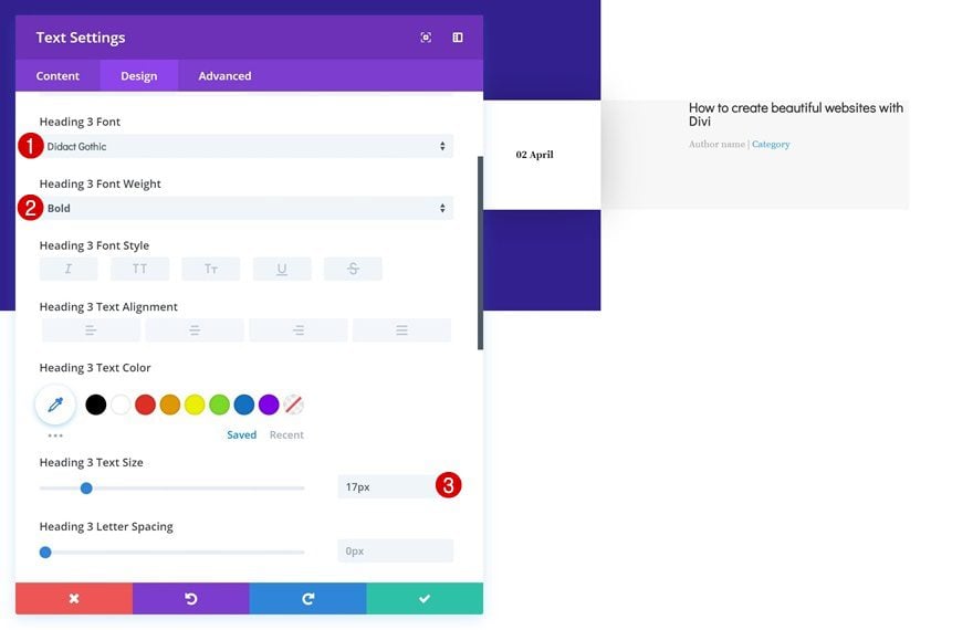
H3 Text Settings
Continue by changing the H3 text settings as well.
- Heading 3 Font: Didact Gothic
- Heading 2 Font Weight: Bold
- Heading 3 Text Size: 17px
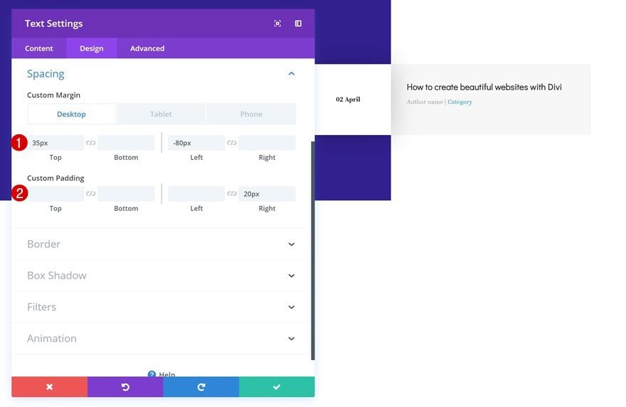
Spacing
Lastly, we’ll need to add some custom spacing values. You’ll notice that we’re also adding some negative left margin to the module. This is the last step towards creating a different kind of column structure on smaller screen sizes. So although the column structure is technically still the same, we’ve combined column backgrounds, module widths and negative left margin to create a differently-looking outcome.
- Top Margin: 35px
- Left Margin: -80px (Desktop), -50px (Tablet & Phone)
- Right Padding: 20px
Clone Row Twice
Once you’re done modifying the row and all of its modules, you can go ahead and clone the entire row up to as many times as you want, depending on how many latest blog posts you want to feature.
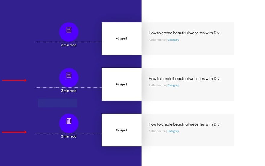
Change Icons
Change the icon of each duplicate.
Modify Content & Links
Along with the content and links that are involved and you’re done!
Preview
Now that we’ve gone through all the steps, let’s take a final look at the outcome on different screen sizes.
Final Thoughts
In this post, we’ve shown you how to create a stunning mobile design that showcases your latest blog posts. The design we’ve recreated step by step is primarily made for smaller screen sizes but it looks great on tablet and desktop as well. If you have any questions or suggestions, make sure you leave a comment in the comment section below!


I was just Thinking when Divi will add this option I am so much happy and badly need this option. Thank You very much Divi team to work hard and help us with their outstanding update in every week.
Thanks
It,s nice
How can I make an hover effect in the blog?
OMG: I am overwhelmed and still don’t seemthe final blog. Is this post what it looks like? This is so hard to understand. Most bliggers are not coders. I am not a coder but thanks!
its really a nice share , love this 🙂
Thank n you but Why is there no preview as demo?
It’s ET modus operandi not to give us that … instead they add 1 000 000 cosmetic functions instead of fixing already known issues. I’ve been a customer to ET since day 1 way back and the “family feeling” is long gone. Sorry to say but i lost that loving feeling 🙂
Yeah I have to agree, it would be helpful to actually view this on a webpage rather than an image.
I like the layout however unsure I’d go to the trouble of trying this with viewing it, in action, as such!
The problem with this is that it does not use the blog module but the text module. So you would have to upload manually a blog post ?
+1 for the live demo 🙂 Especially on a mobile, these images are hard to get a feeling of. But great work, and nice with the examples overall.
Yes spot on, live demo, Poss a link to download for import to see how it looks.
Making a blog list by hand is not very smart. You would have to keep updating it , as well as all pages. Imagine when you have 100 blog posts?
This is just pretty but is not practical or applicable in a real situation.
I agree
Agree with that… handmade overview for a blog isn’t a real good practise.
But at the same time it gave me ideas… I’m a toolset enthusiast … and combining one of the rows out off this tutorial in a toolset view can create n amazing full blog overview page.
Why do you not use dynamic content to the blog post?
Not dynamic? No interest
+1
As always very well explained, and the initiative I liked a lot! Thank you.
The design is nice but is ultimately completely useless since it doesn’t utilise the core functionality of WordPress! WordPress began life as a blogging tool, why should you have to build (and update) a list of your posts by hand?!
This post highlights the infuriating fact that despite all the fancy new features Divi has gained over the past few years, it still lacks one of the most fundamental features a “Builder” (or indeed “Multi-Purpose Theme”) should have – a way to display/customise a list of posts from any Post Type.
Sad to say, but other “Page/Theme Builders” are striving ahead of Divi in areas that matter most to us folks who build websites.
We want to be able to use tools such as Divi to create great websites in a time/cost efficient manner for ourselves and clients, not spending loads of time working around limitations that just shouldn’t exist!