Entertainment has always been popular and the web has opened up new possibilities over the years. This means there’s a great need for good web design in the entertainment industry. Fortunately, Divi has what it takes to build any kind of entertainment website, whether it’s for bands or solo artists, entertainment houses and events providers, movies, plays, D.J.’s, or anything else you can imagine. To help inspire you for your next web design, let’s take a look at 15 examples of entertainment sites using Divi.
It’s easy to see that the topic of entertainment is vast with lots of topics and needs. These sites provide great ideas for using color, layouts, images, audio, video, opt-in forms, and even eCommerce. The websites are in no particular order. The show can go on with Divi.
- 1 1. Sterling Entertainment
- 2 2. Vineyard Music and Events
- 3 3. Royal Ballet of Moscow
- 4 4. iii Points
- 5 5. Rachel Collis
- 6 6. Peter Furler
- 7 7. Korekayu
- 8 8. The Crucible on Screen
- 9 9. Tobias Meinhart
- 10 10. Little Rock Film Festival
- 11 11. Mairi Campbell
- 12 12. Lux Aeterna
- 13 13. DJ Charlie Villas
- 14 14. Probable Cause
- 15 15. Funk Engine
- 16 Final Thoughts
1. Sterling Entertainment
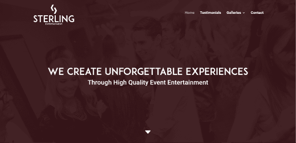
Sterling Entertainment includes a full-screen slider, an about section with a link to the contact form, a section about the founders with a link to the gallery, a description of their work, and a section about their equipment. Each section includes an overlay with true parallax. The testimonials page displays a short version in a standard module and a full version in an accordion. The photo gallery displays the images in a grid with overlay. The contact form is placed over a light background with an image that’s just visible and a full-width image slider at the bottom of the screen. It’s worth visiting the website just to see the overlays and parallax.
2. Vineyard Music and Events
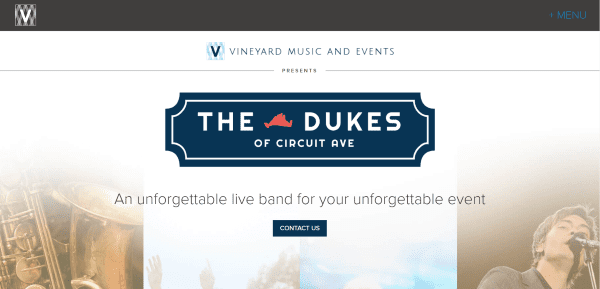
Vineyard Music and Events includes a full-screen image with contact link, diagonal section separators which go in multiple directions, an about section, a section describing why to hire the band with a downloadable song list, embedded video and audio, several about sections with CTA’s, a Who We Are section that’s split into two halves, a contact form, an FAQ, and a large footer with image and contact info. The Calendar page has an embedded Google calendar to show upcoming events. This site makes excellent use of background images.
3. Royal Ballet of Moscow
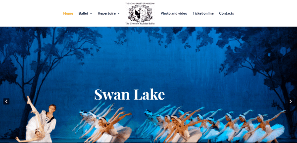
Royal Ballet of Moscow includes a full-screen slider with transition effects, images with hover effects that link to pages, an information section about the founder that includes a two-column design with an image and text with link to read more, and a footer with contact and show information. The Artistic Director page uses a split screen to scroll the column of text while displaying a fixed image in the other column. The pages for the ballets use alternating text with images. The galleries are displayed in a multi-layout with hover effects. The Ticket Online page displays the schedule in a table with links to purchase.
4. iii Points

iii Points includes a full-screen slider with transitioning background, animated logo, parallax, CTA with hover effect, social icons with hover effect, and a newsletter signup form. The site is simple, acting mostly as a landing page. Other pages are accessed by clicking the contact link in the footer, which includes venue info, a full-screen gallery of past shows, and the store is integrated with Shopify. The galleries of past events make great use of images and sliders.
5. Rachel Collis
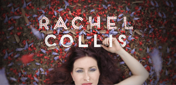
Rachel Collis includes a full-screen image with parallax, a delayed menu on scroll, a stylized testimonial section, an email opt-in, an events calendar that displays event cards on click, and blog posts with hover effects. The menu includes hover effects. The Albums page includes descriptions and links to iTunes. Shows and News displays the calendar and blog posts. The video page includes a video slider. This site makes great use of images and effects and the branded font and backgrounds are used throughout the site.
6. Peter Furler
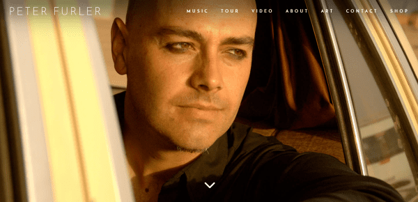
Peter Furler is mostly a one-page design that displays a full-screen image with transparent menu that changes on scroll, a double-column section with an image on one side and links to albums on the other, a full-width image with button to see tour dates, featured video with link to more, a strip that shows sales stats for social proof, an about section, a section about his art that includes parallax, another parallax section with email opt-in, and social and contact info. The shop page uses WooCommerce to display the merchandise images. A cart button slides the shopping cart to the right side of the screen.
7. Korekayu
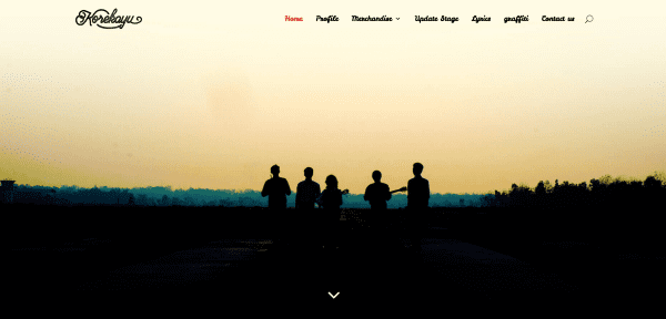
Korekayu includes a full-screen image, a two-column about section with image, text, and link to read more, a full-width shop section, another two-column section, and a blog section. A cropped version of the image from the home-screen is used as the header for other pages. The events calendar has a feature to search for events. The site makes good use of branding with imagery and color.
8. The Crucible on Screen
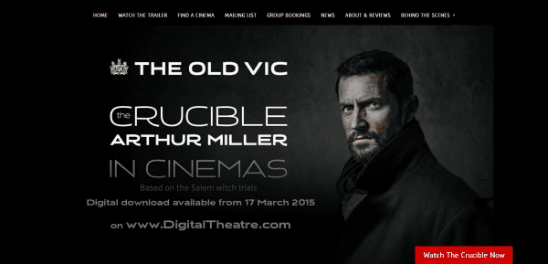
The Crucible on Screen displays an image with description and CTA, a link to a free download, a video, social feeds, and a custom footer with links and an image. The About and Reviews page provides a description and snippets of media reviews with star ratings. The Cast and Creatives page shows the actors using person modules. It includes two blogs: News and Film Director’s Blog, which are displayed in their own pages using categories.
9. Tobias Meinhart
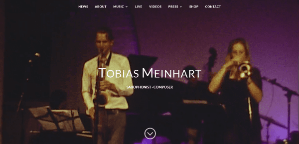
Tobias Meinhart includes a full-screen video, a color parallax section with link to see tour dates, posts from the blog with the same parallax background but in monochrome, and a custom footer with social links and a mailing list subscription form with the same background in sepia. The various pages use full-screen images or sliders. The music pages include sample tracks in a playlist. Upcoming shows are displayed using GigPress. Products are displayed with WooCommerce. This site makes great use of branded images.
10. Little Rock Film Festival
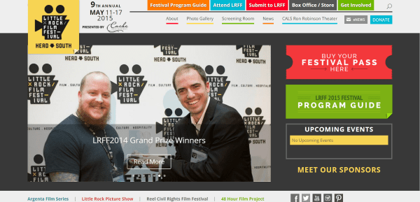
Little Rock Film Festival displays a post slider next to stylized CTA’s, a menu with social links, a blog section, a CTA section, a sponsors slider, and contact info. The menu includes two sections of links, an overlapping logo, and information of an event. Many of the pages include right and left sidebars. The Festival Program Guide displays an interactive schedule powered by Sched. The Store page using WooCommerce. I found the menu and schedule to be interesting.
11. Mairi Campbell
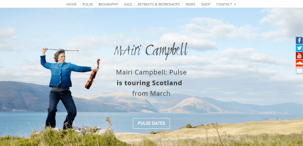
Mairi Campbell has a full-screen image with a link to show dates, an about section with CTA and interesting background artwork, a biography section, a section with embedded soundtracks, a full-screen video, a section about artwork, a full-screen image with a link to the contact form, and a custom footer with social feeds. The various pages use a full-width image with a narrow column of text and embedded video. The Gigs page displays the schedule using GigPress. The shop is powered by WooCommerce and includes an audio sample and purchase options.
12. Lux Aeterna
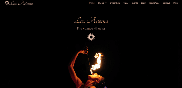
Lux Aeterna includes a full-screen image, an about section with contact info and an image, another full-screen image, images with links to the various shows with hover effects, another large image, contact form, testimonial slider, and links to shows in the footer. The pages for the shows display image galleries with parallax sections. A credentials page provide information and links within accordions. Events are displayed in a text box with previous events shown in accordions. The site uses branded colors and organized text throughout and makes great use of images, giving the site an elegant touch.
13. DJ Charlie Villas
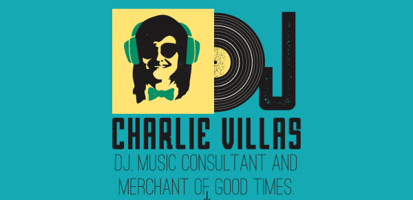
DJ Charlie Villas uses a one-page design with a full-screen graphic, stylized icons for each of the pages, an about section, sections for each of the services with images that use different colors in parallax over an artistic background that fits that section, testimonials, and description of what’s included in the package, audio samples, client list, upcoming gigs using MF Gig Calendar, and a contact section. The branded colors look fantastic throughout the webpage.
14. Probable Cause
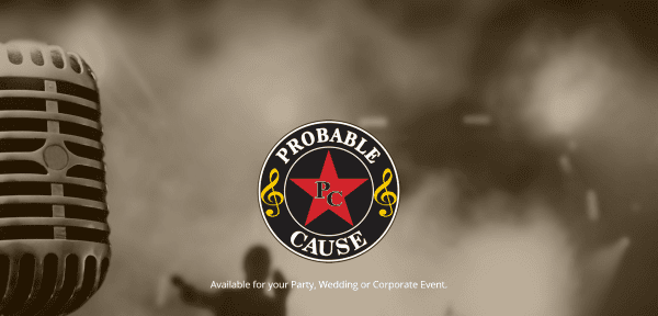
Probable Cause has a full-screen image with their logo front and center next to a microphone to make it easy to understand what they’re about. It includes an about section, images in parallax, a video section with fancy section separators, and a section in parallax with social icons and a contact form. Upcoming and past shows are displayed in text boxes. Song titles are displayed within accordions. The shop page is powered by WooCommerce. The menu includes contact and Facebook buttons.
15. Funk Engine
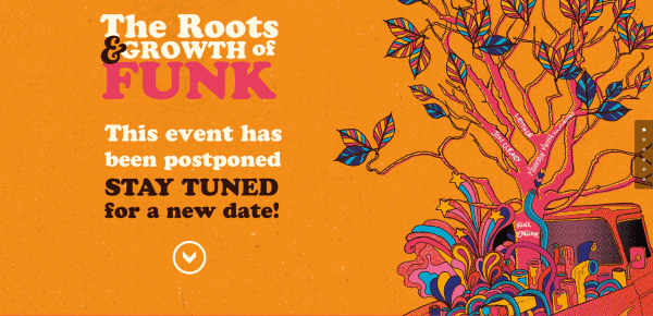
Funk Engine uses bright colored backgrounds and artwork throughout the site. The one-page design includes full-screen artwork with an event description, an about section with images of the band members, embedded tracks from their album, a couple of videos, a section for upcoming gigs using GigPress, an image gallery, and a contact section over a full-screen background with sepia filter. The site makes nice use of backgrounds and image overlays.
Final Thoughts
These 15 examples of entertainment websites using Divi are great examples for using layouts, colors, images, video, opt-in forms, sliders, navigation, animations, shops, sidebars, and more. If you need inspiration for an entertainment website, these are sure to provide some ideas for you to use in your own designs.
What are some of your favorite elements of these Divi entertainment sites? Let us know in the comments below!
Featured Image via Stmool / shutterstock.com





I just started using Divi and it has been wonderful. This post has inspired me to make a new site for a good friend’s country/folk band here in Montana. Cheers and thanks! Eric
Hi
Nice examples, but I really think some of these developers need to read about responsive/mobile first… 🙂
Are they doing any testing in mobile? They don’t even use Divi tools to make font size better for mobile.
How do you find these niche specific sites on Divi?
Hi Eugene. Great question! I use several search methods:
Many web developers post their work in their portfolios. I browse through as many developer’s websites as I can to see what they’ve created.
Many developers place links in the various Facebook groups to show the work they’ve done. I like to make note of them and then follow that developer to see what else they’ve made.
I know a lot of developers and they are great resource for information (I try not to abuse this one though, because I know how busy they are).
There are a few sites, like DiviThemeExamples, that shows some of them.
I like to look through articles about niche sites to see how many Divi sites I can spot.
I also search for the niche and check the code for the sites (right click, View Page Source). That one takes the most time, unfortunately. If I know something is Divi but the developer has gone through extra lengths to white label then I don’t include it without permission from them.
Does anyone else have tricks for finding Divi sites?
Hi Randy. Nice post, thanks for the inspiration. Royal Ballet of Moscow caught my eye especially because I work in-house for a global classical music agency, building Divi websites for our artists and even the company’s own website, which I rebuilt with Divi last year.
Musicians is the niche I definitely want to focus my personal portfolio on, so thanks for sharing!
Tim