
Diet and nutrition is important to a healthy life and the web has plenty of information on the topic. This means there are lots of websites to get inspiration for your next diet and nutrition Divi project. In this article we will cover 13 examples of diet and nutrition websites built with Divi to help spark the imagination of any Divi designer.
Whether your client needs to discuss diets and recipes, show products such as health supplements and vitamins, or even provide coaching, courses, and workshops, these sites can help with inspiration for your next design. The websites are in no particular order.
- 1 1. Lynn K Wagner
- 2 2. Results Food Coaching
- 3 3. Glamor Hippie
- 4 4. Neo Suplemen
- 5 5. Trivert Nutrition
- 6 6. Root of Life
- 7 7. Natural Vitality
- 8 8. Lose the Body Fat
- 9 9. Lose Weight Without Dieting
- 10 10. A Whole New Life
- 11 11. Win the Diet War
- 12 12. Ayesha Curry
- 13 13. Nutrition Research Institute
- 14 Final Thoughts
1. Lynn K Wagner
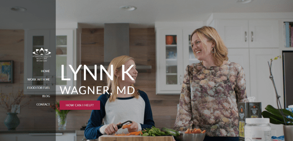
Lynn K Wagner displays a full-screen background with call to action (CTA) and transparent vertical menu. Scrolling reveals a transparent newsletter signup in parallax, a CTA in parallax, a three-column about section in two colors, a testimonials section, and blog posts. The about section looks like it came straight from a well-designed magazine page. The testimonials section uses images and displays the testimonial as an overlay on hover. The blog section includes the blog image with an excerpt in a separate overlay. The various pages include galleries, parallax, and CTA’s.
2. Results Food Coaching
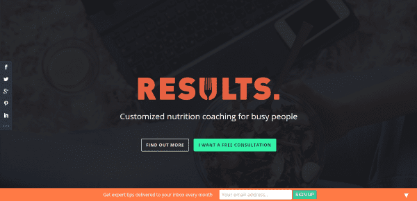
Results Food Coaching includes a full-screen overlay in parallax with CTA. Scrolling reveals an about section in three columns, and elegant information section with CTA, testimonials, a How it Works section using blurbs with branded colors, a contact form, and a footer with results and resources links. A few full-screen images are thrown in here and there. An email CTA remains at the bottom of the screen and can be dismissed if the reader chooses. The site makes great use of icons, color, and images.
3. Glamor Hippie
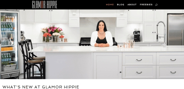
Glamor Hippie uses a full-width image with a simple menu with branded colors. Scrolling reveals the latest blog posts in a grid with a load more feature. Under this is a full-width email signup with branded colors. The last section displays embedded Instagram feeds with a load more feature and a follow button. This site does a great job with branded colors, photography, and presenting blog posts and social feeds.
4. Neo Suplemen
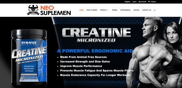
Neo Suplemen includes a full-screen slider followed by product listings powered by WooCommerce. Sales stats are displayed with parallax, another section shows the team members followed by a section with the phone number and tagline. The footer displays the contact info along with about and menu widgets. The site makes excellent use of color and product placement.
5. Trivert Nutrition
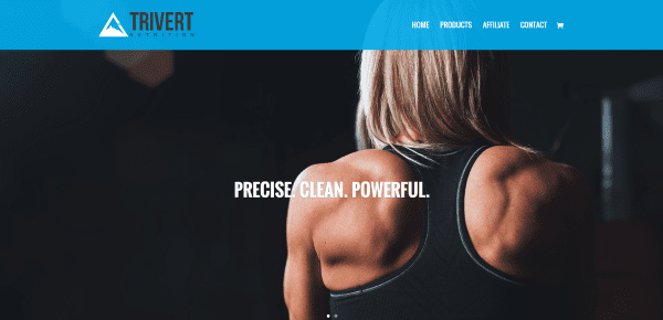
Trivert Nutrition includes a full-screen slider followed by product listings. Rather than using a shop module with WooCommerce products the products are displayed with images and accordions for detailed information and WooCommerce is used to add a purchase button to the listing. The Products page simply lists the benefits of the product. The site is simple and effective, keeping the focus on the product.
6. Root of Life
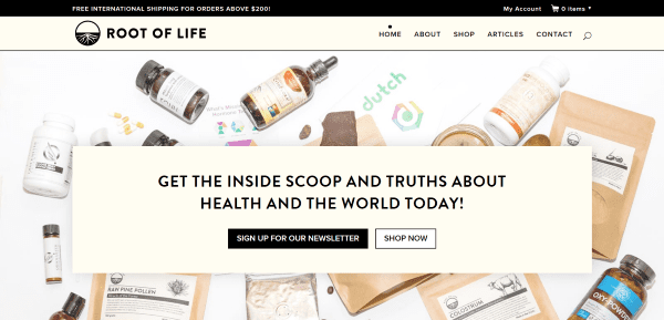
Root of Life has a full-screen background in parallax with CTA. Next is a product slider that shows the next product within the arrow button on hover and displaying the products as thumbnails just under the slider. A shop module displays WooCommerce products with a link to the shop. Blog posts are displayed using a blog slider. The footer displays a signup form and menu links. The Articles page displays the categories across the top and links to the various articles. The site has a clean and simple design.
7. Natural Vitality
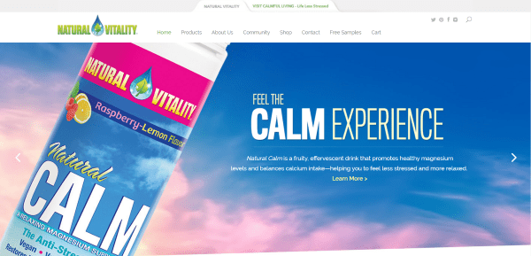
Natural Vitality includes a full-screen post slider and an interesting tabbed menu link for the top menu that takes the reader to a sister site. Scrolling displays images with links to several pages followed by a five-column footer with links and a newsletter signup form. The various product pages keep the product on one side of the screen on scroll. The Find Natural Valley Products page uses EasyLocator to embed a store locator feature. Of course, there are other store locator and interactive maps plugins you can use to create a similar effect. The shop is powered by WooCommerce. A CTA remains on screen and can be dismissed if the reader wished. The site makes great use of product parallax and CTA’s.
8. Lose the Body Fat
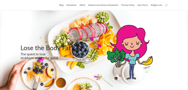
Lose the Body Fat is the only site on this list that’s set up as a blog for the homepage. It includes a full-screen image with a cartoon character and tagline overlay. Scrolling displays the blog posts in two columns with a sidebar. The various pages call attention to vital information about dieting. The Weight Loss page displays the category in a single column listing. The site is clean without distracting from the content.
9. Lose Weight Without Dieting
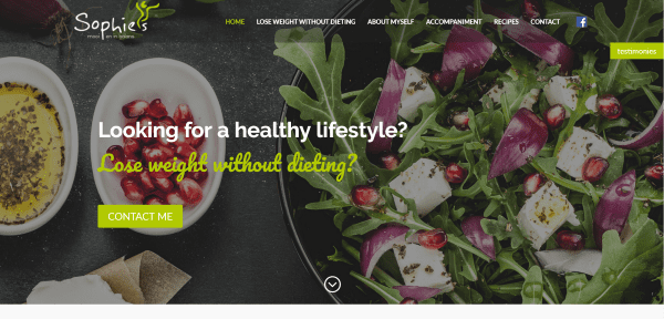
Lose Weight Without Dieting uses a full-screen image with CTA, transparent menu, and a floating testimonies button. Scrolling reveals an about section, a two-column section with information and testimonials, an elegant blog section, a contact form, and footer with contact and social follow links. The blog section includes a background and two posts with branded colors and fonts. Between several sections are smaller sections with motivational statements. The Lose Weight Without Dieting page creates dividers using elegant sections with counters.
10. A Whole New Life
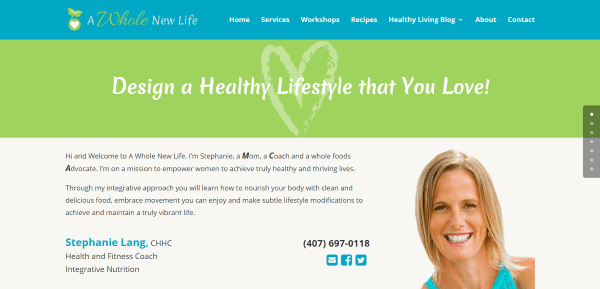
A Whole New Life has a large section with a tagline as a header element, a full-width section with image and contact info, a CTA, testimonial, circular images with links to pages, newsletter form, and a list of recent posts in full width. The Recipes page displays the categories with an image and text links to each post. Payment is handled through WooCommerce. The site makes great use of branded color.
11. Win the Diet War
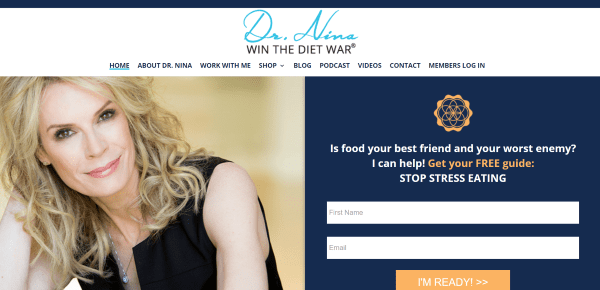
Win the Diet War includes a full-screen image with CTA, an about section with testimonials, an about section with CTA, a section with three different colored text modules with CTA’s, a section with featured media logos, and footer with widgets to display posts and contact info. WooCommerce is used to display courses and books on elegantly designed shop pages. Podcasts are embedded within blog posts. The site makes great use of color and layout design.
12. Ayesha Curry
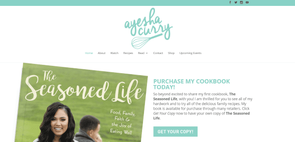
Ayesha Curry includes a large header and logo followed by a double-column section that includes an image, CTA, and a three-page photo gallery displaying two photos at a time. A CTA section includes three boxes with text links. The next section includes an image with a link to her show on Food Network. Following this is a blog grid with hover effects and a section with Scripture in an elegant script from Bible Gateway. The Watch page displays a video gallery. The various pages display content in three-columns. WooCommerce powers the shop page. The site makes great use of color and layout design.
13. Nutrition Research Institute
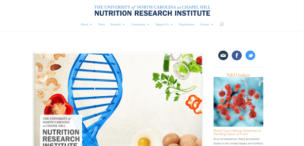
Nutrition Research Institute from the University of North Carolina has a magazine design. The homepage includes a post slider, CTA, an about section with blurbs and accordions, a sidebar with the latest post and CTA, and a footer with contact info. The Timeline page displays an embedded timeline. Schedules, employment, and other info are displayed with accordions. WooCommerce is used to receive donations. Blog posts are placed under the News category and are displayed in a double-column offset format with a load more feature. This is a large site but is organized and easy to navigate and makes great use of color.
Final Thoughts
These 13 examples of diet and nutrition websites built with Divi go to show that Divi can be used to create interesting designs for any type of diet and nutrition website, whether it includes recipes and articles, an online shop, or a site with courses and workshops. Check out these popular recipe plugins to build your own site that features healthy options.
These sites a great for providing ideas for layouts, colors, photography, video, podcasts, navigation, and more. These websites are sure to inspire you for your next diet and nutrition design with Divi.
What are some of your favorite elements of these Divi diet and nutrition sites? Let us know in the comments below!
Featured Image via Visual Generation / shutterstock.com


The Mediterranean Dietitian uses Divi and loves it too!
TopTrainer Uses Divi. We are big fans!
He theme DiVI da to be can adapt to any project. Great alrticulo and great displays of sites built with DIVI
What a fantastic list of Diet & Nutrition websites. Thank you!
This is very interesting, as well as all of the examples that you show.
I wonder if I will ever be able to see examples similar to my website with blog, quotes, poems, pictures.
I want to redo mine, I bought Divi for this reason, but I don’t have any ideas and being old does not help.
Can you share some idea for this purpose?
Thanks so much 🙂
Yes, absolutely! We have a series in the works that shows how to style Divi’s blog in a number of really cool ways.
Thanks so much, Lio [and LioSite]
I cant wait to see that series! Im working on a site now and could sure use that!
Great selection – thank you.
Randy, are you able to tell us more about how the menu setup was done in number 1, the Lynne K Wagener site?
Divi also has a menu style for this. In the theme customizer, if you go to Header & Navigation > Header Format you can select the “enable vertical navigation” option. That should get you started!
Hi Martin. One way to do this is by using image and button modules using a 2-column layout with 1/4 and 3/4. Set the background image in the section. Use the image module for the logo and set the links in the button modules. Set that column to have the opacity you want. The right column would have text and button modules for the name and CTA.