
The web is filled with creative agencies. Lots of them use Divi, which is no surprise since Divi has become one of the top development themes for WordPress. This means there are lots of examples of creative agency sites using Divi to help provide creative inspiration. In this article we will look at 14 of them.
Whether the creative agency provides services such as graphic design, photography, web design, video, logos, or even app development, these sites can help with inspiration for your next design. They’re in no particular order.
1. Delish Agency
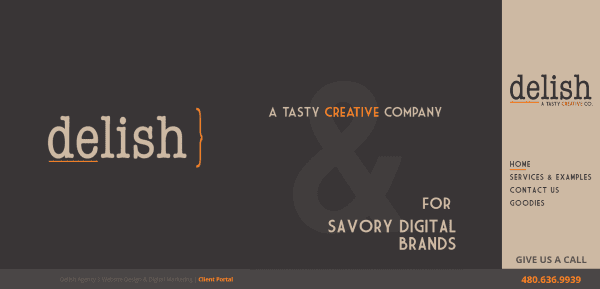
Delish Agency includes a full-screen image with tagline, a right sidebar design, and a message bar that remains on screen. Scrolling reveals a full-screen image with overlay and parallax with a CTA (call to action), a stylized three-column section about the services, and another full-screen section with overlay and CTA. The Services page uses alternating images and text with overlays and parallax. The site is a great example of color and font branding.
2. Kipo
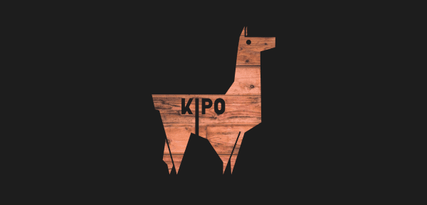
Kipo uses an interesting logo design as a cutout over a full-screen image in parallax. Scrolling reveals a menu, full-screen animated image of the team, an about section, blurbs for their services, an Instagram feed, client logos made to match the website’s color branding, and a social follow section. The site makes great use of branded color.
3. Fern Colab
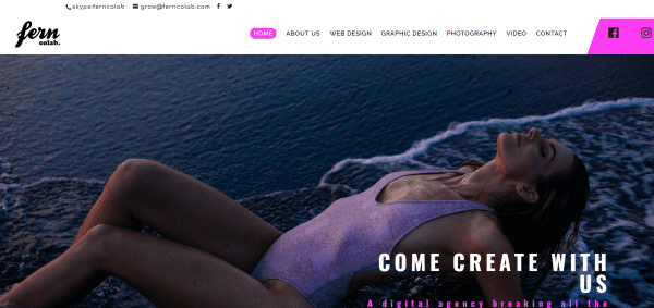
Fern Colab displays a full-screen image in parallax with a company quote. Following this is an about section with CTA and a section showing client logos. The portfolio pages show off their client work in masonry grids or in full-width sliders. The menu displays different colors for each of the pages, which use the same colors as highlights.
4. Dusty Dog Marketing
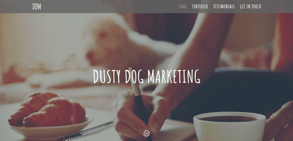
Dusty Dog Marketing displays a full-screen image in parallax, an about section that discusses their services and then shows the services in blurbs, and an about section that talks about the team. The Portfolio page displays their work within flat-screen monitors. The site makes great use of branded fonts and color.
5. 2DSign
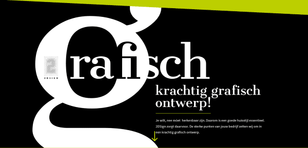
2DSign displays a full-screen image with section overlay in parallax. Scrolling reveals a small section with CSS design and social icons which appears throughout the layout on both the right and left side of the layout, and about section with CTA, links to pages and services, a testimonial section with large quotation marks with all of the testimonials within them, and a contact form. The site makes creative use of section separators.
6. Little Red Chimp
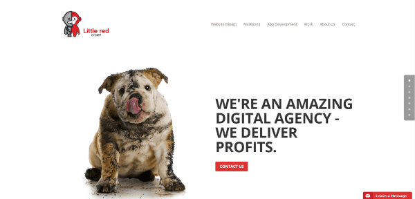
Little Red Chimp uses a full-screen two-column section with image and CTA. Scrolling shows an about section, a portfolio section, about the team and their projects, and a custom footer with contact info and social links. Each of the portfolio pages provide details of the type of work they do within each category with links to that specific portfolio. The site makes good use of images.
7. Morley Group
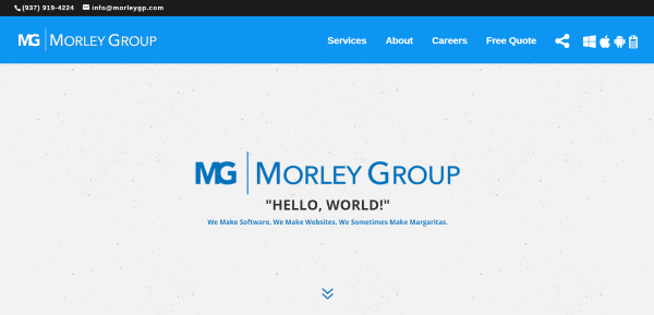
Morley Group includes a full-screen welcome message, a full-screen image of their hometown of Dayton, Ohio, a CTA quote, a branded contact form and map, and a client logo section with hover animation and a link to the company. The About page details their design process with branded colors and icons. The site makes excellent use of color and textured backgrounds.
8. Bamboo StudioWeb
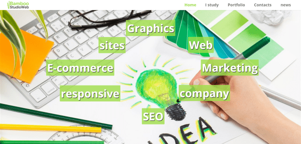
Bamboo StudioWeb includes a full-screen slider in parallax with CSS animated elements that follow your mouse. Next is a small section of blurbs with shadow and hover effects, a company quote in parallax, an about section with branded drop-cap, a services grid in parallax with overlay, a portfolio section showing designs within monitors, a newsletter form, social follow, and a contact section with large icons. The site makes excellent use of branded color.
9. Purple Finch Studios
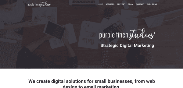
Purple Finch Studios includes a full-width image with overlay, logo, and tagline. Also included is a section with company info, blurbs for services, sections for each of the services with more detail, a portfolio, testimonials, and CTA. The various sections are separated by full-width images in parallax. The Support page include a pricing table and FAQ using accordions. It also has a Help Desk page that’s powered by Freshdesk.
10. Indexxa Content
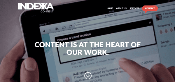
Indexxa Content includes a full-screen video, menu with CTA, a section with video and CTA, information about services, a section about the team with animated cards, and a custom footer with branded colors. The Services page uses charts and graphics to match the branded colors. The site is simple but makes elegant use of highlights with a dot pattern design.
11. Dynamic Presence
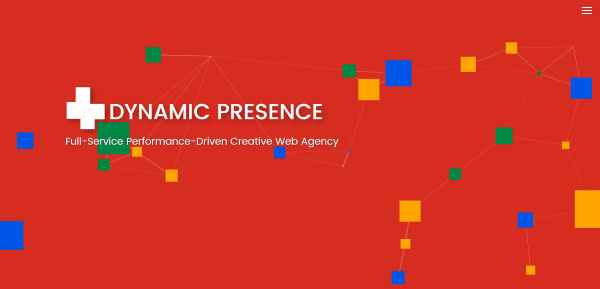
Dynamic Presence includes a full-screen animated background with logo and tagline and hamburger menu that opens in full-screen. Next is a section about their web development services, a workflow description, a section about their marketing services, and a CTA. Each of the services pages use styled acordions to reveal more information. All of the sections use bold primary colors with parallax and section separators. The animated boxes have connecting lines when you mouse over them, which can be a fun distraction. The site makes great use of color and images.
12. The Studio
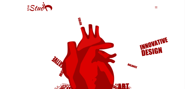
The Studio includes a full-screen animation that shows the types of creative work they do. Scrolling shows their primary services, a company quote, and a contact form. The Portfolio page shows projects in a masonry grid which reveals the project names on hover. The portfolio pages display the work in a three-column design with several images and descriptions. The site is simple and makes great use of branded color with the contrast of white and bold red.
13. Costa Marketing
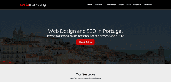
Costa Marketing displays a full-width image in parallax with CTA overlay, a services section with blurbs, an about section with a company quote, a CTA with patterned background in parallax, a blog section, contact form, and footer with widgets. The services pages use the same patterned background in parallax with CTA’s and images in split-screen with text. The site makes good use of branded color.
14. Alfred Team
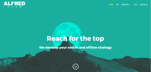
Alfred Team displays a full-screen image with parallax, an about section, a services section using blurbs, a stats section, and a contact information section. The Jobs page uses accordions for descriptions of open positions. The site is simple but makes great use of color in branding.
Final Thoughts
These 14 examples of creative agency sites using Divi go to show that Divi is not only a popular theme for client work, but it’s also powerful enough that creative agencies use it for their own websites. With Divi you can create interesting designs for any type of creative agency website, no matter how complex or simple, from small sites to display services to large sites with animation and portfolios.
These sites a great for providing ideas for layouts, use of color, images, CSS effects, video, menu systems, and more, and give you inspiration for your next creative agency design.
What are some of your favorite elements of these Divi creative agency sites? Let us know in the comments below!
Featured Image via elenabsl / shutterstock.com


Hi, I have tried to put the title of the image when you roll over it, like here:
http://www.thestudio.red/portfolio/
I tried to do it here: http://blancaorte.ga/ but I can’t.
Can you help me, please? Can I do it with the visual builder or I need coding?
Thanks you!
once again, I need to mention that these blog posts are an exercise in frustration. It is wonderful to SEE what can be done – but the HOW is always missing 🙁
If you could find it in your hearts to give us the HOW when highlighting DIVI sites, it would be appreciated.
Thanks all!
Lois, I couldn’t agree more – the hows aren’t always in the divi forums nor can they be easily found.
I say if you profile a company at the very least give the hows.
I would rather see 1 company broken down then 10 that have learned tricks we could use if we only knew how.
Would be great to learn how they build teh customization of dynamic content like http://dynamicpresence.com.sg/ top header and http://www.bamboostudioweb.it/ header. Obviously not exact copy of their header, but a similar effect.
Hi guys, I’ve just created my brand new site using Divi: http://www.callmefred.com
Love the Kipo cutout logo. Any idea how that was done?
SharonG, I think that was done using RevSlider (or similar)
1. Basically it looks like the “slider element’ is an imported black image on transparent background (designed in PhotoShop with the ‘cutout’ showing the transparent background behind it and saved/uploaded to WP Media file).
2. When adding the slider to RevSlider (or similar) the ‘slider’ is your imported black image with cutout. You have the option in RevSlider (or similar) to have a different ‘background’ for the image you have selected. By adding ANOTHER image as the slider background, THAT image will show through the cutout.
I have probably made it should complicated, but if you learn how to ‘cut out’ / erase bits in Photoshop – the rest is easy – the Slider program will allow you to place ANOTHER image behind it to show through etc etc..
Looks like a full width image inside a section with a parallax background.
Here’s the image:
http://kipo.us/wp-content/uploads/2016/05/kipostudio-01.png
The white part is transparent so it shows the underlying parallax background.
How they do static right section on the first Delish Agency example?
some great examples, but some are very basic though. You should include some other styles, like http://www.punkgraphic.com or something vintage, different…
great post !!!
there was also the agancy planet dichtl, with a space theme who was made with divi. https://planetdichtl.com
What I also liked is some of these Creative Agencies have Great Names.
How about this site built with Divi as an agency showcase website: https://graphic-design-santa-clarita.com/
Wow I really like Dynamic Presence’s site! Their use of Canvas for their top header as well as mutating the cube showing their different services is really cool as well. I’d like to utilize something like that at some point, of course when it fits.
Thanks for the article, I enjoyed checking these sites out for inspiration!