
When you decide to showcase pricing plans on your website, there are a couple of ways to approach it. One of the most popular approaches out there is creating a monthly/yearly pricing toggle which allows users to easily navigate through the different pricing plans based on the way they choose to bill. In today’s tutorial, we’ll show you how to make the pricing toggle work with Divi. We’ll recreate a stunning example from scratch and you’ll be able to download the JSON file for free as well!
Let’s get to it.
- 1 Preview
- 2 Download The Monthly/Yearly Pricing Toggle Design for FREE
- 3 Download For Free
-
4
Let’s Start Recreating!
- 4.1 Add Section #1
- 4.2 Add New Row
- 4.3 Add Text Module to Column 1
- 4.4 Clone Text Module & Place Duplicate in Column 2
- 4.5 Add Section #2
- 4.6 Add Row #1
- 4.7 Column 2 Settings
- 4.8 Column 3 Settings
- 4.9 Add Divider to Column 1
- 4.10 Add Text Module #1 to Column 2
- 4.11 Add Text Module #2 to Column 2
- 4.12 Clone Both Modules & Place Duplicates in Column 3
- 4.13 Add Row #2
- 4.14 Column 1 Settings
- 4.15 Column 2 Settings
- 4.16 Column 3 Settings
- 4.17 Add Text Module to Column 1
- 4.18 Add Text Module to Column 2
- 4.19 Clone Text Module & Place Duplicate in Column 3
- 4.20 Clone Row as Many Times as Wanted
- 4.21 Add Row #3
- 4.22 Column 2 & 3 Settings
- 4.23 Clone Divider Module & Place in Column 1 of New Row
- 4.24 Add Button Module to Column 2
- 4.25 Clone Button Module & Place Duplicate in Column 3
- 4.26 Clone Section #2
- 4.27 Add New One-Column Row to Top of Section #1
- 4.28 Add Code Module #1 with CSS Code
- 4.29 Add Code Module #2 with JQuery Code
- 5 Preview
- 6 Final Thoughts
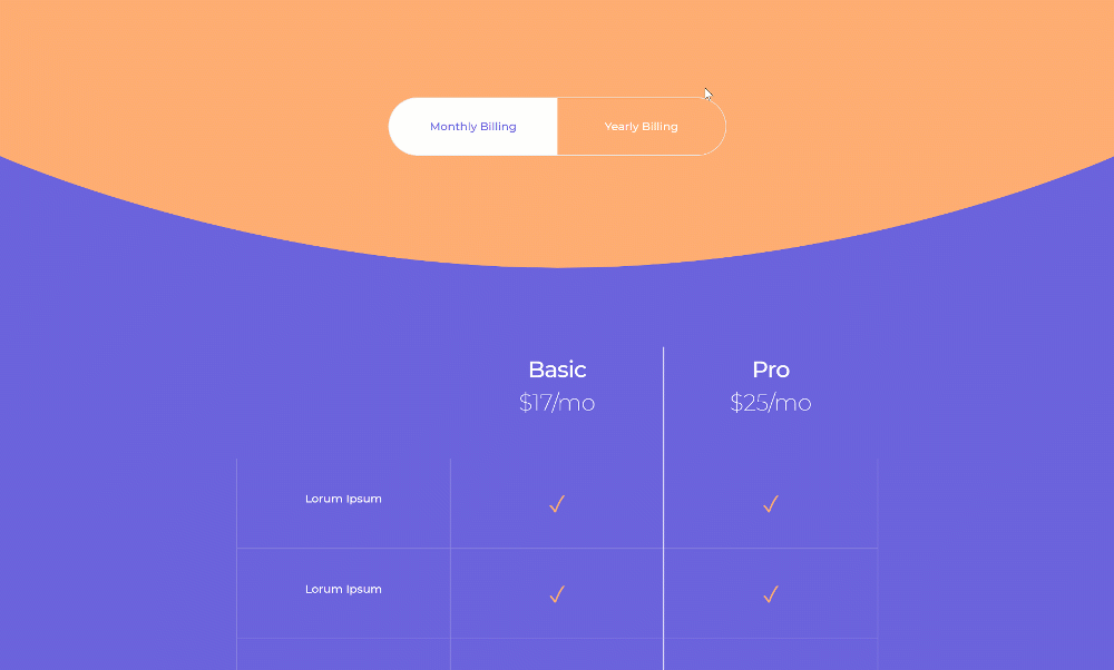
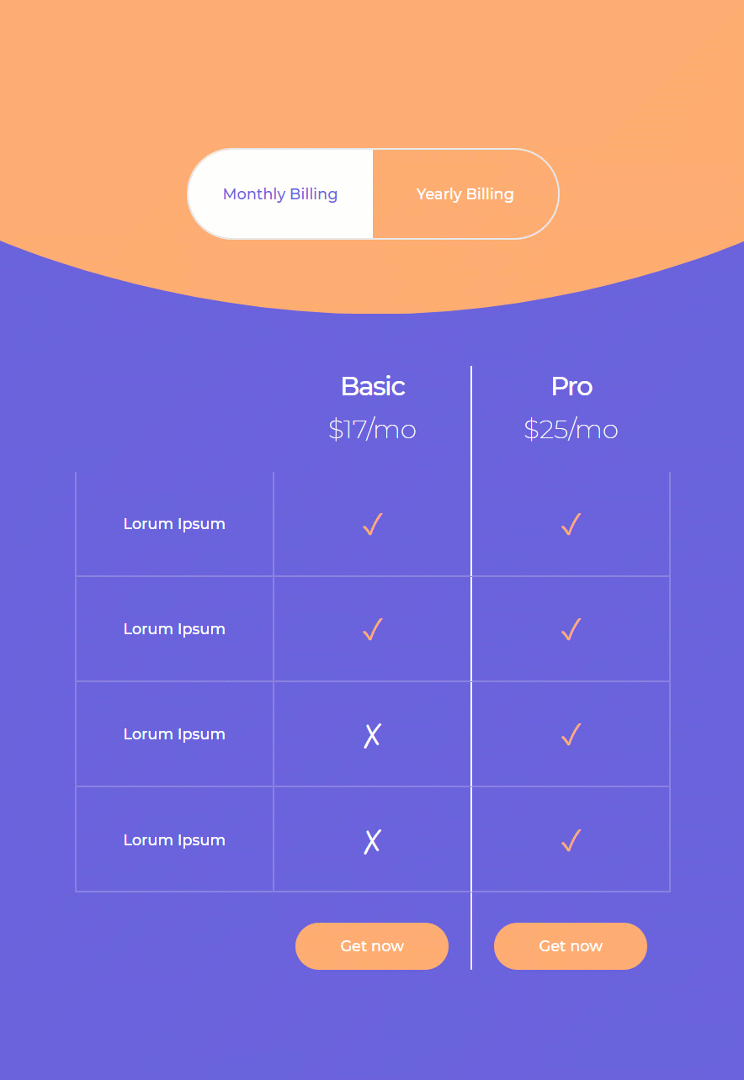
Preview
Before we dive into the tutorial, let’s take a quick look at the outcome across different screen sizes.
Desktop
Mobile
Download The Monthly/Yearly Pricing Toggle Design for FREE
To lay your hands on the free monthly/yearly pricing toggle design, you will first need to download it using the button below. To gain access to the download you will need to subscribe to our newsletter by using the form below. As a new subscriber, you will receive even more Divi goodness and a free Divi Layout pack every Monday! If you’re already on the list, simply enter your email address below and click download. You will not be “resubscribed” or receive extra emails.

Let’s Start Recreating!
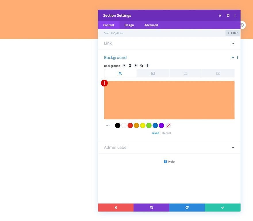
Add Section #1
Background Color
Start by adding a first section to the page your working on. Open the section settings and add a background color.
- Background Color: #ffad72
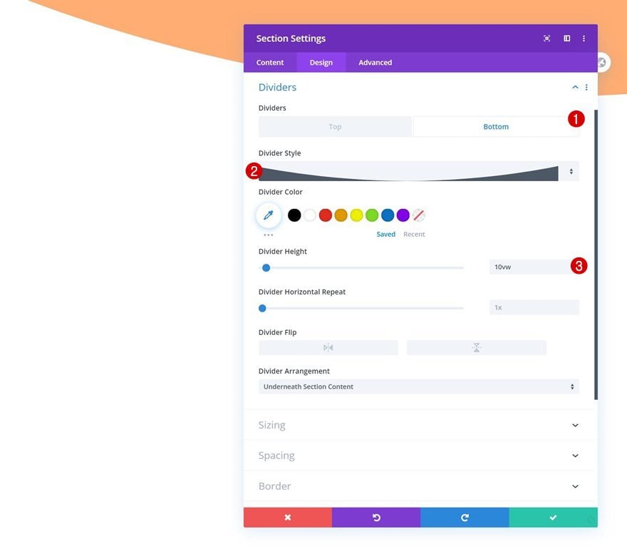
Bottom Divider
Move on to the design tab and insert a bottom divider next.
- Divider Style: Find in List
- Divider Height: 10vw
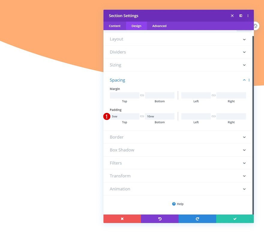
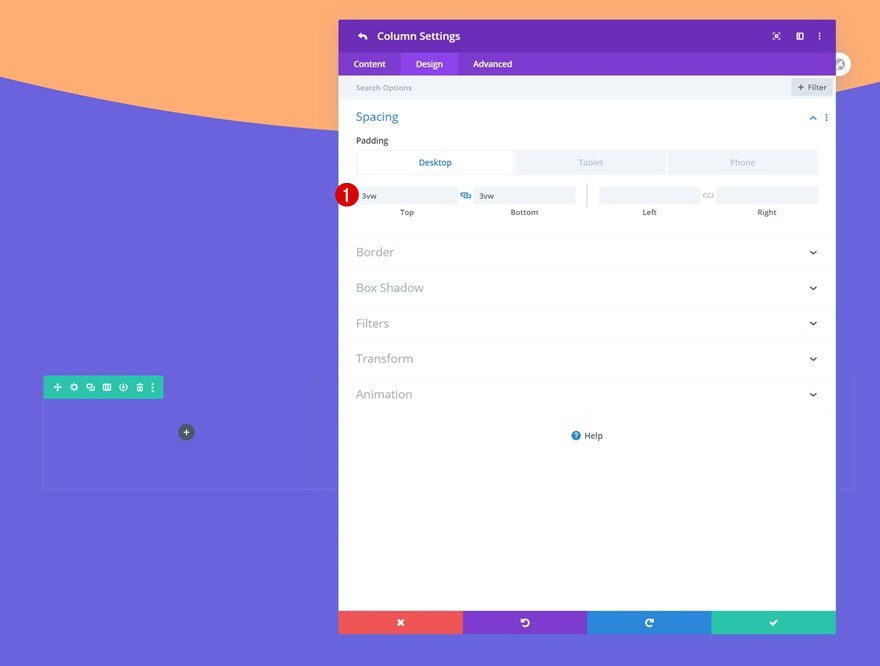
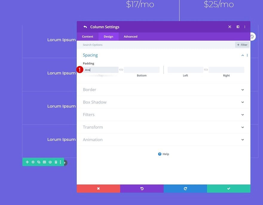
Spacing
Add some custom top and bottom padding as well.
- Top Padding: 5vw
- Bottom Padding: 10vw
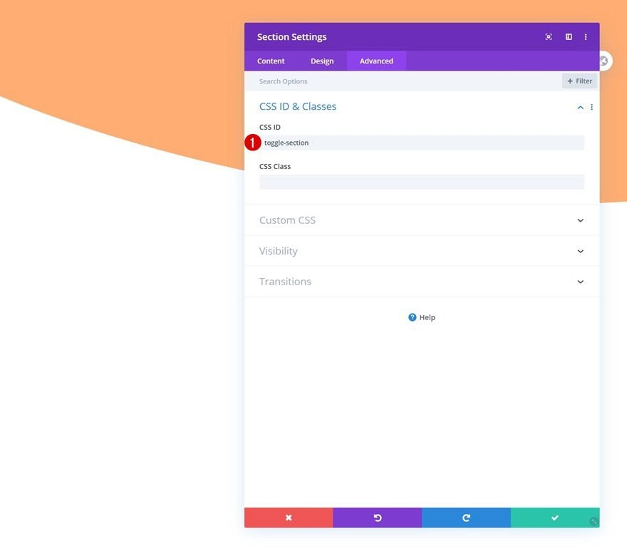
CSS ID
And add a CSS ID to the section.
- CSS ID: toggle-section
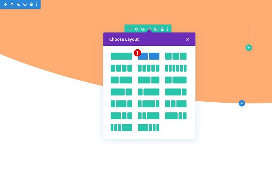
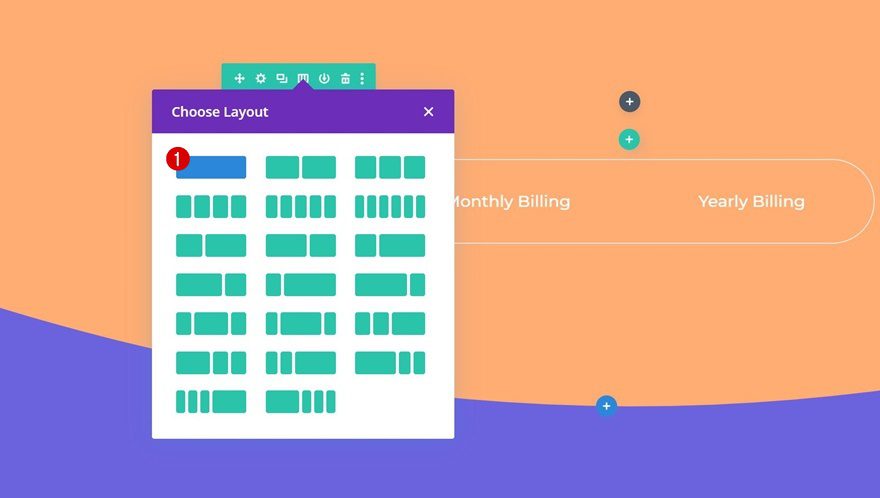
Add New Row
Column Structure
Continue by adding a row to the section using the following column structure:
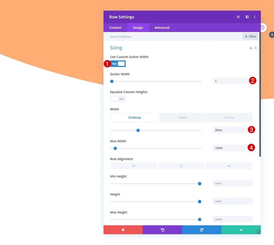
Sizing
Without adding any modules yet, open the row settings and allow the row to take up the entire width of the screen.
- Use Custom Gutter Width: Yes
- Gutter Width: 1
- Width: 30vw (Desktop), 45vw (Tablet), 50vw (Phone)
- Max Width: 100%
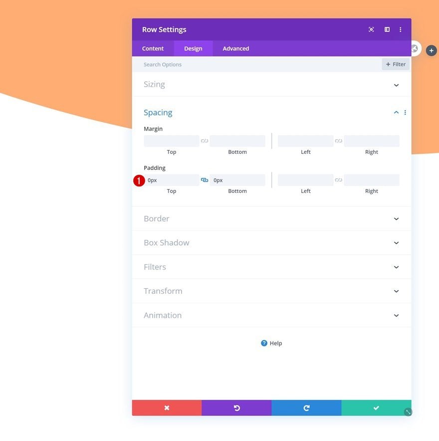
Spacing
Get rid of the default top and bottom padding next.
- Top Padding: 0px
- Bottom Padding: 0px
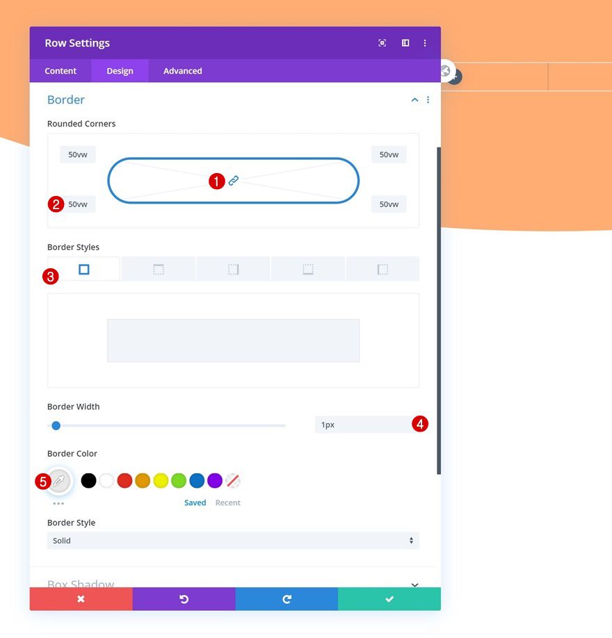
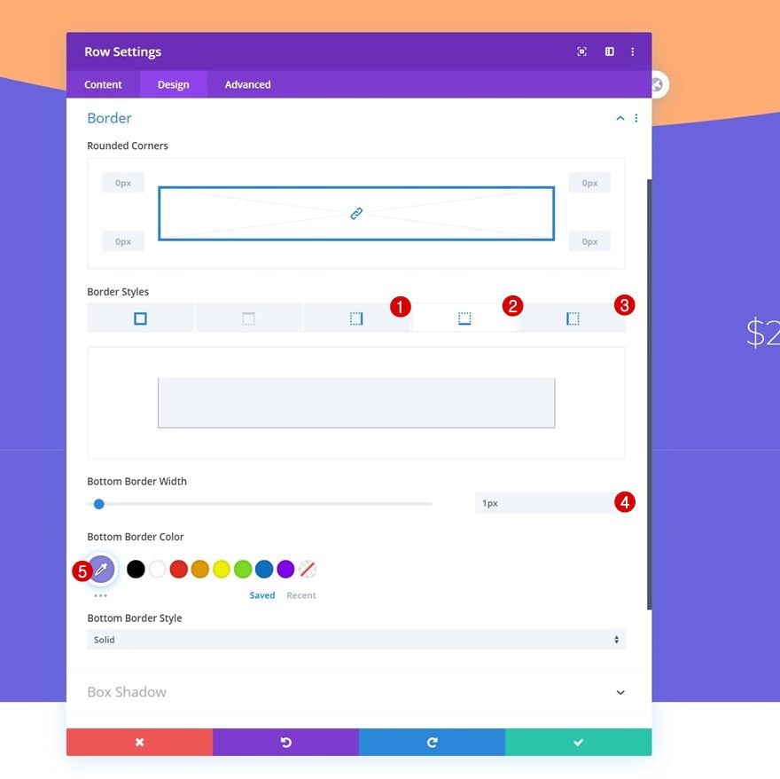
Border
And modify the border settings as well.
- Rounded Corners: 50vw (All Corners)
- Border Width: 1px
- Border Color: #e8e8e8
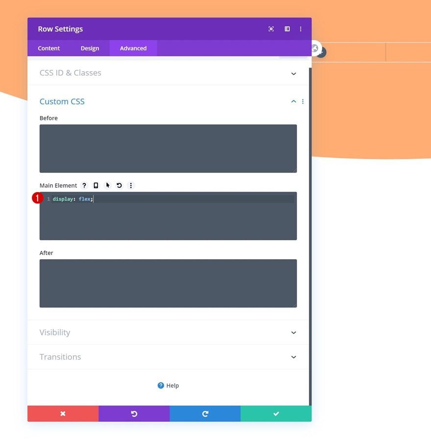
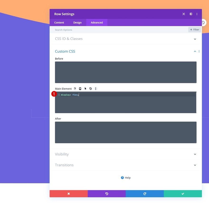
Display
To make sure both columns appear next to each other on smaller screen sizes, we’ll add one single line of CSS code to the main element of the row.
display: flex;
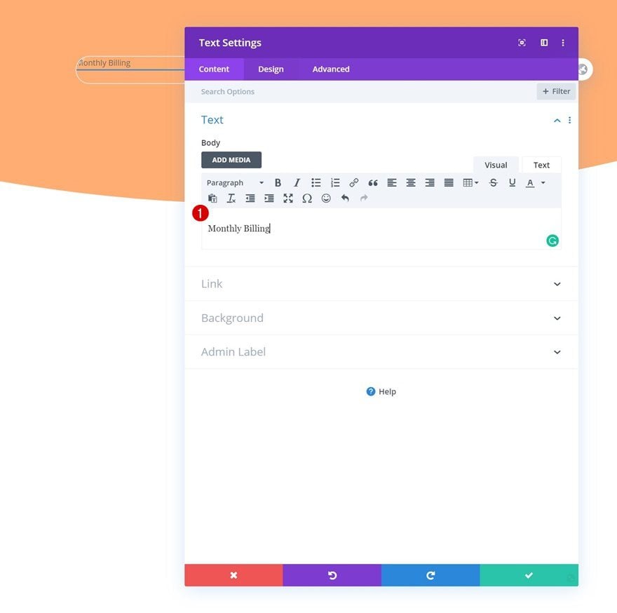
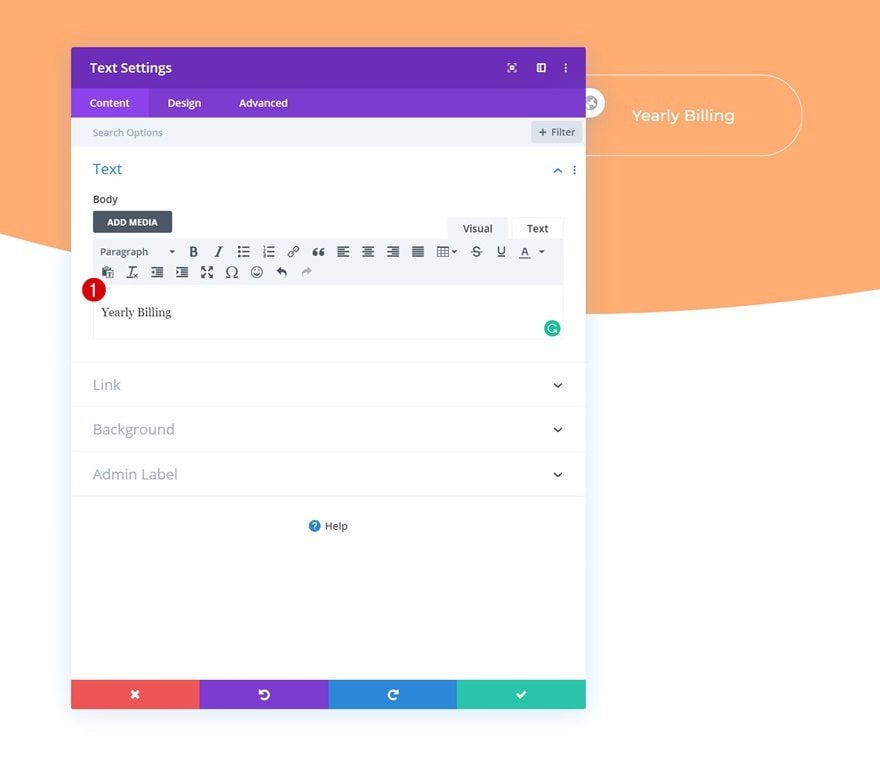
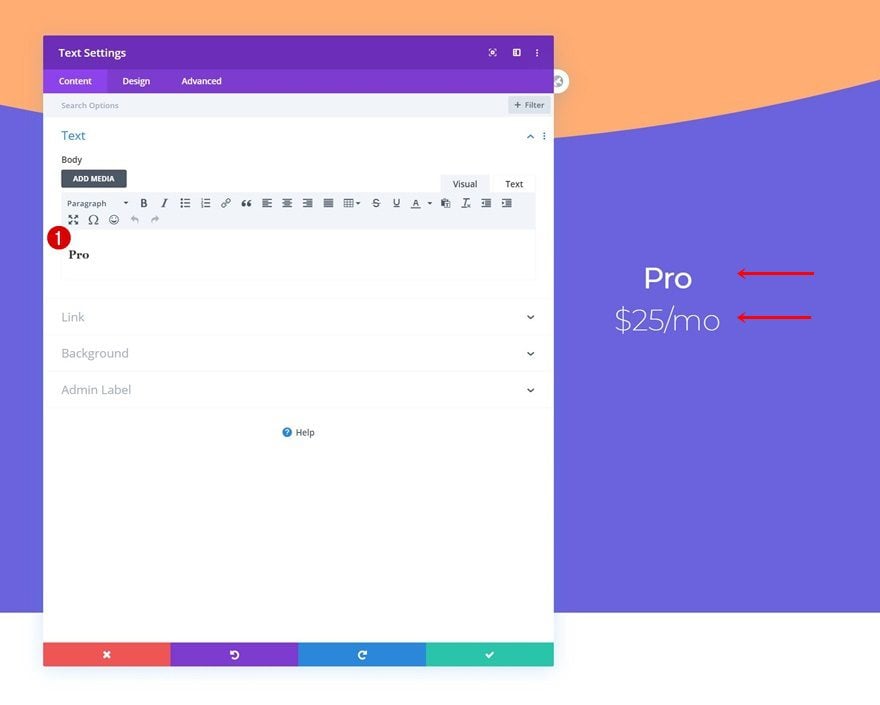
Add Text Module to Column 1
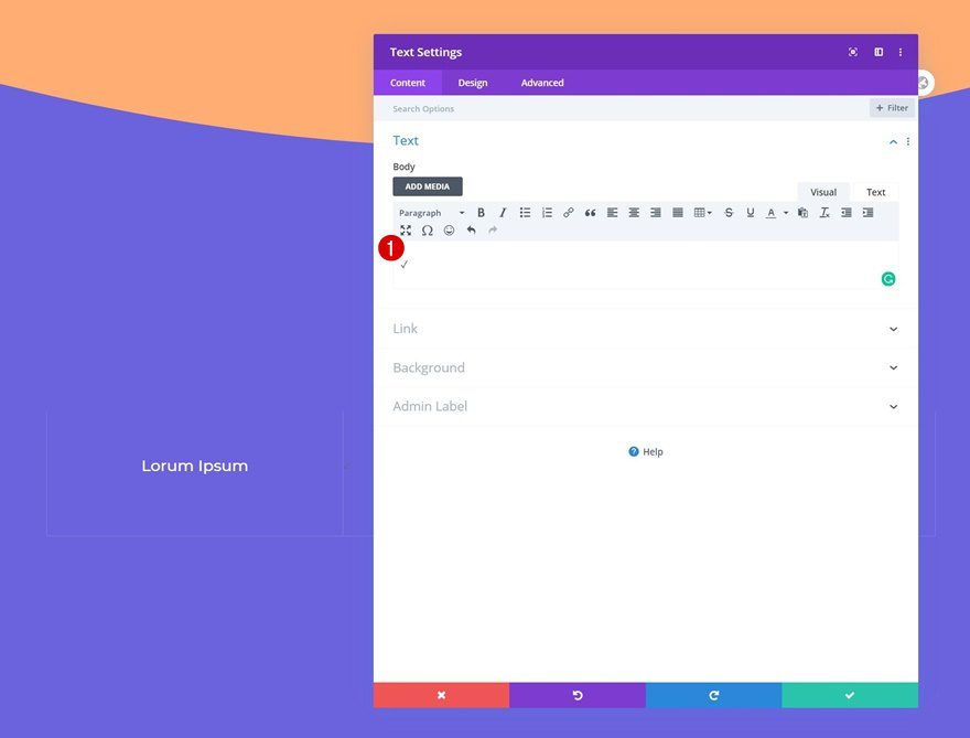
Add Content
Time to start adding modules! The only module we need in column 1 is a Text Module. Enter some content of your choice.
Text Settings
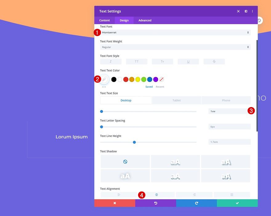
Move on to the design tab and change the text settings as follows:
- Text Font: Montserrat
- Text Size: 1vw (Desktop), 1.5vw (Tablet), 2vw (Phone)
- Text Alignment: Center
- Text Color: Light
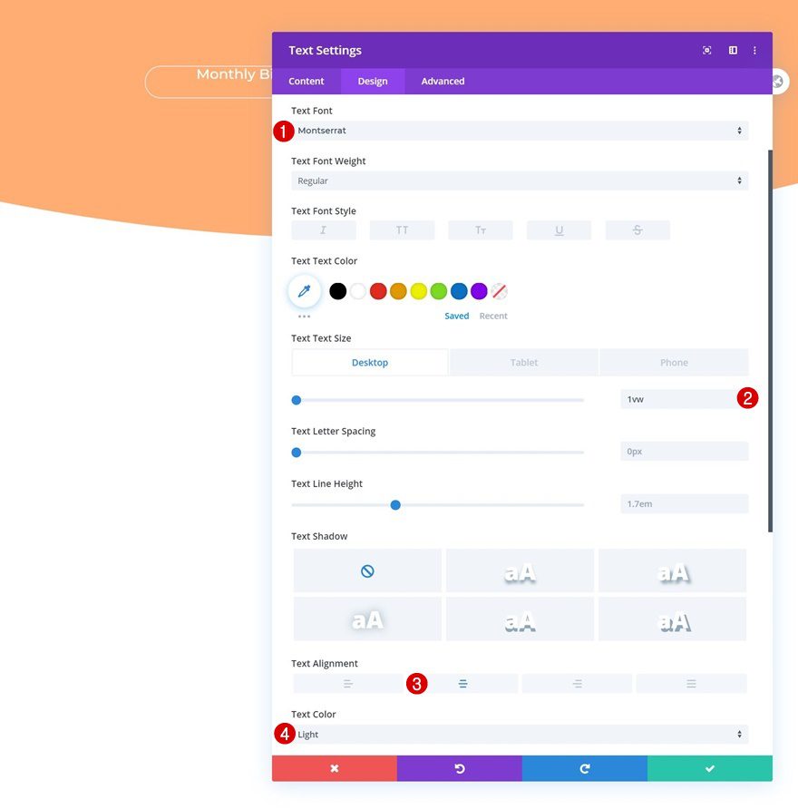
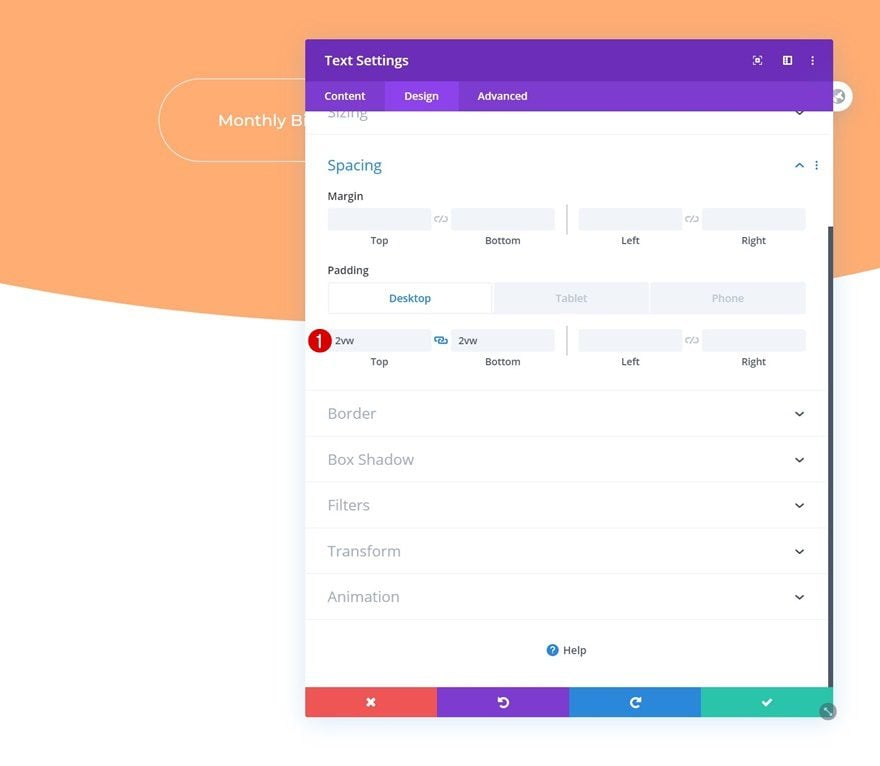
Spacing
Modify the top and bottom padding values across different screen sizes as well.
- Top Padding: 2vw (Desktop), 3vw (Tablet), 4vw (Phone)
- Bottom Padding: 2vw (Desktop), 3vw (Tablet), 4vw (Phone)
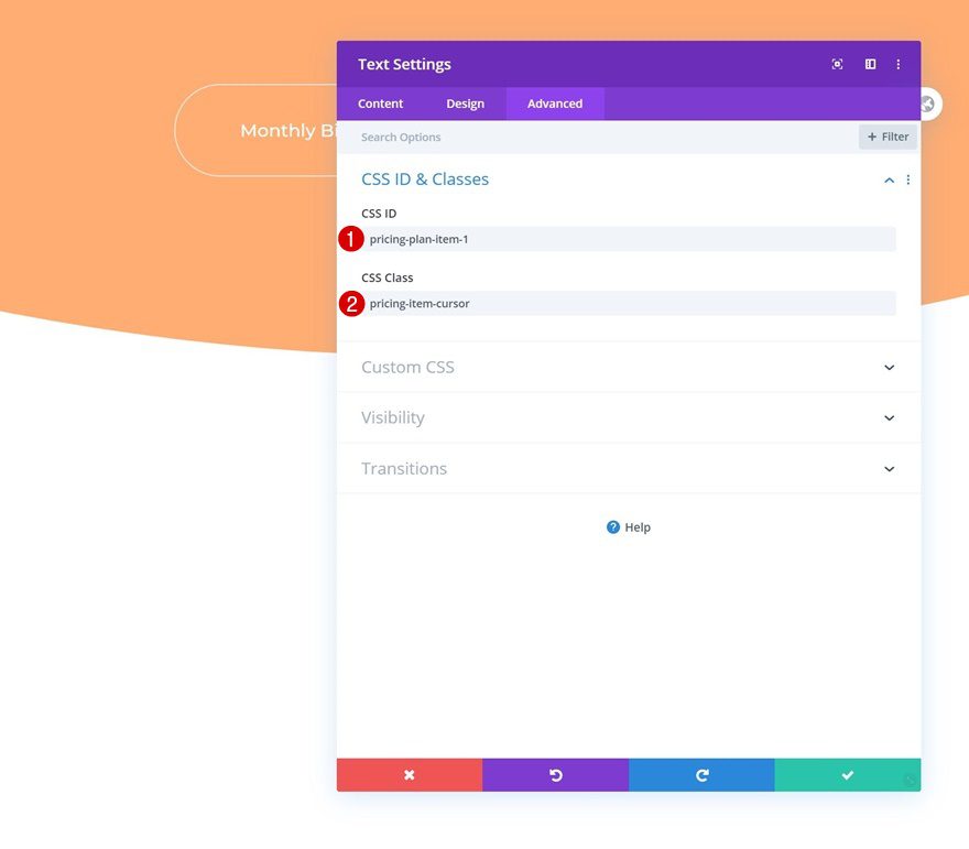
CSS ID & Class
And assign a CSS ID and class to the text module.
- CSS ID: pricing-plan-item-1
- CSS Class: pricing-item-cursor
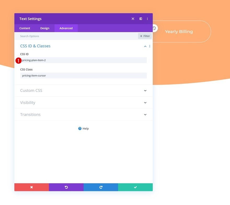
Clone Text Module & Place Duplicate in Column 2
Once you’ve completed the Text Module in column 1, you can clone it once and place the duplicate in column 2.
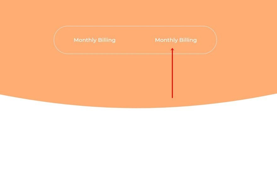
Change Content
Make sure you change the content.
Change CSS ID
And use a different CSS ID.
- CSS ID: pricing-plan-item-2
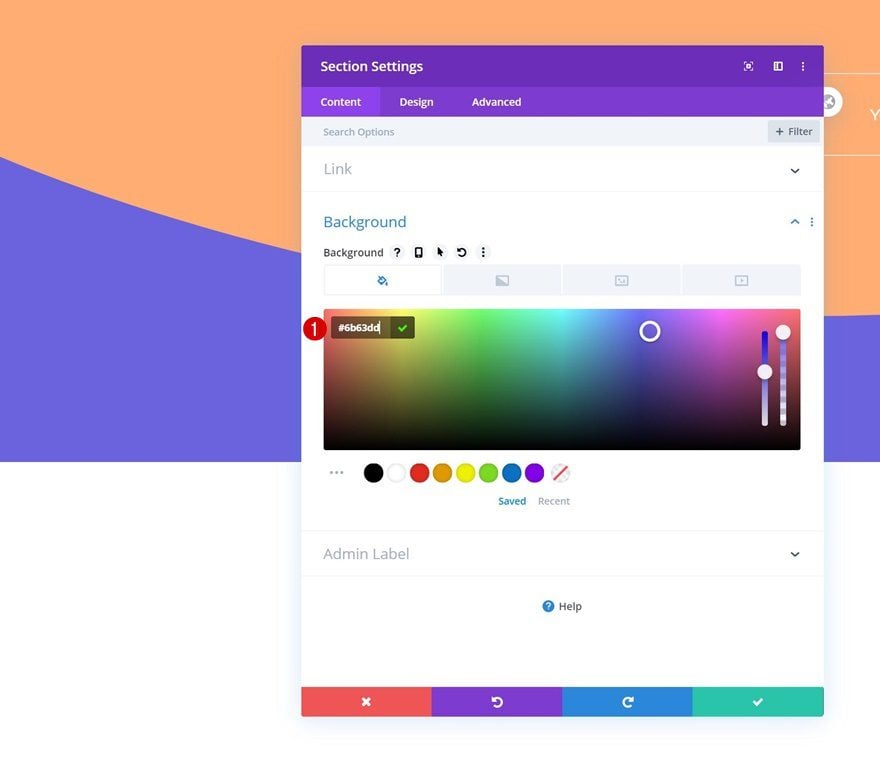
Add Section #2
Background Color
On to the second section. Add the following background color:
- Background Color: #6b63dd
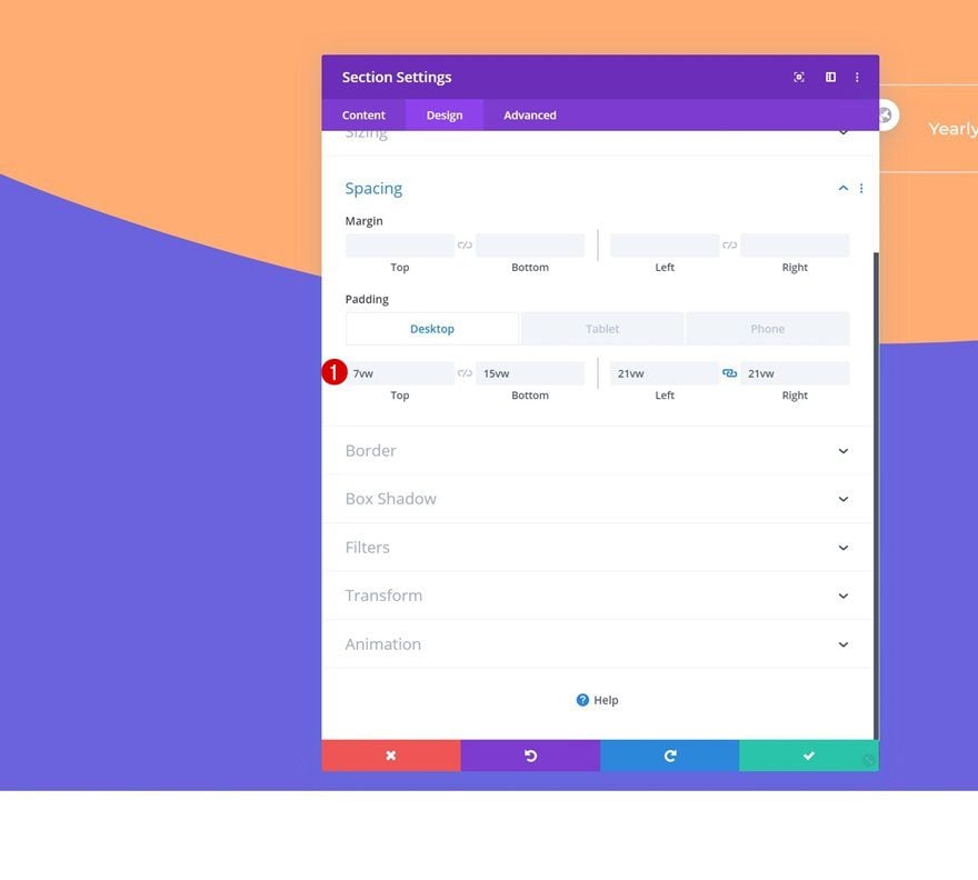
Spacing
Then, go to the section spacing settings and add some custom padding values across different screen sizes.
- Top Padding: 7vw
- Bottom Padding: 15vw
- Left Padding: 21vw (Desktop), 10vw (Tablet & Phone)
- Right Padding: 21vw (Desktop), 10vw (Tablet & Phone)
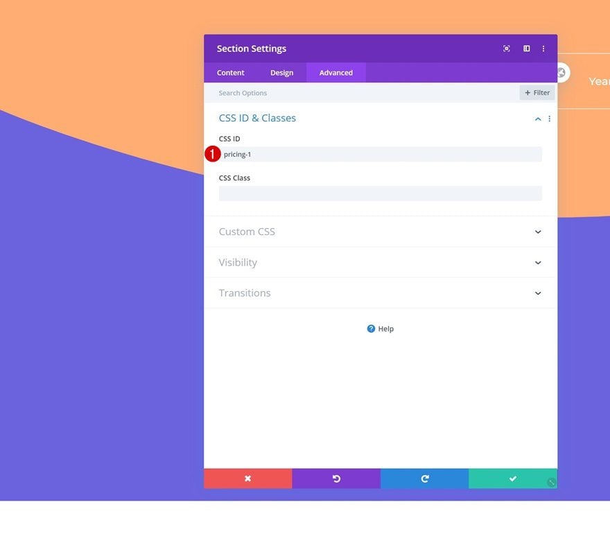
CSS ID
Add a CSS ID to the section as well.
- CSS ID: pricing-1
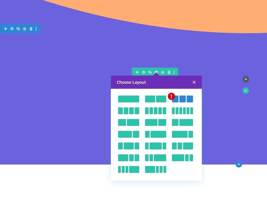
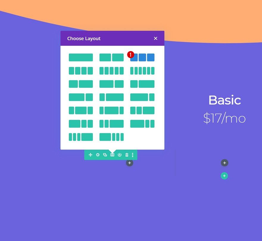
Add Row #1
Column Structure
Continue by adding a new row to the section using the following column structure:
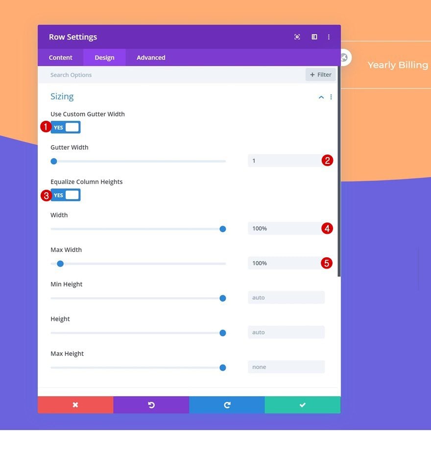
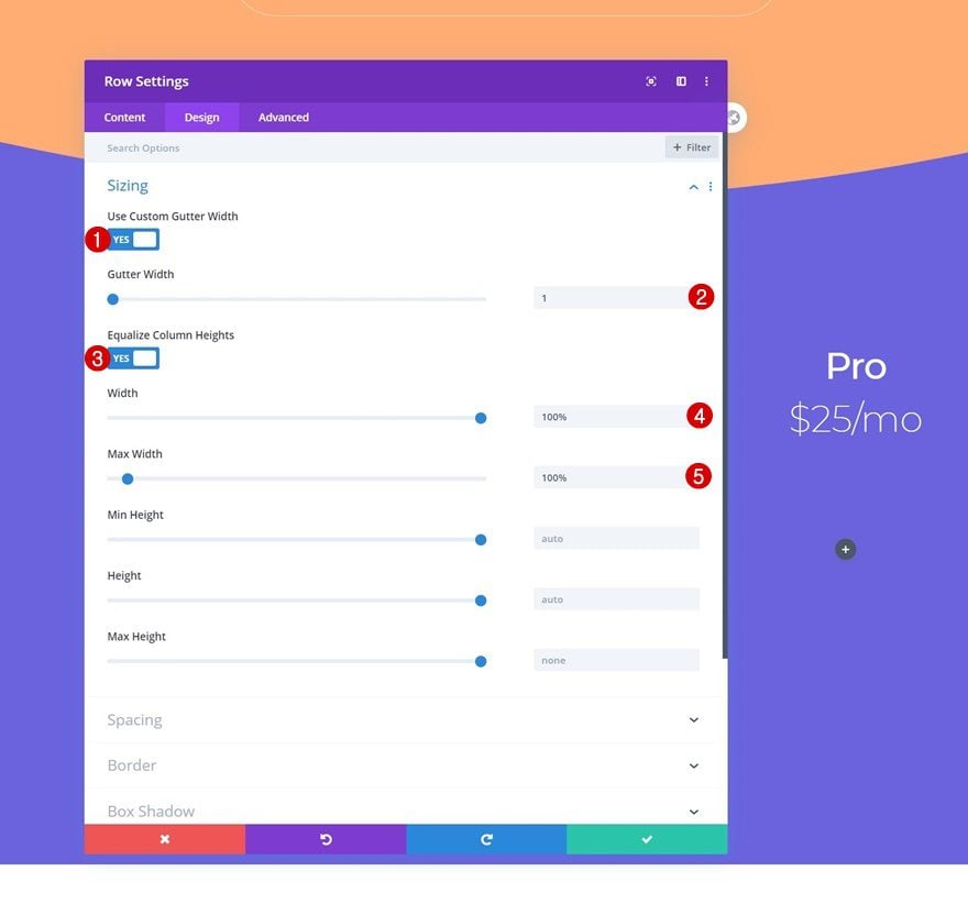
Sizing
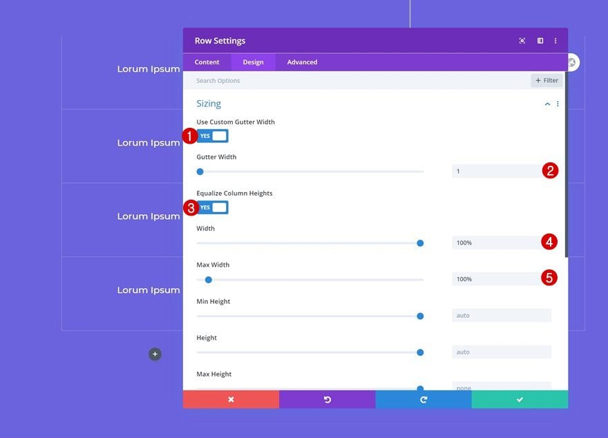
Without adding any modules yet, open the row settings and modify the sizing settings.
- Use Custom Gutter Width: Yes
- Gutter Width: 1
- Equalize Column Heights: Yes
- Width: 100%
- Max Width: 100%
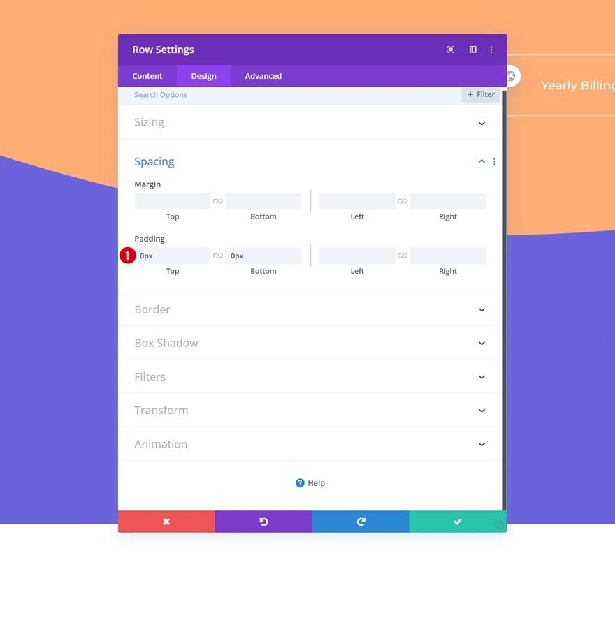
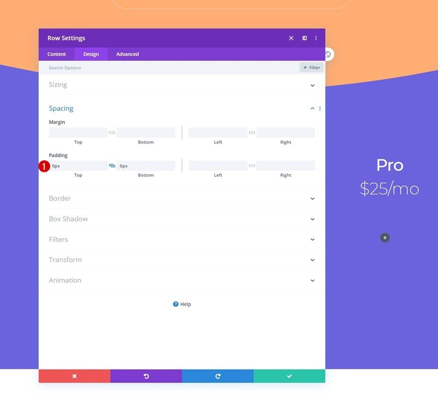
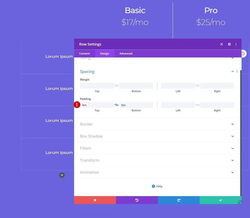
Spacing
Remove all default top and bottom padding next.
- Top Padding: 0px
- Bottom Padding: 0px
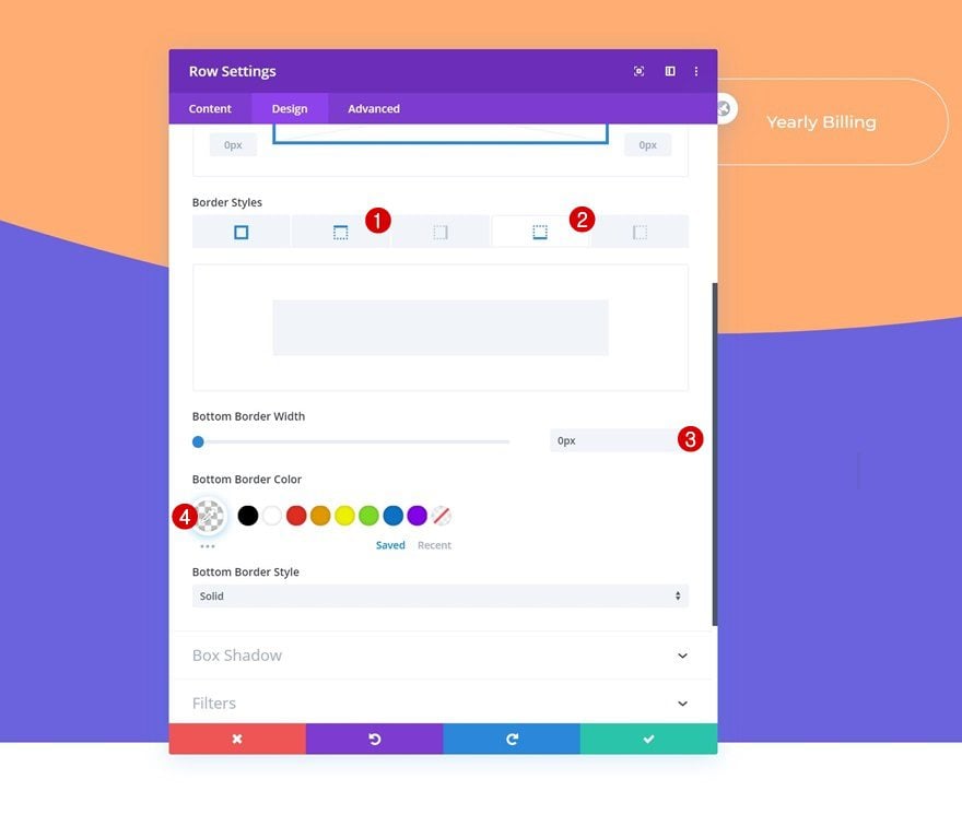
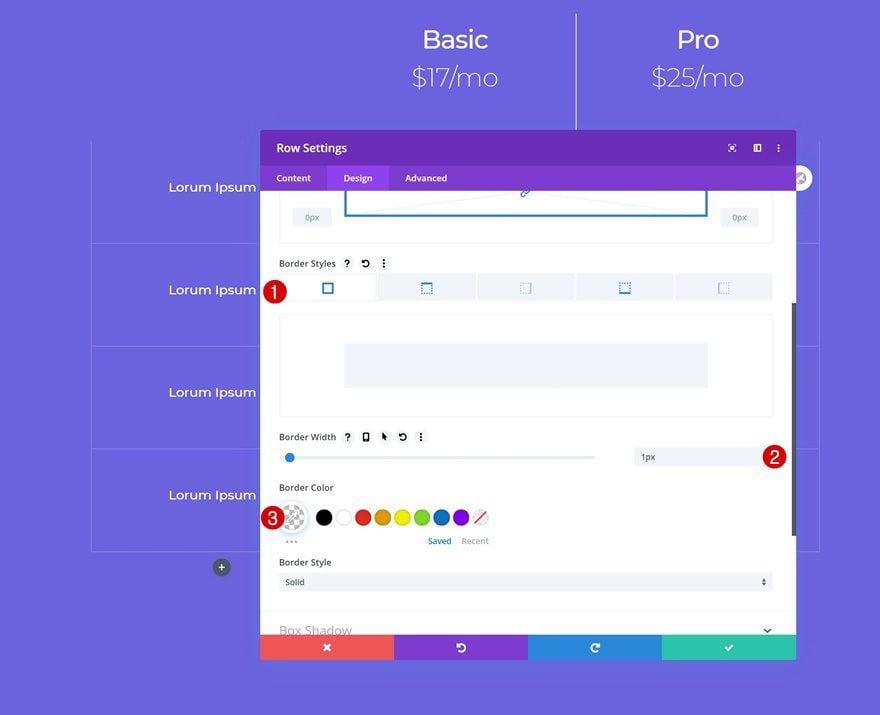
Border
Then, go to the spacing settings and apply the following border settings:
- Right Border Width: 1px
- Left Border Width: 1px
- Top Border Width: 0px
- Bottom Border Width: 0px
- Border Color: rgba(255,255,255,0)
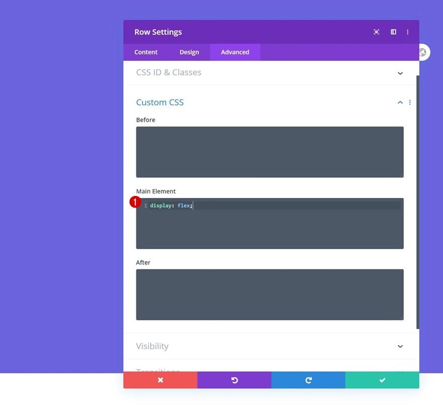
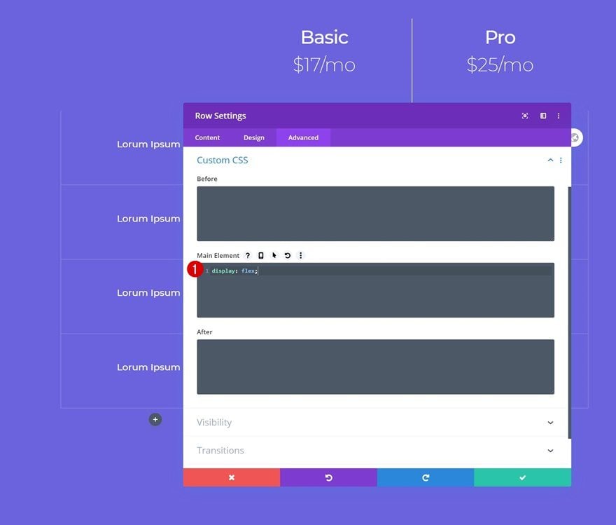
Display
Make sure the columns appear next to each other on smaller screen sizes by adding one single line of CSS code to the row’s main element.
display: flex;
Column 2 Settings
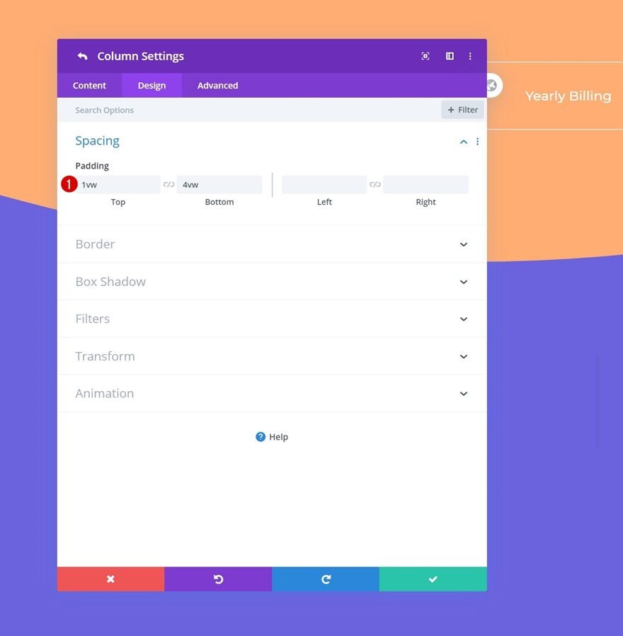
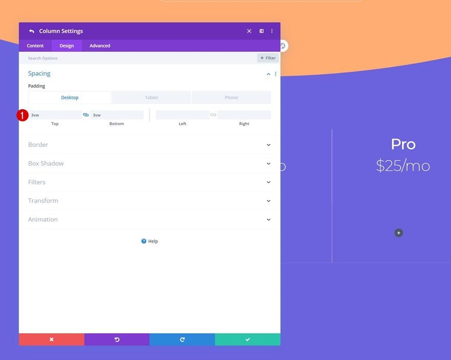
Spacing
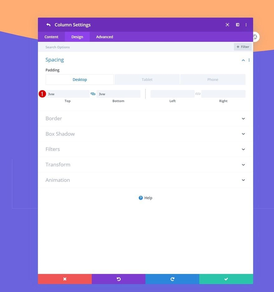
Once you’ve completed the general row settings, open the column 2 settings and add some custom top and bottom padding.
- Top Padding: 1vw
- Bottom Padding: 4vw
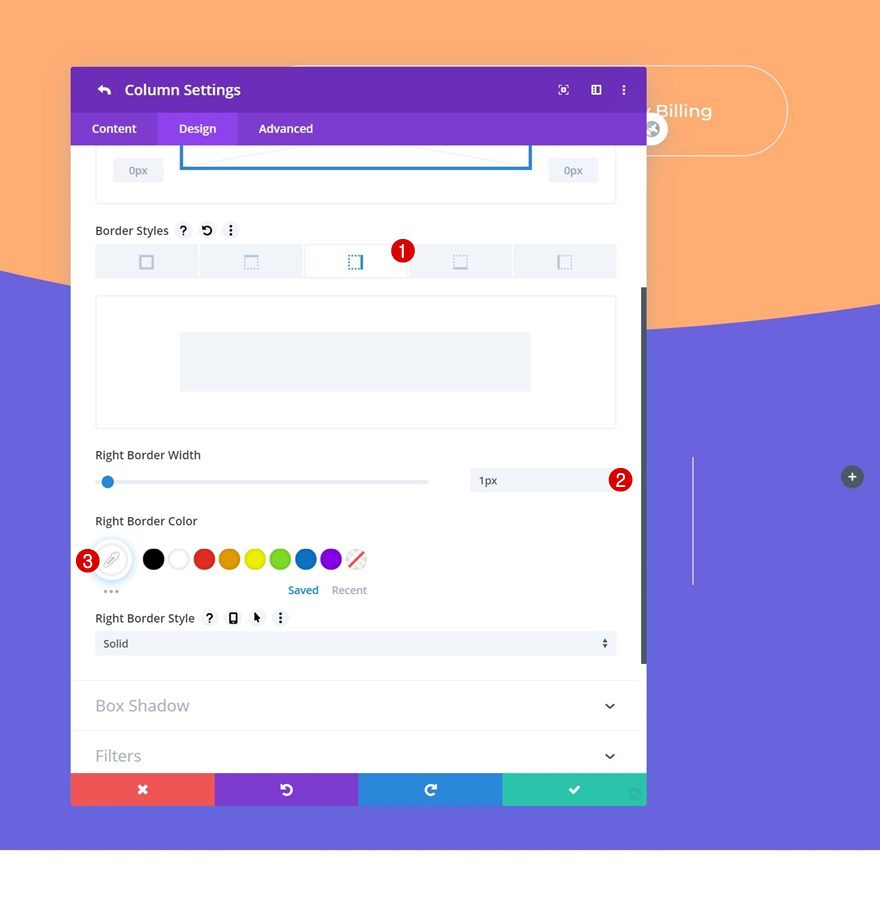
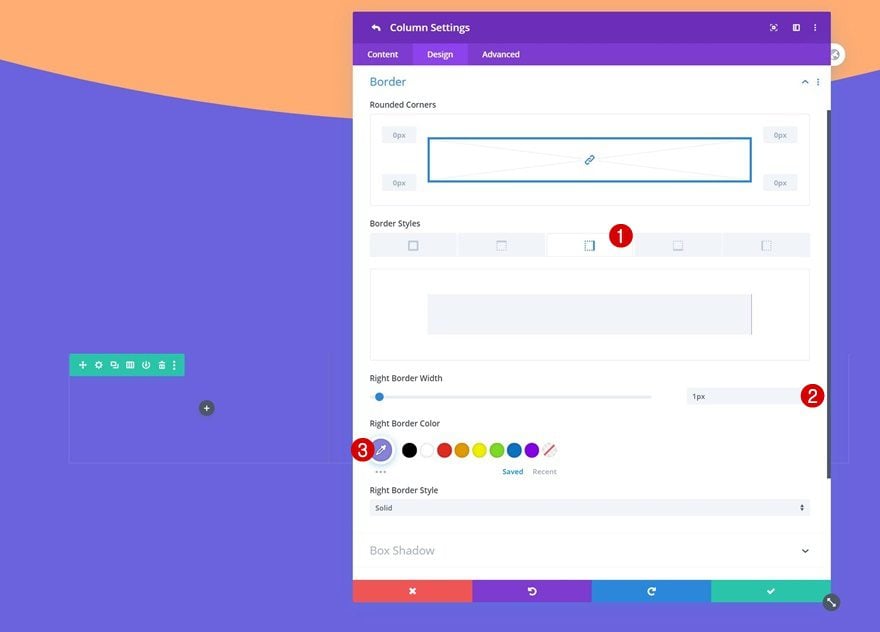
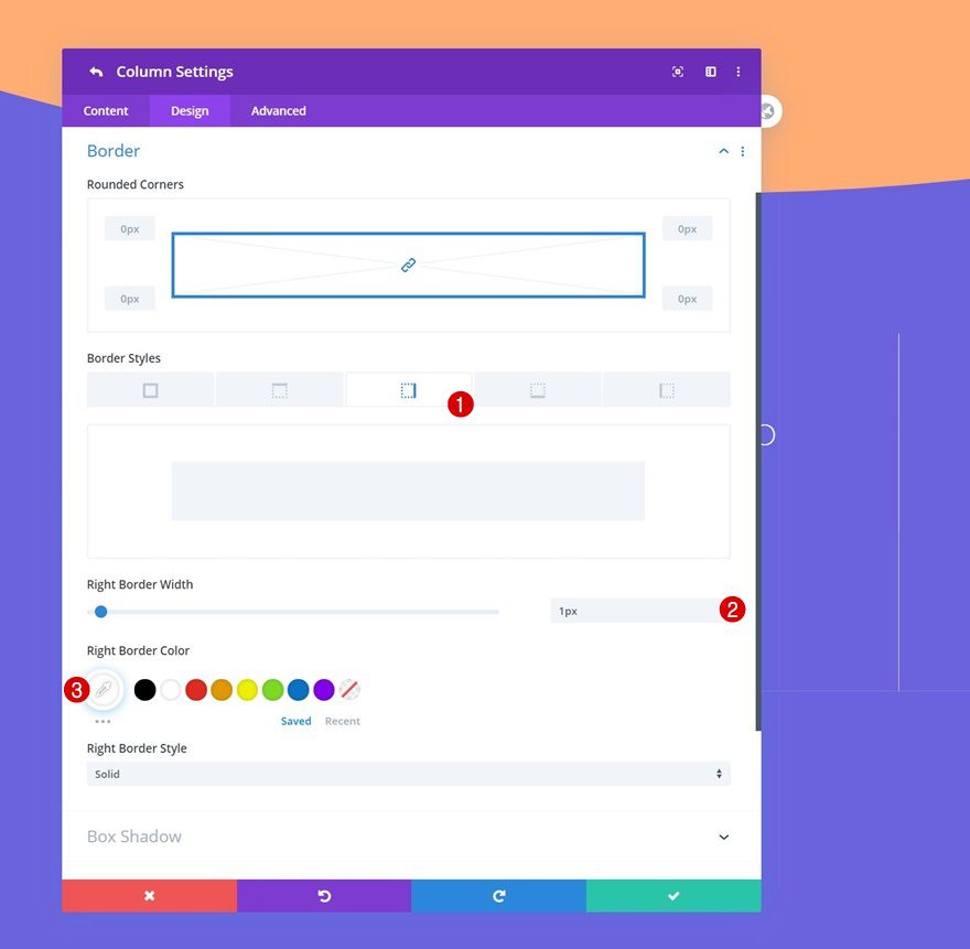
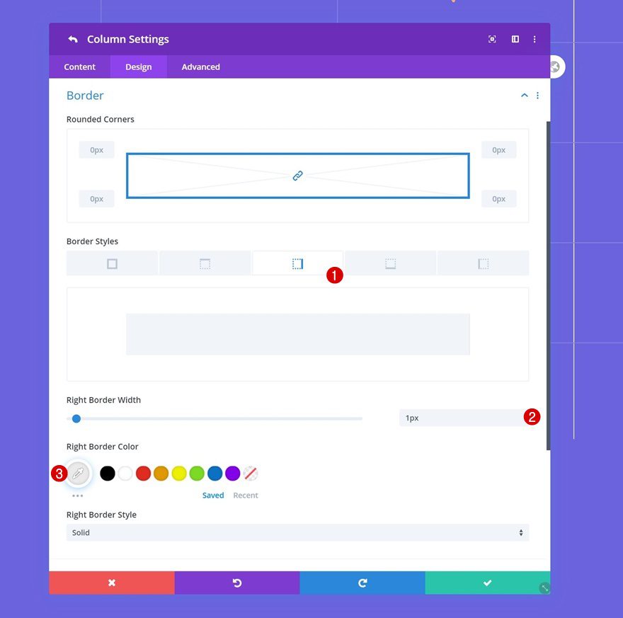
Border
Use a border on column 2 as well.
- Right Border Width: 1px
- Right Border Color: #ffffff
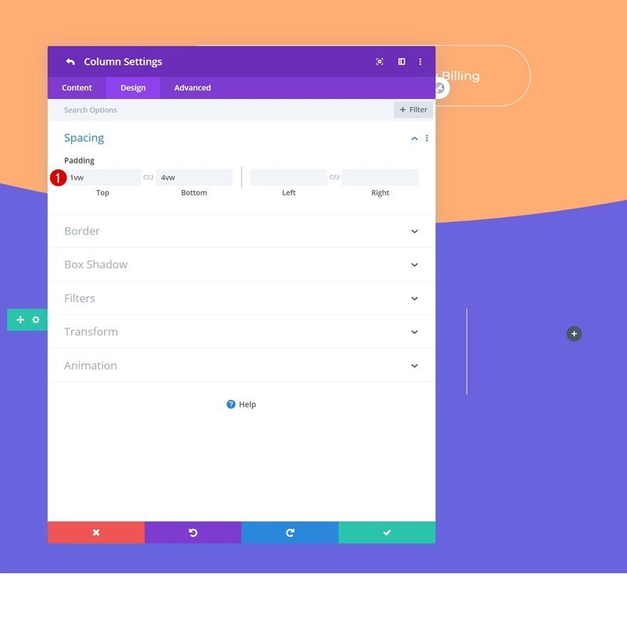
Column 3 Settings
Spacing
Move on to the third column’s settings and add some custom padding values.
- Top Padding: 1vw
- Bottom Padding: 4vw
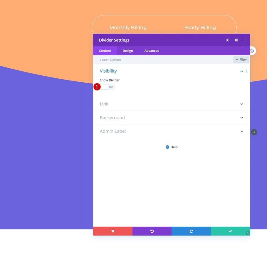
Add Divider to Column 1
Visibility
Time to start adding modules! The first module and only module we need in column 1 is a Divider Module. Make sure you disable the ‘Show Divider’ option. We only need this module to make sure the rest of the design stays intact.
- Show Divider: No
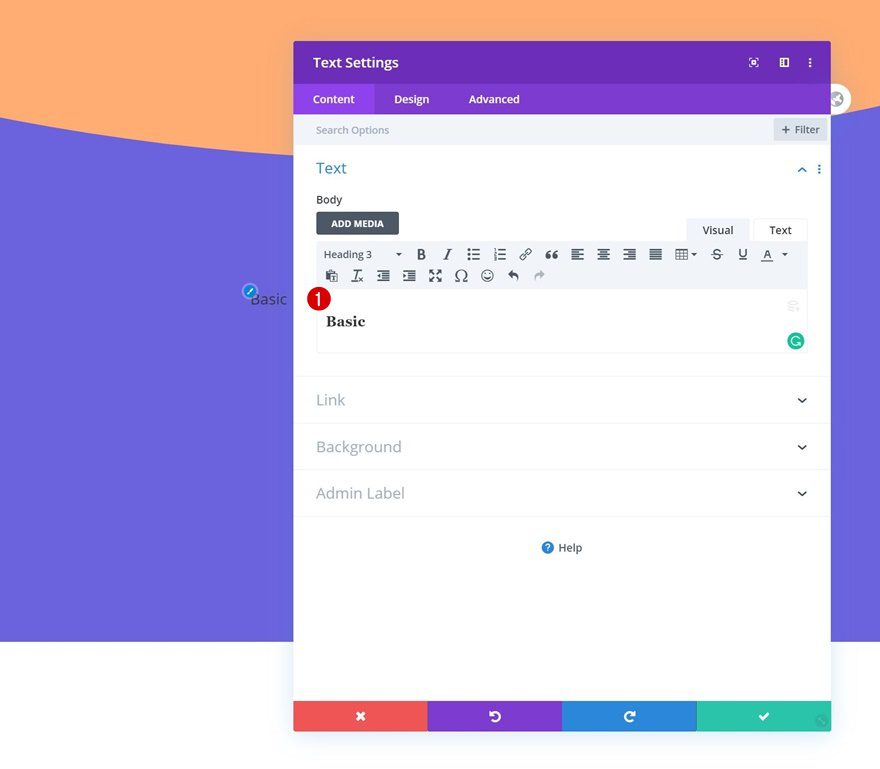
Add Text Module #1 to Column 2
Add H3 Content
Move on to column 2 and add a Text Module with some H3 content of your choice.
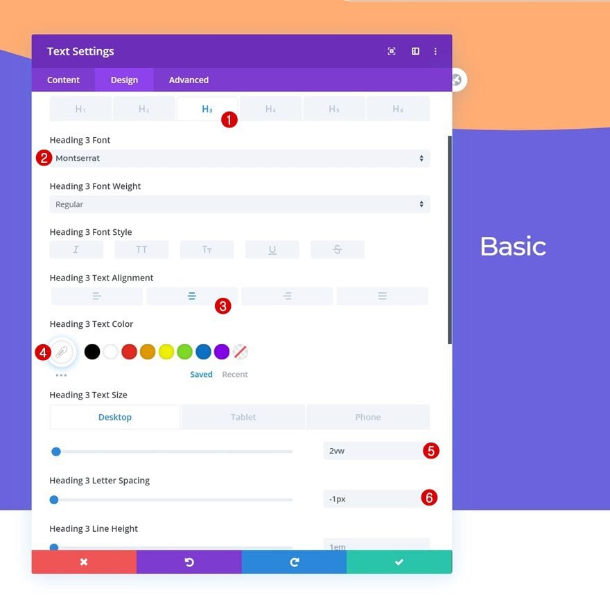
H3 Text Settings
Change the H3 text settings as follows:
- Heading 3 Font: Montserrat
- Heading 3 Text Alignment: Center
- Heading 3 Text Color: #ffffff
- Heading 3 Text Size: 2vw (Desktop), 3vw (Tablet), 3.5vw (Phone)
- Heading 3 Letter Spacing: -1px
Add Text Module #2 to Column 2
Add Content
Add another Text Module right below the previous one and insert some content of your choice.
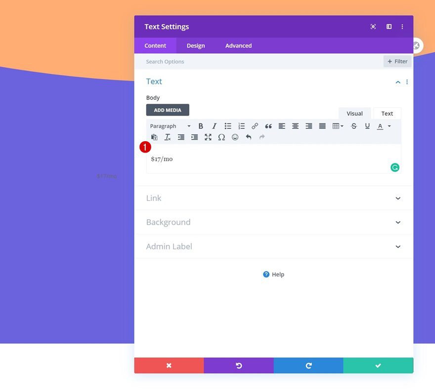
Text Settings
Move on to the design tab and change the text settings accordingly:
- Text Font: Montserrat
- Text Font Weight: Ultra Light
- Text Color: #ffffff
- Text Size: 2vw (Desktop), 3vw (Tablet), 3.5vw (Phone)
- Text Line Height: 1em
- Text Alignment: Center
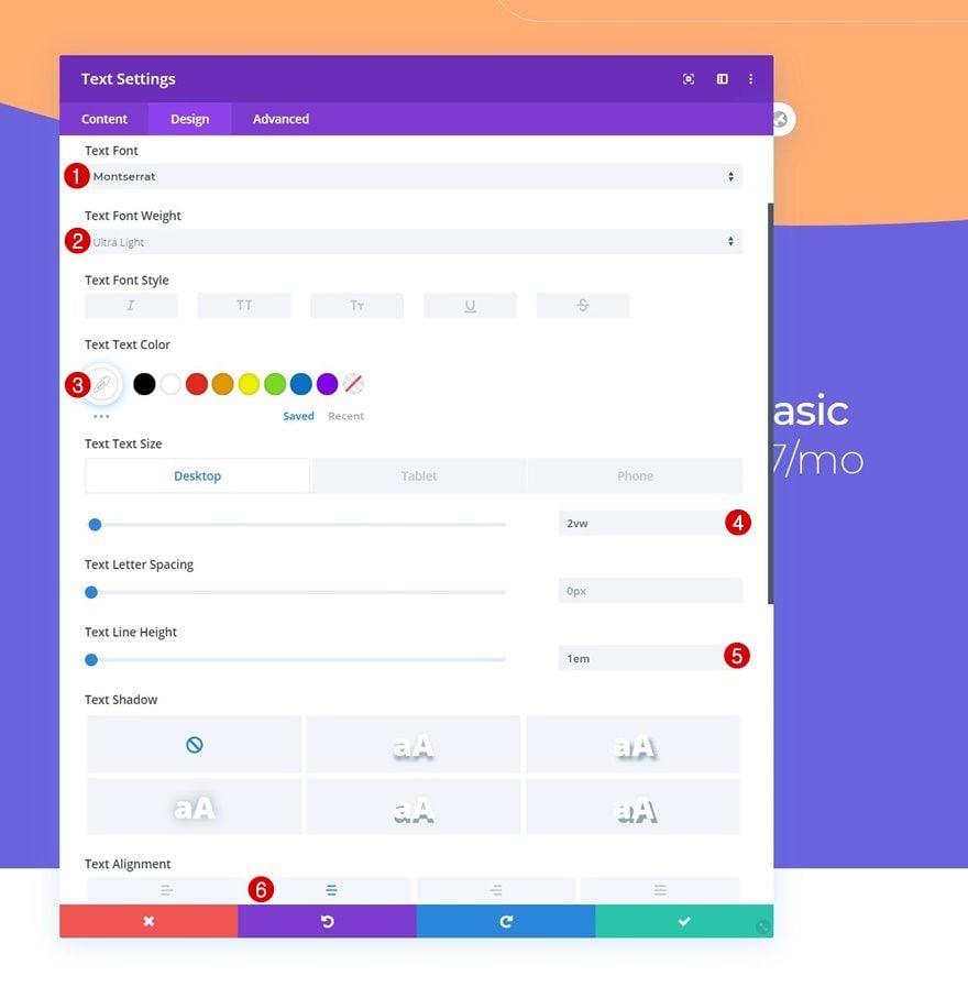
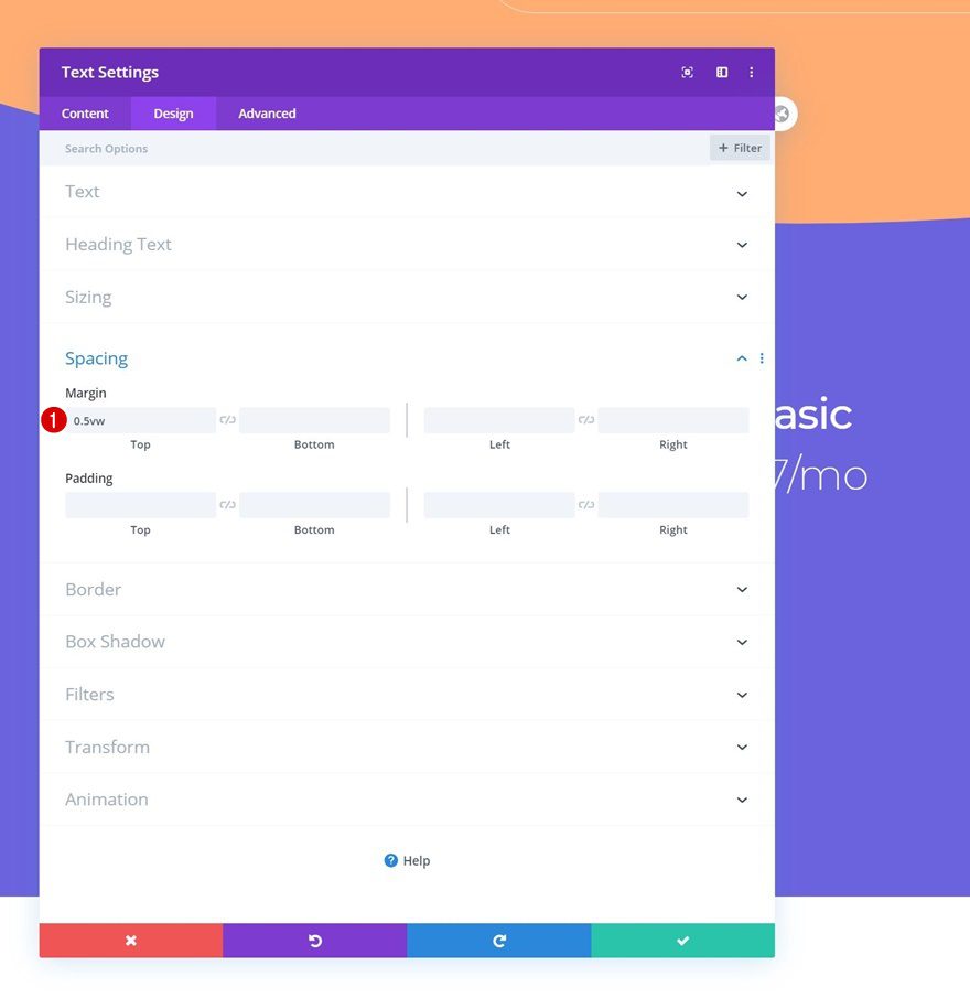
Spacing
Add some custom top margin too.
- Top Margin: 0.5vw
Clone Both Modules & Place Duplicates in Column 3
Once you’ve completed the modules in column 2, you can clone both of them and place the duplicates in column 3.
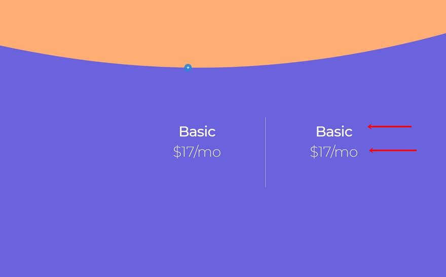
Change Content
Make sure you change the content of each duplicate.
Add Row #2
Column Structure
On to the second row in section 2! Choose the following column structure:
Sizing
Without adding any modules yet, open the row settings and change the sizing settings as follows:
- Use Custom Gutter Width: Yes
- Gutter Width: 1
- Equalize Column Heights: Yes
- Width: 100%
- Max Width: 100%
Spacing
Remove the default top and bottom padding next.
- Top Padding: 0px
- Bottom Padding: 0px
Border
And apply a border.
- Top Border Width: 0px
- Right Border Width: 1px
- Bottom Border Width: 1px
- Left Border Width: 1px
- Border Color: #8882dd
Display
Make sure the columns appear next to each other on smaller screen sizes by adding one single line of CSS code to the row’s main element.
display: flex;
Column 1 Settings
Spacing
Continue by opening the column 1 settings and apply some custom padding values across different screen sizes.
- Top Padding: 3vw (Desktop), 5vw (Tablet & Phone)
- Bottom Padding: 3vw (Desktop), 5vw (Tablet & Phone)
Border
Add a right border to the column as well.
- Right Border Width: 1px
- Right Border Color: #8882dd
Column 2 Settings
Spacing
Move on to the second column and change the spacing settings.
- Top Padding: 3vw (Desktop), 5vw (Tablet & Phone)
- Bottom Padding: 3vw (Desktop), 5vw (Tablet & Phone)
Border
Add a right border next.
- Right Border Width: 1px
- Right Border Color: #ffffff
Column 3 Settings
Spacing
Then, open the column 3 settings and add some custom top and bottom padding values across different screen sizes.
- Top Padding: 3vw (Desktop), 5vw (Tablet & Phone)
- Bottom Padding: 3vw (Desktop), 5vw (Tablet & Phone)
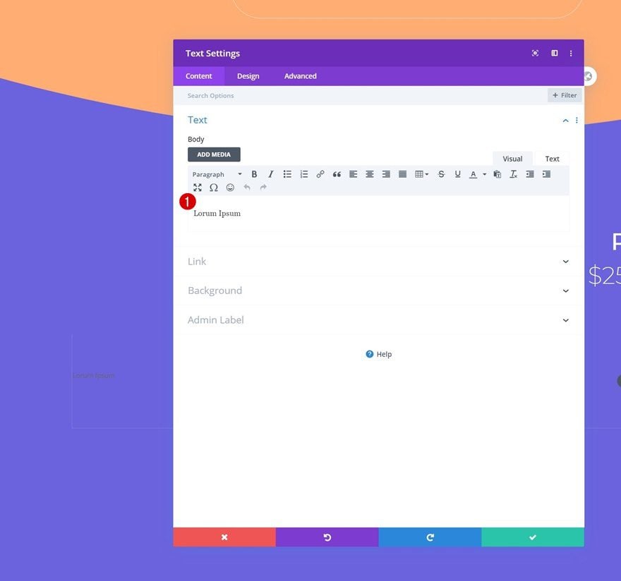
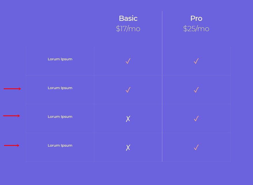
Add Text Module to Column 1
Add Content
Once you’ve completed the row and column settings, it’s time to start adding modules. Add a Text Module to column 1 and insert some content of your choice.
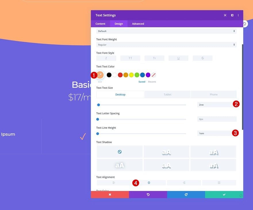
Text Settings
Move on to the design tab and change the text settings accordingly:
- Text Font: Montserrat
- Text Color: #ffffff
- Text Size: 1vw (Desktop), 1.5vw (Tablet), 2vw (Phone)
- Text Alignment: Center
Add Text Module to Column 2
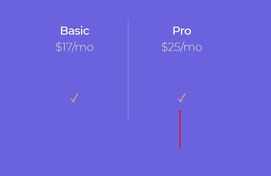
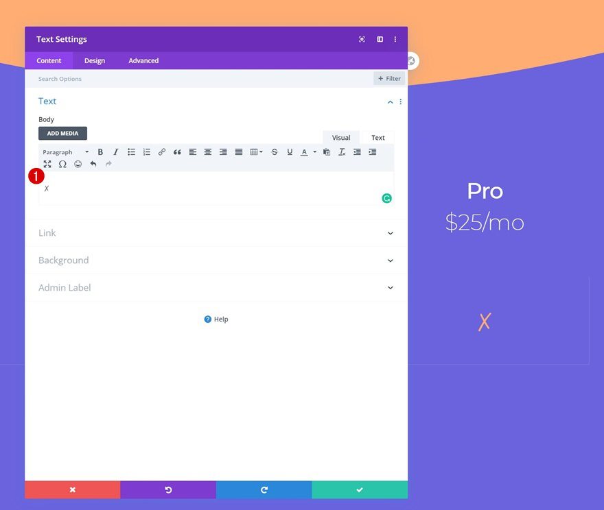
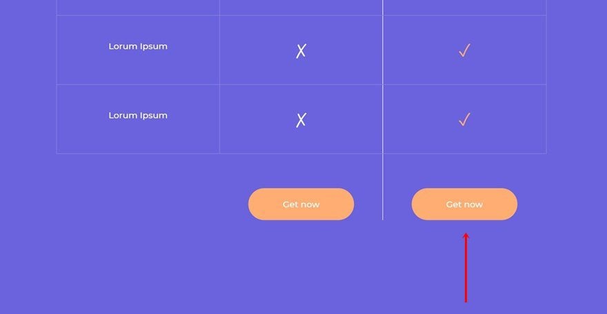
Add Symbol to Content Box
In the second column, we’ll need another Text Module. Add the ‘✓’ symbol to the content box.
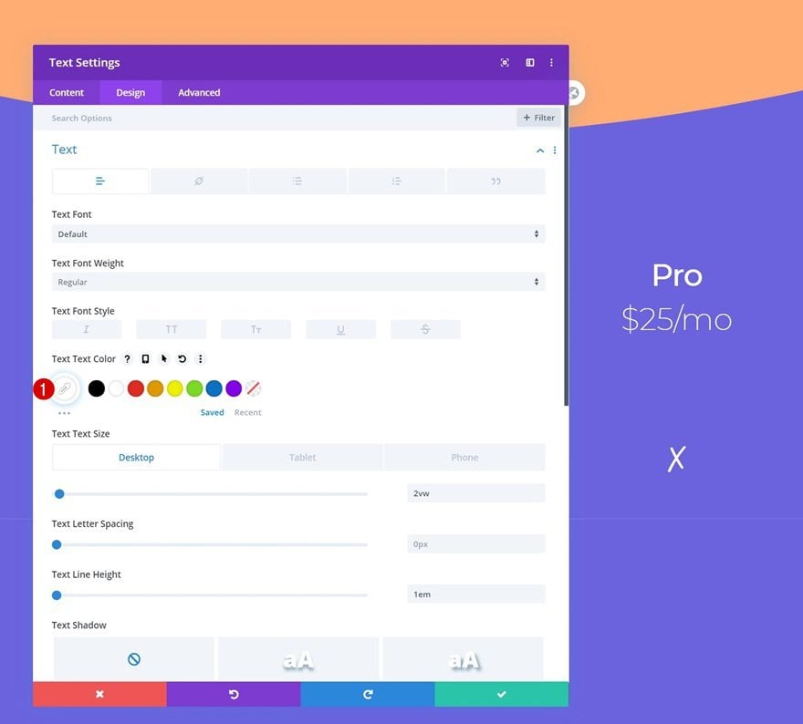
Text Settings
Move on to the design tab and change the text settings as follows:
- Text Color: #ffad72
- Text Size: 2vw (Desktop), 3vw (Tablet), 4vw (Phone)
- Text Line Height: 1em
- Text Alignment: Center
Clone Text Module & Place Duplicate in Column 3
Once you’ve completed the Text Module in column 2, you can clone it and place the duplicate in column 3.
Alternative Symbol & Text Color
Depending on the feature you’re showcasing, you might want to change the symbol into ‘✗’. Use a different text color as well.
- Text Color: #ffffff
Clone Row as Many Times as Wanted
Once you’ve completed the entire row, you can clone it up to as many times as you want, depending on how many features you want to show.
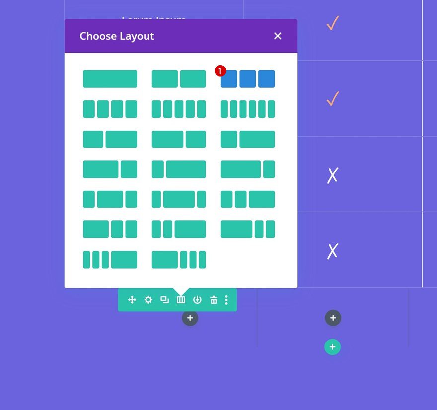
Add Row #3
Column Structure
The last row we’ll add to the second section contains the following column structure:
Sizing
Without adding any modules yet, open the row settings and change the sizing settings as follows:
- Use Custom Gutter Width: Yes
- Gutter Width: 1
- Equalize Column Heights: Yes
- Width: 100%
- Max Width: 100%
Spacing
Remove the default top and bottom padding next.
- Top Padding: 0px
- Bottom Padding: 0px
Border
Add a border too.
- Top Border Width: 0px
- Bottom Border Width: 0px
- Right Border Width: 1px
- Left Border Width: 1px
- Border Color: rgba(255,255,255,0)
Display
And make sure the columns appear next to each other on smaller screen sizes by adding one single line of CSS code to the row’s main element.
display: flex;
Column 2 & 3 Settings
Spacing
Continue by adding some top margin to both column 2 and 3.
- Top Padding: 4vw
Column 2 Border
Add a right border to column 2 as well.
- Right Border Width: 1px
- Right Border Color: #eaeaea
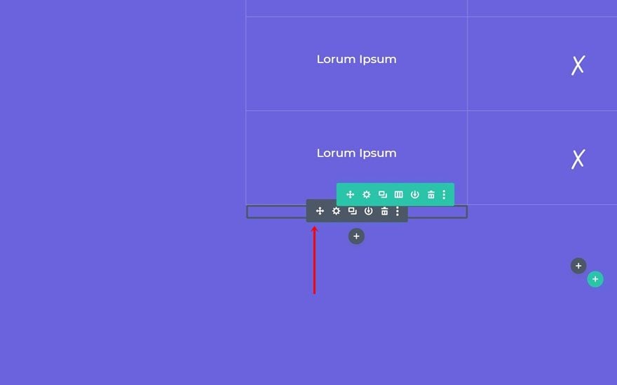
Clone Divider Module & Place in Column 1 of New Row
Clone the Divider Module that you can find in the first row of the section and place the duplicate in the first column of your new row.
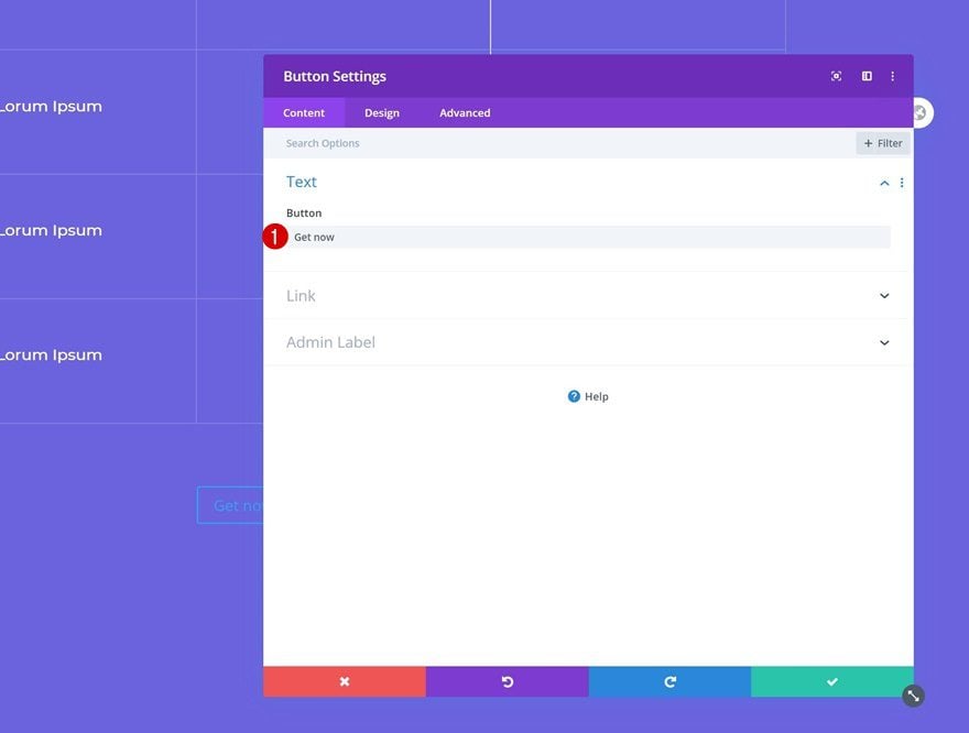
Add Copy
Continue by adding a Button Module to column 2 and insert some copy of your choice.
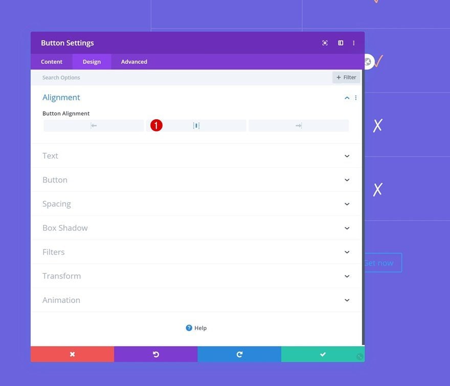
Alignment
Modify the button alignment in the design tab.
- Button Alignment: Center
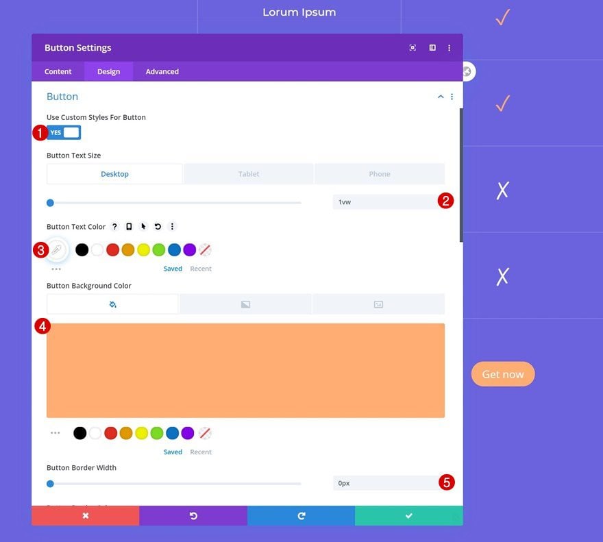
Button Settings
And change the button settings as follows:
- Use Custom Styles For Button: Yes
- Button Text Size: 1vw (Desktop), 1.5vw (Tablet), 2vw (Phone)
- Button Text Color: #ffffff
- Button Background Color: #ffad72
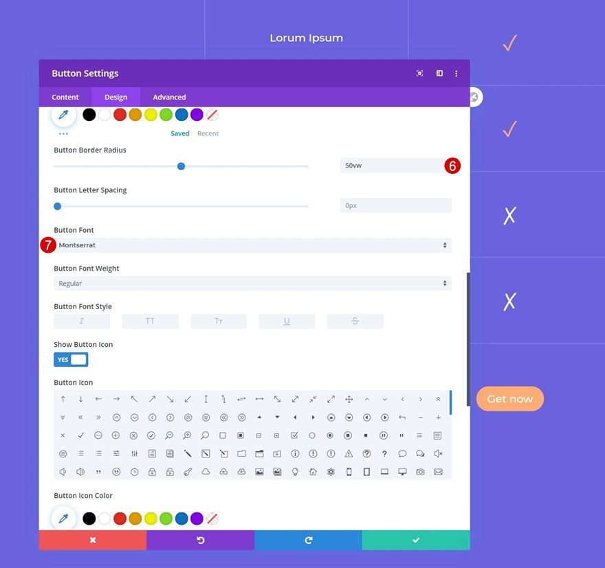
- Button Border Width: 0px
- Button Border Radius: 50vw
- Button Font: Montserrat
Spacing
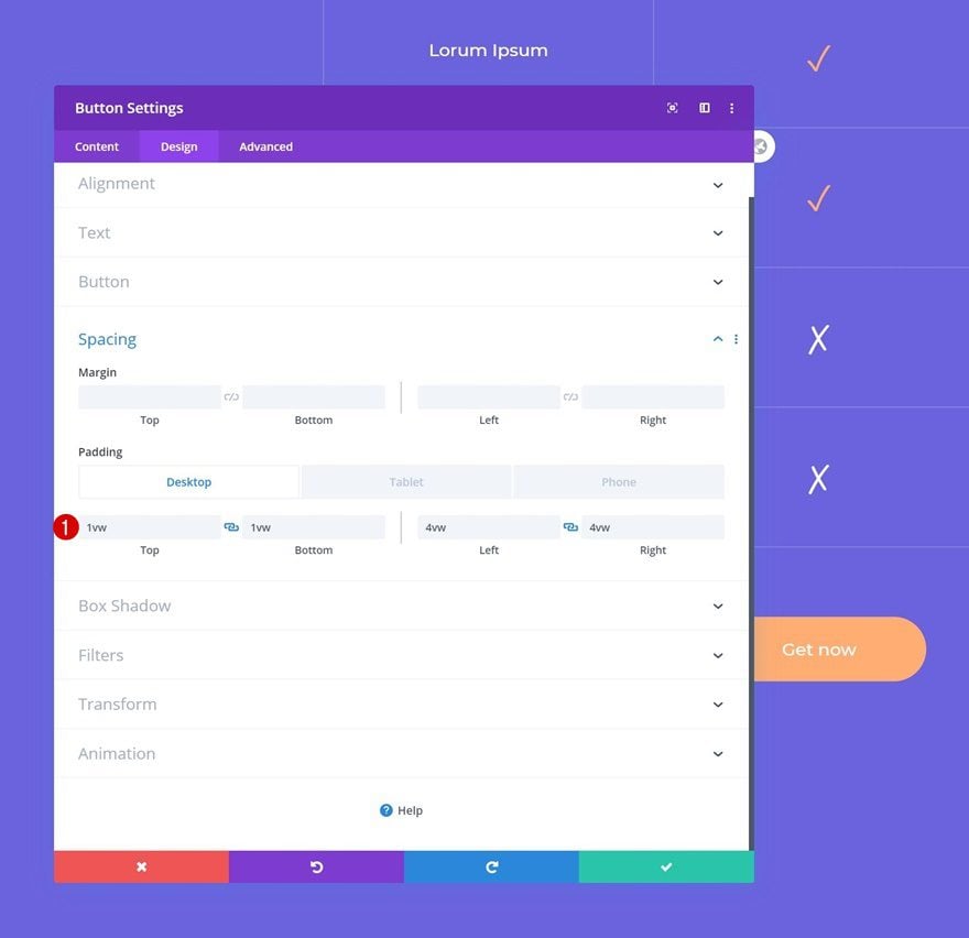
Add some custom padding values to the Button Module as well.
- Top Padding: 1vw (Desktop), 1.5vw (Tablet & Phone)
- Bottom Padding: 1vw (Desktop), 1.5vw (Tablet & Phone)
- Left Padding: 4vw (Desktop), 6vw (Tablet & Phone)
- Right Padding: 4vw (Desktop), 6vw (Tablet & Phone)
Once you’ve completed the Button Module in column 2, you can clone it and place the duplicate in column 3.
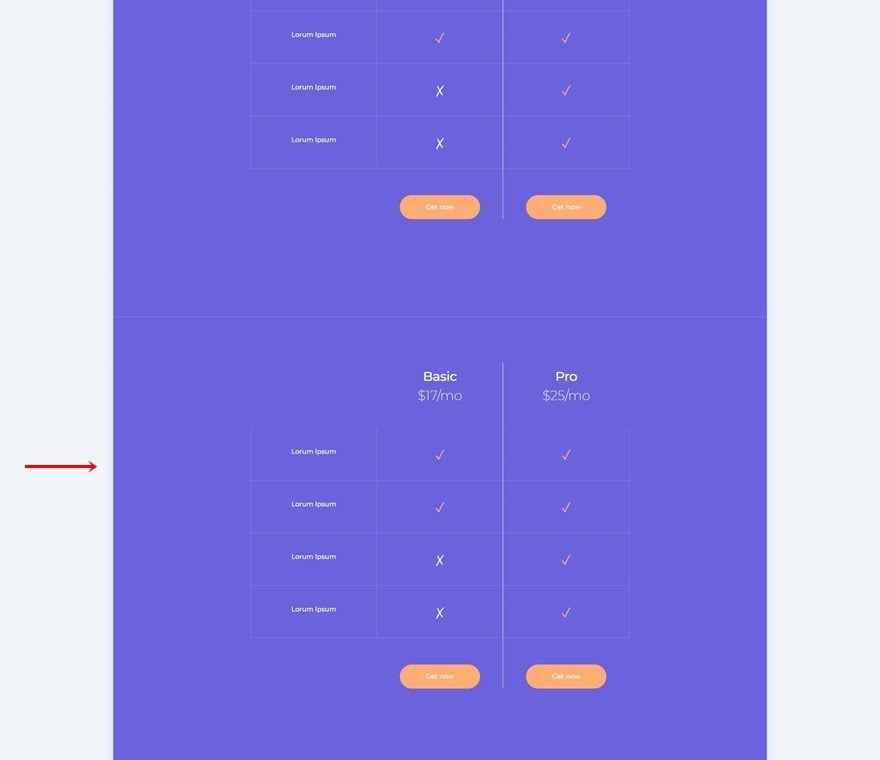
Clone Section #2
Continue by cloning the entire second section. Make sure you change the pricing values in the text modules to make it match with the yearly billing options. This is the section that’ll appear once someone clicks on ‘yearly billing’.
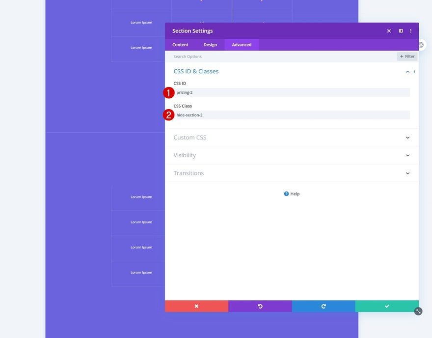
Change CSS ID & Add CSS Class
Change the section’s CSS ID next and add a CSS class too.
- CSS ID: pricing-2
- CSS Class: hide-section-2
Add New One-Column Row to Top of Section #1
The only thing left to do is adding the CSS and jQuery code to make the functionality work. To do that, we’ll add a new row to the top of section 1.
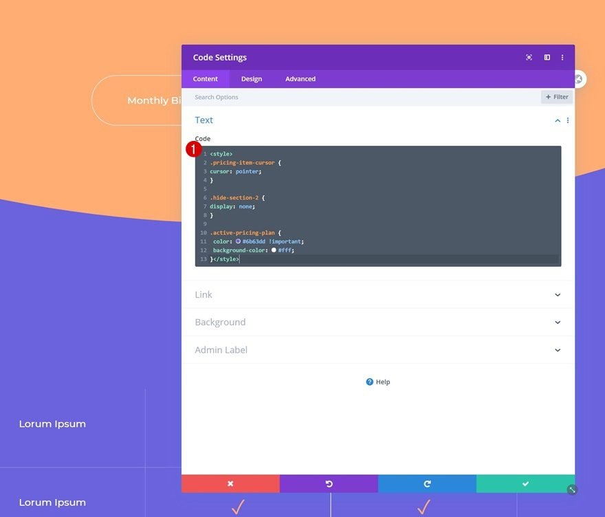
Add Code Module #1 with CSS Code
Add a first Code Module and insert the following lines of CSS code:
<style>
.pricing-item-cursor {
cursor: pointer;
}

.hide-section-2 {
display: none;
}

.active-pricing-plan {
color: #6b63dd !important;
background-color: #fff;
}</style>
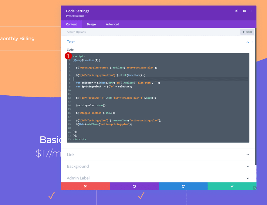
Add Code Module #2 with JQuery Code
Add another Code Module right below the previous one, insert the jQuery code below between script tags and you’re done!
jQuery(function($){

$('#pricing-plan-item-1').addClass('active-pricing-plan');

$('[id*="pricing-plan-item"]').click(function() {

var selector = $(this).attr('id').replace('-plan-item', '');
var $pricingselect  = $('#' + selector);


$('[id*="pricing-"]').not('[id*="pricing-plan"]').hide();

$pricingselect.show()

$('#toggle-section').show();

$('[id*="pricing-plan"]').removeClass("active-pricing-plan");
$(this).addClass('active-pricing-plan');

});
});
Preview
Now that we’ve gone through all the steps, let’s take a final look at the outcome across different screen sizes.
Desktop
Mobile
Final Thoughts
In this post, we’ve shown you how to create a monthly/yearly pricing toggle design with Divi. This is a great way to add interaction to your pricing plans. Besides applying the click technique, we’ve also designed a beautiful grid pricing plan that allows you to emphasize which features are included in which plans. You were able to download the JSON file for free as well. If you have any questions or suggestions, feel free to leave a comment in the comment section below!
If you’re eager to learn more about Divi and get more Divi freebies, make sure you subscribe to our email newsletter and YouTube channel so you’ll always be one of the first people to know and get benefits from this free content.


Finally, I found the solution to fix this issue.
I named each section with a CSS iD (Section Settings > Advanced) and I added this iD code in the Toggle Code Module #2 with JQuery Code.
(find this line to add your others Section iD)
$pricingselect.show().siblings().hide();
$(‘#toggle-section’).show(); <<<< (leave it, don't change anything)
ADD CODE LINES JUST BELOW WITH YOUR OWN iD CSS like that :
$('#YOUR SECTION iD NAME').show();
*** IN MY CASE *** I'VE PUTTED MY SECTION iD JUST BELOW
$('#page-header').show(); <<<<< iD CSS page-header
$('#introduction').show(); <<<<< iD CSS introduction
$('#pricing').show(); <<<<<
$('#toggle-section').show(); <<<<<
$('#explanation').show(); <<<<<
$('#testimonials').show(); <<<<<
$('#faq').show(); <<<<<
$('#email-subscribe').show(); <<<<<
And it works perfectly !!!
Enjoy guys.
THANK YOU I TRY THIS ! <3
Is it possible for this to work whene there are other secions on the page also. Currently a click is hides everything every other section on the page.
The tutorial is great! However, why construct a price list instead of using your very own Price Table Module?
Same Problem. Solution please
I tried to import the pre-designed layout and I can’t save the page. Then I followed the entire tutorial and designed the layout from scratch, but after adding the final CSS and Jquery scripts, I got the same error and can’t save the page. What to do?
Hi, this is a great pricy toggle design thank you so much !
Sorry for my english in advance.
I have a problem and I dont get it, when I click on monthly or yearly button, my website only show this particular div and nothing else and I cant scroll anymore, so I have to refresh the page to see the entire page again…
Someone has the same problem and maybe a solution ?
Thank you !
yes I’ve the same problem ^^
Same
Same problem too
Wow. Thanks for this.
Just what I need, thank you for sharing as always!
Just going to buy and find your post and its freeee
thanks Vuniqi.
How do I import the downloaded file into a page?
Great functionality! Minor thing; on mobile you see in the preview, that selecting the box YEARLY/MONTHLY the box becames square for a flash, and then gets styled with rounded corners. this is a thing we keep on seeing on almost all new posts of Divi after 4.0 Styling is applied too late, firt you get a box, then it gets styled.
+1
The longest post, ever. Thanks for sharing!