
Divi and its scroll effects bring tons of new design possibilities to websites you create. With every new feature, we try to share cool Divi techniques you can use to make your pages stand out from the crowd. This tutorial is no different, today, we’ll show you how to create a horizontal self-scrolling list. As visitors vertically scroll down your page, the horizontal items scroll along horizontally. This removes the need for a separate horizontal scrollbar and improves the overall user experience visitors have. It also helps you focus on sharing bulk content without it taking over your entire page. You’ll be able to download the JSON file for free as well!
Let’s get to it.
Preview
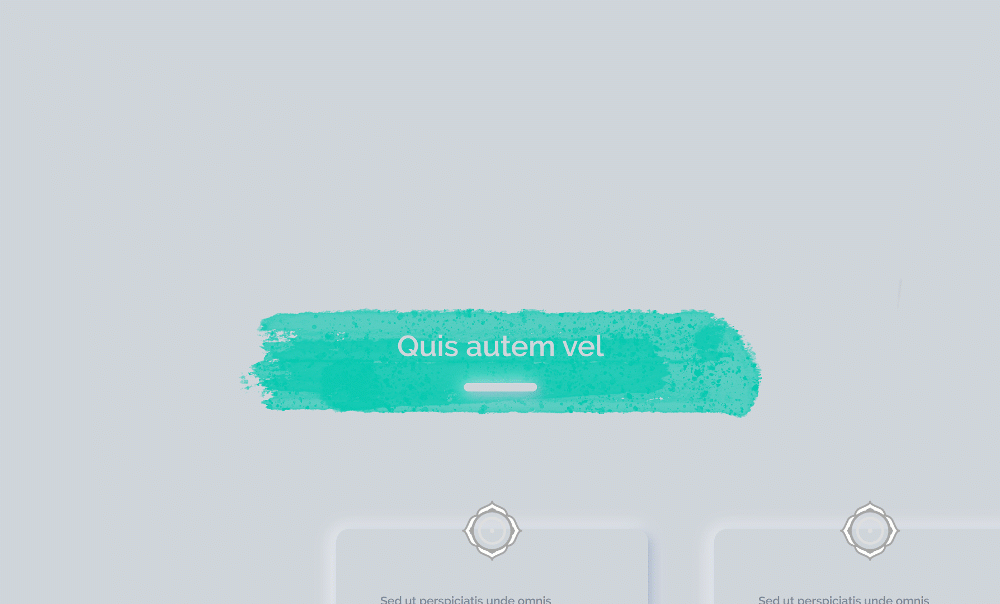
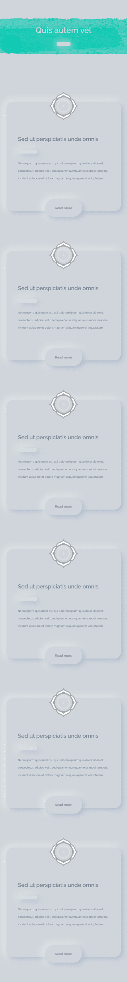
Before we dive into the tutorial, let’s take a quick look at the outcome across different screen sizes.
Desktop
Mobile
Download The Horizontal Self-Scrolling List Layout for FREE
To lay your hands on the free horizontal self-scrolling list layout, you will first need to download it using the button below. To gain access to the download you will need to subscribe to our newsletter by using the form below. As a new subscriber, you will receive even more Divi goodness and a free Divi Layout pack every Monday! If you’re already on the list, simply enter your email address below and click download. You will not be “resubscribed” or receive extra emails.

Let’s Start Recreating!
Add New Section
Background Color
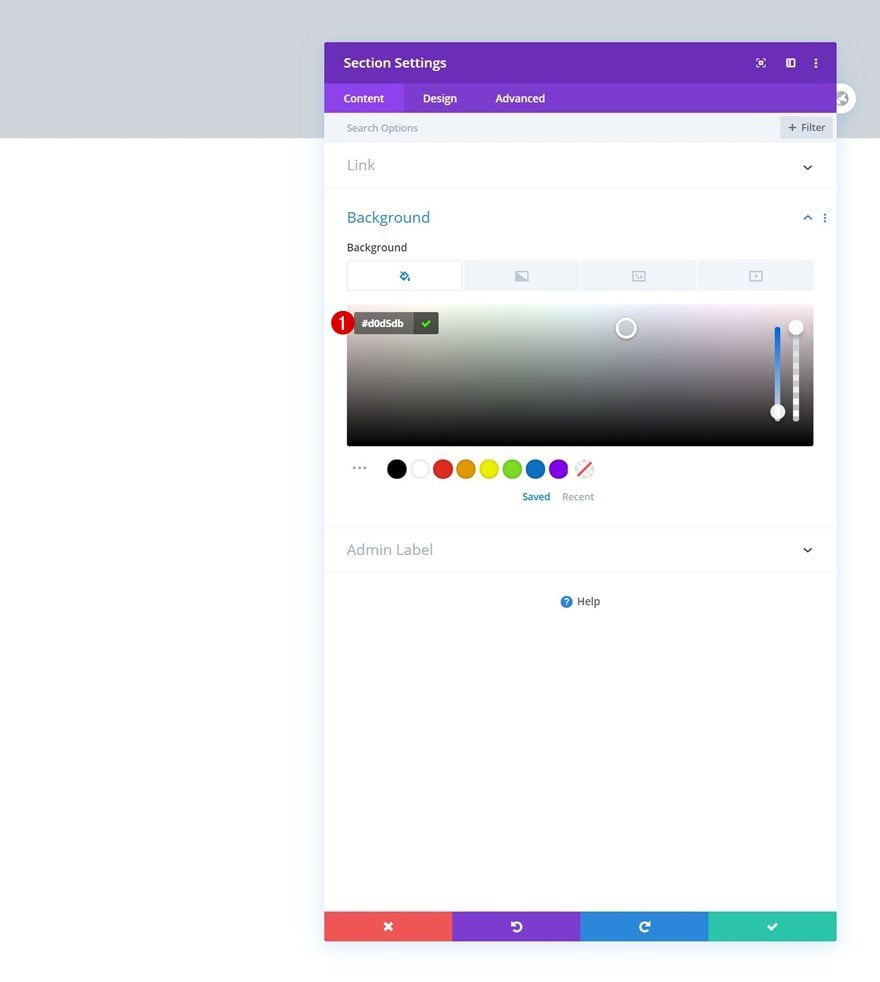
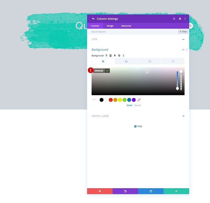
Start by adding a new section to the page you’re working on. Open the section settings and modify the background color.
- Background Color: #d0d5db
Overflows
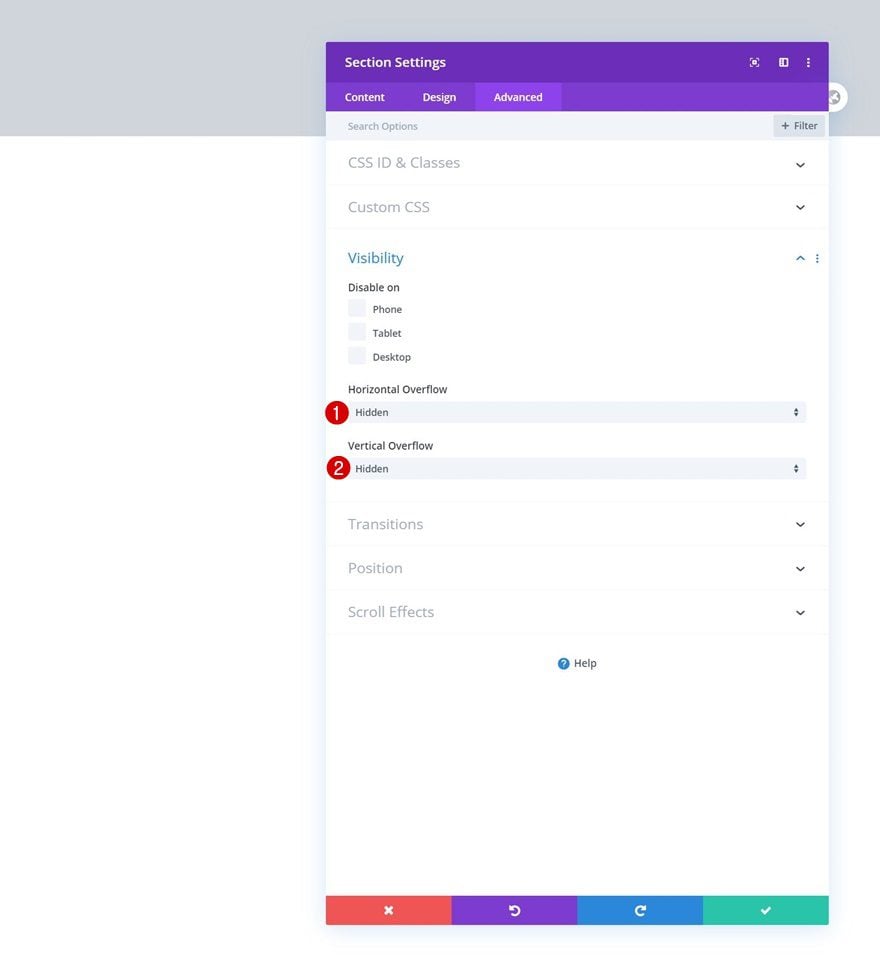
Hide the section overflows too.
- Horizontal Overflow: Hidden
- Vertical Overflow: Hidden
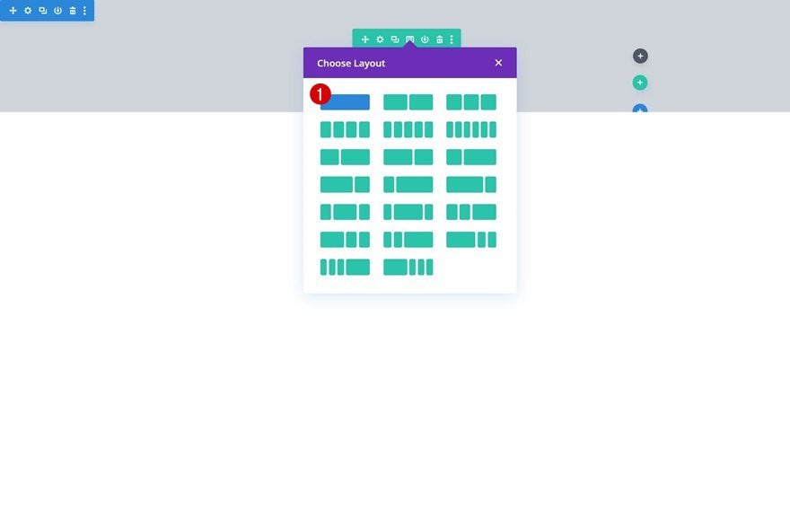
Add Row #1
Column Structure
Continue by adding a new row using the following column structure:
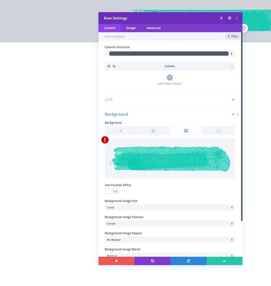
Background Image
Without adding any modules yet, open the row settings and upload the background image you can find in the download folder that was shared at the beginning of this tutorial.
Sizing
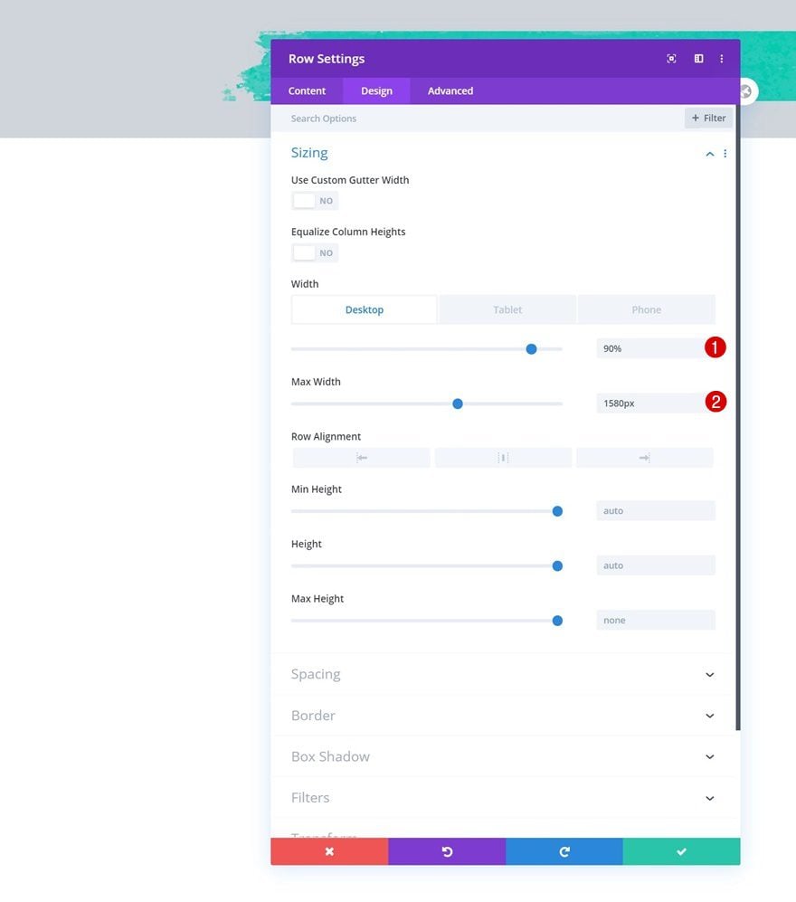
Move on to the row’s design tab and change the sizing settings next.
- Width: 90% (Desktop), 100% (Tablet & Phone)
- Max Width: 1580px
Spacing
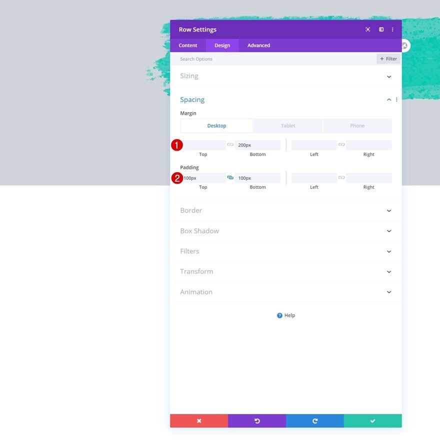
Modify the spacing settings as well.
- Bottom Margin: 200px (Desktop), 50px (Tablet & Phone)
- Top Padding: 100px
- Bottom Padding: 100px
Add Text Module to Column
Add H2 Content
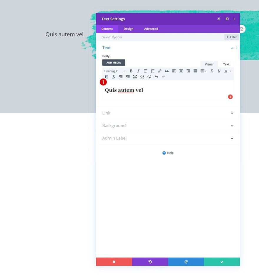
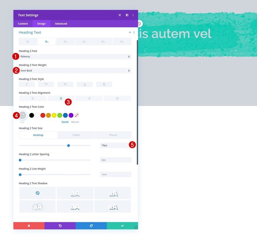
Time to add modules, starting with a Text Module containing some H2 content of your choice.
H2 Text Settings
Modify the module’s H2 text settings accordingly:
- Heading 2 Font: Raleway
- Heading 2 Font Weight: Semi Bold
- Heading 2 Text Alignment: Center
- Heading 2 Text Color: #d0d5db
- Heading 2 Text Size: 70px (Desktop), 50px (Tablet), 40px (Phone)
Add Divider Module to Column
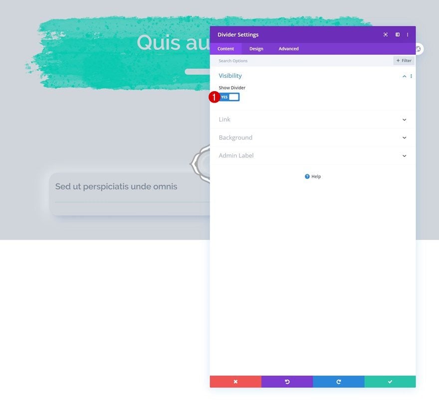
Visibility
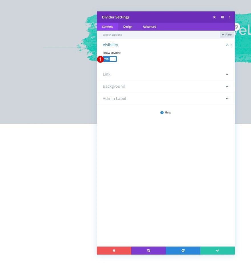
Then, add a Divider Module and make sure the ‘Show Divider’ option is enabled.
- Show Divider: Yes
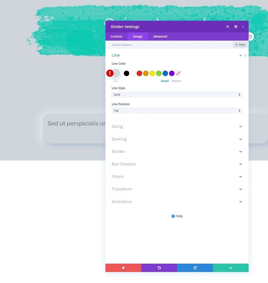
Line
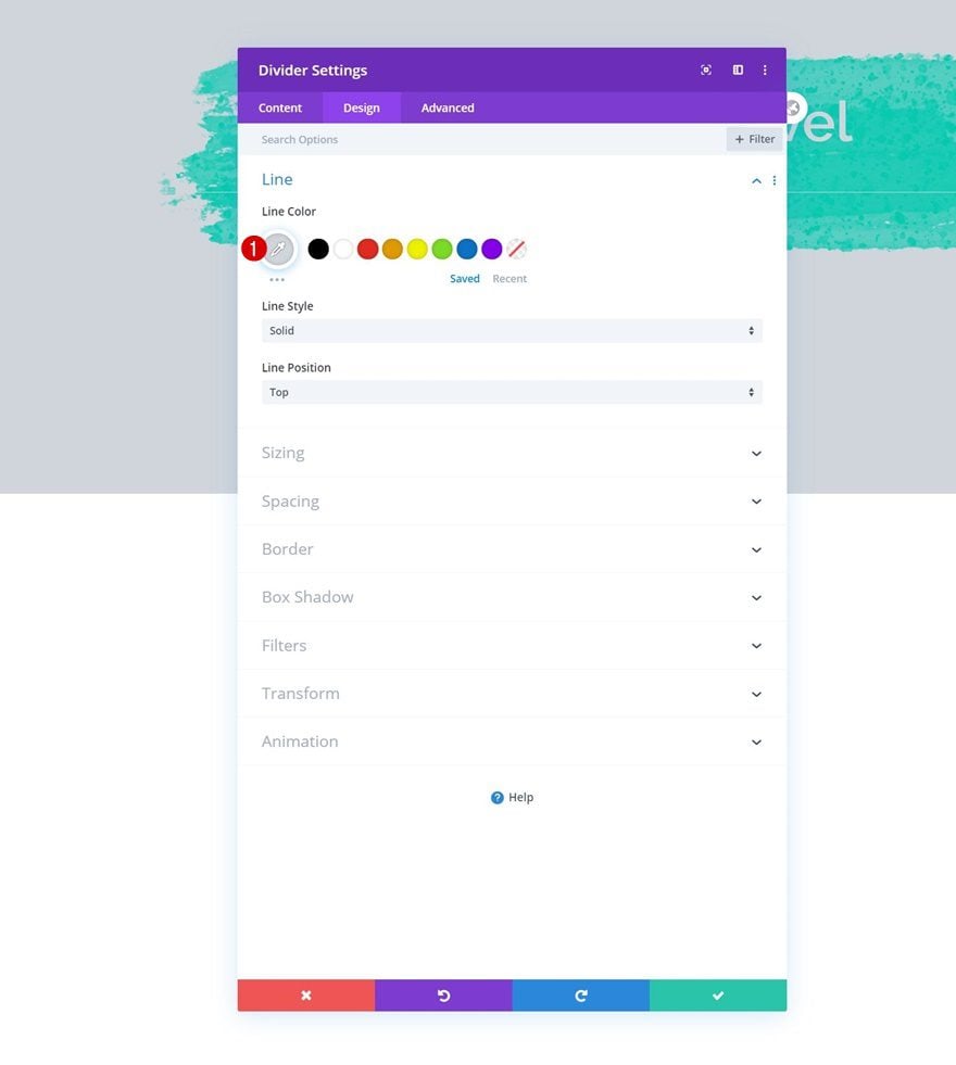
Change the module’s line color next.
- Line Color: #d7dce2
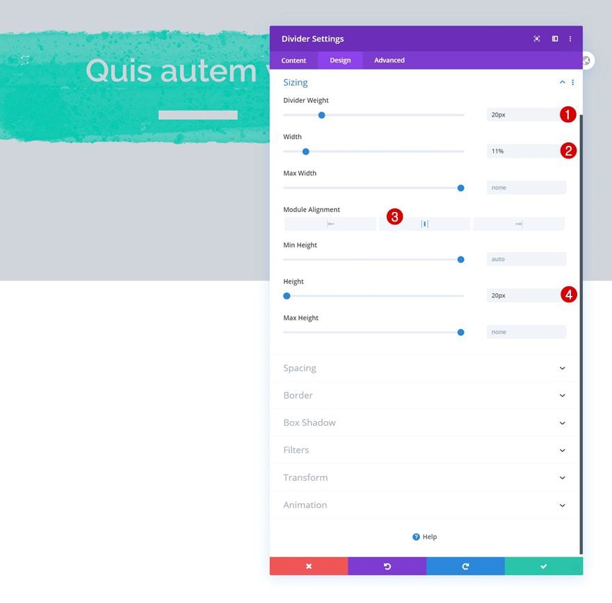
Sizing
Along with the sizing settings.
- Divider Weight: 20px
- Width: 11%
- Module Alignment: Center
- Height: 20px
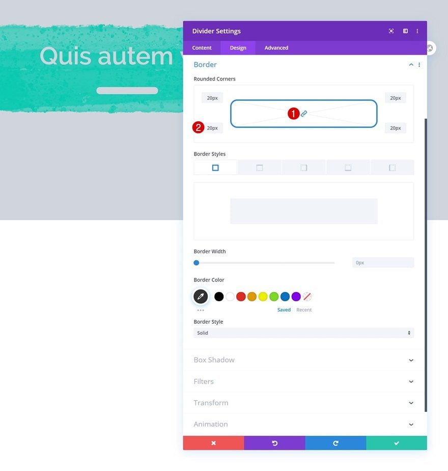
Border
Complete the module settings by adding some border radius.
- Border: 20px (All Corners)
Add Row #2
Column Structure
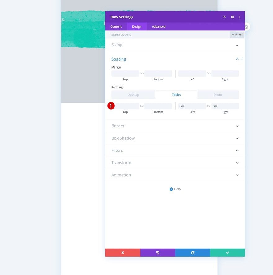
On to the next row. Use the following column structure:
Spacing
Without adding any modules yet, open the row settings and change the left and right padding values across different screen sizes.
- Left Padding: 0% (Desktop), 5% (Tablet & Phone)
- Right Padding: 0% (Desktop), 5% (Tablet & Phone)
Column Settings
Background Color
Then, go to the column settings and use a background color.
- Background Color: #d0d5db
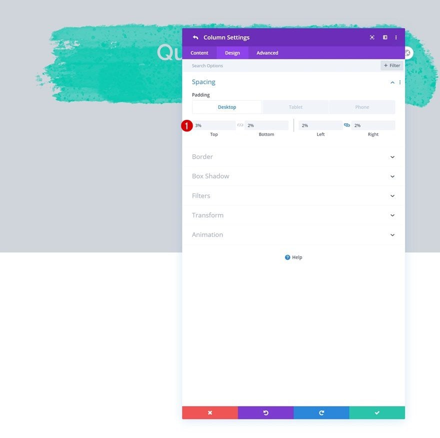
Spacing
Modify the column padding values across different screen sizes too.
- Top Padding: 3% (Desktop), 20% (Tablet), 30% (Phone)
- Bottom Padding: 2% (Desktop), 15% (Tablet), 20% (Phone)
- Left Padding: 2% (Desktop), 10% (Tablet & Phone)
- Right Padding: 2% (Desktop), 10% (Tablet & Phone)
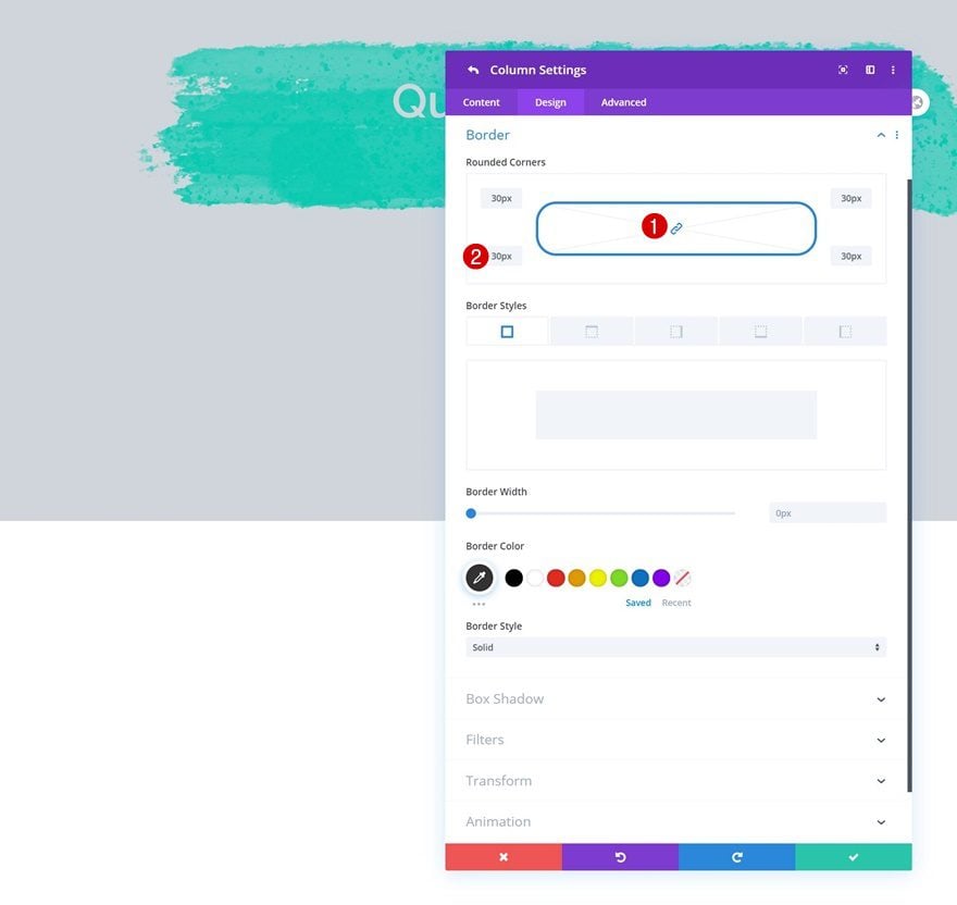
Border
Next, go to the border settings and add some border radius to the column container.
- All Corners: 30px
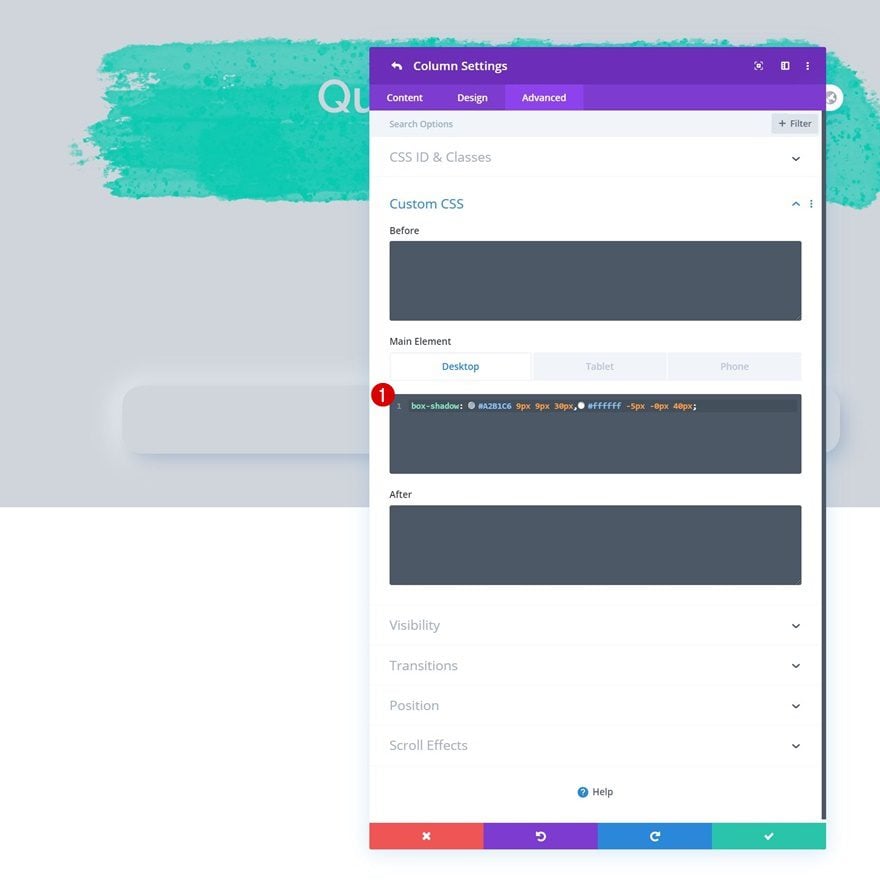
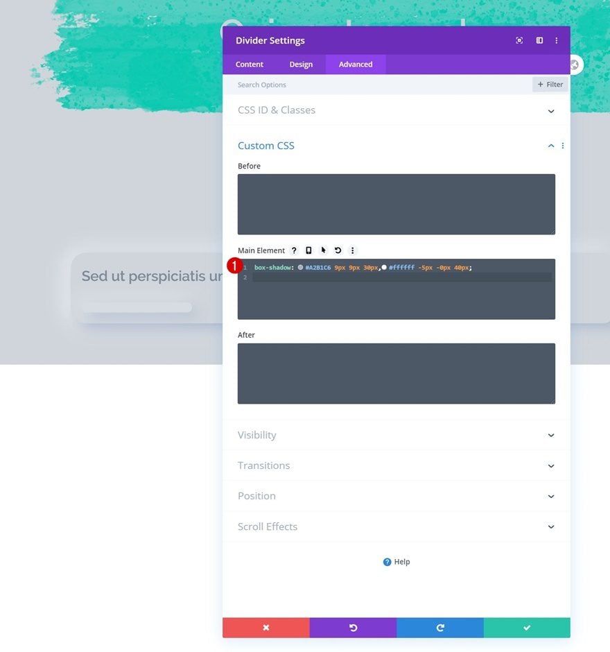
Main Element CSS
Complete the column settings by adding some responsive CSS code. We’re using CSS for the box shadow to obtain the neumorphism design style where two different box shadows are combined. However, feel free to replace this box shadow with a Divi-built box shadow if you want to change the overall style of the design. We’re also making sure the columns appear below each other on smaller screen sizes.
Desktop:
box-shadow: #A2B1C6 9px 9px 30px,#ffffff -5px -0px 40px;
Tablet & Phone:
box-shadow: #A2B1C6 9px 9px 30px,#ffffff -5px -0px 40px;
width: 100% !important;
margin: 100px 0px 100px 0px !important;
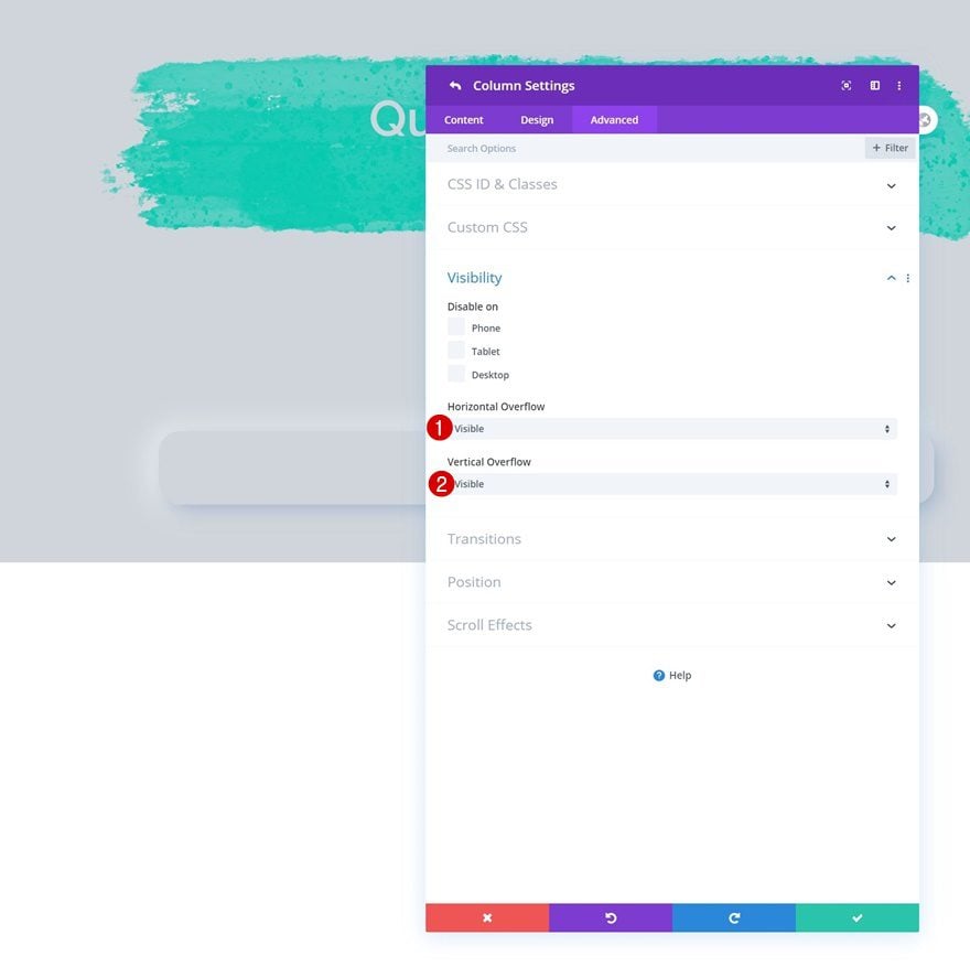
Overflows
Complete the column settings by setting the overflows to visible. This will allow us to create the overlaps you were able to notice in the preview of this post.
- Horizontal Overflow: Visible
- Vertical Overflow: Visible
Add Image Module to Column
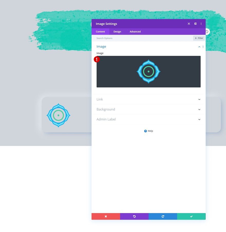
Upload Image
Time to add modules, starting with an Image Module. Upload an image of your choice.
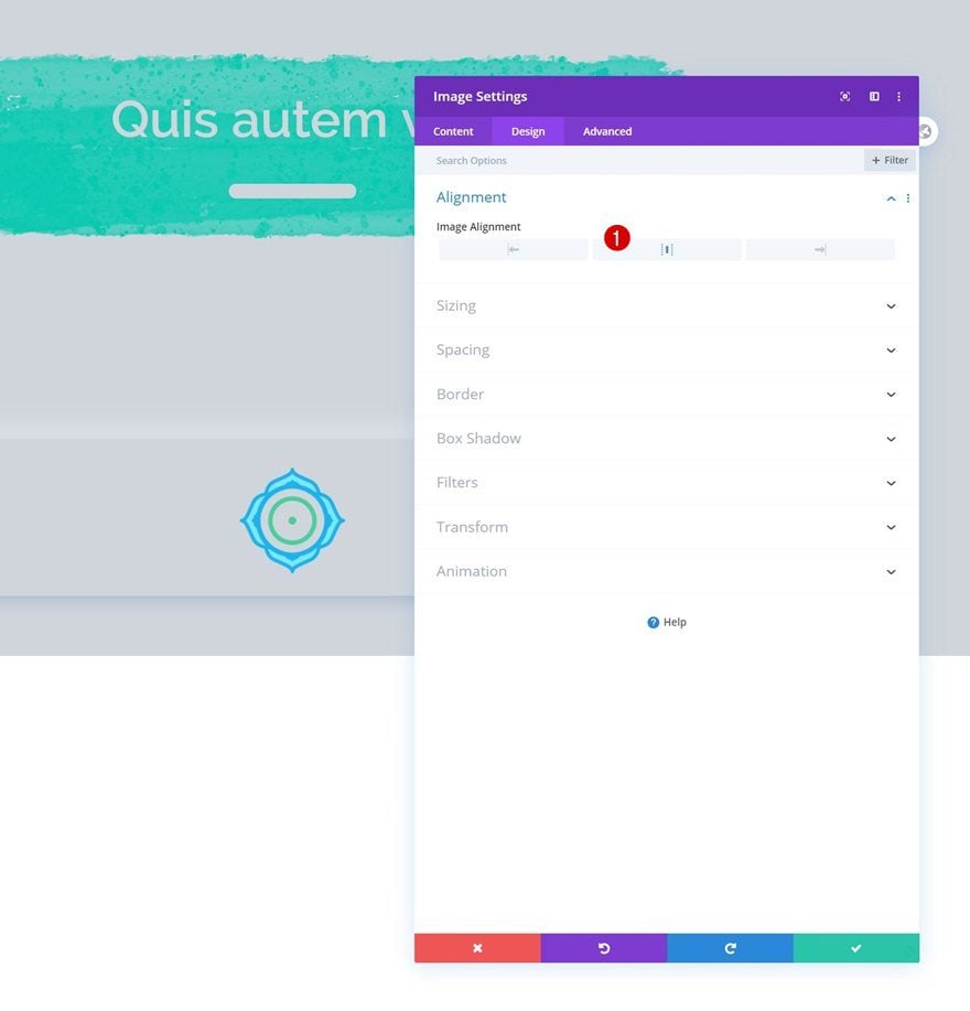
Alignment
Move on to the module’s design tab and change the image alignment.
- Image Alignment: Center
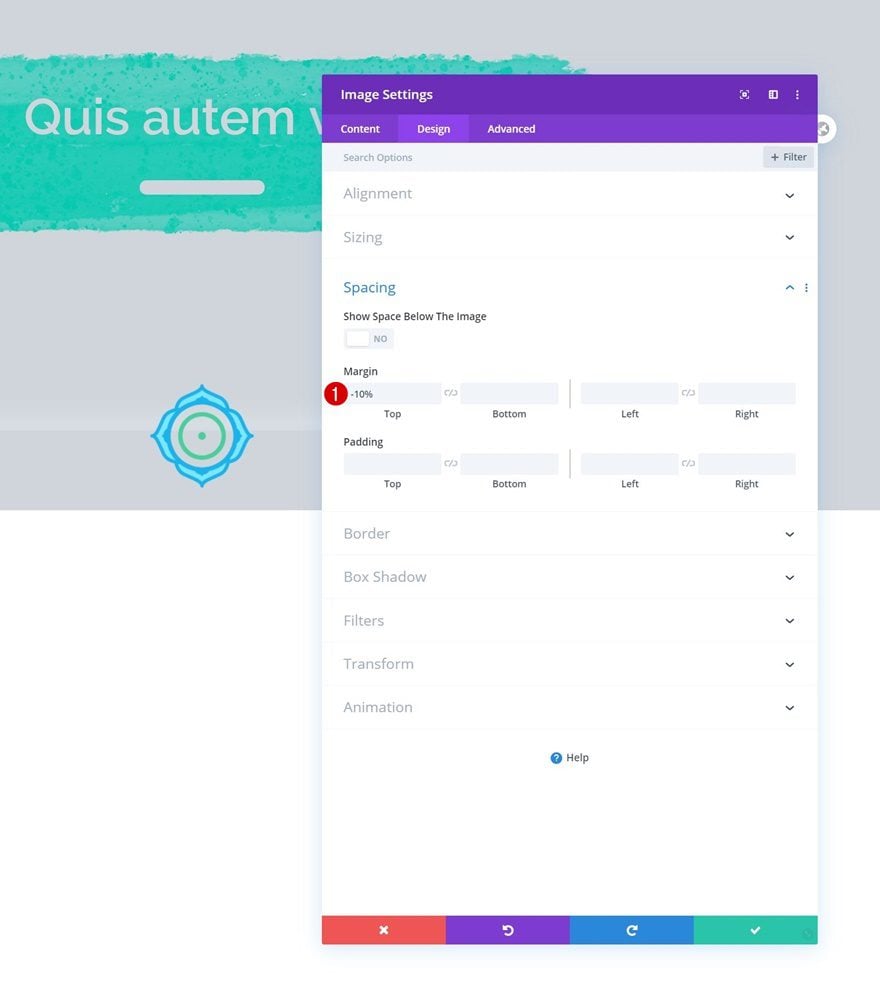
Spacing
Add some negative top margin too.
- Top Margin: -10%
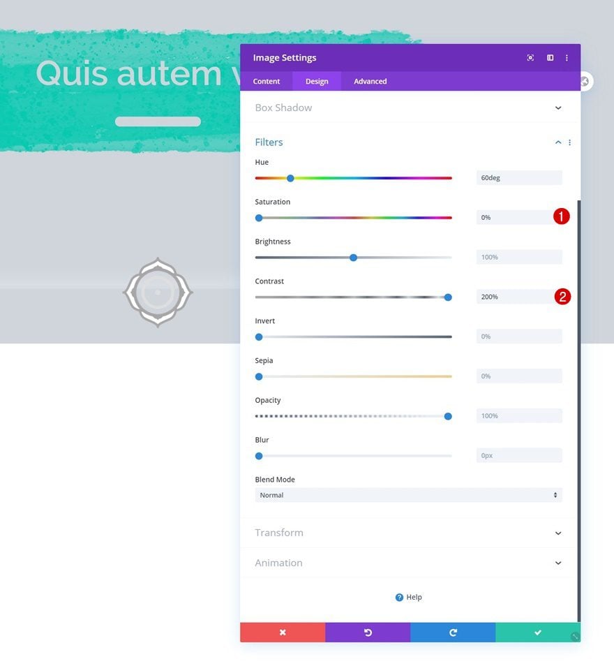
Filters
Then, go to the filters settings and remove all saturation. We’re adding some additional contrast as well.
- Saturation: 0%
- Contrast: 200%
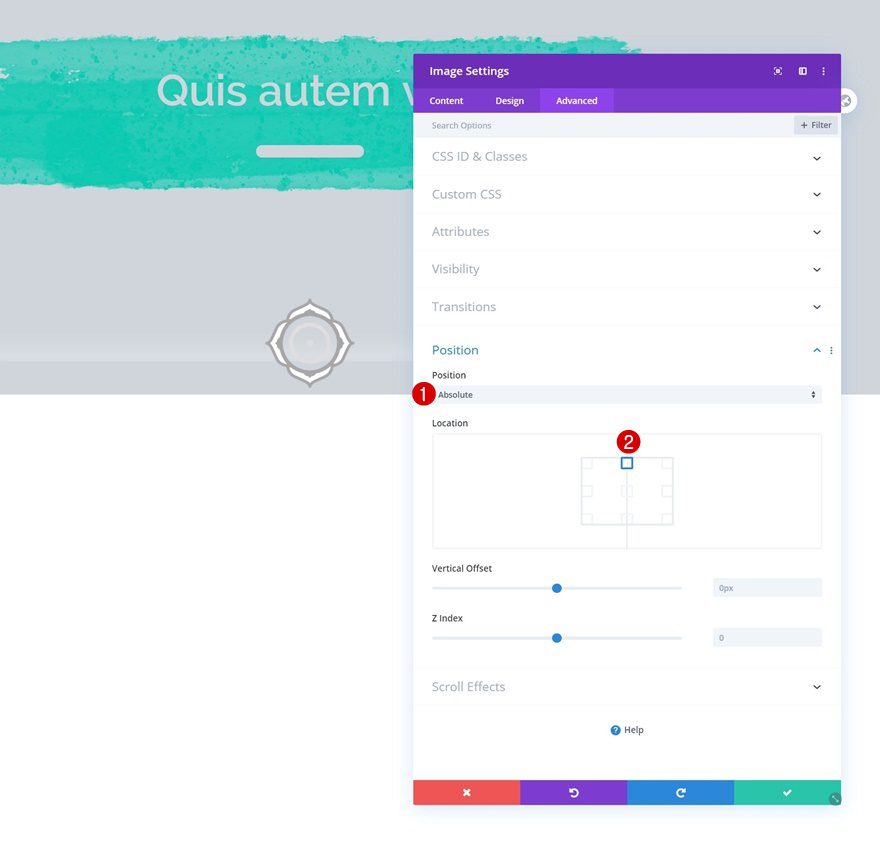
Position
Complete the module settings by repositioning the entire module.
- Position: Absolute
- Location: Top Center
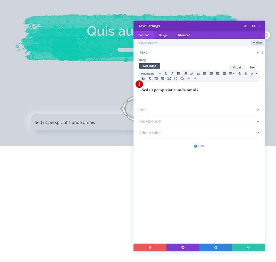
Add Text Module #1 to Column
Add H3 Content
The next module we need is a Text Module with some H3 content of your choice.
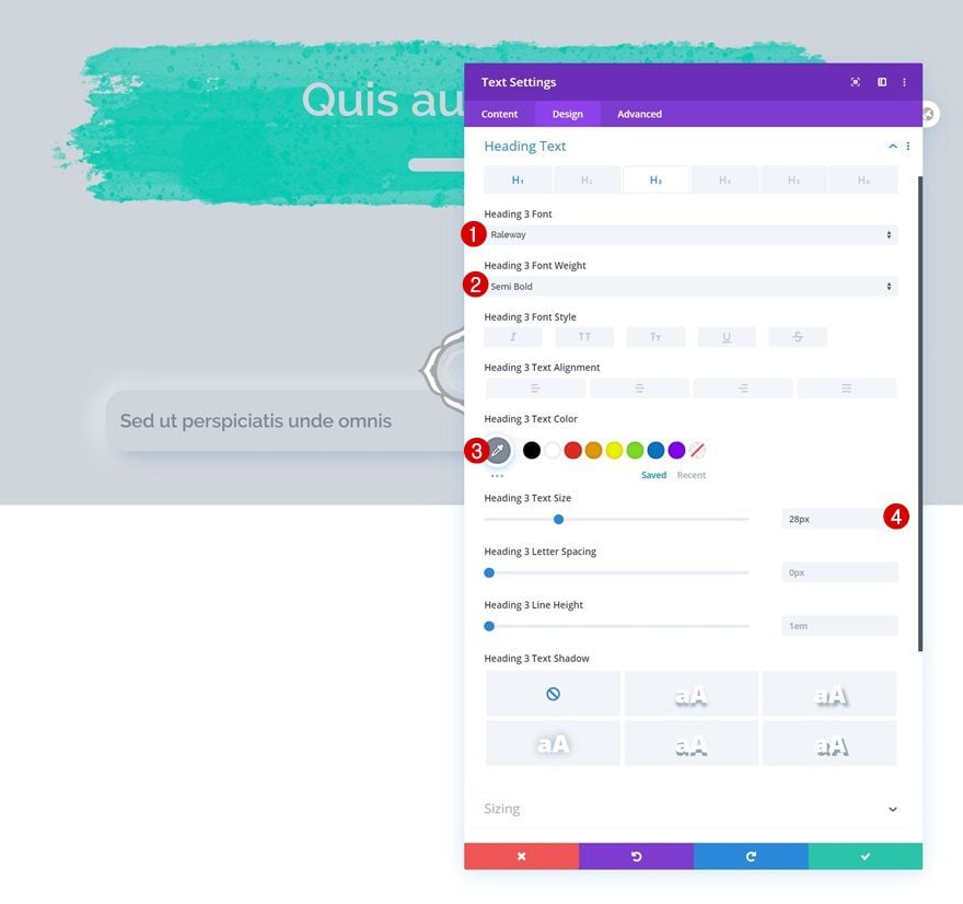
H3 Text Settings
Move on to the module’s design tab and change the H3 text settings accordingly:
- Heading 3 Font: Raleway
- Heading 3 Font Weight: Semi Bold
- Heading 3 Text Color: #7e8a98
- Heading 3 Text Size: 28px
Add Divider Module to Column
Show Divider
Add a Divider Module right below the Text Module and make sure the ‘Show Divider’ option is enabled.
- Show Divider: Yes
Line
Change the module’s line color next.
- Line Color: #d7dce2
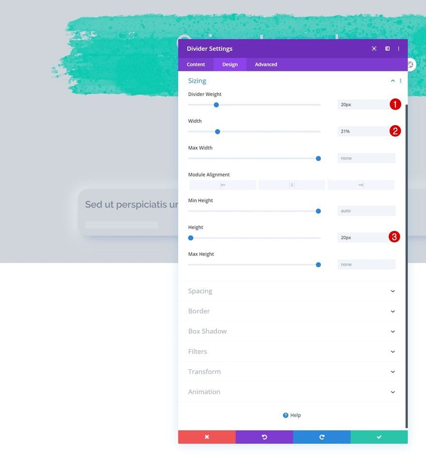
Sizing
Modify the sizing settings too.
- Divider Weight: 20px
- Width: 21%
- Height: 20px
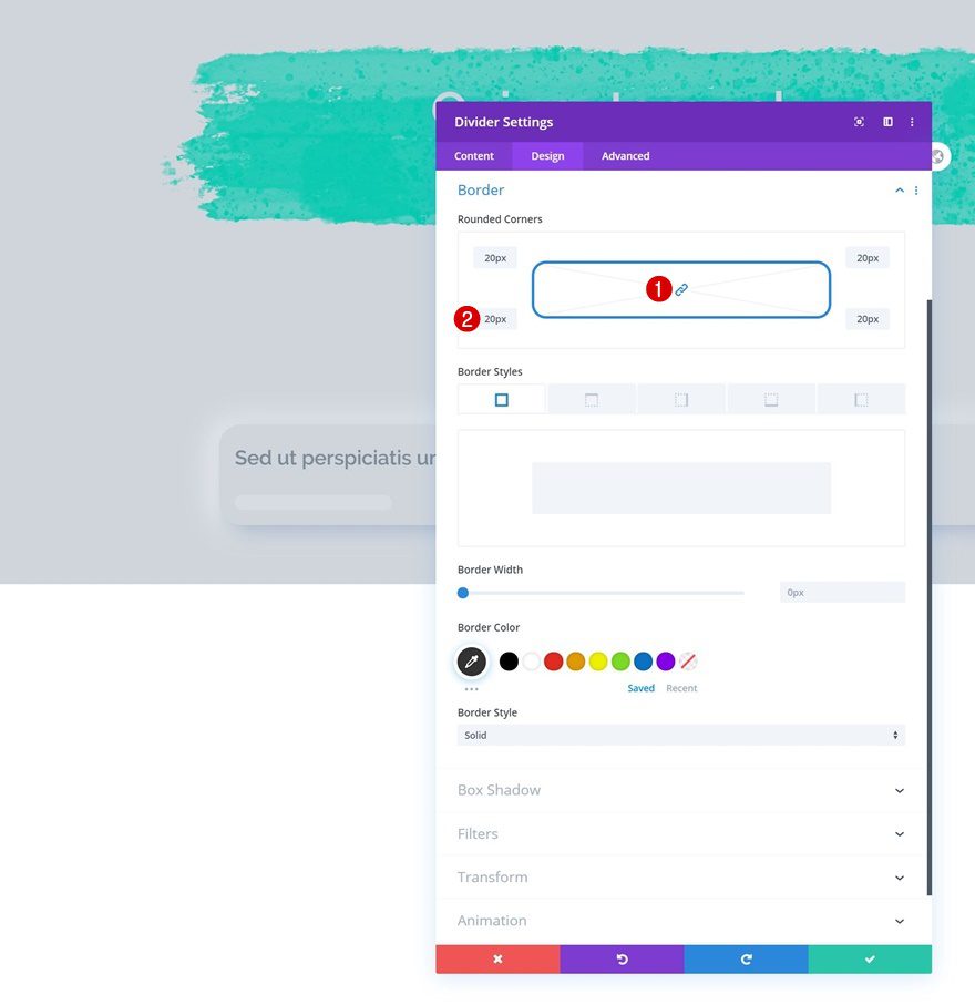
Border
Then, go to the border settings and use some border radius.
- All Corners: 20px
Main Element CSS
Complete the module settings by adding the same type of neumorphism box shadow to the module’s main element. Again, you’re free to use a Divi built-in box shadow instead.
box-shadow: #A2B1C6 9px 9px 30px,#ffffff -5px -0px 40px;
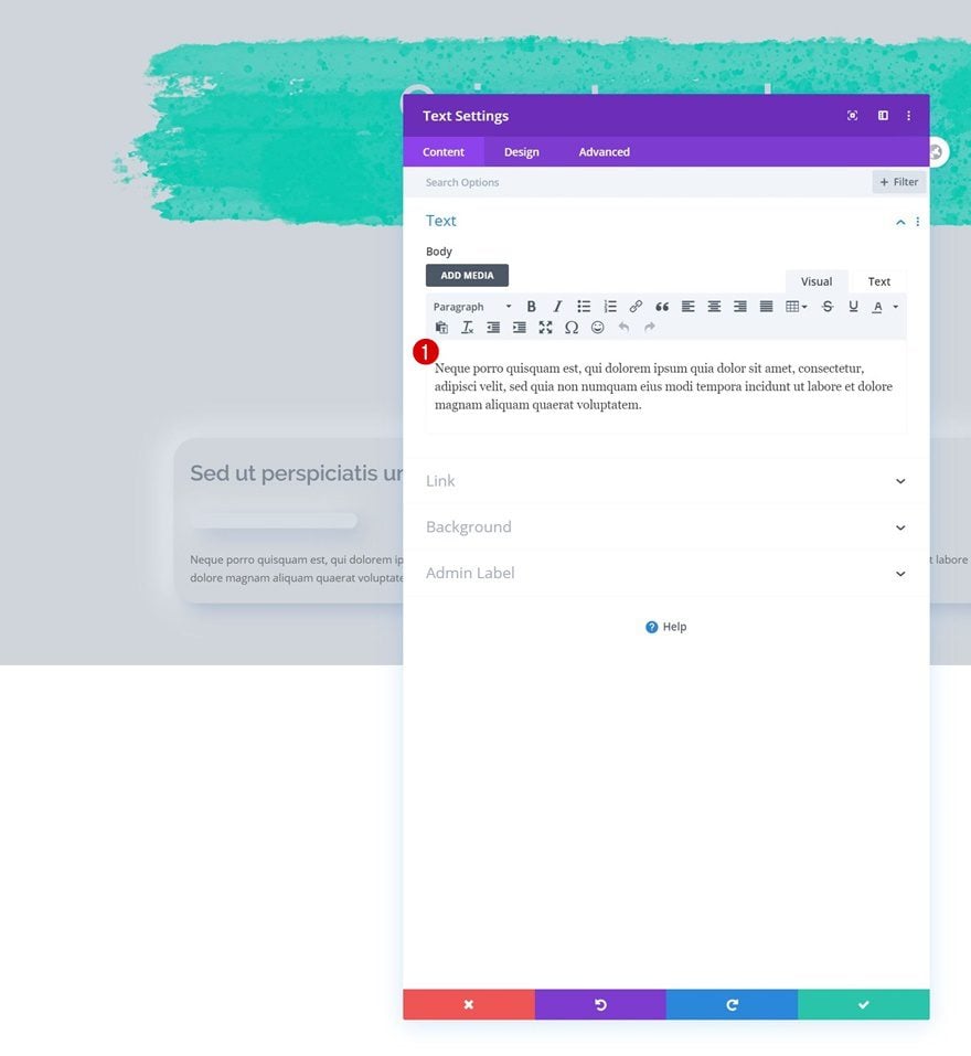
Add Text Module #2 to Column
Add Content
Up next we have another Text Module with some description content.
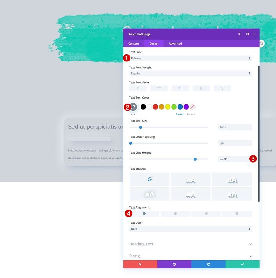
Text Settings
Change the module’s text settings as follows:
- Text Font: Raleway
- Text Color: #7e8a98
- Text Line Height: 2.7em
- Text Alignment: Left
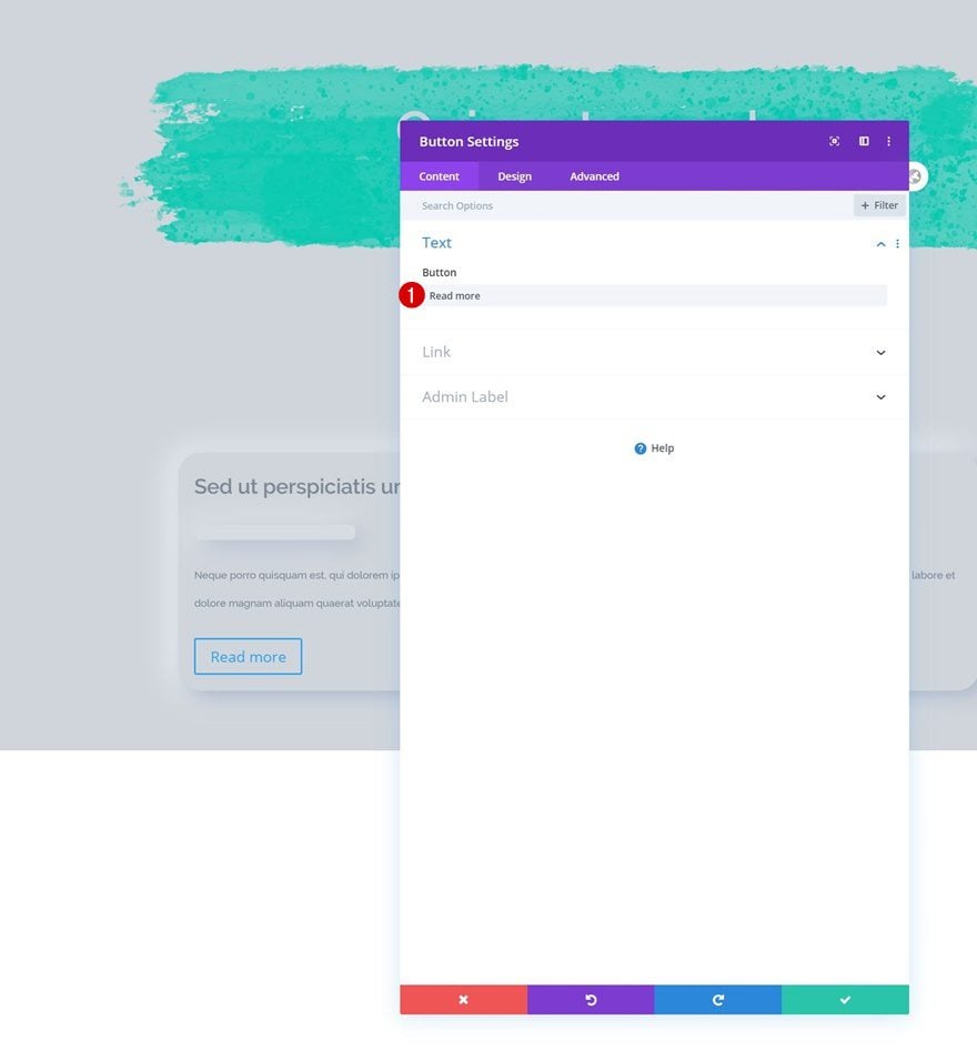
Add Copy
Last but not least, we’ll also need a Button Module. Enter some copy of your choice.
Button Settings
Then, move on to the design tab and style the button accordingly:
- Use Custom Styles For Button: Yes
- Button Text Size: 17px
- Button Text Color: #7e8a98
- Button Background Color: #d0d5db
- Button Border Width: 0px
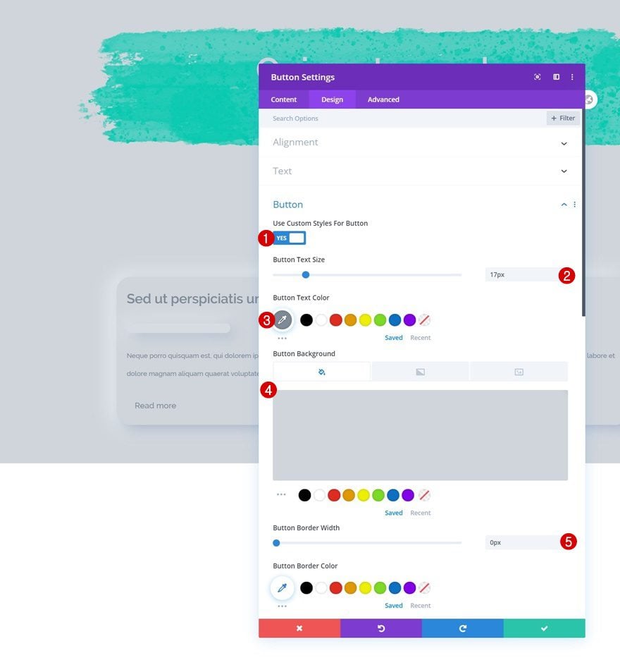
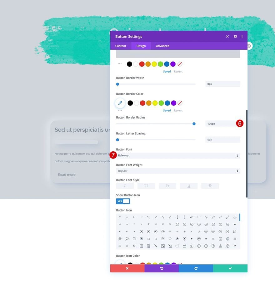
- Button Border Radius: 100px
- Button Font: Raleway
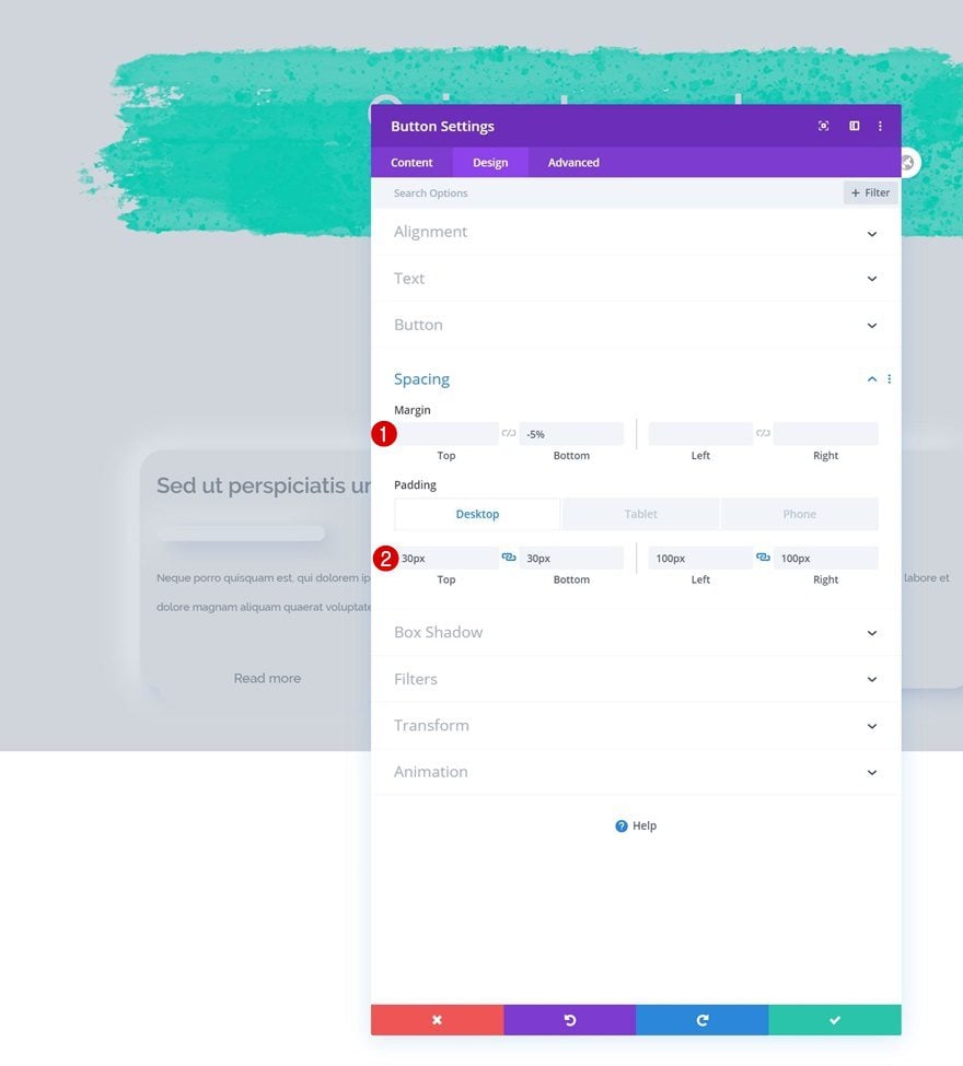
Spacing
We’ll make some changes to the spacing settings as well.
- Bottom Margin: -5%
- Top Padding: 30px
- Bottom Padding: 30px
- Left Padding: 100px (Desktop & Tablet), 50px (Phone)
- Right Padding: 100px (Desktop & Tablet), 50px (Phone)
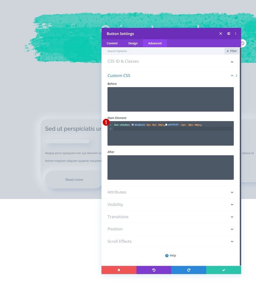
Main Element CSS
We’ll use the same neumorphism box shadow.
box-shadow: #A2B1C6 9px 9px 30px,#ffffff -5px -0px 40px;
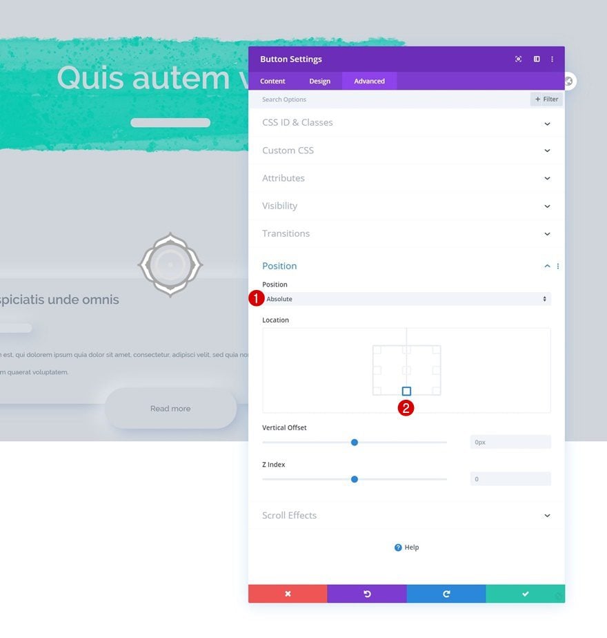
Position
And complete the Button Module settings by repositioning the module.
- Position: Absolute
- Location: Bottom Center
Turn Row Into Self-Scrolling List
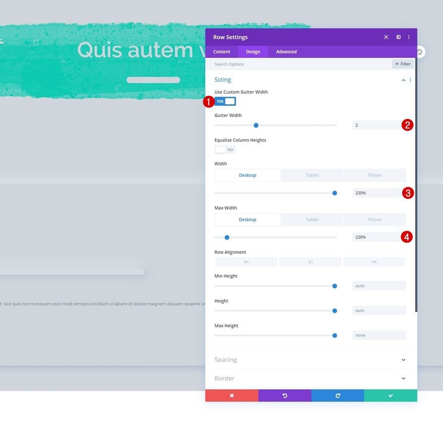
Change Row Sizing
Now, in the last part of this tutorial, we’ll turn the second row into a self-scrolling list. The first step to achieve the desired outcome is opening the row settings and modifying the sizing settings as follows:
- Use Custom Gutter Width: Yes
- Gutter Width: 2
- Width: 220% (Desktop), 100% (Tablet & Phone)
- Max Width: 220% (Desktop), 100% (Tablet & Phone)
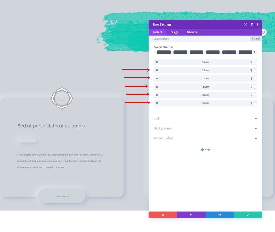
Clone Column 5x
Then, clone the column five times.
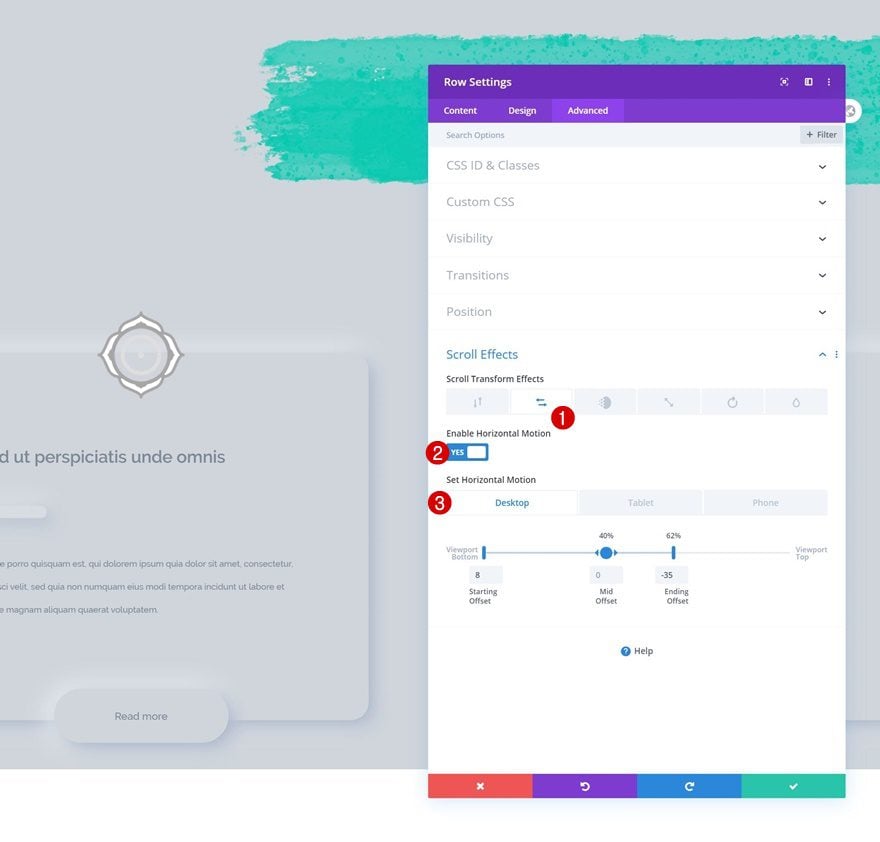
Add Horizontal Motion Scroll Effect
To make the self-scrolling list effect happen, we’ll add some horizontal motion.
- Enable Horizontal Motion: Yes
- Starting Offset:
- Desktop: 8
- Tablet & Phone: 0
- Mid Offset: 0 (at 40%)
- Ending Offset:
- Desktop: -35 (at 62%)
- Tablet & Phone: 0
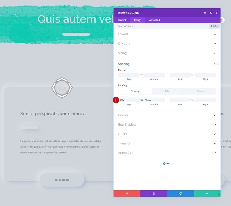
Increase Section Padding
Complete the design by adding some additional padding to your section. That’s it!
- Top Padding: 300px (Desktop), 100px (Tablet & Phone)
- Bottom Padding: 300px (Desktop), 100px (Tablet & Phone)
Preview
Now that we’ve gone through all the steps, let’s taka a final look at the outcome across different screen sizes.
Desktop
Mobile
Final Thoughts
In this post, we’ve shown you how to create a horizontal self-scrolling list with Divi’s scroll effects. As your visitors are scrolling down vertically, the horizontal column list scrolls on its own, revealing different parts of the list at a time. This is a great way to share bulk content and improve your visitors’ user experience. You were able to download the JSON file for free as well! If you have any questions or suggestions, feel free to leave a comment in the comment section below.
If you’re eager to learn more about Divi and get more Divi freebies, make sure you subscribe to our email newsletter and YouTube channel so you’ll always be one of the first people to know and get benefits from this free content.


if the desired outcome l make ,l would use the icon-text module and add scroll-efftes one module by one .too tired.
this tutorial gives me another way .thank you
Can some of the Divi experts explain why json files are so awful confusing?
There are many different divi json usage files, and nobody knows where to use.
I tried to use this lecture json file with no luck on different websites – even after 1 hour work and trying in all areas…
Somehow I get tired with new features and tons of documents, more and more bad usabiltiy and bugs on every new Divi Version.
Neat trick, for sure. And I always appreciate new tricks and tips from Elegant Themes. The content has an amazing track record.
However …
This is not good UX. For the reasons stated in previous comments, but also because the neumorphic design ignores some basic UX concepts.
To start, the horizontal auto scroll will confuse users. Even when they figure it out (which actually shouldn’t take too long), they’ll be annoyed that they don’t have more control. A card carousel is more familiar and offers better control if you want something that moves horizontally. Almost any other design would be better user experience than this (even an extra horizontal scroll bar).
As for the design, I’m not a neumorphism hater like many designers. But you still need to make buttons stand out (add a background color or a border – if you do it right, it can still work with the shadows). Typography should vary enough to show hierarchy. Neumorphic shadows should ONLY be used on elements you can interact with (cards, buttons), not on everything. Why do the divider lines have Neumorphic shadows?
Overall, while it’s a neat concept, I will not be using this design. I can see that it took some skill to create, and I give props for that. It just detracts too much from user experience.
I will look forward to more great content from Elegant Themes and probably from this author as well. This wasn’t my cup of tea, but I’m sure there will be many more posts that I will enjoy, as usual.
Sorry, but this is bad UX, You are asking the user to track diagonally and try read. They first have to learn whats going to happen then try deal with it. You need to add more features to Divi that controls js level interactions, such as locking vertical scroll until the sectional horizontal scroll is done so elements stay centered and a con-formal event occurs. This is a bit all over the place.
I agree with Christyn, but I’m willing to consider seeing this in REAL time. What you all are asking us to look at are jittery GIFs, so it’s not easy to tell. Not to mention that in THIS example, everything is in gray with really small type in off black.
BUT, that said, when anyone scrolls on a website, the scrolling is NOT smooth. It jitters, it moves in galumphs because of how we use scroll bars and even the mouse. Most of us do NOT use the scroll wheel on automatic when perusing websites. So what results is visually uncomfortable. And this new scrolling thing that Divi does in the BEST of circumstances moves in fits and starts.
Personally, I see NO advantage, use, or improvement of UX with this whatsoever. It’s an invention no one wanted.
But, that’s just my opinion for a theme I dearly love.
Even my wife does some dumb things. At least I think I remember one.