
There are many ways you can use Blurb Modules throughout your page design and now, with Divi and its scroll effects, animating them on scroll becomes an effortless experience. In today’s tutorial, we’ll show you how to create an expanding circular blurb layout that you can use to emphasize four different Blurb Modules. We’ll use Divi’s absolute positioning to achieve our desired outcome and add a separate scroll effect to the entire row container. You’ll be able to download the JSON file for free as well!
Let’s get to it.
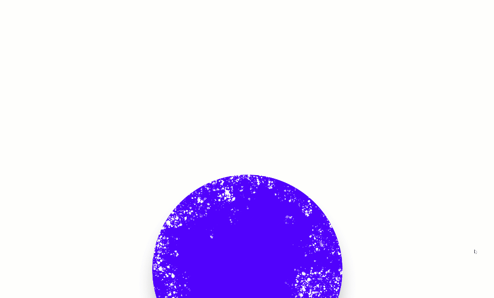
Preview
Before we dive into the tutorial, let’s take a quick look at the outcome across different screen sizes.
Desktop
Mobile

Download The Blurb Expanding Layout for FREE
To lay your hands on the free blurb expanding layout, you will first need to download it using the button below. To gain access to the download you will need to subscribe to our newsletter by using the form below. As a new subscriber, you will receive even more Divi goodness and a free Divi Layout pack every Monday! If you’re already on the list, simply enter your email address below and click download. You will not be “resubscribed” or receive extra emails.

1. Recreate All Elements
Add New Section
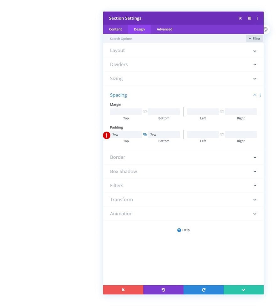
Spacing
Start by adding a new section to the page you’re working on. Open the section settings and modify the top and bottom padding.
- Top Padding: 7vw
- Bottom Padding: 7vw
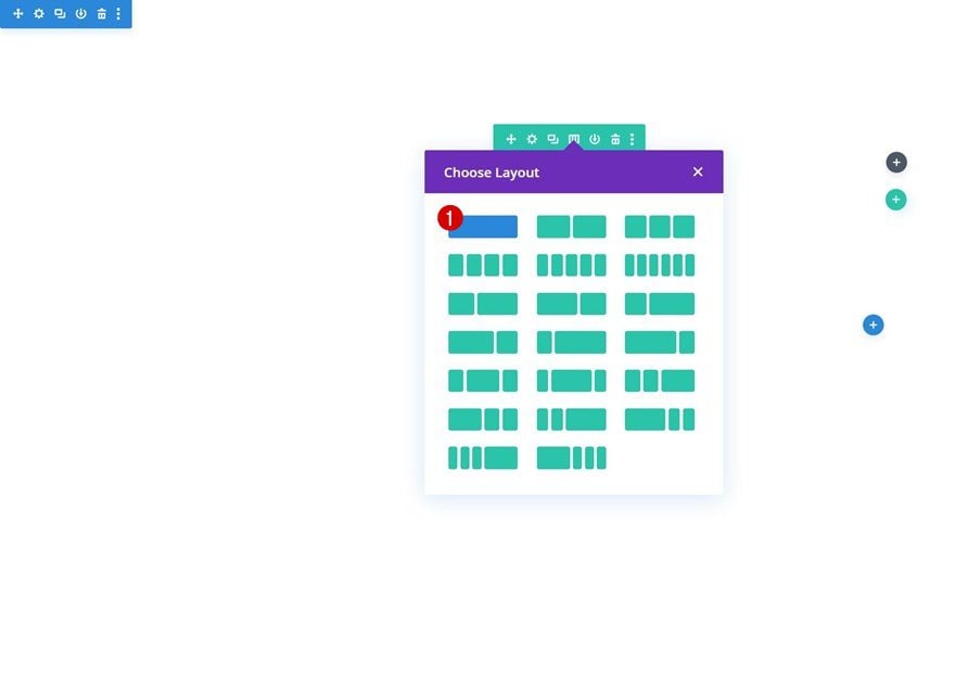
Add Row
Column Structure
Continue by adding a new row using the following column structure:
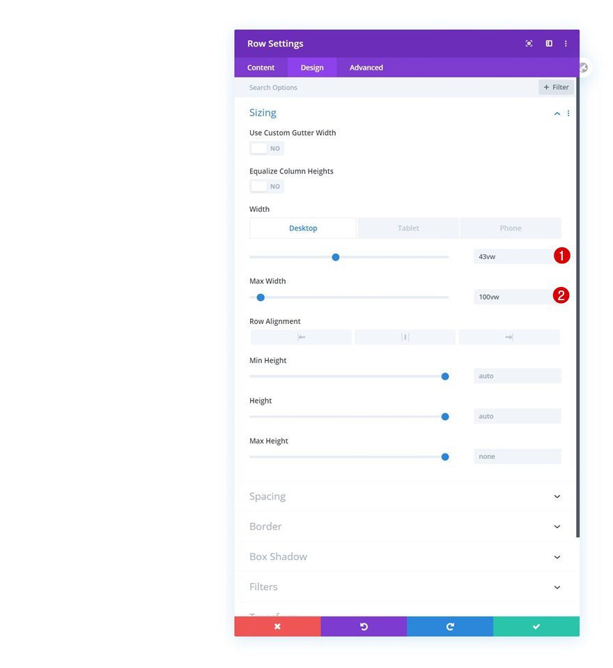
Sizing
Without adding any modules yet, open the row settings and modify the sizing settings as follows:
- Width: 43vw (Desktop), 85vw (Tablet & Phone)
- Max Width: 100vw
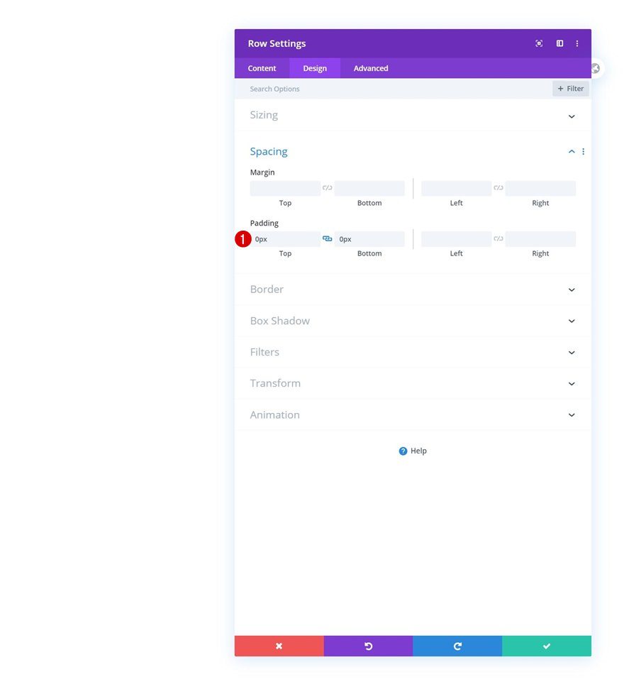
Spacing
Remove all default top and bottom padding next.
- Top Padding: 0px
- Bottom Padding: 0px
Column Settings
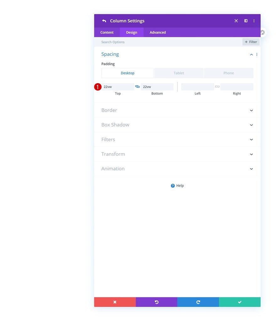
Spacing
Then, open the column settings and add some custom padding values across different screen sizes.
- Top Padding: 22vw (Desktop), 40vw (Tablet), 44vw (Phone)
- Bottom Padding: 22vw (Desktop), 40vw (Tablet), 44vw (Phone)
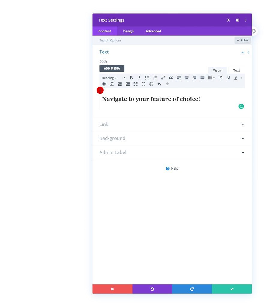
Add Text Module to Column
Add H2 Content
Time to add modules, starting with a Text Module containing some H2 content of your choice.
H2 Text Settings
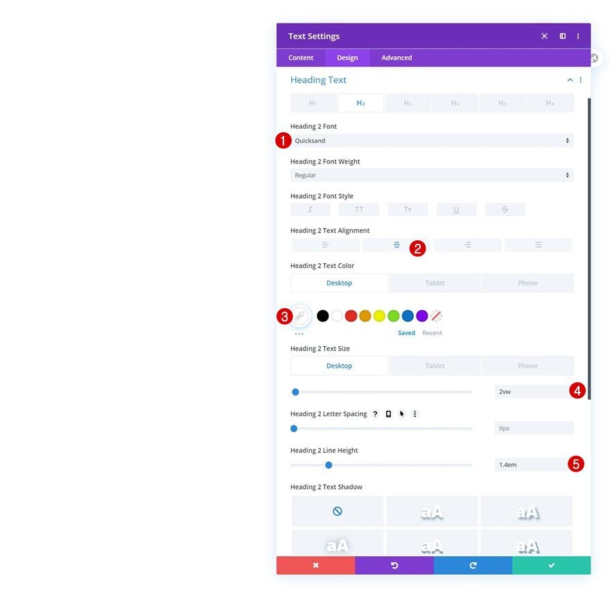
Move on to the module’s design tab and change the H2 text settings as follows:
- Heading 2 Font: Quicksand
- Heading 2 Text Alignment: Center
- Heading 2 Text Color: #ffffff (Desktop), #000000 (Tablet & Phone)
- Heading 2 Text Size: 2vw (Desktop), 6vw (Tablet), 7vw (Phone)
- Heading 2 Line Height: 1.4em
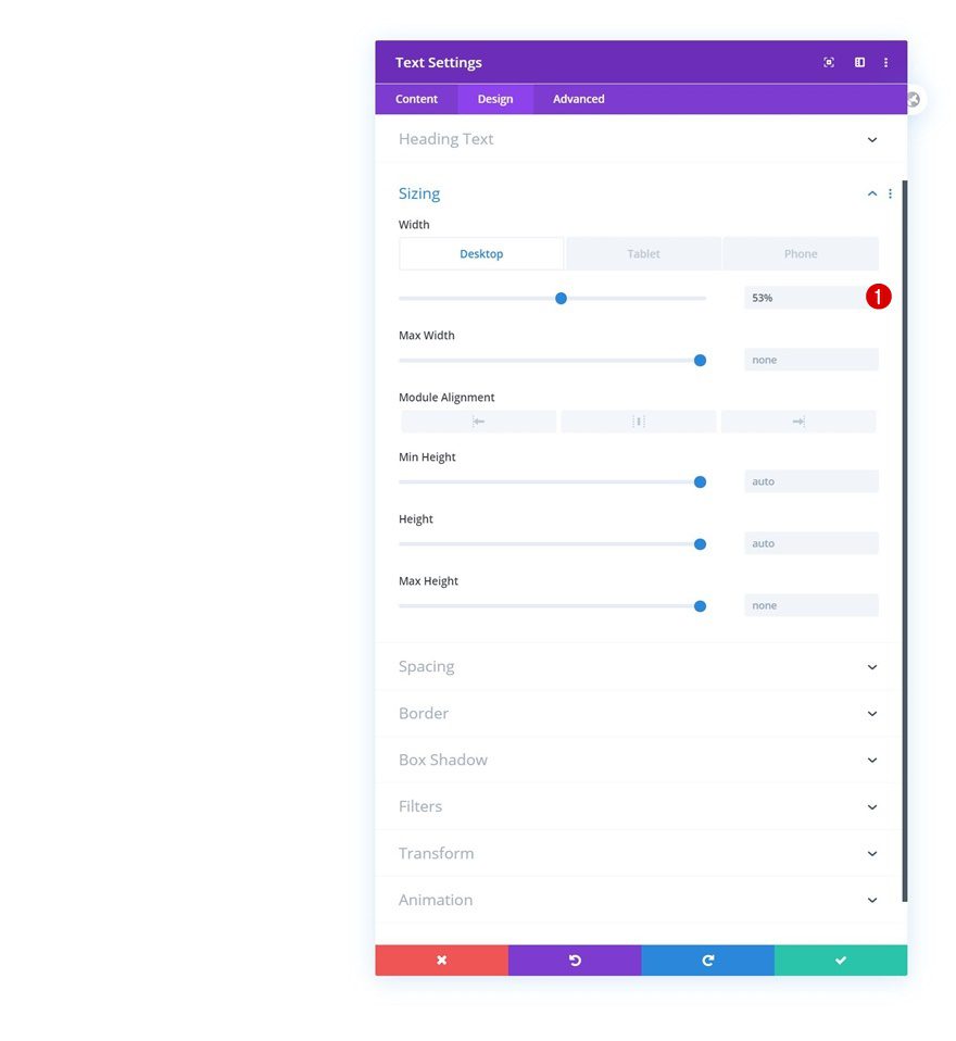
Sizing
Modify the width values across different screen sizes too.
- Width: 53% (Desktop), 70% (Tablet & Phone)
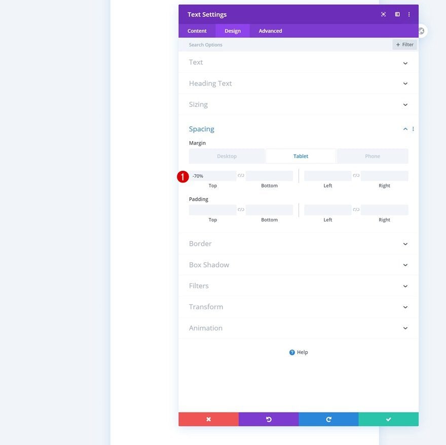
Spacing
Then, add some responsive top margin.
- Top Margin: 0% (Desktop), -70% (Tablet), -80% (Phone)
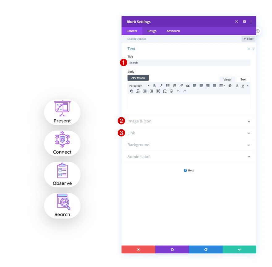
Add Blurb Module to Column
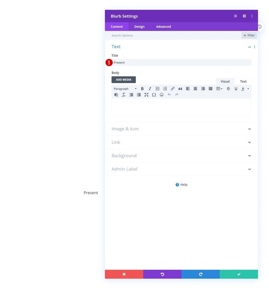
Add Content
The next module we need is a Blurb Module. Enter a title of your chocie.
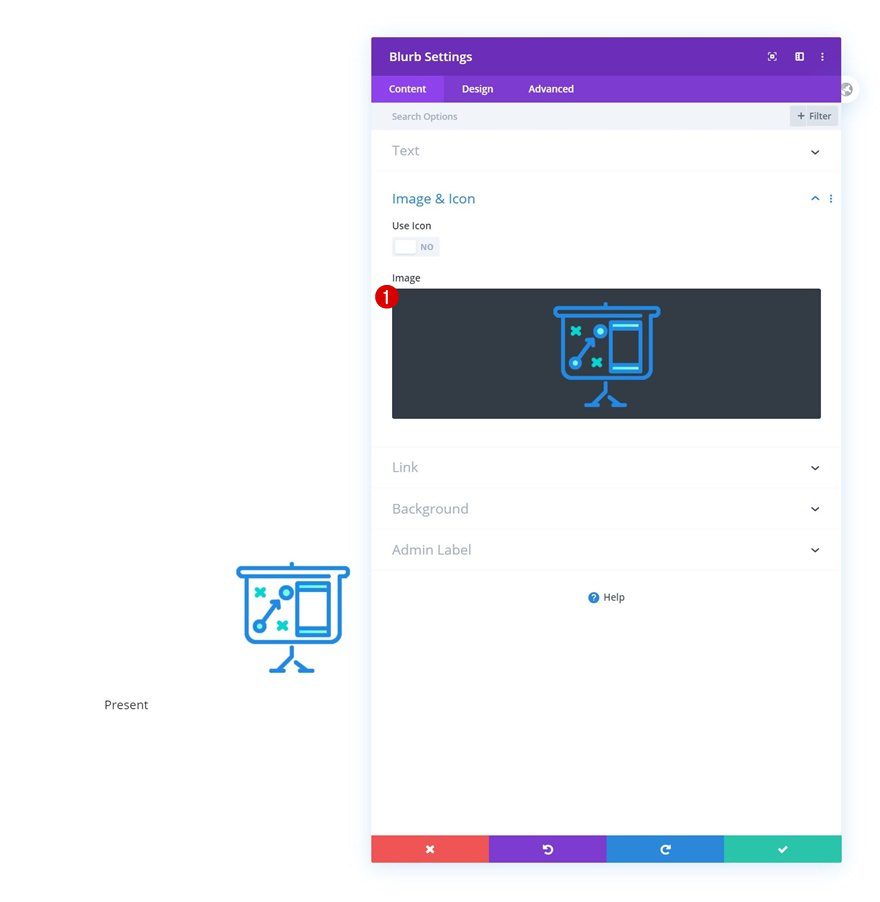
Upload Image
Upload an image next. You can find the ones we’re using throughout this tutorial in the download file at the beginning of this tutorial.
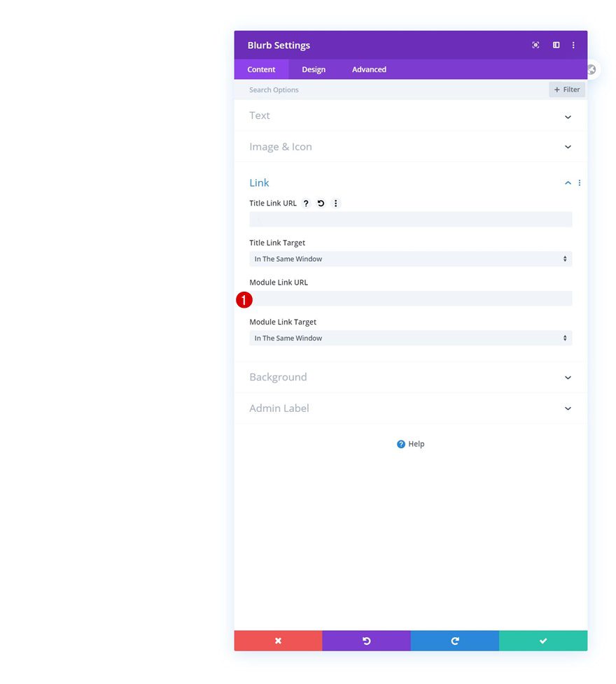
Add Link
Add a link too.
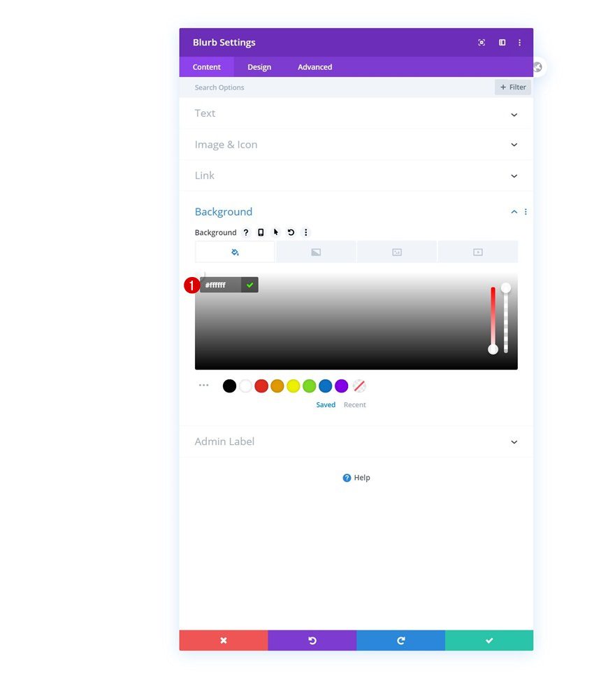
Background Color
Along with a background color.
- Background Color: #ffffff
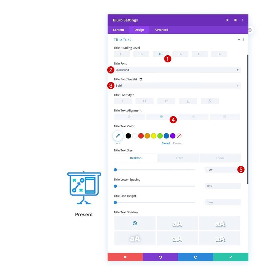
Title Text Settings
Move on to the design tab and change the title text settings as follows:
- Title Heading Level: H3
- Title Font: Quicksand
- Title Font Weight: Bold
- Title Text Alignment: Center
- Title Text Size: 1vw (Desktop), 3vw (Tablet & Phone)
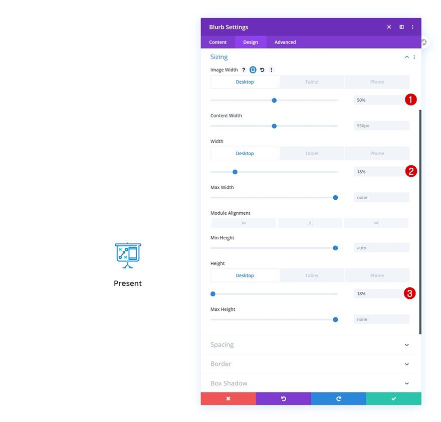
Sizing
Then, make some changes to the sizing settings.
- Image Width: 50% (Desktop), 30% (Tablet), 25% (Phone)
- Width: 18% (Desktop), 23% (Tablet), 30% (Phone)
- Height: 18% (Desktop), 23% (Tablet), 30% (Phone)
Border
We’re adding some border radius too.
- All Corners: 500px
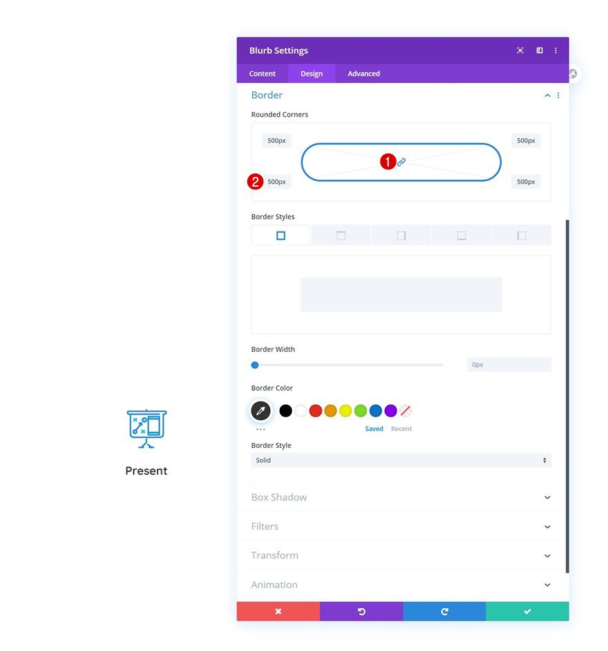
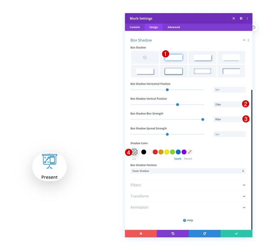
Box Shadow
Up next, we have a subtle box shadow.
- Box Shadow Vertical Position: 23px
- Box Shadow Blur Strength: 80px
- Shadow Color: rgba(0,0,0,0.19)
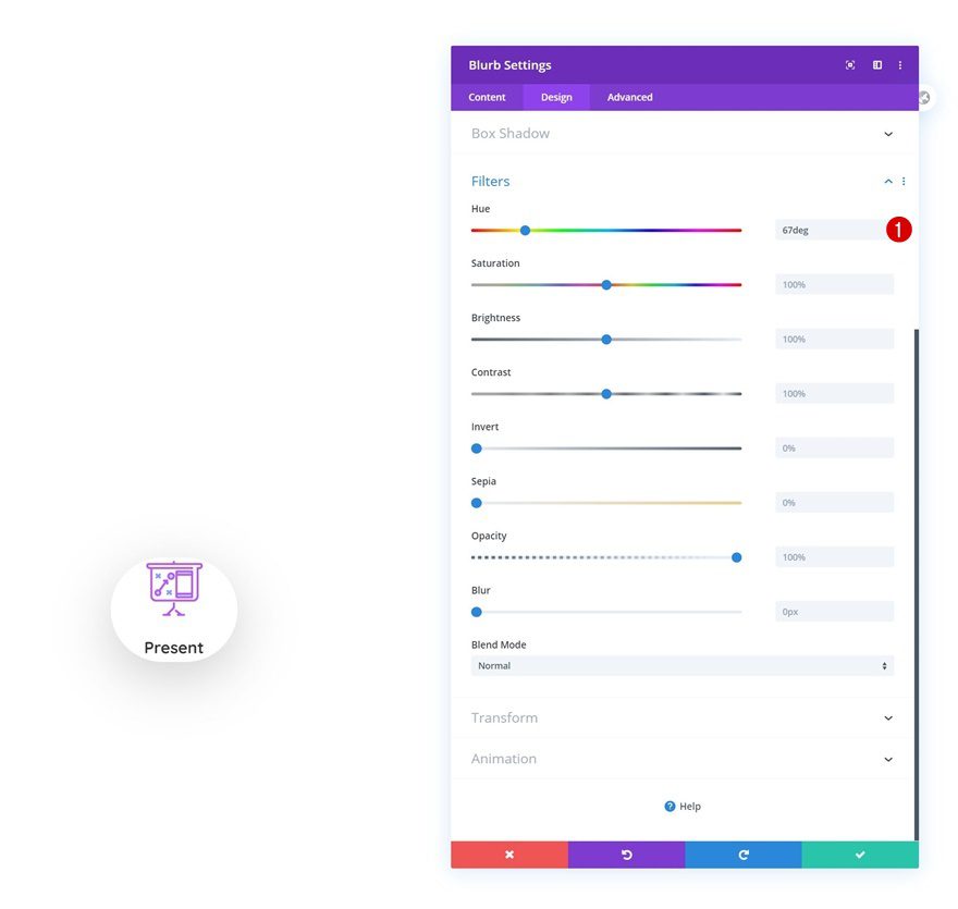
Filter
And we’ll change the hue in the filters settings as well.
- Hue: 67deg
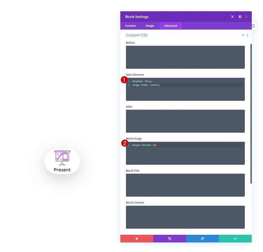
Main Element & Blurb Image CSS
Now, navigate to the advanced tab and add some custom CSS code lines to make some additional responsive tweaks.
Main Element:
display: flex;
align-items: center;
Blurb Image:
margin-bottom: 0px
Clone Blurb Module Three Times
Once you’ve completed the first Blurb Module, you can clone it three times.
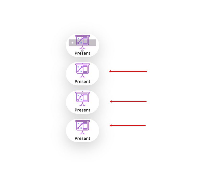
Change Content, Icon & Link
Make sure you change the title, icon and link for each duplicate.
2. Put The Pieces Together
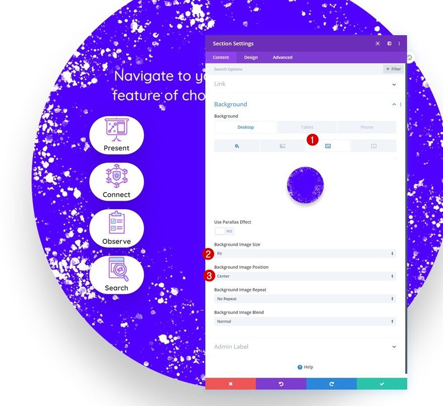
Add Responsive Section Background Image
Now that we have all the elements in place, it’s time to put the pieces together. First, we’ll upload a section background image and modify the background image position across smaller screen sizes. You can find the background image we’re using in the download post that was shared at the beginning of this tutorial.
- Background Image Size: Fit
- Background Image Position: Center (Desktop), Bottom Center (Tablet & Phone)
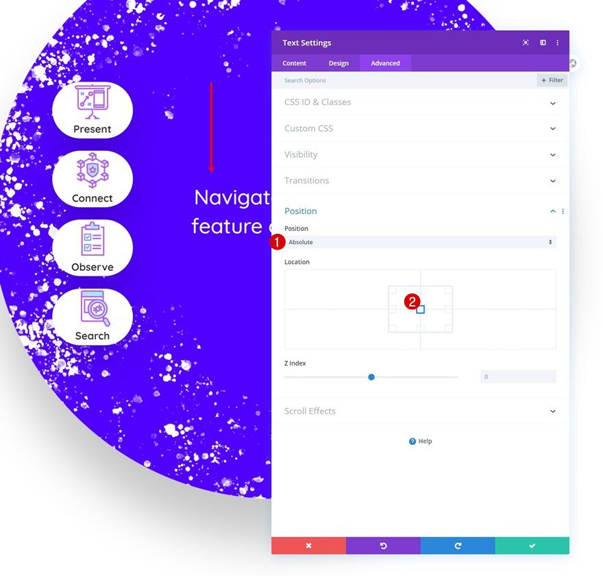
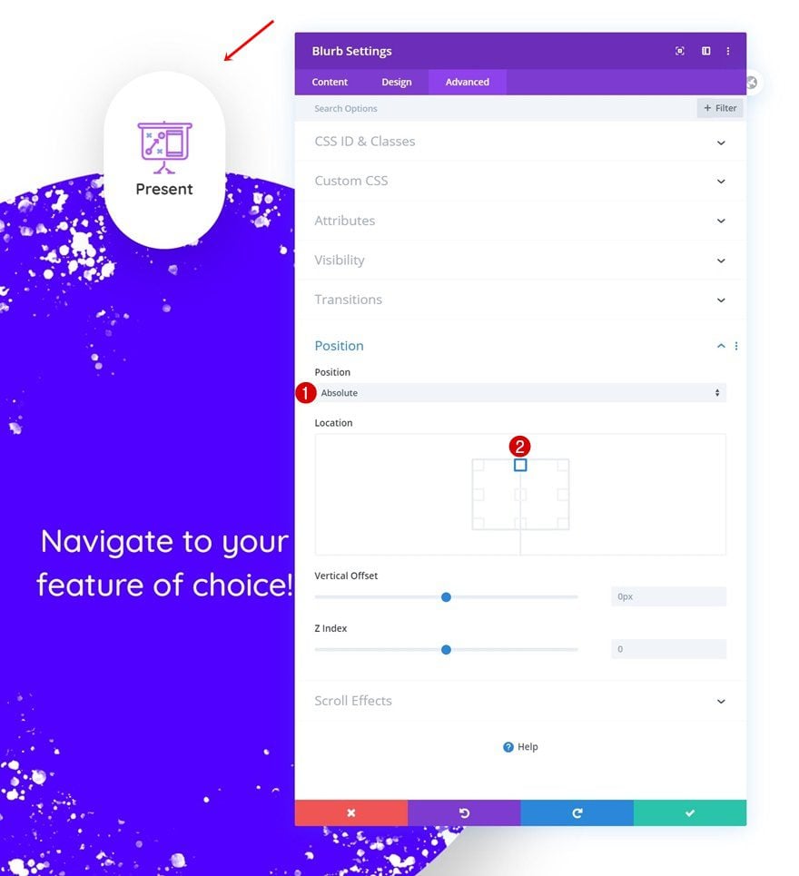
Text Module Position
Next, we’ll open the Text Module and change the position.
- Position: Absolute
- Location: Center
Blurb Module #1 Position
Then, we’ll open the first Blurb Module in the list and change the position accordingly:
- Position: Absolute
- Location: Top Center
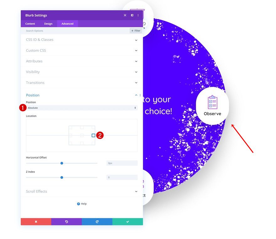
Blurb Module #2 Position
We’ll modify the second Blurb Module’s position too.
- Position: Absolute
- Location: Bottom Center
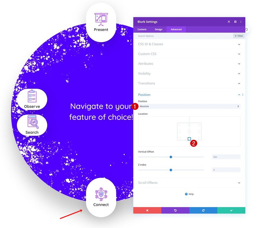
Blurb Module #3 Position
Up next, we’ have the third Blurb Module’s position.
- Position: Absolute
- Location: Right Center
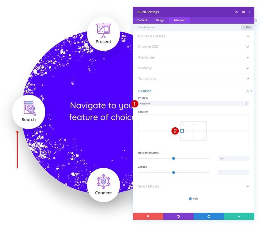
Blurb Module #4 Position
And last but not least, we’ll also reposition the fourth Blurb Module as follows:
- Position: Absolute
- Location: Left Center
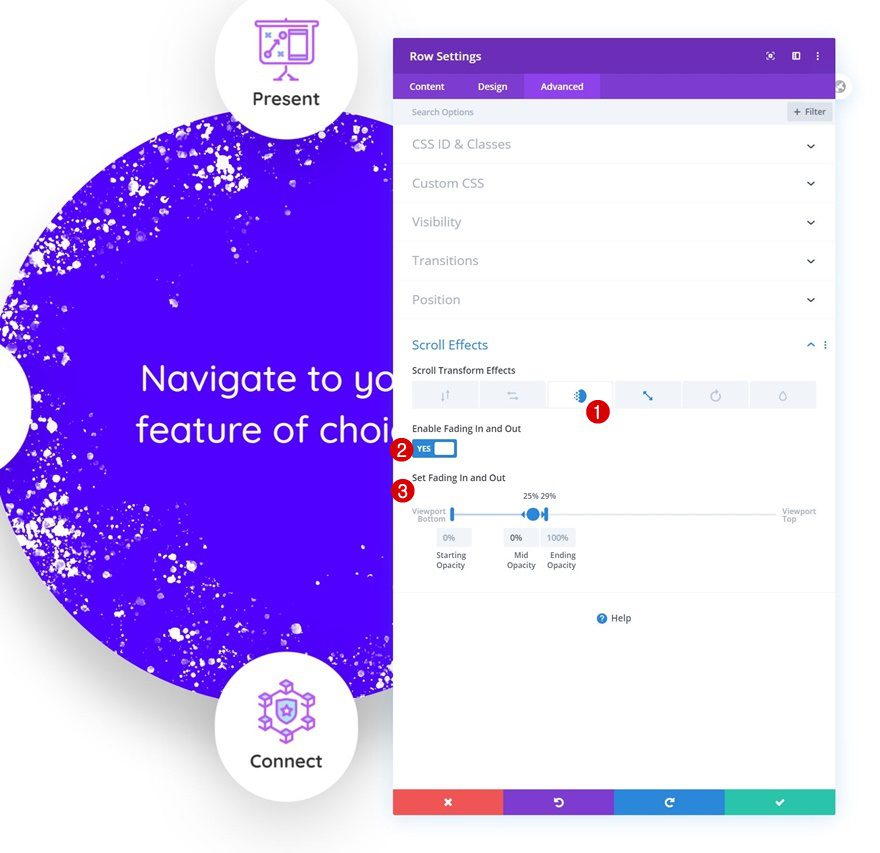
Row Fading In and Out Scroll Effect
The last steps to this tutorial include adding a fading in and out scroll effect to the row container.
- Enable Fading In and Out: Yes
- Starting Opacity: 0%
- Mid Opacity: 0% (at 25%)
- Ending Opacity: 100% (at 29%)
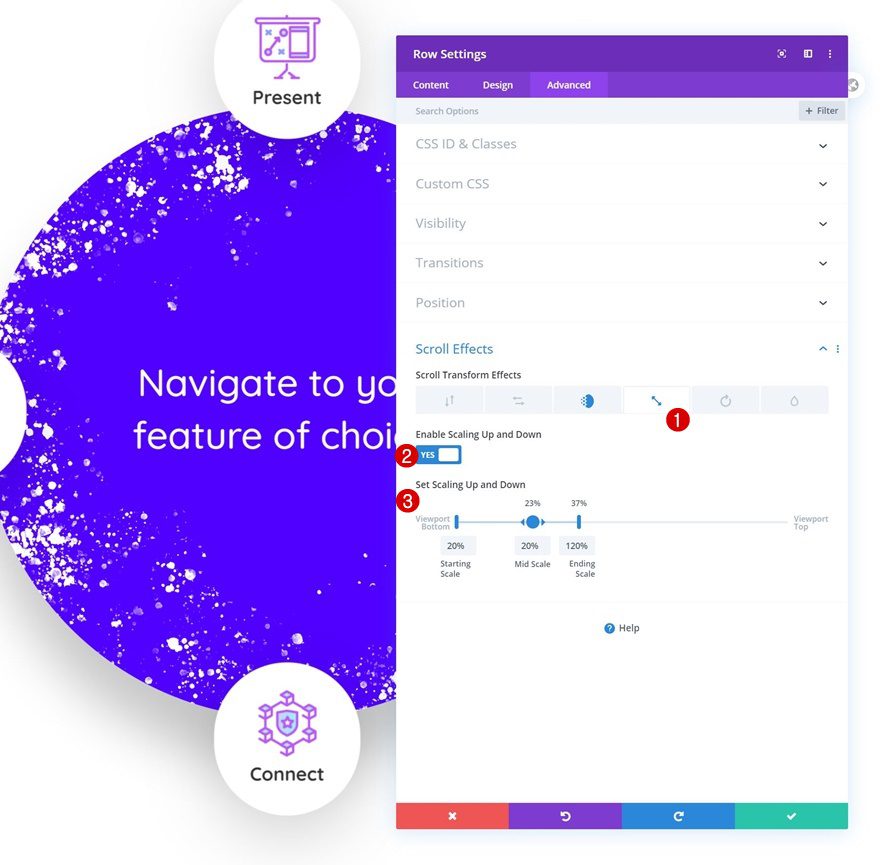
Row Scaling Up and Down Scroll Effect
Complete the design and effect using a row scaling up and down scroll effect and you’re done!
- Enable Scaling Up and Down: Yes
- Starting Scale: 20%
- Mid Scale: 20% (at 23%)
- Ending Scale: 120% (at 37%)
Preview
Now that we’ve gone through all the steps, let’s take a final look at the outcome across different screen sizes.
Desktop
Mobile
Final Thoughts
In this post, we’ve shown you how to get creative with Divi’s new scroll effects. More specifically, we’ve shown you how to create an expanding blurb effect that highlights the different blurb items in a circular element. You were able to download the JSON file for free as well! If you have any questions, feel free to leave a comment in the comment section below.
If you’re eager to learn more about Divi and get more Divi freebies, make sure you subscribe to our email newsletter and YouTube channel so you’ll always be one of the first people to know and get benefits from this free content.


In Mobile and tab view , Three icons are showing , one is not showing. The same problem occurs with with the JSON file provided in this post.
Can you tell how to solve this problem ? plz
You have shown us how to create, thats good, for people who cannot do it you have provided with a link to free download the JSON file, but no where did you explain how to install this JSON file
the “json” file is installed through import / export
Here are instructions on how to import the layout:
https://www.elegantthemes.com/documentation/divi/library-import/
Hope this helps!