
I think we can all agree upon the fact that Divi is highly versatile. There are so many possibilities to customize and personalize any website you’re building. If you’re looking to give your work productivity a boost, this might be the ideal post for you. We’re going to cover 7 Divi UX best practices that you might or might not be familiar with. The 7 tips I’ll share are some I personally use a lot and benefit from while working with Divi on a daily basis.
Let’s get to it!
- 1 1. Using Micro Animations
- 2 2. Optimizing Responsiveness Manually
- 3 3. Using Viewport Units Instead of Pixels
- 4 4. Extending Style for Text Orientation
- 5 5. Switching Back and Forth Between Visual Builder & Wireframe Mode
- 6 6. Import/Export Layout Directly on Page
- 7 7. Using the ‘Zoom out’ Option Regularly to Keep Perspective
- 8 Final Thoughts
1. Using Micro Animations
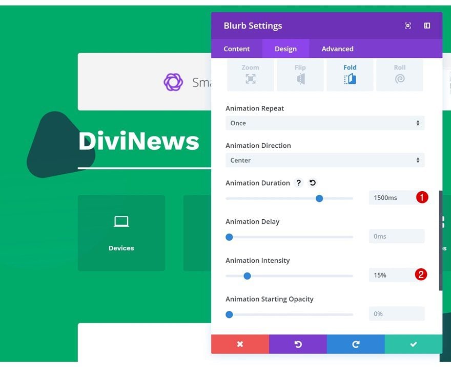
The first Divi UX best practice you might want to keep in mind is using micro animations instead of excessive ones. There used to be a time where the more animations a website had, the ‘more customized’ or ‘advanced’ it seemed to the public. However, those times are over. Besides looking really fancy, excessive animations don’t contribute to the overall user experience people have on your website. As a matter of fact, they can often distract visitors from what’s really important. Opting for micro animations instead is the way to go. Divi’s animation options allow you to customize the speed and intensity of any animation you add. The key to creating micro animations is using a low animation intensity with a slightly longer animation duration.
Go to Design Tab of a Design Element
Open any design element of your choice and go to the advanced tab. There, you’ll find the animation options.
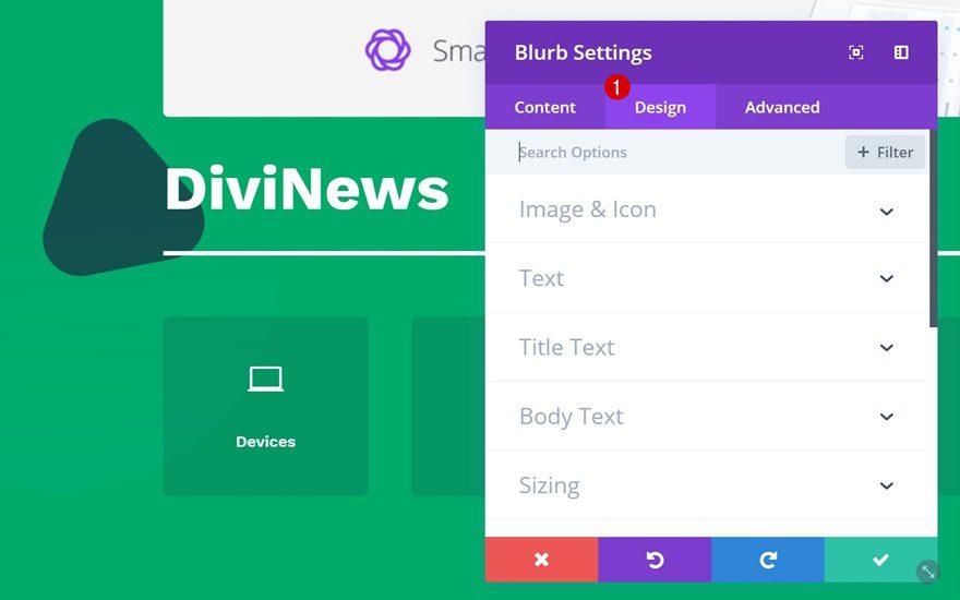
Use Small Amounts of Animation Intensity
You can pick any animation type and decrease the animation intensity. The lower you go, the more subtle the animation becomes. By increasing the animation duration, you’ll make sure the animation doesn’t go unnoticed.
2. Optimizing Responsiveness Manually
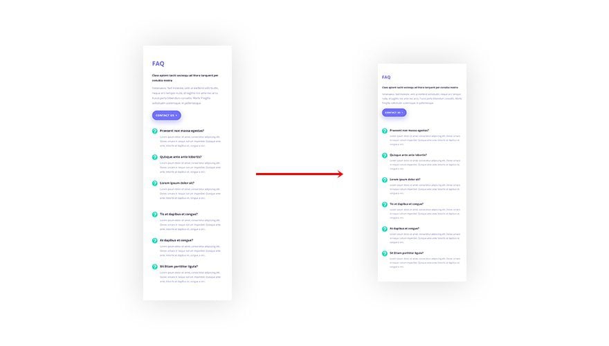
One of Divi’s biggest advantages is the fact that it’s easy to make any layout you’re creating responsive as well. As a matter of fact, Divi does most of the work for you already. Everything you create becomes responsive from the moment you add it. From that point forward, the only thing left to do is manually make changes to design elements. This includes changing the text size of copy you’re sharing according to screen size, for instance.
Now, rows and columns have a predefined margin value built-in that changes according to the screen size. But you don’t necessarily have to go with these default values. I, for instance, have found that many popular websites use less left and right margin on smaller screen sizes. That way, you can fit more content horizontally, which means less vertical scrolling is required.
The default left and right margin that is used on smaller screen sizes is 40px. To take advantage of the entire width of smaller screen sizes, I recommend replacing this value with 25px.
Let’s go through the process step by step.
Change Row Sizing
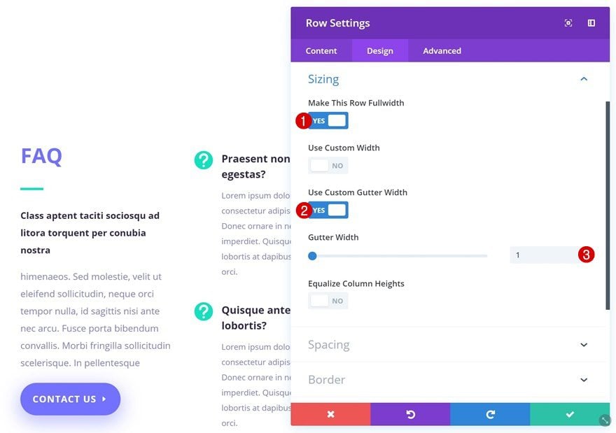
The first thing you’ll need to do is remove all the space between sections, rows and modules by enabling the following options in the sizing settings of the row:
- Make This Row Fullwidth: Yes
- Use Custom Gutter Width: Yes
- Gutter Width: 1
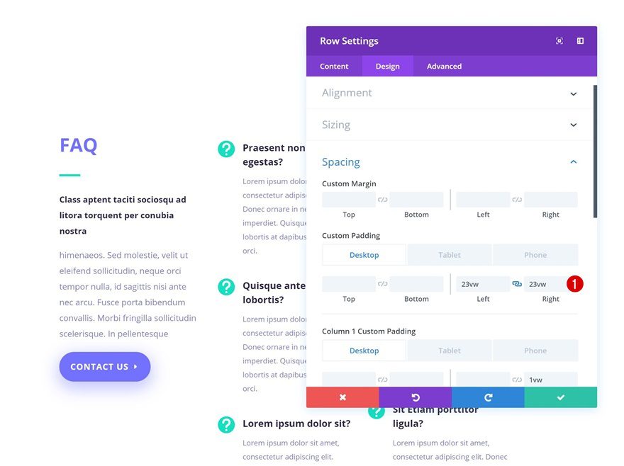
Add Section OR Row Padding
Now, we still want to have sufficient space between the section and the row. You can choose if you want to add left and right custom padding to the row or section you’re working on. Adding it to the row won’t affect other rows in the section. But on the other hand, applying it to sections will make sure these margins remain the same throughout the entire section, no matter how many rows you’re adding.
- Left Padding: 23vw (Desktop), 30px (Tablet), 25px (Phone)
- Right Padding: 23vw (Desktop), 30px (Tablet), 25px (Phone)
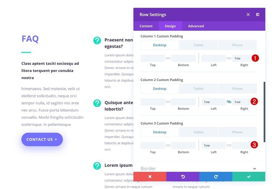
Add Column Padding
The space between columns and modules is important as well. You can customize these values according to different screen sizes.
- Column 1 Right Padding: 1vw (Desktop), 0vw (Tablet & Phone)
- Column 2 Left Padding: 1vw (Desktop), 0vw (Tablet & Phone)
- Column 2 Right Padding: 1vw (Desktop), 0vw (Tablet & Phone)
- Column 3 Left Padding: 1vw (Desktop), 0vw (Tablet & Phone)
Decrease Text Sizes
Want to 100% utilize the horizontal width you get on smaller screen sizes? Although 13px for body text size might seem small from a laptop’s perspective, it’s usually more than enough for a mobile device. Try viewing a 13px body text size from your mobile phone, in combination with the steps above, and you’ll see what I’m talking about!
3. Using Viewport Units Instead of Pixels
This is one of the things we’ve done in the previous step as well. To make sure your website remains responsive across all desktop screen sizes, it’s recommended you use viewport units instead of pixels. This will make sure your website looks great and exactly the way you’ve designed it, even on 27″ desktop monitors.
Smaller screen sizes, on the other hand, don’t tend to differ as much as a 15″ vs a 27″ desktop screen. It might help to use viewport units when creating vertical overlaps but sticking with pixels for left and right padding/margin won’t do any harm.
4. Extending Style for Text Orientation
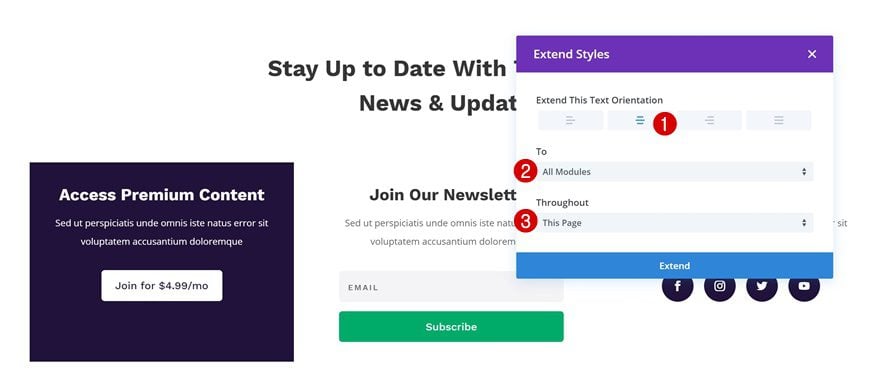
One of the things people will quickly notice on your website, even subconsciously, is how consistent you are in the design you’ve built. This includes, but is not limited to, the text orientation you use throughout your pages. One of Divi’s UX best practices is finishing a design by checking the text orientation. You can sure combine different text orientations within a page, if they’re well thought out and played out. But, it gets more difficult when you’re combining different text orientations in one particular section. The best scenario; you keep one text orientation throughout your page. But if you feel like experimenting more, try to at least keep one kind of text orientation per section. You can do that by just taking a look at all the different design elements, or you can use one of Divi’s efficiency features that’ll do the job for you.
In just a few steps, you can make sure you’re using the same text orientation, and consistency, throughout your entire page or section.
Let’s go through those steps.
Open Any Module That Contains Text
Open any module on your page that contains text and go to the text settings.
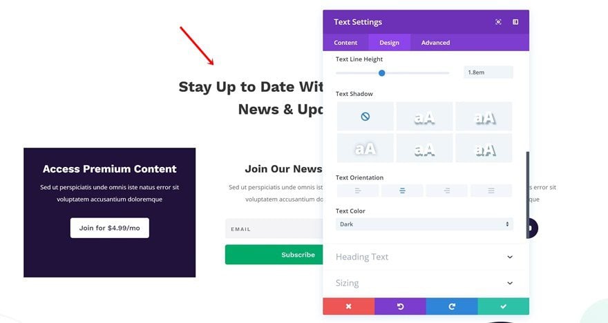
Right Click Text Orientation Option
Right-click the Text Orientation option you can find in the text settings and select the ‘Extend Styles‘ option.
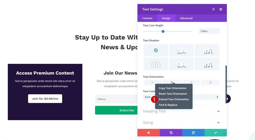
Extend Text Orientation of Choice Throughout Section or Entire Page
Now, depending on how consistent you want the text orientation to be throughout your page, you can choose to extend the text orientation of your choice throughout the entire layout or a particular section.
5. Switching Back and Forth Between Visual Builder & Wireframe Mode
One of the great things about Divi’s Visual Builder is that you don’t even have to choose between editing something in the backend or frontend. Changing between both takes literally less than one second. I’m of the opinion that you can get the best level of productivity and overview if you combine both. Especially if you’re dealing with multiple overlaps in your layout, switching over to wireframe mode can help you make changes quickly. Or, if you’re looking to drag and drop a certain design element elsewhere on the page, you can make it easier by switching over to wireframe mode and dragging that particular element without having to scroll endlessly.
And did you know that you can open a design element’s modal and switch between Visual Builder and Wireframe Mode while still having the modal open? This allows you to make changes in the backend of your design and watch your new design settings fall into place whenever you want to.

6. Import/Export Layout Directly on Page
By now, we’ve all gotten used to the premade layouts, saved layouts and the Divi Library in general. But say you’re working on a particular page on a local host, and you want to upload it to a live website once it’s done, without going through the hassle of:
- Saving the layout to your Divi Library
- Going to your Divi Library and exporting the JSON file
- Going to your live website’s Divi library
- Uploading the JSON file
- Going to your live website’s page
- Uploading the JSON file from your saved layouts
Then, you can simply use the import/export option that’s right there on your page. This will allow you to create a JSON file without having to access the Divi Library at all.
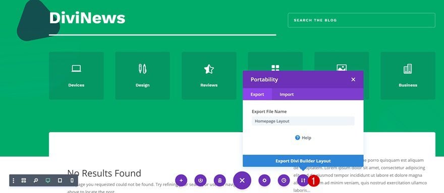
The same way you’ve exported the layout, you’ll be able to import the layout to your new page. But know that once you choose this approach, you won’t be able to import the layout to your Divi Library on your live website. Only directly to a page.
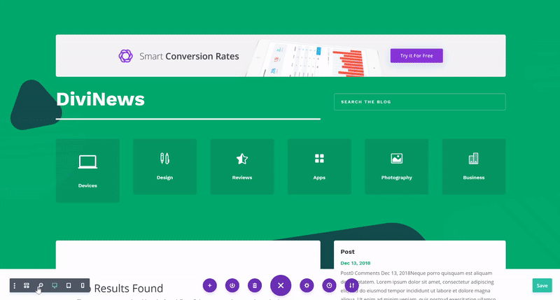
7. Using the ‘Zoom out’ Option Regularly to Keep Perspective
This is probably one of my favorite Divi UX features. I’m sure we’ve done it all before; open a new regular tab or incognito window to see the outcome of a page we’ve made. And then, taken a print screen of the entire page using a Chrome extension or Firefox add-on. All of this to give yourself a fresh view on the layout you’re working on and seeing if everything fits in the overall page structure.
Although I still recommend doing that occasionally, you won’t have to do it multiple times within a short amount of time. Instead, use the zoom-out option that’s right there, in your Visual Builder. This will not only give you the perspective you were looking for, but it’ll also help you make quick changes without ever having to leave the page.
Final Thoughts
In this post, we’ve shown you 7 different Divi best practices that’ll help you boost productivity when creating websites with Divi. These tips will surely come in handy when creating any kind of website! If you have any questions or suggestions, make sure you leave a comment in the comment section below!
Featured Image by aurielaki / shutterstock.com


Great article. Very useful pieces of information which are today almost obligated mandatory in UX design
Always I love divi article.It gives me new energy to create awesome layout and website.
You know what would be nice? If Divi allowed different Text Orientation for different screen sizes. So often, centered doesn’t make sense on mobile, but looks great on desktop. Right now I just duplicate the modules in question and hide them respectively on different screensizes. Or, I could probably do some overriding by adding media targets and left align all for mobile.
Thanks Donjete, you gave excellent suggestions explained with the usual clarity and professionalism. I hope that you will soon share with us other suggestions. Happy Holidays
Thank you for the tips, as a private beginner I found the responsiveness part particularly useful. Much appreciated 🙂
When will you finally realize that an additional link to the end result of your tipops would be more useful than such childish screenshots? It would also make it easier to understand your tips.
But what do I know…
From all the posts that I have read relating to UX, it was the best undoubtedly! In fact the post is so well oriented and user friendly that it proves all your points! Excellent post!
Love this post! Thank you, Donjete!
Nice article, will you be updating djvi defaults to take advantage of these tips as well?
Absolutely love these instructional posts from Donjete! Thank you, please keep them coming.
I would definitely like to see Viewport units used as default in Divi or toggle all Pixel Units to Viewport automatically in the back-end. Having to change all the default margins and padding manually really bloats my time.
Great article!
I do almost all of this when I design too especially when zooming out. It’s like stepping back from a large painting to see how the whole thing looks. I also agree 100% on the animations. Too many web designs I’ve seen have so many animations it’s overwhelming!
IE still does not fully support Viewport Units. Do you have any IE hacks to aid in supporting IE?
Thank you, as Divi goes through all the changes sometimes it is hard to keep up. I found this article helpful. Again Thank you.
Elsie