
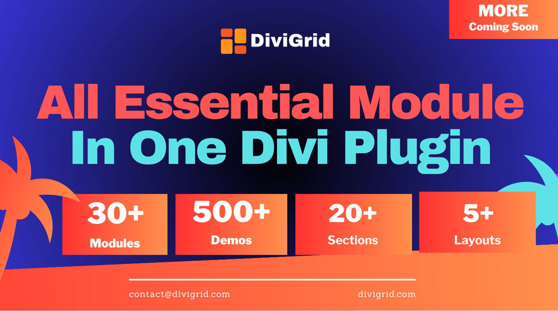
DiviGrid is a plugin that adds 30+ new modules to the Divi Builder. With these additional modules, you can build complex layouts to showcase your content in interesting ways. This plugin includes several plugins that make it easy to display content in a grid, ideal for showcasing features, products, services, and more. The modules include extensive design settings, interesting animation and hover effects, and intuitive controls over the order and layout of the items. Additionally, the plugin has 500+ demo layouts you can use to jumpstart your own designs.
In this post, we’ll take a look at DiviGrid to help you decide if it’s the right Divi product for your next web design project.
Let’s get started!
- 1 Installing DiviGrid
- 2 DiviGrid Settings
-
3
DiviGrid Modules
- 3.1 Advanced Blurb
- 3.2 Advanced Heading
- 3.3 Advanced Image Carousel
- 3.4 Advanced Person
- 3.5 Advanced Price List
- 3.6 Advanced Tab
- 3.7 Before After Image
- 3.8 Blog Carousel
- 3.9 Business Hour
- 3.10 Content Grid
- 3.11 Floating Image
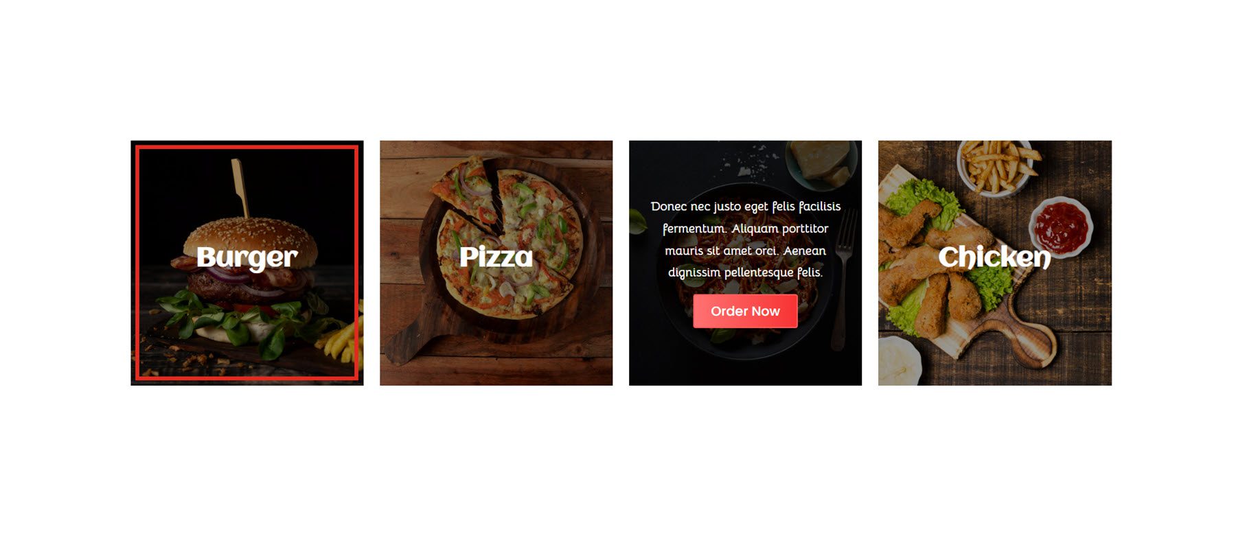
- 3.12 Food Menu
- 3.13 Gradient Text
- 3.14 Honeycomb
- 3.15 Image Accordion
- 3.16 Image Caption
- 3.17 Image Carousel
- 3.18 Image Hotspot
- 3.19 Inline Popup
- 3.20 Interactive Card
- 3.21 Justified Gallery
- 3.22 List Grid
- 3.23 Masonry Gallery
- 3.24 Multiple Button
- 3.25 Post Grid
- 3.26 Scroll Multiple Image
- 3.27 Single Image Scroll
- 3.28 Social Share
- 3.29 Star Rating
- 3.30 Tilt Image Card
- 4 Where to Purchase DiviGrid
- 5 Final Thoughts
Installing DiviGrid
Before you begin, make sure the Divi theme is installed and active on your website.
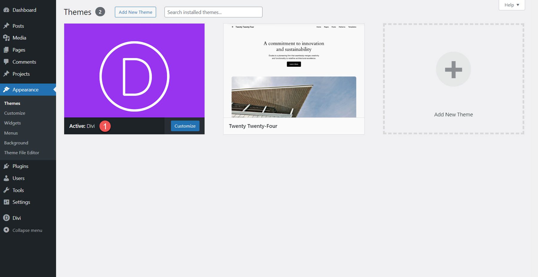
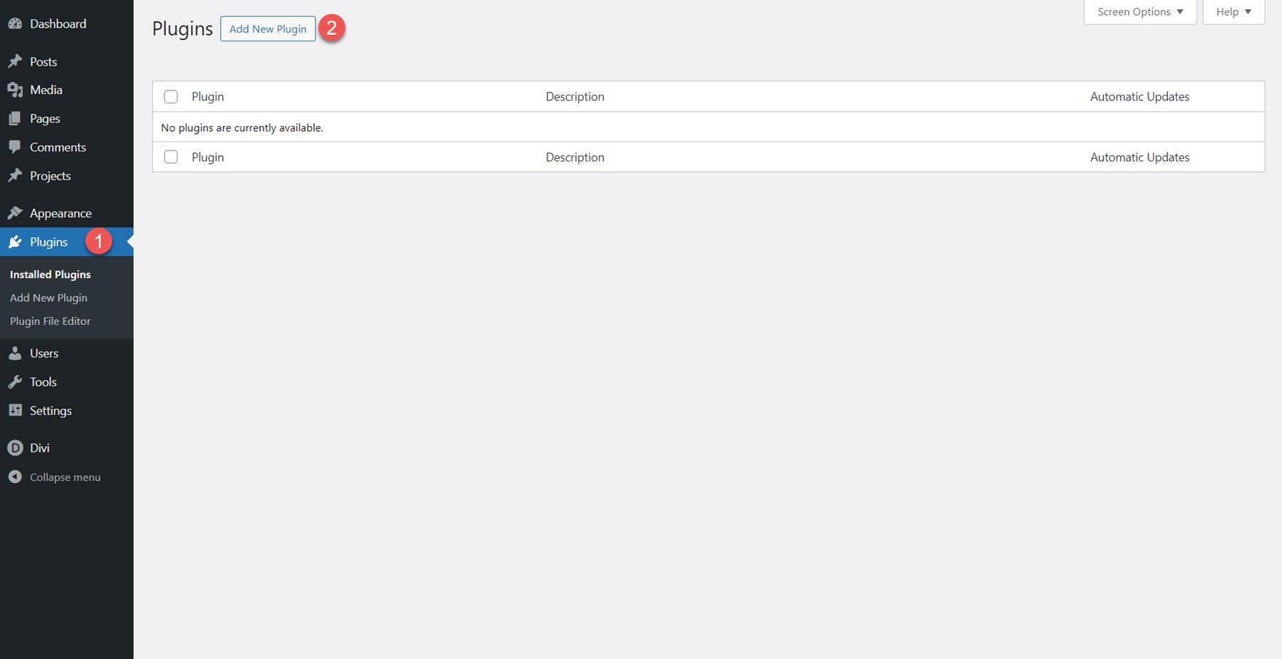
DiviGrid can be installed just like any other WordPress plugin. Open the plugins page in the WordPress dashboard, then click Add New.
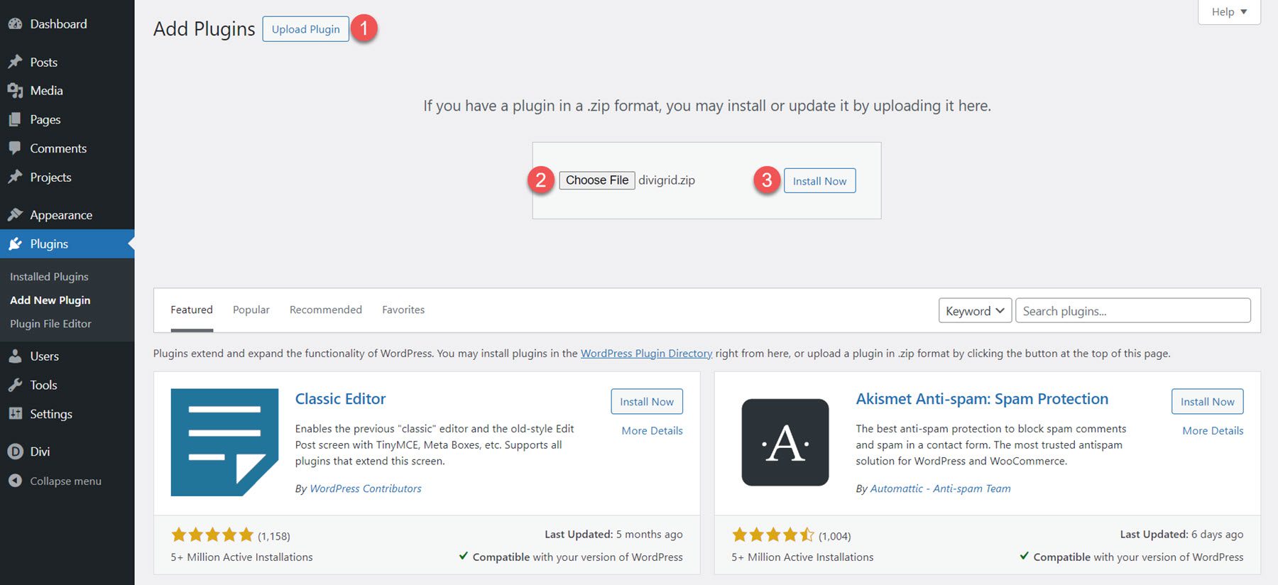
Click Upload Plugin at the top, then select the plugin file and click Install Now.
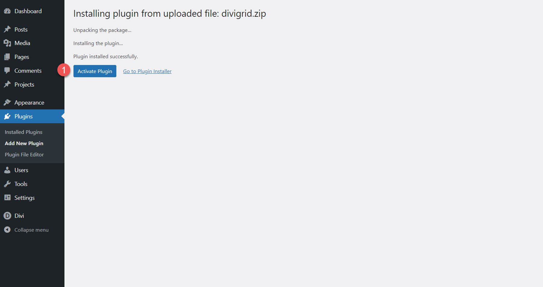
Once installed, activate the plugin.
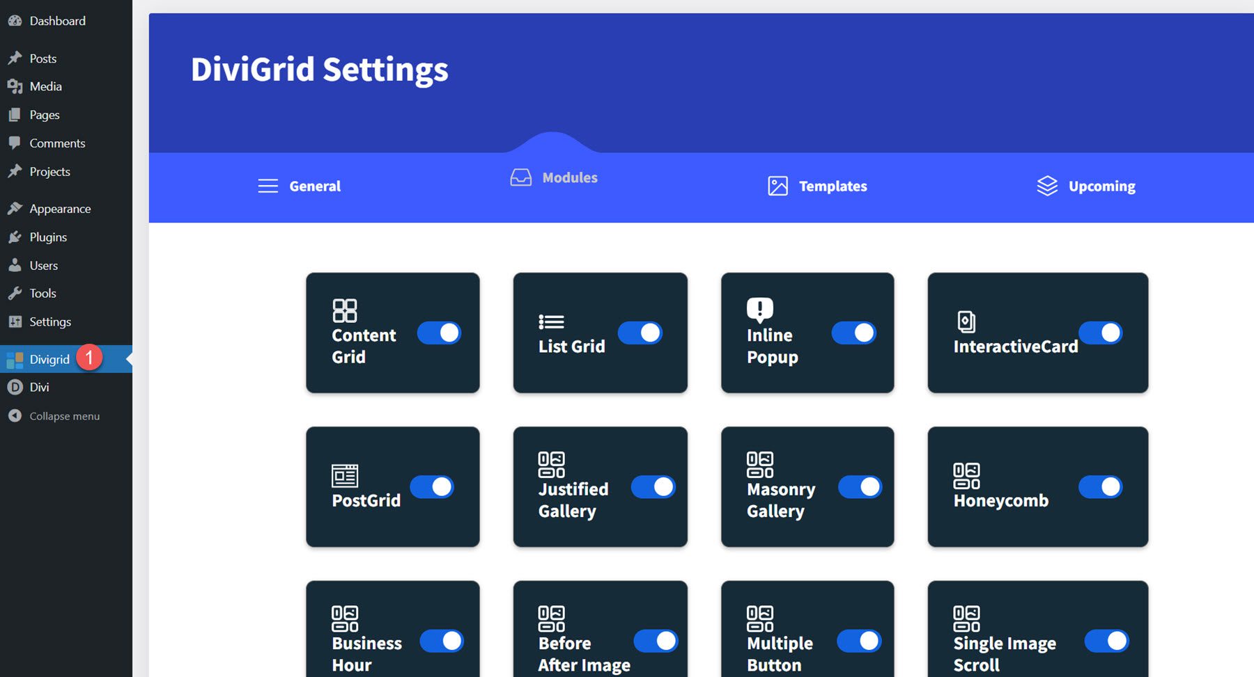
DiviGrid Settings
Once DiviGrid is installed and activated, you will see a new tab for DiviGrid in the WordPress dashboard. Here, you can manage the active DiviGrid modules and access links to view and download the included demo templates. Additionally, there are some handy links to documentation and support.
DiviGrid Modules
DiviGrid comes with 30+ modules. Open a page with the Divi Builder and click the grey plus icon to add a new module. You should see the DiviGrid modules available in the list of modules.
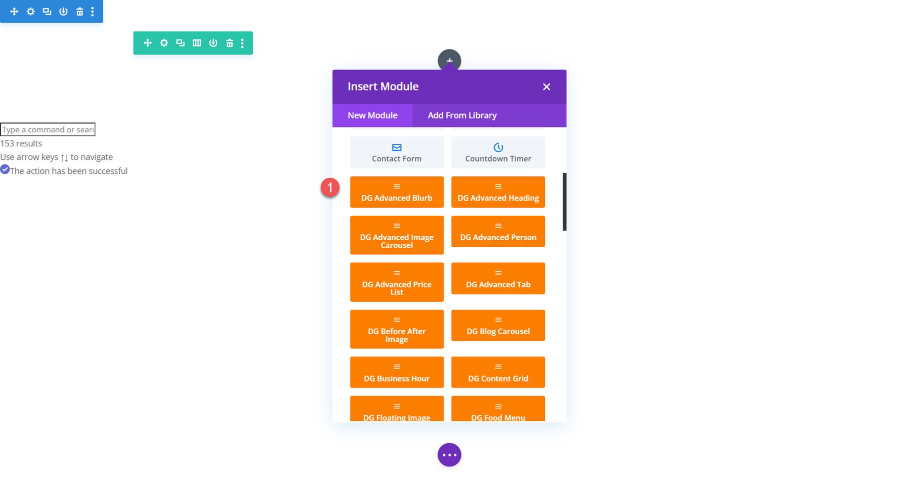
Let’s take a closer look at each of the modules included in DiviGrid.
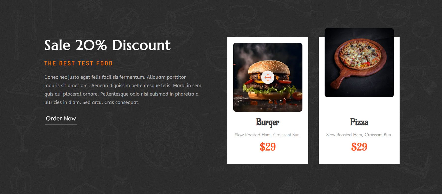
Advanced Blurb
With the Advanced Blurb Module, you can create unique blurb designs with control over the title, subtitle, text, icon, image, badge, and button. It includes control over the order of each of these items in the blurb, the ability to add dividers between any of the content items, unique hover effects, and plenty of settings to fine-tune the design to your liking.
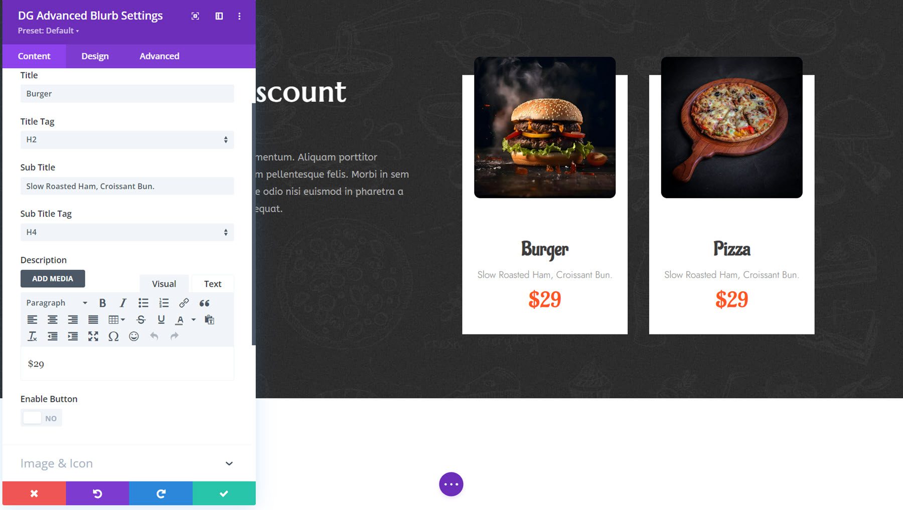
Here’s Advanced Blurb Demo 2 with a unique hover effect.
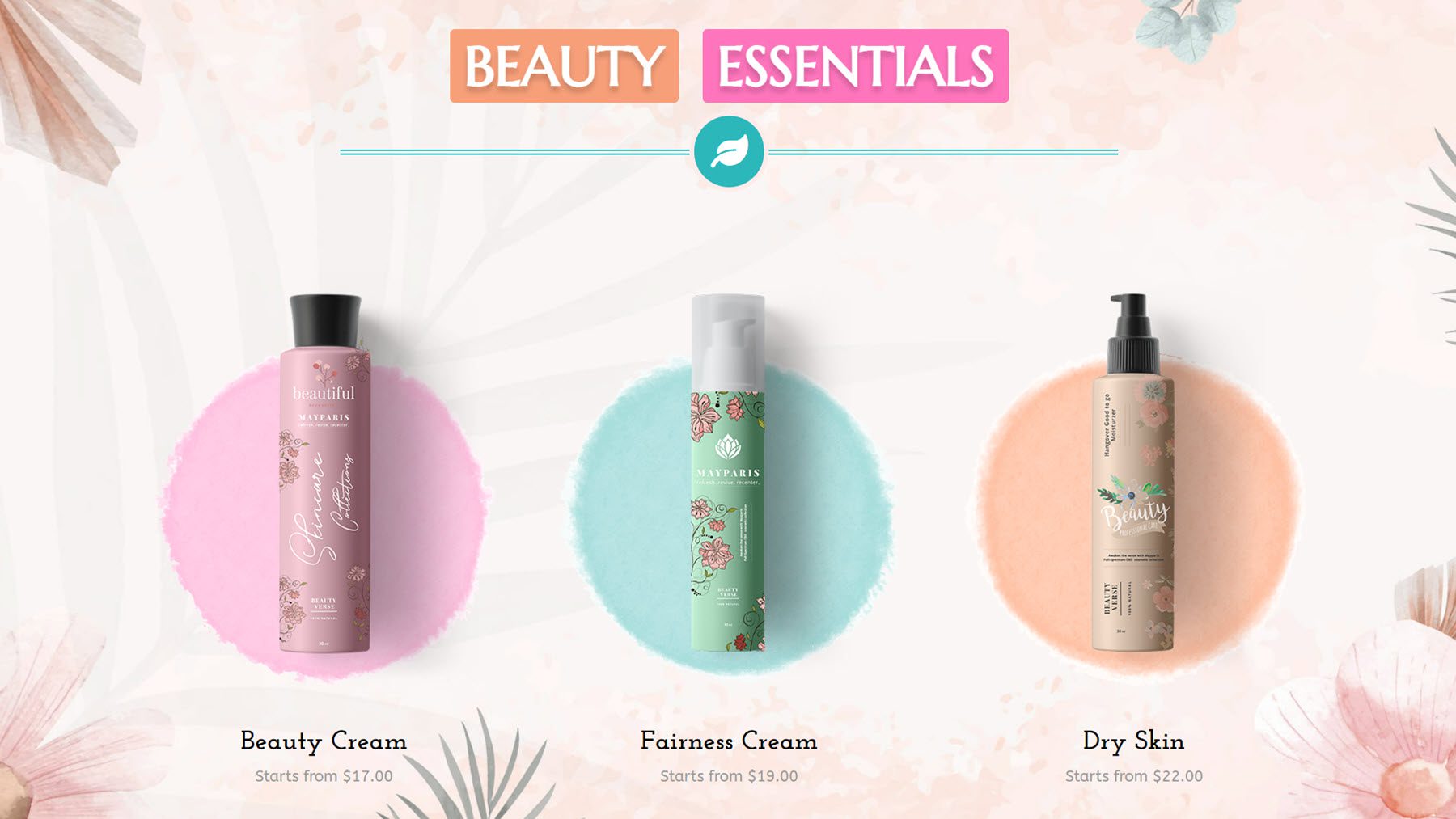
Advanced Heading
The Advanced Heading Module makes it easy to create interesting heading designs with multiple content fields that can be individually styled, dual text layouts, and dividers. In the design options, you can add gradient and background clip styling, reveal and hover effects, text highlights, and many design options for each of the heading elements.
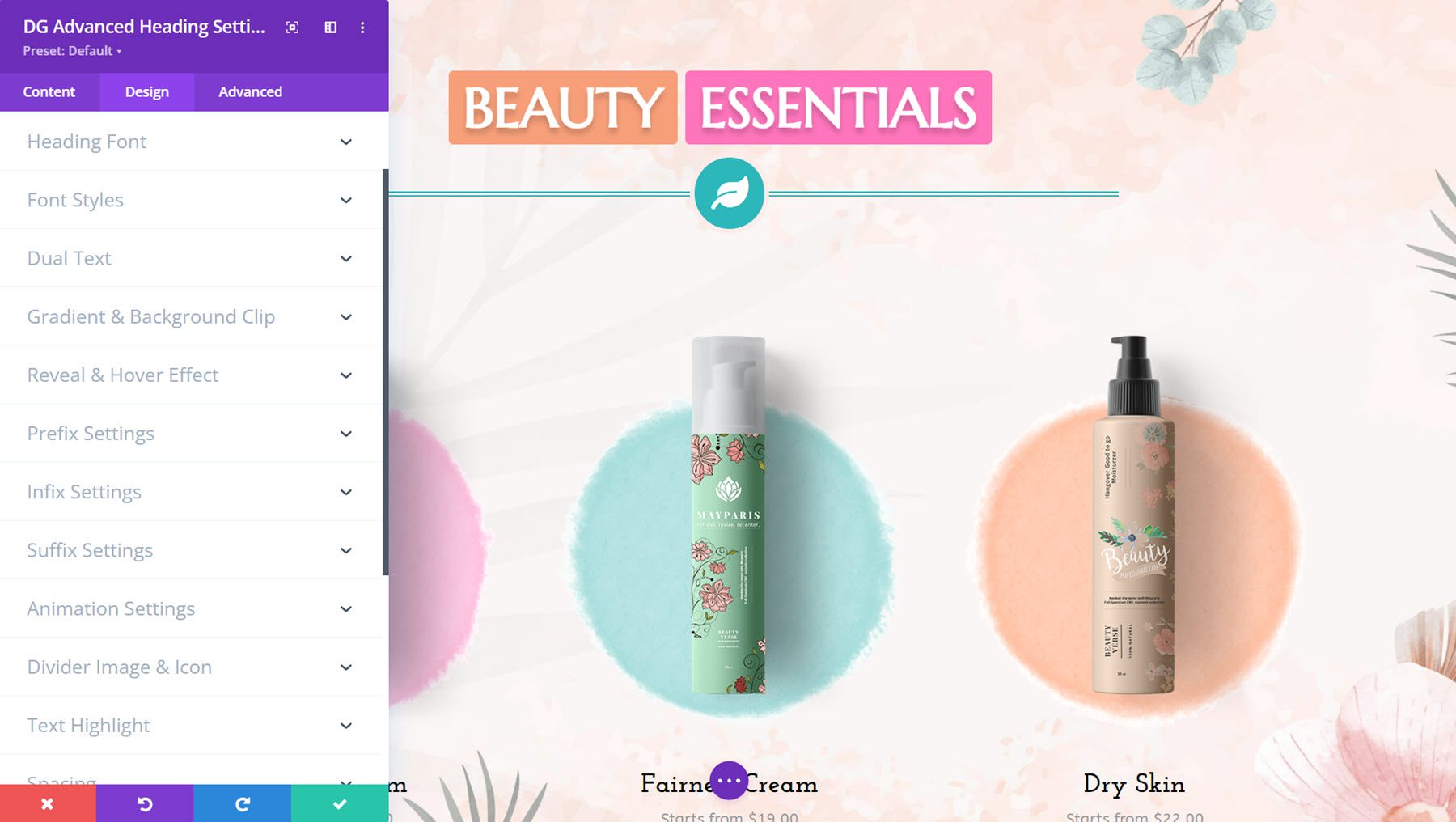
This is Advanced Heading Demo 6, featuring two styled text fields and a divider styled with an icon. The text has a wobble effect on hover.
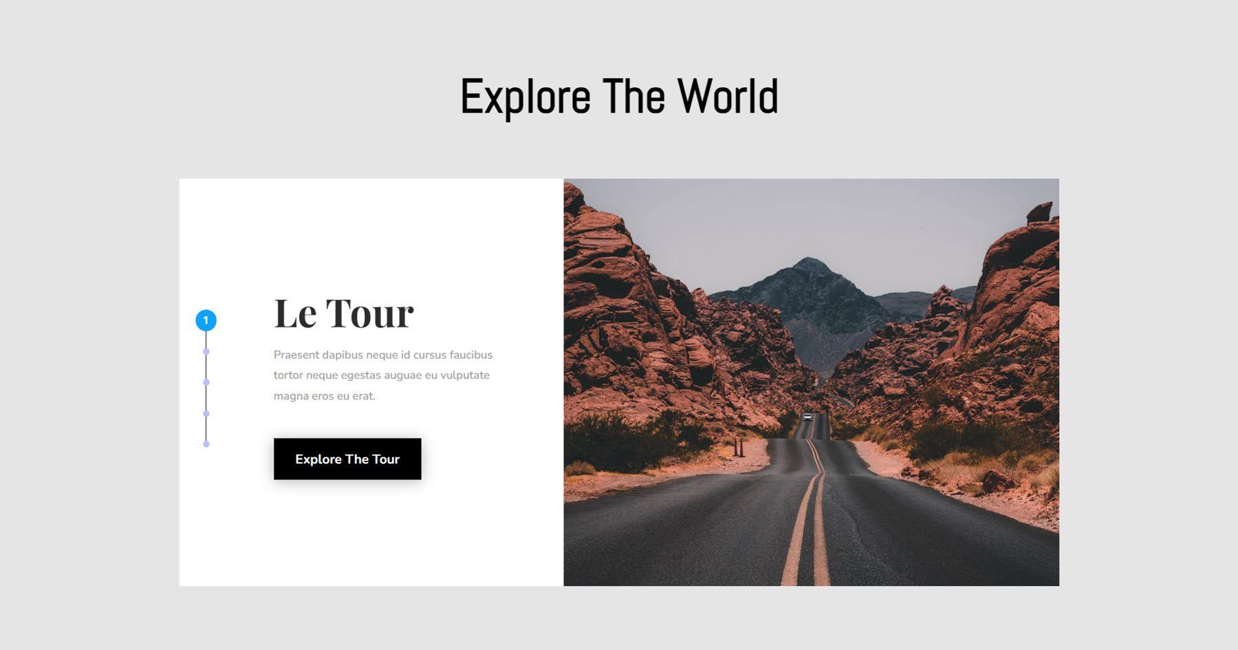
Advanced Image Carousel
With the Advanced Image Carousel Module, you can design captivating carousels with two layout options, each with full design control over the static and carousel elements. You get precise control over sizing, navigation arrows, pagination, overlays and backgrounds, typography, buttons, slide direction, autoplay and loop, and more.
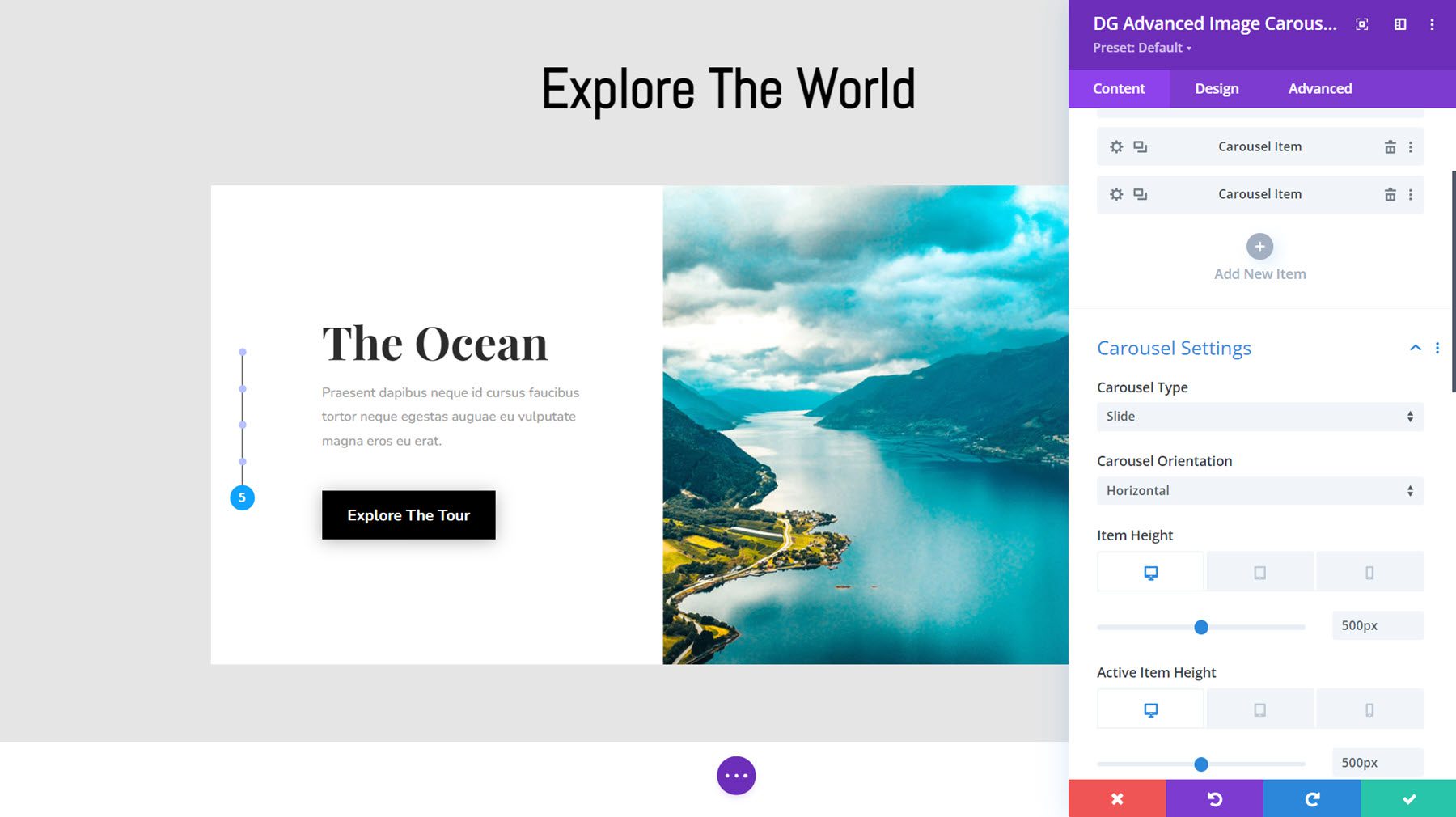
Here is Demo Layout 15, featuring slide navigation on the very left edge, text and a button on the left side, and a full-height image on the right. The carousel uses a nice slide effect on the text and image.
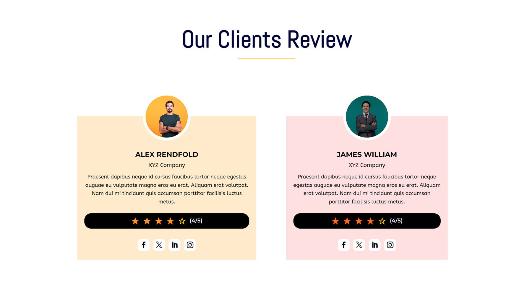
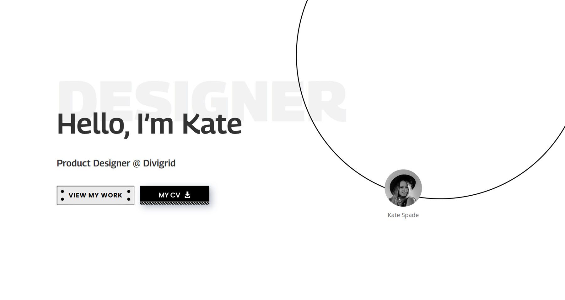
Advanced Person
Next, the Advanced Person Module is great for showing off team members or customer testimonials. You can add a title, designation, description, button, image, an alternate image to show on hover, badge, star rating, and social icons.
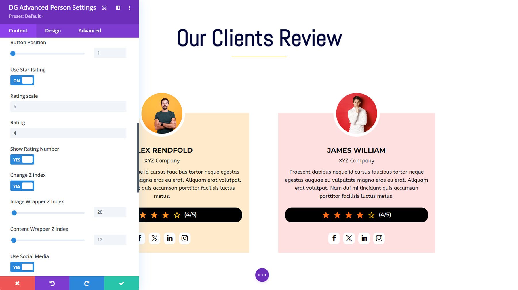
This is Advanced Person Demo 5, with a round profile image that displays an alternate image on hover.
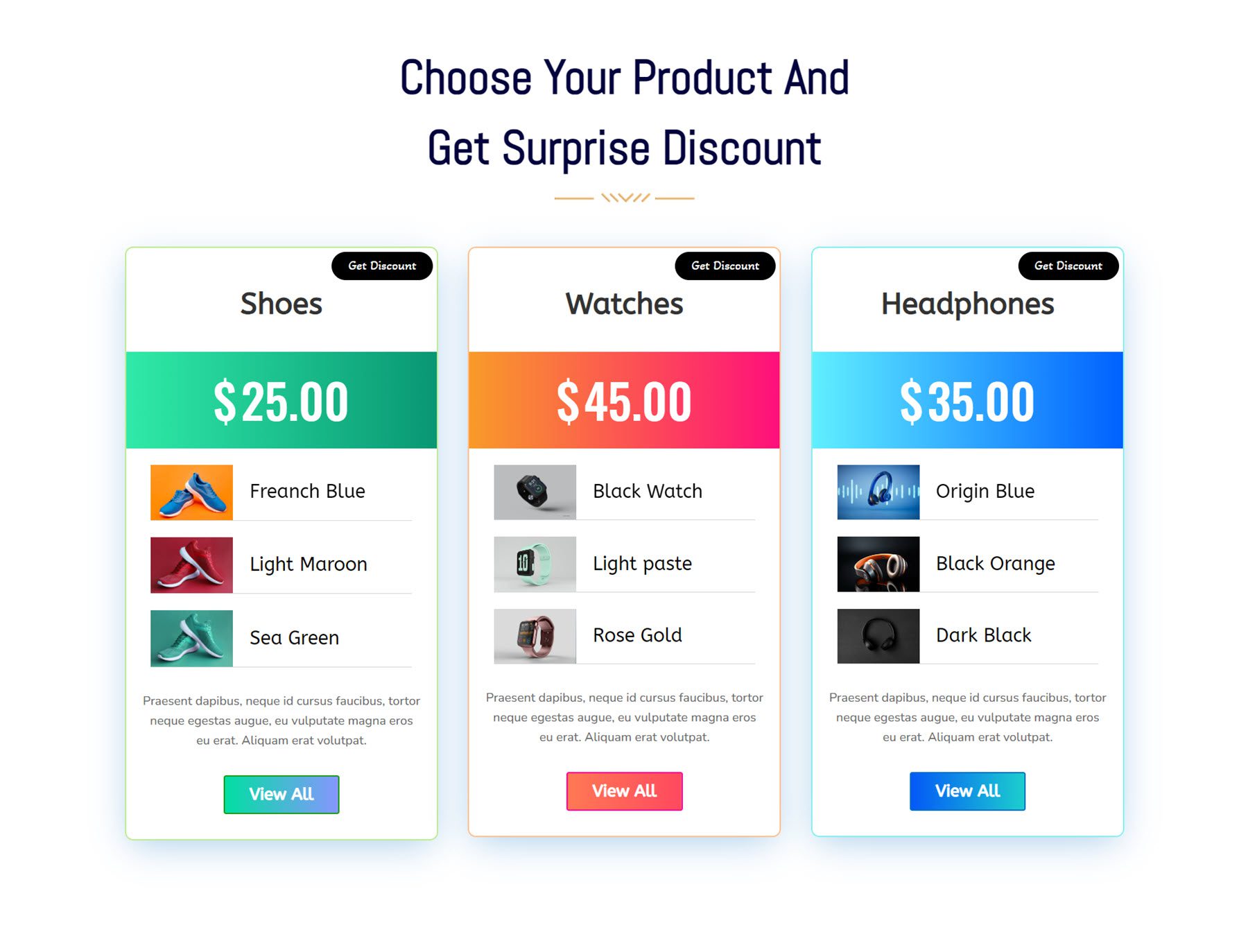
Advanced Price List
In the Advanced Price List Module settings, you can add individual items for each of the components you want to display. You can pick from an icon, image, title, price value, description, icon and text, image and text, ordered list, unordered list, or button. You can also add badges to the price list and customize each of the components with a plethora of design options.
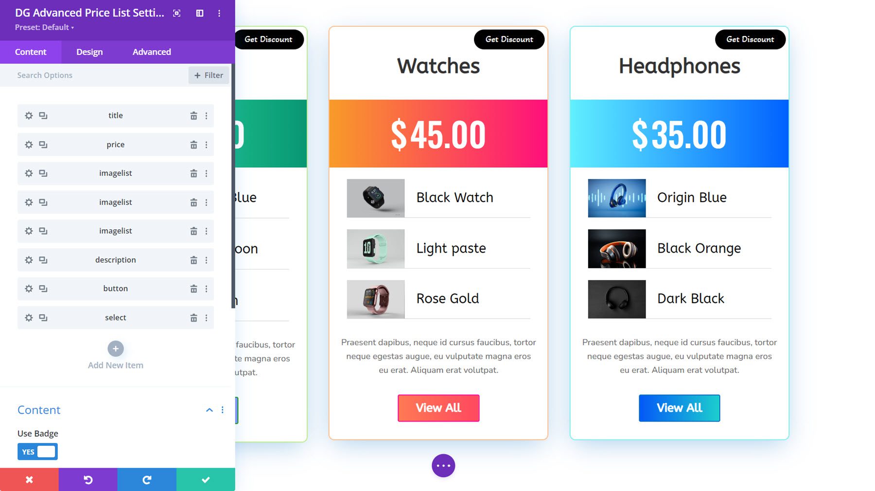
Advanced Price List Demo 10 features a gradient background for the price component, image, and text layouts to showcase the items, and a badge at the top.
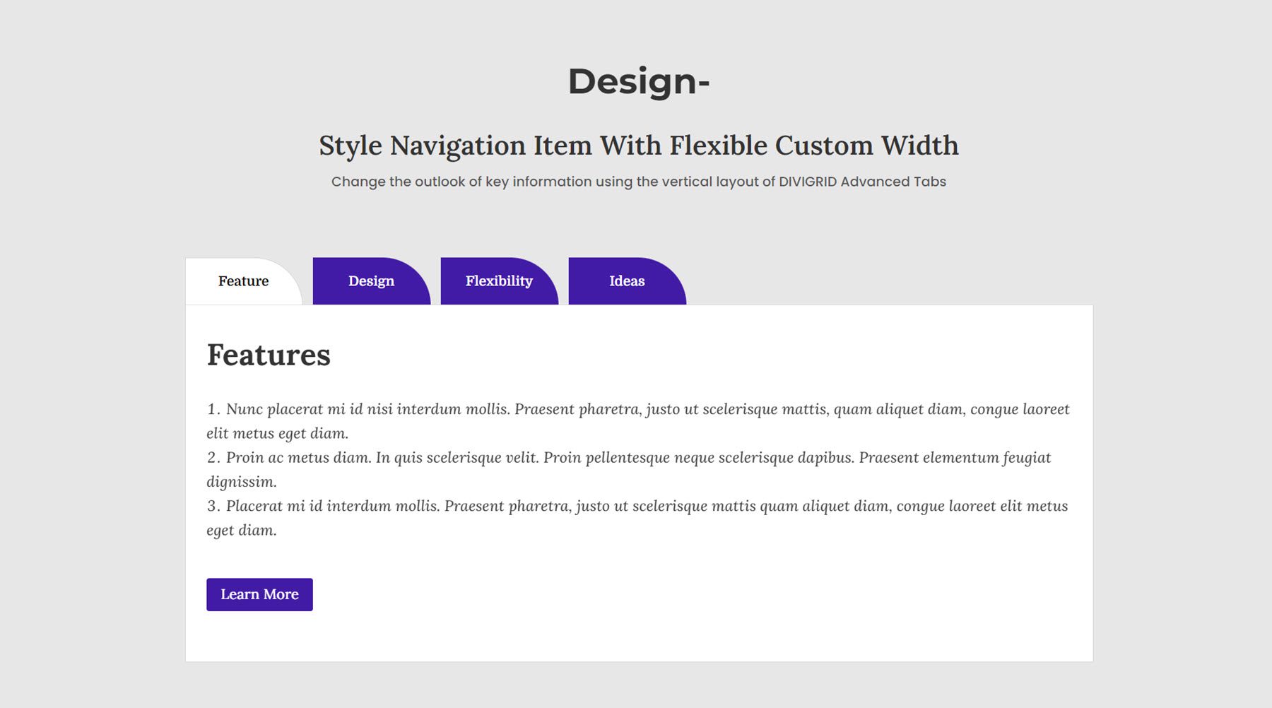
Advanced Tab
Now let’s take a look at the Advanced Tab Module. You can choose to reveal tabs on hover or click, add tab reveal animations, customize the layout and spacing, and customize the design of each element.
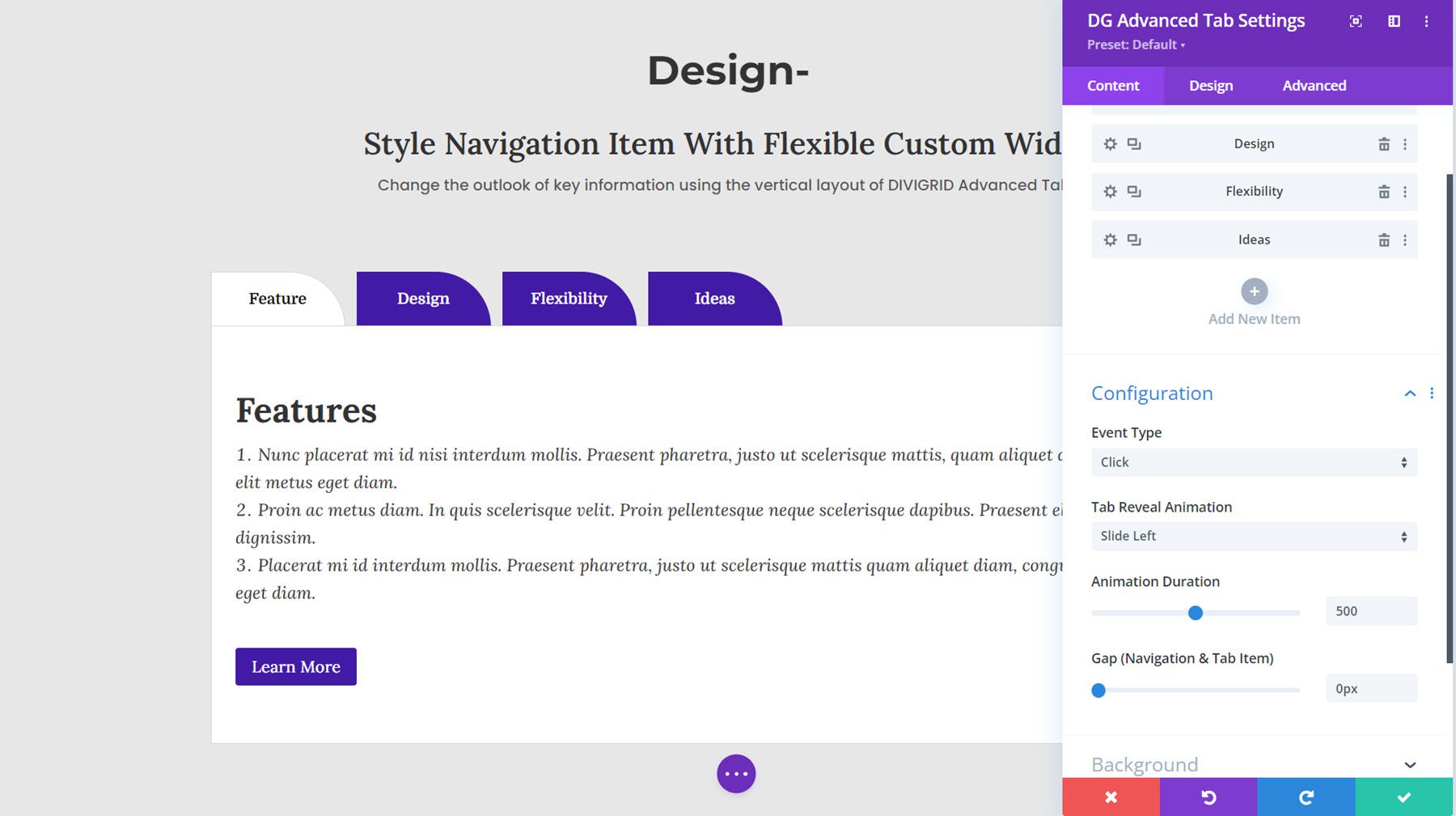
This is Demo Layout 8, with purple tabs that reveal on click with a transition animation.
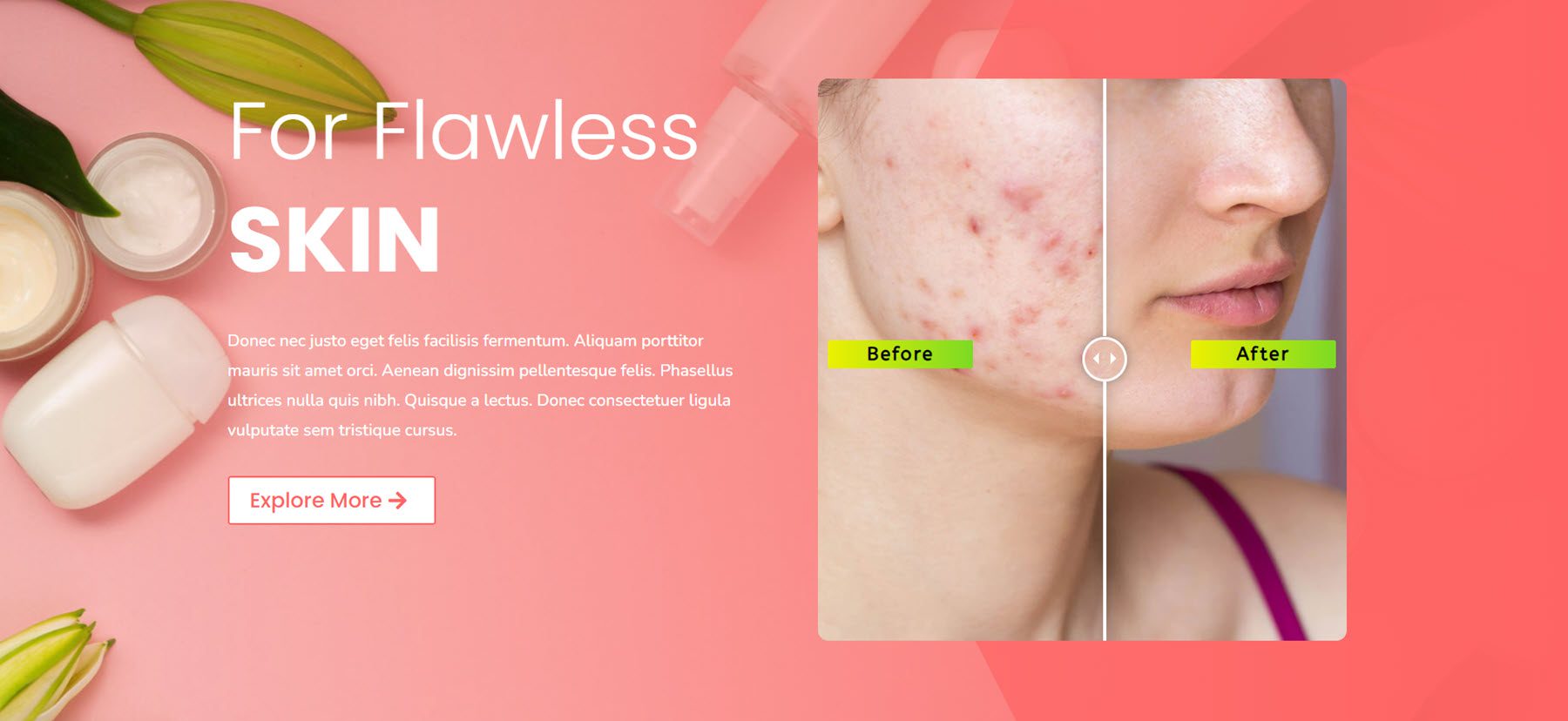
Before After Image
A before-and-after image can be an engaging way to show potential clients the results you can offer. With this module, you can drag the slider to switch between the before and after images. You can customize the slider controls, add a label to the slider, and customize the design.
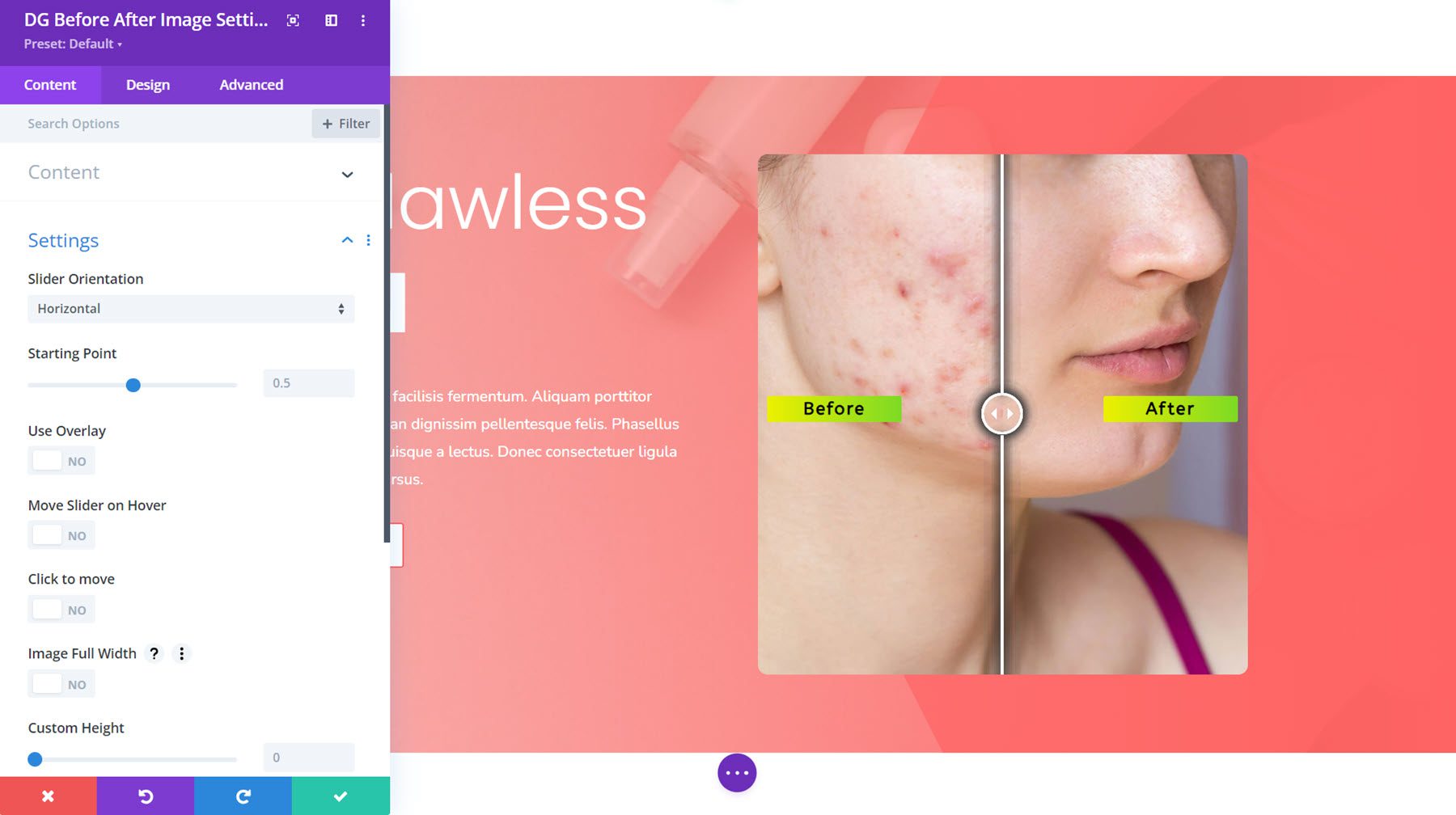
Here is Before After Image Layout 1.
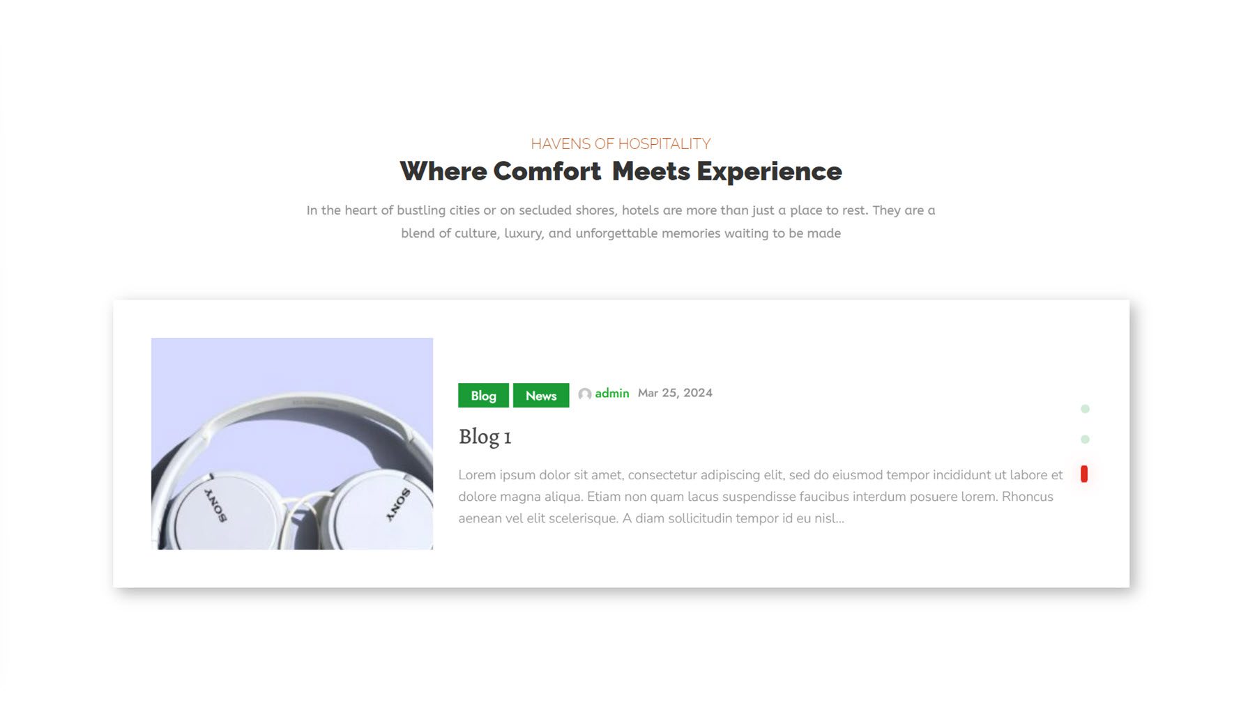
Blog Carousel
With this module, you can add a carousel view of your blog posts. You can choose from two layout types and four slide styles. You can add a divider, change the item order, and control the elements that are shown and the design of each component.
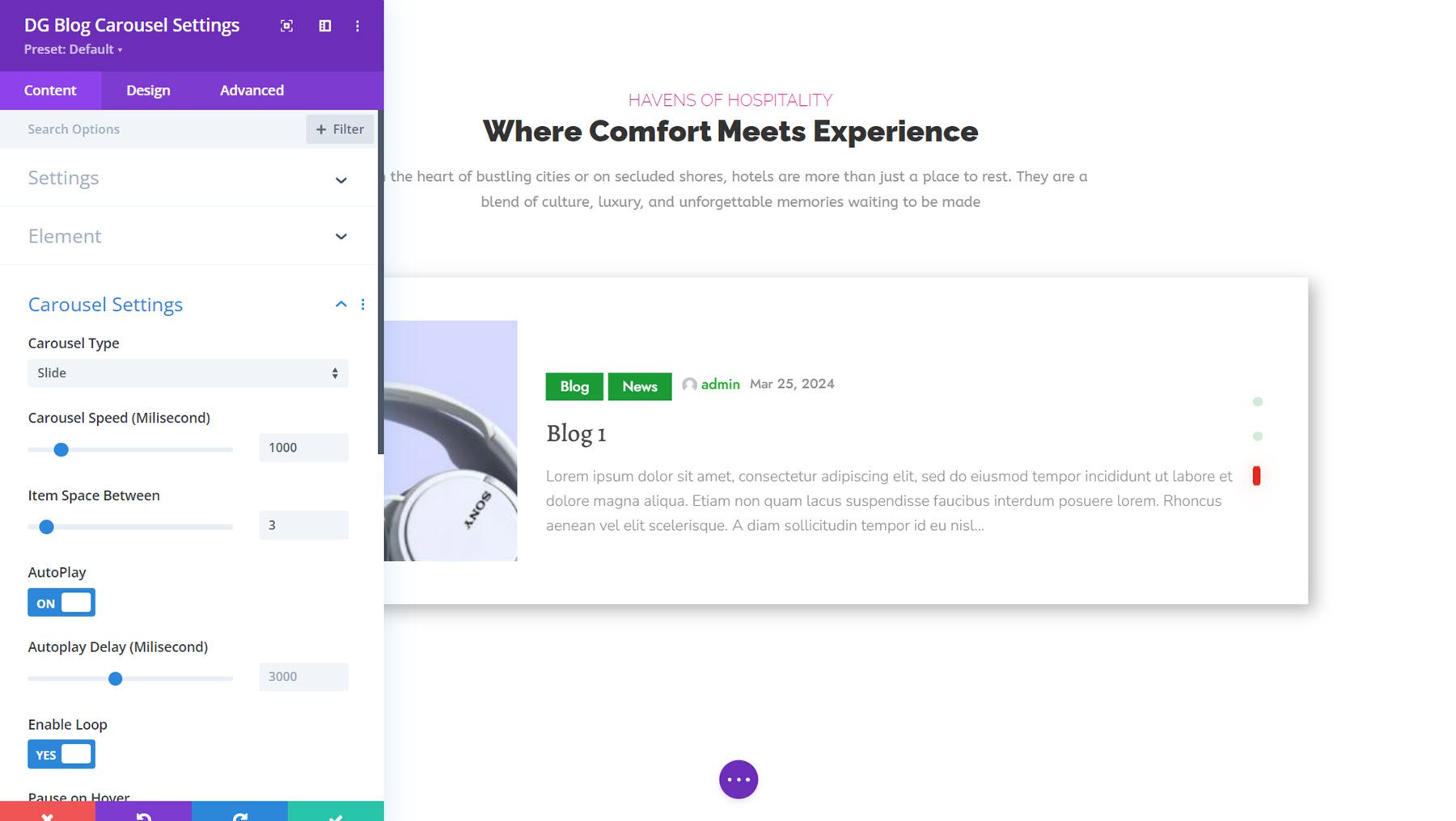
This is Blog Carousel Demo 3, with a slide carousel type. It features an image on the left, information about the post in the center, followed by the blog title and excerpt. On the very right are navigation dots.
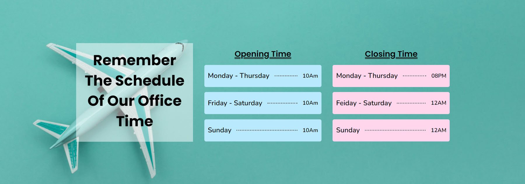
Business Hour
The Business Hour Module makes it easy to add your operating hours to your website in a simple display. You can add a starting time and end time to your hours, customize the divider style, individually style each line in the module, and style the entire module with a variety of design options.
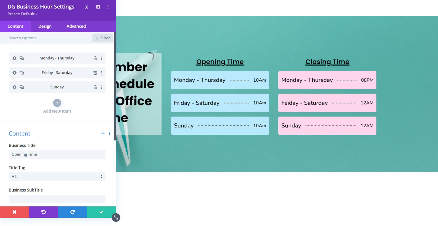
Here is Business Hour Layout 7, featuring two Business Hour Modules styled with colorful backgrounds and a dotted divider line.
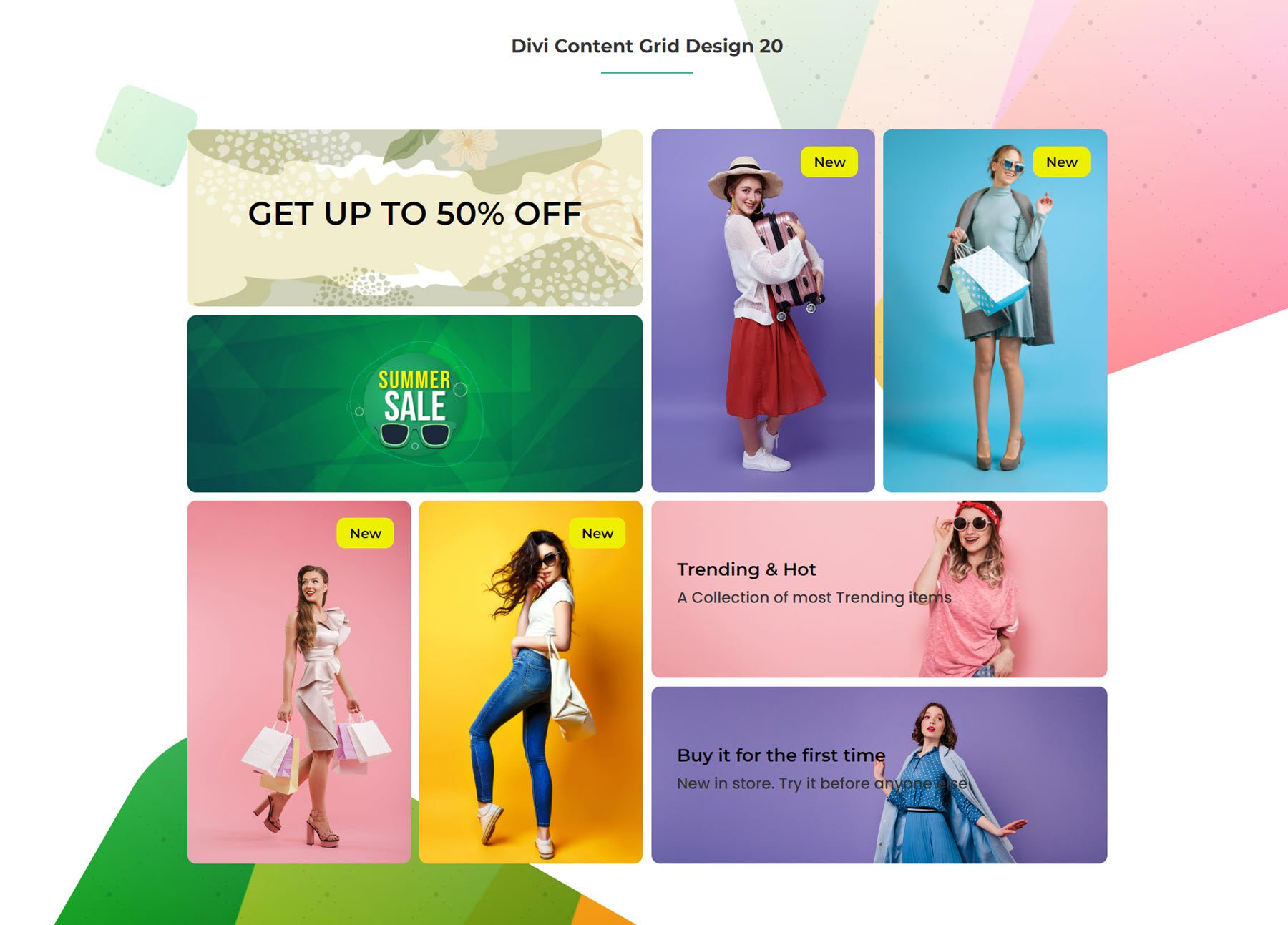
Content Grid
Next, the content grid is a versatile module where you can create a grid layout to display cards with text, images, and buttons. Each grid item can be styled individually, and the Grid Module itself comes with plenty of options to control the layout and design of the grid.
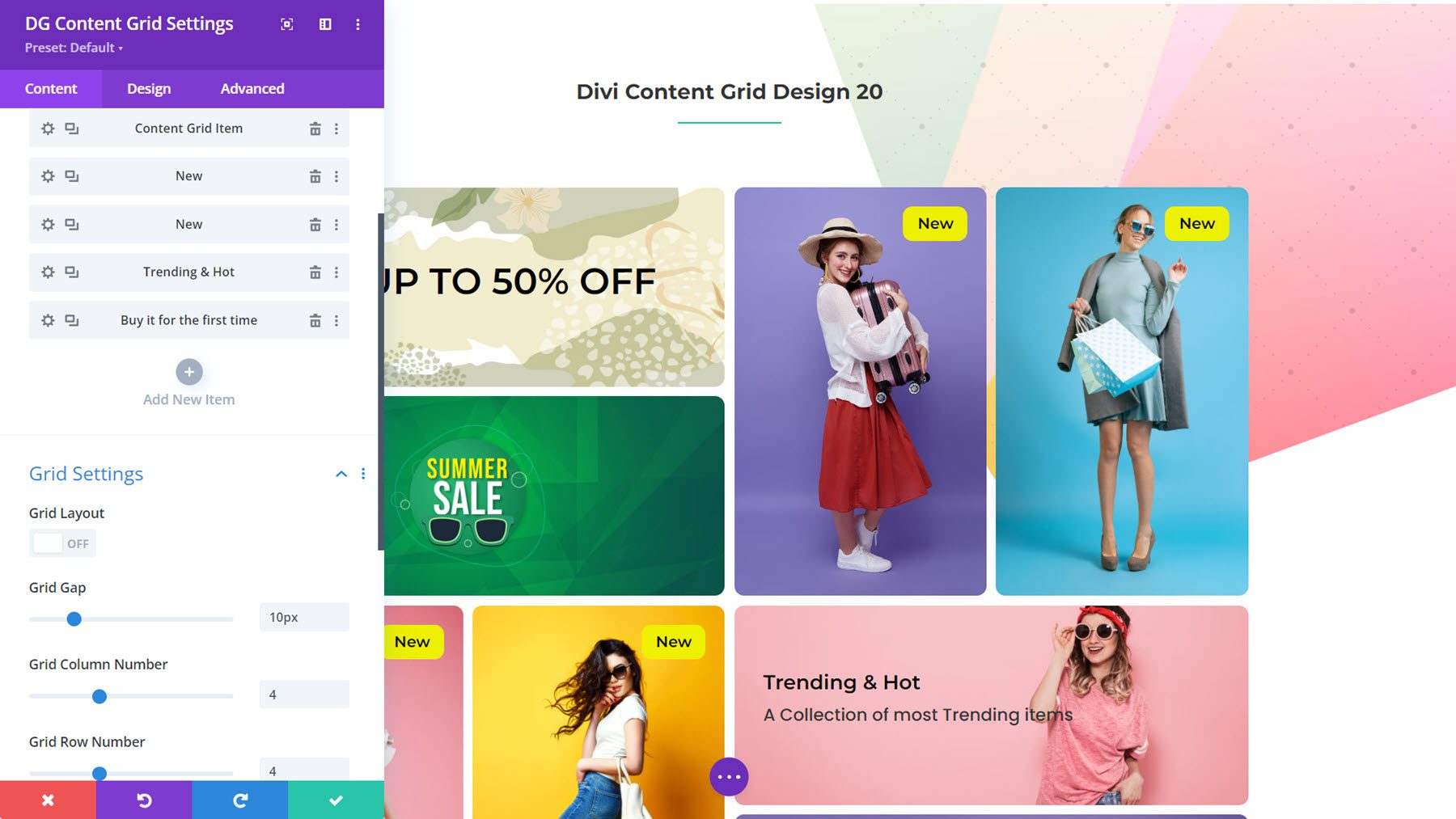
This is Content Grid Layout 20, styled as a navigation section for an ecommerce store.
Floating Image
With the Floating Image Module, you can create a composition with several images and add a floating animation effect that adds motion to the section, drawing the user’s eye.
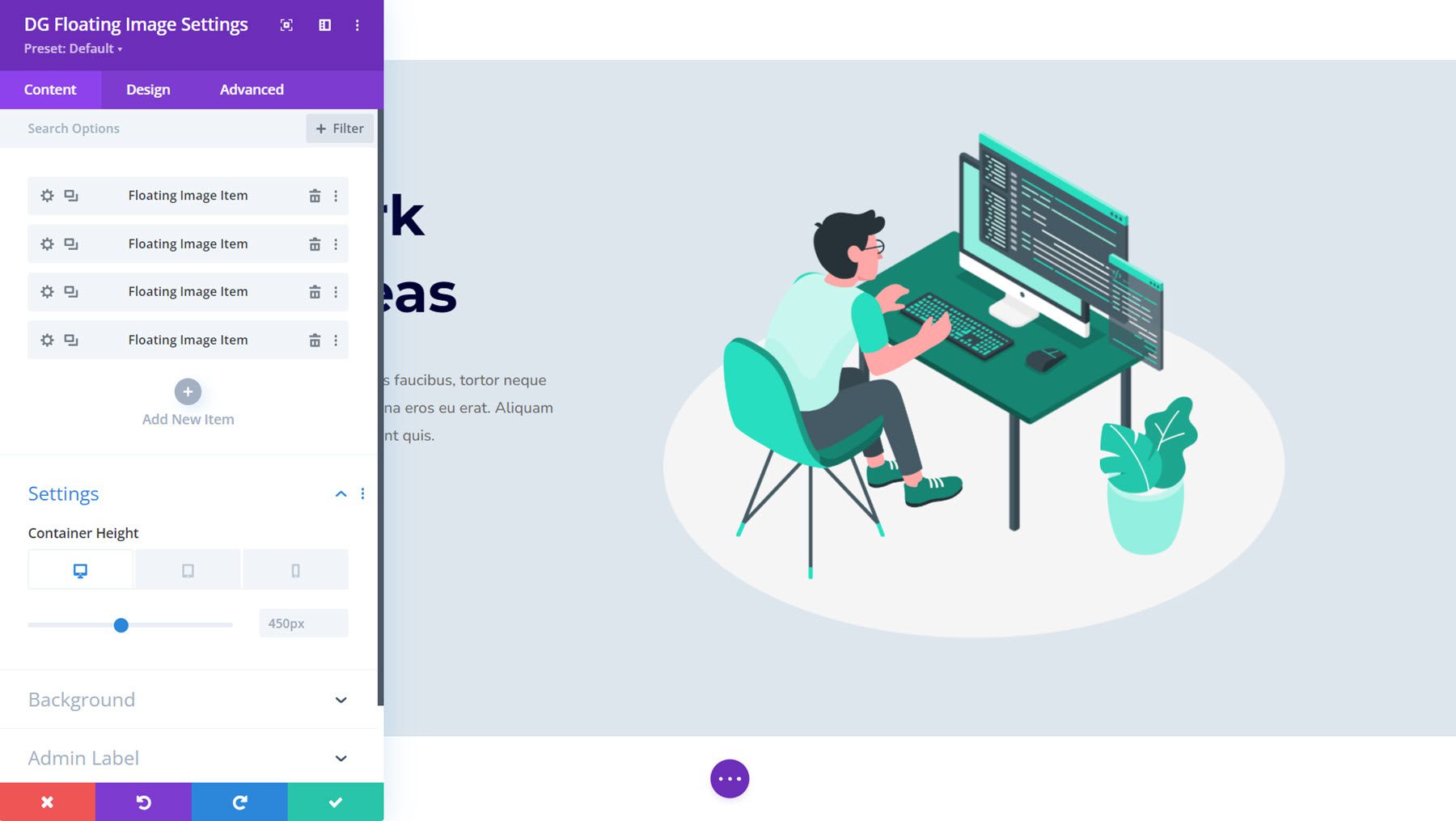
This is Floating Image Example 4. In this example, the person in the chair, the desk, the plant, and the white circle in the background are all separate images placed together and animated with the module settings.

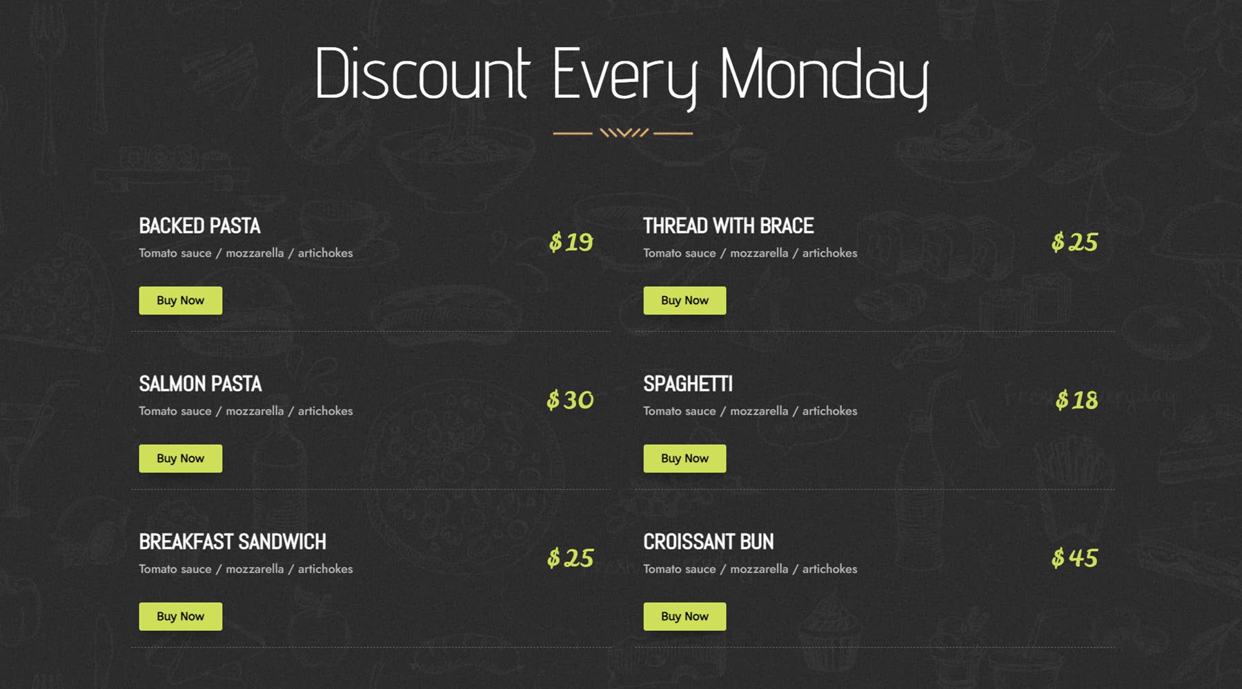
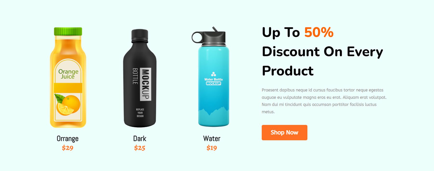
Next is another useful module that provides the functionality for creating easy menu layouts. For each menu item, you can add a title and subtitle, set their heading levels, add the currency indicator and the price, and add a button and/or badge.
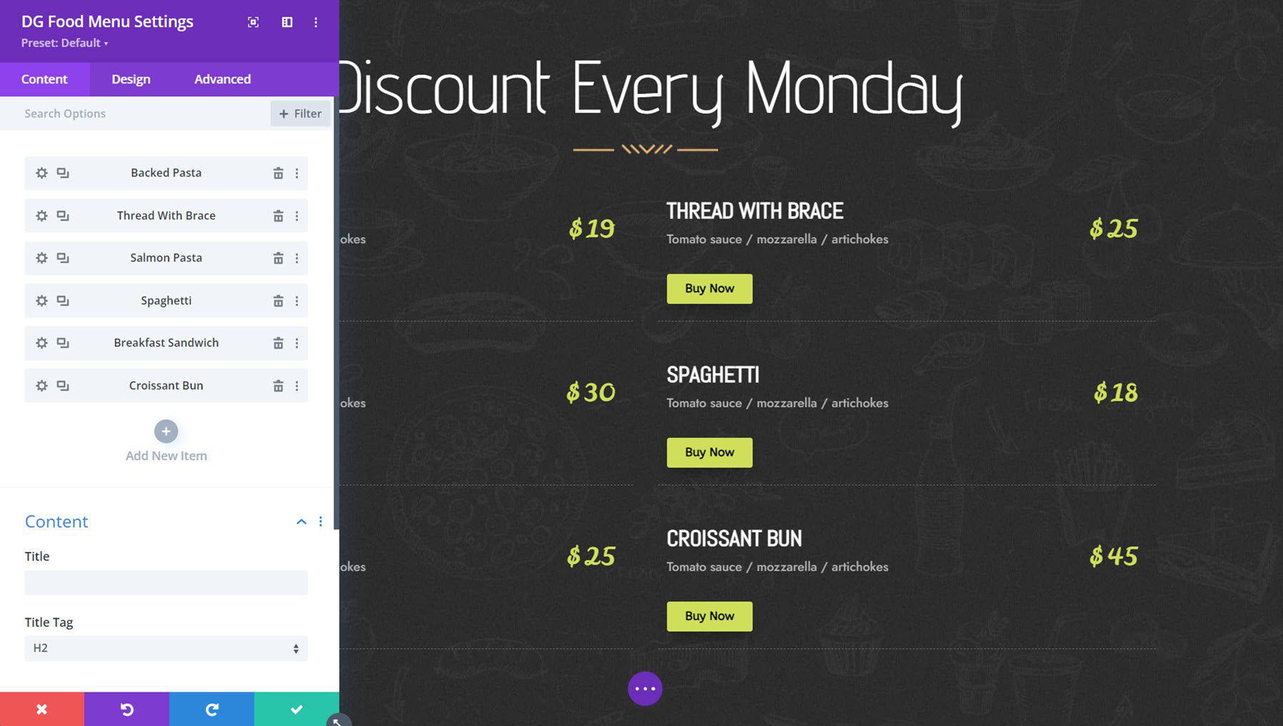
Here is Food Menu Layout 6, with a two-column menu featuring the item title, subtitle, price, and buy button.
Gradient Text
With the Gradient Text Module, you can create interesting, eye-catching heading layouts. You can add prefix, infix, and suffix text and customize each with a variety of design options, including gradient heading, background clip, outline styles, animation settings, hover effects, and more.
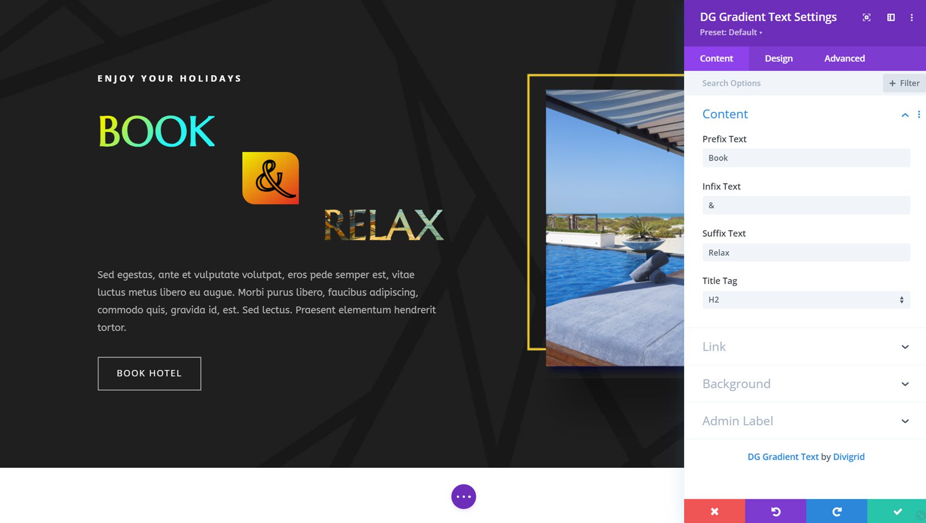
Here is Gradient Text Module Example 2. It features a prefix and infix with gradient backgrounds and the suffix text with a background clip that is moving.
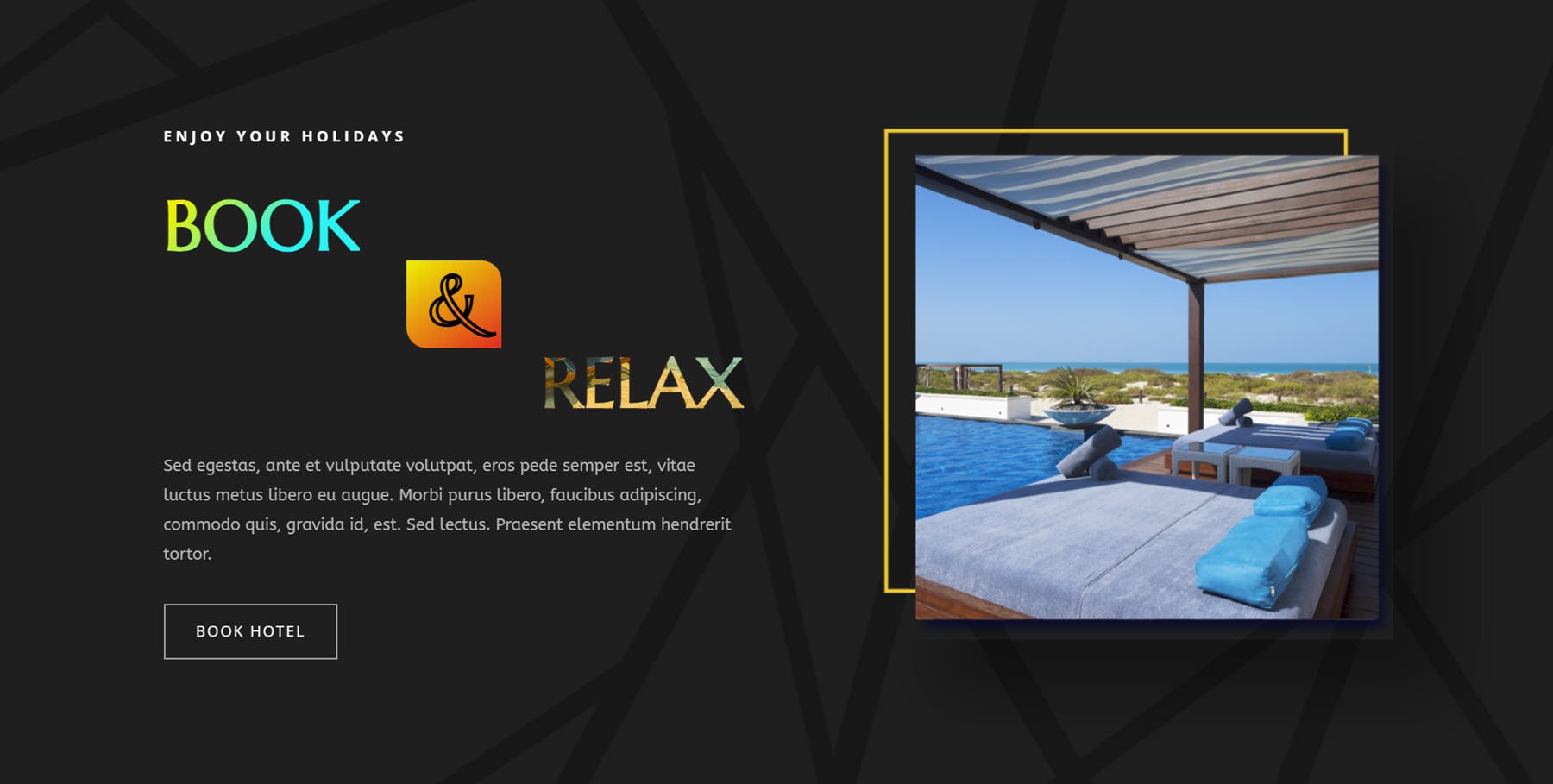
Honeycomb
The Honeycomb Module is another module that allows you to display content in a unique layout. In this case, you can add text, images, and icons to honeycomb-shaped cards that are arranged in a honeycomb pattern.
This is Honeycomb Example 9, which displays an image on hover.
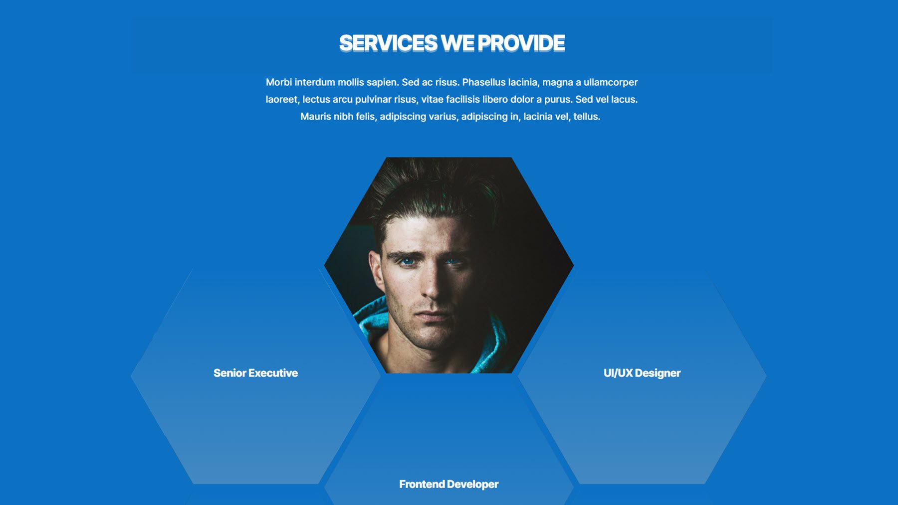
Image Accordion
This is the Image Accordion Module. On click or hover, the image selected will expand, revealing the content. You can simply display the image, or you can add content like text, icons, images, or buttons to showcase.
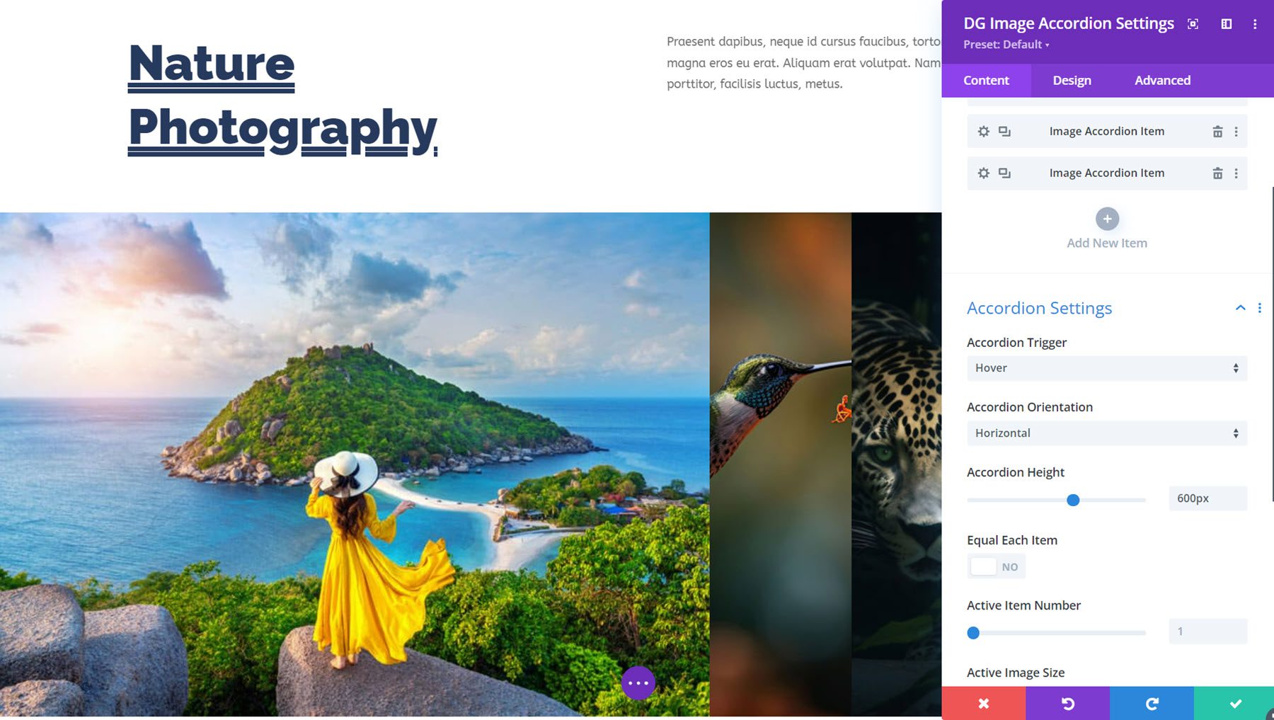
This is Image Accordion Demo Layout 5. This is a simple layout that reveals the image on hover with an animated border.
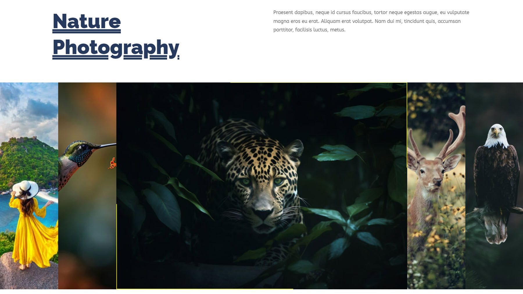
Image Caption
Next is the Image Caption Module. With this, you can display multiple images and display a caption on hover. There are many design options to customize the styling, layout, fonts, images, and more.
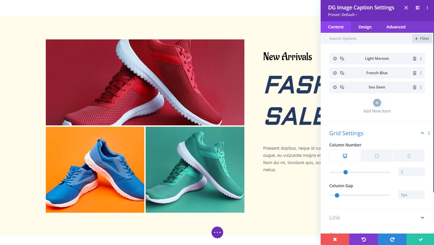
Here is Image Caption Demo Layout 8. On hover, the caption appears and the other images have a grey overlay.
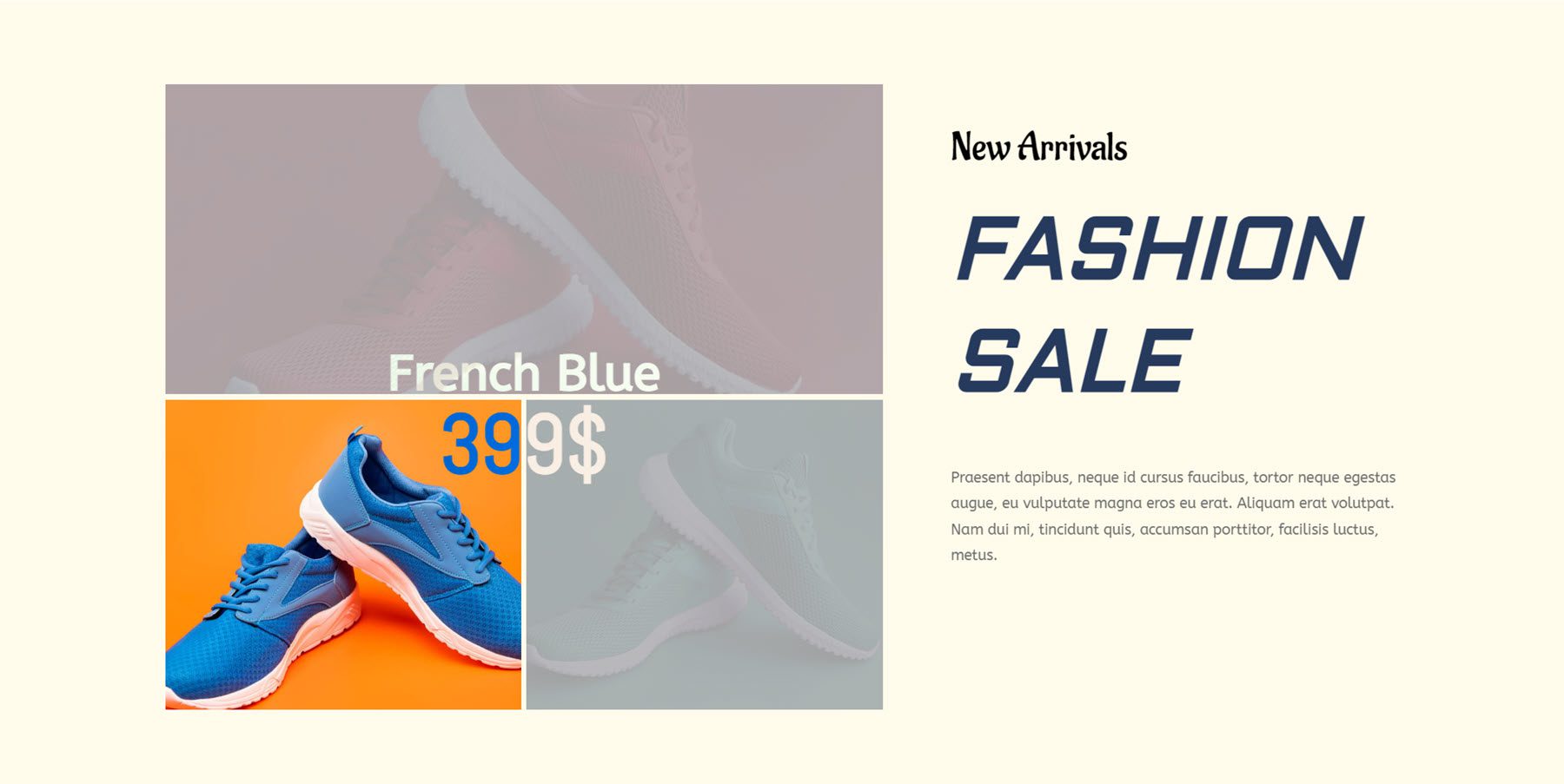
Image Carousel
DiviGrid’s Image Carousel Module comes with many interesting options you can use to showcase your images, pages, products, services, and more. You can add text and buttons to the images, pick from multiple slide and navigation styles, add hover effects, and more.
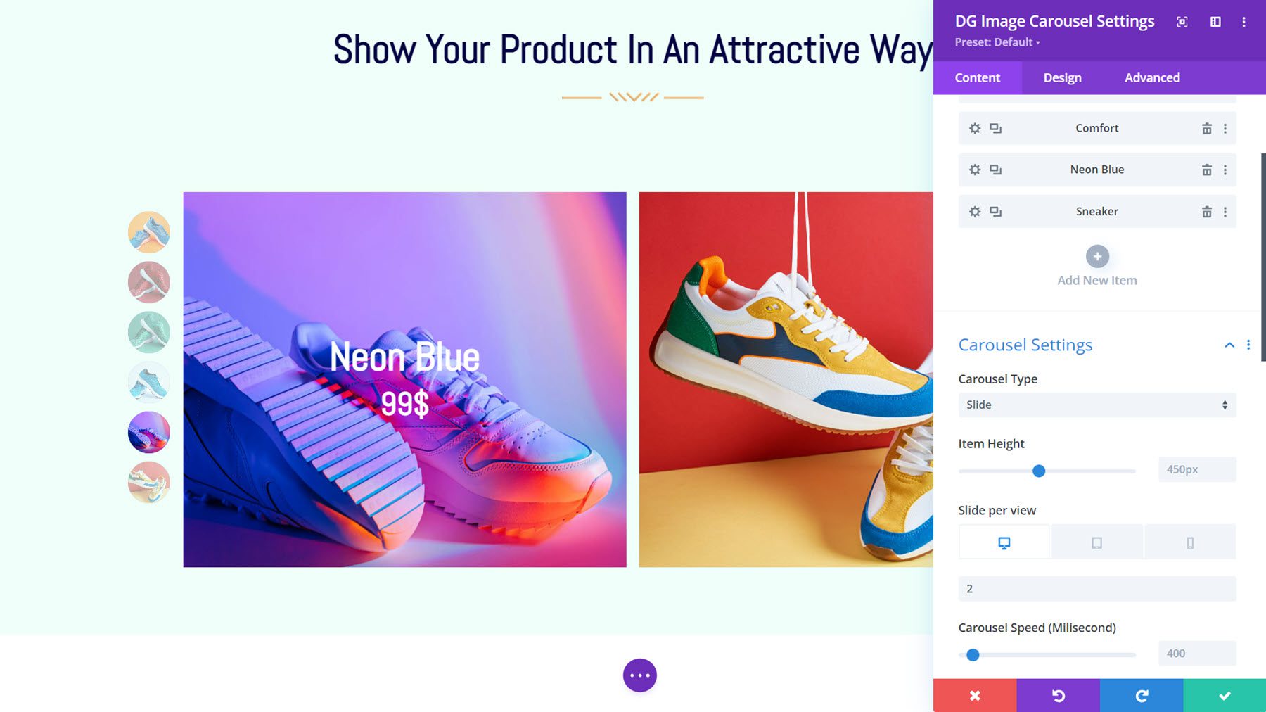
This is Image Carousel Layout 1, featuring the bullet-style pagination on the left. On hover, the title and price are revealed with an overlay.
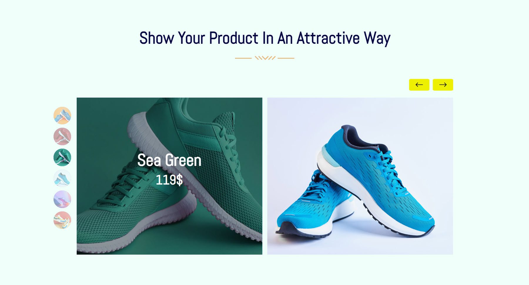
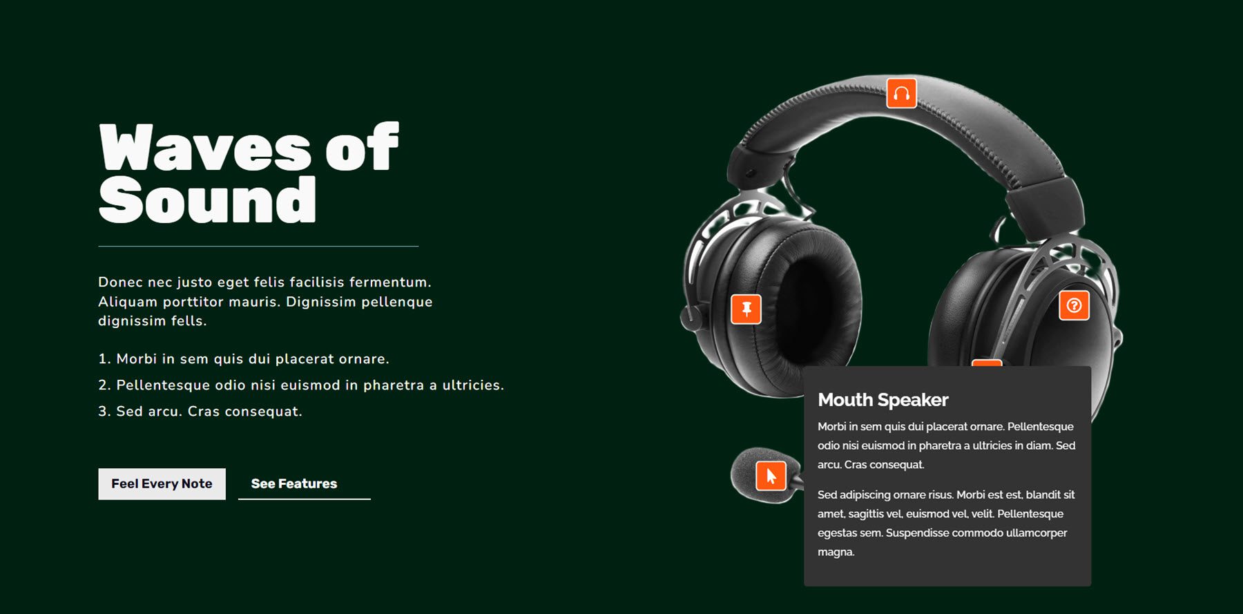
Image Hotspot
With the Image Hotspot Module, you can add hotspots to an image and add content that displays in a tooltip on click and/or hover. You can choose from an icon, text, or image hotspot, add hotspot animation settings, show text or a library layout in the tooltip, and fully customize the design of each tooltip individually.
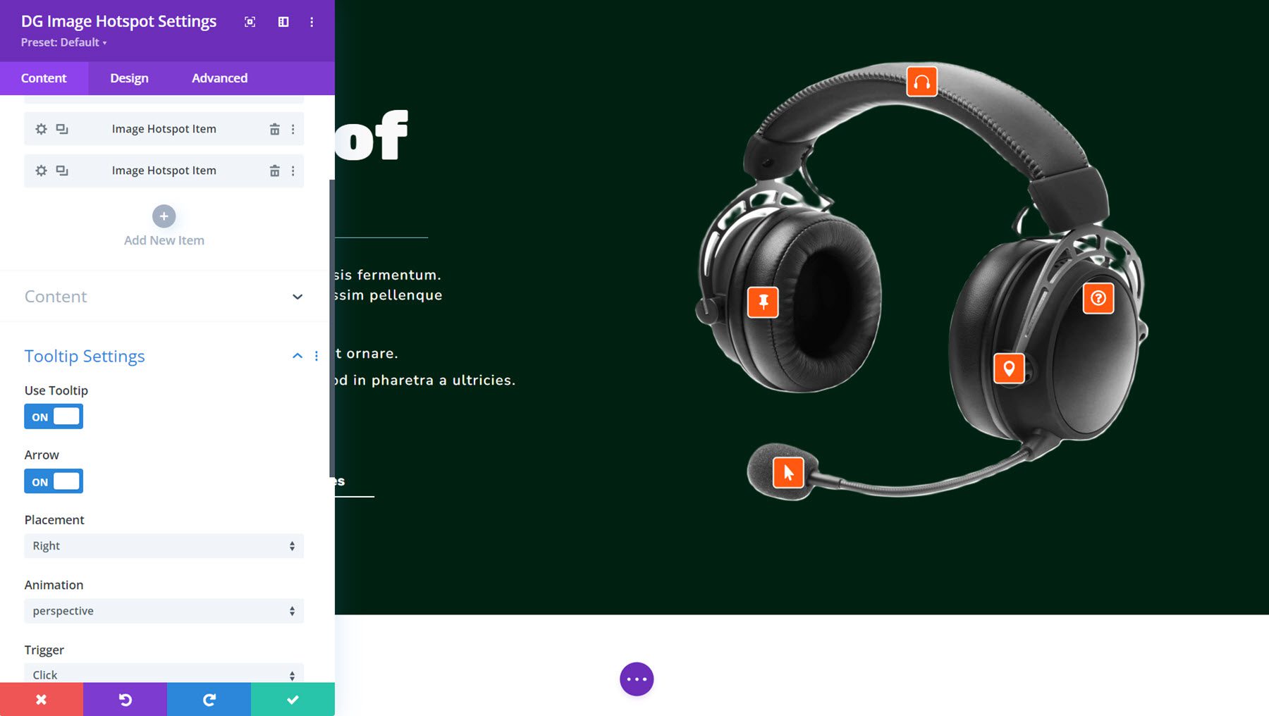
Here is Image Hotspot Demo Layout 3, with orange tooltips with icons. On click, the tooltips open to reveal information about the product.
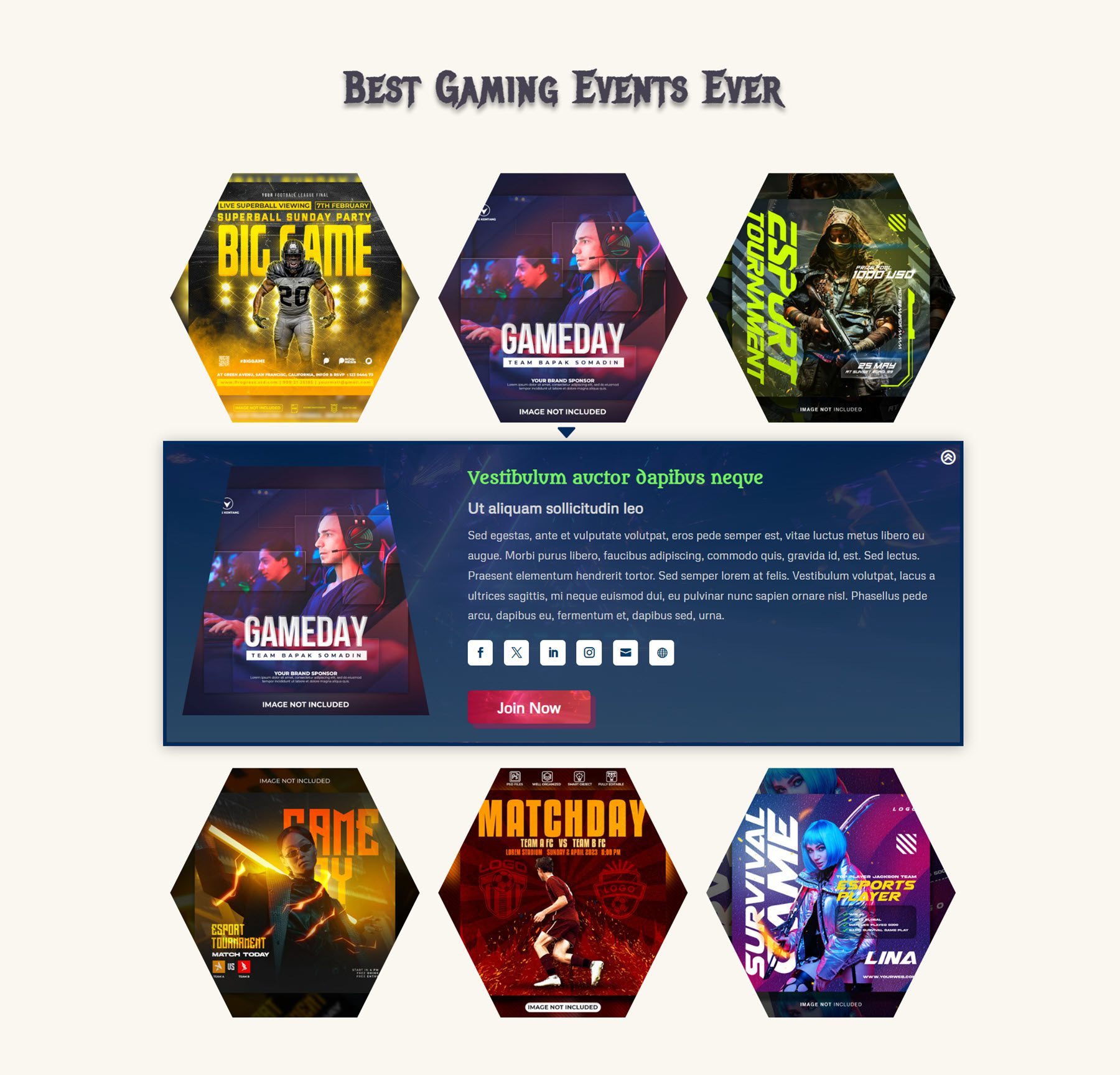
Inline Popup
With this module, you can create a grid layout of items that reveal an inline popup on hover. You can add an image, title, subtitle, text, and overlay text to the grid item. In the popup, you can show an image, title, subtitle, text content, button, and social media icons. All of these elements can be fully styled with the design settings.
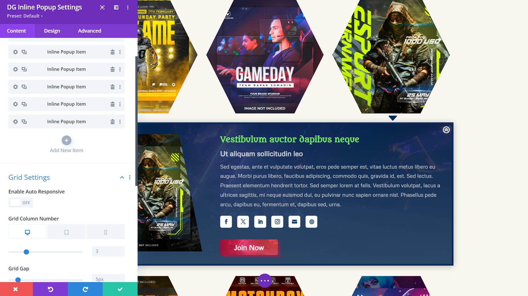
This is Inline Popup Layout 25, with a hexagon image wrapper and image zoom hover style applied. On click, the inline popup appears below with an image, content, social icons, and a button.
Interactive Card
The interactive card is another feature-rich module that allows you to display information in an engaging way. You can add content that appears on click or hover or appears alongside the cover content to create an interactive card. You can add a heading, subtitle, text content, and a button to the front. On the back, you can also display these items, along with social media icons.
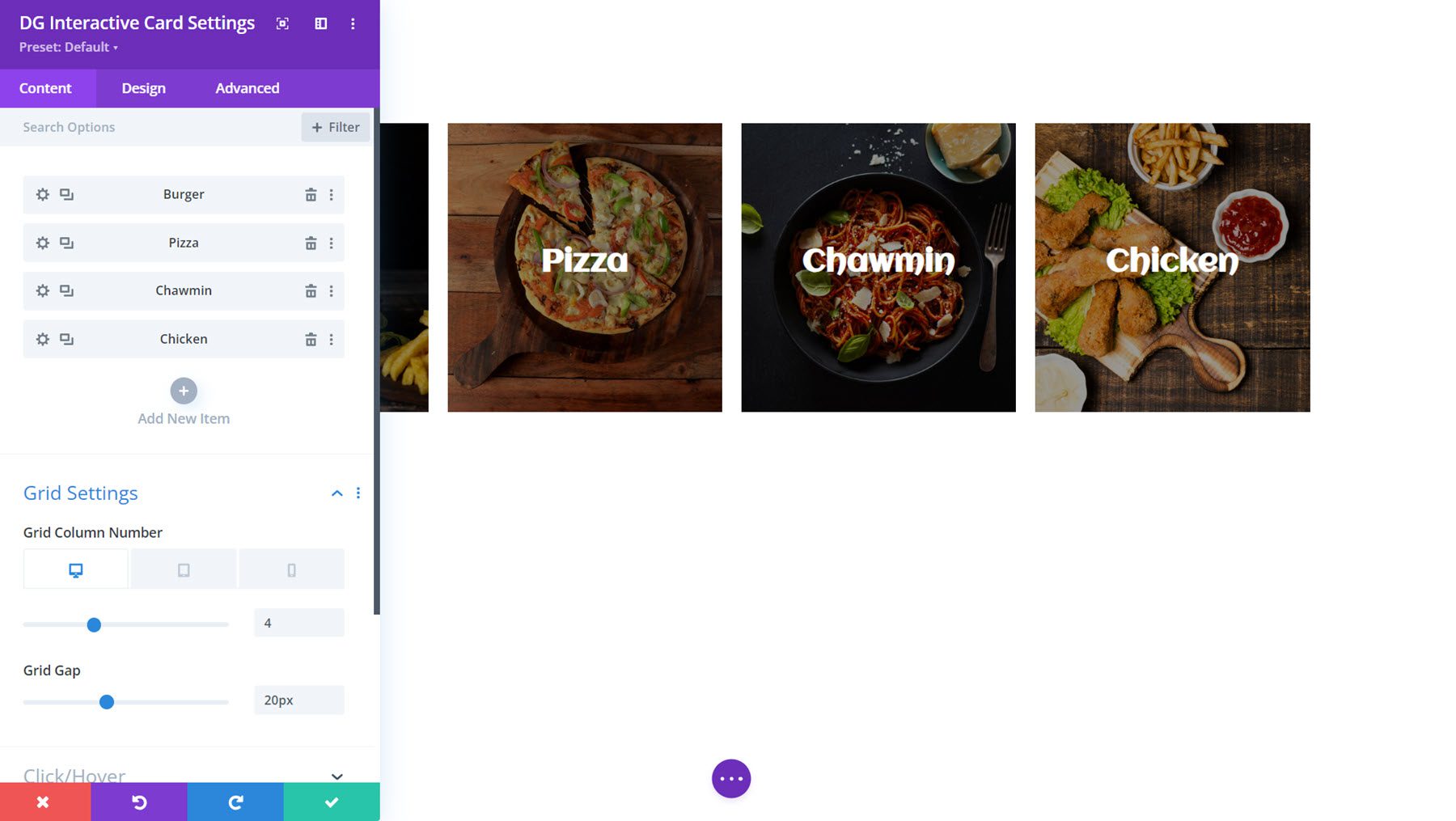
Here is Interactive Card Example 11, which displays a border animation on hover and reveals the back side with text and a button on click.
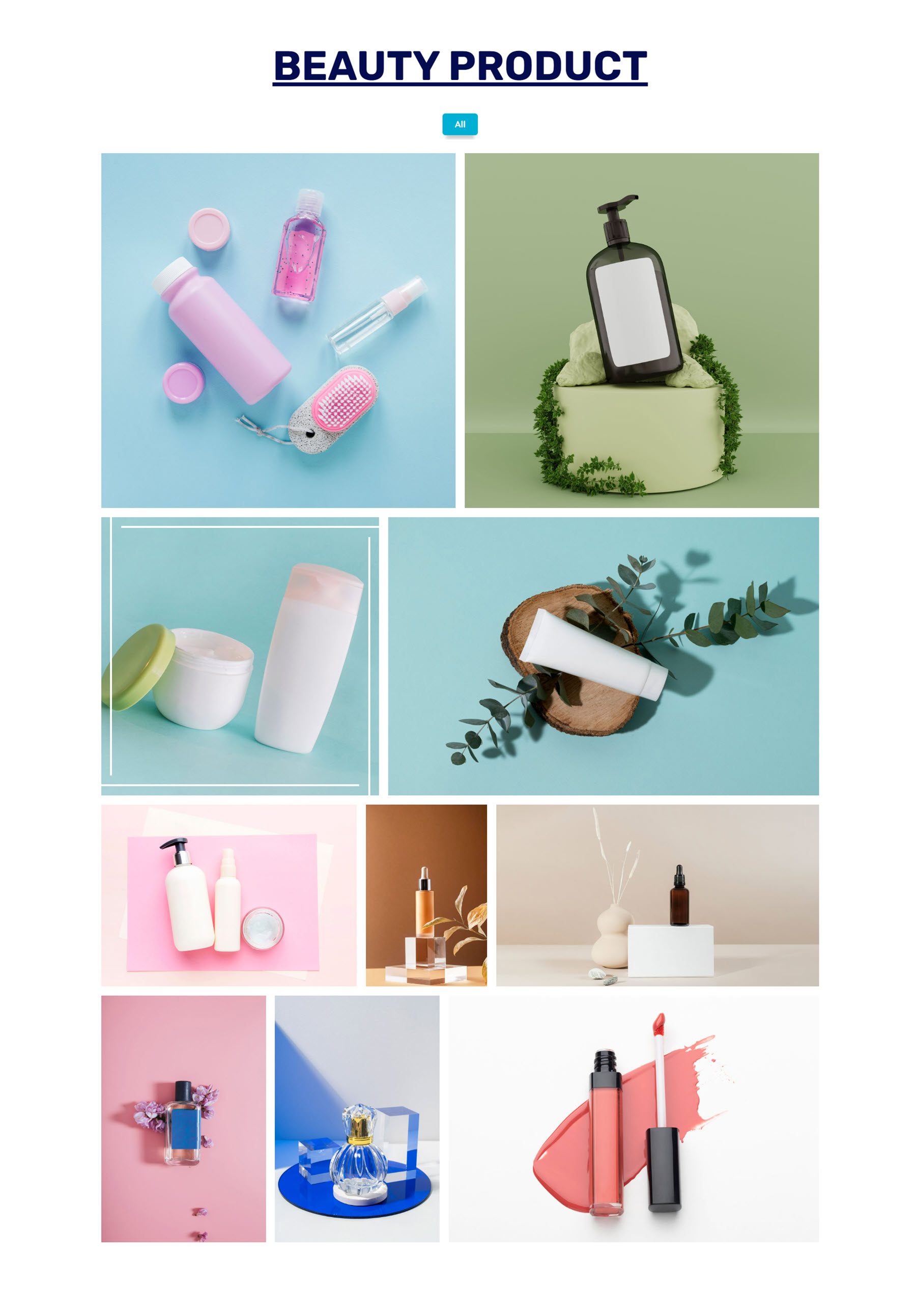
Justified Gallery
The Justified Gallery Module is a great way to display images on your site. You can add overlay and hover effects for the images, and you can enable a lightbox to open on click.
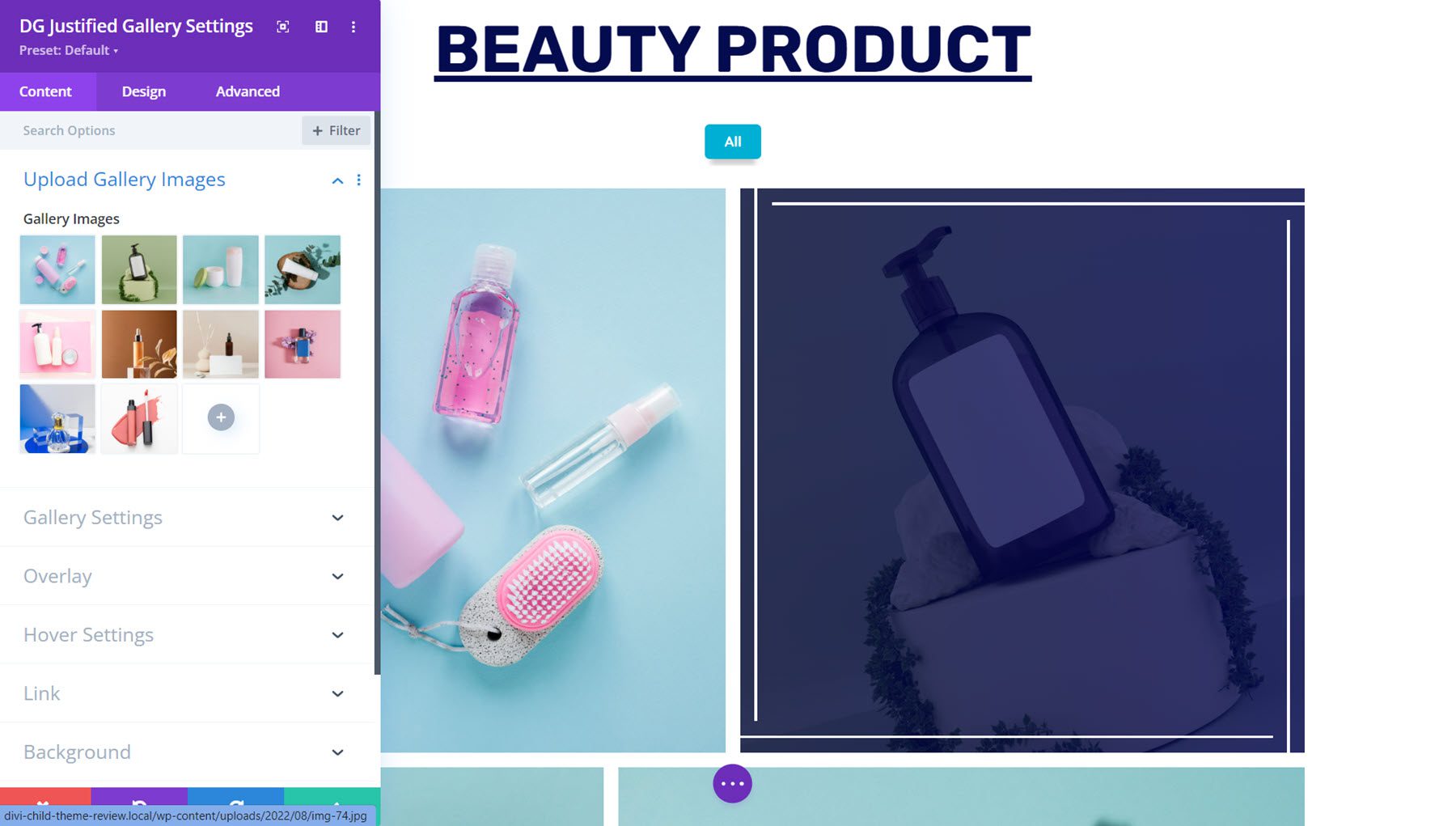
This is Justified Gallery Demo Layout 9. On hover, the image zooms in at an angle, and a border appears. On click, you can view the image in a lightbox.
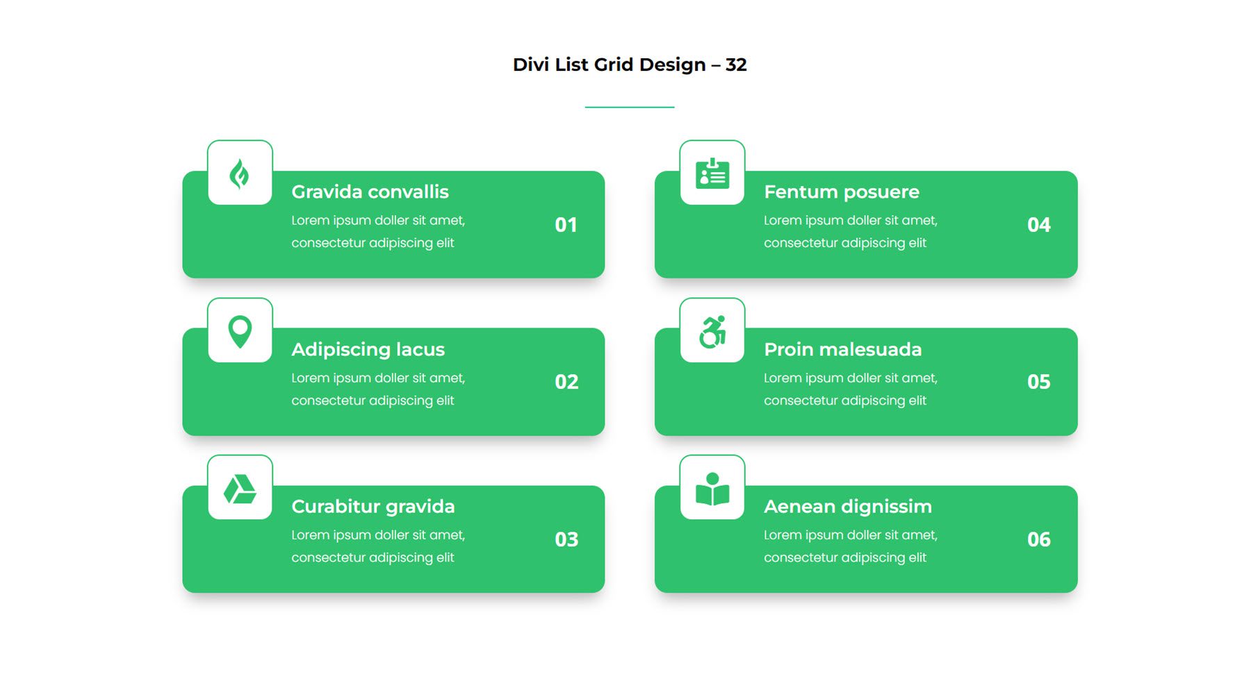
List Grid
Next, the List Grid Module is handy for creating a list of services, features, steps in a process, and more. You can add a title, description, badge, and image or icon to each list item. You can also enable a connector line that can visually tie together your list items.
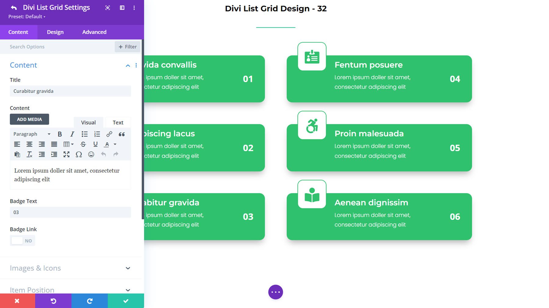
This is List Grid Layout 32, with an icon at the top and a badge on the right with the number.
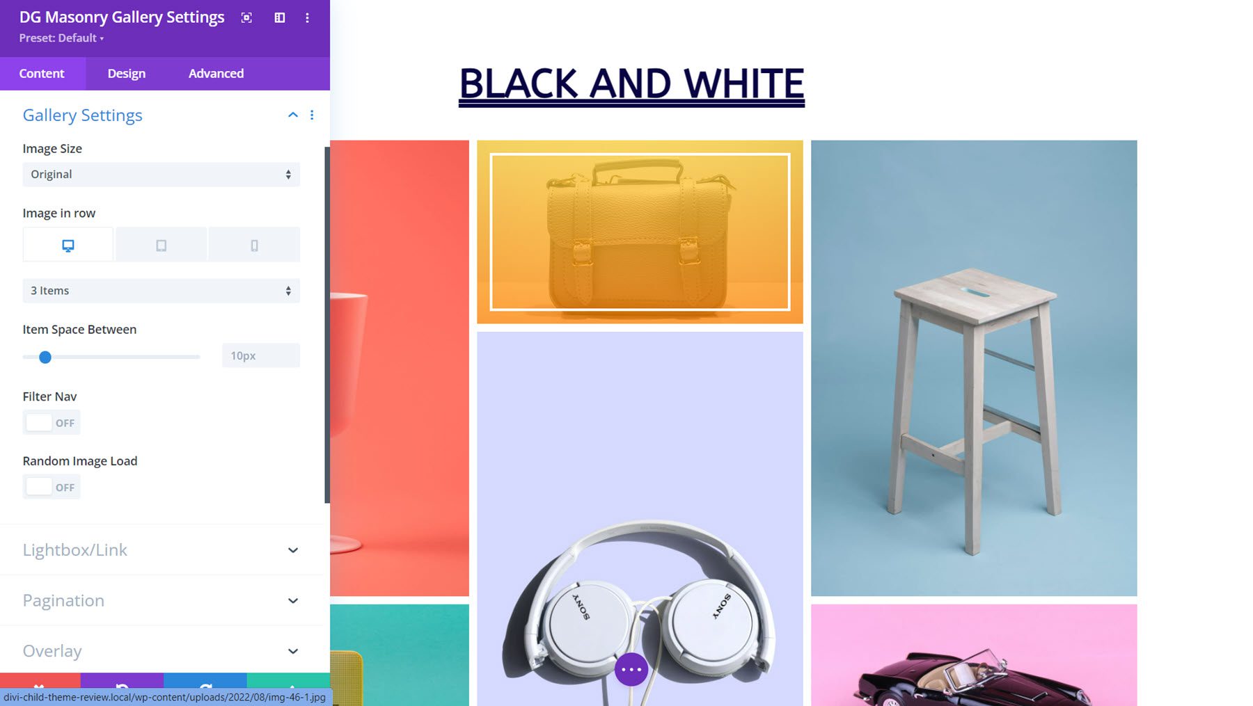
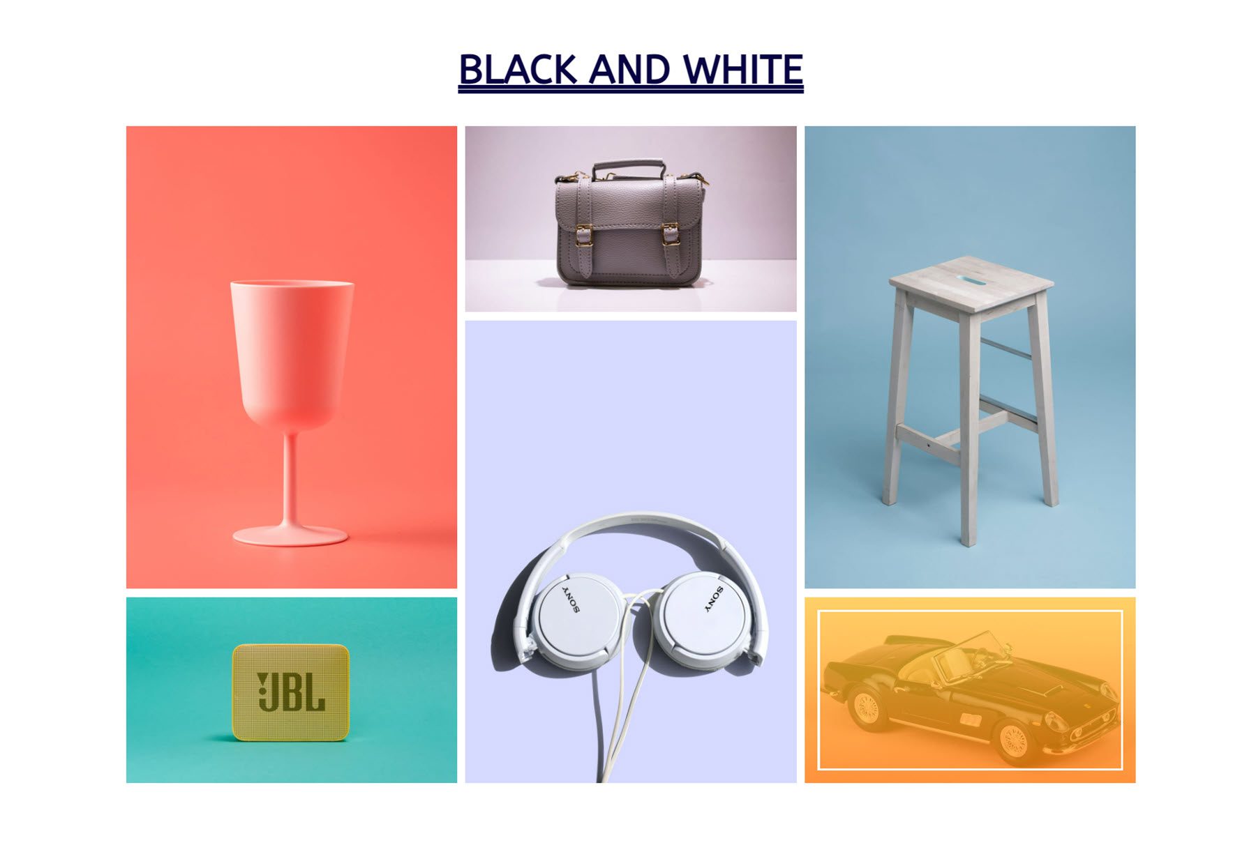
Masonry Gallery
The Masonry Gallery is another option for displaying your images in a gallery layout. You can open images in a lightbox, add pagination, apply overlay and hover effects, and more. Each element is fully customizable with the design settings.
Here is Masonry Gallery Layout 2. It features a colorful overlay and white borders on hover.
With the Multiple Button Module, you can add multiple buttons within the module that display alongside each other. You can choose to display buttons in a row or in a column and customize the alignment. Each button can be individually styled, and the module includes many interesting hover effects that can be added.
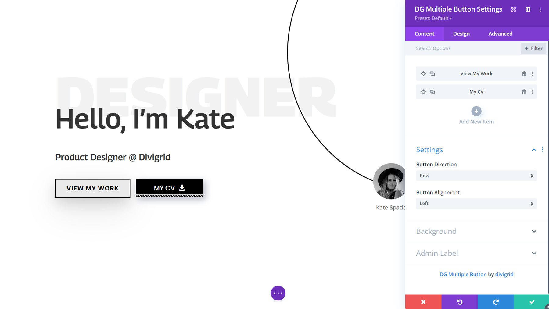
This is Multiple Button Module Example Layout 10. On hover, Dots appear on hover over the first button. On the second button, the stripes on the bottom move on hover.
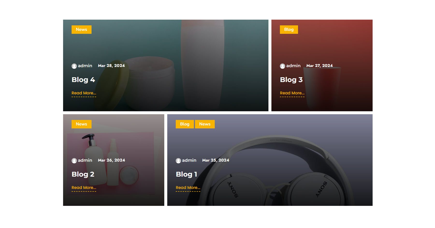
Post Grid
This module makes it easy to display blog posts in a customizable grid. You have full control over the type of posts that appear in the grid as well as the elements that appear on each post. There are many options to customize the layout of the grid, the way the post image appears, and of course, the design of each element that you see in the grid.
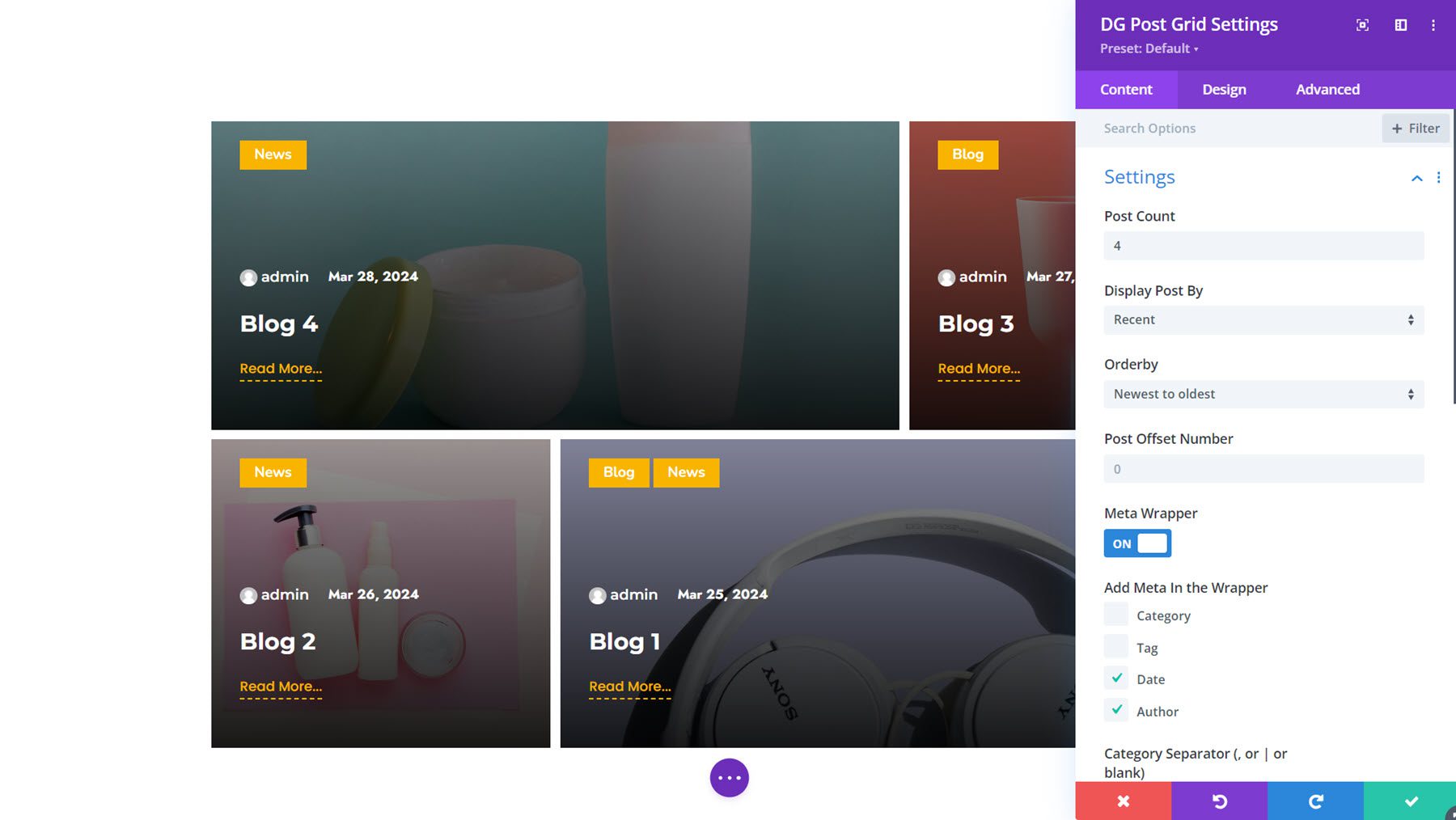
This is Post Grid Module Example 14. It features the featured image as the background of the post item with a dark overlay. For each post, you can see the category, author, date, title, and read more link.
Scroll Multiple Image
Next, with the Scroll Multiple Image Module, you can add images to a carousel that automatically scrolls on your page. You can set up a horizontal or vertical layout and customize the scroll duration and spacing. Each item can have an image, title, and description.
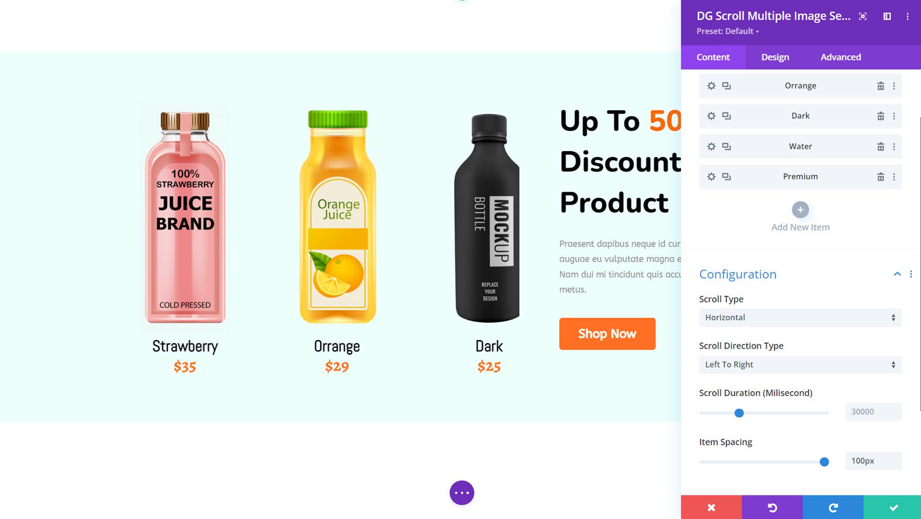
This is Scroll Multiple Image Demo Layout 7, featuring drinks in a horizontal scroll layout with the title and price.
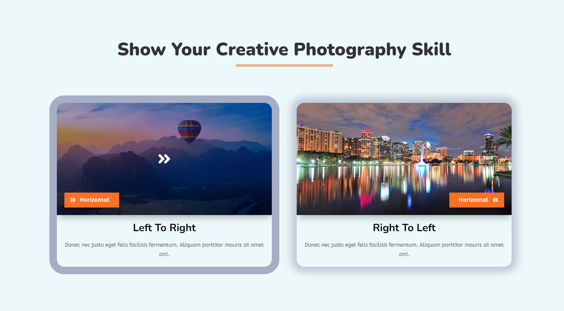
Single Image Scroll
The Single Image Scroll Module is a great way to showcase large images, such as panoramic images, in detail. On hover, you can set the image to scroll top to bottom, bottom to top, left to right, or right to left. You can also add a badge, title, and description to display alongside the image.
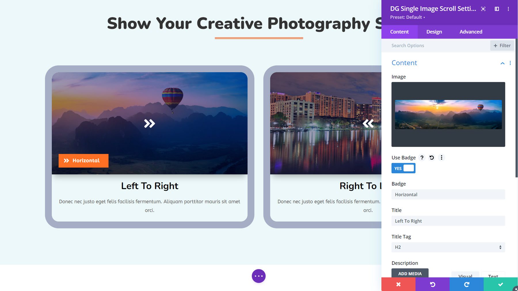
This is Single Image Scroll Module Example 4, which showcases the left-to-right and right-to-left scroll options with an overlay that disappears on hover.
With the Social Share Module, you can encourage users to share your page or post on social media. The module comes with many design options to customize the styling of these icons, including two different layouts, various content and design settings, and interesting hover effects.
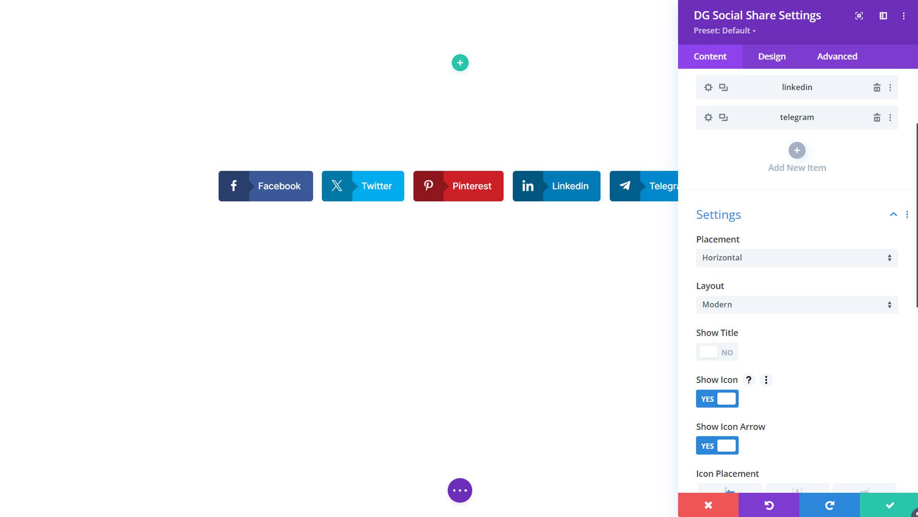
Here is Social Share Demo Layout 1.

Star Rating
You can use the Star Rating Module to showcase customer ratings for your products or services, display testimonials, and more. With this module, you can also display a title, image, badge, subtitle, and description alongside the star rating to create comprehensive layouts.
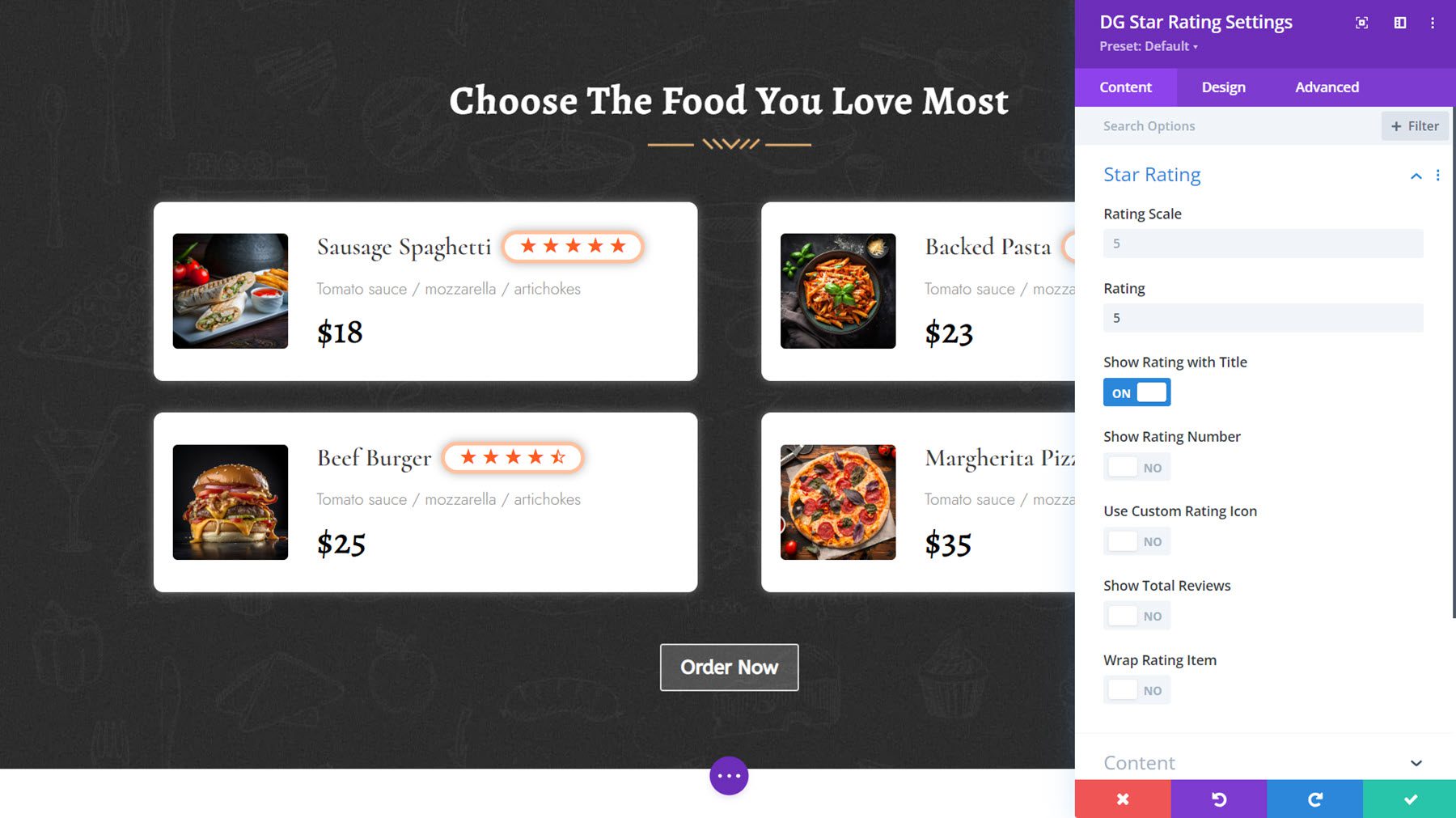
Star Rating Example Layout 3 displays star ratings alongside menu items.
Tilt Image Card
With the Tilt Image Card Module, you can create card designs with an image, content, and a button and enable a tilt effect on hover, adding interactivity to your design. You can also enable an option to show the content on hover.
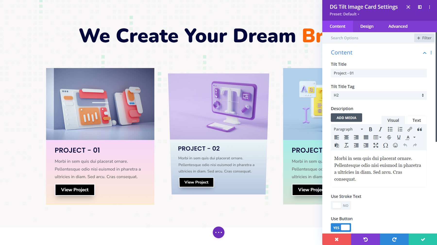
This is Tilt Image Card Demo Layout 8, with a gradient background applied to the content area.
Where to Purchase DiviGrid
DiviGrid is available in the Divi Marketplace. It costs $59 for unlimited website usage and 1 year of support and updates. The price also includes a 30-day money-back guarantee.
Final Thoughts
If you’re looking for a Divi plugin that adds new modules with extended features and design settings, DiviGrid is a great option. With DiviGrid’s modules, you can build complex layouts easily without the need for custom code. All of the modules offer extensive design options, and many include interesting hover and animation effects. The example layouts included with the plugin also utilize the modules and can be a great starting point for your own designs.
We would love to hear from you! Have you tried DiviGrid? Let us know what you think about it in the comments!


I think it should be made clear in the beginning of the blog that this plugin needs to be paid for and it is not included in the Divi Builder for free.