
Home and Garden has always been a popular topic and it’s just as popular online as it is offline. It includes a wide range of subtopics and services, so there are lots of different website needs within the industry. Fortunately, Divi has what it takes to build any kind of Home and Garden website no matter the subtopic.
The topic of Home and Garden is vast can include services such as home design, pool installation, home repair, furniture, home products, and lots more. This list of websites includes most of those topics and those that are not here can easily be visualized from these websites, so there’s still something here to help give you ideas no matter the subtopic you’re designing for.
Let’s take a look at 17 examples of Home and Garden site using Divi. They’re in no particular order.
- 1 1. Design Focus
- 2 2. Sharon Fox Designs
- 3 3. Gellner Ofenbau
- 4 4. Junk Love Boutique
- 5 5. Pocklington Carpets
- 6 6. Penderyn Furniture
- 7 7. GKI Design
- 8 8. Create Interior Design
- 9 9. Eco Cool Homes
- 10 10. Straits
- 11 11. Victoria’s Shutters
- 12 12. Kimberly Timmons Interiors
- 13 13. Luxe Pools
- 14 14. Swiss Krono
- 15 15. Greenington
- 16 16. Breezway Louvre Windows
- 17 17. Residential Interiors
- 18 Final Thoughts
1. Design Focus
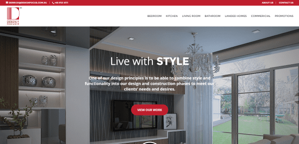
Design Focus includes a full-width hero image with true parallax, a CTA that works as a section separation, about info with an image slider, masonry portfolio with hover effects, and contact info. It includes page links in the top menu. The various pages show off their work in a grid portfolio and includes an information request form in the sidebar with selections and a file upload. This site makes great use of color and layout design. Even though there are multiple portfolios and contact forms the navigation structure keeps them well organized.
2. Sharon Fox Designs
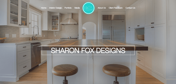
Sharon Fox Designs uses a one-page design with full-screen image with transparent menu, an about section, large alternating images with text for each of the rooms and services, an image grid portfolio, media, about, testimonials, and contact form. The site makes nice use of large images and color branding.
3. Gellner Ofenbau
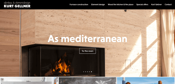
Gellner Ofenbau uses a full-width image slider with CTA and parallax, page links with images and hover effects, about section, and then back to the original image slider. The various pages are portfolios with a large description section followed by the portfolio grid or images and text in two columns. The images look great and the large information sections on the pages add a simple but interesting touch.
4. Junk Love Boutique
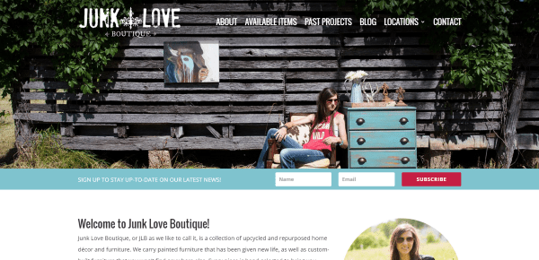
Junk Love Boutique features a full-width image with a transparent menu until scroll, a slim email opt-in form, excellent use of parallax, and an interesting Instagram section with a follow button. Navigation is simple and includes an about page, pages for current and past projects with galleries for each, and a styled blog with a full-screen featured post. The location pages include the address, hours, and a full-width Google map. The contact page includes a short message with phone number and a simple contact form. I love the home and the project page design.
5. Pocklington Carpets
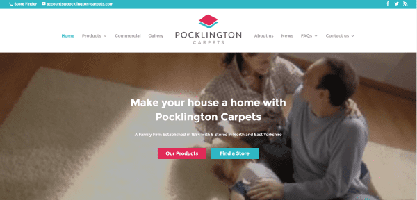
Pocklington Carpets uses a video background with CTAs, a section showing brands, products with images and links to the various pages, a post slider, a store location section with images of the stores and hover effects, map search, contact form, links to the blog, and a footer with all of the links customers will need. The product pages show all of the colors in tiles, information in tables and lists, and a store finder. The branded colors are used throughout the pages in fonts and section dividers, and within menus.
6. Penderyn Furniture
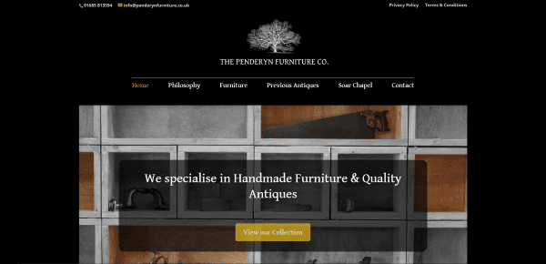
Penderyn Furniture uses a boxed design with a large image and CTA in an overlay and links to the latest products. It includes page links within the top menu. WooCommerce is used to display products available in the store. The site includes a couple of about pages and a contact page with map and contact form. It’s a simple site that makes good use of color branding.
7. GKI Design
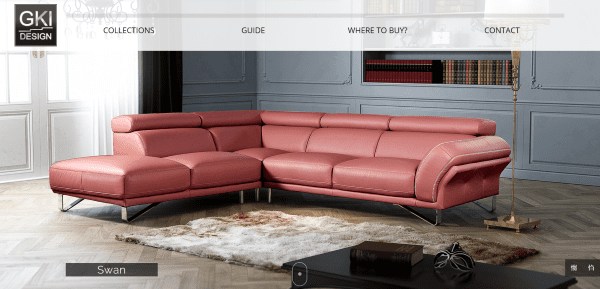
GKI Design uses a full-screen image slider with transparent menu and parallax, several sections of post images with hover animation, and a large footer with links. The Collections page shows the various products and the product pages display the product using a product card. The Guide page uses a post grid in a one-page design with interesting use of color, image galleries, and small articles. This site makes elegant use of color and images and I find the separation of text in the menu intriguing.
8. Create Interior Design
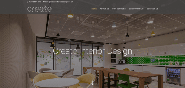
Create Interior Design uses a full-screen parallax background, an about section with section styling, a testimonial with a parallax overlay, a link to the portfolio, and a contact form. Warm brown tones set the mood and style. The About, Services, and Portfolio pages use a post grid with hover effects and information or links in the sidebar. The Contact page uses a hand-drawn map with link to Google Maps, contact information, and a contact form. The site uses color and hover effects consistently throughout to create a professional setting.
9. Eco Cool Homes

Eco Cool Homes uses a full-screen image with CTA and signup form, an information section with four columns of text, another information section with an image, bullets, and CTA, product info with blurbs and parallax, a section with alternating text and image sliders, an about section, a portfolio, awards, and CTA. The portfolio pages include a full-width header, images, bullets, video, and a detailed image gallery. The product information pages use WooCommerce to display the images and bulleted information along with a PDF download.
10. Straits
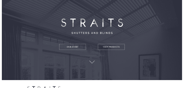
Straits includes a full-screen image with CTAs, a header under the image with the logo, menu links, and clickable phone number, a section with images that link to product collections using hover effects, an about section, and a contact section. The product pages include an image with information about customization and content toggles. The popup signup form includes a matching background image.
11. Victoria’s Shutters
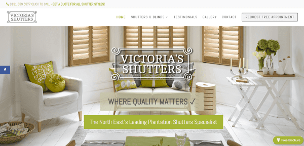
Victoria’s Shutters includes a full-width image with parallax and CTA, a CTA in the menu, a floating download link, an image slider with CTA, about section with overlay, information section with overlay, a CTA section, information, contact, another information section with parallax, and a Facebook feed. The product information pages include lots of images and text with overlays, blurbs, and CTAs. The top menu include a clickable phone number. The site makes good use of branded color and images.
12. Kimberly Timmons Interiors
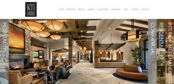
Kimberly Timmons Interiors has a unique slider with the categories positioned vertically and sliding with the images. The homepage also includes an about section, and a team section with images that include hover effects. The portfolio is filterable and displays a grid with hover effects. The Awards page displays their awards in a masonry grid. The Publications page displays magazine covers with links to PDFs. The site makes excellent use of visuals. I love that slider!
13. Luxe Pools
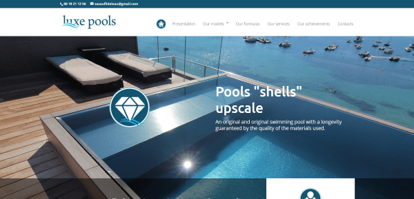
Luxe Pools uses a full-screen image that displays with multiple sections using parallax. The homepage include animated text, company information with contact links, product information with images, CTA, links to posts with hover effects, and a contact form. The product information pages use WooCommerce to display ratings, pricing request forms, images, etc. The menu includes animations.
14. Swiss Krono
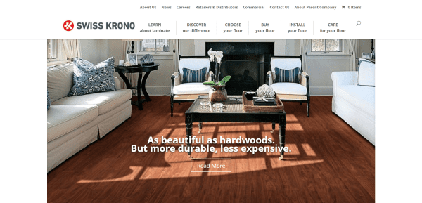
Swiss Krono uses a boxed layout with a full-width slider, an overlapping product search section using a search widget, blurbs with multiple links, and a footer with links to the various pages placed under categories. The various pages include accordions, stylized post thumbnails, a dealer locator, etc. The site keeps a consistent design throughout, uses styled sidebars, and makes great use of color in its branding.
15. Greenington
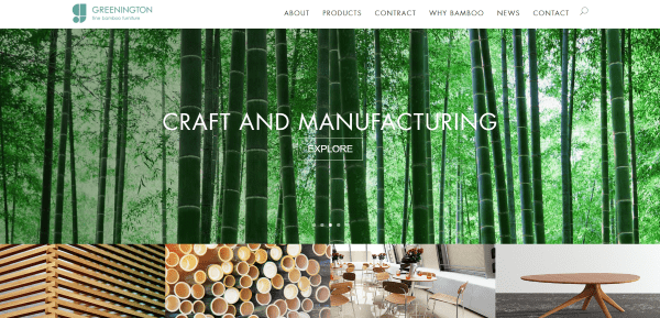
Greenington uses a full-width slider with CTAs, image links to key pages, and a footer with text links to all pages. The About, Contract, and Why Bamboo pages are highly detailed using multiple images with parallax and company and product information. Products are displayed with WooCommerce and include a filterable category menu. This site makes great use of images and parallax.
16. Breezway Louvre Windows
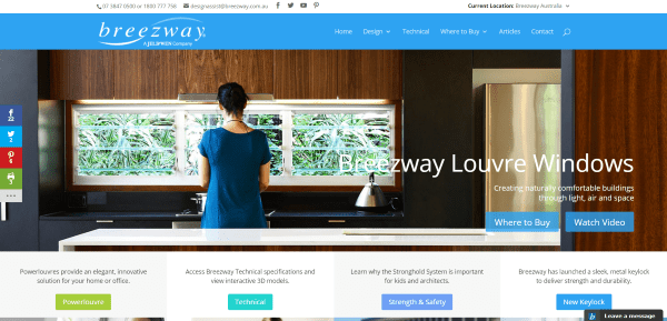
Breezway Louvre Windows includes multiple page designs that are displayed based on the location you choose from the top menu. I chose Australia which includes a full-width image with links, and page descriptions and links and images. The design pages display everything from the company profile to an FAQ. The Ideas Gallery features multiple gallery categories. Where to Buy includes a location search feature. This one is interesting in that it includes many design features that makes it look like Divi and not look like Divi at the same time.
17. Residential Interiors
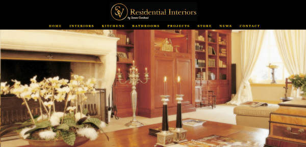
Residential Interiors uses a landing page with a single link to the homepage which includes an image slider and menu with links to various pages for the rooms, projects, and store include galleries in a grid. What I find interesting is the News page, which is actually a grid with Facebook posts that are integrated perfectly within the design of the website.
Final Thoughts
These 17 examples of Home and Garden websites created with Divi are great examples for using layouts, sliders, navigation, colors, images, video, animations, shops, sidebars, and more. If you need inspiration for a Home and Garden website, these are sure to provide some ideas for you to use in your own creations.
What are some of your favorite elements of these Divi Home and Garden sites? Let us know in the comments below!
Featured Image via Dukesn / shutterstock.com


On the Swiss Krono site how did they get their main menu to have two lines to it?
For example the first one
LEARN
about Laminate.
Great!
Divi looks aweasome
Wow! How to apply the same menu as Kimberly Timmons Interiors used? I can’t see this option in my Divi theme.
Hi Randy,
Wow, these are looking awesome sites built on Divi. Divi is great all in one theme. I’ve a review post of Divi on my blog.
Thanks!
You always rock.. Great pick!!
Thanks Abhishek!