It’s time again for our monthly Divi Showcase where we take a look at some amazing Divi websites from our community members. Each month we showcase the best Divi websites that were submitted from our community and today we want to share with you the top ten websites for this month. Throughout the post I will point out some of my favorite features for each of the websites.
I hope you enjoy them!
The Best Community Divi Site Submissions for October 2017
1. Ground Up Restaurants
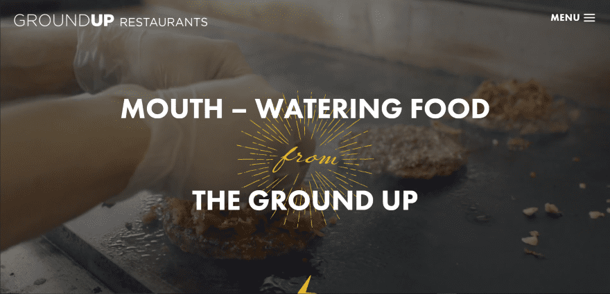
This site was submitted by Haley Kramer. The header plays a full-screen video behind an animated tagline and icon. Images of the restaurant are used in true parallax backgrounds. CTA’s use the yellow branding from the tagline. The food menus use toggles with images that expand on click, creating one of the most unique food menus I’ve seen while remaining simple at the same time. The site makes excellent use of large typography and toggles.
2. Loxone
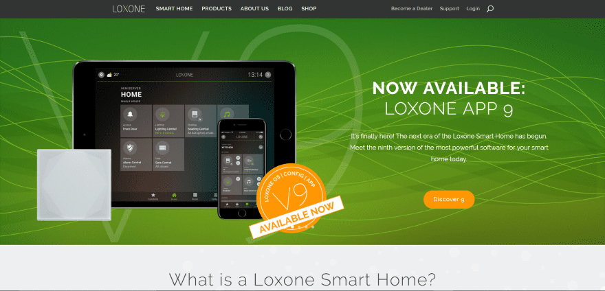
This site was by John Wechsler. The site uses a full-width slider with a stylized background that focuses on the product. Product information is displayed as clickable images with text overlays within a four column grid. The blog displays posts within the header using overlays and uses a different color overlay for each category, creating a unique blog design that’s nice to look at and intuitive to use.
3. CODECRATER
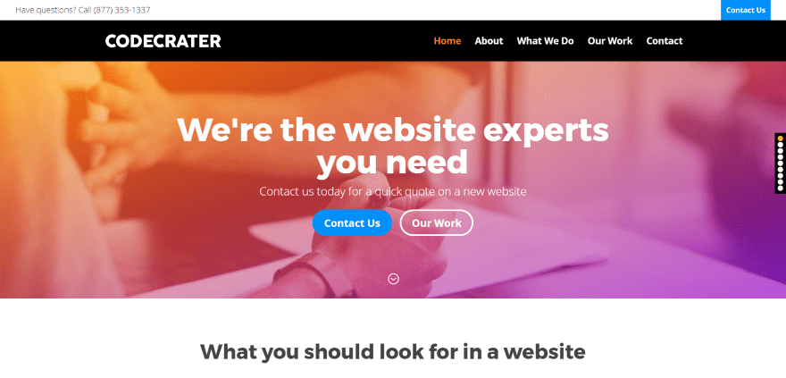
This site was submitted by Michael Salem. The site displays a full-width background with gradient overlay, tagline, and CTA’s. A smaller version of the image and gradient is used for Contact Us CTA’s throughout the homepage. Blurbs are displayed in a section of five columns. The secondary menu includes a CTA. It also uses stylized dot navigation that stands out while not overpowering the site’s design.
4. Duse Media

This site was submitted by Victor Duse. The full-screen header displays a diagonal overlay that covers the parallax background on one side. A typing effect displays the tagline under the full-screen header. The site uses a bold combination of yellow and blue with white text, and makes great use of backgrounds, overlays, and animations.
5. Flair Designs
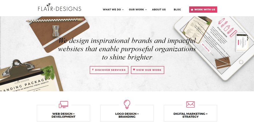
This site was submitted by Rachel Shewmaker. The site uses a clean design with red highlights throughout. It makes creative use of red for icons and buttons, menu CTA’s, and even within the objects in the background images. Projects are displayed in a stylized project grid with red overlays and styled filter in the header.
6. The Malverns
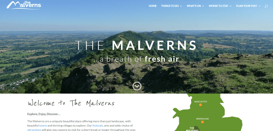
This site was submitted by Joel Keller. It displays a full-width image with tagline followed by a section with a styled map. A multi-layout grid displays images and links to pages with hover animation. A video section displays a clickable icon over a parallax background. Events are displayed in a two-column calendar with one column focusing on a specific event. Locations are highlighted in blurbs. Icons invite you to search according to categories. This website makes me want to travel.
7. Adaptive Architects
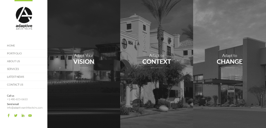
This site was submitted by David Blackmon. This is the only site on the list with a vertical menu. The full-screen header displays pages in three columns with hover animation that shows the image in full color. Scrolling reveals a line-drawn background that’s used in parallax for the next three sections – each with either no overlay or a transparent overlay. Stylized testimonials use overlapping images. The green highlights give the site a touch of color without distracting from the content.
8. Boutique Nana
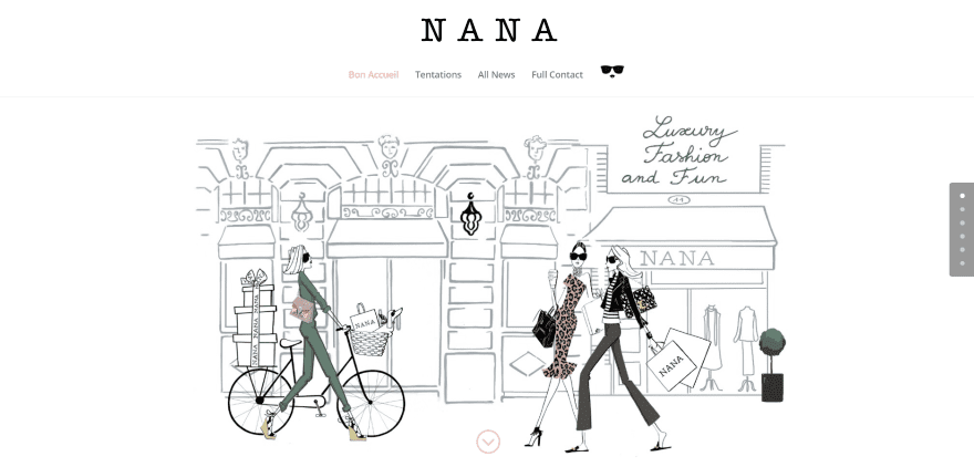
This site was submitted by Fifa Randrianasolo. The site uses a simple but effective design. The line-drawn background with a focus on the people are all that’s needed to show what the site is about. The next section tells the story of the boutique and categories are displayed with images from the items in the boutique. Another section steps through the selling process. The simple design is highlighted with soft colors that appeal to the target audience.
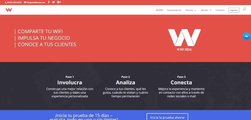
This site was submitted by Juan Acosta. This website displays business actions within the header and describes the three-step process with CTA. Information sections use colorful icons that follow the site’s styling. The customer’s page shows the various types of clients by showing icons and text over a colored background, which varies by section. The site makes excellent use of color and icons.
10. Midnay

This site was submitted by Ajay M Arvind. The site uses large typography with bold colors. The full-screen header displays a large tagline in a purple overlay with CTA’s. Orange is used as highlights in text and icons. Stats are displayed with large icons and fonts in white and orange text over a dark purple background overlay. Client icons are displayed in a full-width grid. I’m amazed at how perfectly orange and purple work together.
In Closing
That’s all for this round of the Divi design showcase. The sites look great! Thanks everyone for your submissions.
If you’d like your own design considered please feel free to email our editor at nathan at elegant themes dot com. Be sure to make the subject of the email “DIVI SITE SUBMISSION”.
We’d also like to hear from you in the comments! Tell us what you like about these websites and if there is anything they’ve done you want us to teach on the blog.
Featured image via Lantica / shutterstock.com


All stunning websites.
I liked exploring The Malverns – by jeanius-design.
There’s a lot to like, from hover effects to the sticky map on scroll.
Inspirational and Nicely done 🙂
Thanks for the comments, Chook! It was a great project to work on. Joel was an excellent client & together we’ve put together something that we are very proud of! 🙂
Jeanius, is a really great website! May i ask what kind of drop menu are you using? Thanks in advance 🙂
Hi Nayara! Thank you! It’s the standard Divi Mega Menu, but customised with classes & CSS 🙂
I agree – the Exploring the Malverns site is great. What were you using for the calendar? It’s exactly what I’m looking for.
Flair Designs has a gorgeous portfolio. Wow. Love the colors and alignment.
Thanks for featuring GroundUp Restaurants! =)
Thanks for featuring Loxone Smart Home!
Loved Boutique Nana
Nice websites! I hope that the next update will be focussed on menu styling because this is the weak spot of DIVI (there are options but not fully customisable). Great work!
How to submit Divi sites?
I submitted mine but it didn’t make the list nor I received a reply to know if they got my email. Oh well, I ll try again next month ?
I love the Malvern one – I’d love to know how the video and the section above it were put together
Thanks for promoting Duse Media. 🙂 Great webdesign inspiration from all 10 sites.
Thanks for featuring our Visit the Malverns site! 🙂
Wow! Thanks for featuring Midnay’s website Randy.
Great websites! I’m looking forward to the next update, especially if it focuses on menu styling, as that’s a weaker area in DIVI. There are some options, but they aren’t fully customizable. Keep up the excellent work!