
It’s time again for our monthly Divi Showcase where we take a look at 10 awesome Divi websites made by our community members. Each month we showcase the best Divi websites that were submitted from our community and today we want to share with you the top ten websites for the month of July. Throughout the post I’ll point out some of my favorite design features that draw me to each of the websites.
I hope you like them!
Divi Design Showcase: New Submissions from July 2018
1. Teix Web Studio
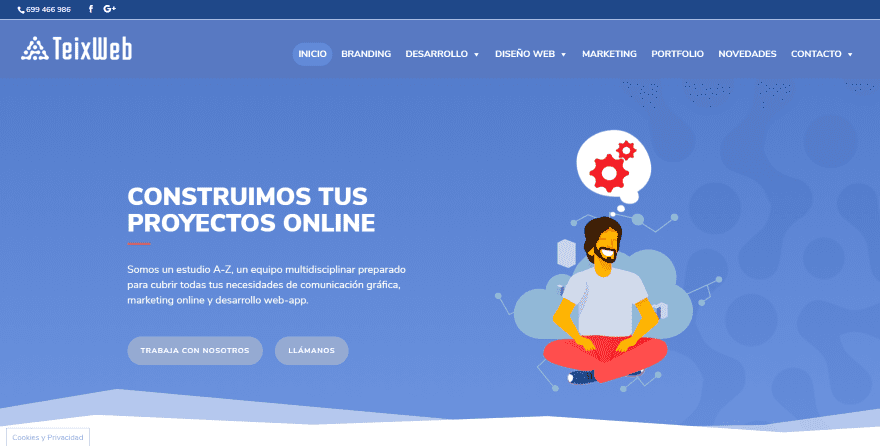
This site was submitted by Axel Shannon. It includes a hero section with a nice background pattern. Over the pattern is an animated graphic and a call to action. The section utilizes styled section dividers that appear throughout the homepage. The next section provides information and blurbs. The blurbs create a mosaic and use box shadow. Another section uses a similar styling for a gallery over a patterned background. Rounded number counters overlap the sections. A contact form overlaps a map. I love the way this site uses overlapping and graphics.
2. Vity
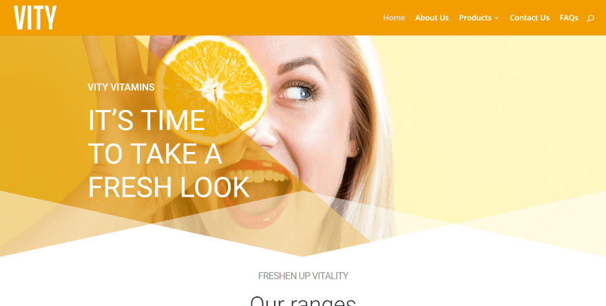
This site was submitted by John Cooper. It uses an interesting design for overlays over the hero section that creates a styled divider and provides multiple colors created by the pattern. The product images overlap two sections and it includes styled blurbs for descriptions. A product slider shows images in the center of the screen while blurbs provide information on both sides. The product pages use a similar design and include box shadow styling.
3. Newport Cosmeceuticals
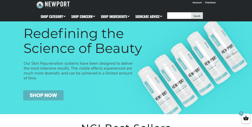
This site was submitted by Jeremy Gruver. It includes a full-width slider to show information and images of the products and a button to visit the shop. A shop module shows the products in four columns with styling to match the company branding. A CTA shows the product with a list of features and a shop button. The shop pages provide a search filter that lets you narrow down your search choices. It also provides an interesting social-follow section that shows the number of shares next to extra-wide buttons.
4. Dual Sportswear
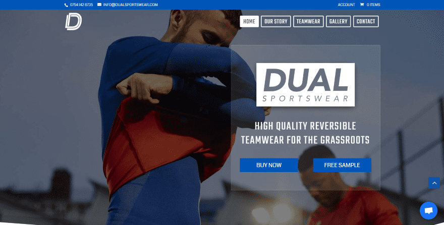
This site was submitted by Simon Frost. It has an interesting shop design. The homepage includes a full-screen image, a styled menu with each menu item outlined, a transparent CTA, and a styled section divider. The next section is my favorite. It includes a photo of the product next to a numbered system to show the steps. Each number is clickable and clicking on them shows information with a transition animation. The contact section shows a background image in true parallax with styled dividers.
5. OMT Veyhl
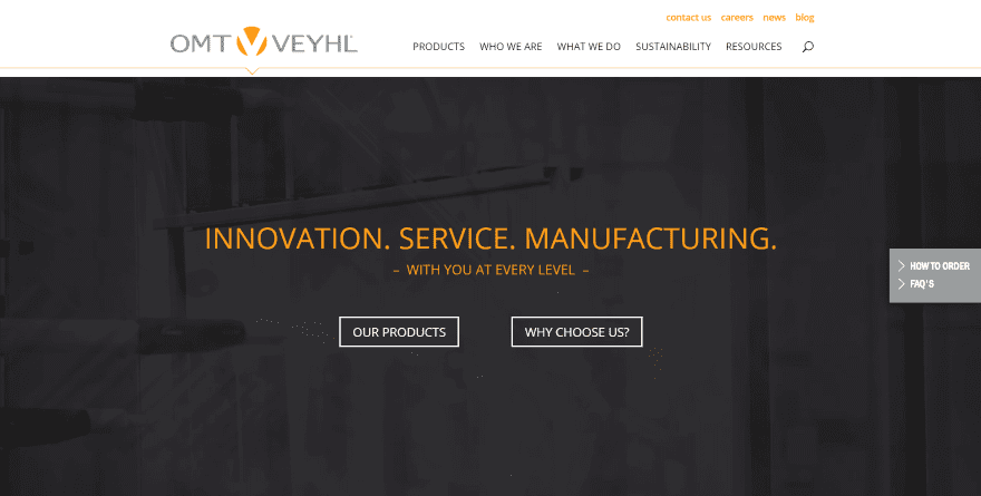
This site was submitted by Jonathan Mast. A line under the menu shows a small arrow that moves to the menu item you’re hovering over. The hero area shows a video to demonstrate the manufacturing process behind a dark overlay. Bold yellow text provides a tagline. This same yellow is used as titles and as the background for the footer. The next sections provide a single column of text and a pair of CTA’s over a styled background pattern.
6. Volume 18
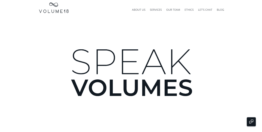
This site was submitted by Chelsey Lake. It uses a minimal design with a focus on large typography and black and white photography. Scrolling away from the large tagline shows an image that overlaps the two sections and provides company information. Services are described within blurbs that use a scrolling title for the section. Oversized person modules show large images with box shadows and text to one side in an alternating pattern, overlapping each image. A numbered section shows the benefits of working with the company with a heading that overlaps the previous section.
7. Amelie Frohlich
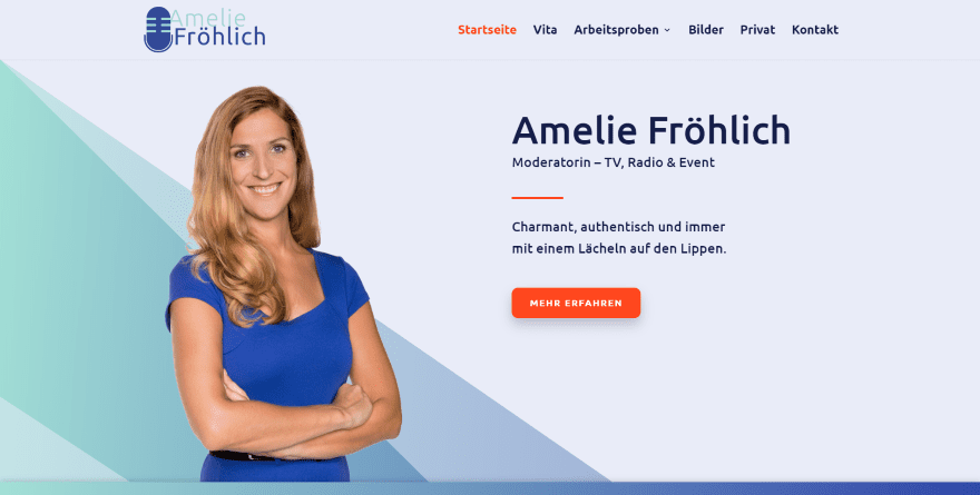
This site was submitted by Philipp Stakenborg. The homepage makes interesting use of gradients to create background patterns in multiple colors. The colors appear behind a photo to one side with a CTA on the other. Just under this is a full-width section with logos of media and then the background continues into the next section that includes an image on one side and info on the other. Blurbs display large graphics within circles that match the colors of the site and buttons with box shadows. The footer uses a gradient that includes the colors from the site.
8. HighSpark

This site was submitted by Eugene Cheng. It displays a dark background just in focus enough to tell what it is for the hero section. Over this is the tagline and information with a CTA using a blurred shadow effect. The next section displays a title, divider, and company logos. The next section uses a styled section divider and provides testimonials in three columns and the same CTA as the hero area. The colors change from yellow to orange to display blurbs, an email signup, and then a final CTA blends the two colors as a gradient over a background image. The blog uses the same colors as image overlays.
9. Bubbles Planner
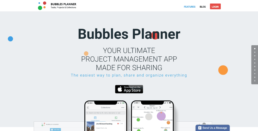
This site was submitted by Gennady Batrakov. Bubbles animate across the screen as the hero area shows the title, tagline, links to the app store, and images of the product that overlaps the next section. Blurbs show graphics to match the bubbles. I love the next section that shows an embedded video and overlaps the section above it and the two columns for its section. The box-shadow makes it stand out. Several sections show the product on one side with blurbs on the other, alternating as you go from one section to another. The blog slider is also interesting. It shows a large featured image with text to the left and the category overlapping the image.
10. Charlie Clark
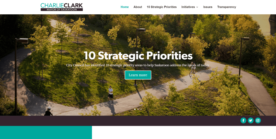
This site was submitted by Molly Seaton-Fast. A slider shows multiple CTA’s and includes a small full-width section to display social follow buttons. The next section provides a styled newsletter signup form to one side with a blog feed on the other followed by an embedded social feed slider. Multiple blurbs with a column of text create a CTA while animated blurbs expand on the information. An interesting green is used for titles, buttons, blurb icons, and backgrounds throughout the site. It also includes an embedded Instagram feed. I love the use of color and typography in this site.
In Conclusion
That’s our 10 best community Divi website submissions for the month of July. These sites look amazing and as always we want to thank everyone for your submissions!
If you’d like your own design considered please feel free to email our editor at nathan at elegant themes dot com. Be sure to make the subject of the email “DIVI SITE SUBMISSION”.
We’d also like to hear from you in the comments! Tell us what you like about these websites and if there is anything they’ve done you want us to teach on the blog.
Featured image via world of vector / shutterstock.com


Volume 18 is nice looking for a minimalist site.
So awesome, very inspiring.
Like the sportswear site. Buy now/free sample good idea!
Dual sportwear look better, good for ecommerce themes.
Guys…I don’t understand…when I try to reach you to enter my website to showcase I got an answer that divi showcase is no longer maintained…
But I see that is maintained….
Hi Linas,
I’m the only person who manages these posts. I’m sorry if someone else accidentally misinformed you. If you follow the instructions in the post above I’ll receive your site submissions.
Best,
Nathan
Hi Nathan: Can you tell me how they Teix Web Studio Site added the Popup We’ll Call You Now. Much Appreciated, Vickie Christensen
Hi Vickie. That’s done with Bloom. There are several good tutorials here in the blog about setting up and styling Bloom. I like that one too! 🙂
Exactly, we configured it with our Mailchimp and as soon as we receive a new suscribed user we call him 🙂
I love the Volume 18 one, so much minimalist inspiration there.
Volume 18 is fabulous, best-looking site for ages
Volume 18: from logo to page is very clean, lovable and attractive. As need for 4 womans agency. take 5
Love to see some Canadian content with the website from the Saskatoon mayor.
Thanks Divi team for submitting our website!
Divi Is amazing theme I am just going to purchase Divi Theme For my website and redesign my site with divi