It’s that time again for our monthly Divi Showcase, where we take a look at ten awesome Divi websites made by our community members. Each month we showcase the best Divi websites that were submitted from our community and today we want to share with you the top ten websites for the month of January. Throughout the post, I’ll point out some of my favorite design features that draw me to each of the websites.
I hope you like them!
Divi Design Showcase: New Submissions from January 2020
1. Altmonde
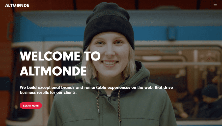
This site was submitted by Daniel Behrens. It displays a full-screen background video with a tagline and CTA in the foreground. Following this is a full-screen section with a title with hover effects to introduce the next section, which displays in parallax as you scroll past the title. This section displays titles in large text with hover effects to one side and a CTA in the other. The next section provides information about how they work with clients. This includes a white background with a diagonal design and numbered text that expands on hover. Another CTA zooms in and out as you scroll. The Services page shows each service within a split-screen with CTAs on one side and background images in parallax on the other. I like the use of text, color, and images in this site.
2. Vemel
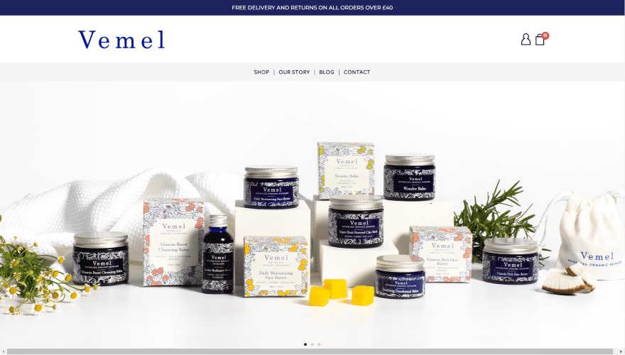
This site was submitted by Murray Price. This is an online shop with a image slider that displays products in full-width. A welcome section shows information next to a product image with a link to read more. A shop section shows products with links to the product pages. My favorite section shows a large product image in the center surrounded by blurbs with descriptions, icons, and curved arrows pointing back to the product. The home page also shows product images in an alternating layout, reviews within a testimonial slider, a blog section with two posts, and an Instagram slider. The layout includes a line a white-space and simple lines that creates a minimal design.
3. Prugner’s
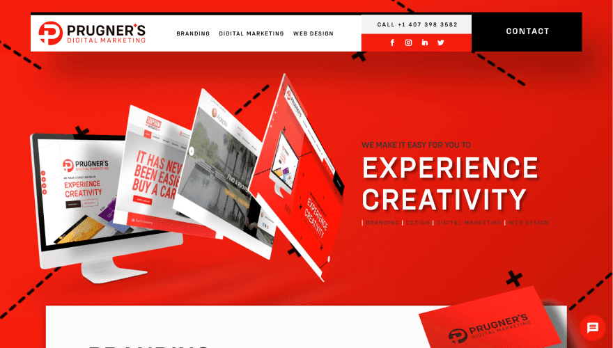
This site was submitted by RAPHAEL PRUGNER. This is a one-page design. A multi-layered menu sets apart from the page and shows a clickable phone number above social buttons next to a CTA. The hero section shows a full-screen background pattern, while the foreground shows a computer screen with an example of work and reveals even more on hover next to a title and tagline. Scrolling reveals a cutout section with text and graphics that scroll over a background image in parallax. Benefits are disaplayed within blurbs in an alternating layout against across multiple sections and include hover zoom effects. Example projects are displayed within a slider. Other projects are displayed within an embedded Instagram feed. It also shows a CTA that zooms as you scroll and a styled contact form.
4. Purple Lemur
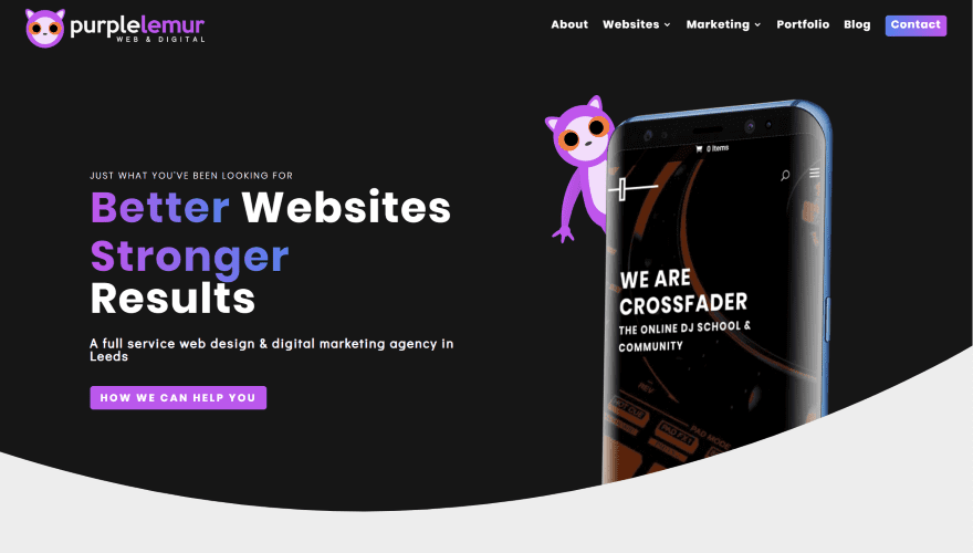
This site was submitted by Liam Pedley. The ttitle, tagline, CTA, and an example product image with a branded graphic of a lemur sits over a black background that includes a rounded section divider. The text and buttons have a purple gradient that matches the graphics throughout the site. A row with three graphics of lemurs are placed above a section that shows text and blurbs. Clicking on the lemurs reveals different sections of information with an arrow pointing to the section. Company information is shown in a two-column section with a computer screen to one side that shows a background image in true parallax. I especially like the portfolio section. It shows images at an angle. Hovering over any of them lifts the image upward and toward the screen, leaving colored slides behind them. A testimonial slider shows three sides at a time with the one in the center flat and the other two angled. It also includes styled blog cards and blurbs with hover animations for each of the services.
5. DShjemmeside
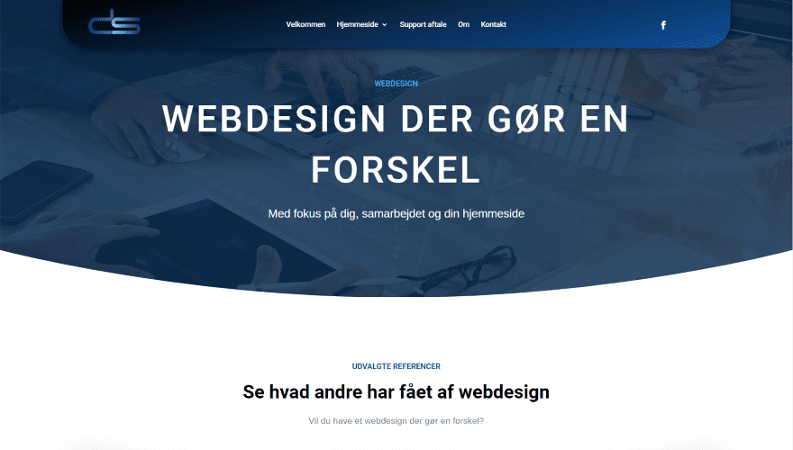
This site was submitted by David Sylvest. It displays a background with a dark blue overlay and a rounded section divider and a large title in the center. The header placed the menu in the center and incldues a styled background with a gradient and rounded corners. I love the next ection. It shows examples of work within three cards that are tilted. The two on the sides are angled inward. They include hover effects. The next section shows a CTA with computer monitors at an angle and a patterned background. The benifits section shows bullet points with large blurbs next to a graphic of gears. The site also includes lots of CTAs with styled icons and circled images, a circled image of the developer, an FAQ section with toggles, and a styled contact form. The layout makes excellent use of color, graphics, and images.
6. Zipline Careers
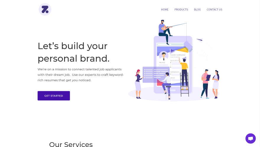
This site was submitted by Nicole Marie Zinnanti. The site uses lots of white-space with the right amount of purple graphics and highlights. The hero section shows a CTA on one side and a graphic of people building a resume on the other. The next section shows the services within blubs that use purple and white graphics and purple borders and shadows. An embedded video is placed over a background pattern that shows dots in the top half on the left and in the bottom half on the right. Blurbs with styled icons show the benefits in a clean 3-column layout. The design also includes a CTA with graphics, styled blog seciton, and a CTA with buttons to create a custom footer. I also like the blog. It displays a full-with graphic in the header with a diagonal divider and then blog cards in a clean grid.
7. Adoption Support Center of Saskatchewan

This site was submitted by Molly Seaton-Fast. It shows a full-width image of kids playing and three text modules to create large buttons for navigation. Each of the buttons have rounded covers that become taller and have square corners on hover. Blurbs with partial borders create links to specific topics. Information is provided in a tow-column section with blurbs and a CTA to one side and a accordion on the other. A donate CTA blends into the mailing list section. Each of the sections use styled colors and background patterns that match. The Events page includes an embedded events calendar. The Donations page includes an embedded donation box. The site has a lot of information to share and the menu keeps navigating the informaiton a clean as possible.
8. Nanaimo Heights
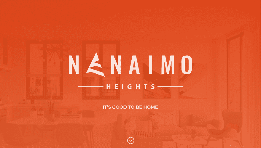
This site was submitted by Danielle Mah. It has a one-page design and it’s multi-lingual. The hero section displays a full-scren background with an orange overlay that includes the title, tagline, and down arrow. The hero section also includes an angled section divider followed by the navigation menu which locks in at the top on scroll. Several registration CTAs show images of the building. The layout also includes a full-width image of the interior with blurbs that show the benifits. Several sections show features using bullets and images in alternating layouts. An embedded map uses the same colors as the rest of the site. Floorplans are shown within a slider and includes downloadable PDFs. The registration form includes questions to help determine the exact type of apartment you’re looking for. I love the use of color and photography in this site.
9. More than a Few Words
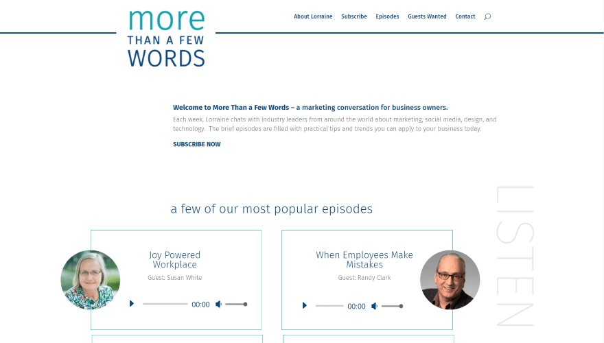
This site was submitted by Britt Baue. The menu displays an overlapping logo followed by a small welcome message. The main portion of the page includes lots of embedded podcast epsiodes with styled audio players. The first section shows podcasts in two columns with a verticle title and a link to hear more. A section of text with information about the show includes a verticle title on the oposite side. Another section includes the title and displays a list of podcasts with an audio player next to a contact form. Following this is a section with links to subscribe to the podcast from all of the major hosts. The About page adds a list of topics and a styled testimonial slider. The design uses lots of white-space and a minimal layout that looks clean and elegant.
10. Negrosanon Young Leaders Institute
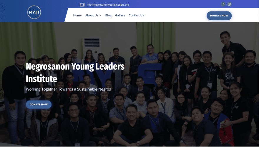
This site was submitted by JR Galia. The hero section displays a full-width background image with a title and CTA in the overlay The navigation menu also displays the CTA and includes the menu within a separate segment. A section of programs displays cards with donation buttons. I especially like the Get Involved section. It displays a large image on one side and blurbs with graphics on the other. The layout also includes number counters and a styled contact form. The about, blog, and gallery pages follow a similar design and adds a solid shadow to the text, blog, and gallery modules.
Conclusion
That’s our 10 best community Divi website submissions for the month of January. These sites look amazing and as always we want to thank everyone for your submissions!
If you’d like your own design considered please feel free to email our editor at nathan at elegant themes dot com. Be sure to make the subject of the email “DIVI SITE SUBMISSION”.
We’d also like to hear from you in the comments! Tell us what you like about these websites and if there is anything they’ve done you want us to teach on the blog.
Featured Image via ProStockStudio / shutterstock.com


##1, 2, and 8 – are the best for me.
Good works!
Hi Community,
I really like Zipline Careers it’s very clean modern and colourful.
But what really interests me is the way the code is minified. And everything seems to be hidden i.e. Theme, plugins etc.
Is there anybody out there that can tell me how they do this because I have no idea but would love to know.
It may be WordPress Super Cache ??
Many thanks
PS. I use Whatruns plugin for Chrome to see
Hi Shaun,
yes, it’s WP-Super-Cache, and Autopimize.
Was curious about their mobile scores on Google Page Speed – not good 🙁
It seems obvious that it’s a struggle with Divi because you would assume optimization was important as well considering the amount of work that went into making these sites.
Altmonde – 60% mobile
Vemel – 3% mobile
Prugner – 18% mobile
Purple Lemur – 22% mobile
Dshjemmeside – 43% mobile
Zip Line Careers – 48% mobile
Adoption Support – 62% mobile
Nanaimoheights – 22% mobile
Morethanafewwords – 23% mobile
Negrosanon Young Leaders – 40% mobile
I’d like to see more examples that are not agency websites. What are people using DIVI for in client work?
Very good question 🙂 I use it for client work, but the low prices clients are willing to pay these days means I can’t spend a lot of time coming up with interesting design. That stuff takes time. When I’m not on the clock, such as when I build a site for myself, I love what I’m able to do.
No.10 Negrosanon Young Leaders Institute looks promising and suits my company.. Soon, I will change my WordPress blog theme to Divi. Thanks for the article.
Purple Lemur is definitely my favorite.
Zip Line Careers is nice. It’s clean and modern, but this style is becoming more common.
I like how prugner utilized the theme builder to design their header. I thought it would take up too much space on mobile but it looks decent on my phone. Well, I do have a galaxy note. It’ll definitely cover up half the screen for people with smaller phones.
Keep up the great work everyone!
I like the Prugner’s website with the exploding 3D screen, it’s simple but gets it’s message across. I also think the Purple Lemur logo and branding. All up some nice examples.
I really like Zipline Careers it’s very clean modern and colourful.