
It’s that time again for our monthly Divi Showcase, where we take a look at ten amazing Divi websites made by our community members. Each month we showcase the best Divi websites that were submitted from our community and today we want to share with you the top ten websites for the month of February. Throughout the post, I’ll point out some of my favorite design features that draw me to each of the websites.
I hope you like them!
Divi Design Showcase: New Submissions from February 2021
1. University of Me
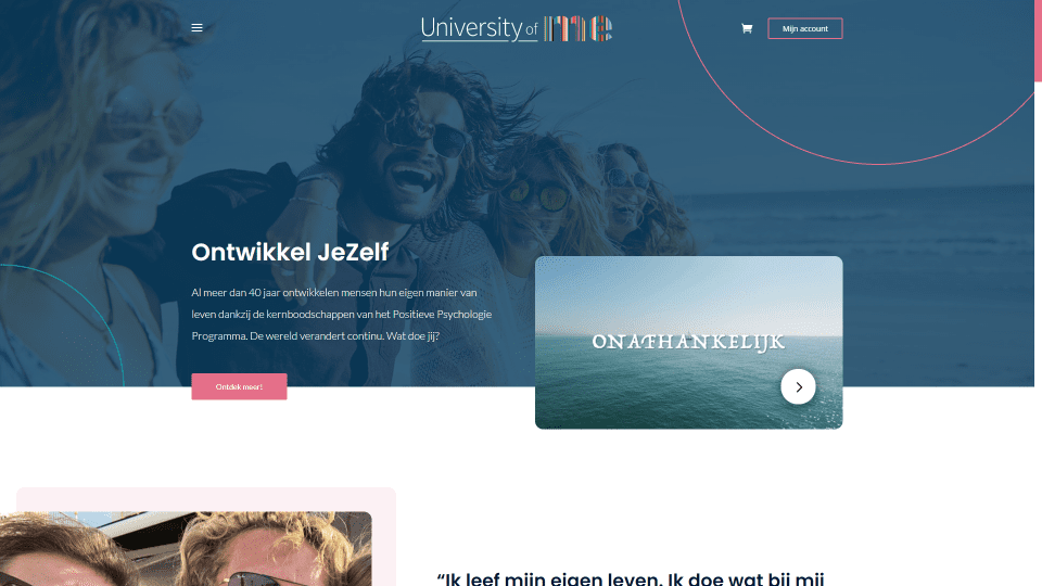
This site was submitted by Eric Wils. Red highlights throughout the site appear within the menu, in buttons, navigation, borders for images, circle patterns in the background, and the scroll bar. The hero section displays a full-width background image with a button and a video that overlap the next section. CTAs display images on one side and information on the other in an alternating layout. The testimonial slider is interesting. The navigation arrows appear at the top of the slider. Testimonial cards are large and elegant. I also like the blog section, which displays a single post. The featured image is short and wide and the excerpt is placed within a box that overlaps the image. The blog page follows this design. Even the product pages follow the site’s design.
2. mcitycreative
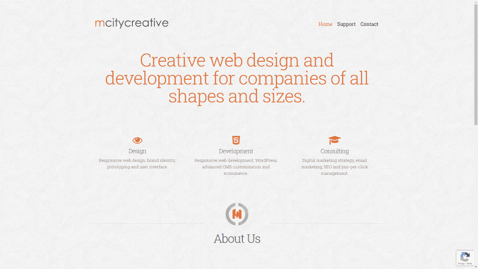
This site was submitted by Scott Alberti. It has a simple design that’s clean and interesting. A background pattern gives this site some visual texture while highlighting the content. Orange highlights appear throughout the site including the headings, menu, icons, and clickable links. The hero section shows a message in a large text followed by blurbs to showcase services. Information about the company is introduced with a logo and divider, while the information is displayed in a resume-styled layout. The footer repeats the logo and provides clickable contact links. Each of the pages follows this same design and includes a styled pre-loader.
3. SO SIGHTY
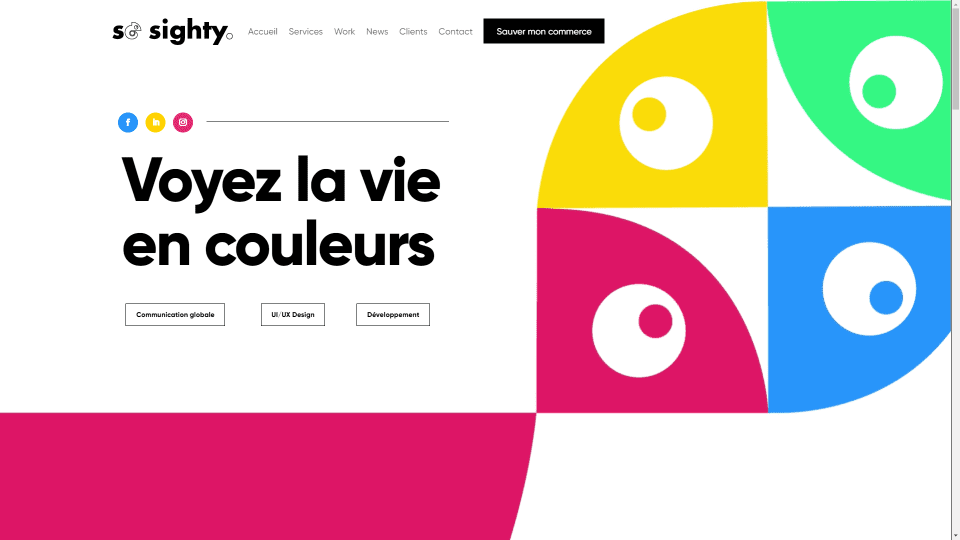
This site was submitted by Naïm Boughattas. This one has lots of large blocks of bright colors and sliding animations throughout the site. The hero section a title with several buttons on one side and animated circles on the other that help set up the rest of the site. Most of the sections include a large background pattern on one side with large titles and animated blocks. Information and CTAs are provided within blurbs of various shapes. A slider shows examples of work with slides that blend with the rest of the site. I love the section about clients. An airplane flies through the circles and changes color in every circle. The blog page follows a similar design but uses the colors in the featured images.
4. Wonderland Childcare
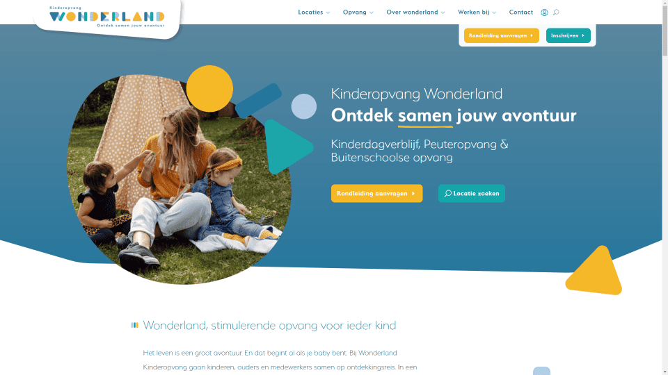
This site was submitted by Camiel Bos. This one uses lots of bright, but not primary, colors for backgrounds, shapes, buttons, and text to create a site that promotes the topic of childcare and is sophisticated at the same time. The header includes a logo and a section of buttons that overlap the header. Colored shapes scroll and animate apart from the rest of the site. The hero section displays an interesting design with a background color and styled section separator, an image within a shape with other shapes around it on one side, and CTAs on the other side. Several sections include a similar background color with styled section separators. I especially like the gallery section which displays slides with styled images.
5. Z Shere
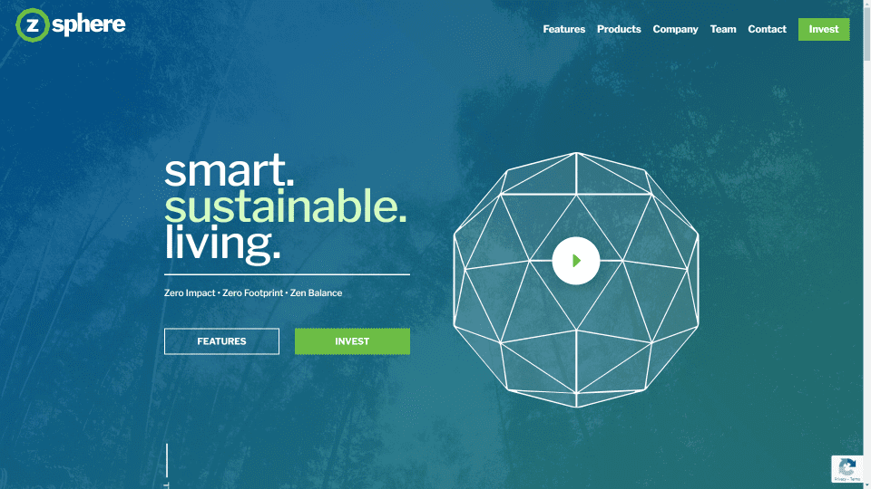
This site was submitted by Justin Arcara. This one has a one-page design that makes excellent use of color and layouts. The hero section displays a full-screen background image with a blue/green gradient overlay. Text and graphical elements follow the blue/green color scheme throughout the site. Several sections have embedded videos that blend perfectly with the content. I especially like the section of blurbs that displays a graphic in the center with blurbs surrounding it. The gallery is also interesting. The title of the section slides into place on scroll behind the gallery. Many sections include a similar sliding title in the background. Many of the elements have box shadows to stand out from the background.
6. Željko Škipić
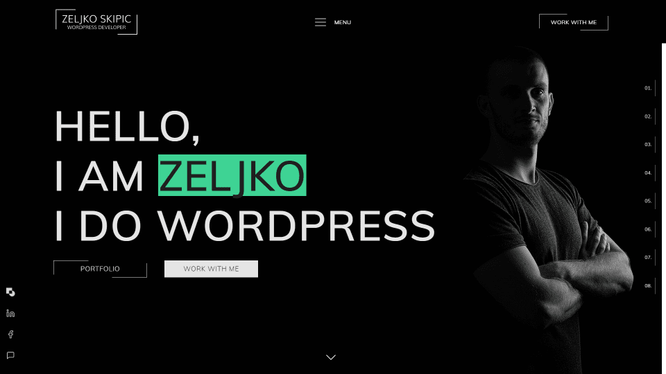
This site was submitted by Željko Škipić. This one has lots of animated black and white elements and green highlights throughout. The hero section displays a black background with a large title on one side and an image of the site owner on the other that blends with the background. Button animations either show a green or white background. Sticky social icons sit on the left side and a fixed navigation menu sits on the right and shows the name of the section. Both are either black or white depending on the color of the background. Blurbs display large icons behind the text. I especially like the section of the latest work. It shows work within cards that include a large image, description, and a button. The cards are animated and show a box shadow on hover.
7. Media Cows
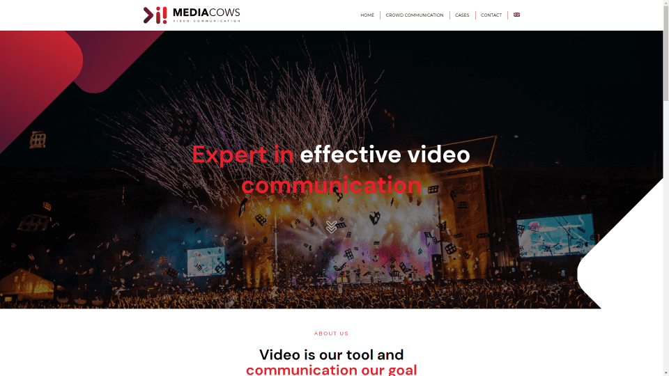
This site was submitted by Wouter Hendrixen. This one uses lots of white with shades of red and purple throughout the design. The hero section plays a full-screen background video with styled patterns on both sides and a message in the center. Several sections include red text, icons, buttons, arrows, and background elements such as blurbs, headings, buttons, and a background gradient. The pages for case studies show the case details in a single column and include a styled sidebar with case details and a contact form to works perfectly within the sidebar. The Crowd Communication page adds more styling and elements that include multiple sections of information and a slider that tilts the slides on the sides. Purple backgrounds and red highlights make this one pop.
8. Webaas
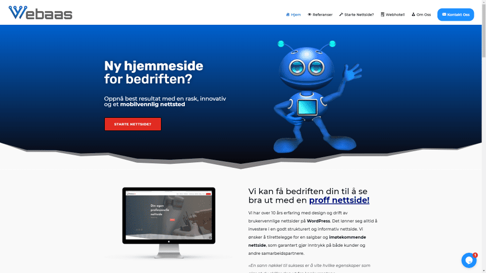
This site was submitted by Daniel Aaserud. This one has a clean layout with blue highlights. The hero section includes a blue gradient background with a CTA in the overlay and a styled section separator to divide it from the next section. A CTA for a quote displays a graphic on one side and information on the other. The latest work shows projects within cards in three columns. The center column includes a dark background to stand out. Pricing tables include blue highlights with the most popular option in red. I like the testimonial section, which displays cards from Google reviews. The footer is also interesting. It shows information in three columns that include a sign-up form, the menu in a large colored block, and the latest blog posts within a different colored block. I like the references page that shows projects with large images and links to the websites.
9. TrueCare
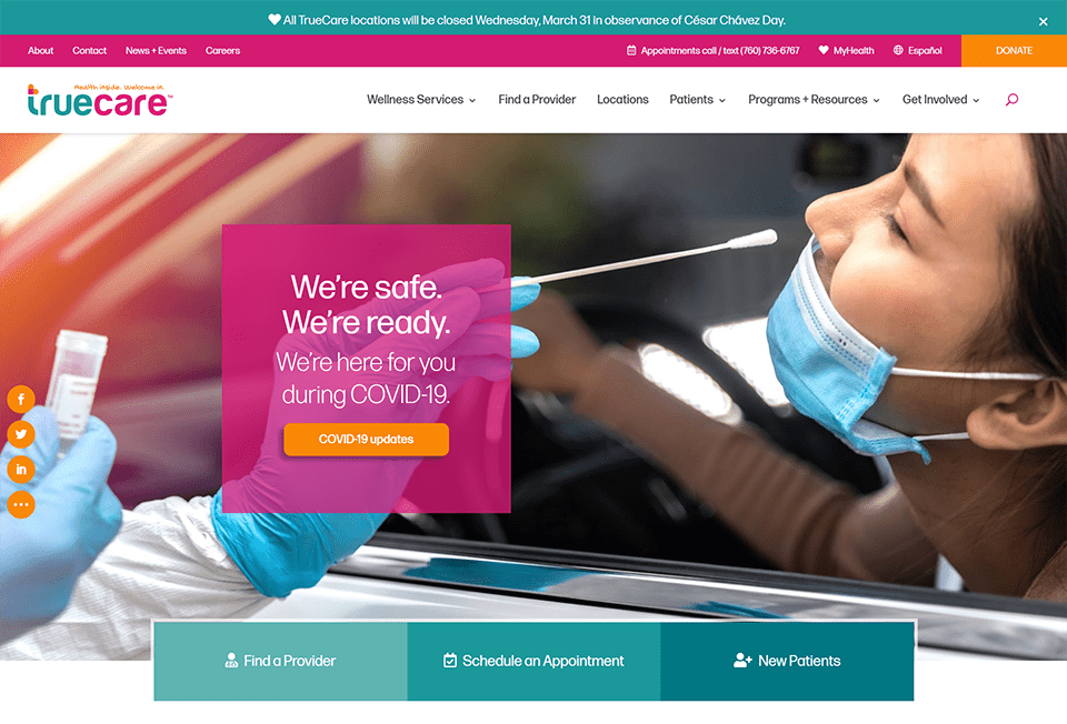
This site was submitted by Nicolle Principe. This one uses lots of bright colors in the backgrounds, buttons, text, icons, and more. The hero section displays a full-screen image with a CTA in the overlay with a bright background. Links are placed within boxes that overlap the hero and next section. Several CTAs display information with blocks of color, images, blurbs, stats, and buttons. A section for services displays sidebar navigation with links over a background gradient. A section to meet the team members displays images on one side and links on the other. Several of the CTSs include overlapping elements. I also like the footer that displays 4 rows, each with a different colored background. The blog page is interesting. It includes a styled search feature with a dropdown that covers one side of the screen.
10. Willflies
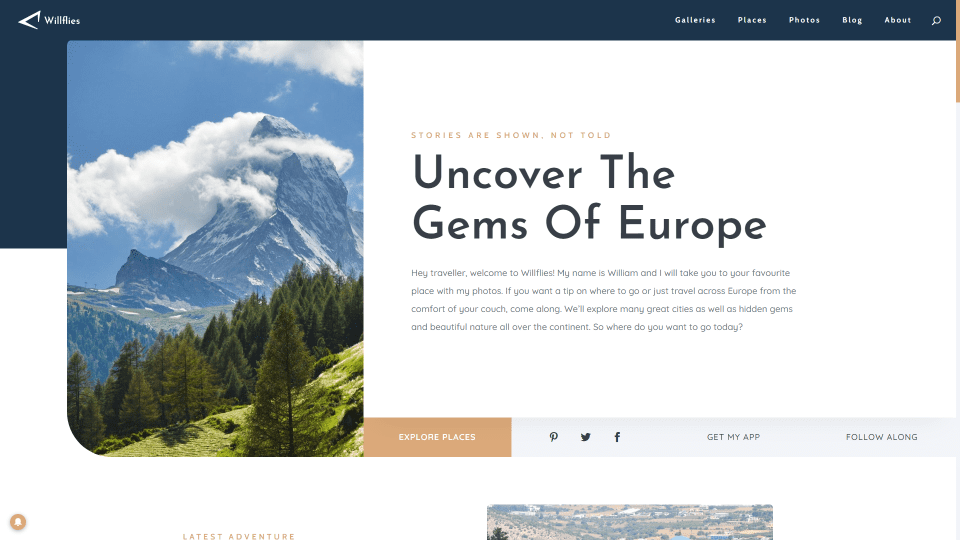
This site was submitted by Vilém Nečesaný. This one makes interesting use of color and the layout. The hero section displays an image that overlaps the background color on one side, while a description followed by a strip of links sits on the other side. Information is provided with text, images, and a stat counter. My favorite section highlights what’s trending. It displays a three-column grid with an image of a location and information. This alternates from showing the information on top of the image to the image on top of the information. each includes a link to see more details. The blog section overlaps the background, while a large map showcases locations. I also like the email subscription form that’s styled to match the rest of the website. Each of the pages follows the same styling elements and adds even more. It also has a styled scrollbar.
Wrapping Up
That’s our 10 best community Divi website submissions for the month of February. These sites look amazing and as always we want to thank everyone for your submissions!
If you’d like your own design considered please feel free to email our editor at nathan at elegant themes dot com. Be sure to make the subject of the email “DIVI SITE SUBMISSION”.
We’d also like to hear from you in the comments! Tell us what you like about these websites and if there is anything they’ve done you want us to teach on the blog.
Featured Image via Mascha Tace / shutterstock.com


Ok, this has been “bugging” me about your description of the #3 submission of So Sighty. Usually you are spot on with your sharing what is special about the site. And I kept looking for the “airplane” changing colors. So my husband had a look at it, and felt you could easily see the Chameleon as an airplane.
This is the same Chameleon that is wrapped around the “o” in their logo. And the clever graphic of a Chameleon’s independent eye movement in very top right heads placed on the site. And now, the smart changing color of the Chameleon’s body as it passes behind the portals in the middle of the website.
The solid line work, fields of color and movement make this site a winner in my opinion. Thanks!
Thanks, ET, it is an honor to be featured with the new site as well as the old one back in 2017.
Excellent design
#10 was featured in March 2020 also. That’s less than a year ago.
Not saying it’s not a good design, but are there not enough submissions coming in that you need to start repeating sites now?
Some excellent sites great work everyone. Do theme developers have suggestions on how best to choose “the right” theme for local and small businesses owners? Especially when you’re investing in purchasing a theme I think it’s important to have a process that works and you won’t be changing next near. Thanks in advance!
Yes it’s important to choose a theme that has a solid future. The best signs of this are good reviews, a sustainable business model, and an established history of success.
Please fix the screengrab on #9. Its a duplicate image… and not TrueCare.
Thank you!
The Willflies site is beautifully laid out, easy to read and navigate. I’d love to know how he structured his blog.
I have a comment about Will Flies; I do agree about what is said about the colors and the general layout. It looks very nice, even if I don’t particularly like the use of three fonts. IMHO that is one too many. But, however good the site may be, I don’t think it is called for to showcase it again, since it was already done in March 2020…
8 and 9 have duplicate images