
It’s that time again for our monthly Divi Showcase, where we take a look at the amazing Divi websites made by our community members. Each month we showcase the best Divi websites that were submitted from our community and today we want to share with you the top five websites for the month of February. Throughout the post, I’ll point out some of my favorite design features that draw me to each of the websites.
I hope you like them!
Divi Design Showcase: New Submissions from February 2020
1. Walter Di Martino
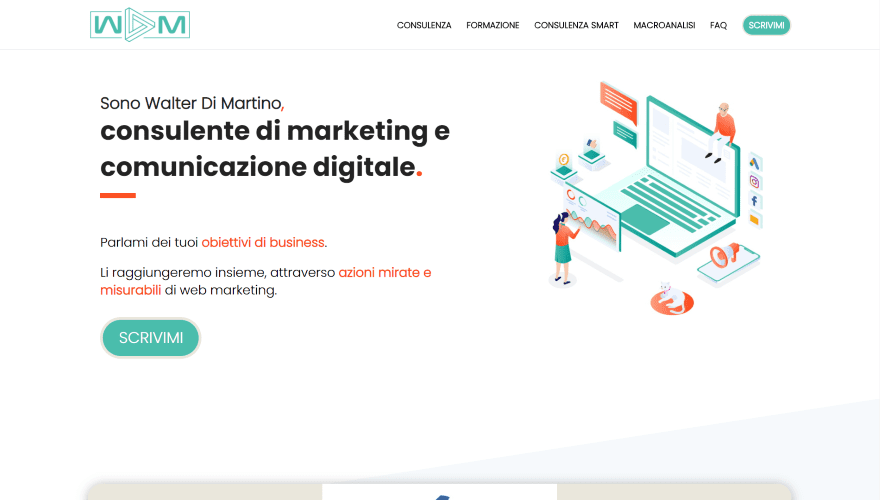
This site was submitted by Walter Di Martino. It uses red and green highlights as branding throughout the site. The hero section displays a description and CTA on one side and graphics on the other. A section of testimonials follows this. The testimonials display client logos and include multi-color backgrounds that stand apart from the section. Services are described within blurbs and use red and green graphics. Portions of the text are highlighted in red. A section with information about the writer includes a circled image with a green background on one side and text on the other. Other sections include a testimonial slider, CTA, blurbs to show training, bullets to show benefits, and toggles for an FAQ. The sections include lots of styled dividers. I love the colors and graphics in this one.
2. daar-so.nl
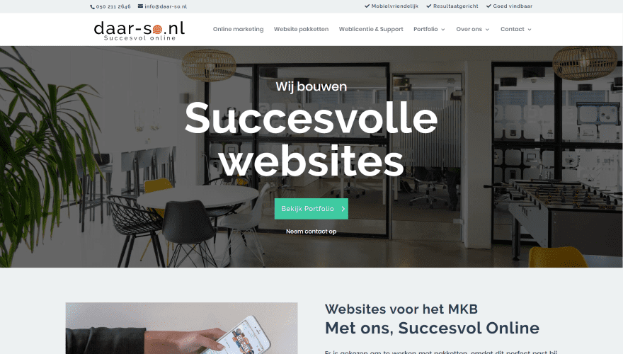
This site was submitted by Mark Kranenburg. The hero section displays a full-width CTA with a description over a background image followed by another CTA in two columns. Services are shown within blurbs using green backgrounds with icons and text in white, and buttons overlapping the blurbs. A section with information about the owner shows an overlapping image next to large text. Another section shows services as blurbs within a grid to one side next to a CTA. The blurbs reverse colors on hover. A two-column contact section shows a form on one side with text and icons on the other. The page for case studies shows an image of the project with overlapping text that links to a detailed project page. I love the simplified styling for the modules and graphics.
3. Lydia Calero
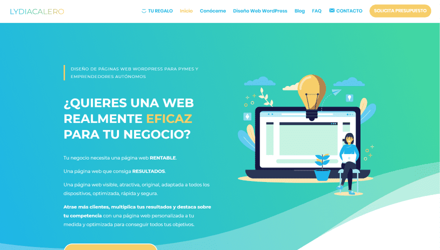
This site was submitted by Lydia Calero. The hero section shows a CTA on one side with graphics on the other over a gradient background. Each uses colors from the site. The section also includes a large wavy divider. The next section shows the types of clients and situations in numbered blurbs. A screenshot of an example website overlaps two sections that lead to a CTA with a full-screen gradient. Benefits are described using blurbs with text and icons. A similar section adds more blurbs with custom icons, rounded corners, and box shadows. I love the section about the owner. It includes two background colors with a CTA in the foreground and an image overlapping the CTA and background. Blog posts use colors from the site within their featured images. I love the colors on this site.
4. Roots
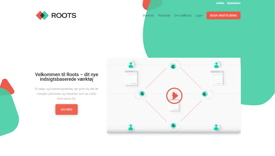
This site was submitted by Dennis Mathiasen. The hero section displays background shapes in multiple colors that are used throughout the site. The foreground shows a CTA with an embedded video. The next few sections show a description and image of the product in two columns in an alternating layout. A section about what’s new shows blurbs with custom graphics over a white background for the row that’s placed over a fullscreen background image in parallax. The other pages follow a similar design and include lots of background shapes and blurbs for information. The one called Roots stands out the most to me. I love the animated logo over the full-screen parallax background. The layouts are simple and make excellent use of color and shapes to stand out.
5. Mark Pinnock
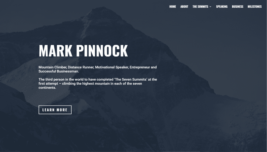
This site was submitted by Andy Dennis. The hero section shows a full-screen background image with a dark overlay. The foreground displays the title, description, and a button to learn more. The next section uses images as links and includes icons in the overlays. An information section shows text and images alternating in 2 columns followed by a set of 3 images. Locations are shown in a 4-column section with images, a description, and a button to read more. A motivational speaking CTA displays an image in true parallax on one side and a CTA on the other. Following this is a section of videos and then a button to get in touch placed over a full-width image in true parallax. The pages for the locations show overlapping images followed by text in 2 columns. The other pages keep a simple layout with large titles. I love the images, colors, and fonts in this one.
Conclusion
That’s our five best community Divi website submissions for the month of February. These sites look amazing and as always we want to thank everyone for your submissions!
If you’d like your own design considered please feel free to email our editor at nathan at elegant themes dot com. Be sure to make the subject of the email “DIVI SITE SUBMISSION”.
We’d also like to hear from you in the comments! Tell us what you like about these websites and if there is anything they’ve done you want us to teach on the blog.
Featured Image via DRogatnev / shutterstock.com


Thanks for sharing!! 🙂
Thanks for sharing!! 🙂
Though the site look good. . All of the menus look terrible on an iPad
I’ve already fixed, thanks for your comment 🙂
In my opinion divi is the most popular design provider in the market.
I am web developer and I only trust on divi designs.
Nice showcase.
Thank you.
I always enjoy the Divi user site submissions and often get new ideas and inspiration when browsing the winners so I think it’s about time I submitted one of my own. Wish me luck next month!