
It’s time again for our monthly Divi Showcase where we take a look at 10 amazing Divi websites made by our community members. Each month we showcase the best Divi websites that were submitted from our community and today we want to share with you the top ten websites for the month of February. Throughout the post, I’ll point out some of my favorite design features that draw me to each of the websites.
I hope you like them!
Divi Design Showcase: New Submissions from February 2019
1. New Sherpa
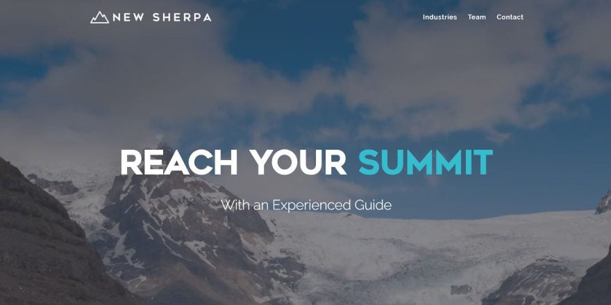
This site was submitted by Gregory Little. This is a one-page design. The full-screen header displays a background video that transitions to another video as you scroll. You can actually see both at the same time during the transition. The header uses large text with a dark blue/green branded color to create a tagline. An About section uses the same font family and styling to show the company’s focus. A contact CTA is placed over a full-width image followed by blurbs with icons styled with the branded colors. The Management Team section shows the founding members with information and links to read more, which reveals more lines of text, all in branded colors.
2. Sea Jets
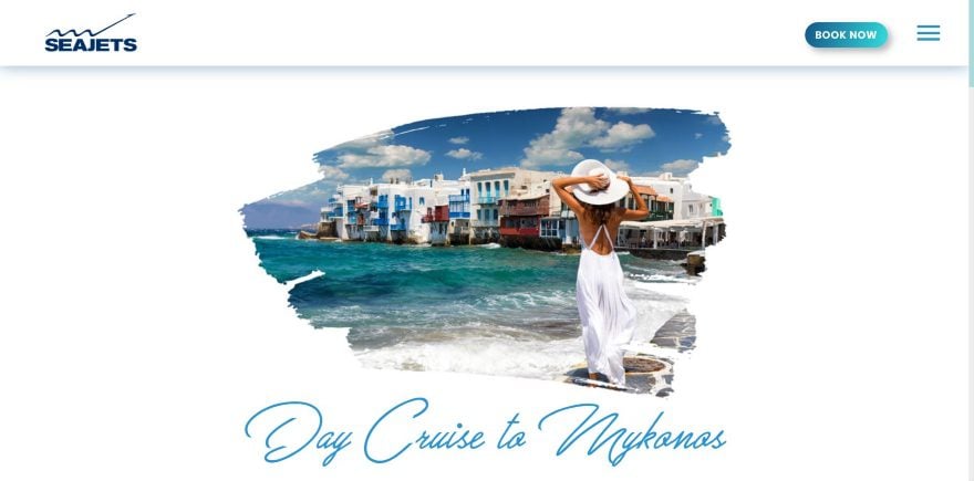
This site was submitted by George Paratsokis. The header includes a shadow effect and a styled CTA button that matches the site’s branded colors. Images are revealed through the screen as animated boxes wipe across the area as you scroll to the section, which also reveals the styled buttons. Titles are written with an elegant script font that stands out. The layout itself displays information and images in two columns in an alternating design. It uses a lot of white-space to showcase the design. A CTA includes a background image with overlay and elegant fonts, displayed with a box shadow. The footer is interesting. It has a background in a light gray silhouette with all of the contact info over it.
3. Breeze
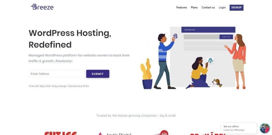
This site was submitted by Sakshi Behl. The site uses a simple layout with a few styled elements to make it stand out. The header displays the tagline with an email opt-in form next to a graphic to help define the site. Client logos are displayed in an offset layout. Blurbs show the benefits over a styled background pattern that sits at the side of the screen. The features section is interesting. It displays a screenshot next to descriptions. Each description has a title. Clicking on the title reveals the text for that description. A styled line next to the title becomes darker to show which title is selected. The pricing tables also look interesting against the blue background. The suggested plan is shown with a box shadow to stand out.
4. Dragonfly Ave
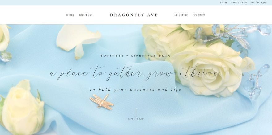
This site was submitted by Marci Angeles. This site uses soft colors and floral photography to attract the target audience. Several page links are displayed to one side in the top bar while the header shows the menu centered. The description and tagline are shown in several fonts over the full-screen background image. A full-width email opt-in is styled with a light blue background and uses a graphic of a key to show that the visitor can unlock information. The blog posts are shown in a single column with a sidebar- all with matched styling. The blog posts include the same sidebar. An embedded Instagram feed shows the latest photos.
5. Parris Mfg. Company
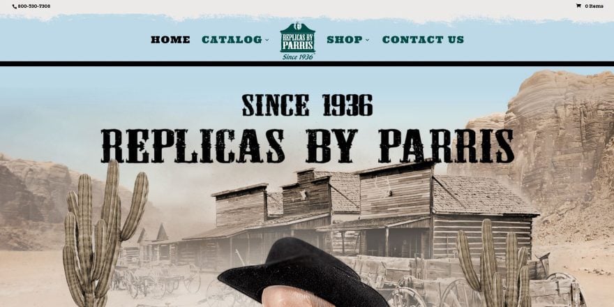
This site was submitted by Joseph Brown. This site makes fun use of photography to portray the old west. It displays a full-screen background with a graphic reminiscent of clouds above the menu and a title under the menu. An animated layer of dust moves across the screen in 3D. The clouds come down behind the menu on scroll, which then looks more like a painted section. The next section shows a fence background with wanted posters for the pages. The posters animate on hover as if you’ve touched them. The footer has a mountain range and cowboys in black with a dark green sky with the menu. The shop pages place items over a western background. The items are shown in sepia and are colorized on hover. The product pages place the images over the fence background. The site makes great use of images.
6. imparaqui
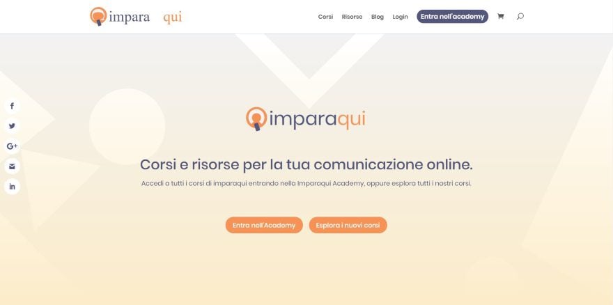
This site was submitted by Pascal Claro. The site uses orange to white gradients for the hero section and CTA, and orange highlights throughout the site for buttons, icons, and text. The hero section shows the logo with buttons to log in or see courses. Below these several cards show the most followed courses. The cards show information at the top, an image, title, excerpt, and button- all styled to match the site and include hover animation. They stand out over the background gradient. The courses page uses this same design. Reviews are shown in a testimonial slider. Resources are displayed with orange icons over a dark image with a touch of orange in an overlay.
7. Phoenix Building
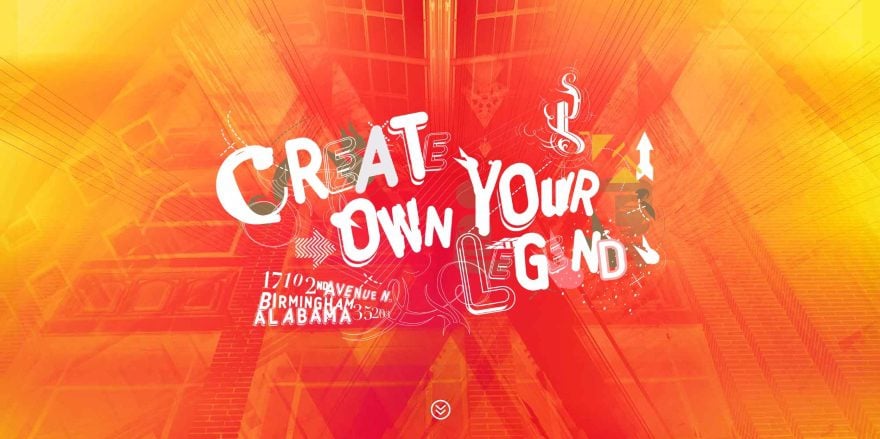
This site was submitted by Andre Villanueva. It has a full-screen background with a styled pattern and a tagline in an interesting font and swirly graphics. Scrolling reveals the header which includes the same font for the menu items. The font and swirlies are also used in the logo, which appears in several locations throughout the site, including an About section that uses the logo in one side and multi-colored text in the other. It has several backgrounds in parallax with blue or red overlays. One of the most interesting sections shows slanted images with boxes behind them that slant in the opposite direction. Other pages use this section and a similar section with image and bold borders with padding. The site makes excellent use of bold color.
8. Marx Creative
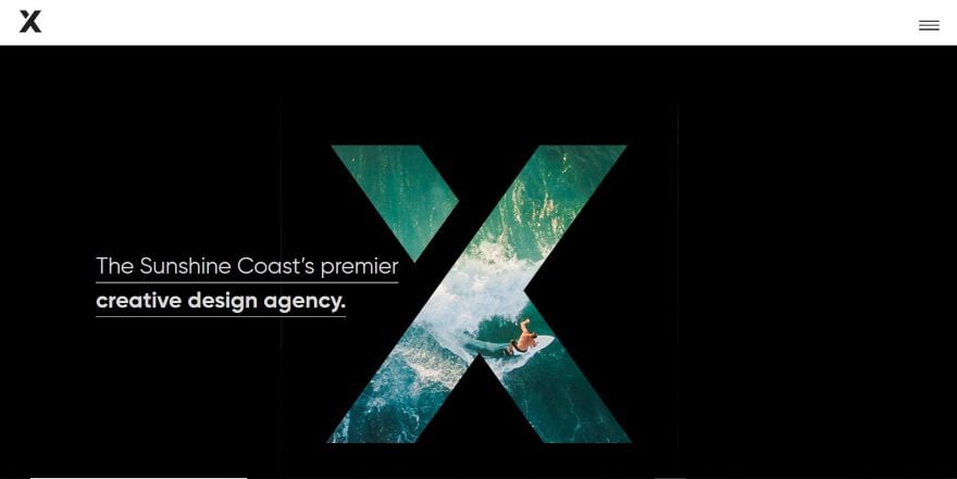
This site was submitted by PK SON. The large logo is placed in the center of a black background. The logo is a cutout. Behind it displays an image in parallax. White text shows the tagline with the main point in bold. A section about the company provides links with arrows that change location on hover. A slider overlaps two sections and uses verticle dots for navigation. Projects are showcased in a multi-column layout with elegant photography. It has a neat call to action that shows a 3D version of the logo on one side over a light gray background and text on the other over a black background- tying the design back to the header. I like the menu. Clicking on the hamburger icon opens the menu in full-screen, showing navigation in one side and an image with information in the other.
9. Epic Tree
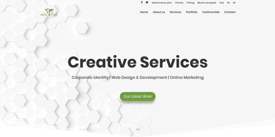
This site was submitted by Ľubomír Mičúch. This one-page website has a background pattern made of hexagons that display in parallax behind the tagline and CTA button. Several sections show the company’s services and information in two columns with graphics on one side and text with a CTA on the other. The graphics are made up of branded green elements that match the buttons and highlights throughout the website. The section of counters is interesting. It shows green numbers over a background image of mountains with an overlay in parallax and wavy section dividers. A similar section creates a CTA. A section that shows work numbers each of the projects in an alternating layout. Client icons have rounded backgrounds with box shadows. The site includes styled testimonials, toggles, social follow, contact form, and more.
10. Robert L. O’Neil
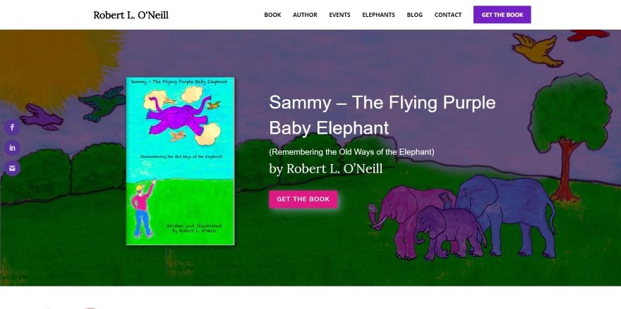
This site was submitted by Masha Goltsova-Lanoue. This author’s website uses color and artwork to attract the target audience. The hero section shows a CTA with the book cover, description, and button to purchase- all placed over a background that includes artwork from the book. An About section provides information with a button to see more next to an image of the target audience reading the book. All of the buttons use different colors from the book. A testimonial slider uses the branded purple as the background. Several CTAs invite the reader to purchase books, learn more, or read about the author. Backgrounds include artwork from the books, including the footer. The artwork is even used as the preload graphic. I like how the shop page shows testimonials. The layout is simple and makes great use of color.
In Closing
That’s our 10 best community Divi website submissions for the month of February. These sites look amazing and as always we want to thank everyone for your submissions!
If you’d like your own design considered please feel free to email our editor at nathan at elegant themes dot com. Be sure to make the subject of the email “DIVI SITE SUBMISSION”.
We’d also like to hear from you in the comments! Tell us what you like about these websites and if there is anything they’ve done you want us to teach on the blog.
Featured image via MJgraphics / shutterstock.com


Wow! Thanks Randy for mentioning our website! We’re honored to be on this Divi Design Showcase! 🙂
Ohh! Great, thanks for sharing. It really helpful.
terrible submissions besides X – wow – literally entered better sites to this – are these guys paying you off to be showcased cause damn there are some dumpsites here
Nope, no one has paid. And I’m the person who chooses the sites from those submitted. If you’d like to try again feel free to submit again.
Hi Nathan,
A lot of these sites look top notch but one thing I notice is that the page load times on many of them are not great and don’t do great on GT Metrix in terms of performance.
I ask because I work hard to improve performance on the sites I build. This isn’t always easy because that must have plugin adds extra overhead and working on sites that require a lot of visual images that need to look right on big screens.
I work in a location where broadband speed is quite poor, so page load speed on sites is pretty obvious straight away. Perhaps some developers don’t notice this because they have relatively good broadband.
We are told that how quickly a site loads is taken into account for SEO and ranking by search engines so it is important. Divi isn’t the lightest theme out there and you have to work hard to make it perform well. Perhaps a post on how to optimise your site and keep the size of assets down is in order?
Try wp fastest cache plugin and you will get rocket speed divi site 😉
Recently I have had two website host comment on using Divi which I found strange that they would go out of their way to comment at all. One recommended I try Beaver Builder due to Divis performance issues, speed, and size. For now I am sticking with Divi as I have invested too much time to switch to something else. Unfortunately, I have done tests with the most basic Divi installation on Google page speed and GT Metrix and there are several suggestions for the way loading and files are handled, number of loads etc. Not sure if this is a priority to address as the forms are full of people having “jumping issues” due to slow loading, along with poor performance scores because they can’t or don’t have the knowledge to combine core files etc. as suggested myself included.
Rest assured, have tried all the performance solutions. Tried WP Fastest Cache and it is good but managed to squeeze a bit more performance with Site Ground’s SG Optimiser. The point I was making above is that by adding more plugins and not being aware that the unoptimised images you might be using can cost you in performance. But, yes we do get stuck using plugins. So I use Yoast, because I want to do something with my SEO results, but it ends up adding some overhead. The only thing to do is keep testing on GT Metrix and continuing to research new configurations. You will eventually get improvements.
In the time since this post (https://www.elegantthemes.com/blog/tips-tricks/how-to-improve-your-google-page-speed-score) was published we’ve actually done a lot to improve Divi’s speed on our end. However, as is the case with any theme, a lot depends on you and the host if you want to get the best speeds possible. I encourage you to read the post I’ve linked and go through the steps that are recommended for your own site as methodically.
Hi Nathan…
Thanks for the reply and the reminder of that post. I think I did skim through that post when it originally came out and will definitely refer back to it now that I have more time to read it in full. I noticed that the article seems to focus more on achieving a decent desktop score. It would be nice to know how the tests in the post affected the mobile score. I would consider achieving a decent mobile score of equal importance if not more important.
One thing I noticed from the sites featured in this showcase post is that the sites have mobile scores of 14/100, 16/100, 26/100. 33/100 etc. with desktop scores averaging around 65/100. One would assume that with the amount of work that went into the look of these sites that achieving decent mobile and desktop scores would be equally important? I am not criticizing the developers/designers as I only achieve mid 40’s – 60’s for mobile on most of my sites. So I would be curious to know do most just overlook mobile? Where are people running into roadblocks with mobile? What solutions were you able to find etc. I can’t speak for everyone but one of the reasons I use Divi is so I don’t have to install multiple plugins to achieve a goal, perhaps this is an antiquated way to think on my part.
It has to be considered as well that in real perceptual terms I do see sites load reasonably well despite the low performance scores given by Google. They are also testing for a 3G. If I am correct many users are getting a good 4G service in urban areas, leaving us in the sticks with a slower service with the expectation that things are going to be a bit slower. With faster 5G in the pipeline I do wonder why Google insists at measuring against 3G especially when any page they produce is generally quite minimal.
And I will ad, Google is no great shakes at UX when it comes to using their services as a developer. Try asking a client to go sign up on Google Cloud services, submit their payment details, and then retrieve the API key for maps so you, the developer can go and embed maps on their site. I always end up with the headache of getting their details and doing it for them or let them use an API key generated on my account. Let’s hope they never go over the monthly quota, because then their maps are on me!
Hi Trent,
Good Point.
The heavy page was necessary because of a Divi limitation. Currently, you cannot use a 3rd party hosted video as a background video. It has to be on our server. I have 2 videos on top of each other to achieve the look. It would be great if Divi would allow us to use linked videos for backgrounds,
I have been in contact with the client about it. When he has a little time he is going to create another user for me to go back in. Installing a caching and minification plugin should get it to an acceptable level.
Thanks Nathan for posting that again and agreed. I had to build a major site for somebody who insisted on using a certain type of hosting. Trying to built it with Divi was brutal because that hosting’s performance was poor.
I see them mentioned again and again and use them myself and I can say that SiteGround is pretty good.
What a terrible outlook this Christyn has! With such a crappy attitude, no wonder you didn’t get picked!
I don’t see yours being any better lol
Weather Good or Bad, All of these showcased websites have elements we can choose from and I look forward to seeing them every month. I know everyone has the right to their own opinion but I hope you will see this place gives all of us a chance to showcase our project.
Divi is used by both extremely good developers and beginners, but seeing how they come up with ideas and implementing them is amazing.
I bet you are a nightmare to work with.
It’s always inspiring to see other great work using Elegant products – thank you!
I really want to know how Marx creative did that menu to a page builder full-width menu. Is that a custom plugin or did they write a custom build for that?
That look, with X on the left and hamburger on the right can be done with a little know how. Keep in mind that the design requires a compact logo and sticking to the hamburger menu, which may not always be the the best strategy in terms of SEO.
I have done something similar on the a prototype test site. The tricky thing is to get the logo and menu to invert when the background changes. There are a number of ways do do this, java script and waypoints or, set up the logo and menu with filters so that they react as they pass over different backgrounds. The second really only works where it is high contrast black and white.
So inspiring! Awesome picks! Nice to see PK SON’s amazing work (8. Marx Creative)!
Marx Creative is the best.
In a style which I like most of all.
It would be nice to have some of those websites explained how they did it, what CSS they used etc.
Could not agree more Photis, that’s exactly what is needed, it is so frustrating to look at a great sight and wonder how they did that, Like Marx site which I really like
Hi,
it’s a great idea!! Thanks for sharing such big information.
Wow! Thanks for the Marx Creative mention! (Our boss is gonna be happy) Our designer and I worked on it for quite a while to get it to look like it does now.
To answer the question about the menu, it’s the Divi full screen menu. It’s just been edited via php and styled quite a bit.
I didn’t use any plugins in particular except for the page transition, cf7, and caching. Everything else is just Divi.
Thanks again. 🙂
Hi PK Son,
It looks great.
Suitable for a tutorial on your site…?
Hey Donal, thanks for the kind words!
And yes, the menu tutorial is already on my site. It’s the one titled “custom layout full screen menu” have a look and if you have questions, just leave a comment on that page. 🙂
No wait, we used Gravity forms. haha
Wow, this month is fullfilled with great and really inspiring web designs. Cheers to the mentioned ones!
I did something similar on a prototype test site. The hard thing is that changing the background is to override the logo and menu. There are several ways to do this, set javascript and waypoints or, logos and menus with filters so that they respond when they pass on different backgrounds. The second really does the same thing where it is of high contrast black and white.
New Sherpa mobile menu has an issue of text on top of text as the nav background is transparent so the nav text displays over the header text.
Parris Mfg. Company has an issue with the mobile footer the silhouette of the children floats over the text.
Really like the Marx Creative site.
Ohh! Thanks for sharing. It really helpful to me.
Ohh! Thanks for sharing. It really helpful to me.
All great designs! Can anyone help me out and tell me how the the Marx Creative header logo switched colors twice?
Nice inspiration, thanks!
hello,
its very useful to us. nice articles
hello,
good thought and best inspiration for us.
This is very informative and really inspiring.
Hello Randy
It was such an awesome it’s very helpful for us…
Thank you so much
I love Robert L. O’Neil?s website!!!
Original design for Epic Tree website
Thank you 😉