
It’s that time again for our monthly Divi Showcase where we take a look at 10 awesome Divi websites made by our community members. Each month we showcase the best Divi websites that were submitted from our community and today we want to share with you the top ten websites for the month of December. Throughout the post, I’ll point out some of my favorite design features that draw me to each of the websites.
I hope you like them!
Divi Design Showcase: New Submissions from December 2018
1. Rad Speicher
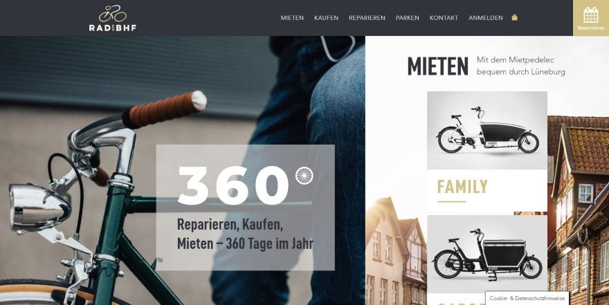
This site was submitted by Saskia Lund. It uses a multi-column layout for the hero section with an overlay in the larger column to describe the purpose of the site and a set of blurbs in the smaller column with overlays to show the products. Hovering over the blurbs reveals a description and a button. Services are shown with images that include text with a styled gold box. Hovering changes the color of the text and its background. The styled gold boxes carry through the layout’s design and appear behind several images. Gold is also used for headers and titles. The menu includes a styled reservation CTA.
2. Ane Riel
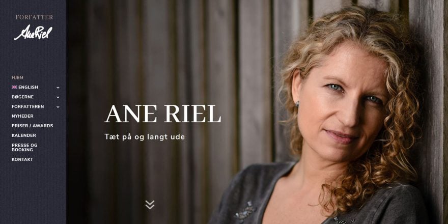
This site was submitted by Rikke Ekelund. The site uses a left vertical menu that remains in place as you scroll. The full-screen header shows the author’s name and photo with an arrow showing you to scroll down. The next two sections showcase a book complete with a description, book cover, and links to read more. A full screen About section matches the design of the previous sections. Another book CTA shows the book in the center between a book description and testimonial. Other testimonials follow the blog section and match the branding. I love the colors on this site.
3. Selecta Webs
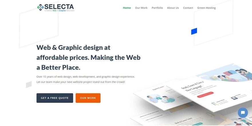
This site was submitted by Emy. It uses a clean design with lots of white space to showcase their services, which utilize blurbs and toggles in a two-column section. Information is provided with blurbs using multi-colored graphics, a top border, title, and text- all with box shadow effects to stand apart from the background. I like the section that shows examples of their latest work. A layout is placed within a box that overlaps a gray box. The layout scrolls within the box on hover to show the website design. Next to this is the description and link. These alternate down the page as you scroll. A section of logos is placed over small colored boxes. They also make good use of bar counters, number counters, and testimonials.
4. Kalle Wallner
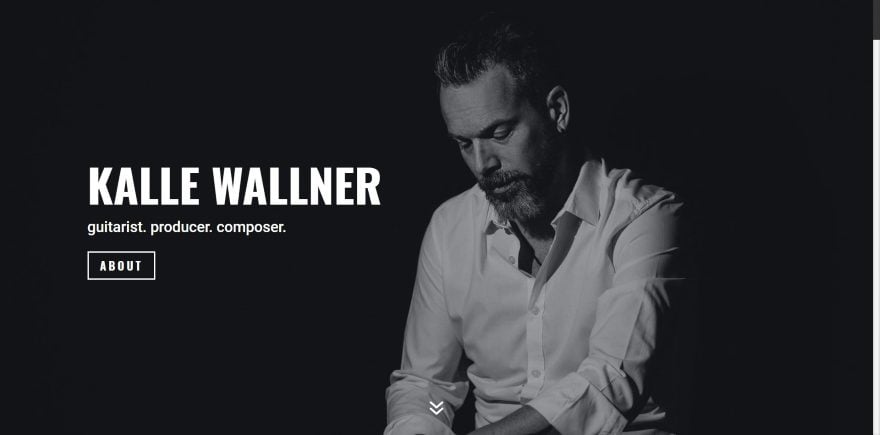
This site was submitted by Marcel Tannich. It shows an image of the site owner over a black background with a name, tagline, and button to read more in true parallax. As you scroll you’ll see an About section with social buttons and stylized images. A Projects section displays over a black background and includes white text with red dividers. Each of the projects includes images and links. A section of music and a section of films embeds three columns of YouTube videos over white or black backgrounds. A discography section shows album covers in 6 columns. Each of the elements has plenty of white space to stand apart, keeping the vast amount of information from getting cluttered.
5. Filip Jankowski
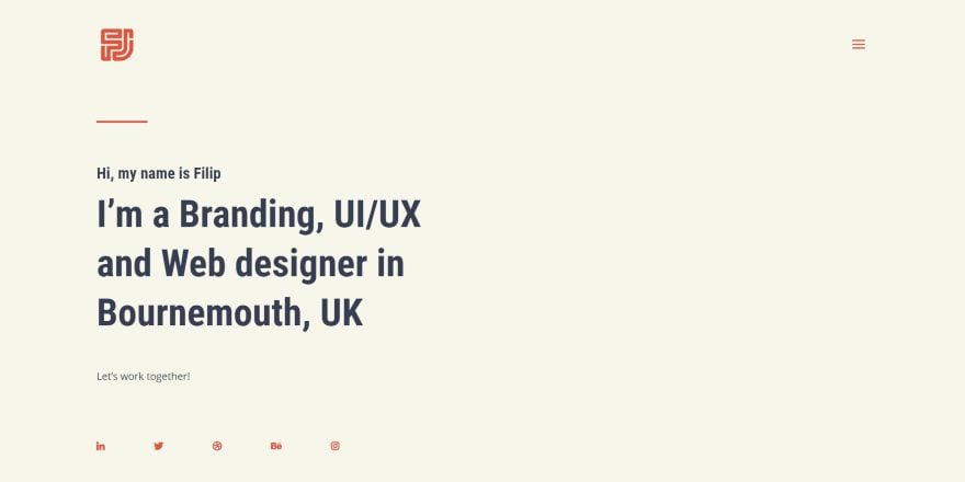
This site was submitted by Filip Jankowski. This site uses a simple and clean hero section with just a message and social icons. A curated portfolio shows as you scroll and demonstrates a website design within a mockup of a mobile phone. The layout in the mobile phone scrolls as you scroll. On the other side of the mobile phone mockup is just enough text to describe the project with a button to see it live. This design alternates down the screen, showing the example in either a laptop screen or a mobile phone. The red text and highlights look great against the cream background.
6. Zachary Nielson
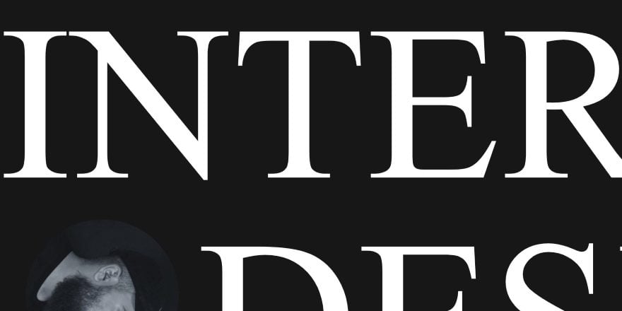
This site was submitted by Zachary Nielson. This one has one of the most unique uses of text in a hero section that I’ve seen. Ultra-large white text displays portions of words across a black background with circled images of the site owner spun to face different directions. Text is also used within the background behind the featured work section, which shows an example of work over a gray background. Another portfolio section shows smaller images within computer monitors in four columns. This section expands on hover to take the full width of the screen. A blog post excerpt is placed over a gray background. The entire blog section background follows the same design elements as other section with large text and a black background. Links to social networks are supplied as text that expands on hover. It’s interesting how the text describes the network’s purpose, such as thoughts or photos, rather than the network names.
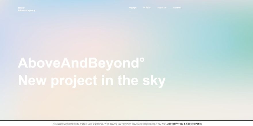
7. Above and Beyond
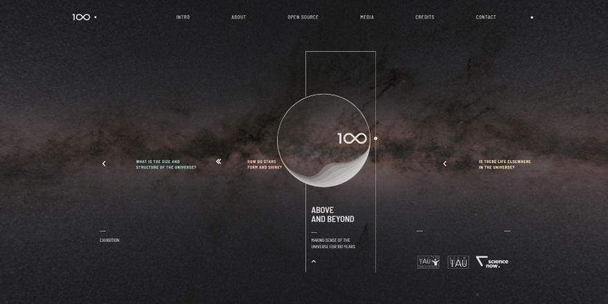
This site was submitted by Michał Żywiecki. Here’s another unique hero section. A video of moving through space slowly plays in the background while article titles scroll from one position to another across the screen. The logo sits close to the center within a rectangle design and the site’s title. Scrolling reveals planets in true parallax with information and embedded videos. Contributor’s logos show the names on hover. An About section shows a multi-column gallery with a description to one side. Other sections include links to events, sliders, downloads, and more – all with white text against the black background of space, planets, and satellites in true parallax.
8. Tokenika
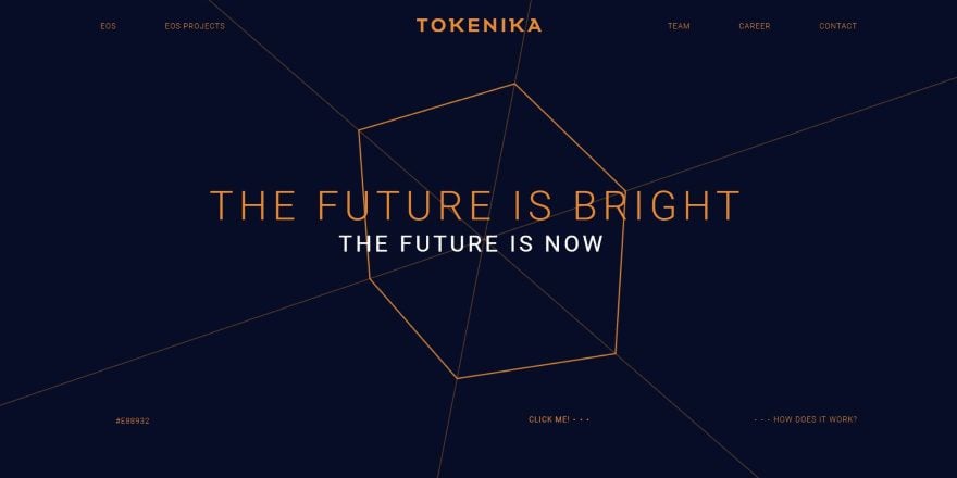
This site was submitted by Michał Żywiecki. This site displays an animated design in the background of the hero section with a tagline in the foreground. The foreground text slowly changes color. The hex code for the current color is displayed in the bottom left corner of the section. Links within the hero area let you create your own background spinner that you can style and then download. The site itself shows animated text over backgrounds that also change color and display hex codes. The site includes explanations of the codes throughout the pages. Line-drawn designs are used for graphics throughout the site.
9. Leniva Fullmetal Agency
This site was submitted by Michał Żywiecki. This site shows a full-screen background for the hero section. Scrolling reveals recent work and a link to view all projects. The work is displayed in a two-column project section with images that are uniform in size. Hovering shows the name of the project and clicking takes you to the project’s detail page where you see high-rez images of the project. An About section uses large text that’s styled to stand out. As you scroll down the page, the menu item for the section you’re at is underlined within the header.
10. On the Agenda
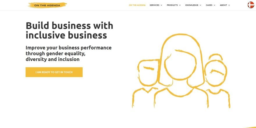
This site was submitted by Mathias Rue. This one uses yellow highlights throughout the site within graphics and as styled backgrounds. The backgrounds have a brushed look, creating wide splotches of either yellow or gray over the white backgrounds and within the logo. The brushed edges work as section separators. Graphics look hand drawn and have a sketched look. The layout itself mostly follows a two-column design with that alternates with graphics on one side and text on the other, and alternates between the gray or yellow sections over the white background. I love the colors and graphics on this website.
Conclusion
That’s our 10 best community Divi website submissions for the month of December. These sites look amazing and as always we want to thank everyone for your submissions!
If you’d like your own design considered please feel free to email our editor at nathan at elegant themes dot com. Be sure to make the subject of the email “DIVI SITE SUBMISSION”.
We’d also like to hear from you in the comments! Tell us what you like about these websites and if there is anything they’ve done you want us to teach on the blog.
Featured image via VectorKnight / shutterstock.com


hello
I´d like to know if the highlighted brushed edges as section separators on the # 10 “On the Agenda” are a divider style. If not, how can we do it?
thanks a lot!
It would be good to publish some of these websites (specially Rad Speicher & any other) in Divi Layouts, to know in detail how they are made.
Thanks in advance
#6 sure does not look like DIVI at all at first glance. Had to do the view source code thing to see for sure if it was DIVI.
I enjoy these monthly opportunities to see the creative ways that Divi is being used. One thing I noticed with several of these websites is the horribly slow page load times. It’s clear that this is not a consideration when choosing sites to showcase, but given the importance of speed for search results and user retention, shouldn’t that be a factor in what constitutes good, or at least practical website design?
Probably most of the websites featured here are getting high peaks of traffic after being featured on this blog whihc leads to exceeding the default hosting settings or capabilities. This may result in lower speed loading occasionaly.
Yes and also it should be considered that many sites are hosted on servers that might be really far away from your location – whilst loading very fast in their local target market, some sites might load very slowly when accesses from the other side of the world..
Load balancing systems should be able, to handle that these days (if you have chosen a good hosting-service). And yes, there are a lot more reasons, why a website takes too much time to reach the UA finally.
But – be honest to yourself – in a lot of cases the developer, the agency or the designer didn’t get their jobs right. Some sites causes more than 80, 90 or even more requests. The next neglected thing are way too big images. Why load images with sizes up to 1,600 px, when only 500 px are needed? Some do not use a cache-system, some uses no compression, have to deliver more than 4 or 5 css files! There are a lot more of those sins …
I believe, if you are developing websites for clients, you have to tell them, how much speed counts today. 4 seconds are 3 seconds too long these days – design or not.
Very solid collection of websites. One of my favorite showcases.
have a tutorial for creating web pages like the one above?
well collection of theames in your website i always buy from your site thanx for wonderful themes always. and provide a best blogs
Mmm strange that 3 of the sites are by the same designer. It’s not that there wasn’t more choice. I have also submitted a few sites and imo I can’t say all of the featured sites are a whole lot better.
Thanks for selecting my submission 🙂 (No.1)
I enjoy these posts but I would like to see more “real world” examples to see how designers are using Divi to solve client problems. Many of the entries are agencies and web designer personal sites.
Collection of beautiful website build with Elegant them. I like the most Ane Riel.
Thank you so much for showcasing my submission (2. Ane Riel). I enjoy exploring all the showcases every month and I am very proud that my work is one of them this time.
BR Rikke
Brilliant collection, Randy! Love it! Surreal!