
It’s that time again for our monthly Divi Showcase, where we take a look at ten amazing Divi websites made by our community members. Each month we showcase the best Divi websites that were submitted from our community and today we want to share with you the top ten websites for the month of August. Throughout the post, I’ll point out some of my favorite design features that draw me to each of the websites.
I hope you like them!
Divi Design Showcase: New Submissions from August 2020
1. Divemaster Gilis
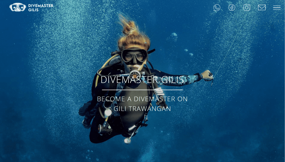
This site was submitted by Alexander Falch. The site uses a coral color scheme for the fixed header background, dividers, icons, blurb backgrounds, footer, blog shadows, etc. The hero section uses a full-screen background image that draws me in and text in the overlay that describes the site. The header appears when you scroll and includes a dark shadow to give it a 3D look. The header also includes line-drawn icons that change color as you scroll. Fonts for the headings are tall and thin. The color, icons, and fonts fit perfectly with the genre and work well with the whitespace throughout the site. Packages are shown with alternating layouts with images to help describe the events.
2. Techie
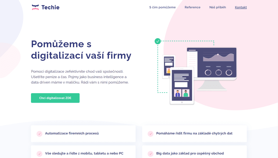
This site was submitted by Michal Teska. The site is a one-page design that uses lots of whitespace with minimal graphics throughout. Blue and pink are used for the branded colors in the backgrounds, text, dividers, graphics, and menu. I like the examples of services that show graphics on one side and text on the other in an alternating layout. The whitespace makes the graphics and text stand out and gives it a clean design. I also like the simplified blurbs to describe services, the wavy section separators, and the contact form that overlaps two sections.
3. The PA Academy
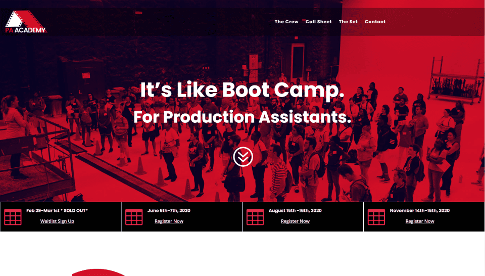
This site was submitted by Aimee Agee. This site uses lots of red, black, and white for branded colors. Red is especially prominent in background overlays and icons. Along with white borders and icons over the red backgrounds, this makes the site stand out and look exciting. Every section includes scroll animations. I especially like the simple event calendar section under the hero section that shows the workshop dates with a registration link. The section on what you’ll learn shows the main points within blurbs in the outer columns while an image floats in the center and follows the mouse scroll. Another of my favorite sections is the workshop CTA. It displays a large image on the left half of the screen with a red overlay and CTA. On the right are simple blurbs for bullets with styled icons.
4. Fitness and Food
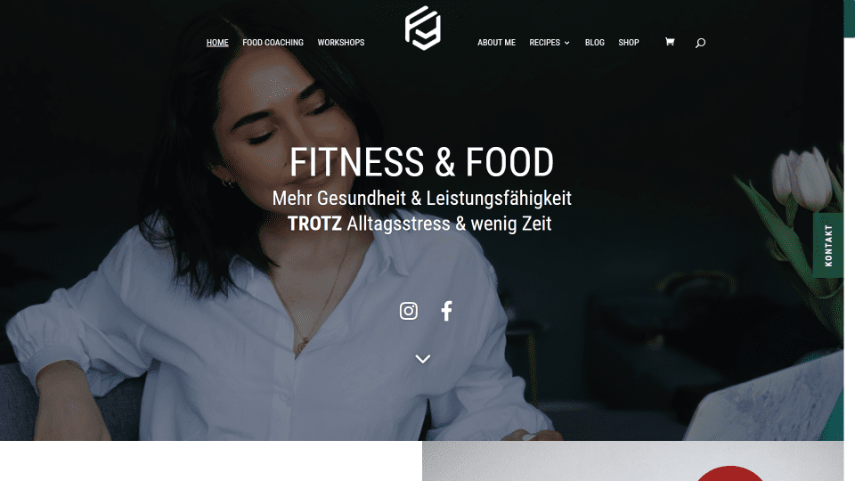
This site was submitted by Patrick Hertnagel. This site uses a nice green for the branded color in the menus, borders, buttons, overlay text, footer background, and even the scrollbar. The titles use large text that blends perfectly with the site design. I especially like the section of large CTAs. The display in two columns that take the full width of the screen with the text and button on one side and an image on the other. It includes four of these in an alternating layout. The blog section includes a search box that matches the width of the blog column. Another section that stands out is the mosaic image gallery. It displays images in multiple columns and heights, but they all fit within the space, creating perfect symmetry.
5. Hey Bear Creative
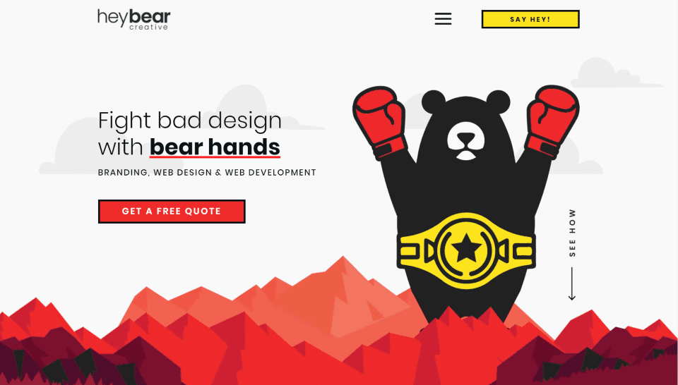
This site was submitted by Marcy Henriques. It uses lots of cartoonish graphics throughout and bold red, black, and yellow for branded colors. The hero section displays a background graphic of a mountain with a similar graphic overlapping it, all in various shades of red with darker shades for the graphics in the foreground. The foreground graphic expands in size as you scroll. The header displays a hamburger menu with bold lines and a CTA in yellow with a bold black border. Similar buttons are placed throughout the site. I love the bear and mountain graphics this website uses. The design makes great use of bold color and background graphics while still keeping the content clean and readable.
6. Rue
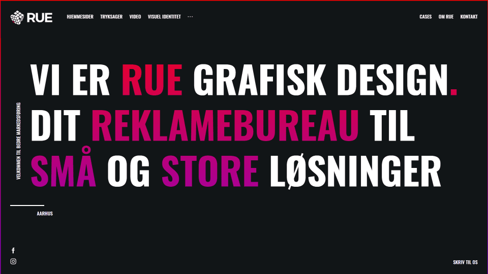
This site was submitted by Mathias Rue. It uses a black background with white, red, and purple text. The hero section is a full-screen section that frames the screen and places links in the corners. It includes extra-large text for the tagline. All of the modules have a border that goes from red to purple. The purple text in the hero section and the purple portions of the border turn to red as you scroll. The next sections show images of the services and portfolio with black backgrounds, white text, and red tags and links. These modules are placed side-by-side with 2 or 3 per row. Each of these modules expands on hover to take more of the space and their images zoom. Contact information in the footer also uses the extra-large text that changes color as you scroll. This site makes interesting use of large text and hover-effects.
7. Dijimoe
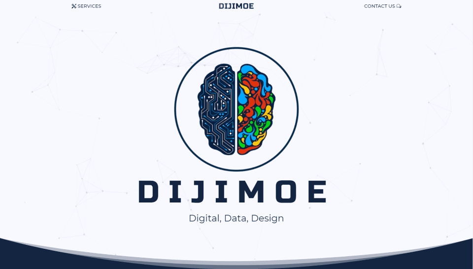
This site was submitted by Moe at Dijimoe. This site uses lots of dark blue for the backgrounds and highlights. The hero section displays a large graphic with a title over a background of animated particles. Each section uses styled separators for the bottom to provide a styled u shape to stand out. The sections alternate between dark blue backgrounds and white backgrounds. This keeps a simple design that’s clean and elegant. Services are displayed within blurbs that use icons of different colors. Client logos are shown within a slider that’s always moving, so it stands out from the rest of the site. The menu is simple with a link on each side that includes an icon on the outside of the link. Hovering over the link reveals a rounded background. I especially like the use of styled accordions and graphics on the Services page.
8. Nutritionist Maria Antonietta Gastone
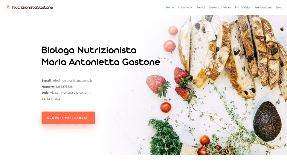
This site was submitted by Daniele Bardella. This site uses a clean design with lots of orange highlights throughout for buttons, links, and icons. The layout uses whitespace to help each blurb, CTA, and testimonial stand out. The section for services uses an image to one side and displays a set of blurbs with a short description and an icon with a link to read more. I like the section about the method used. It provides a description followed by blurbs that overlap an image to one side. A full-width CTA for a book displays a button in the center and an image to one side. The book page uses white text and an image of the book cover over an orange background. This site makes good use of color and whitespace.
9. Webstrategen
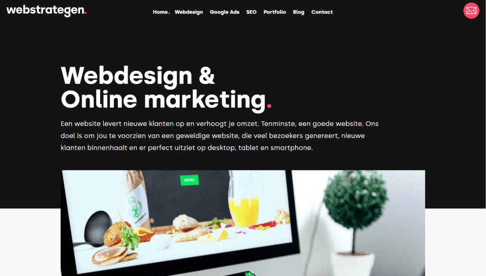
This site was submitted by Michael Kwasiuk. This site uses Radical red for highlights against white and black backgrounds. The red is also used as a preloader screen. Practically every section has something that overlaps or offsets from the center. When the sections alternate, this creates a unique balance that leads your eye. Several sections place text to one side with an animated image on the other. The portfolio uses a slider that’s shifted to one side with unique navigation styling. The blog section displays cards with descriptions that are offset from the image. I love how the logo erases the letters as you scroll and leaves the first letter with the period for the primary menu.
10. Lemonade IT
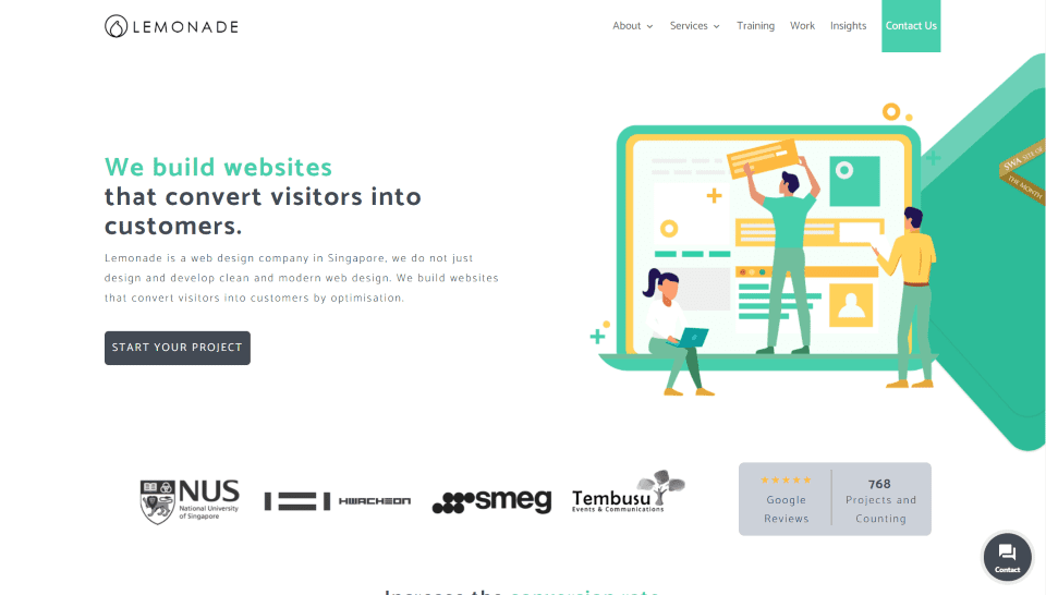
This site was submitted by Teck Seng Chan. The design uses a yellow and green (lemon and lime) color scheme for highlights such as the CTA in the menu, graphics, borders, text, slider navigation, blog post featured image background colors, and more. All of the section backgrounds are either white or light gray to help keep the design as simple and clean as possible. Services are shown within tall blurbs that add shadows to the bottom on hover. My favorite section is a CTA with a mobile phone and a website layout that moves independently behind it. The testimonial slider is also interesting. It scrolls the testimonials vertically. This site makes good use of color and a simple layout.
In Conclusion
That’s our 10 best community Divi website submissions for the month of August. These sites look amazing and as always we want to thank everyone for your submissions!
If you’d like your own design considered please feel free to email our editor at nathan at elegant themes dot com. Be sure to make the subject of the email “DIVI SITE SUBMISSION”.
We’d also like to hear from you in the comments! Tell us what you like about these websites and if there is anything they’ve done you want us to teach on the blog.
Featured Image via ann131313 / shutterstock.com


How do you submit a website for consideration?
Check out the last section of the blog post for instructions.
Hi,
All websites are great but as for me, #6 and #5 are the best.
They really stand out from the rest.
Well done!
Thank you Eugene. #5 is mine 🙂
A nice selection. Could anybody tell me how the mobile navigation of the Divemaster Gilis Site was built?