
It’s that time again for our monthly Divi Showcase where we take a look at 10 amazing Divi websites made by our community members. Each month we showcase the best Divi websites that were submitted from our community and today we want to share with you the top ten websites for the month of August. Throughout the post, I’ll point out some of my favorite design features that draw me to each of the websites.
I hope you like them!
Divi Design Showcase: New Submissions from August 2019
1. Matrix Roofing
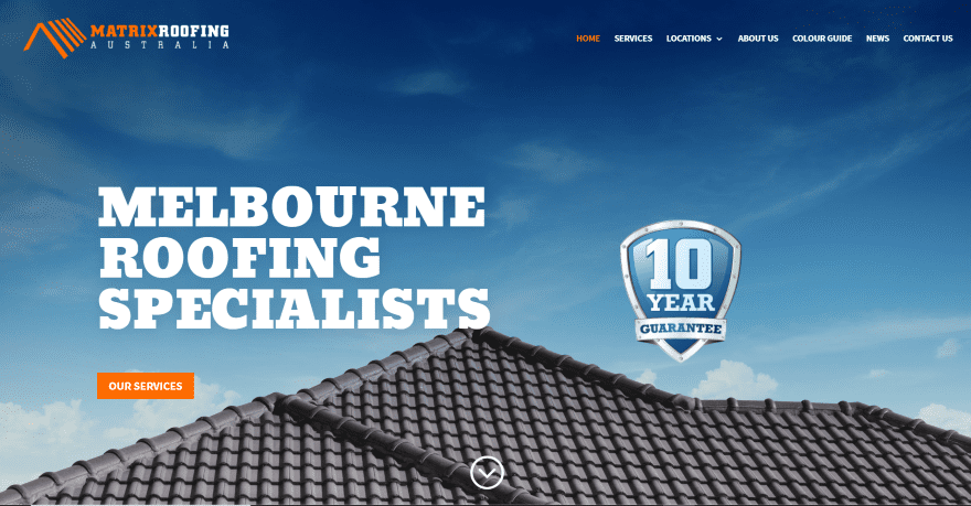
This site was submitted by Christian McMinn. It uses a full-screen background image to show the type of work that’s available and places a CTA in the overlay. Information about the company is placed in a two-column layout with an image to one side and bullet points on the other. A Read More button takes the reader to the About Us page. A similar two-column section shows testimonials with a link to read more. Services are shown in blurbs with large one-color icons. More links to information are placed within CTAs with dark overlays. The footer includes a full-width map in black-and-white that doesn’t scroll by default. I like the Color Guide page that shows the same house with different colored roofs.
2. Brightworks Group
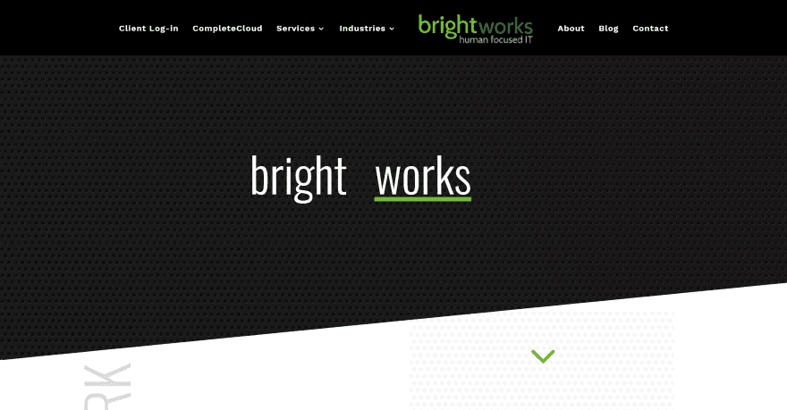
This site was submitted by Britt Baue. A dark background pattern sits behind the rotating title text. An angled divider separates the hero section from the next, which displays vertical text, a tagline, and services in bold green text that zooms on hover. The next section displays a gray background with angled dividers for the top and bottom. The large text leads the reader into the CTA download. A section for services also includes vertically-aligned text for the title and shows services in blurbs. A simple testimonial slider is introduced with a large title. Another angled section shows client logos. A contact section creates a CTA and provides contact information. I like how the logo is offset from the center in the menu.
3. Isla
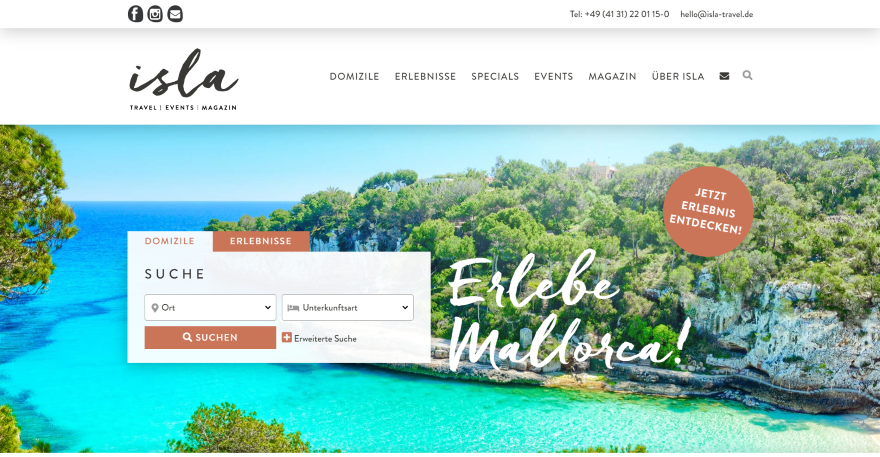
This site was submitted by Saskia Lund. This site includes a background image in true parallax in the hero section to show the types of vacation spots that are available. The overlay includes a tagline in a scripted font and a search box with a tab where you can do advanced searches for specific accommodations. Tall and thin blurbs with hover effects show images and a description of the types of vacations to expect. A section of specials shows vacations in a slider. Each one is a tall card with an image and description and includes hover effects. A section of rentals shows the locations within a card that includes the image, description, and information. Events are displayed in a full-screen slider. The blog section matches the tall card design and also includes hover effects. The Magazine page displays articles within categories in a multi-column layout.
4. Headshed

This site was submitted by Gustav Espenes. A CTA and graphic are placed over a background pattern in true parallax. The graphic includes a button to play a video in a popup overlay. Similar graphics are used throughout the site as elements withing CTAs, blurbs, and backgrounds. The site includes lots of styled dividers to help build the backgrounds. Blurbs are offset from each other to create an interesting vertical design and have colors that blend into the background. A section of questions displays answers within toggles. Another section of blurbs shows benefits with icons. It also includes a full-width testimonial slider, client logos, and a styled contact form. I like the single-column person modules for the team members and the blog page with its clean design.
5. Emerge Richmond

This site was submitted by Christian Schick. This site uses lots of green highlights along with wavy section dividers to give the layout an interesting but minimal design. The hero section places a CTA to one side and a product example on the other that overlaps the section divider. The next section shows a similar product on one side with benefits on the other. Another section shows icons with a styled background to create a flower to show the services. Projects are shown within a multi-column section with an image to one side and the description on the other. A testimonial is placed within a box that’s centered on the screen and overlaps section dividers that lead into the next CTA. The custom footer also includes wavy dividers that are overlapped by a newsletter form. I like the green highlights throughout the site.
6. South Service Corporation
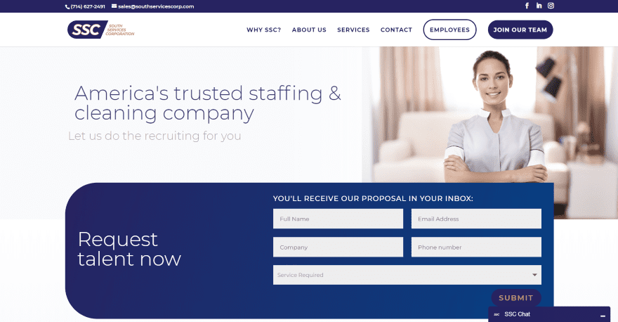
This site was submitted by Mercedes Bugarin. The hero section includes sliding text to show the benefits of the service. It places a form in the hero section with a service selection. The form uses rounded corners on one side and overlaps the image in the hero section. The next section shows services within blurbs that include styled corners and shadows. Client logos are displayed within a slider. Following this is a small section with social buttons and a button where employees can log in. The menu includes two different CTAs. Sections are divided with wavy dividers. The Services page follows the same design and adds styled toggles to provide information about each of the services. The toggles include rounded corners on one side to match the form. The Contact Application forms include a similar design and stand out with shadows.
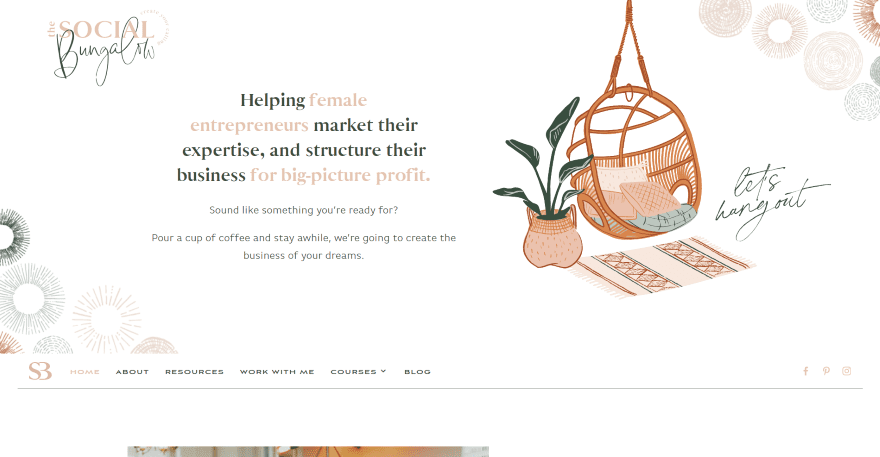
This site was submitted by Kelsey Specter. The hero section shows the logo in one corner with similar graphics in several corners. Graphics from the header are placed throughout the site. Information and a CTA is placed on one side with a graphic on the other. The main menu sits under this section and remains at the top of the screen as it scrolls to that point. An introduction section shows an image on one side and a block of text that overlaps it on the other. A CTA follows this and includes a button with angles that changes on hover. A blog section shows posts with soft colors that match the site and includes scripted text for the title. A full-width CTA uses the same colors and graphics like the header and places the scripted title text in the background. I love the elegant design of the Blog page which uses the same colors and fonts with multiple layouts.
8. Descargar Ecuakaraoke
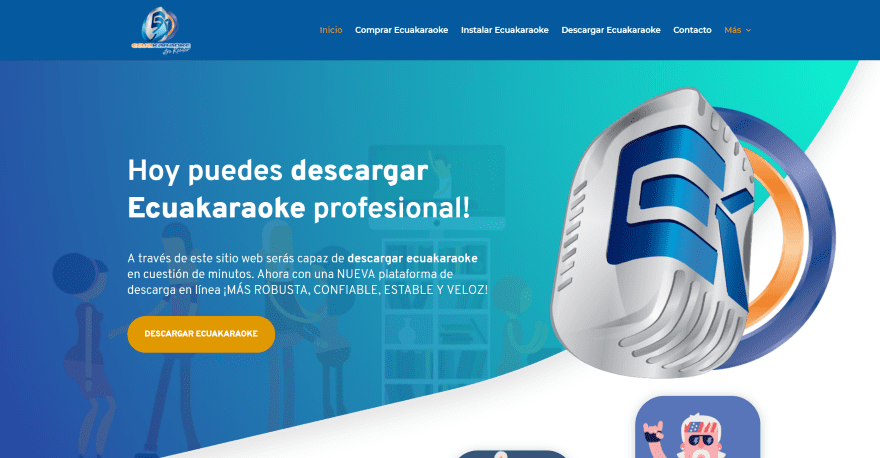
This site was submitted by Jero Shannon. This one has lots of cartoon animations throughout. The hero section shows an animated cartoon in the background with a CTA in the overlay. A graphic overlaps the section divider, which leads into the next section with animated blurbs that are vertically offset from each other and track with the dividers. An angled image leads into the next section that includes a purchase CTA and a link to the blog. Star reviews overlap the background and provide another CTA. An embedded YouTube video is tilted. This site includes lots of angled elements and dividers, along with several CTAs with images or colored angles.
9. Flourishing Figures
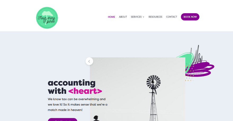
This site was submitted by Kate Britton. It includes a color-splotch within the background and a slider in the overlay to one side. The slider text overlaps the slider image and provides information and links. The slider’s controls are placed in the upper left and lower right corners. The next section uses multi-colored text and another background splotch to provide information. Squared blurbs with solid colors show numbered titles and change color on hover. Another CTA displays an image on one side with the color splotches and a CTA on the other. The booking section shows the title over a solid background and utilizes a map to select the location. A download CTA places the description in a block that overlaps the image. This one uses lots of bold colors that stand out nicely.
10. Block Head Challenge
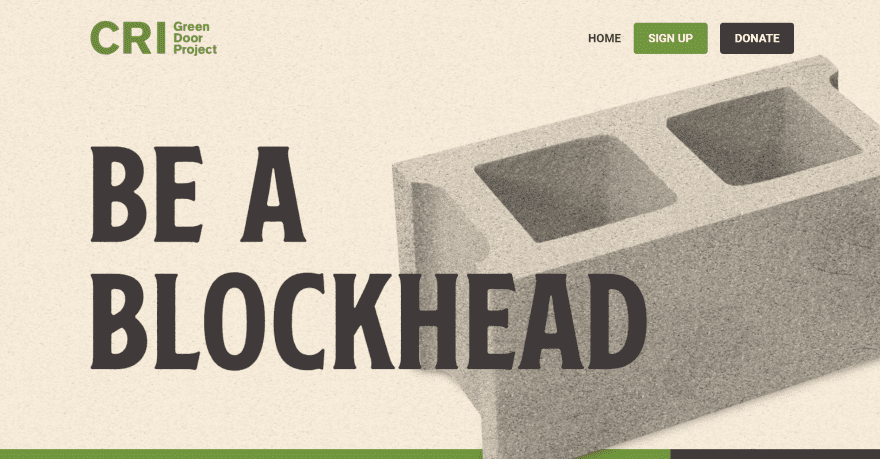
This site was submitted by Keith Green. The hero section displays a block in the background with a textured filter for the overlay. The tagline uses extra-large text. The menu includes two call-to-action buttons. The block image overlaps the next section, which displays a full-width text element to show a title to one side and a block of color on the other. Two alternating sections show an image to one side and information on the other over the textured background. The next several CTA sections include even larger titles with block text that’s clear inside. Some overlap the sections. Images overlap even darker textured backgrounds. I love the use of green, images, and fonts in this one.
In Closing
That’s our 10 best community Divi website submissions for the month of August. These sites look amazing and as always we want to thank everyone for your submissions!
If you’d like your own design considered please feel free to email our editor at nathan at elegant themes dot com. Be sure to make the subject of the email “DIVI SITE SUBMISSION”.
We’d also like to hear from you in the comments! Tell us what you like about these websites and if there is anything they’ve done you want us to teach on the blog.
Featured image via ProStockStudio / shutterstock.com


I always love looking at these. Thanks for sharing!
Hi,
Really very happy to say, your post is very interesting to read. I never stop myself to say something about it. You’re doing a great job. Keep it up.
I joined Divi in 2016 and feel like Divi came a long way in terms of regular feature updates and improving the design and developing processes. I’ve seen feature updates that my design hugely improved in functionality and speed, some of the features that came along were expected, some of them I didn’t even think they were possible. A few days ago, I started another website design after a long time and I was confronted again with the old and extremely limited customization possible through divi>theme options and divi>theme customizer.
It’s almost incredible that these crucial tools haven’t seen a major rethinking in three years, only small tweaks like global defaults. I guess that this is in the divi works behind the scene, but, I feel like hope is gone, when we still don’t have a promised deadline for theme buider update and woocommerce update. Even this selection of divi submissions smells like divi from miles away. You can tell a site is built with divi so easily because the customization of the top sections are so boring and so 2015-2016… come on guys, when will we see a breakthrough in terms of theme customization?
Thank you so mucb and looking forward to next feature updates!
Not only does this comment feel like it doesn’t belong on this page, it’s also… oblivious to all the updates and innovations ET has been working on.
I apologize for misplaced comment. Kindly, please point to me any changes made in the last three years you notice in divi>theme options and divi>theme customizer. Thanks!
You say “apologize,” but you’re saying the same thing again.
Since direct links aren’t allowed, try scrolling further down, and check out ‘product updates’ in the footer.
Nice examples!
I have 3 favorites this time around!
Social Bungalow is my favorite out of the 3. It’s followed by Flourishing Figures then Block Head Challenge.
Great job everyone!
Some very nice looking creative sites. Unfortunately, with the exception of “Descargar Ecuakaraoke” they all rank really poorly for mobile according to Google page speed.
Matrix Roofing = 42%
Brightworks Group = 40%
Isla = 10%
Headshed = 48%
Emerge Richmond = 39%
South Service Corporation = 22%
Social Bungalow = 13%
Descargar Ecuakaraoke = 85%
Flourishing Figures = 29%
Block Head Challenge = 52%