
When designing a product page to promote your product, it helps to include striking images combined with clean backgrounds, succinct content, and clear CTA’s. To make your page unique, adding a few creative elements can also help. So, if you are looking for a fresh product layout and a few inspirational design tips, this post is for you.
In this tutorial, I’m going to show you how to use Divi to design a beautiful product layout using a few simple (yet powerful) design techniques. When creating the layout, I’ll cover how to add three-dimensional perspective to any image with one short custom CSS snippet. Then I’m going to show you how to stack section dividers to create an abstract multi-colored wave to divide your content. And, I’ll even throw in a easy tip to keep your dual CTA buttons the same width.
- 1 Sneak Peek
- 2 What you need for this Tutorial
- 3 Design a Striking Divi Product Layout with Image Perspective and Colorful Abstract Waves
- 4 Creating the Fullwidth Header
- 5 Adding the fullwidth Product Image
- 6 Creating the Abstract Multi-Colored Wave Divider
- 7 Import the Software Marketing Landing Page Layout
- 8 Adding Perspective and Rotation to Your Featured Section Images
- 9 Mobile Responsive
- 10 Final Thoughts
Sneak Peek
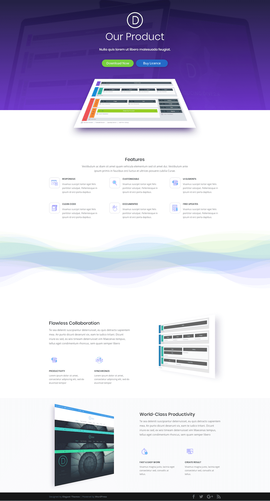
Here is a sneak peek of the layout we will be creating today.
What you need for this Tutorial
For this tutorial, the only design tool you will need is Divi so make sure you have your Divi theme installed and active. Then we will use the Visual Builder to create a unique hero section and the wave divider. And to finish the layout design, you will need to import elements from the Software Marketing Landing page layout from within the Divi builder. You will need to add one or two snippets of custom CSS which can easily be placed in the advanced tab of a module.
Let’s get started.
Design a Striking Divi Product Layout with Image Perspective and Colorful Abstract Waves
Subscribe To Our Youtube Channel
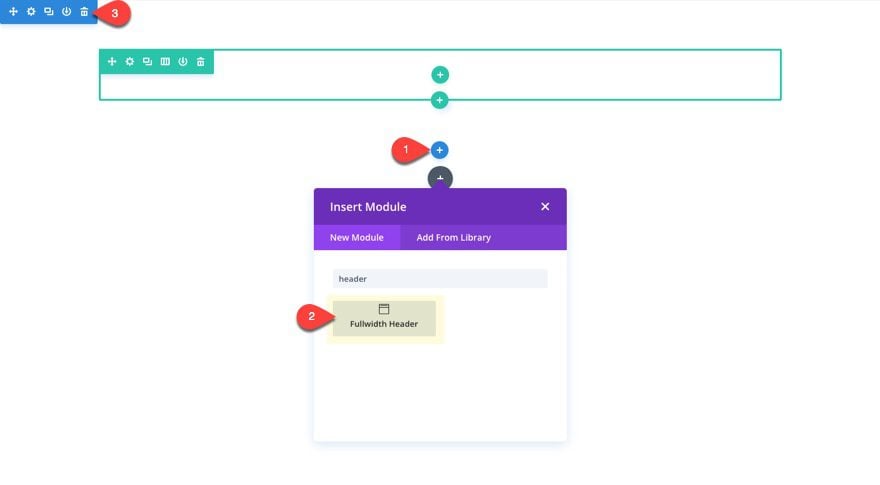
Creating the Fullwidth Header
To create the fullwidth header, first create a new page and deploy the visual builder. Then add a new fullwidth section with a fullwidth header module.
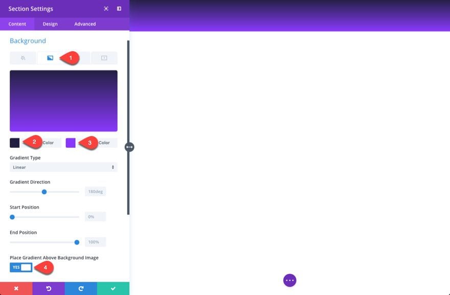
Before adding the header content, go to the fullwidth section settings and update the following:
Background Gradient Color 1 (left): rgba(23,20,57,0.95)
Background Gradient Color 2 (right): rgba(136,52,253,0.98)
Place Gradient Above Background Image: YES
Notice the background gradient colors have a very slight opacity added and are placed above the background image. This will allow you to create a nice gradient overlay for your background image.
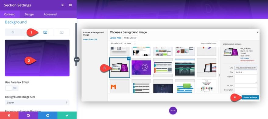
Next enter the background image.
Background Image: [insert image]
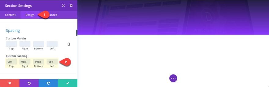
Under the design tab, add some custom padding to your section.
Custom Padding: 0px Top, 0px Right, 80px Bottom, 0px Left
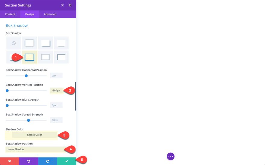
Next add a white inner box shadow with a -200px vertical position. This will allow our product image (not yet added) to appear to be overlapping into the next section. This method is a little cleaner than adding negative bottom margin to our image to bring it down into the next section.
Box Shadow: [see screenshot]
Box Shadow Vertical Position: -200px
Shadow Color: #ffffff
Box Shadow Position: Inner Shadow
This will cause your visual preview of the background to disappear for now but don’t worry. It will all balance out when we add our content.
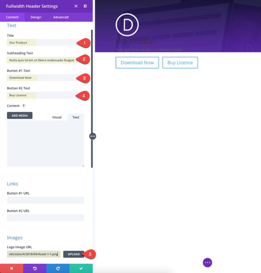
Now you can go back to your fullwidth header module settings and add the header content by updating the following:
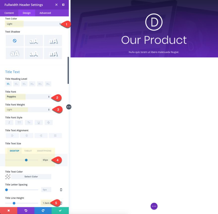
Title: Our Product
Subheading Text: Nulla quis lorem ut libero malesuada feugiat.
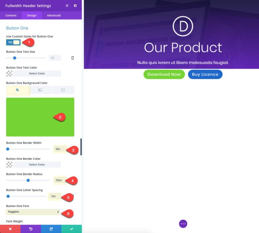
Button #1 Text: Download Now
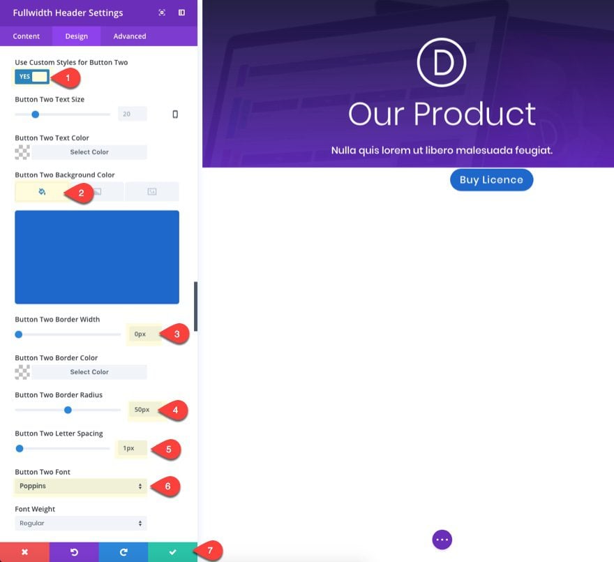
Button #2 Text: Buy License
Logo Image URL: [insert image, 100px by 100px]
Tip: Make sure your logo image is white (or light in color) since we are using a dark background.
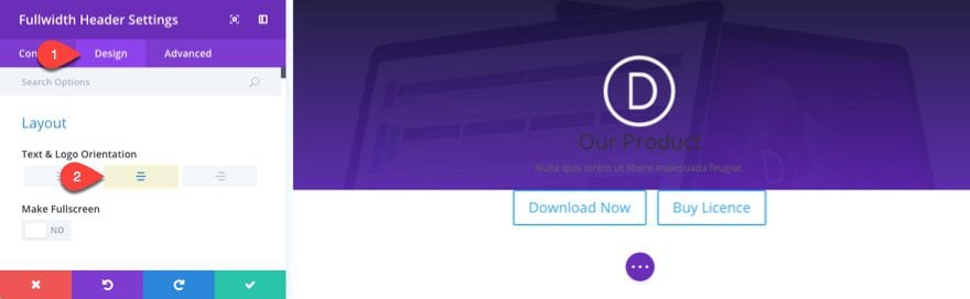
Hop over to the Design tab and update the Text & Logo Orientation option to “centered”.
Then update the following:
Text Color: Light
Title Font: Poppins
Title Font Weight: Light
Title Text Size : 65px (desktop), 40px (smartphone)
Title Line Height: 1.5em
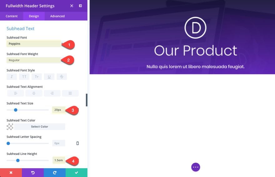
Subhead Font: Poppins
Subhead Font Weight: Regular
Subhead Text Size: 20px
Subhead Line Height: 1.5em
Use Custom Styles for Button Two: YES
Button Two Background Color: #1e69cb
Button Two Border Width: 0px
Button Two Border Radius: 50px
Button Two Letter Spacing: 1px
Button Two Font: Poppins
Use Custom Styles for Button One: YES
Button One Background Color: #75d334
Button One Border Width: 0px
Button One Border Radius: 50px
Button One Letter Spacing: 1px
Button One Font: Poppins
One of the unique features of the fullwidth header is the ability to add two buttons (dual CTA’s) next to each other. This is perfect for products offering both a free download and a premium license.
If you have used the dual button on your header before, you may be aware that the two buttons don’t exactly match in size because the button width adjusts depending on the amount of text in the button. To make the buttons match in width no matter the amount of text, you can add a couple of lines of custom CSS.
To add the custom CSS, go to the advanced tab and enter the following CSS snippet in the input field for both Button One and Button Two:
width: 100%;
max-width: 220px;
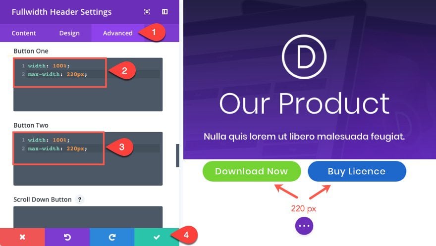
Save Settings.
You may need to adjust the max-width to adjust to your own button font and size. Just make sure you account for the animated icon that will need room on hover.
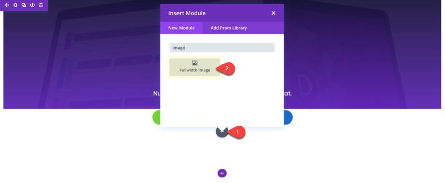
Adding the fullwidth Product Image
For this mock product image, I’m going to use a screenshot of the product’s user interface (UI) which, in this case, is the Divi Builder. To create the fullwidth image, add a fullwidth image module under the fullwidth header.
Then upload your image. The size of the image should be around 1920px by 1080px.
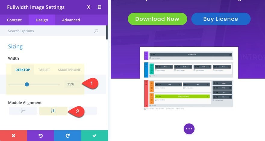
Then update the following design settings.
Width: 35% (desktop), 60% (tablet), 70% (smartphone)
Module Alignment: center
Adjusting the width of the module using percentages will help create a smoother transition when adjusting browser widths and better mobile displays.
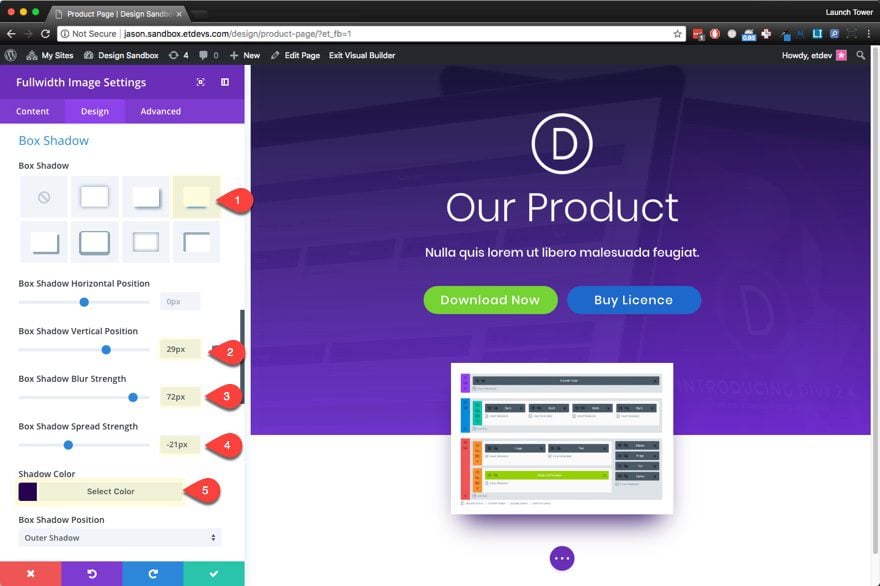
Box Shadow: [see screenshot]
Box Shadow Vertical Position: 29px
Box Shadow Blur Strength: 72px
Box Shadow Spread Strength: -21px
Shadow Color: #27005e
Now we are ready to add our perspective and rotation to our image in order to give it that cool 3d effect. To do this, go to the advanced tab and add the following line of custom CSS (with vendor prefixes for cross browser compatibility) to the Main Element input field.
-webkit-transform: perspective(700px) rotateX(45deg);
-moz-transform: perspective(700px) rotateX(45deg);
-ms-transform: perspective(700px) rotateX(45deg);
-o-transform: perspective(700px) rotateX(45deg);
transform: perspective(700px) rotateX(45deg);
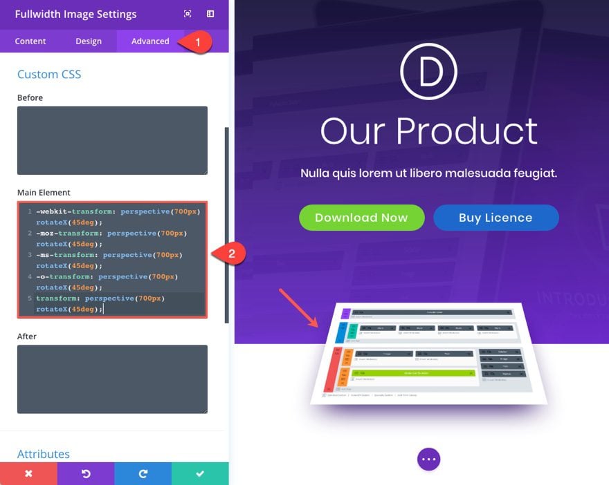
This css is doing two thing to our image using the Transform CSS Property. First, it adds a perspective of 700px. This is basically creating the amount of distance between the image and the perspective of the user when viewing the page. Right now it sits 700px away from the user. The smaller amount of pixels will bring the image closer. A larger pixel value will take it farther away. But, this perspective value alone will not produce the effect we want until we add rotation to the image. That is the next part of the transform property value. The rotateX(45deg) tells the image to rotate on the X axis 45 degrees. And because the perspective is set, the image now has a three dimensional appearance. Feel free to play with these settings to get the look you want.
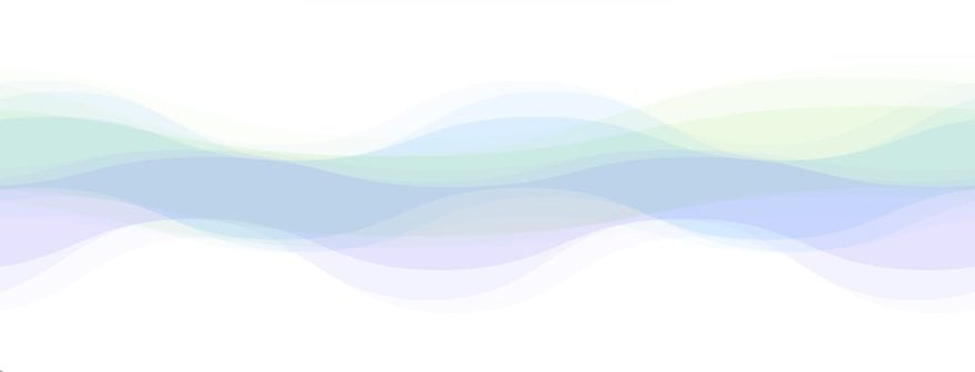
Creating the Abstract Multi-Colored Wave Divider
For this next part, I’m going to get a little creative with section dividers. If you don’t already know, each section allows you to add a top and/or bottom divider to create some beautiful transitions between sections of content. For this design, I’m going to use four sections stacked on top of each other (each with top and bottom dividers). This will make it possible to overlap dividers with different colors to create a unique and colorful abstract wave. The trick is to leave your sections free of content and padding so that the section has a 0px height. Then you need to mirror the top and bottom dividers (the ones that are connected) and match them with the same color to create a single beam of color flowing across the page. When you stack the other sections and dividers, you will have a total of 3 beams of color intertwining across the page. Pretty cool.
Let’s get to it.
Adding the first Section of Dividers
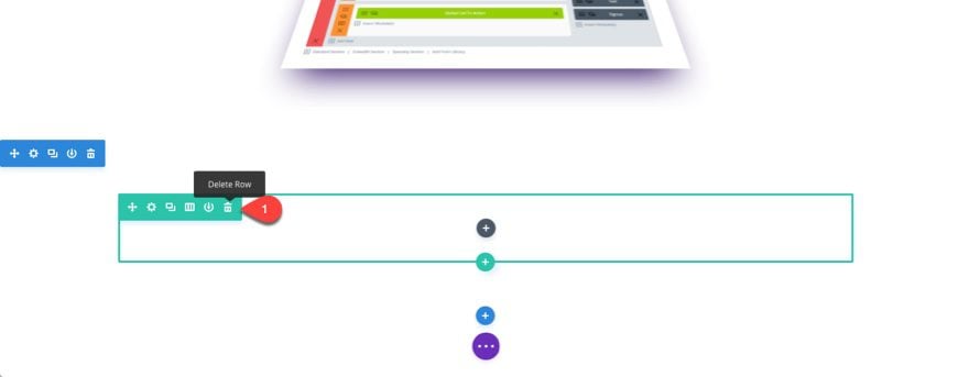
Add a new regular section below your existing content, but don’t add a module. Then delete the row within the section. Remember, we don’t want any height on our sections.
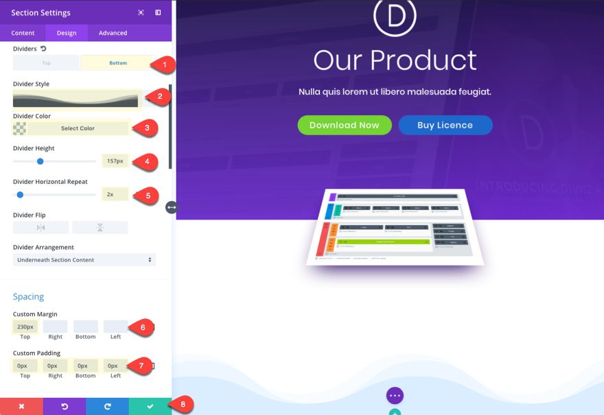
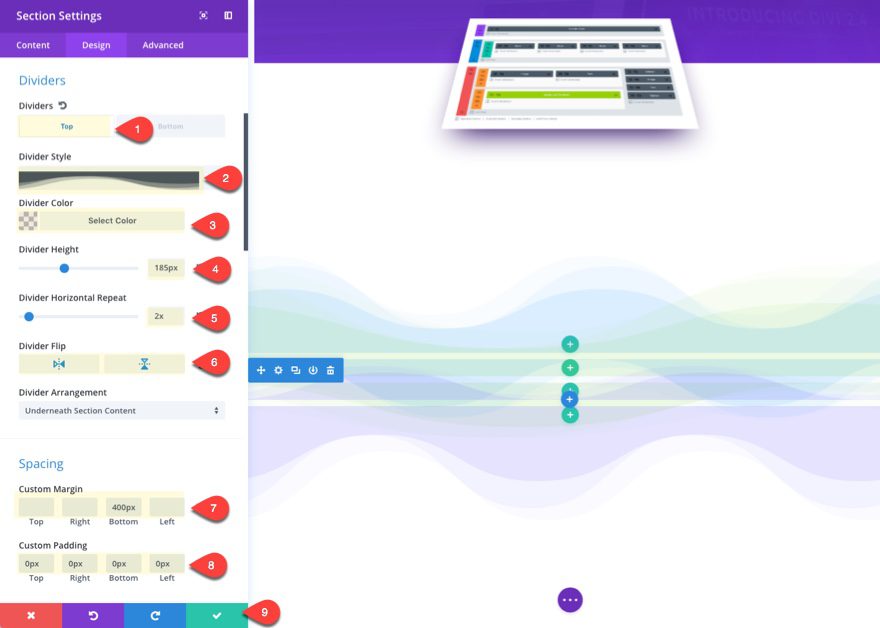
Update the section design settings by adding a bottom divider.
Divider: Bottom
Divider Style: [see screenshot]
Divider Color: rgba(45,153,255,0.1)
Divider Height: 157px (desktop), 75px (tablet and smartphone)
Divider Horizontal Repeat: 2x
Then add some custom spacing that will create some needed margin above the section and zero padding. This gets rid of the section height so that the dividers will stack seamlessly on top of one another.
Custom Margin: 230px Top (desktop), 115px (tablet and smartphone)
Custom Padding: 0px Top, 0px Right, 0px Bottom, 0px Left
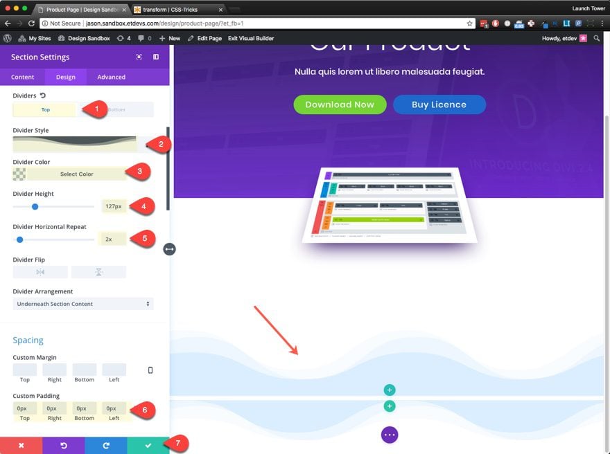
Adding the Second Section of Dividers
At this point you are going to repeat the same process. Add another regular section below, but don’t add a module. Then delete the row within the section.
Update the section design settings by adding a top and bottom divider.
Divider: Top
Divider Style: [see screenshot]
Divider Color: rgba(45,153,255,0.1)
Divider Height: 127px (desktop), 60px (tablet and smartphone)
Divider Horizontal Repeat: 2x
Custom Padding: 0px Top, 0px Right, 0px Bottom, 0px Left
You can already see the first wave take shape.
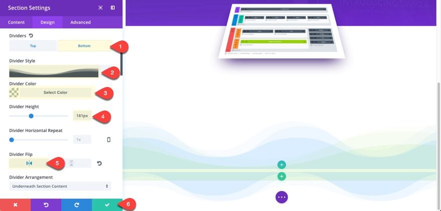
Divider: Bottom
Divider Style: [see screenshot]
Divider Color: rgba(117,211,52,0.08)
Divider Height: 181px (desktop), 90px (tablet and smartphone)
Divider Flip: Horizontal
This will serve as the top of the second wave that will be finished in the next section.
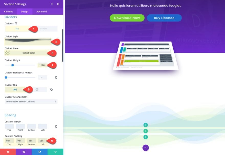
Adding the Third Section of Dividers
Continue to repeat the same process. Add another regular section below. Don’t add a module. Then delete the row within the section.
Then update the section design settings by adding a top and bottom divider.
Divider: Top
Divider Style: [see screenshot]
Divider Color: rgba(117,211,52,0.08)
Divider Height: 119px (desktop), 60px (tablet and smartphone)
Divider Flip: Horizontal
Custom Padding: 0px Top, 0px Right, 0px Bottom, 0px Left
You can now see the second wave take shape.
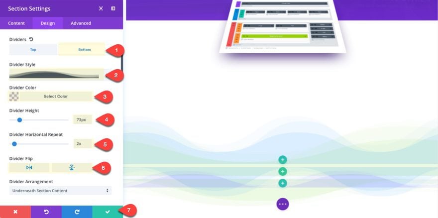
Divider: Bottom
Divider Style: [see screenshot]
Divider Color: rgba(122,112,251,0.12)
Divider Height: 72px (Desktop), 40px (tablet and smartphone)
Divider Horizontal Repeat: 2x
Divider Flip: Horizontal and Vertical
This will serve as the top of the third wave that will be finished in the next section.
Adding the Fourth Section Divider
Add one more regular section without a module. Then delete the row within the section.
Then update the section design settings by adding a top divider.
Divider: Top
Divider Style: [see screenshot]
Divider Color: rgba(122,112,251,0.12)
Divider Height: 185px (Desktop), 90px (tablet and smartphone)
Divider Horizontal Repeat: 2x
Divider Flip: Horizontal and Vertical
Custom Margin: 500px bottom (Desktop), 250px bottom (tablet and smartphone)
Custom Padding: 0px Top, 0px Right, 0px Bottom, 0px Left
Now the third wave is complete. The 500px bottom margin is to create some necessary space before your next section below the section dividers.
Here is the final result.
Import the Software Marketing Landing Page Layout
To finish off the design, import the Software Marketing Landing Page layout by going to your settings menu, clicking the Load From Library button and selecting the layout. This will load the layout under your current content so we can use different elements to finish our design. The colors and fonts also match nicely.
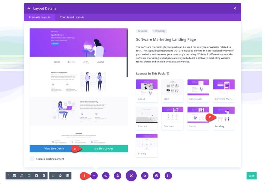
Once the new layout is imported, delete the first section in the layout and the last four sections of the layout. This is only my preference for this tutorial. You can of course use whatever elements you want for your own product page.
Here is what your page should look like now.
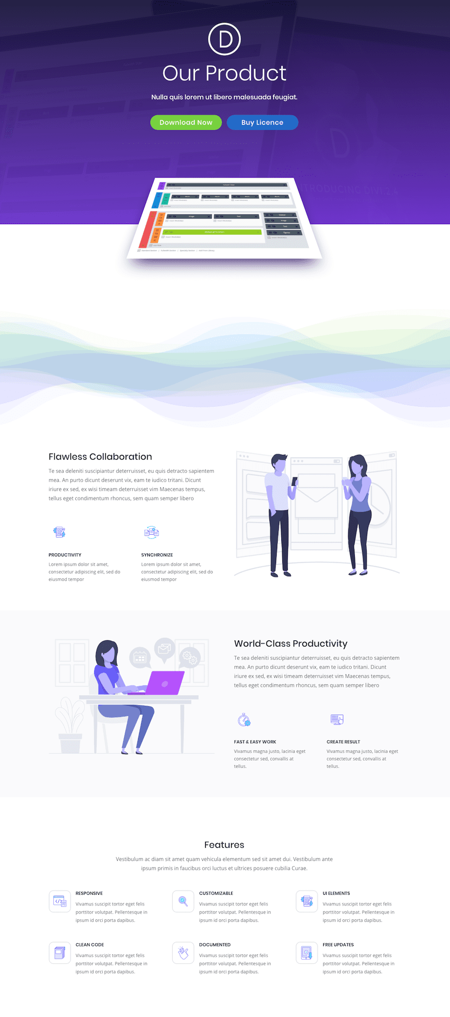
Now drag the bottom “Features” section directly below the fullwidth section and above the dividers.
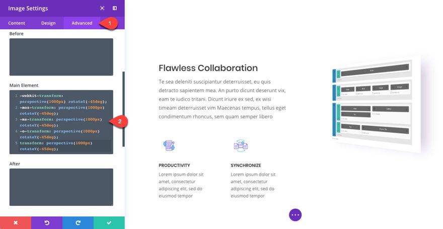
Adding Perspective and Rotation to Your Featured Section Images
In the first section containing the large graphic illustration, delete the image module displaying the illustration and add a new image module with an image that displays your product interface.
Then go to the advanced tab and add the following Custom CSS inside the Main Element input field.
-webkit-transform: perspective(1000px) rotateY(-45deg);
-moz-transform: perspective(1000px) rotateY(-45deg);
-ms-transform: perspective(1000px) rotateY(-45deg);
-o-transform: perspective(1000px) rotateY(-45deg);
transform: perspective(1000px) rotateY(-45deg);
This CSS looks a lot like the first one we used in the header, but there are three minor differences. The perspective is 1000px to create greater distance. The image is now rotating on the Y axis and I used the negative 45 degree value to turn the image clockwise on the Y axis. This works well for images on the right column.
IMPORTANT NOTE: It is important that you delete the image module before adding the new image module because the previous module had animation. This animation conflicts with the CSS code we are using. So if you added the CSS and nothing changed, this is probably because you have an animation effect in place.
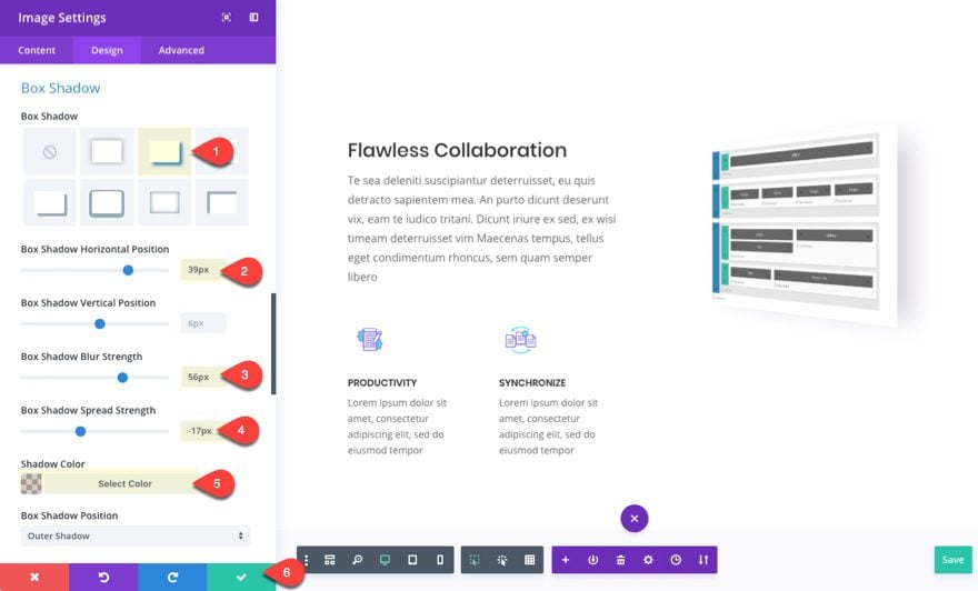
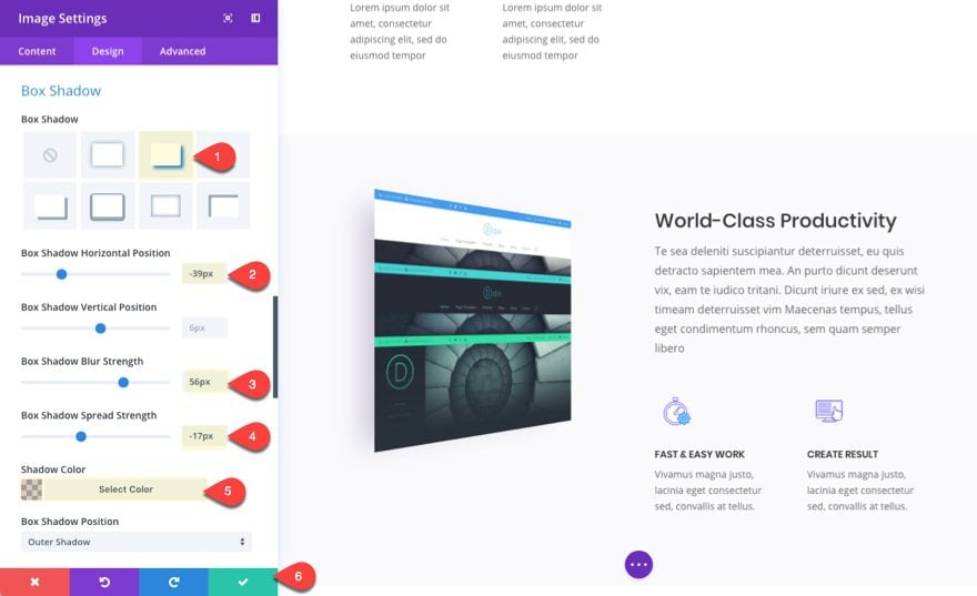
With the image perspective in place, go to the design tab and add a box shadow that works with the new position of the image as follows:
Box Shadow: [see screenshot]
Box Shadow Horizontal Position: 39px
Box Shadow Blur Strength: 56px
Box Shadow Spread Strength: -17px
Box Shadow Color: rgba(39,0,94,0.19)
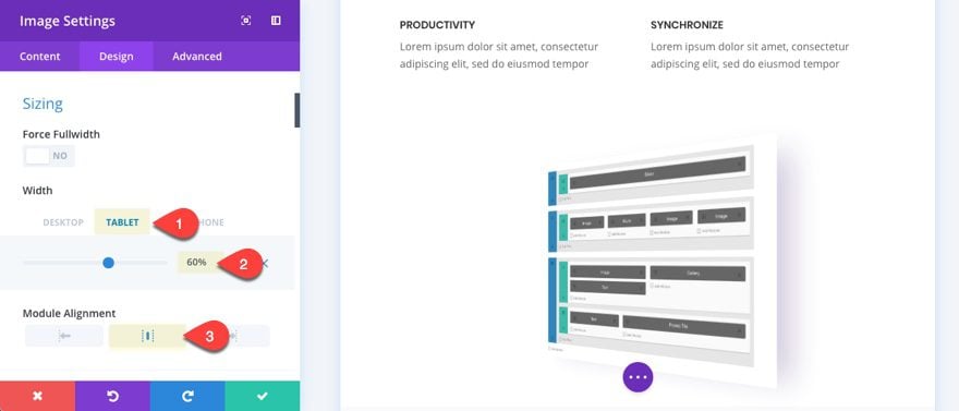
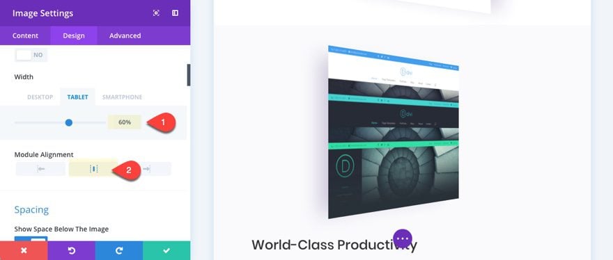
For mobile display, you will want to adjust the size of the image to 60% on tablet with a centered alignment.
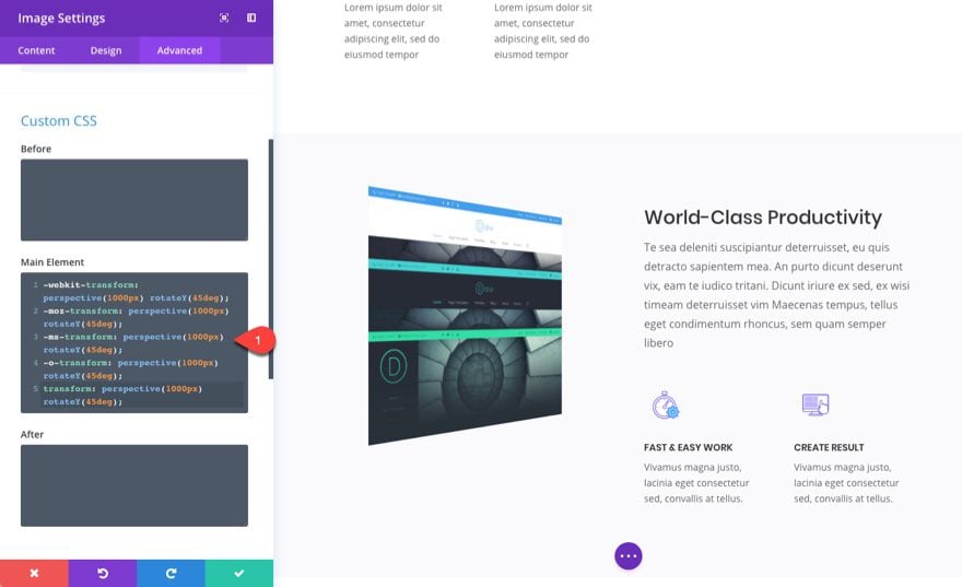
Now we are going to do the same for the next section containing the illustration. Delete the image module and add a new one with the image of your choice. Then add the following Custom CSS inside the Main Element input field.
-webkit-transform: perspective(1000px) rotateY(45deg);
-moz-transform: perspective(1000px) rotateY(45deg);
-ms-transform: perspective(1000px) rotateY(45deg);
-o-transform: perspective(1000px) rotateY(45deg);
transform: perspective(1000px) rotateY(45deg);
The only difference here is the rotation. Since this image is set to rotate a positive 45 degrees, the image now rotates counter clockwise. This works well for images in the left column.
Finally, go to the design tab and add the following box shadow settings:
Box Shadow: [see screenshot]
Box Shadow Horizontal Position: -39px
Box Shadow Blur Strength: 56px
Box Shadow Spread Strength: -17px
Box Shadow Color: rgba(39,0,94,0.19)
For mobile display, you will want to adjust the size of the image to 60% on tablet with a centered alignment.
That’s it! Let’s check out the final result.
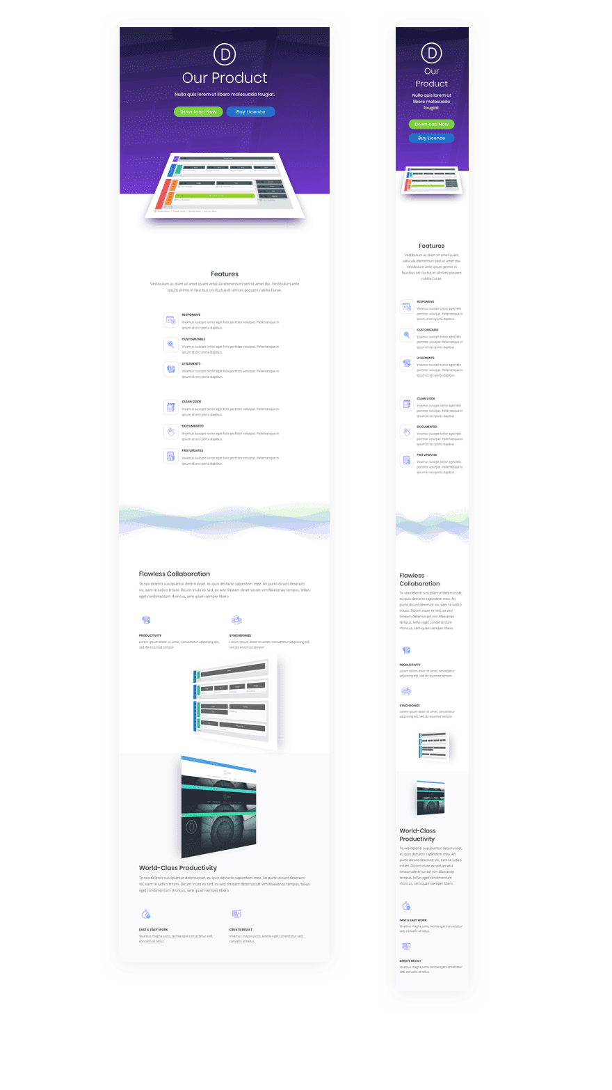
Mobile Responsive
With the mobile adjustments made along the way, your layout will look great on tablet and smartphone.
The only modification I would suggest is to add the following Custom CSS to your Page Settings or Theme Customizer:
@media (max-width: 757px) {
.et_pb_button_two.et_pb_button {
  margin-left: 0px !important;
  }
}
This takes out the margin between the two buttons so that they align perfectly when stacked on mobile.
Here is what it looks like on tablet and smartphone.
Final Thoughts
Adding perspective and rotation to your images is really easy to do once you know how the transform property value works and where to add that CSS snippet. And the effect is pretty impressive. These images really do “stand out”. Of course, this design is not limited to product images. You can add perspective to any image you want on any page you want.
The abstract wave design will not be for everyone. I get it. But, just think of all the different designs one can make by using this method of stacking section dividers with multiple colors. With so many divider styles, heights, and colors, you might end up spending the rest of the day creating for the fun of it. These stacked dividers would also serve as a unique background for certain content.
Anyway, I hope you are inspired to add some of these design techniques to your own site, and, as always, I look forward to hearing from you in the comments.
Cheers!


Awesome tutorial and I love the effect! I just have a few comments that could improve the tutorials.
* Add names or number to the Dividers. When you reference them in the tutorial, you fail to mention that the visual shape of the Divider Style will change when you modify the options and confuses the reader.
* Take new screenshots of the interface. This tutorial references the previous UI without the recent improvements, which can confuse readers because some fields have been repositioned. This can be seen in the Spacing section, under Custom Margin where the Top/Bottom and Right/Left are now side-by-side.
* Add a better visual highlight to the tabs when selecting the Top or Bottom under Dividers. It is hard to tell if you are in one tab or the other because it uses white and light grayscale colors.
Overall though, great tutorial.
When i Creating the Fullwidth Header it fill a background color automatically
and i can’t delete it under content > background. the button don’t work.
inner shadow -200px not working
Hi Matt,
Are you using -200px for the box shadow vertical position?
Hello and thank you for this idea.
However I have a problem because wanting to try everything is displayed well in computer and tablet mode,
but in phone mode everything disappears.
Or could I have made a mistake?
Greetings
Sorry you are having this problem. Can you be more specific about what actually disappears?
Wow, now this one is super duper slick! Thank you.
Just working on a new design for a client and it looks great – awesome tutorial – thanks a bunch
You are very welcome, Holger. Hope the new design works out for you and your new client.
Brilliant thanks for your work and sharing!
I have seen a bunch of your posts, this one was my favorite… Great ideas, and looks great.
That means a lot, Luiz. Thanks for the support.
I tried the code on a video and it worked. Opens up some more creative options. Neat stuff for sure.
Awesome Mak. Love the 3d CSS!
didn’t work for me at all once i loaded the landing page layout it deleted the work i did from the begining, thanks.
Sorry about that. I should have mentioned that in the post. Howevery, by default, the layout shouldn’t replace the content unless you check that option when adding the layout to the page.
You gotta be mindful of the little box that asks if you want to overwrite everything when you import the layout.
Enjoyed running up that one on my sewing mac… I mean PC.
Yes I see what you mean by the dividers. Looks like Siri has invaded.
haha. It does remind me of Siri.
That was a joke by the way ; )
Brilliant thanks for your work and sharing!
What an awesome design look. I will be using that on a new build I am working on right now and I am sure it will blow this client out of the water. I am thinking based on previous comments that I should export the json file for the page I build so that it can be imported and edited by those here that want it
Thanks Paul. Glad it was helpful.
Yes that would be great!
That would be brilliant! Thank you. I go blind trying to move all the settings into a new page layout.
I agree with the others. Should be download link and maybe a demo version :p
Thanks anyway! Nice work!
Same Thing…
Great presentation Jason. Don’t need layouts or download links, the inspiration is just fine with me.
Awesome. Thanks Jade.
I agree, great tutorial and download links not required as we wouldn’t be learning how to create these beautiful sections, after all it is a tutorial and we get new layouts that we can tweek each Monday.
Cheers and keep up the good work.
Hi, it would be great if you can add this layout to the DIVI theme where all the layout exist.
I like this and apprectiate that you shared. Can we please have download links on these tutorials?
Thank you
Love it! Thank you. I was wondering if it made sense to also offer the layout as a download. This would be greatly helpful.
I was coming here to say the same thing. Why wouldn’t they post it here???
Totally agree
That would be really amazing, to be able to download all the tutorials
This comment is regarding all the tutorials.
I agree. Good tutorial and very good idea to have a download link!!
There should always be download links on DIVI tutorials. Don’t you think?
I don’t get the Divi Team strategy on that matter. Why don’t they make the layout available? They might be making a pack for a new Layout Manager Update. Otherwise, it’s pointless and actually pretty dumb. Chears!