Every week, we provide you with new and free Divi layout packs which you can use for your next project. For one of the layout packs, we also share a use case that’ll help you take your website to the next level.
This week, as part of our ongoing Divi design initiative, we’re going to show you how to create stunning fixed icon navigation using Divi’s Risk Management Layout Pack. We’ll combine this fixed icon navigation with anchor links. This is a great approach for one-pagers but you’re also free to use it for multiple pages on your website to ease the navigation process for your visitors. We’re going to recreate three examples but you can easily create your own kind of fixed icon navigation using this approach.
Let’s get to it!
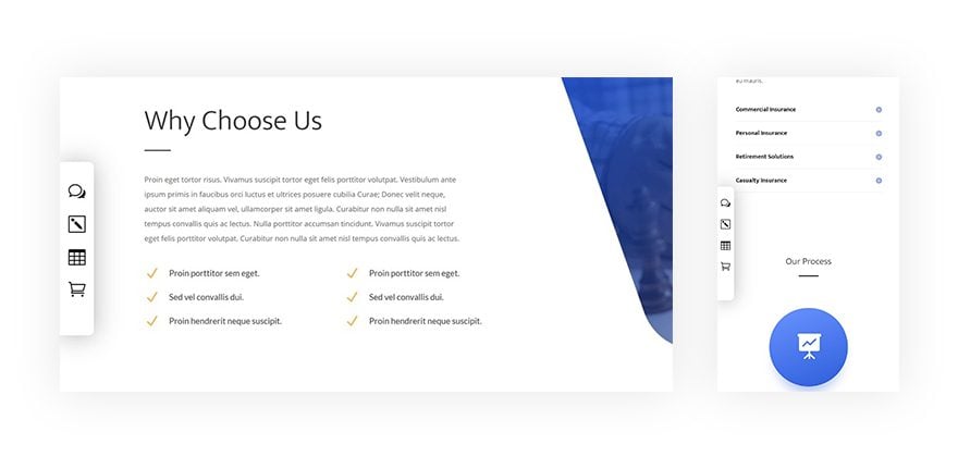
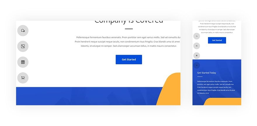
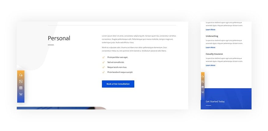
Preview
Before we dive into the tutorial, let’s take a quick look at the three examples and what they look like on different screen sizes.
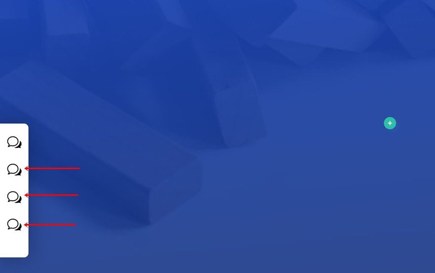
Example #1
Example #2
Example #3
Add Anchor Links
Add Anchor Link #1 to Section
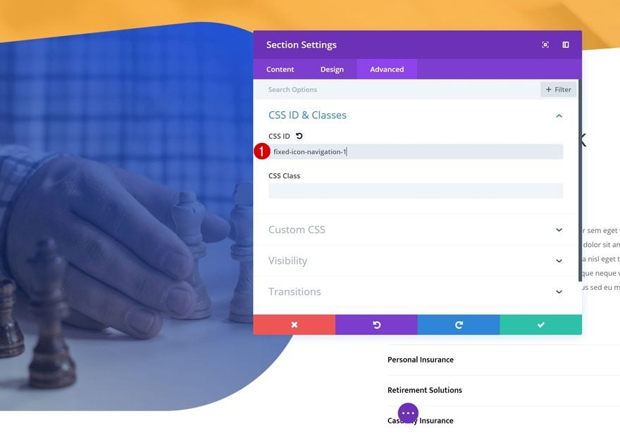
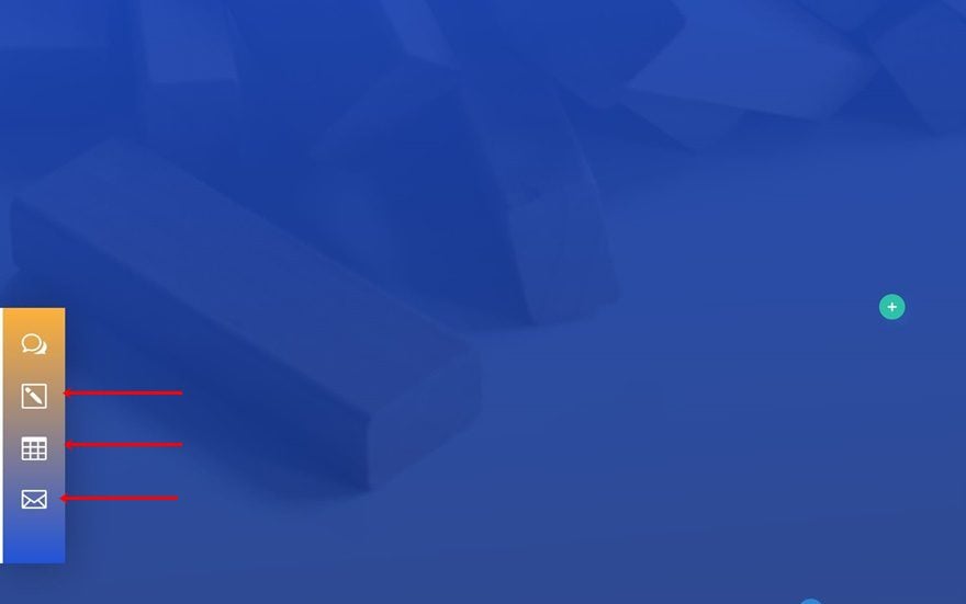
The first thing we’re going to start off with is the anchor IDs. The fixed icon navigation bars that we’ll recreate will contain 4 different icons. This means that you’ll have to link each one of the icons to a different part of your page. You can add an anchor ID to any kind of design element, but it’s most commonly used for sections. Create a new page using the Risk Management Layout Pack‘s landing page and add the first anchor link to one of the sections on the page.
- CSS ID: fixed-icon-navigation-1
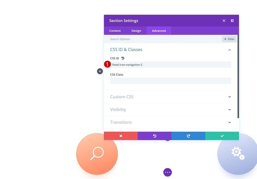
Add Anchor Link #2 to Section
Add another anchor ID to a second section.
- CSS ID: fixed-icon-navigation-2
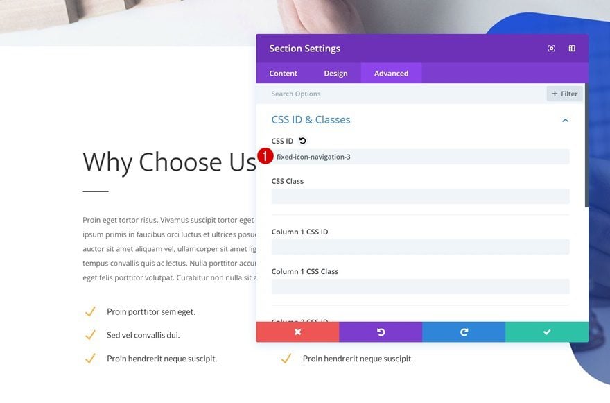
Add Anchor Link #3 to Section
Repeat the same step for the third anchor ID.
- CSS ID: fixed-icon-navigation-3
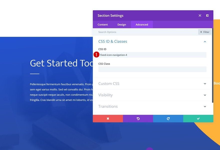
Add Anchor Link #4 to Section
And add the anchor ID to the fourth and last section as well. Later on this tutorial, we’re going to link these IDs to the icons that we place in the fixed icon navigation bar.
- CSS ID: fixed-icon-navigation-4
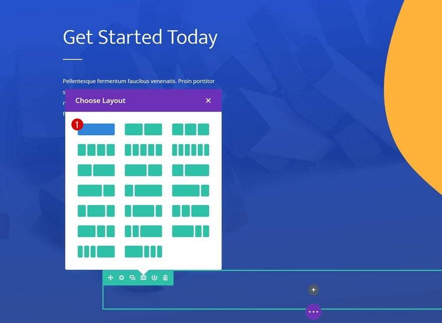
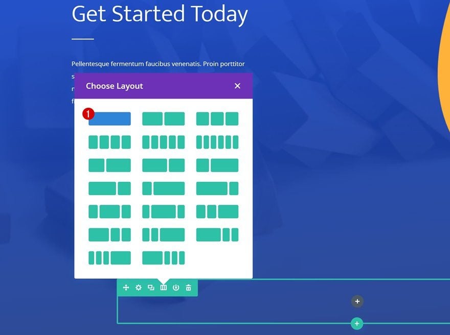
Start Recreating Example #1
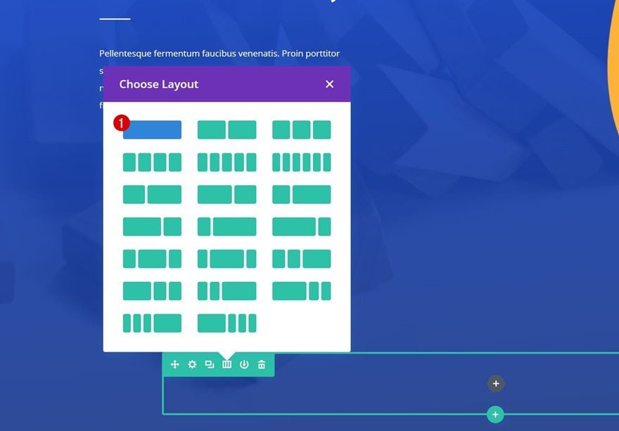
Add New Row to Last Section of Page
Column Structure
Let’s start recreating the first example! Scroll down to the bottom of your page and add a new row to the last section using the following column structure:
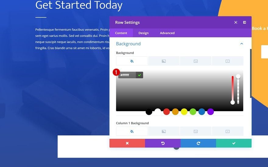
Background Color
Without adding any modules yet, open the row settings and add a background color to the row.
- Background Color: #ffffff
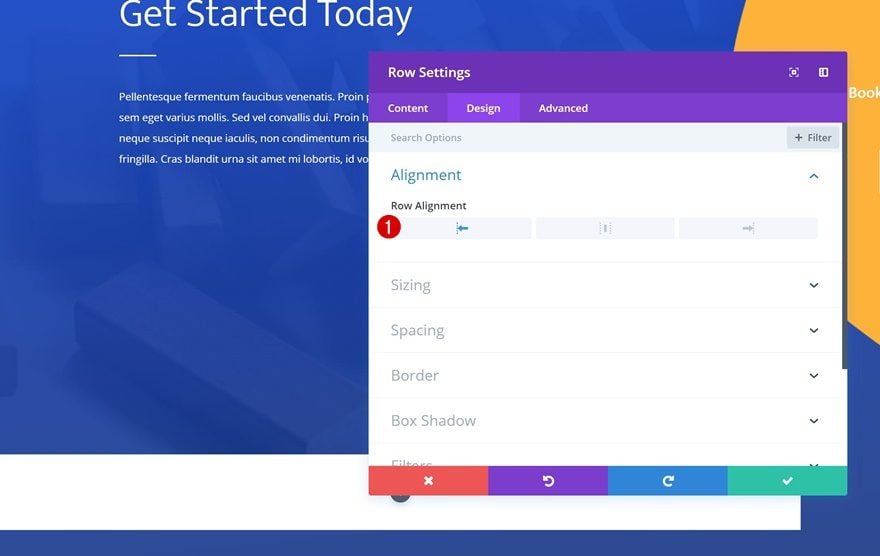
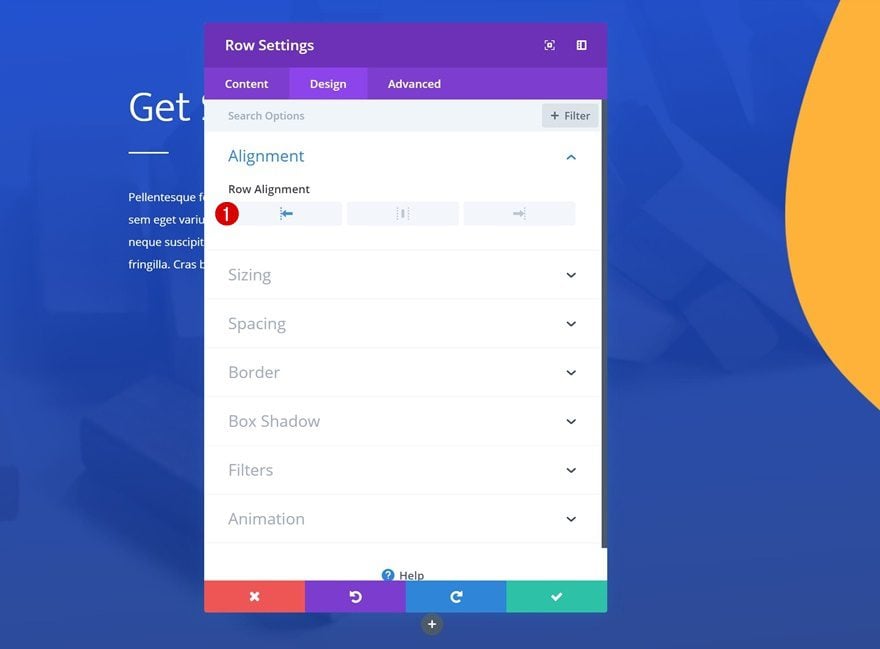
Alignment
Then, change the row alignment.
- Row Alignment: Left
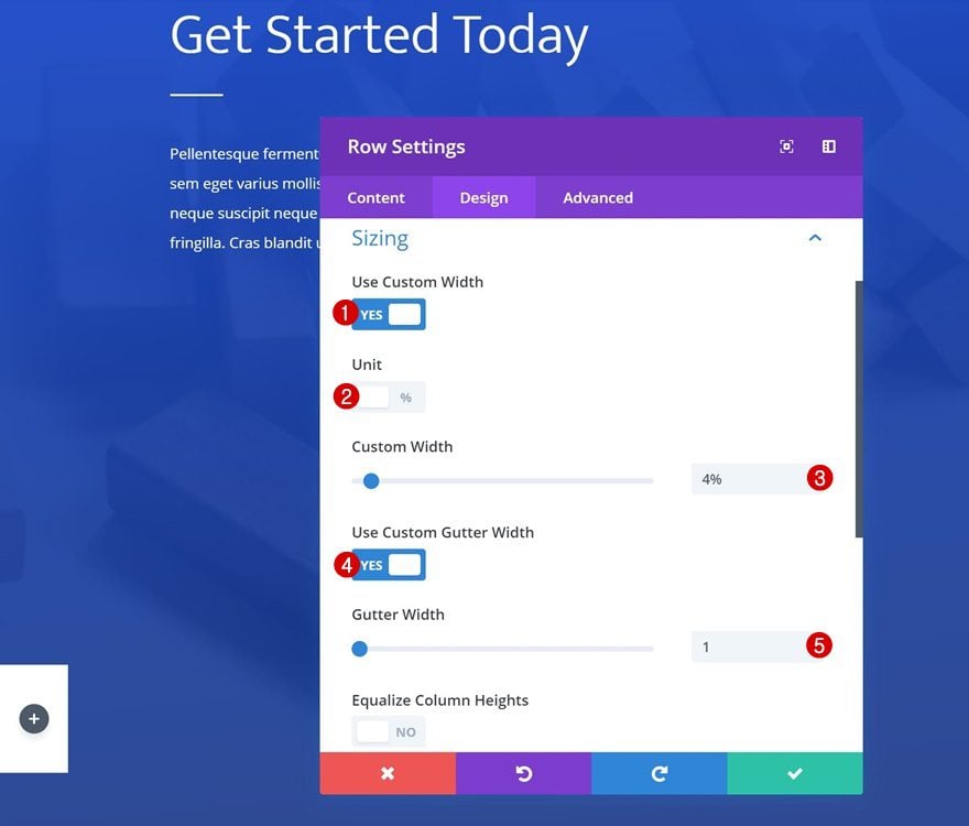
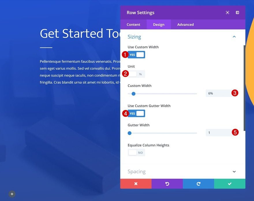
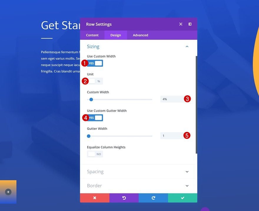
Sizing
Modify the sizing settings of the row as well.
- Use Custom Width: Yes
- Unit: %
- Custom Width: 4%
- Use Custom Gutter Width: Yes
- Gutter Width: 1
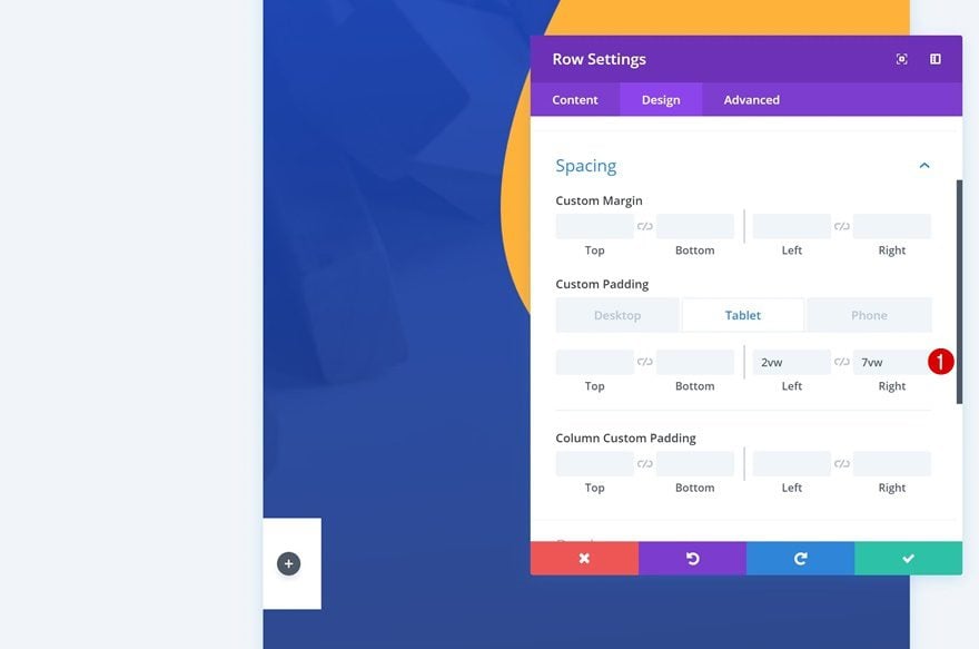
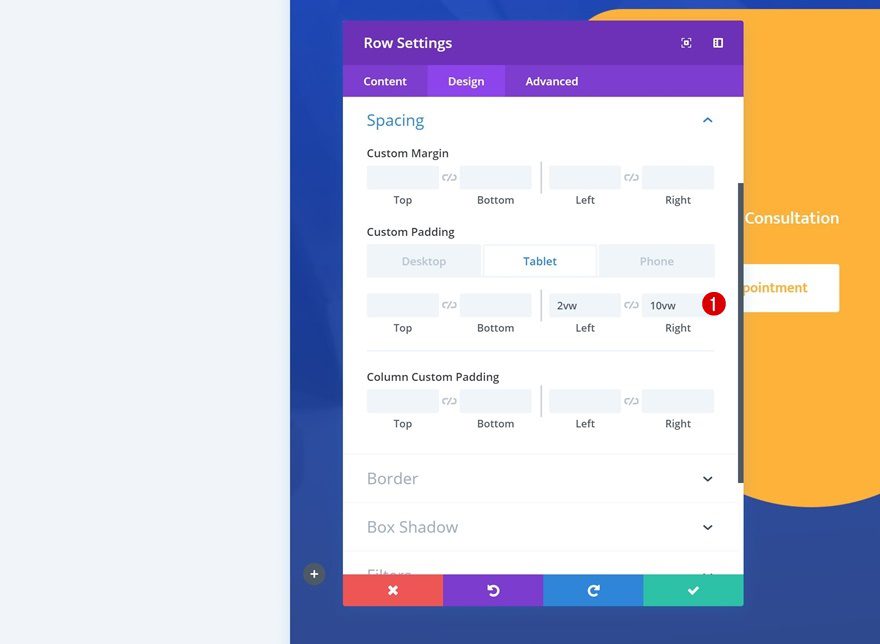
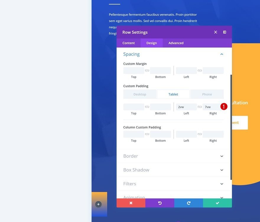
Spacing
And add some custom padding for smaller screen sizes.
- Left Padding: 2vw (Tablet & Phone Only)
- Right Padding: 7vw (Tablet & Phone Only)
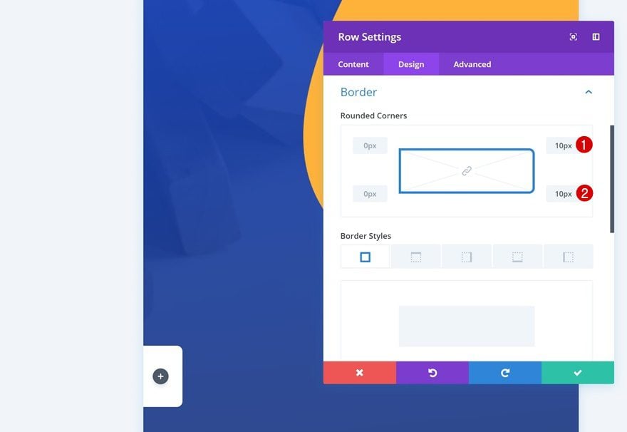
Border
We’re also using some rounded corners in the border settings.
- Top Right: 10px
- Bottom Right: 10px
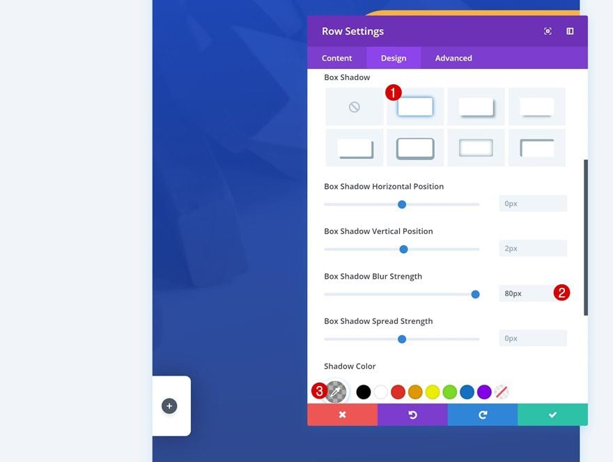
Box Shadow
Along with a subtle box shadow that’ll help us create some depth.
- Box Shadow Blur Strength: 80px
- Shadow Color: rgba(0,0,0,0.3)
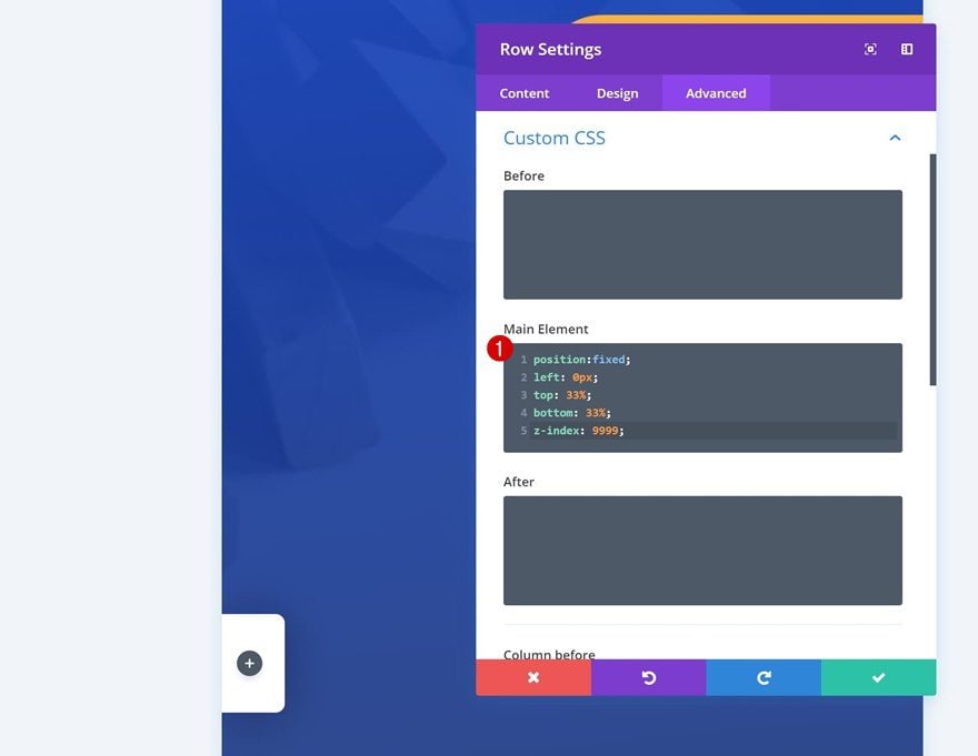
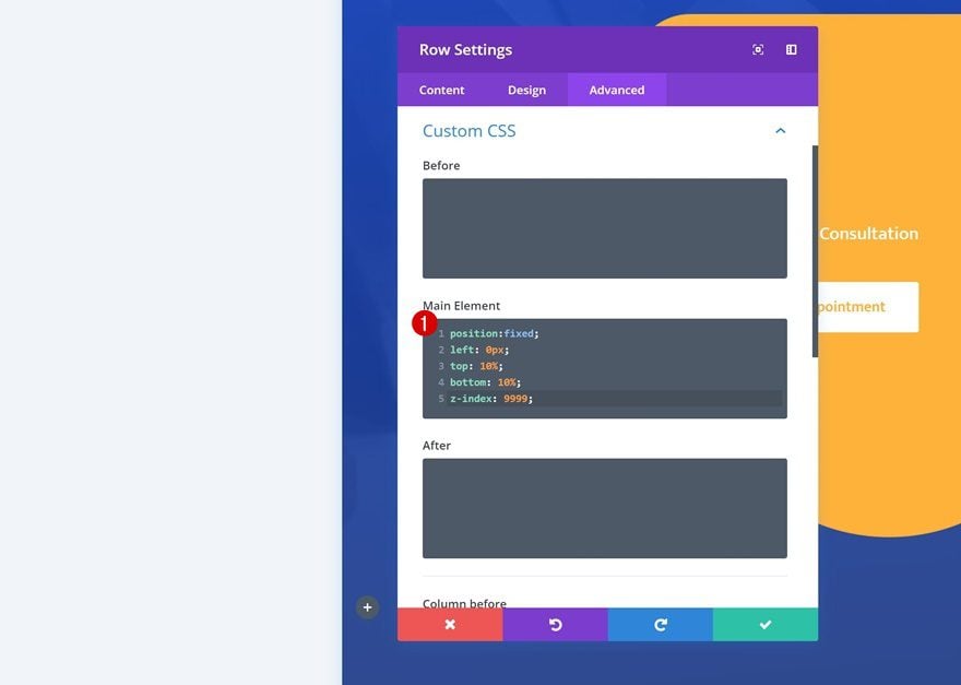
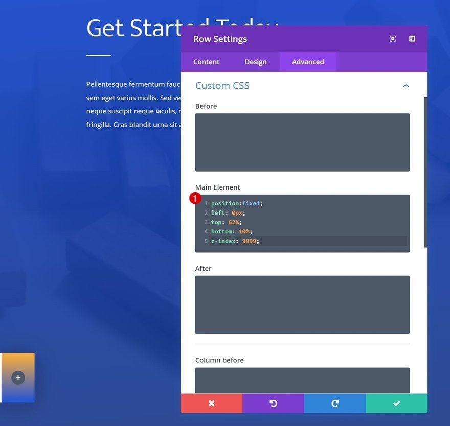
Custom CSS
Last but not least, we’re going to make the icon navigation fixed by adding some custom CSS code lines in the advanced tab of the row.
position:fixed;
left: 0px;
top: 33%;
bottom: 33%;
z-index: 9999;
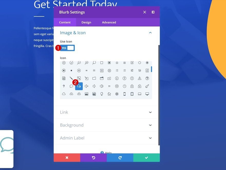
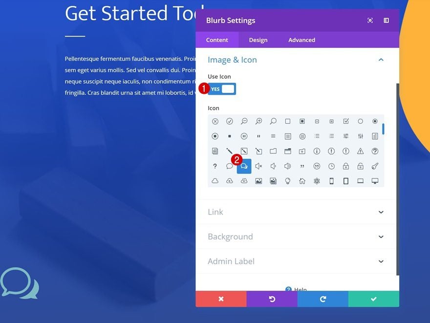
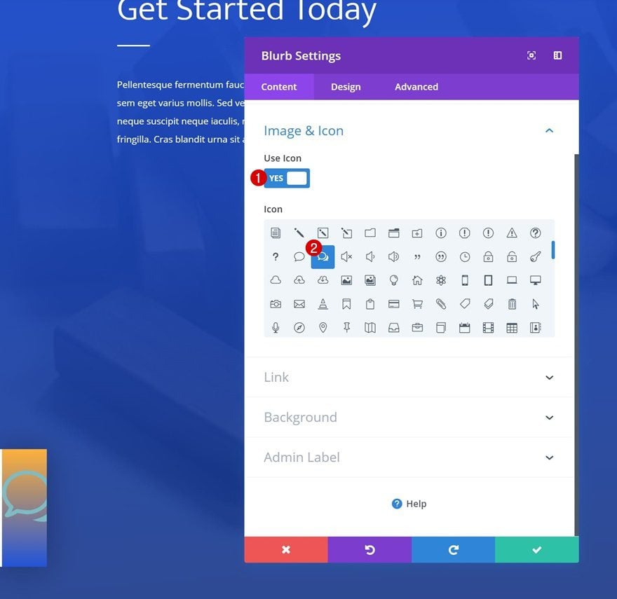
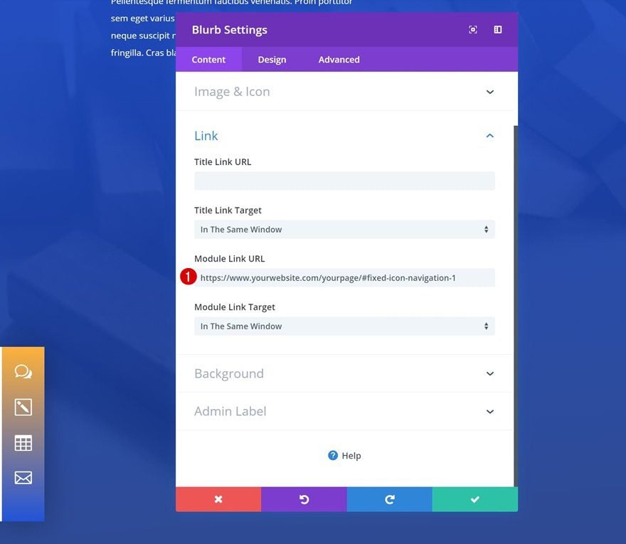
Add Blurb Module to Column 1
Select Icon
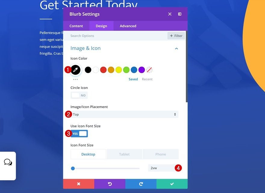
Now that we’re done modifying the row settings, we can start adding the modules. Add a Blurb Module and select an icon of your choice.
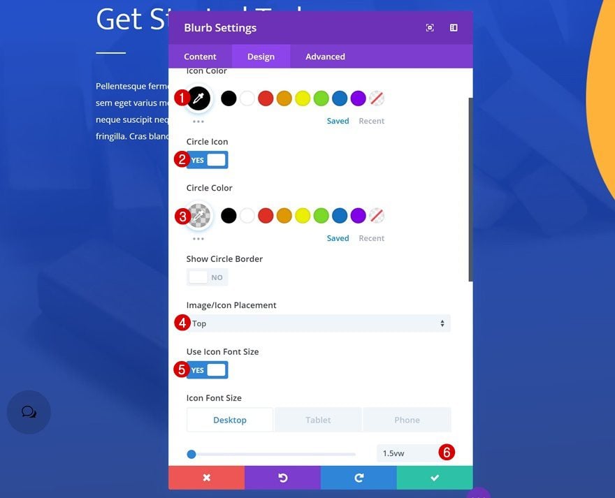
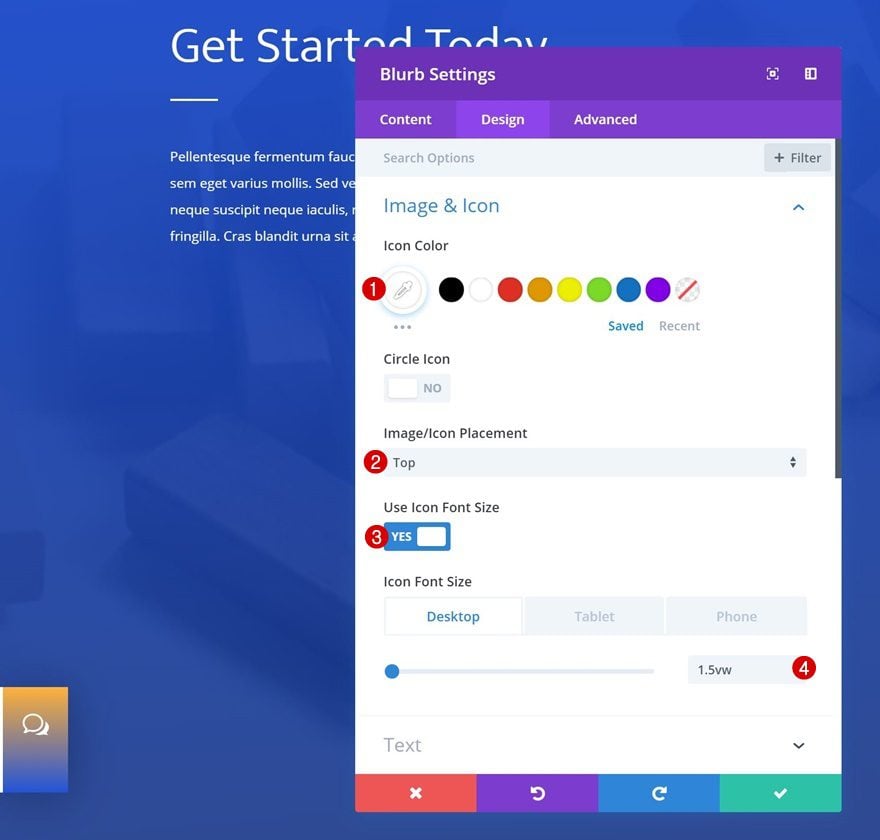
Icon Settings
Then, go to the design tab and modify the icon settings.
- Icon Color: #000000
- Icon Placement: Top
- Use Icon Font Size: Yes
- Icon Font Size: 2vw (Desktop), 4vw (Tablet), 5vw (Phone)
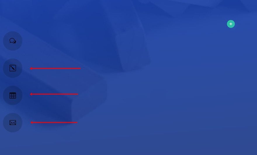
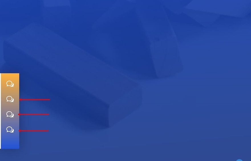
Clone Blurb Module 3 Times
Clone the Blurb Module you’ve added three times.
Change Icons
And change the icon for each one of the duplicates.
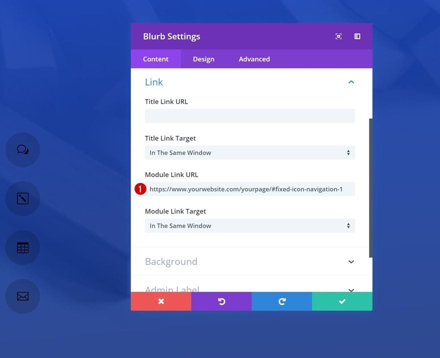
Add Anchor Links to Blurb Modules Individually
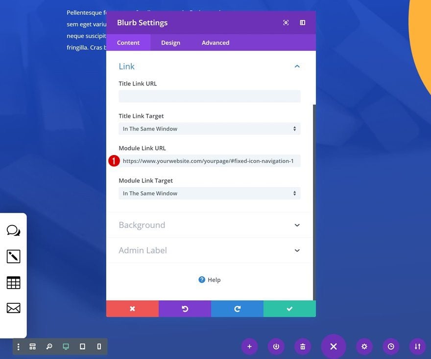
Last but not least, you’ll need to add the anchor URL to each one of the Blurb Modules individually. Make sure you link each one of the icons to the correct section ID.
- Module Link URL: https://www.yourwebsite.com/yourpage/#fixed-icon-navigation-1
Start Recreating Example #2
Add New Row to Last Section of Page
Column Structure
On to the second example! Add a new row to the last section of the page using the following column structure:
Alignment
Without adding any modules yet, open the row settings and change the row alignment.
- Row Alignment: Left
Sizing
Modify the sizing settings as well.
- Use Custom Width: Yes
- Unit: %
- Custom Width: 6%
- Use Custom Gutter Width: Yes
- Gutter Width: 1
Spacing
And add some custom padding values for smaller screen sizes.
- Left Padding: 2vw (Tablet & Phone Only)
- Right Padding: 10vw (Tablet), 15.5vw (Phone)
Custom CSS
Last but not least, add the custom CSS code in the advanced tab of the row to make the icon navigation fixed.
position:fixed;
left: 0px;
top: 10%;
bottom: 10%;
z-index: 9999;
Add Blurb Module to Column 1
Select Icon
Continue by adding a Blurb Module to the column of your row and select an icon of your choice.
Icon Settings
Then, go to the design tab and make some changes to the appearance of the icon in the icon settings.
- Icon Color: #000000
- Circle Icon: Yes
- Circle Color: rgba(0,0,0,0.14)
- Icon Placement: Top
- Use Icon Font Size: Yes
- Icon Font Size: 1.5vw (Desktop), 3vw (Tablet), 2.5vw (Phone)
Clone Blurb Module 3 Times
Once you’re done modifying the first Blurb Module, you can go ahead and clone the module three times.

Change Icons
Make sure you change the icon that is used for each one of the duplicates.
Add Anchor Links to Blurb Modules Individually
And, again, link each one of the Blurb Modules to the correct anchor link.
- Module Link URL: https://www.yourwebsite.com/yourpage/#fixed-icon-navigation-1
Start Recreating Example #3
Add New Row to Last Section of Page
Column Structure
On to the next and last example! Add a new row to the last section of your page using the following column structure:
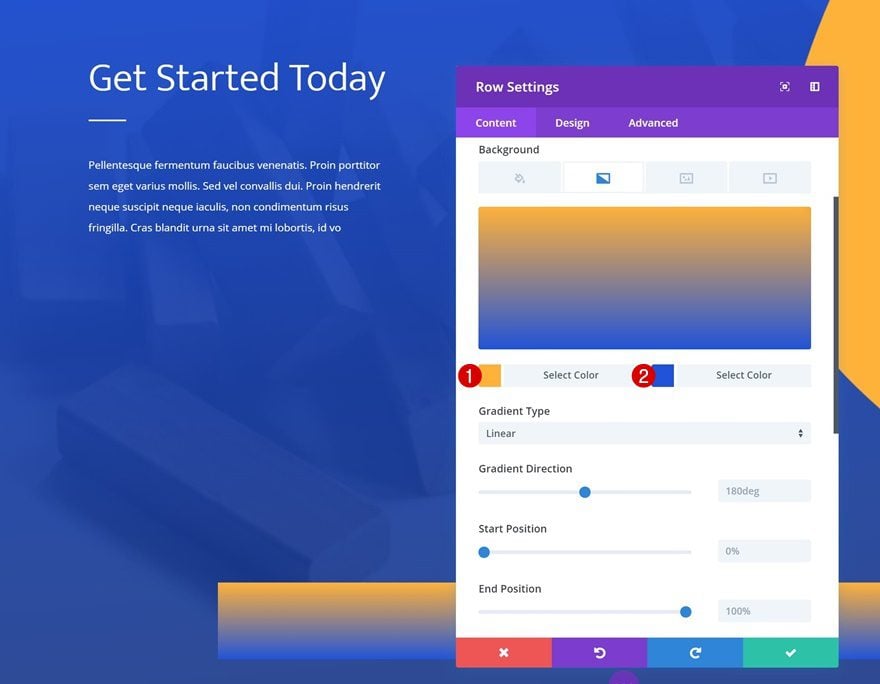
Gradient Background
Without adding any modules yet, open the row settings and add a gradient background.
- Color 1: #ffb337
- Color 2: #1b52d9
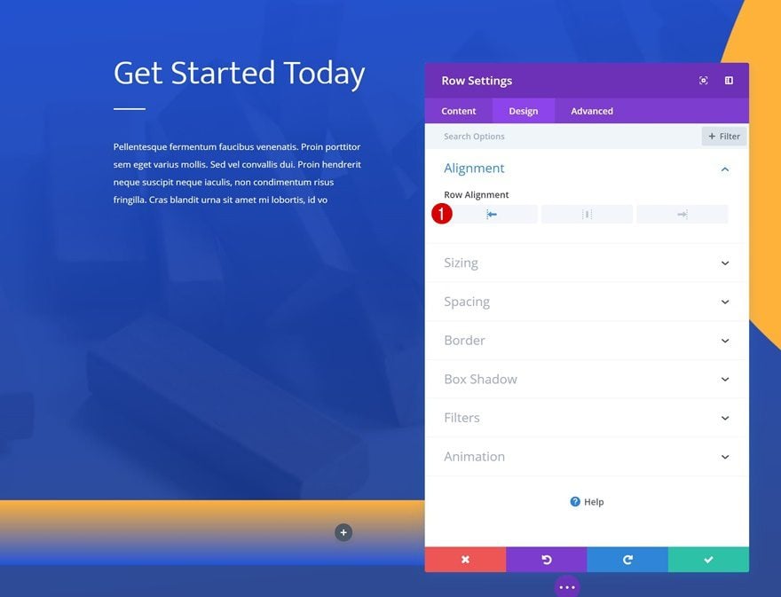
Alignment
Continue by changing the row alignment in the design tab.
- Row Alignment: Left
Sizing
Then, modify the sizing settings.
- Use Custom Width: Yes
- Unit: %
- Custom Width: 4%
- Use Custom Gutter Width: Yes
- Gutter Width: 1
Spacing
Add some custom padding values for smaller screen sizes too.
- Left Padding: 2vw (Tablet), 1vw (Phone)
- Right Padding: 7vw (Tablet), 5.5vw (Phone)
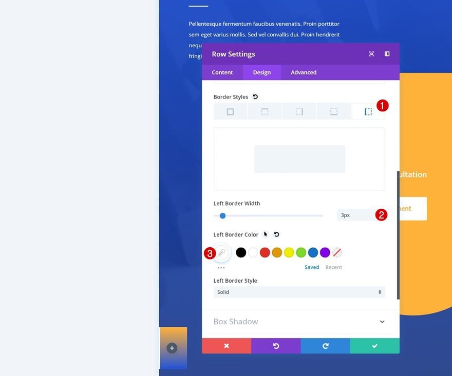
Border
And add a left border to the row.
- Left Border Width: 3px
- Left Border Color: #ffffff
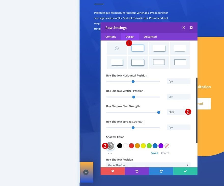
Box Shadow
We’re also adding a subtle box shadow to create depth on the page.
- Box Shadow Blur Strength: 80px
- Shadow Color: rgba(0,0,0,0.3)
Custom CSS
Last but not least, add the following CSS code lines to the advanced tab of the row settings. This will help make the icon navigation bar fixed.
position:fixed;
left: 0px;
top: 62%;
bottom: 10%;
z-index: 9999;
Add Blurb Module to Column 1
Select Icon
Continue by adding the first Blurb Module to the column of the row and select an icon of your choice.
Icon Settings
Then, go to the design tab and change the icon settings.
- Icon Color: #ffffff
- Icon Placement: Top
- Use Icon Font Size: Yes
- Icon Font Size: 1.5vw (Desktop), 4vw (Tablet & Phone)
Clone Blurb Module 3 Times
Clone the Blurb Module three times.
Change Icons
And make sure you change the icon of each one of the duplicates.
Add Anchor Links to Blurb Modules Individually
Last but not least, add the anchor URL to each one of the Blurb Modules individually and you’re done!
- Module Link URL: https://www.yourwebsite.com/yourpage/#fixed-icon-navigation-1
Preview
Now that we’ve gone through all the steps, let’s take a final look at the outcome on different screen sizes.
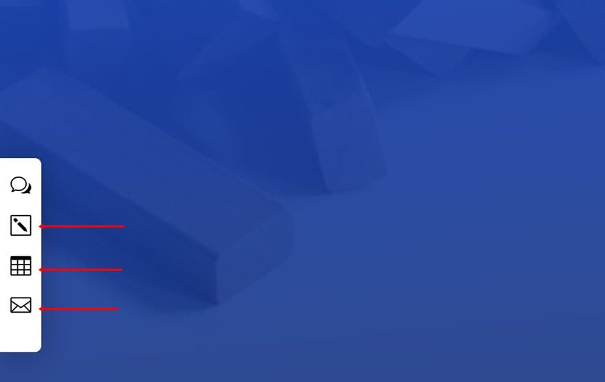
Example #1
Example #2
Example #3
Final Thoughts
In this post, we’ve shown you how to create fixed icon navigation bars that you can apply to any kind of website your building. The ones we’ve created match the Risk Management Layout Pack really well. We hope that you’re enjoying this ongoing Divi design initiative where we try to put something extra into your design toolbox each and every week. If you have any questions or suggestions, make sure you leave a comment in the comment section below!


Can this be done with any layout? Been looking for something like this for awhile now for a clients sites.
Excellent tutorial. Just in time when I was looking for it.
But the lazy guy inside me asks – when you post these, why not also give us an example code to download and try for ourselves? These features if built into divi will add amazing value and a great time-saver.
When will these features be available within Divi to click and install – just like the themes? Please dedicate a page to showcase these superb features from all tutorials and one click download.
I am a regular user of your blog. You always share an amazing post.
This is nice. Next time, a way to do it that has hover text for each link? Also, theme shortcoming, this would be a bore to add to each page if one wanted to use this sleek style for a site navigation menu. More nav menu options and theme builder please.
I would rather the builder didn’t constantly load twice on every site I worked on, than make a manual menu using dot navigation. That bug needs fixing.
Aloha Divi, I feel like you’re getting very astute feedback from your faithful users. Why so silent?
Donjete, this is great – thanks for taking the time to share…
Nice! Thanks for sharing! 🙂
When I saw this blog post for the first time; That was the first to come to my mind > Nick and his team are in a serious race with elementor and others.. on the other hand other virtual organizers are in the same race too.
You share nice things. The sites I’ve done with divi work fine. For now!
Please also give more about the menu development options. The classic menu options are very boring. Perhaps ‘we’ can not find variations..
Needs some tips and tricks for menu.
Thanks
Yes, can’t agree more. Menu development options are much needed.
Or you could just do what you announced back in September 2018 and release the Theme Builder that would allow us to customize the header, footer, and menus like EVERY OTHER PREMIUM THEME.
Seriously, it is no secret that ET has been languishing in the important updates to Divi and is spending more time on non-critical workflow updates that no one really asked for. Enough with the ridiculous tutorials which seem to be nothing more than overglorified workarounds for a subpar design.
And to the OP, I agree, Monarch is abysmal and so outdated, it’s not even worth installing along with Bloom.
The theme builder was not announced in September 2018, it was even four months earlier…in May 2018.
Sadly I have to agree.
Mostly I agree: I’d dump Bloom, Monarch and Extra and only concentrate on Divi to make it the best builder on the market. If you think about it, Elementor arrived about 2 years ago and they only have Elementor… To be meditated…
agree
so agree.
i’m using ET for 9 years, but first time i think ET is lower than others.
waoo Now to the serious thing. when they update divi.
I bought divi in November and now I am sorry because you are just promises I had to buy a social media plug-in because monarch is old. yes, old does not offer news you do not realize the changes because not even a WhatsApp button will update, that shows the carelessness they have. I am very sorry and I can not ask for my money back. What a terrible mistake to spend for Divi. nope listen to their customers