")
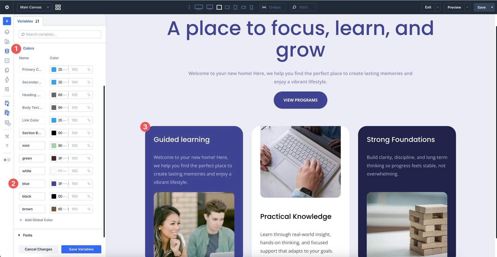
Divi 5 makes it easy to build cohesive layouts with a smarter, more flexible color workflow. In this free pack, you’ll get 4 color adjustment design examples designed to show how powerful Divi 5’s design variables can be in real layouts. Instead of manually styling every element one by one, each example starts with a global color in the Variable Manager and then uses HSL-based adjustments throughout the design to automatically create lighter, darker, softer, and deeper variations.
The result is a collection of polished sections that feel intentional and consistent while still being easy to customize. Change the base color variable, and the entire section updates with it. That’s what makes this pack especially useful for client work, fast prototyping, branded landing pages, and anyone who wants a more system-driven approach to design in Divi 5.
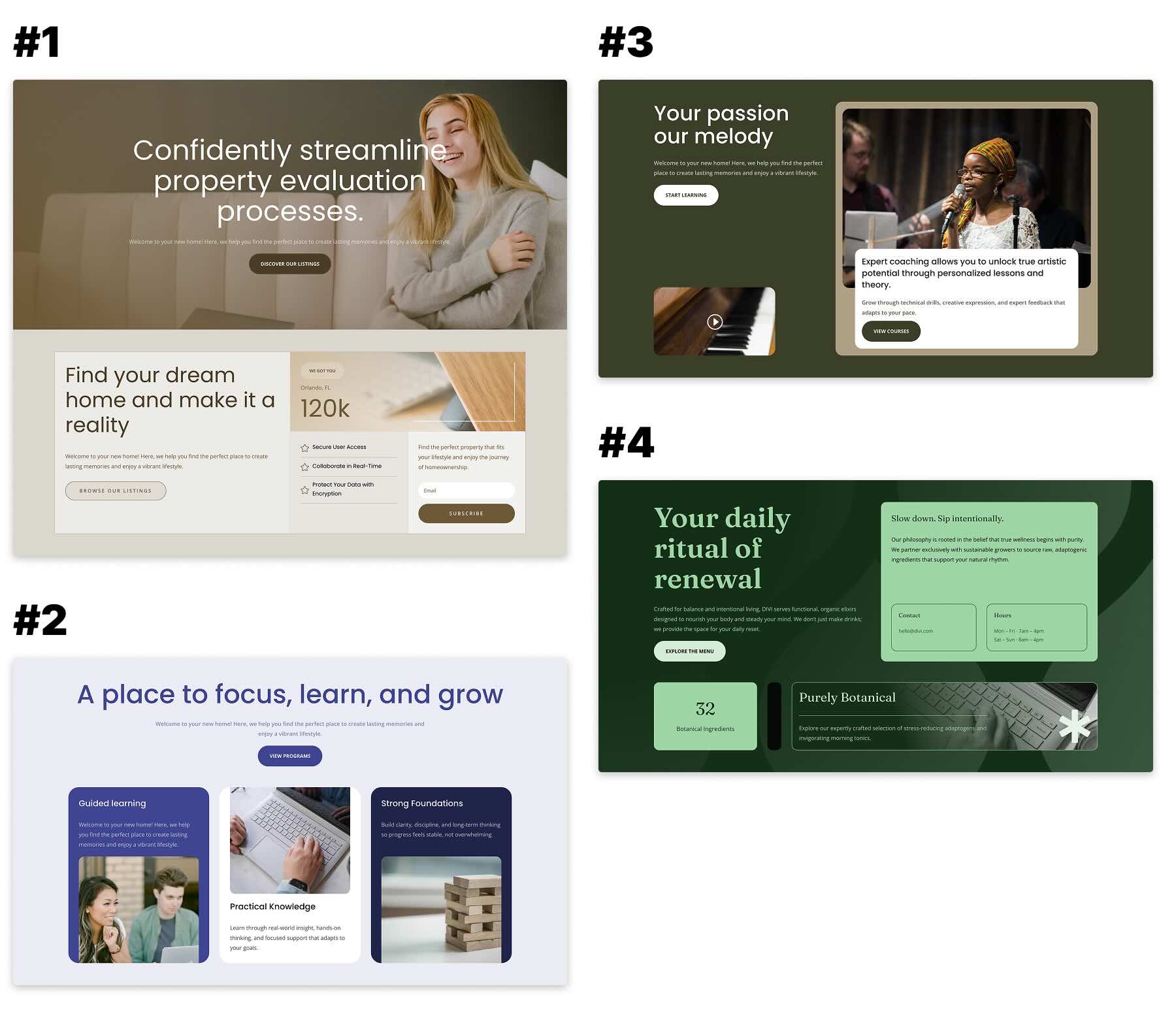
Preview
Here’s a quick look at the 4 color adjustment design examples included in the pack. The download is further down the post.
Download 4 Color Adjustment Designs For Divi 5
Get all 4 examples for free. Import them into your Divi Library and add them to any page in the Visual Builder.

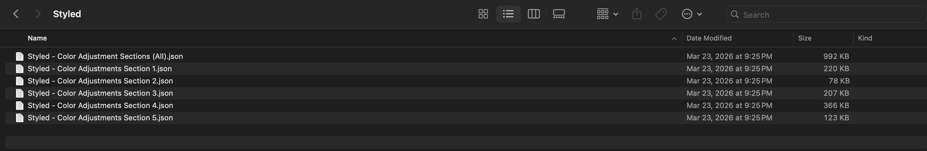
What’s Included (6 Exports)
After you download and unzip the file, you’ll find 5 styled section exports, plus 1 file containing all designs.
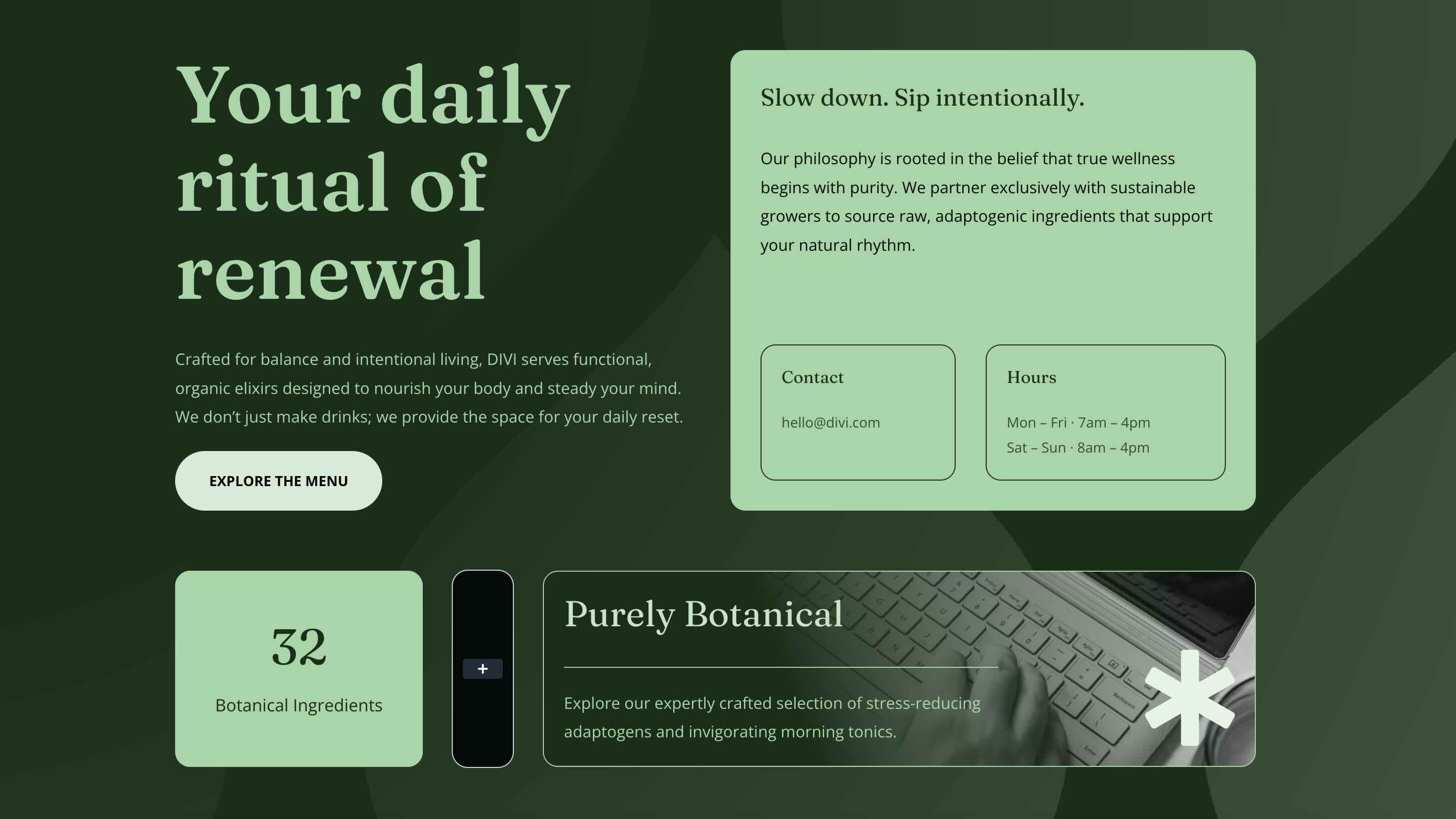
Styled – Color Adjustments Section 1 → The first half of Example 1. This section is meant to be used together with Section 2 and introduces the layout system with a strong hero-style composition.
Styled – Color Adjustments Section 2 → The second half of Example 1. Add it directly below Section 1 to complete the full two-section design.
Styled – Color Adjustments Section 3 → A standalone section example built around the same variable-based color workflow.
Styled – Color Adjustments Section 4 → A standalone section example showing a different color direction using the same structure and adjustment system.
Styled – Color Adjustments Section 5 → A standalone section example demonstrating another variation based on a different global color variable.
Styled – Color Adjustment Sections (All) → Imports the full collection into your Divi Library at once.
How To Use The Color Adjustment Sections
Keep your download folder handy. We’ll import the files, add a section to a page, and then update the variable-based colors or content as needed.
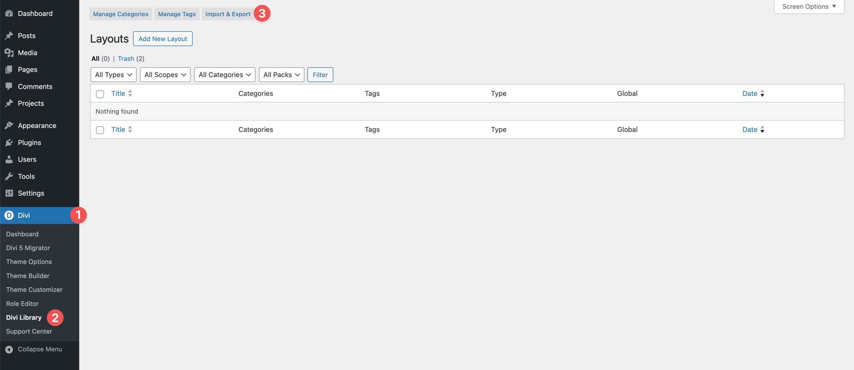
1. Import Sections Into The Divi Library
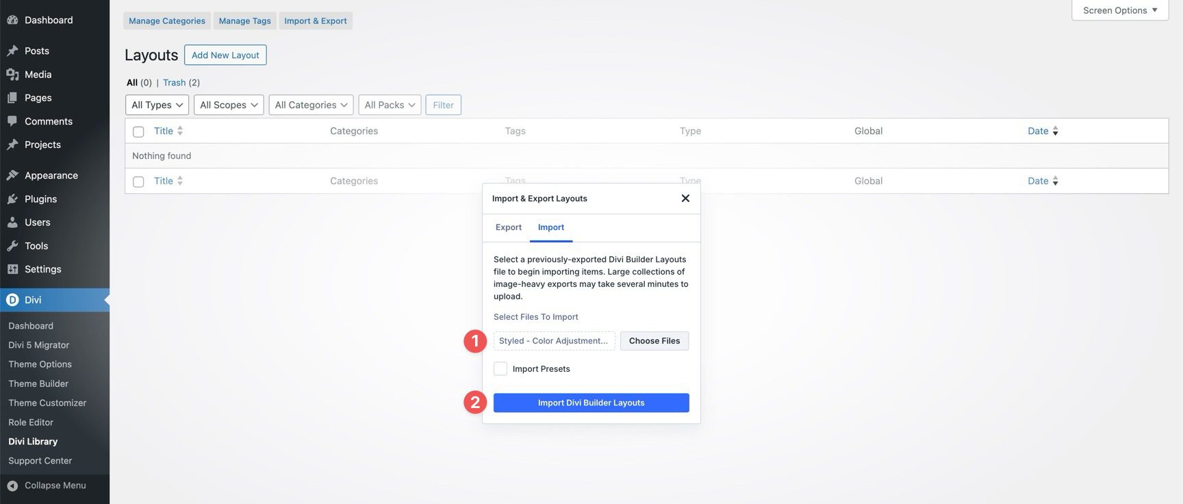
Go to Divi → Divi Library. Click Import & Export at the top of the screen.
In the Import & Export Layouts modal, switch to the Import tab, then click Choose File and select your JSON file.
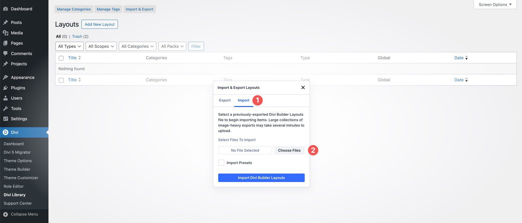
Choose any Color Adjustment Section JSON you’d like to use, then click Import Divi Builder Layouts.
2. Add A Color Adjustment Section To Any Page
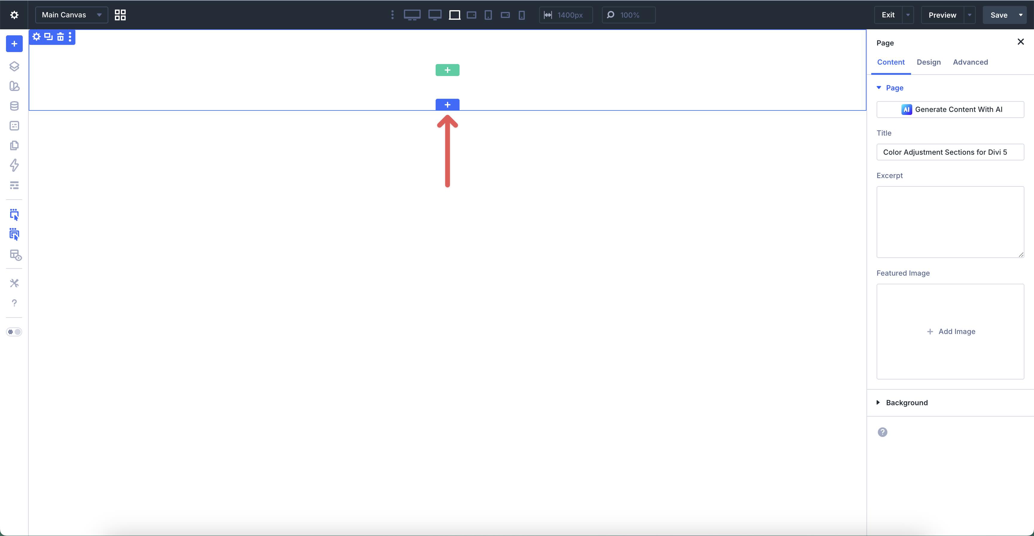
Open a page in the Visual Builder and add a new Section.
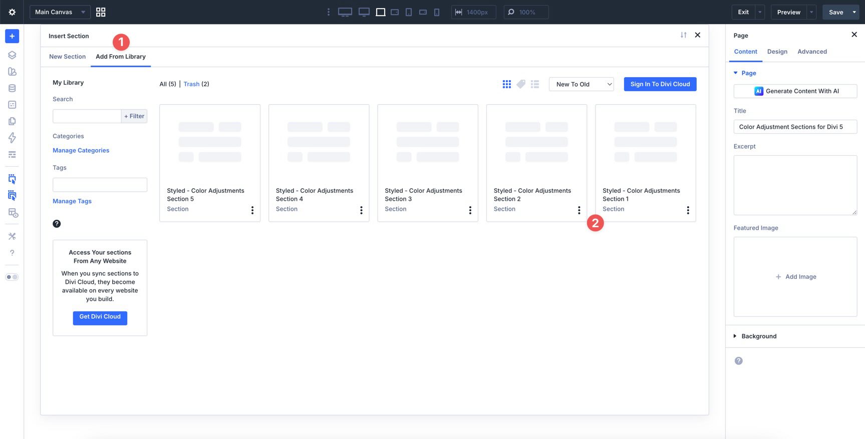
In the Insert Section modal, click Add From Library and select a Color Adjustment Section layout.
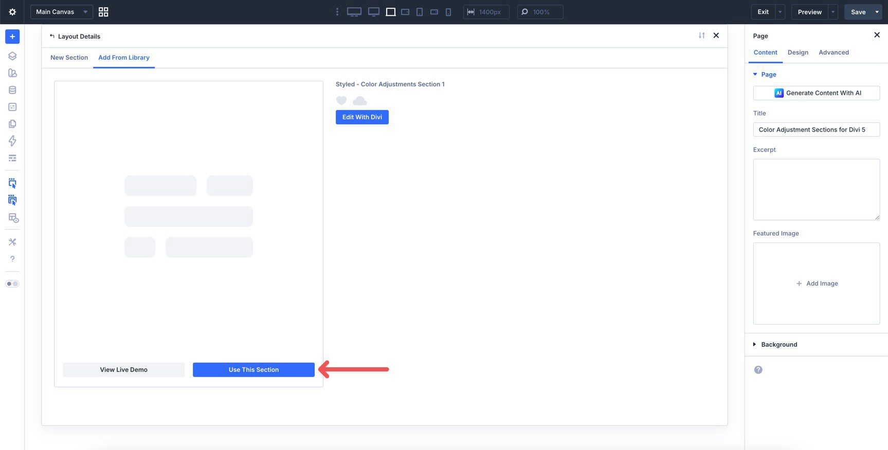
Finally, click Use This Section.
3. Pair Sections 1 And 2 Together
The first example in this pack is split across two sections. Color Adjustments Section 1 and Color Adjustments Section 2 are designed to work together as one continuous composition, so place Section 2 directly below Section 1 on the page.
The remaining examples are standalone sections, so you can use them individually without pairing them with another export.
4. Swap The Content
Once the section is on the page, replacing the placeholder content only takes a few clicks. Start by updating the headline, supporting copy, buttons, links, and images so the layout matches your message.
Because these designs rely on a coordinated color system, it’s helpful to update the content first and then refine the color direction after the structure and messaging are in place.
5. Change The Base Color In Variable Manager
Each example is built around a global color inside Divi 5’s Variable Manager. In this pack, the examples are based on different variables such as mint, green, white, blue, black, and brown. Each design uses one of those variables as its foundation.
To change the overall look of a section, open the Variable Manager and edit the base color assigned to that example. Because the layout uses color adjustments derived from that variable, the design updates across headings, backgrounds, buttons, accents, and supporting elements while maintaining the same overall hierarchy.
This is what makes the pack especially useful: you’re not just changing one flat color. You’re updating a system of related tones that already work together.
6. Fine-Tune The Adjustments Inside The Design
After setting the base color, you can refine how it behaves inside the layout. The sections use Divi 5’s color controls and HSL-based adjustments to create softer backgrounds, darker cards, more subtle borders, and stronger call-to-action elements from the same source color.
For example, one section might use a pale version of the base color for the overall background, a deeper version for a card, and a stronger, more saturated version for headings or buttons. That gives the design contrast and depth without breaking visual consistency.
If you want the section to feel brighter, reduce darkness in the adjusted values. If you want more contrast, push the darker variations further. If you want a softer aesthetic, lower saturation and keep the tonal range closer together.
7. Use The Pack As A Starting Point
These sections are already styled, so you can use them as-is or treat them as a starting point for your own system-based layouts. Keep the structure and simply change the base variable, or study how the same layout logic produces a very different result depending on the source color.
This approach is especially helpful when building branded sites, client kits, or reusable design systems where color consistency matters across multiple sections and pages.
Tips For Working With Color Adjustment Sections
These layouts are simple to use, but they’ll work best when you treat the colors as a system rather than a collection of disconnected choices.
Start With One Strong Base Color
Each example begins with a single global variable. Choose a base color that reflects the brand or page’s mood, then let the design adjustments generate the supporting tones. This creates a more unified result than assigning separate colors everywhere by hand.

Use Contrast To Create Hierarchy
The most effective examples in this pack use tonal contrast deliberately. Lighter backgrounds help content breathe, while darker cards and stronger buttons draw attention to key areas. Keep that relationship in mind if you change the underlying variable.

Let The Variable System Do The Heavy Lifting
One of the biggest benefits of Divi 5’s variable workflow is speed. Instead of restyling individual modules, update the base variable and then make small adjustment tweaks only where needed. That keeps the process fast and the results more consistent.
Keep Supporting Elements In The Same Color Family
Buttons, text accents, backgrounds, and card treatments should all feel related. Even when there is strong contrast, the adjusted tones should still clearly come from the same base variable. That relationship is what gives these sections their polished, system-driven feel.
Check The Design On Mobile
Color contrast can feel different on smaller screens, especially when cards stack and background areas become more prominent. Review the section on tablet and phone views to make sure text remains readable and the tonal hierarchy still feels clear.
Start Building In Divi 5 Today!
These 4 color adjustment design examples are a great way to explore a more flexible, system-based design workflow inside Divi 5. Use them to build cleaner branded layouts, experiment with global variables, and see how far a single base color can go when the rest of the design is built around smart adjustments instead of one-off styling decisions.


Leave A Reply