
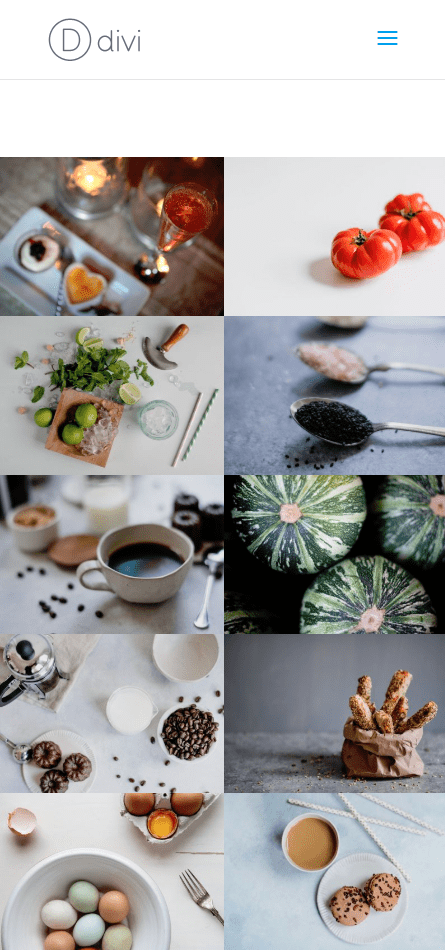
The Divi Gallery Module allows you to create beautiful image gallery in a responsive grid layout. The gallery is considered responsive because it will scale the size of your images and adjust the number of columns in the grid according to different browser widths.
By default, the gallery module has three breakpoints (points where the style changes at certain browser widths) that adjust the number of columns in the grid. It will display your image gallery in four columns on desktop and then break into three columns on tablet, two columns on small tablets (and large phones), and one column on phones.
This default setup will usually work for most cases, but sometimes you may need more control over the number of columns displayed on certain browser widths. That’s why in this tutorial, I’m going to show you how to have complete over the number of columns displayed in the Divi Gallery Module not only for desktop, but also for three additional browser breakpoints.
- 1 Sneak Peek
- 2 Preparing Your Design Elements
- 3 Implementing the Custom Spacing for the Divi Gallery Module
- 4 Adjust Row Settings to Make Fullwidth Gallery without Gutter Width
- 5 How the Gallery Responds to Different Browser widths by Default
- 6 Setting a specific number of columns for all browser sizes
- 7 Changing the Number of Columns for Specific Breakpoints
- 8 Final Result
- 9 Final Thoughts
Sneak Peek
Here is a sneak peek of what we will build in this tutorial. Notice the different number of columns for the image gallery on different browser widths.

Preparing Your Design Elements
Subscribe To Our Youtube Channel
For this tutorial, you will need the Divi theme installed and active. You will also need 12 images added to your media library to be used for the building the image gallery. For a Divi gallery module using a grid layout, the size of your images should be around 1500px by 800px if you plan on your images opening up in lightbox display so that it fills the screen nicely on most desktops.
Implementing the Custom Spacing for the Divi Gallery Module
Setting up a New Page
For starters, create a new page, give your page a title, and deploy the Divi Builder. Select the option “Build from Scratch” and then publish your page. Then click to build on the front end.
Creating the Image Gallery
With the Divi Builder deployed, go ahead and create a new regular section with a one-column row and add a Divi Gallery Module to the row.
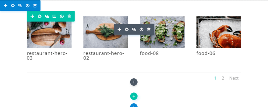
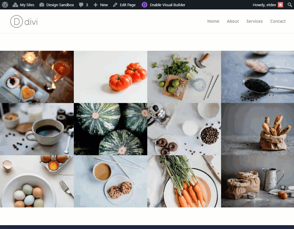
Divi will populate the gallery module with some images from your media gallery in a grid display like the following:
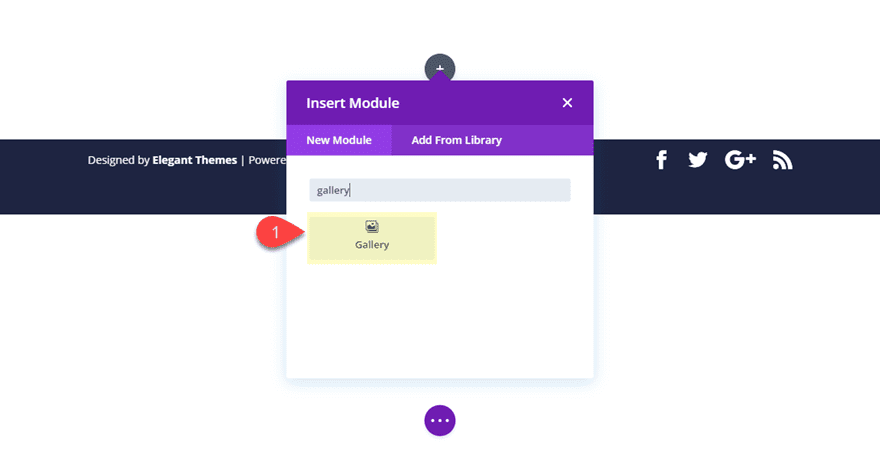
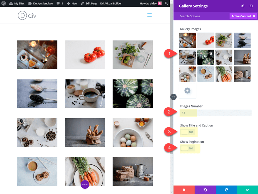
In the gallery module settings, click the gray plus icon to add 12 images to the gallery.
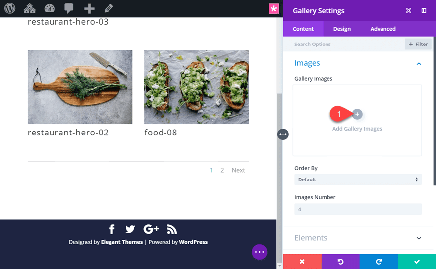
Then update the Divi Gallery Module settings as follows:
Images Number: 12
Show Title and Caption: NO
Show Pagination: NO
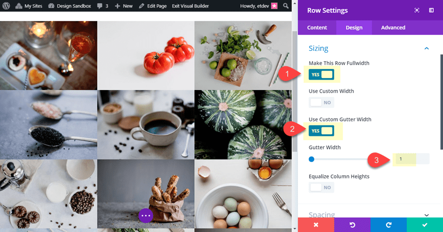
Adjust Row Settings to Make Fullwidth Gallery without Gutter Width
In order for our new column structure to work, the main thing we need to do is get rid of the default spacing/margin that exists between our images in the gallery. To do this, all we need to do is set the gutter width to 1. Also, as an option, you can make the row fullwidth in order to make the image gallery span the full width of the browser. To do this, open the row settings and update the following:
Make This Row Fullwidth: YES
Gutter Width: 1
If you want to add spacing between the images in the gallery, I suggest using this method since we need to keep the gutter width set to 1.
How the Gallery Responds to Different Browser widths by Default
As mentioned earlier, by default, the Divi gallery module will display your image gallery in four columns on desktop and then break into three columns on tablet, two columns on small tablets (and large phones), and one column on phones.
However, we are going to change this up to include a custom number of columns at certain breakpoints using a few snippets of custom CSS.
Setting a specific number of columns for all browser sizes
If you want to change the number of columns displayed in the gallery so that the number of columns stays the same on all browser sizes, there is simple way to do this. This might be helpful if you only want to display your gallery in one column, two columns, or three columns. That way you can have really large images on desktop and smaller images on mobile while keeping the column number the same. Having four or more columns will probably not work since the images will be too small for phone displays.
Let’s say you want to display three columns on all browser sizes. To do this, open your Divi gallery module settings and add the following custom CSS to the Gallery Item:
width: 33.33% !important;
margin: 0 !important;
clear: none !important;
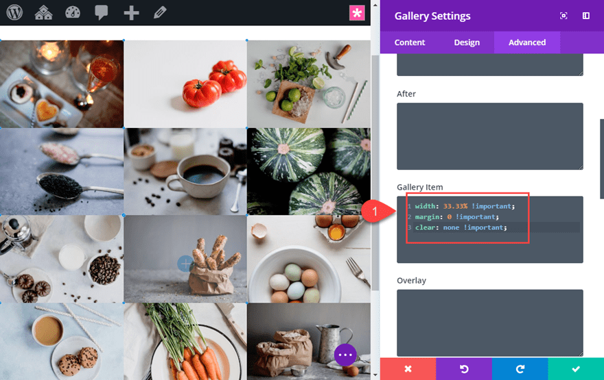
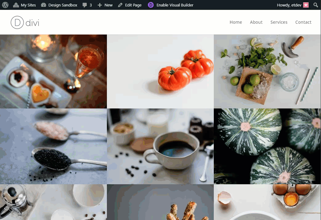
Now your gallery will retain the three column structure on all browser sizes.
If you wanted a 2 column layout for all browser sizes, all you need to do is change the width property value to 50%.
If you want a 1 column layout, simply update the width to 100%.
That’s it.
But, if you want to gain more control of the number of columns at certain breakpoints, read on.
Changing the Number of Columns for Specific Breakpoints
If you want to gain complete control over the number of columns displayed when the browser reaches certain breakpoints, we can use a few snippets of CSS with media queries that target certain browser widths.
Add the CSS Class to the Divi Gallery Module
Before we add the custom CSS, first we need to give our gallery module a custom CSS Class so we can reference that specific class in our CSS. This will make sure our css is only applied to this specific gallery module. To do this, open the gallery module settings and add the following CSS class under the advanced tab:
CSS Class: col-width
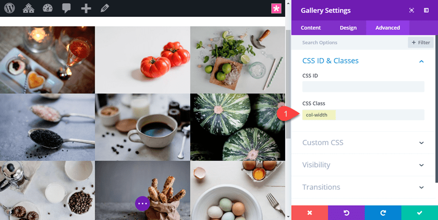
Don’t forget to take out the custom css added to the Gallery Item in the previous section of this article if you added it.
After that, save your settings.
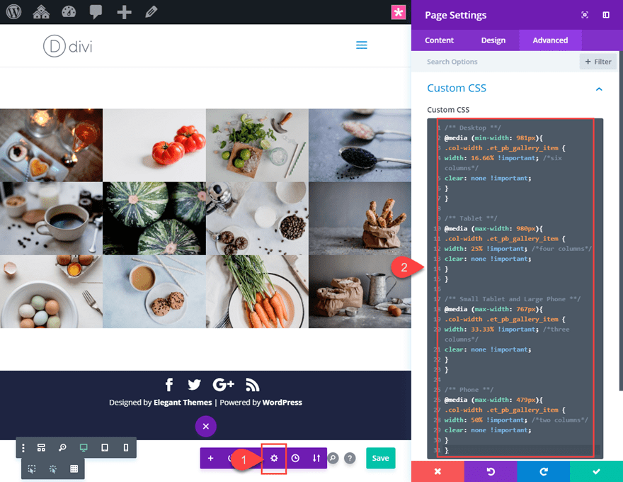
Add the Custom CSS to Page Settings
With you CSS class in place, you are ready to add the Custom CSS. Open the page settings by clicking the gear icon in the page settings bar at the bottom of the page (or you can use the keyboard shortcut “o”).
Then add the following Custom CSS under the advanced tab.
/** Desktop **/
@media (min-width: 981px){
.col-width .et_pb_gallery_item {
width: 16.66% !important; /*six columns*/
clear: none !important;
}
}

/** Tablet **/
@media (max-width: 980px){
.col-width .et_pb_gallery_item {
width: 25% !important; /*four columns*/
clear: none !important;
}
}

/** Small Tablet and Large Phone **/
@media (max-width: 767px){
.col-width .et_pb_gallery_item {
width: 33.33% !important; /*three columns*/
clear: none !important;
}
}

/** Phone **/
@media (max-width: 479px){
.col-width .et_pb_gallery_item {
width: 50% !important; /*two columns*/
clear: none !important;
}
}
This CSS will add a custom number of columns to certain breakpoints as follows:
Desktop: 6 columns
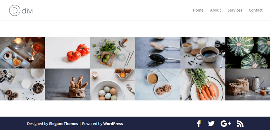
Tablet: 4 columns
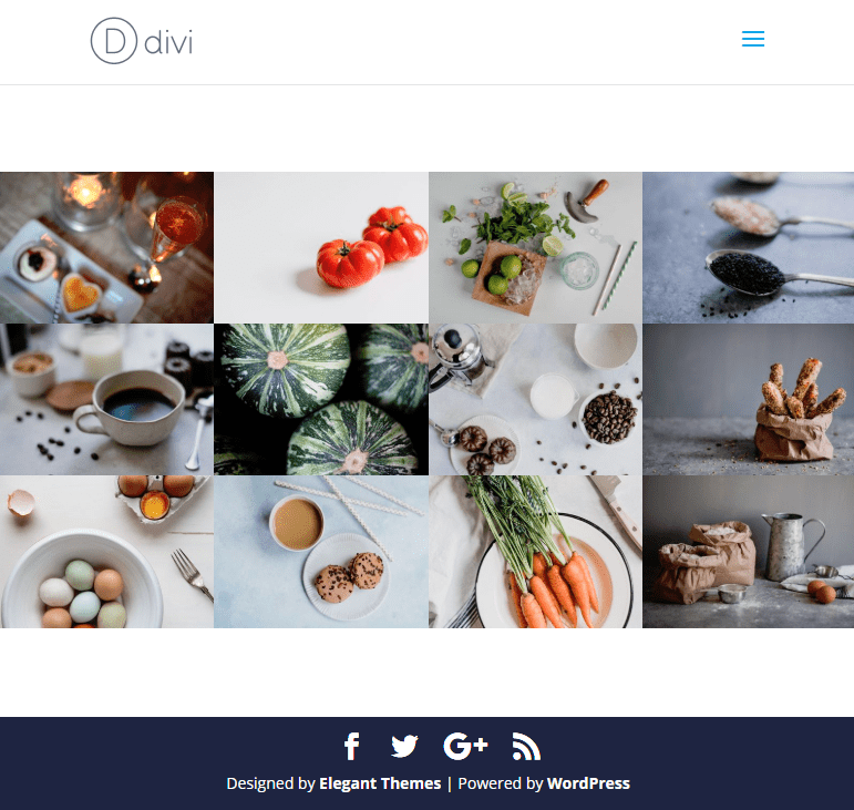
Small Tablet and Large Phone: 3 columns
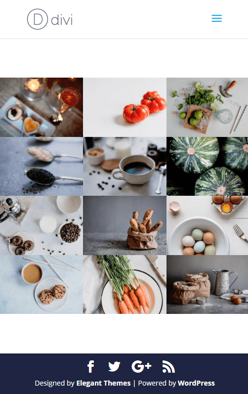
Phone: 2 columns
Understanding and Adjusting the CSS
Looking at the CSS, you will notice that it is broken up into four separate media queries. The top media query adds styling to desktop browsers (browsers with a minimum width of 981px). The second media query adds styling to browsers around the size of tablet, and so on.
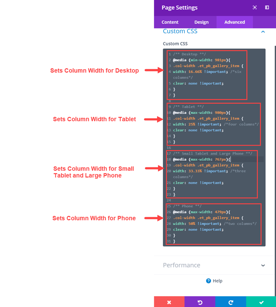
Within each media query, the most important CSS to take not of is the width property. This designates the size of each gallery item and which also sets the column width for the gallery.
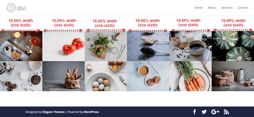
For example, the top media query for desktop sets the width of the gallery item to 16.66%.
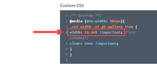
This is equivalent to one-sixth of the total width of its container (or row). Therefore, the gallery will display a six column layout on desktop.
To adjust the number of columns for desktop, all you would need to do is change the width property to a different value. Here is a list of width percentages that you can try.
12 columns: 8.33%
10 columns: 10%
8 columns: 12.5%
6 columns: 16.66%
5 columns: 20%
4 columns: 25%
3 columns: 33.33%
2 columns: 50%
1 column: 100%
Final Result
Here is the final result on the different browser widths.
Desktop (6 columns)
Tablet (4 columns)
Small Tablet and Large Phone (3 columns)
Phone (2 columns)
Final Thoughts
I hope this tutorial was helpful for those of you looking to gain more control over the number of columns that your gallery displays on certain devices or breakpoints. With this setup, you can add any number of columns you desire for any browser width to create gallery displays with the user in mind.
The breakpoints I used in the custom CSS are those breakpoints that Divi already uses. Feel free to check out our post on how to fine tune your designs with media queries for more information on this concept.
Until next time, I look forward to hearing from you in the comments.
Cheers!


I love that you posted and explained the CSS. I want to add captions to my images. Is there a way to do this while still keeping the columns I want?
Thanks
You can enable Captions by going to the Gallery Module Settings > Content > Elements and enable the Show Title and Captions option: https://prnt.sc/RFzV5vNa2spk
Before adding images to the Gallery, make sure you’ve added the Captions here: https://prnt.sc/X9OMjL0UX-9P
Nice post. Helps someone like me who doesn’t know much css!
Quick question, could this css be used on any module or is it just the gallery? For example if I have a row with 6 columns of blurbs and I wanted it to show it as 6 on desktop, 3+3 on tablet and 2+2+2 on mobile… Would the concept be the same if I used the css in this tutorial? Because I sometimes use 6 columns as in my example and I’m not so keen on it showing as 1+1+1+1+1+1 on mobile so I normally just use the visibility option and hide 2 of the columns on the mobile and tablet views. Hope I’m making sense.
On another note…just learned that Oxygenbuilder have implemented the SRCSET hmtl attribute to their latest update.
When will this be done in Divi?
Nice tutorial. But when I use the 1 colum layout, my images get really blurry. Maybe because it’s still loading the thumbnails?
Nice. Considering how easy this is to do, it really is trivial wether at this stage Divi comes with every bell and whistle conceivable.
Thanks for the comment, Irishetcher.
Nice one! Can the same code be used for the blog module?
Great tutorial on column width that I can apply to other modules. Good job 🙂
That’s a great point. Thanks, Neil.
Easy and simple. Thank you. The responsive sometimes doesn.t looks welll
The default WordPress gallery already allows you to choose the number of columns.
Hopefully Divi can simply add that feature to the current gallery module soon (or at least add dropdown to the gallery module that will allow a user to choose the number of columns).
Easy enough to change the number of colours with css.
Consider a gallery of 5 x 3 = 15 images. Changing down to 4 columns at breakpoint leaves you with the last row partially filled. Any ideas how you could change the number of images shown eg down to 4×3 = 12.?
6ryyju
great tutorial, but the gallery needs to have more layout options such as a masonary layout
And what if they make a new Gallery module with all these options and more, natively? The current module is very precarious.
how about using just css grid?
display: grid;
grid-template-columns: repeat(auto-fit, minmax(250px, 1fr));
margin: 0 auto;
Thanks for the suggestion, Bob.
Interesting, Bob. Do you have a live example?
Thank you, Jason!
It is a long waited tutorial!
Glad you liked it, Igor.
This was great and I was actually given the code to add to the Advanced tab by one of Divi’s tutorial videos. This solved ONE of my problems with the Gallery. I need to be able to link each image to another info page about the image and make that open on a NEW TAB.
Any idea how to do this? I like the Gallery, but I would take the answer as well for the Portfolio (which opens the link on the same page). Thanks, this would help me inmmmmmenssseeelllyy!
BTW, I am still working on the site so you won’t be able to see it yet from the URL
Where’s the responsive button in Divi for this? This should be a standard feature. Let’s be honest, this type of post points out the flaws in Divi to prospective buyers who see the blog, doesn’t it? However, I’m glad the solution is available now to others who doesn’t know CSS.
Nelson,
Thanks for the comment. I thought it would be helpful for those looking for a custom solution using the breakpoints currently being used in Divi. Hopefully it can be of value for some and the knowledge can be applied to customizing other designs as well.
+1 Nelson. These tutorials keep on amazing me. Sometimes I am sure it takes them more time to write the tutorial with all images and examples then it would take them to simple add another setting.
@Frede, yes Divi is responsive out of the box, but I wouldn’t say 100%. Two examples:
1) use this gallery module in full width with 4 images and no gutters. Then open the page on an iPad in landscape. It shows 1 row with 3 images and a second row with 1 image. That completely breaks your design. It should stay at 4 or 2×2. Reported this to ET years ago, still no fix.
2) full width header module. Add the two buttons. Then look at an iPhone 5 or 6. The buttons are displayed underneath each other, but not correctly centered. And often the title and content breaks wrong.
Totally agree. Have been using another builder more recently for my projects.
A lot of features in Divi are very dated at this stage.
Hi Nelson, jsyk Divi is 100% responsive out of the box so any “responsive” button would probably just cause confusion. Anyhoo, what I got from this post was, if you want to make adjustments to any of the built-in or default responsive settings, this post shows one of the many ways Divi allows you to go about it. I know just enough CSS to get into trouble, so the fact that this post allows you to bypass having to learn any CSS and invites you to cut & paste the code from this post into our own Divi website if you choose is extremely helpful & considerate. I hope this helps 😉 Happy Triple Duece Day!
Agreed. I’ve been using Divi for years. But I’m seriously considering jumping to Elementor.
The last feature update was in August. I know the Divi team has big plans and wants to do the updates right – but at some point you’re just getting left in the dust by the competition. :-/