

The Divi Builder allows you to have up to four columns for page layouts. And, for most websites, four columns is all you need. But sometimes you need to add more columns. Of course, there are plugins that allow you to embed shortcodes to add extra columns to your layout. But, this can be limiting when working with the Divi Builder since shortcodes require that you work from within a module.
That’s why in today’s post I’ll be showing you how to add more columns to your rows using the Divi Builder without the use of a plugin or shortcodes. This way you can add any number of columns to organize Divi modules of any type. Do you need a ten column layout to display client logos or portfolio pieces using the Image Module? Do you need a six column layout to list your company services using the Blurb Module? Well, you can! And the best part is, you can still edit the modules in these columns using the Divi Builder.
Let’s get started!
How to Add More Columns to Your Divi Builder Posts or Pages
Subscribe To Our Youtube Channel
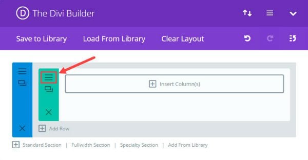
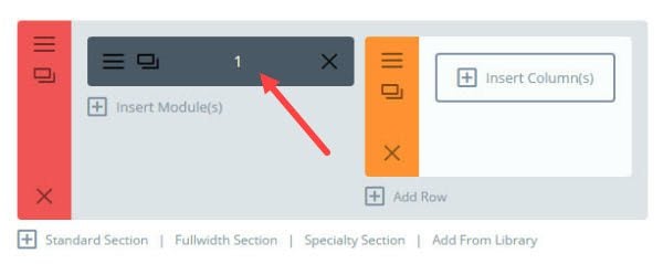
First deploy the Divi Builder and stick with the Standard Section layout shown.
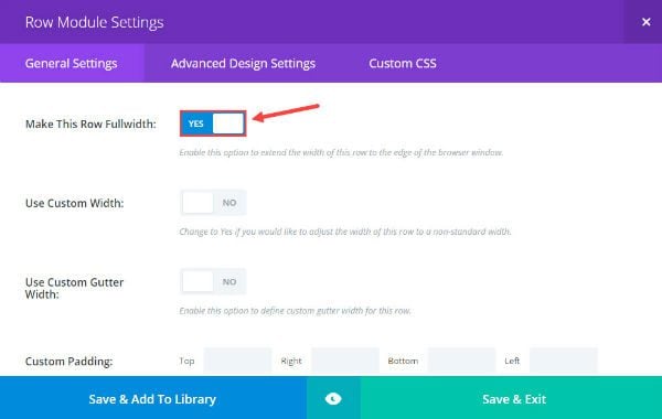
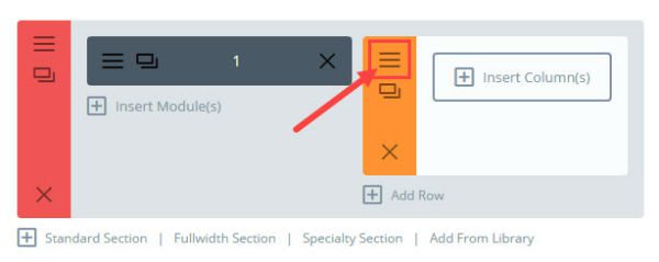
Select Row Module Settings. Under General Settings, select the option to make the row fullwidth.
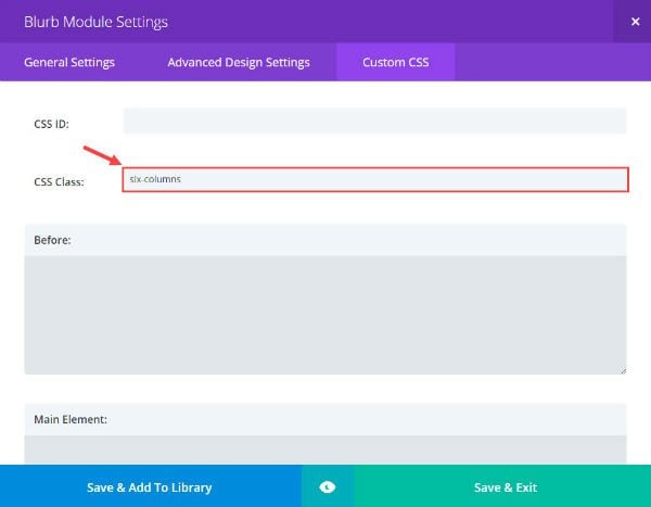
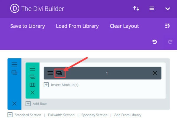
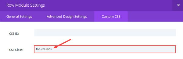
Under the Custom CSS tab, enter “six-columns” in the CSS Class text box. We will be adding CSS to this class later.
Save & Exit
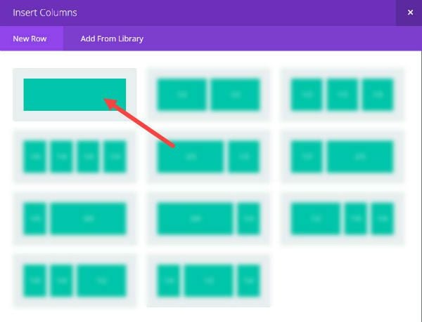
Now Insert a fullwidth column to your row.
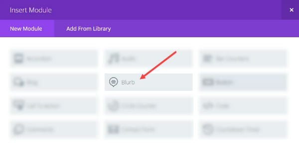
Insert the Blurb Module.
In the Blurb Module Settings under General Settings update the following settings:
Insert Title: [enter your title]
Upload an Image (width 300px, I’m using an image from unsplash.com)
Text Orientation: center
Insert Content: [enter your content]
Enter an Admin Label (optional)
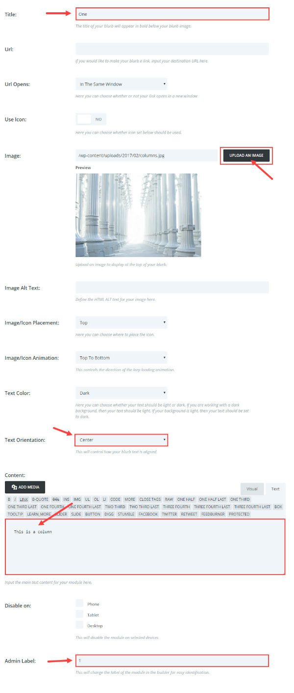
Save & Exit
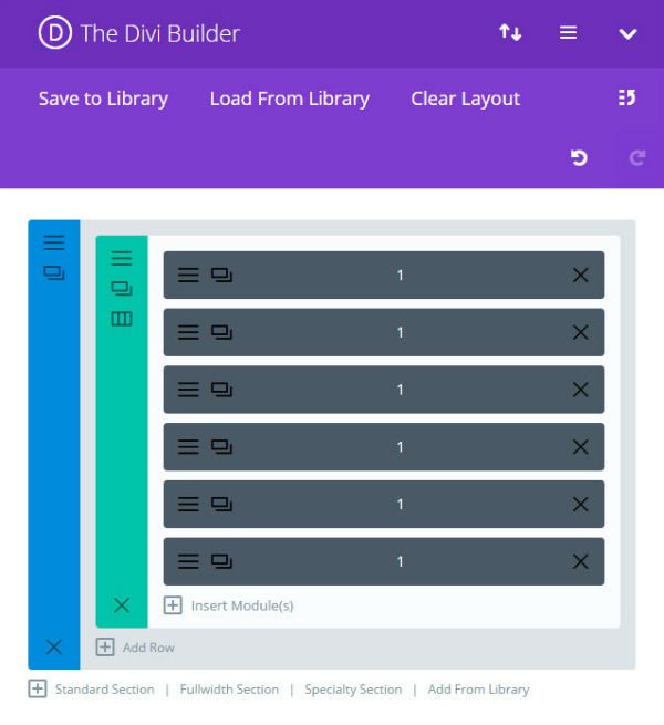
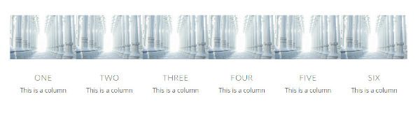
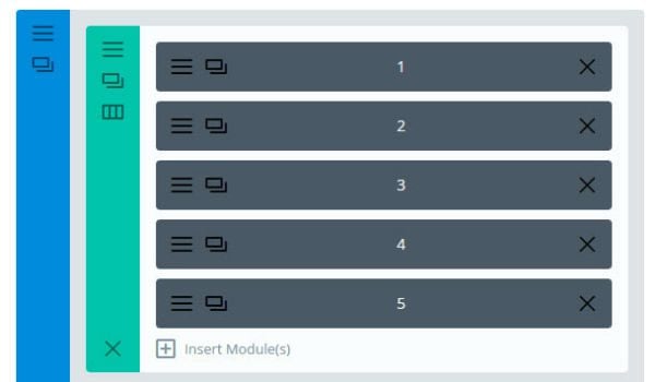
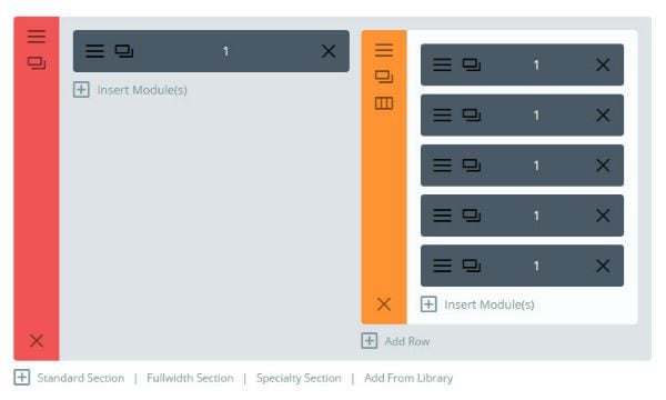
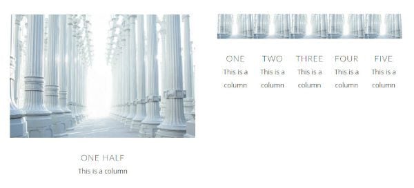
Now you need to duplicate the Blurb Module you just customized to make five additional modules giving you a total of six blurb modules. It is important that you have six modules here because this coincides with the “six-columns” class you created earlier.
Save or publish your page.
Now that your six modules are ready, go to Divi → Theme Options and add the following CSS in the Custom CSS text box:
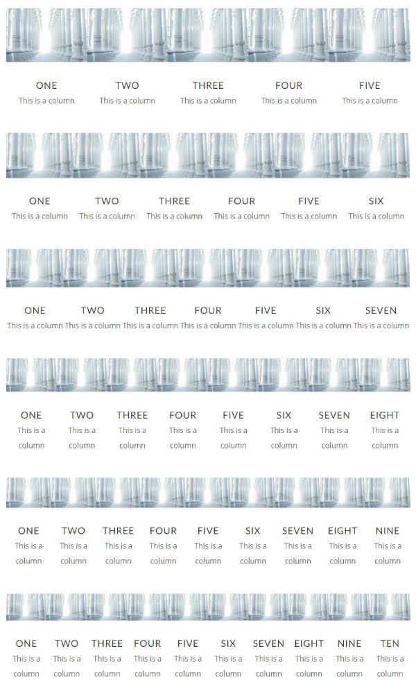
.ten-columns .et_pb_module {width: 10%; float: left;}
.nine-columns .et_pb_module {width: 11.11%; float: left;}
.eight-columns .et_pb_module {width: 12.5%; float: left;}
.seven-columns .et_pb_module {width: 14.28%; float: left;}
.six-columns .et_pb_module {width: 16.66%; float: left;}
.five-columns .et_pb_module {width: 20%; float: left;}
Now preview your page. You should see your blurb modules in a six-column layout.
You may have noticed the custom CSS code you entered includes six different classes. This gives you the ability to create layouts for five, six, seven, eight, nine, and/or ten columns.
The six-column class is what you are creating now. But, if you want a different amount of columns, you only have to change two things.
The first change is to update the Row Module Settings Custom CSS with a different CSS Class. For example if you want five columns, you would put “five-columns” in the CSS Class text box.

The second change is to make sure you have five blurb modules instead of six.
Need More Column Layouts?
If you are good at math (Who are we kidding? Just use your calculator app) you can add as many columns as you want to your layout. Just calculate the percentage you need and create a class for that percentage.
For example, if you want a 12 column layout, here is what you do:
- Divide 1 by 12 and multiply that by 100 to get 8.33%. (This will be the width of one of your columns.)
- Add a custom CSS Class called “twelve-columns” to the Row Module that holds your 12 modules.
- Input the following custom css for this percentage:
.twelve-columns {width: 8.33%; float: left;}
Getting Even More Creative With Your Column Layouts
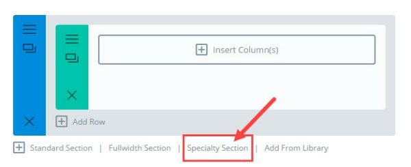
To create more creative column layouts, you can incorporate this functionality with the specialty section.
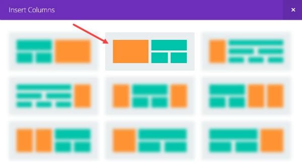
For example, here is how you would make a one-half five-fifths layout.
Select the Specialty section from the Divi Builder.
Insert the following column layout:
Insert a blurb module in the left one-half column:
Go to the Row Module Settings on the right row module.
Under the Custom CSS tab, enter “five-columns” in the CSS Class text box.
Insert a fullwidth column and add five modules to your row repeating the same steps you did earlier.
The result is a one-half five-fifths column layout.
Taking Care of Mobile
If you don’t want to keep your custom column layout the same on all devices, you can enter some additional css to scale the columns down to a more readable size on mobile devices. Feel free to change the percentages to fit your needs.
@media (max-width: 980px){
.ten-columns .et_pb_module {width: 20%;}
.nine-columns .et_pb_module {width: 33.3%;}
.eight-columns .et_pb_module {width: 25%;}
.seven-columns .et_pb_module {width: 25%;}
.six-columns .et_pb_module {width: 33.3%;}
.five-columns .et_pb_module {width: 33.3%;}
}

@media all and (max-width: 767px) {
.ten-columns .et_pb_module {width: 100%;}
.nine-columns .et_pb_module {width: 100%;}
.eight-columns .et_pb_module {width: 100%;}
.seven-columns .et_pb_module {width: 100%;}
.six-columns .et_pb_module {width: 100%;}
.five-columns .et_pb_module {width: 100%;}
}
That’s it. Now you have the ability to add more columns to your page layouts using the Divi Builder.
Final Thoughts
I first added this functionality when completing a project for a client who wanted to add more columns for a bunch of logos to display their featured clients and partners. They also wanted the ability to order and edit the images/logos using the Divi Builder. The solution worked perfectly. I hope you find this to be a helpful solution as well.
Looking forward to hearing from you in the comments. Enjoy!


Does this work with the Blog Module? (I can’t make it so far).
I’d love to be able to have a 6 column blog section. Please let me know – it’s very perplexing!
This workaround is all good, but how do I maintain padding between the blurbs/images on mobile to look good, especially on portrait cell phones? They all run together like in your example above.
didnt work for me what am i doing wrong?
Hm, nice solution but this is still a hack and a potential hassle for many users. Basic functionality that should be integrated into the core product.
Hello. Thanks for the tutorial.
I would like to have a row with four columns, but the first one with different widht, like that:
1/2 – 1/6 – 1/6 – 1/6
Can I do this by folowing this tutorial?
Thank you.
Hi,
great tutorial! I am using your concept to put 2 buttons next to each other – http://test.ecotourism-cambodia.com/ in 2/3 divi module (40%, floating left), so my buttons stay next to each other on a smaller screen. However, when viewed on smaller screen one of them is slightly higher then the other. How do I resolve this issue? Also, how do you add padding to your blurbs? Thanks.
I’m sorry but I try many times but nothing works, I updated all divi to last version.
I have the css code in the divi child, but when i create a row full width and then a single column module to put the blurb modules I still see the burbs modules one on the others six times instead of the columns 🙁
Thank you for this helpful post.
But I am having a strange problem.
When I am logged into the backend of wordpress in Chrome it works. When I am viewing from incognito or not logged in, it does not display in Chrome. Works fine with Firefox and Edge.
Hi David,
That does seem strange. I would say it was a caching issue but you say it doesn’t work in an incognito browser. Are you still having the issue?
In your article, near the second screenshot, you write “Under the Custom CSS tab, enter “six-columns” in the CSS Class text box. We will be adding CSS to this class later.” The screenshot shows the Blurb Module Setting, but you haven’t added the Blurb module at that point in the piece. Should the .six-columns class be entered in the Row Module Settings instead?
Thanks, Kevin. You are correct. That screenshot should say Row Module Settings instead of Blurb Module Settings. My apologies.
Maybe fix that?
Agree everyone on this issue. Multiple columns should be native to the code.
I have adopted Divi as my central development tool but given the issues with columns and nested columns I probably will not renew at the end of my subscription. I don’t see any response from Divi to everyone who has brought this issue up.
I tried as described and doesn’t work for me. Frankly, I agree with other comments that if ET wants a long lasting customer relationship, they MUST compete with Beaver Builder and other themes that aren’t built on the use of shortcodes. I have lifetime dev subscription, which now seems unlikely. I’m sure I’m not the only designer / developer that would love to feel confident about using one builder. The advantage is familiarity with the process and nuances (issues), so that we can efficiently build sites. Even WPBeginner, who used to proclaim Divi as one of the best themes out there, has shifted to Beaver Builder and a few other page builders that are a better platform.
Sweet! I’ve been needing this for my footer forever. Thanks.
This was great, it’s just what I’d been searching for.
Talk about timing!
Thank you
Thanks for this, this blog is so informative, wondering why module needs to be full width??? Also wish you could next explain how to put three buttons side by side WITHIN one column. ET Support says only way to do do that is use Specialty Section (which wrecks rest of my layout) but… “A Girl and her Mac” website shows it CAN be done within a single text module. But I can’t get that to work for me—the buttons are always stacked. I’ll check to see if my module is full width. See “Side By Side Customizable HTML Buttons” at https://agirlandhermac.design/side-side-html-buttons/
The module doesn’t have to be fullwidth. I made it fullwidth so that you would have more room to add the columns.
As far as the 3 button issue goes, I’m not sure. It sounds like you are trying to put them side by side without enough room for your buttons, so they end up stacking on top of each other. Maybe try increasing the horizontal space for you buttons?
Best post ever!!!!! Claps!!! Thanksssss
It would be interesting to be able to play with the size of the columns just by dragging them to the desired width size.
I hope the developers will keep it in mind for future updates.
Thanks Jason for the tip on adding more columns. Much appreciated. Divi is great. You’ve made it even greater!
I did try this and it worked by creating six columns. However it did create an issue in the sense that I was unable to resize the images in the columns in custom css. I was placing six logo images in 6 columns and it worked, but I needed to re-size the images in the custom css and divi wouldnt let me do this. If I use the normal 4 column layout it lets me resize the images in the custom css module section with no problem, but when using the 6 column layout I could not do this for some reason. Any ideas? (I guess I could resize the images in photoshop but im too lazy 😛 )
Hey Tommy,
Would you mind posting the css you are using to try and accomplish this?
Something like this worked for me for the 5 column layout:
.five-columns .et_pb_module img {width: 70%;}Thanks
Qirks, quirks, quirks…
how about using FLEX? It’s much more elegant and easier to maintain even for mobile.
CSS3 is very well supported this days. Over 90% of users are capable to display it right. Honestly don’t really care about people who are 5 generations of browsers behind because of lazyness or ignorance.
Love having the option to add more columns, though! Thank you very much for that! 🙂
You are very welcome, Sherry. Enjoy!
The CSS seems like it would need to be tweaked, because I might want a sliver of padding between those column images so that they aren’t pressed up against one another like that. The columns need a little room to breathe. Otherwise it can look squished and messy.
Yes, Sherry. You could tweak the css to add the padding or you could handle that from within the module settings.
Or you could try this. Create as many rows as you need columns in Divi builder. In the ‘Custom CSS’ for each row in ‘main element’ add: “float:left;
width:210px;” You will have to adjust the ‘width’ to get all your columns on one line. You can adjust the margins in ‘Advanced settings’ to get the spacing right.
While reading this, I just had the same idea. I was thinking as well of using flexbox… should work to.
Good idea, Michael. That sounds like it would work. Thanks for the tip.
I’m a big fan of Divi but I think many basic features that we see more and more in other themes and tools should be added to be accessible right out the box thus reducing the use of too many plugins.
This is not working for me at the moment – not sure if the folks commenting above have actually tried this as suggested?
There is a little confusion for me in that near the beginning of the tutorial you are working on Row settings and while adding the CSS ID to the row Custom CSS tab yet the screengrab shows the Blurb Module Custom CSS and not the Row Custom CSS – Is that a mistake?
I have tried adding six-columns as the CSS ID in the Row Custom CSS and have tried adding the CSS ID in all of the blurb Custom CSS settings – didnt work and I even tried adding the class in both – result – they all stay in a single column and I have followed this guide step by step.
Anyone else tried this and it works for you?
I found the same issue of the process not working. I was adding the CSS at the bottom of codes in e-panel. When I shifted the code to the top, above all existing code, it worked. Hope this helps you.
My apologies, Cliff. You are correct. That screenshot you are referring to that instructs you to add the CSS ID “six-columns” has “Blurb Module Settings” at the top, but it should be “Row Module Settings” instead.
If you haven’t done so, try adding the “six-columns” CSS ID to the Row Module settings and take out any other CSS ID’s in the blurb modules you may have added.
Also make sure you aren’t adding the “.” in front of the Class ID. I sometimes do that.
Other than that it should work once you have the Custom CSS added.
Let me know if that helps.
Cliff, Jason – thank you. Cliff, I, like you, could not get this to work. I am so glad I scrolled down to the comments to get the correction. This made the difference.
Jason, maybe a change to the instructions at the top would be helpful? This is a “go to” process for me now. Thank you for posting it.
No problem – I hadn’t made any mistakes but it still does not work on the site I tried it on. I have now tried on a different site and it does work as described – so there must be something preventing it working on my original test site – maybe a conflict with other code I have been testing – will see if I can find what that was.
Thanks for the information in this and while I agree I do think ET should now think about increasing the number of columns you can choose natively as others have mentioned this at least gives a way to have more than 4 columns without resorting to plugins etc.
There is for me though a big restriction, I use columns a lot and quite often have different colour backgrounds and different amounts of content requiring me to use the equalise columns setting and as you know you normally set the background colours in the column options within the Advanced Row settings – since we are in a single column row those options are not available to me.
Is there a workaround for that limitation?
Right. I understand the restriction you are referring to. Try this using the six-column layout as an example…
Go to Row Module Setting and add the following css in the Main Element:
Now add the background colors you want using the individual module settings.
Then switch out the following in your custom CSS…
.six-columns .et_pb_module {
    width: 20%;
    float: left;
}
with this…
.six-columns .et_pb_module {
    width: 20%;
    display: table-cell;
}
This should equalize the column heights for you.
How annoying to have to go through all of this just to have more than 4 columns. Huge shortcoming guys, please fix this.
How annoying to have to go through all of this just to have more than 4 columns. Huge shortcoming guys, please fix this.
This is great but as has been mentioned, I think the ability to easily nest rows within columns is whats really missing from the Divi Builder. For me that’s a deal-breaker of what is an otherwise great tool. I know there are plugins that let you nest a section from the library within a code module using short codes, but the problem with them is that the contents of the nested section then needs to be edited on a separate page. I’d love to see this addressed.
Very helpful and incredible timing. Just this morning I was trying to figure out how to leave a 1/3 section on the right for sidebar but still allow for some control in formatting the left 2/3. This should work perfectly.
Awesome. Hope it helps.
If a have a 4 column, what I need to do do in order that when viewing in mobiles it does not display 1 blurb for each column?
Alexandre,
Are you using any of the custom CSS from this article or are you just using the default layout of Divi?
Thanks
Hi Jason, I’m only using the default Divi layout. I’ve tried many different things but I on mobile the page always display one blurb of columns
How can I add the comments form to my page’s?
Carlos,
Do you want to add the ability submit comments on your page?
Click to edit the page you want to add comments to, click the very top right button that says screen options. Make sure “discussion” is checked off. Now scroll down and check off allow comments in the discussion box.
Hope that makes sense.
Real cool…. thank´s a lot for this post
I would like to “up vote” all the comments on featuring 6 columns natively. I have started to use Divi actively for all my new projects just recently and I’m already wondering why only maximum 4 columns is available. It’s already 2017!
Post useful, but why elegant themes don’t add 5 or 6 columns format natively ?
Thank you Jason, I see this as a super great solution with speciality section to create some really special layouts…
Perfect timing. I have to do this right now on a client’s site.
Fantastic Jason. Very much appreciated.
And Geekcheck. Thank you also. You hit the nail on the head.
I hope Divi is paying attention to the comments on these posts.
Thank you, Jason. But I really don’t know why Elegant Themes do not act as if it was a very important feature. Really, I will never understand that. It should be a native feature to have the options of simply choosing 5, 6, 7… columns.
Pretty great – we have actually been looking for such a solution for quite some times.
Seems very easy to use.
Thanks!
Valuable tutorial for the Divi users. I completely agree with Geekcheck. Hope Divi have the six column layouts in the coming updates.
Great stuff Jason! Been looking for a solid solution for columns without using a plugin for awhile now.
Great to hear! Hope you enjoy it.
Could you use the Half column instead of the specialty Section and create the columns on one side and use another module on the next side
Marcus,
Unfortunately that isn’t possible with the currently setup. Sorry.
While I find this tutorial helpful, it highlights one of Divi glaring shortcomings: the lack of sufficient columns.
There are very few, if any, premium themes that don’t allow for the use of six columns by default, especially in drag-n-drop WordPress builders. Having to resort to CSS to allow for such things is (I’m sorry to say) just bad design.
Themes such as Avada, X, Enfold, Salient, and those that use Visual Composer do not have this issue because they adapted to the changing needs of its users. Elegant Themes on the other hand, seems to be hellbent on ignoring this issue for reasons they have yet to explain or care to answer.
In addition to this, it also highlights the accompanying problem of Divi’s inability to allow for nested columns. The Speciality Section is too restrictive and does not allow for free design choices making it a liability and essentially useless. I know very few Divi users who rely on it because once they start using it, they realize how artistically restrictive it is to use it.
There are many design and quality of life issues such as this that need to be addressed. Unfortunately, I am not confident that Elegant Themes will ever correct them for the good of its community.
Agreed. Today’s hi-res monitors require at least an 8 column option. Yeah, it’s going to muddy up your clean Insert Columns window but… it’s necessary. So figure it out.
Totally agree. So far Divi has not made it out of my local development play area. As a drag and drop builder, it is just not ready for prime time.
Can’t agree more.
Hello,
I totally agree as well with Geekcheck
I also use Avada for another client … and have been immensely frustrated how their drag-and-drop doesn’t seem to update “last-column” settings when I want to re-arrange my column order.
Varied column setups have always been, and seem to remain a challenge. Nothing is perfect.
you are right Geekcheck. I already asked for the problem of the nested columns. No feedback was given to me…
And there are many other things that have to be changed or adopted. And not to mention the Extra theme…
I have to agree also. The ability to have more columns out of the box would be a huge benefit both to myself and my clients.
I do like this post, as I need to use it but Geekcheck makes some valid points.