
Using a bold and colorful design style for your website is a great way to make your website pop. It will help you bring a positive vibe to your website and although it doesn’t fit any kind of website, it definitely fits many of them.
In this post, we’ll show you 7 different Divi techniques on how to get to create bold and colorful web design using Divi’s built-in options only. First, we’ll go through the different techniques and afterwards we’ll recreate an example that matches the description.
This is the last post in the post series where we’ve handled 4 different website styles and how to achieve them using Divi:
- Clean & Abstract
- Minimal
- Flat
- Bold & Colorful
Let’s get to it!
Subscribe To Our Youtube Channel
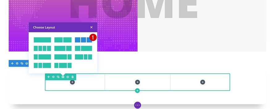
- 1 1. ‘Turn’ Rows into Sections With Columns
- 2 2. Gradients + Background Textures
- 3 3. Semitransparent Gradient Colors + Underneath Section Dividers
- 4 4. Horizontal Column Overlap of Modules
- 5 5. Split up Copy for Perfect Alignment
- 6 6. Combine Black and Semitransparent Text Colors
- 7 7. Avoid Box Shadow at Top or Bottom to Unite Sections
- 8 Preview
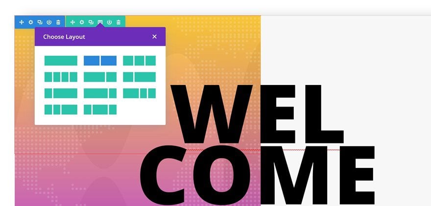
- 9 Let’s Start Creating: Add Standard Section #1
- 10 Add Standard Section #2
- 11 Preview
- 12 Final Thoughts
1. ‘Turn’ Rows into Sections With Columns
The first technique you can use to create bold and colorful web design is turning rows into sections. By removing all default padding between a section and row, you’ll leave no apparent difference between the two. This, in combination with removing the gutter width, allows you to have two columns that are pressed together.
2. Gradients + Background Textures
Using gradient backgrounds on your website can deliver stunning results. But what helps you empower these colors, even more, is combining them with a textured background. To keep the balance, use this combination for one column only. Keep the second column clean and light for a modern touch.
3. Semitransparent Gradient Colors + Underneath Section Dividers
After you’ve turned a row into a section, you can add section dividers to your column background as well. To make sure the dividers show through, without overlapping the content, use slightly transparent gradient colors for your column.
4. Horizontal Column Overlap of Modules
You often see websites use vertical overlapping. Horizontal overlapping, on the other hand, is less frequently used although it can bring absolutely stunning results. To achieve this kind of result, it’s important to know that elements in the right column have a hierarchical advantage to elements in the left column. You can’t achieve the same result if you place your elements in the left column.
5. Split up Copy for Perfect Alignment
There’s nothing more satisfying than having perfect alignment. It’s one of the primary design principles that distinguished good design from bad design. To make sure this alignment is perfect when overlapping two columns, try splitting up your copy into different Text Modules. This will allow you to create a perfect alignment by making the negative left margin match that word or sentence in particular.
6. Combine Black and Semitransparent Text Colors
To add the bold aspect to your website, use a big font size for the copy you’re sharing along with an ultra bold Text Font Weight. And to balance the boldness, you can switch between using a black text color and a semitransparent one. This will help you create enough depth and variation on your website.
7. Avoid Box Shadow at Top or Bottom to Unite Sections
You can easily unite two sections on your page by playing around with the box shadow options. First things first, use a very subtle box shadow. That means using sufficient blur strength, negative spread strength and a very light box shadow color. Once you create your subtle box shadow, play around with the vertical position. For the first section on your page, make sure you move the vertical position until the box shadow doesn’t appear at the bottom of your section. Same applies to the last section, but instead, make sure it doesn’t appear at the top.
Preview
Now that we’ve gone through all the different techniques, it’s time to put things into practice. We’re going to recreate the following design:
Let’s Start Creating: Add Standard Section #1
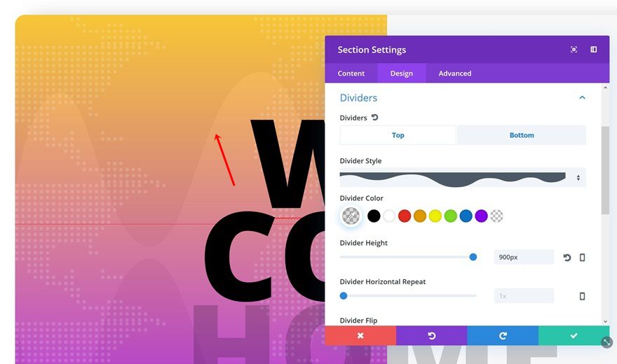
Section Settings
Top Divider
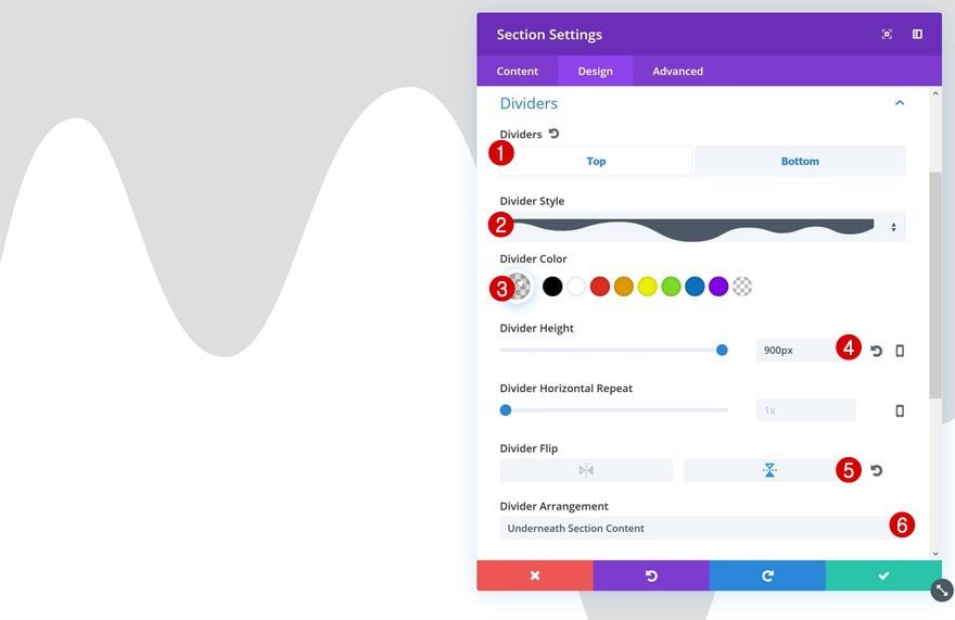
Add a new page with a standard section and open the section settings right away. The first thing we’ll need is a top divider:
- Divider Style: Find in List
- Divider Color: rgba(0,0,0,0.13)
- Divider Height: 900px
- Divider Flip: Vertical
- Divider Arrangement: Underneath Section Content
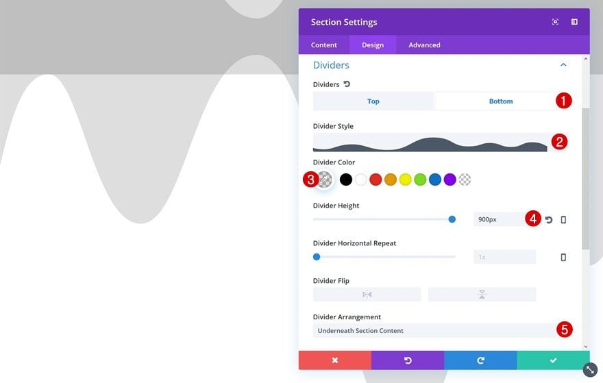
Bottom Divider
Continue by adding a similar bottom divider as well.
- Divider Style: Find in List
- Divider Color: rgba(0,0,0,0.13)
- Divider Height: 900px
- Divider Arrangement: Underneath Section Content
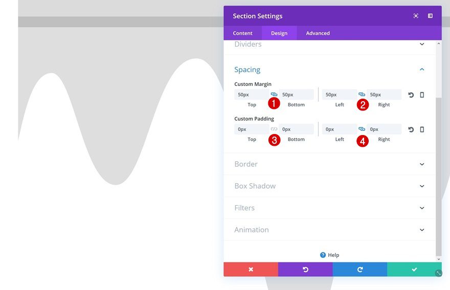
Spacing
Next, give the section some margin and remove the default padding.
- Top & Bottom Margin: 50px
- Left & Right Margin: 50px
- Top & Bottom Padding: 0px
- Left & Right Padding: 0px
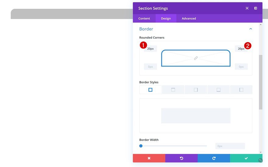
Rounded Corners
Then, open the Border settings and add some rounded corners.
- Top Left: 20px
- Top Right: 20px
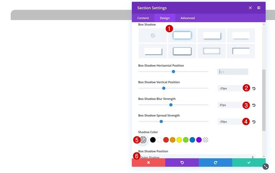
Box Shadow
We’re using a subtle box shadow at the top of our section by making the following adjustments:
- Box Shadow Vertical Position: -23px
- Box Shadow Blur Strength: 37px
- Box Shadow Spread Strength: -29px
- Shadow Color: rgba(0,0,0,0.22)
- Box Shadow Position: Outer Shadow
Add New Row
Column Structure
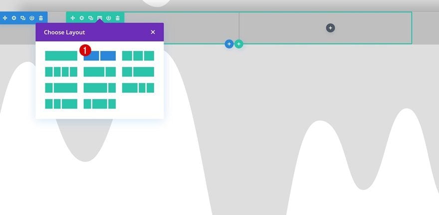
Not that we’re done modifying the section settings, we can continue by adding a row with two columns.
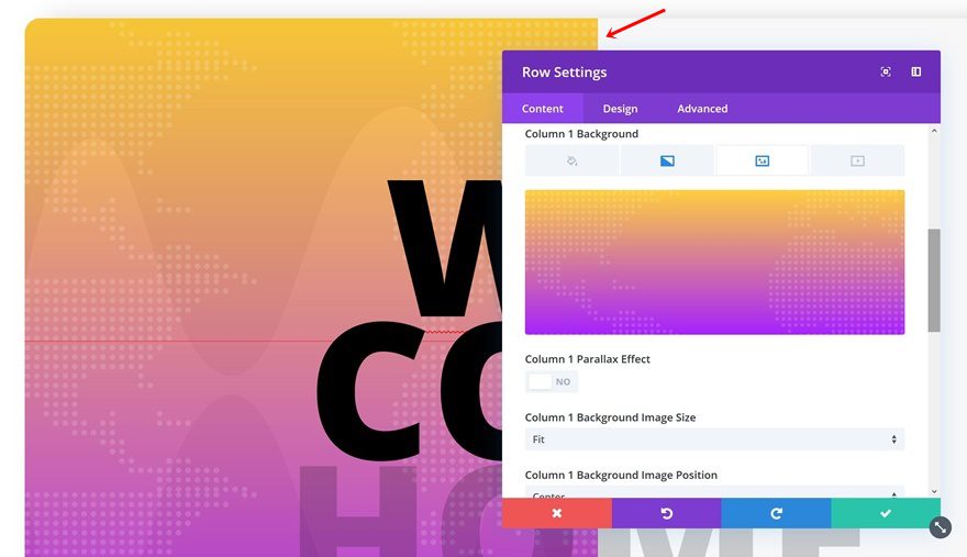
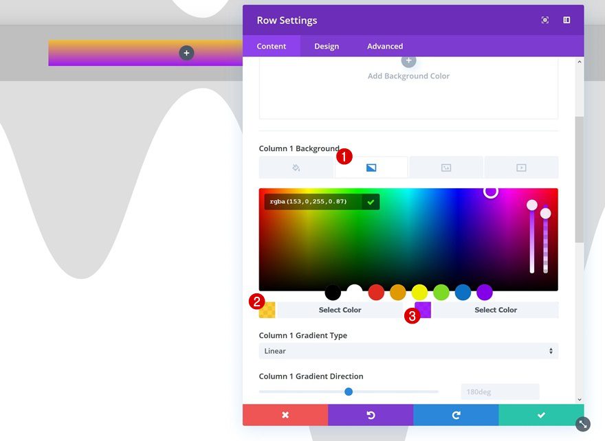
Column 1 Gradient Background
Without adding any modules yet, we’re going to open the row settings. The first thing we’ll need to do there is adding a gradient background to our first column.
- Color 1: rgba(255,191,0,0.76)
- Color 2: rgba(153,0,255,0.87)
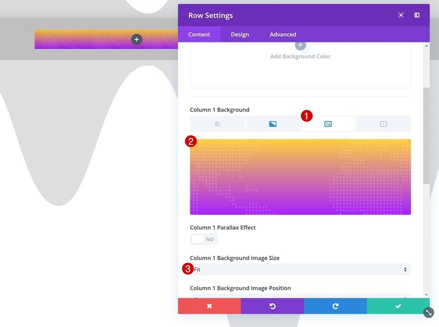
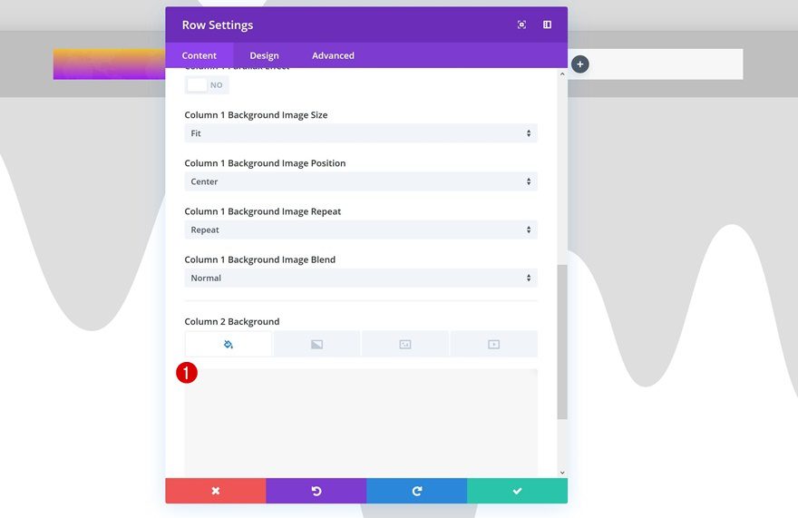
Column 1 Texture Background Image
We’ll combine this gradient background with a textured background. The image I’m using is part of Divi’s Meetup Layout Pack. Save the following image to your desktop by right clicking and saving it (it’s a png file with white textures, you won’t be able to see the what it looks like until you open it on your computer and/or use it on your website):

After you upload the image to your Media Library, make sure you select ‘fit’ as the Column 1 Background Image Size as well.
Column 2 Background Color
Next, give your second column the ‘#F7F7F7’ background color.
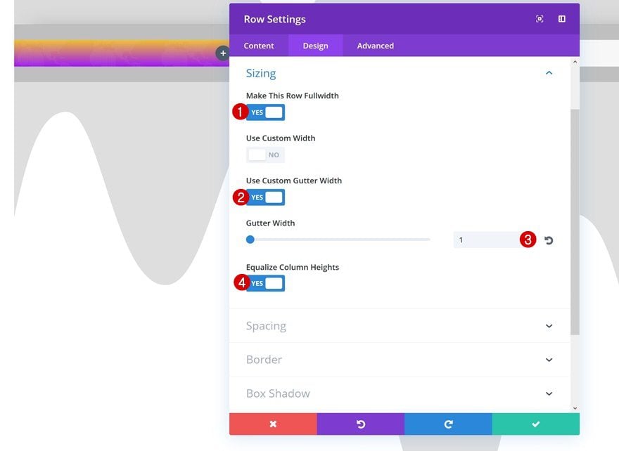
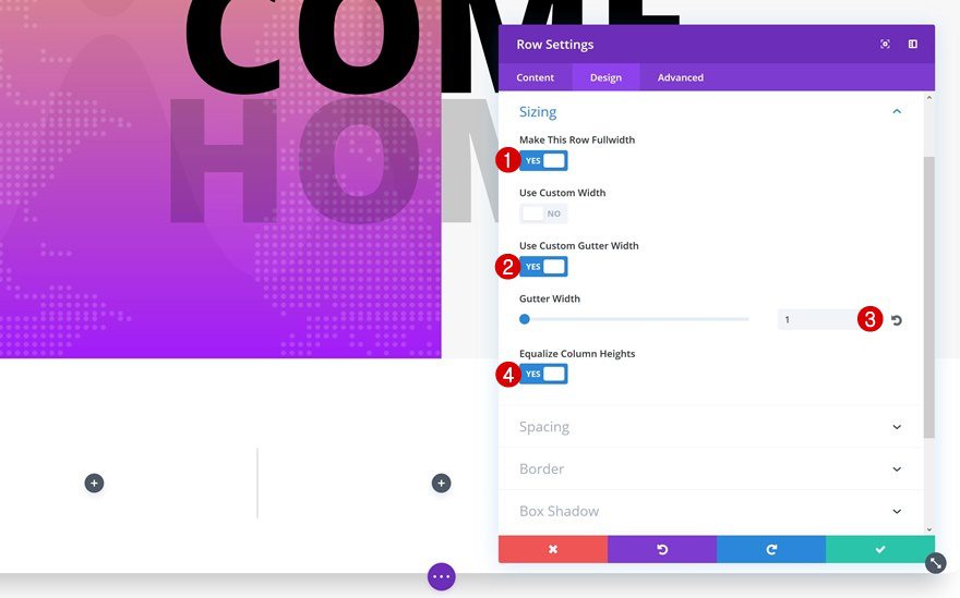
Sizing
We’re going to ‘turn’ our row into a section by making it take up the entire width of the section.
- Make This Row Fullwidth: Yes
- Use Custom Gutter Width: Yes
- Gutter Width: 1
- Equalize Column Heights: Yes
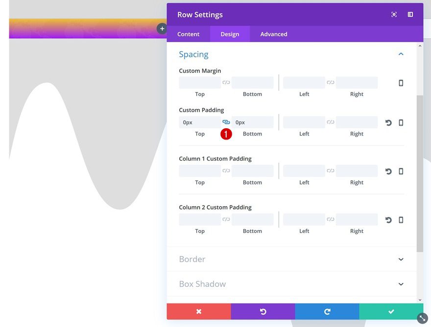
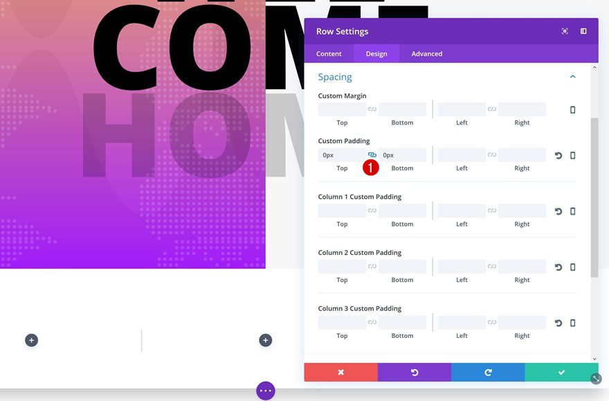
Spacing
Along with making the row take up the entire width of the section, we’ll also need to remove the top and bottom padding of our section.
- Top & Bottom Padding: 0px
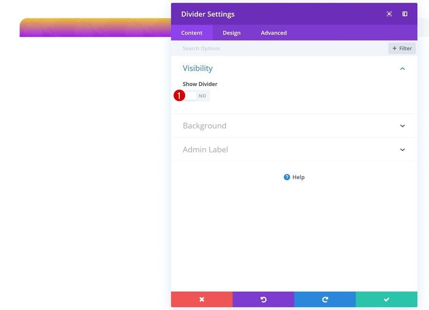
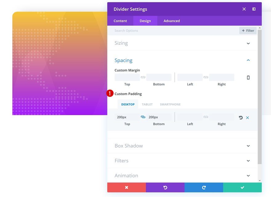
Add Divider Module to Column 1
Hide Divider
Let’s start adding the modules! The first thing we’ll need is a Divider Module in the first column. We’re only using this module to create the space we need in the first column. We don’t actually want it to show up. Once you add the module, make sure you disable the ‘Show Divider’ option.
Spacing
Go to the Spacing settings next and add the following custom padding to the divider:
- Top Padding: 200px (Desktop & Tablet), 150px (Phone)
- Bottom Padding: 200px (Desktop & Tablet), 150px (Phone)
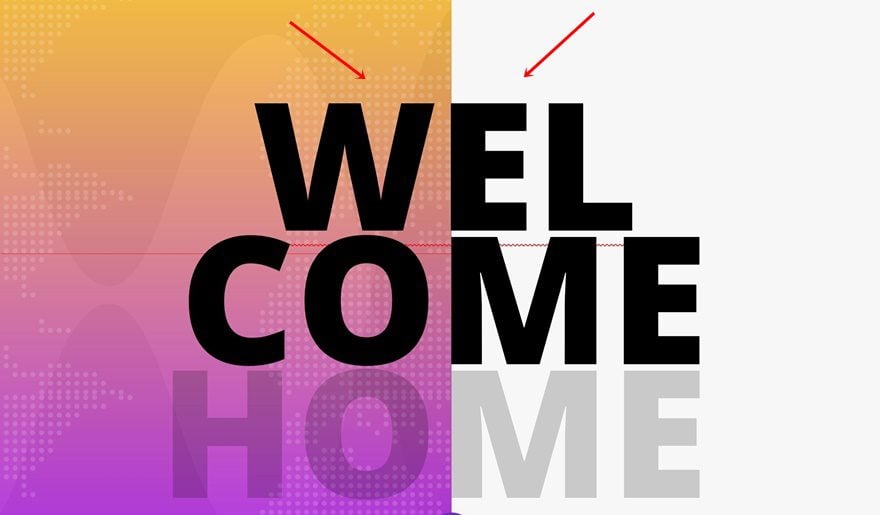
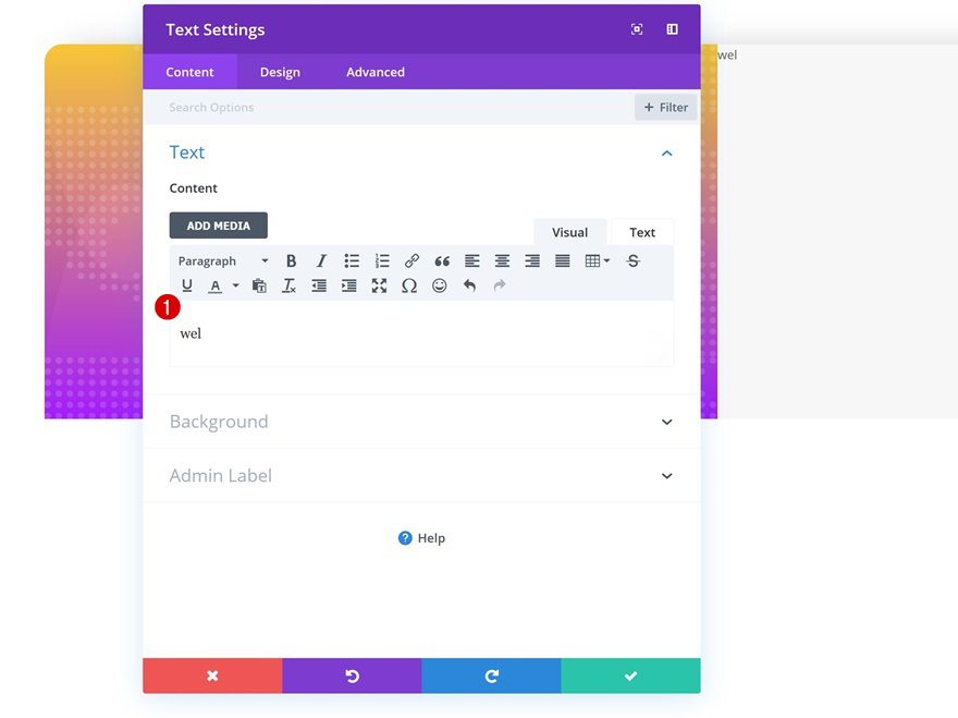
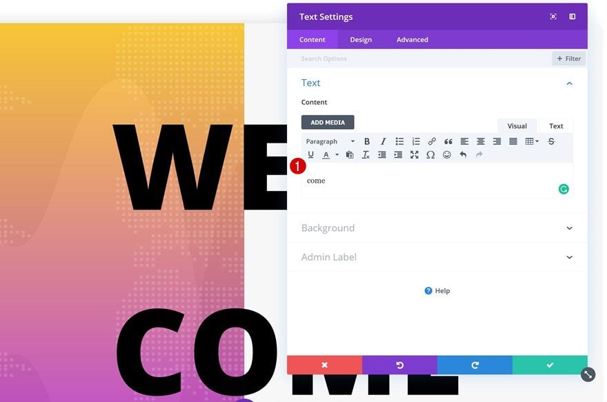
Add Text Module #1 to Column 2
Add Copy
We can now move on to the second column. Here, we’re going to drop our three different Text Modules and make them overlap both columns. If you want to make a module overlap two or more columns, you’ll always need to place it in the column that’s on the right. That’s just how the hierarchical structure works. Add your first Text Module and add some copy.
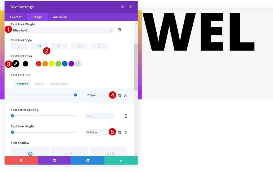
Text Settings
Open the text settings next and apply the following changes:
- Text Font Weight: Ultra Bold
- Text Font Style: Uppercase
- Text Color: #000000
- Text Size: 250px (Desktop), 200px (Tablet), 100px (Phone)
- Text Line Height: 0.75em
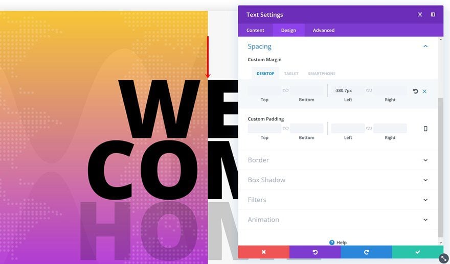
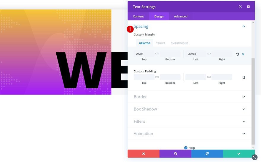
Spacing
We’ll also need some margin. The negative left margin we’re using matches the copy we’ve chosen. If you want to make this work with other text as well, you’ll need to play around with this value. Change it until you see the beginning of a character align with the transition of the columns.
- Top Margin: 200px (Desktop), -250px (Tablet), -120px (Phone)
- Left Margin: -279px (Desktop), 5% (Tablet & Phone)
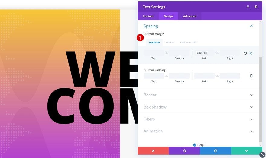
Clone Text Module Twice
Clone #1
Change Text
We’ve created our first Text Module and to save ourselves some time, we’ll clone it twice and make some changes. The first thing you’ll need to change about the second Text Module is the copy.
Change Spacing
The copy we’re using here is different, so that means we’ll need to change the left margin. Notice how we’re also using decimal numbers to make the Text Module align perfectly. Get rid of the top margin as well.
- Left Margin: -360.7px (Desktop), 5% (Tablet & Phone)
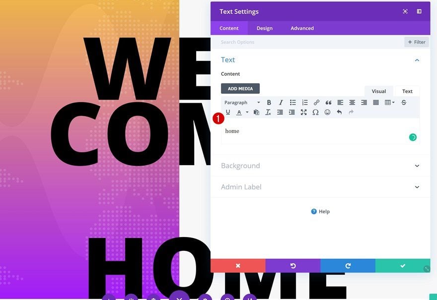
Clone #2
Change Text
Change the copy of your third Text Module as well.
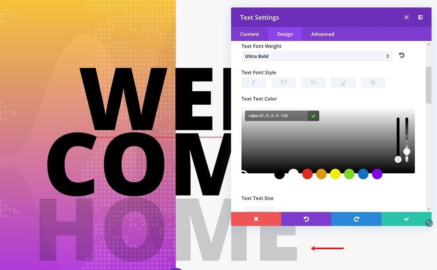
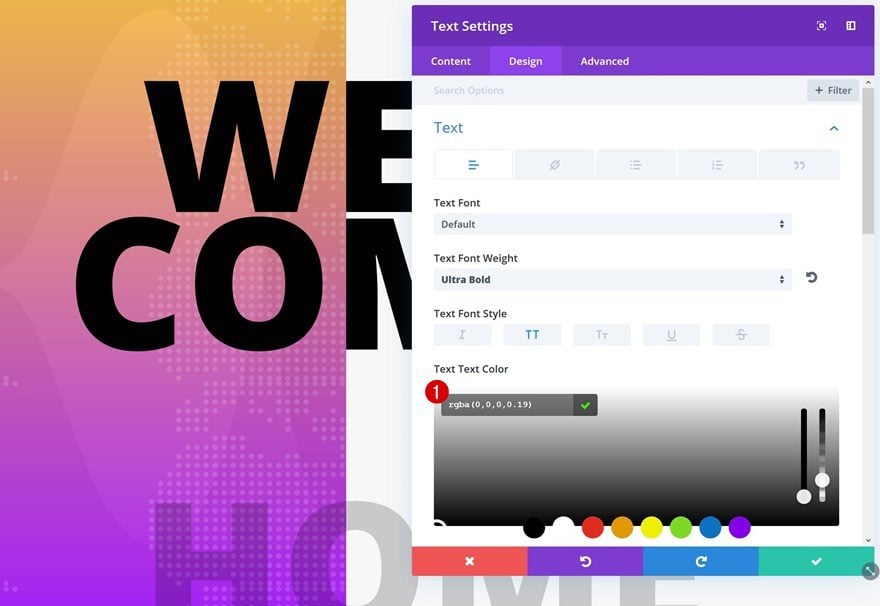
Change Text Color
And to make the design stand out even more, we’re going to change the text color of this module into ‘rgba(0,0,0,0.19)’.
Change Spacing
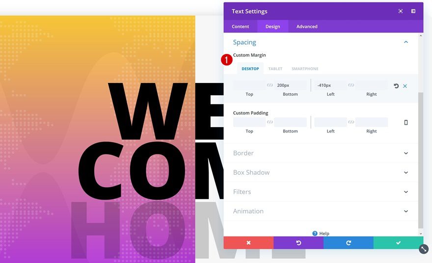
We’re removing the top margin for this module and adding some bottom margin instead. The negative left margin is different as well.
- Bottom Margin: 200px
- Left Margin: -410px (Desktop), 5% (Tablet & Phone)
Add Standard Section #2
Section Settings
Spacing
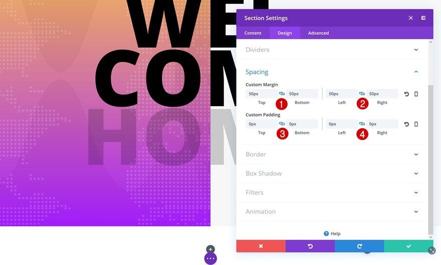
We’re done with the first section, time to move on to the next! Once you add a new standard section, open the Spacing settings and make the following changes:
- Top & Bottom Margin: 50px
- Left & Right Margin: 50px
- Top & Bottom Padding: 0px
- Left & Right Padding: 0px
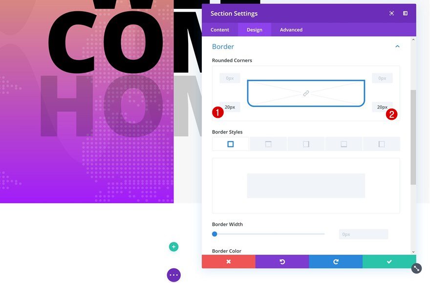
Rounded Corners
Continue by adding some bottom rounded corners:
- Bottom Left: 20px
- Bottom Right: 20px
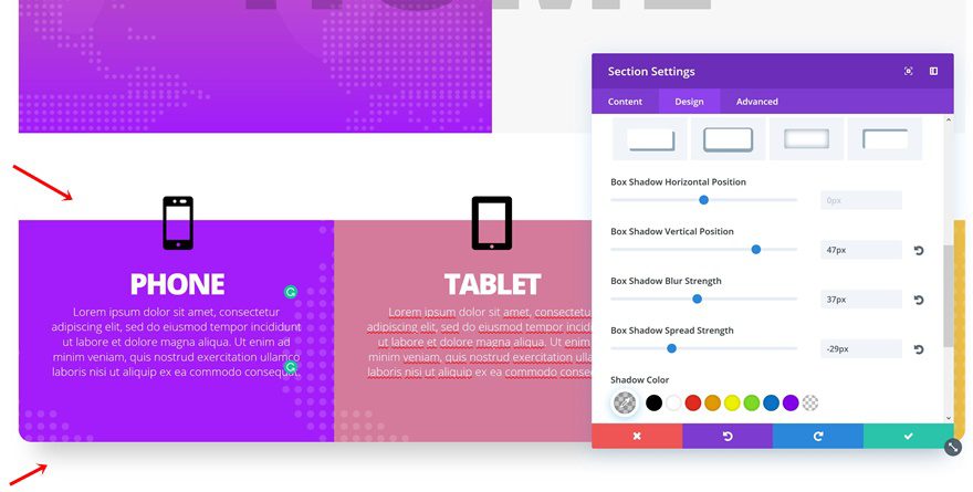
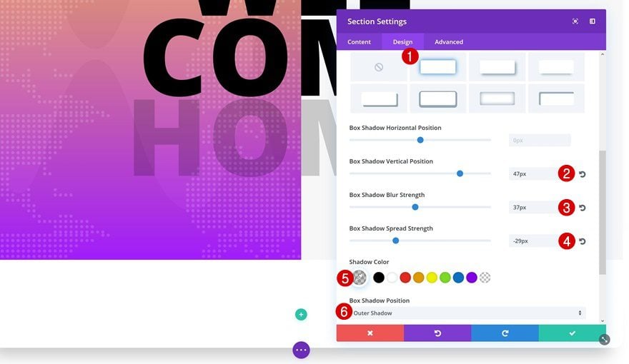
Box Shadow
Add a Box Shadow to the bottom of the section as well.
- Box Shadow Vertical Position: 47px
- Box Shadow Blur Strength: 37px
- Box Shadow Spread Strength: -29px
- Shadow Color: rgba(0,0,0,0.22)
- Box Shadow Position: Outer Shadow
Add New Row
Column Structure
Next, add a row with three columns to your new section.
Sizing
We’re ‘turning’ this row into a section as well:
- Make This Row Fullwidth: Yes
- Use Custom Gutter Width: Yes
- Gutter Width: 1
- Equalize Column Heights: Yes
Spacing
And we’ll remove the default top and bottom padding.
- Top & Bottom Padding: 0px
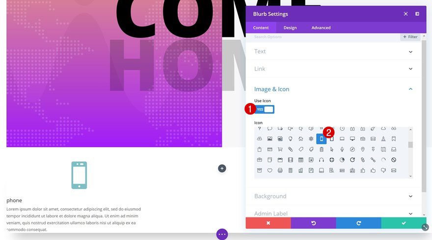
Add Blurb Module #1 to Column 1
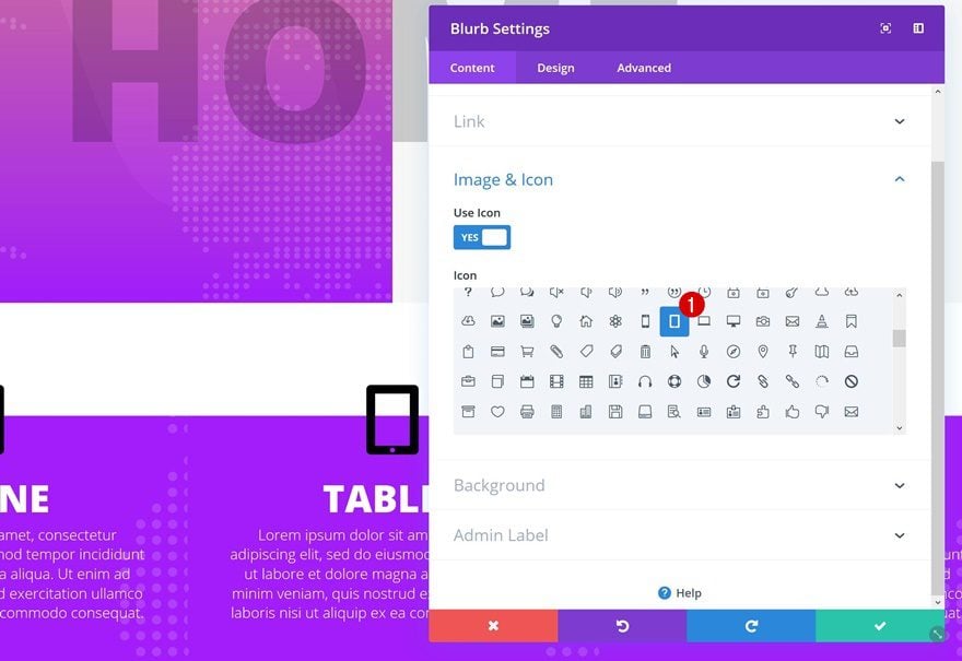
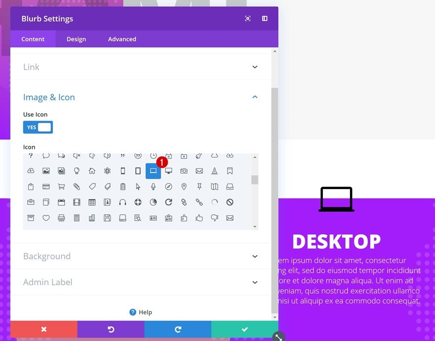
Choose Icon
In total, we’re going to need three Blurb Modules. One for each column. We’ll start off by adding one in the first column and after we’re done, we’ll clone it and place it in the remaining columns. This will help us save time. After you’ve added the content to your Blurb Module, select an icon of choice in the Image & Icon settings.
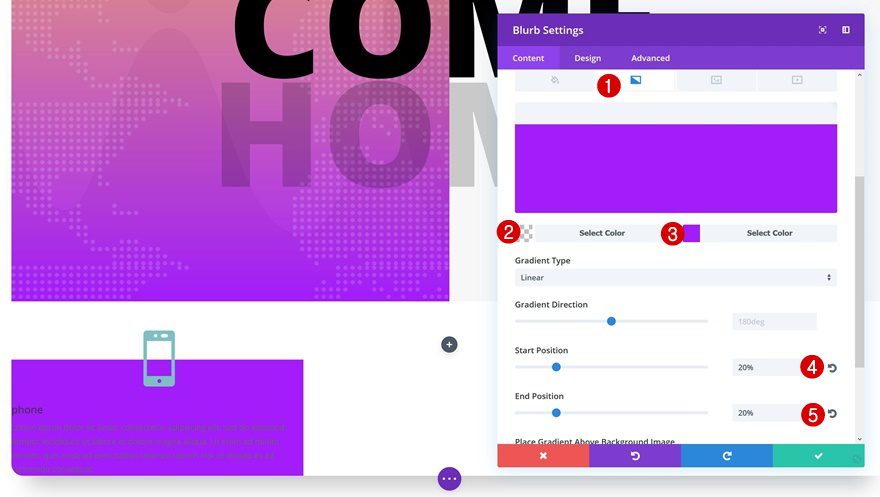
Gradient Background
We’re going to make it seem like the icon is overlapping the top of the Blurb Module by using a gradient background for it:
- Color 1: rgba(255,255,255,0)
- Color 2: #A21DF9
- Start Position: 20%
- End Position: 20%
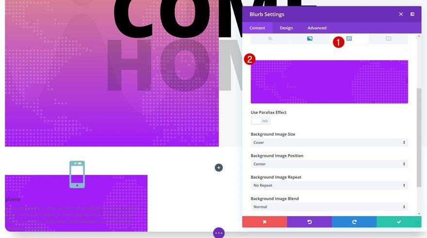
Texture Background Image
We’re combining the gradient background with the same textured background we’ve used in the previous section.
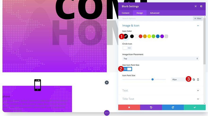
Icon Settings
Change the icon settings next:
- Icon Color: #000000
- Use Icon Font Size: Yes
- Icon Font Size: 85px
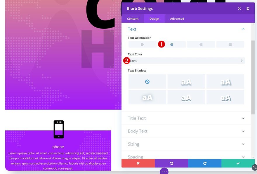
Text Settings
Continue by modifying the text setting.
- Text Orientation: Center
- Text Color: Light
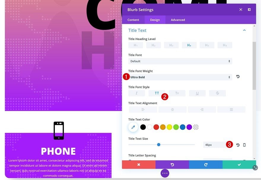
Title Text Settings
Then, we’ll use the following settings to style our blurb title:
- Title Font Weight: Ultra Bold
- Text Font Style: Uppercase
- Title Text Size: 46px
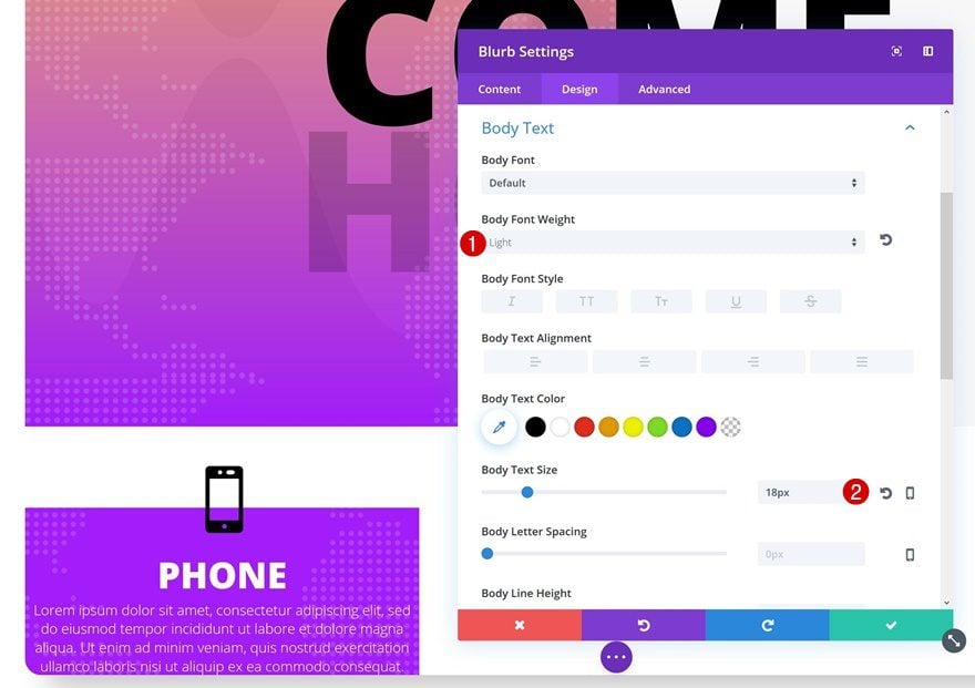
Body Text Settings
And the following settings for the body text:
- Body Font Weight: Light
- Body Text Size: 18px
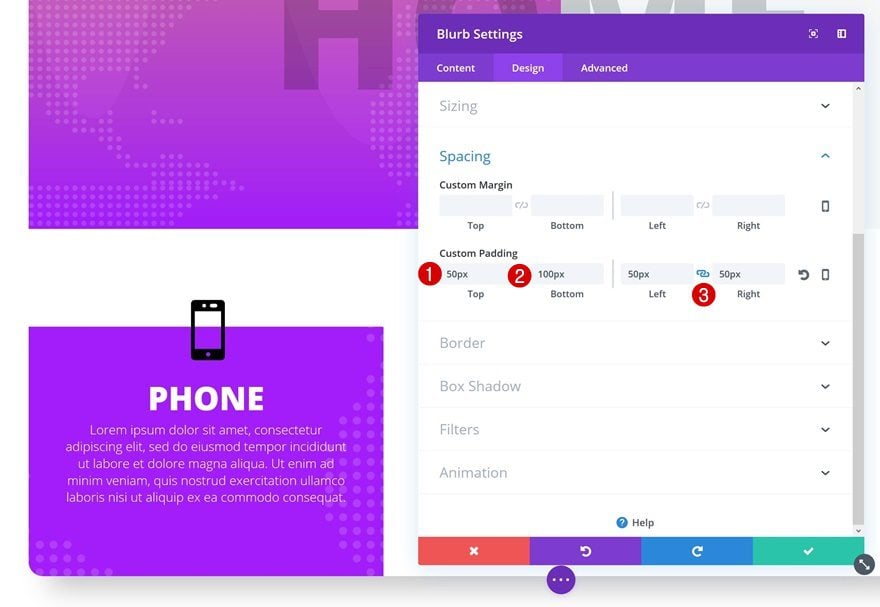
Spacing
Last but not least, we’re going to give our Blurb Module some space to breathe by adding custom padding:
- Top Padding: 50px
- Bottom Padding: 100px
- Left & Right Padding: 50px
Clone Blurb Module Twice & Place in Remaining Columns
Clone #1
Change Icon
When you’re done modifying the Blurb Module, clone it twice. After you do so, place the duplicates in the remaining columns. Then, open the Blurb Module in your second column and change the icon that is being used.
Change Gradient Background
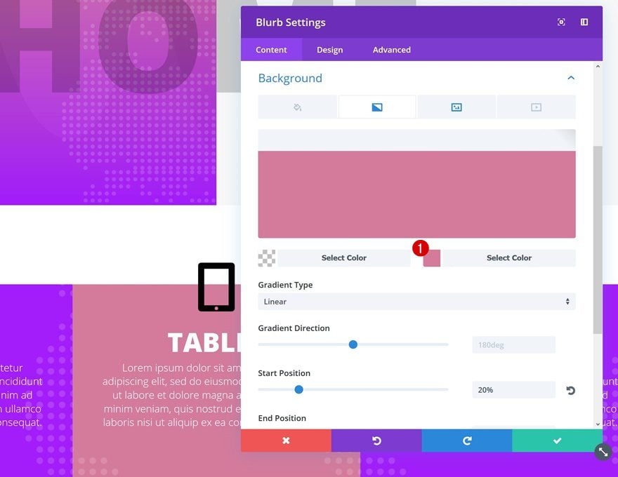
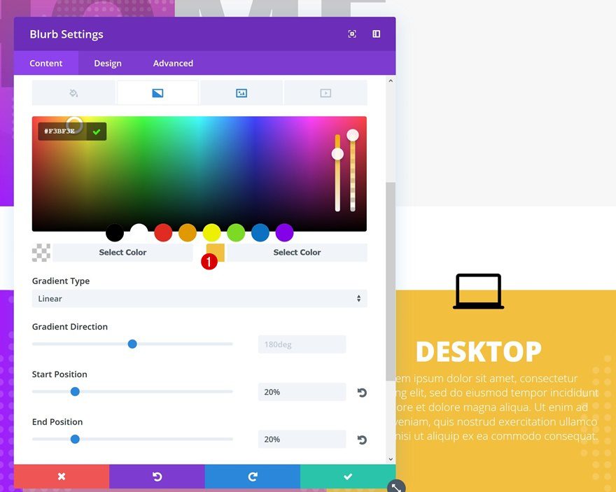
Continue by changing the second gradient background color into ‘#D47A9A’.
Clone #2
Change Icon
Do the same thing for the Blurb Module in the last column.
Change Gradient Background
For this module, we’re using ‘#F3BF3E’ as the second gradient background color instead.
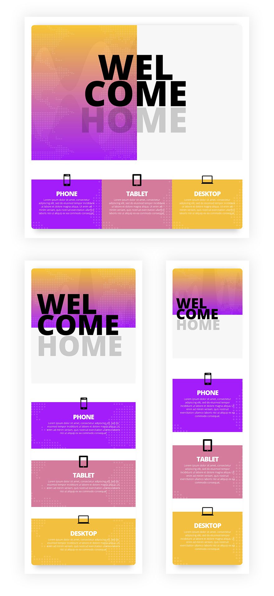
Preview
If you’ve followed each one of the steps above, you should have achieved the following result on different screen sizes:
Final Thoughts
In this post, we’ve shown you how to create bold and colorful websites using Divi’s built-in options only. First, we’ve gone through some Divi techniques you can tackle and afterwards, we’ve recreated a matching example from scratch. If you have any questions or suggestions, make sure you leave a comment in the comment section below!


put this layout together last night, really great work Donjete, looks great, I put the abstract one together this morning, now not sure which one I like best lol.
I agree with this as I complained about this just the other day and also said that the old system is better. this chatbox is defiantly not user-friendly.
But anyway nice tutorial
Though there’s a large divi community, the problem is there’s no one answering the questions posed in the forum. You can see the many questions unanswered.
Live chat is not 24/7, and have to have a few hours before a support team reply. And you may not be always connected online waiting for their reply. By the time you reply, and you’re going to wait a few more hours for another reply from the team.
The previous world class support now becomes crappy. Can Divi just revert back to the old forum support, and use live chat as a bonus support instead?