
A site footer is an important part of the overall build because it appears across the site, carries essential business details, reinforces the brand, and gives visitors one last clear path to contact you. That makes it the perfect place to bring together Divi 5’s Theme Builder, Design Variables, and Element Presets into a single reusable global layout.
By the end of this post, your Coworking site will have a global footer with three styled columns up top: a brand block, an address-and-socials block, and a contact CTA against an accent background. Beneath that, you’ll add a single-line copyright row that pulls in the current year dynamically, so it updates automatically. This is another fast tutorial because the footer is styled almost entirely with the Design Variables from Part 3 and the Element Presets from Part 4.
-
1
Custom Footer Build
- 1.1 Setting Up The Global Footer Template
- 1.2 Step 1: The Section And Row
- 1.3 Step 2: Adding The Modules
- 1.4 Step 3: Styling The Footer Columns
- 1.5 Step 4: Responsive Column Classes
- 1.6 Step 5: The Logo Image
- 1.7 Step 6: The Headings
- 1.8 Step 7: The Social Media Follow Module
- 1.9 Step 8: The Button
- 1.10 Step 9: The Text Modules
- 1.11 Save And Verify
- 1.12 What’s Coming Next
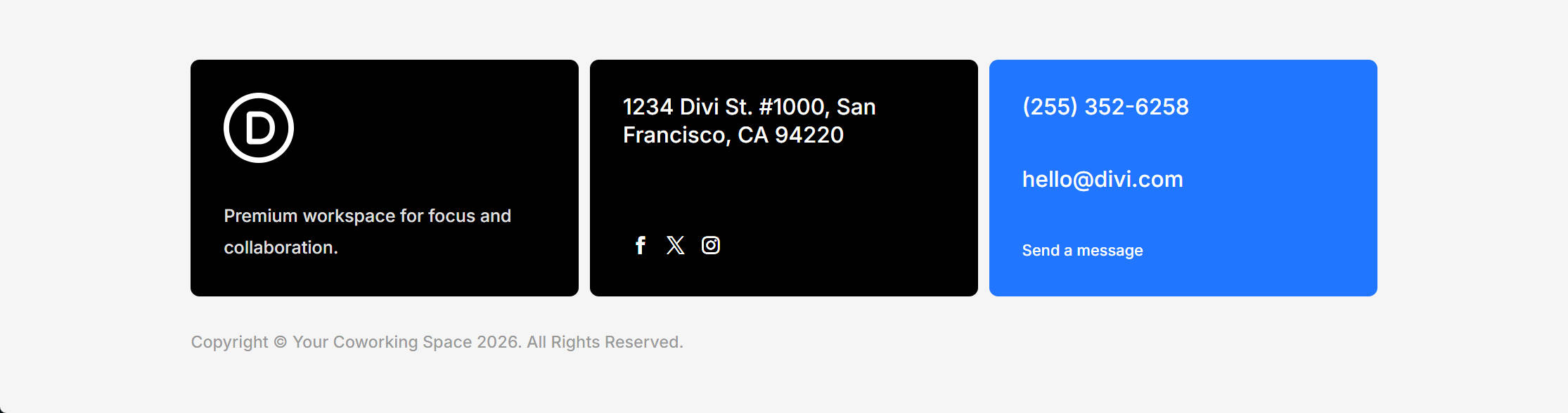
Building a footer is much like building any other section in Divi. Start with structure and layout before moving into styling. We’ll begin with the Section and a structured Row, add the Modules and a second Row, then move through content, presets, responsive behavior, and dynamic data until the whole footer is ready. Here’s the desktop result you’ll be building:
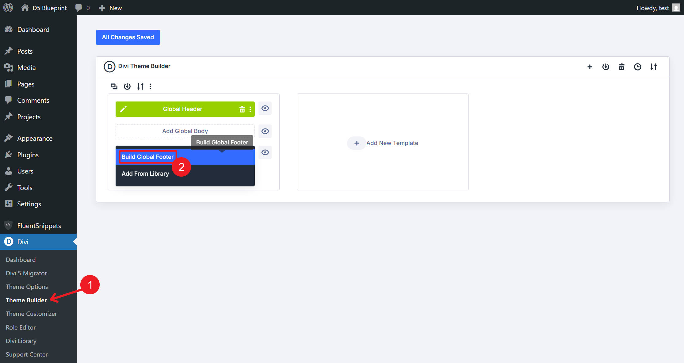
The Theme Builder workflow for the footer mirrors the global header from Part 6. From the WordPress dashboard, go to Divi > Theme Builder. In the Default Website Template, click Add Global Footer > Build Global Footer. Save the template once before you start so the global footer assignment is committed, then open the layout in the Visual Builder.
Step 1: The Section And Row
On the empty Visual Builder canvas, Divi gives you an empty Section to start from. In the Section’s Content tab, open the Background option group and apply the Background – Light Gray Design Variable to the background color field. If you created a Background option group preset for that same value earlier in the course, you can apply that instead.
Next, go to the Section’s Design tab, open the Layout option group, and apply the Spacing – Medium Design Variable to the Vertical Gap field. This gap separates the main footer row from the copyright row beneath it.
Before moving on, set the Section’s semantic wrapper. Go to Advanced > HTML and set Element Type to footer. The footer will look the same visually, but the markup now tells browsers, screen readers, and search engines that this area is the site footer.
Add a Row to the Section and choose the Flex Three Equal Columns structure. In the Row’s Design tab, open the Layout option group and set Layout Wrapping to Wrap. This allows the columns to wrap instead of forcing three squeezed columns on narrower screens.
Apply the Spacing – XSmall Design Variable to both the Horizontal Gap and Vertical Gap fields.
Step 2: Adding The Modules
With the structure in place, add the modules each column needs.
In Row 1, Column 1, add an Image module, then a Text module beneath it.
In Column 2, add a Heading module, then a Social Media Follow module.
In Column 3, add a Heading module, a second Heading module, and then a Button module.
Next, add a second Row to the Section and choose Flex Single Column. In its lone column, add one Text module. This completes the footer’s structure.
Open Row 1, Column 1 and apply the Contained – Dark Element Preset from the column preset menu. That preset carries the dark background, medium padding, and rounded corners created in Part 4.
In the column’s Design tab, open the Layout option group and set Justify Content to Space Between. This pushes the logo toward the top and the tagline toward the bottom of the card.
Use Extend Design Attributes to send those same column settings to the other Columns in the same Parent Row. All three columns now share the dark background, rounded corners, medium padding, and vertical spacing behavior in one move.
The third column needs one override so it becomes the CTA block. Open Row 1, Column 3. In the Design tab, open the Background option group and apply the Primary Color Design Variable to the background color field. It keeps the same shape, spacing, and alignment as the other two cards, but now uses the brand’s primary color.
Step 4: Responsive Column Classes
Now set how the footer behaves across breakpoints. Desktop is the base breakpoint, so desktop values cascade down to tablet and phone unless you override them. Because you chose the Flex Three Equal Columns structure when you added the first row, the desktop column layout is already handled.
Switch the Visual Builder to the Tablet breakpoint and open Column 1. In the Sizing option group, set Column Class to Fullwidth. Column 1 now spans the full row on tablet and below, while Columns 2 and 3 can sit beneath it.
Still on the Tablet breakpoint, open Column 2 and set Column Class to Grow To Fill. Repeat that for Column 3. This lets Columns 2 and 3 share the remaining row width cleanly on tablet.
Switch to the Phone breakpoint. Open Column 2 and set Column Class to Fullwidth. Repeat the same setting for Column 3. The Row’s Wrap setting from Step 1, combined with these breakpoint-specific column classes, creates a clean stacked layout on mobile.
Step 5: The Logo Image
Open the Image module in Column 1. In the Content tab, hover over the Image field and click the Insert Dynamic Content icon. Bind the image source to the Logo Light Design Variable.
Set the image’s alternative text to the brand name unless the same brand name is already written directly beside it and the logo is purely decorative. In that case, keep the alt text empty so screen readers do not announce the same brand twice.
In the Design tab, open the Sizing option group and set Max Height to 64px.
Step 6: The Headings
You have three Heading modules to style. Open the Heading module in Column 2 and apply the Heading 5 Element Preset for the visual style.
Create a second Heading Element Preset named Light. Set its text color to the White Design Variable, save it, and apply it to the same Heading module. If both presets define the same property, remember that the last preset applied wins.
In the Content tab, hover over the Heading field, click the Insert Dynamic Content icon, and bind the text to the Address Design Variable. Binding the address to a variable instead of typing it directly means a future office move can be handled once in the Variables panel and updated wherever that variable is used.
Use Extend to apply the Heading 5 and Light presets to the other Heading modules in the Parent Row. There are two more Heading modules in Column 3. Bind the first one to the Phone Number Design Variable and the second one to the Email Design Variable.
For the phone and email modules, add matching URL Design Variables in the Link option group: use a tel: URL for the phone number and a mailto: URL for the email address. That keeps the visible text and clickable links managed from the same global system.
Open the Social Media Follow module in Column 2 and apply the Isolated Icons – Light Element Preset.
In the Content tab, open the Elements option group and add three Social Network children for the platforms that match the brand. Open each network item, choose the correct platform, and add the destination URL.
Click the edit icon for each Network, then apply the No Background Element Preset. The result is a clean row of white icons against the dark column, without a plate or pill behind each icon.
Open the Button module in Column 3 and apply the Text – White Element Preset.
In the Content tab, set the Button Text to Send a message. Set the link URL to the contact page, the Contact Page URL Design Variable if you created one, or the same mailto: URL variable used for the email address.
The Text – White preset gives the button a transparent background, a white label, and the hover behavior you defined in Part 4.
Step 9: The Text Modules
There are two Text modules to style: the tagline in Column 1 and the copyright line in Row 2.
Open the Text module beneath the logo in Column 1 and apply the Light Text Element Preset. Set the body content to: Premium workspace for focus and collaboration.
Open the Text module in Row 2. Stack two Element Presets on it: apply Dark Text first, then Small Text. The order matters because stacked presets follow a cascade. Small Text narrows the body type from Body to Body Small, while Dark Text keeps the color and link behavior intact unless a later preset overrides those same properties.
In the same Text module’s body content, click the Insert Dynamic Content icon and choose Current Date. In the dynamic content settings, enter Copyright © Your Coworking Space in the Before field and . All Rights Reserved. in the After field.
Set Date Format to Custom and set Custom Date Format to Y. The line renders as Copyright © Your Coworking Space 2026. All Rights Reserved., with the year changing automatically each January.
One last touch: in the same module’s Design tab, open the Body Text option group and apply the Text – Dark Transparent Design Variable to the Body Text Color field. This gives the copyright line a quieter tone so it supports the footer instead of competing with the cards above it.
Save And Verify
Check the footer before leaving the builder. You now have a global footer that uses Divi 5’s Flex layout controls, Design Variables, Dynamic Content, and reusable presets.
Preview the tablet and phone breakpoints to confirm that Column 1 becomes full-width on tablet, Columns 2 and 3 share the next row on tablet, and all three cards stack on phone. Also test the social icons, the button link, the tel: link, and the mailto: link.
Save the Visual Builder, return to the Theme Builder, and click Save Changes.
Open any front-end page and scroll to the bottom to see the global footer in place.
What’s Coming Next
With the global header from Part 6 and the global footer from this post in place, every page on your Coworking site is now wrapped in a consistent, on-brand structure. In Part 8: Using Divi 5 Theme Builder To Create Global Website Templates, we’ll move on to the templates that handle the rest of the site, including All Posts, Category Pages, Author Pages, Search Results, and the 404 page.
The same Design Variables and Element Presets you’ve been building since Part 3 carry directly into those templates. By Part 8, the design system starts paying you back: the core decisions are already made, so you can build the remaining templates faster and keep the site consistent as it grows.


Leave A Reply