The Divi Map Module
How to add, configure and customize the Divi map module.
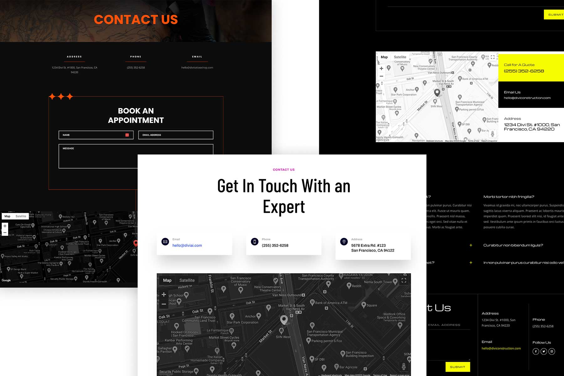
The Divi Map Module is an easy way to display an interactive Google map on your website. You can specify multiple pin locations and is a visual and useful way to share your business’s location on a contact page or an about page.
In this documentation we’ll go over how to add the map module to your page and all of the settings and design customizations available within the Divi Map Module.
View A Live Demo Of This Module
How to Add the Divi Map Module to Your Page
Before you can add the Divi Map module to your website, you’ll need to have the Divi theme installed on your WordPress website. Learn how to install the Divi theme on your WordPress website here. Once you have the Divi theme installed and activated, we can begin using the features and functionalities of Divi. For additional information on the Divi Builder itself, its interface, usage philosophy and best practices, please refer to our Getting Started With The Divi Builder guide.
Add the Divi Map Module
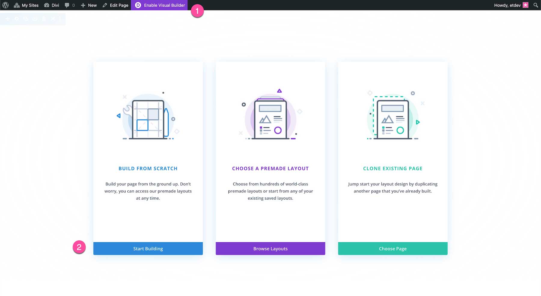
Navigate to the page you want to add a Divi Map Module on and click “Enable Visual Builder” on the WordPress Admin Bar. This will reload your page using Divi’s drag-and-drop interface. You’re presented with three options: Build From Scratch, Load From Library, or Clone Existing Page. For our purposes, select Build From Scratch which will load a blank page.
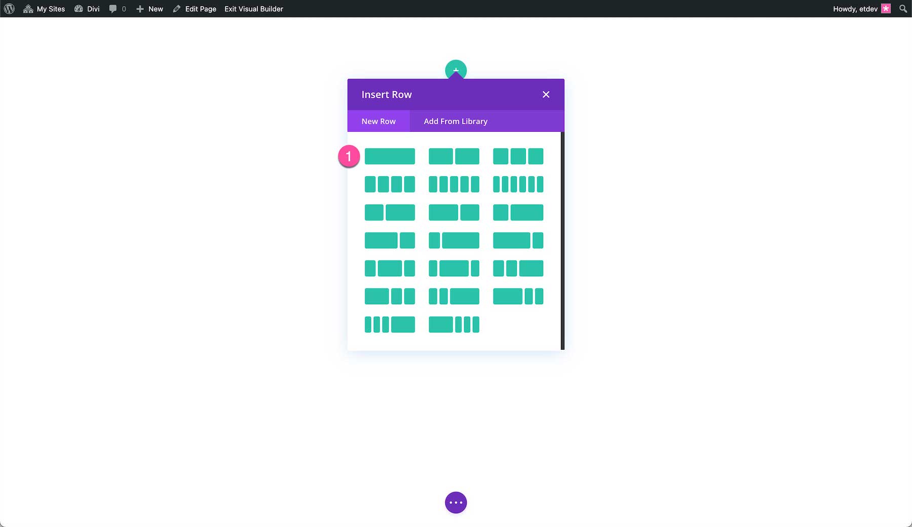
Divi automatically adds a section and row to your page and the row’s column options popup. Select the column structure you’d like. To learn more about how to modify and customize sections and rows, view our documentation for sections and rows.
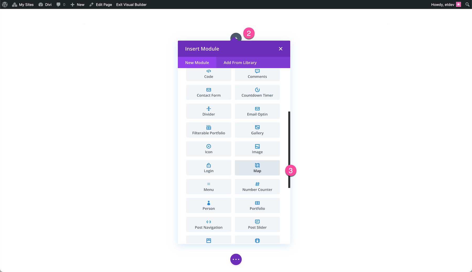
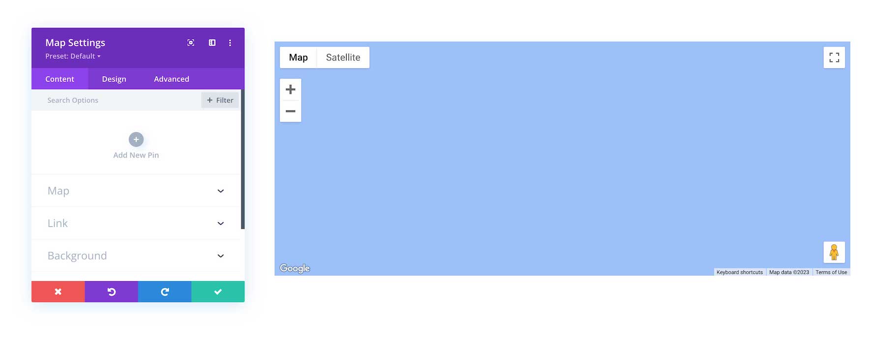
Once the section, row, and columns are set up, click on the grey + icon inside the row. This brings up the Divi Module Library which contains all the modules included with the Divi theme. Scroll down to Map and click on it to load the module. The module library is also searchable. Type the name of the module you want in the search bar at the top.
Now the Divi Map Module is added to your page!
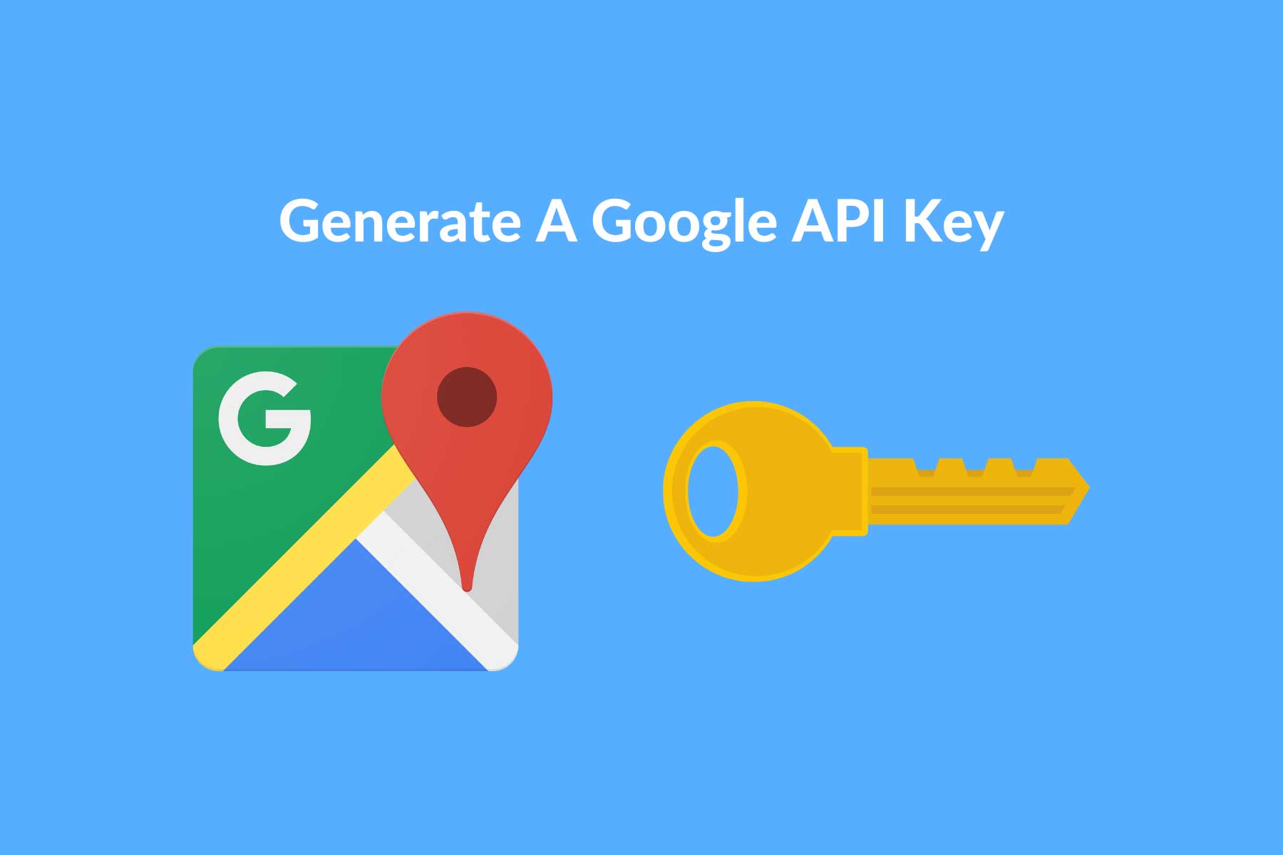
Generate A Google Maps API Key
Before you can start using the full functionality of the maps module, you’ll need a Google API Key. A Google API Key authenticates your connection to Google’s location services and makes the Map Module function.
To generate an API key you’ll need a Google account, a project linked with a billing account, and the Geocode API enabled.
Pro Tip: If you created your Google API Key, pasted it in the Map Module, and it’s still not working, you likely need to add a billing method to your Google Account. Why do I need to add my credit card or bank account if Google maps is free?. Because Google requires it. However, don’t worry – if your website generates less than 15,000 visitors a month, you’ll likely never be charged.
All Divi Map Module Options Explained
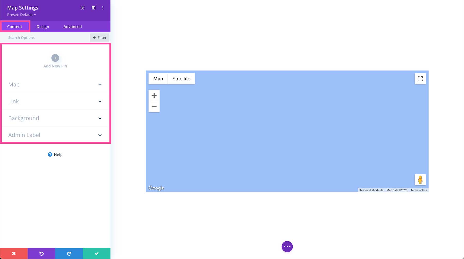
Once the Map Module is added to the page, the map module settings automatically pop up. This is where all of the content and design styles for this module are configured. These settings are organized into three groups via the tabs at the top of the module: Content, Design, and Advanced.
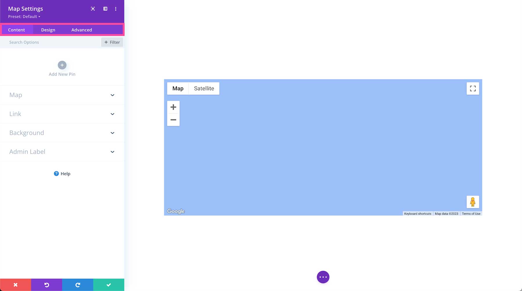
Content Settings
Inside this tab, you’ll find the content options available for the Divi Map module.
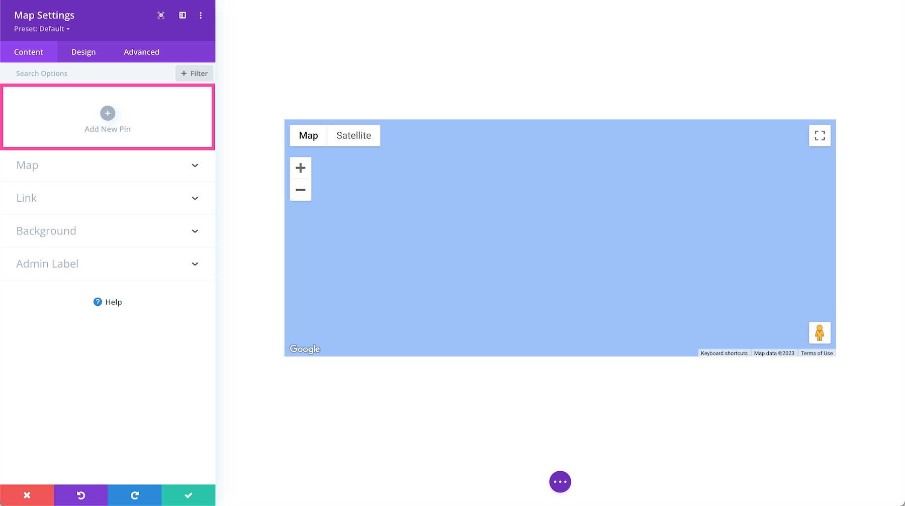
Add A New Pin
The first section in the Content settings is where you can add and remove map pins. Adding a pin to the map will highlight a specific location on the map. You can add multiple pins which can be helpful, for example, if you’re creating a map of a neighborhood tour of your favorite spots.
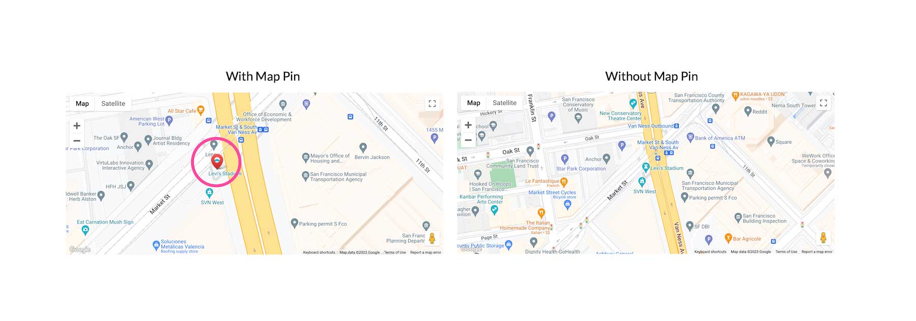
Below is an example of what the map looks like with and without a pin added.
How to Add a Pin to the Divi Map Module
To add a pin to the map module, click “Add A Pin”. Once clicked, this will load the individual pin’s content settings.

Inside the pin’s content settings are settings groups to add a title, body text, and map address.
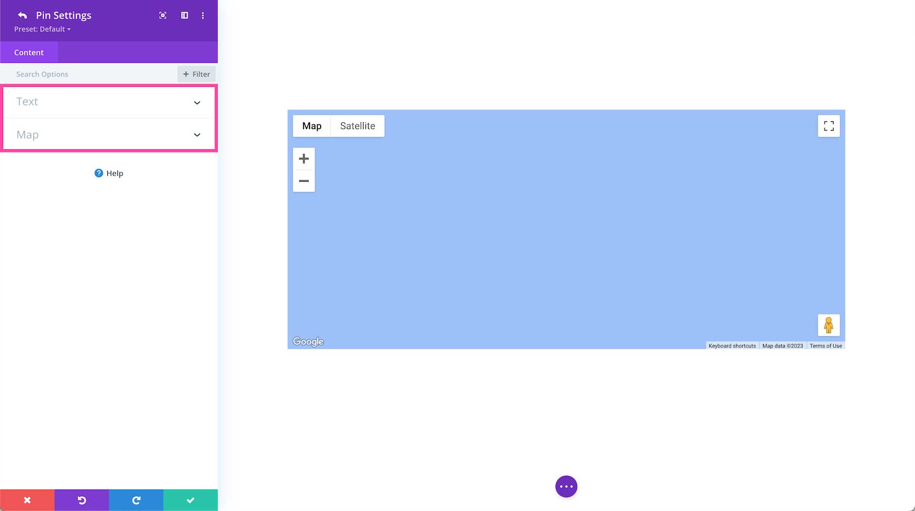
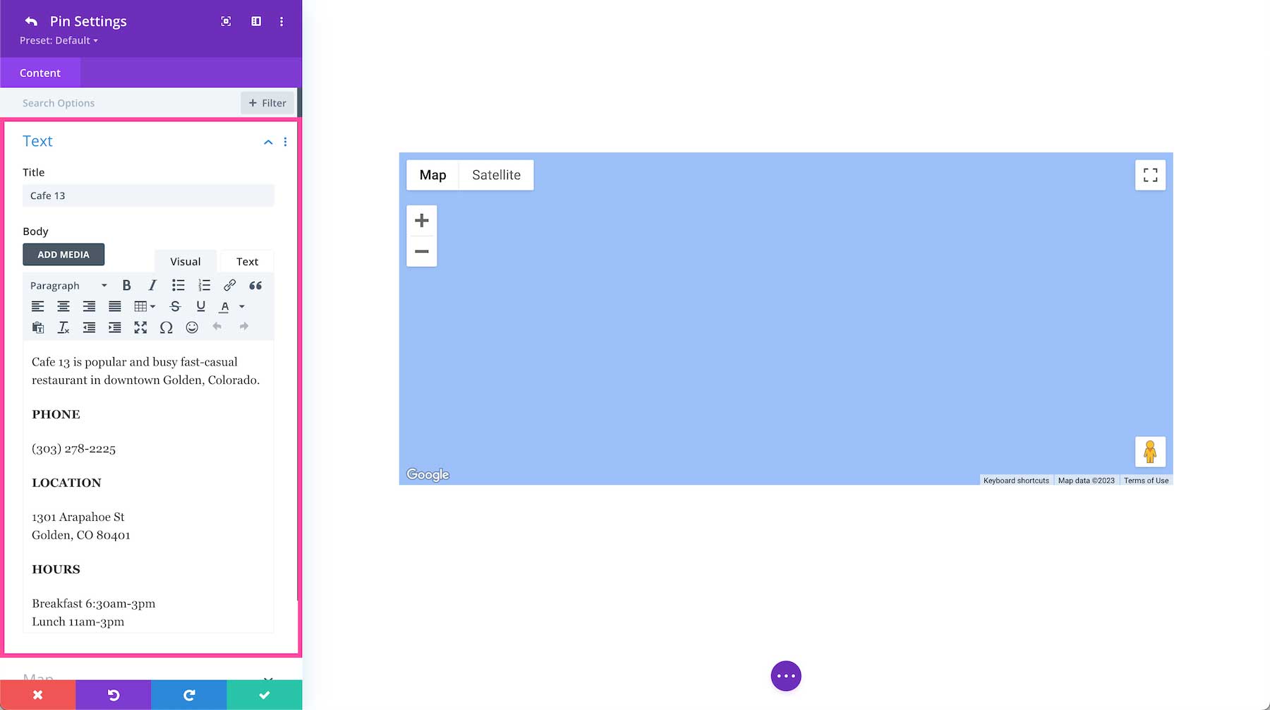
Text
Here you can add the text content for the pin like a pin title and descriptor text. When the pin is clicked, this text will display in a popup. If you don’t want any information to display in the popup, leave these fields blank.
- Title – Type the title of the pin here.
- Body – This is where you can type the text you want displayed when the pin is clicked. For example, you could put a description of this location, contact info for this location, etc.
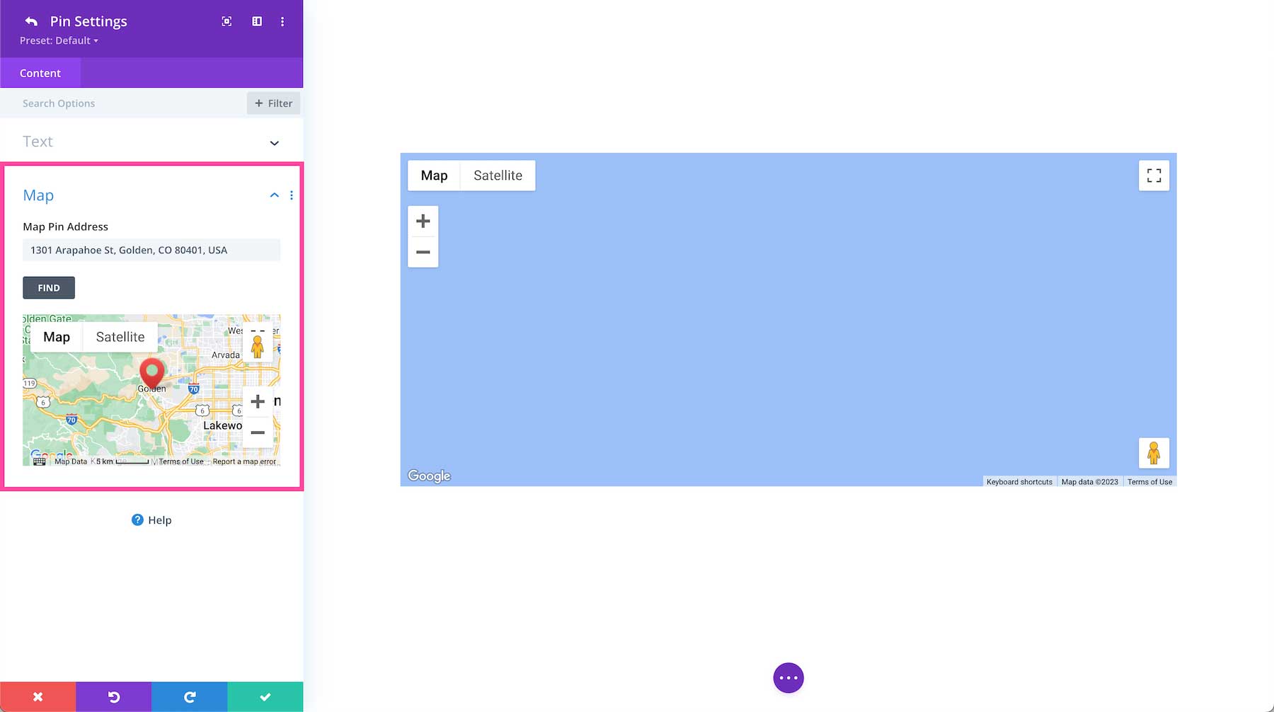
Map
This is where you paste the address you want the pin to point to.
- Map Pin Address – Paste the address here and then click “Find” to orient the pin to that address.
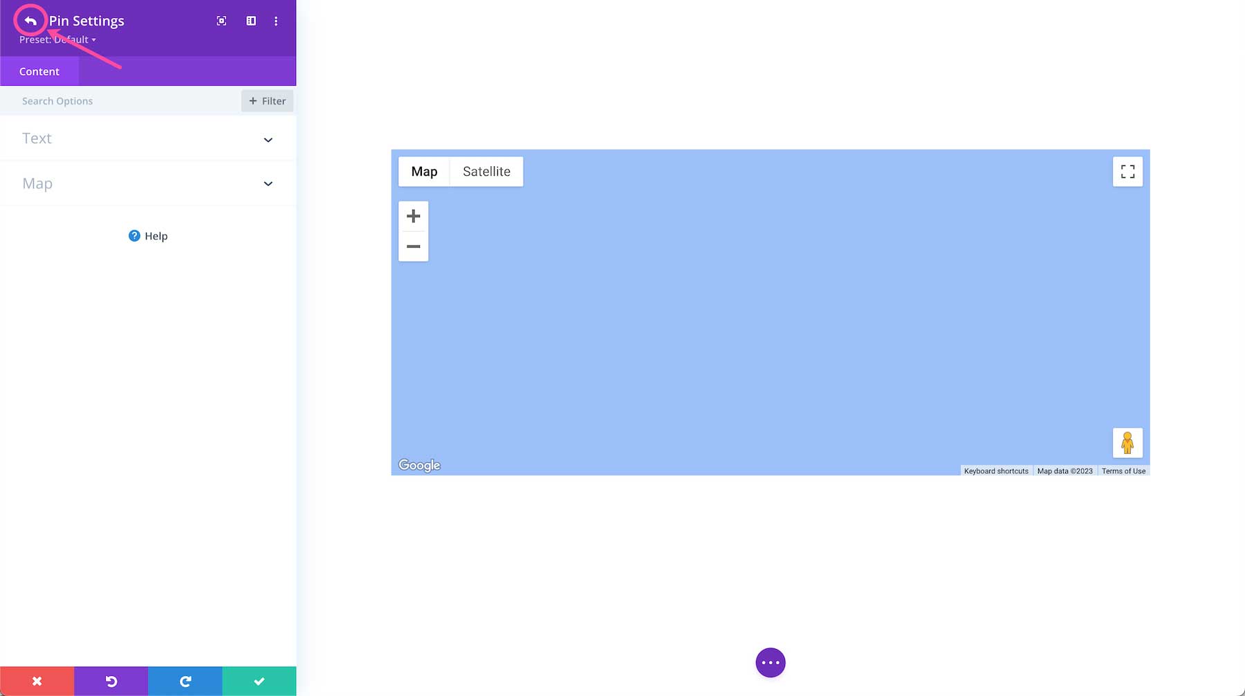
Now that we’re done customizing the individual pin settings, let’s return to the main module settings by clicking the white back arrow at the top left of the module.
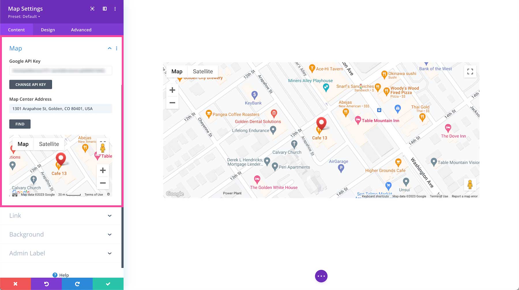
Map
This is where you add your Google API key and choose the focal point address for the map to center on.
- Google API Key – To add your Google API Key, click the button “Change API Key” which will open up a tab to the Divi Theme Options where you can paste the API key in the Google API Key field.
- Map Center Address – Put the address you want to be the center focal point for the map here and then clicked “Find” to orient the map to that address.
- Map – This is a preview of the map.
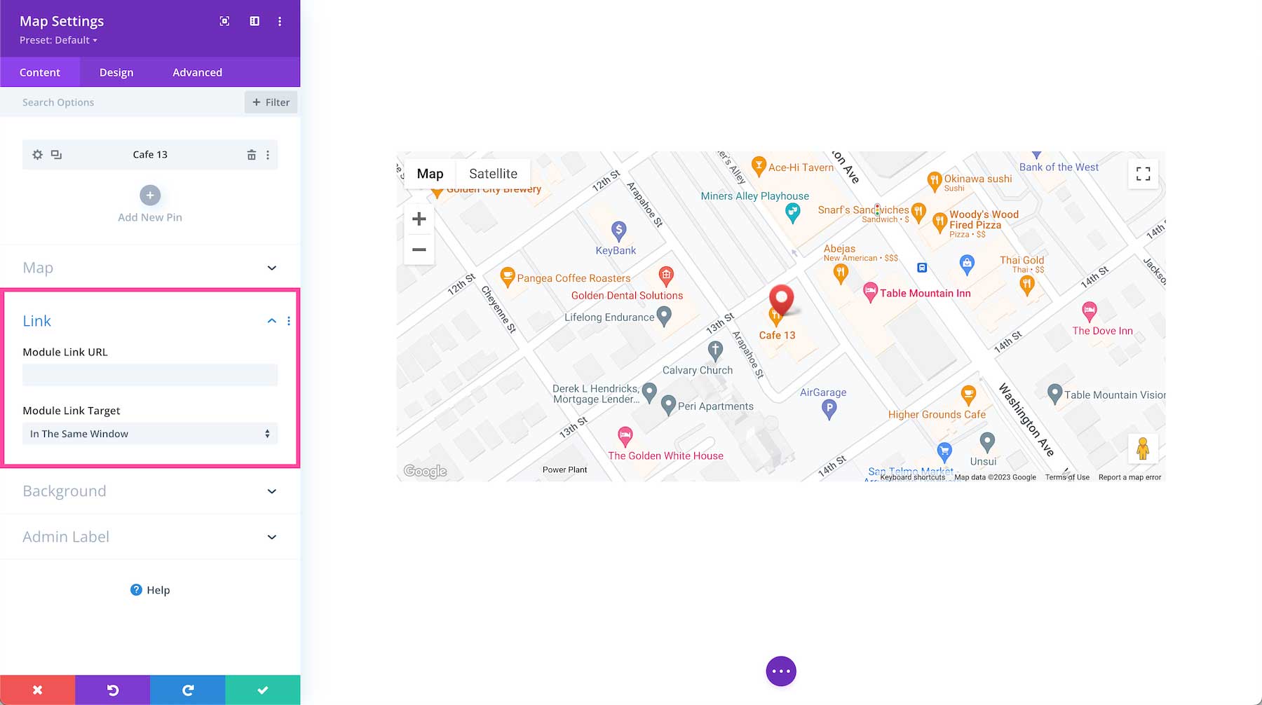
Link
If you would like to apply a clickable link to the entire module, you can do so here.
- Module Link URL – Paste the URL of the link you would like to apply to this module here. This makes the entire module clickable and when clicked it will direct visitors to the URL pasted here.
- Module Link Target – Defining a link target determines whether the link, when clicked, opens in a new tab or in the same window. Choose “In The Same Window” if you want the link to open in the same window and click “In The New Tab” if you would like that link to open in a new tab. By default, “In The Same Window” is selected.
Background
This is where you can add a background color, gradient, image, video, pattern, or mask to this module.
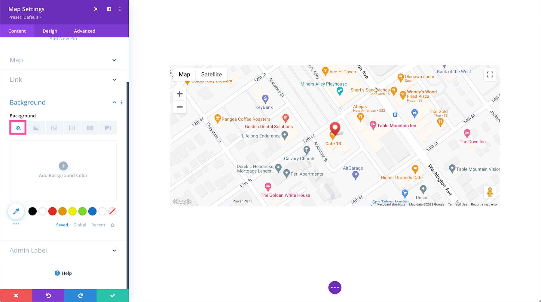
How to Add a Background Color
To add a background color to the entire module, click the first tab, the paint bucket. Click “Add Background Color” and choose from your site’s color palette or use the eyedropper icon to find a new color. Note, since the Divi Map Module fills up 100% of the module’s space, you won’t be able to see any backgrounds unless there is an opacity applied to the map or the sizing is adjusted.
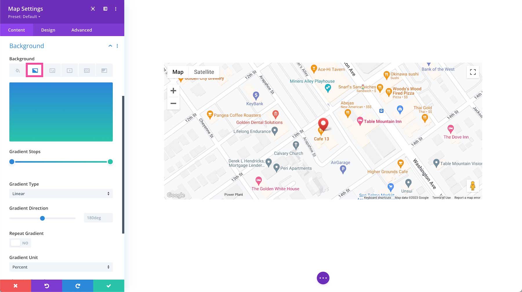
How to Add a Background Gradient
To add a background gradient, click the second tab, the gradient tab, then click “Add Background Gradient.”
To change the gradient colors, click on the gradient stops and select a color from your site’s color palette or use the eyedropper icon to choose a new color. Gradient stops allow you to add more colors to the gradient. Simply click anywhere on the range slider to add a new stop.
- Gradient Type – You can change the gradient type by clicking the dropdown menu and selecting the gradient type you’d like.
- Gradient Direction – You can change the direction of the gradient by dragging the range slider or typing in a numerical value.
- Repeat Gradient – Toggle this option to “yes” if you’d like the gradient to repeat.
- Gradient Unit – The gradient unit changes how the gradient stop points are calculated. Select the dropdown to change the unit.
- Place Gradient Above Background Image – If you have a background image applied, then you can choose to place the gradient above the background image by toggling this option to “yes”.
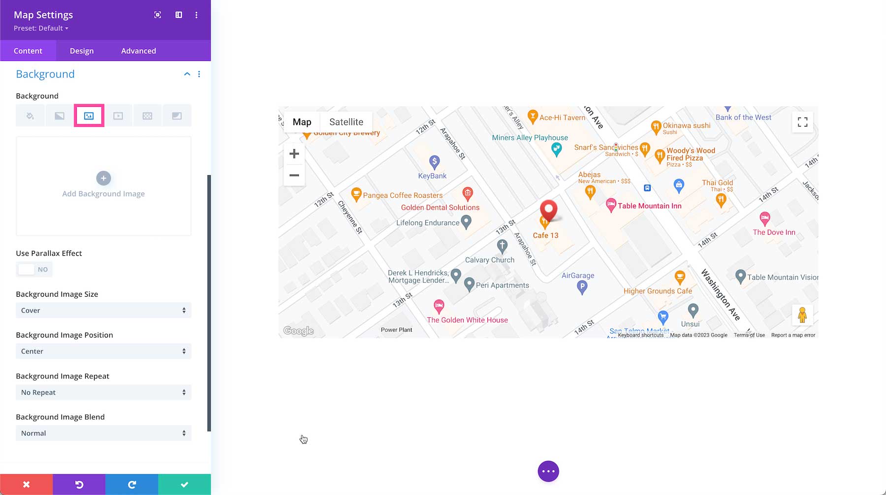
How to Add a Background Image
To add a background image, click the third tab, the image tab. Then, click the gray “+” sign to bring up the media library where you can select an already uploaded photo from your library or upload a new one.
- Use Parallax Effect – To apply a parallax effect to the image (where the image scrolls faster than the foreground content, giving the illusion of a 3D effect) then toggle this option to “on.” By default, this setting is set to “off.”
- Background Image Size – Choose the size of your background image by selecting a size from the dropdown menu.
- Background Image Position – Choose the position of the background image by selecting a position from the dropdown menu.
- Background Image Repeat – Choose if and how the background image repeats by selecting an option from the dropdown menu.
- Background Image Blend – Choose how the background blends with other layers in the module by selecting an option from the dropdown menu.
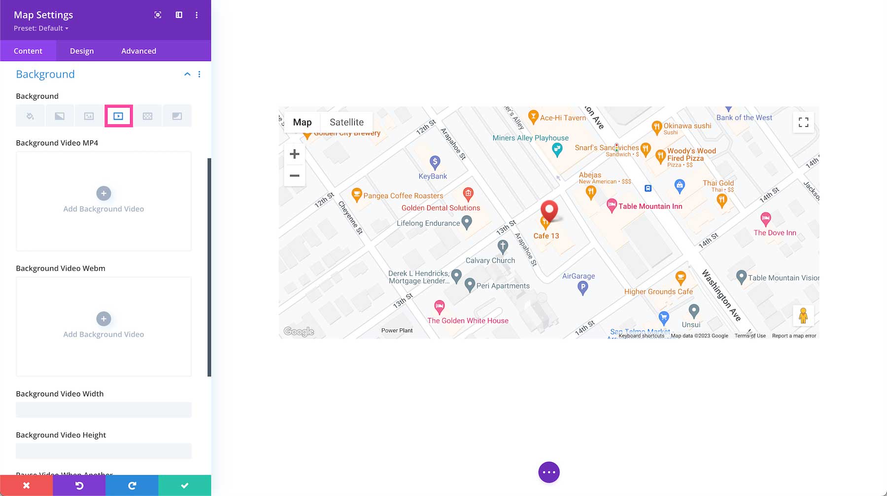
How To Add a Background Video
To add a background video, click the fourth tab, the video tab. Click the gray “+” sign to bring up the media library, where you can select an already uploaded photo from your library or upload a new one.
- Mp4 vs Webm. – We recommend uploading both an mp4 version and webm version of the video because not all browsers support webm video formats. Uploading both file types ensure your video will play on all devices and browsers.
- Background Video Width – Set the width of the video by typing in a numerical value.
- Background Video Height – Se the height of the video by typing in a numerical value.
- Pause Video When Another Video Plays – If you’d like the background video to pause when another video is playing, toggle that option to “yes.” By default, the video will pause when not in view. If you’d like the video to continue playing, toggle this option to “no.”
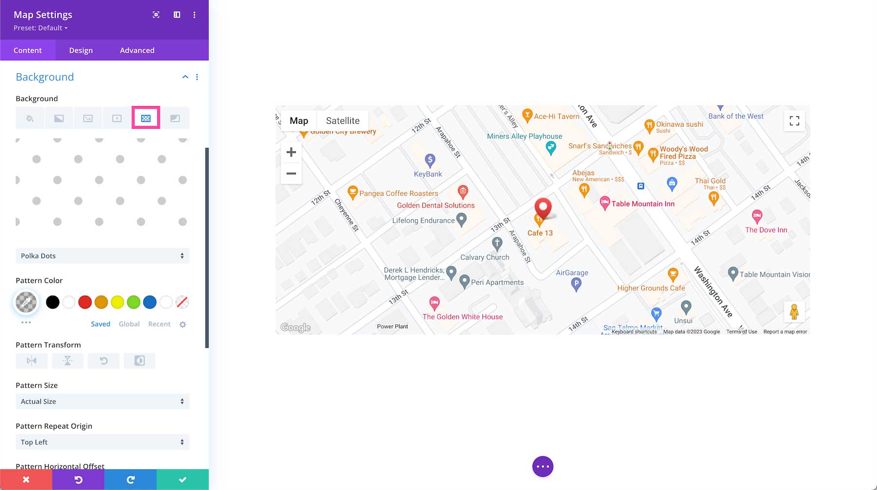
How to Add a Background Pattern
To add a background pattern, click the 5th tab, the pattern tab, then click “add background pattern.” Choose the pattern type you want from the dropdown.
- Pattern Color – Select the pattern color from your site’s color palette or use the eyedropper icon to find a new color.
- Pattern Transform – This is where you can transform the pattern horizontally, vertically, rotate it, or invert it.
- Pattern Size – Pattern size is where you can select the pattern size: the actual size, cover, fit, stretch to fill or custom size. If you select custom size, the following options will appear: pattern width and pattern height. Drag the range slider or type in a numerical value to define those options.
- Pattern Repeat Origin – Here you can select the origin from which the pattern repeats.
- Pattern Horizontal and Vertical Offset – You can also adjust the horizontal and vertical offsets for the pattern.
- Pattern Repeat – Here you can choose how the pattern repeats – horizontally, vertically, and more.
- Pattern Blend Mode – This defines how the pattern layer interacts with the layers beneath it. Select from one of the 16 blend modes available from the dropdown.
How to Add a Background Mask
To add a background mask, click the 6th tab, the mask tab and then click “add background mask”. Select the mask type you want via the dropdown menu.
- Mask Color – Choose the mask color from your site’s color palette or use the eyedropper icon to find a new color.
- Mask Transform – Here you can transform the mask horizontally, vertically, rotate it, or invert it.
- Mask Aspect Ration – Here you can set the aspect ratio of the mask. The aspect ratio of an image is the ratio of its width to its height.
- Mask Size – This is where you can select the mask size: the actual size, cover, fit, stretch to fill or custom size. If you select custom size, the following options will appear: mask width and mask height. Drag the range slider or type in a numerical value to define those options.
- Mask Blend Mode – This defines how the mask layer interacts with the layers beneath it. Select from one of the 16 blend modes available from the dropdown.

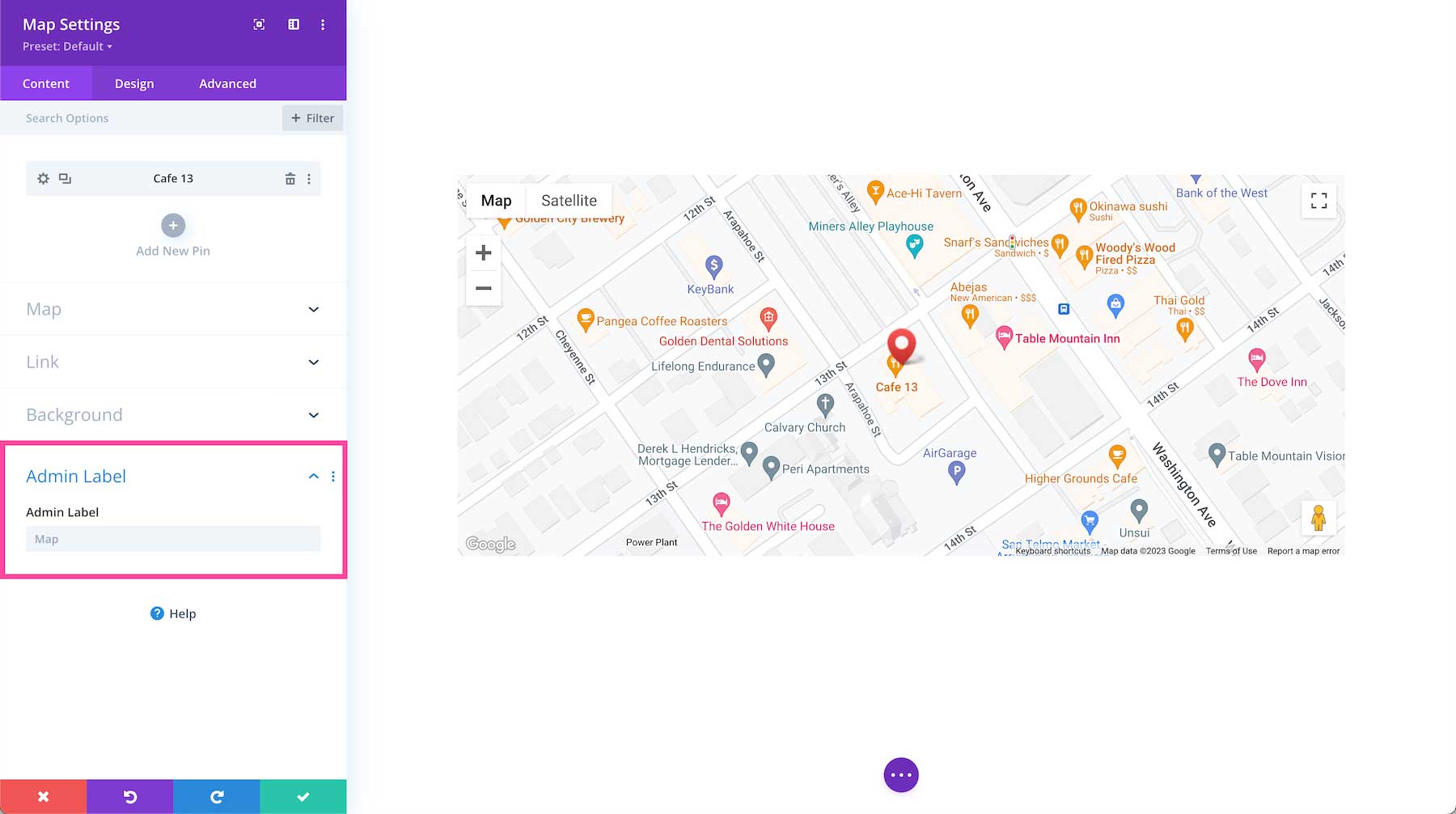
Admin Label
The Admin Label is where you can give the module a name only visible to you in order to assist in keeping things organized and easy to understand on the back end. By default, the admin label will be the name of the module. You can change the text of the admin label to reflect what you’d like.
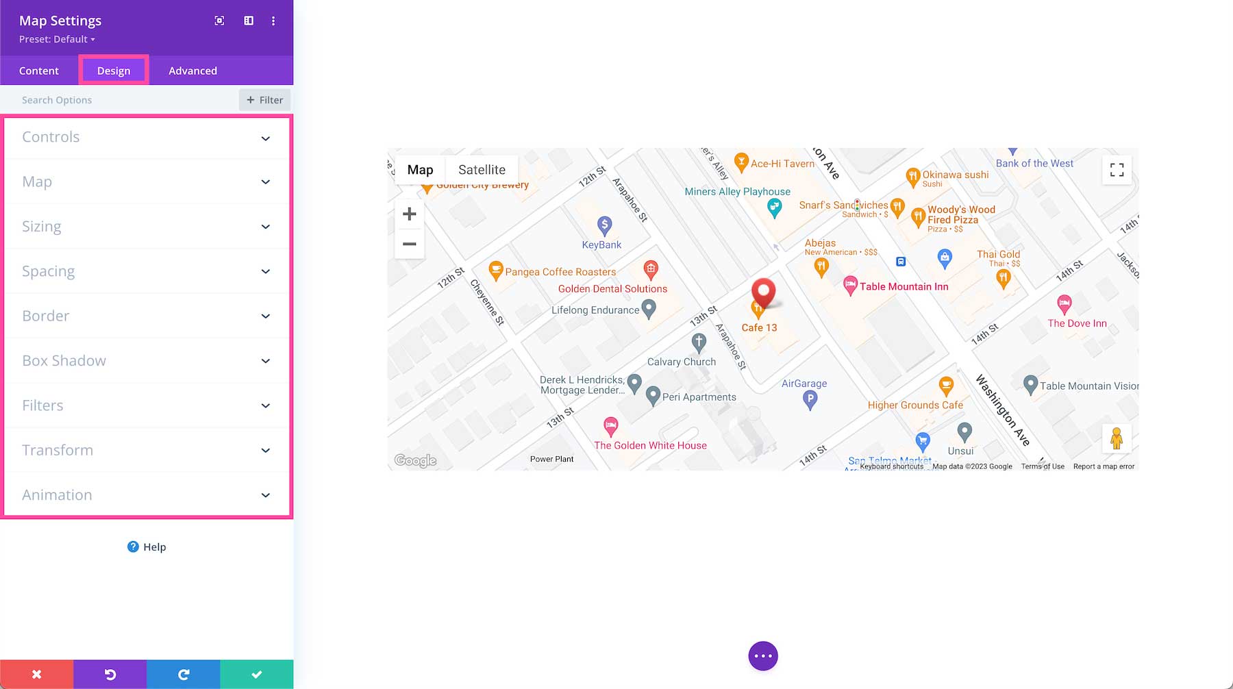
Design
Inside this tab, you’ll find all the design styles and settings for the Divi Map module.
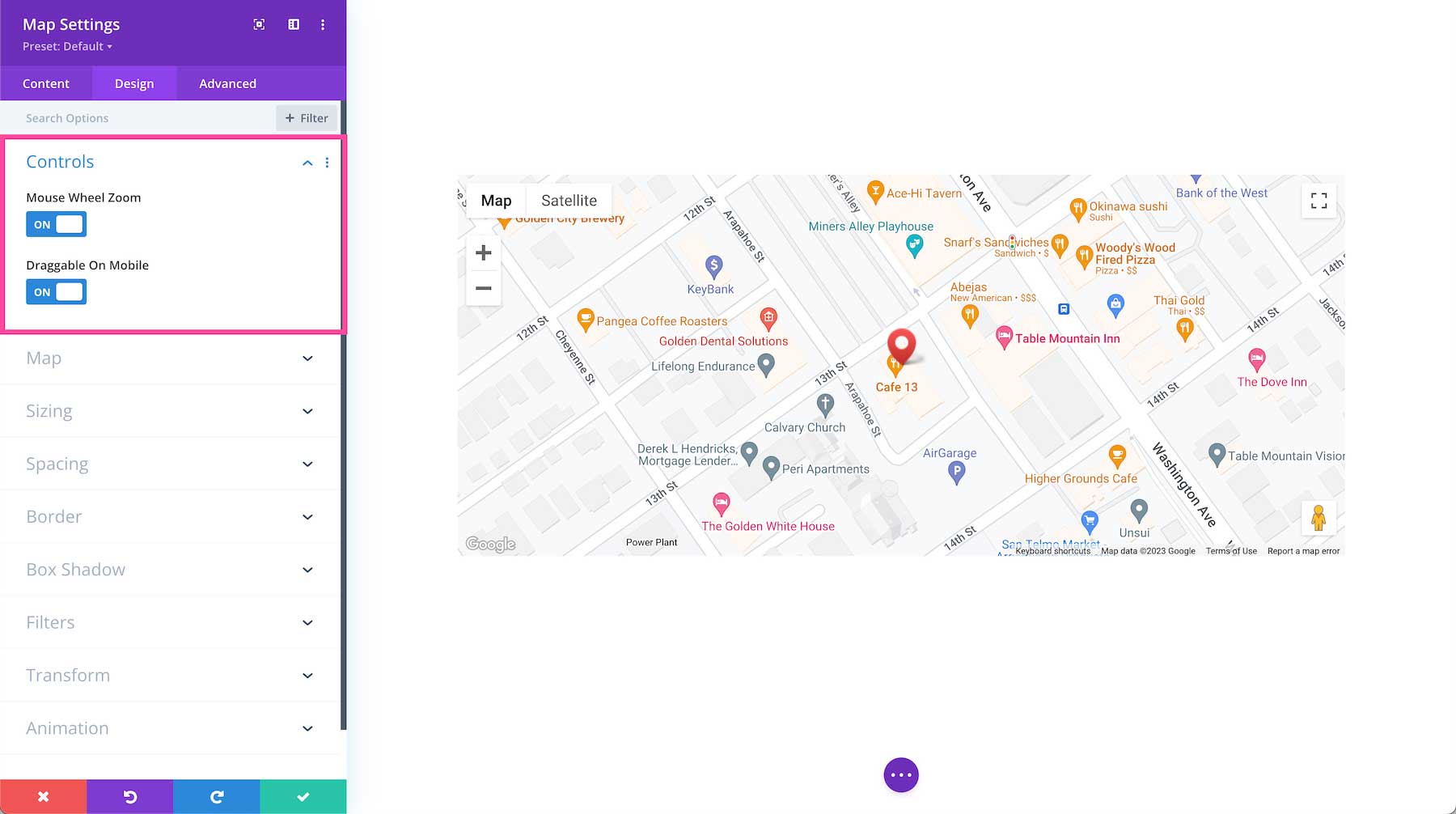
Controls
- Mouse Wheel Zoom – Toggle this option to “yes” if you want the map’s zoom level to be controlled by the mouse wheel or toggle to “no” to disable this mouse wheel zoom functionality.
- Draggable On Mobile – Toggle this option to “yes” or “no” if you want the map to be draggable on mobile or not draggable on mobile.
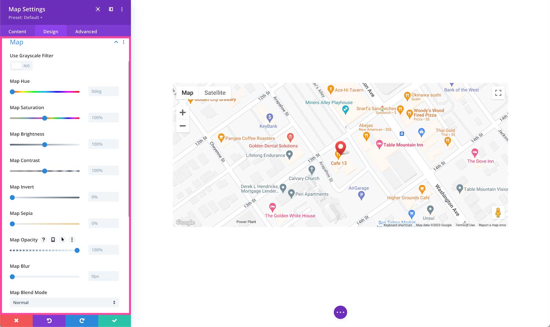
Map
This is where you can adjust the look and feel of the map by adjusting hue, saturation, brightness, contrast, color tones (inverted colors or sepia), opacity, and blur of this map. Applying the grayscale filter will change the map colors to black and white while leaving the pin red. Blend Mode refers to how the module blends with the layers beneath it. By default, “normal” will be selected.
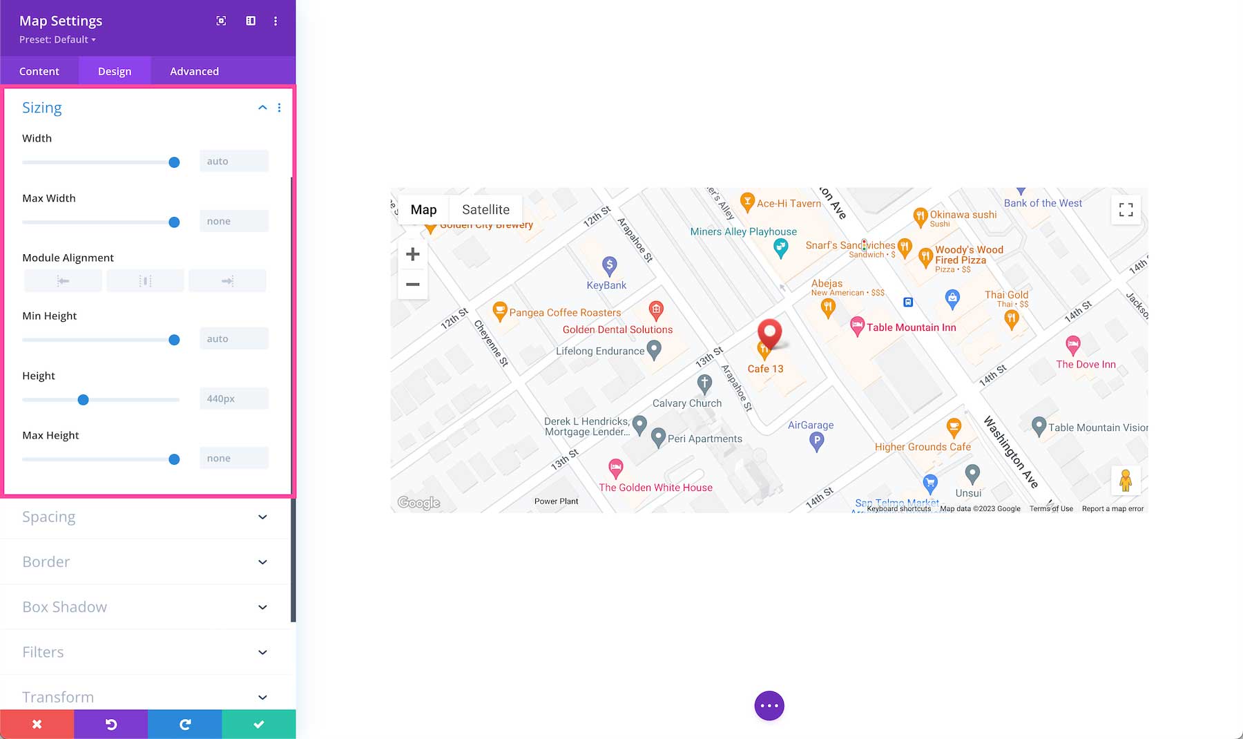
Sizing
Define the sizing (width and height) of the module. You can set a max-width and a max-height and a min-height. Choose the module alignment (left, center, or right) by clicking the arrows. By default, modules align center.
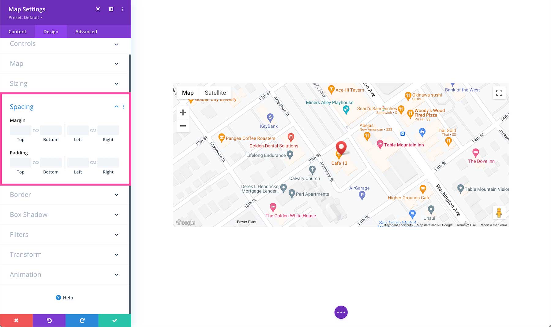
Spacing
Add margins or spacing to this module by typing in numerical values. Margins add space outside the module element, and padding adds space inside the module element. To lock in ratios and keep the values the same, you can click the chainlink icon between the values you want to always be identical (ex: top and bottom).
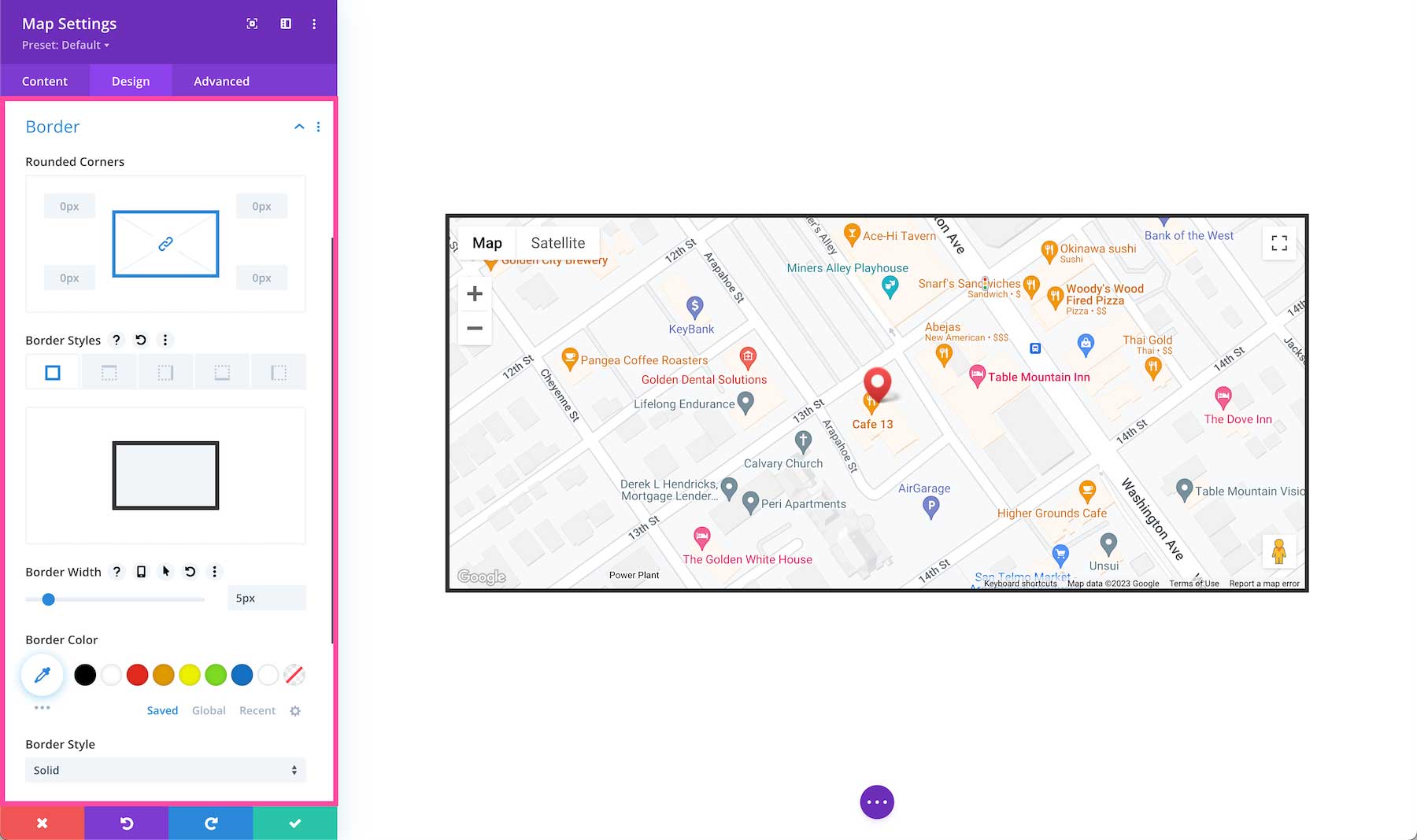
Border
Add a border to the module. You can add a complete border or add a border to only one side of the module. Adjust the width via the range slider and select a color. Choose a border style by clicking the dropdown.
- Rounded Corners – If you would like to have round border corners, type in a numerical value. The higher the number, the rounder the corners will be. The corner values are automatically linked (as seen by the highlighted blue chainlink in the middle) however if you’d like to have different values for each corner, simply click the blue chainlink to unlink the values. If the values are automatically linked that means they will always have the same value and update automatically if one value is changed.
- Border Styles – Here you can add a border to all sides of the module or to individual sides (top, right, bottom, and left).
- Border Width – This is where you set the width of the border. For a thicker border, increase the number. The border width must be at least 1px in order to show.
- Border Color – This is where you can pick the color of the border. You can select a color from your default site color palette already displayed, or click on the eyedropper icon to find a new color.
- Border Style – Here you can select what style of border you’d like: solid, dashed, dotted, double, groove, ridge, inset, outset, or none.
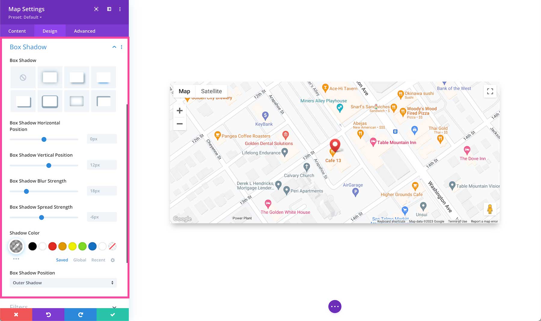
Box Shadow
Adds a drop shadow to the module. Once a shadow style is clicked, you can customize the position of the drop shadow (horizontal and vertical), the strength of the blur, and the spread strength by adjusting the range slider or inputting numerical values. Select the drop shadow’s color from your site’s color palette or click the eyedropper to find a new color. Choose the box-shadow position to be inside the container or outside the container via the dropdown.
Filters
Adjust the hue, saturation, brightness, contrast, color tones (inverted colors or sepia), opacity, and blur of this module. The Blend Mode refers to how the module blends with the layers beneath it. By default, “normal” will be selected.

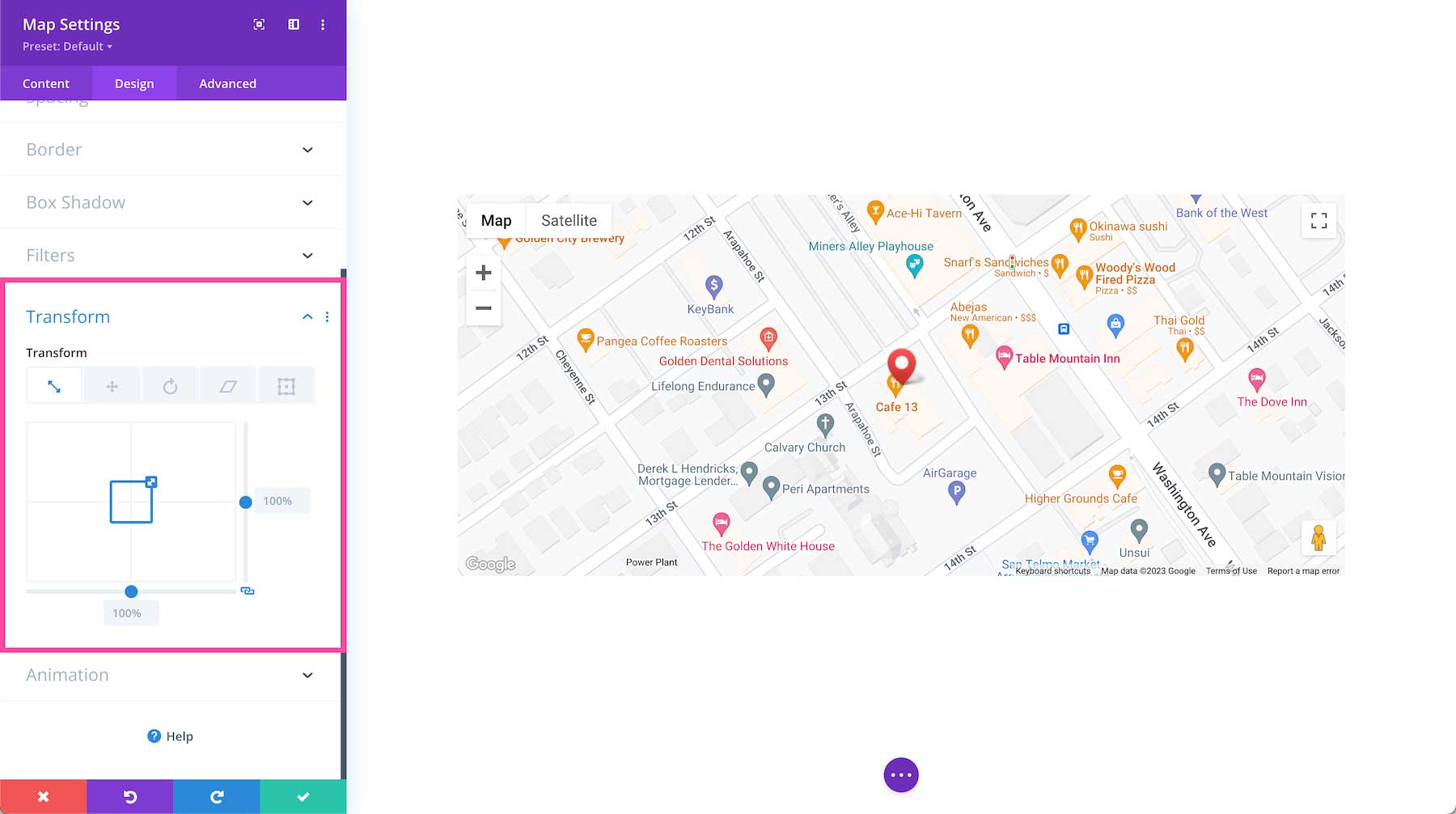
Transform
Scale, translate, rotate, skew, and set origin points for this module. Tab through to access each feature. Configure each feature by inputting numerical values or dragging and expanding the box or circle. You can lock in these values to always be identical by clicking the chain link icon at the bottom right.
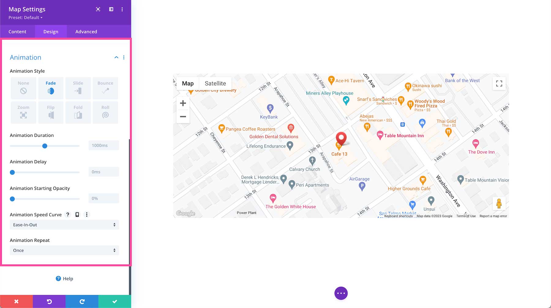
Animation
Here you can apply animation to the module. Once you choose an option you can also adjust the duration, delay, opacity, and speed of the animation and whether you want it to continually repeat or just happen once.
Advanced
This is where the advanced customization settings are for the Divi Map module.
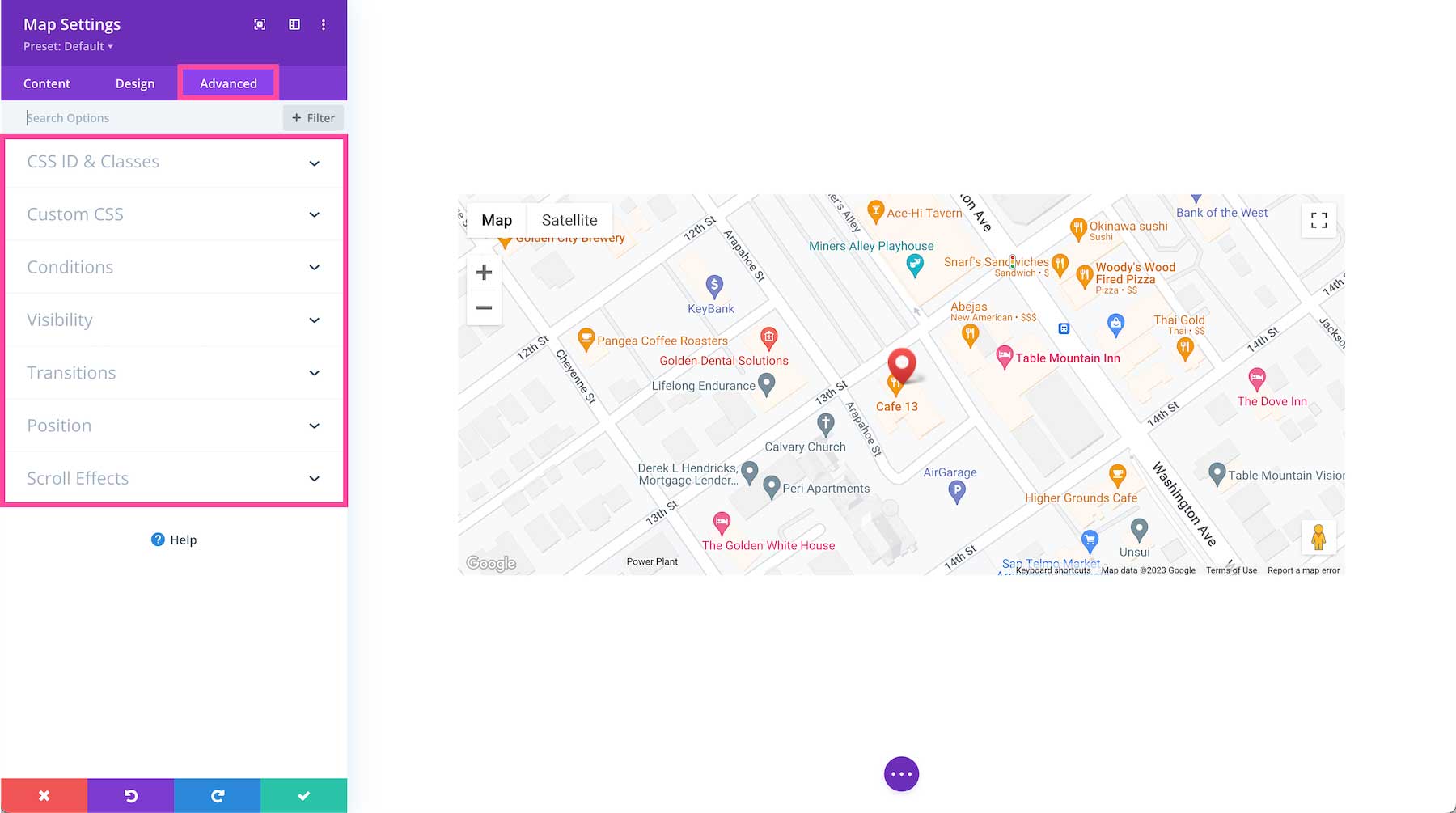
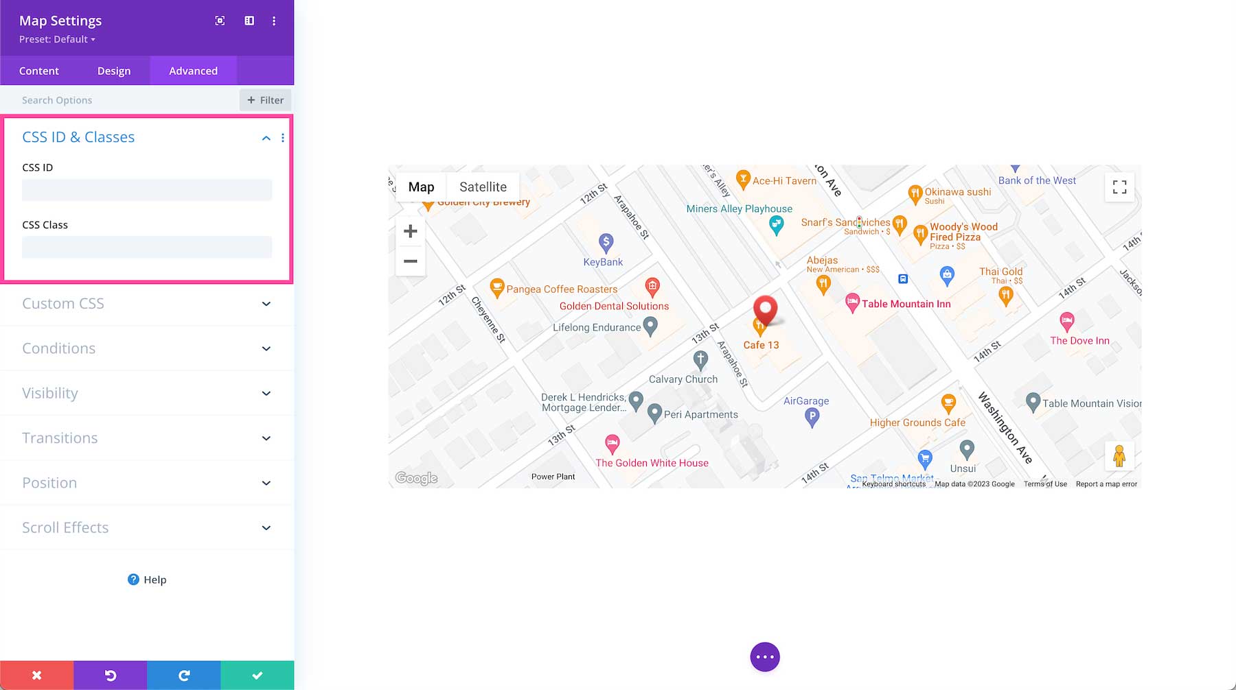
CSS ID & Classes
This is where you can assign a specific CSS ID or class to this module. This is helpful when you’d like to apply custom CSS to a module by using your child theme’s stylesheet.
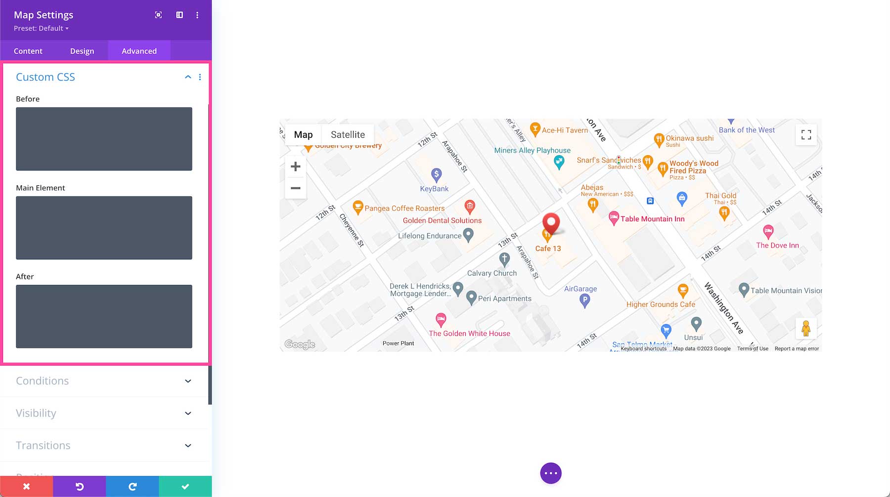
Custom CSS
You can also apply custom CSS to this module by pasting it in this tab. When you click on the Custom CSS tab, you’ll see individual sections where you can add CSS to specific elements in the module.
Conditions
This tab allows you to choose when to display this module based on a set of conditions, like what time a user is visiting the page if they’ve already purchased from your company before, what browser they are using, what operating system they’re using, and more. You can add one condition or multiple conditions.
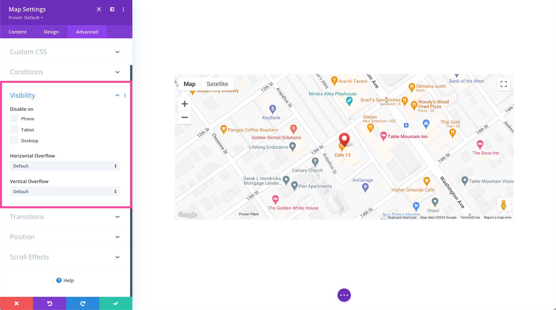
Visibility
This defines the visibility of the module. You can choose to disable it (hide it from view) when the display window is a Phone, Tablet, or Desktop by clicking the corresponding checkbox. You can also determine how you want overflow content to be displayed if the content overflows the element that it is in. You can choose visible, scroll, hidden, or auto for both horizontal and vertical content. By default, “auto” is selected.
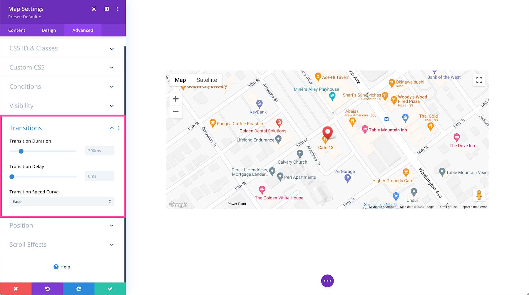
Transitions
This controls the transition duration of the hover animation as well as the delay, and speed curve.
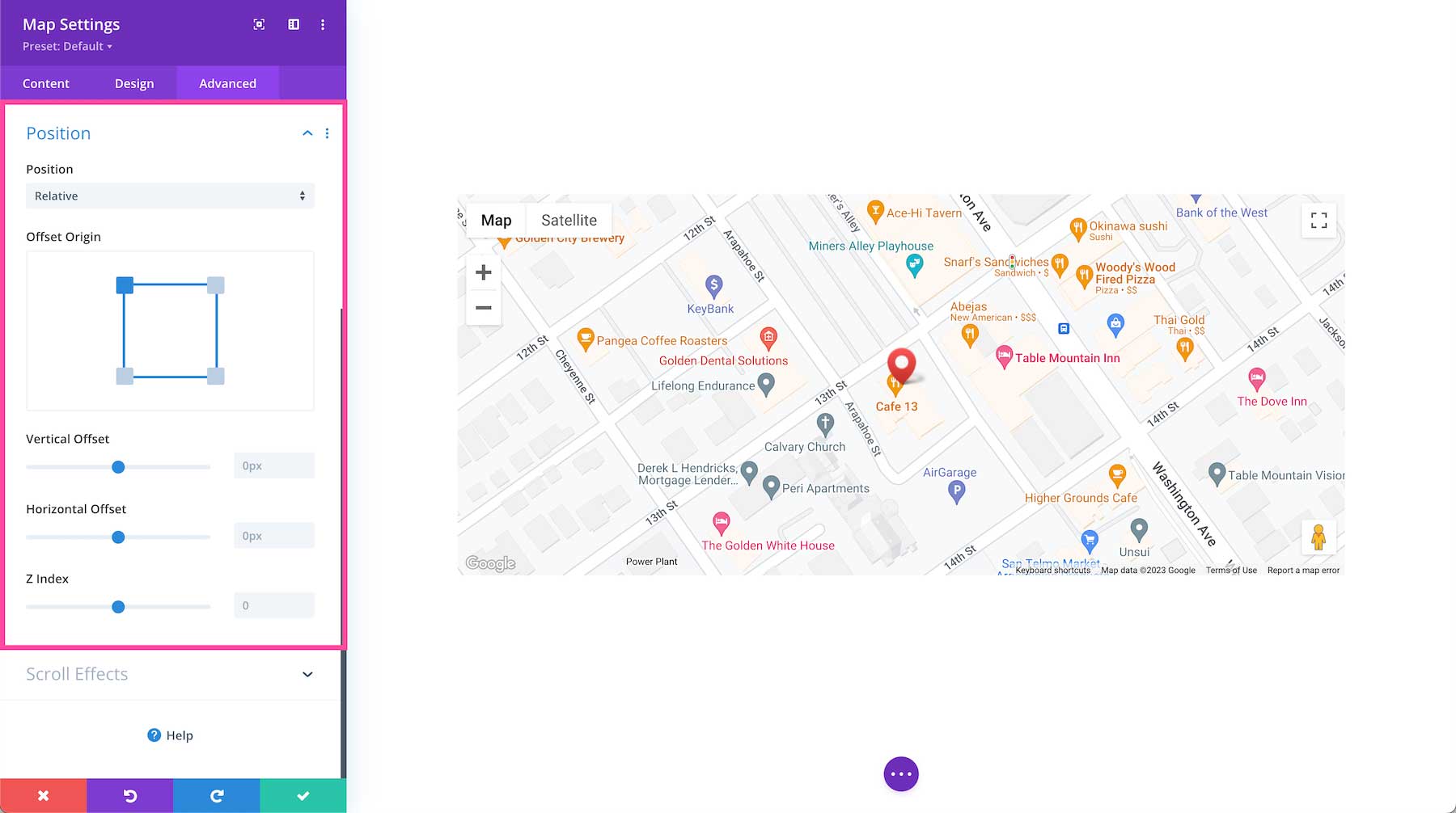
Position
This defines the position of the module as well as the offset origin, vertical and horizontal offsets, and the z-index of the module. The available positions are default (which is automatically selected), relative, absolute, and fixed. Defining the z-index allows you to specify the stack order of elements. Elements with a higher z-index number overlap elements with a lower z-index.
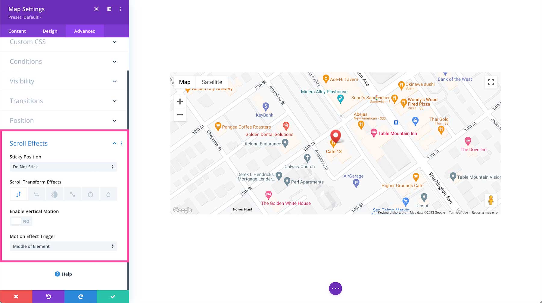
Scroll Effects
This defines how the module behaves upon scroll. You can make the module sticky (to top, bottom, or top and bottom), and choose if the module transforms upon scroll. You can also enable vertical motion on this module which allows you to adjust the speed at which this element scrolls (making it faster or slower) without affecting the surrounding elements. The Motion Trigger Effect allows you to choose when the scroll effect you just applied is triggered: when the top of the element is in view, the middle, or the bottom.
Divi Map Module Resources
- How to Add a Button to Your Divi Map Location’s Info Box
- How to Add a Fixed Map Toggle to Your Divi Page Template