The Divi Woo Related Products Module
How to add, configure and customize the Divi Woo related products module.
The Divi Woo Related Products Module fully integrates with WooCommerce capabilities and displays related products to the product you’re viewing. It’s great to include it on product pages to help increase sales and conversions. The Divi Woo Related Products module is one of the building block modules for creating customized eCommerce pages in the Theme Builder.
Install Divi and WooCommerce
Before we can use the Divi Woo Related Products module you’ll need to have both Divi and WooCommerce installed on your website. Once you have the Divi theme installed and activated, we can begin using the features and functionalities of Divi.
For additional information on the Divi Builder itself, its interface, usage philosophy and best practices, please refer to our Getting Started With The Divi Builder guide.
How to Add the Divi Woo Related Products Module To Your Page
In this doc, we’ll be adding the Divi Woo Related Products Module to the Cart Page. This is a great way to suggest related products to customers as they are viewing their cart.
The Cart Page is built as a Page Template within the Divi Theme Builder. The Divi Theme Builder allows us to create and design eCommerce page templates easily. To learn more about the Divi Theme Builder click here.
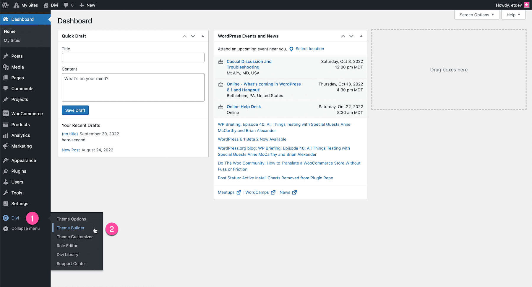
Navigate To The Divi Theme Builder
Navigate to the WordPress Dashboard and go to Divi > Theme Builder on the left sidebar. This takes you to the Theme Builder dashboard where all of the custom templates for your website live.
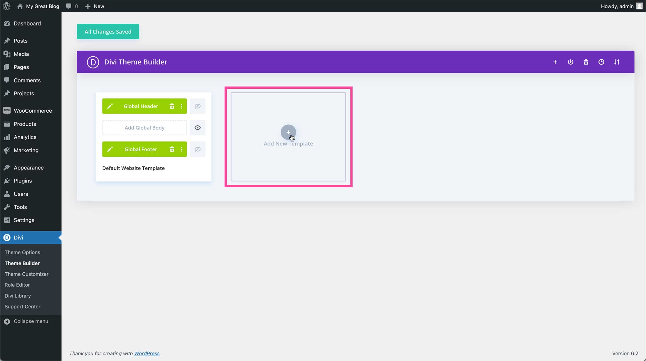
Add a New Cart Page Template
First, we’ll need to create the Cart Page Template. To do so click “Add New Template”.
Once you have selected “Create Template” you’ll have two options: Build New Template or Add From Library.
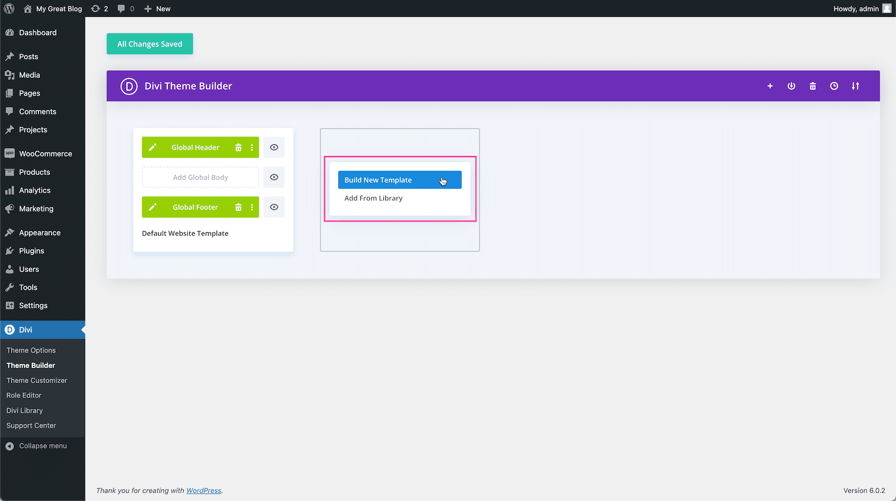
Option 1: Build New Template
If you’d like to start designing from scratch, select “Build New Template”. When selected, this will load a blank page template with the global header and global footer applied. If you don’t want to use the global header or footer you can disable or delete them.
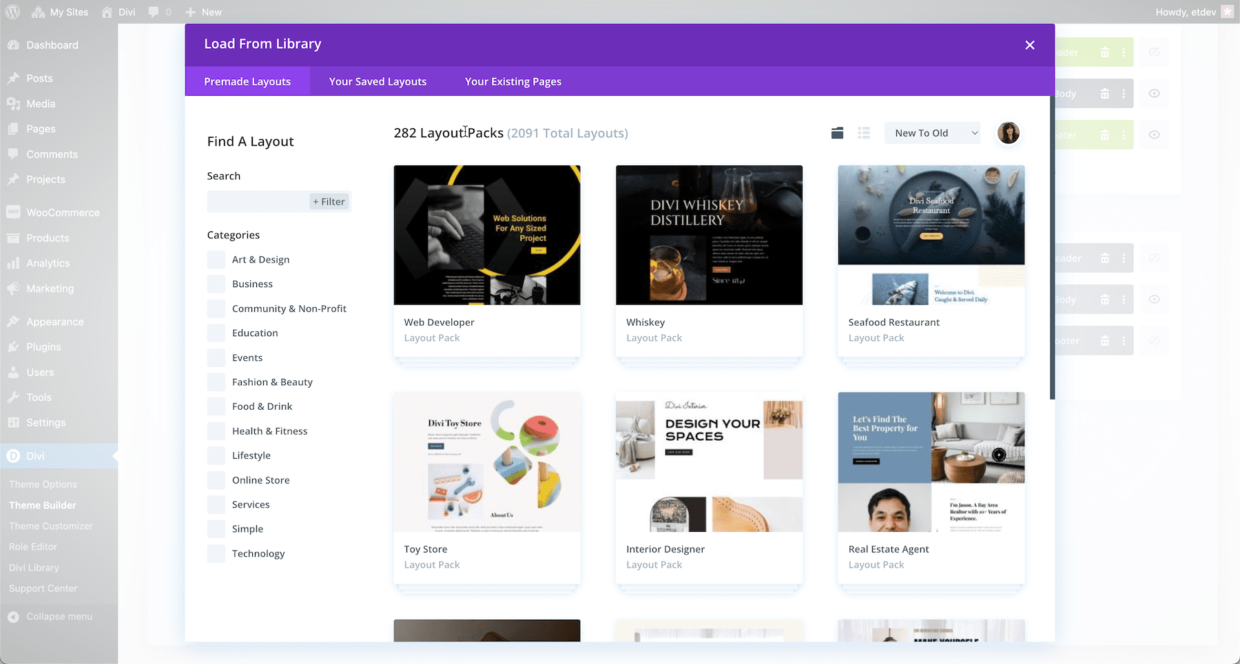
Option 2: Add From Library
To import a premade layout pack click “Add From Library”. This will load the Divi Library where you can browse premade layout packs. Learn how to import premade layout packs from the Divi library here.
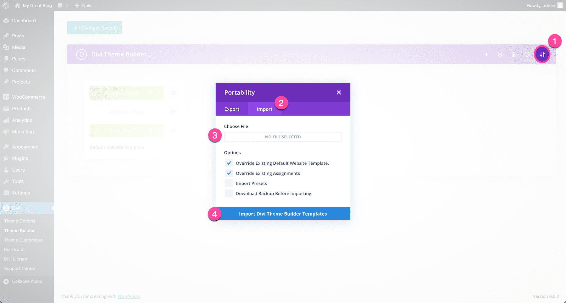
Import via Portability
There is one other way to import a pre-made design into the Divi Theme Builder. That is by importing a JSON file using Divi’s portability feature. Learn how to do this here.
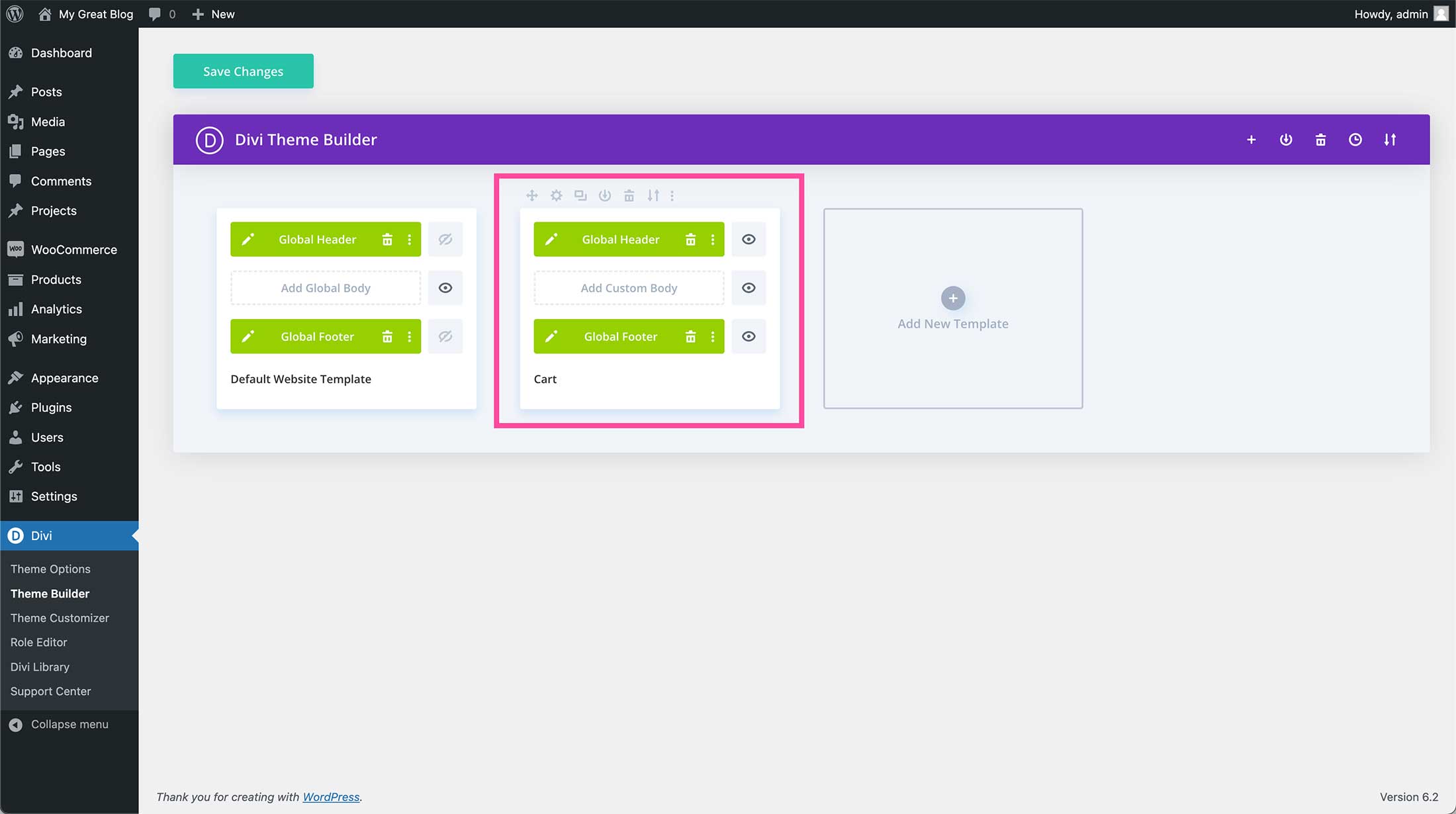
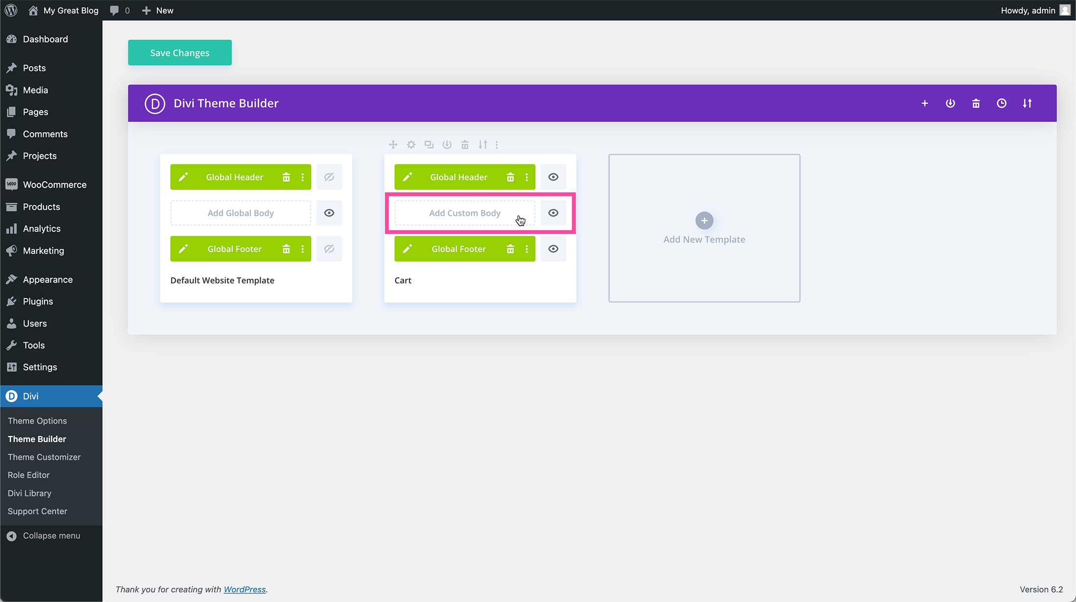
Add Custom Body
Now that the default template is loaded, click “Add Custom Body”.
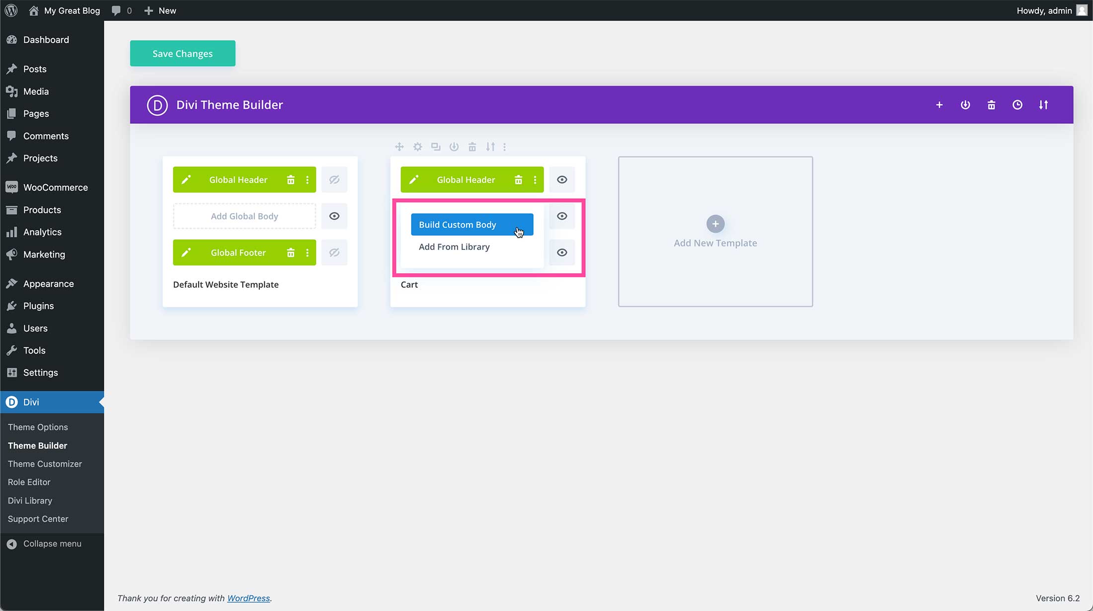
Then click “Build Custom Body”.
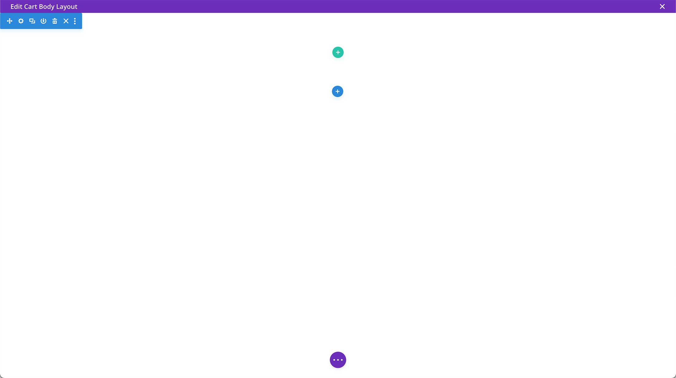
Now your page should look like this: a blank page template.
How To Add The Divi Woo Related Products Module
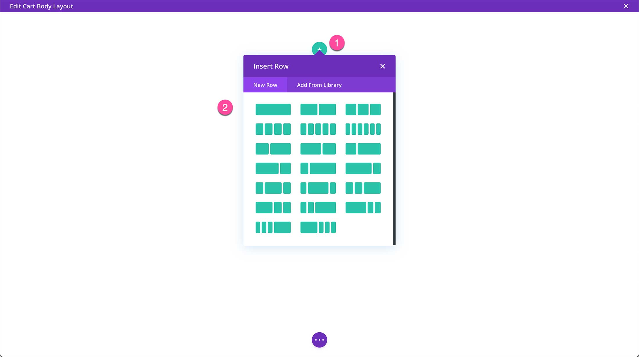
To add the Divi Woo Related Products module your page needs a section and a row first. New pages and page templates are loaded with a standard section already populated on the page. To add a row click the green “+” button and select the column structure you want.
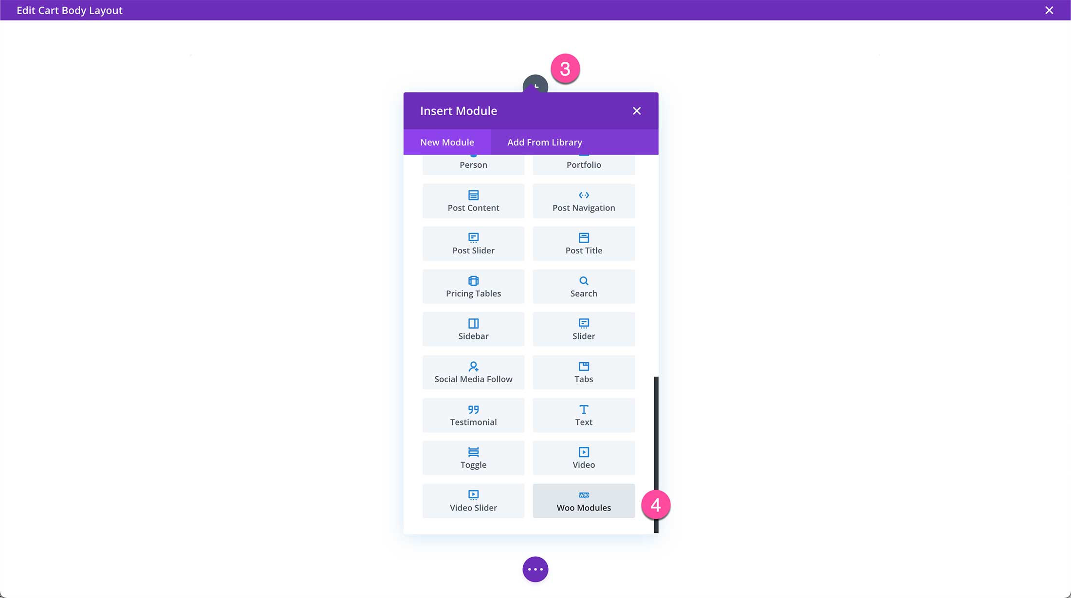
Next, click the gray “+” icon to load the module library. Click “Woo Modules” to view all the Divi Woo Modules.
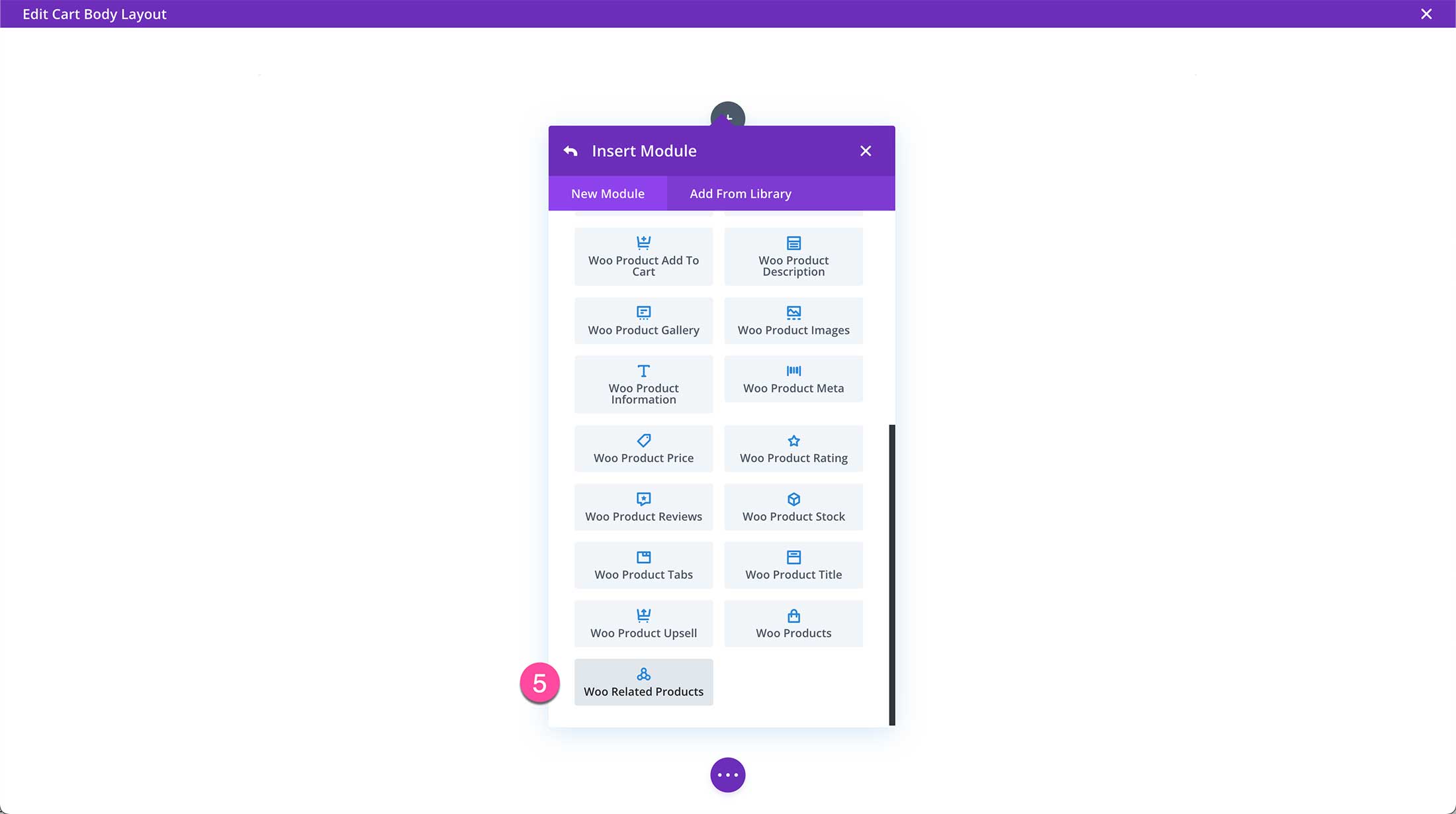
Then click “Woo Related Products” to add it to your page.
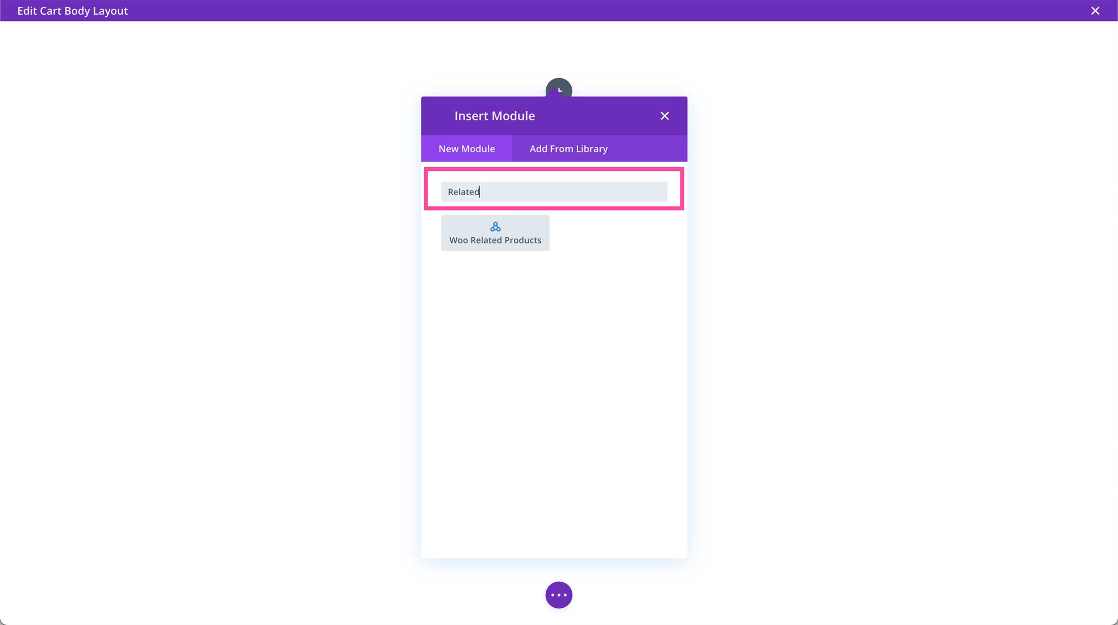
Note: The module library is also searchable! Use the search bar at the top of the module library to type in the name of the module you are looking for.
All Divi Woo Related Products Module Settings Explained
Once the module is added to the page, the module settings window automatically pops up. This is where all of the content and design styles for the module are configured. These settings are organized into three groups via the tabs at the top of the module: Content, Design, and Advanced.
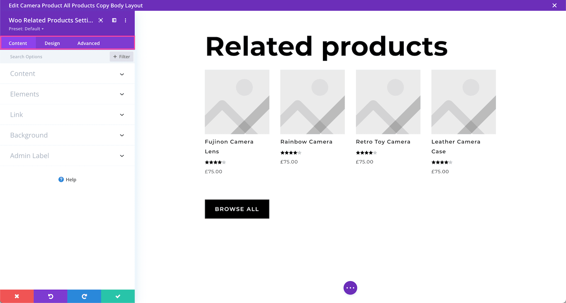
Content Settings
Inside this tab, you’ll find all of the content options available for the module.

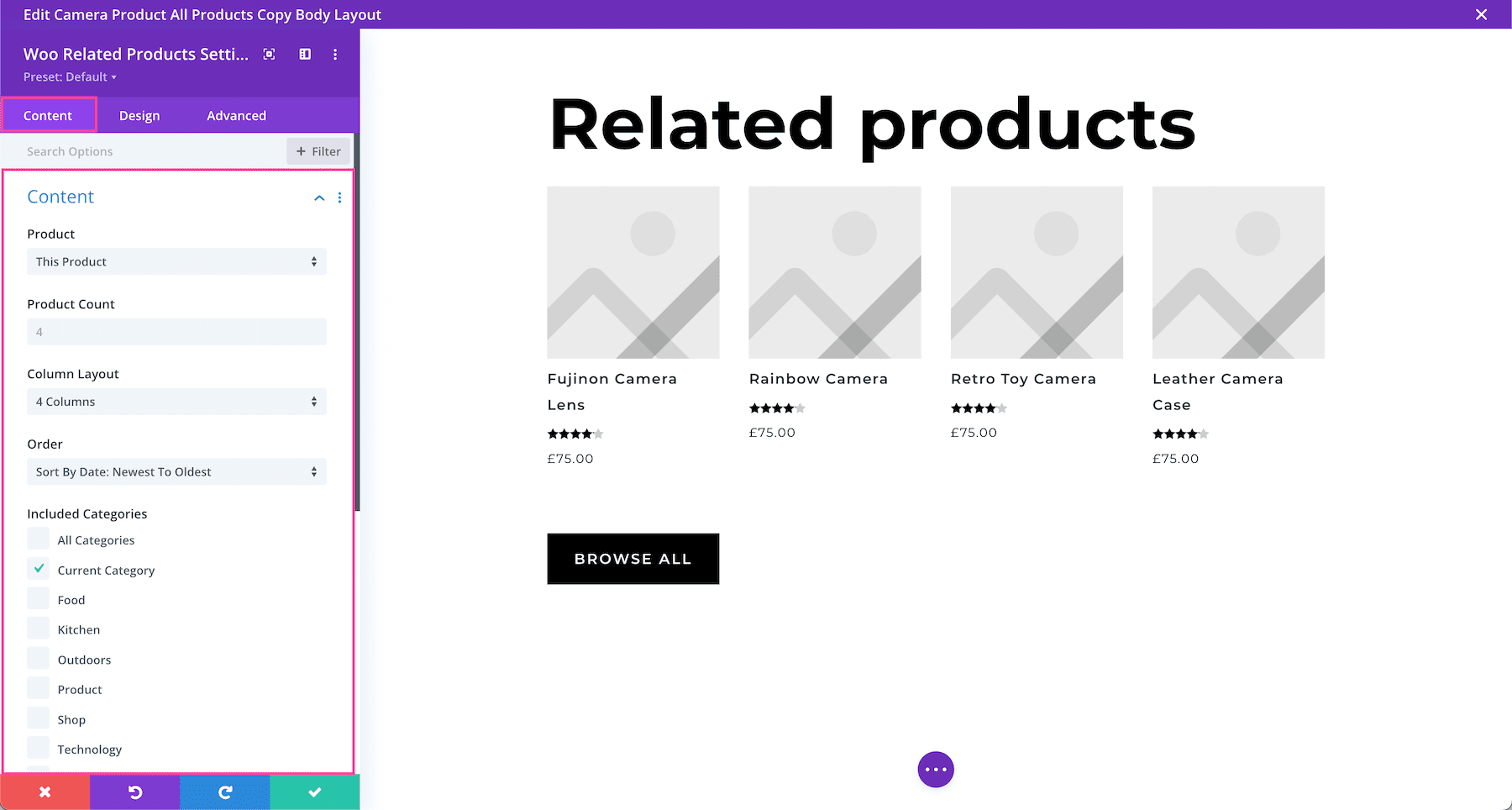
Content
The first settings group is also called Content, where you can control what type of content is displayed and how.
- Product– This setting allows you to specify which product you want the module to relate to when it shows related products. By default, it’s set to “This Product”. For our purposes, we’ll leave this setting set to “This Product” so that it displayed related products to the one visitors are viewing.
- Product Count – Define the number of products displayed at one time per results page by typing in a numerical value in the input field.
- Column Layout – Choose how many columns you want the module to display by selecting a number from the dropdown menu.
- Order – Choose how you’d like the products to be ordered from the dropdown menu: a random order, by menu order, by popularity, by oldest to newest, by newest to oldest, by price low to high, or high to low.
- Included Categories – This is where you can choose what product categories you want to be included in the display results. By default, all categories are displayed. To select a category, click its corresponding checkbox. When a category or categories are selected, only those will display. For this module, we’ll select “This Product” so that it displays related products to the product currently being viewed by the visitor.
- Product Offset Number – Here you can choose how many products you would like to skip. They won’t be displayed in the feed. For example, if you have a total of 12 products but only want products 2-12 to display, type “1” in this field.
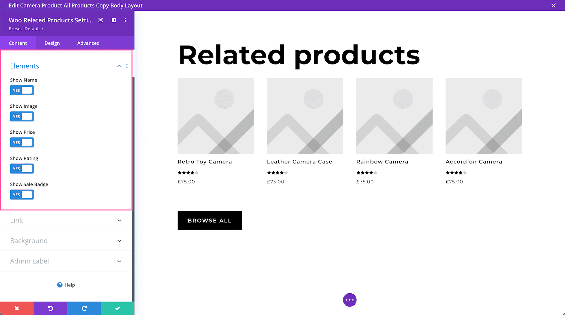
Elements
Here you can choose what product information is displayed.
- Show Name – Toggle this option to “yes” or “no” to show or hide the name of the product.
- Show Image – Toggle this option to “yes” or “no” to show or hide the product image.
- Show Price – Toggle this option to “yes” or “no” to show or hide the product price.
- Show Rating – Toggle this option to “yes” or “no” to show or hide the product rating.
- Show Sale Badge – Toggle this option to “yes” or “no” to show or hide the sale badge.
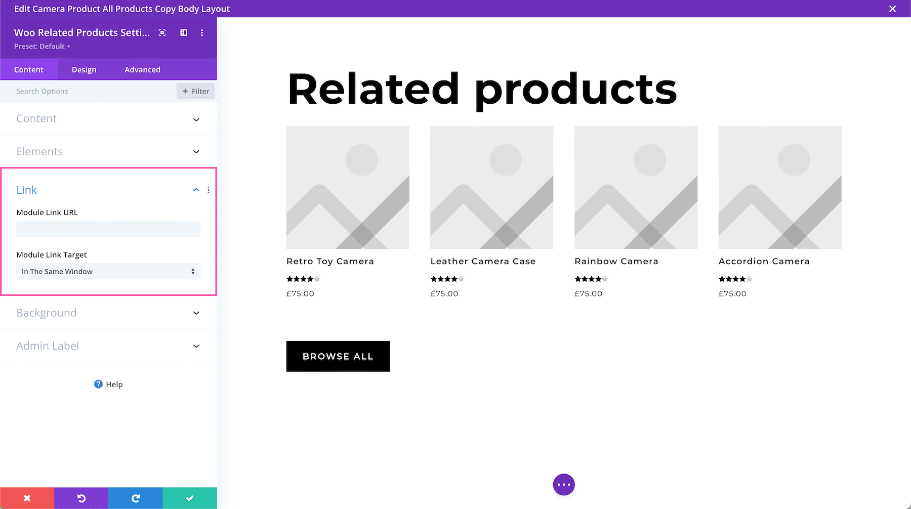
Link
If you would like to apply a clickable link to the entire module, you can do so here.
- Module Link URL – Paste the URL of the link you would like to apply to this module here. This makes the entire module clickable and when clicked it will direct visitors to the URL pasted here.
- Module Link Target – Defining a link target determines whether the link, when clicked, opens in a new tab or in the same window. Choose “In The Same Window” if you want the link to open in the same window and click “In The New Tab” if you would like that link to open in a new tab. By default, “In The Same Window” is selected.
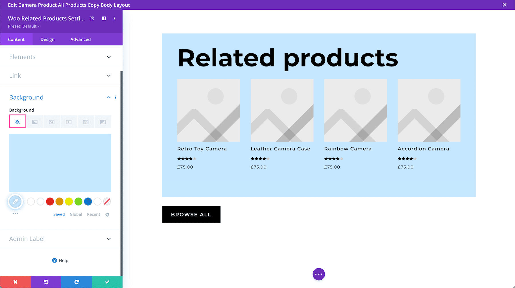
Background
This is where you can add a background color, gradient, image, video, pattern, or mask to this module.
How to Add a Background Color
To add a background color to the entire module, click the first tab, the paint bucket. Click “Add Background Color” and choose from your site’s color palette or use the eyedropper icon to find a new color.
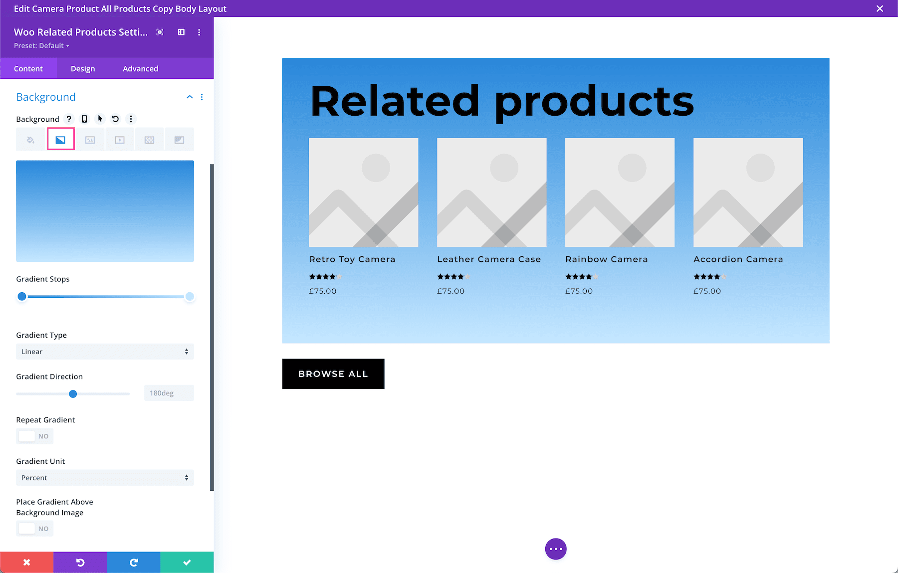
How to Add a Background Gradient
To add a background gradient, click the second tab, the gradient tab, then click “Add Background Gradient.”
To change the gradient colors, click on the gradient stops and select a color from your site’s color palette or use the eyedropper icon to choose a new color. Gradient stops allow you to add more colors to the gradient. Simply click anywhere on the range slider to add a new stop.
- Gradient Type – You can change the gradient type by clicking the dropdown menu and selecting the gradient type you’d like.
- Gradient Direction – You can change the direction of the gradient by dragging the range slider or typing in a numerical value.
- Repeat Gradient – Toggle this option to “yes” if you’d like the gradient to repeat.
- Gradient Unit – The gradient unit changes how the gradient stop points are calculated. Select the dropdown to change the unit.
- Place Gradient Above Background Image – If you have a background image applied, then you can choose to place the gradient above the background image by toggling this option to “yes”.
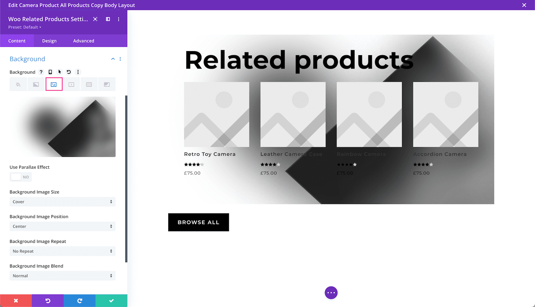
How to Add a Background Image
To add a background image, click the third tab, the image tab. Then, click the gray “+” sign to bring up the media library where you can select an already uploaded photo from your library or upload a new one.
- Use Parallax Effect – To apply a parallax effect to the image (where the image scrolls faster than the foreground content, giving the illusion of a 3D effect) then toggle this option to “on.” By default, this setting is set to “off.”
- Background Image Size – Choose the size of your background image by selecting a size from the dropdown menu.
- Background Image Position – Choose the position of the background image by selecting a position from the dropdown menu.
- Background Image Repeat – Choose if and how the background image repeats by selecting an option from the dropdown menu.
- Background Image Blend – Choose how the background blends with other layers in the module by selecting an option from the dropdown menu.
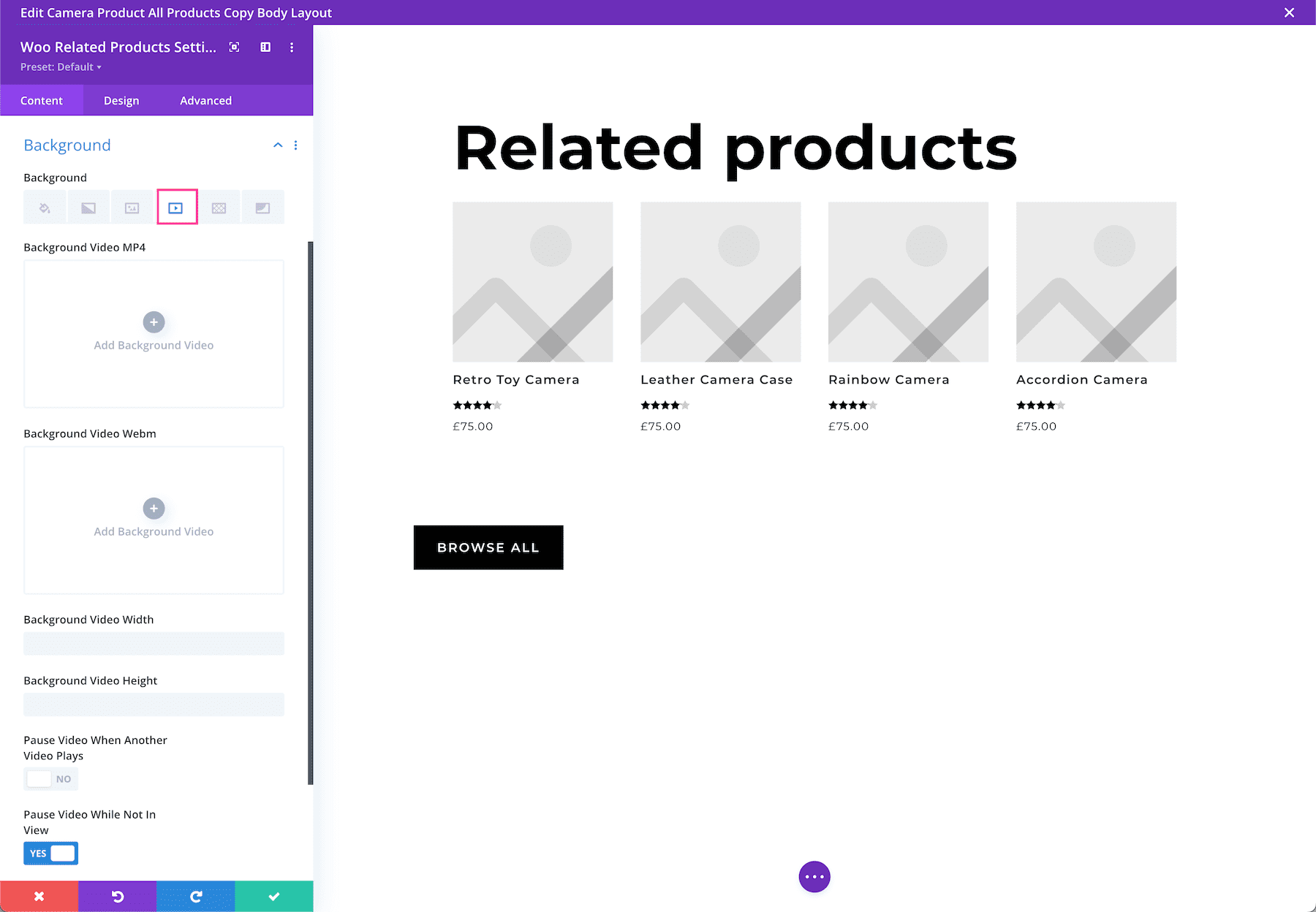
How To Add a Background Video
To add a background video, click the fourth tab, the video tab. Click the gray “+” sign to bring up the media library, where you can select an already uploaded photo from your library or upload a new one.
- Mp4 vs Webm. – We recommend uploading both an mp4 version and webm version of the video because not all browsers support webm video formats. Uploading both file types ensure your video will play on all devices and browsers.
- Background Video Width – Set the width of the video by typing in a numerical value.
- Background Video Height – Se the height of the video by typing in a numerical value.
- Pause Video When Another Video Plays – If you’d like the background video to pause when another video is playing, toggle that option to “yes.” By default, the video will pause when not in view. If you’d like the video to continue playing, toggle this option to “no.”
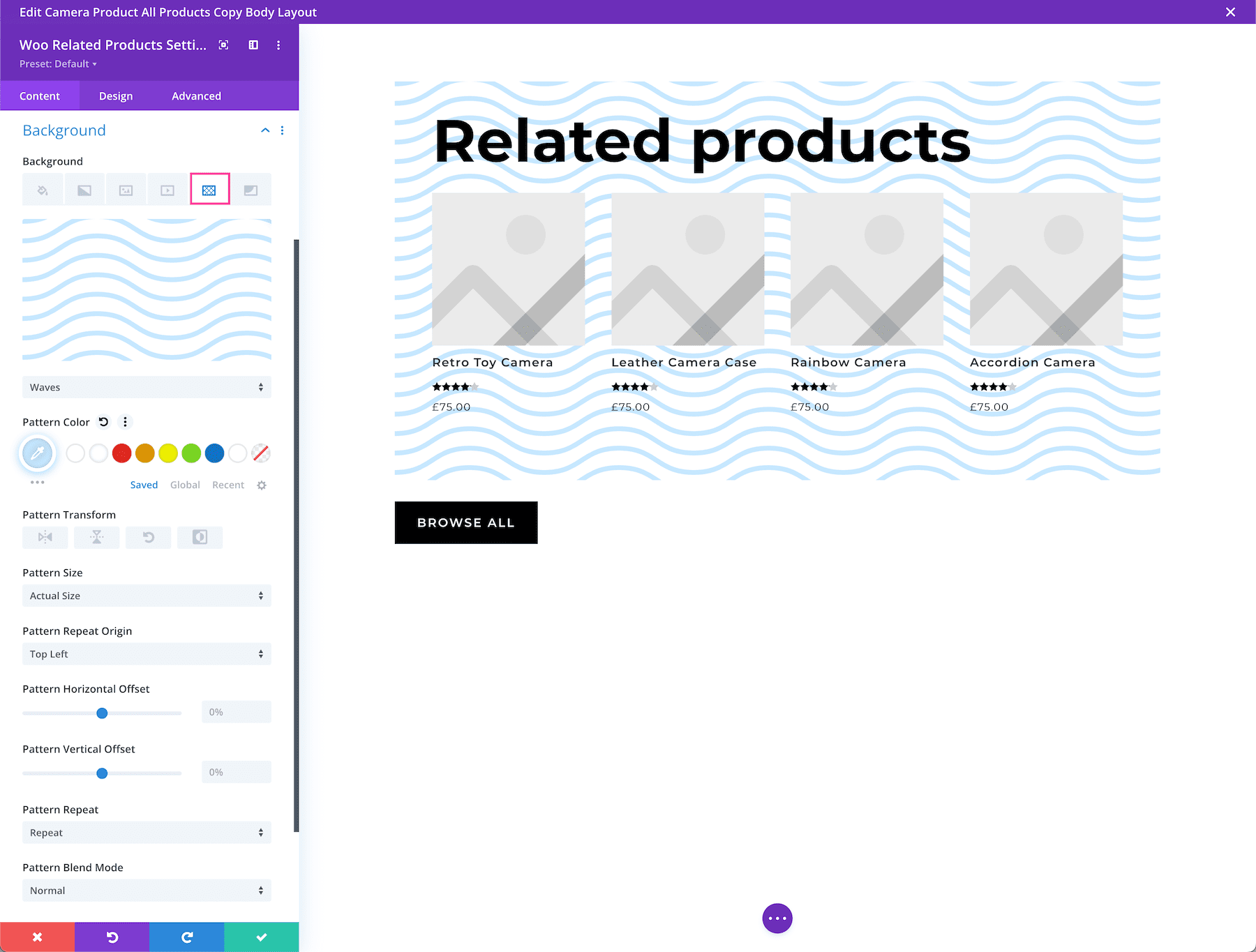
How to Add a Background Pattern
To add a background pattern, click the 5th tab, the pattern tab, then click “add background pattern.” Choose the pattern type you want from the dropdown.
- Pattern Color – Select the pattern color from your site’s color palette or use the eyedropper icon to find a new color.
- Pattern Transform – This is where you can transform the pattern horizontally, vertically, rotate it, or invert it.
- Pattern Size – Pattern size is where you can select the pattern size: the actual size, cover, fit, stretch to fill or custom size. If you select custom size, the following options will appear: pattern width and pattern height. Drag the range slider or type in a numerical value to define those options.
- Pattern Repeat Origin – Here you can select the origin from which the pattern repeats.
- Pattern Horizontal and Vertical Offset – You can also adjust the horizontal and vertical offsets for the pattern.
- Pattern Repeat – Here you can choose how the pattern repeats – horizontally, vertically, and more.
- Pattern Blend Mode – This defines how the pattern layer interacts with the layers beneath it. Select from one of the 16 blend modes available from the dropdown.
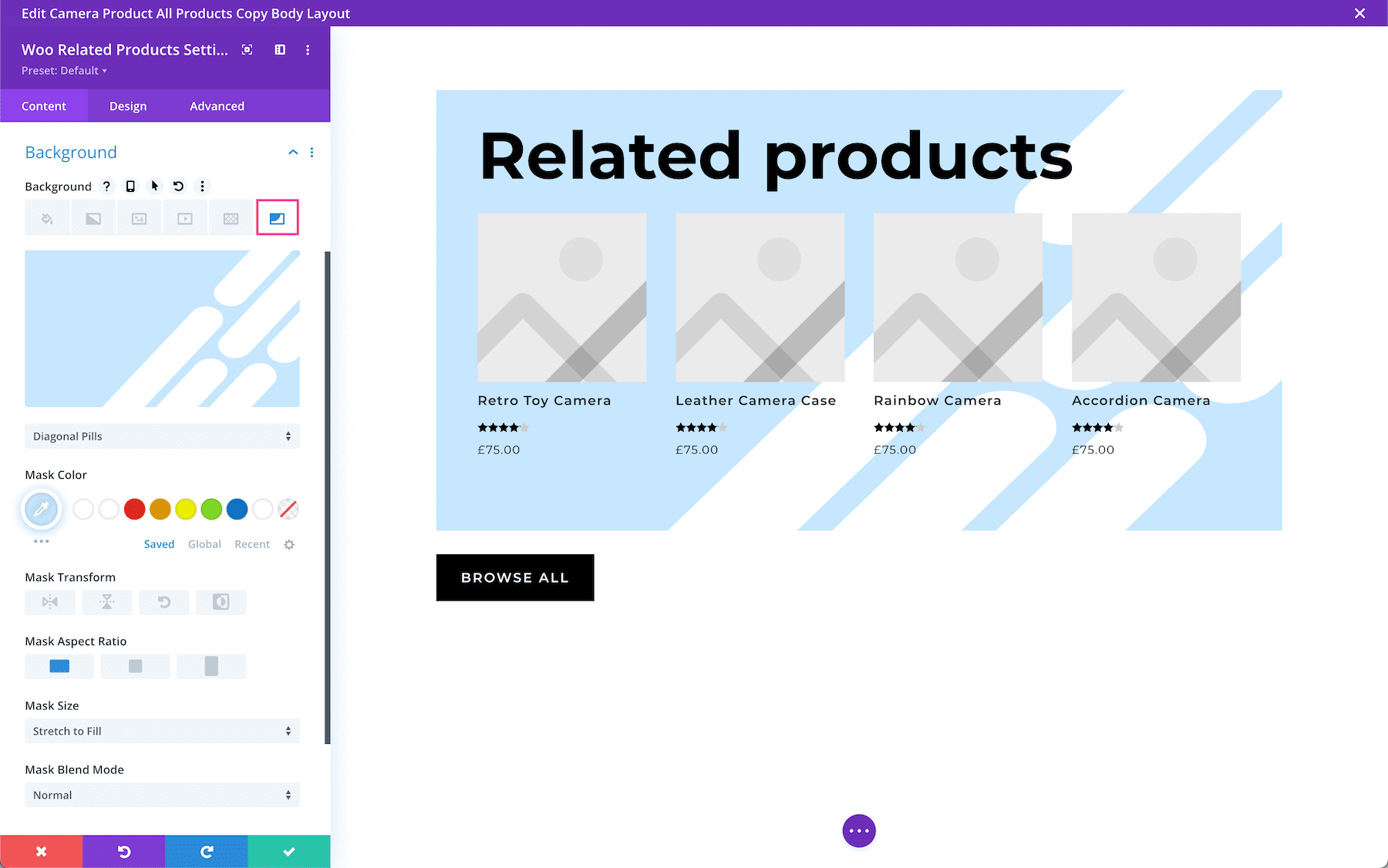
How to Add a Background Mask
To add a background mask, click the 6th tab, the mask tab and then click “add background mask”. Select the mask type you want via the dropdown menu.
- Mask Color – Choose the mask color from your site’s color palette or use the eyedropper icon to find a new color.
- Mask Transform – Here you can transform the mask horizontally, vertically, rotate it, or invert it.
- Mask Aspect Ration – Here you can set the aspect ratio of the mask. The aspect ratio of an image is the ratio of its width to its height.
- Mask Size – This is where you can select the mask size: the actual size, cover, fit, stretch to fill or custom size. If you select custom size, the following options will appear: mask width and mask height. Drag the range slider or type in a numerical value to define those options.
- Mask Blend Mode – This defines how the mask layer interacts with the layers beneath it. Select from one of the 16 blend modes available from the dropdown.
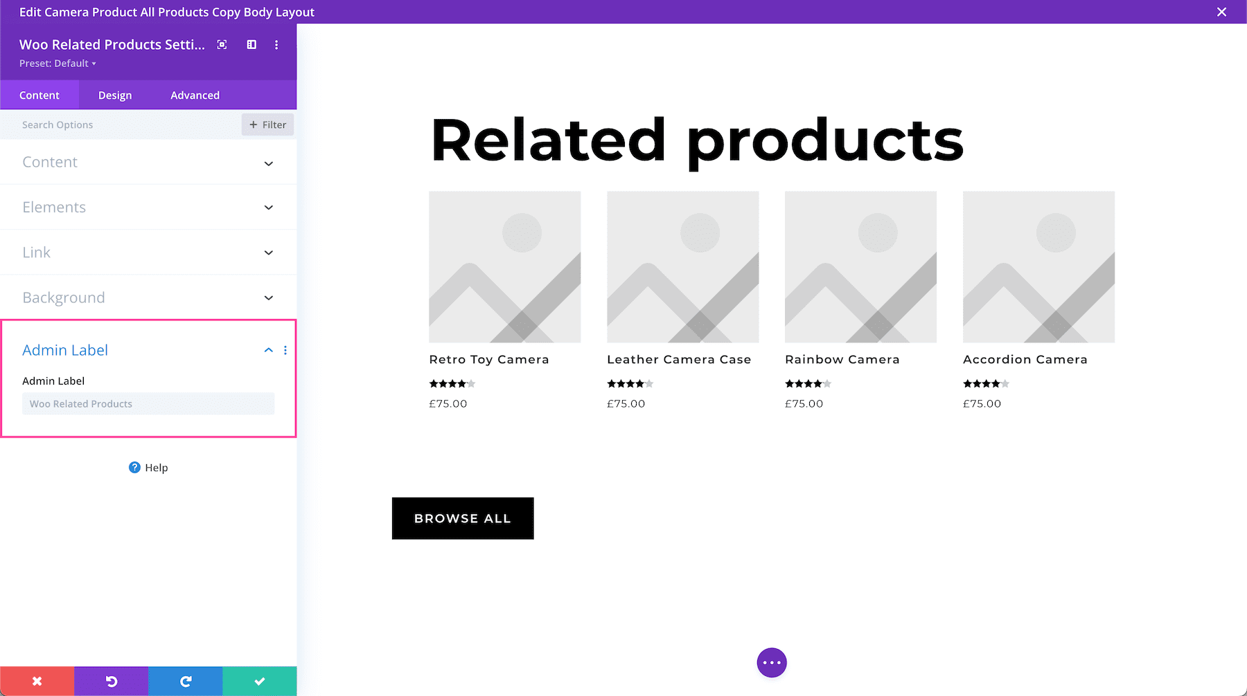
Admin Label
The Admin Label is where you can give the module a name only visible to you in order to assist in keeping things organized and easy to understand on the back end. By default, the admin label will be the name of the module. You can change the text of the admin label to reflect what you’d like.
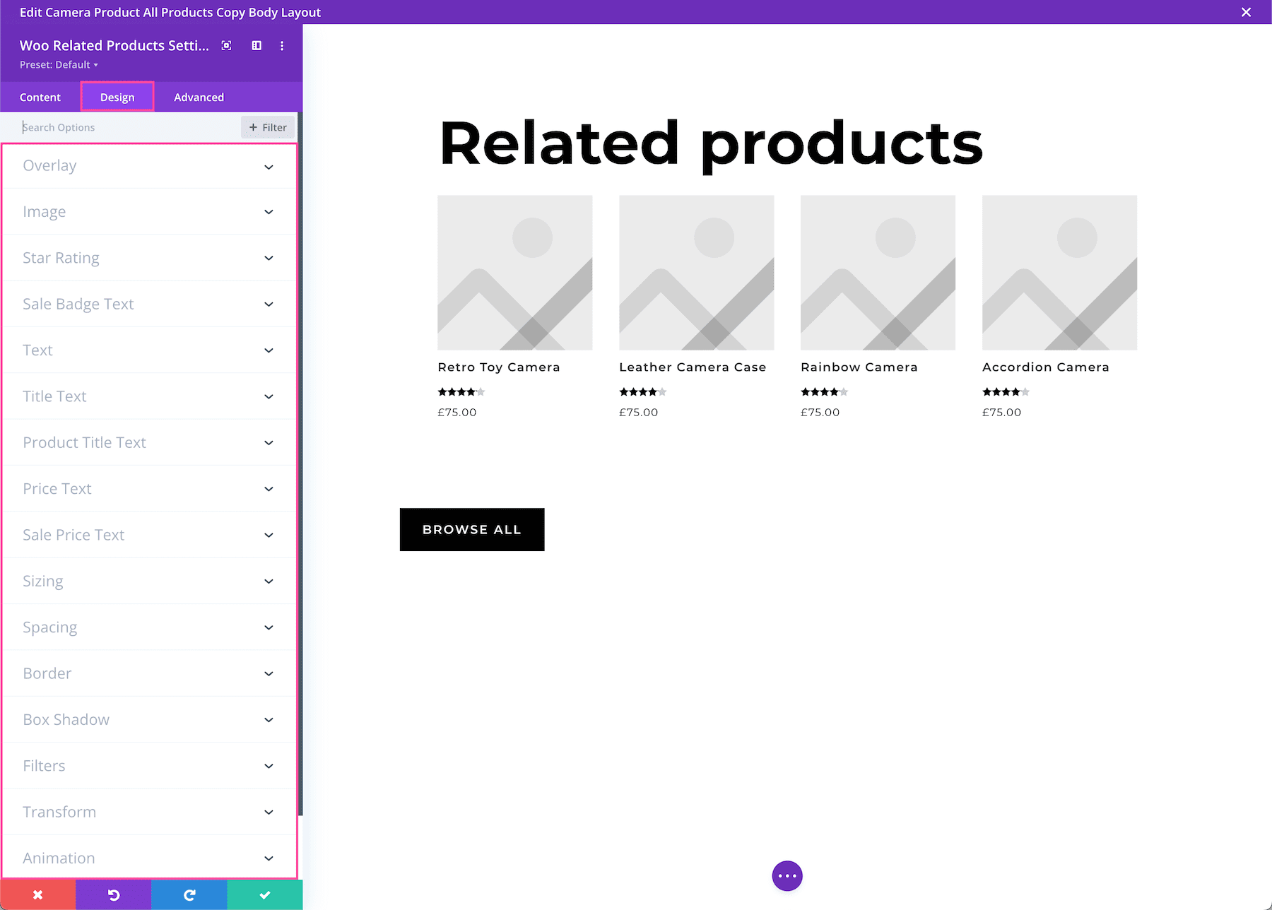
Design Settings
Inside this tab, you’ll find all the design styles and settings for this module.
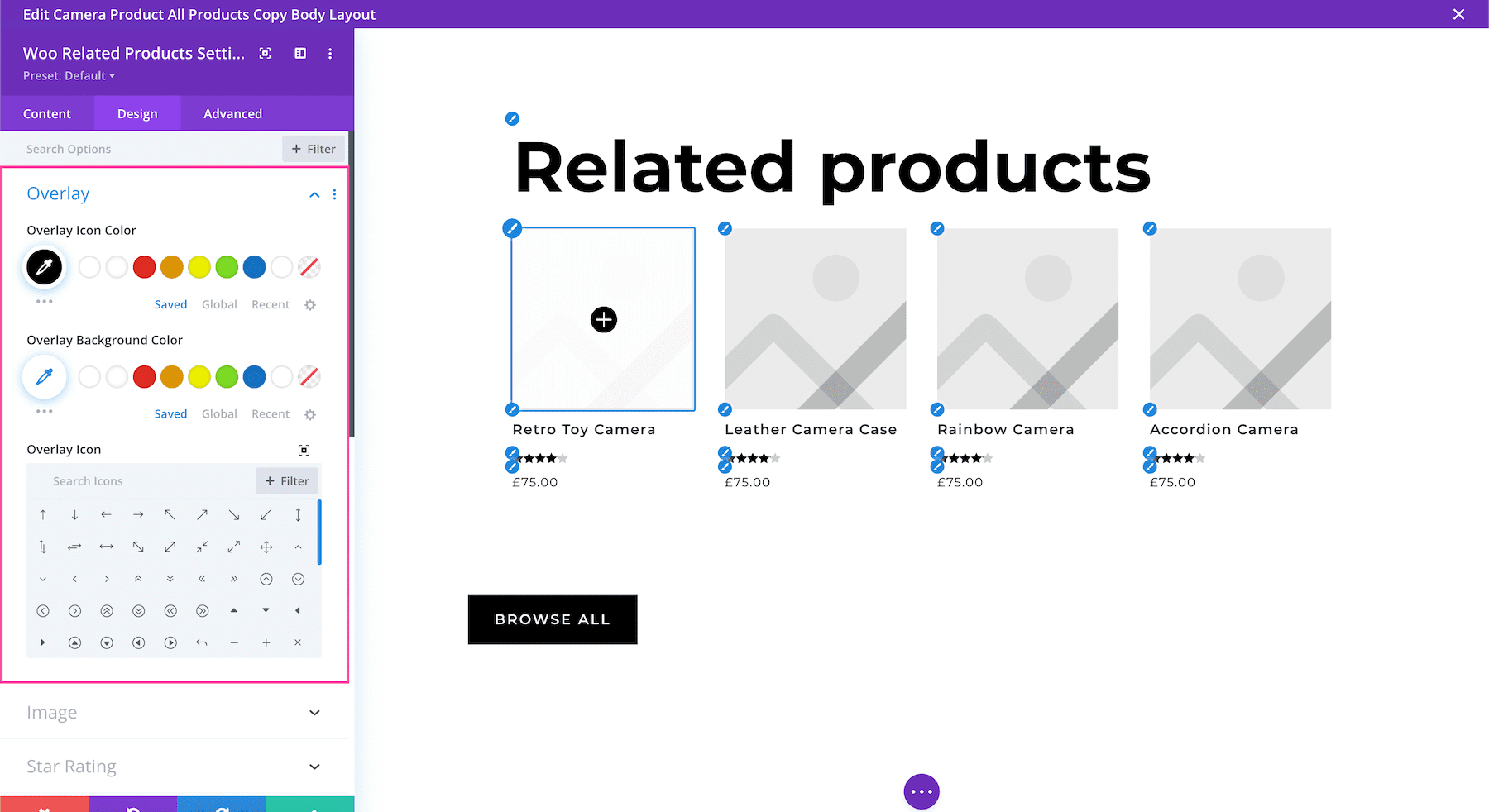
Overlay
- Overlay Icon Color – Choose the color of the icon by selecting from the color palette or by using the eyedropper icon to find a new color.
- Overlay Background Color – Choose a background color for the icon by selecting from the color palette or by using the eyedropper icon to find a new color.
- Overlay Icon – Choose from the hundreds of icons that come with Divi. Use the filter button to sort through solid icons, like icons, Divi icons, and Font Awesome icons.
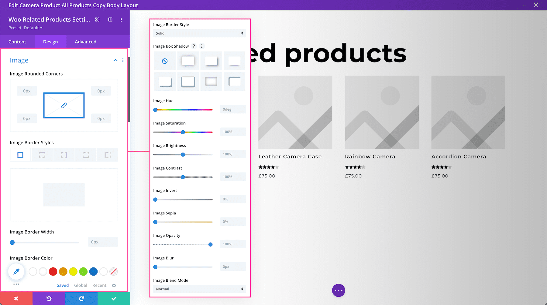
Image
This settings group allows you to style the look and feel of the product images.
- Image Rounded Corners – If you would like to round the corners of the image, type in a numerical value. The higher the number, the rounder the corners will be. The corner values are automatically linked (as seen by the highlighted blue chainlink in the middle) however if you’d like to have different values for each corner, simply click the blue chainlink to unlink the values. If the values are automatically linked that means they will always have the same value and update automatically if one value is changed.
- Image Border Styles – This is where you can add a border to the image. You can add a border to all sides of the image, or to individual sides (top, right, bottom, and left).
- Image Border Width – This is where you set the width of the border. For a thicker border, increase the number. The border width must be at least 1px in order to show.
- Image Border Color – This is where you can pick the color of the border. You can select a color from your default site color palette already displayed, or click on the eyedropper icon to find a new color.
- Image Border Style – Here you can select what style of border you’d like: solid, dashed, dotted, double, groove, ridge, inset, outset, or none.
- Image Box Shadow – Choose the style of shadow you want applied to the image. By default, no shadow is applied.
- Box Shadow Horizontal Position – Controls the horizontal positioning of the image box shadow.
- Box Shadow Vertical Position – Controls the vertical positioning of the image box shadow.
- Box Shadow Blur Strength – Controls shadow blur strength the image box shadow. The higher the number, the more blur.
- Box Shadow Spread Strength – Controls the spread strength of the shadow on the image.
- Shadow Color – Choose the color of the image shadow.
- Box Shadow Position – Choose the position of the shadow applied to the image – an inner shadow or an outer shadow.
- Image Hue – Adjusts the hue of the image.
- Image Saturation – Adjusts the saturation of the image.
- Image Brightness – Adjusts the brightness of the image.
- Image Contrast – Adjusts the contrast of the image.
- Image Invert – Inverts the color of the image
- Image Sepia – Controls the level of sepia tone applied to the image.
- Image Opacity – Controls the level of opacity (transparency) of the image.
- Image Blur – Controls the blurriness of the image.
- Image Blend Mode – The Blend Mode refers to how the module blends with the layers beneath it. By default, “normal” will be selected.
Star Rating
- Star Rating Alignment – This allows you to choose how the star rating aligns: left, center, right, or justify.
- Star Rating Color – Define the color of the star rating by selecting a color from the color palette or by using the eyedropper icon to find a new color.
- Star Rating Size – Set the size of the star rating by typing in a numerical value or dragging the range slider. The higher the number, the bigger the size.
- Star Rating Letter Spacing -Choose the letter-spacing of the start rating text by dragging the range slider or by typing in a numerical value. Letter spacing is the space between each individual letter. The higher the number, the more space.

Sale Badge Text
- Sale Badge Color – Define the color of the sale badge by selecting a color from the color palette or by using the eyedropper icon to find a new color.
- Sale Badge Margin – Add a margin to the sale badge by typing in a numerical value. Margins add space outside the element. To lock in ratios and keep the values the same, you can click the chainlink icon between the values you want to always be identical (ex: top and bottom).
- Sale Badge Padding – Add padding to the sale badge by typing in a numerical value. Padding adds space inside the element. To lock in ratios and keep the values the same, you can click the chainlink icon between the values you want to always be identical (ex: top and bottom).
- Sale Badge Font – Choose the font you want to use for the sale badge text. The default font is automatically selected; however, you can choose a different font or upload a custom font by clicking the dropdown box.
- Sale Badge Font Weight – Click the dropdown to select the boldness of the sale badge text font.
- Sale Badge Font Style – Choose the style of the sale badge text font: italicized, capitalized, small capitals, underlined, or strike-through.
- Sale Badge Text Alignment – Choose the text alignment specifically to the sale badge text only; left, center, right, or justify.
- Sale Badge Text Color – Choose a specific color for the sale badge text. Select from your site’s color palette or click the eyedropper icon to find a new color.
- Sale Badge Text Size – Choose the font size of the sale badge text by dragging the range slider or typing in a numerical value.
- Sale Badge Letter Spacing – Choose the letter-spacing of the sale badge text by dragging the range slider or by typing in a numerical value. Letter spacing is the space between each individual letter. The higher the number, the more space.
- Sale Badge Line Height – Choose the line height of the sale badge text by dragging the range slider or by typing in a numerical value. The line-height is the amount of space between each line of text. The higher the number, the more space.
- Sale Badge Text Shadow – Here you can add a drop shadow to the sale badge text. Once a style is selected, you’ll be able to configure the direction of the shadow (horizontal and vertical), the strength of the drop shadow blur, and the shadow color.
- Sale Badge Rounded Corners – Here you can round the corners of the sale badge by typing in a numerical value. The higher the number, the rounder the corners will be. The corner values are automatically linked (as seen by the highlighted blue chainlink in the middle) however if you’d like to have different values for each corner, simply click the blue chainlink to unlink the values. If the values are automatically linked that means they will always have the same value and update automatically if one value is changed.
- Sale Badge Border Styles – This is where you can add a border to the sale badge. You can add a border to all sides of the sale badge, or to individual sides (top, right, bottom, and left).
- Sale Badge Border Width – This is where you set the width of the border. For a thicker border, increase the number. The border width must be at least 1px in order to show.
- Sale Badge Border Color – This is where you can pick the color of the border. You can select a color from your default site color palette already displayed, or click on the eyedropper icon to find a new color.
- Sale Badge Border Style – Here you can select what style of border you’d like: solid, dashed, dotted, double, groove, ridge, inset, outset, or none.
- Sale Badge Box Shadow – Choose the style of shadow you want to be applied to the sale badge text. By default, no shadow is applied.
Text
This sets the overall text styles for this module; however, you can set specific styles of specific text in other settings groups like Title Text, Product Title Text, Price Text, and Sale Price Text.
- Text Alignment – This allows you to choose how the text aligns: left, center, right, or justify.
- Text Shadow – Here you can apply a drop shadow to all the text inside this module. When a shadow type is selected, it will apply to all of the text content in the module.

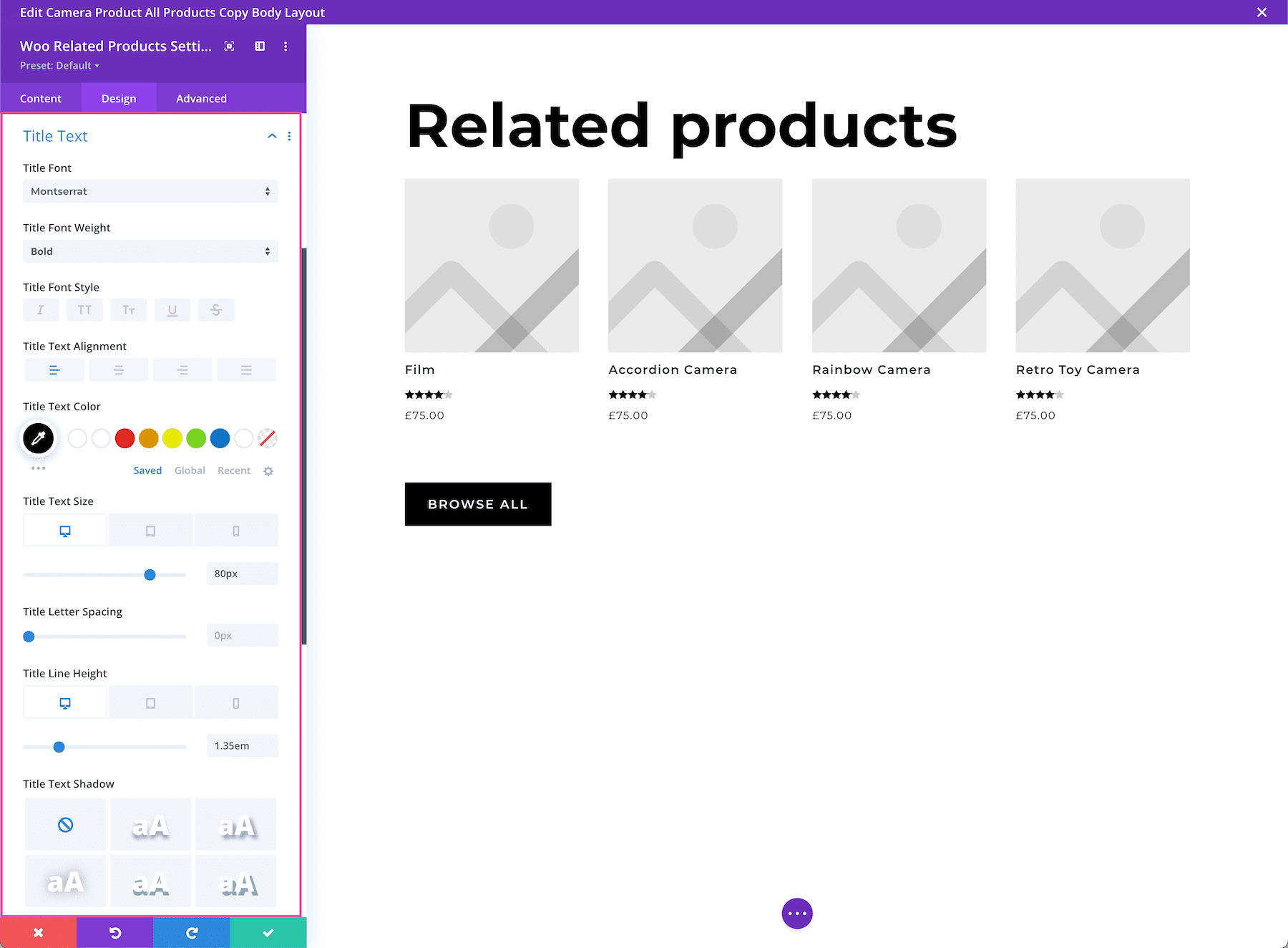
Title Text
These are the settings for specific styling and configuration for the Title Text only.
- Title Font – Choose the font you want to use for the title text. The default font is automatically selected; however, you can choose a different font or upload a custom font by clicking the dropdown box.
- Title Font Weight – Click the dropdown to select the boldness of the title text font.
- Title Font Style – Choose the style of the title text font: italicized, capitalized, small capitals, underlined, or strike-through.
- Title Text Alignment – Choose the text alignment specifically to the title text only; left, center, right, or justify.
- Title Text Color – Choose a specific color for the title text. Select from your site’s color palette or click the eyedropper icon to find a new color.
- Title Text Size – Choose the font size of the title text by dragging the range slider or typing in a numerical value.
- Title Letter Spacing – Choose the letter-spacing of the title text by dragging the range slider or by typing in a numerical value. Letter spacing is the space between each individual letter. The higher the number, the more space.
- Title Line Height – Choose the line height of the title text by dragging the range slider or by typing in a numerical value. The line-height is the amount of space between each line of text. The higher the number, the more space.
- Title Text Shadow – Here you can add a drop shadow to the title text. Once a style is selected, you’ll be able to configure the direction of the shadow (horizontal and vertical), the strength of the drop shadow blur, and the shadow color.
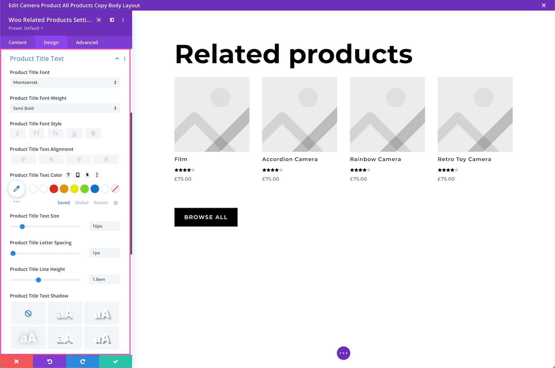
Product Title Text
- Product Title Font – Choose the font you want to use for the product title text. The default font is automatically selected; however, you can choose a different font or upload a custom font by clicking the dropdown box.
- Product Title Font Weight – Click the dropdown to select the boldness of the product title text font.
- Product Title Font Style – Choose the style of the product title text font: italicized, capitalized, small capitals, underlined, or strike-through.
- Product Title Text Alignment – Choose the text alignment specifically to the product title text only; left, center, right, or justify.
- Product Title Text Color – Choose a specific color for the product title text. Select from your site’s color palette or click the eyedropper icon to find a new color.
- Product Title Text Size – Choose the font size of the product title text by dragging the range slider or typing in a numerical value.
- Product Title Letter Spacing – Choose the letter-spacing of the product title text by dragging the range slider or by typing in a numerical value. Letter spacing is the space between each individual letter. The higher the number, the more space.
- Product Title Line Height – Choose the line height of the product title text by dragging the range slider or by typing in a numerical value. The line-height is the amount of space between each line of text. The higher the number, the more space.
- Product Title Text Shadow – Here you can add a drop shadow to the product title text. Once a style is selected, you’ll be able to configure the direction of the shadow (horizontal and vertical), the strength of the drop shadow blur, and the shadow color.
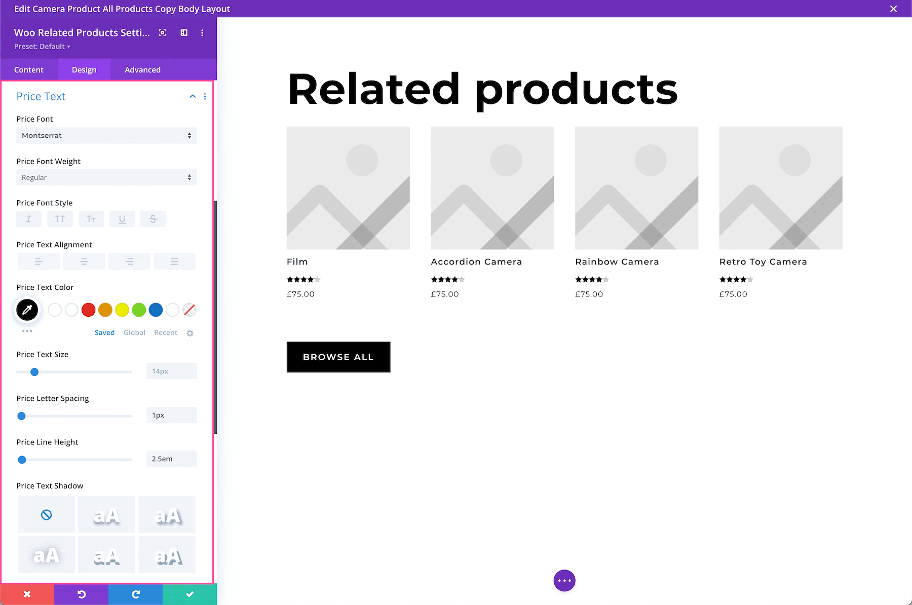
Price Text
- Price Font – Choose the font you want to use for the price text. The default font is automatically selected; however, you can choose a different font or upload a custom font by clicking the dropdown box.
- Price Font Weight – Click the dropdown to select the boldness of the price text font.
- Price Font Style – Choose the style of the price text font: italicized, capitalized, small capitals, underlined, or strike-through.
- Price Text Alignment – Choose the text alignment specifically to the price text only; left, center, right, or justify.
- Price Text Color – Choose a specific color for the price text. Select from your site’s color palette or click the eyedropper icon to find a new color.
- Price Text Size – Choose the font size of the price text by dragging the range slider or typing in a numerical value.
- Price Letter Spacing – Choose the letter-spacing of the price text by dragging the range slider or by typing in a numerical value. Letter spacing is the space between each individual letter. The higher the number, the more space.
- Price Line Height – Choose the line height of the price text by dragging the range slider or by typing in a numerical value. The line-height is the amount of space between each line of text. The higher the number, the more space.
- Price Text Shadow – Here you can add a drop shadow to the price text. Once a style is selected, you’ll be able to configure the direction of the shadow (horizontal and vertical), the strength of the drop shadow blur, and the shadow color.
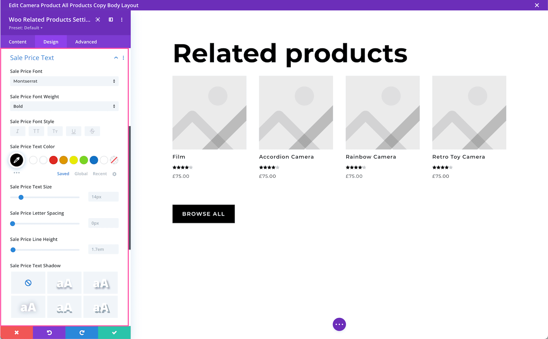
Sale Price Text
- Sale Price Font – Choose the font you want to use for the sale price text. The default font is automatically selected; however, you can choose a different font or upload a custom font by clicking the dropdown box.
- Sale Price Font Weight – Click the dropdown to select the boldness of the sale price text font.
- Sale Price Font Style – Choose the style of the sale price text font: italicized, capitalized, small capitals, underlined, or strike-through.
- Sale Price Text Alignment – Choose the text alignment specifically to the sale price text only; left, center, right, or justify.
- Sale Price Text Color – Choose a specific color for the sale price text. Select from your site’s color palette or click the eyedropper icon to find a new color.
- Sale Price Text Size – Choose the font size of the sale price text by dragging the range slider or typing in a numerical value.
- Sale Price Letter Spacing – Choose the letter-spacing of the sale price text by dragging the range slider or by typing in a numerical value. Letter spacing is the space between each individual letter. The higher the number, the more space.
- Sale Price Line Height – Choose the line height of the sale price text by dragging the range slider or by typing in a numerical value. The line-height is the amount of space between each line of text. The higher the number, the more space.
- Sale Price Text Shadow – Here you can add a drop shadow to the sale price text. Once a style is selected, you’ll be able to configure the direction of the shadow (horizontal and vertical), the strength of the drop shadow blur, and the shadow color.
Sizing
Define the sizing (width and height) of the module. You can set a max-width and a max-height and a min-height. Choose the module alignment (left, center, or right) by clicking the arrows. By default, modules align center.

Spacing
Add margins or spacing to this module by typing in numerical values. Margins add space outside the module element, and padding adds space inside the module element. To lock in ratios and keep the values the same, you can click the chainlink icon between the values you want to always be identical (ex: top and bottom).

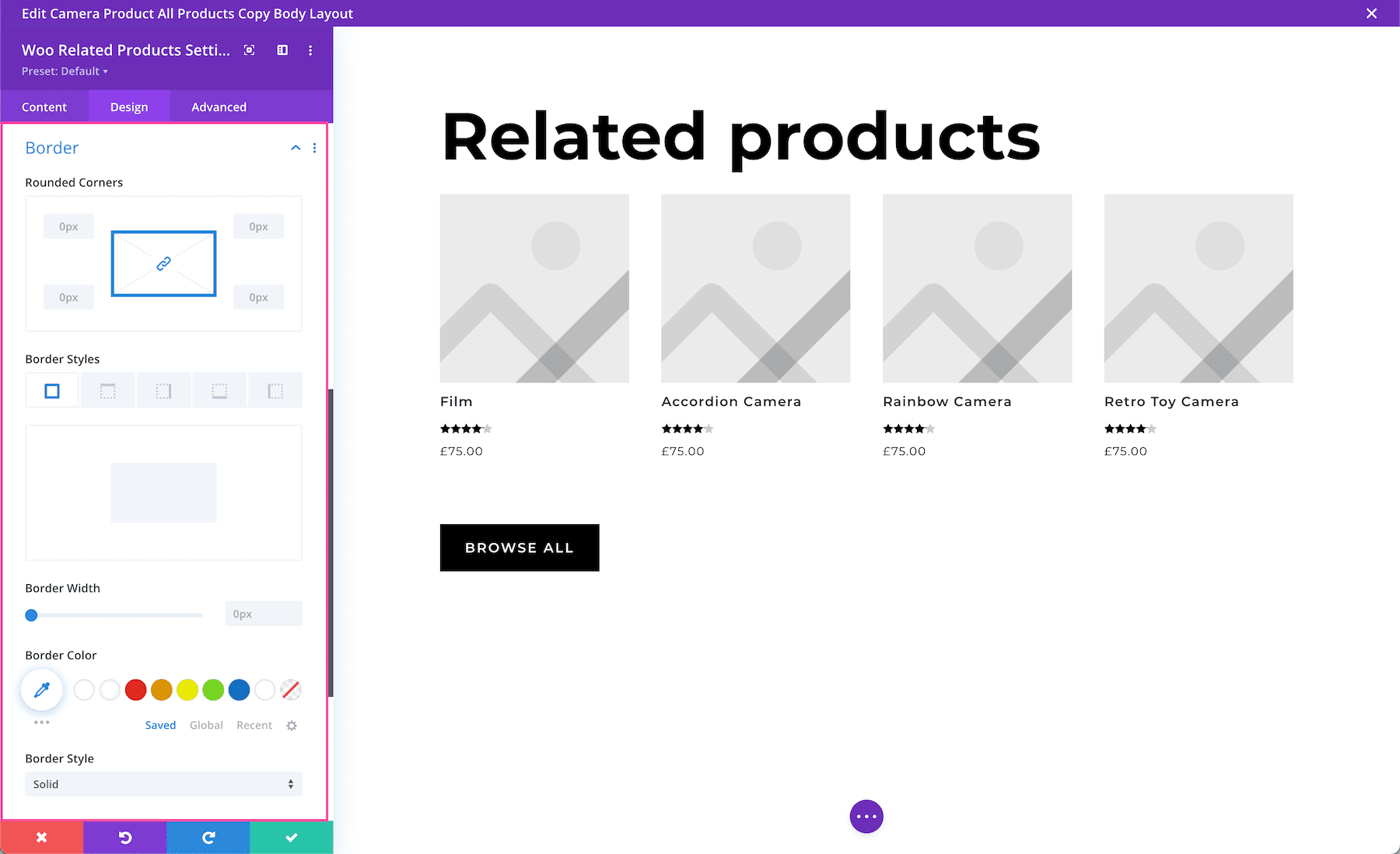
Border
Add a border to the module. You can add a complete border or add a border to only one side of the module. Adjust the width via the range slider and select a color. Choose a border style by clicking the dropdown.
- Rounded Corners – If you would like to have round border corners, type in a numerical value. The higher the number, the rounder the corners will be. The corner values are automatically linked (as seen by the highlighted blue chainlink in the middle) however if you’d like to have different values for each corner, simply click the blue chainlink to unlink the values. If the values are automatically linked that means they will always have the same value and update automatically if one value is changed.
- Border Styles – Here you can add a border to all sides of the module or to individual sides (top, right, bottom, and left).
- Border Width – This is where you set the width of the border. For a thicker border, increase the number. The border width must be at least 1px in order to show.
- Border Color – This is where you can pick the color of the border. You can select a color from your default site color palette already displayed, or click on the eyedropper icon to find a new color.
- Border Style – Here you can select what style of border you’d like: solid, dashed, dotted, double, groove, ridge, inset, outset, or none.
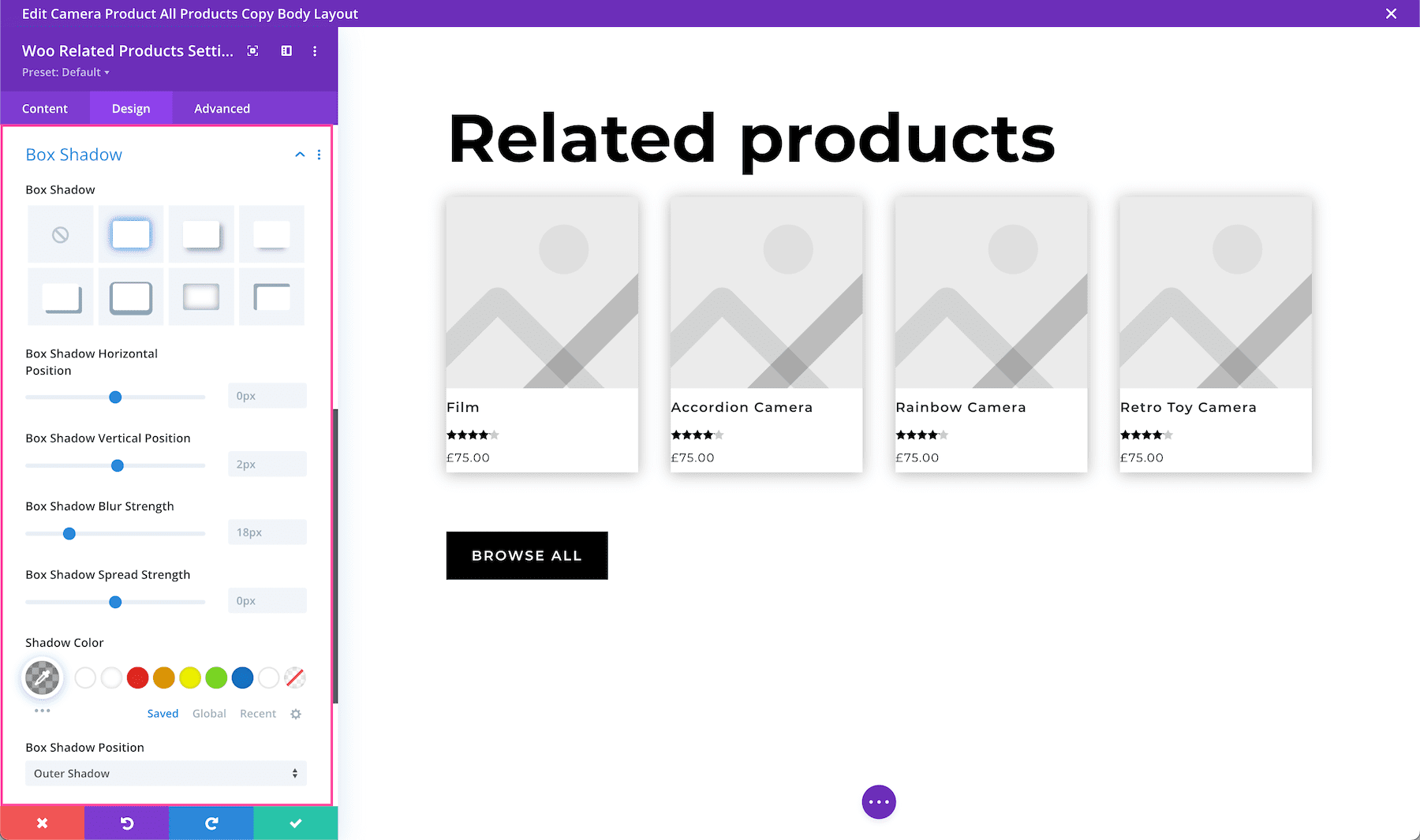
Box Shadow
Adds a drop shadow to the module. Once a shadow style is clicked, you can customize the position of the drop shadow (horizontal and vertical), the strength of the blur, and the spread strength by adjusting the range slider or inputting numerical values. Select the drop shadow’s color from your site’s color palette or click the eyedropper to find a new color. Choose the box-shadow position to be inside the container or outside the container via the dropdown.
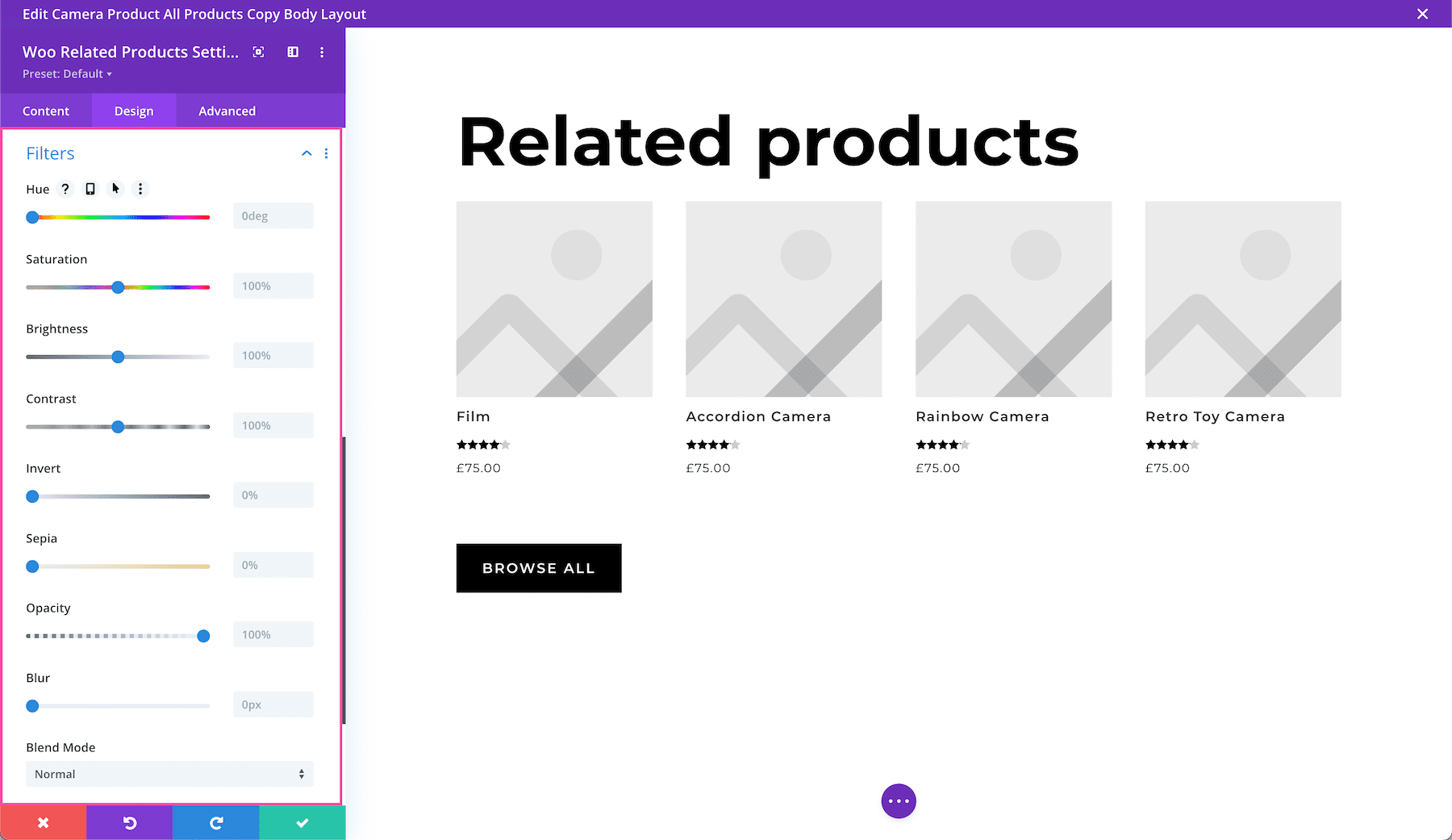
Filters
Adjust the hue, saturation, brightness, contrast, color tones (inverted colors or sepia), opacity, and blur of this module. The Blend Mode refers to how the module blends with the layers beneath it. By default, “normal” will be selected.
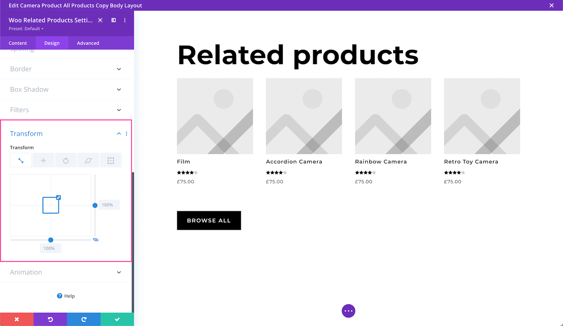
Transform
Scale, translate, rotate, skew, and set origin points for this module. Tab through to access each feature. Configure each feature by inputting numerical values or dragging and expanding the box or circle. You can lock in these values to always be identical by clicking the chain link icon at the bottom right.
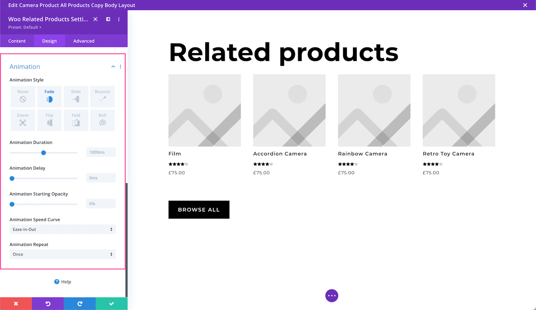
Animation
Here you can apply animation to the module. Once you choose an option you can also adjust the duration, delay, opacity, and speed of the animation and whether you want it to continually repeat or just happen once.
Advanced Settings
This is where the advanced customization settings are for this module.

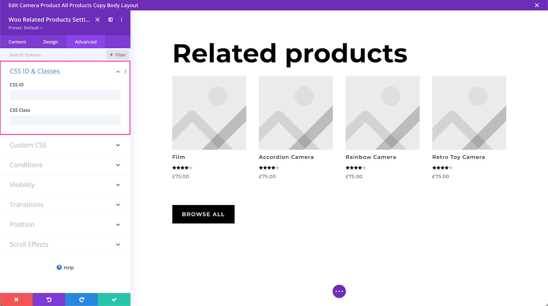
CSS ID & Classes
This is where you can assign a specific CSS ID or class to this module. This is helpful when you’d like to apply custom CSS to a module by using your child theme’s stylesheet.
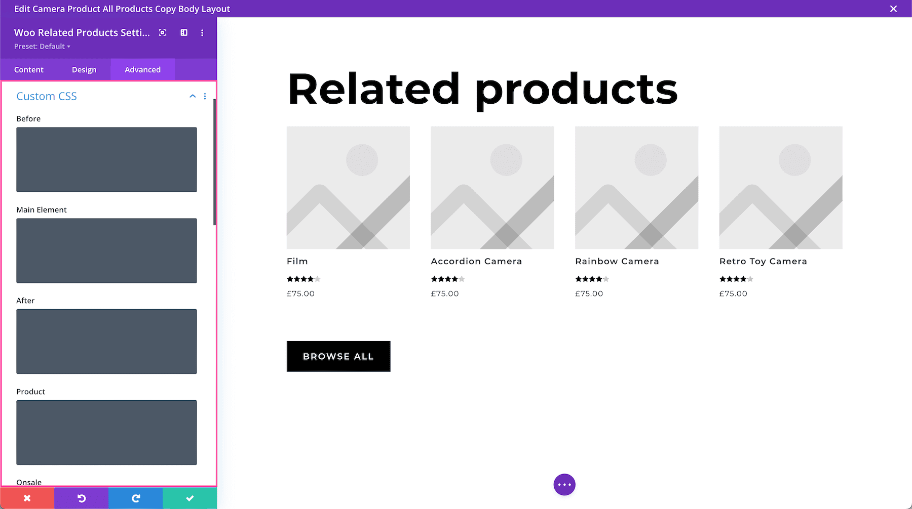
Custom CSS
You can also apply custom CSS to this module by pasting it in this tab. When you click on the Custom CSS tab, you’ll see individual sections where you can add CSS to specific elements in the module.
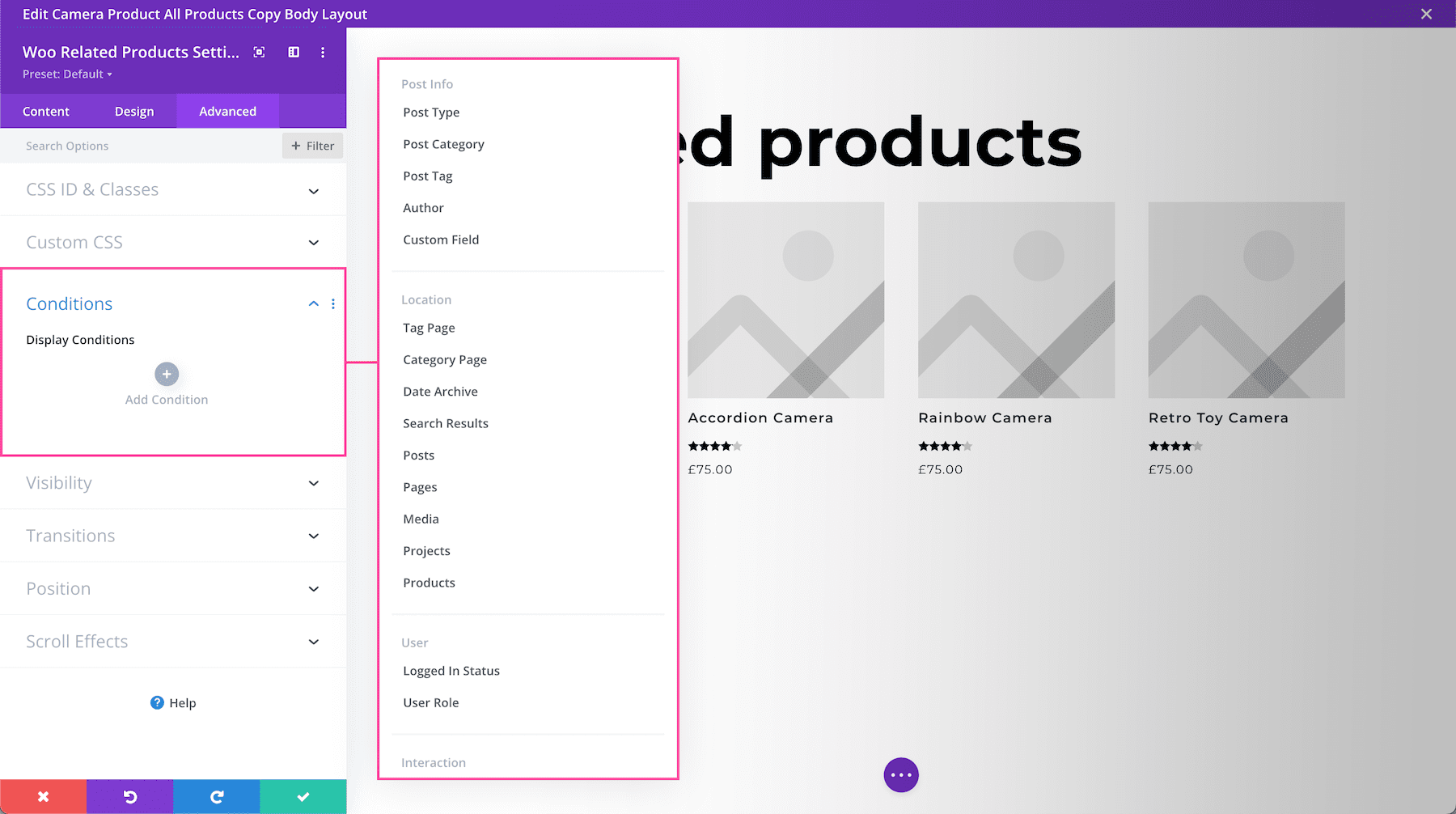
Conditions
This tab allows you to choose when to display this module based on a set of conditions, like what time a user is visiting the page if they’ve already purchased from your company before, what browser they are using, what operating system they’re using, and more. You can add one condition or multiple conditions.
Visibility
This defines the visibility of the module. You can choose to disable it (hide it from view) when the display window is a Phone, Tablet, or Desktop by clicking the corresponding checkbox. You can also determine how you want overflow content to be displayed if the content overflows the element that it is in. You can choose visible, scroll, hidden, or auto for both horizontal and vertical content. By default, “auto” is selected.

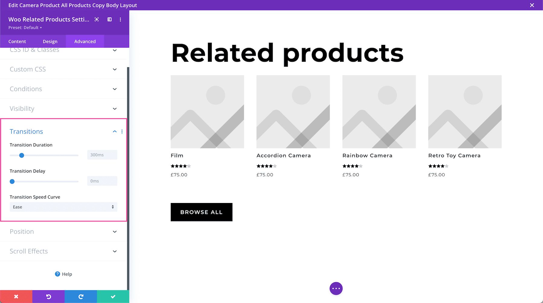
Transitions
This controls the transition duration of the hover animation as well as the delay, and speed curve.
Position
This defines the position of the module as well as the offset origin, vertical and horizontal offsets, and the z-index of the module. The available positions are default (which is automatically selected), relative, absolute, and fixed. Defining the z-index allows you to specify the stack order of elements. Elements with a higher z-index number overlap elements with a lower z-index.

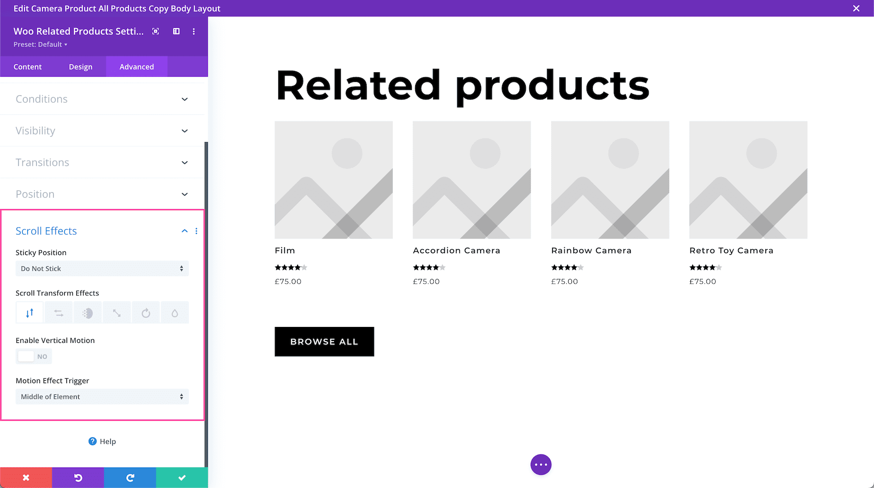
Scroll Effects
This defines how the module behaves upon scroll. You can make the module sticky (to top, bottom, or top and bottom), and choose if the module transforms upon scroll. You can also enable vertical motion on this module which allows you to adjust the speed at which this element scrolls (making it faster or slower) without affecting the surrounding elements. The Motion Trigger Effect allows you to choose when the scroll effect you just applied is triggered: when the top of the element is in view, the middle, or the bottom.
Save Your Design
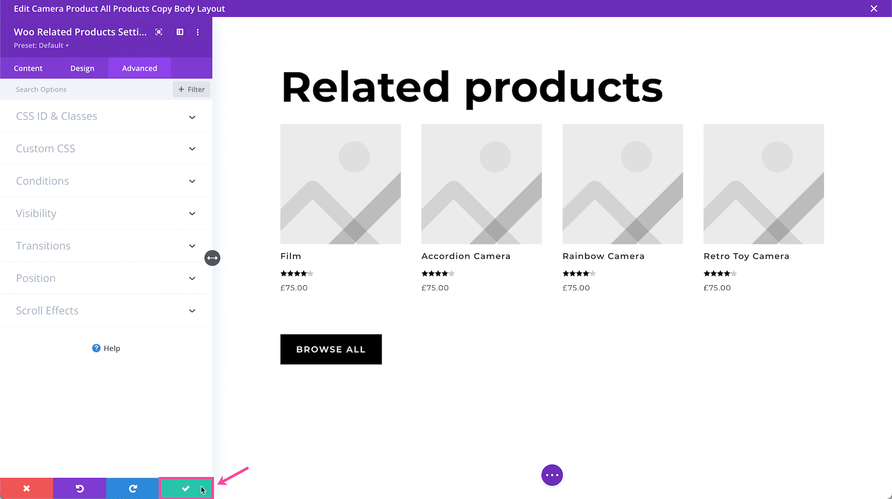
Once you are finished styling and configuring the module, click the green checkmark at the bottom right of the module to save your design. If you close the module without saving, your work will be lost.
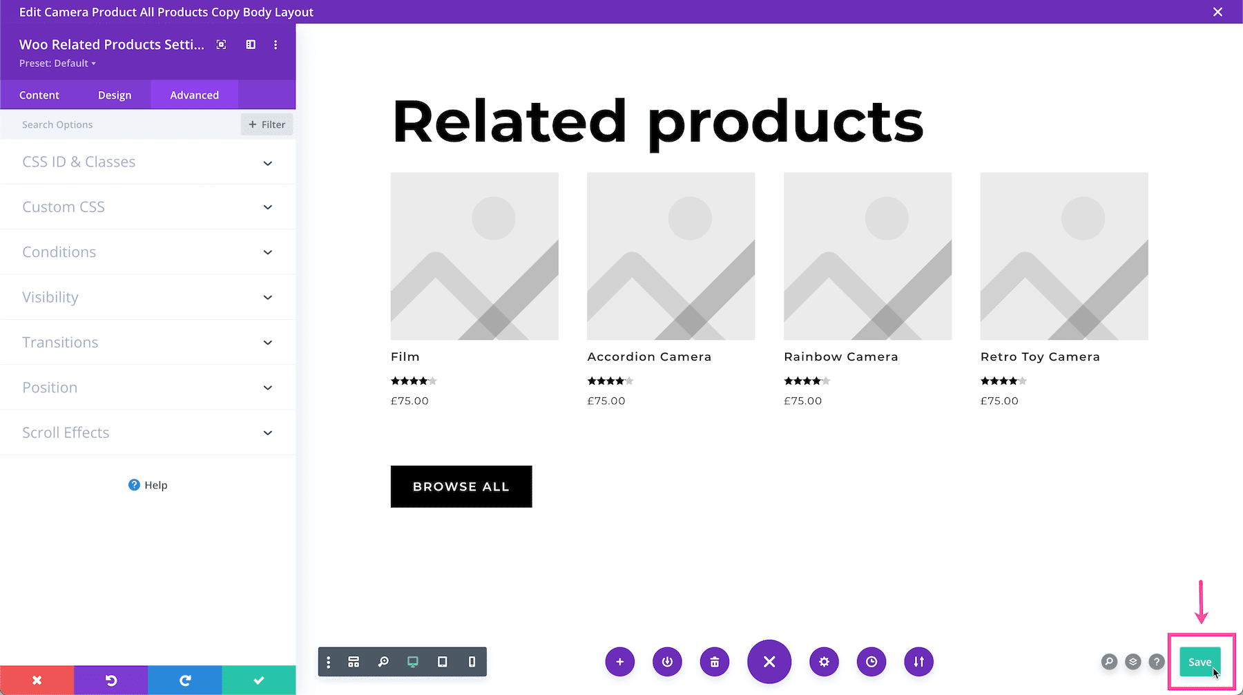
Next, Save the Page Design
To save the page design, you can type CMD + S on a Mac or CTRL + S on a PC. You can also use the bottom Divi toolbar to save your page design by clicking the circle purple icon with the three dots “…” to expand the toolbar, and then clicking the green “Save” button at the bottom right.
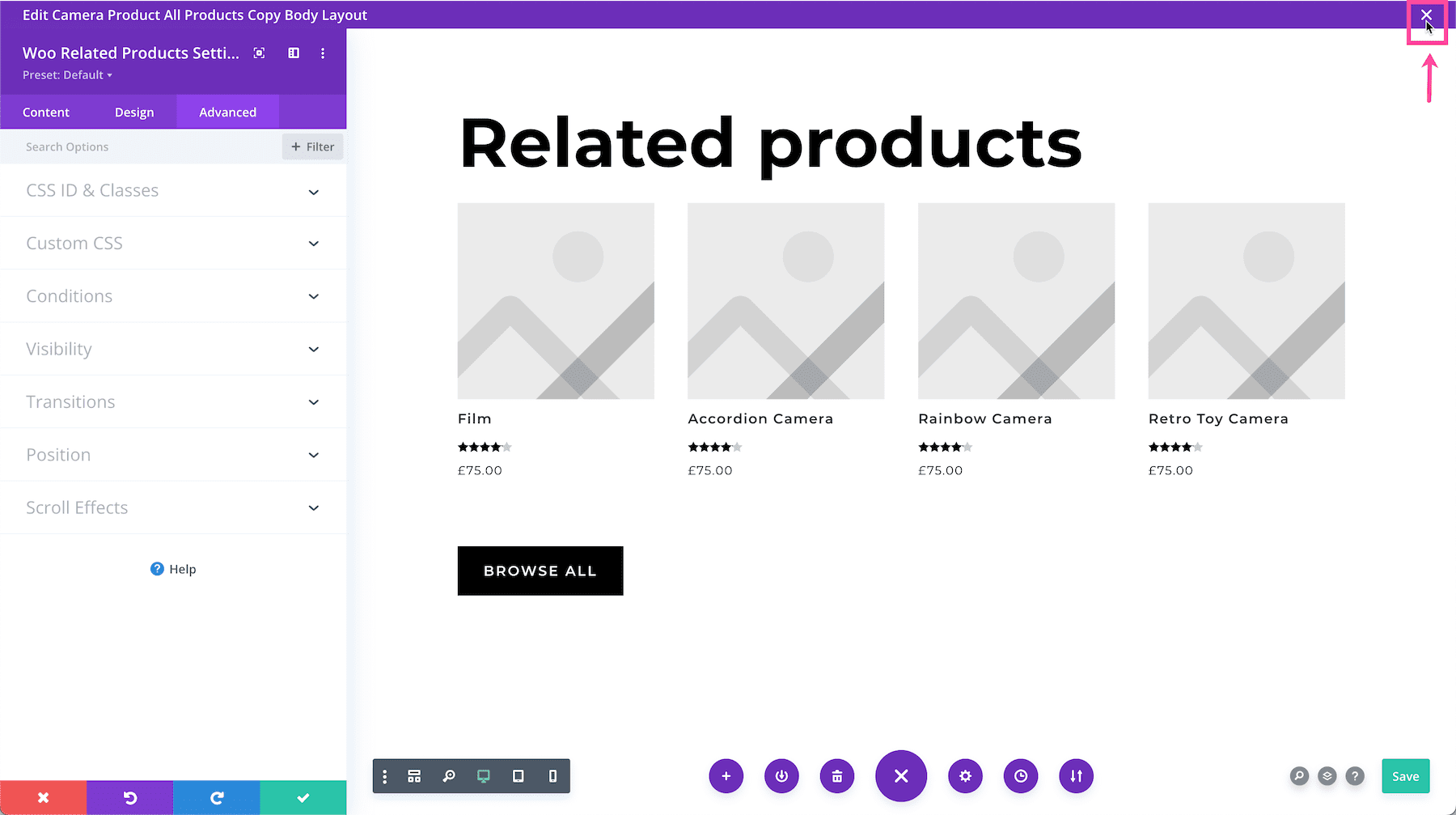
Exit the Visual Builder
Now that all your changes are saved, click the white X at the top right to exit the Visual Builder and return to the Theme Builder.
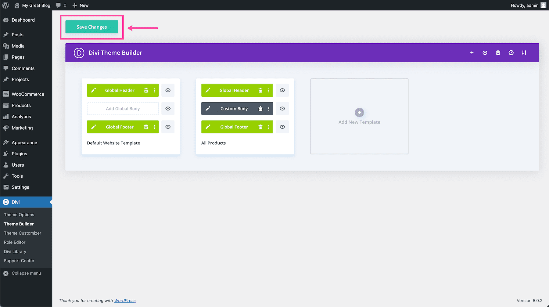
Save Theme Builder Settings
Click the “Save Changes” green button at the top of the page to save your Theme Builder settings.
Tips for Using the Divi Woo Related Products Module
When using the Divi Woo Related Products module, keep these best tips and practices in mind!
Set the Module to Display Related Products Based on the Product the Product Being Viewed”
By default, the Divi Woo Related Products shows products related to the product being viewed. However, if you’re using the Divi Woo Related Products module on a category page, you can select the category you want this module to relate to.
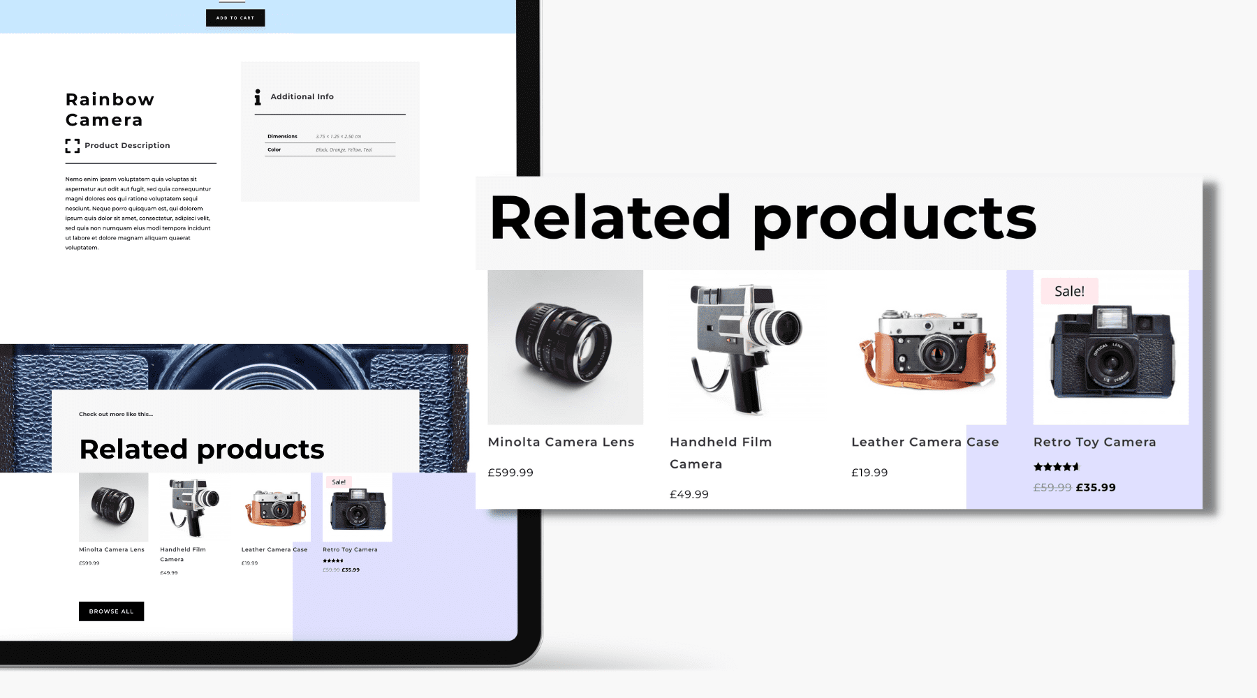
Add a Woo Related Products Module to Your Product Page Template
The Divi Woo Related Products module works well on product pages because it helps suggest other products your users might be interested in. This provides a better user experience and can help increase sales.
Learn More: An Overview of Required Elements for Your Divi Product Page Template.
Divi Woo Related Products Resources
- An Overview of Required Elements for Your Divi Product Page Template
- How to Install WooCommerce & Set Up Your Shop
- How to Configure WooCommerce Settings
- 5 eCommerce Personalization Ideas for WooCommerce
- WooCommerce Performance Optimization: 14 Tips & Best Practices
- A Simple Guide to WooCommerce’s Default Pages
- Updating WooCommerce: Best Practices to Follow Every Time