Using Divi Box Shadow Options
Divi’s box shadow options allow you to give any page element the illusion of depth.
Drop shadows are a creative way to bring your website design elements to life. They can be used to highlight elements and even give a really cool 3d effect. In this doc, we’ll explore all the box shadow options available within Divi, how to use them, and best tips and practices for using box shadows.
How Box Shadows Work
Box shadows apply vertical and horizontal shadows to design elements. You can add box shadows to sections, rows, columns, and modules.
Box shadows are a unique design property that doesn’t take up actual space on the page (or HTML DOM). When you add a box shadow to an element in Divi, the shadow is applied around the element similar to a border. However, unlike a border, the shadow is not a part of the CSS Box Model which controls the overall size (height and width) of an element by including it’s content, padding, and border. In short, this means that adding a box shadow won’t affect the size or spacing of the element on your page.
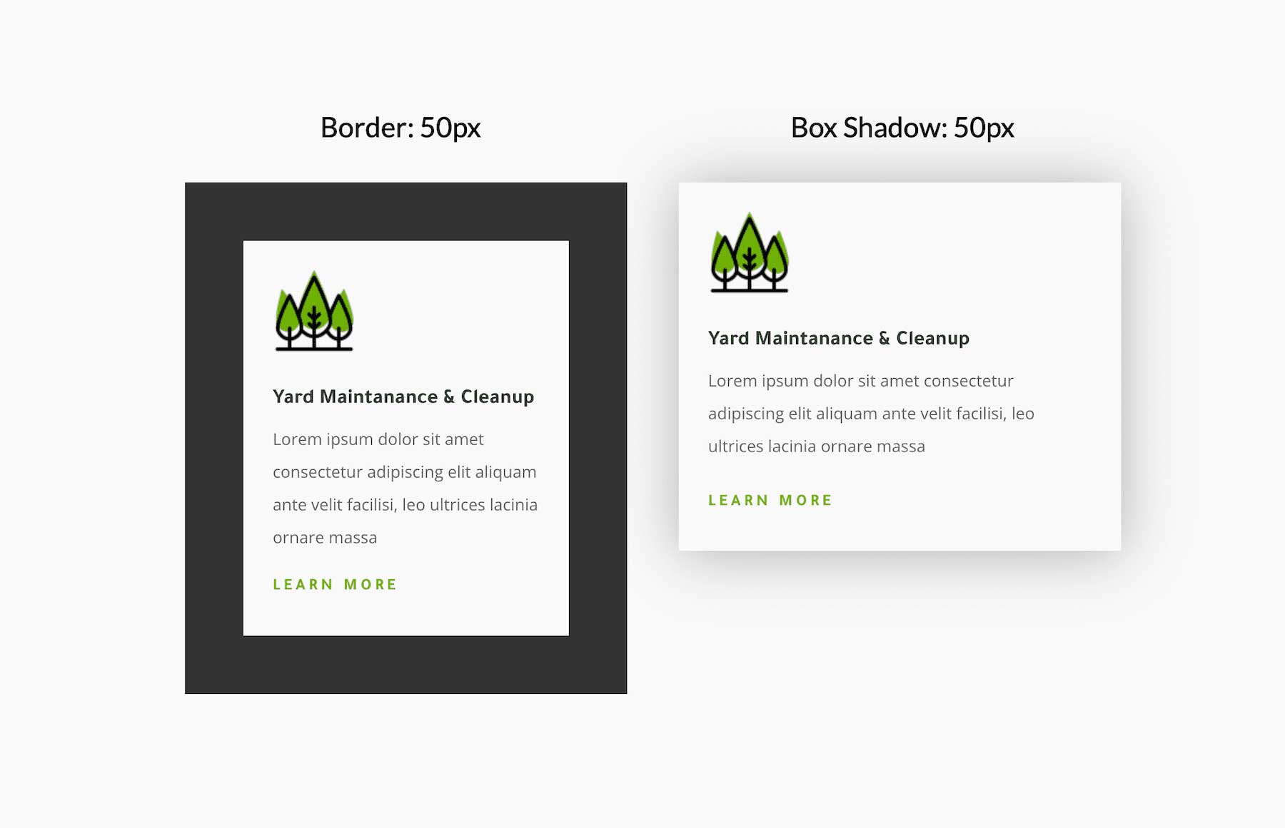
In the image above, notice how the border takes up actual space in the DOM. It shrinks the amount of available space for the inside content. However, on the right, the box shadow isn’t a factor in the module’s size and will display without moving any other elements around it.
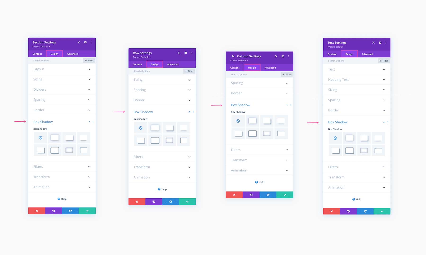
Where To Find Box Shadow Settings
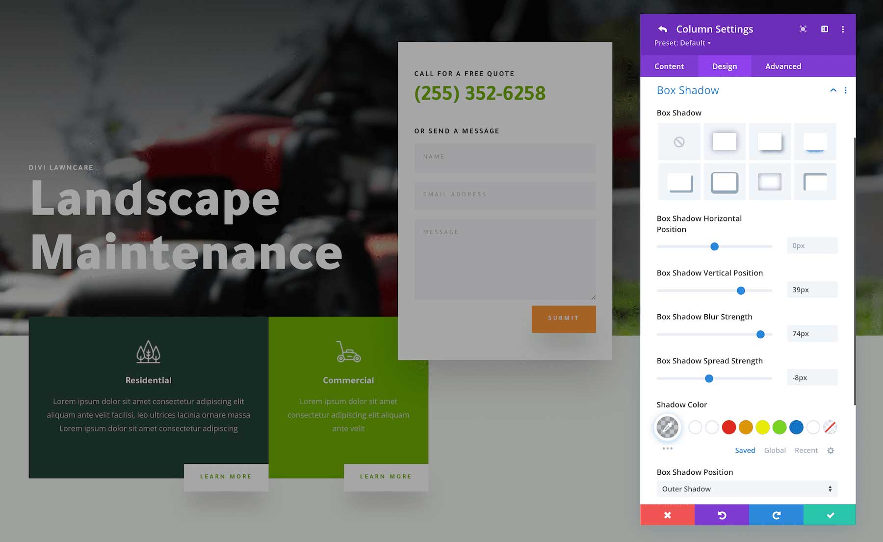
Box Shadow settings are always located under the Design tab in any section, row, column, or module you are working on. Navigate to the Box Shadow settings group and click to expand the options.
Divi’s Built-In Box Shadow Styles
Divi makes it easy to add box shadows to your design elements because it comes with 7 built-in shadow styles that you can apply to any element with the click of a button.
Customizing the Box Shadow
These built-in box shadow styles are a great starting point; however, with Divi, it’s easy to customize any box shadow to fit your vision. Let’s take a look at the custom box shadow options.
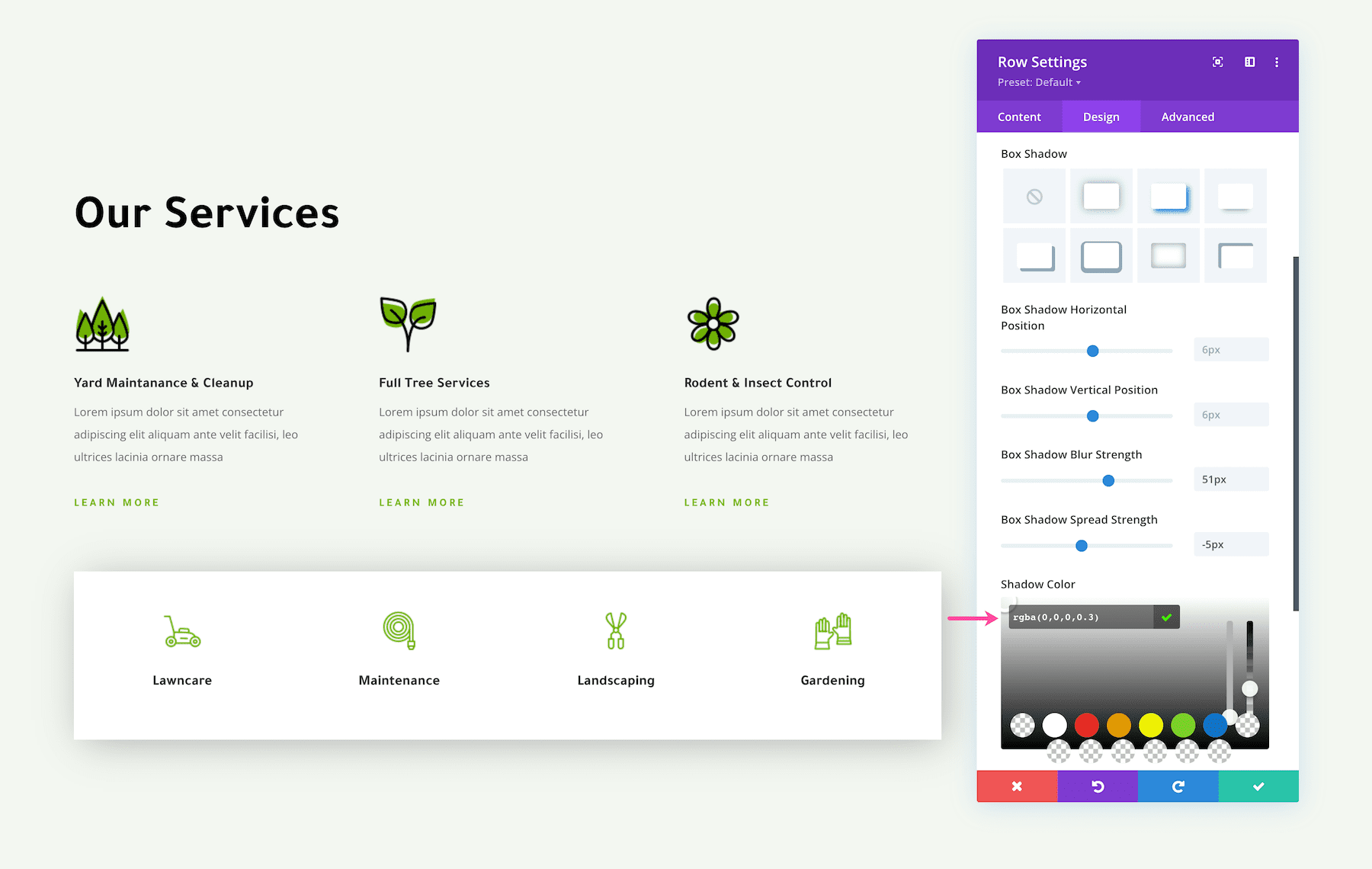
Box Shadow Horizontal Position
This defines the horizontal distance of the shadow from the element. A positive value places the shadow to the right of the element, and a negative value places the shadow to the left of the element. Simply drag and drop the range slider or input a numerical value in the input field to adjust this setting.
Box Shadow Vertical Position
This defines the vertical distance of the shadow from the element. A positive value places the shadow below the element, and a negative value places the shadow below the element. Simply drag and drop the range slider or input a numerical value in the input field to adjust this setting.
Box Shadow Blur Strength
This defines the strength (intensity) of the blur. The higher the value, the bigger the blur becomes, which makes the shadow become wider and lighter. The lower the value, the darker and narrower the shadow becomes. Simply drag and drop the range slider or input a numerical value in the input field to adjust this setting.
Box Shadow Spread Strength
This defines the spread strength (density) of the box shadow. The higher the value, the higher the density of the shadow which results in a more intense shadow. Simply drag and drop the range slider or input a numerical value in the input field to adjust this setting.
Shadow Color
You can also adjust the color of the shadow. You can choose from your saved color palette, global colors, or recent colors, or use the eyedropper icon to find a new color. Once you click on the eyedropper icon, you can input a hex value for the color code you want or drag the dropper to find a new color. We recommend setting a light opacity to your colors to create that soft box shadow effect.
Box Shadow Position
There are two options for the box shadow position: Outer and Inner. The outer position places the box shadow on the outside of the element, whereas the inner position places the box shadow inside the element.
Box Shadow Length Units
When adjusting the values of the box shadow, pixels (px) will be the default length unit used. However you can use other CSS length units by entering them manually into the input box for each property value. Common length units that are allowed include:
- px (pixels)
- vw (relative to browser viewport width)
- em (relative to element’s font-size)
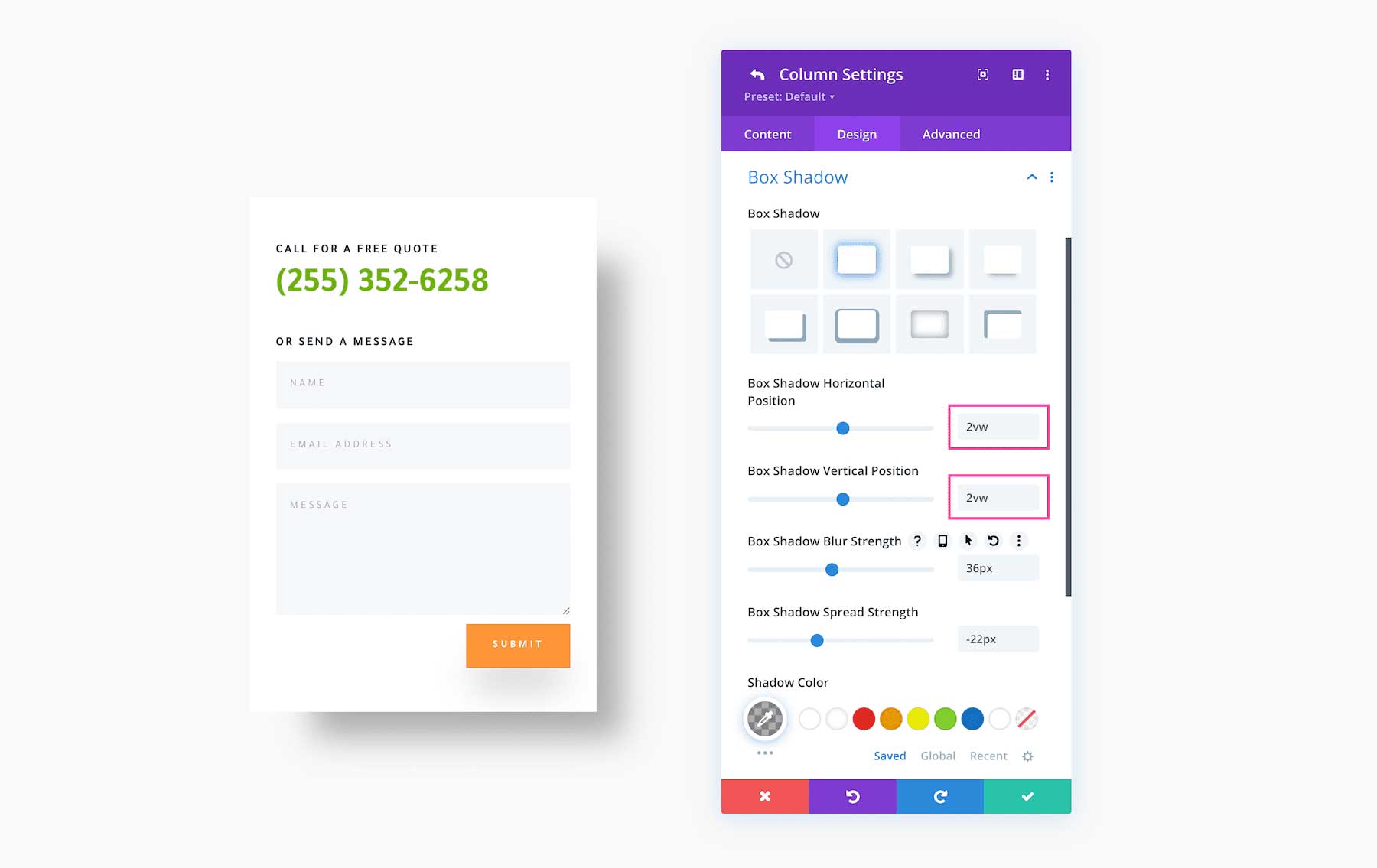
Some length units are NOT allowed. These include:
- %
- vmin
- vmax
Box Shadow with Rounded Corners
If you have a design element that has rounded corners, the box shadow will take on the same rounded corners.
Box Shadow Tips and Best Practices
Use Box Shadows with Borders
Applying both a border AND box shadow to an element creates two layers of creative design for framing content.
3-Dimensional Effect
Use a box shadow to create 3d depth for your design elements. Increase the blur and spread strength to create the illusion that the object is closer to the viewer, and decrease the blur and spread strength to make the object appear farther from view.
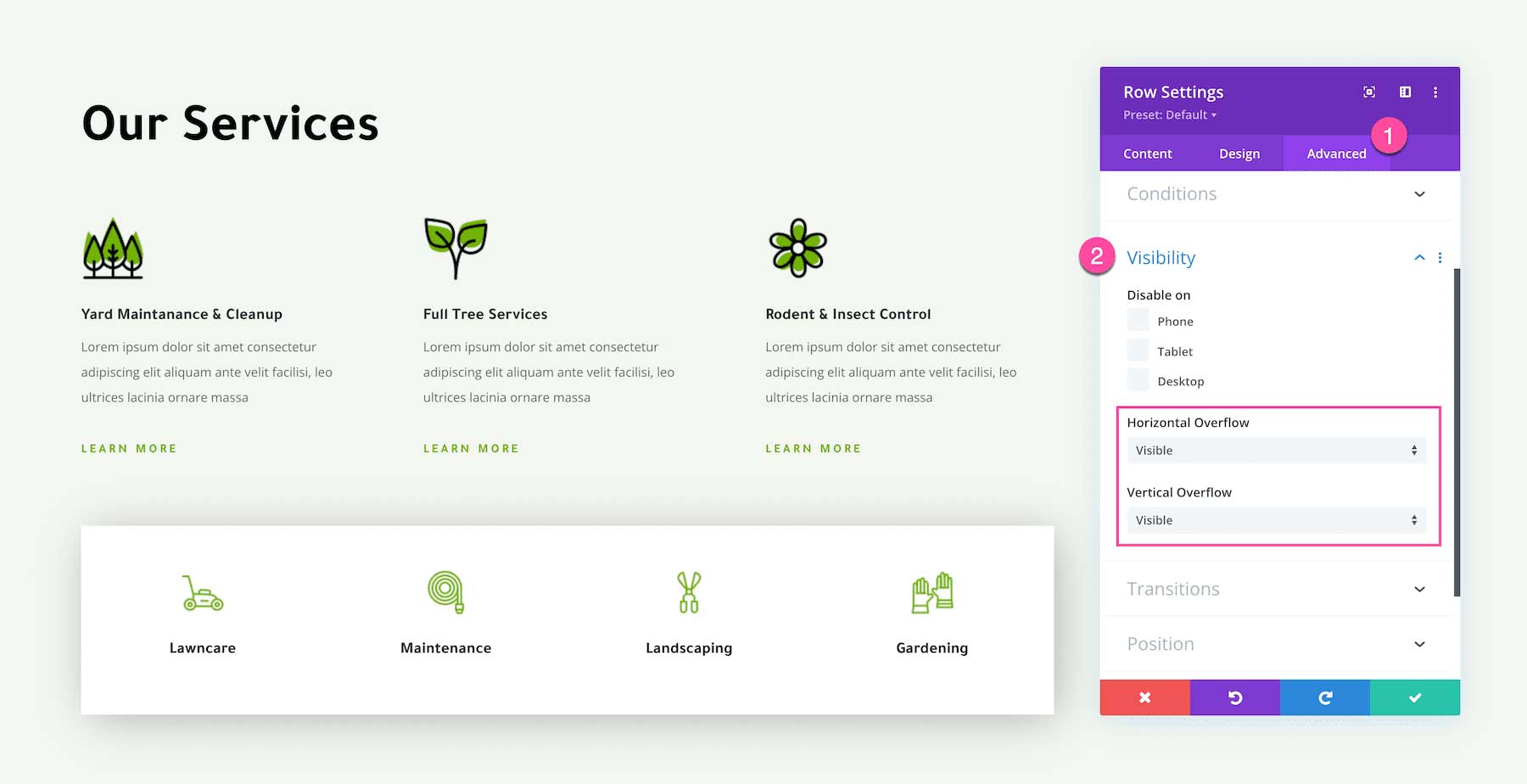
Ensure Visibility of Box Shadows with Horizontal and Vertical Overflow
In some instances, you may not be able to see the outer box shadow of an element. If this is the case, in Advanced > Visibility, make sure the horizontal and vertical overflows are set to “visible” when you have a box shadow with an outer shadow. Otherwise, they will be hidden.
Use Low Opacity Colors for Box Shadows to Illustrate Depth
In general, when you’re using a box shadow to illustrator depth, use a subtle low opacity color. You can lower the opacity of any shadow color using Divi’s built-in color management system.
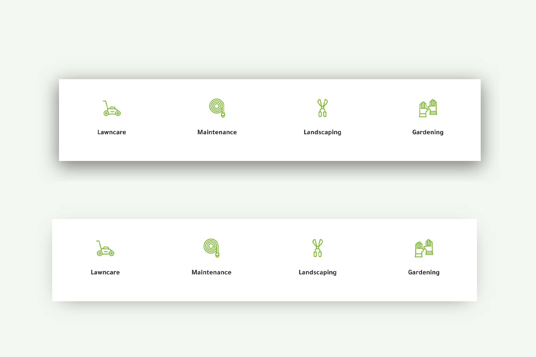
Frame Content Without Taking up Space
One way to frame content in web design is by adding borders to your design elements. However, borders take up pixel space in your web design so when your browser window is resized to a smaller width, the border will be a factor that limits the width of the container’s content. However, box shadows don’t take up any page space so it will not be a factor in how your content resizes as the window gets smaller. View the video below to see how the content size changes as a larger border is added, and how the content size stays the same when a box shadow is added.
Frame Content In Creative Ways
You can use box shadows to frame content in so many creative ways to highlight important content and make certain elements stand out. Check out the examples below for some inspiration.
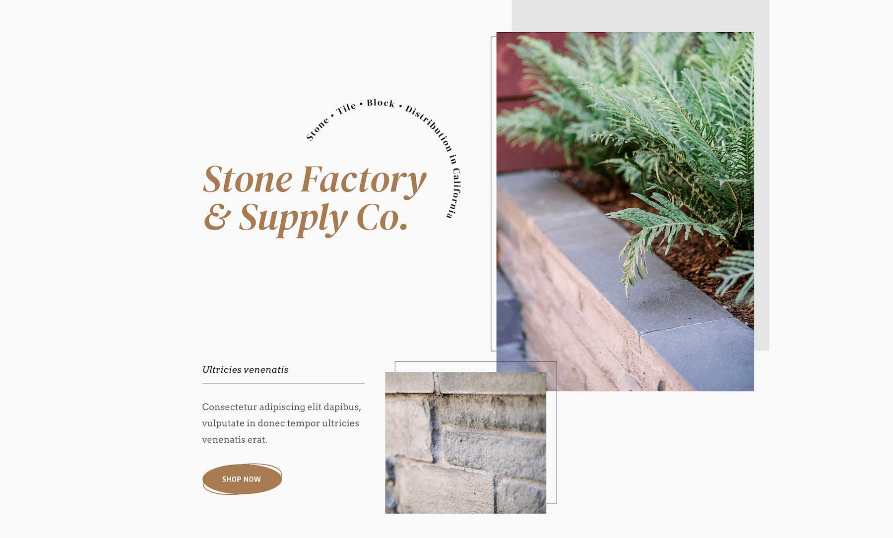
Example: Stone Factory Layout Pack

Example: Hostel Layout Pack
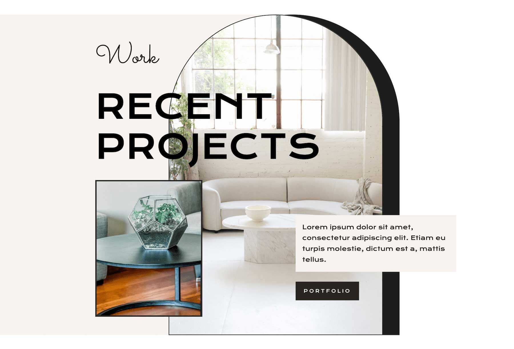
Example: Interior Design Layout Pack