
UI and UX are two popular buzzwords that have been around for many years. They’re also two of the most important buzzwords to WordPress web designers and developers. Sometimes they are used interchangeably in general conversation, but these two terms refer to two completely different, yet totally compatible, concepts. You might even say they are two sides of the same coin. In this article, we will take a look at what they are, where they came from, and where they are going. We will also see how they are different and how they interrelate.
What is UI?
UI stands for User Interface. It encompasses the tools that humans use to interact with machines. It is how the user controls and operates the computer. There are lots of user interfaces including physical switches and buttons, as well as onscreen buttons, fields, and selection switches. Touch controls such as touchscreens, and audio controls such as voice command. Even phones that have cameras to track eye movement is a kind of user interface.
For modern day computing, it’s basically how the user interacts with a website, app, or OS. The most common UI is a graphical user interface (GUI). There is also the web-based user interface (WUI). Here are some of the requirements of a great UI:
- Clean
- Clear
- Familiar
- Aesthetically pleasing
- Intuitive
- Efficient
- Consistent
- Forgiving
What is UX?
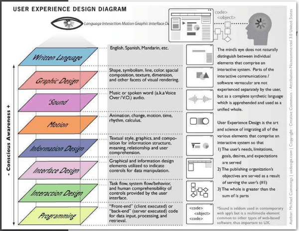
Image by UXDesign.com
UX stands for User Experience. Its primary concern is how the product feels to the user. It involves any aspect of a user’s interaction with the computer system. This includes the physical interaction, what they think about the graphics, the user interface, their behavior, their attitudes, and the emotions they have while using the system.
Designers work more with people and the experience they have while interacting with a computer or device. They look at human-computer interaction (HCI) and consider all the aspects involved with the human experience.
According to ISO 9241-210, the international standard on ergonomics of human system interaction, the user experience is defined as “a person’s perceptions and responses that result from the use or anticipated use of a product, system or service.” This includes all the user’s emotions, responses (both physical and psychological), beliefs, preferences, perceptions, behaviors and accomplishments that occur before, during and after use.
It’s actually very similar to Industrial Engineering as it compares ergonomics, motion analysis, the user’s perception and response. They even had a similar beginning. Here are some examples of what’s included in UX:
- Motion required to reach a button
- The look of the button
- The feel of the button click
- The look of the button click
- The emotional response of the user by having to click the button
- The emotional response of the user by clicking the button
- The emotional response of the user after clicking the button
- Did everything work as the user expected?
A Brief History of UI
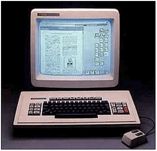
Image by PopHistoryDig.com
Back in the day, graphics were made to accommodate screens that displayed only green or ember. Sound was just beeps from a built-in speaker. UIs were text-only interfaces for most systems. Other systems used switches.
The mid-1980’s popularized the GUI’s that others had developed for years. Graphics improved but 320 pixels was considered high resolution. UI’s started to become graphical with boxes that could be clicked on.
Everything upgraded in the Pentium years and UI design was based on the general population having 14k modems. This meant going lean on colors and the number of clickable regions on the page. This meant fewer images at lower resolutions. It didn’t take long for the design trends to accommodate 28k modems, and then finally 56k modems.
Today the limits that can be shown on screen are relatively few. Website design is limited by the imagination and programming abilities of the designers and developers
A Brief History of UX

Image by OldComputers.net
The term User Experience came from Donald Norman in 1990, although the concepts and ideas have been around for longer than that to include effective factors and behavioral concerns within the design of systems. The term has grown to include more than this over the years. Here’s a look back in time.
Even though the field of User Experience Design is modern, the concepts for the user experience has been around for a long time. Dating back to the 19th century, the machine age brought in new needs for production and productivity improvement. Productivity improvement activities saw the need to improve the user experience in all aspects of work.
Henry Ford looked at making work more efficient, productive, and routine. Toyota expanded on this when they developed the Toyota Production System. Toyota included the workers in the improvement process. Manufacturing systems were developed that took the user’s experience into account. Toyota looked at waste in the process such as reach, motion, steps, walk, etc., and analyzed ways to make every aspect of work more efficient.
Switches were placed within a hand motion instead of an arm motion. Lights were moved so users could see them without having to move their heads. The users were more productive, and at the same time, their experience with the systems improved. This concept put the people first.
This continued on into the age of computers where the need for high productivity hasn’t changed. The computer age brought in keyboards, mice, light pens, graphical user interfaces, and touch screens. Buttons went from physical switches to digital representations on the screen.
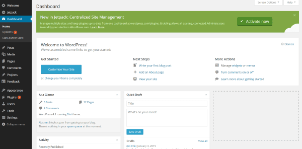
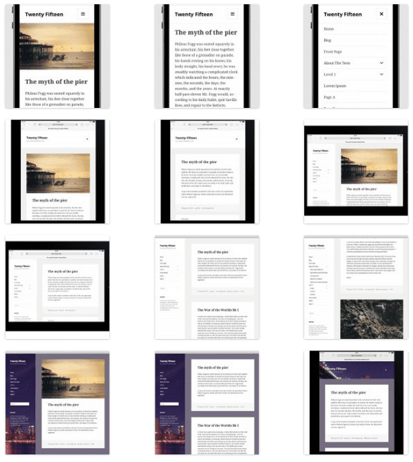
A Short History of the WordPress UI and UX
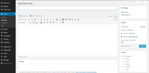
Before we look at where we’re going, let’s look at where we’ve been.
Most of the changes we’ve seen in the WordPress UI take place on the backend and primarily affect the admin (hey, admin’s are users too!). Lots of these, such as the commenting structure, affect the end users as well.
- The first version of the WordPress UI, from way back in 2003, did not have a dashboard and it was very limited on features. You could only assign one category to a post until the next version was released in 2004. The user interface was still simple and there weren’t very many features until the next 2004 release introduced plugins. This edition also added sub-categories, custom fields, thumbnails, post previews, and a few other items under the hood.
- The 2005 release brought in the dashboard and added pages and supported multiple themes. The next 2005 release introduced the WYSIWYG editor and Akismet because, as it turns out, spam can have an effect on the user experience. It also added image and file uploading.
- The two 2007 releases added spell-check (spelling affects the user experience), a menu structure for comments, tags, update notifications for new plugins and WordPress upgrade availability, URL redirect, and a button for the advanced visual editor.
- 2008 brought in lots of updates that included a new admin panel, one-click upgrade for plugins in the WordPress plugin directory, improvements to the visual editor, a built-in gallery, a word-count feature for the writing section, the ability to use Google Gears, automatic install for plugins in the directory, the ability to reply to comments from the admin panel, comment paging, sticky posts, keyboard shortcuts, and much more.
- 2009 brought in global trash/undo, batch plugin updates, easier video embedding, a built-in image editor, faster scripting to speed everything up, the CodePress editor, the ability to browse the entire theme directory and install a theme with a single click, drag and drop widgets in the sidebar, and more.
- 2010 introduced APIs to help developers with custom backgrounds, headers, shortlinks, menus, post types, and taxonomies. It also merged MU with WordPress, giving admins the ability to run multiple sites from a single installation. It also gave a lighter interface.
- 2011 saw the introduction of a modern UI and a full screen editor. WordPress got faster and lighter and a new dashboard design tightened the typography, design, and code.
- 2012 introduced another improvement to the images and media uploading and streamlined gallery creation. There were improved styles for the dashboard, everything was updated with high resolution graphics to be Retina-ready, a new color picker was added, and more.
- In 2013, automatic maintenance and security updates were added (I can attest that this had a positive effect on UX), as well as stronger password recommendations, better global support, autosave (another positive affect on this user’s UX), native support for audio and video embeds, and lots more.
- 2014 saw straightforward typography that felt at home on mobile devices, a better distraction-free writing mode, better media management, new metrics for better plugin searching and browsing, improved image editing, live widget and header previews, gallery previews, a new theme browser, and tons more.
As you can see, many of the WordPress improvements over the years make great improvements to the UI for both admins and end users. These improvements had the goal of building a great UX while building an efficient and effective UI.
What the Future Holds
Some things will continue on the path they are currently heading. Some will become more prominent, and some will be improved. Here is a list of some of the most important things to pay attention to in the near (and not so near) future.
Scrolling, scrolling, scrolling…
Scrolling will be more dominant in WordPress designs as more users are using mobile devices. Scrolling is much more user friendly than clicking. Scrolling is also more intuitive and improves the site’s load-time, which is a key element in SEO… so, score!
Flat UI
UI’s will be flat. Gone are the days of shadows and 3D buttons. Flat design is intuitive and simple, and it works best for mobile devices. It looks great and performs well.
Material Design
Here’s what Google says about Material Design:
“Develop a single underlying system that allows for a unified experience across platforms and device sizes. Mobile precepts are fundamental, but touch, voice, mouse, and keyboard are all first-class input methods.”
Concepts will include:
- Bold
- Graphic
- Intentional
- Motion provides meaning
Navigation will be designed to help users to be fast and efficient. Touch targets will be 48 x 48 pixels. It will support mouse-free and standard gesture navigation. It will help you manage the focus of the end user. It will ensure usability with larger fonts with enough contrast for reading. It will use color to convey information, use visuals as an alternative to sound, and provide clues about special relationships.
These are the features that web developers will be moving toward. It is with good reason that Google’s Material Design concepts will spill over to WordPress design.
Minimalism
Gone are the days of flashy things cluttering the screen. Forward-thinking websites will take a minimalistic approach to layout and design.
Mobile is King
Mobile will be king of the hill. We’ve already seen the latest rendition of Windows being built around mobile first. Google’s OS came from mobile systems. With small screens to convey the message, this means focusing on large visuals instead of small text.
Dynamic Backgrounds
Background video can convey a message much faster and in greater detail than text. For this reason, the trend toward high quality background visuals, whether they be video, graphics, or photos, will continue. Large images and video is easier to see and consume on smaller screens, like those on mobile devices.
Voice Control
More motion and voice controls. “Xbox on!”
The Eyes Have It
Eye control. This is not new – the Samsung Galaxy S4 did this. But it will become a more popular user interface as mobile overtakes desktops and laptops as the primary use machine for social media and the web in general. These concepts will even spill over to desktops and laptops through the use of cameras and motion-detection systems.
Tiles and Cards
Pinterest made cards popular and it’s been a consistent web design trend ever since. Its uncluttered look and functional layout will become a standard in WordPress design.
Typography
Typography will become more customized to match the brand-image. Fonts will be chosen based on style, image, mood, and so forth.
Personalized UX
Content is already tailored to customer’s behavior and tastes on many retail sites. Now it’s time for the UX to be tailored to each customer’s tastes as well. Analytics shows how customers use websites. This information can help websites to provide content to the user the way they use it the most.
This will give users more abilities to make changes to suit their needs. Even better is the site doing it for you. For example, if I go to Amazon.com every day to check the daily Kindle deals, a link to the deals should be prominent on the home page when I sign in. If I never use it, then the website should make something else more prominent.
The Basic Rules Remain the Same
Even though the design will be flat, buttons look like buttons. Links will look like links – if it’s clickable it will look like it’s clickable. Headings should look like headings. Similar things should be grouped. Page design should be consistent throughout the site (a button should be in the same place from one page to another). Everything should be organized in a logical manner and navigation should be straightforward.
Mark required items with an asterisks *. If a certain format is required then give them the format in advance. Give an indication that the system is working when they are waiting on the system. Indicate when they input information correctly (the red box changes to green, a regular face becomes a smiley, etc.).
Remove the chances for error. Instead of requiring them to input dates, numbers, and so forth, give them a way to select it from a calendar or drop-down box. Show progress with a status bar or similar indication.
Wrapping Up
Well that’s a quick look at the evolution if the user interface and user experience, how they relate to each other, and where they are heading in web design and development. For a site to be successful you must get a handle on your UX. Develop with the idea of the user first. This will become more prominent as websites continue to compete for user’s attention.
Your turn! What changes do you see coming to improve the UI and UX experience? Did I leave something out that should have been included in this list? I’d like to hear about it in the comments!
Article thumbnail image by vasabii / shutterstock.com


Dear Brenda, good job! We have translated into italian and published on our web site: http://www.marcellomoresco.com/ui-e-ux-design-con-wordpress/.
Regards!
Marcello Moresco
Brenda, I hope my earlier comments were taken in the tongue-in-cheek way in which they were intended. It occurred to me later that those who don’t know me personally might not appreciate my warped sense of “humor.” Sorry if there was any offense taken.
Brenda, I wondered what the difference was and your post is informative and easy to understand. Thank you.
Brenda great great great great article!!
Thanks for easy explanation about difference and history!
Can someone please tell the designers at Elegant Themes that the stupid pop up message asking me to subscribe – EVERY – time I come to their site is a very bad UX in fact it SUX!
Nice article though, thanks.
Unfortunately good design skills are an innate ability that I cannot learn!
Fantastic post Brenda 🙂
Another great article, thanks. There’s a small typo – “green or ember” should read “green or amber” (unless that’s an alternative spelling that I’m not aware of).
Brenda,
This was a pleasure to read. It was informative, well thought out, and at times even entertaining.
I found the article to be something many of us already “realized” but might not have been familiar with the term UX. So I find it nice to have an acronym we can use (and now be familiar and knowledgeable about).
I agree that paying attention to the concept of UX is going to be vital as we move forward.
I just wanted to say thanks for this extraordinary article on the subject of US vs UX.
Sincerely,
Gary Gordon
President > WPBNS.com
It is best not to use ready-made solutions when it comes to UI. But the article is interesting.
Thanks for sharing such a informative post and the way in which you have defined the evolution of UI/UX design is really appreciable.
Thanks! for sharing so valuable and detailed article.
1. There are people who use the terms “UI” and “UX” in “general conversation?” I’m afraid I’m not one of them. Ran into an old friend in the grocery store the other day. It never occurred to me in our general conversation to bring up her UI or her UX. If I had, she would have probably launched into one of those excruciating conversations regarding recent medical procedures she’s had, as people over the age of 50 are so inclined to do…
2. I like shadows and 3D buttons. I’m not going to quit using them altogether. So there.
3. Not looking forward to more voice and motion controls, especially for web sites. On the extremely rare occasion that I travel on a subway train, having people talking to their i-pads and waving them around to navigate a website would not be something that would enhance the UX of the subway ride.
4. By now you realize that I am so hopelessly old-fashioned that the 60 seconds you’ve just spent reading my comment is time that you’ve wasted and will never get back.
Ironically, I think MS and the XBox One “Xbox on” debacle are proving that no one actually likes or wants motion/voice controls everywhere.
Great article !
Well written article full of good information. A concise list new trends and feature sets for web design.
This post is so interesting and informative about the way things have gone and are going in web design.
Apart from being interesting it will be a really helpful guide for me in designing and building websites for may clients.