
A good UX design is essential to increasing the effectiveness of the emotion, intuition and delight a visitor feels when navigating a website.
Statistics on UX design reveal:
- Only 55 percent of companies conduct any online UX testing. (source)
- 88 percent of visitors informed they are less likely to revisit a website if they had a bad user experience.(source)
- Every $1 invested in user experience can result in a return up to $100.(source)
The stats show that UX has the potential to rule website visitors and ROI-thirsty businesses with an iron fist, yet few companies pay attention to it. Those that do deliver more engaging, rewarding, and meaningful customer journeys.
Although nothing is set in stone on how to create a great user experience, a look at the latest UX design trends can help you determine what elements are being embraced by users (and what elements drive them mad).
Acknowledged? Then let’s take a look at the 5 UX design trends you should be aware of:
1. Exploration Design Becomes Common
Curiosity is the primal response of visitors when they encounter new experiences. According to scientific research, when a person embarks on a novel experience, their brains produce high quantities of dopamine (a neurotransmitter that controls the brain’s pleasure and reward center) as compared to familiar situations. This results in attachment to new experiences, which urges them towards continual discovery.
A design that enables users to experience new information or engagement is therefore critical to ignite positive associations with a website. Social media sites do this really well; a user never follows the same steps. One day you’ll be checking out someone’s profile, the next day you’d be exploring the newsfeed to see what’s trending and who wrote that viral post.
By enabling users to wander through their digital experiences with a sense of discovery, you can utilize this UX design trend to your website’s benefit. Take a look at what Shopify did with their footer:
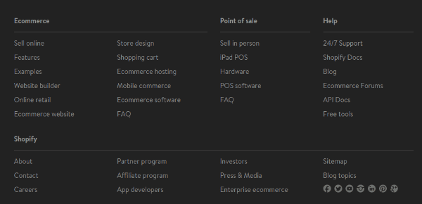
The elements force people to explore – there’s the blog, point-of-sale resources, community forum, affiliate opportunity and a lot more. Heat maps can provide insights on whether the elements you’ve designed are triggering exploration behaviors.
2. Web Designers Pay More Attention To Microinteractions
There’s a reason why Dan Saffer’s book “Microinteractions – Designing with Details” is attracting eyeballs these days. Saffer described microinteractions as little bits we don’t think about often. They are not similar to features, which have a larger scope and include multiple user stories. Microinteractions are brief, simple and almost effortless.
Saffer also revealed that effective microinteractions follow a four-step process:
- Trigger: The visual signifier that initiates the action.
- Rules: Determine what happens in what order when a user takes action.
- Feedback: Verification for the user about what’s happening as a result of their action.
- Loop & Modes: How long does the microinteraction last (does it repeat itself or ends immediately?).
This is one of the few UX design trends that can make users love or hate a website. Here are a few examples of microinteractions:
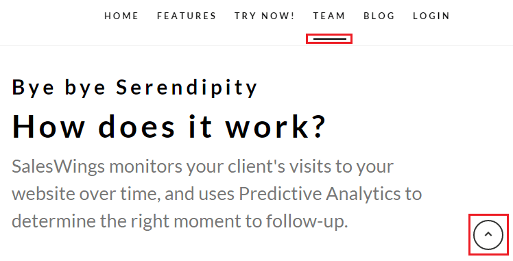
- SalesWings
On the website of SalesWings, there are tabs at the top right corner. Putting the cursor over one of these tabs underlines it, informing the user about the tab they’re on.
Also, when you scroll, there is a button at the bottom right that takes you at the start of the page. These seem like tiny elements, but are important microinteractions for enriching user experience.
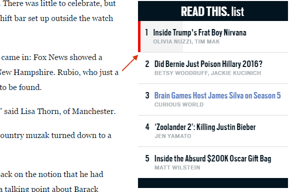
- The Daily Beast
When you read an article on The Daily Beast, the grey progress bar in the right sidebar indicates how much you’ve read.
The underlying premise here is facilitated learning through prompts and instructions.
Focus on incorporating elements that facilitate interactions, with notifications, feedback, details, and even little entertainment. But make sure to communicate information in a way that doesn’t distract or bore users.
3. Testing of AI-based UX Design
UX designers will start testing a variety of aspects from computer engineering in web design, changing sites in ways that create an intelligent or open-minded dimension for user interactions.
Think of the iOS keyboard for instance; the AI inside it draws attention to itself. When users type on the keyboard, they interact with AI that changes its guess about what word the user will type next dynamically.
AI-based UX design trends purport that the key to winning the visitor’s attention is to develop a model of the user’s goal and then let artificial intelligence interpret user actions in the light of those goals. Expect more designers to test AI on websites and web applications this year.
As for the debate whether users can trust machine-driven advice, Corina Yen and Clifford Nass wrote in the book “The Man Who Lied to His Laptop: What Machines Teach Us About Human Relationships” that people treat machines like normal people. As we use devices with people-like characteristics, we hold them to people-like expectations without realizing it.
AI and UX design could be a match made in heaven because AI can be integrated into the design without drawing attention to itself. That means the user may not know there’s a clever algorithm running in the background of a website they’re looking at. That is what happens in the Facebook News Feed, but not everyone notices it.
A great example of this UX design trend is Netflix’s website. The AI works in the background to recommend you movies based on your preferences in genre (but it does take into account loads of other factors such as browsing habits, microinteractions, etc.).
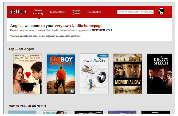
UX Magazine pointed out that the enriched experience doesn’t come from what is recommended, but how the recommendations are presented. For instance, users don’t just get recommendations for romance, they get recommendations for regency romance. That is the level of personalization that enriches the UX by bridging the gap between machine and man.
Note: Anticipatory design is almost the same concept, with the aim of creating personalized user flows and bypassing decision fatigue.
4. Automatic Carousel Will Become The UX Detractor
UX design trends also include the death of some old practices. A major one is the use of carousel or automatic image sliders to attract users. Research pointed out that a rapid change in something (including carousel) triggers the reptilian part of the brain and distract site visitors.
ConversionXL cited this tweet from product design expert Luke Wroblweski:
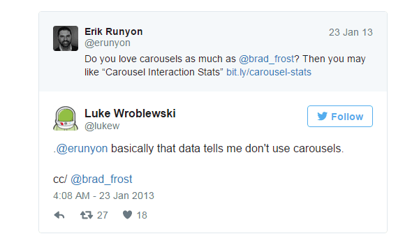
Also, because carousels are often placed at the top of a webpage, they can be mistaken as banners. This can be an issue as users avoid things that look like an ad (even if it is not actually an ad). Moreover, there is a slim chance that users will absorb the important details from the carousel, as each detail changes after some seconds.
Search Engine Land published the data of three B2B sites for which event tracking was set on carousels. Site 1 used carousel for branding reasons. Site 2 used carousel to promote whitepapers and webinars. Site 3 used carousel to promote their services.
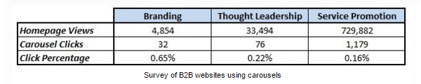
As evident from the numbers, visitors barely clicked on the carousel. And in most instances, these few clicks don’t give an ROI that’s worth your efforts. So what could be a better approach than using multiple carousels in web design?
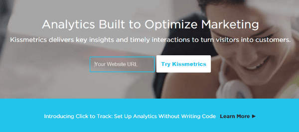
A hero image background perhaps.
The homepage of Kissmetrics is a great example. They have good typography along with a hero image background, which should perform better than sliders or swishes. Visitors are given time to learn about what the company does, and can click on the black button to learn more. They are also given an option to try the analytics software by entering their website’s URL.
Another thing you can do is provide different options that take visitors to different landing pages. It is a great way to narrow down their focus than to throw information at them for just a few seconds.
On Aflac’s home page, the options remain static.
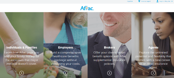
And users have control over which landing page they want to go to. Even eCommerce companies can replicate these UX design trends instead of relying on carousel to showcase their products.
5. The Rise of Content Display
Web designers will collaborate with copywriters and content marketers to display content in intriguing ways. Visitors may love reading blog posts, but you can take user experience up a notch by using different elements to display content.
Display content can be in the form of graphs, tables, buttons, lists, etc. For the purpose, designers are encapsulating the content where it is easy to read and get the message from. Content in different forms rather than one will attract users and their affection for the website.
As visitors continue to tame the web, the use of varying elements for content display will become increasingly popular. Rather than empty whitespaces and states, designers will use this trend for message interaction, length, and optimal call-to-action.
For example, take a look at Piwik’s landing page:
It uses line graphs and tables for content display. It takes more time for the brain to process the text and depict what it all means, but graphs and tables are concise and clear.
However, there isn’t always enough space on a landing page to display all the content you want visitors to read. Fortunately, you can solve this issue by offering users an option to hover over the content display, and link the display to another landing page, so that visitors can read additional details by clicking the display.
Final Thoughts
As visitors interact with elements on a website, and compare this interaction with UX on other devices (smartphones, tablets, etc.), it will become critical for web designers to incorporate real-world context. The trends mentioned above will play a decisive role in UX development, and their implementation will undoubtedly be seen on new websites and sites that receive a makeover.
What are your thoughts on these UX design trends? Did you spot a trend not mentioned in this post? Feel free to leave comments.
Thumbnail via vasabii / shutterstock.com


This article got my thoughts in motion. A great post.
Great Post !
Thanks for the share
Glad the SalesWings website is recognized to be using recent design trends! 🙂 Here you can see our full site http://www.saleswingsapp.com
Okay, I officially love you Elegant Themes. Your article took me on a chase for all the articles on B2B and sliders and you are right on. The best part is the timing is perfect. We just bought the Elegant Themes lifetime membership and are in the process of building two websites. Your article, and several others it led me to, are causing me to rethink our whole approach to website design. The issue of UX is fascinating, and something all business owners need to come up to speed on fast. I am loving the blogs here. Thanks for a good product and thought provoking articles.
Perfect timing for this post !! Thank you 🙂
What have you found to be the #1 Best way to test User Experience (without paying loads of money from the testing companies)?
I think all website owners know that their UX can be improved, it’s sometimes just hard to know where the weak spots are.
I think this topic of affordable usability testing is a great idea for a future blog post. In the meantime I was able to find this http://uxmyths.com/post/831431504/myth-22-usability-testing-is-expensive
The research on carousels is super interesting. Awesome stuff!
Glad you liked it Cody 🙂
awesome post Dan. My website is still in its infancy stage, so i am still learning what people are doing on my website. Some of the things you noted are things I will definitely be considering to try. Thanks for the insights 🙂
Actually,Reality is UX plays an important role on ROI.Bad user experience means loss of potential customer & sales.I’m trying my level best to increase user experience on my site.thanks for your useful stuff
Really good article. The challenge is to get marketing departments away from a pure focus on a “beautiful website” towards an “effective website”.
As our designer here at ET (Mario Maruffi) has said to me often, “Web design is not art (in the sense of a painting). It’s about accomplishing objectives.”
Great post!
The dopamine connection to memory is amazing. Just posted on my blog about curiosity, dopamine, and UX design last week. http://bit.ly/1Rj9D8M
Similar idea, but a little different. I like you take on it.
Thanks!
Sounds really interesting. Thanks for sharing.
I’m not sure if the author realized it or not but kissmetrics.com is built on Divi. My team (dark square.com) recently moved them to Divi and it’s helped tremendously with their marketing efforts.
Great article. Thanks for sharing.
That’s awesome! I know I was not aware of that. Do you have any specific examples you can share?
mainly the freedom to make updates quickly without calling me or another developer to make changes or additions to their marketing site.
We’re all excited for the coming a/b testing features announced.
I’m a newbie here, but will someone please tell me what UX is? I never heard of it until three or four months ago, and now it’s everywhere. And I still don’t know what the letters UX stand for.
UX is short for User eXperience
User Experience
Really good post, thank you. Given me somethings to think about for projects coming up this year.
The change away from carousels makes total sense when you look at it like that, triggering your reptile brain, forcing a fast reaction. I’d not looked at it from that angle before.
I’ll definitely be using some of your ideas, many thanks.
Thanks Dan. You’ve explained UX in terms of my very own. Now I know why I keep bookmarking sites that delight me and keep me engaged. Some are low hanging fruit like robust footers and making it easy to explore. I appreciate the additions to my swipe files. Not to implement.
A great article on the basis of what customer and viewers prefer to see and interact with a website, I agree sliders can be distracting but they also have a place with photography and art visual sites.
I agree, yet disagree – I think galleries (groupings of thumbnails that trigger on overlay slideshow) are more effective both from an aesthetic standpoint (eliminates the distracting context of the site itself) and from a performance standpoint (don’t load the images until they’re needed). Also can give the user an at-a-glance taste of the artist’s overall style without having to make the commitment of clicking through an entire slideshow.
I totally agree Adam, but static UX with buttons could work for these sites too. Perhaps users would appreciate being in control 🙂 A/B testing is the key.
Very thought provoking. Some of the ideas have reinforced my suspicions and others are making me think
Same here! Did you like the SalesWings example?