Logo design trends are important for web designers to stay on top. After all, maintaining this knowledge ensures your portfolio remains relevant and up-to-date. These trends are also something you need to pay attention to if you wants to wow every client that requests your services. And since logos help brands tell their stories in the simplest visual way possible, this is pretty vital.
Every client has a different set of tastes, and every project requires a different style. Knowing what styles are in and what styles are working–as well as having the skills to utilize those styles–are all things you can use to keep your designs ahead of the pack.
It’s also important to remind yourself of the way businesses use logos in the digital era as you approach the design process. Customer reach is achieved through social media and other digital channels, which are places where a recognizable logo from a reputable brand can catch someone’s attention in an instant. This, too, is pretty important.
We hope this list helps you design beautiful, eye-catching logos. We’re offering up plenty of inspiration and maybe even a heads up on a few styles you may not be aware of. Some of these trends aren’t new, but they’re definitely relevant.
1. Flat

This style isn’t new but it’s definitely a hot trend. The more companies that use this style, the more others will take notice and be influenced to use it in their logos.
A few major examples include the logos for such brands as IHOP, Microsoft, Windows, and Netflix. All of these brands had bold, 3-D logos in the 2000s as those were the styles that were trending at the time. However, as flat styles began to hit the world of web design, these companies took advantage of the trend by creating simple designs that portray the brands in a fresh, minimal way.
Style isn’t the only reason this type of design became a trend. Its simplicity allows these types of logos to scale well, making them compatible with numerous browsers and mobile devices. This is especially important as the entire world of web design is in the middle of an epic shift to responsive and mobile design in an attempt to improve compatibility with smartphones and tablets.
2. UI-Friendly Typography
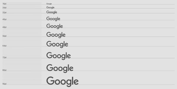
More and more people are choosing mobile devices over desktops/laptops these days. This is increasingly the case every year and brands are finally beginning to take notice. More and more brands will redesign their logos with sans-serif typefaces that scale well and look great no matter what size screen they’re on.
One major example of this is Google’s recent font change in September 2015. The company had been using a serif font since 1999 but switched to a sans-serif font designed by its own team of web designers to modernize its font in a way that makes it scalable at any size.
The company tested the font at many sizes and designed and redesigned as many times as they needed to reach the right size and spacing. It also created an animated version featuring four dots in Google’s colors that’s meant to be used for transitions in Google apps and products as well as a compact “G” version.
3. Minimalism

Minimalism isn’t new. It’s been gaining traction in every area of design throughout the last few years, from interior design to web design. It became a hit in site designs beginning in 2014 and its continued relevance makes it a hot choice for logos this year.
Minimalism emphasizes flat designs that use as few colors as possible in an attempt to influence where a potential customer or site visitor focuses his attention.
In e-commerce, this might mean designing your site against a white background with your homepage featuring nothing but a plain black text version of your logo, a transparent navigation menu featuring black text, and stunning images of your products displayed as a gallery. This cuts out prices, product titles, product descriptions, sidebars and any other objects that may draw customer attention away from what really matters — your products.
This works the same with logos. By using this simple style, you can create a straight-to-the-point design that cuts down on clutter to draw potential customers’ attention right where they need to be, which is–of course–your client’s brand and overall message.
4. Line Art
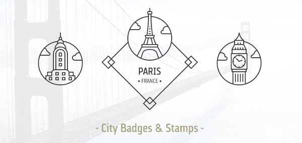
Image source Dreamstale / Creative Market
Yep. This 2015 design trend is here to stay, and it’s even made its way into logos. Monolines get their name due to the single, thin lines that comprise their designs. This line is typically the same thickness throughout the logo, and the logo is most often one solid color. That color is usually black.
You’ll typically find this logo being used in the coffee and food industries. They’re simple, but they contain some type of graphic that makes them playful as well. While these logos are often accompanied by a graphic, they can appear without them as well.
5. Hand-Drawn
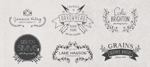
Image source: MakeMediaCo. / Creative Market
The digital era is in full swing, but many still love the look and appeal of hand-drawn fonts and logos. That’s why this hand-drawn style is likely to remain a trend. It relies on semi-connected and connected script fonts in combination with cute, cartoonish graphics to portray a more personal feeling.
This is most useful for brands that don’t require the serious sophistication of many minimalist styles and instead prefer to use a lighter approach when it comes to branding. This style also allows designers to add more color to their logos, creating freer tones in designs.
6. Negative Space

This isn’t a new trend, but it’s picking back up. A negative space design uses what’s typically unused white space and incorporates it into a logo as a “subliminal message.” A popular example of this is the NBC logo. This logo features a peacock spreading its feathers, displayed as vibrant colors. NBC adopted a peacock logo in 1956 to advertise its use of color programming, which was still new at the time. A variation of the logo we know now was adopted in 1979.
7. Stacked Text

Web designers like to use plain text with one solid color in minimalist designs, but some find this approach tired and overused. So, they make a compromise by stacking the text vertically in a way that may catch your eye much more effectively than horizontal text.
This design can also be paired with horizontal text to create more style possibilities while still relying on one primary style. It’s a new and simple approach to an already simple design. Again, it’s nothing new, but it’s still a contender for our list of logo design trends because it continues to be relevant.
8. Modern Retro/Vintage
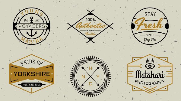
Image source: Decade Type Foundry / Creative Market
This style began appearing a few years back but picked up in 2015 and will definitely continue. It combines the flat styles of today with the shapes and styles that appeared in older logos. It’s a fresh take on a traditional style, which can always be a great way to combine things you already know and turn them into something no else has seen.
The best part about these types of logo design trends is how striking their appearances can be when you see them for the first time. They may not look as sleek as the minimalist styles do, but they certainly get the job done when it comes capturing a customer’s attention and portraying everything a brand represents, especially when that means portraying a brand’s silly personality!
9. Mixing Things Up

This one kind of relates to the stacked text style. It uses varying fonts to create contrast within a text-based logo, which is similar to how you would place black text against a white background. Like the stacked text style, it’s a great way to use the basic styles you were already using and spruce things up a bit.
How you mix the fonts up can be done in various ways. You can use a different font for each word. You can use a different font for certain letters in a word, such as the “o’s” in Moot if that was my brand name. The only thing that remains the same with each variation of this style is that whichever way you choose to mix things up, one font is always in plain format while the other one is a little more fun and vibrant.
10. Dynamic
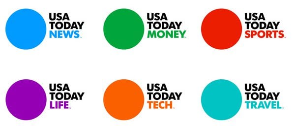
This is one of those decades-old styles that has probably appeared on many lists of logo design trends, perhaps even in print. But it’s been used by more and more companies in recent years, which has earned it a spot in this logo design trends list. What is a dynamic logo exactly? In basic terms, it’s a logo that changes regularly but remains the same in some way so you can always identify the brand.
A great example of this logo can be found at USA TODAY. The company keeps the same logo and with primary brand name and a circle for each different branch of its network, but changes the sub-text and color to identify these sub-categories will still making it recognizable as a part of USA TODAY.
What is the Recurring Theme?
With Google’s Material design, the matured form of flat design, set to become a top web design trend, flat designs are set to be a recurring theme in logos this year. Almost all logos will have some form of flat design, whether it be true flat or variations similar to Google’s Material design. It may even be Flat 2.0, a variation of flat design that features subtle shadows.
Flat designs have a simplicity that allow simple colors and shapes to become bold and vibrant. These styles can be transferred over to logos easily to create striking brand identities using very few elements. Many companies transferred over to simple, flat logo designs in 2015, and this will continue.
Logo Design Trends – Final Thoughts
Winning a consumer over with a well-designed logo may be one of the most strategic moves a brand makes in the modern era. Consumers have more distractions now than ever, making it increasingly hard for brands to get noticed, especially as online business continues to grow. But with a solid grasp on the logo trends, you’re certain to get a leg up on the competition.
What are your picks for logo design trends? Let us know in the comments!
Article thumbnail image by piickz / shutterstock.com




Ironically our logo is very old and drawn into thousand eight and it’s automatically a flat logo
great logo designs and colour selections very useful blog i love yhis blog,
Thank you!
Hello
logos are a way to set up our brand
thanks for the post
useful
Perhaps this is a strange question . . .
But I was curious
How to assess or predict that something will be the future trend
Including logo design
I found a misstake. The headline is “10 logo…” but I can just count 9 trends. Between 8 and 10 is one number missing.
But I like the blog you wrote.
Sorry about that. The article has been updated.
I mean you skipped one number.
Perhaps that was the “negative space” they were referring to. LOL.
Christyn, you have to understand the marketers are money-obsessed chattering monkeys, they don’t bother with making actual sense, their shtick is to convince you that they make sense.
The other marketing monkeys type “oh thank you it’s so great just what we need” ad nauseum to fool normal humans and help to bury us all in peanut shells. The mistake is in taking them seriously.
sorry i dont agree with any of this.
I do a logos with various elements new and old for various clients with various tastes.
logos cant afford to have trends as they represent the vision not the trend.
Although, I appreciate the intent of this article, anyone who is trying to create a logo, logotype, or mark for themselves or any client, shouldn’t be focusing on any design trends. Instead, they should focus on just the opposite: creating a unique and memorable identity. Don’t follow trends, create them. 🙂
The great thing about using flat design in logos is the small file sizes. Your logo is one of the few images that appear on every page of your website, and being able to create a tiny PNG file (due to the simple flat colours) means that your logo doesn’t just look simple and clean… but is also economical to page load times.
#9 really left me feeling like someone forgot to add it to the article. LOL
It’s an example of ultra-minimalism.
Whoops. That was a mistake for sure. The article has been updated to include all 10 trends.
Great article Lyn. It’s very exciting to read into the design trends for 2016! Looking forward to my upcoming projects to practice this.
Out of all these logo designs #7 and 10 caught my eye and imagination. Thanks for sharing this article.
Make that nine logo design trends
Sorry about that. The article has been updated to include all 10.
Hi Lyn,
great article. My personal suggestion to elegant themes: adding the font-family to the fonts provided with DIVI!
ciao,
Lillo
I’d add to that the ability to seamlessly add your own font from the Divi c-panel.
I was very surprised to see the logo trend going toward the “flat” design logo, but after the launch of the new iPhone with the “flat” icons I knew it would start a trend, and it has. Many of my logo designs are for minor league sports teams, after the success of the Mighty Ducks when Disney owned them everyone was requesting some sort of “character” logo with the name of the team under or above the character, that now has taken a back seat to the more simplified old school logo designs. The logo that has never changed and is always at the top of sports merchandise sales is the logo for the Chicago Blackhawks, the colors in the logo as well as the colors of the uniforms are very classic and not “gimmicky” like the Ducks logo.
Still one of the best “negative” space logos I love is the old logo for Northwest Airlines:
http://goodlogo.com/images/logos/northwest_airlines_logo_2557.gif
it took me a while to see the “w” but that logo is a classic that isn’t used any longer and great use of negative space!
I think a better logo is one for a long long time – example Coca Cola
Its interesting how little the Coke logo has changed since 1905: http://www.ideator.si/wp-content/uploads/2013/08/history_and_evolution_of_logos7.jpg