
Layout design isn’t as simple as just adding text and images to your page and hoping for the best. A stellar layout can help to attract viewers and guide them to the most important sections of your content. Thankfully, there are plenty of strategies you can employ to make the design process easier.
In this article, we’ll offer four tips for creating a balanced layout for your website, such as using white space and repeating important design elements. Throughout, we’ll also tell you how you can use Divi’s functionality to bring some of the elements to life. Let’s get started!
Why Your Page Layout Is Important
Your page layout can be the difference between people leaving your website almost immediately, or sticking around to read your content. In a nutshell, the right layout can attract visitors, direct them to the most important content, and encourage them to stay on your site.
Of course, people would rather spend their time looking at a beautifully designed website than something plain. Quite simply, an unattractive website is enough to lose visitor engagement.
While gaining website visitors is one thing, getting them to behave in a certain way when they’ve landed is another thing entirely. Ultimately, you want your most important content to be consumed, and your Calls To Action (CTAs) to be followed. In fact, the human mind actually expects and wants a CTA – so all you have to do is guide the reader in the right direction with the correct layout.
4 Layout Design Tips to Optimize Your Web Content
While the tips in this article will cover a myriad of design elements to get you started, there also numerous websites to help you find layout inspiration. Sites such as Awwwards showcase great, high-quality examples – and even Pinterest can be a source of inspiration. As for the tips, let’s take a look!
1. Use a Grid System
In the context of web design, a grid is set of visible or imaginary horizontal and vertical lines that serve as guide to help you organize and arrange your content. While plotting your grid system, you can also incorporate other design techniques such as the use of a focal point and the rule of thirds.
A good focal point, whether it’s part of an image or block of text, should serve to capture the reader’s attention. It is often placed in the center of the page, or the center section of your grid.
The rule of thirds is based on the concept of splitting the page in three vertically and/or horizontally. However, this doesn’t necessarily mean that separate content sections have to appear in three columns, and some might span two. For example, many web pages – such as our blog – have a sidebar that takes up the right third, while the main text spans the left and middle thirds.
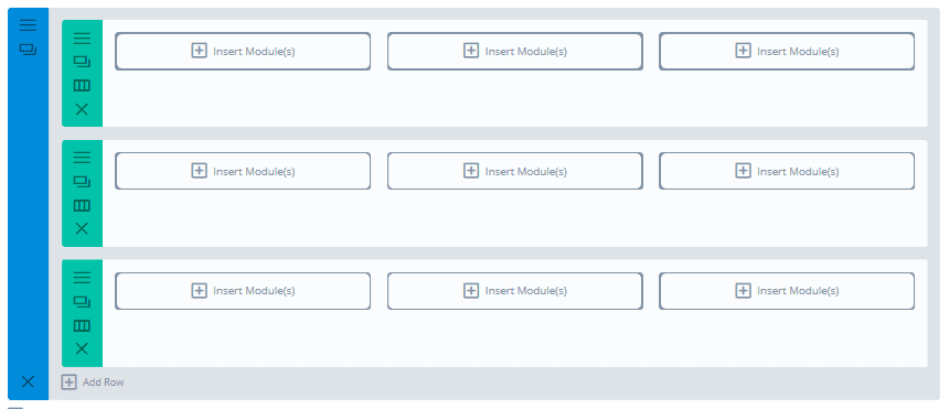
Using the Divi Builder makes it easy to create a grid of elements. For example, to apply the rule of thirds very literally you can create three rows, each with three columns:
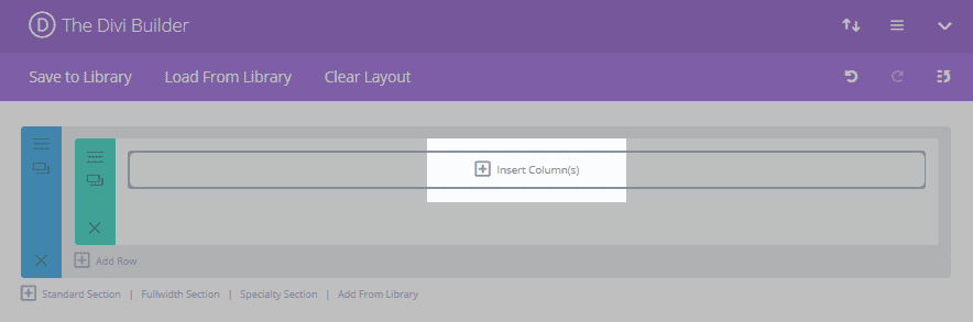
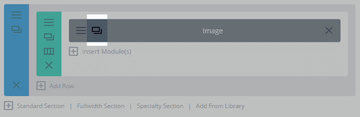
To create this grid, first go into the Divi Builder and click on Insert Column(s):
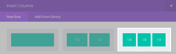
In the pop-up select the three column option:
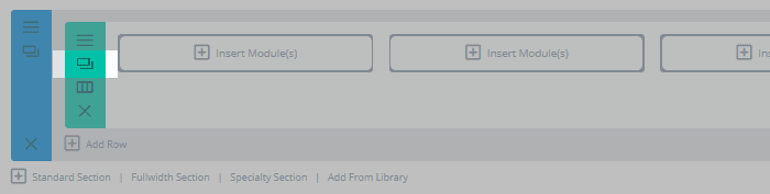
Next, click twice on the copy button and you’ll have a three-by-three grid, ready for your content:
Of course, this isn’t the only element of a great layout. Where you guide the reader is also crucial.
2. Structure Your Content in a ‘Z-Pattern’ or ‘F-Pattern’
Depending on the type of content you display, most people read web pages in a certain way. Eye tracking studies using heat maps have shown that the most common patterns are F-patterns and Z-patterns. You can use this knowledge to your advantage to guide the reader to the most important areas of the page.
When a reader scans the top of your site from left to right, then looks at your page from top to bottom, this is an F-pattern. They typically apply to more text heavy pages, such as blog posts, and it showcases the importance of using subheadings in your content.
In contrast, readers who scan across the top of your site from left to right, diagonally down to the bottom, then again from left to right are said to be reading in a Z-pattern. They’re applicable for simpler pages, particularly those with a CTA. This is why it’s often recommended to place your CTA in the bottom right hand corner of the page. Of course, the other information along the bottom of your page should also offer the reader enough information to entice them to click the CTA. The Quick Sprout homepage is a good example:
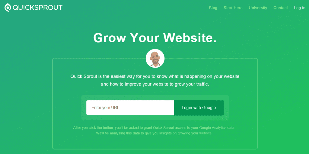
The logo and navigation menu lead you across the top of the page. The eye is then drawn to the bold text and image of a face in the middle of the page, which will hopefully entice you to read the sales copy. Finally the bright white URL bar leads you across the bottom of the main content to the CTA button.
In Divi, the modular system makes creating F-patterns and Z-patterns simple. You can start in the Divi Builder to create your general layout and content, then tweak it in real time using the Visual Builder.
Of course, it’s also important that the CTA itself is clickable. Our Divi CTA module can help persuade your readers to click through:

Within this module you have practically endless options for creating incredible CTAs. You can control sizes, fonts, and colors among other options, and can even make them sticky so that they’re permanently wedged in place.
3. Repeat Important Design Elements
Repetition of elements is something that we often add into our designs without thinking. Maintaining the same font and size for subheadings, or using the same bullet point style throughout a piece, are both common examples of element repetition. However, it can also be expanded to images, graphics, colors, spatial relationships, and pretty much any component of design you can think of.
Element repetition injects consistency into your layout, and it unifies the individual components to create a more cohesive and appealing design. It can also help the reader to navigate the page with minimal confusion. For example, take Buffer’s home page:
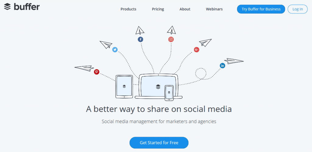
This shows the logo repeated within the focal image of the screen. The paper airplanes also resemble the sheets of paper featured in the logo, making the whole page make sense and look more cohesive.
Replicating elements in Divi is super-easy. Simply navigate to your chosen element in the Divi Builder, and click the copy button to duplicate the element. From here, you can and drag and drop the element elsewhere on your page, and tweak it without affecting your original:
Similarly, you can save layouts for future to create consistency across your site – we’ll have more on this a bit later.
4. Use White Space Appropriately
White space – alternatively called negative space – is simply the blank portions of a page that are not occupied by content. The use of white space is often overlooked. Many designers find it tempting to try and cram in as much information as possible. However, when it comes to maintaining viewer engagement, it appears that less really can be more, and appropriate use of white space is key.
Here are some tips for using white space appropriately:
- Adjust the margins around copy. Increasing the margin size can help to separate sections of copy. This makes the page appear less cluttered and the text easier to read.
- Add space between paragraphs. Increasing the space between paragraphs can break up text and make longer articles appear less intimidating.
- Adjust line height and letter spacing. You can tweak the space between lines and letters to make sure your text is as readable as possible.
- Surround your focal point with white space. White space added around a focal point, such as an image or header, can make it stand out even more.
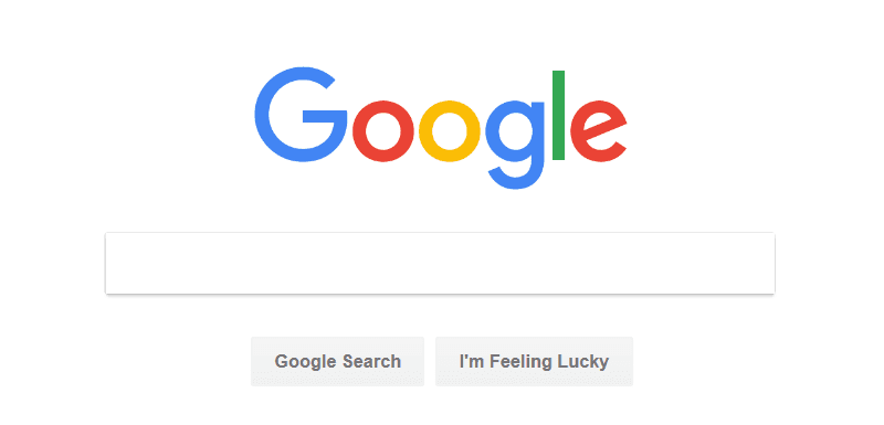
For a real-world example, the Google home page is as good an example as any other – in fact, it takes things to the extreme:
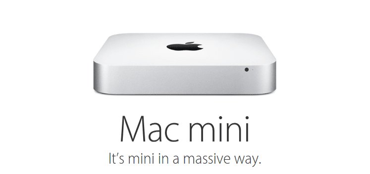
Apple is another company who uses focal points (usually a product image and header) surrounded by lots of white space:
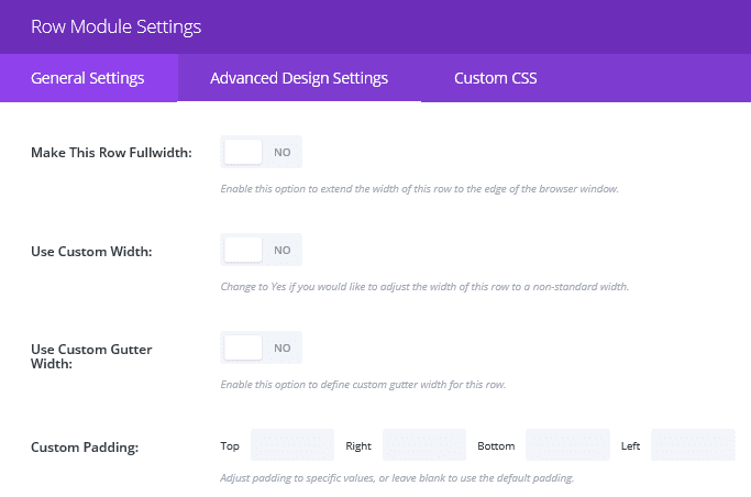
Divi can help you create just the right amount of white space by enabling you to adjust margins and padding within your sections, rows, and modules. For example, to adjust a row, click on the Menu button, which displays the myriad of options you’ll need:
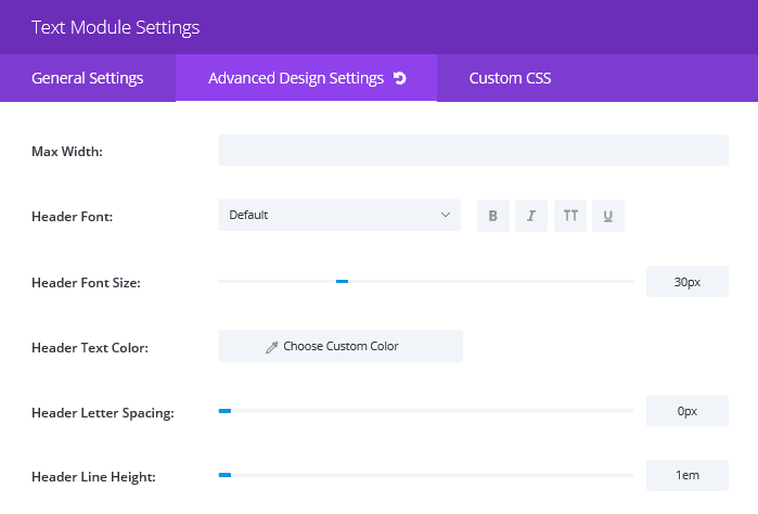
When you have text in a module, there’s usually the option to adjust your line height and text spacing. For example, in a Text module, go into the Advanced Design Settings screen, and among the features you’ll see that you have height and spacing options:
You can adjust them accordingly until you’re happy. You can also opt to make these changes using the Visual Builder to see how your changes will look in real time.
Finally, for even more white space, you can use a Divider module. This enables you to create a line or some blank space between individual modules, almost anywhere on the page.
How Divi Can Help You Keep Your Layout Design Consistent
Once you’ve crafted the perfect layout, you probably won’t want to use it only once. Saving your layout means you can use it for multiple pages on your site. This not only saves lots of time and effort, but also creates a sense of unity and familiarity across your pages, which helps the reader’s experience.
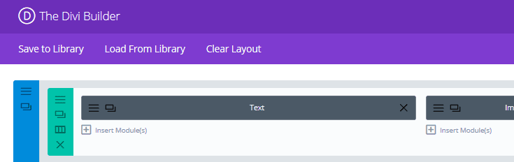
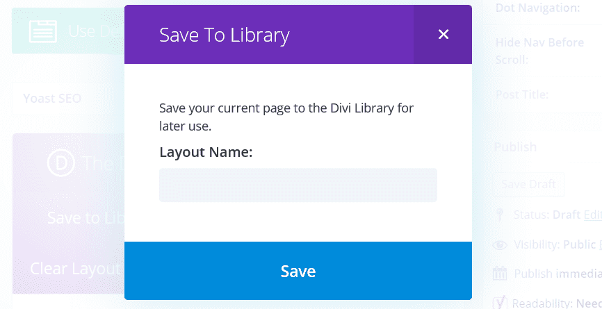
This is simple to do within Divi. Once you’re happy with your layout, select Save to Library in the upper left hand corner of the Divi Builder:
In the pop-up, enter the name you want to use for your new design, and hit Save:
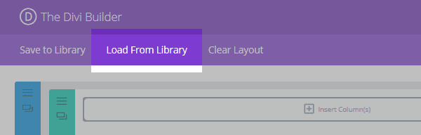
To retrieve your layout for future use, select Load From Library in the Divi Builder…
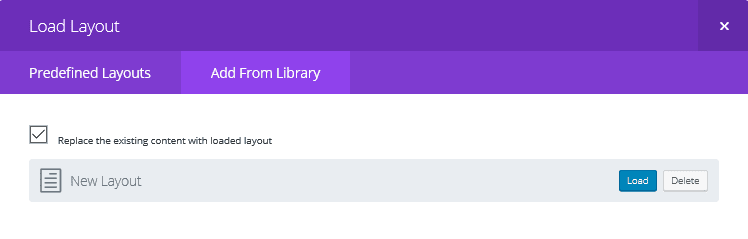
…then go to the Add From Library tab, and select the layout you want to use:
To edit your layouts, you can access them from your WordPress dashboard. Select Divi, and click on Divi Library to see a list of your saved layouts.
Conclusion
Your choice of layout is a hugely important component of the overall design of your site. However, it can be a seriously overwhelming task, especially if you dive in without a plan.
Thankfully, this area has been widely studied, and there are plenty of strategies you can employ to ensure a superlative outcome. This article has provided four tips to help you create the perfect layout design for your website. Let’s recap them quickly:
- Use a grid system.
- Structure your content in a Z-pattern or F-pattern.
- Repeat important design elements.
- Use white space appropriately.
Do you have any additional tips for optimizing your page layout? Let us know in the comments section below, and don’t forget to subscribe so you can follow the conversation!
Article thumbnail image by atibodyphoto / shutterstock.com.


Thanks for your sharing john, i will be try your tips in my website..
You’re welcome! Good luck. 🙂
how can i give semi bold for content??
how can i give semibold for title or subtitle content??
You’ll probably have to get your hands dirty with some coding. Check out this resource: https://tinyurl.com/gqyc3bz. If that doesn’t help, try posting in our forums (https://www.elegantthemes.com/forum/) to see if another user has some ideas.
Helpful article.
Thanks! 🙂
“I like it. But make the Logo BIGGER. And make the Picture BIGGER. And there is still plenty of room left over there. Why? Use it”.
That’s what we always hear.
That’s where your powers of persuasion come in, Adrian. 🙂
Good article and very well explained.
thanks for sharing
Thanks. 🙂
Great tips! It remembers my photo course!
Great stuff!
Very helpful tips, thanks!
However there is another rule you missed here. This is called The Golden Rule, or The Golden Ratio. I found it very hard to build a grid 1:1,618 (or even close 1:1,6) using the Divi Builder. If I want to apply this rule my sidebar should be around 38% of the total screen width. Of course I can tweak the css manually, but it would be great to have such option in the theme customizer itself.
The Rule of 3rds is the same thing as the golden Ratio – approximately. It is mentioned in the first paragraph.
I studied photography and graphic design. None of the teachers would measure 1:1,618 – just apply the rule of thrids and you are safe. 38% is not that far of from 33%. Nobody could tell a difference by eye.
The rule of thirds is widely known. I just wonder, why do american tv stations not apply it. When you see news anchors on US TV stations, they are almost all the time in the middle of the screen. When you watch news anchors in Switzerland, Germany, Austria and other European countries, they are off the middle axis, to the right usually. the rule of thirds is applied on tv screen too over here. Does any of you bright minds know why?
You are wrong, @Adrian. The Golden Ratio, known as Fibonacci Principle is not the same as the rule of thirds. Although it’s often very easy to miss, the exact composed visuals has very strong impact on subcouncious feelings and reactions.
Great addition, Adam – while it’s not absolutely compulsory that you use it, the Golden Ratio works very well for many different layouts.
Wonderful Post. I always like the quality of writing in this blog. And Elegant is the one of beautiful place of themes and plugins I really like. Thanks a lot for sharing.
Thanks a lot for your kind words, Pavan!
Thank you for sharing the tips, Jhon.
No problem!
Should the F be a mirror image now that primary sidebar navigation tends to go on the right rather than the left?
You would think so, Barbara, but no. The F-pattern is a rigid shape and based on the eye pattern of the reader, rather than a flexible design aesthetic.
Hope this helps. 🙂