The new Gradient Builder for Divi can create lots of interesting backgrounds. The colors work together to create shapes and patterns that are usually difficult to create. Divi’s Gradient Builder includes settings that make creating circular patterns, such as a circular background shape, which makes creating unique backgrounds a simple task. In this post, we’ll see how to use the Divi Gradient Builder to design unique circular background shapes that draw attention to any section or column.
Let’s get started.
Preview
First, let’s see what we’re building.
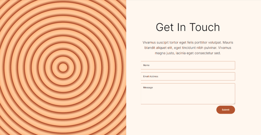
First Circular Background
Desktop
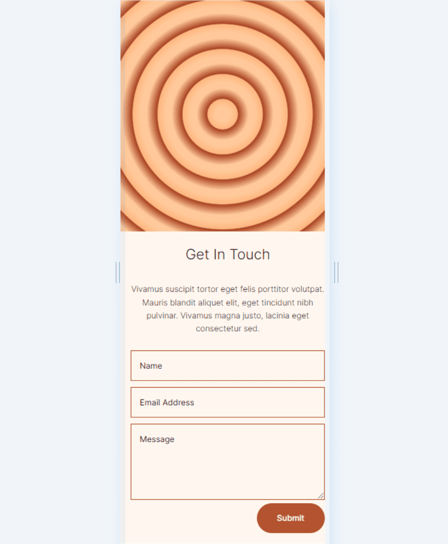
Phone
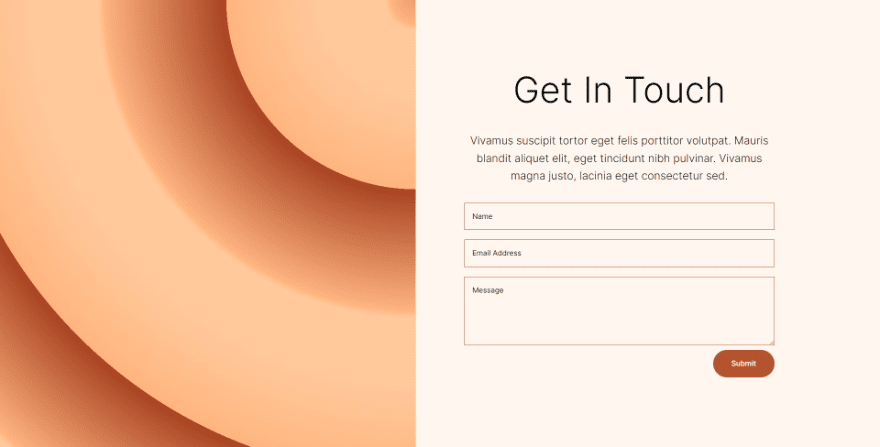
Second Circular Background
Desktop
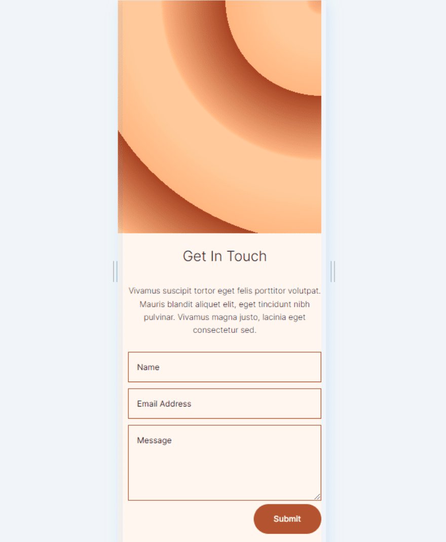
Phone
Third Circular Background
Desktop
Phone
Fourth Circular Background
Desktop
Phone
Create the Circular Shape Section
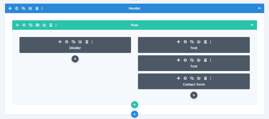
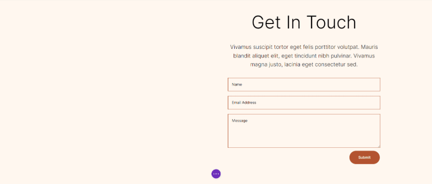
Rather than using a section from a Divi layout, we’ll create a custom section for this tutorial. The section will need a two-column row with equal-size columns.
In the left column, we’ll place a divider. This will not be visible. It allows our column 1 background to display on smaller screen sizes. Only columns with modules display on smaller screens. The right column will include two text modules and a contact form.
Section Settings
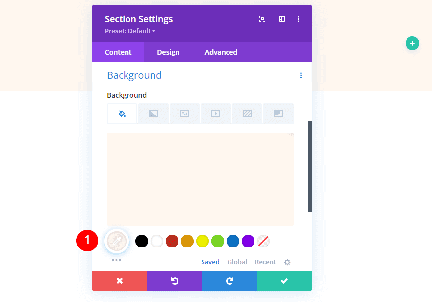
Open the section’s settings by clicking its gear icon.

Scroll down to Background and change the Color to #fff7ef.
- Background Color: #fff7ef
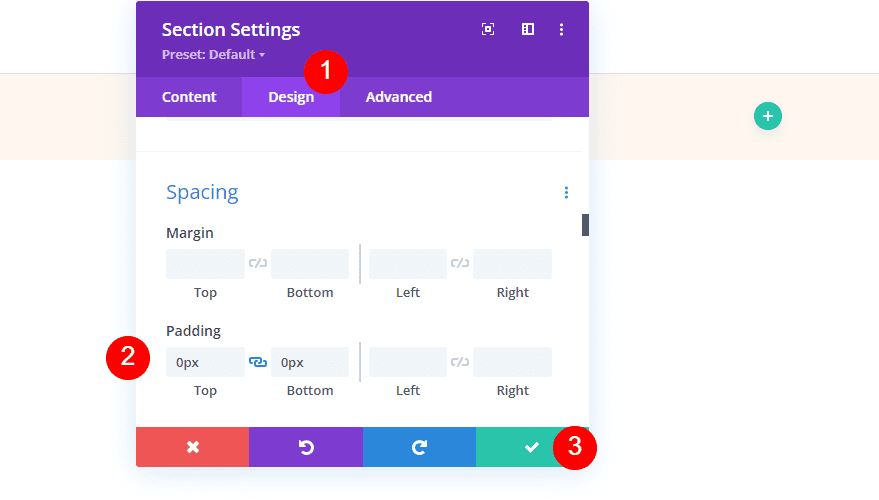
Next, select the design tab. Scroll down to Spacing and enter 0px for the Top and Bottom Padding. Close the section’s settings.
- Top: 0px
- Bottom: 0px
Add the Row
Next, add a two-column row.

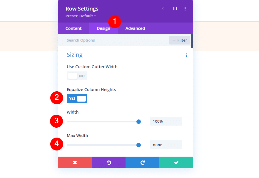
Next, open the row’s settings by clicking its gear icon.

Select the design tab and enable Equalize Column Heights. Set the Width to 100% and change the Max Width to None.
- Equalize Column Heights: Yes
- Width: 100%
- Max Width: None
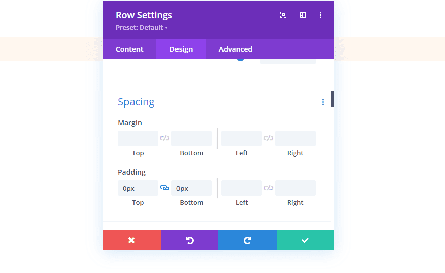
Next, scroll down to Spacing and enter 0px for the Top and Bottom Padding.
- Padding: 0px Top, 0px Bottom
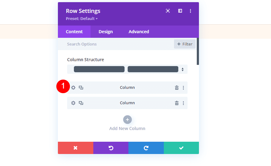
Column Settings
Next, we’ll make some Spacing adjustments to the columns. We’ll come back to the column settings when we create the circular backgrounds. Open the settings for the first column.
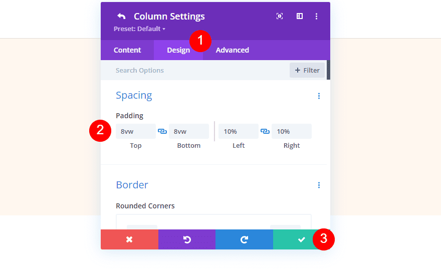
Go to the design tab and enter 8vw for the Top and Bottom Padding and 10% for the Left and Right Padding. Close the column settings.
- Top: 8vw
- Bottom: 8vw
- Left: 10%
- Right: 10%
Next, open the second column’s settings.
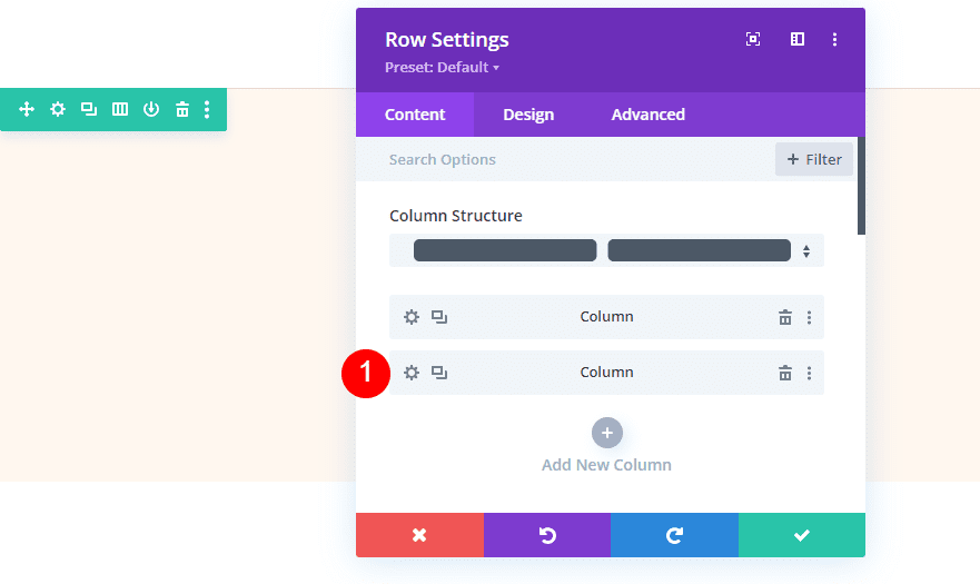
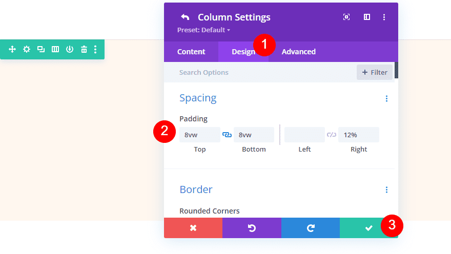
Go to the design tab and enter 8vw for the Top and Bottom Padding and 12% for the Right Padding. Close the column and row settings.
- Top: 8vw
- Bottom: 8vw
- Right: 12%
Divider Module
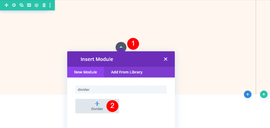
Next, add a divider module to the left column.
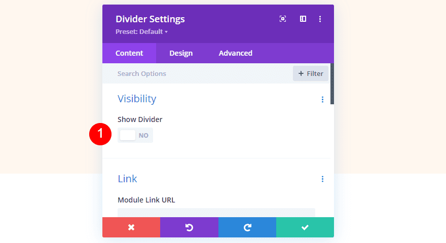
Open the divider module’s settings and select No for Show Visibility.
- Show Visibility: No
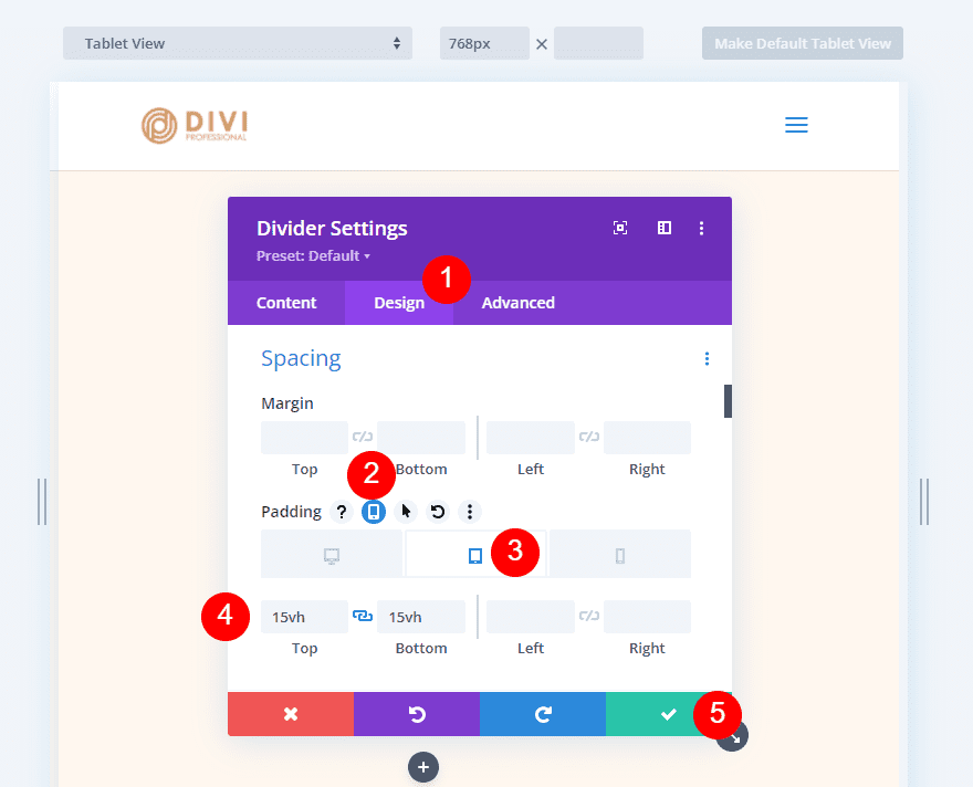
Next, select the design tab and scroll down to Spacing. Select the tablet icon and choose the tablet tab. Add 15vh to the Top and Bottom Padding. The phone settings will follow the tablet settings. We won’t need these settings for the desktop version. Close the module’s settings.
- Padding (tablet): 15vH Top, 15vh Bottom
Title Text Module
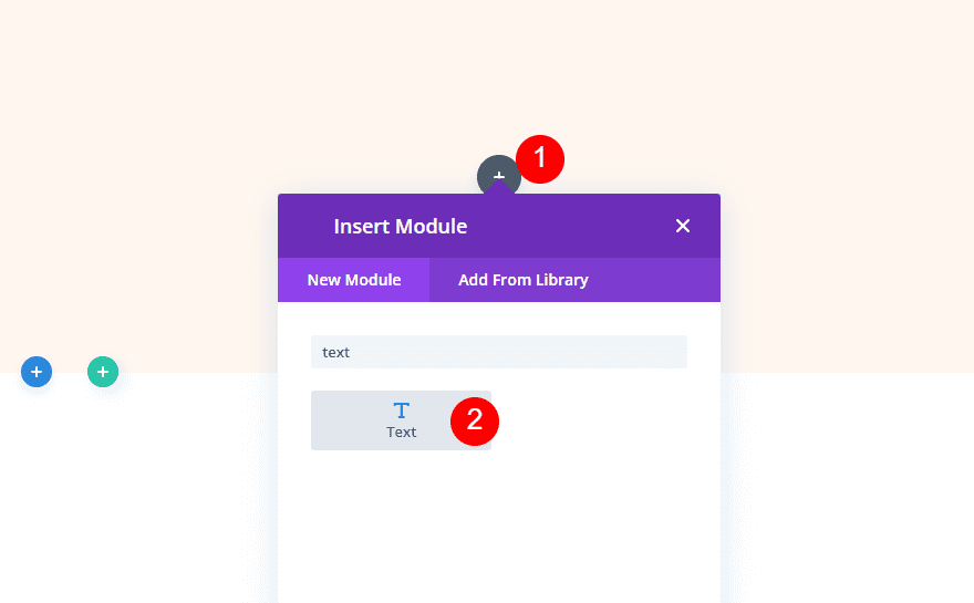
Next, add a text module to the right column. This will create the title for the contact form.
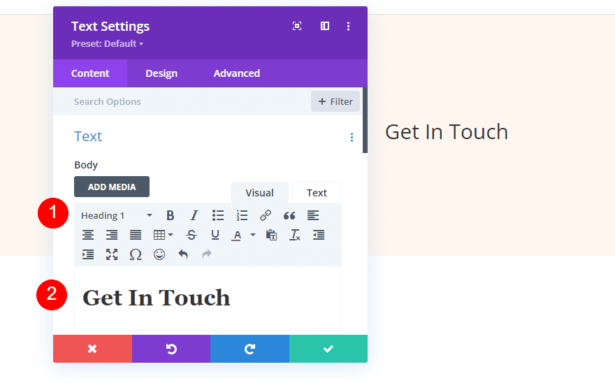
Add the title “Get In Touch” and change the font to Heading 1.
- Font: Heading 1
- Body Content: Get In Touch
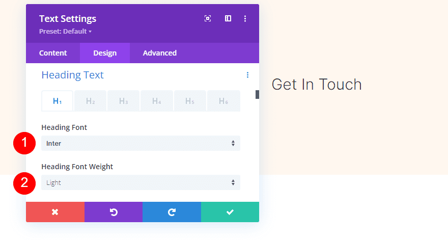
Select the design tab and scroll down to Heading Text. Select Inter for the Font and choose Light for the Font Weight.
- Font: Inter
- Font Weight: Light
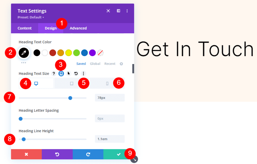
Set the Font Color to black, the desktop Font Size to 78px, the tablet Font Size to 44px, and the phone Font Size to 28px. Change the Line Height to 1.1em. Close the module’s settings.
- Color: #000000
- Font Size: 78px (desktop), 44px (tablet), 28px (phone)
- Line Height: 1.1em
Description Text Module
Next, add a text module under the title text module.
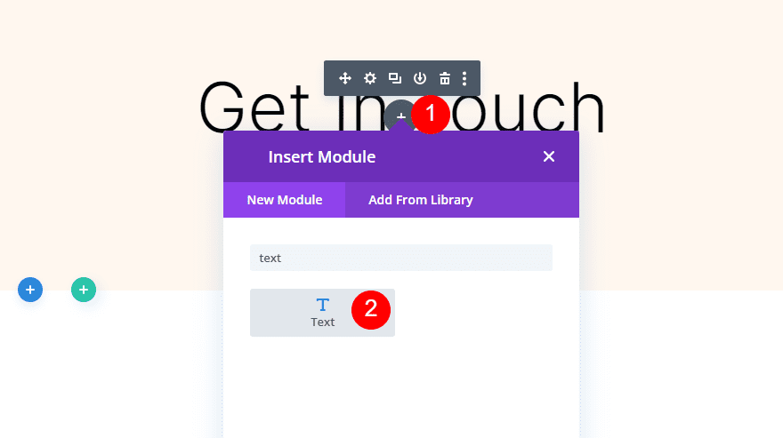
Open its settings and add your description to the content area. I’m just using dummy content for my example.
- Body Text: description
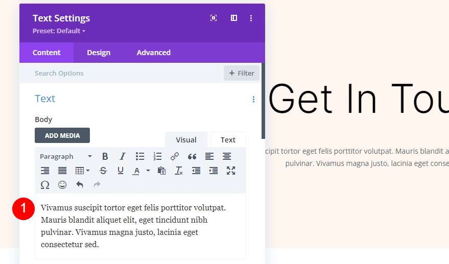
Next, select the design tab and choose Inter for the Font. Choose Light for the Font Weight and set the Color to black.
- Font: Inter
- Font Weight: Light
- Color: #000000
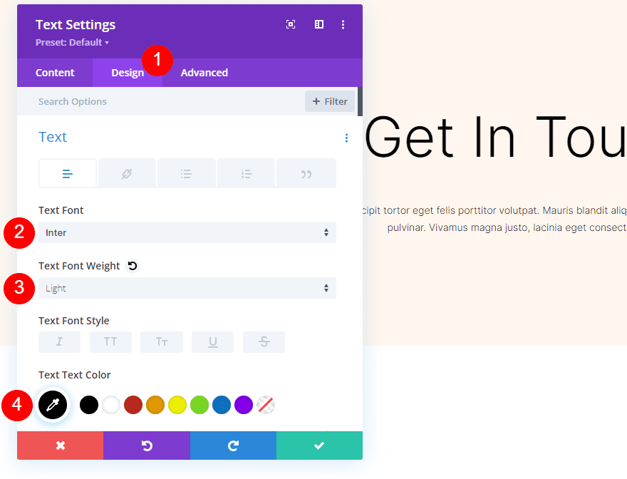
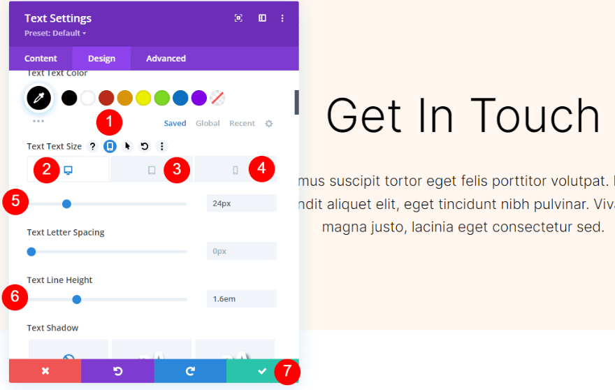
Select the tablet icon to set the sizes for each screen type. Click the desktop icon and change the Size to 24px. Select the tablet icon and change the Size to 20px. Select the phone icon and change the Size to 16px. Change the Line Height to 1.6em. Close the module’s settings.
Contact Form Module
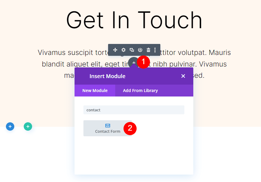
Finally, add a contact form module under the description text.
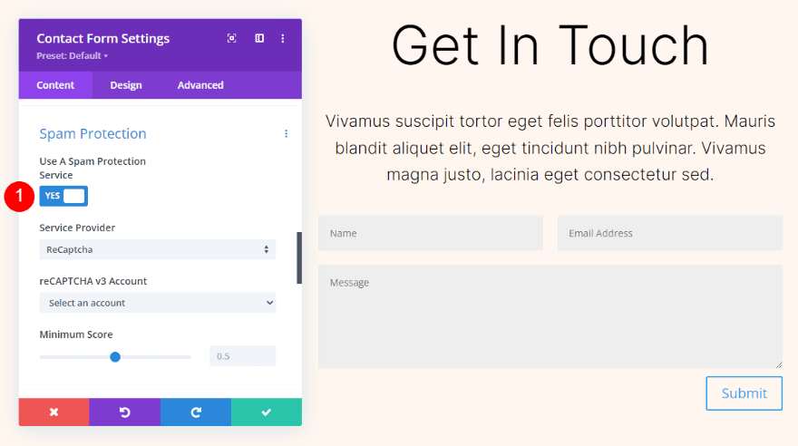
Open the settings, scroll down to Spam Protection, and enable Use a Spam Protection Service. For more information about this feature, see the article How to Use a Spam Protection Service in Divi’s Email Optin Module.
- Use a Spam Protection Service: Yes
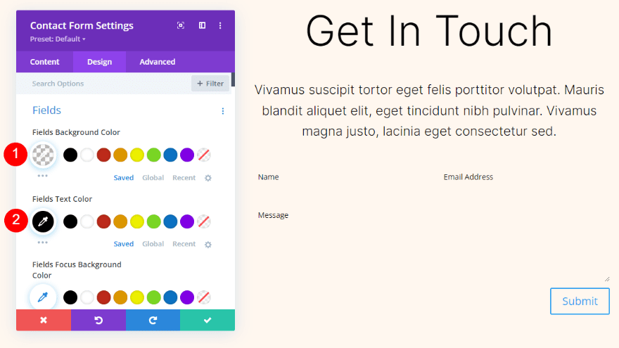
Fields
Go to the design tab and set the Fields Background Color to rgba(0,0,0,0). Set the Fields Text Color to black.
- Fields Background Color: rgba(0,0,0,0)
- Text Color: #000000
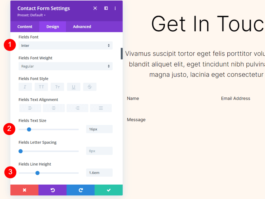
Next, choose Inter for the Fields Font. Change the Size to 16px and the Line Height to 1.6em.
- Font: Inter
- Size: 16px
- Line Height: 1.6em
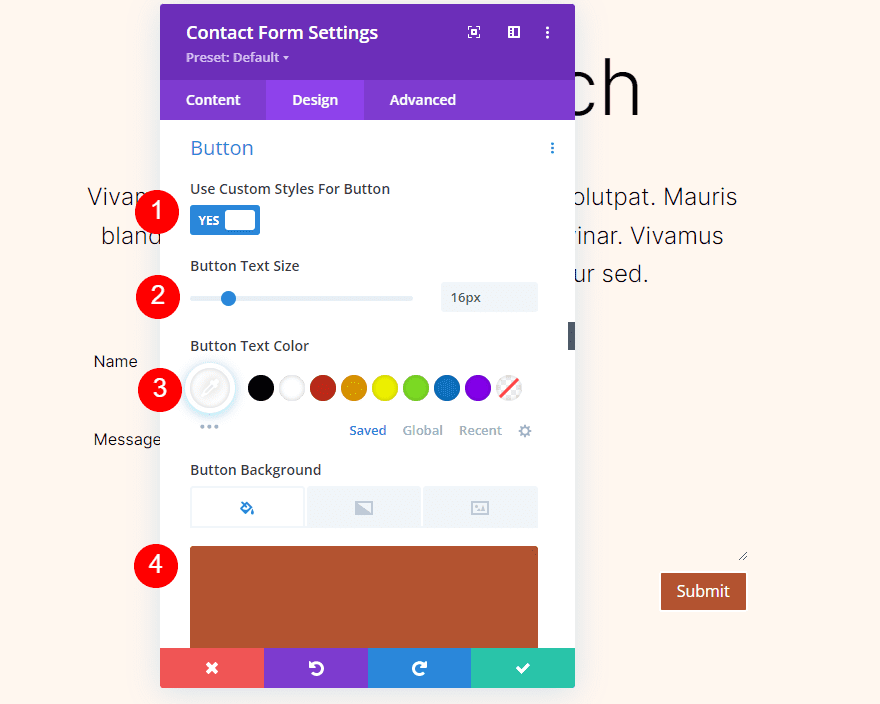
Button
Scroll down to Button and select Use Custom Styles. Change the Text Size to 16px. Change the Text Color to white and set the Background Color to #b35330.
- Use Custom Styles: Yes
- Text Size: 16px
- Text Color: #ffffff
- Background Color: #b35330
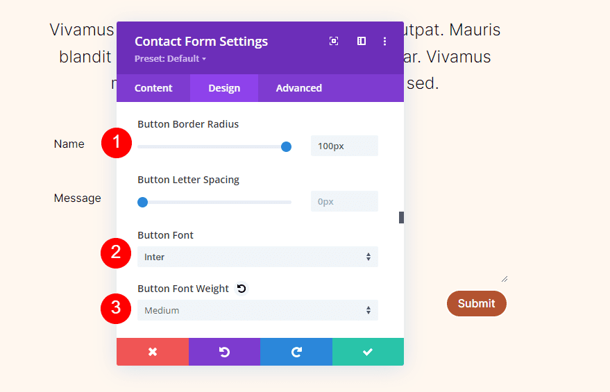
Change the Border Radius to 100px. Select Inter for the Button Font. Change the Weight to Medium.
- Border Radius: 100px
- Button Font: Inter
- Weight: Medium
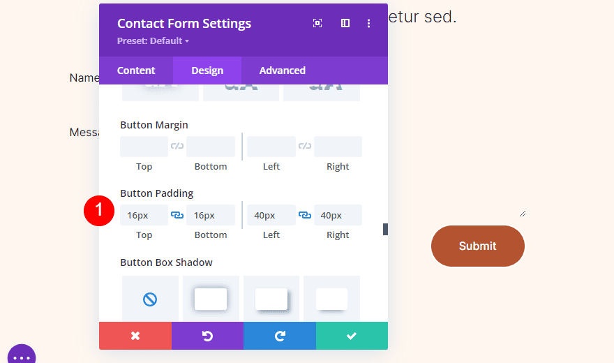
Scroll down to Button Padding and add 16px for the Top and Bottom and 40px for the Left and Right.
- Button Padding: 16px (Top, Bottom), 40px (Left, Right)
Field Borders
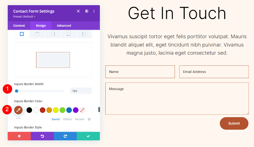
Scroll down to Border and change the Inputs Border Width to 1px. Change the Inputs Border Color to #b35330.
- Inputs Border Width: 1px
- Inputs Border Color: #b35330
Field Settings
Next, open the settings for the Name field.
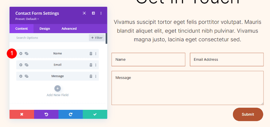
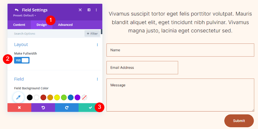
Select the design tab and enable Make Fullwidth. Close the name field’s settings.
- Make Fullwidth: Yes
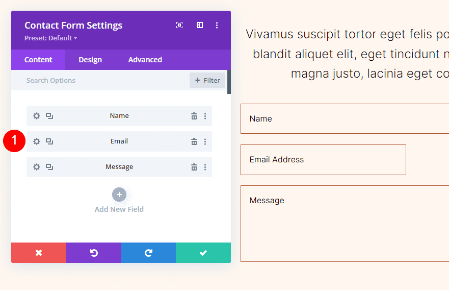
Next, open the Email field settings.
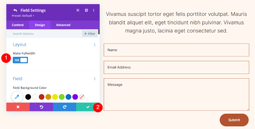
Select the design tab and enable Make Fullwidth. Close the email field’s settings, close the contact form’s settings, and save your work.
- Make Fullwidth: Yes
Duplicate the Section
We now have a section with an empty column on the left and a contact form created with two text modules and a contact form module on the right. Before we create the backgrounds, let’s duplicate this section.
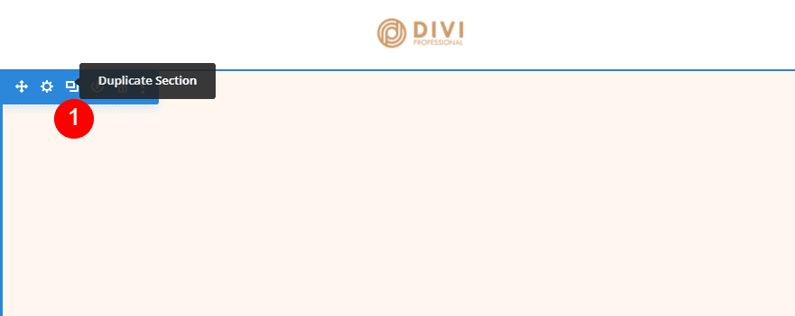
Hover over the section’s settings and click the Duplicate Section icon three times. We’ll then have four sections. We’ll add a different circular background to each one.
Adding the Background Gradient
For each of our circular backgrounds, we’ll add the Background Gradient to the left column of the row. They’ll mostly use the same colors, and several will have Gradient Stops that stack. Pay extra attention to the stack order, as this will change the gradient. We’ll also use different Units, but they’ll all start as percent.
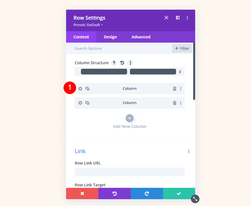
To create a Background Gradient, open the row’s settings by clicking its gear icon.

Click the gear icon for the first column.
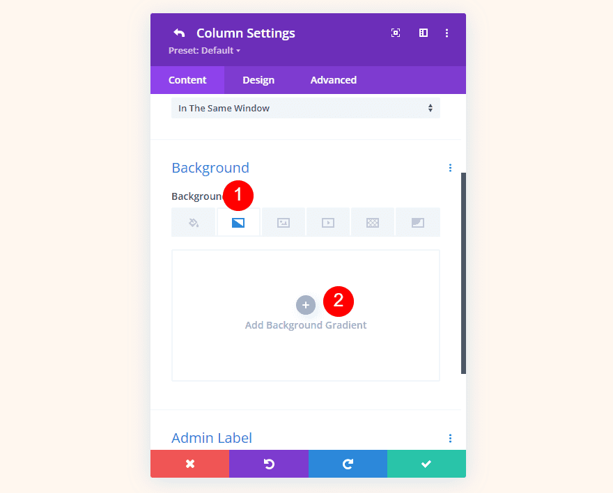
Scroll down to Background, select the Background Gradient tab, and click Add Background Gradient.
Place the Gradient Stops by clicking the gradient bar. Change their colors by selecting them. The gradient bar shows them as percent by default, but we’ll change them as we go.
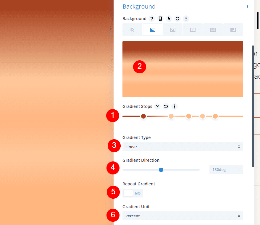
Now, let’s build our circular background examples.
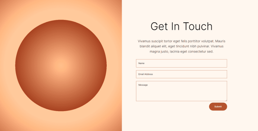
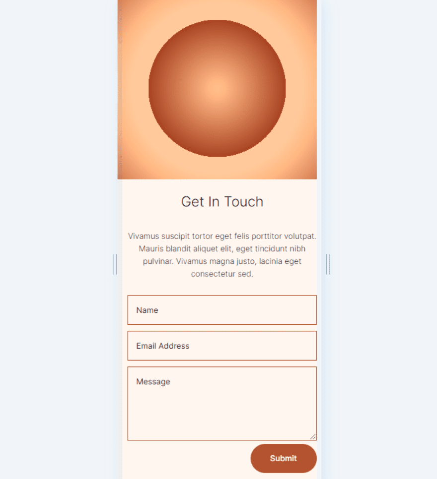
Circular Background Shape One
This circular background will have five Gradient Stops and create lots of circles within circles.
First Gradient Stop
For the first Gradient Stop, set it to the 29% Position and use the Color #ffb482.
- Position: 29
- Color: #ffb482
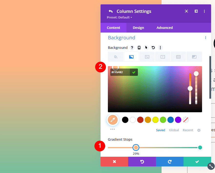
Second Gradient Stop
Add the second Gradient Stop at the 31% mark and change its Color to #a84321.
- Position: 31
- Color: #a84321
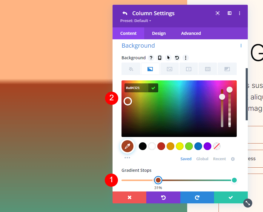
Third Gradient Stop
Set the third Gradient Stop at 51% and change the Color to #ffc99b.
- Position: 51
- Color: #ffc99b
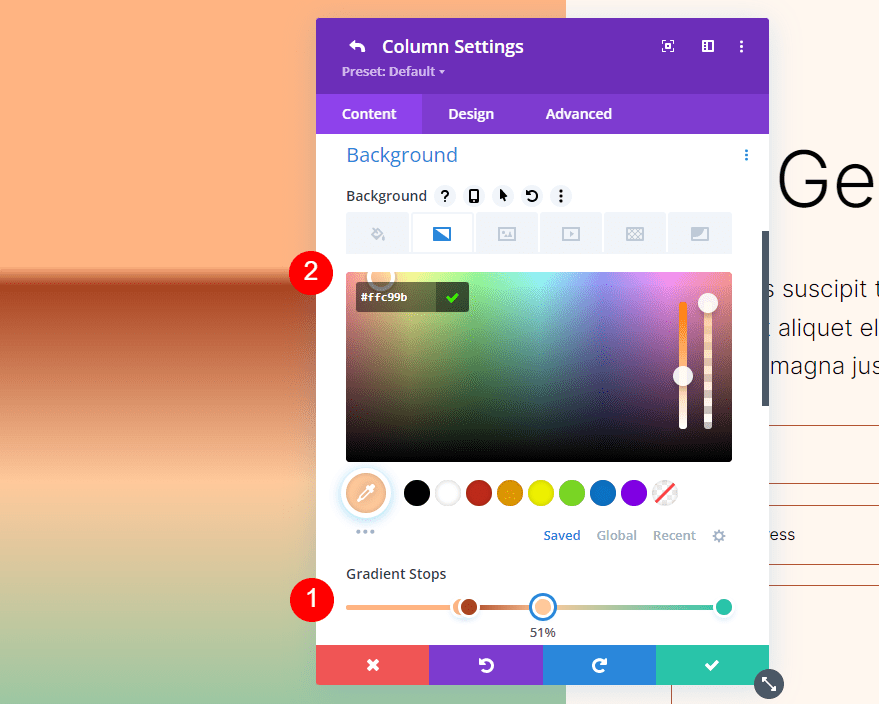
Forth Gradient Stop
Set the fourth Gradient Stop at 63% and change the Color to #ffc99b.
- Position: 63
- Color: #ffc99b
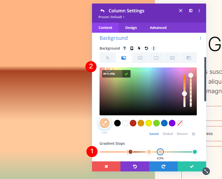
Fifth Gradient Stop
Set the fifth Gradient Stop at the 78% mark and change its Color to #ffb67f.
- Position: 78
- Color: #ffb67f
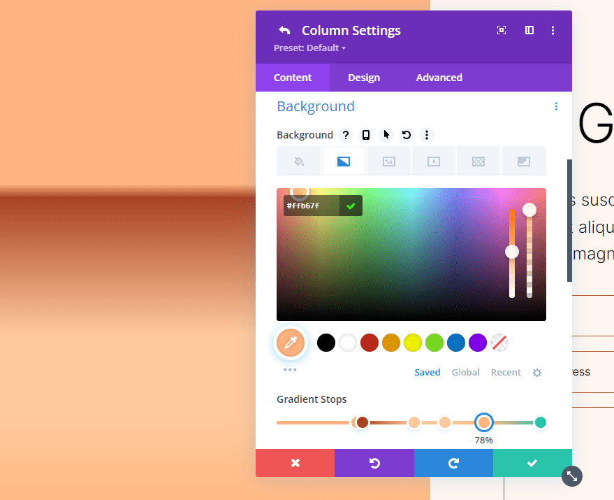
Gradient Settings
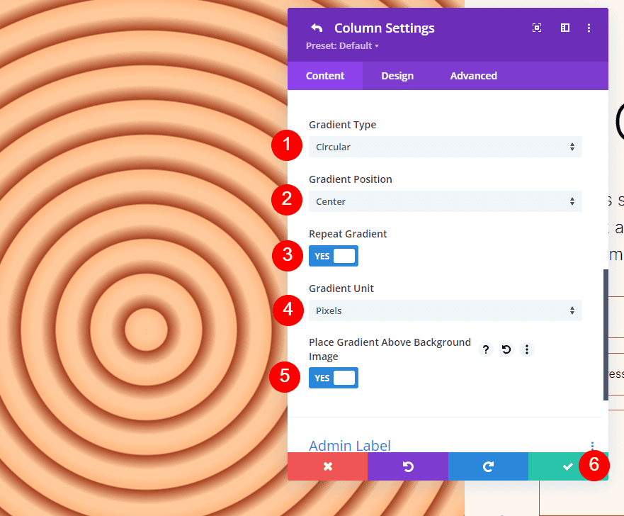
For the Gradient settings, change the Type to Circular and the Position to Center. Enable Repeat Gradient, change the Unit to pixels, and enable Place Gradient Above Background Image.
- Type: Circular
- Position: Center
- Repeat Gradient: Yes
- Gradient Unit: Pixels
- Place Gradient Above Background Image: Yes
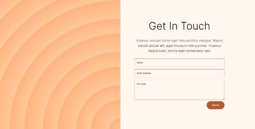
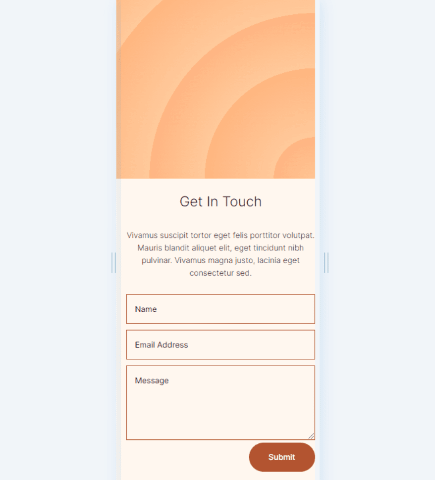
Circular Background Shape Two
Our second circular background shape will include five Gradient Stops. It will show part of a circled pattern from one corner.
First Gradient Stop
For the first Gradient Stop, set it at 31% and change the Color to #a84321.
- Position: 31
- Color: #a84321
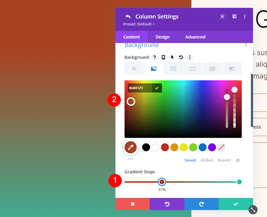
Second Gradient Stop
Place the second Gradient Stop at 51% and change the Color to #ffb482.
- Position: 51
- Color: #ffb482
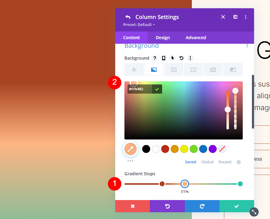
Third Gradient Stop
Place the third Gradient Stop at 52% and change the Color to #ffc99b.
- Position: 52
- Color: #ffc99b
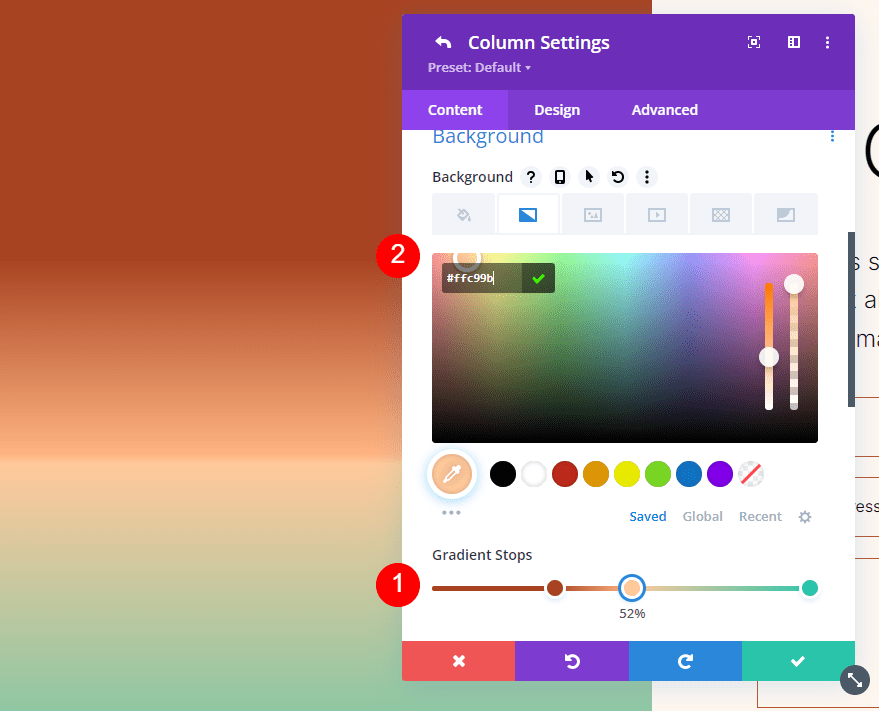
Forth Gradient Stop
Set the fourth Gradient Stop at 63% and change the Color to #ffc99b.
- Position: 63
- Color: #ffc99b
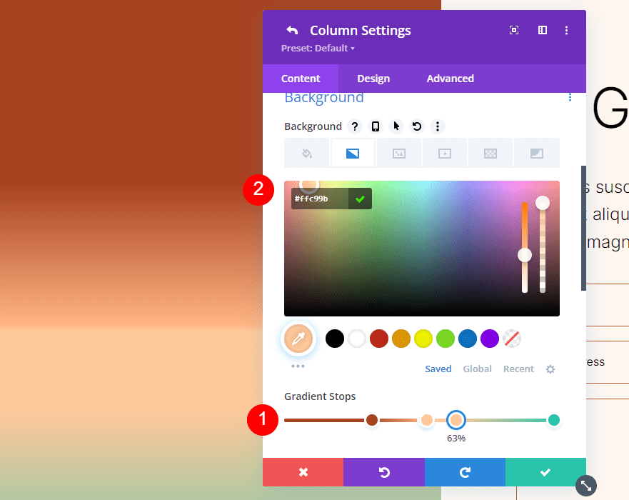
Fifth Gradient Stop
Set the last Gradient Stop to 78% and change the Color to #ffb67f.
- Position: 78
- Color: #ffb67f
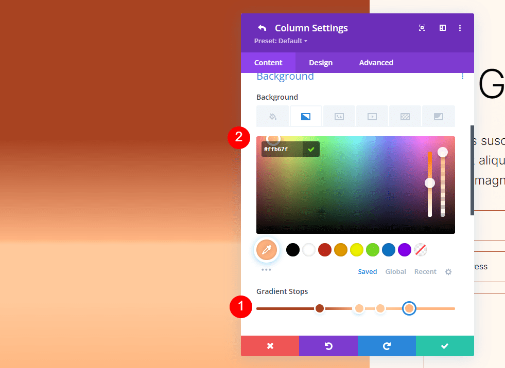
Gradient Settings
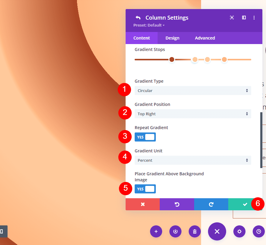
Next, set the gradient adjustments. Change the Type to Circular and set the Position to Top Right. Enable Repeat Gradient, select Pixels for the Unit, and enable Place Gradient Above Background Image. Close the module and save your settings.
- Type: Circular
- Position: Top Right
- Repeat Gradient: Yes
- Gradient Unit: Percent
- Place Gradient Above Background Image: Yes
Circular Background Shape Three
For our third circular background shape, we’ll use our five Gradient Stops with two stacked. This will create a centered circle.
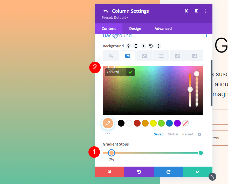
First Gradient Stop
Place the first Gradient Stop at 7% and change the Color to #ffb482.
- Position: 7
- Color: #ffb482
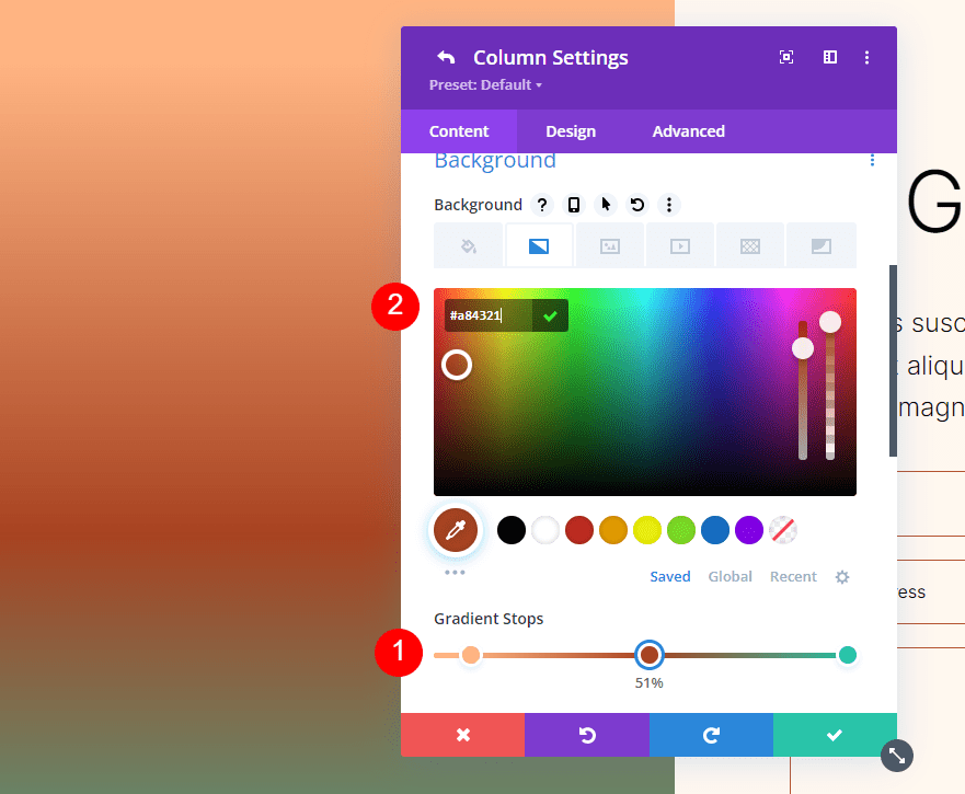
Second Gradient Stop
Place the second Gradient Stop to 51% and change the Color to #a84321.
- Position: 51
- Color: #a84321
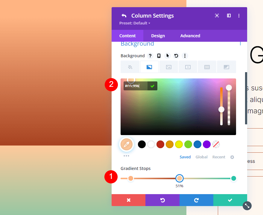
Third Gradient Stop
Place the third Gradient Stop at 51%, over the second one, and change the Color to #ffc99b.
- Position: 51
- Color: #ffc99b
Forth Gradient Stop
Place the fourth Gradient Stop at the 63% mark and change the Color to #ffc99b.
- Position: 63
- Color: #ffc99b
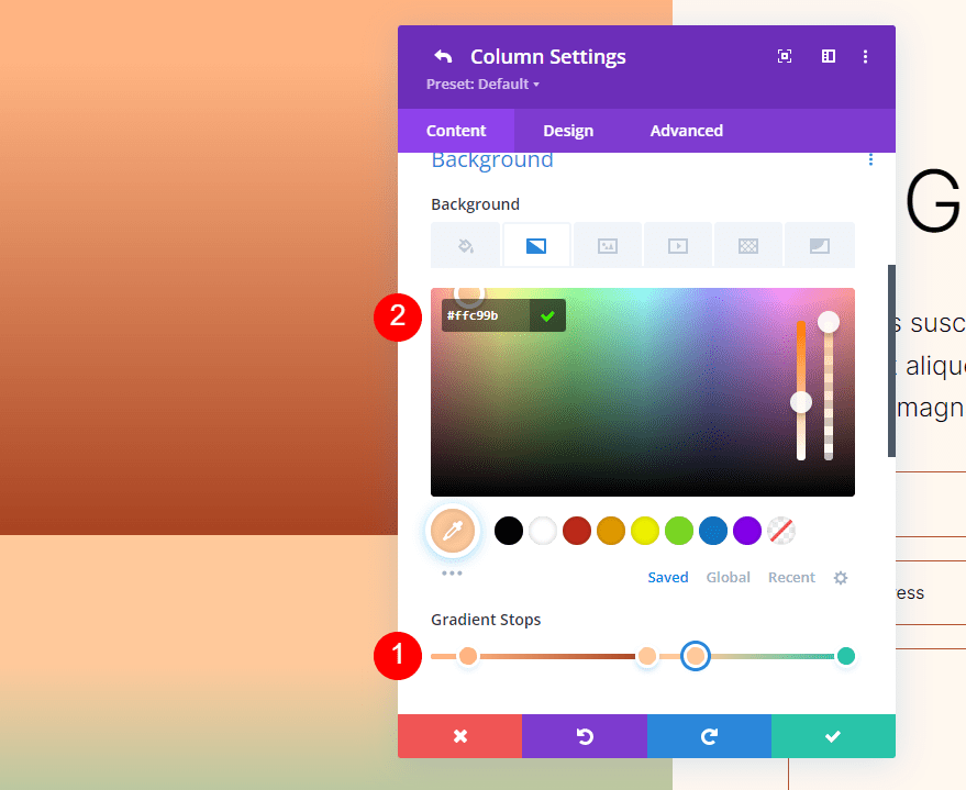
Fifth Gradient Stop
Finally, place the last Gradient Stop at the 78% mark and change the Color to #ffb67f.
- Position: 78
- Color: #ffb67f
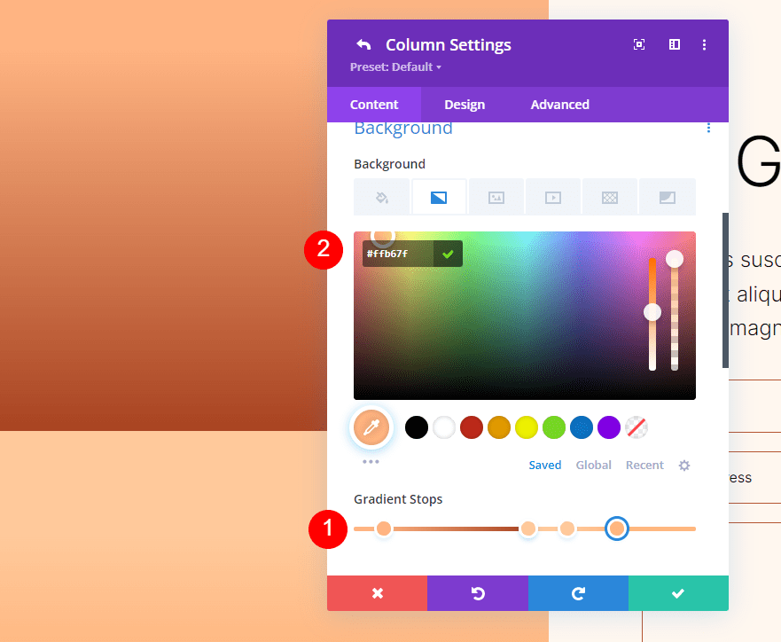
Gradient Settings
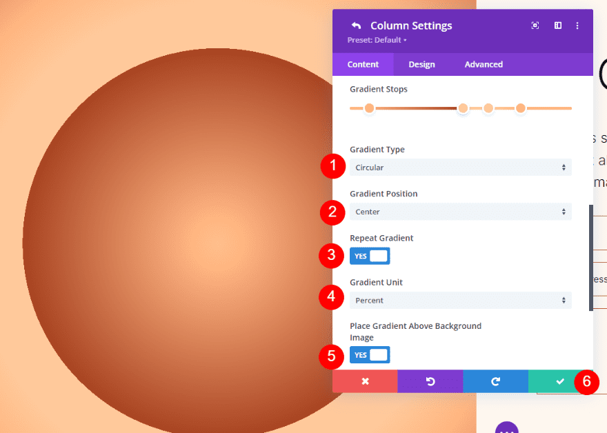
Lastly, change the Gradient Type to circular and the Position to Center. Enable Repeat Gradient, select Percent for the Unit, and enable Place Gradient Above Background Image. Close the settings and save your work.
- Type: Circular
- Position: Center
- Repeat Gradient: Yes
- Gradient Unit: Percent
- Place Gradient Above Background Image: Yes
Circular Background Shape Four
Our last example uses five Gradient Stops and shows a quarter of a circular pattern.
First Gradient Stop
Set the first Gradient Stop at the 51% mark. We’ll change them to vh in our settings. Change the Color to #a84321.
- Position: 51
- Color: #a84321
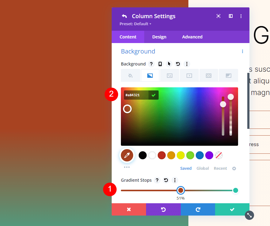
Second Gradient Stop
Place the next Gradient Stop on top of the first one, at 51%. Change the Color to #ffc99b.
- Position: 51
- Color: #ffc99b
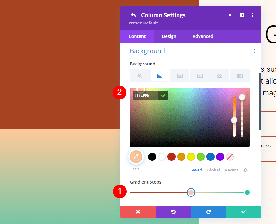
Third Gradient Stop
Place the third Gradient Stop at the 63% mark and change its Color to #ffb482.
- Position: 63
- Color: #ffb482
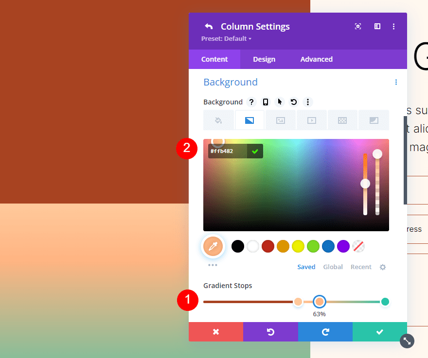
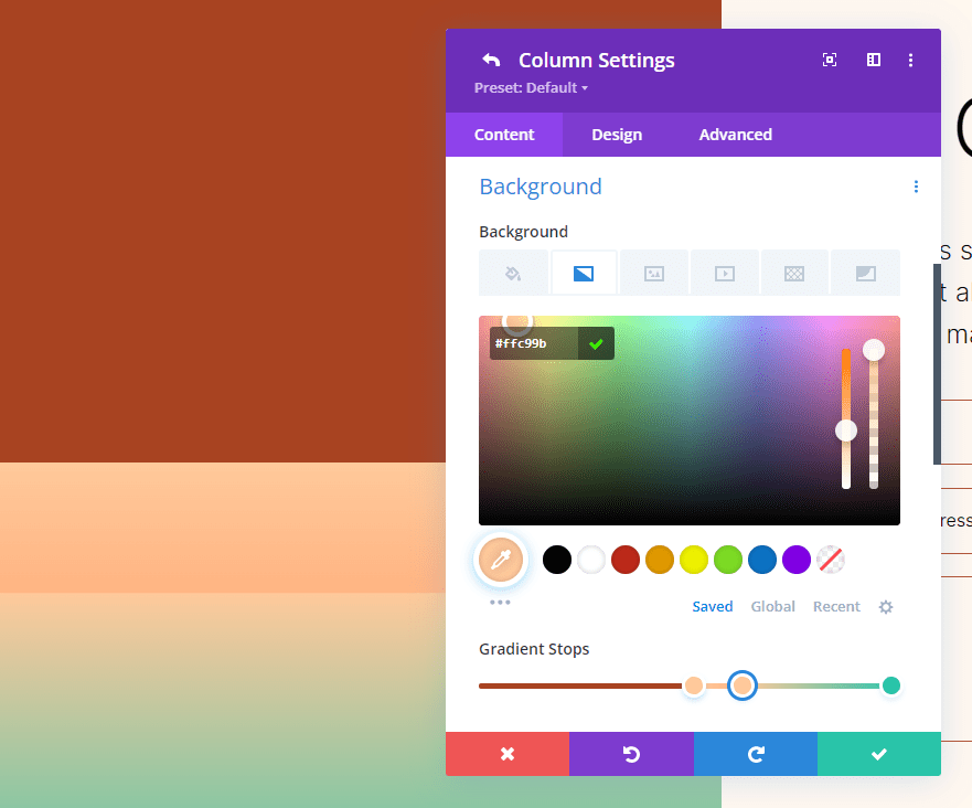
Forth Gradient Stop
Place the fourth Gradient Stop on top of the third Gradient Stop at the 63% mark.
- Position: 63
- Color: #ffc99b
Fifth Gradient Stop
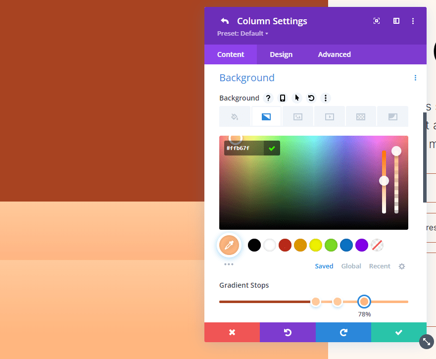
Place the fifth Gradient Stop at the 78% mark and change its Color to #ffb67f.
- Position: 78
- Color: #ffb67f
Gradient Settings
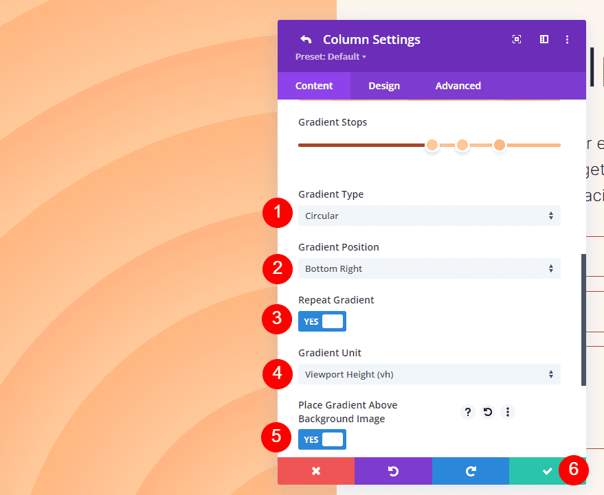
Finally, change the Type to Circular and set the Position to Bottom Right. Enable Repeat Gradient, change the Unit to vh, and enable Place Gradient Above Background Image. Close your settings and save your work.
- Type: Circular
- Position: Bottom Right
- Repeat Gradient: Yes
- Gradient Unit: Viewport Height (vh)
- Place Gradient Above Background Image: Yes
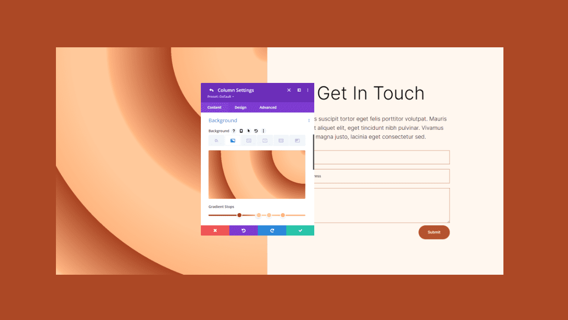
Results
First Circular Background Shape
Desktop

Phone

Second Circular Background Shape
Desktop

Phone

Third Circular Background Shape
Desktop

Phone

Fourth Circular Background Shape
Desktop

Phone

Ending Thoughts
That’s our look at how to use the Divi Gradient Builder to design unique circular background shapes. The Gradient Builder is an excellent tool for creating interesting backgrounds. Circular shapes stand out and add some unique visual design to any section or column. Using the methods we’ve shown here, anyone can create interesting circular patterns within minutes. I recommend playing around with the controls and stacking order to see what you can create.
We want to hear from you. Have you used the Divi Gradient Builder to design circular background shapes? Let us know about your experience in the comments.





I really want to thank you for sorting my confusion and giving me a clear picture of Divi & Gutenberg. Before I read this article I was viewing Gutenberg as the competitor of Divi. But now I have come to know that these can be used together.
I am looking for this detailed information for so long, thank you so much for this useful blog.
I am looking for this detailed information for so long, thank you so much for this useful piece of information.
Great article on how to use the Divi Gradient Builder to design custom circular background shapes. I have been playing around with it for several days and I really love it.
I like this article. Everything is in details. Thanks for sharing.
Thanks a lot for this blog.