
Every week, we provide you with new and free Divi layout packs which you can use for your next project. For one of the layout packs, we also share a use case that’ll help you take your website to the next level.
This week, as part of our ongoing Divi design initiative, we’re going to show you how to turn the standard horizontal Divider Module that we all know into a vertical one using Divi’s Moving Company Layout Pack as an example. This approach will come in particularly handy if you’re trying to create timelines on your pages. It’s great to use for ‘how it works’ sections too, and so much more. After setting up the vertical divider, we’ll add Blurb Modules on top of it to create the timeline effect. This tutorial doesn’t require any CSS code and is based on Divi’s built-in options only.
Let’s get to it!
- 1 Preview
- 2 Let’s Start Creating: Add a New Page & Upload Moving Company Layout Pack’s Landing Page
-
3
Start Creating the Vertical Divider Timeline
- 3.1 Find Timeline Section
- 3.2 Add a New Standard Section Below
- 3.3 Place ‘How it Works’ Row in New Section
- 3.4 Add New Row
- 3.5 Add Divider Module to Column 1
- 3.6 Add Blurb Modules of the Previous Section to Column 1
- 3.7 Modify Blurb Module #1
- 3.8 Copy Blurb Module Style & Add it to Remaining Blurb Modules
- 3.9 Spacing Blurb Modules
- 3.10 Drop Image Module in Column 2
- 3.11 Remove Previous & Next Section
- 4 Preview
- 5 Final Thoughts
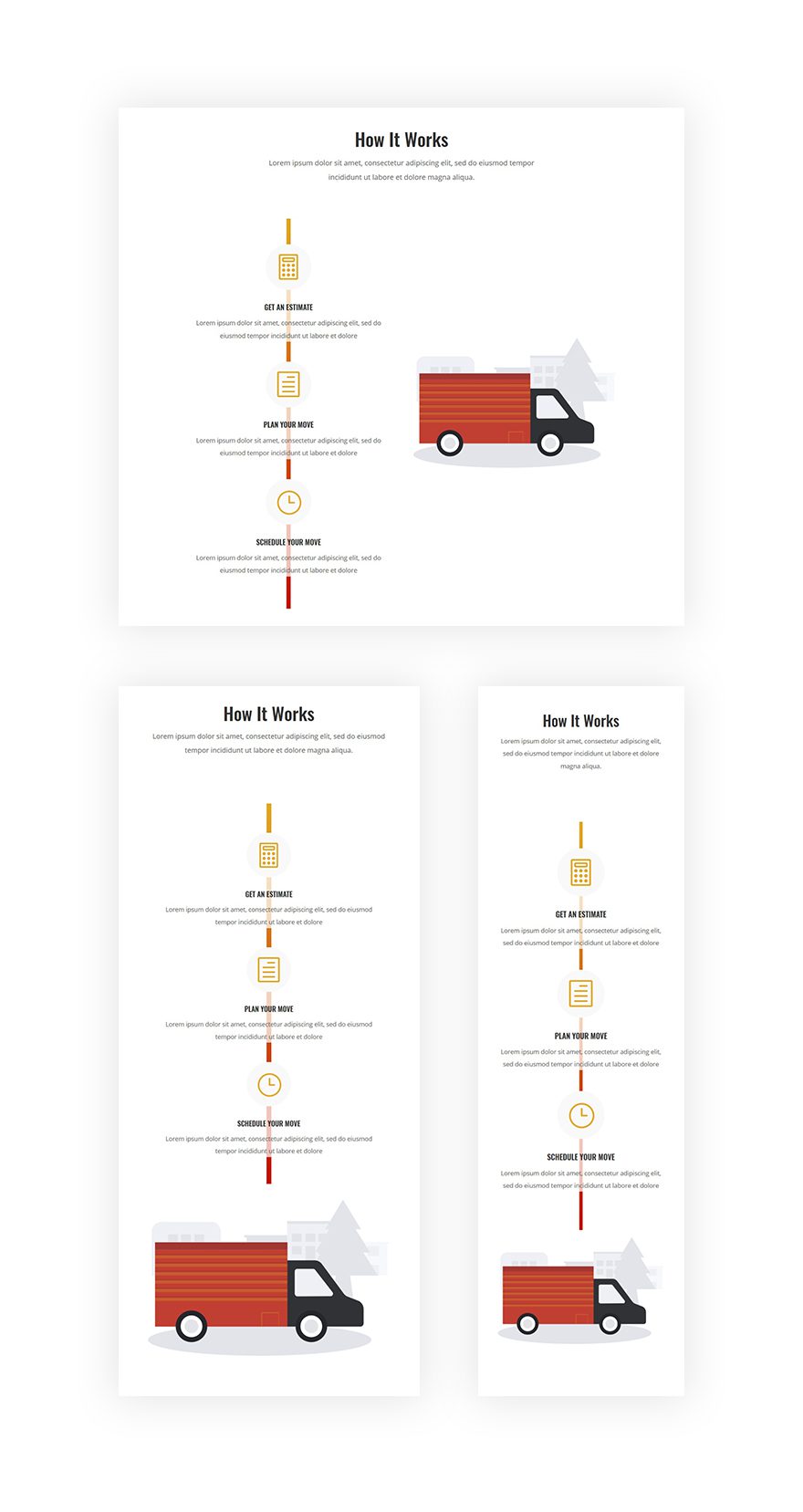
Preview
Before we dive into the tutorial, let’s take a look at the result on different screen sizes.
Let’s Start Creating: Add a New Page & Upload Moving Company Layout Pack’s Landing Page
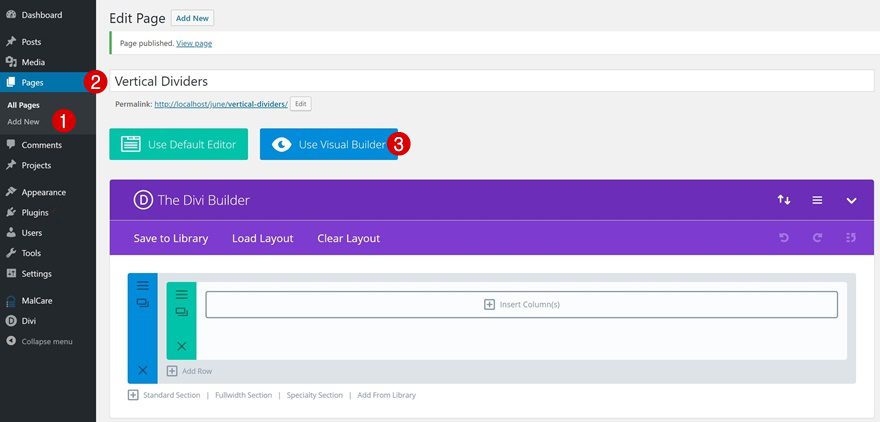
Add a New Page & Switch Over to Visual Builder
Let’s start by adding a new page, adding a title and switching over to Visual Builder.
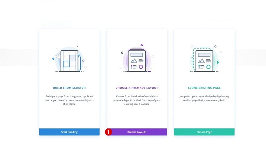
Choose a Premade Layout
Once you do that, you’ll have the ability to build from scratch, choose a premade layout or clone an existing page. We’re going to use the Moving Company Layout Pack’s landing page to create the end result so go ahead and browse through the premade layouts.
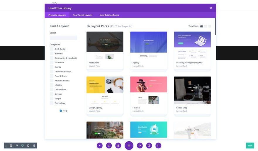
Select the Moving Company Layout Pack’s Landing Page
Scroll down the premade layouts until you come across the Moving Company Layout Pack and upload the landing page to your page.
Start Creating the Vertical Divider Timeline
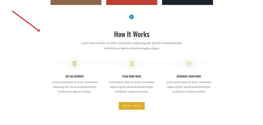
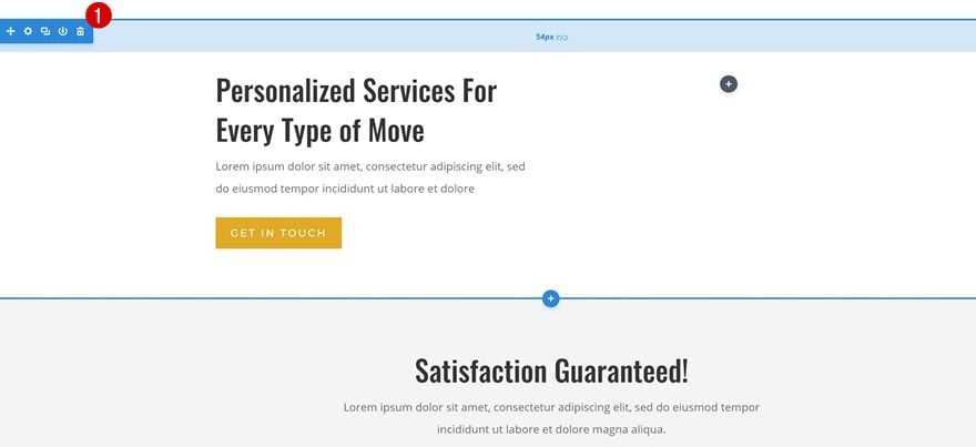
Find Timeline Section
We’re now ready to start turning horizontal dividers into vertical ones and using that divider to create a timeline. Go ahead and locate the following section on your landing page:
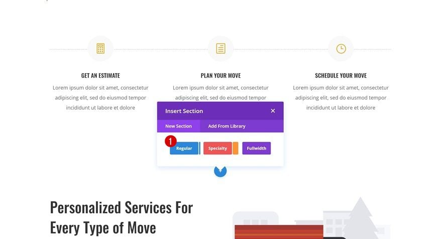
Add a New Standard Section Below
Right below this section, add a standard section.
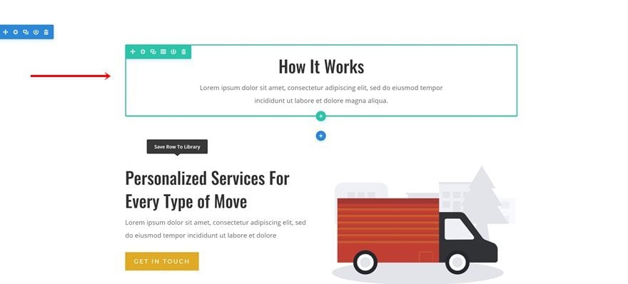
Place ‘How it Works’ Row in New Section
Continue by dragging the ‘How it Works’ row of the previous section to your new section.
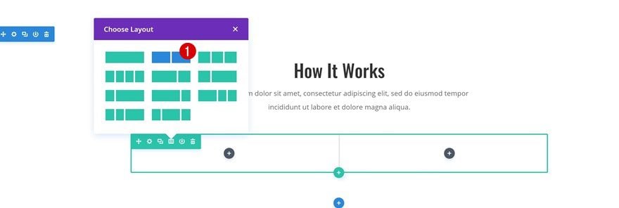
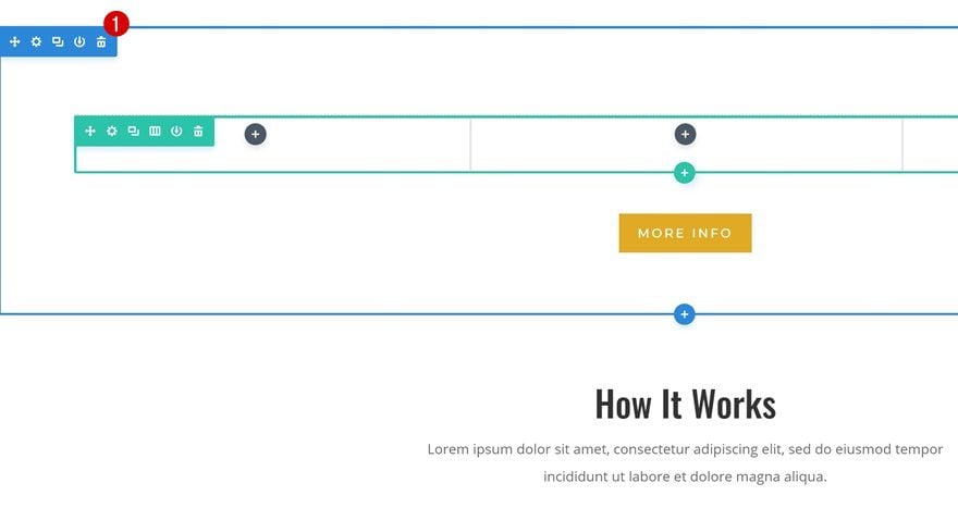
Add New Row
Column Structure
Right below the row you’ve just placed in your section, add another one with the following column structure:
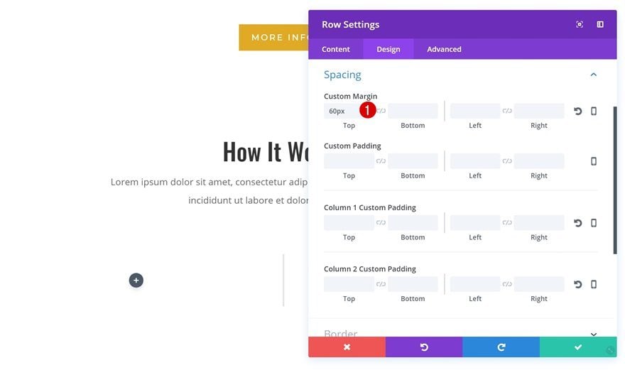
Spacing
Before adding any modules, open your row settings and add ’60px’ to the top margin.
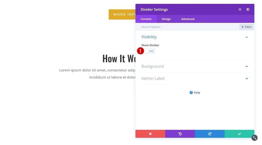
Add Divider Module to Column 1
Hide Divider
We can now start adding modules! We’ll start with the first column and once we’re done, we’ll move on to the second one. The first thing we’ll need in the first column is a Divider Module. As mentioned before, we’re going to turn it into a vertical one. The first step towards achieving our desired result is disabling the Show Divider option.
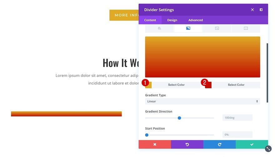
Gradient Background
Instead of using the actual divider, we’ll create a divider using the background of the Divider Module. We’re using the following gradient background:
- Color 1: #e0aa25
- Color 2: #c11000
Sizing
Now, we’ve already made sure the divider isn’t visible. The next crucial step towards creating a vertical divider is decreasing the width of our divider drastically. We’re using ‘2%’ but you can make it appear as thick as you want. We’re also enabling center Module Alignment.
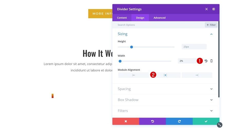
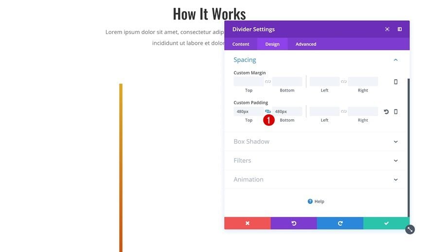
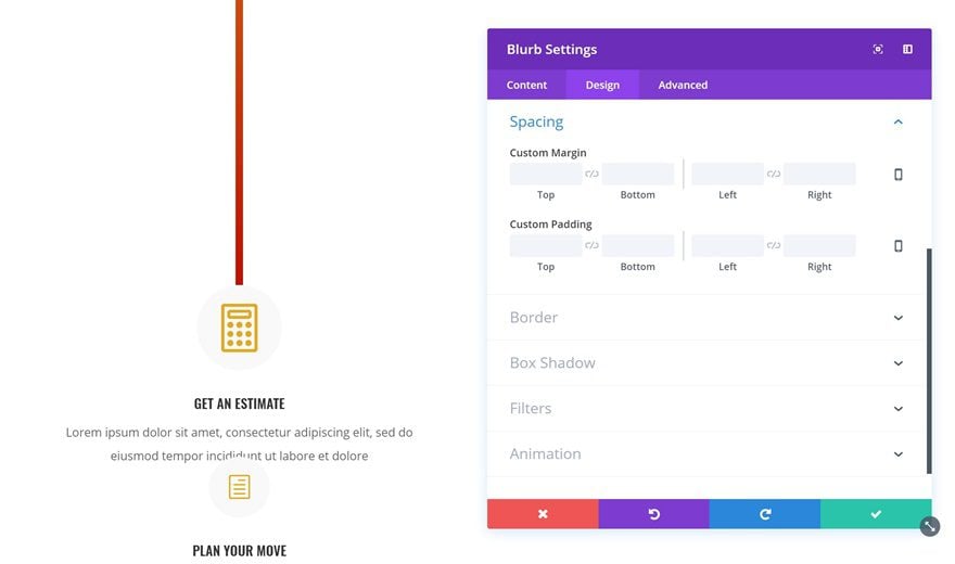
Spacing
To stretch the Divider Module vertically, we’re going to add ‘480px’ to the top and bottom custom padding of our Divider Module. Et voilà, we have our vertical divider!
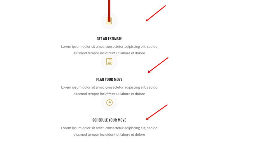
Add Blurb Modules of the Previous Section to Column 1
The next thing we’re going to do is create a timeline using this vertical divider. Within the previous section, you’ll find three Blurb Modules. Go ahead and place each one of them in the first column of the row you’re working on, right below the Divider Module.
Modify Blurb Module #1
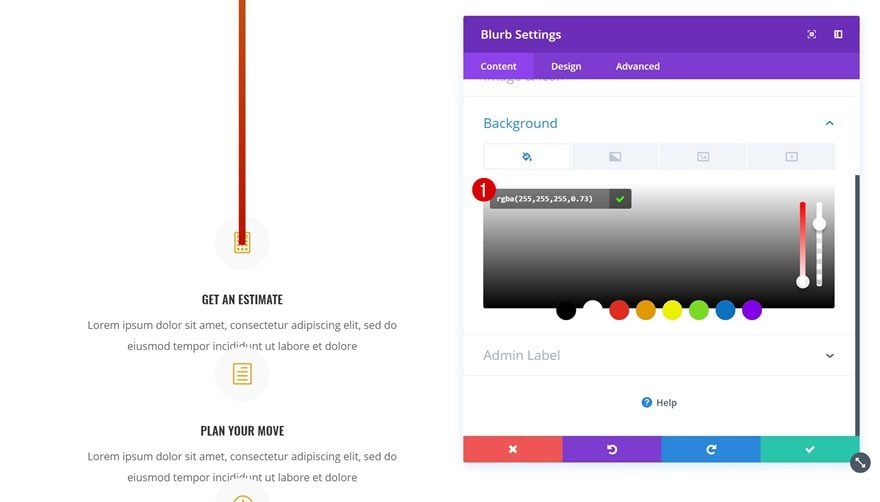
Add Background Color
We’re going to use one of Divi’s efficiency features to speed up the process while editing our Blurb Modules. We’ll apply all changes to the first Blurb Module and afterwards, we’ll simply copy the module styles and add them to the other Blurb Modules in one click. Open your first Blurb Module and add ‘rgba(255,255,255,0.73)’ as the background color.
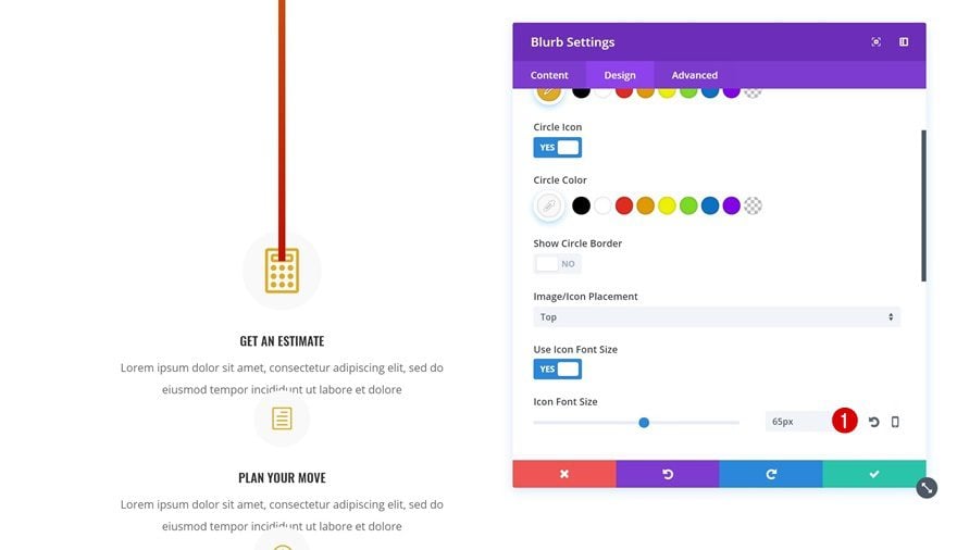
Change Icon Font Size
The next thing you’ll need to do is change the Icon Font Size into ’65px’.
Remove Spacing
We’ll also remove all the margin in the Spacing settings. Later on, we’ll add the margin to each Blurb Module individually because the values differ.
Copy Blurb Module Style & Add it to Remaining Blurb Modules
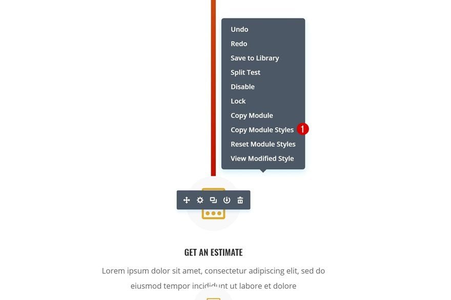
Copy Blurb Module Styles
We’re done modifying the first Blurb Module. Right click on it and select ‘Copy Module Styles’. This will copy all the modifications we’ve just made.
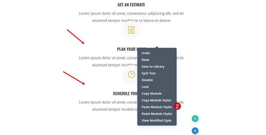
Paste Module Styles on Remaining Blurb Modules
And paste the module styles on the two remaining Blurb Modules. You’ll notice that it doesn’t change the content, it only changes the design settings which saves you a lot of time.
Spacing Blurb Modules
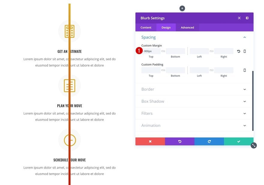
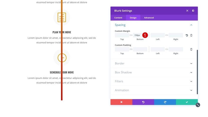
Blurb Module #1
As mentioned before, the spacing of the Blurb Modules differs. The second one doesn’t have any but the first one uses ‘-900px’ for the top margin. Once you add this negative margin, you’ll notice the Blurb Modules become part of the timeline. Within the Visual Builder, it seems like the Divider Module is on top of the Blurb Modules. But once you exit the Visual Builder, you’ll watch everything fall into place so don’t worry about that.
Blurb Module #3
Open your last Blurb Module next and add ‘150px’ to the bottom margin.
Drop Image Module in Column 2
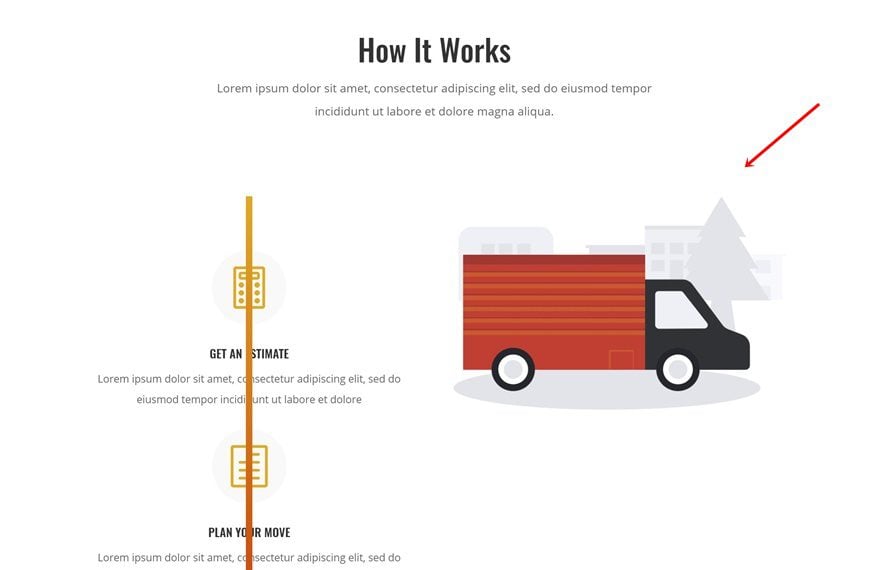
Locate Image
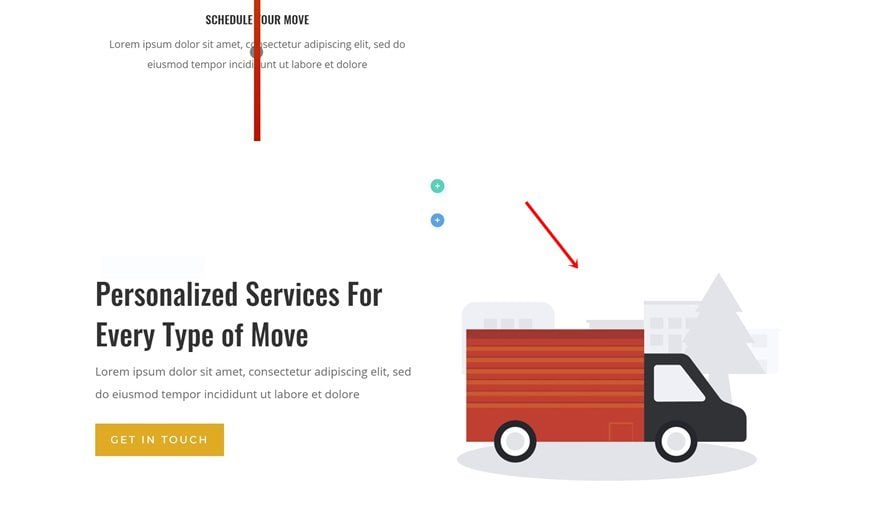
We can now move on to column 2! The only module we’ll need there is an Image Module. We’re reusing one that’s already on our page so go ahead and locate it:
Drop Image in Column 2
Drop and drag it to your second column next.
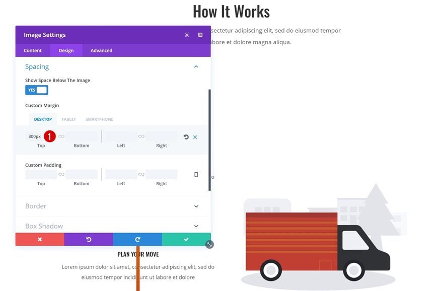
Change Spacing
To center it vertically, we’re going to add some margin to it:
- Top Margin: 300px (Desktop), 30px (Tablet & Phone)
- Bottom Margin: 50px (Tablet & Phone)
Remove Previous & Next Section
We’re done creating our section! The last thing remaining to do is deleting the excessive sections.
Preview
Now that we’ve gone through all the steps, let’s take a final look at the result on different screen sizes.
Final Thoughts
In this use case blog post, we’ve shown you how to turn vertical dividers into vertical ones using Divi’s Moving Company Layout Pack. This approach is ideal if you want to create timelines on your page without having to use any additional code. It’s solely based on Divi’s built-in options. If you have any questions or suggestions, make sure you leave a comment in the comment section below!


Obviously a little CSS would have the same effect. But I really appreciate these balances of manipulation from our visual builder. It makes my brain elongate with Divi, and customers love receiving their designs and manipulating them without having to look at codes. Thank you!
Couldn’t have described it better! We love to show the community all the ins and outs of Divi! Thanks for the comment, Rangel 🙂
This layout is excellent in different screen sizes. Very nice tutorial.
Thanks
Thanks Shane, glad you like it! 🙂
transform: rotate(90deg);
🙂
Where’s the fun in using CSS, Nelson 😉
Thanks Elegantthemes perfect example ♥
You’re welcome!! 🙂
Thanks again, great example!
You’re welcome, Joost. Happy you like it! 🙂
Great ideas only come from here. Thanks for the post.
Thanks, Dave! You’re very welcome 🙂
Very clever 🙂 There’s so much you can do by thinking outside the square a little.
The possibilities are really endless! Thanks for the comment, Neil. Happy you like it 🙂
Thanks this is great! Is it easily customisable for people with more than 3 steps? The process I’m trying to show is 10 steps and I’d like to use this layout for mobile. I’m guessing I can just keep adding blurbs and add to the padding of the divider?
Thanks for the comment, Joel! Yes, you can add as many steps as you want. Keep adding the padding to the Divider Module and make sure there’s enough negative top margin for the first Blurb Module.
I believe I followed all directions, but the divider doesn’t show. The blurbs appear to cover it up.
http://doctorsofcourage.org/8293-2/.
Doesn’t something have to be translucent to see the divider through?
Hi Linda, make sure you give your Divider Module a gradient background + a semitransparent background color to the Blurb Modules. Hope that helps!
Very good idea as always, thank you Donjete.
A lot of possibility of customization.
We had to think about it
There are definitely a lot of things possible with Divi’s built-in options if you give it some thought! Thanks for the comment, Bruno 🙂
Great idea and so helpful. Thank you Donjete !!! How creative of you !!!
Glad I could help, Silvia! Thanks for the comment 🙂
Donjete, as always. grat and excelent Job. Thank you.
Thanks a lot, Octavio! Happy you like it 🙂