
This post is part 4 of 5 in our mini series titled 5 Interesting Ways to Style Divi’s Slider Module. Stay tuned for all five unique examples of the slider module and tutorials on how to achieve them!
In today’s slider tutorial instead of changing out the animation name on the slide description I’m actually going to be removing it altogether, and I’ll explain why below. I’m also bringing in a few gradients, ’cause who doesn’t love a gradient? Aaaand I’ll show you how to have three buttons instead of two (or as many as you want).
Let’s get started! 😀
- 1 Today’s Before & After: The Divi Slider Module
- 2 How to Style the Divi Slider with a Static Description by Removing the Description Transition
- 3 The Concept & Inspiration
- 4 Preparing the Design Elements
- 5 Implementing the Design with Divi
- 6 The Section Settings
- 7 The Row Module Settings
- 8 The Slider Module Settings
- 9 The Slide Settings
- 10 Finishing Up with the CSS
- 11 Tomorrow: How to Create a Navigation Mosaic with the Divi Slider Module
Today’s Before & After: The Divi Slider Module
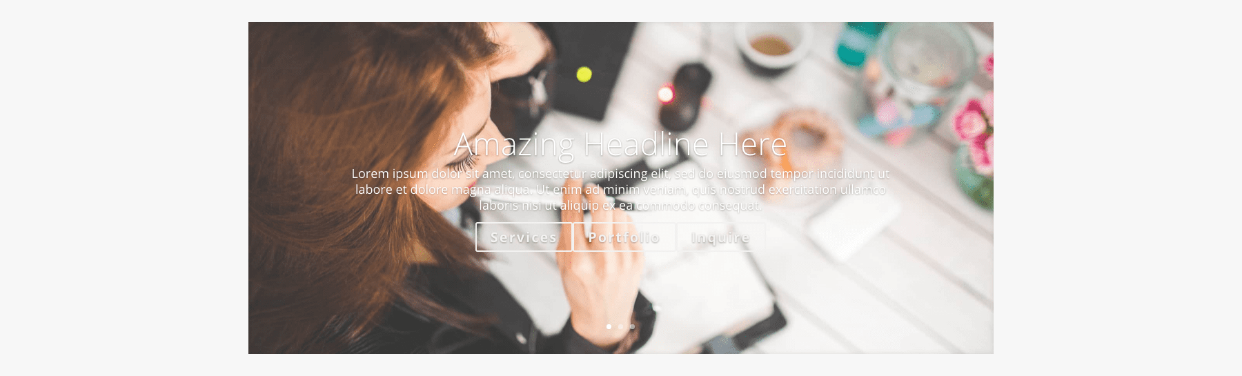
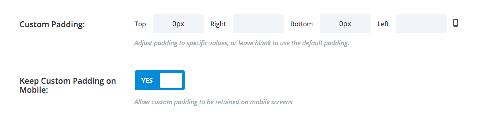
Below is an example of the Divi Slider Module with an image and dummy text added, but no settings changed. This represents our starting point.
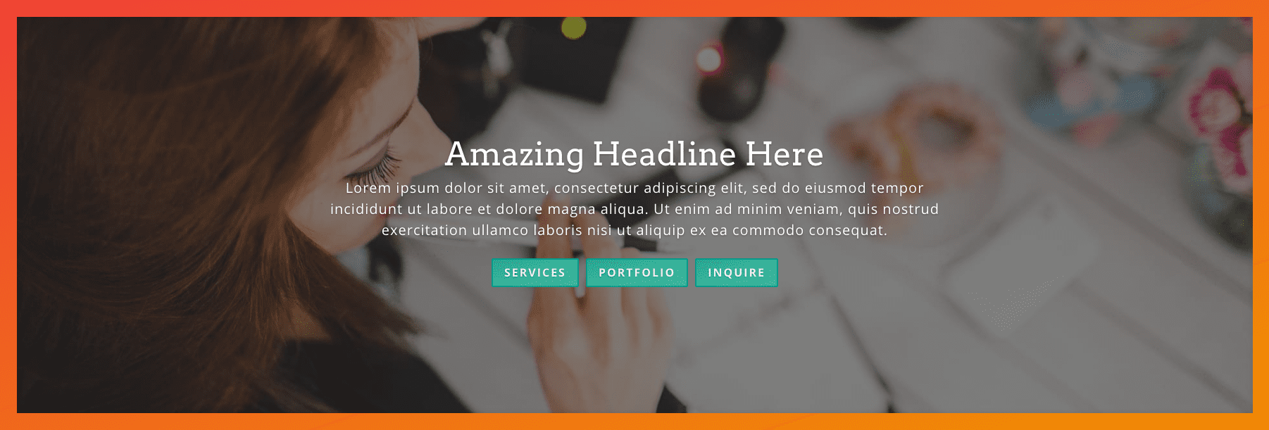
What we’ll end up with is a an almost fullwidth, sleek hero slider with a gradient background, giving the appearance of a thick gradient border.
How to Style the Divi Slider with a Static Description by Removing the Description Transition
Subscribe To Our Youtube Channel
The Concept & Inspiration
It’s a pretty popular opinion that sliders in the header (aka hero sliders) are bad for conversions. That they’re too distracting and people aren’t going to click through all of them anyway.
Of course everyone needs to do what’s best for their site–or their clients’–but even if that is true I say it’s still not reason enough to ditch the beloved hero slider entirely.
The visual movement above the fold is something that’s almost expected nowadays in web design, so in this step-by-step tutorial the slider is keeping the visual movement but ditching the rotating words. A win-win I say!
Preparing the Design Elements
I’ve gathered my background images ahead of time. It’s best to optimize your images beforehand, and also size them down close to the size they’ll actually be appearing on the frontend when possible.
In this example my images are 1920px wide by 1280px high. This is a great size for full-width images.
Something else you can do is get some assets together so you can have a point of reference during the design process, sort of similar to a mood board if you’re familiar with those. It can be as simple or complex as you want it to be. Here we’re just collecting some gradients and images.

Implementing the Design with Divi
In the sections below we’ll work our way in from Section settings to Module settings, to Slide settings, and finally a quick snippet of CSS. Here we go!
The Section Settings
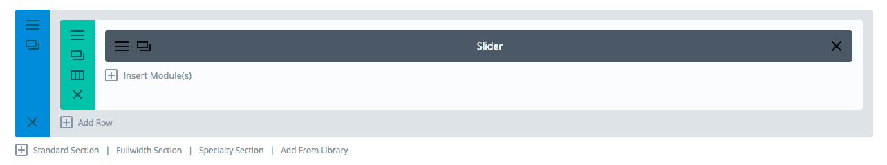
We’re going to start with a standard 1-column section and add a slider module to it.
Next we’ll change some settings in the section module itself.
For the Section General Settings I’m setting a background color of #ef4136 and putting a top and bottom padding of 0. The background color is what you see quickly flash between slide changes and I’ve chosen a color that’s used in my gradient. I think most people tend to forget this little detail and leave the default white as the background, but it’s a nice little touch to have it match.
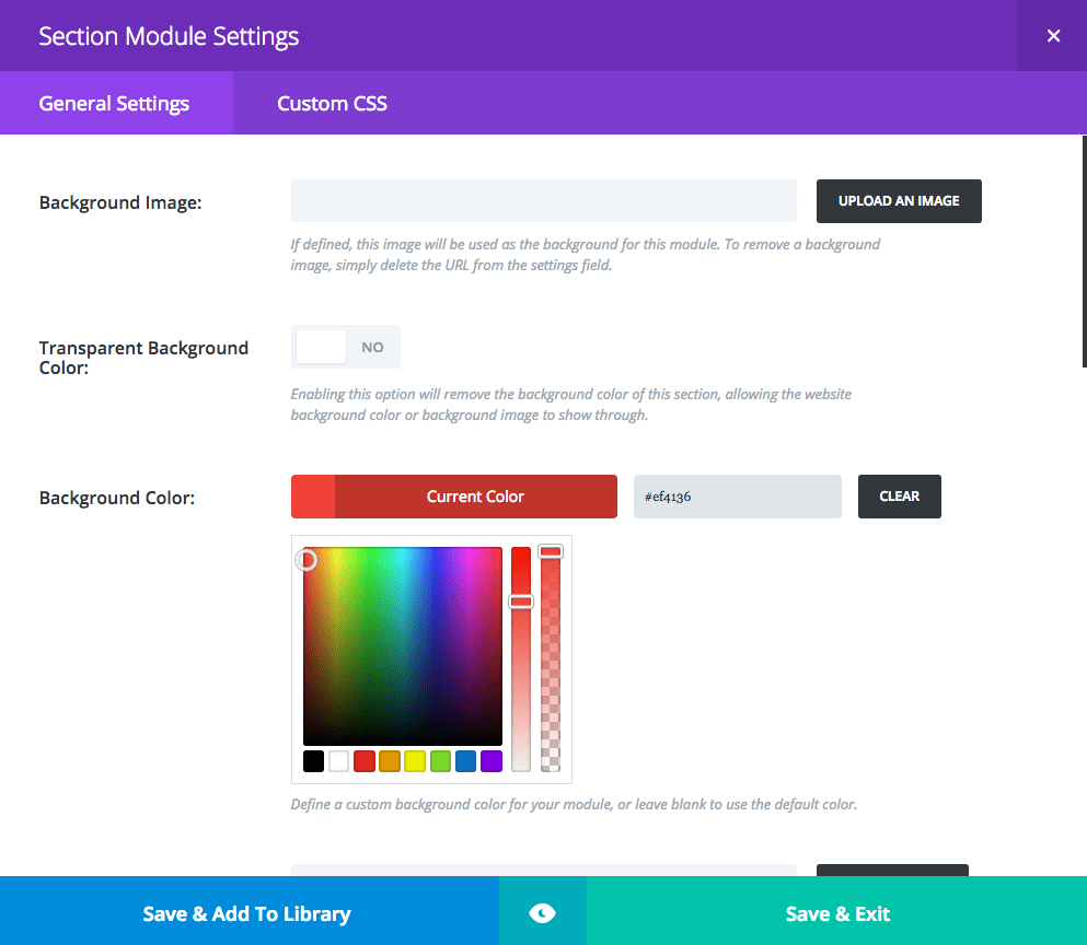
In the Section Custom CSS Settings I’m adding some CSS and I’m assigning an ID to the section. I’m using the name “gradient-slider” but you can use whatever you’d like.
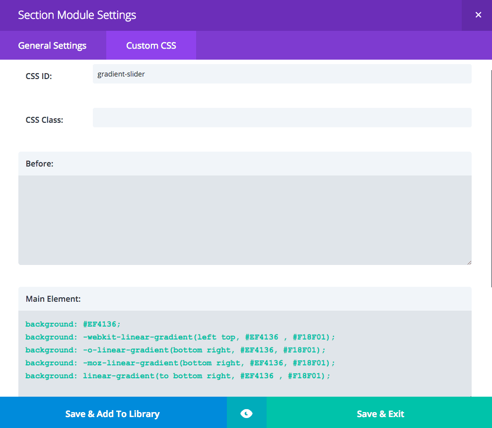
Main Element – We’re using a diagonal linear gradient and as you probably guessed the first hex code applies to the color being used in the upper left corner, the second hex code applies to the lower right. All the variations are needed for different browsers.
background: #EF4136;
background: -webkit-linear-gradient(left top, #EF4136 , #F18F01);
background: -o-linear-gradient(bottom right, #EF4136, #F18F01);
background: -moz-linear-gradient(bottom right, #EF4136, #F18F01);
background: linear-gradient(to bottom right, #EF4136 , #F18F01);
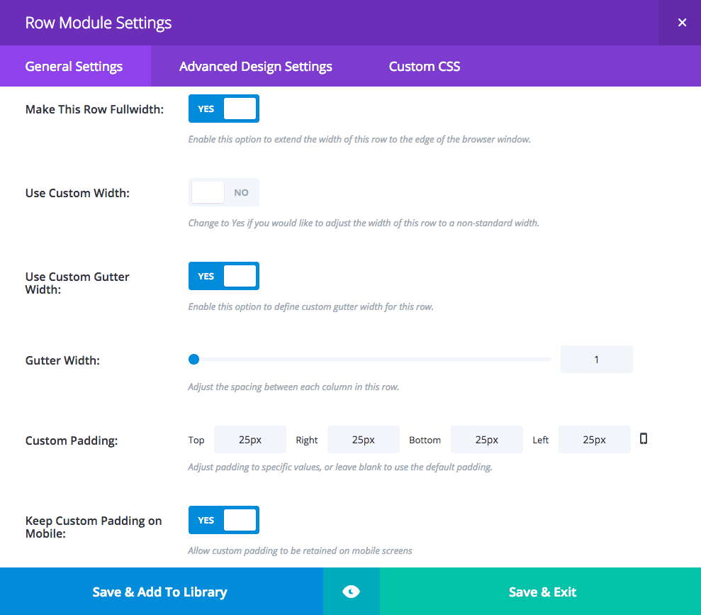
The Row Module Settings
Now let’s set the settings in the row’s general settings. We will not be changing anything in the advanced design or custom CSS tabs.
The Slider Module Settings
For the Slider Module General Settings set the following:
- hide arrows
- show controls: no
- automatic animation: on
- animation speed set to 7000
- continue automatic slide on hover: on
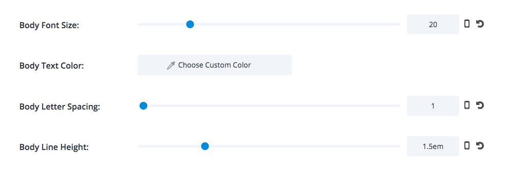
In the Slider Module Advanced Design Settings as the header font I’m using Arvo and I’m changing the body font settings but you can set what you’d like.
For the Slider Module Custom CSS Settings add the following code:
Slide Description – Here I’m removing the animation/transition effect that is normally seen applied to the description text. This essentially is what will make it a “static” slider in the sense that the text will never move. Of course for this to really work every slide has to have the exact same title and content.
animation-name: none;
The Slide Settings
For the slide General Settings see below, the opaque black you see is rgba(0,0,0,0.5).
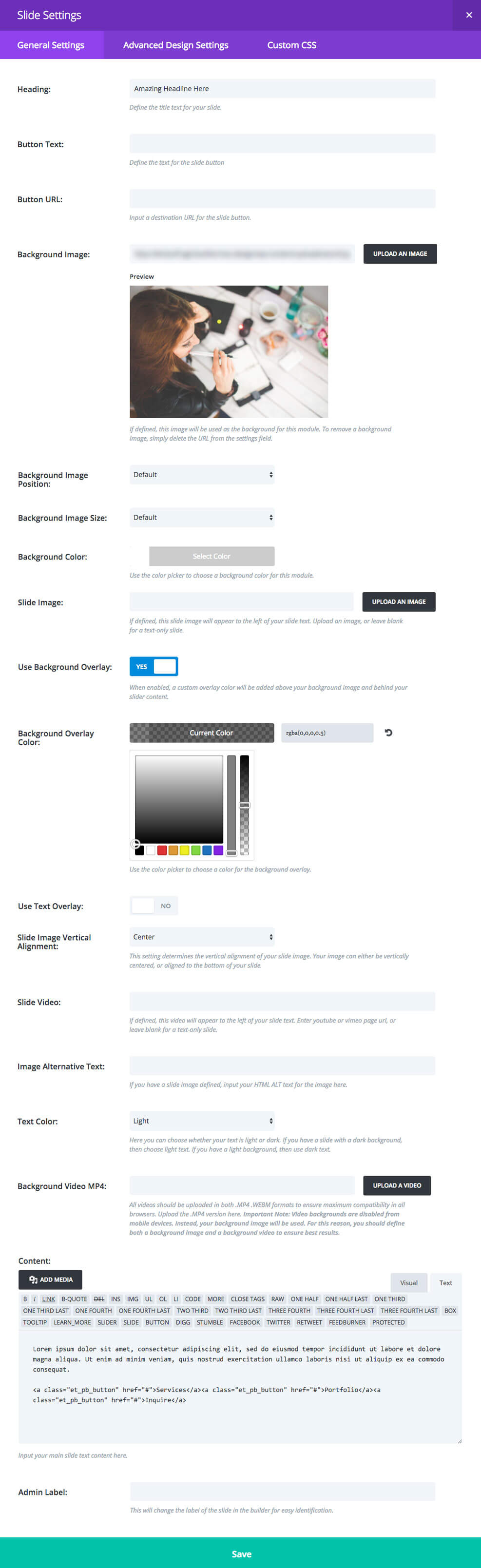
Nothing in the advanced design or custom CSS tabs are changed. You’ll notice at the end we’re adding our description text along with some HTML code in text mode, not visual. This code that we’re adding is the code for the three buttons, notice how in this last screenshot the button field was left blank? Because we’re taking away the ability to have multiple bodies of text show up in order to make it seem “static” we need to compensate for the loss of call-to-action (or CTA) opportunities, so voilà! More buttons!
Something to note is that I’m using Elegant Themes’ ready-made class “et_pb_button”. The reason I’m doing this is in case you want these buttons to apply the settings you’ve already set in customizer > buttons you don’t need to add the CSS that we’ll be adding below. For the purposes of this tutorial though, we’ll be giving these buttons their own styling that will only apply to them.
You can start adding your slides and be sure to copy/paste the HTML code as it’s shown in the photo, replacing with your URL links and button text of course. You should also add titles or any other attributes at this time. Remember for this to really work every slide has to have the exact same title and content. I suggest making the first slide and then duplicating, only changing the background image for each slide.
<a class="et_pb_button" href="#">Services</a><a class="et_pb_button" href="#">Portfolio</a><a class="et_pb_button" href="#">Inquire</a>
Finishing Up with the CSS
Remember how we assigned the ID “gradient-slider” to the section in the very beginning? Here’s where we’re going to use that ID. This will ensure these styles only apply to these slider buttons. You can change the hex codes to what you’d like, the same style of diagonal linear gradient is being used here as we used in the section background.
#gradient-slider .et_pb_button {
    text-transform: uppercase;
    font-size: 16px;
    display: inline-block;
    margin: 5px;
    border-color: #02998A;
    background: #2F9C95;
    background: -webkit-linear-gradient(left top, #2F9C95, #40C9A2);
    background: -o-linear-gradient(bottom right, #2F9C95, #40C9A2);
    background: -moz-linear-gradient(bottom right, #2F9C95, #40C9A2);
    background: linear-gradient(to bottom right, #2F9C95, #40C9A2);
}
#gradient-slider .et_pb_button:hover {
    border-color: #15BF9F;
}
And that’s it! You should have a pretty cool hero slider with no moving text and some extra buttons that won’t have to fight each other for slide order attention. Hope you can make some great use of this tutorial!
Things are going to get interesting tomorrow! Instead of offering up a design concept with just one Divi slider module, I’ll be showing you how to combine several together to create a unique form of site navigation. See you then!
Be sure to subscribe to our email newsletter and YouTube channel so that you never miss a big announcement, useful tip, or Divi freebie!


Thank you for the great slider. The only question – is there any possibility to add preview thumbnails instead of dots?
Hi there:
This is great and I have used the idea in one my websites (link given below). However, the image and the texts in the slider do not get auto-adjusted in smart phones (mobile). To maintain Divi theme being fully responsive, is there any help for make the slider module responsive in mobile device?
Thank you indeed.
Wonderful develop your tailor made slider, Leslie! Enjoy your creative imagination.
Thanks for the tutorial Leslie. I’ve gone through a few of yours from your site and now I’ve got your site bookmarked in multiple places on my pc, gotta organize these.
I now started a site to organize my bookmarks and design ideas.
Would it be possible for you guys to set up live demos/previews of these sliders somewhere? I neither have time to watch the videos nor time to put together the sliders myself, so having a live preview would save me a lot of time in finding out whether it’s something I want to make myself (now or in the future).
Roland – check the author’s site by clicking her name (Leslie Bernal) and then look for ‘TUTS Y MÁS’ on the right hand menu.
Thanks everyone, glad you could find some useful bits in this! 😀
Great work on this, Leslie! I’ve been using negative margins and padding to arrange elements over my slides, but this is such a better method. I’m going to apply this ASAP. Well done!
Amazing help ! Thanks for sharing!
Leslie, Congratulations excellent work.
I am very grateful for this amount of ideas that you have shared to create new things on our websites.
successes
Great work with CSS design
Thank you for this helpful post!
Great!!
Great work on the custom slider, Leslie! Love the creativity.
Thanks Ryan 😀