
When designing a website, you have an important choice to make at the very beginning: “What device am I going to design for first?” Often, the answer is desktop. But just because you design for desktop first, doesn’t mean your mobile design can’t be as thorough. By using rotated copy, for instance, you can maximize Divi and its mobile viewports and fit more content inside the mobile viewports without overburdening your visitors or your design. In this tutorial, we’ll show you exactly how to do that inside Divi. You’ll be able to download the JSON file for free as well!
Let’s get to it.
- 1 Preview
- 2 Download The Maximizing Mobile Viewports Layout for FREE
- 3 Download For Free
-
4
Let’s Start Recreating!
- 4.1 Add New Section
- 4.2 Add Row #1
- 4.3 Column 1 Settings
- 4.4 Column 2 Settings
- 4.5 Add Image Module to Column 2
- 4.6 Add Text Module to Column 1
- 4.7 Add Divider Module to Column 1
- 4.8 Add Row #2
- 4.9 Column 1 Settings
- 4.10 Column 2 Settings
- 4.11 Add Text Module to Column 2
- 4.12 Add Button Module to Column 2
- 4.13 Add Text Module to Column 1
- 4.14 Clone Section for Reuse
- 5 Preview
- 6 Final Thoughts
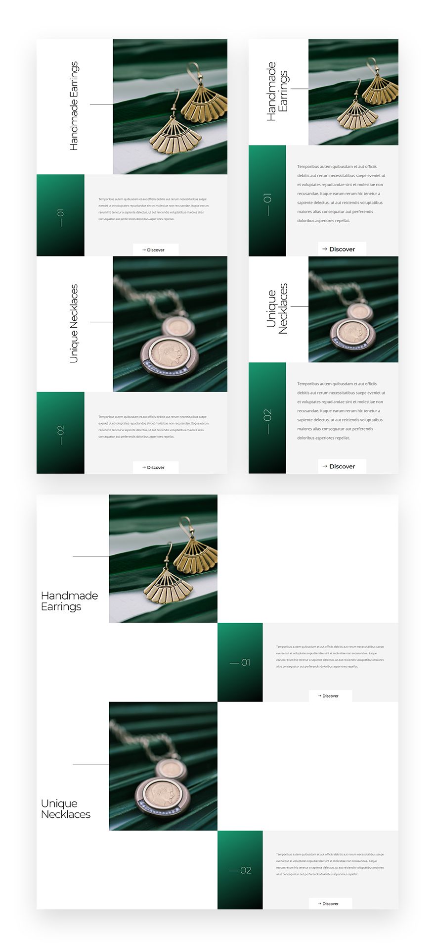
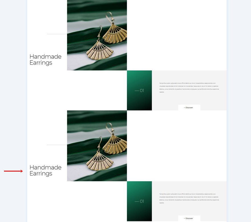
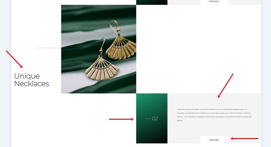
Preview
Before we dive into the tutorial, let’s take a quick look at the outcome across different screen sizes.
Download The Maximizing Mobile Viewports Layout for FREE
To lay your hands on the free maximizing mobile viewports layout, you will first need to download it using the button below. To gain access to the download you will need to subscribe to our newsletter by using the form below. As a new subscriber, you will receive even more Divi goodness and a free Divi Layout pack every Monday! If you’re already on the list, simply enter your email address below and click download. You will not be “resubscribed” or receive extra emails.

Let’s Start Recreating!
Add New Section
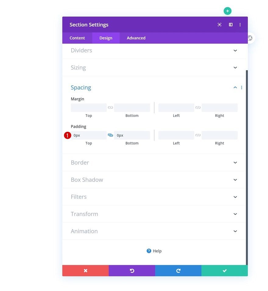
Spacing
Start by adding a new section to the page you’re working on. Open the section settings and remove all default top and bottom padding.
- Top Padding: 0px
- Bottom Padding: 0px
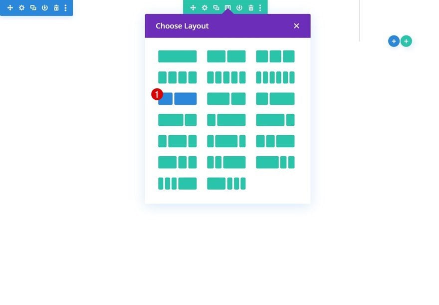
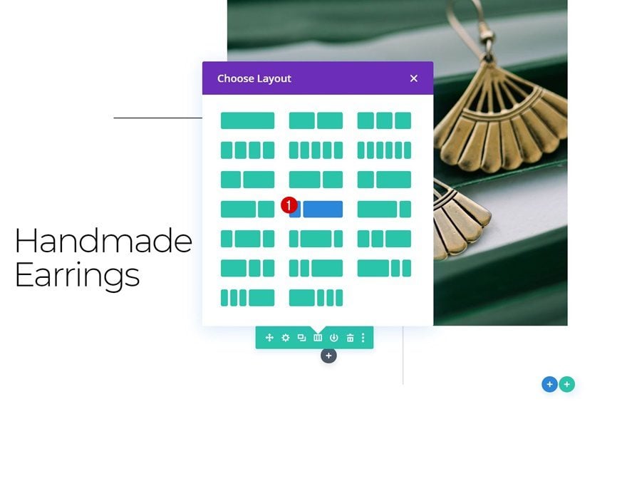
Add Row #1
Column Structure
Continue by adding a new row to the section using the following column structure:
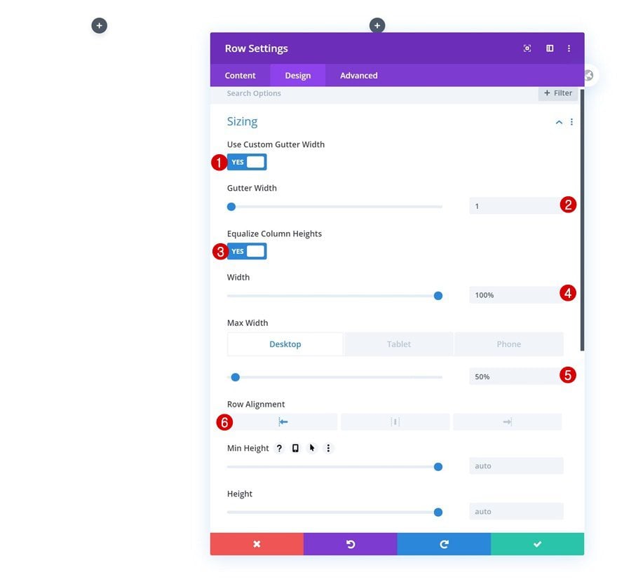
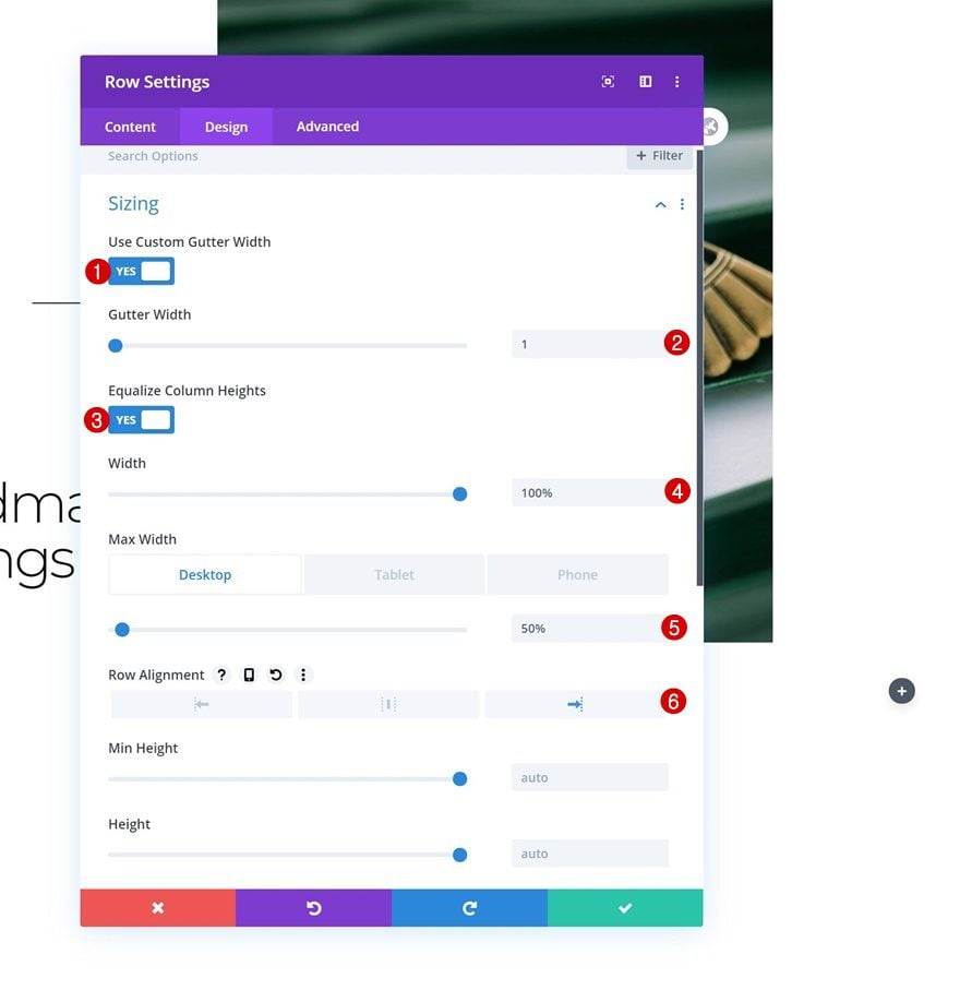
Sizing
Without adding any modules yet, open the row settings and modify the sizing settings as follows:
- Use Custom Gutter Width: Yes
- Gutter Width: 1
- Equalize Column Heights: Yes
- Width: 100%
- Max Width: 50% (Desktop), 100% (Tablet & Phone)
- Row Alignment: Left
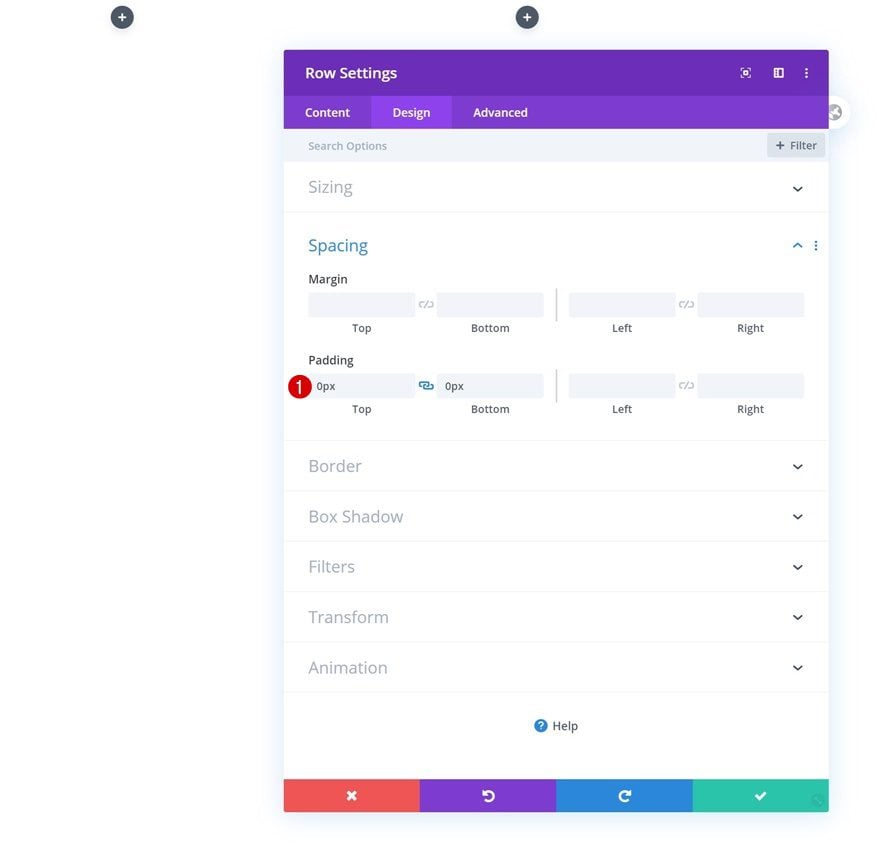
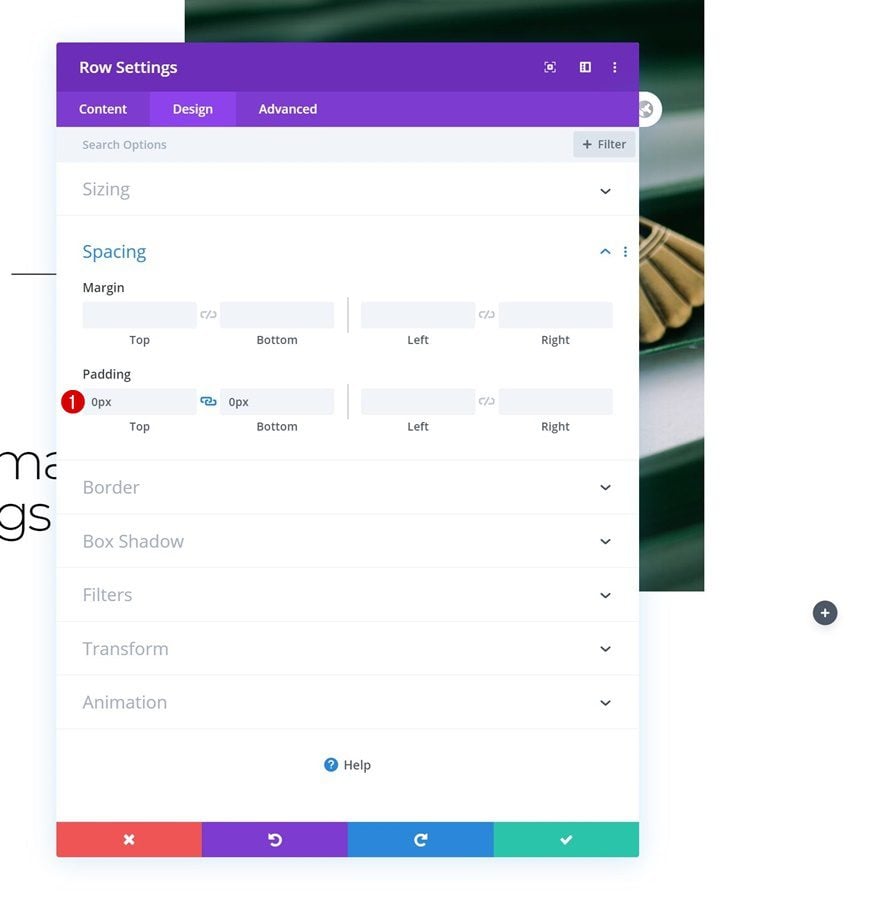
Spacing
Remove all default top and bottom padding next.
- Top Padding: 0px
- Bottom Padding: 0px
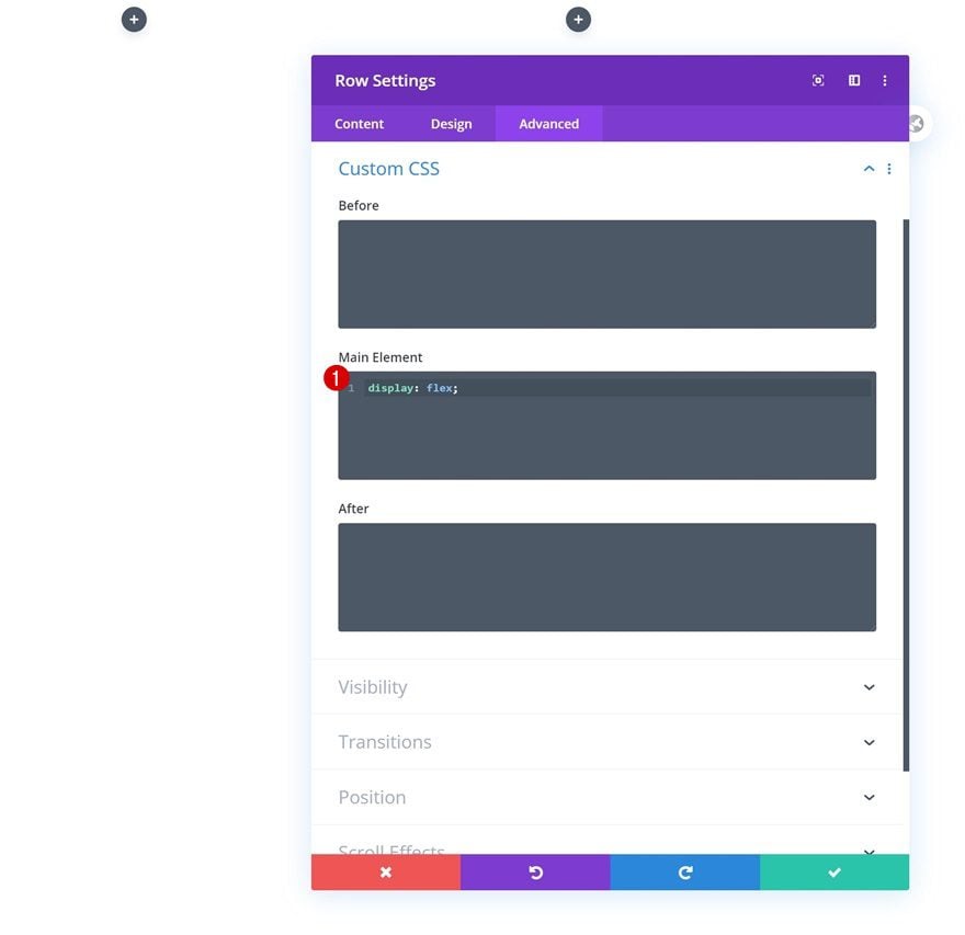
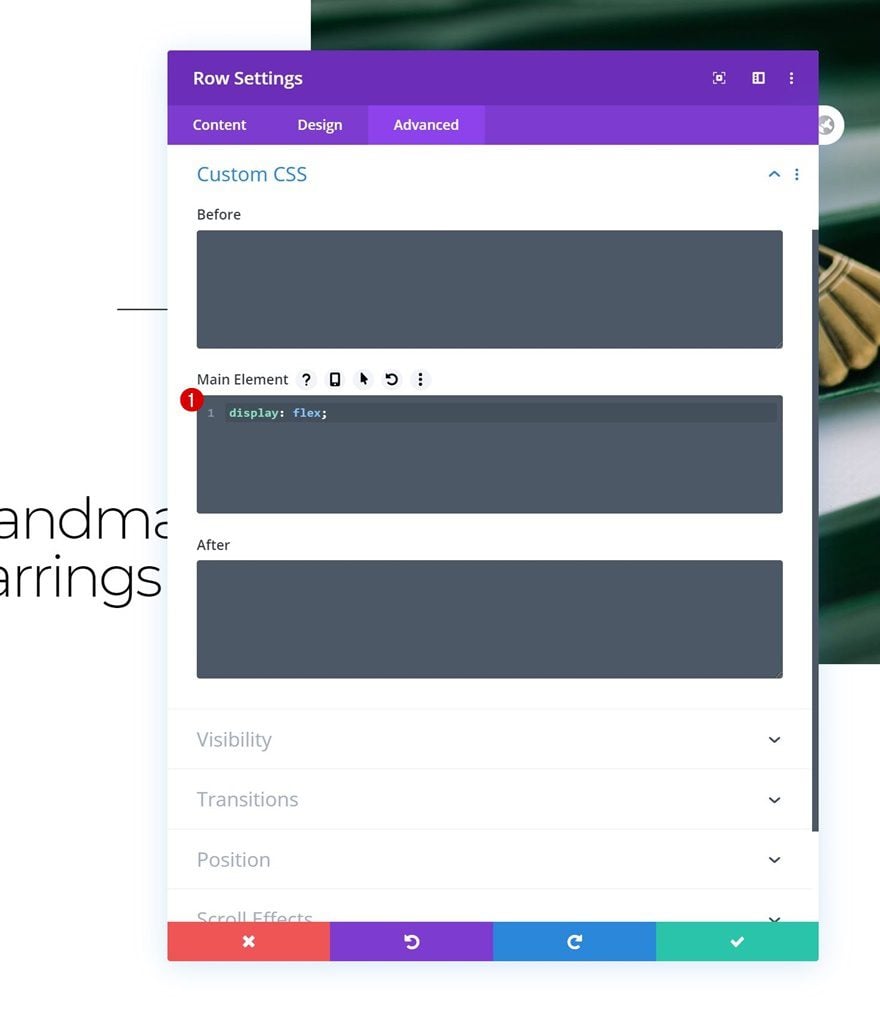
Main Element CSS
To make sure all columns remain next to each other, we’ll add one single line of CSS code to the row’s main element too.
display: flex;
Column 1 Settings
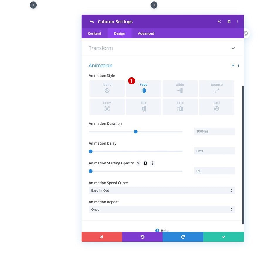
Animation
Then, we’ll open the column 1 settings and add the following animation:
- Animation Style: Fade
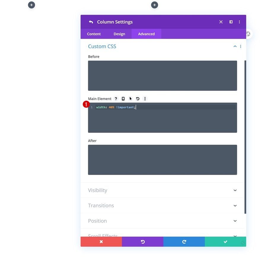
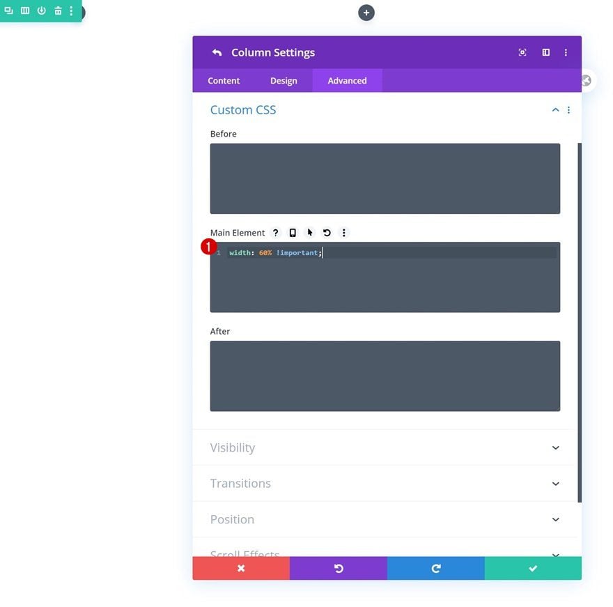
Main Element CSS
We’ll keep the column size on smaller screen sizes by adding the following line of CSS code to the column’s main element:
width: 40% !important;
Column 2 Settings
Animation
Next, we’ll open the column 2 settings and apply the following animation:
- Animation Style: Fade
- Animation Delay: 200ms
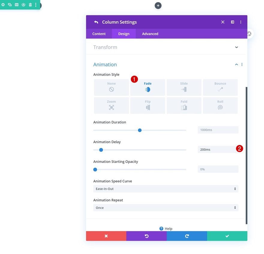
Main Element CSS
We’re keeping the column’s size on smaller screen sizes by adding the following line of CSS code:
width: 60% !important;
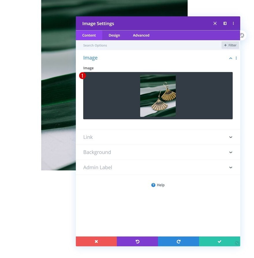
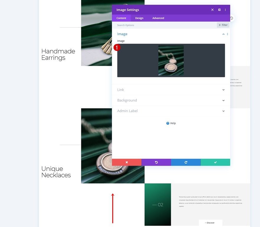
Add Image Module to Column 2
Upload Image
Time to add modules. Add an Image Module to column 2 and upload a portrait image of your choice.
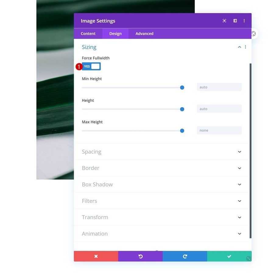
Sizing
Move on to the module’s design tab and force fullwidth on the module.
- Force Fullwidth: Yes
Add Text Module to Column 1
Add H2 Content
In column 1, the first module we need is a Text Module containing H2 content.
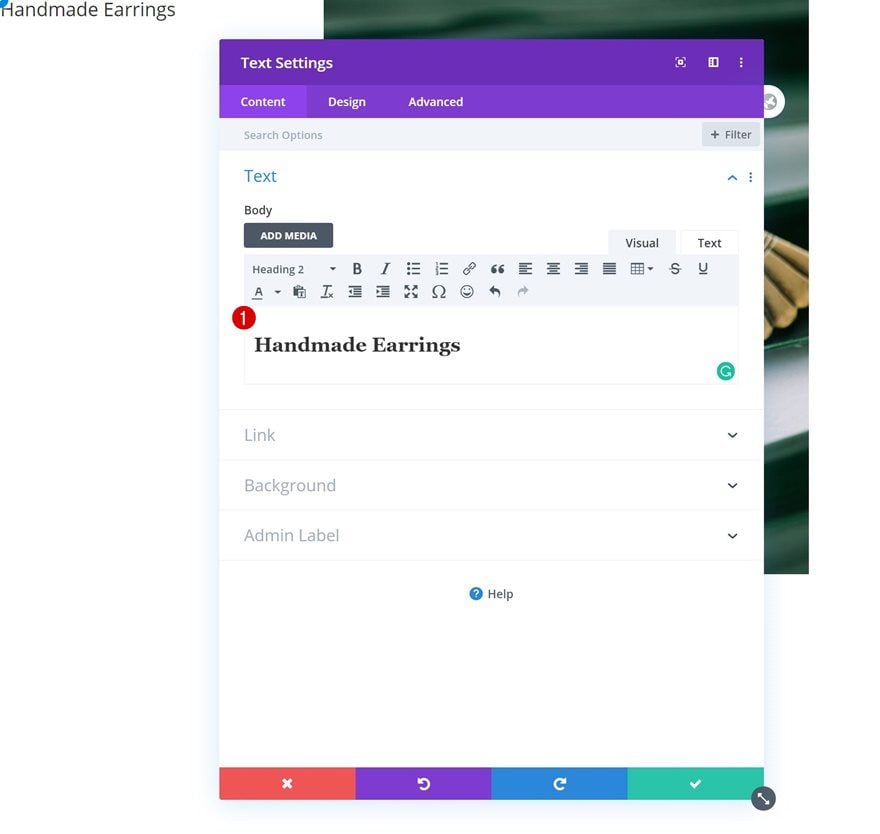
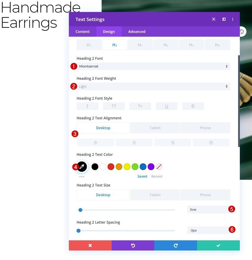
H2 Text Settings
Move on to the module’s design tab and modify the H2 text settings as follows:
- Heading 2 Font: Montserrat
- Heading 2 Font Weight: Light
- Heading 2 Text Alignment: Center (Tablet & Phone Only)
- Heading 2 Text Color: #000000
- Heading 2 Text Size: 3vw (Desktop), 50px (Tablet), 40px (Phone)
- Heading 2 Letter Spacing: -3px
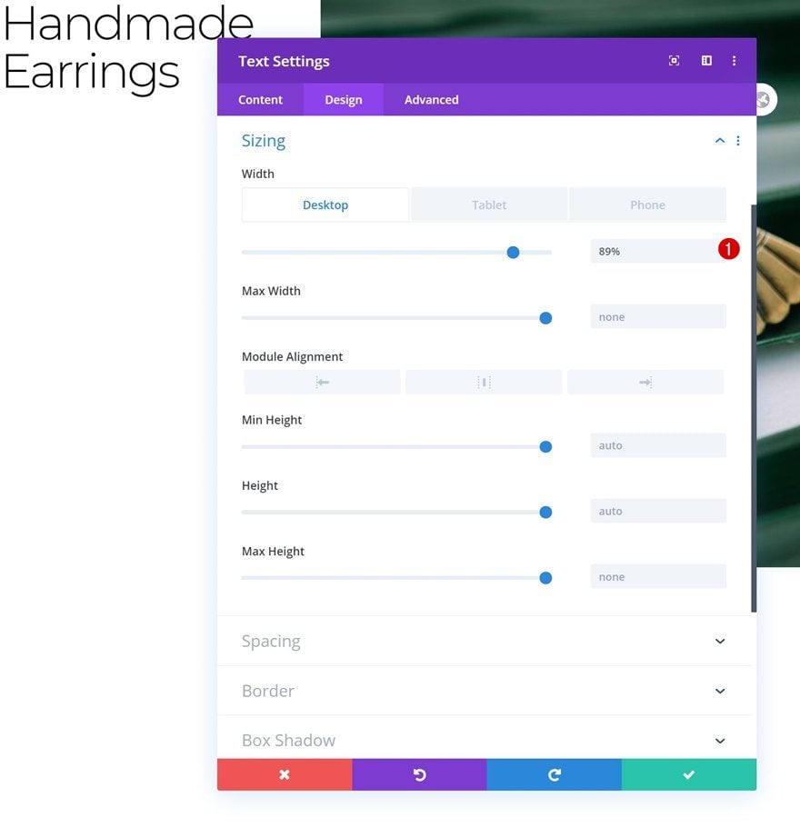
Sizing
Next, we’ll modify the width in the sizing settings.
- Width: 89% (Desktop), 150% (Tablet & Phone)
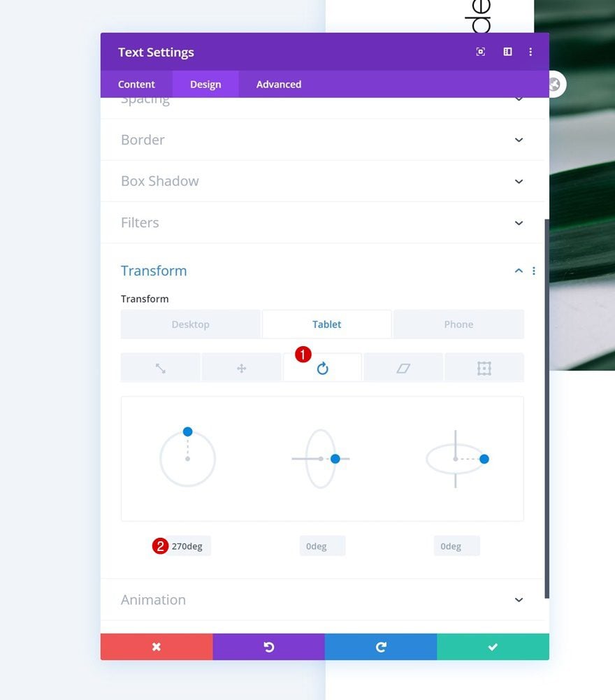
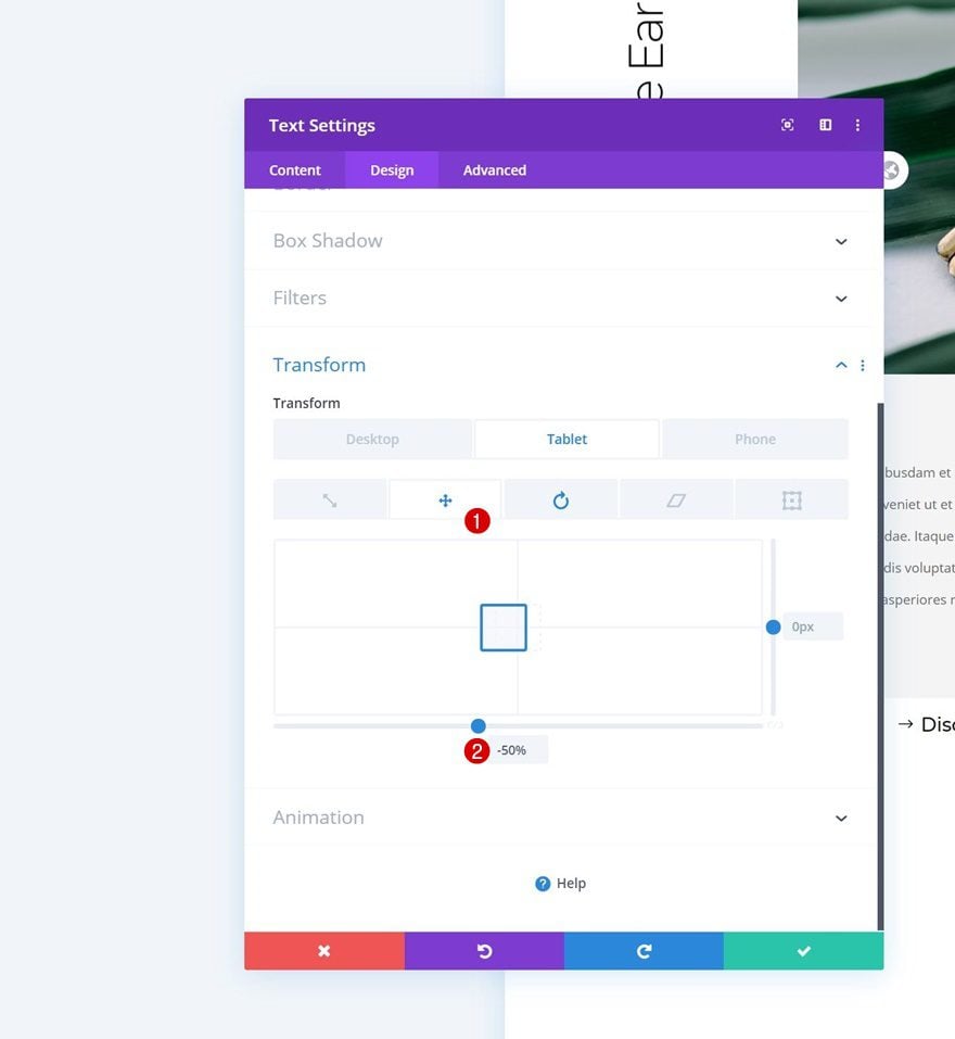
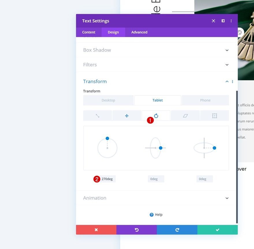
Transform Rotate
To rotate our module on smaller screen sizes, we’ll use the transform rotate settings.
- Left: 270deg (Tablet & Phone Only)
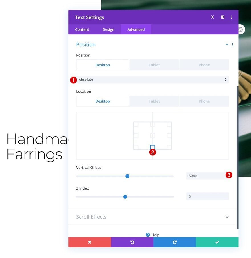
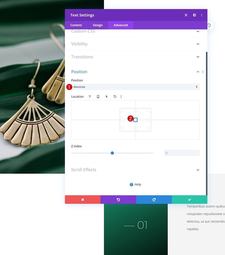
Position
We’re also repositioning the module differently across different screen sizes.
- Position: Absolute
- Location: Bottom Center (Desktop), Center (Tablet & Phone)
- Vertical Offset: 50px
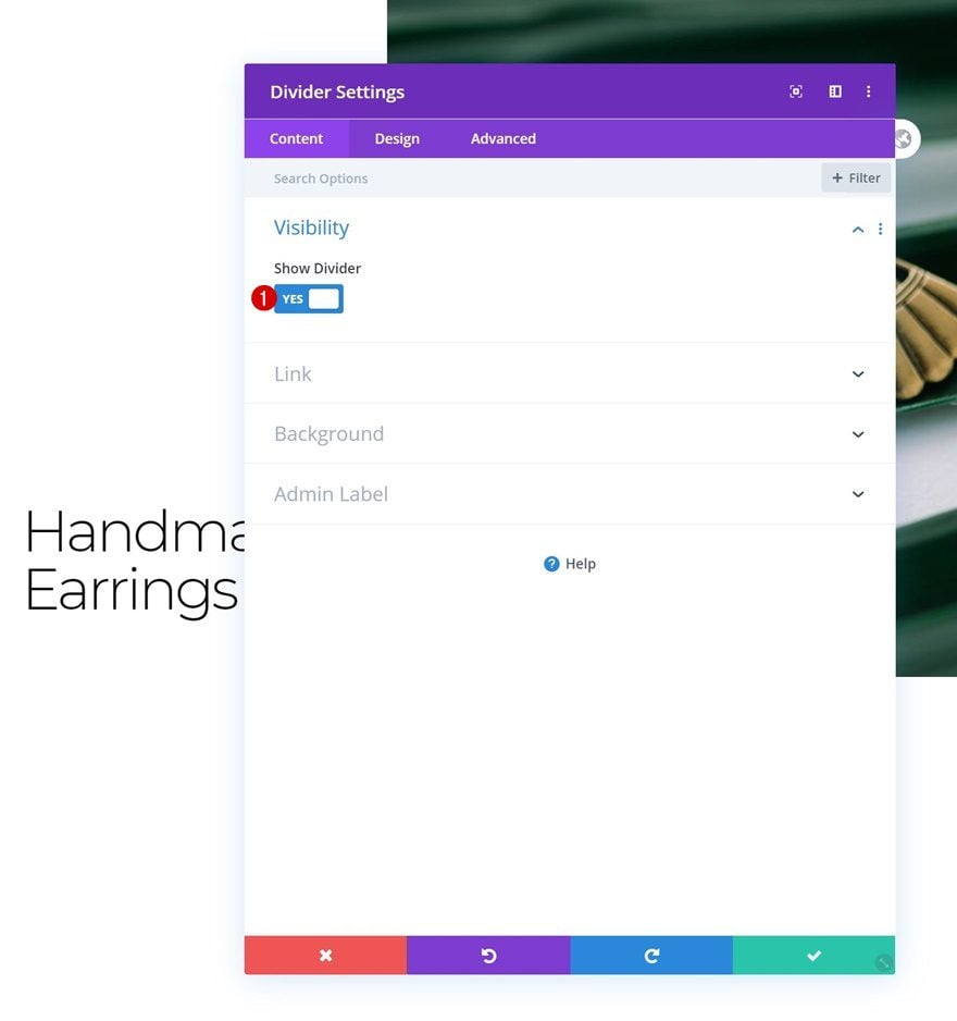
Add Divider Module to Column 1
Visibility
The next and last module we need in column 1 is a Divider Module. Make sure the ‘Show Divider’ option is enabled.
- Show Divider: Yes
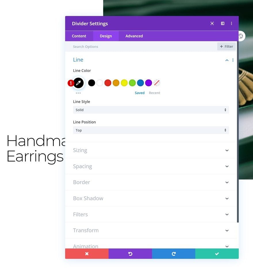
Line
Move on to the module’s design tab and change the line color.
- Line Color: #000000
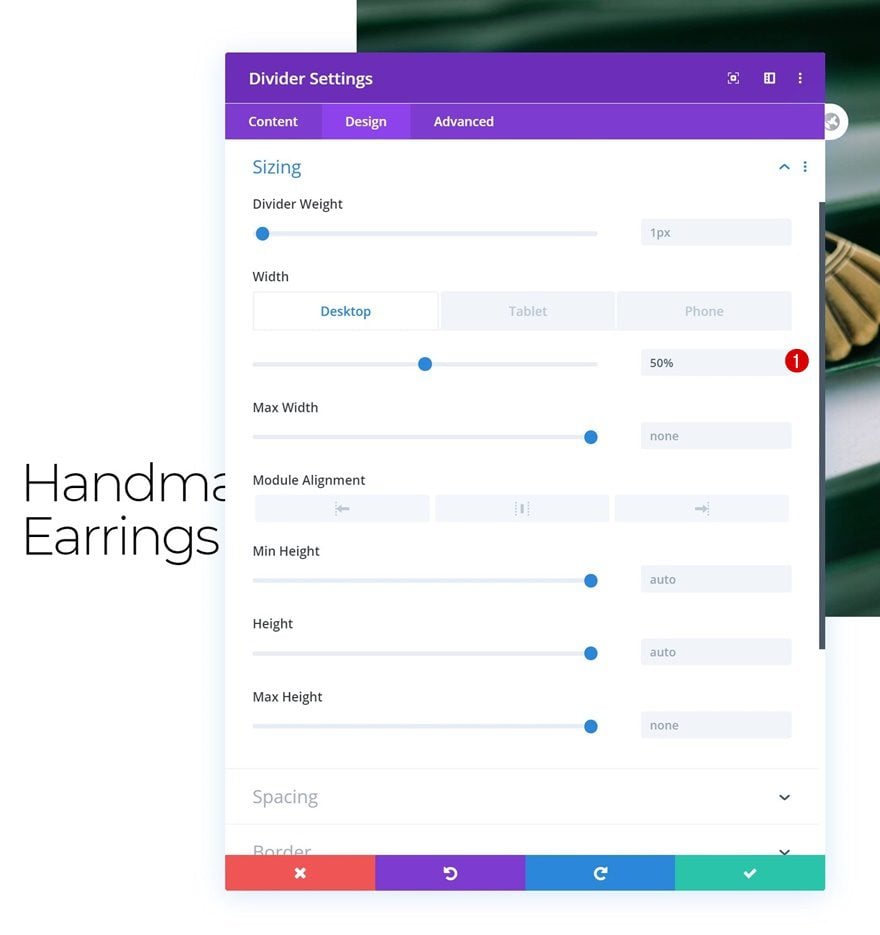
Sizing
Modify the sizing settings too.
- Width: 50% (Desktop), 30% (Tablet & Phone)
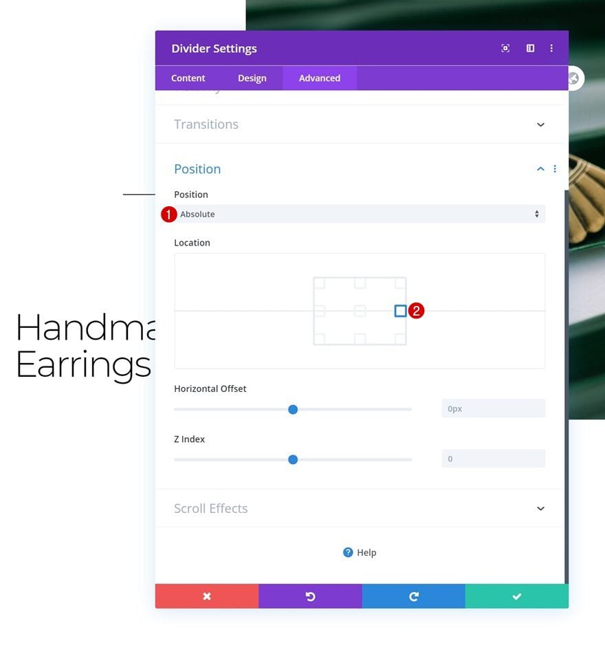
Position
And complete the module settings by repositioning the module accordingly:
- Position: Absolute
- Location: Center Right
Add Row #2
Column Structure
On to the next row, use the following column structure:
Sizing
Without adding any modules yet, open the row settings and modify the sizing settings as follows:
- Use Custom Gutter Width: Yes
- Gutter Width: 1
- Equalize Column Heights: Yes
- Width: 100%
- Max Width: 50% (Desktop), 100% (Tablet & Phone)
- Row Alignment: Right
Spacing
Remove all default top and bottom padding next.
- Top Padding: 0px
- Bottom Padding: 0px
Main Element CSS
To make sure both columns remain next to each other on smaller screen sizes, we’ll add one single line of CSS code to the row’s main element.
display: flex;
Column 1 Settings
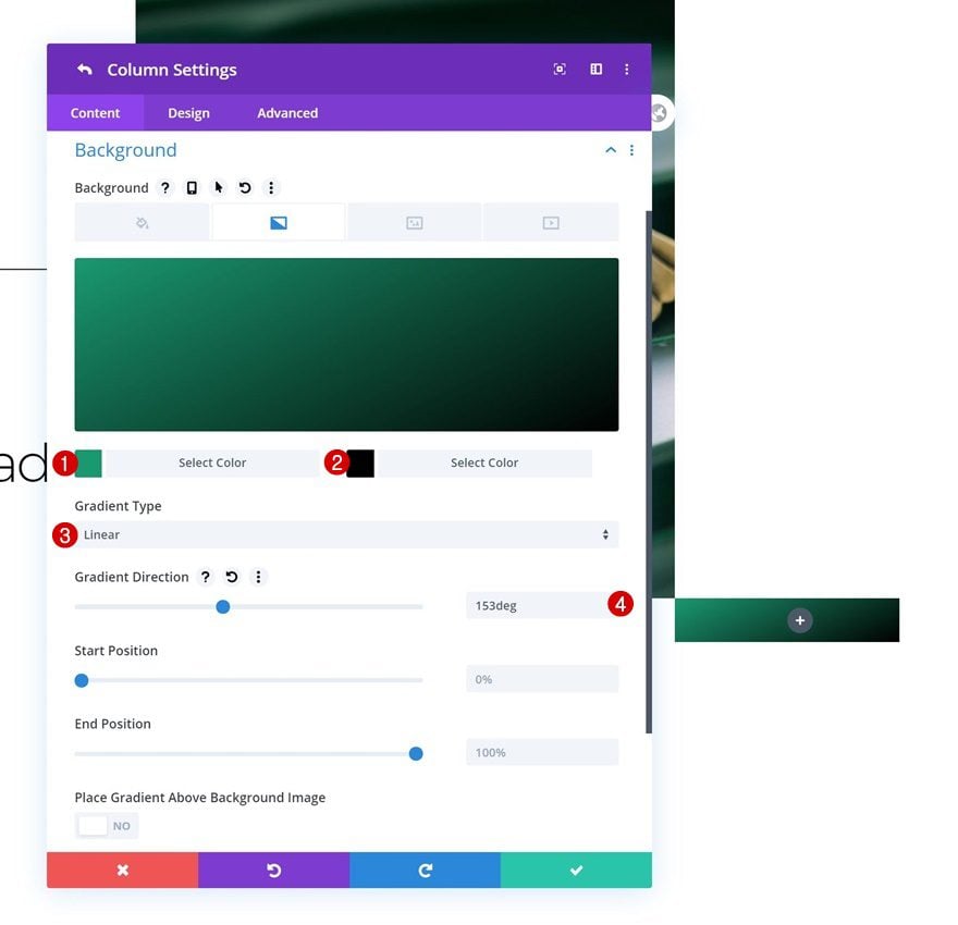
Gradient Background
Next, we’ll open the column 1 settings and we’ll apply a gradient background.
- Color 1: #1a9970
- Color 2: #000000
- Gradient Type: Linear
- Gradient Direction: 153deg
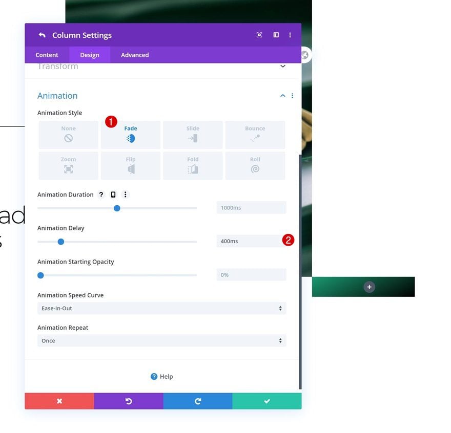
Animation
We’re using a delayed animation on this column too.
- Animation Style: Fade
- Animation Delay: 400ms
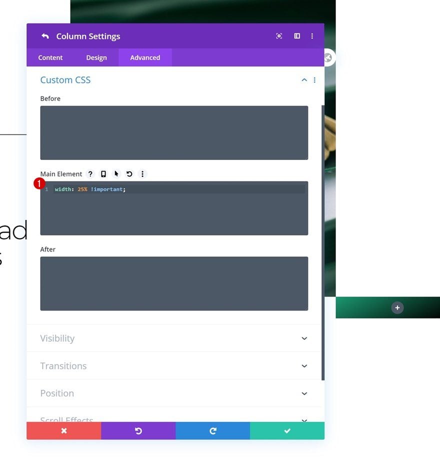
Main Element CSS
We’ll, then, make sure we keep the column’s size on smaller screen sizes by adding the following line of CSS code to the column’s main element:
width: 25% !important;
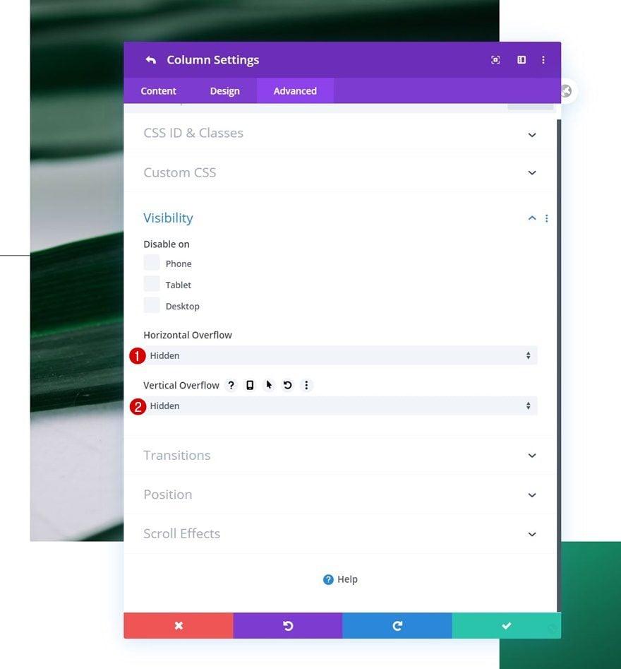
Visibility
Last but not least, we’ll hide the column’s overflows to make sure nothing surpasses the container.
- Horizontal Overflow: Hidden
- Vertical Overflow: Hidden
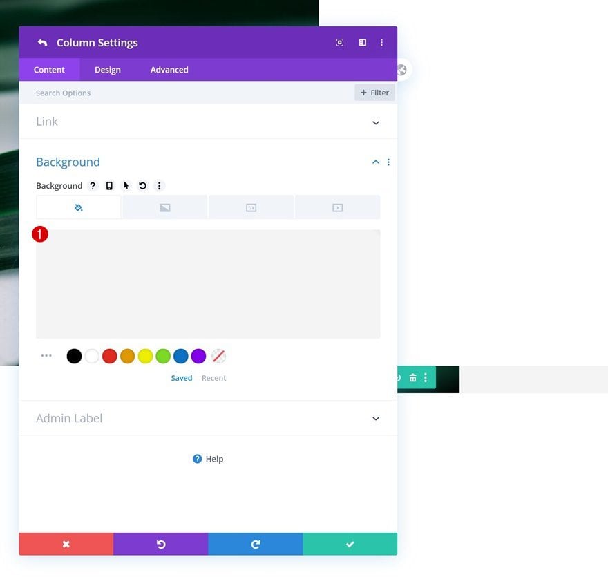
Column 2 Settings
Background Color
On to the column 2 settings. Use the following background color for it:
- Background Color: #f4f4f4
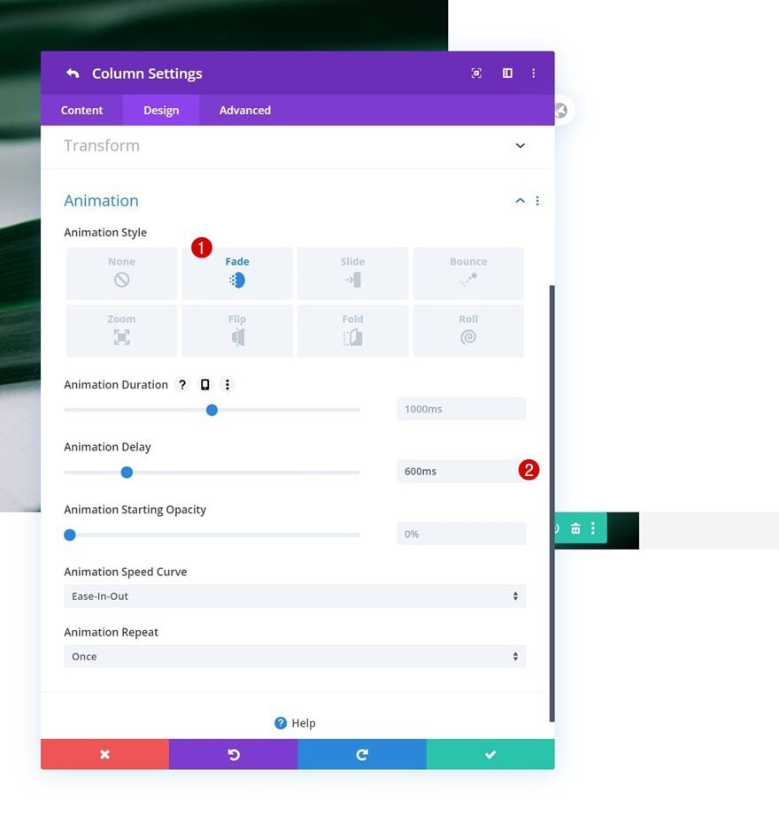
Animation
Apply a delayed animation too.
- Animation Style: Fade
- Animation Delay: 600ms
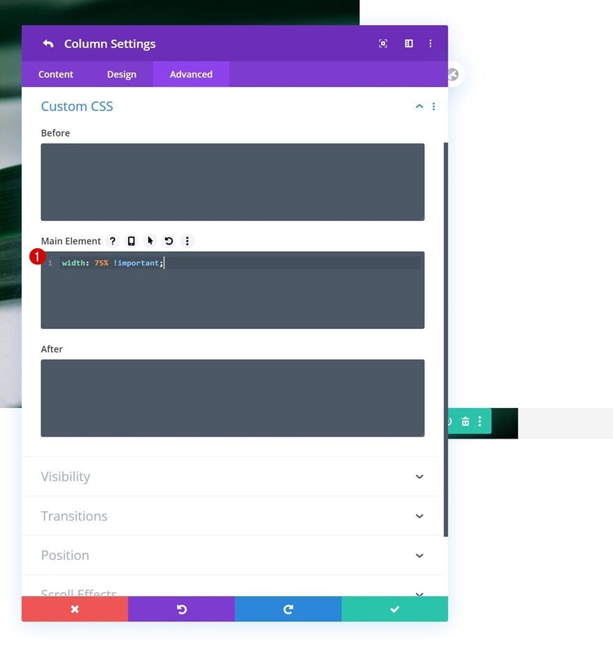
Main Element CSS
And complete the column settings by adding one single line of CSS code to the column’s main element. This will make sure the column keeps its size on smaller screen sizes.
width: 75% !important;
Add Text Module to Column 2
Add Content
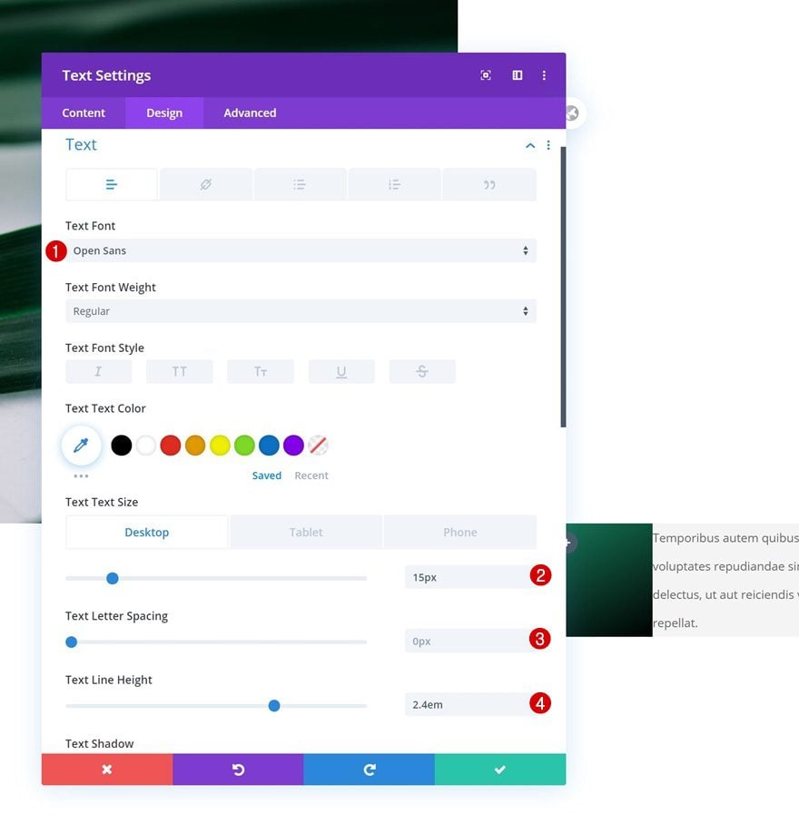
Time to add modules. Add a Text Module to column 2 with some description content of your choice.
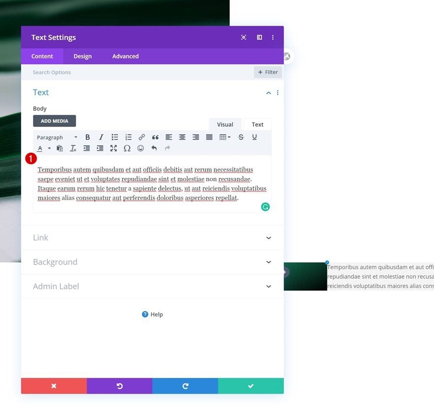
Text Settings
Move on to the module’s design tab and change the text settings accordingly:
- Text Font: Open Sans
- Text Size: 15px (Desktop), 14px (Tablet), 13px (Phone)
- Text Line Height: 2.4em
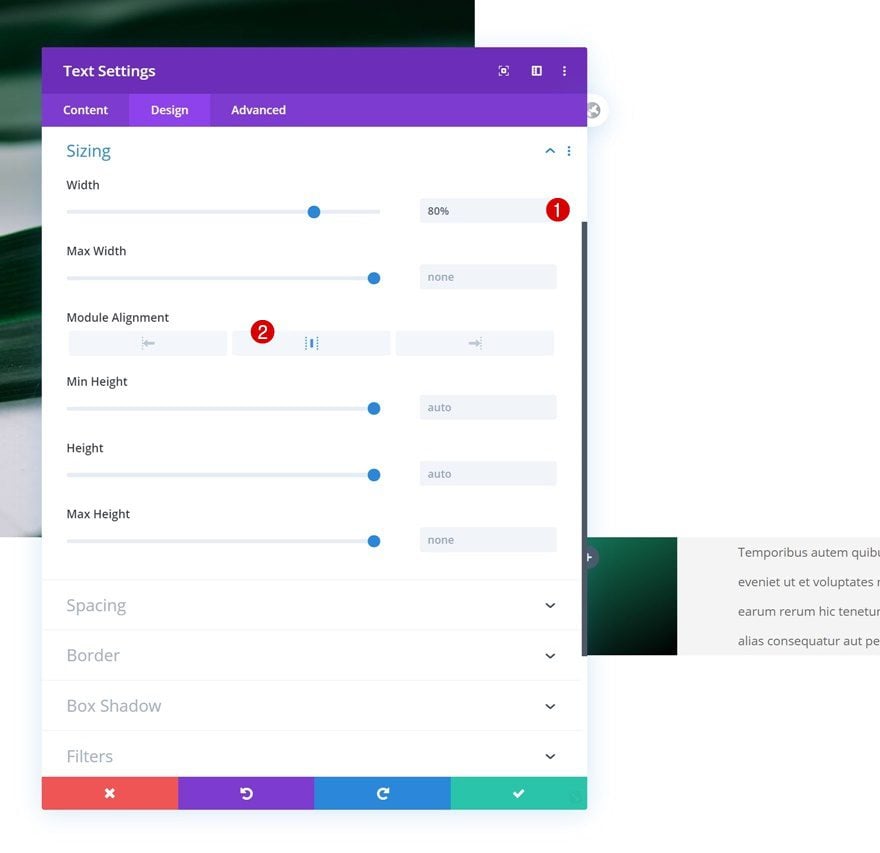
Sizing
Then, we’ll change the sizing settings.
- Width: 80%
- Module Alignment: Center
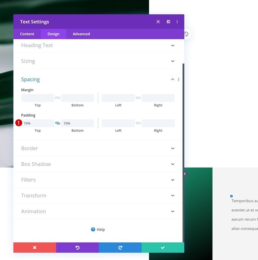
Spacing
We’ll complete the module settings by adding some custom padding values to the spacing settings.
- Top Padding: 15%
- Bottom Padding: 15%
Add Copy
The next and last module we need in column 2 is a Button Module. Add some copy of your choice.
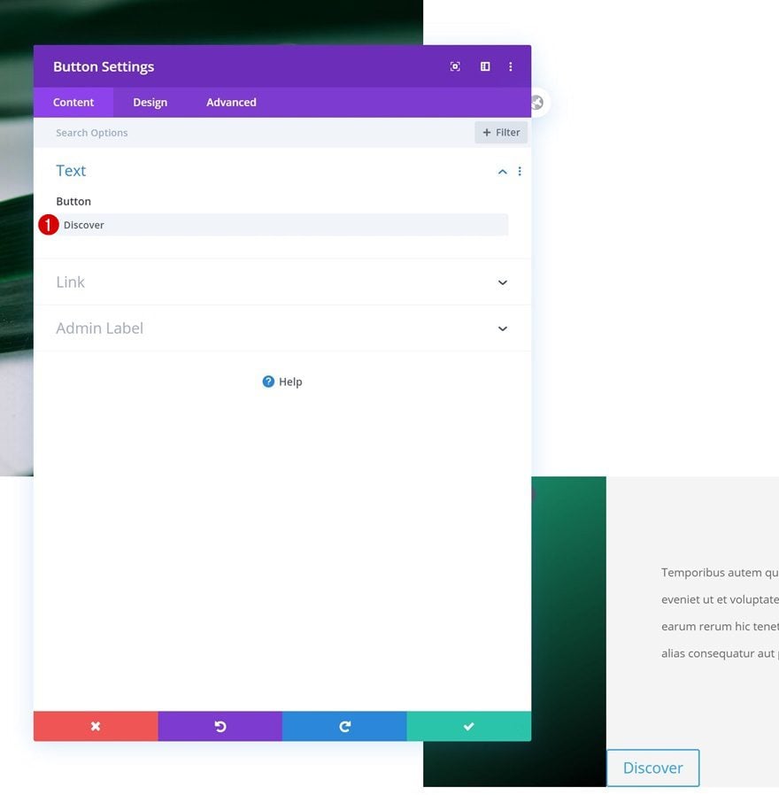
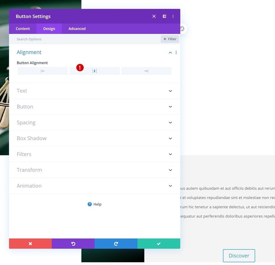
Alignment
Move on to the module’s design tab and change the button alignment.
- Button Alignment: Center
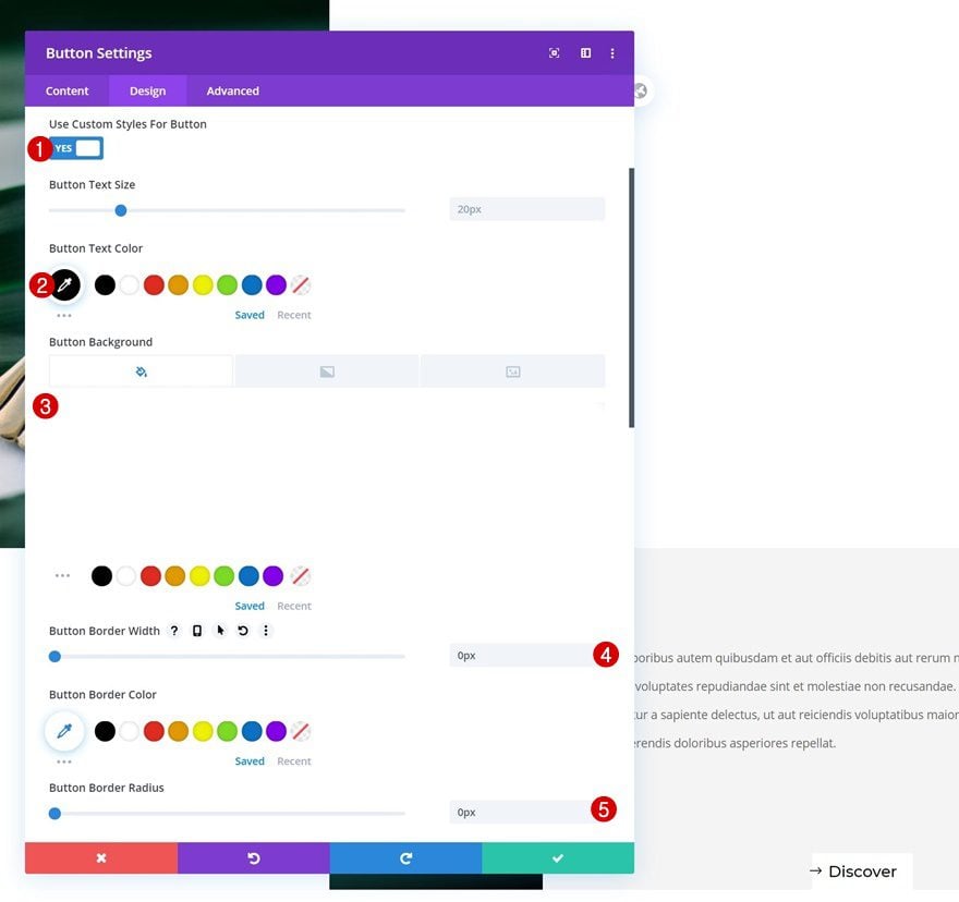
Button Settings
Style the button next.
- Use Custom Styles For Button: Yes
- Button Text Color: #000000
- Button Background Color: #ffffff
- Button Border Width: 0px
- Button Border Radius: 0px
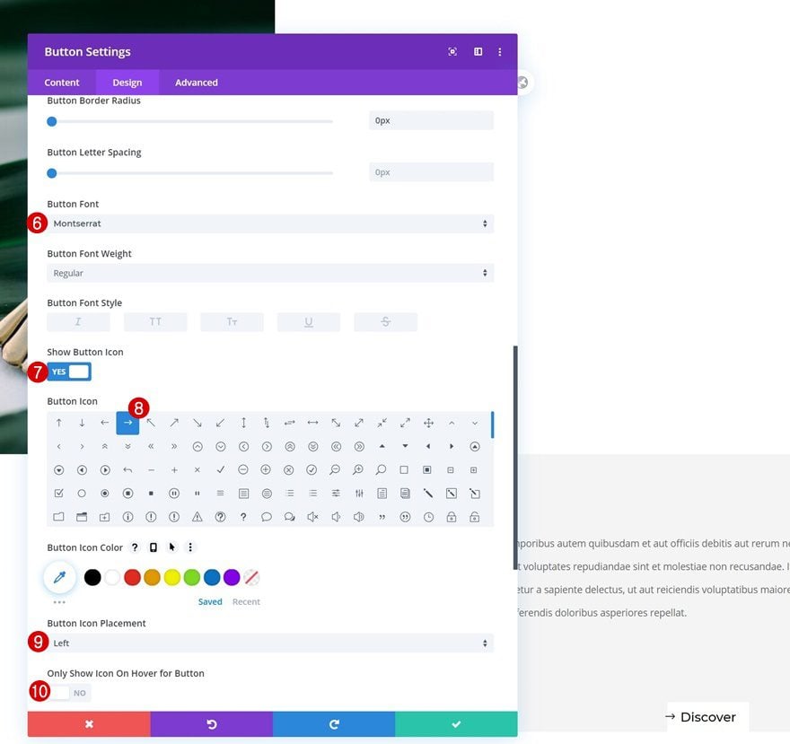
- Button Font: Montserrat
- Show Button Icon: Yes
- Button Icon Placement: Left
- Only Show Icon On Hover for Button: No
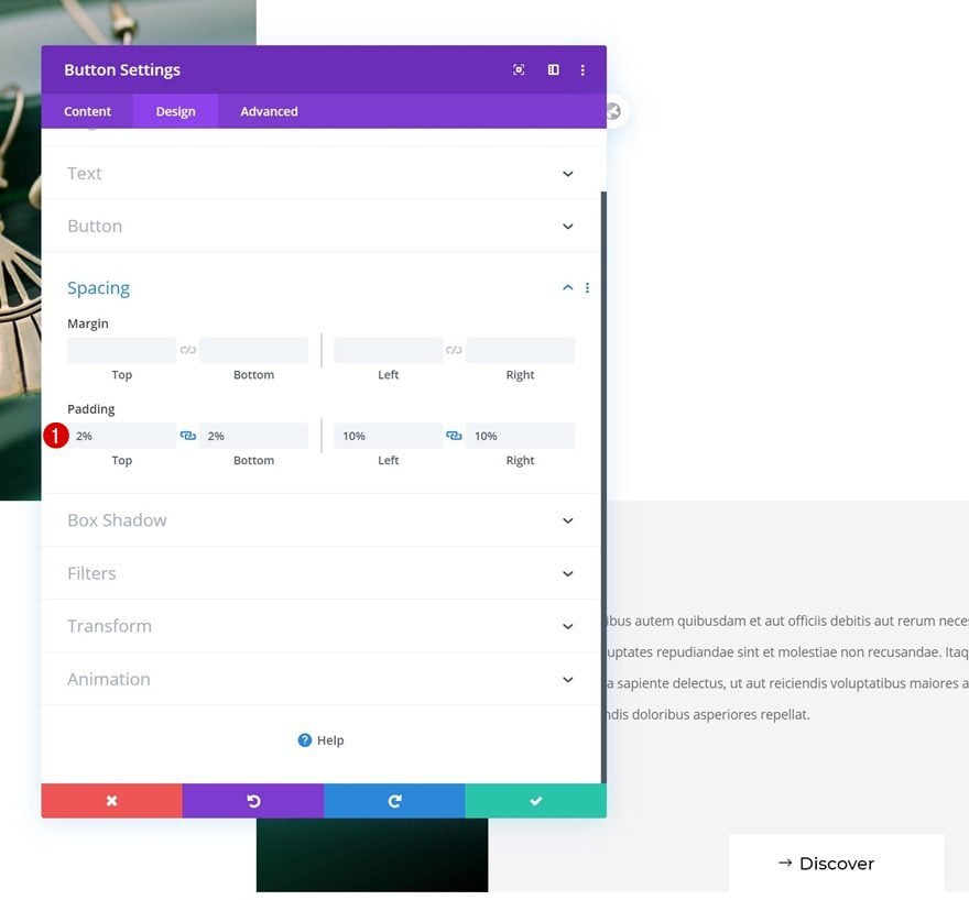
Spacing
And complete the module settings by adding some custom padding values to the spacing settings.
- Top Padding: 2%
- Bottom Padding: 2%
- Left Padding: 10%
- Right Padding: 10%
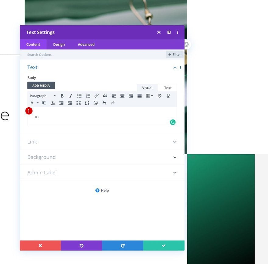
Add Text Module to Column 1
Add Content
In column 1, the only module we need is a Text Module. Add the following content to the content box: ‘— 01’.
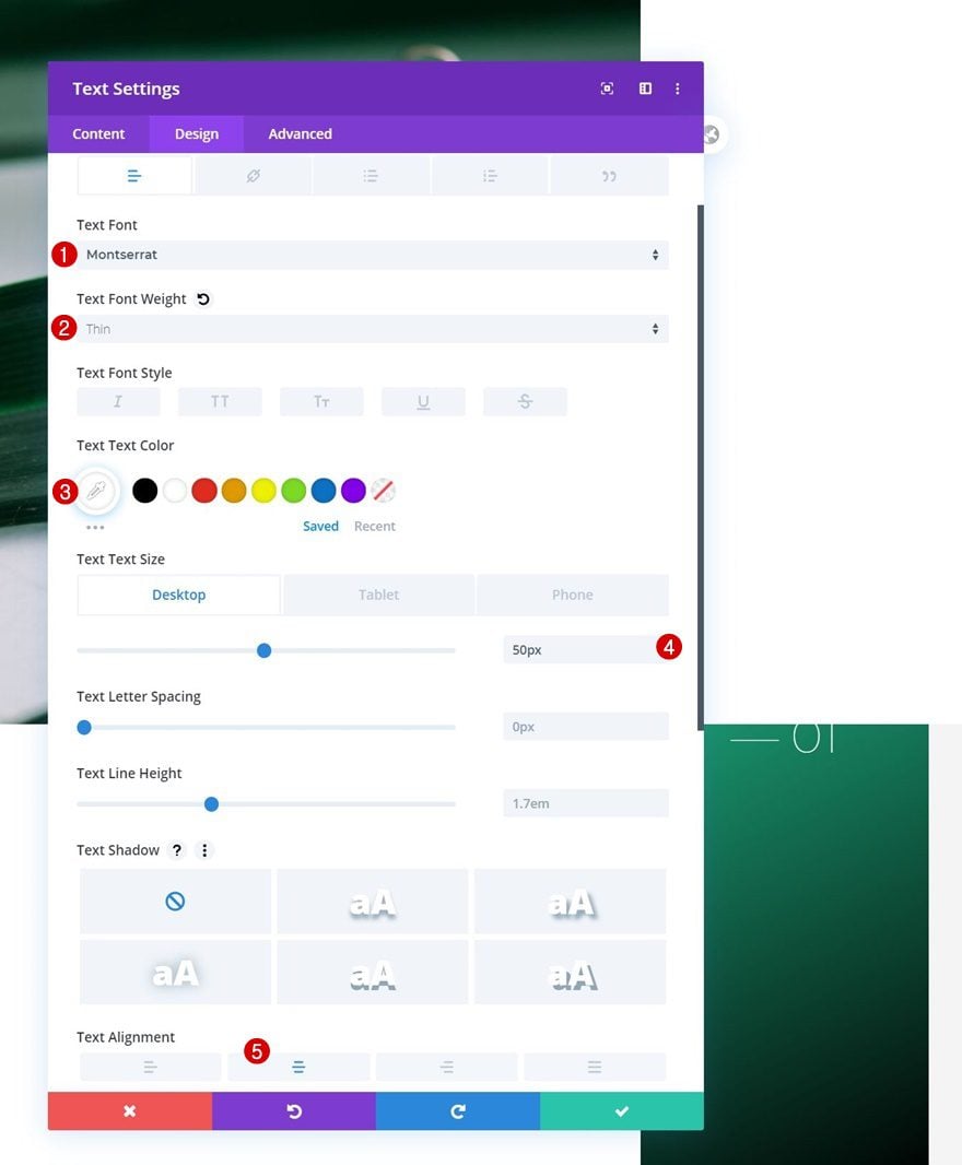
Text Settings
Move on to the module’s design tab and change the text settings accordingly:
- Text Font: Montserrat
- Text Font Weight: Thin
- Text Color: #ffffff
- Text Size: 50px (Desktop), 40px (Tablet), 35px (Phone)
- Text Alignment: Center
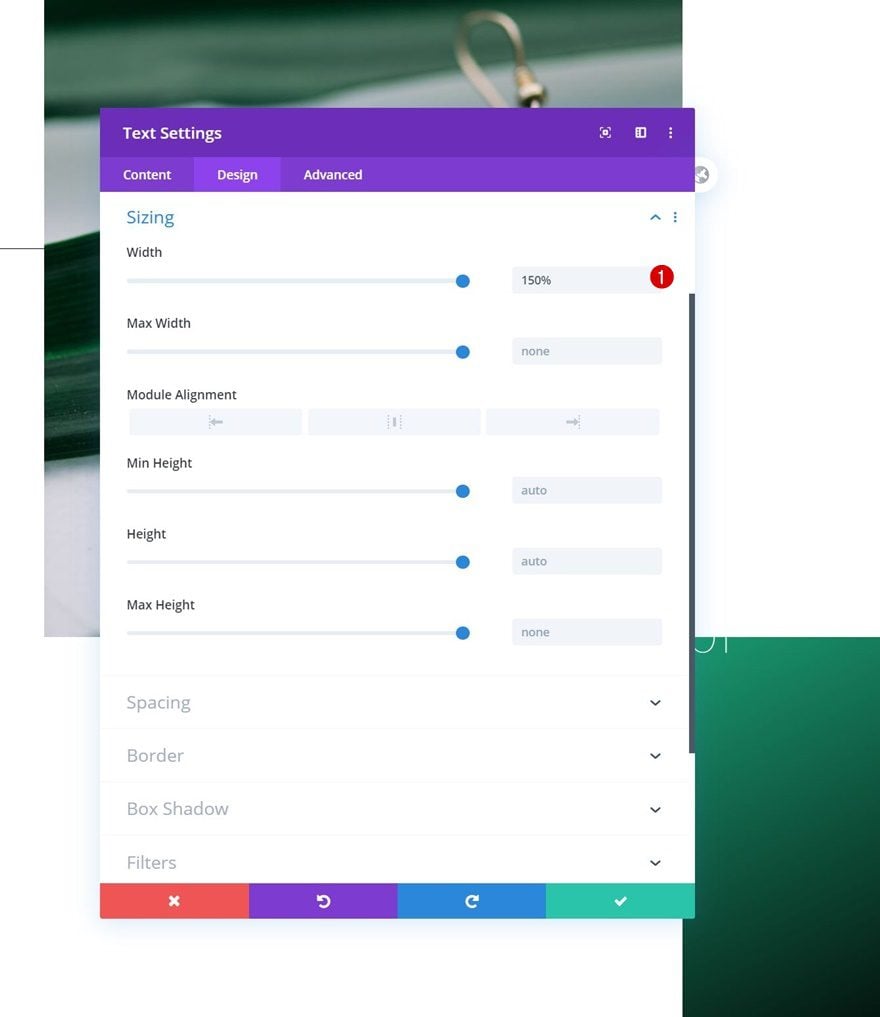
Sizing
Increase the module’s width next.
- Width: 150%
Transform Translate
Then, go to the transform settings and reposition the module by modifying the transform translate settings:
- Bottom: -50% (Tablet & Phone Only)
Transform Rotate
We’re rotating the module on smaller screen sizes as well.
- Left: 270deg (Tablet & Phone Only)
Position
And we’ll complete the module settings by repositioning the module in the advanced tab.
- Position: Absolute
- Location: Center
Clone Section for Reuse
Once you’ve completed the first section, you can clone it up to as many times as you want.
Change All Copy & Links
Make sure you change all copy and links.
Change Image
Along with the portrait image and you’re done!
Preview
Now that we’ve gone through all the steps, let’s take a final look at the outcome across different screen sizes.
Final Thoughts
In this post, we’ve shown you how to maximize your mobile viewports inside Divi. More specifically, we’ve used rotated copy to fit more content inside our viewports without creating an overwhelming design experience. You were able to download the JSON file for free as well! If you have any questions or suggestions, feel free to leave a comment in the comment section below.
If you’re eager to learn more about Divi and get more Divi freebies, make sure you subscribe to our email newsletter and YouTube channel so you’ll always be one of the first people to know and get benefits from this free content.


This is a really nice tip! It is always nice and refreshing to have out of the box ideas to adapt the websites to mobile view 🙂 Only… if there is a width and max-widht properties, why was it needed to use the extra css?
For some reason, Elegant Themes doesn’t provide options for Width and Max Width in the Design tab for Columns. Not sure why though.
Really nice post. You guys from Elegant Themes always offer to people accurate and cool informations. Keep up the good work.