

Knowing how to fan out images with Divi and its scroll effects can be a subtle and impressive design element to help promote an image gallery on a landing page. The idea is to engage users as they scroll down the page by fanning out images like a hand of playing cards.
In this tutorial, we are going to create a clean section layout for promoting an image gallery that includes a collection of images that fan out on scroll. You can use any images you want with this design and it would be a nice addition to any landing page.
- 1 Sneak Peek
- 2 Download the Layout for FREE
- 3 Download For Free
- 4 You have successfully subscribed. Please check your email address to confirm your subscription and get access to free weekly Divi layout packs!
- 5 What You Need to Get Started
- 6 Part 1: Creating the Layout and Mock Content
- 7 Part 2: Creating the Images with the Fan-Out Scroll Effect
- 8 Final Result
- 9 Final Thoughts
Sneak Peek
Here is a quick look at the design we’ll build in this tutorial.
Download the Layout for FREE
To lay your hands on the designs from this tutorial, you will first need to download it using the button below. To gain access to the download you will need to subscribe to our newsletter by using the form below. As a new subscriber, you will receive even more Divi goodness and a free Divi Layout pack every Monday! If you’re already on the list, simply enter your email address below and click download. You will not be “resubscribed” or receive extra emails.

Subscribe To Our Youtube Channel
To import the section layout to your Divi Library, navigate to the Divi Library.
Click the Import button.
In the portability popup, select the import tab and choose the download file from your computer.
Then click the import button.
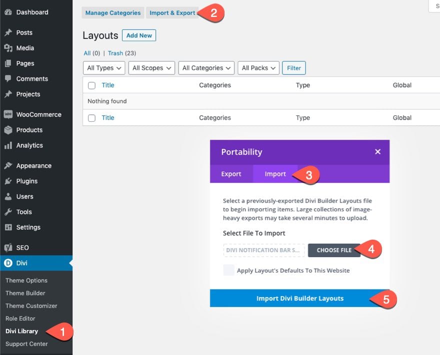
Once done, the section layout will be available in the Divi Builder.
Let’s get to the tutorial, shall we?
What You Need to Get Started
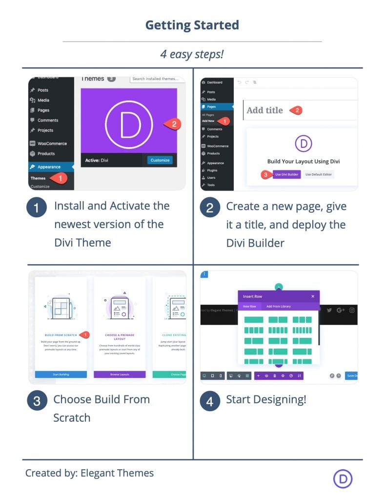
To get started, you will need to do the following:
- If you haven’t yet, install and activate the Divi Theme.
- Create a new page in WordPress and use the Divi Builder to edit the page on the front end (visual builder).
- Choose the option “Build From Scratch”.
After that, you will have a blank canvas to start designing in Divi.
Part 1: Creating the Layout and Mock Content
For this first part of the tutorial, we are going to build the section layout with a two-column row that has a title and a button in the left column. In the second part, we will add the fan-out images to the right column.
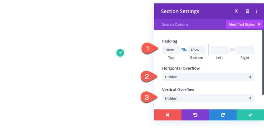
Section Settings
Before we add anything to the layout, update the settings for the default section as follows:
- Padding: 10vw top, 10vw bottom
- Horizontal Overflow: Hidden
- Vertical Overflow: Hidden
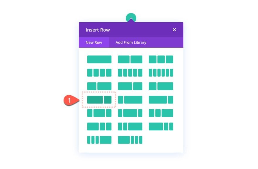
Adding the Row
Next, add a new row with a two-thirds one-third column structure.
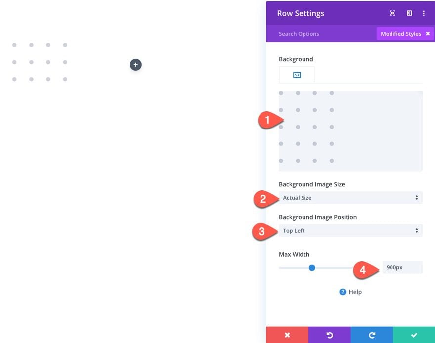
Row Settings
Then update the row settings with a custom background image. I’m using one from the Stationery Shop Landing Page Premade Layout. After that update the following:
- Background Image Size: Actual Size
- Background Image Position: Top Left
- Max Width: 900px
Adding the Text Module to Create the Title
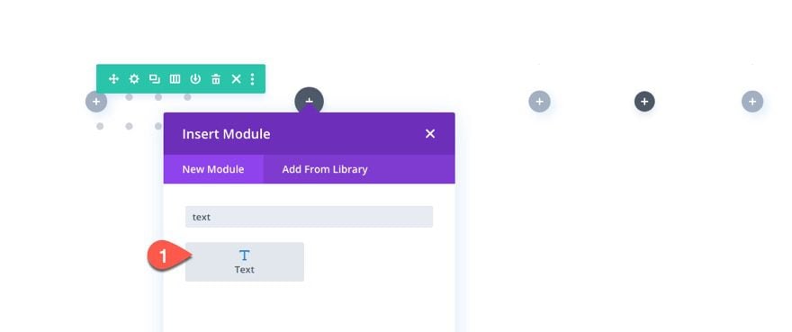
Once the row is ready, add a new text module to column 1 to create the title.
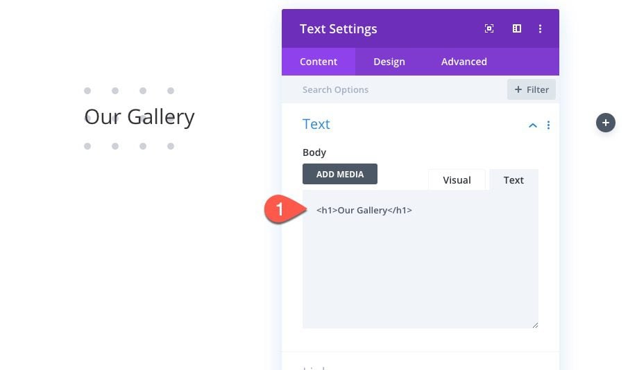
Text Content
Add the following H1 Heading to the body content:
<h1>Our Gallery</h1>
Text Settings
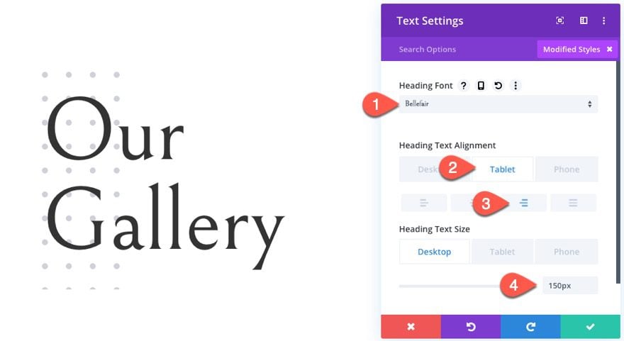
Then update the text settings as follows:
- Heading Font: Bellefair
- Heading Text Alignment (tablet and phone): right
- Heading Text Size: 150px (desktop and tablet), 110px (phone)
Under the text module, add a new button module.
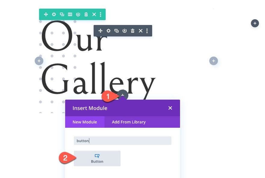
Button Text
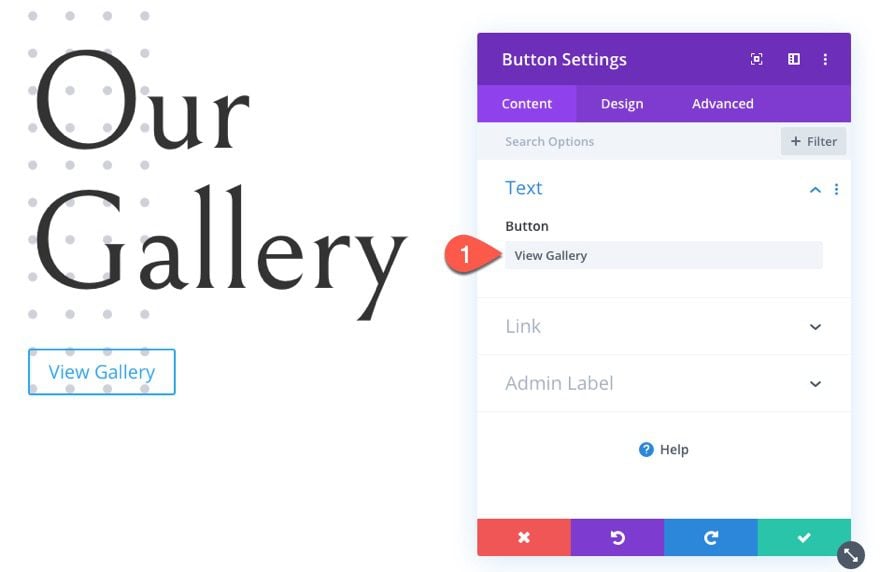
Update the button text with “View Gallery”.
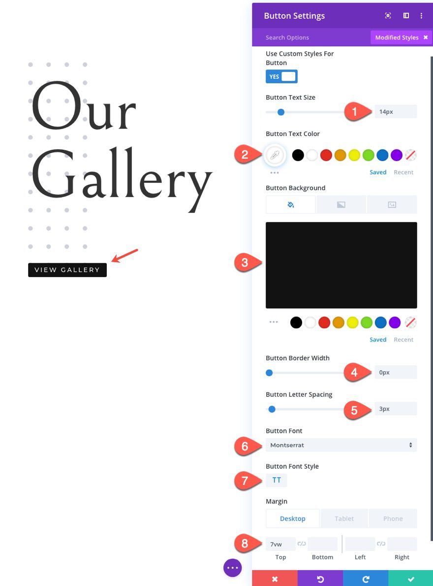
Button Settings
Under the design tab, update the following:
- Alignment (tablet and phone): right
- Button Text Size: 14px
- Button Text Color: #ffffff
- Button Background Color: #121212
- Button Border Width: 0px
- Button Letter Spacing: 3px
- Button Font: Montserrat
- Button Font Style: TT
- Margin: 7vw top
Part 2: Creating the Images with the Fan-Out Scroll Effect
In this second part of the tutorial, we will create the images with the fan-out scroll effect. We will start with the middle image. I’m using the images from the Fashion Gallery Page Premade Layout. They should be all the same size for a consistent design. The ones I’m using are 400px by 600px.
Creating the Middle Image
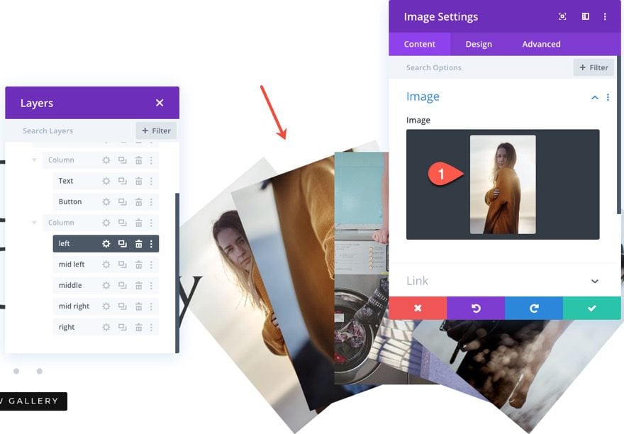
Add a new image module to the right column.
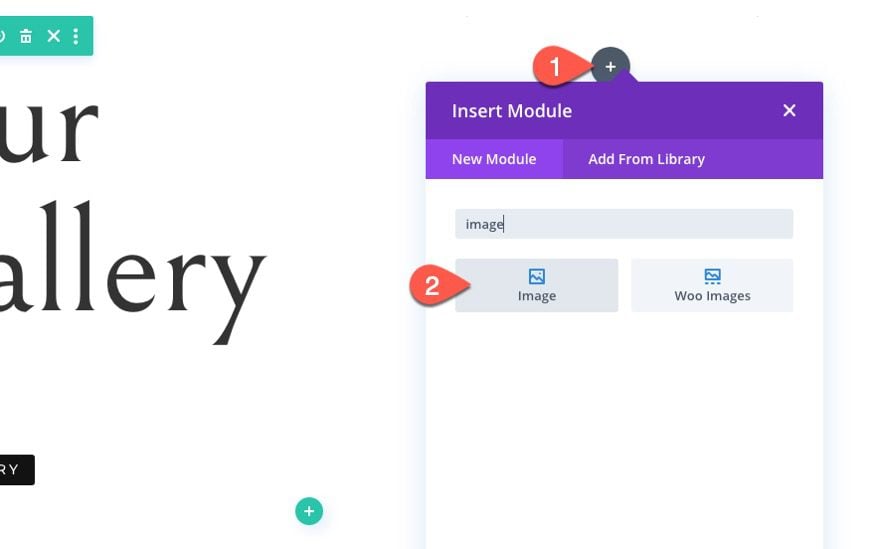
Then upload an image to the module.
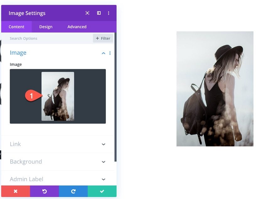
Image Settings
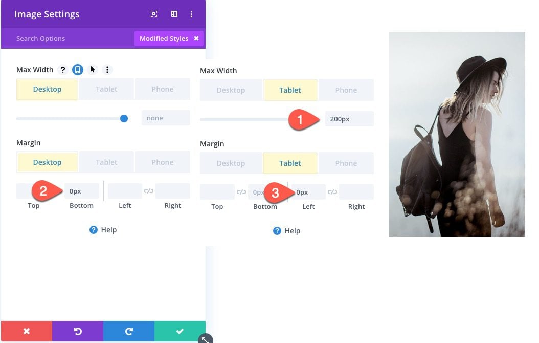
Update the max width and margin for mobile displays as follows:
- Max Width (tablet and phone): 200px
- Margin (tablet and phone): 0px left
Creating the Middle Right Image
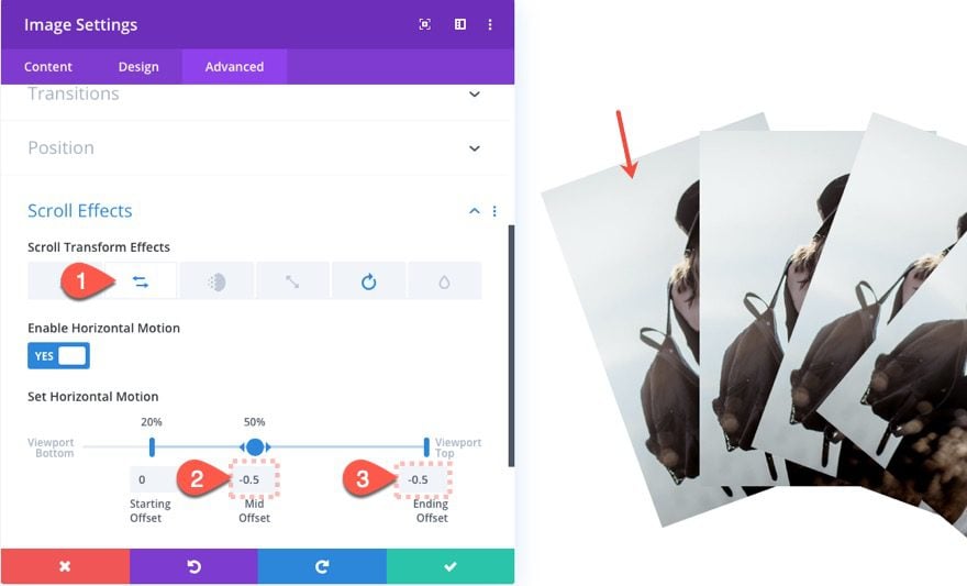
To create the second image (or middle right image), duplicate the first image module.
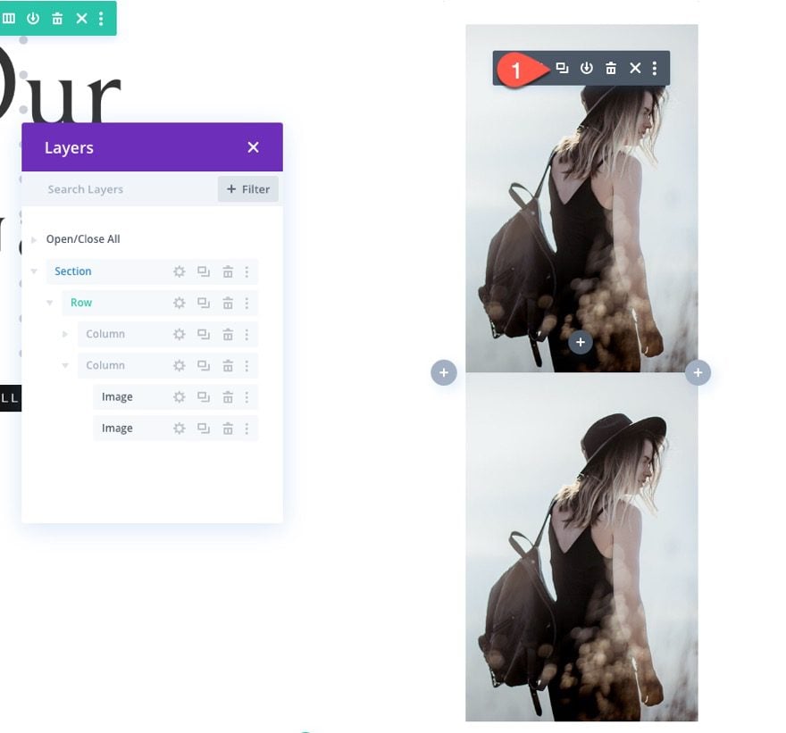
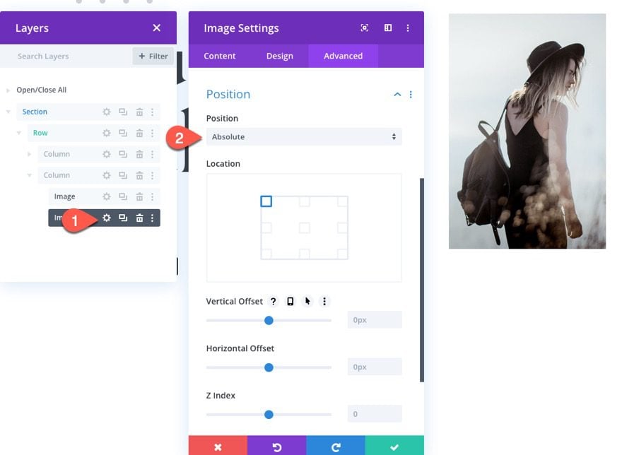
Image Settings
Then open the settings for the duplicate image module and update the following:
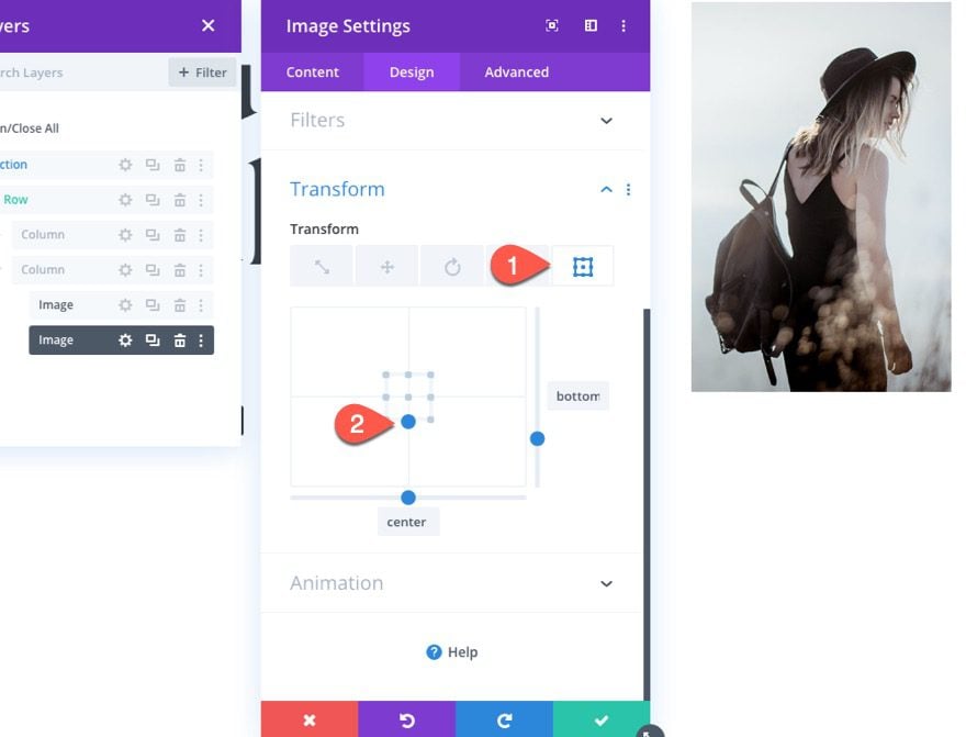
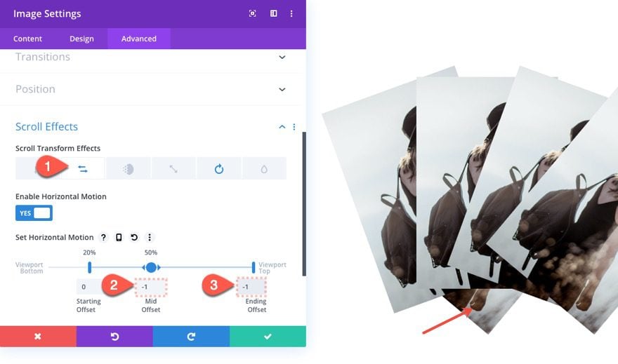
Position
- Position: Absolute
Transform Origin
- Transform Origin: bottom center
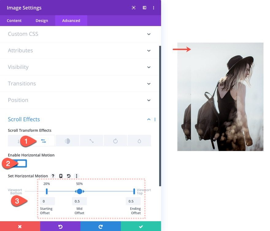
Scroll Effects
Under Horizontal Motion, update the following:
- Enable Horizontal Motion: YES
- Starting Offset: 0 (at 20%)
- Mid Offset: 0.5 (at 50%)
- Ending Offset: 0.5 (at 100%)
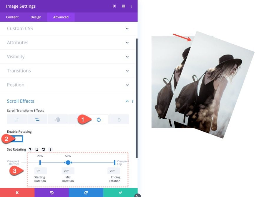
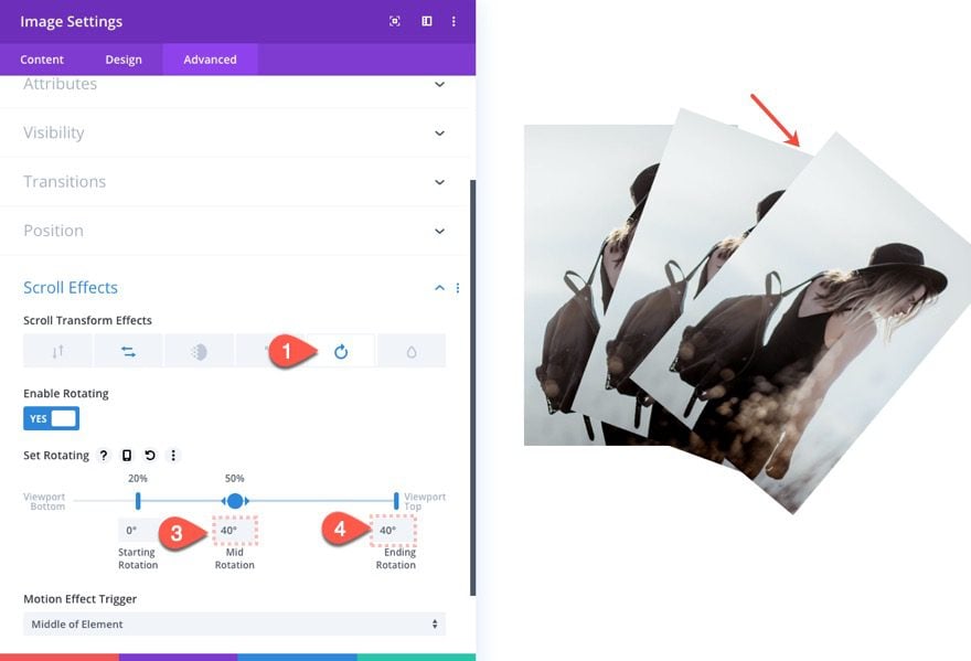
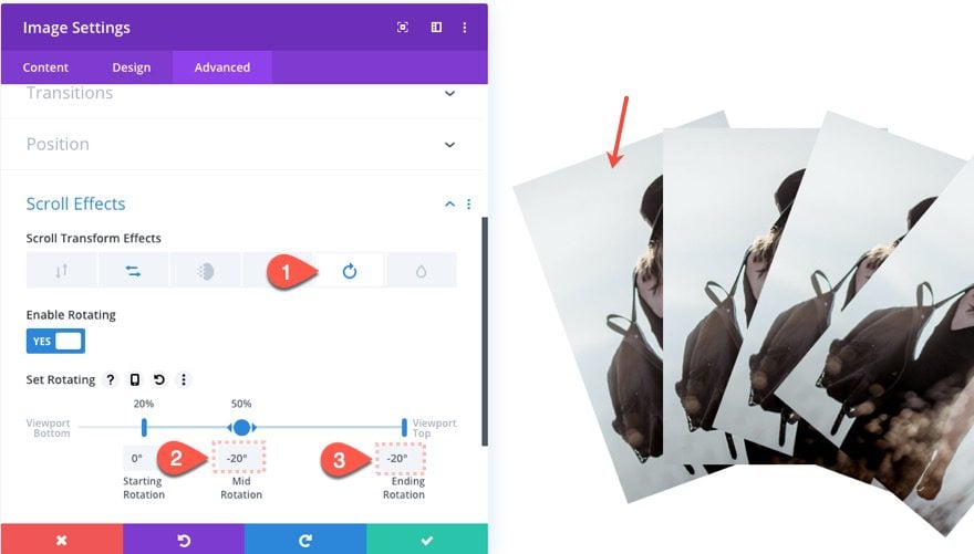
Under Rotating, update the following:
- Enable Rotation: YES
- Starting Rotation: 0 deg (at 20%)
- Mid Rotation: 20 deg (at 50%)
- Ending Rotation: 20 deg (at 100%)
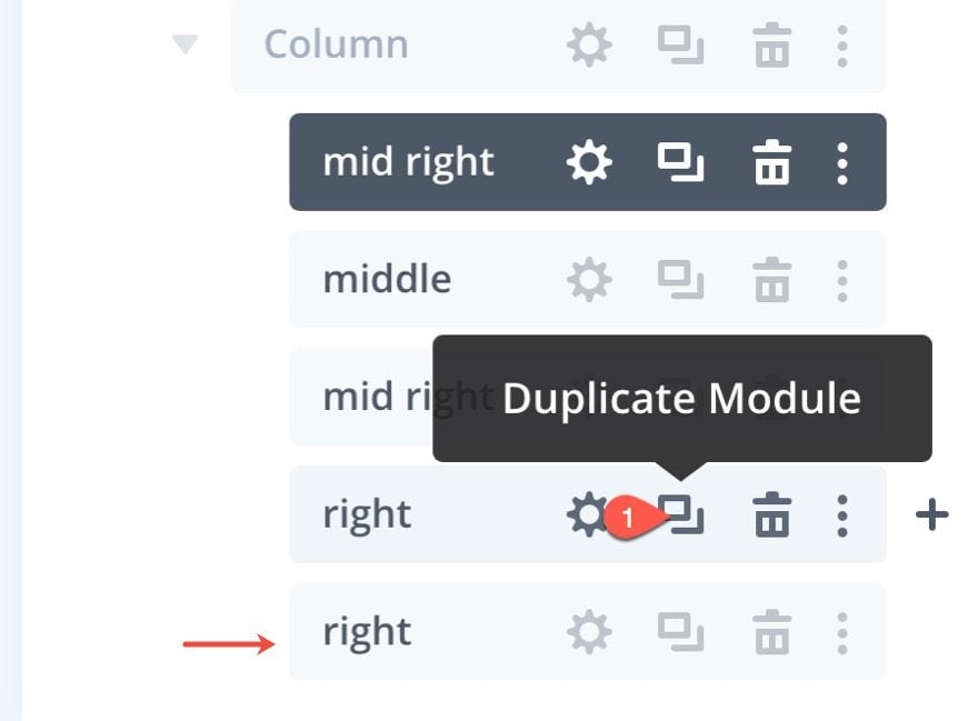
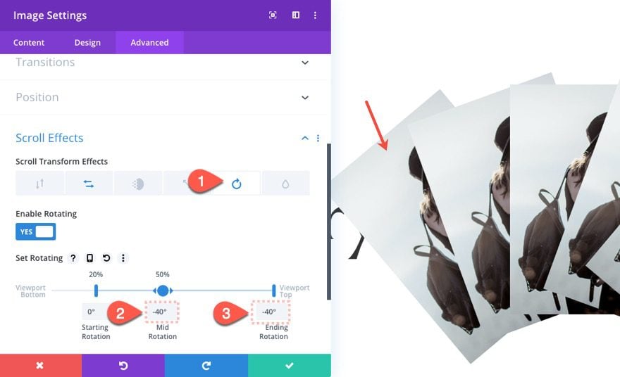
Creating the Right Image
To create the third image that will fan out to the far right, duplicate the second image we created.
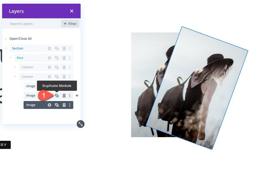
Update Scroll Effects
Under Horizontal Motion, update the following:
- Mid Offset: 1
- Ending Offset: 1
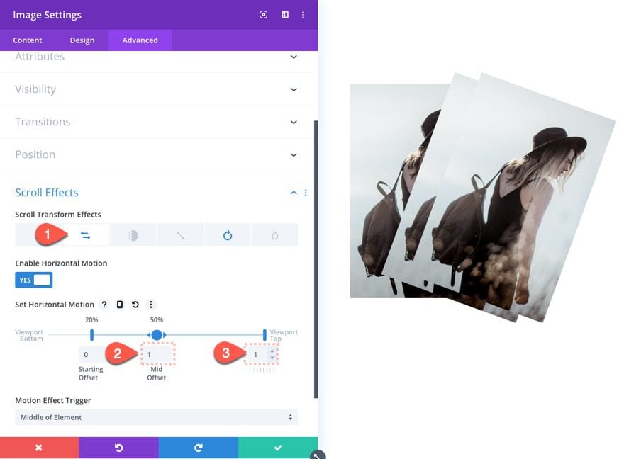
Under Rotating, update the following:
- Mid Rotation: 40 deg
- Ending Rotation: 40 deg
If you haven’t noticed, we are essentially increasing the horizontal offset by 0.5 increments and the rotating offset by 20-degree increments with each image. This will create equal spacing between the images. And because the scroll effect animation is based on the bottom-center transform-origin, it will give the impression that the images are fanning out like a hand of playing cards.
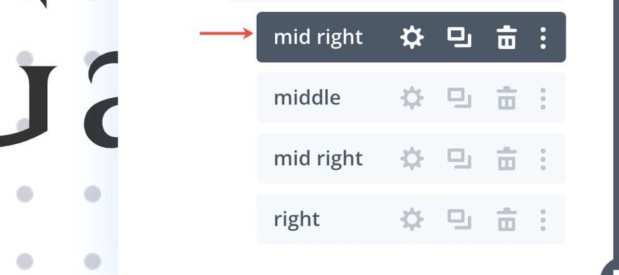
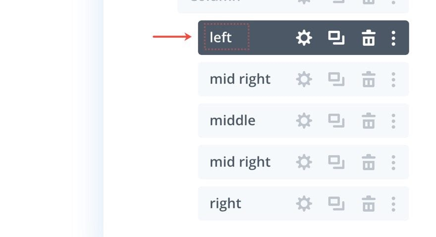
Label Images In Layers Box
Before we create the last two images, let’s update the labels of the current images so that we don’t get confused.
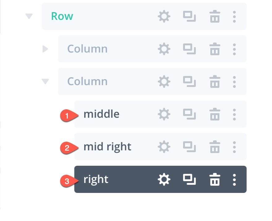
Creating the Middle Left Image
To create the middle left image, we can duplicate the middle right image.
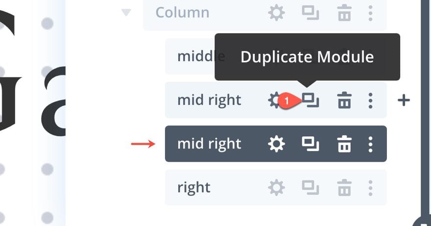
Then drag it above the middle image to the top of the column.
You can update that image label as well.
Update Scroll Effects
Open the settings for the middle left image and update the following scroll effects:
Under Horizontal Motion…
- Mid Offset: -0.5
- Ending Offset: -0.5
NOTE: All we are doing is changing the offset value to a negative.
Under Rotating…
- Mid Rotation: -20 deg
- Ending Rotation: -20 deg
Creating the Left Image
Finally, let’s create the final left image by duplicating the right image and dragging it to the very top of the column.
You can also update the label as well.
Update Scroll Effects
Open the settings for the left image and update the scroll effects:
Under Horizontal Motion:
- Mid Offset: -1
- Ending Offset: -1
Under Rotating…
- Mid Rotation: -40 deg
- Ending Rotation: -40 deg
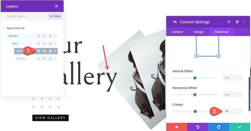
Column 1 Z Index
Right now the images in column to will overlap the content in column 1. To change this, open the settings for column 1 and update the z index as follows:
- Z Index: 10
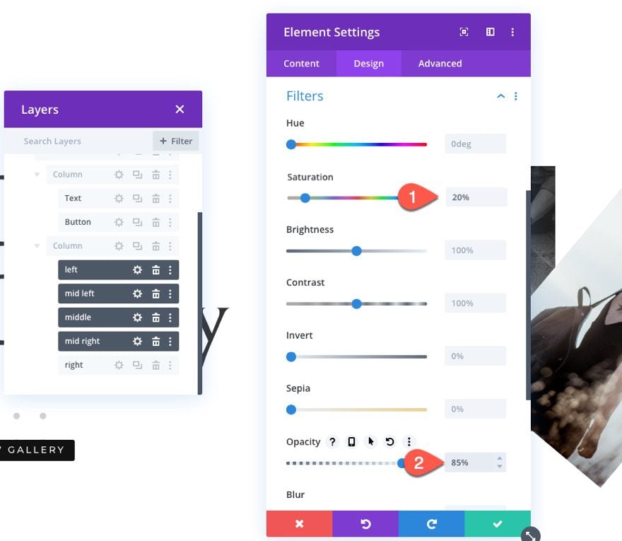
Adding New Images and Filters
Now, all we need to do is update each of the images with new/different ones.
For a unique effect, add the following filters to all the images (using multiselect) except the right image.
- Saturation: 20%
- Opacity: 85%
Result
Here is the result so far…
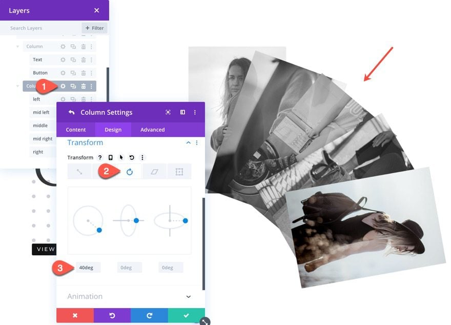
Rotating the Column
To change the design a bit, we can rotate the collection of images by rotating the parent column.
To do this, open the settings for column 2 and add the following transform option:
- Transform Rotate Z Axis: 40 deg
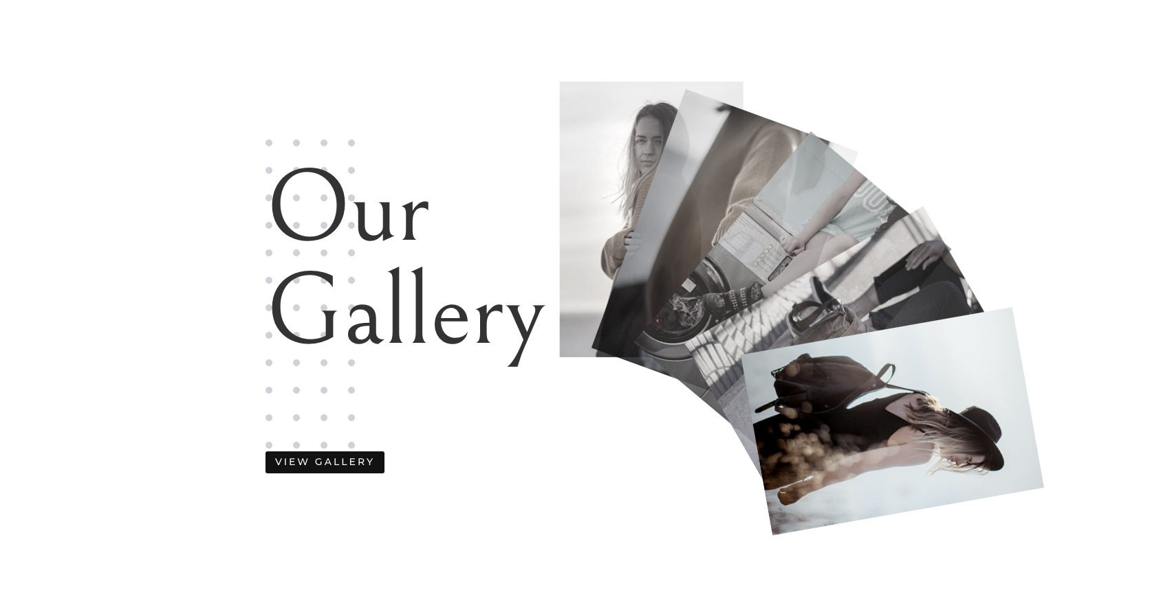
Final Result
Here is the final result.
Desktop
Tablet
Phone
Final Thoughts
In this tutorial, we learned how to fan-out images using Divi’s scroll effects, but you don’t have to stop there! You can easily use this same technique to fan-out any collection of modules (I’m thinking blurbs). I limited the offset distance with each image’s scroll effects so the design isn’t really functional (ie. you can’t really see every image in its entirety). But, you can increase the offsets to make the images more visible if you want.
I look forward to hearing from you in the comments.
Cheers!


My images don’t fan. I’ve gone over the directions twice and don’t see where I’ve made a mistake. Any possible suggestion as what might be wrong?
Never mind. It’s an Edge browser thing. It works on Chrome.
This looks really nice. Love the presentation of images. Question: how does this look/work on mobile?
I tested it here on my site. Scroll down a bit and you will see it. I haven´t used my own photos yet though.
Thanks, John-Arild.
I m just seen the blog regarding Divi and looks perfect for optimized gallery images. A good tool for word press sites.
I agree, James. Thanks for the comment.
Perfect Timing on this one! I was just looking at my family blog and thought I needed to spruce up the gallery pages on there. Definitely going to try this out on a few new galleries.
Great to hear, Brad!