
When it comes to showcasing pricing plans on your website, you can take many turns and create absolutely stunning and attractive pricing pages or sections. When building a website with Divi, you’ll most likely go for the Pricing Tables Module. This module allows you to quickly add pricing tables and style them however you want to. But if you want to add more interaction to this particular section of your page, you can also use the Toggle Module to show pricing plans on click. This a great way to highlight a specific pricing plan by keeping its state open and closing the other two.
In this tutorial, we’ll show you step by step how to create a gorgeous toggle pricing table design using Divi’s Toggle Module. Once you get the approach, you’ll be able to create all kinds of toggle pricing plans on click for any kind of website you build.
Let’s get to it!
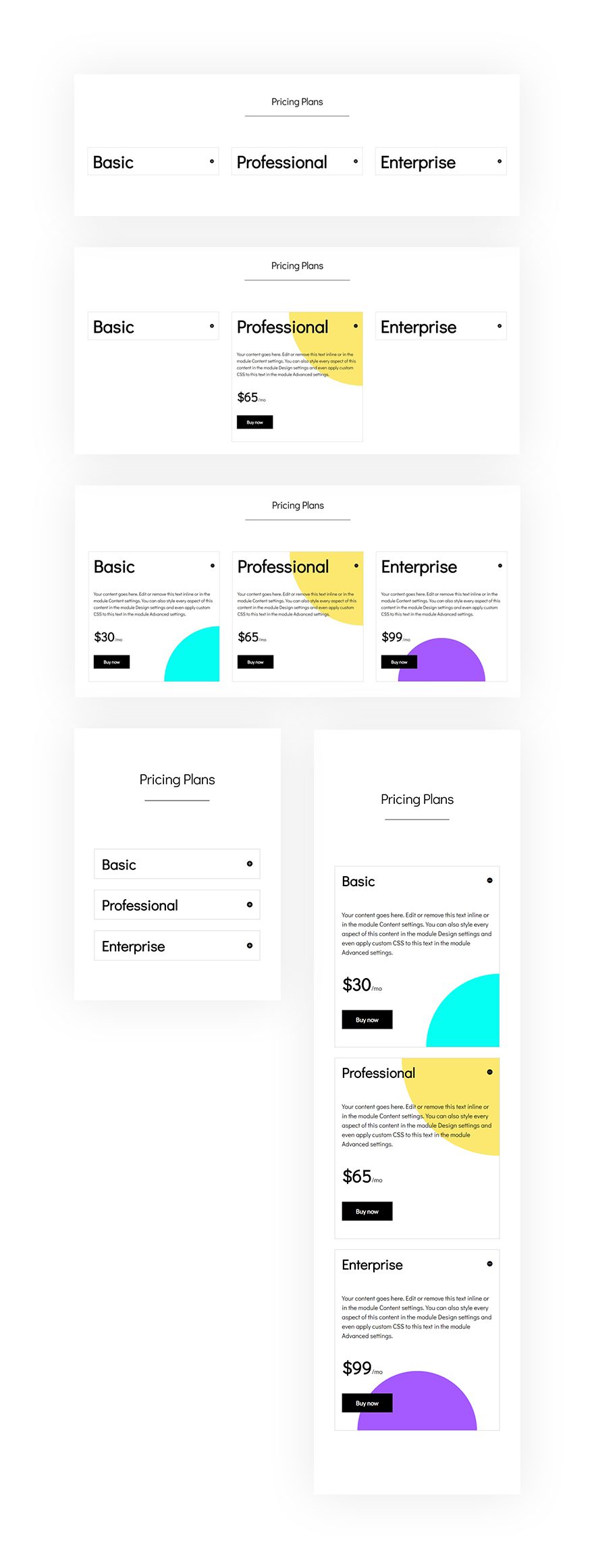
Preview
Before we dive into the tutorial, let’s take a quick look at the outcome on different screen sizes.
Let’s Start Creating!
Subscribe To Our Youtube Channel
Add New Section
Spacing
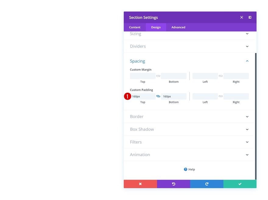
Create a new page or open an existing one using Divi’s Visual Builder. Add a new section to the page, open the section settings and add some custom top and bottom padding to create some space at the top and bottom of the section.
- Top Padding: 160px
- Bottom Padding: 160px
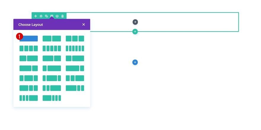
Add Row #1
Column Structure
Once you’re done modifying the section spacing settings, you can go ahead and add a new row using the following column structure:
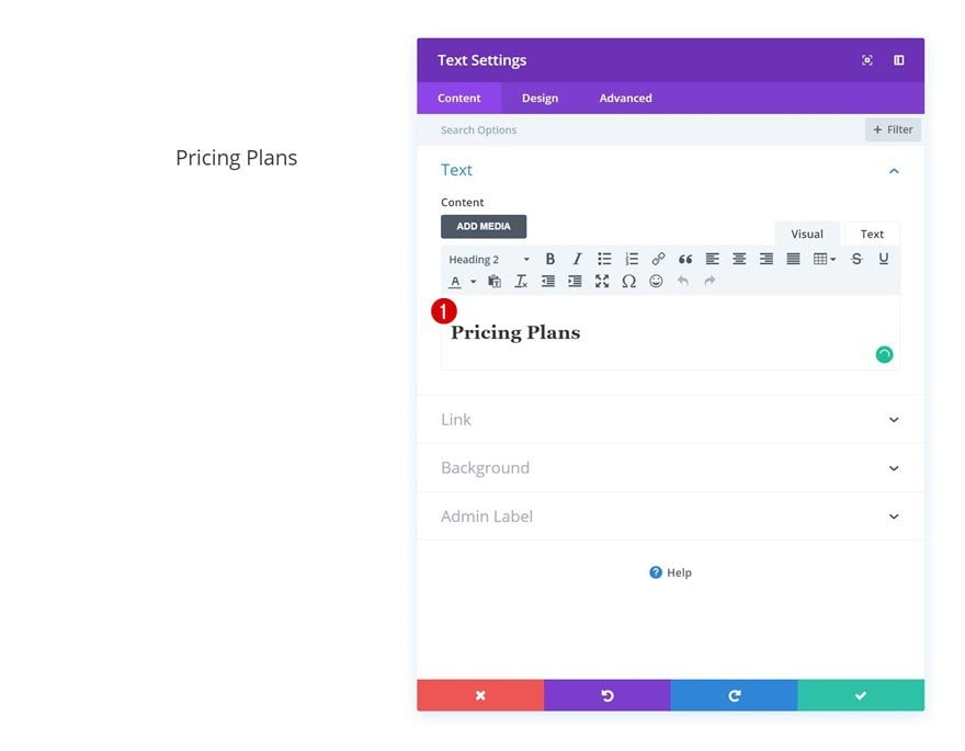
Add Text Module
Add Content
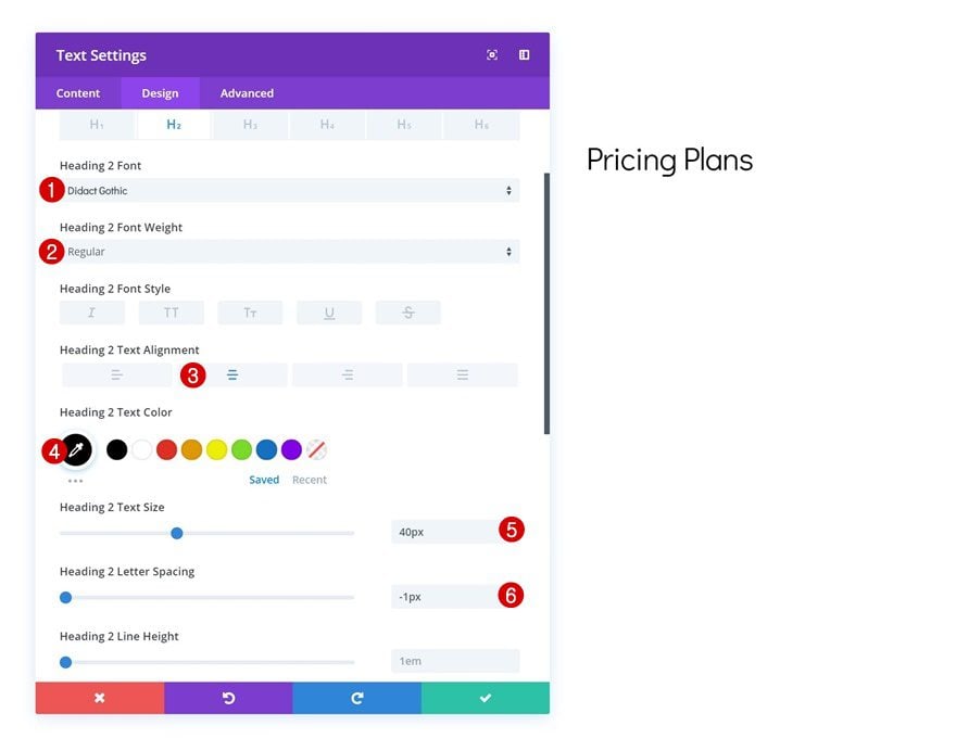
There’s no need to make changes to the row so go ahead and add a Text Module right away. Enter some H2 content of choice in the content box of the module.
Heading Text Settings
Continue by going to design tab and change the heading text settings.
- Heading 2 Font: Didact Gothic
- Heading 2 Font Weight: Regular
- Heading 2 Text Alignment: Center
- Heading 2 Text Color: #000000
- Heading 2 Text Size: 40px
- Heading 2 Letter Spacing: -1px
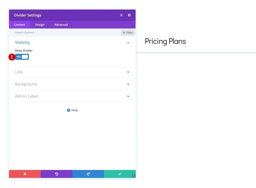
Add Divider Module
Visibility
Add a Divider Module right below the Text Module you’ve added and modified in the previous steps. Make sure the ‘Show Divider’ option of the Divider Module is enabled.
- Show Divider: Yes
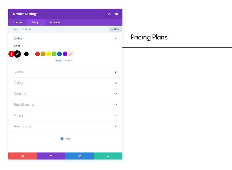
Color
Continue by going to the design tab and change the divider color.
- Color: #000000
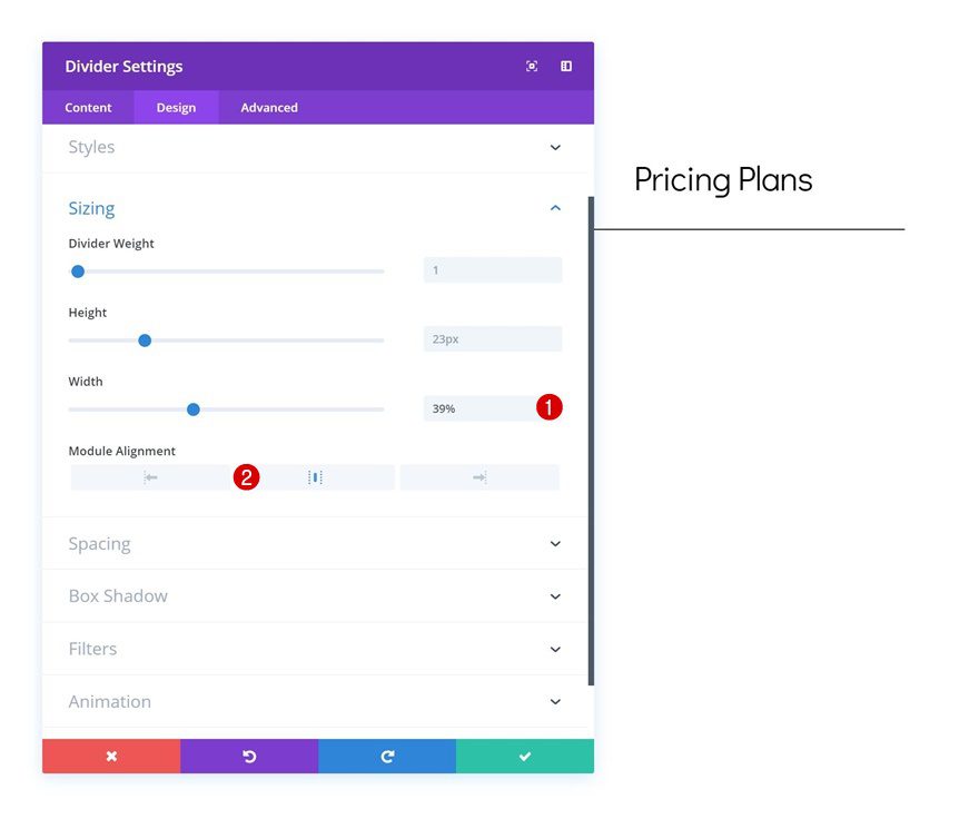
Sizing
Change the width of the module in the sizing settings as well.
- Width: 39%
- Module Alignment: Center
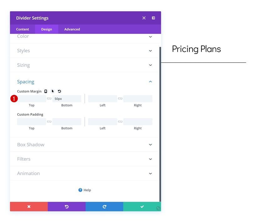
Spacing
Add some custom bottom margin as well.
- Bottom Margin: 50px
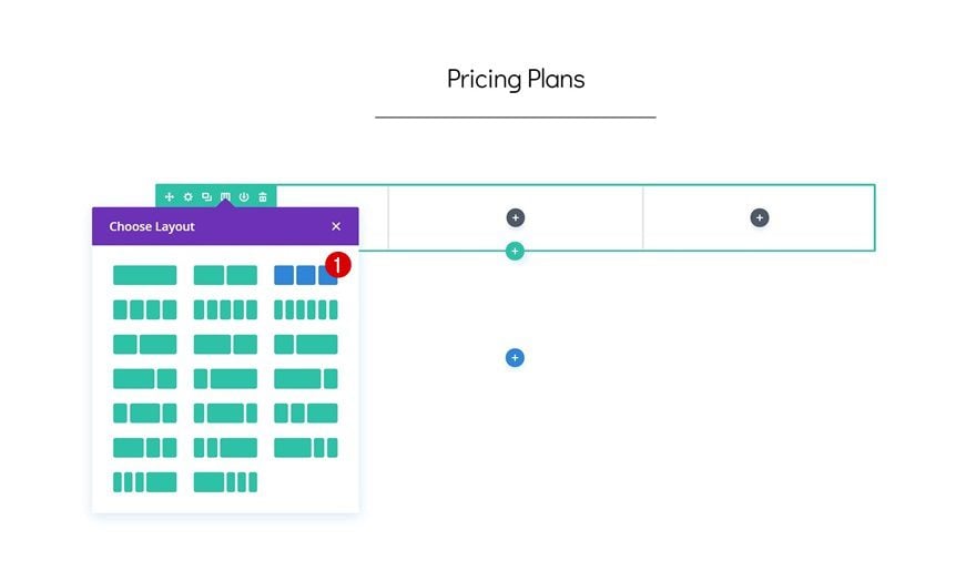
Add Row #2
Column Structure
We’re done modifying the first row and its modules. Time to add a new row using the following column structure:
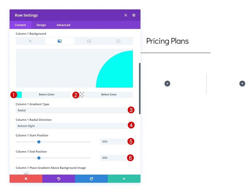
Column 1 Gradient Background
Without adding any modules yet, open the row settings and add a gradient background to column 1.
- Color 1: #00fff2
- Color 2: rgba(255,255,255,0)
- Column 1 Gradient Type: Radial
- Column 1 Radial Direction: Bottom Right
- Column 1 Start Position: 30%
- Column 1 End Position: 30%
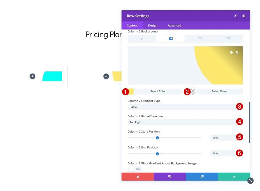
Column 2 Gradient Background
Do the same for the second column as well.
- Color 1: #fce96f
- Color 2: rgba(255,255,255,0)
- Column 2 Gradient Type: Radial
- Column 2 Radial Direction: Top Right
- Column 2 Start Position: 40%
- Column 2 End Position: 40%
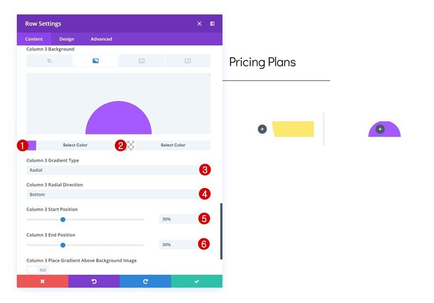
Column 3 Gradient Background
Likewise, add a gradient background to the third column using the following settings:
- Color 1: #a659ff
- Color 2: rgba(255,255,255,0)
- Column 3 Gradient Type: Radial
- Column 3 Radial Direction: Bottom
- Column 3 Start Position: 30%
- Column 2 End Position: 30%
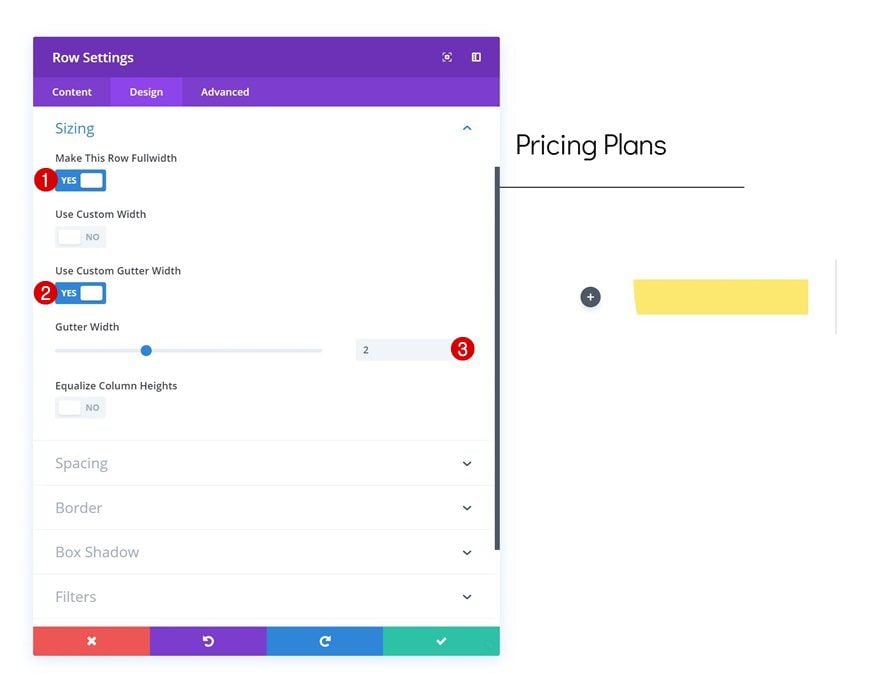
Sizing
Once you’re done adding the gradient background, move on to the design tab and change the sizing settings.
- Make This Row Fullwidth: Yes
- Use Custom Gutter Width: Yes
- Gutter Width: 2
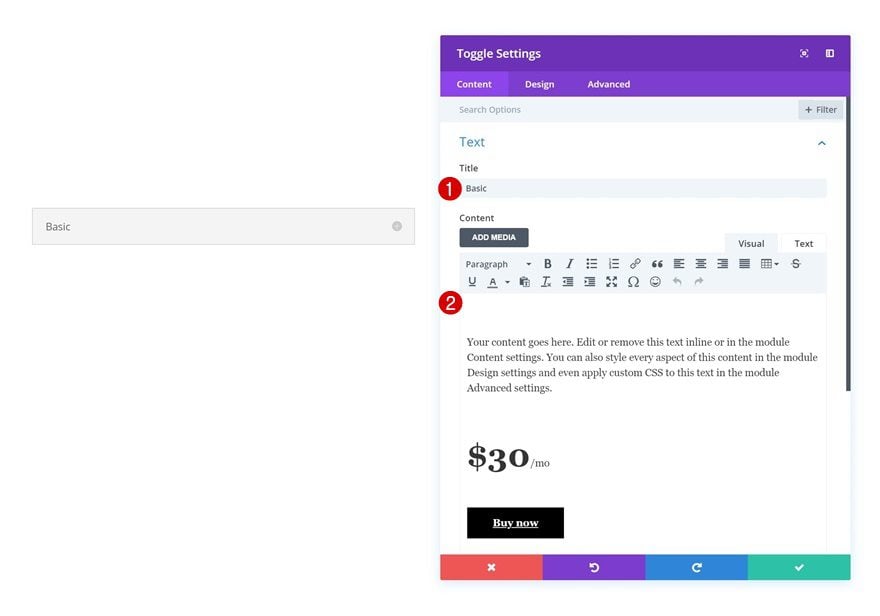
Add Toggle Module to Column 1
Add Content
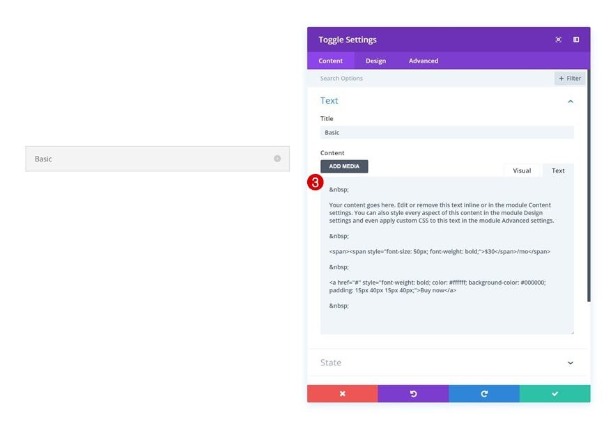
Time to start creating different pricing plans! Add a new Toggle Module to the first column and enter a title. To style the different elements in the content box, we’ve used some extra HTML tags. Go ahead and copy the following lines and add them to the Text tab of your content box:
<p> </p>
<p>Your content goes here. Edit or remove this text inline or in the module Content settings. You can also style every aspect of this content in the module Design settings and even apply custom CSS to this text in the module Advanced settings.</p>
<p> </p>
<p><span><span style="font-size: 50px; font-weight: bold;">$30</span>/mo</span></p>
<p> </p>
<p><a href="#" style="font-weight: bold; color: #ffffff; background-color: #000000; padding: 15px 40px 15px 40px;">Buy now</a></p>
<p> </p>
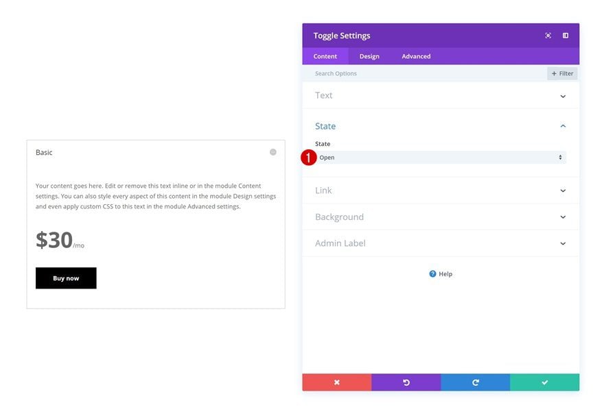
State
You can choose if you want the state of the Toggle Module to be open or closed. To be able to see all the changes you make throughout the rest of the tutorial, I recommend keeping the state ‘open’ until you’re done modifying all the different design settings.
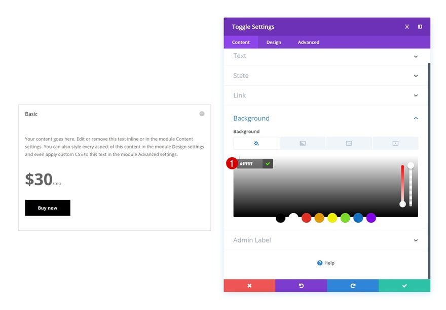
Background Color
Continue by going to the background settings of the Toggle Module and add a white background color.
- Background Color: #ffffff
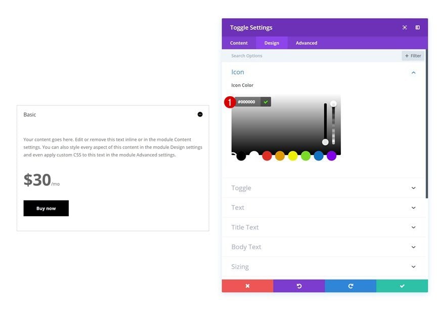
Icon Settings
Change the icon color in the design tab next.
- Icon Color: #000000
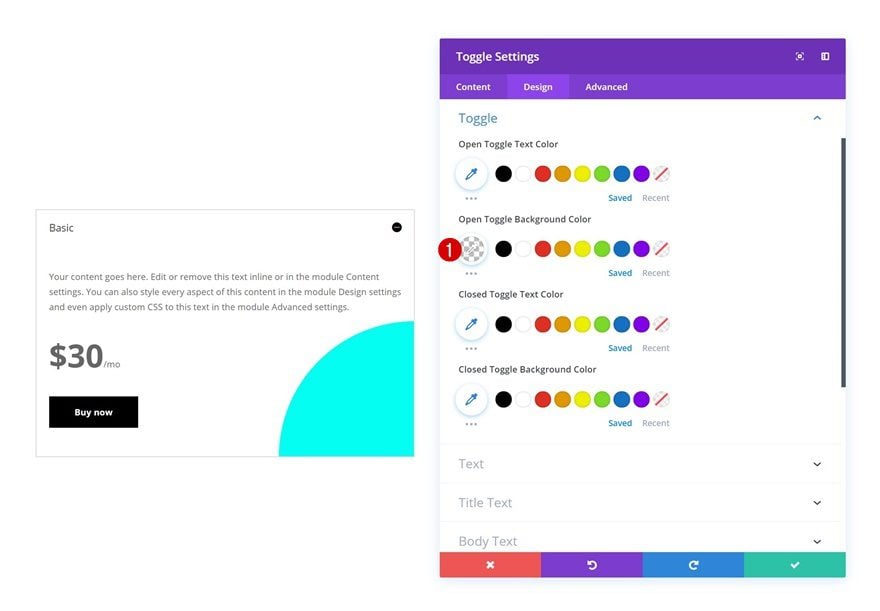
Toggle Settings
And modify the Open Toggle Background Color in the toggle settings as well.
- Open Toggle Background Color: rgba(255,255,255,0)
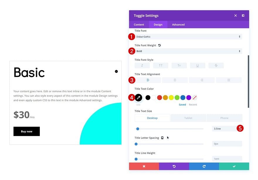
Title Text Settings
Then, make some changes to the title text settings.
- Title Font: Didact Gothic
- Title Font Weight: Bold
- Title Text Color: #000000
- Title Text Size: 3.5vw (Desktop), 60px (Tablet), 40px (Phone)
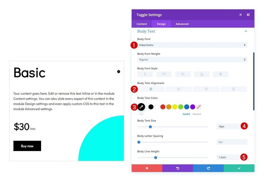
Body Text Settings
Modify the body text settings as well.
- Body Font: Didact Gothic
- Body Text Alignment: Left
- Body Text Color: #000000
- Body Text Size: 18px
- Body Line Height: 1.5em
Clone Toggle Module Twice & Place in Remaining Two Columns
Once you’re done modifying the Toggle Module in column 1, you can go ahead and clone it twice and place the duplicates in the two remaining columns.
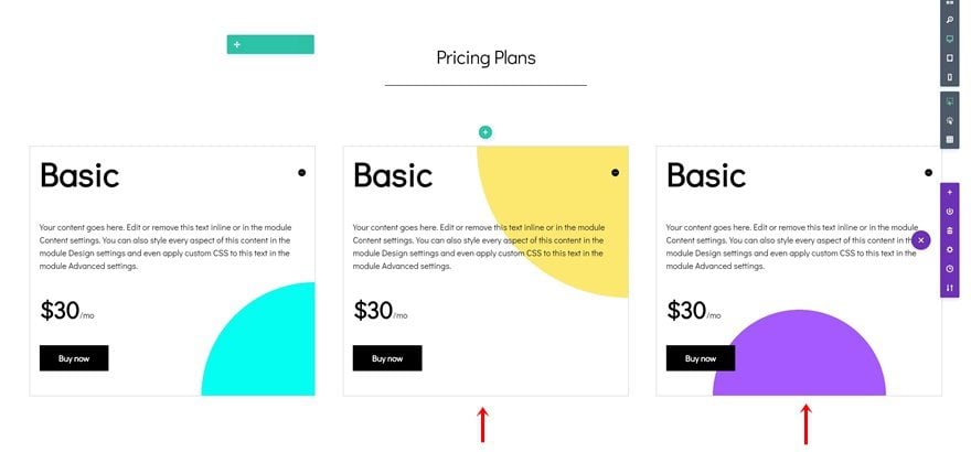
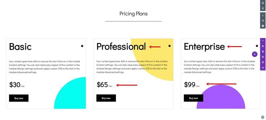
Change Copy
Make sure you change all the copy of the duplicates and you’re done!
Preview
Now that we’ve gone through all the steps, let’s take a final look at the outcome of the design we’ve created on different screen sizes.
Final Thoughts
In this tutorial, we’ve shown you a creative approach on using Divi’s Toggle Module to showcase pricing plans on your website. This is a great way to interact with visitors and elevate your design style. It makes it easier to highlight a specific pricing plan in your section by keeping that one open and the other two options closed. You can use this approach for any kind of website you’re building. If you have any questions or suggestions, make sure you leave a comment in the comment section below!


Hello, Love this design, however I am having trouble getting the add to cart link to work. I pasted the href=”http://yourdomain.com/cart/?add-to-cart=25″ code (That is specific to my website and product number) into the links section of the toggle module. What am I doing wrong?
Wonderful. This is a great post
this is great, thank you for the post
this is great, thank you
Always great to see new ways to approach something. Thanks for sharing…
If only Divi let you add modules into an Accordion/Toggle
I also would like to see nesting of modules and perhaps also rows and sections in all suitable elements
Yes! I agree as well.
+1
+1 Totally agree