")
Gradients can easily elevate your web design. Usually, they’re used in a subtle way. But you can also create sections on your website that are exclusively made out of gradients combinations. They make your design look modern and abstract at the same time. To help illustrate that, we’re going to recreate a section that’s made exclusively out of gradient colors. On top of that, we’ll share 6 different gradient color palettes that you can apply to the result.
Let’s get to it!
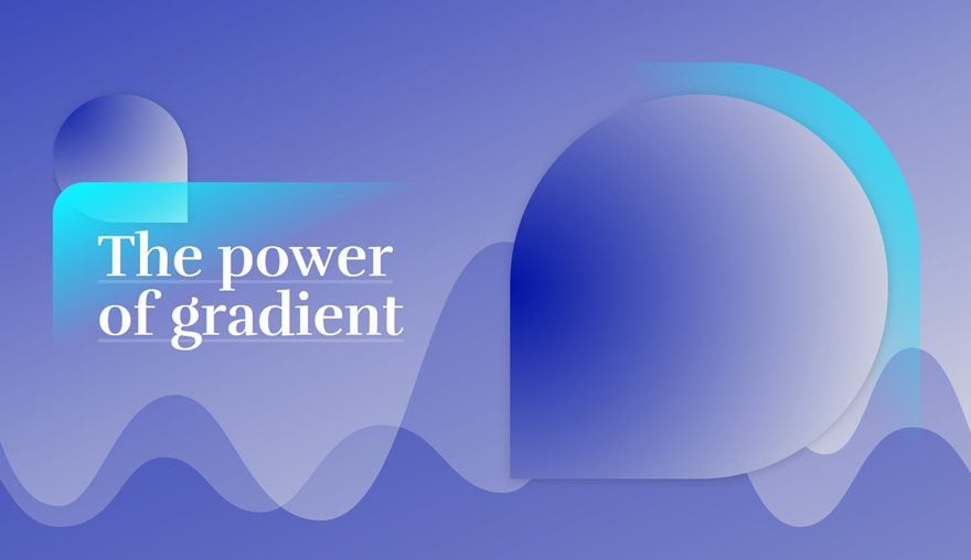
Result
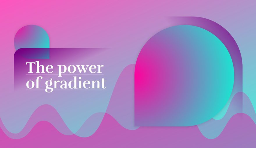
Before we dive into the tutorial, let’s take a quick look at what the result, using the 6 different gradient color palettes.
Gradient Color Palette #1
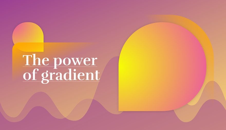
- Color #1: #9b3e93
- Color #2: #ffdf6d
- Color #3: rgba(155,62,147,0.58)
- Color #4: #eb4fa8
- Color #5: #f6ff02
- Color #6: #ffaa00
- Color #7: rgba(255,255,255,0)
Gradient Color Palette #2
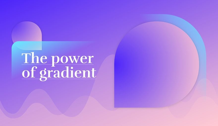
- Color #1: #4b24fb
- Color #2: #ffcad2
- Color #3: rgba(255,202,210,0.4)
- Color #4: #4b24fb
- Color #5: #ffcad2
- Color #6: #6de1ff
- Color #7: rgba(255,255,255,0)
Gradient Color Palette #3
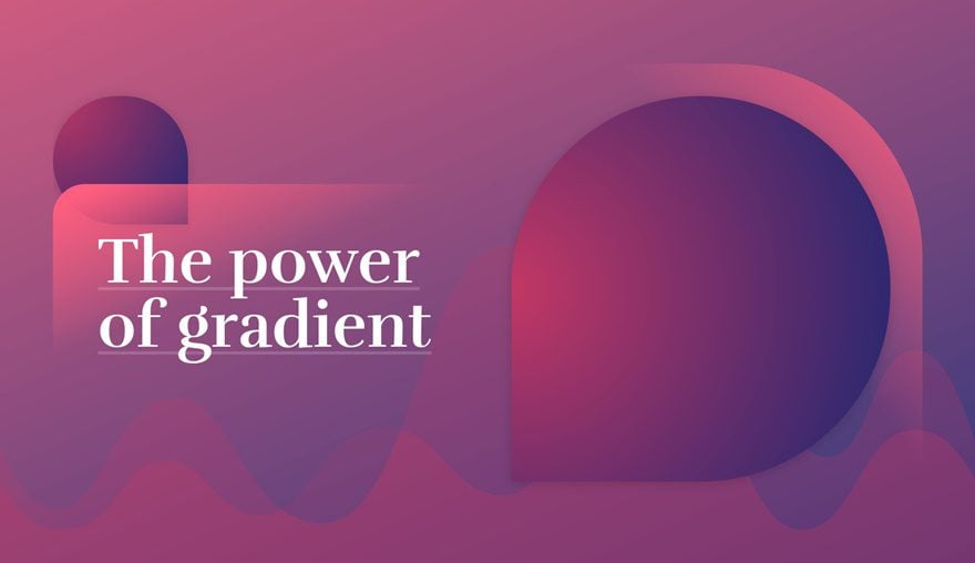
- Color #1: rgba(195,55,100,0.82)
- Color #2: rgba(29,38,113,0.92)
- Color #3: rgba(195,55,100,0.47)
- Color #4: #C33764
- Color #5: #1D2671
- Color #6: #ff5e7e
- Color #7: rgba(255,255,255,0)
Gradient Color Palette #4
- Color #1: rgba(255,0,157,0.67)
- Color #2: rgba(0,255,216,0.8)
- Color #3: rgba(255,0,157,0.51)
- Color #4: #ff009d
- Color #5: #00ffd8
- Color #6: #770082
- Color #7: rgba(255,255,255,0)
Gradient Color Palette #5
- Color #1: rgba(0,19,165,0.76)
- Color #2: #e5e5e5
- Color #3: rgba(0,19,165,0.46)
- Color #4: #0013a5
- Color #5: #e5e5e5
- Color #6: #0fefff
- Color #7: rgba(255,255,255,0)
Gradient Color Palette #6
- Color #1: #873e4c
- Color #2: #ffe9e8
- Color #3: rgba(56,49,112,0.28)
- Color #4: #f27088
- Color #5: #383170
- Color #6: #383170
- Color #7: rgba(255,255,255,0)
How to Create an Abstract Gradient Hero Section with Divi (6 Gradient Color Palettes!)
Subscribe To Our Youtube Channel
Approach
- Keep the color palette of choice close by and keep each palette’s numbering the way it is
- Throughout the tutorial, we’ll refer to the color number of the color palette
- Decide on one certain color palette and reuse its colors for the entire example
- You can clone the section afterwards and apply other color palettes to see the result in real time
- To create the gradient shapes within the hero section, we’re using empty Text Modules
- Each one of these shapes is made using Divi and its built-in options
Recreate Hero Section Design
Add New Section
Gradient Background
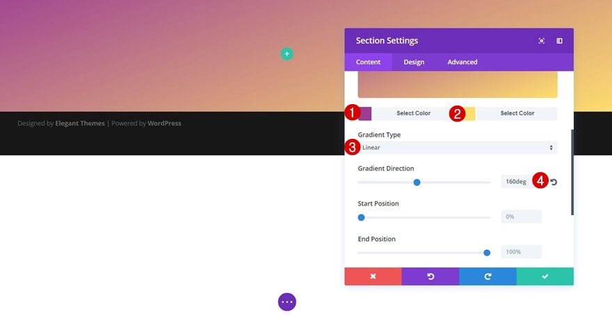
Create a new page or open an existing one and create a new section with the following gradient background:
- First Gradient Color: Color #1 (find in color palette of choice)
- Second Gradient Color: Color #2 (find in color palette of choice)
- Gradient Type: Linear
- Gradient Direction: 160deg
Bottom Divider
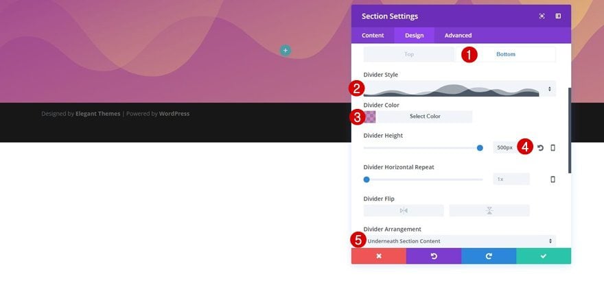
Move on to the Design tab right away and apply the following bottom divider to this section as well:
- Divider Style: Find in List
- Divider Color: Color #3 (find in color palette of choice)
- Divider Height: 500px
- Divider Arrangement: Underneath Section Content
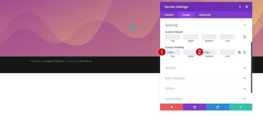
Spacing
Next, open the Spacing subcategory and create some space for the top and bottom of your section by adding ‘100px’ to the top and bottom padding.
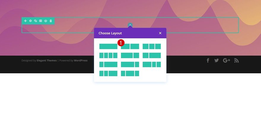
Add a New Row
Column Structure
Once you’re done with the section settings, go ahead and add a two-column row to it.
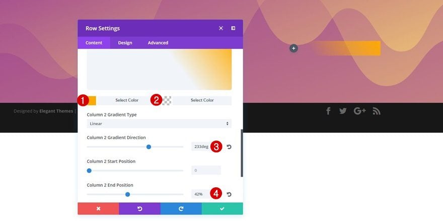
Column 2 Gradient Background
Before adding any modules, open the row settings. First of all, we’ll need to apply a gradient to the second column of this row:
- First Gradient Color: Color #6 (find in color palette of choice)
- Second Gradient Color: Color #7 (find in color palette of choice)
- Column 2 Gradient Direction: 233deg
- Column 2 End Position: 42%
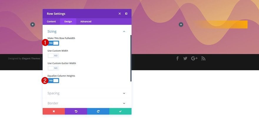
Sizing
Then, open the Sizing subcategory in the Design tab and apply the following settings to it:
- Make This Row Fullwidth: Yes
- Equalize Column Heights: Yes
Spacing
Move on to the Spacing subcategory and use the following padding next:
- Top Padding: 0px
- Bottom Padding: 30px
- Column 2 Top Padding: 50px
- Column 2 Right Padding: 50px
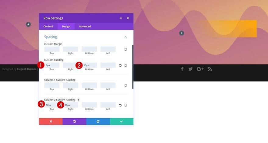
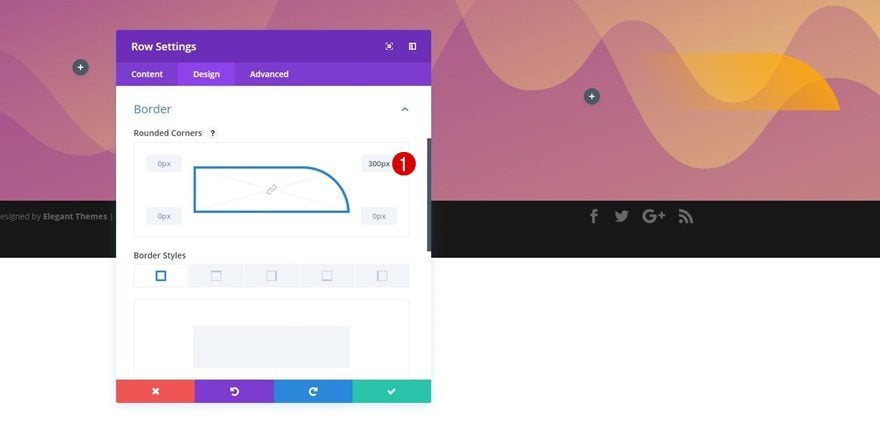
Border
The last thing you’ll need to change about the row settings is the border. Use ‘300px’ for the top right corner.
Add Empty Text Module to Column 1
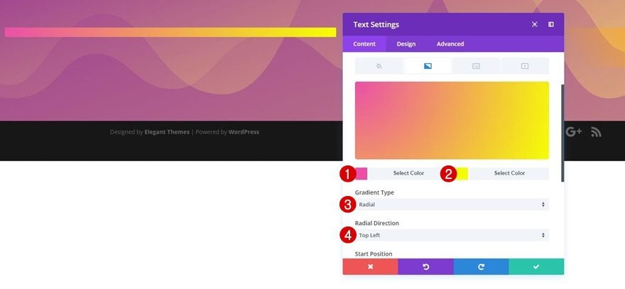
Gradient Background
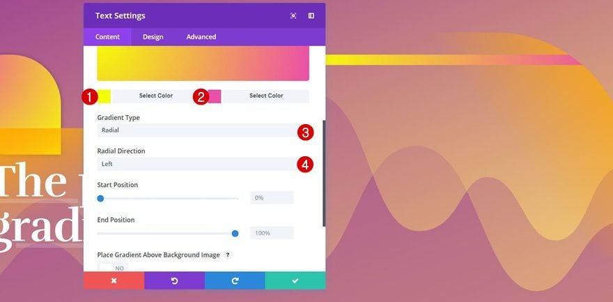
Once the row settings are done, we can start adding the various modules to both columns. We’ll start with column 1 by adding an empty Text Module to it. We’ll create a shape out of this Text Module. Open the Background subcategory and add the following gradient background to it:
- First Gradient Color: Color #4 (find in color palette of choice)
- Second Gradient Color: Color #5 (find in color palette of choice)
- Gradient Type: Radial
- Radial Direction: Top Left
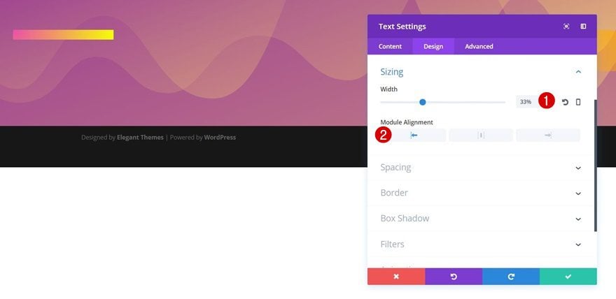
Sizing
Move on to the Design tab, open the Sizing subcategory and make the following changes to it:
- Width: 33%
- Module Alignment: Left
Spacing
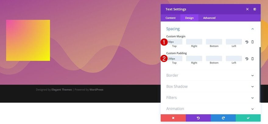
To create a shape out of this Text Module, we’ll need to apply some padding to it as well:
- Top Margin: 50px
- Top Padding: 200px
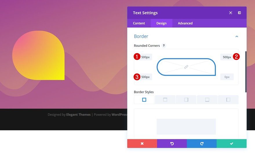
Border
We’re also going to add ‘500px’ to each one of the corners but the bottom right one in the Border subcategory.
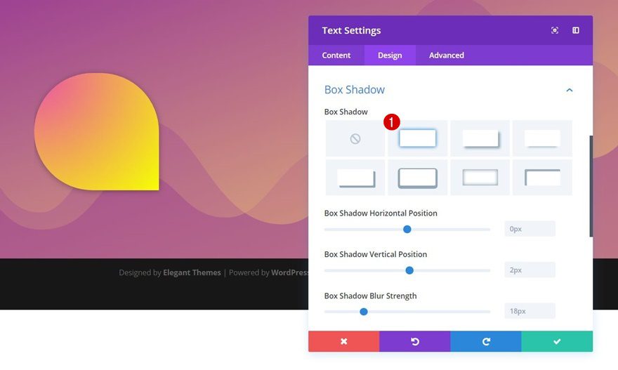
Box Shadow
Lastly, add some depth to your shape by enabling the first option within the Box Shadow subcategory. We’re not making any modifications to its default settings.
Add Title Text Module to Column 1
Gradient Background
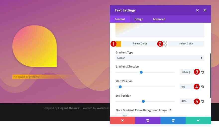
Right below the empty Text Module you’ve created in the previous part of this tutorial, add another Text Module containing the title of your hero section. Open the Background subcategory and apply the following gradient background to it:
- First Gradient Color: Color #6 (find in color palette of choice)
- Second Gradient Color: Color #7 (find in color palette of choice)
- Gradient Direction: 156deg
- Start Position: 6%
- End Position: 47%
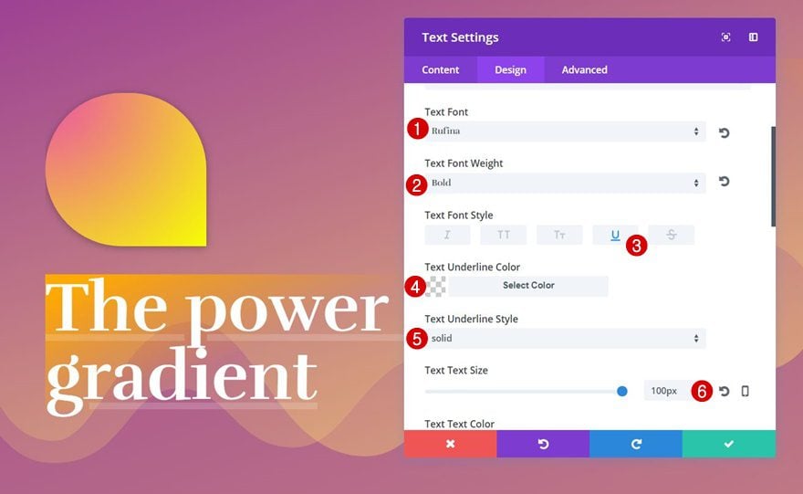
Text Settings
You can use whichever text settings you want, but to create the exact same design, use the following settings for the Text subcategory:
- Text Font: Rufina
- Text Font Weight: Bold
- Text Font Style: Underline
- Text Underline Color: rgba(255,255,255,0.17)
- Text Underline Style: Solid
- Text Size: 100px
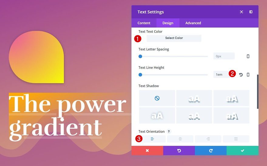
- Text Line Height: 1em
- Text Orientation: Left
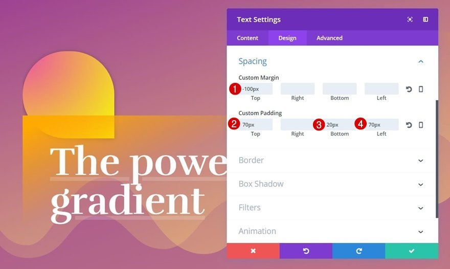
Spacing
Apply some spacing to this Text Module as well:
- Top Margin: -100px
- Top Padding: 70px
- Bottom Padding: 20px
- Left Padding: 70px
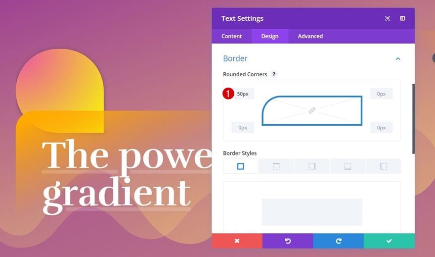
Border
And lastly, we’ll add a top left rounded corner of ’50px’.
Add Empty Text Module to Column 2
Gradient Background
We’ve created all the modules we need for the first column so let’s move on to the second. Again, we’ll use an empty Text Module to create a shape. After adding the Text Module, apply the following gradient background to it:
- First Gradient Color: Color #4 (find in color palette of choice)
- Second Gradient Color: Color #5 (find in color palette of choice)
- Gradient Type: Radial
- Gradient Direction: Left
Spacing
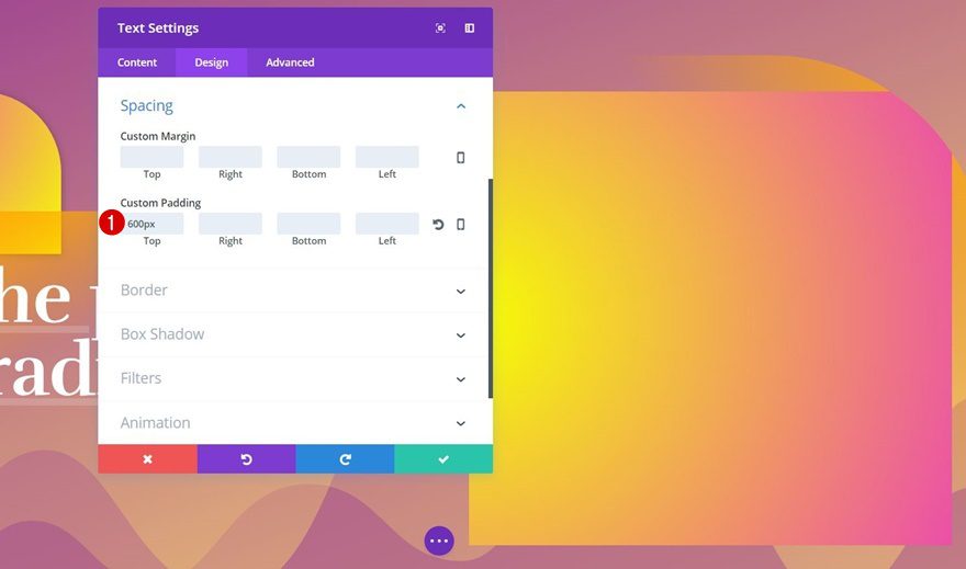
To create the shape we want, add ‘600px’ to the Top Padding option of this Text Module.
Border
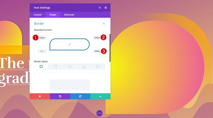
And apply ‘500px’ to each one of the corners but the bottom left one.
Box Shadow
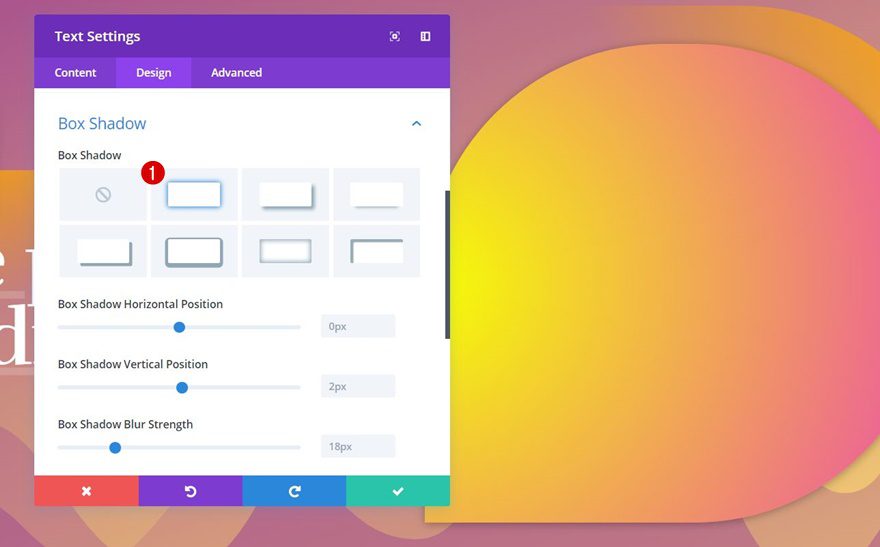
To finish your shape, you can choose to add some Box Shadow using the first option without making any changes to its default settings.
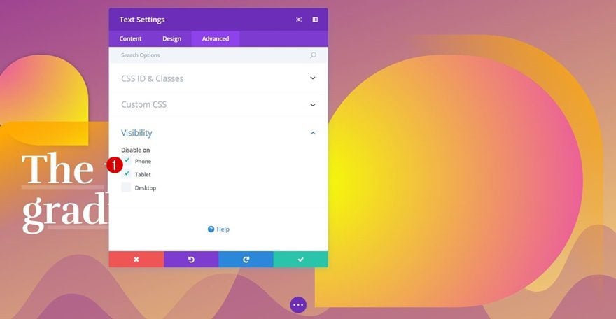
Visibility
This shape takes up quite some space on tablet and phone. That’s why we’re going to disable it within the Visibility subcategory.
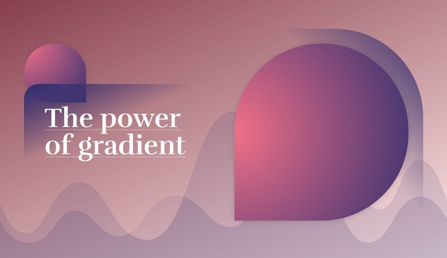
Result
Now that we’ve gone through all the steps, let’s take a final look at the result using all 6 different gradient color palettes.
Gradient Color Palette #1
Gradient Color Palette #2
Gradient Color Palette #3
Gradient Color Palette #4
Gradient Color Palette #5
Gradient Color Palette #6
Final Thoughts
In this post, we’ve shown you how to create a hero section entirely out of gradients. On top of that, we’ve provided you with 6 different gradient color palettes that you can apply to this example. If you have any questions or suggestions, make sure you leave a comment in the comment section below!


Awesome – thank you.
I’ve noticed that I don’t have the option for setting the position of the divider. even though I have the most recent version of divi, I find I’m always missing something these tutorials show and I have to figure out why. Sigh…
Anyhoo, if it helps someone else, I ended up using the following CSS snippet that I found…
#main-header { display:none; }
#page-container {
padding-top:0px !important;
margin-top:-1px !important
}
The option appeared once I did this and I was able to work through the rest of the tutorial.
Oh sure I lost my menu but we can add that back in there again.
Keep up the good work, these tutorials are very helpful!
I have to say that the every time I look the your panels to customize website, It’s just professional panel I have ever seen.
The team behind UI/UX are really would be many years of experienced.
Salute to them.
Appreciate their’s work.
I imagine all the effort and work it takes to create these classes, not to mention the result of the desing you propose, and the post with all small steps to achieve such great result.
Thank you a lot for your advices, this gradient design is awesome!
– Rodrigo, from Guadalajara, Mexico
Very nice Donjete.
Excellent color gradient matches which make’s it flow seamlessly together.
Thanks, and we need more tutorials from you.
Nicely done.
Hello,
Really good ideas to use empty modules!
Thank you Donjete
Great post! Are these gradients are exportable from DIVI as well? I know I can always grab the code. But can they be exported from the GUI?
Very nice. Great idea to use Gradient option(s). Thank you for sharing.
Amazing what can be created for the web. I remember what an accomplishment it was for me to display “Hello World” in Netscape Navigator 1.0 in Windows 3.1. Never did I dream that something like this would be possible for someone like me, who definitely am not an artist or creative person. These tutorials are invaluable to me. Thank you very much.
LOL – You don’t look old enough to remember 1994! I remember a few year earlier, my buddy Charlie telling me I should be using “Deskview” because Windows wasn’t going anywhere!
Does Donjete have too much time on her hands?
Thank you Donjete Vuniqi! Lovely design ideas.
Some clever ideas here – who would have thought of adding an empty text module and styling it 🙂