
Team pages are often underestimated. Before purchasing a product or hiring a service, many users navigate to team or about pages to get a better idea of the company and the people behind it. If your team page leaves a positive first impression, it could lead towards higher conversion rates. Now, there are many ways to create beautiful team pages with Divi, but if you’re searching for some inspiration for your next project, you’re going to love this post. We’ll recreate a vibrant hover team page that triggers member bios on hover.
Let’s get to it!
- 1 Preview
- 2 1. Start With a Regular Section + One-Column Row For The Title
- 3 2. Add Content to Text Module & Style It
- 4 3. Style the Divider
- 5 4. Create Team Bios Using a Regular Section + Three-Column Row
- 6 5. Adjust Row Sizing Settings
- 7 6. Adjust Row Spacing Settings
- 8 7. Add an Image & Blurb Module to Column One
- 9 8. Upload an Image & Style It
- 10 9. Add Content to Blurb & Style It
- 11 10. Style Column One
- 12 11. Delete Empty Columns & Duplicate First Column Twice
- 13 12. Change Content & Colors of Column Two
- 14 Preview
- 15 It’s a Wrap!
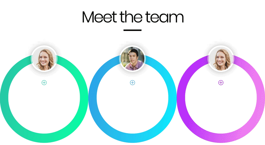
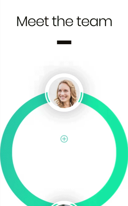
Preview
Before we dive into the tutorial, let’s take a quick look at the outcome across different screen sizes.
Desktop
Mobile
Subscribe To Our Youtube Channel
1. Start With a Regular Section + One-Column Row For The Title
Open a new page and set the page attributes to ‘blank page.’ Once you’ve done that, enter the Divi Builder and add a section with a one-column row.
Add a text and divider module.
2. Add Content to Text Module & Style It
Add some H1 content to the text module.
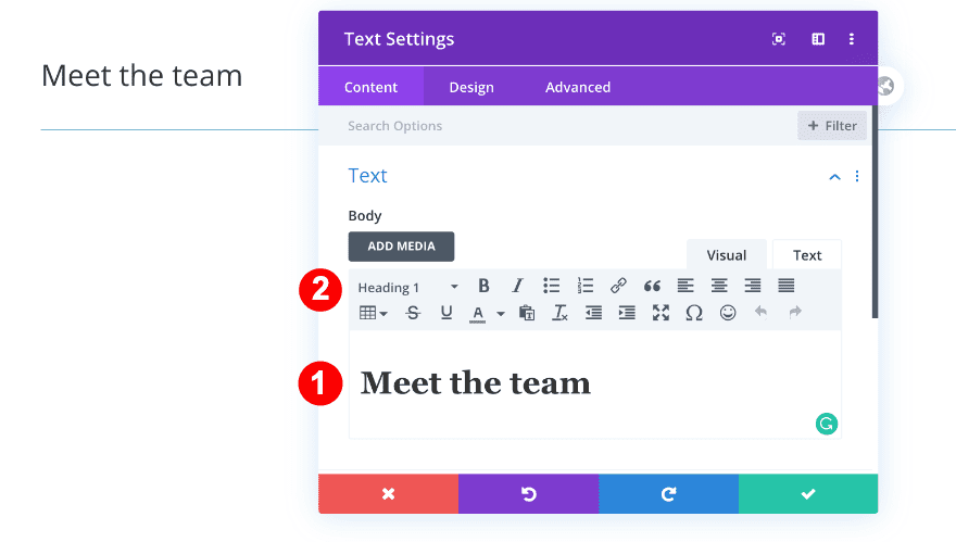
Move on to the design tab and style the H1 text settings accordingly:
- Heading Font: Poppins
- Heading Font Weight: Light
- Heading Text Alignment: Center
- Heading Text Color: Black #000000
- Heading Text Size:
- Desktop = 6vw
- Tablet = 9vw
- Phone = 11vw
- Heading Letter Spacing: -0.4vw
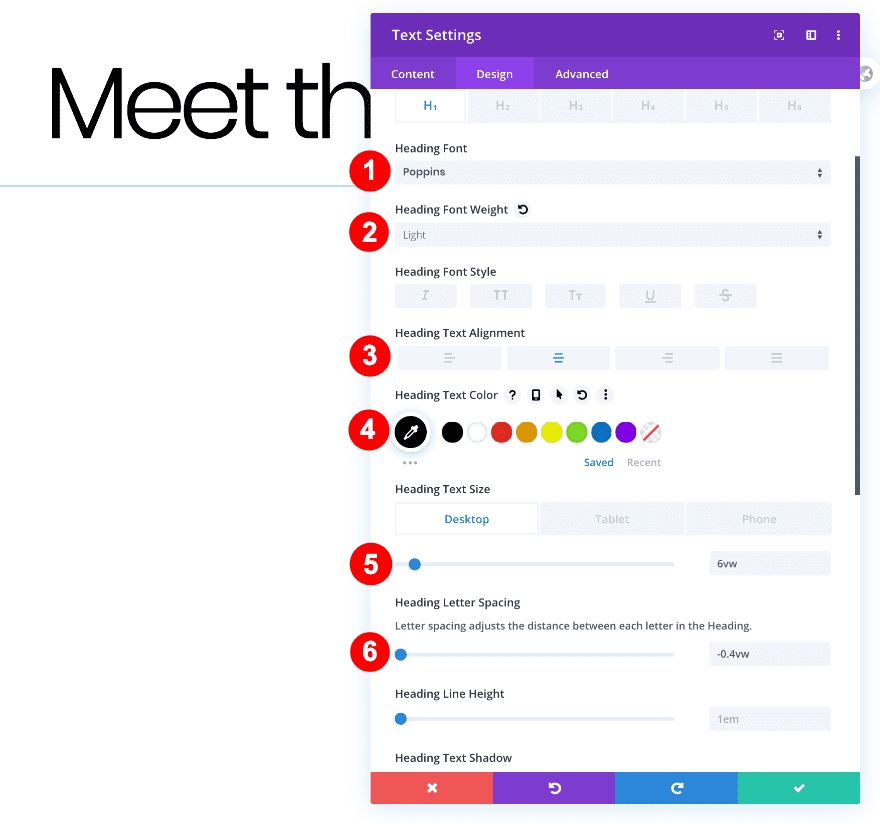
3. Style the Divider
On to the next module, which is the divider module. Change the divider color into black and modify the sizing settings.
- Divider Color: Black #oooooo
- Divider Weight: 12px
- Width: 14%
- Module Alignment: Center
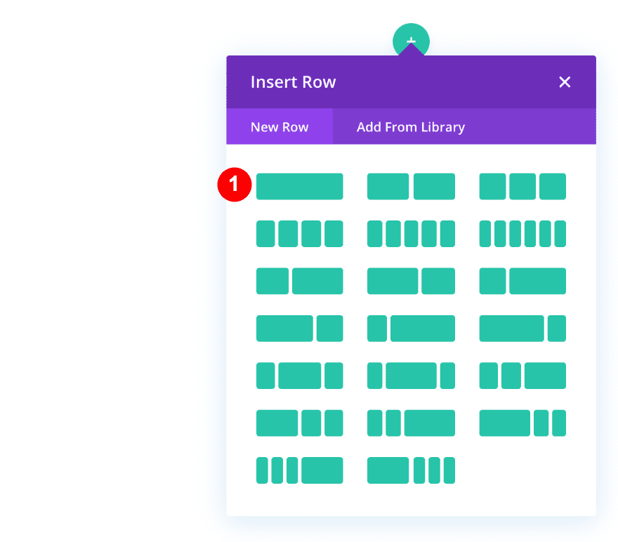
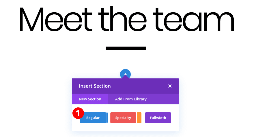
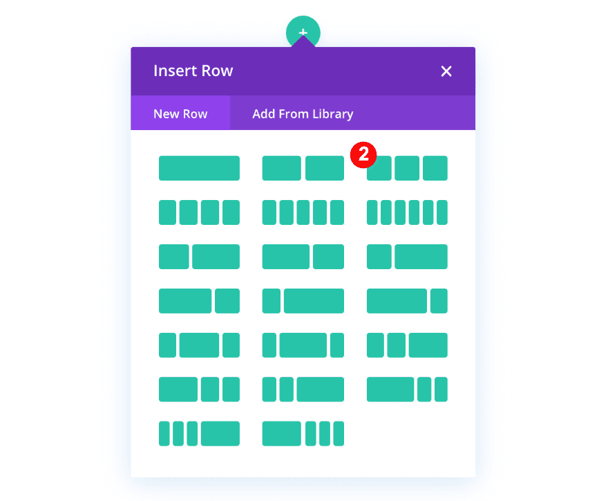
4. Create Team Bios Using a Regular Section + Three-Column Row
Now that we’ve completed the title section, we’re ready to start building the team bios. Start by adding a new regular section with a three-column row.
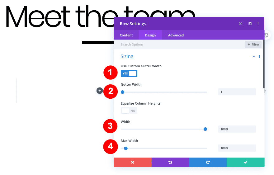
5. Adjust Row Sizing Settings
Allow the row to take up the entire width of the section container by modifying the sizing settings.
- Use Custom Gutter Width: Yes
- Gutter Width: 1
- Width: 100%
- Max Width: 100%
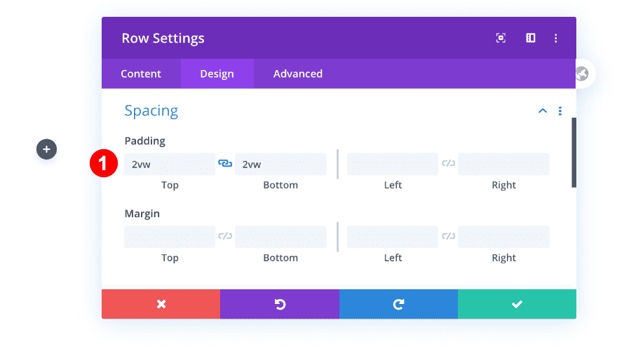
6. Adjust Row Spacing Settings
Add some custom top and bottom padding as well.
- Top Padding: 2vw
- Bottom Padding: 2vw
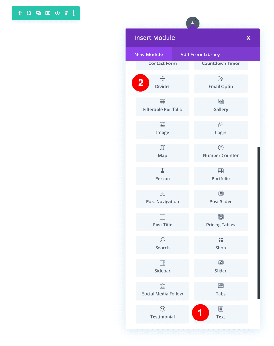
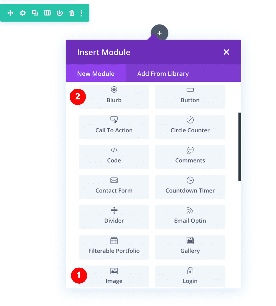
7. Add an Image & Blurb Module to Column One
The two main modules we’ll use to create the final effect are an image and a blurb module. First, add the image module and then the blurb.
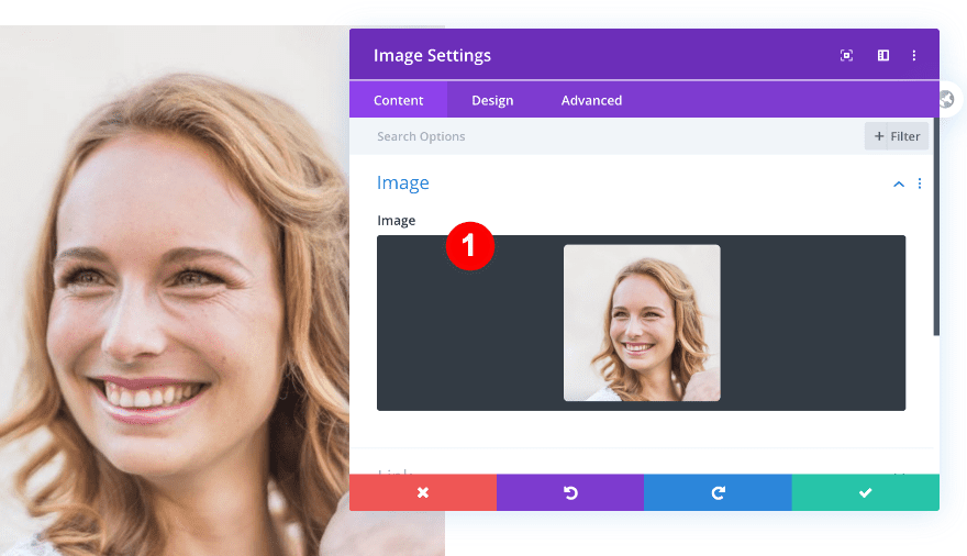
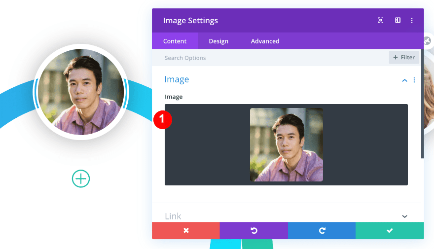
8. Upload an Image & Style It
Your hover team page is all about showcasing team members. Open the image module and add a photo of one of them. We’ll use one of our Divi stock images. Make sure your image dimensions are 612px X 612px.
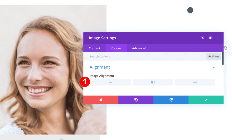
Alignment
Move on to the design tab and change the image alignment.
- Image Alignment: Center
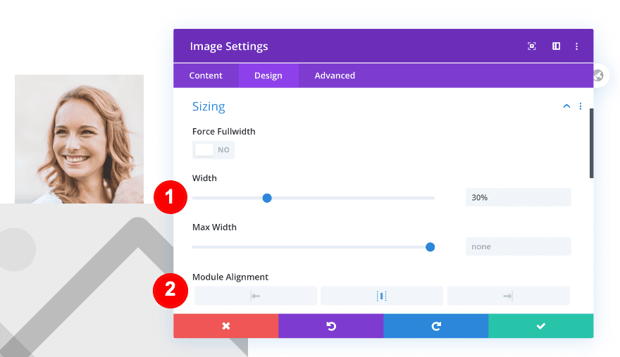
Sizing
Modify the sizing settings too.
- Width: 30%
- Module Alignment: Center
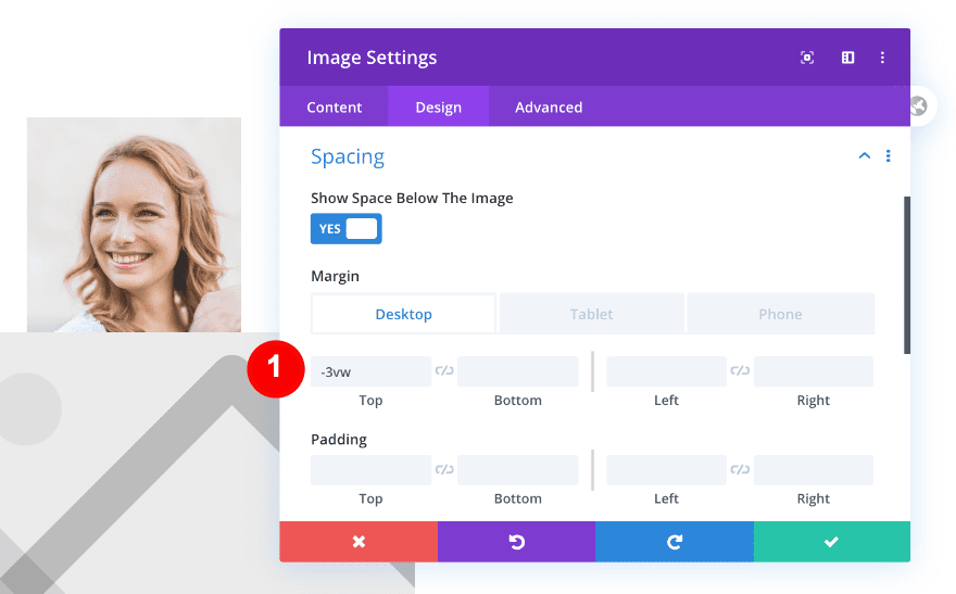
Spacing
And add some negative top margin.
- Margin:
- Desktop = -3vw
- Tablet and Phone = -13vw
Border
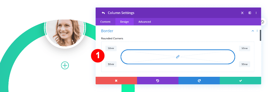
To turn the image into a circle, we’re going to change the border settings.
- Rounded Corners: 20vw All Four Corners
- Border Styles: All Four Sides
- Border Width: 12px
- Border Color: White #ffffff
- Border Style: Double
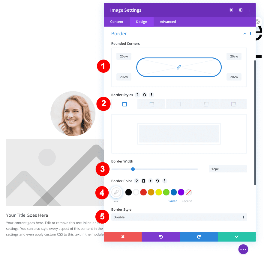
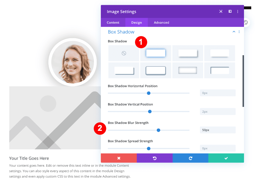
Box Shadow
We’re also adding some depth to the image by applying a subtle box shadow.
- Box Shadow: The First Option
- Box Shadow Blur Strength: 50px
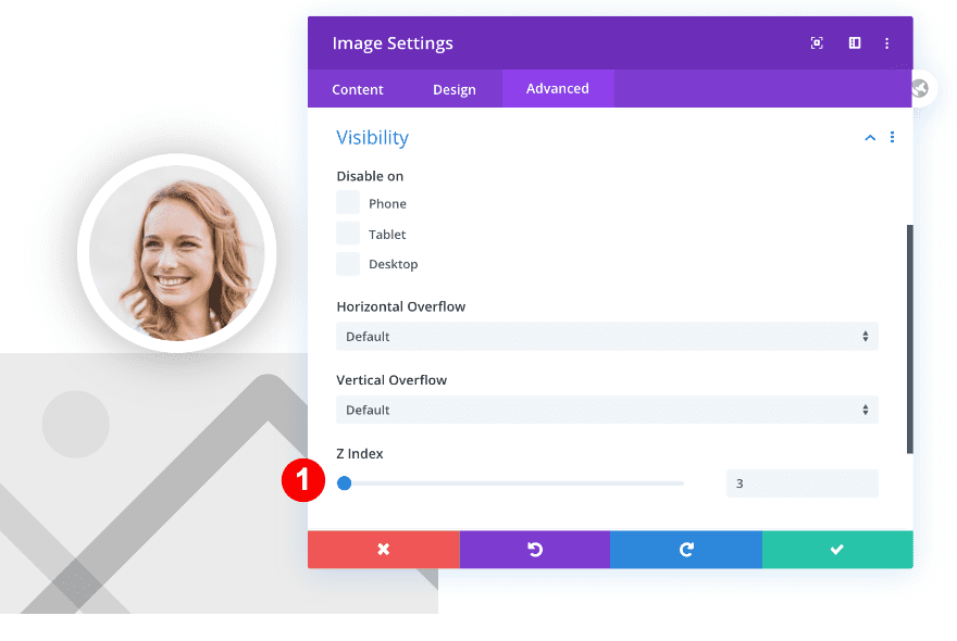
Z Index
In one of the previous steps, we’ve added some negative top margin. To make sure the image stays on top of the column, even when it exceeds it, we’re going to increase the z index in the visibility settings.
- Z Index: 3
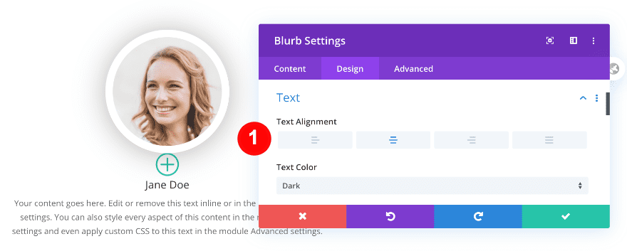
9. Add Content to Blurb & Style It
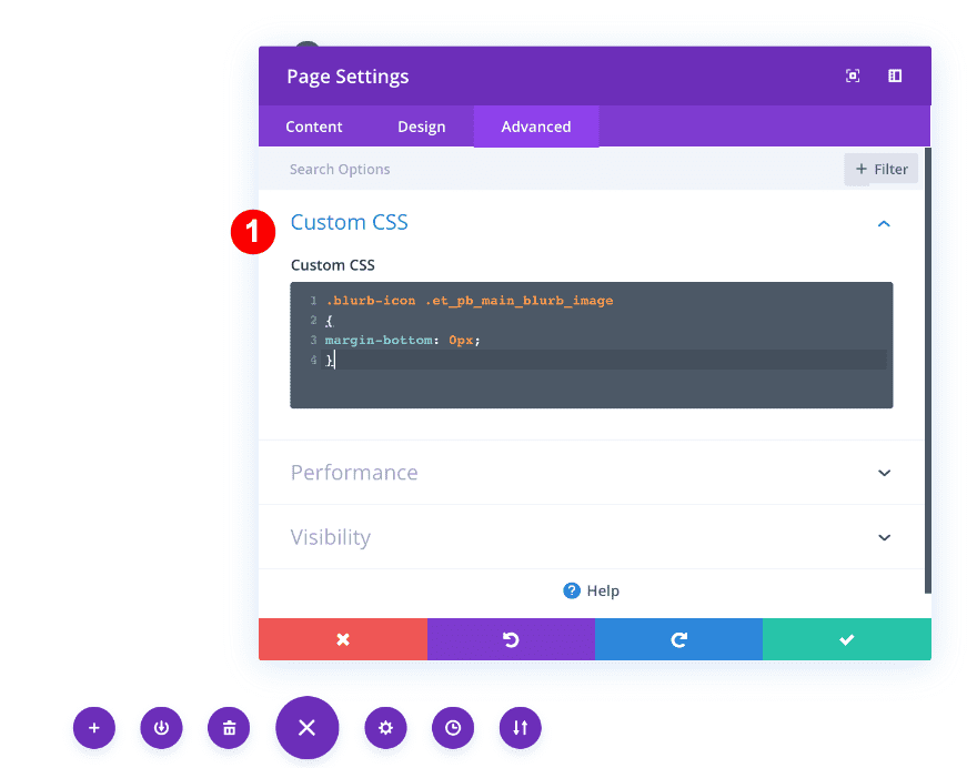
Add Custom CSS to The Page Settings
Before we do anything else, we’ll add some custom CSS to get rid of the default bottom margin of the icon inside the blurb. Add the following lines of CSS code to the page settings:
.blurb-icon .et_pb_main_blurb_image
{
margin-bottom: 0px;
}
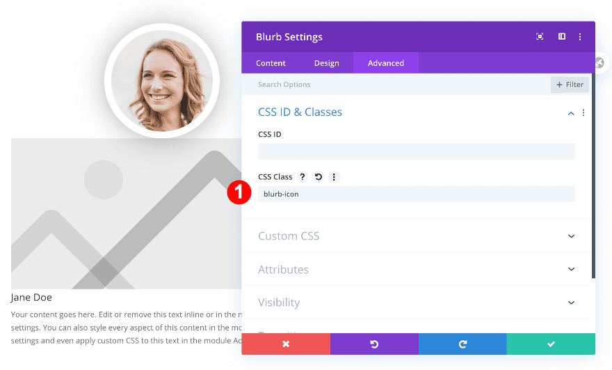
Give Blurb a CSS Class
Open the blurb module next and add the matching CSS class.
- CSS Class: blurb-icon
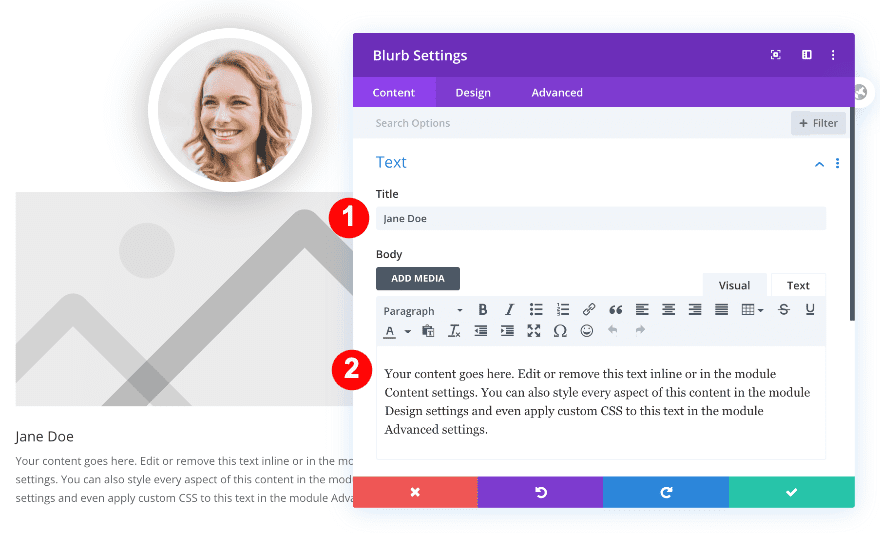
Add Content
We’ll use placeholder text but you can insert the actual name and description of a team member.
Choose Icon
Choose a plus icon next.
- Use Icon: Yes
- Icon: Plus Sign Inside a Circle
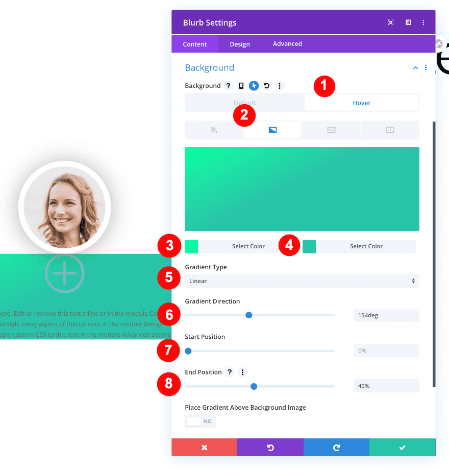
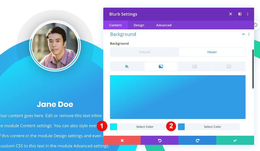
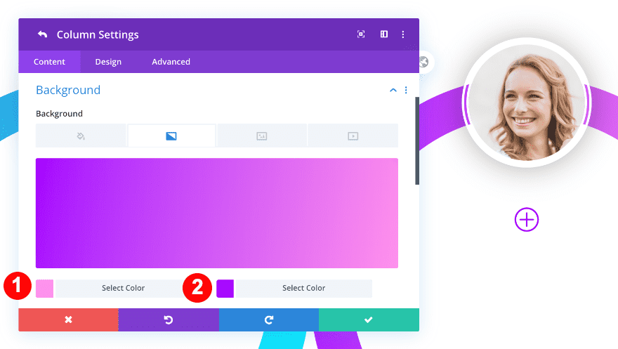
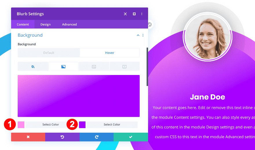
Style Background
Move on to the background settings, add a white default background color and a gradient background on hover.
- Background: White #ffffff
- Hover Background: Gradient
- Gradient Color One: #00ffa1
- Gradient Color Two: #29c4a9
- Gradient Type: Linear
- Gradient Direction: 154deg
- Start Position: 0
- End Position: 46%
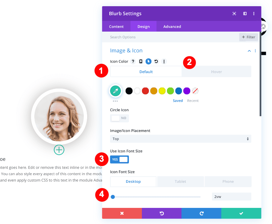
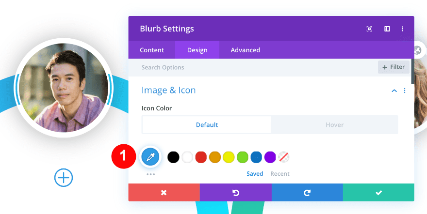
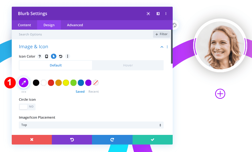
Style Icon
Apply the following icon settings next:
- Icon Color:
- Default: #29c4a9
- Hover: Transparent rgba(255,255,255,0)
- Use Icon Font Size: Yes
- Icon Font Size:
- Desktop = 2vw
- Tablet = 4vw
- Phone = 6vw
Alignment
Move on to the text settings and change the text alignment.
- Text Alignment: Center
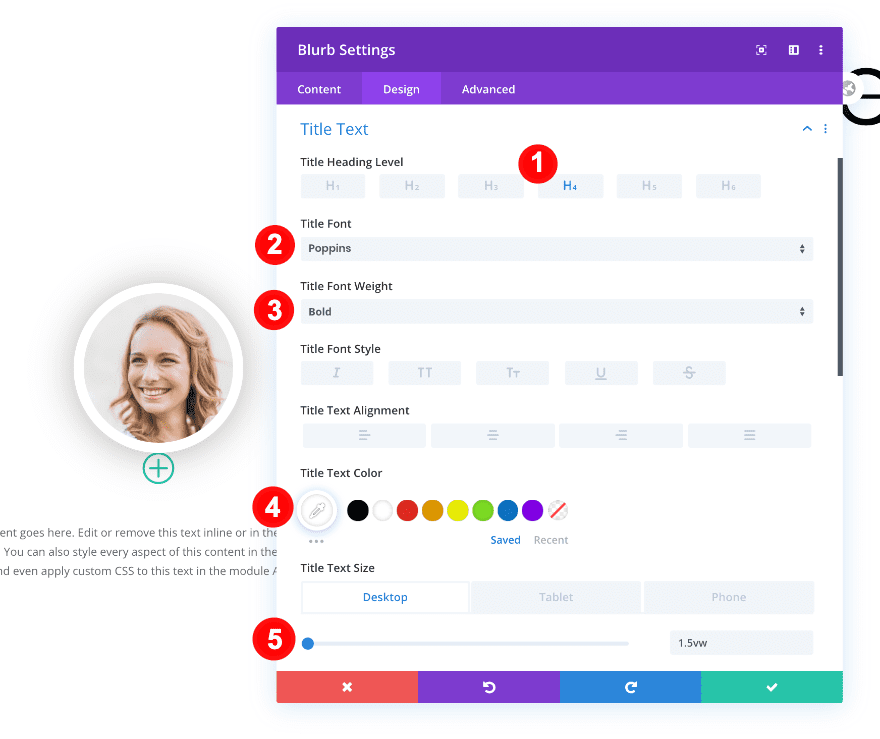
Style Heading Text
Then, open the heading text settings and make some changes across different screen sizes.
- Heading: H4
- Title Font: Poppins
- Title Font: Bold
- Title Text Color: White #ffffff
- Title Text Size:
- Desktop: 1.5vw
- Tablet: 2.5vw
- Phone: 3.5vw
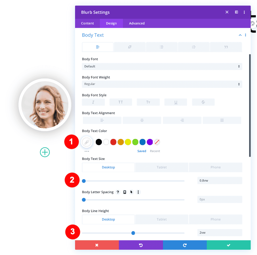
Style Body Text
Do the same for the body text settings.
- Body Text Color: White #ffffff
- Body Text Size:
- Desktop = 0.8vw
- Tablet = 1.9vw
- Phone = 2.6vw
- Body Line Height:
- Desktop = 2vw
- Tablet + Phone = 3vw
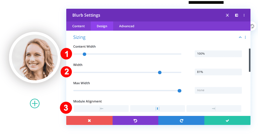
Sizing
Next, we’re going to change the sizing settings of our blurb module.
- Content Width: 100%
- Width: 81%
- Module Alignment: Center
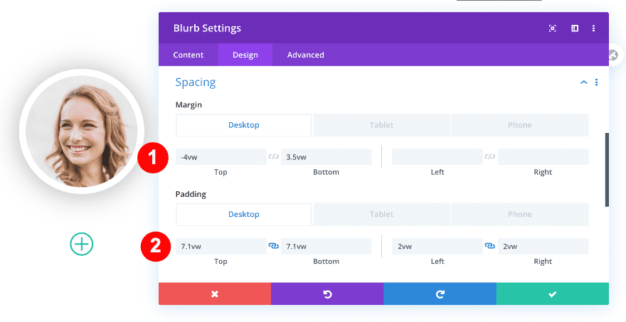
Spacing
We’ll apply some custom margin and padding values across different screen sizes as well.
- Top Margin:
- Desktop = -4vw
- Tablet + Phone = -9vw
- Bottom Margin:
- Desktop = 3.5vw
- Tablet + Phone = 10vw
- Top and Bottom Padding:
- Desktop = 7.1vw
- Tablet = 30vw
- Phone = 28vw
- Left and Right Padding
- Desktop = 2vw
- Tablet + Phone = 8vw
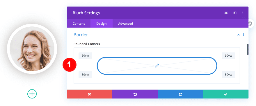
Border
Turn the blurb module into a circle by adding some border radius.
- Rounded Corners: 50vw All Four Corners
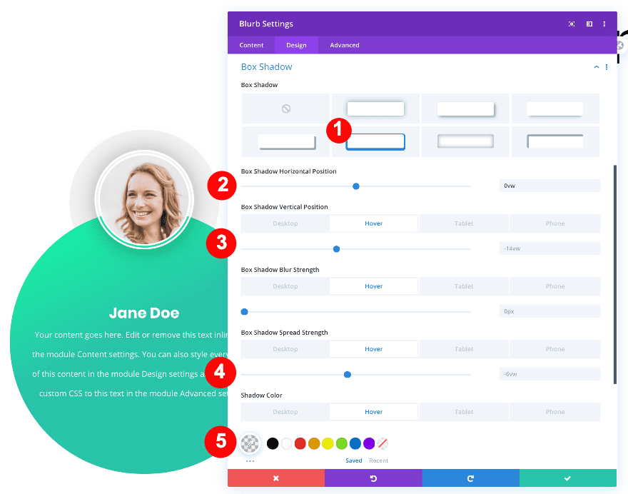
Box Shadow
And complete the blurb module design by adding a box shadow that appears on hover.
- Box Shadow: Fifth Style
- Box Shadow Horizontal Position: 0vw
- Box Shadow Vertical Position:
- Desktop + Hover = -14vw
- Tablet = -44vw
- Phone = -46vw
- Box Shadow Spread Strength:
- Desktop + Hover = -6vw
- Tablet + Phone = -19vw
- Box Shadow Color:
- Hover = rgba(0,0,0,0.05)
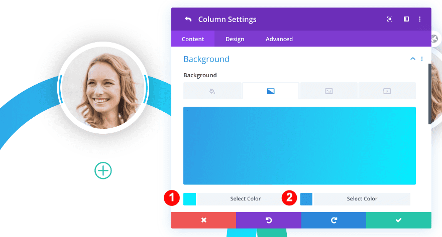
10. Style Column One
Now that we’ve added all modules we need to column one, it’s time to style the column.
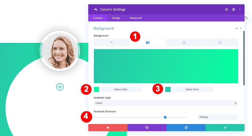
Background
Open the column one background settings and apply the following gradient background:
- Background Style: Gradient
- Gradient Color One: #00ffa1
- Gradient Color Two: #29c4a9
- Gradient Type: Liner
- Gradient Direction: 282deg
Border
Move on to the design tab and turn the column into a circle by adding some border radius.
- Rounded Corners: 50vw
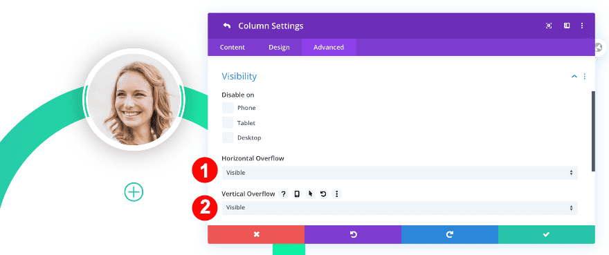
Overflow
To make sure the image appears above the column, we’re going to change the horizontal and vertical overflows in the visibility settings.
- Horizontal and Vertical Overflow: Visible
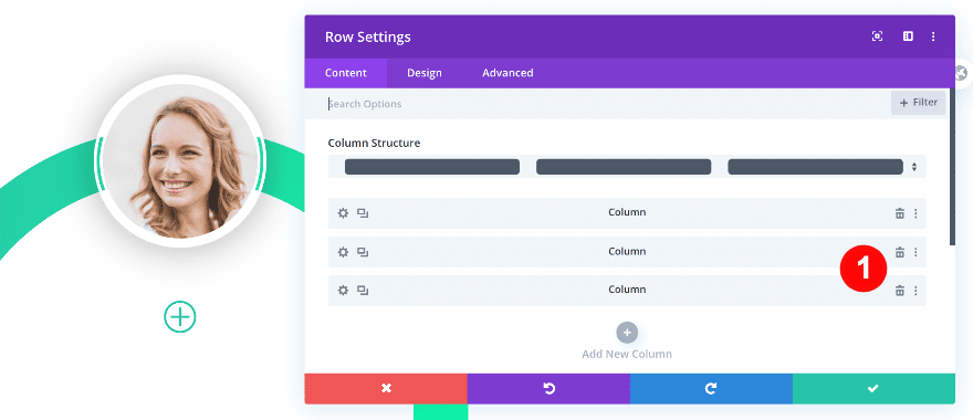
11. Delete Empty Columns & Duplicate First Column Twice
We’ve completed the first column and all the modules inside it. To save ourselves some time, we’re going to remove the empty columns and clone the first column twice.
Delete Columns Two & Three
Go back to the main row settings and click on the trash icon for columns two and three.
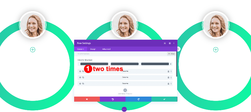
Duplicate Column One Twice
After you’ve deleted columns two and three, column one will look weird for a second, but that all changes as soon as you clone the column twice.
12. Change Content & Colors of Column Two
Now it’s time to style the new columns for your two other team members.
Column Two
Open the second column’s settings and change the gradient background
- Background Gradient Color One: #00eeff
- Background Gradient Color Two: #309ce5
Upload a different image as well.
Continue by opening the blurb module and changing the gradient background.
- Hover Background Color One: #00eeff
- Hover Background Color Two: #309ce5
Change the icon color as well.
- Default Icon Color: #309ce5
Column Three
Open the third column’s settings and change the gradient background.
- Background Gradient Color One: #ff91ec
- Background Gradient Color Two: #a500ff
Change the blurb gradient background next.
- Hover Background Color One: #ff91ec
- Hover Background Color Two: #a500ff
Along with the icon color.
- Default Icon Color: #a500ff
Preview
Now that we’ve gone through the different steps, let’s take a final look at the outcome across different screen sizes.
Desktop
Mobile
It’s a Wrap!
In this post, we showed you how to create a vibrant hover team page with colorful hover options. Feel free to use this design in your next Divi project. Try it out for a team page or a contributors directory. Let us know if you have any thoughts in the comments.


Yes same issue here. Not coming out this way.
Can you please email me this library section? I cannot get it to work and would love to use it.
Thank-you
This seems like a very cool and professional manner to introduce any team or board of directors for example.
However, there is just SO much to change. It has taken me hours to repeat the steps and I still can’t get it right.
It may be because of the conversions from VW to pixels. Could you make the function available as a library unit
so I can examine it step by step. Something seems to be missing or wrong in following the directions, its probably
me but I can’t spend much more time trying to figure this out. My email is below.
Thank-you