
In this post, we’ll be showing you how you can create a scrolling fashion catalogue. Using this method will help you connect with your audience as you would by handing them a paper catalogue. Creating an online scrolling fashion catalogue may help increase the results you get from the catalogue. By including direct links to shop items, for example, the buying process will be enhanced as well.
- 1 Result
- 2 How to Create a Scrolling Fashion Catalogue with Divi
-
3
Add Transparent Shapes to Images with Photoshop
- 3.1 Open Photoshop
- 3.2 Open Image
- 3.3 Double-Click on Image & Create Layer
- 3.4 Add Another Layer
- 3.5 Select Layer 1 & Polygonal Lasso Tool
- 3.6 Make a Shape
- 3.7 Make Layer 1 Invisible & Press Delete While Having Selected Layer 0
- 3.8 Select Rectangular Marquee Tool & Click Somewhere on Image
- 3.9 Save Image as PNG
- 4 Primary Menu Bar Settings
- 5 Edition Intro
- 6 Desktop Fashion Catalogue (New Section)
- 7 Tablet & Phone Catalogue (New Section)
- 8 Result
- 9 Final Thoughts
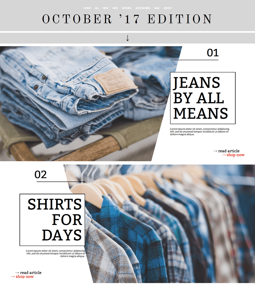
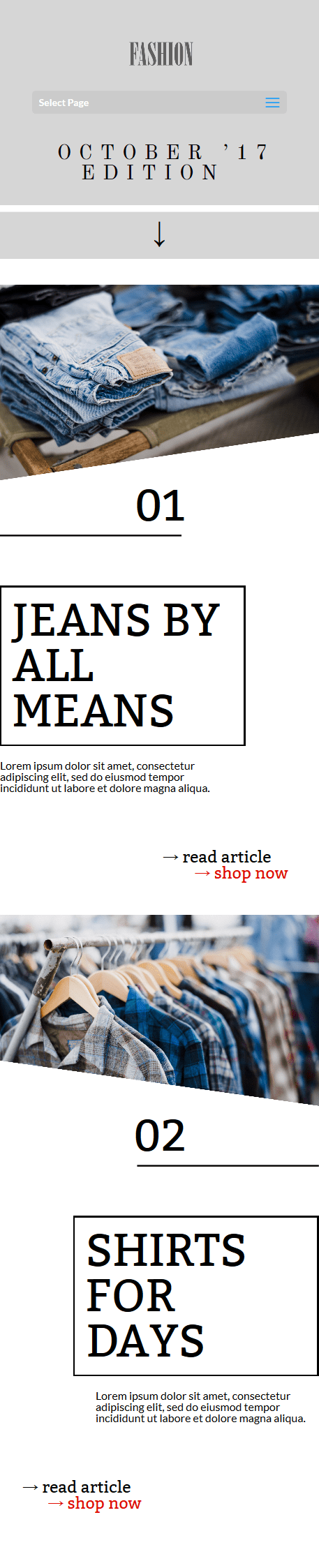
Result
The result we’ll show you how to create, step by step, looks like this on desktop:
And like this on phone and tablet:
How to Create a Scrolling Fashion Catalogue with Divi
Subscribe To Our Youtube Channel
Add Transparent Shapes to Images with Photoshop
The first thing we’ll be showing you is how to add a transparent part to an image with Photoshop. There’s a free alternative for Photoshop called GimpShop, but in this part of the tutorial, we’ll be using Photoshop only. We’ll need two images with each two different shapes; one for desktop and one for mobile and tablet. In this part, we’ll simply show you how to add a transparent shape to the image. Afterwards, you can make all the images you need yourself.
Open Photoshop
Start by opening Photoshop on your computer.
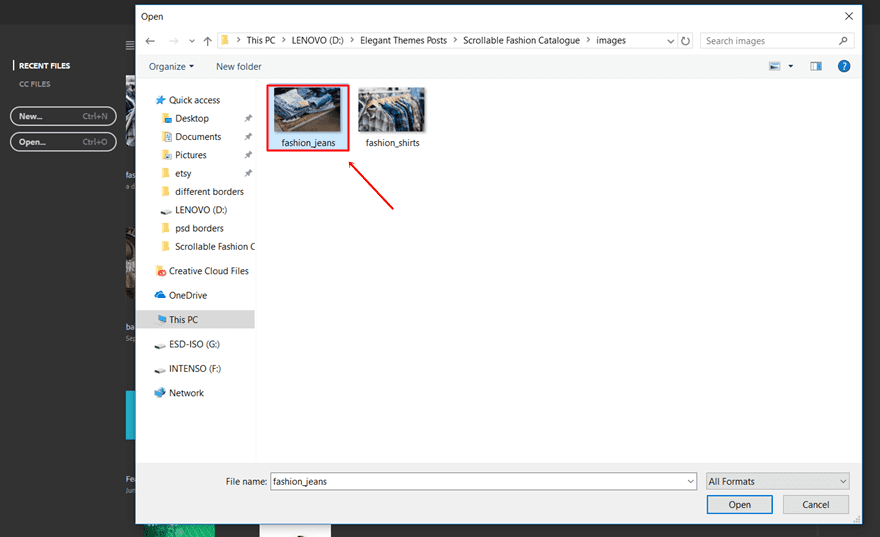
Open Image
Next, open the first image you’d like to edit. The method remains the same for all three images you’ll be using throughout this tutorial. That’s why we’ll only explain it once.
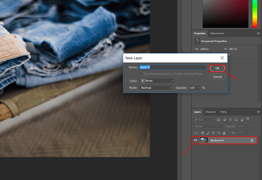
Double-Click on Image & Create Layer
Once you’ve opened the image you want to edit, double-click on the image and create a new layer for it.
Add Another Layer
Continue by adding another empty layer on top of it.
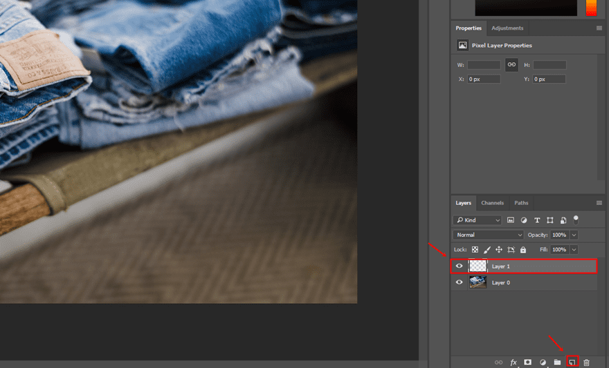
Select Layer 1 & Polygonal Lasso Tool
Select Layer 1 and start using the Polygonal Lasso Tool.
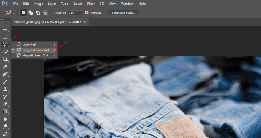
Make a Shape
While having the Polygonal Lasso Tool activated, go ahead and create the transparent shape within your image.

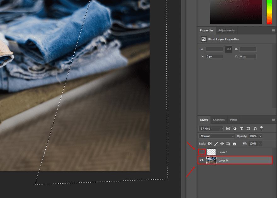
Make Layer 1 Invisible & Press Delete While Having Selected Layer 0
Once you’ve selected the area you want to become transparent, go ahead make Layer 1 invisible, select Layer 0 again and press the Delete button on your keyboard.
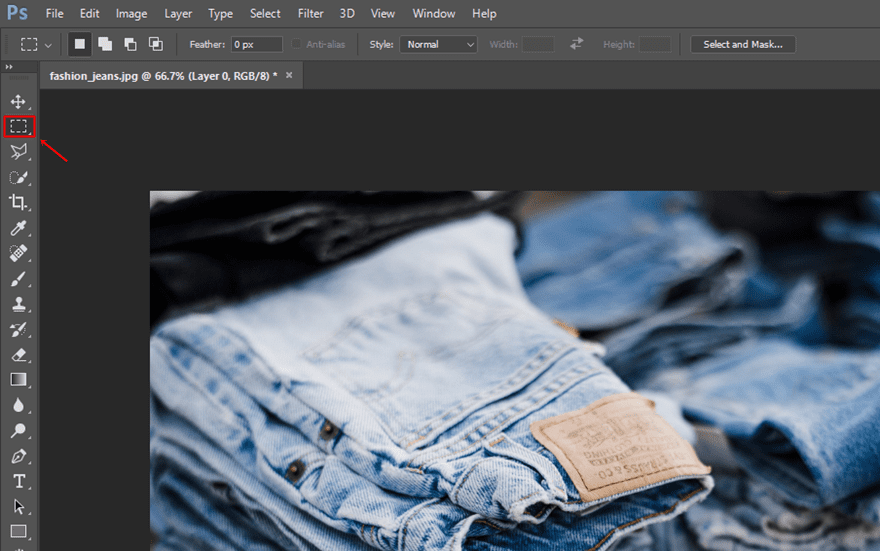
Select Rectangular Marquee Tool & Click Somewhere on Image
Once you’ve done that, select the Rectangular Marquee Tool and click somewhere on your image.
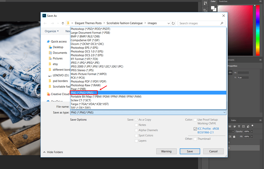
Save Image as PNG
Lastly, you’ll need to save the image as a PNG and repeat the same process for all four images you’ll use throughout the layout.
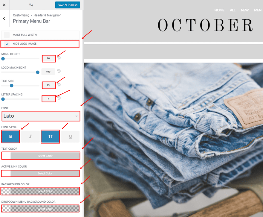
The Primary Menu Bar settings we need for the layout we’re creating are the following:
- Hide Logo Image: Enable
- Menu Height: 30
- Text Size: 15
- Letter Spacing: -1
- Font: Lato
- Font Style: Bold & Uppercase
- Text Color: #FFFFFF
- Active Link Color: #FFFFFF
- Background Color: rgba(255,255,255,0)
- Dropdown Menu Background Color: rgba(255,255,255,0)
Edition Intro
Once you’ve modified the Primary Menu Bar, you can go ahead and add a new page, use the Divi Builder and switch over to Visual Builder.
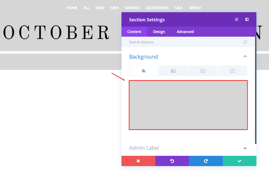
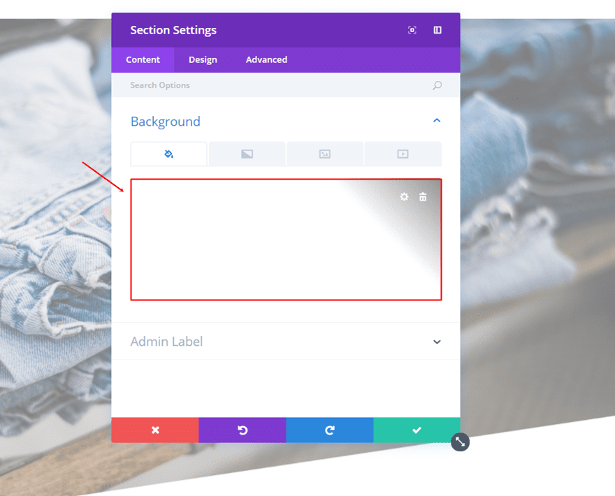
Add New Section
Within that page, start by adding a standard section.
Section Background Color
The background of that color needs to be ‘#d6d6d6’.
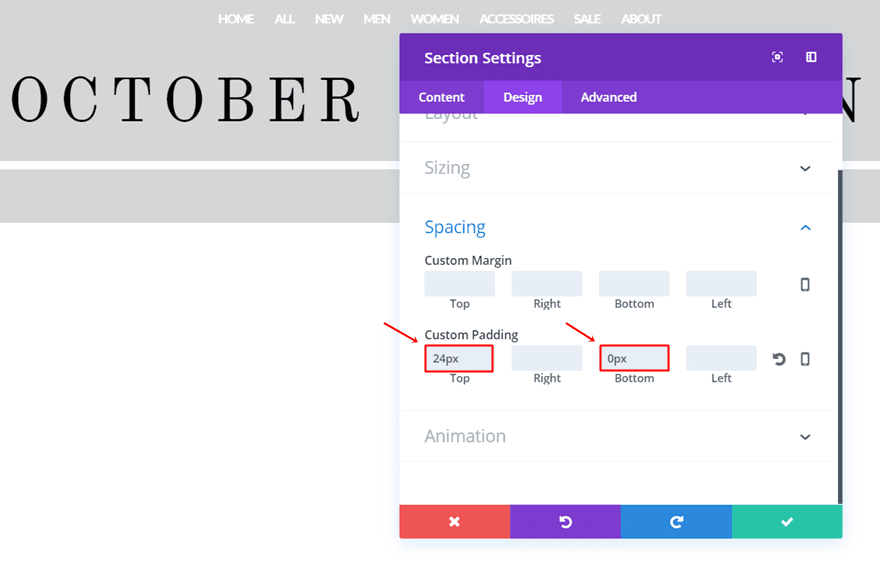
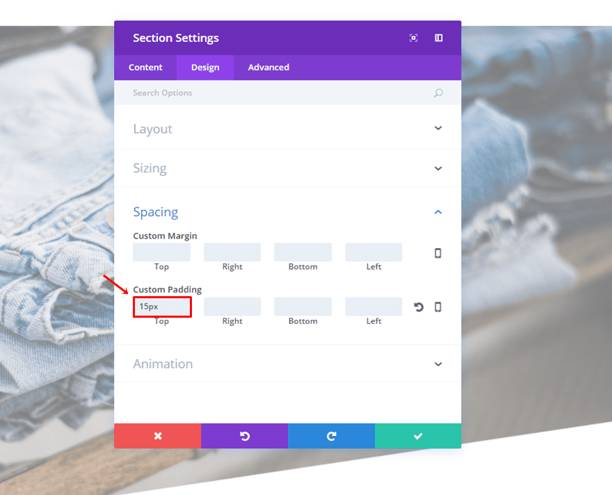
Custom Padding
Move on to the Design tab of that section. Within the Spacing subcategory, add ’24px’ to the top padding and 0px to the bottom one.
Add One-Column Row
Once that’s done, you can go ahead and add a one-column row to the section.
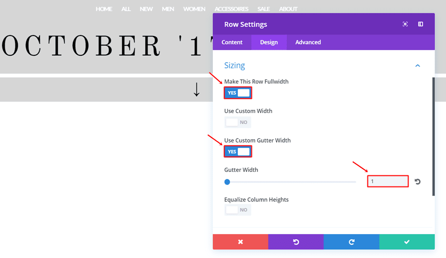
Sizing
Go to the Design tab and modify the Sizing subcategory:
- Make This Row Fullwidth: Yes
- Use Custom Gutter Width: 1
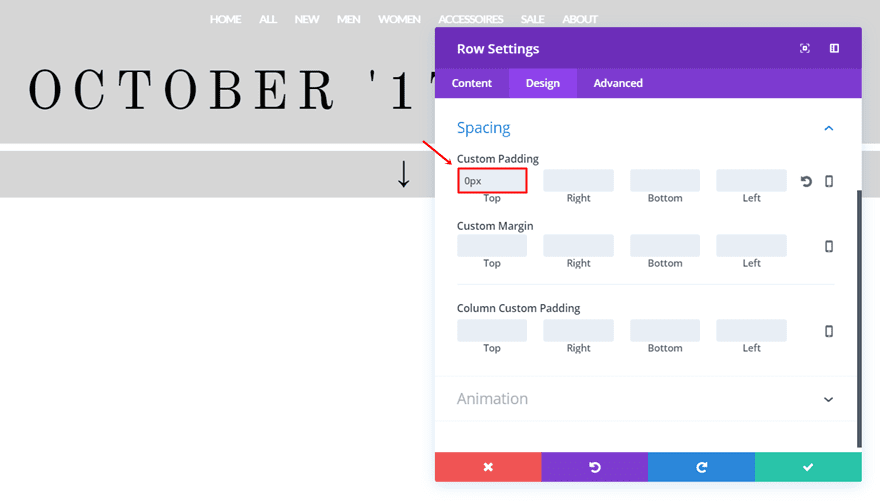
Custom Padding
Scroll down and add ‘0px’ to the top padding of the row.
First Text Module
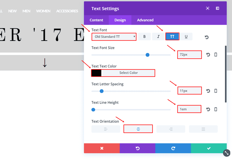
Once that’s done, you can add a Text Module to the row. After having entered the text you want to appear, go to the Design tab and make sure the following changes apply to the Text subcategory:
- Text Font: Old Standard TT
- Font Style: Uppercase
- Text Font Size: 72 (Desktop), 41 (Tablet), 29 (Phone)
- Text Color: #000000
- Text Letter Spacing: 11px
- Text Line Height: 1em
- Text Orientation: Center
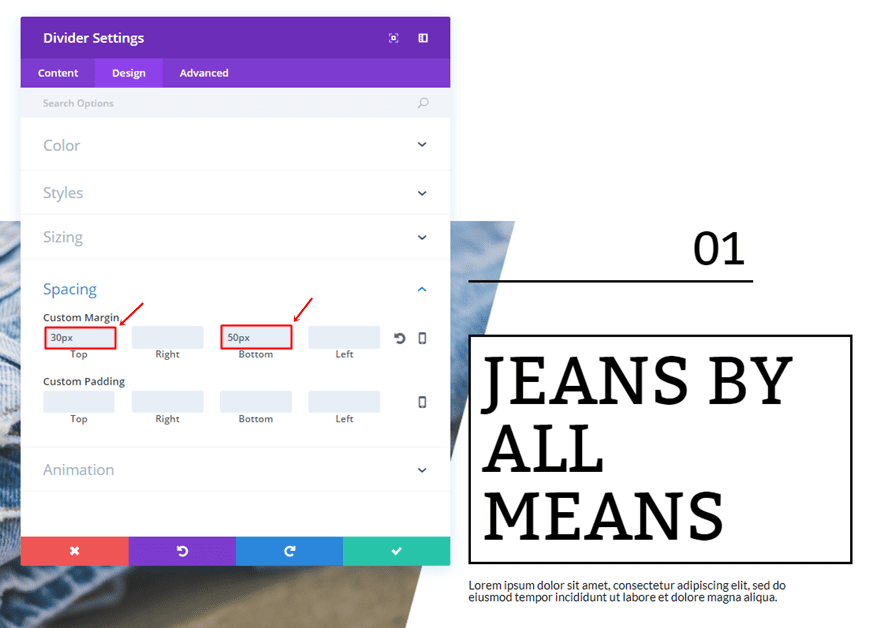
Open the Spacing subcategory and add ’30px’ to the top and bottom padding.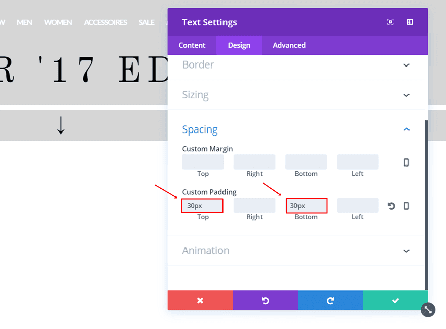
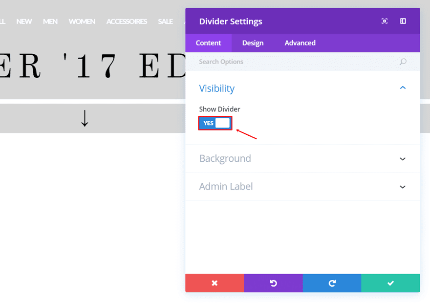
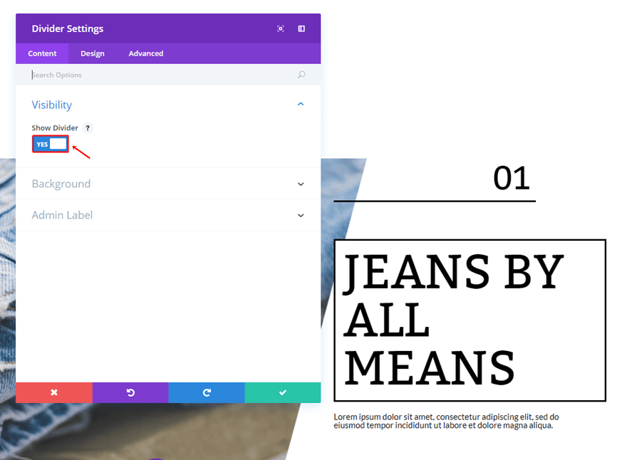
Divider Module
Right below the Text Module, add a Divider Module and enable the ‘Show Divider’ option.
Go to the Design tab and choose ‘#FFFFFF’ as the divider color.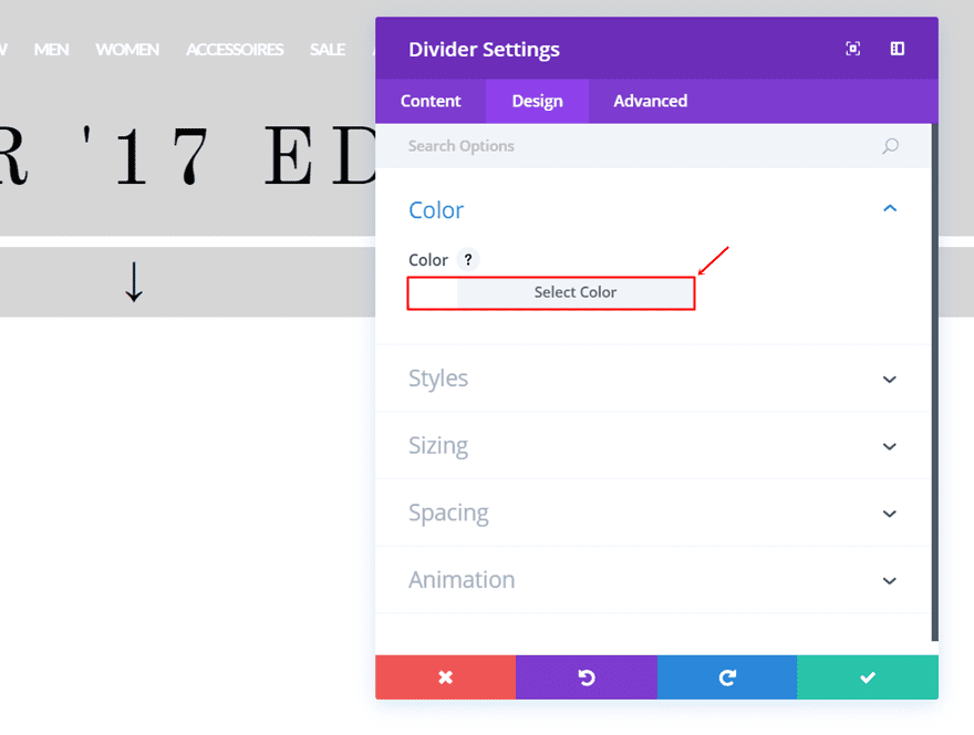
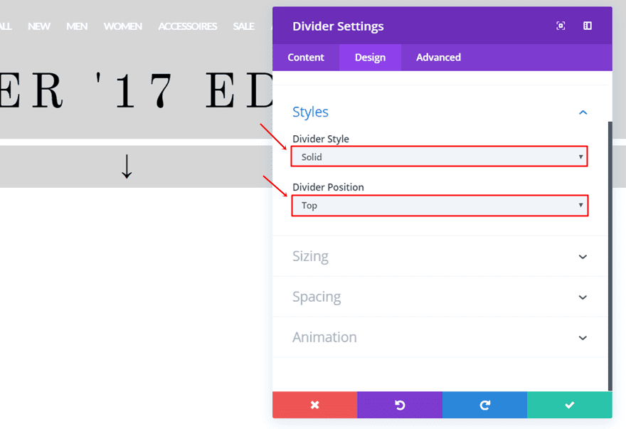
Next, choose ‘Solid’ as the Divider Style and ‘Top’ as the Divider Position within the Styles subcategory.
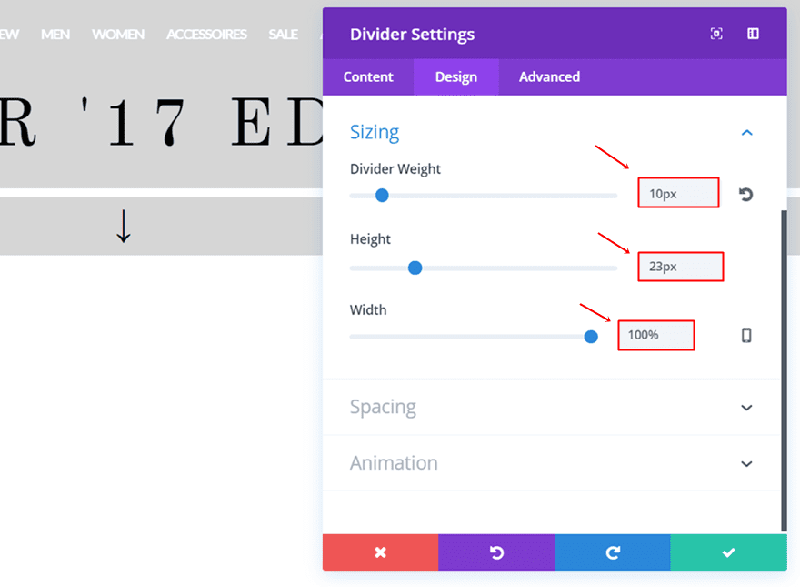
Then, open the Sizing subcategory and make the following settings apply:
- Divider Weight: 10px
- Height: 23px
- Width: 100%
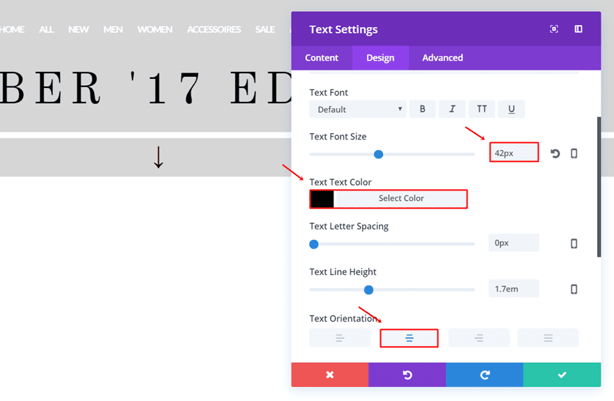
Second Text Module
Right below the Divider Module, add another Text Module. Choose whatever icon you want within your Character Map (Windows) or Character Palette (Mac) and place it in the Content tab. For this example, we’ve used the following symbol: ‘↓’. Then, go to the Design tab and make the following settings apply:
- Text Font Size: 42px
- Text Color: #000000
- Text Orientation: Center
Desktop Fashion Catalogue (New Section)
Now, add another standard section. This section will contain two rows that’ll display a different part of the catalogue on desktop.
Section Settings
Background Color
Use ‘#FFFFFF’ as the background color of this section.
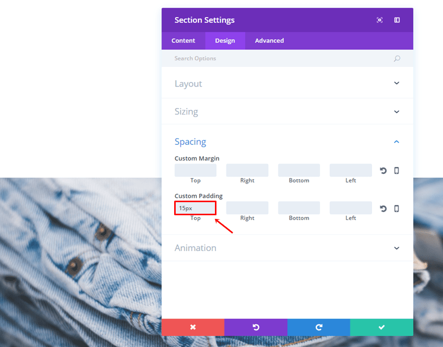
Custom Padding
Then, go to the Design tab and add ’15px’ to the top padding.
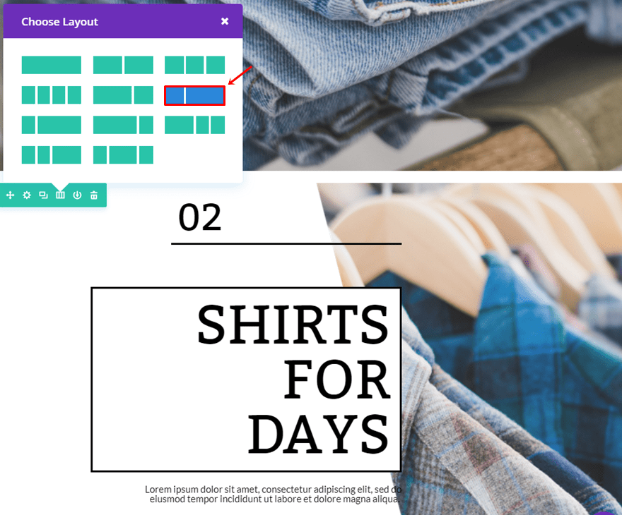
First Row
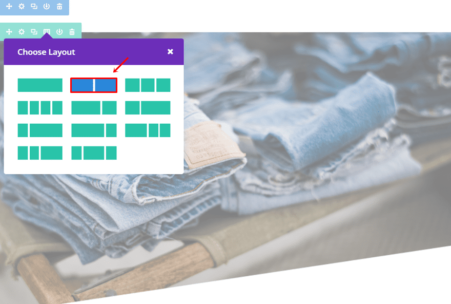
Column Structure
Once you’ve made the changes to the setting, add a row with the following column structure:
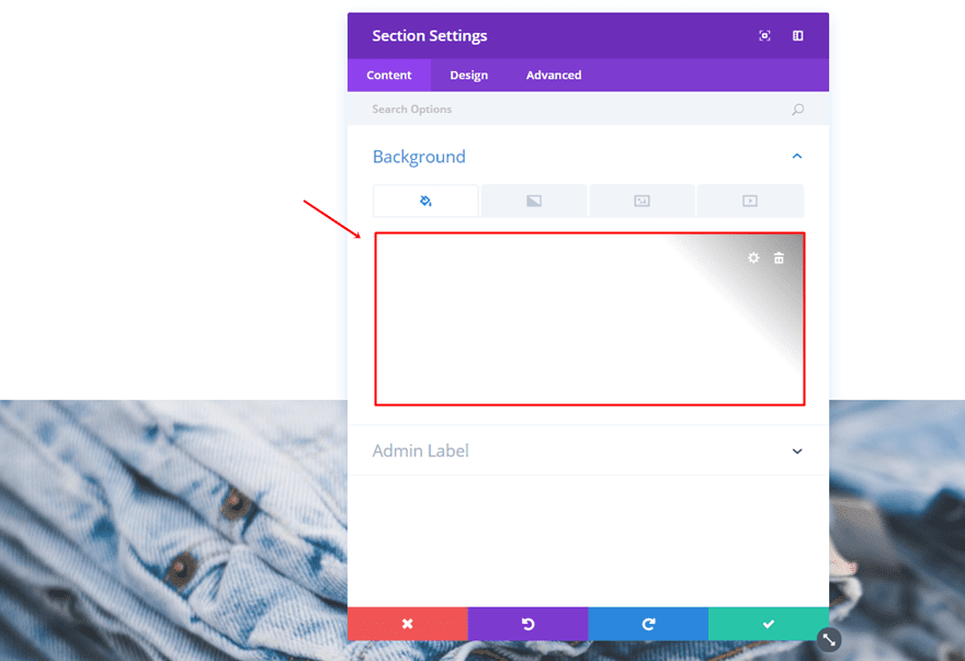
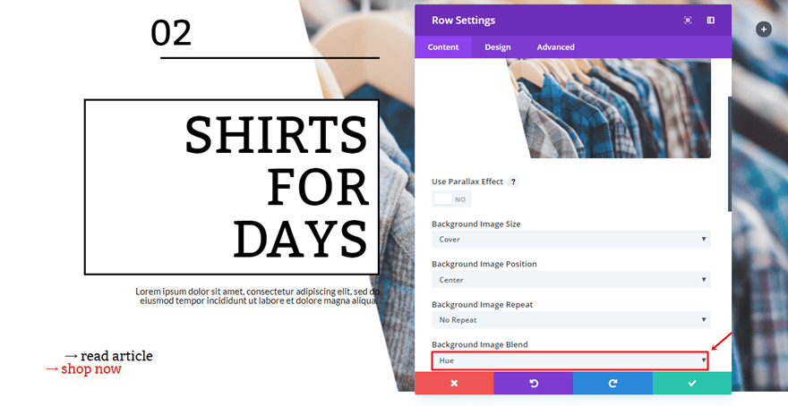
Background Color
Open the row settings and add ‘rgba(255,255,255,0.14)’ as the background color.
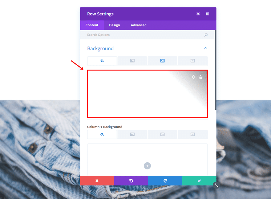
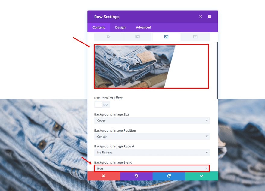
Background Image
Add one of the images you’ve made in the Photoshop part of this post and use ‘Hue’ as the Background Image Blend.
Sizing
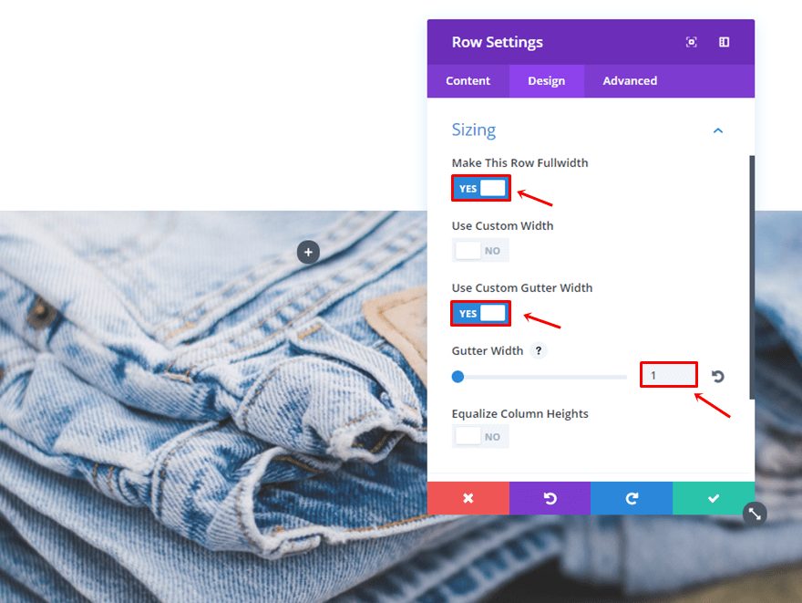
Lastly, make the following changes to the Sizing subcategory:
- Make This Row Fullwidth: Yes
- Use Custom Gutter Width: Yes
- Gutter Width: 1
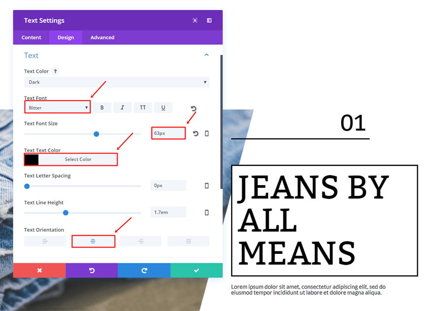
First Text Module
Once you’ve completed the row settings, add a Text Module to the second column. Use the following settings for the Text subcategory:
- Text Font: Bitter
- Text Font Size: 63px
- Text Color: #000000
- Text Orientation: Center
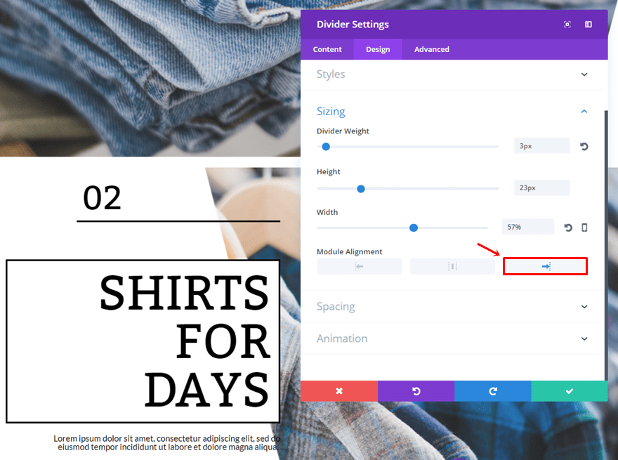
Divider Module
Right below the first Text Module, add a Divider Module and enable the ‘Show Divider’ option.
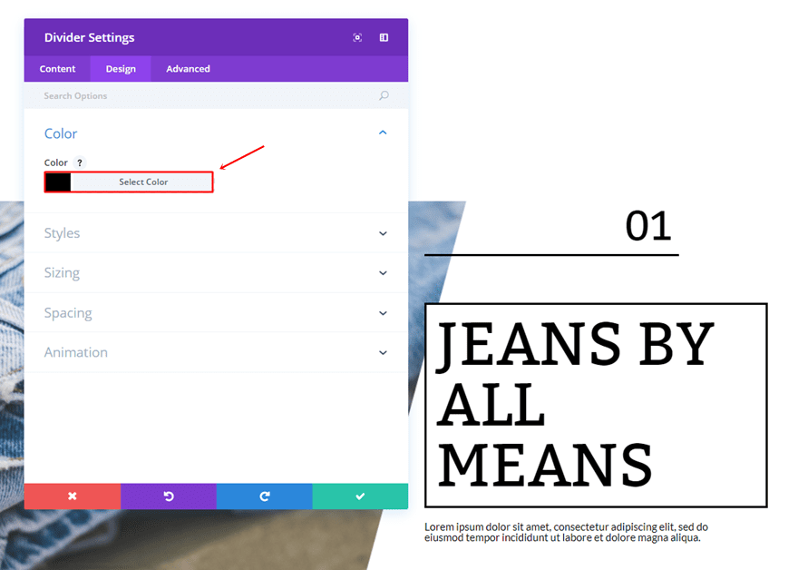
Move on to the Design tab and use ‘#000000’ as the divider color.
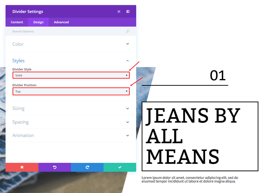
Within the Styles subcategory, use ‘Solid’ as the Divider Style and ‘Top’ as the Divider Position.
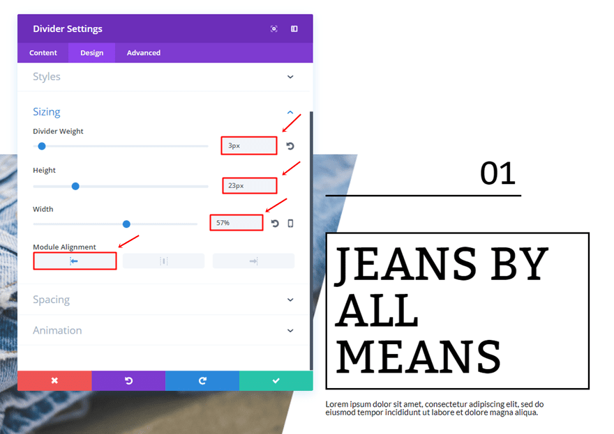
Scroll down the same tab and make the following settings apply to the Sizing subcategory:
- Divider Weight: 3px
- Height: 23px
- Width: 57%
- Module Alignment: Left
Lastly, add a top margin of ’30px’ and a bottom margin of ’50px’.
Second Text Module
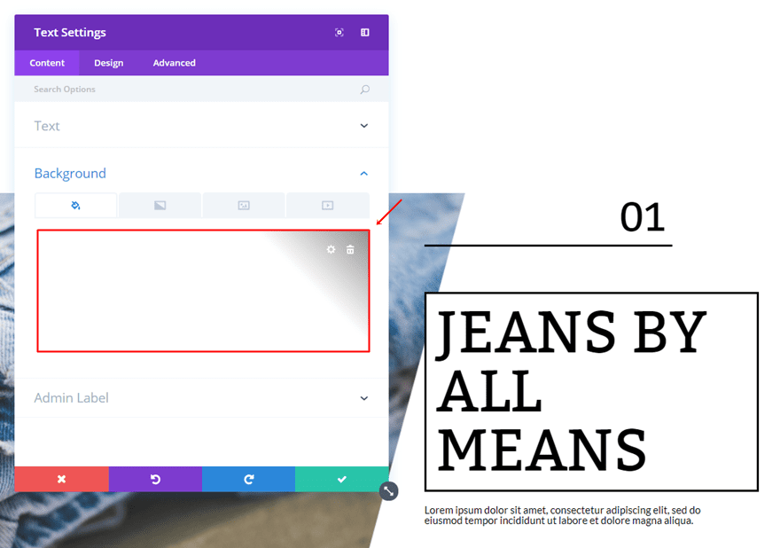
Once the Divider is in place, go ahead and add the second Text Module that’ll contain a title. First of all, use ‘#000000’ as its background color in the Content tab.
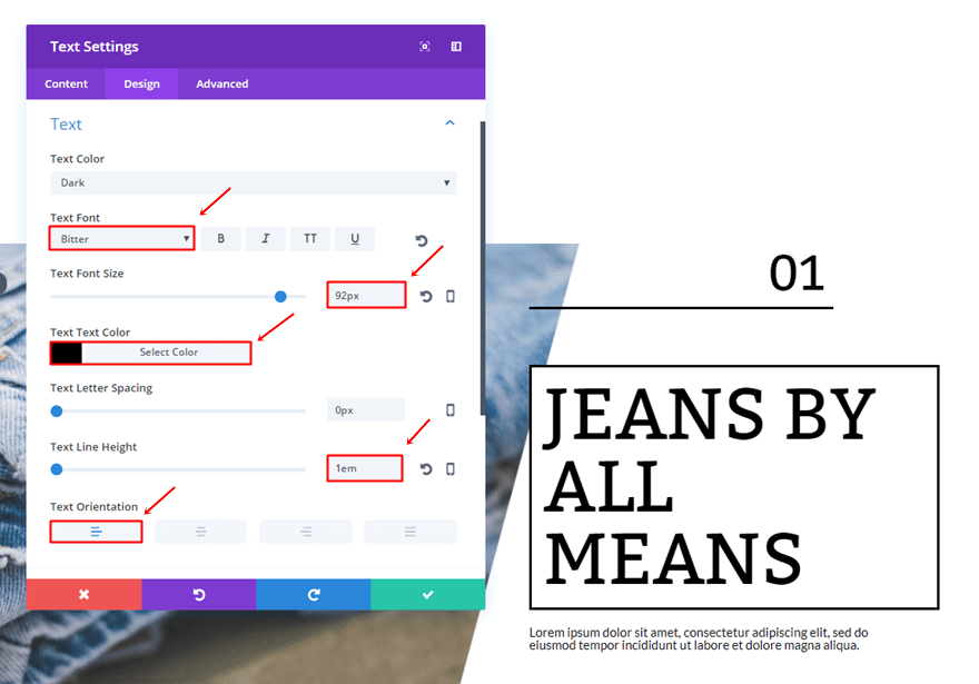
Then, move on to the Design tab and make the following settings apply to the Text subcategory:
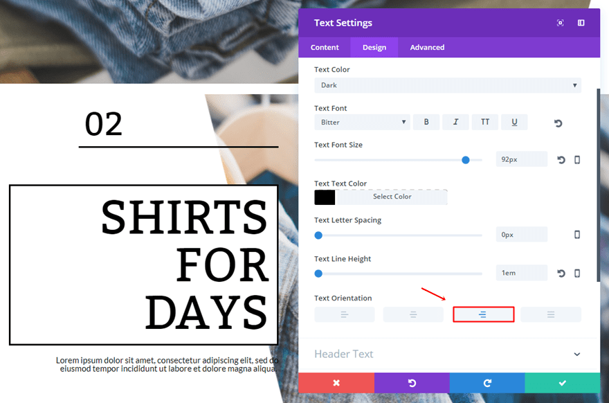
- Text Font: Bitter
- Text Font Size: 92px
- Text Color: #000000
- Text Line Height: 1em
- Text Orientation: Left
Open the Border subcategory and use the following border:
- Use Border: Yes
- Border Color: #000000
- Border Width: 3px
- Border Style: Solid
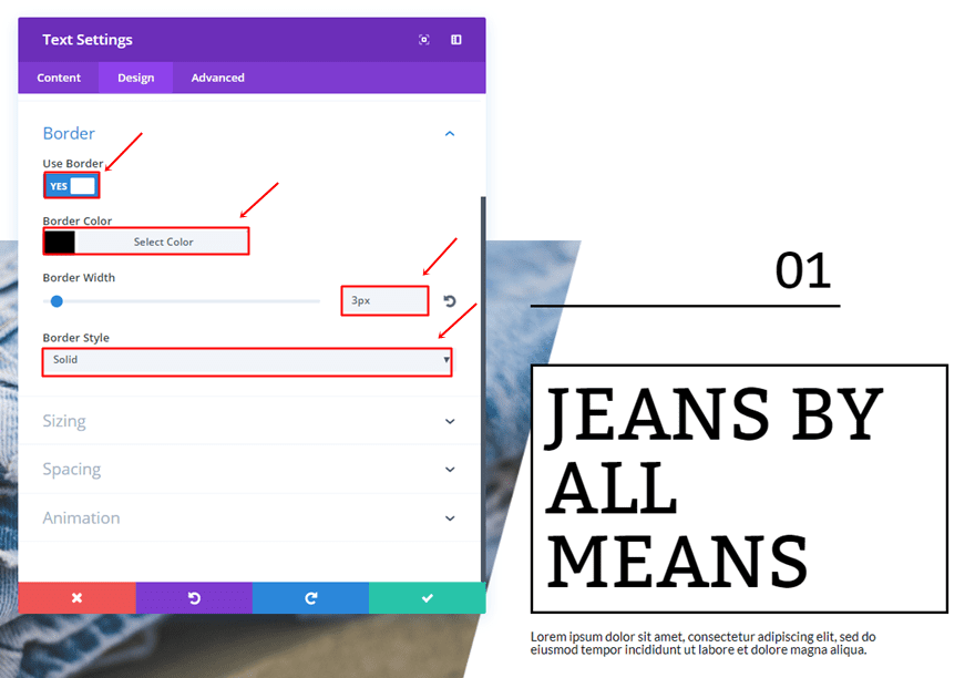
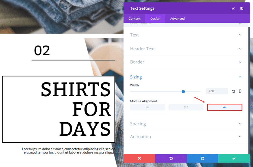
Furthermore, use a Width of ‘77%’ and a left Module Alignment.
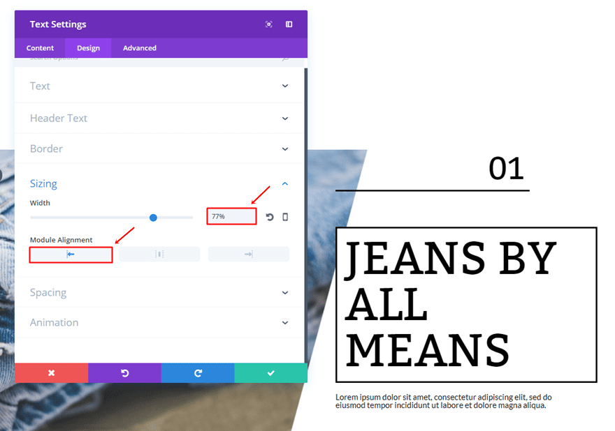
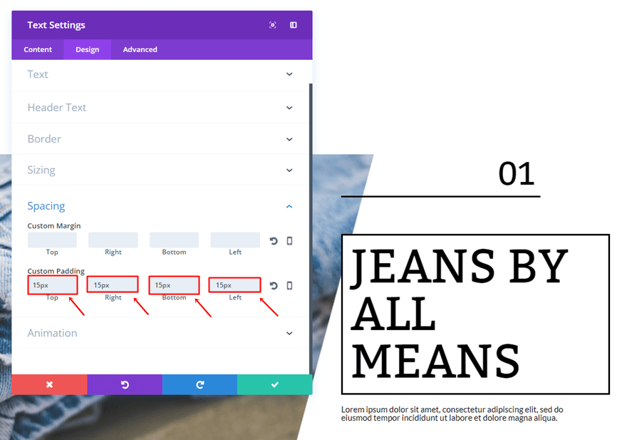
Lastly, add ’15px’ to the top, right, bottom and left padding of the Text Module.
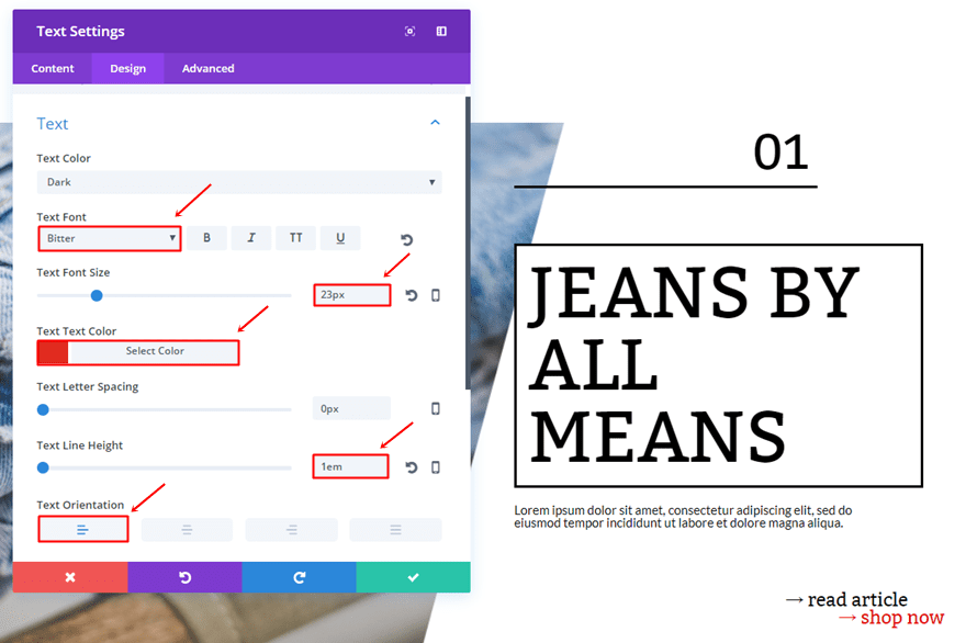
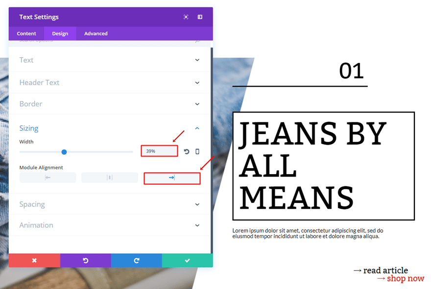
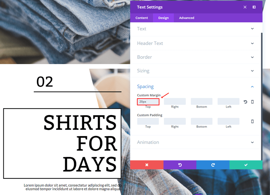
Third Text Module
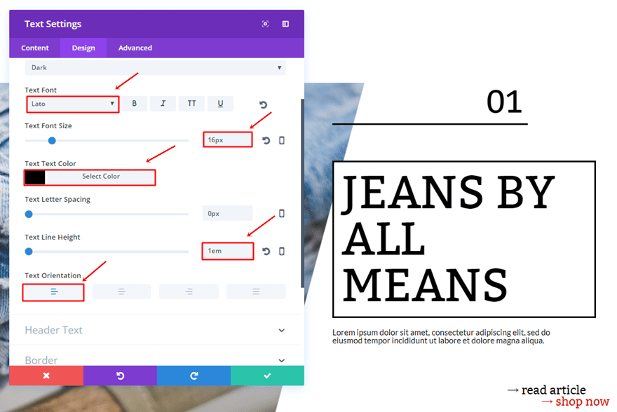
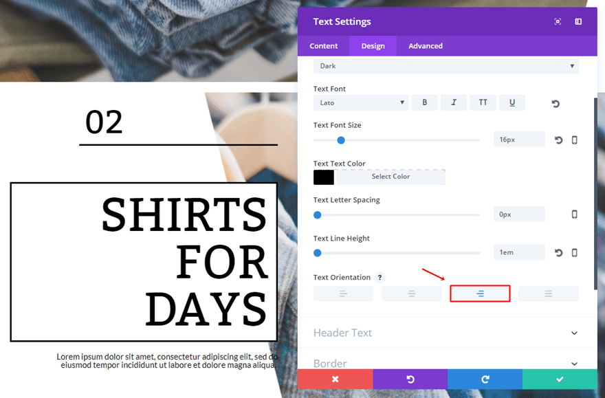
Add another Text Module right below the previous one. This one will represent the description. Go to the Design tab and use the following settings for the Text Subcategory:
- Text Font: Lato
- Text Font Size: 16px
- Text Color: #000000
- Text Line Height: 1em
- Text Orientation: Left
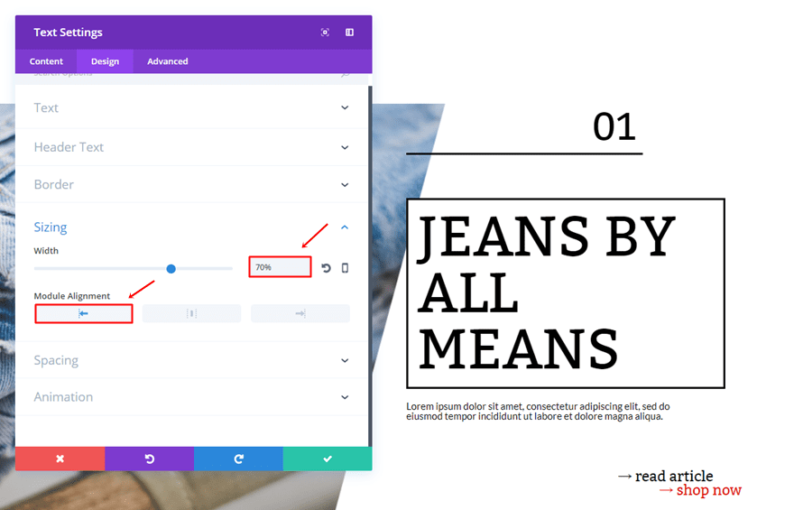
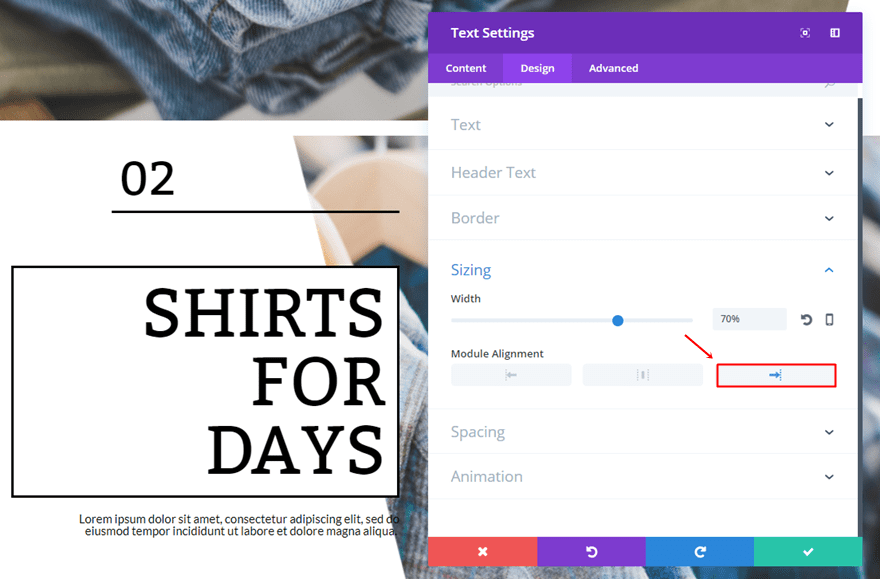
Open the Sizing subcategory, use ‘70%’ for the Width and select the left Module Alignment.
Lastly, add a top margin of ’20px’.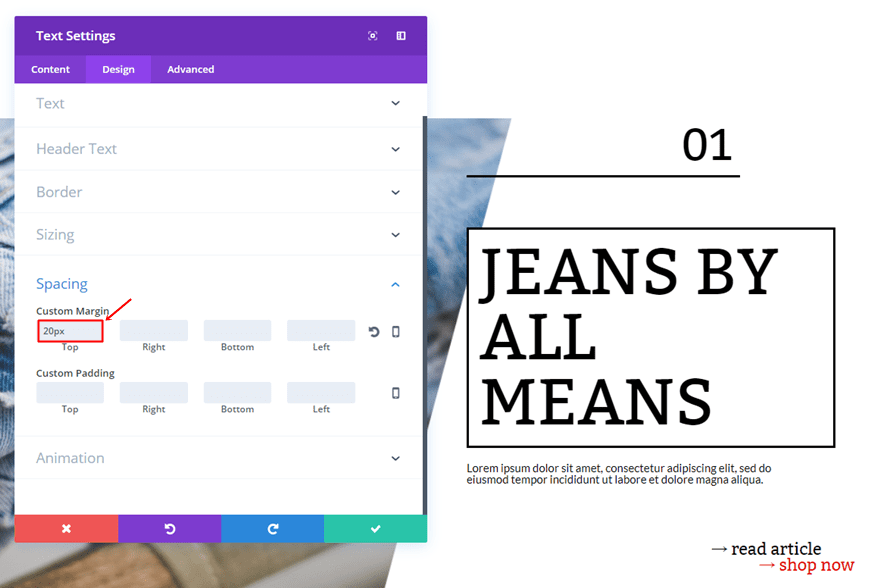
Fifth Text Module
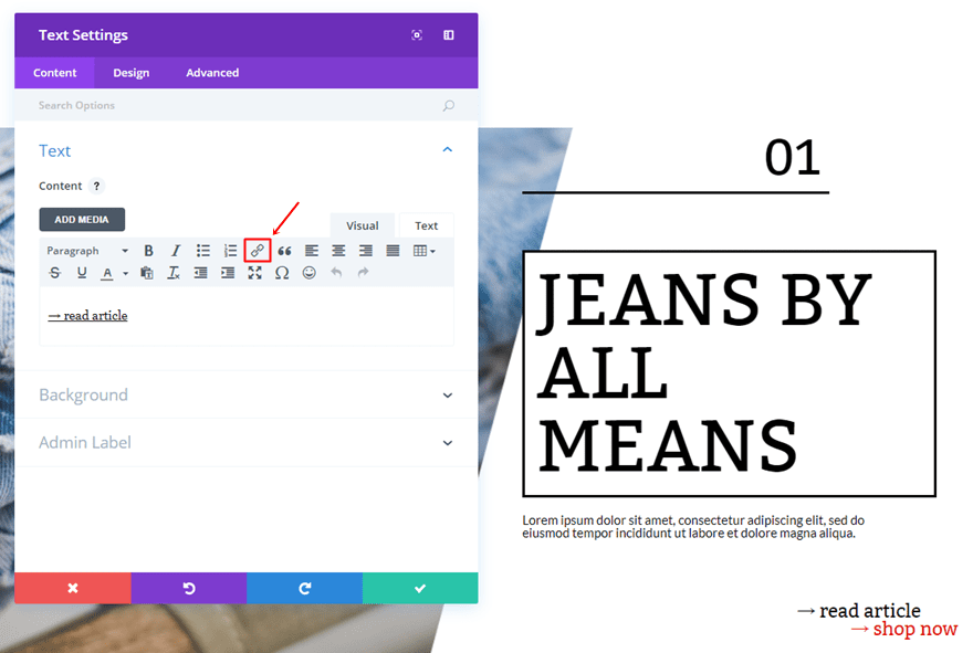
The fifth Text Module serves as a minimalistic button. Within the Content tab, use the ‘→’ symbol + the text and put a link behind it.
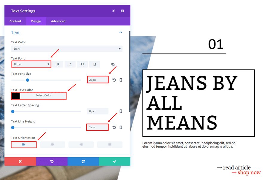
Then, go to the Design tab. Use the following settings for the Text subcategory:
- Text Font: Bitter
- Text Font Size: 23px
- Text color: #000000
- Text Line Height: 1em
- Text Orientation: Left
Scroll down the same tab until you come across the Sizing subcategory. Within that subcategory, use a Width of ‘49%’ and a right Module Alignment.
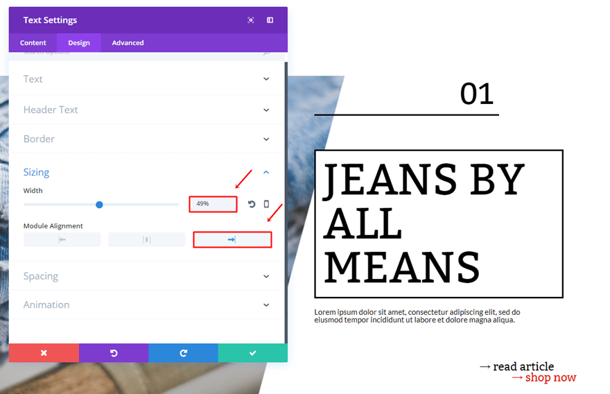
Lastly, add a top margin of ’80px’.
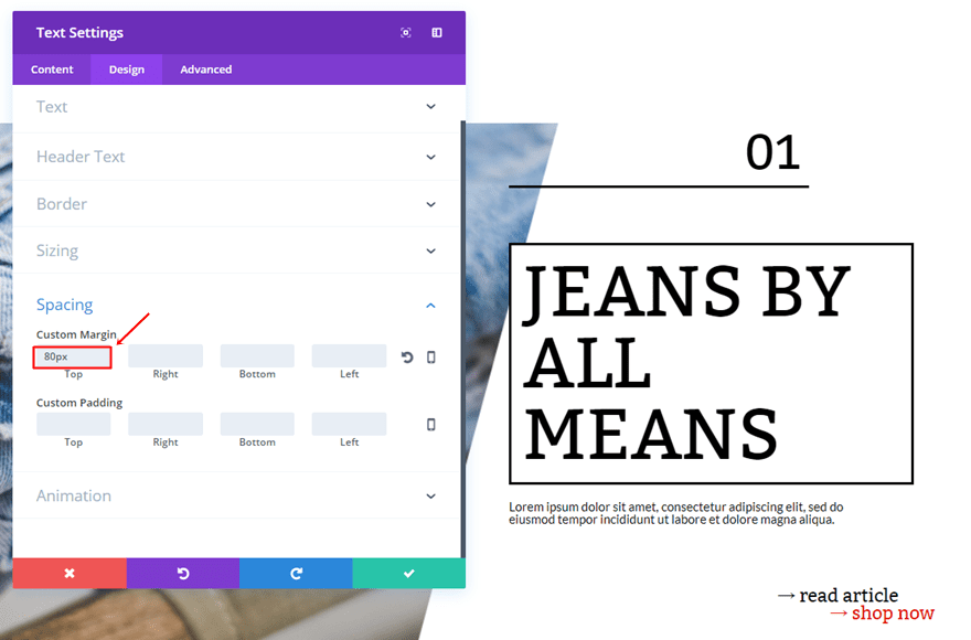
Sixth Text Module
The sixth and the last module we’ll be needing is almost the same as the previous one. Use the ‘→’ + text and put a link behind it.

The settings for the Text Subcategory are the following:
- Text Font: Bitter
- Text Font Size: 23px
- Text Color: #e02b20
- Text Line Height: 1em
- Text Orientation: Left
Change the Width to ‘39%’ and use the right Module Alignment as well.
Second Row
Background Color
Open the row settings and add ‘rgba(255,255,255,0.14)’ as the background color.
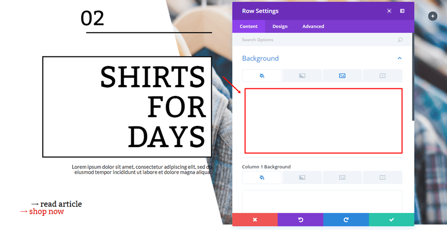
Background Image
Add one of the images you’ve made in the Photoshop part of this post and use ‘Hue’ as the Background Image Blend.
Column Structure
The second row you need to add to the standard section is just the opposite of the previous one.
Clone Modules
The modules we’ve used in the previous row are the same ones we need for this row so go ahead, clone them and place them in the first column instead of the second one. We’ll need to make some alignment changes in the next part of this post.
First Text Module Modifications
Open the first Text Module and add a top margin of ’20px’.
Divider Module Modifications
Then, open the Divider Module and change the Module Alignment within the Sizing subcategory to right.
Second Text Module Modifications
Set the Text Orientation of the second Text Module to right.
And choose a right Module Alignment in the Sizing subcategory as well.
Third Text Module Modifications
The third Text Module will need a right Text Orientation too.
And a right Module Alignment as well.
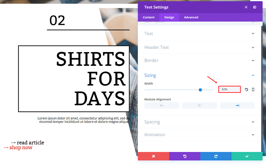
Fifth Text Module Modifications
The only thing you’ll have to do for the fifth Text Module is change the Width into ‘82%’.
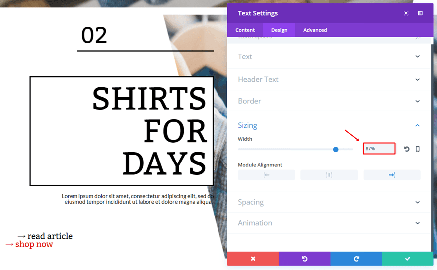
Sixth Text Module Modifications
Same counts for the sixth Text Module but use ‘87%’ instead.
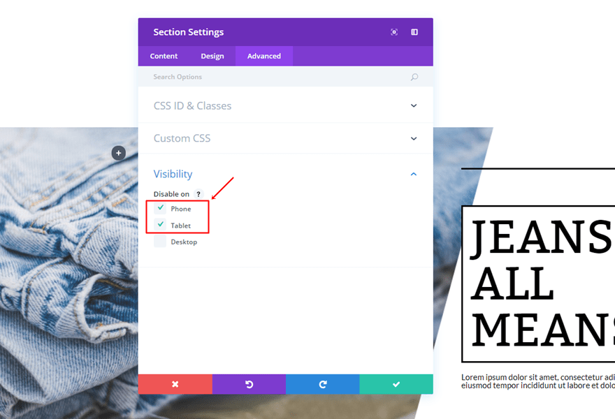
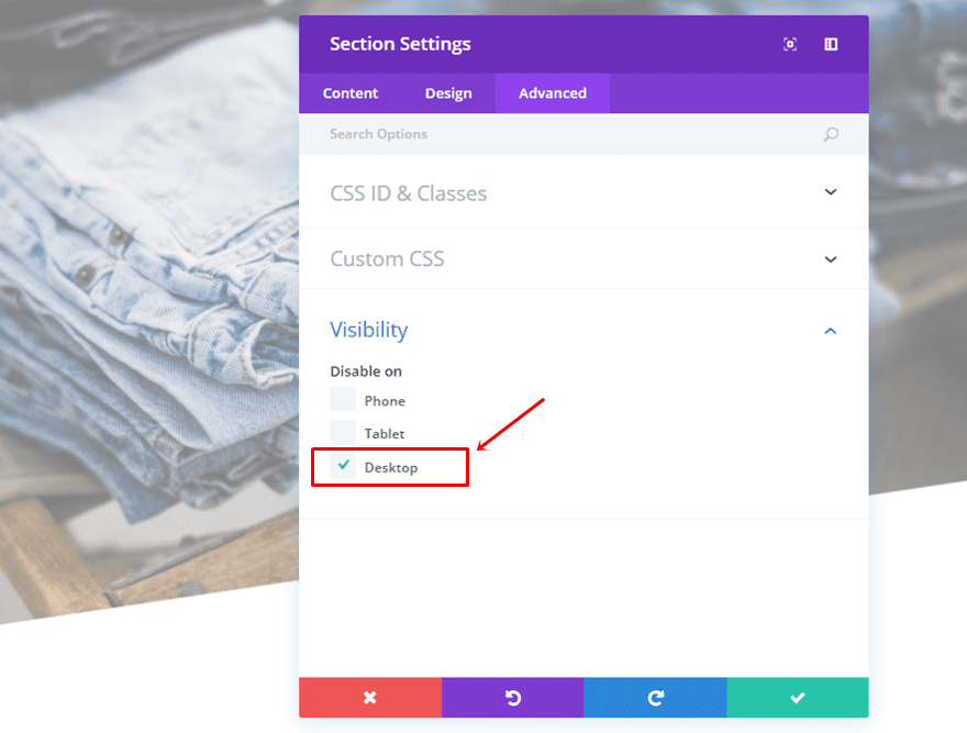
Hide Section for Tablet & Phone
Once you’ve finished the two rows, you can go ahead and disable the whole section on phone and tablet.
Tablet & Phone Catalogue (New Section)
To make everything look great on tablet and phone as well, we’re going to create a new standard section.
Section Settings
Background Color
Add ‘#FFFFFF’ as the background color of that section.
Custom Padding
Move on to the Design tab and add a top padding of ’15px’.
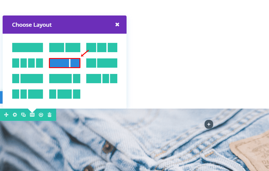
First Row
Column Structure
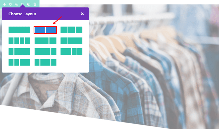
Then, add a two-column row to the section.
Sizing
Go to the Sizing subcategory of that row and make the following changes:
- Make This Row Fullwidth: Yes
- Use Custom Gutter Width: Yes
- Gutter Width: 1
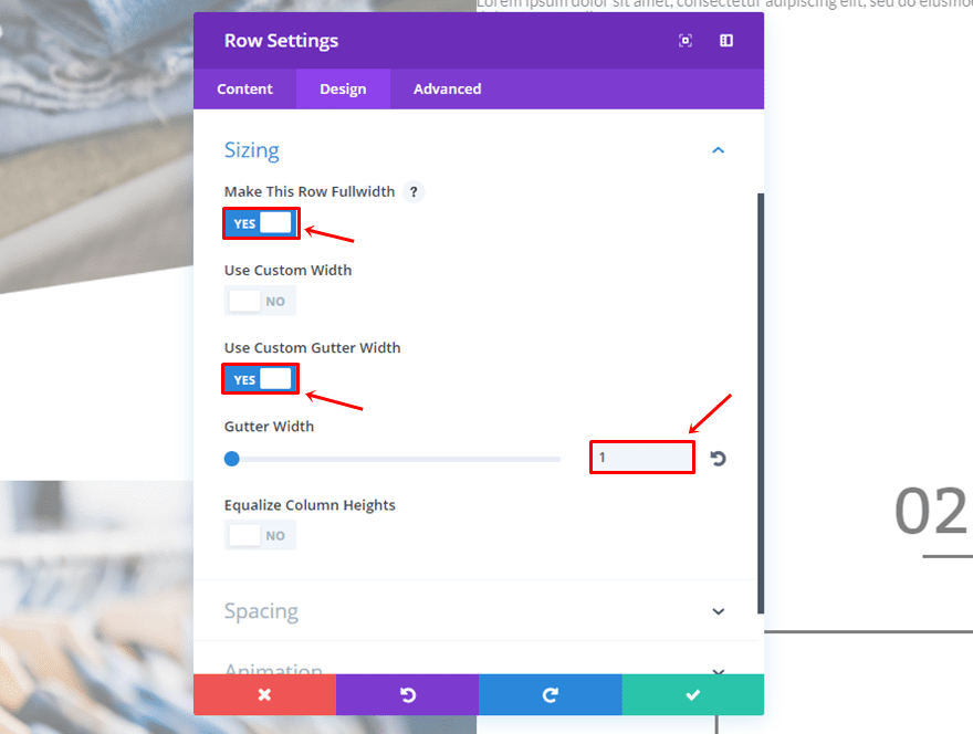
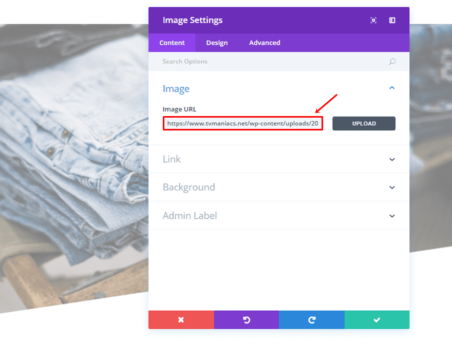
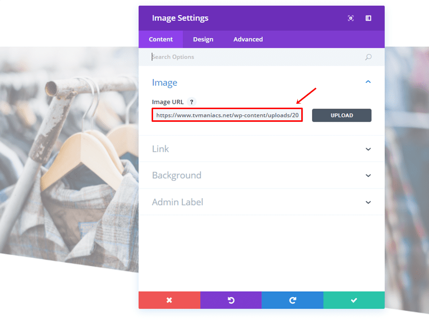
Image Module
Instead of using a background image, we’re going to use an Image Module instead. That way, we’ll be sure that the text and image won’t overlap. Go ahead and add an image module to the first column of the row and upload an image.
Clone Modules of First Row in Desktop Version
Then, clone all of the modules that you’ve used in the first row of the desktop version and place them within the second column.
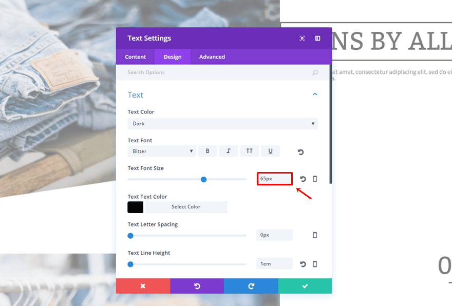
Change Second Text Module Font Size
There’s only one thing that needs to be changed; the font size of the second Text Module. Change it into 65px.
Second Row
Column Structure
Then, go ahead and add another two-column row to the section.
Sizing
This row will need a modified Sizing subcategory as well:
- Make This Row Fullwidth: Yes
- Use Custom Gutter Width: Yes
- Gutter Width: 1
Image Module
Add the Image Module to the first column as well and upload an image.
Clone Modules of Second Row in Desktop Version
Then, go ahead and clone the modules that are placed within the second row of the desktop version. Once you’ve cloned them, place them in the second column of this row.
Change Second Text Module Font Size
The text size of the second Text Module needs to be changed as well. Go ahead and give it a font size of ’65px’.
Hide Section for Desktop
Once you’ve finished both rows, you can go ahead and disable the entire section on desktop.
Result
Et voilà, after following all the steps in this post, you should achieve the following result on desktop:
And the following on phone and tablet:
Final Thoughts
In this post, we’ve shown you how you can create a nice scrolling fashion catalogue. To make our design work, we’ve first shown you how to make a transparent shape within your image with Photoshop. Afterwards, we’ve used these images within our Divi tutorial to create the design. If you have any questions or suggestions; make sure you leave a comment in the comment section below!
Be sure to subscribe to our email newsletter and YouTube channel so that you never miss a big announcement, useful tip, or Divi freebie!
Featured Image by Rvector / shutterstock.com


Any chance you could provide the layout and png’s for this to play around with?
Outstanding work!
Do you have a link to to a demo site so I can see what the final result looks like in my browser?
I am wondering is there any reason that I could not just create an image and have white or whatever colour I wanted instead of the transparency so I could stick with a jpg and therefore have a smaller size?
The antivirus tells me that the GimpShop software has a Trojan, when installing it, will it be true?
thanks for your reply
Yes I’ve heard this from another user Felix.
Try Gimp from gimp.org, that’s the original bit of software.
Yes. Gimpshop has been compromised.
Use regular Gimp if you need something free.
Why are images not loading on this post?
Images not loading is a common issue on the Elegant Themes blog for me too, but not this time. I’m on Safari and haven’t tried using another browser so I don’t know if the issue is an incompatibility with Safari.
Great article and lovely result! Could you have used a background overlay on the images instead of having to edit the images with transparent shapes?
Thanks Dave! Yes, you can use that method as well. I used this way to avoid problems with IE.
or use clip path.
nice 🙂 stupid question, but how to you add symbols in side divi text module?
You can find those in your Character Map (Windows) or Character Palette (Mac).
Good design is always in the details.