

By default, as soon as you switch over to a mobile device, the shop module turns into a one-column layout. Now, if you’re looking to highlight each product individually, that’s great, but with the bigger smartphone screen sizes nowadays, you might want to allow two products to appear next to each other when using the Shop Module. In today’s Divi tutorial, we’ll show you how to change the shop module’s mobile breakpoint using CSS, allowing two products to appear next to each other on most modern smartphones. This is a great tutorial to have within reach if you’re setting up an online shop in the future! You’ll be able to download the design’s JSON file for free as well!
Let’s get to it.
- 1 Preview
- 2 Download The Shop Page Template for FREE
- 3 Download For Free
- 4 You have successfully subscribed. Please check your email address to confirm your subscription and get access to free weekly Divi layout packs!
- 5 1. Go to Divi Theme Builder & Add New Template
- 6 2. Start Building the Template Body
- 7 3. Save All Theme Builder Changes & Preview Result
- 8 Preview
- 9 Final Thoughts
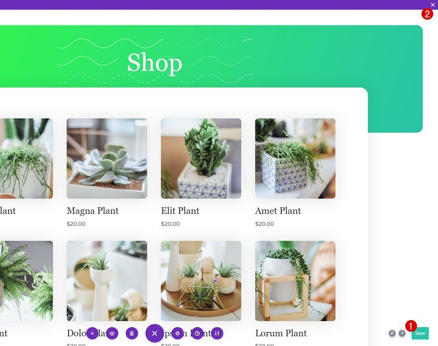
Preview
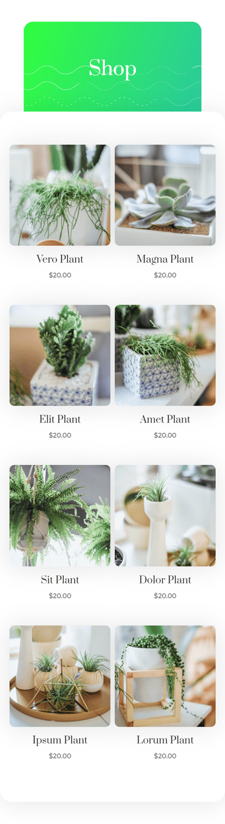
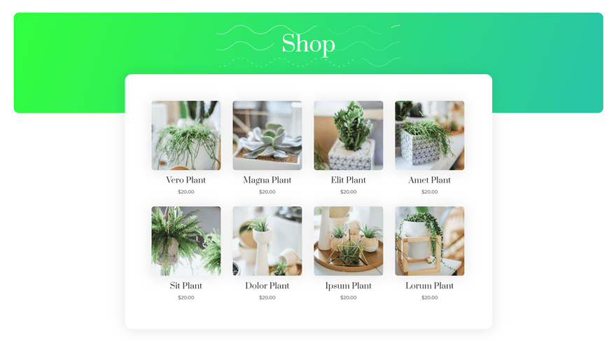
Before we dive into the tutorial, let’s take a quick look at the outcome across different screen sizes.
Mobile
Desktop
Download The Shop Page Template for FREE
To lay your hands on the free shop page template, you will first need to download it using the button below. To gain access to the download you will need to subscribe to our newsletter by using the form below. As a new subscriber, you will receive even more Divi goodness and a free Divi Layout pack every Monday! If you’re already on the list, simply enter your email address below and click download. You will not be “resubscribed” or receive extra emails.

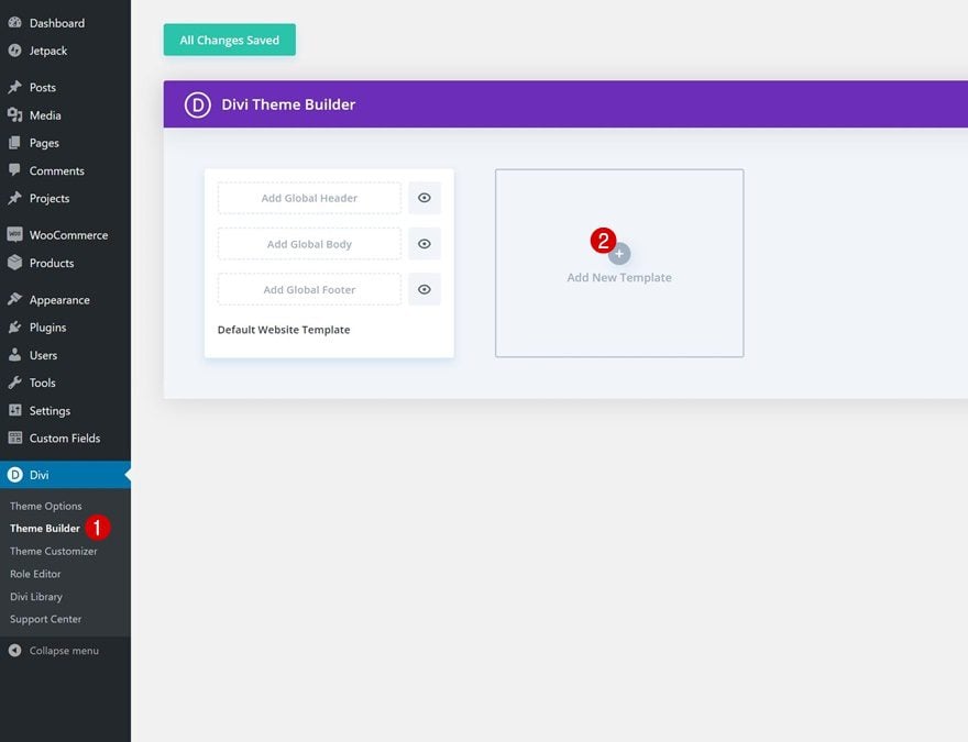
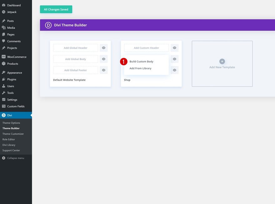
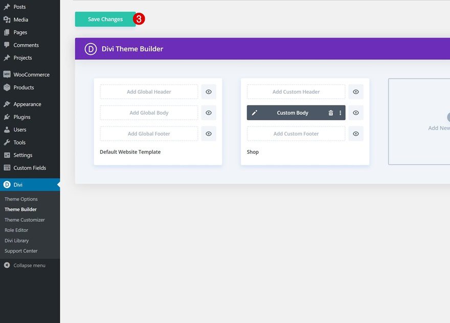
1. Go to Divi Theme Builder & Add New Template
Go to Divi Theme Builder & Add New Template
Start by going to DIvi’s Theme Builder and add a new template.
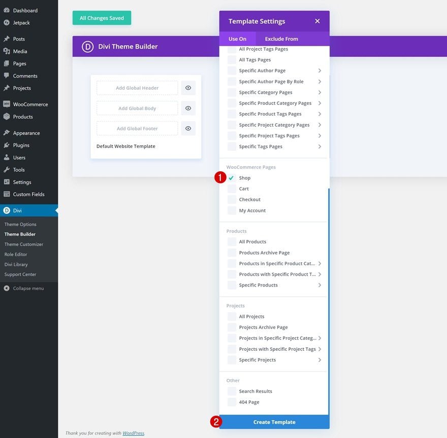
Use Template on Shop Page
Use this new template on your website’s shop page.
- Use On: Shop
Start Building Template Body
And start building the shop template’s body.
2. Start Building the Template Body
Section Settings
Gradient Background
Once inside the template editor, you’ll notice a section. Open that section and use the following gradient background for it:
- Color 1: #32ff3d
- Color 2: #29c4a9
- Gradient Type: Linear
- Gradient Direction: 109deg
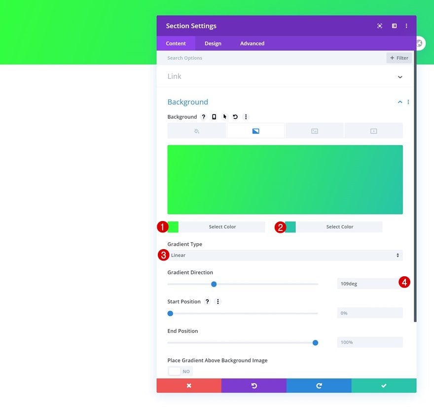
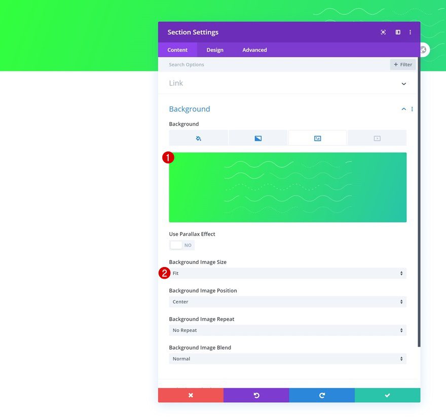
Background Image
Upload a background image as well. You can find the background image we’re using in this tutorial in the download folder you were able to download at the beginning of this post.
- Background Image Size: Fit
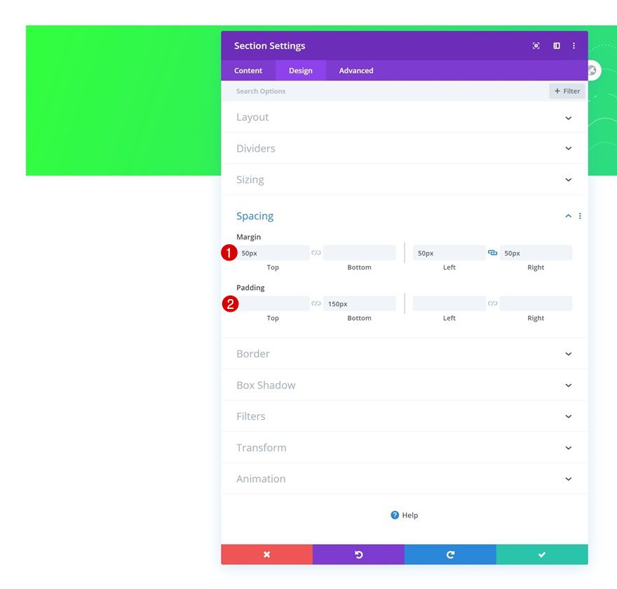
Spacing
Move on to the section’s design tab and modify the spacing values accordingly:
- Top Margin: 50px
- Left Margin: 50px
- Right Margin: 50px
- Bottom Padding: 150px
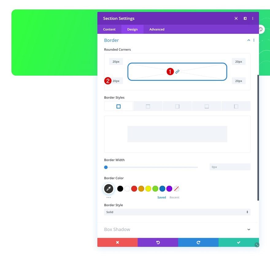
Border
Complete the section settings by adding some border radius.
- All Corners: 20px
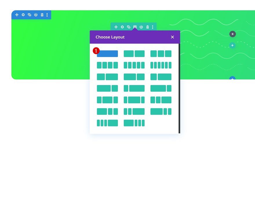
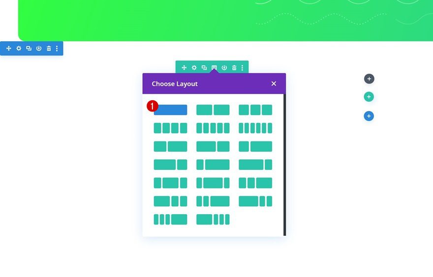
Add New Row
Column Structure
Continue by adding a new row to the section using the following column structure:
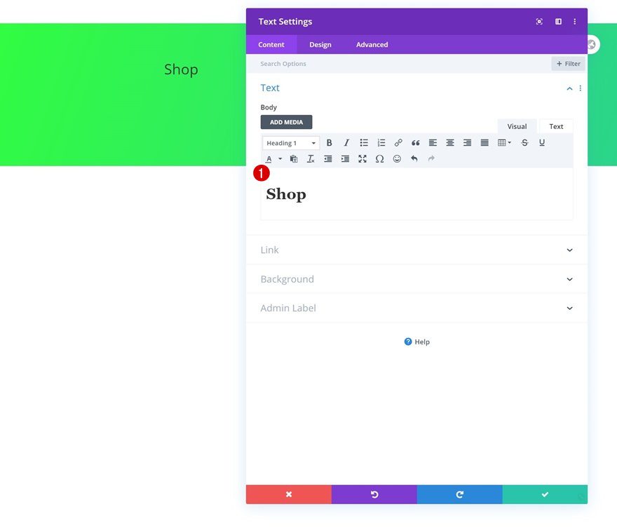
Add Text Module to Column
Add H1 Content
Add a Text Module to the row’s column with some H1 content of your choice.
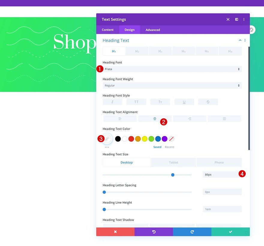
H1 Text Settings
Change the module’s H1 text settings accordingly:
- Heading Font: Prata
- Heading Text Alignment: Center
- Heading Text Color: #ffffff
- Heading Text Size: 80px (Desktop), 60px (Tablet), 40px (Phone)
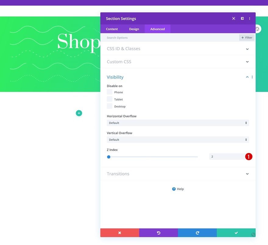
Add Section #2
Z Index
Add another section right below the previous one. Open the section settings and increase the z index.
- Z Index: 2
Add New Row
Column Structure
Then, add a new row using the following column structure:
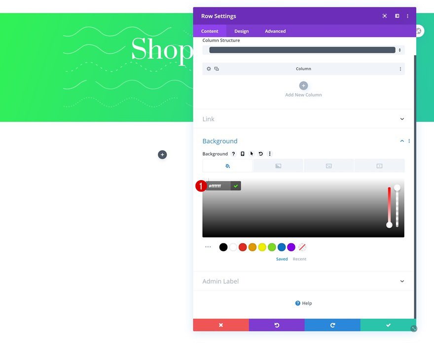
Background Color
Without adding any modules yet, open the row settings and add a background color.
- Background Color: #ffffff
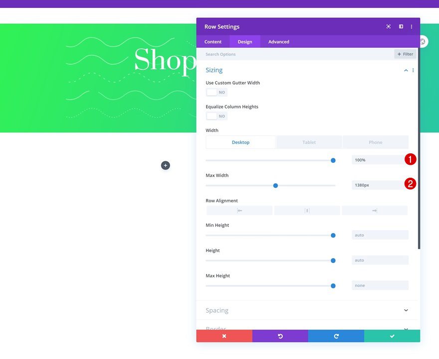
Sizing
Move on to the module’s design tab and modify the sizing settings as follows:
- Width: 100%
- Max Width: 1380px
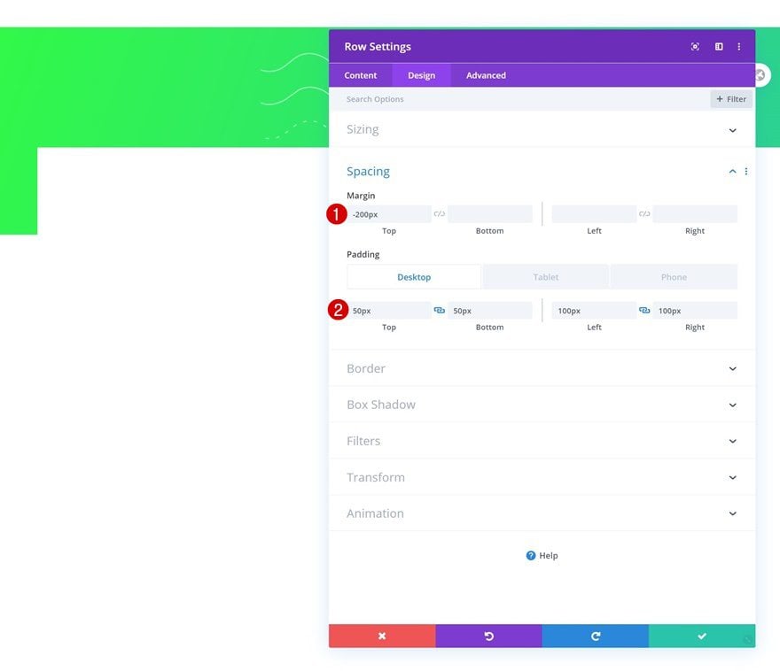
Spacing
Then, add some custom spacing values across different screen sizes.
- Top Margin: 200px
- Top Padding: 50px (Desktop), 20px (Tablet & Phone)
- Bottom Padding: 50px (Desktop), 20px (Tablet & Phone)
- Left Padding: 100px (Desktop), 20px (Tablet & Phone)
- Right Padding: 100px (Desktop), 20px (Tablet & Phone)
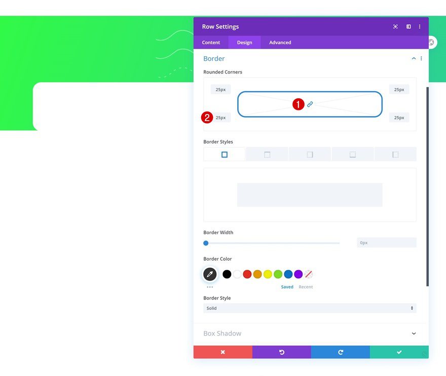
Border
We’re also adding some border radius to the entire row.
- All Corners: 25px
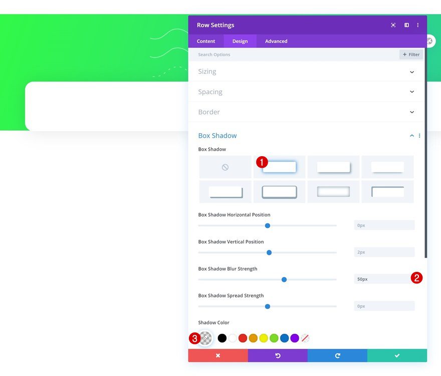
Box Shadow
Complete the row settings by adding a subtle box shadow.
- Box Shadow Blur Strength: 50px
- Shadow Color: rgba(0,0,0,0.1)
Add Shop Module to Column
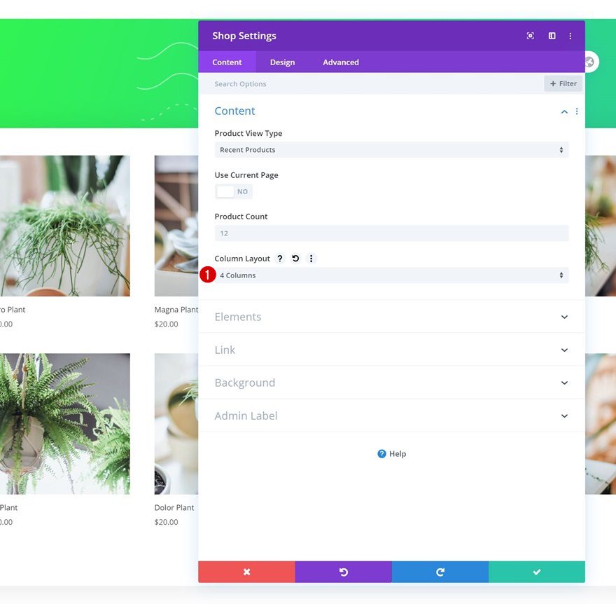
Content
Now, it’s time to insert our Shop Module. We’re using a 4 column layout.
- Column Layout: 4 Columns
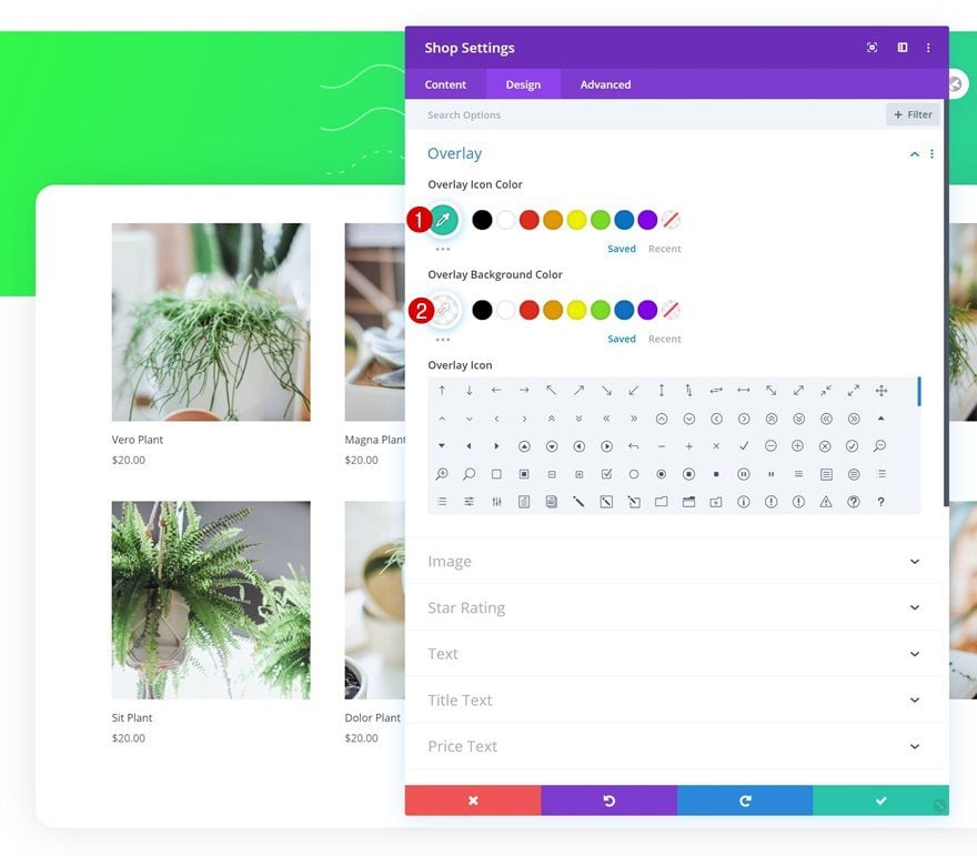
Overlay
Move on to the module’s design tab and change the overlay colors.
- Overlay Icon Color: #29c6a6
- Overlay Background Color: rgba(255,255,255,0.75)
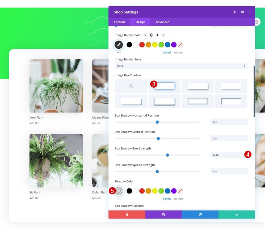
Image
Change the image settings too.
- All Corners: 10px
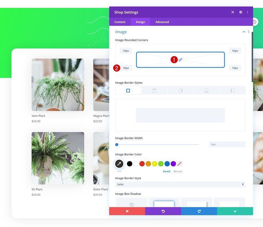
- Box Shadow Blur Strength: 50px
- Shadow Color: rgba(0,0,0,0.11)
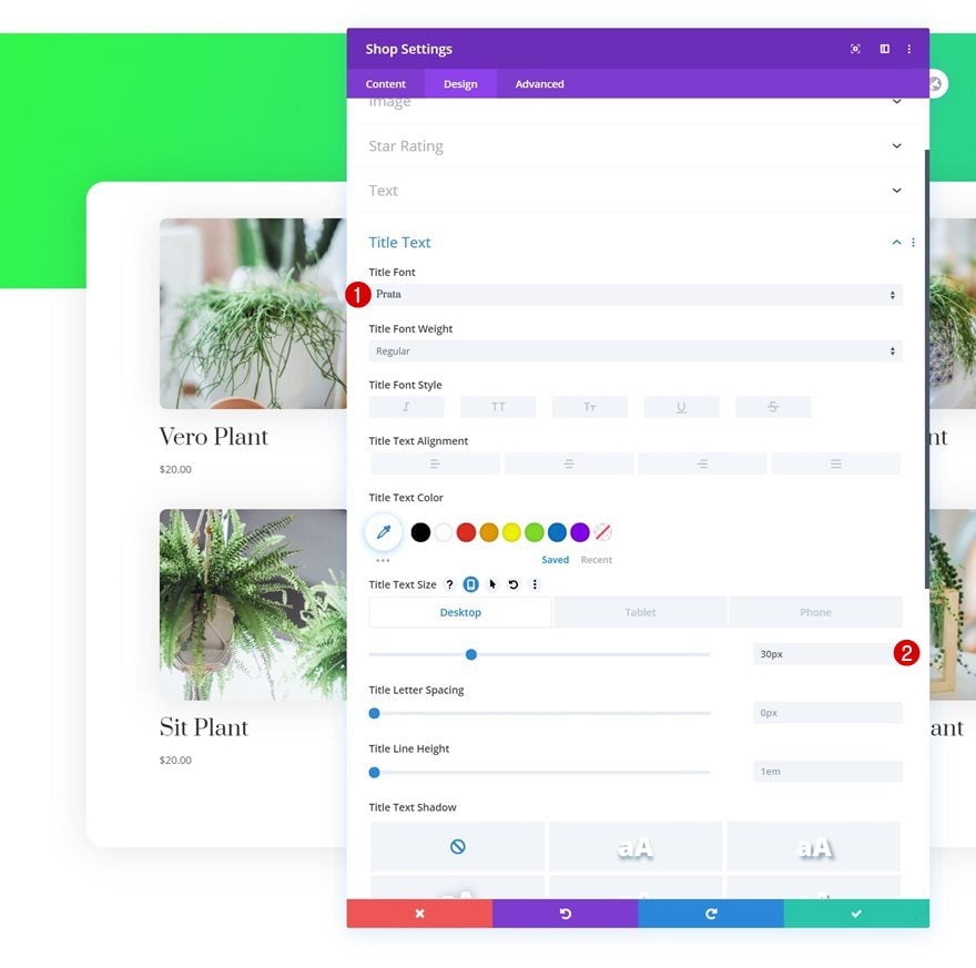
Title Text Settings
Continue by modifying the title text settings accordingly:
- Title Font: Prata
- Title Text Size: 30px (Desktop), 25px (Tablet), 20px (Phone)
Price Text Settings
Next, make some changes to the price text settings.
- Price Font: Montserrat
- Price Font Weight: Medium
- Price Text Size: 18px (Desktop), 16px (Tablet), 14px (Phone)
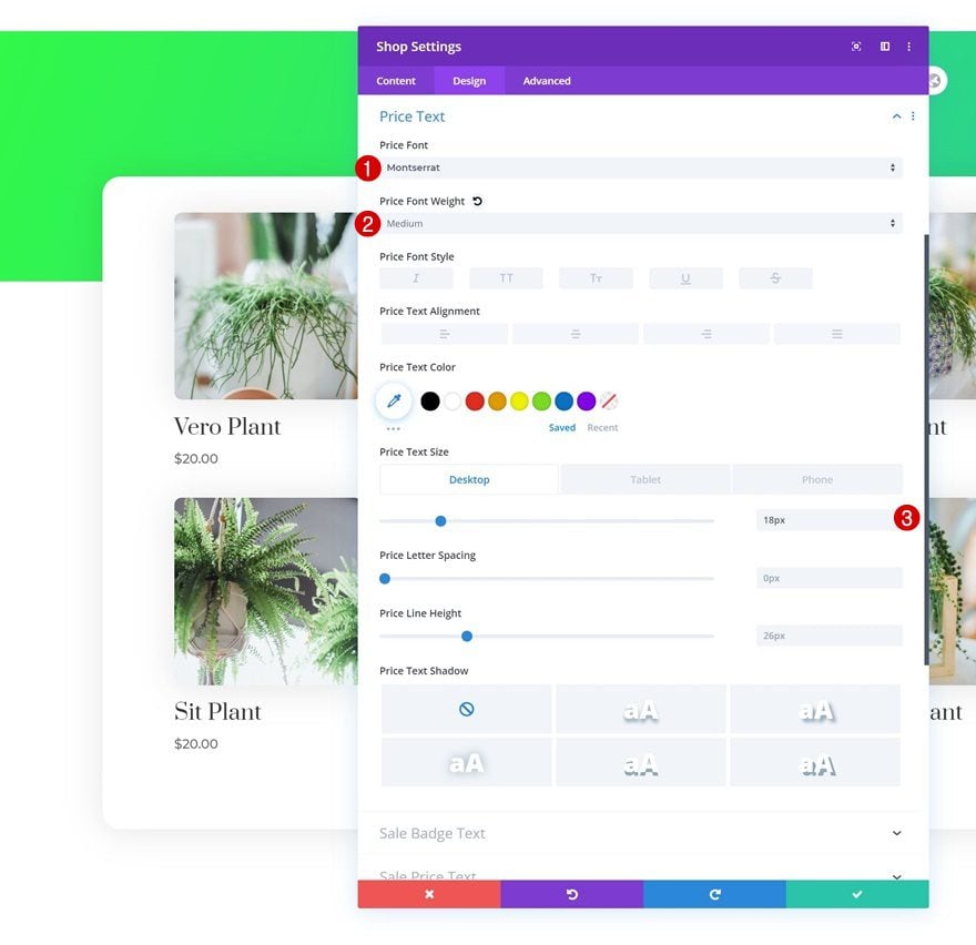
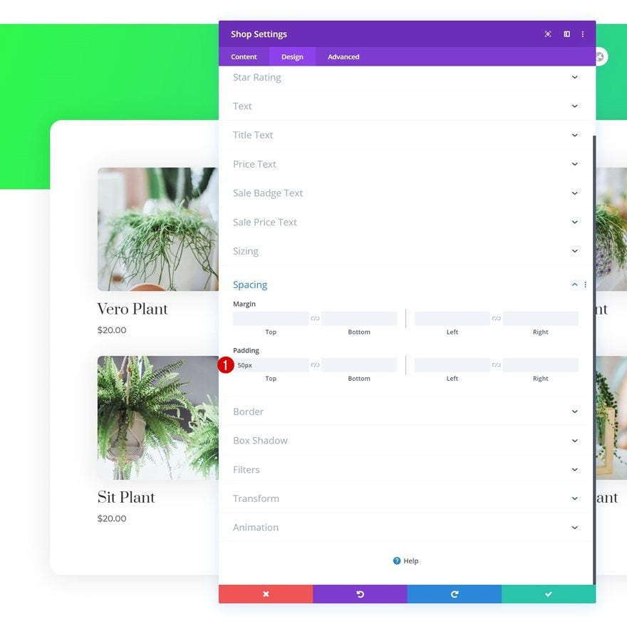
Spacing
Complete the module settings by adding some top padding.
- Top Padding: 50px
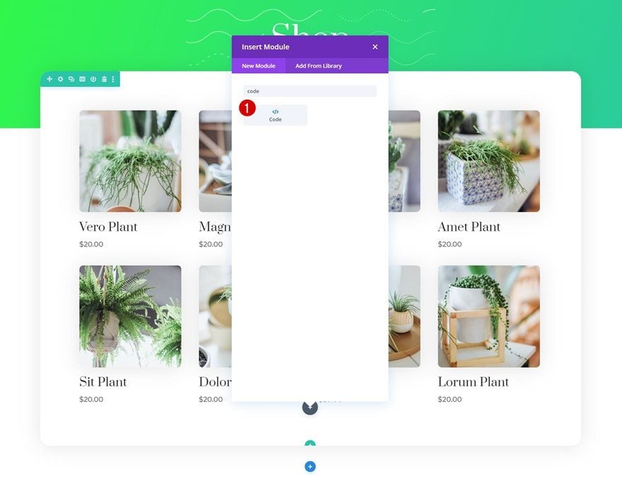
Add Code Module to Column
Once you’ve completed the overall Shop Module design, it’s time to modify the Shop Module mobile column breakpoint using CSS. We’ll add the CSS code to a Code Module inside our design. Go ahead and add a new Code Module right below the Shop Module.
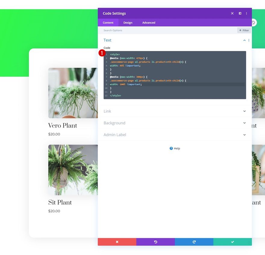
Insert CSS Code
We’re reducing the one-column mobile breakpoint to 300px width. This means that most modern smartphones will display two products next to each other instead of one. To make this happen, we’ll add the following lines of CSS code to the Code Module:
<style>
@media (max-width: 479px) {
.woocommerce-page ul.products li.product:nth-child(n) {
width: 49% !important;
}
}
@media (max-width: 300px) {
.woocommerce-page ul.products li.product:nth-child(n) {
width: 100% !important;
}
}
</style>
3. Save All Theme Builder Changes & Preview Result
Once you’ve completed the shop page design and added the CSS code to change the mobile breakpoint, you can save all Theme Builder changes and view the outcome on your shop page!
Preview
Now that we’ve gone through all steps, let’s take a final look at the outcome across different screen sizes.
Mobile
Desktop
Final Thoughts
In this post, we’ve shown you how to change the shop module’s mobile column breakpoint, which allows you to show two products next to each other on most modern smartphones nowadays. This is an excellent way to reduce the mobile scrolling that’s required and show your visitors more products at once. You were able to download the JSON file for free as well! If you have any questions, feel free to leave a comment in the comment section below.
If you’re eager to learn more about Divi and get more Divi freebies, make sure you subscribe to our email newsletter and YouTube channel so you’ll always be one of the first people to know and get benefits from this free content.


I want my products to go from 3column to 1 column in mobile view. Does anyone have a resource or tutorial on how to do that?
This doesn’t work any longer. Probably sth has changed in theme styling that prevent your custom css to work
H1 Text Settings
Change the module’s H1 text settings accordingly:
Heading Font: Prata
Heading Text Alignment: Center
Heading Text Color: #ffffff
Heading Text Size: 80px (Desktop), 60px (Tablet), 40px (Phone)
Donjete:
The above is from your article.
What’s the point of having predefined heading settings H1, etc anywhere – custom css, default Divi – if they may be altered willy-nilly based on the whim of the module creator. Professor Mak is constantly doing it – “ah that looks better”. With this approach the so called Heading, something that should have a defined constant value wherever it occurs – is in reality no more than body text. IMHO
Very nice idea! Thanks. Small corrction. Top margin was wrong in the article (negative margin not positive 🙂 Top Margin: -200px )
Thanks 😉
This is super helpful! Thanks. It would be great to see a more generic version of this that shows how to do this easily for any column of content. There are numerous times where I’d like to have items that end up in a single column on mobile actually display in two columns. It would even be great to see a setting in the modules for that.