
If you’re going for a clean design style when building a new website, you’ll most likely want to find a way to still add an extra dimension to your website. This tutorial will be all about that. We’ll show you how to use Divi and its sticky options to change sticky styles without movement. Specifically, this means that as soon as visitors scroll past a certain part of your page, the styles of that part will change but the elements will stay in place. This type of effect is completely focused on user behavior. The change of sticky styles only happens when people scroll past it, which gives a beautiful outcome. In this tutorial, we’ll show you step by step how to get there. Once you get the approach, you’ll be able to use it in any kind of design you build! You’ll be able to download the JSON file for free as well.
Let’s get to it.
Preview
Before we dive into the tutorial, let’s take a quick look at the outcome across different screen sizes.
Desktop
Mobile

Download The Layout for FREE
To lay your hands on the free layout, you will first need to download it using the button below. To gain access to the download you will need to subscribe to our newsletter by using the form below. As a new subscriber, you will receive even more Divi goodness and a free Divi Layout pack every Monday! If you’re already on the list, simply enter your email address below and click download. You will not be “resubscribed” or receive extra emails.

1. Create Element Structure
Add New Section
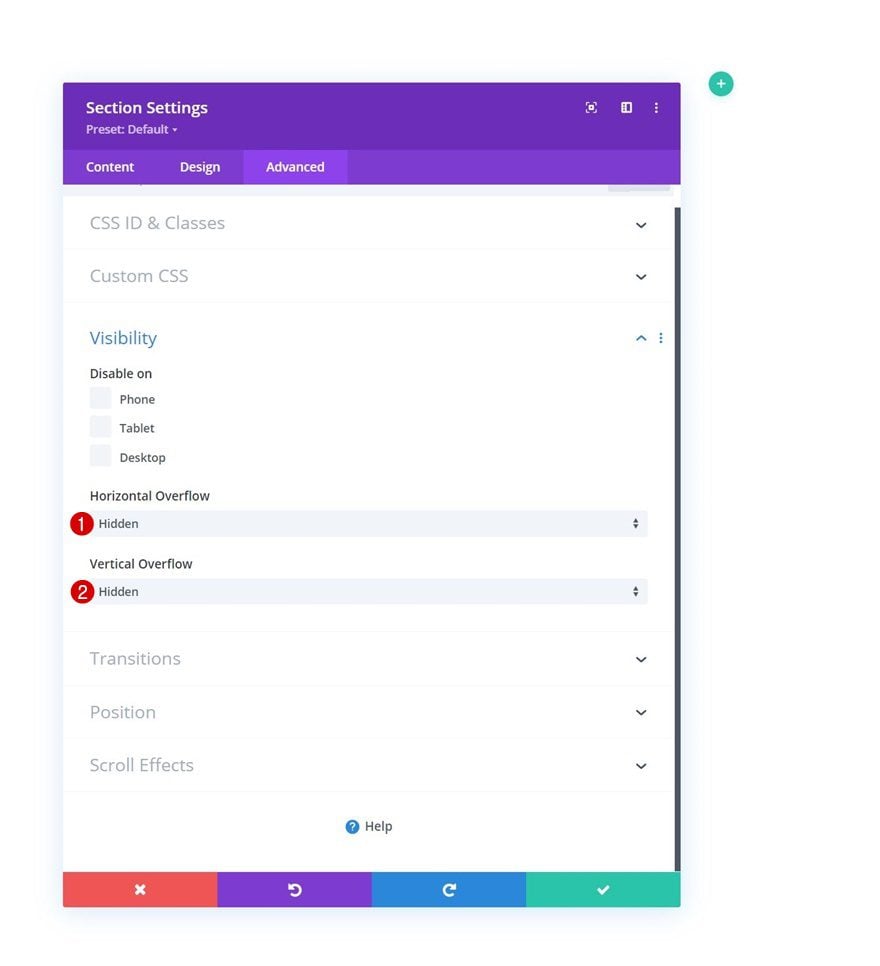
Visibility
Start by adding a new section to the page you’re working on. Open the section settings and hide the overflows in the advanced tab. This will help ensure no horizontal scrollbar appears.
- Horizontal Overflow: Hidden
- Vertical Overflow: Hidden
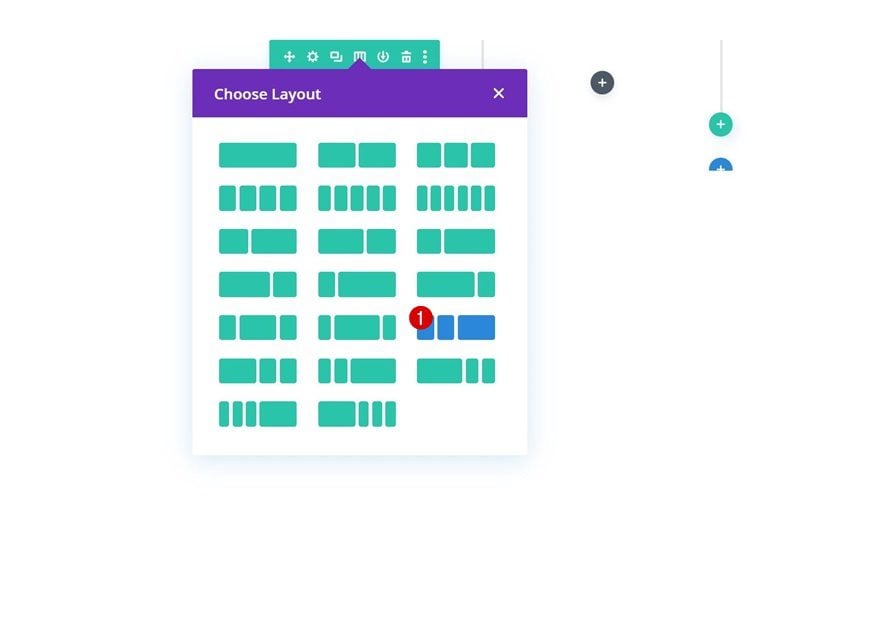
Add New Row
Column Structure
Continue by adding a new row to the section using the following column structure:
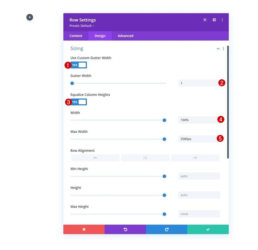
Sizing
Without adding any modules, open the row settings and modify the sizing settings accordingly:
- Use Custom Gutter Width: Yes
- Gutter Width: 1
- Equalize Column Heights: Yes
- Width: 100%
- Max Width: 2580px
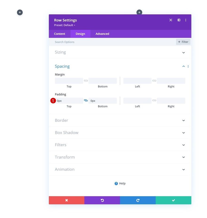
Spacing
Remove all default top and bottom padding next.
- Top Padding: 0px
- Bottom Padding: 0px
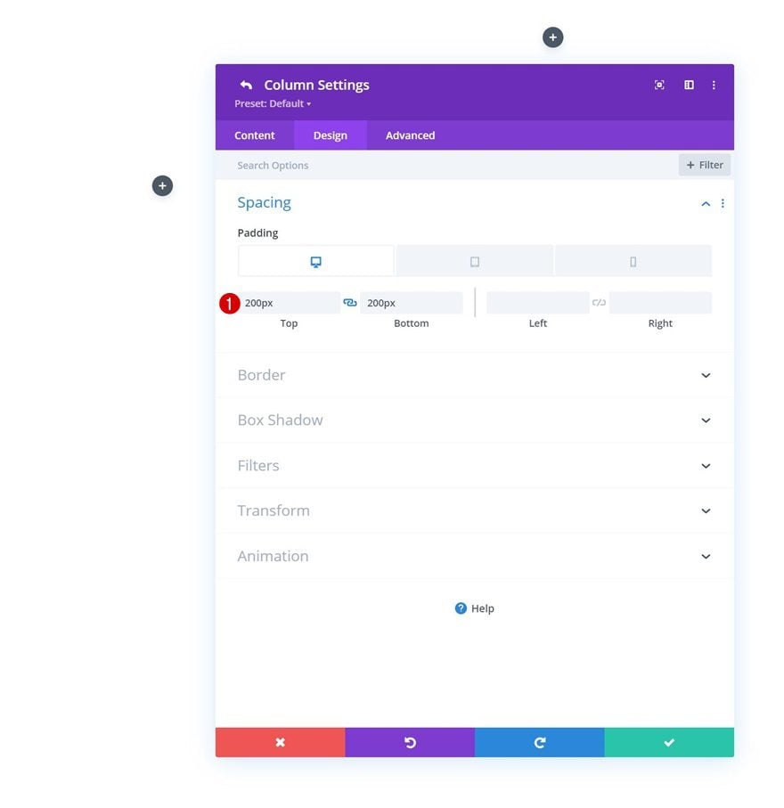
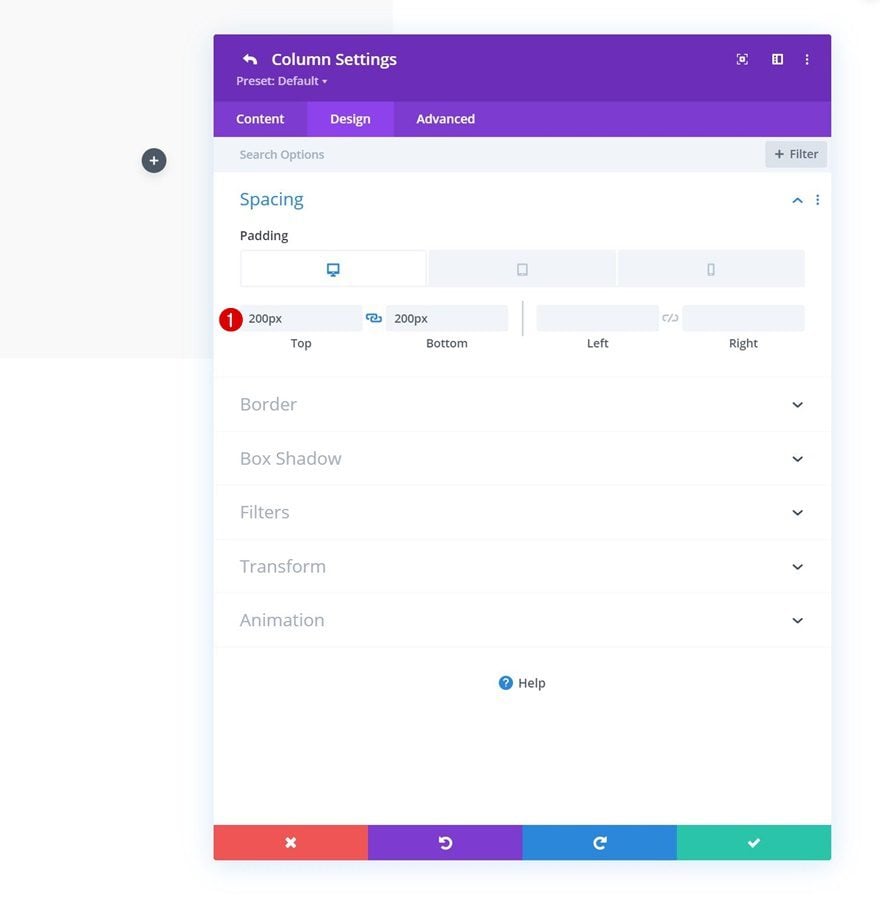
Column 1 Settings
Spacing
Then, open the column 1 settings and apply some custom padding values across different screen sizes.
- Top Padding:
- Desktop: 200px
- Tablet: 100px
- Phone: 80px
- Bottom Padding:
- Desktop: 200px
- Tablet: 100px
- Phone: 80px
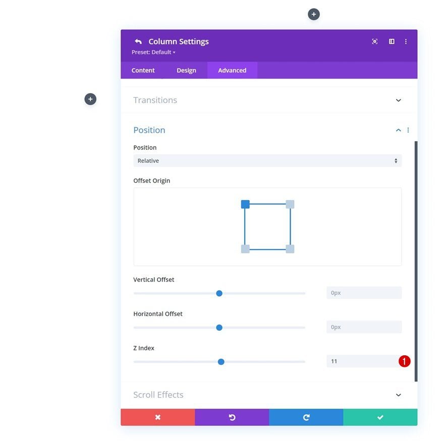
Z Index
Increase the z index of this column as well. Later on the tutorial, we’ll create a horizontal overlap between column 1 and 2. We’re increasing the z index to ensure the column 1 modules stay above the column 2 modules.
- Z Index: 11
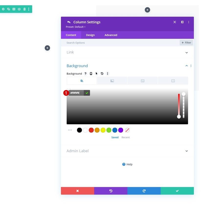
Column 2 Settings
Background Color
Next, we’ll add a background color to column 2.
- Background Color: #f9f9f9
Spacing
We’ll use some custom padding values across different screen sizes too.
- Top Padding:
- Desktop: 200px
- Tablet: 150px
- Phone: 100px
- Bottom Padding:
- Desktop: 200px
- Tablet: 150px
- Phone: 100px
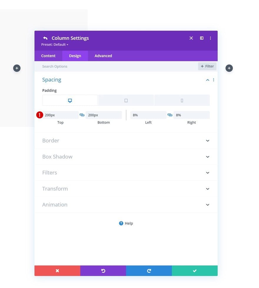
Column 3 Settings
Spacing
Last but not least, we’ll add some custom padding values to column 3 as well.
- Top Padding:
- Desktop: 200px
- Tablet: 100px
- Phone: 50px
- Bottom Padding:
- Desktop: 200px
- Tablet: 100px
- Phone: 50px
- Left Padding: 8%
- Right Padding: 8%
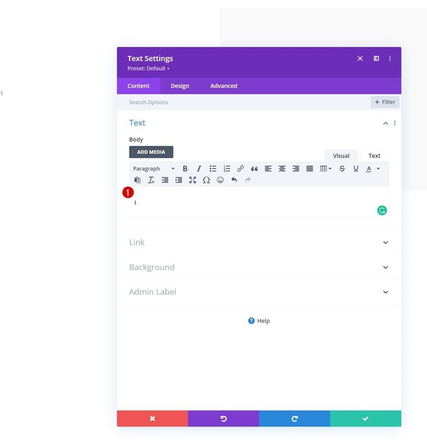
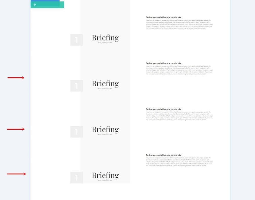
Add Text Module to Column 1
Add Copy
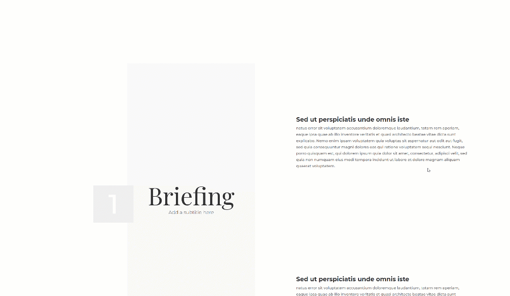
Time to add modules, starting with a Text Module in column 1. Add a number to the content box.
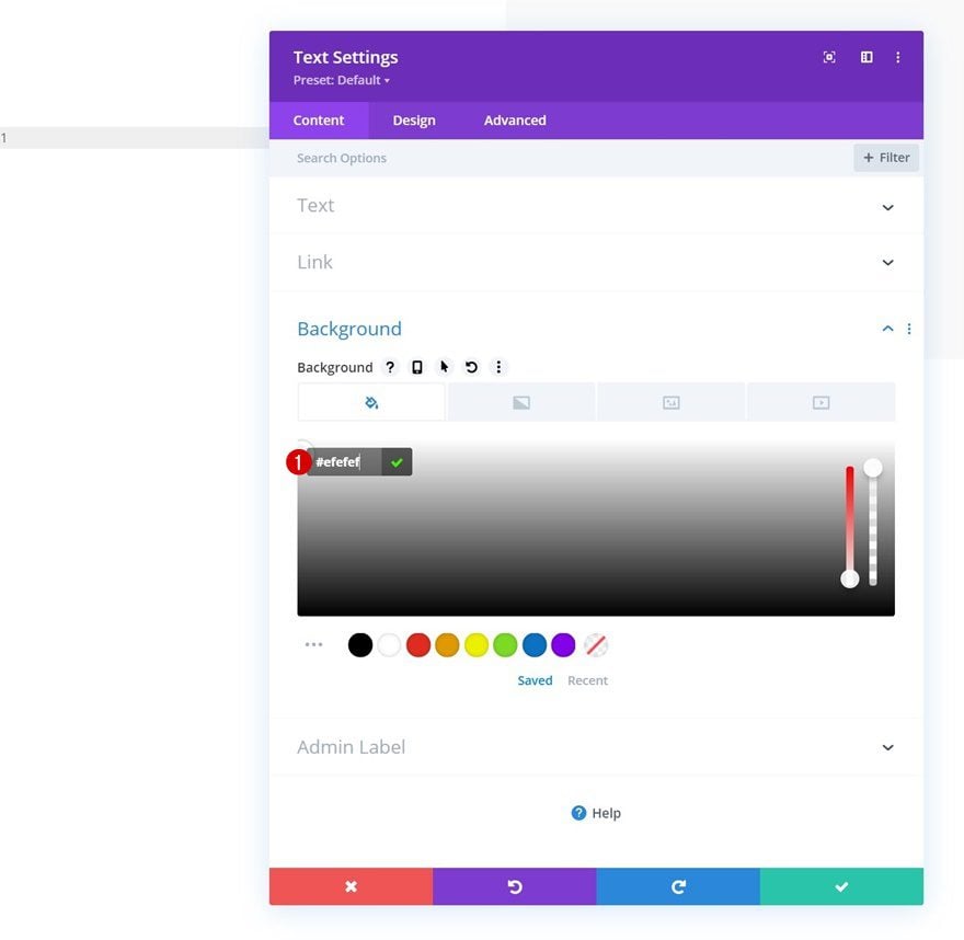
Background Color
Change the background color next.
- Background Color: #efefef
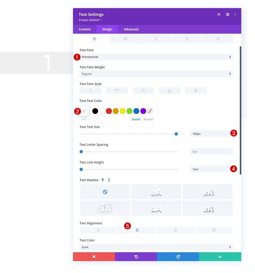
Text Settings
Move on to the design tab and change the text settings accordingly:
- Text Font: Montserrat
- Text Color: #ffffff
- Text Size: 100px
- Text Line Height: 1em
- Text Alignment: Center
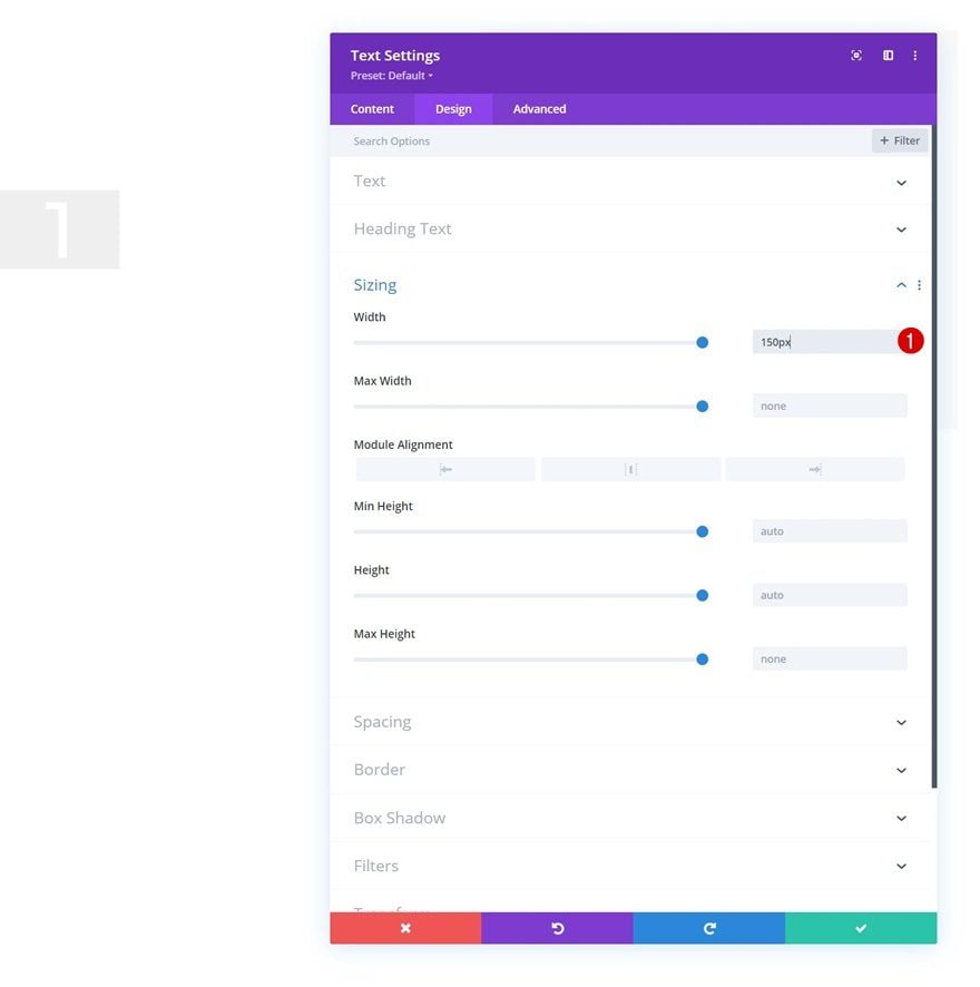
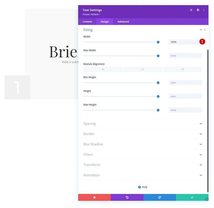
Sizing
Modify the width next.
- Width: 150px
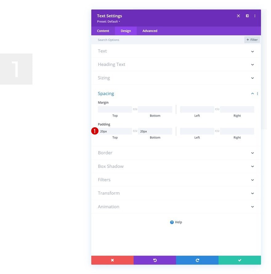
Spacing
Then, add some custom top and bottom padding.
- Top Padding: 20px
- Bottom Padding: 20px
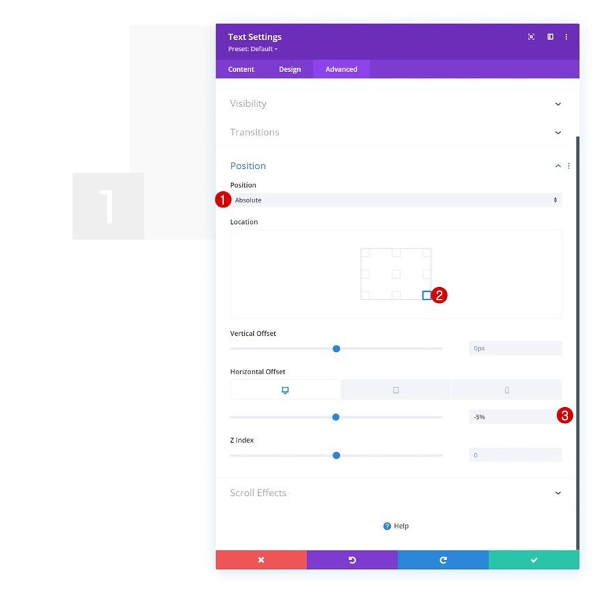
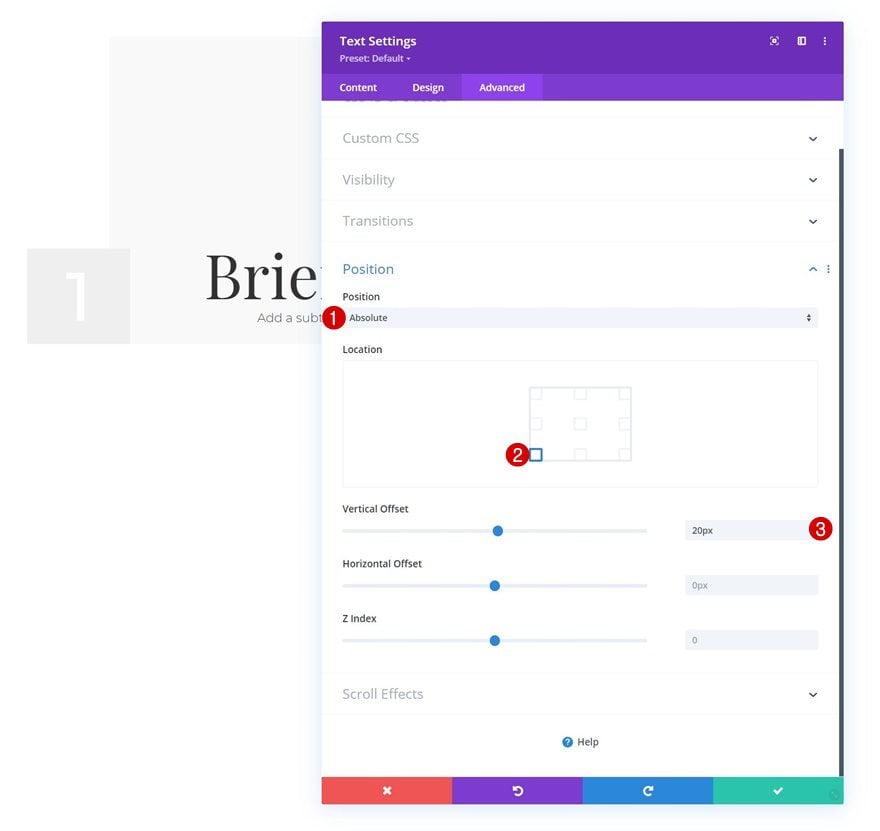
Position
Reposition the module as well.
- Position: Absolute
- Location: Bottom Right
- Horizontal Offset: -5%
Add Text Module to Column 2
Add H3 & H4 Copy
On to the second column. There, we’ll add a Text Module with some H3 and H4 copy.
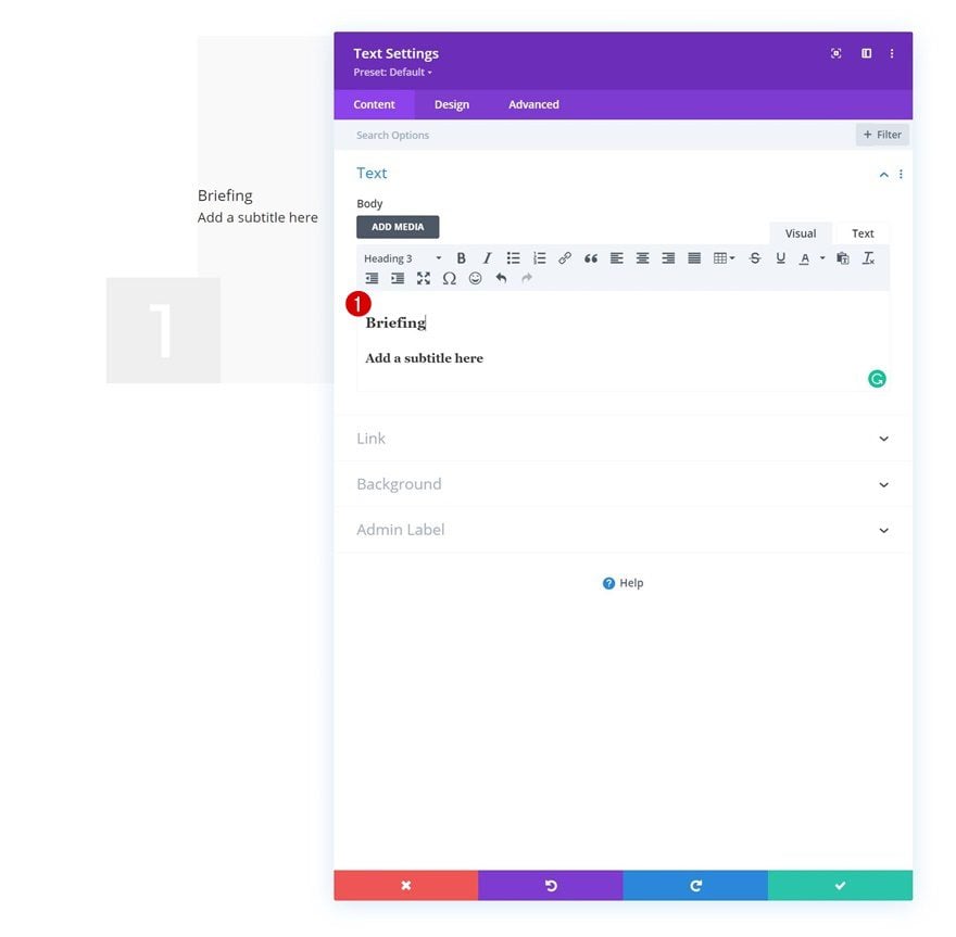
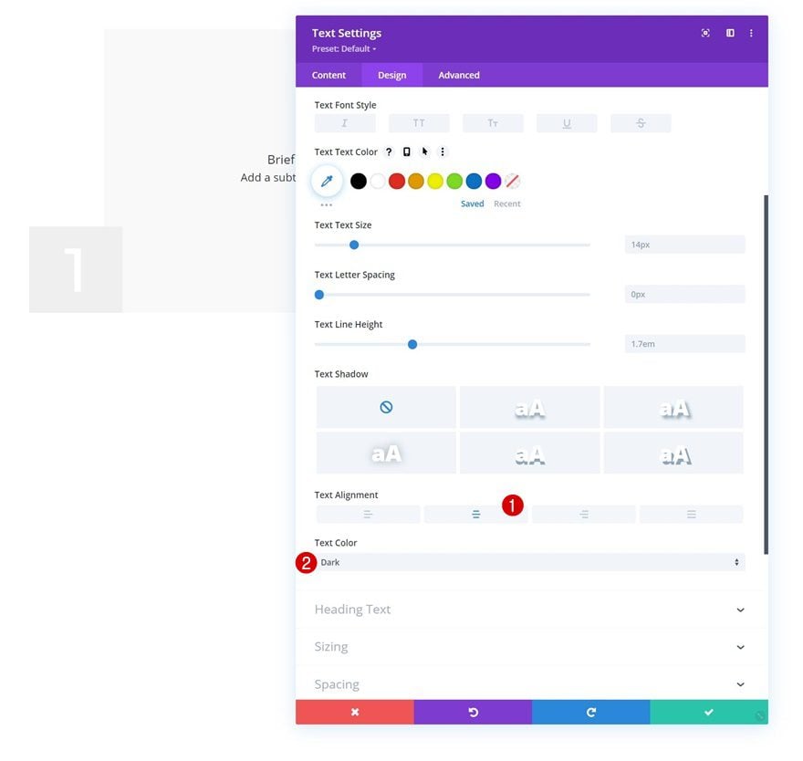
Text Settings
Move on to the module’s design tab and change the text settings as follows:
- Text Alignment: Center
- Text Color: Dark
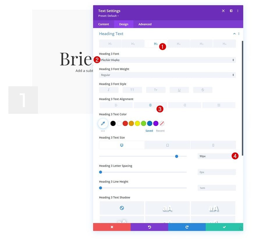
H3 Text Settings
Then, modify the H3 text settings.
- Heading 3 Font: Playfair Display
- Heading 3 Text Alignment: Center
- Heading 3 Text Size:
- Desktop: 90px
- Tablet: 70px
- Phone: 60px
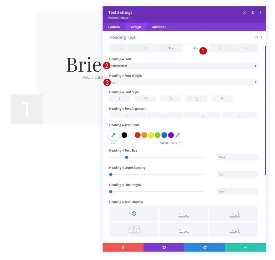
H4 Text Settings
Style the H4 text too.
- Heading 4 Font: Montserrat
- Heading 4 Font Weight: Light
Sizing
Then, go to the sizing settings and apply a “100%” width. This will help with the next step, which is repositioning the module.
- Width: 100%
Position
Complete the module settings by going to the advanced tab and modifying the position settings as follows:
- Position: Absolute
- Location: Bottom Left
- Vertical Offset: 20px
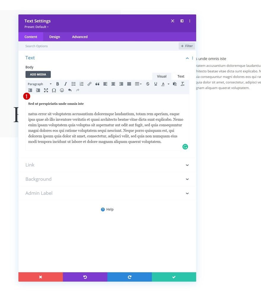
Add Text Module to Column 3
Add H5 & Paragraph Content
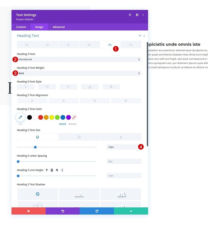
On to the third column. Add a Text Module with some H5 and paragraph content of your choice.
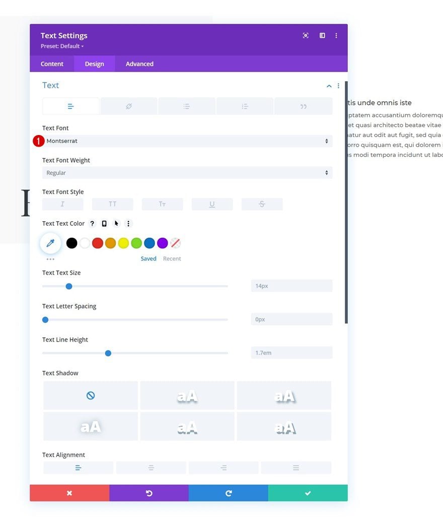
Text Settings
Move on to the module’s design tab and change the font in the text settings.
- Text Font: Montserrat
H5 Text Settings
Style the H5 text too.
- Heading 5 Font: Montserrat
- Heading 5 Font Weight: Bold
- Heading 5 Text Size:
- Desktop & Tablet: 23px
- Phone: 18px
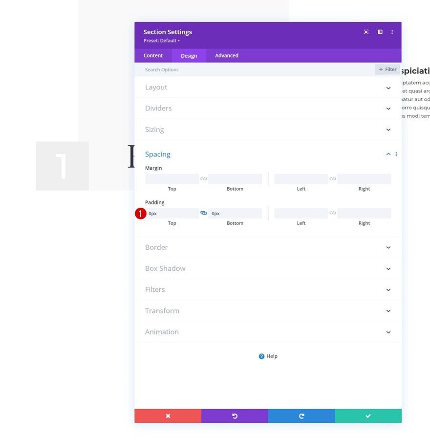
2. Key Changes to Create Effect
Section
Remove Section Padding
Now that we’ve set the foundation of our design, we can start creating the custom sticky styles effect you were able to see in the preview of this post. The first step to achieving this effect is making sure your section’s top and bottom padding values are zero. Doing this will help us ensure that both the section and row start and end at the same point. This is important when we add the sticky position to our row in the upcoming steps. By setting the limit to the bottom of the section, we leave no room for the row to move. The row, however, will be turned sticky for those few seconds and will highlight the changed sticky styles in our design.
- Top Padding: 0px
- Bottom Padding: 0px
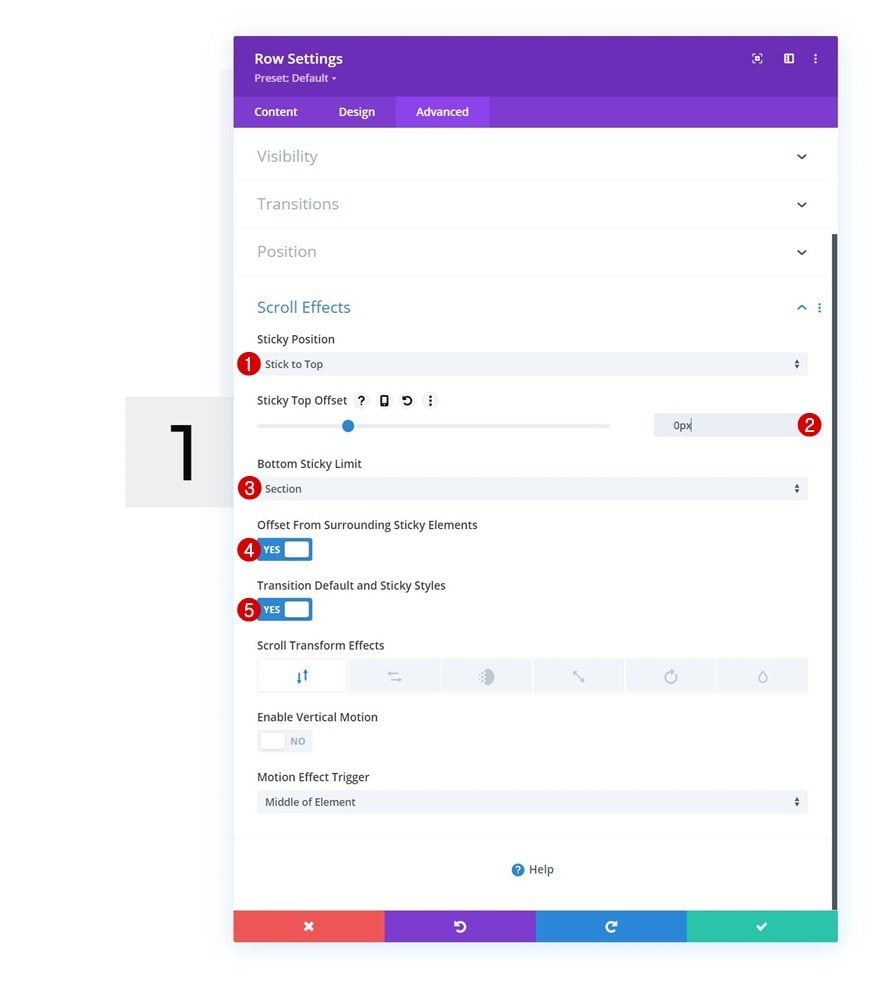
Row
Turn Row Sticky
Open the row settings and turn the row sticky. As mentioned in the previous step, it’s important to make sure the bottom sticky limit of our row is the section. Because there’s no space between the end of the row and end of section, the sticky row will stay in place.
- Sticky Position: Stick to Top
- Sticky Top Offset: 0px
- Bottom Sticky Limit: Section
- Offset From Surrounding Sticky Elements: Yes
- Transition Default and Sticky Styles: Yes
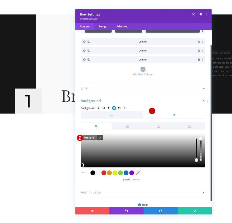
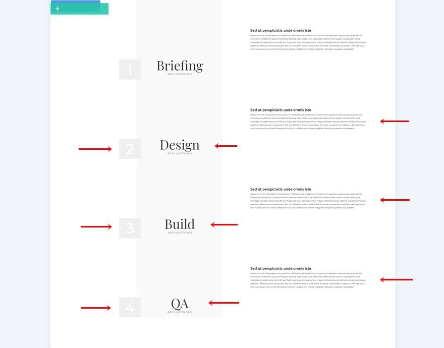
Sticky Row Background Color
Time to start applying some sticky styles to our elements! Start with the row background color.
- Background Color: #161616
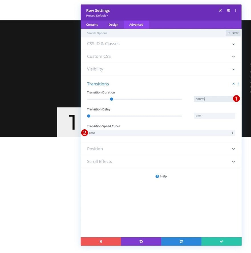
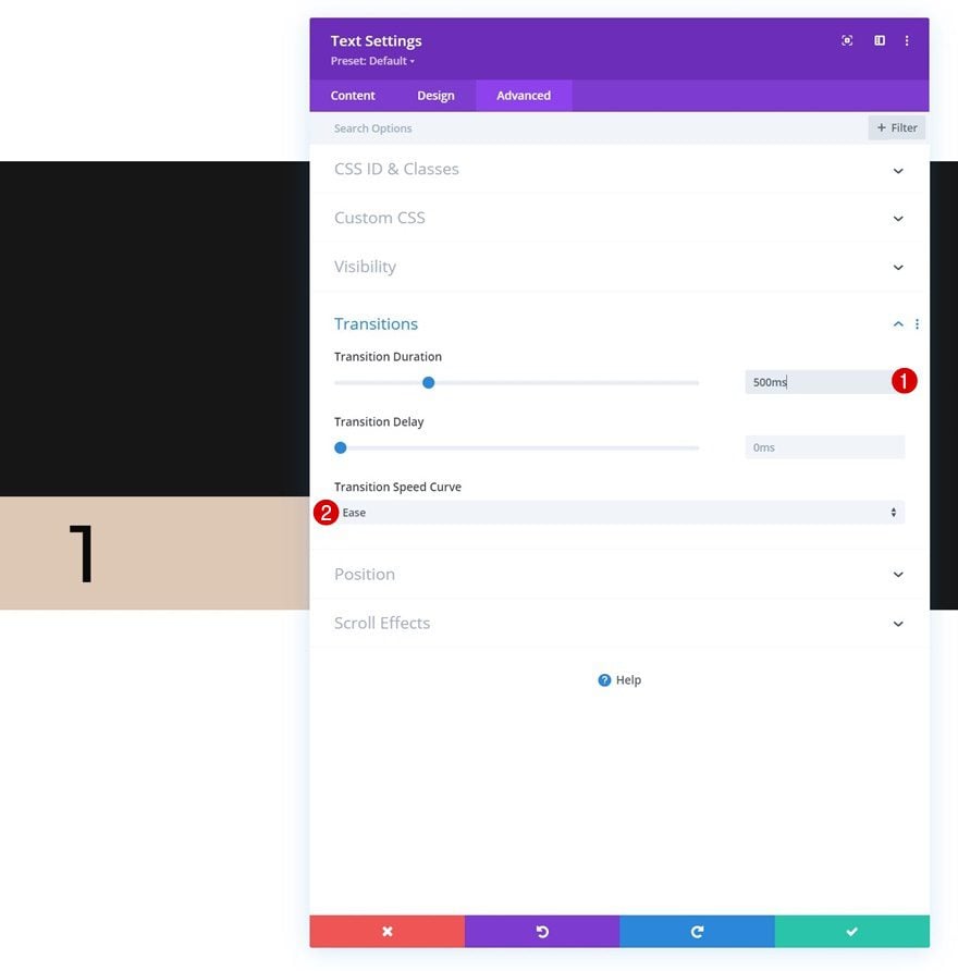
Row Transition
To ensure a smooth transition, we’ll increase the transition duration in the row’s advanced tab.
- Transition Duration: 500ms
- Transition Speed Curve: Ease
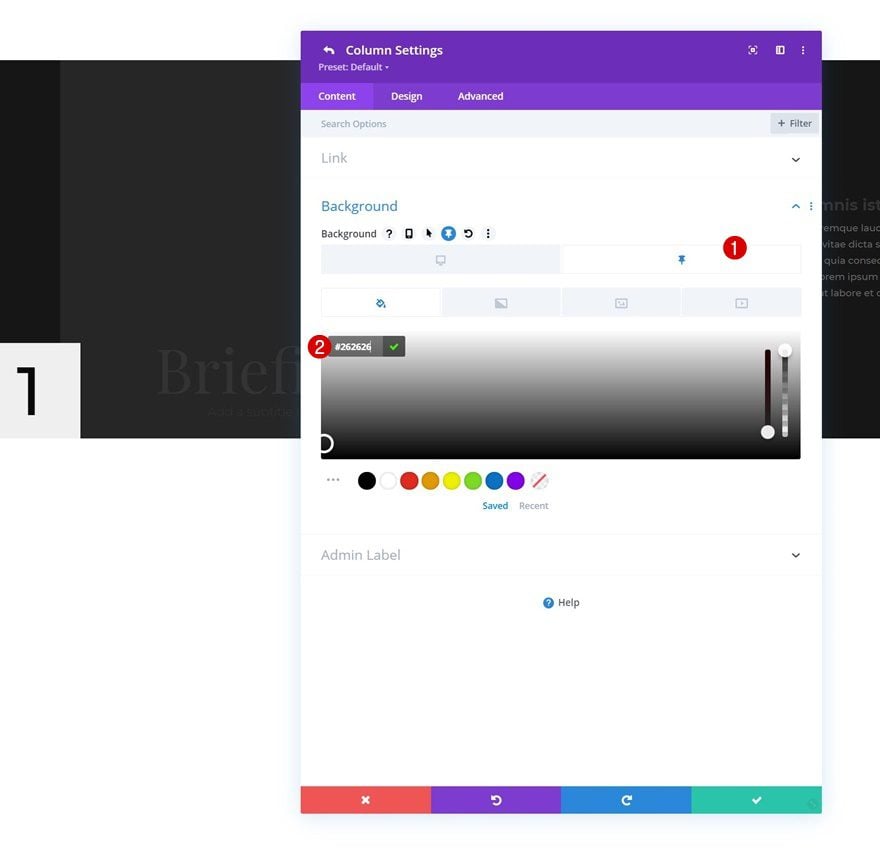
Sticky Column 2 Background Color
Then, we’ll change the sticky column 2 background color.
- Background Color: #262626
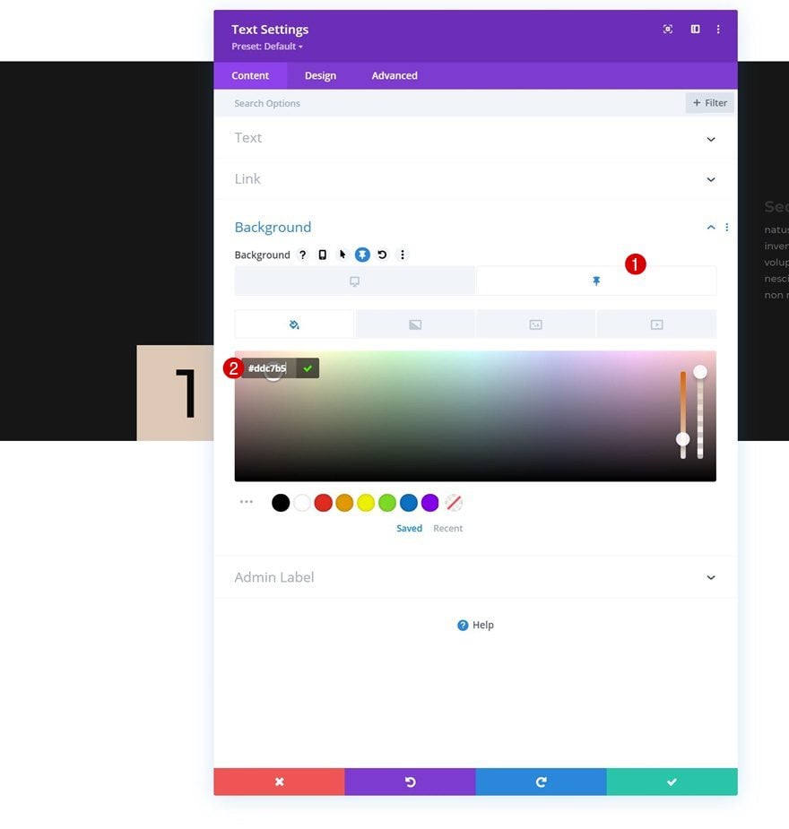
Text Module in Column 1
Sticky Background Color
We’ll change the background color of the Text Module in column 1 too.
- Background Color: #ddc7b5
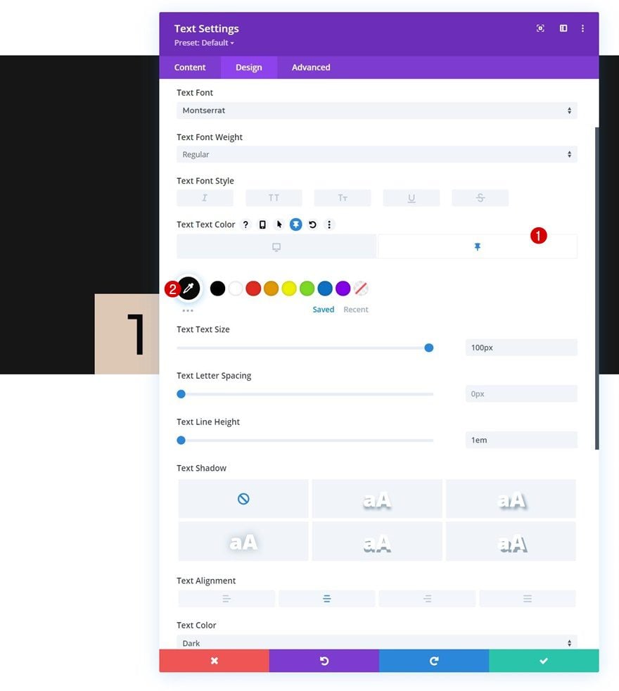
Sticky Text Color
Along with the sticky text color.
- Text Color: #0a0a0a
Sticky Sizing
And we’ll increase the module’s width in the sizing settings.
- Width: 105%
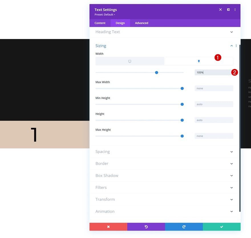
Transition
We’re ensuring a smooth transition by modifying the module’s transition duration in the advanced tab.
- Transition Duration: 500ms
- Transition Speed Curve: Ease
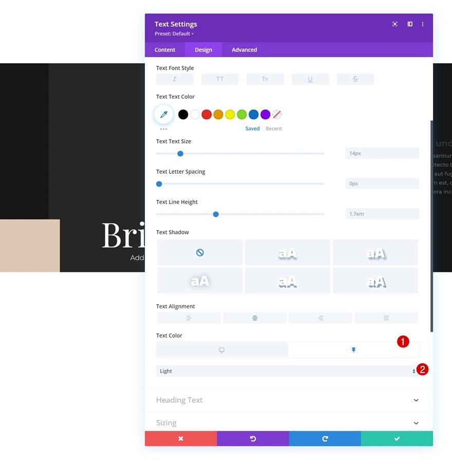
Text Module in Column 2
Sticky Text Color
Up next, we have the Text Module in column 2. We’ll change the text color to light in a sticky state.
- Text Color: Light
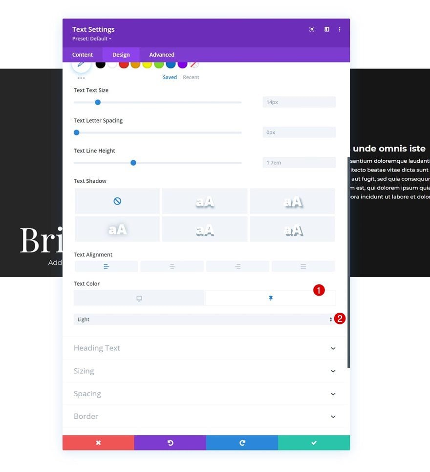
Text Module in Column 3
Sticky Text Color
Same goes for the Text Module in column 3.
- Text Color: Light
3. Clone Section for Reuse
Now that we’ve completed the first section, including the sticky styles change effect, we can reuse this section up to as many times as we want by cloning it.
Change All Copy
Make sure you change all duplicate copy.
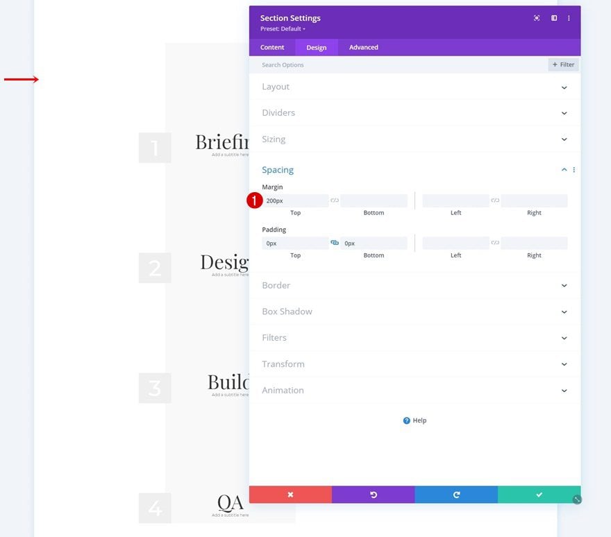
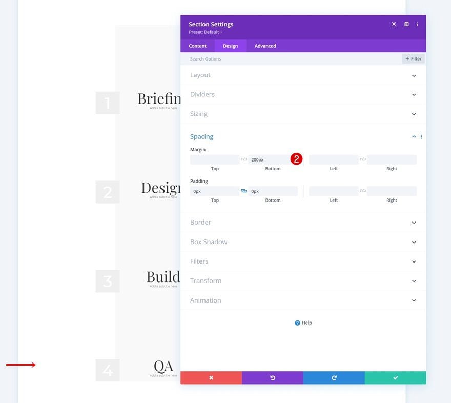
Add Some Top Margin to First Section & Bottom Margin to Last Section
And last but not least, we’ll add some top margin to the first section and bottom margin to the last section. This will help us prevent immediate transitioning before people start scrolling. That’s it!
- Top Margin: 200px
- Bottom Margin: 200px
Preview
Now that we’ve gone through all the steps, let’s take a final look at the outcome across different screen sizes.
Desktop
Mobile
Final Thoughts
In this post, we’ve shown you how to get creative with Divi’s sticky options. More specifically, we’ve used the Divi sticky options to change sticky styles without adding movement. As soon as people scroll past a certain part of your page, the styles of the design change, which highlights that specific part of the page. You were able to download the JSON file for free as well! If you have any questions or suggestions, feel free to leave a comment in the comment section below.
If you’re eager to learn more about Divi and get more Divi freebies, make sure you subscribe to our email newsletter and YouTube channel so you’ll always be one of the first people to know and get benefits from this free content.


hello,
How to fix a line that has become sticky, prevent it from moving a little when it is moved back and forth quickly with the mouse. In mobile vision it is even more visible.
This is the case in the example you show.
Do you have a solution because it’s not really usable when you simply want to change the color of a sector with the sticky option during scrolling.
Thanks
To clarify, are you referring to this line not to shrink? https://prnt.sc/RDQW6n9SzDkV
If that’s the case, kindly go to the Text Module Settings > Design > Sizing and disable the Sticky option by clicking on the sticky button, then set the width value to 105%: https://prnt.sc/9bzdAl3v8_h_
If it doesn’t help, feel free to reach out to the Support Team.
Great ! Thank you so much.
Just one question : why, when you duplicate one of these sections, it doesn’t stick to the one above?
However, it has the same parameters. A space is created.
Thank you very much in advance 😉
Awesome work! Thanks for this tutorial.
Happy you liked it, Edgar! 🙂
Verry good, looks nice!