
Every week, we provide you with new and free Divi layout packs which you can use for your next project. For one of the layout packs, we also share a use case that’ll help you take your website to the next level.
This week, as part of our ongoing Divi design initiative, we’re going to show you how to how to create interchanging sticky questions as you scroll for your FAQ design. This is a great way to add interaction to your design while allowing people to find the information they’re looking for. You’ll be able to download the JSON file for free as well!
Let’s get to it.
Preview
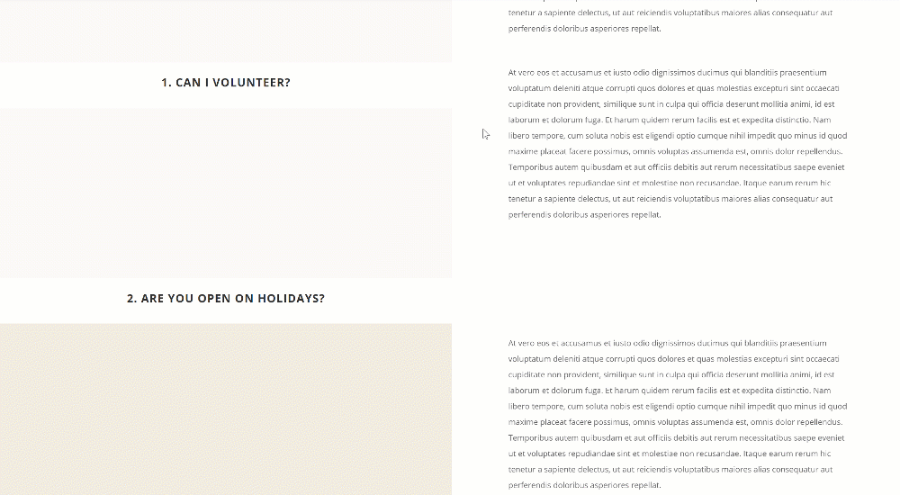
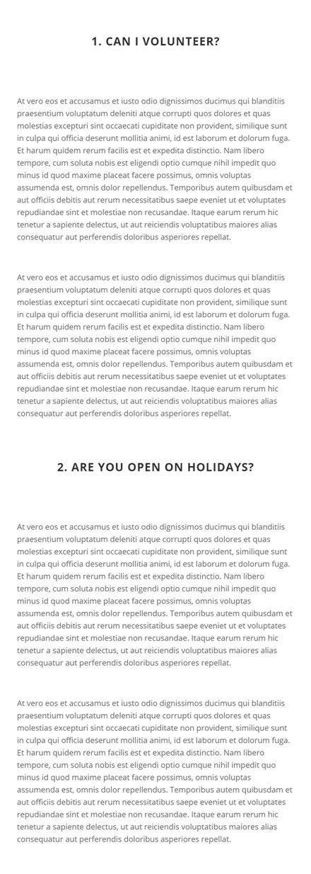
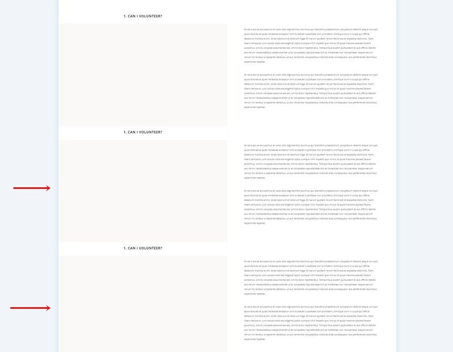
Before we dive into the tutorial, let’s take a quick look at the outcome across different screen sizes.
Desktop
Mobile
Download The Sticky Questions FAQ Design for FREE
To lay your hands on the free sticky questions FAQ design, you will first need to download it using the button below. To gain access to the download you will need to subscribe to our newsletter by using the form below. As a new subscriber, you will receive even more Divi goodness and a free Divi Layout pack every Monday! If you’re already on the list, simply enter your email address below and click download. You will not be “resubscribed” or receive extra emails.

1. Create New Page Using Library Contact Page Layout
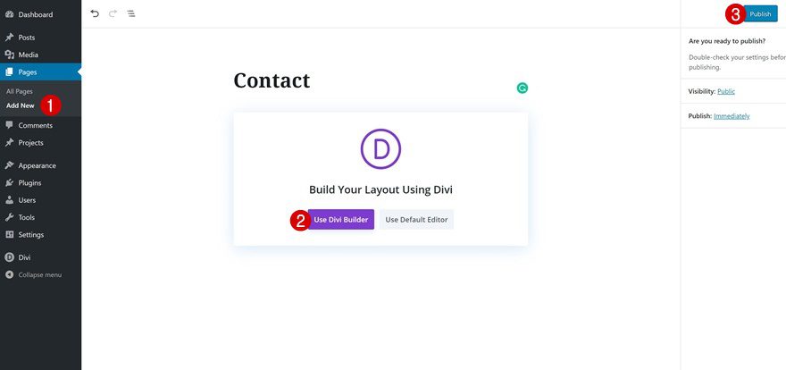
Add New Page
Start by adding a new page. Enter a page title, publish the page and enable the Divi Builder.
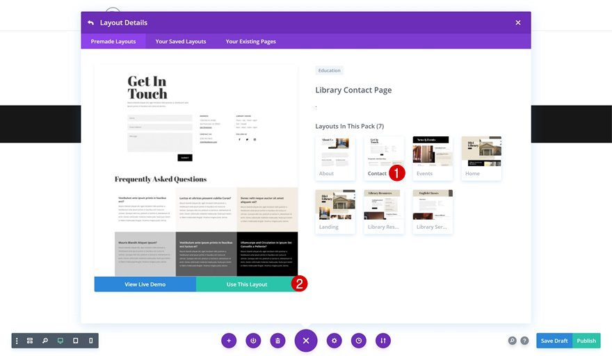
Upload Library Contact Page Layout
Navigate to the premade layouts and select the contact page layout in the Library Layout Pack.
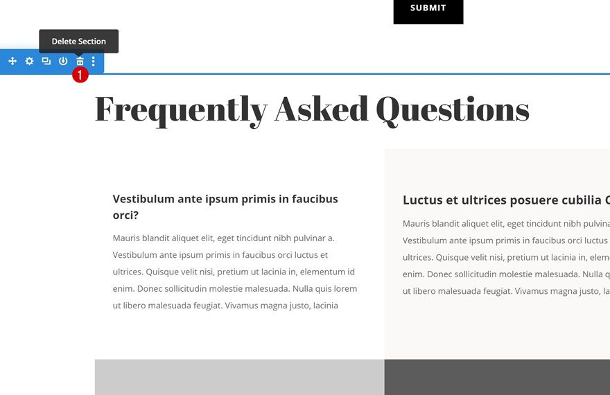
2. Delete Current FAQ Section
Locate & Remove FAQ Section
Locate and remove the following section on the page that already contains a FAQ design:
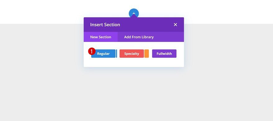
3. Add New FAQ Section Design
Add New Regular Section
We can now start creating our new design that includes the interchanging sticky questions! To do that, insert a new regular section.
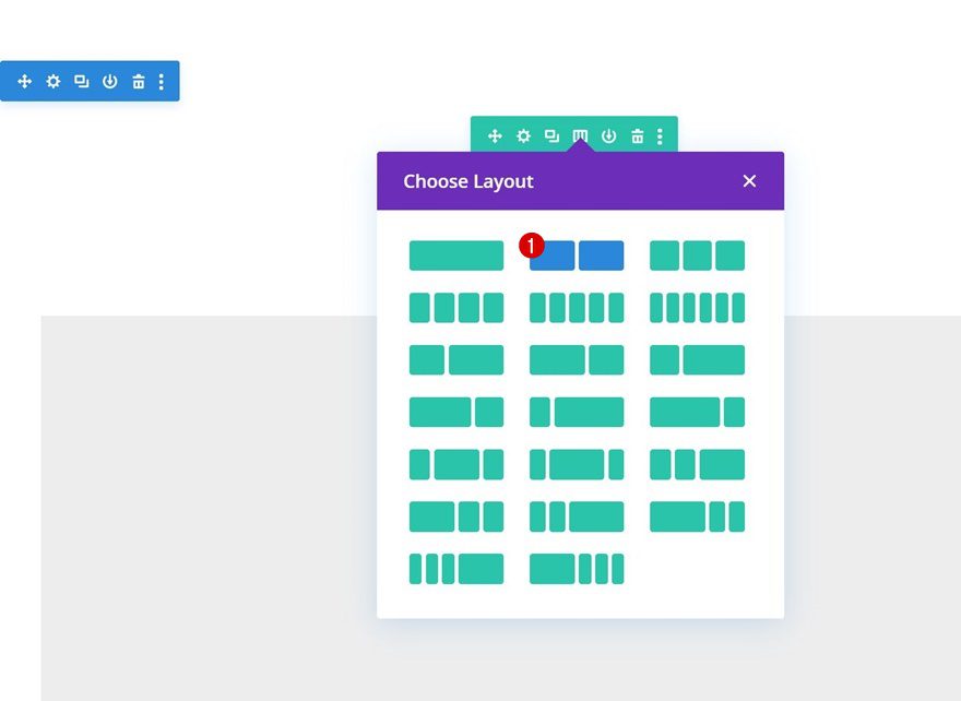
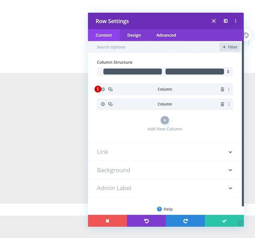
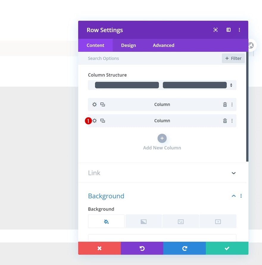
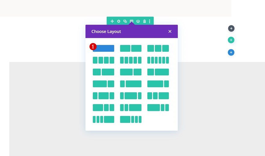
Add New Row
Column Structure
Continue by adding a new row using the following column structure:
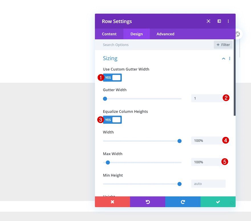
Sizing
Without adding any modules yet, open the row settings and allow the row to take up the entire width of the screen. A very important part of this step is enabling the ‘Equalize Column Heights’ option as well. This will automatically generate some space in column 1, based on the content that is placed in column 2. This space will be used to allow the sticky questions to move freely while scrolling up and down the page.
- Use Custom Gutter Width: Yes
- Gutter Width: 1
- Equalize Column Heights: Yes
- Width: 100%
- Max Width: 100%
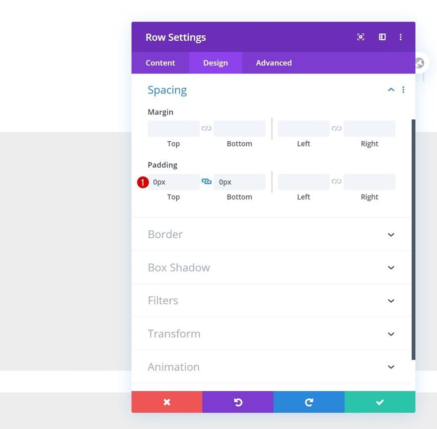
Spacing
Remove all default top and bottom row padding next.
- Top Padding: 0px
- Bottom Padding: 0px
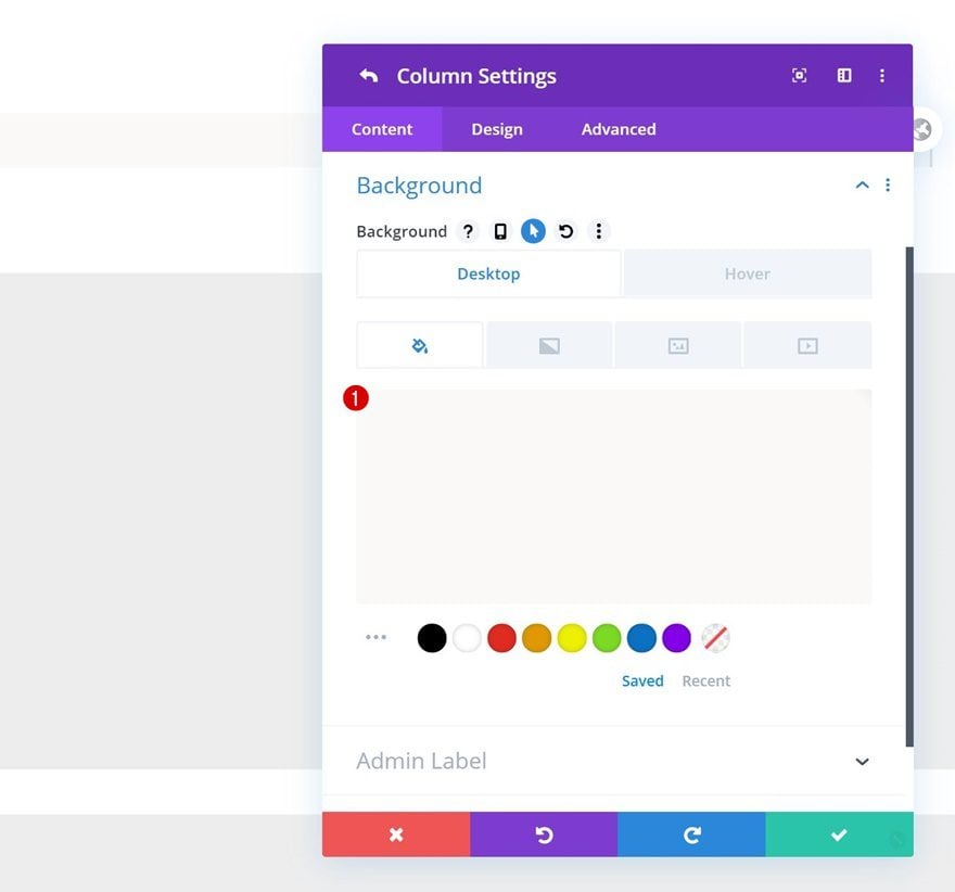
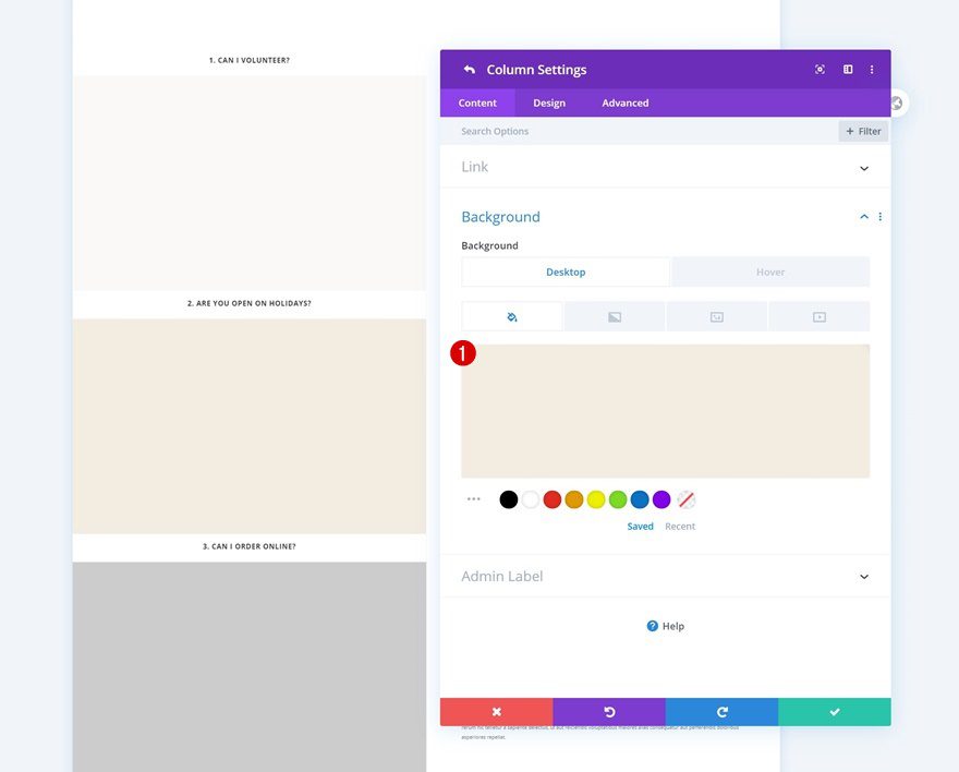
Column 1
Continue by opening the column 1 settings.
Default Background Color
Add a default background color.
- Background Color: rgba(224,216,200,0.15)
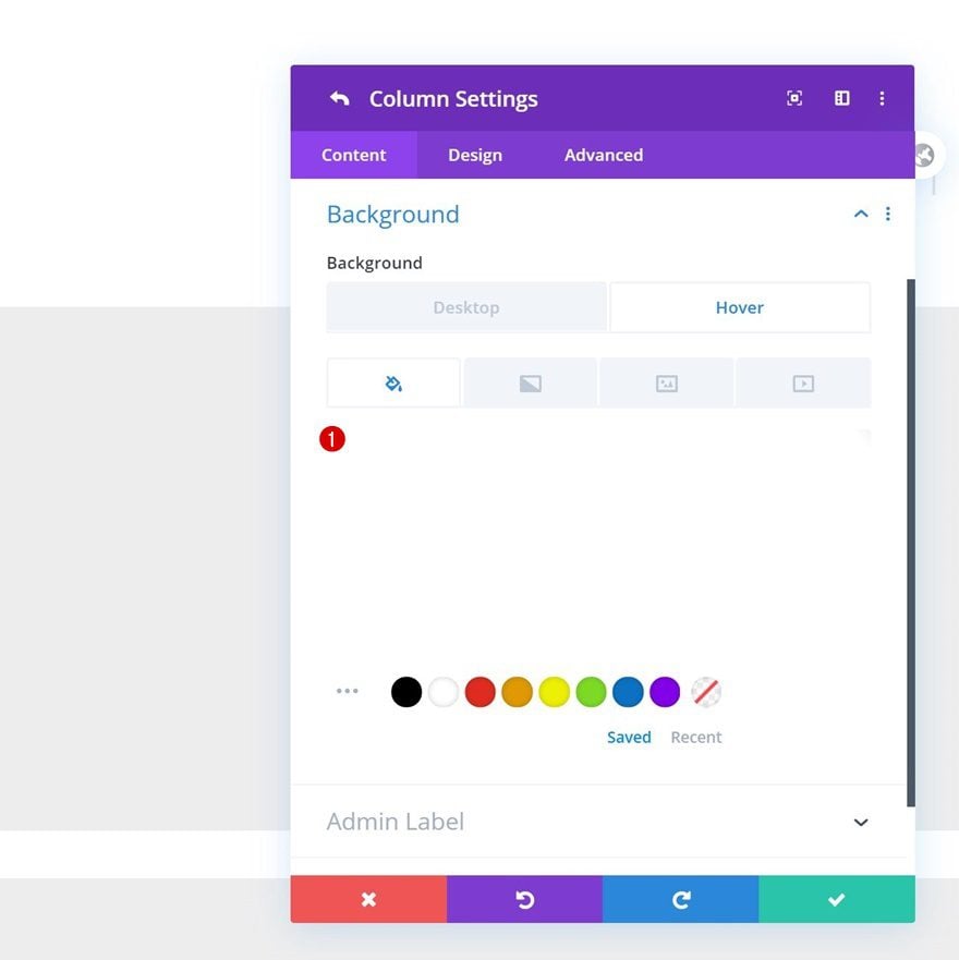
Hover Background Color
And change this background color on hover.
- Background Color: #FFFFFF
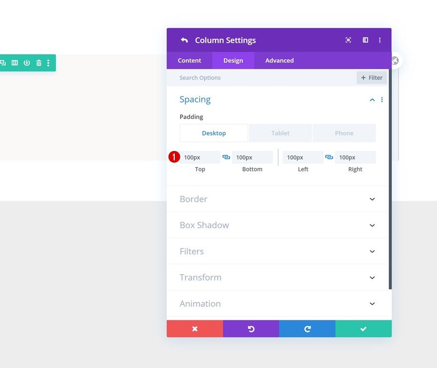
Column 2
Open the second column’s settings next.
Spacing
And apply some custom padding values across different screen sizes.
- Top Padding: 100px (Desktop), 50px (Tablet & Phone)
- Bottom Padding: 100px (Desktop), 50px (Tablet & Phone)
- Left Padding: 100px (Desktop), 50px (Tablet), 30px (Phone)
- Right Padding: 100px (Desktop), 50px (Tablet), 30px (Phone)
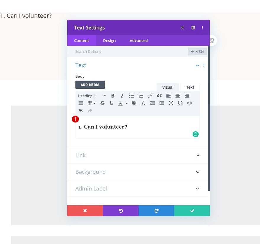
Add Text Module to Column 1
Add H3 Content
Time to start adding modules! The first and only module we need in column 1 is a Text Module containing one of the frequently asked questions. We’re using H3 for this.
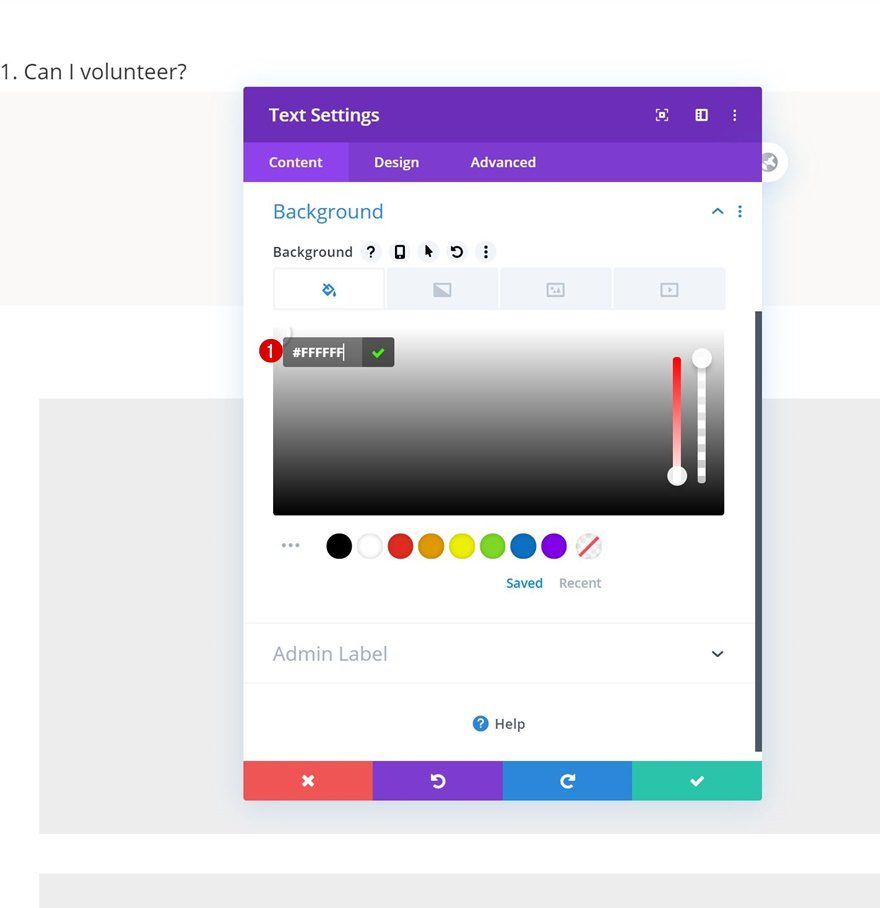
Background Color
Add a background color to the Text Module next.
- Background Color: #FFFFFF
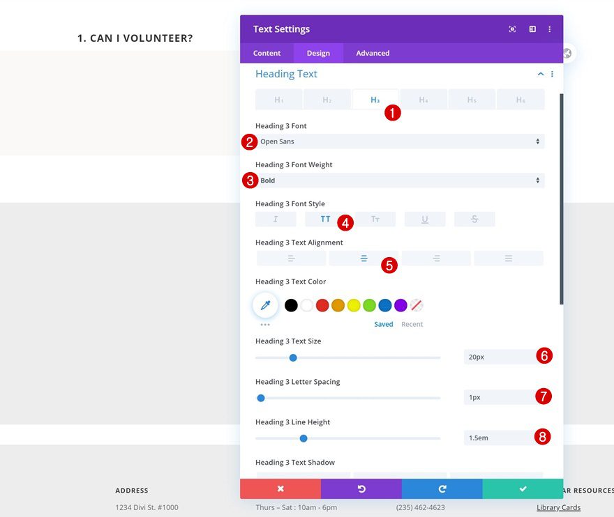
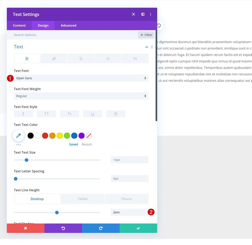
H3 Text Settings
Move on to the design tab and change the H3 text settings accordingly:
- Heading 3 Font: Open Sans
- Heading 3 Font Weight: Bold
- Heading 3 Font Style: Uppercase
- Heading 3 Text Alignment: Center
- Heading 3 Text Size: 20px
- Heading 3 Letter Spacing: 1px
- Heading 3 Line Height: 1.5em
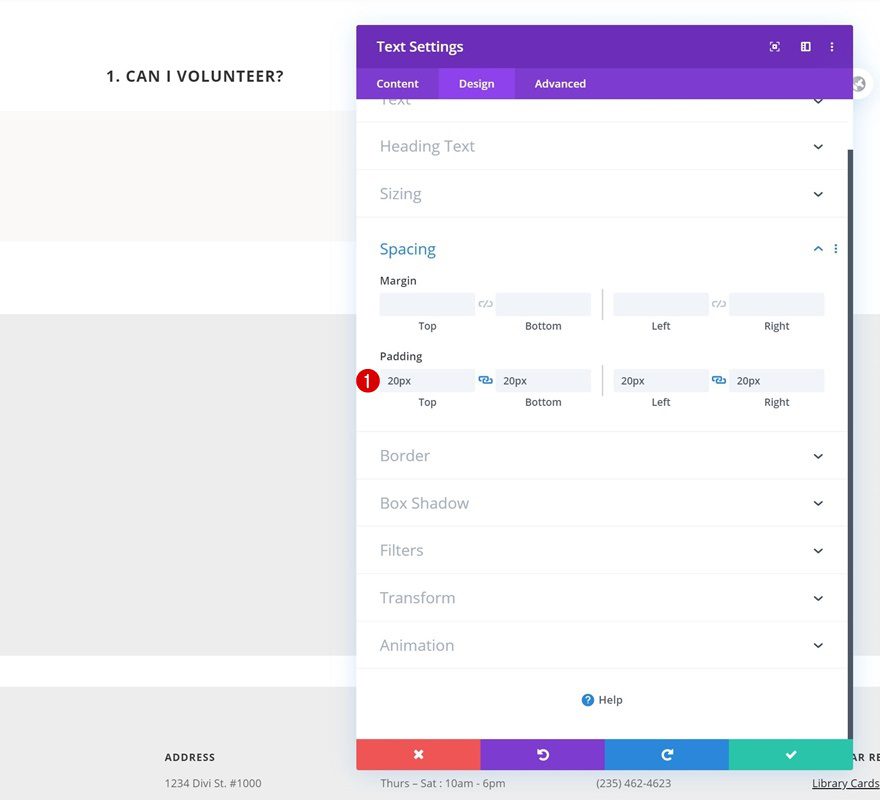
Spacing
Ad some custom padding values as well.
- Top Padding: 20px
- Bottom Padding: 20px
- Left Padding: 20px
- Right Padding: 20px
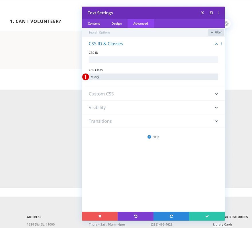
CSS Class
Complete the settings by assigning a CSS class to the module. At the end of this tutorial, we’ll use this CSS class to make the module sticky.
- CSS Class: sticky
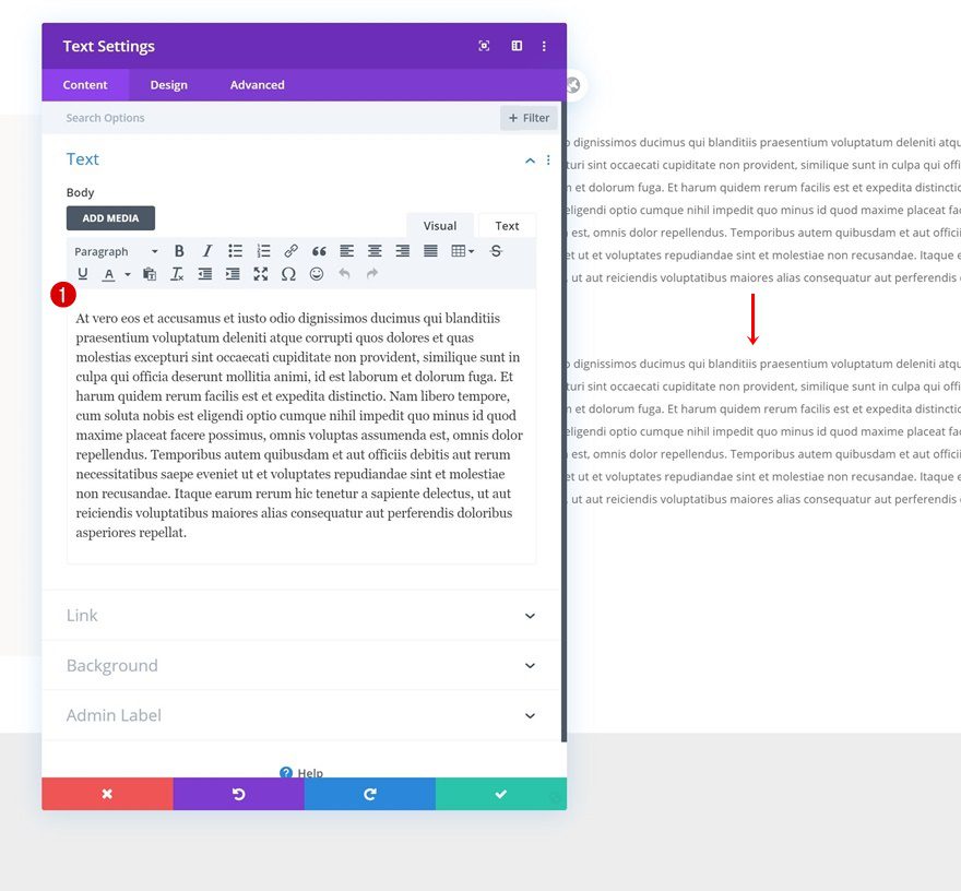
Add Text Module to Column 2
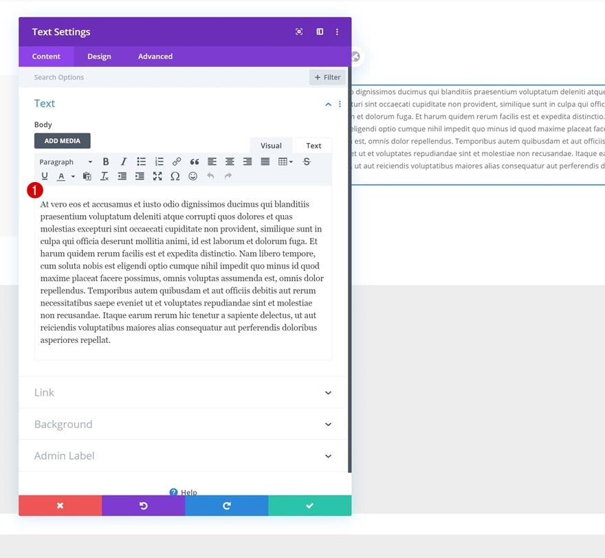
Add Content
On to the second column. There, we’ll add a Text Module with some content of our choice.
Text Settings
Move on to the design tab and change the text settings accordingly:
- Text Font: Open Sans
- Text Line Height: 2em (Desktop & Tablet), 1.6em (Phone)
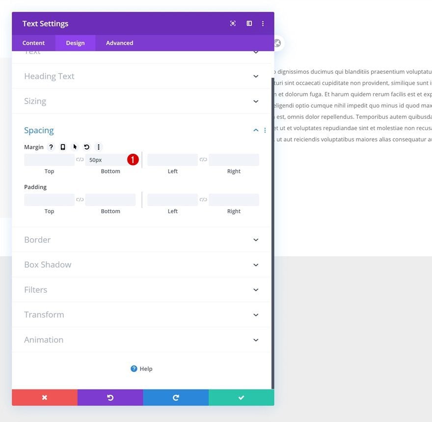
Spacing
And some bottom margin to the module’s spacing settings too.
- Bottom Margin: 50px
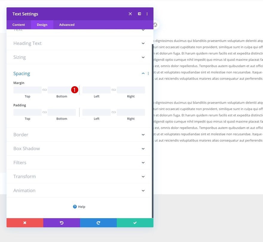
Clone Text Module in Column 2 & Change Content
Clone the entire Text Module in column 2 and change the content.
Remove Bottom Margin
Remove the bottom margin as well.
Clone Entire Row as Many Times as Wanted
Once you’ve completed the first row and all its modules, you can clone the entire row up to as many times as you want; depending on how many frequently asked questions you want to show up on your page.
Change Questions & Answers
Of course, you’ll have to modify all the copy.
Change Column 1 Default Background Colors
Change the column 1 default background colors of each row duplicate as well. If you want it to match the Library Layout Pack, use the following color codes:
- Color 1: #f2ece1
- Color 2: rgba(0,0,0,0.2)
- Color 3: rgba(0,0,0,0.64)
- Color 4: #000000
Add New Row
Column Structure
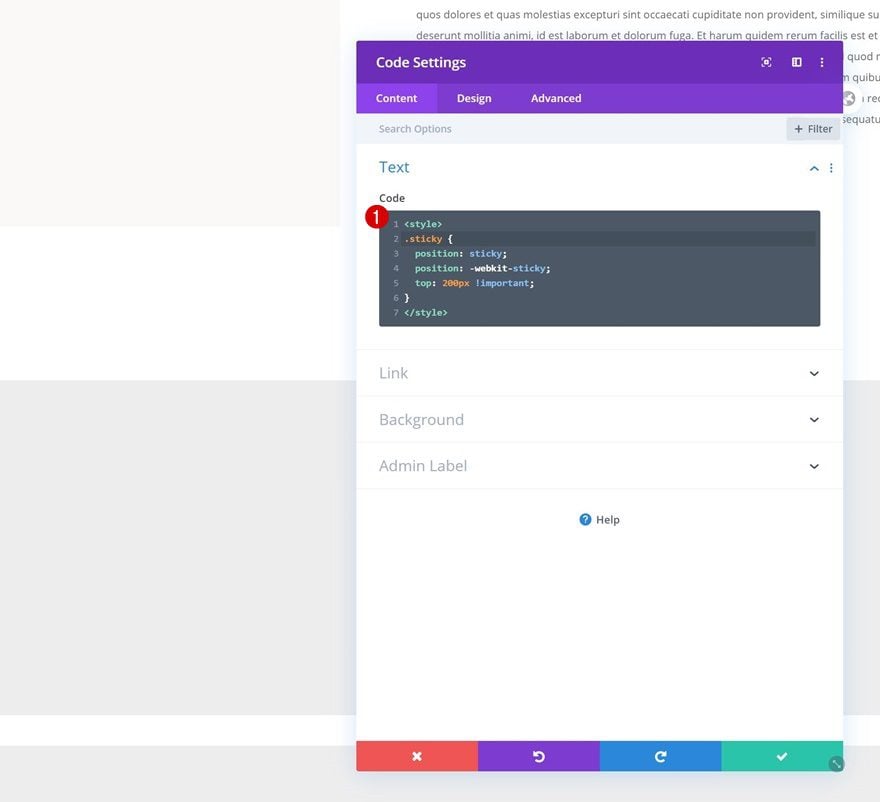
The last part of this tutorial focuses on making the sticky effect work. For that, we’ll need a few lines of CSS code. Add a new row to the bottom of your section.
Add Code Module to Column
Insert Sticky Question CSS Code
Add a Code Module with the following lines of CSS code that’ll make the sticky effect work for each question Text Module:
<style>
.sticky {
position: sticky;
position: -webkit-sticky;
top: 200px !important;
}
</style>
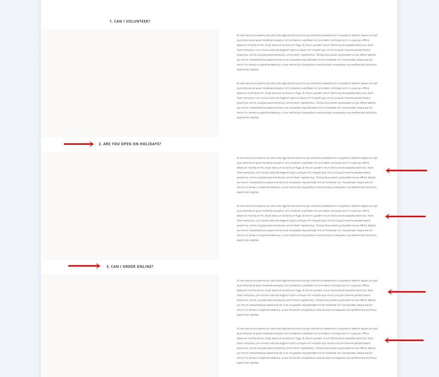
Preview
Now that we’ve gone through all the steps, let’s take a final look at the outcome across different screen sizes.
Desktop
Mobile
Final Thoughts
In this post, we’ve shown you how to create interchanging sticky questions for your next FAQ design using Divi’s Library Layout Pack. Although we’ve used the look and feel of the Library Layout Pack, you can style this design however you want and use it for your upcoming Divi project. This tutorial is part of our Divi design initiative, where we try to put something extra into your design toolbox each and every week. If you have any questions or suggestions, feel free to leave a comment in the comment section below!
If you’re eager to learn more about Divi and get more Divi freebies, make sure you subscribe to our email newsletter and YouTube channel so you’ll always be one of the first people to know and get benefits from this free content.


I have imported it to test it but for some reason it doesn’t work!!! Yes it is true there a little too much space however the idea is a good one. Sticky element does allow for more content without the feel of scrolling a really long page, for that reason I’m glad you shown it.
I’ll be testing the code with other section and see if it can be grown into new ideas for design.
Thanks
PS: This would be a great feature to add, many of your competitors already have it as a feature.
Seriously guys? I’m sorry but it seems that you are running out of ideas.
You need to review your creative department.
All layouts, with few exceptions, look the same. Don’t get me wrong, I appreciate the effort behind all of the daily tutorials but I rather have 3 a week well polished and uniques than one a day with no added value.
Stop focusing on “cool” things and start thinking about basics (Menu, footer etc, etc,), so that we can create our own without the need for funny floating or circular menus (that are good only for desktop btw).
Or think about new kind of layouts, focused 90% on the mobile world.
Way too much white space in my opinion. Visitors could think there is something missing or something, like an image, didn’t download.
Thank you Divi for the faq design.
This one has really befuddled me. It looks as though we’re expecting visitors to click on a big empty space, which they won’t do, and they’ll have to scroll past those blocks on the page to reach each question. It may look to visitors as though there are missing images on the page, which haven’t loaded. I’m sorry, but I really don’t get what this is about. I use the Accordion module for FAQs, which works brilliantly (but I’ve added code to stop the top one being toggled open when the page is loaded).
I agree with your comments entirely – please could you share the code you mentioned?
I think this would have been helped to see it in context. In a demo site. I have NO IDEA what this actually is or how to use it.
More mobile friendly ideas and inspiration PLEASE!!!
Thanks to Donjete, but I totally agree. The articles are welcome, but mostly desktop oriented. The “hover” articles are countless, for example, but what about mobile? Thanks for stressing more on the mostly used device display!