

People relate to other people. That’s why on almost any website you visit, you’ll see faces appear. From previous customers to team members and more; the sooner you show the clients and people behind your company, the higher your chances are of convincing your them your company, brand or product is the right fit. In this post, we’ll focus on showcasing your clients in a beautiful and advanced way. You’ll be able to download the JSON file for free as well!
Let’s get to it!
- 1 Preview
- 2 Download The Client Showcase Hover/Click Design for FREE
- 3 Download For Free
- 4 You have successfully subscribed. Please check your email address to confirm your subscription and get access to free weekly Divi layout packs!
-
5
Let’s Start Recreating!
- 5.1 Add New Section
- 5.2 Add New Row
- 5.3 Column 2 Settings
- 5.4 Add Text Module to Column 1
- 5.5 Clone Text Module Five Times
- 5.6 Add Text Module #1 to Column 2
- 5.7 Add Text Module #2 to Column 2
- 5.8 Add Divider Module to Column 2
- 5.9 Add Text Module #3 to Column 2
- 5.10 Clone Text Module #3 Five Times
- 5.11 Add Code Module #1 to Column 2
- 5.12 Add Code Module #2 to Column 2
- 6 Preview
- 7 Final Thoughts
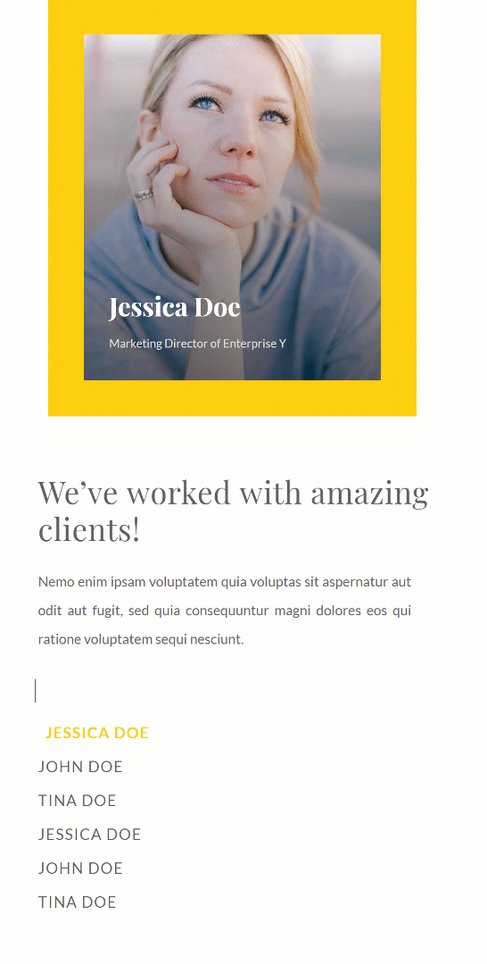
Preview
Before we dive into the tutorial, let’s take a quick look at the outcome across different screen sizes.
Desktop

Mobile
Download The Client Showcase Hover/Click Design for FREE
To lay your hands on the free client showcase hover/click design, you will first need to download it using the button below. To gain access to the download you will need to subscribe to our newsletter by using the form below. As a new subscriber, you will receive even more Divi goodness and a free Divi Layout pack every Monday! If you’re already on the list, simply enter your email address below and click download. You will not be “resubscribed” or receive extra emails.

Let’s Start Recreating!
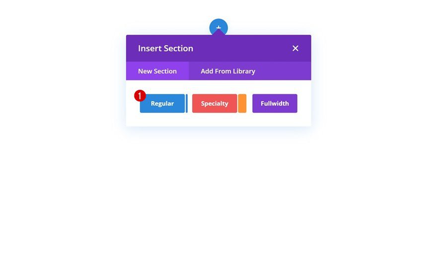
Add New Section
The first thing you’ll need to do is add a new regular section to the page you’re working on.
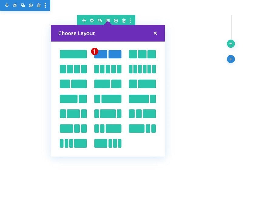
Add New Row
Column Structure
Continue by adding a new row using the following column structure:
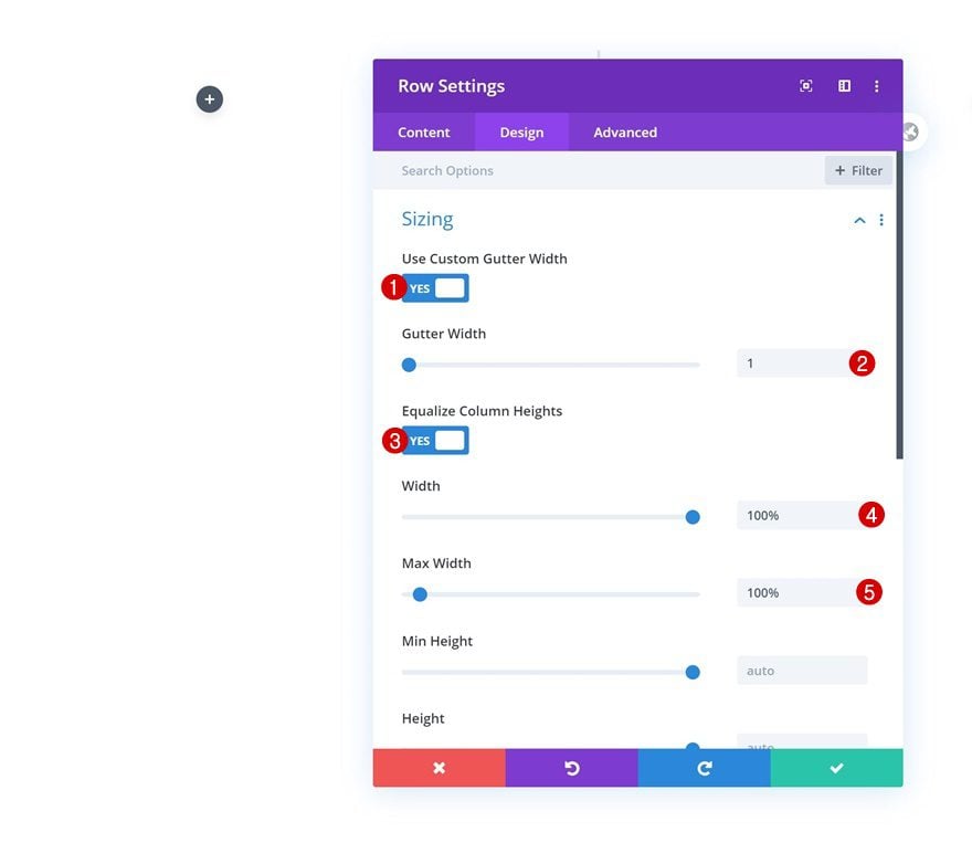
Sizing
Before adding any modules, open the row settings and allow the row to take up the entire width of the screen.
- Use Custom Gutter Width: Yes
- Gutter Width: 1
- Equalize Column Heights: Yes
- Width: 100%
- Max Width: 100%
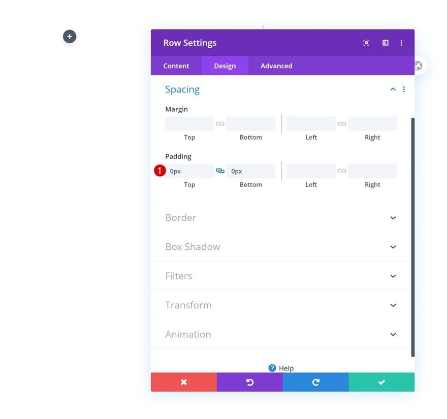
Spacing
Remove the default top and bottom padding of the row next.
- Top Padding: 0px
- Bottom Padding: 0px
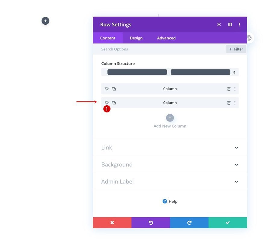
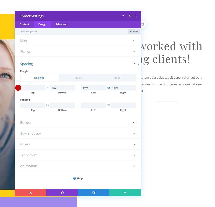
Column 2 Settings
Continue by opening the second column’s settings.
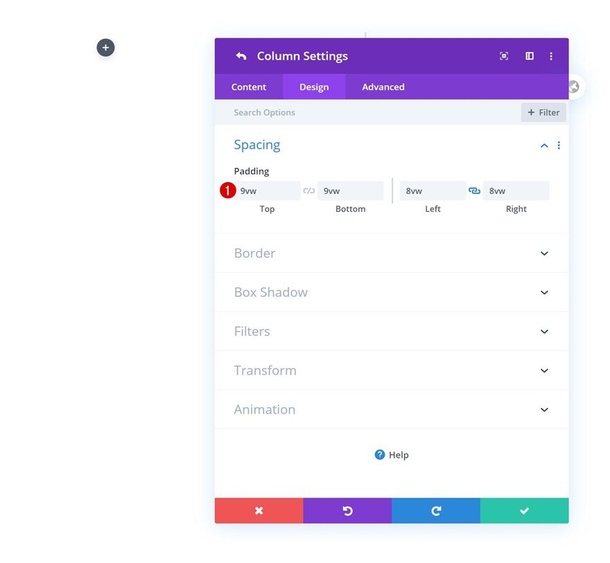
Spacing
Add some custom padding values to the column.
- Top Padding: 9vw
- Bottom Padding: 9vw
- Left Padding: 8vw
- Right Padding: 8vw
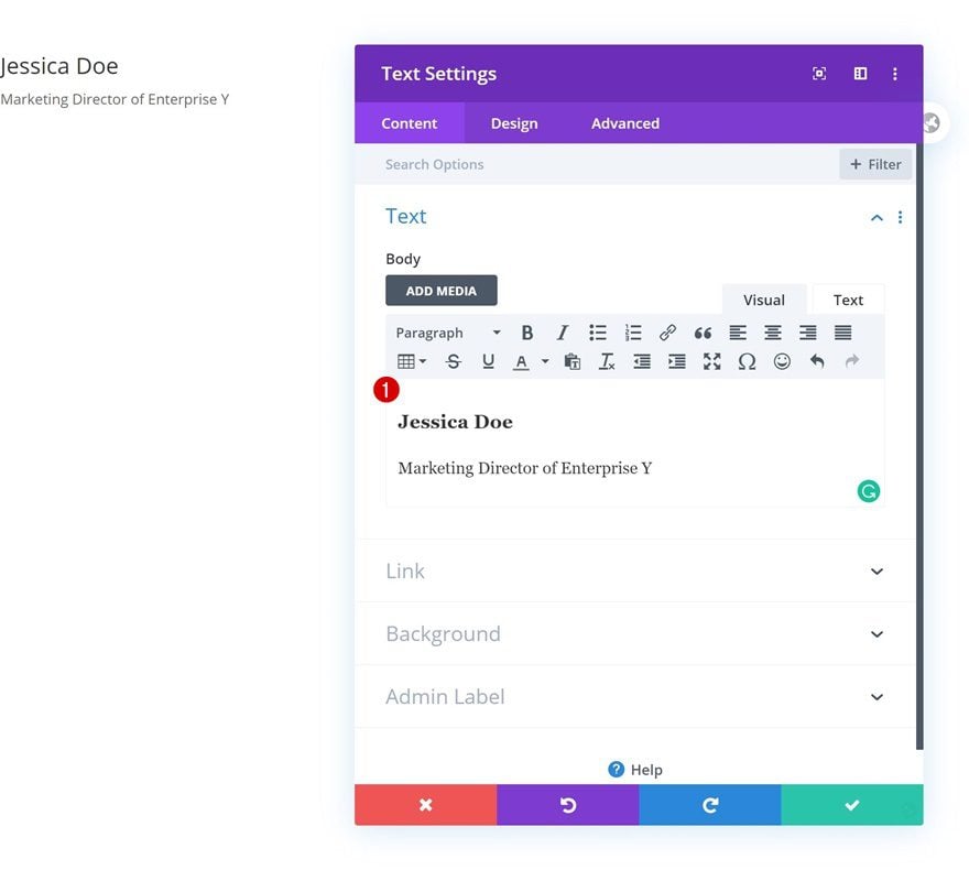
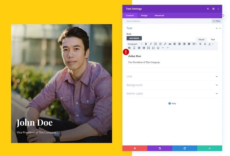
Add Text Module to Column 1
Add H3 & Paragraph Content
Once you’ve completed the row and column settings, continue by adding a Text Module to column 1. Add the client information to the content box.
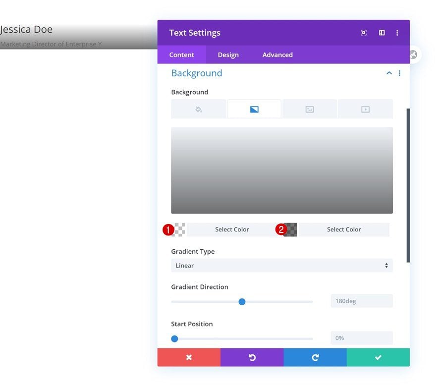
Gradient Background
Go to the background settings next and apply the following gradient background:
- Color 1: rgba(43,135,218,0)
- Color 2: rgba(0,0,0,0.55)
- Place Gradient Above Background Image: Yes
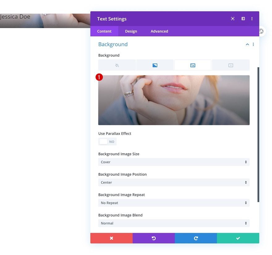
Background Image
Upload a background image as well.
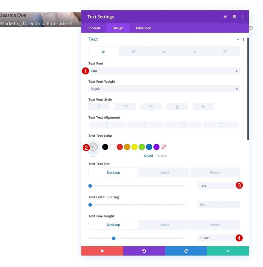
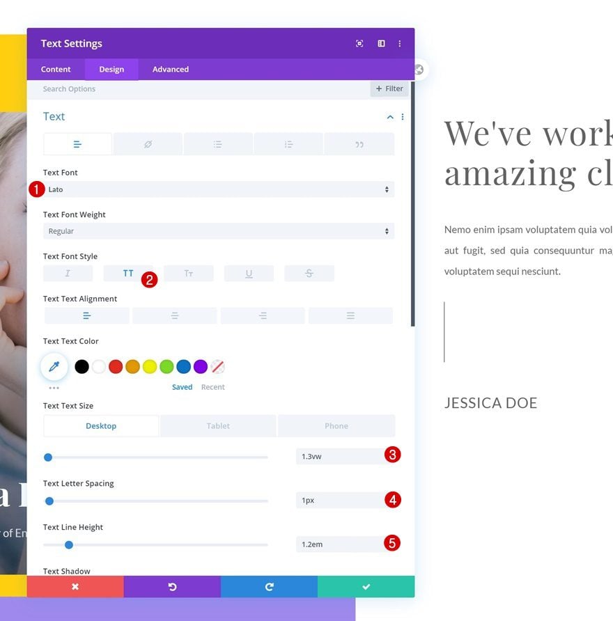
Text Settings
Move on to the design tab and change the text settings accordingly:
- Text Font: Lato
- Text Color: #dbdbdb
- Text Size: 1vw (Desktop), 1.8vw (Tablet), 2.3vw (Phone)
- Text Line Height: 1.5vw (Desktop), 2vw (Tablet), 2.5vw (Phone)
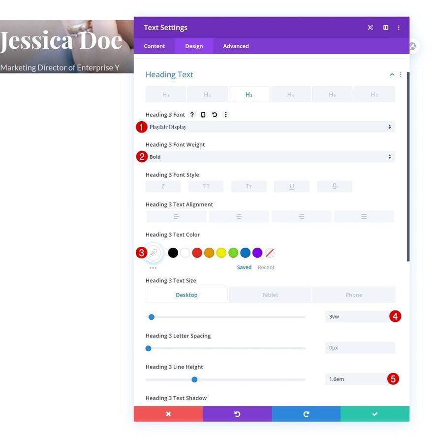
Heading 3 Text Settings
Make some changes to the H3 text settings too.
- Heading 3 Font: Playfair Display
- Heading 3 Font Weight: Bold
- Heading 3 Text Color: #ffffff
- Heading 3 Text Size: 3vw (Desktop), 4vw (Tablet), 5vw (Phone)
- Heading 3 Line Height: 1.6em
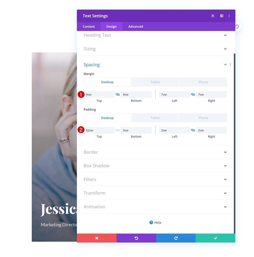
Spacing
Continue by going to the spacing settings and styling the module’s shape and position accordingly:
- Top Margin: 9vw
- Bottom Margin: 9vw
- Left Margin: 7vw (Desktop), 16vw (Tablet), 17vw (Phone)
- Right Margin: 7vw (Desktop), 16vw (Tablet), 17vw (Phone)
- Top Padding: 32vw (Desktop), 55vw (Tablet), 49vw (Phone)
- Bottom Padding: 3vw (Desktop), 6vw (Tablet & Phone)
- Left Padding: 2vw (Desktop), 4vw (Tablet), 5vw (Phone)
- Right Padding: 2vw (Desktop), 4vw (Tablet), 5vw (Phone)
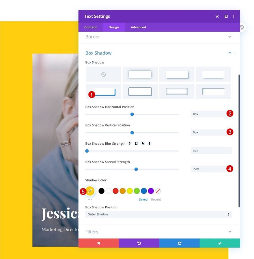
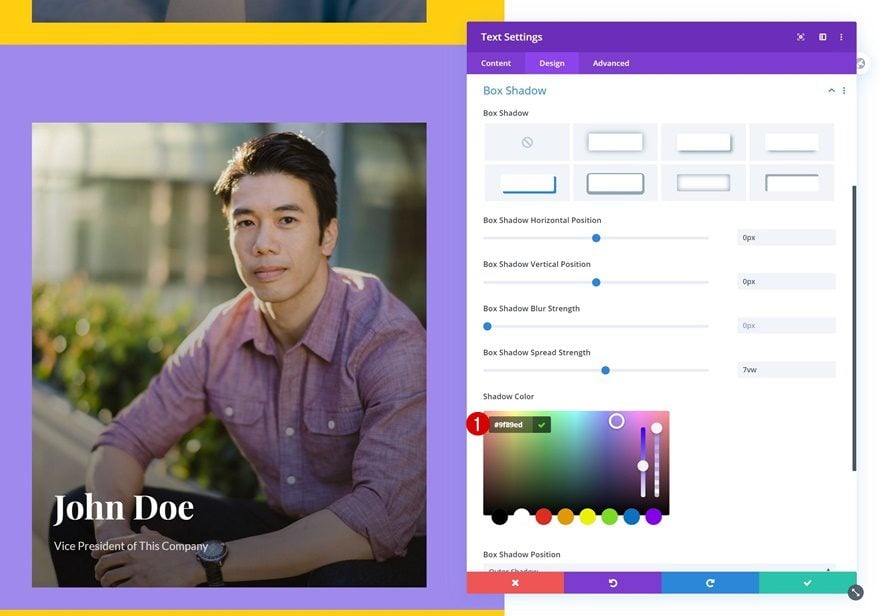
Box Shadow
We’re also adding a colorful box shadow.
- Box Shadow Horizontal Position: 0px
- Box Shadow Vertical Position: 0px
- Box Shadow Spread Strength: 7vw
- Shadow Color: #ffcf0f
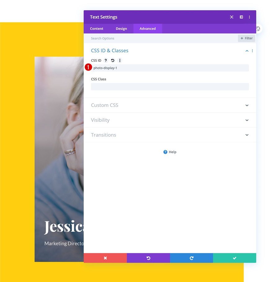
CSS ID
Complete the module settings by adding a CSS ID.
- CSS ID: photo-display-1
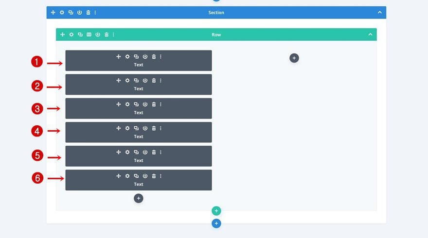
Clone Text Module Five Times
Once you’ve completed the first Text Module, go ahead and clone it 5 times.
Change Content & Background Image of Each Duplicate
Change the content and background image in each duplicate.
Change Box Shadow Color of Each Duplicate
Along with the box shadow.
- Shadow Color: #9f89ed
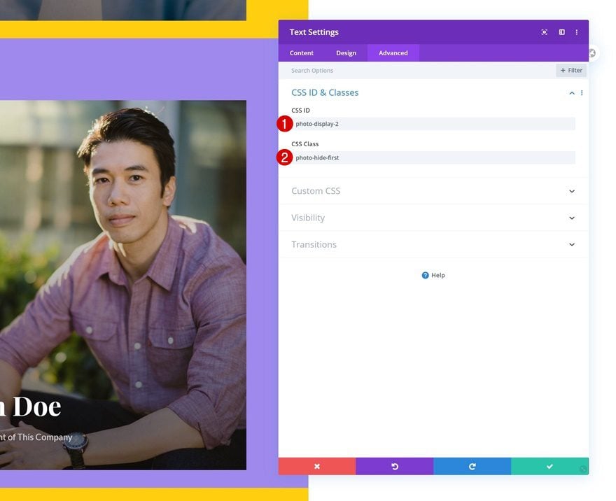
Change CSS ID of Each Duplicate & Add CSS Class
Each Text Module in column 1 needs an unique CSS ID. The first Text Module in the column contains the ‘photo-display-1’ CSS ID, the second needs the ‘photo-display-2’, the third ‘photo-display-3’, and so on. Add a CSS class to each duplicate Text Module too (make sure you don’t add one to the original Text Module).
- CSS ID: photo-display-2 (from 2 to 6)
- CSS Class: photo-hide-first (every Text Module in column 1 except the first one)
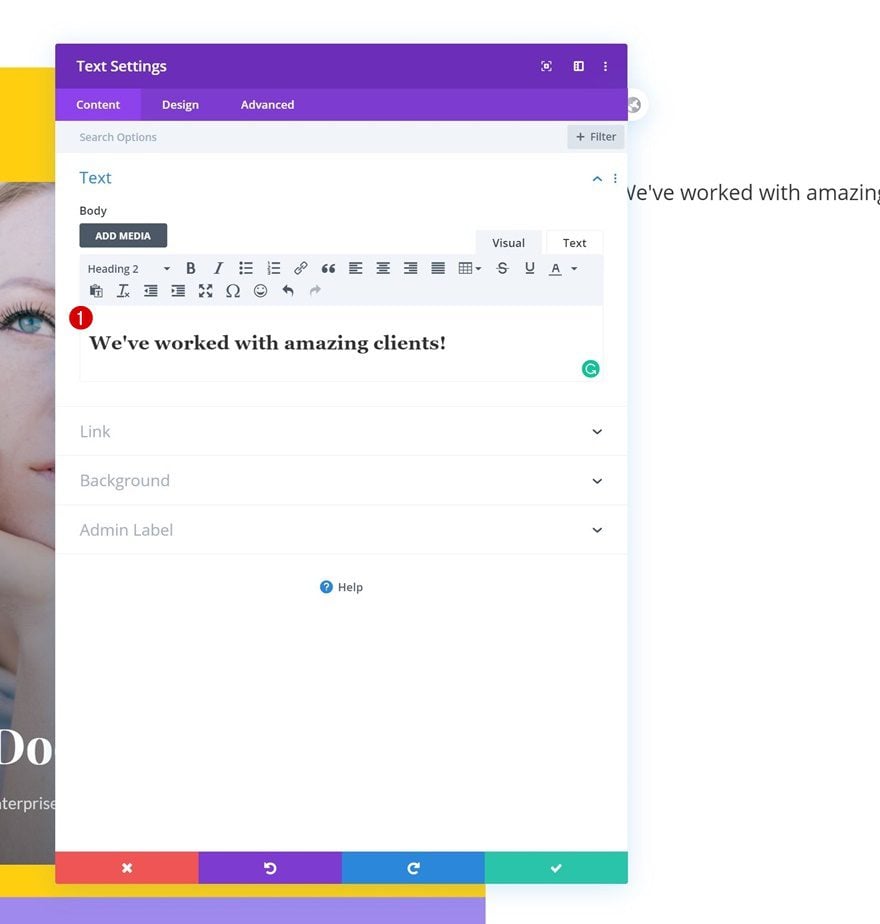
Add Text Module #1 to Column 2
Add H2 Content
Once you’ve completed all 6 modules in column 1, you can move on to the second column. There, the first module we’ll need is a Text Module with some H2 content.
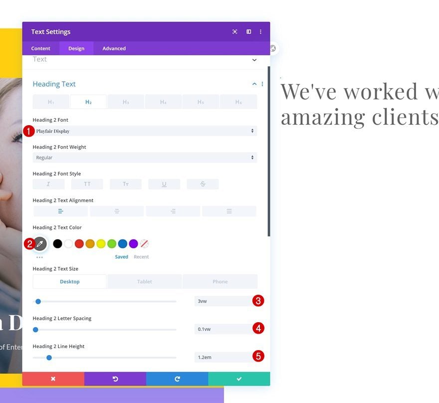
H2 Text Settings
Go to the design tab and modify the H2 text settings accordingly:
- Heading 2 Font: Playfair Display
- Heading 2 Text Color: #636363
- Heading 2 Text Size: 3vw (Desktop), 6vw (Tablet & Phone)
- Heading 2 Letter Spacing: 0.1vw
- Heading 2 Line Height: 1.2em
Add Text Module #2 to Column 2
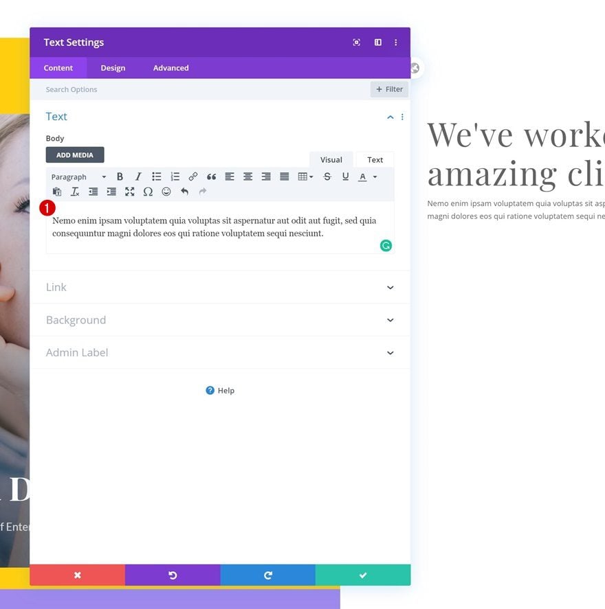
Add Content
Add another Text Module to column 2 with some paragraph content of your choice.
Text Settings
Move on to the design tab and change the text settings accordingly:
- Text Font: Lato
- Text Alignment: Justify
- Text Size: 0.9vw (Desktop), 2vw (Tablet), 2.7vw (Phone)
- Text Line Height: 2.1em

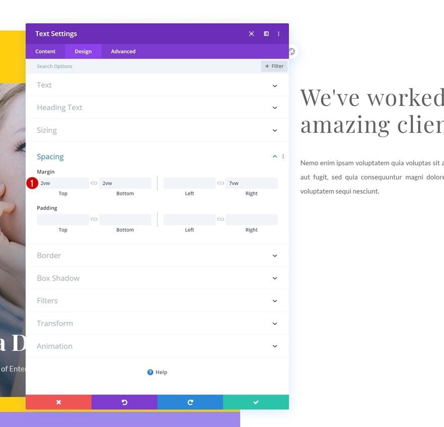
Spacing
Modify the margin values in the spacing settings too.
- Top Margin: 2vw
- Bottom Margin: 2vw
- Right Margin: 7vw
Add Divider Module to Column 2
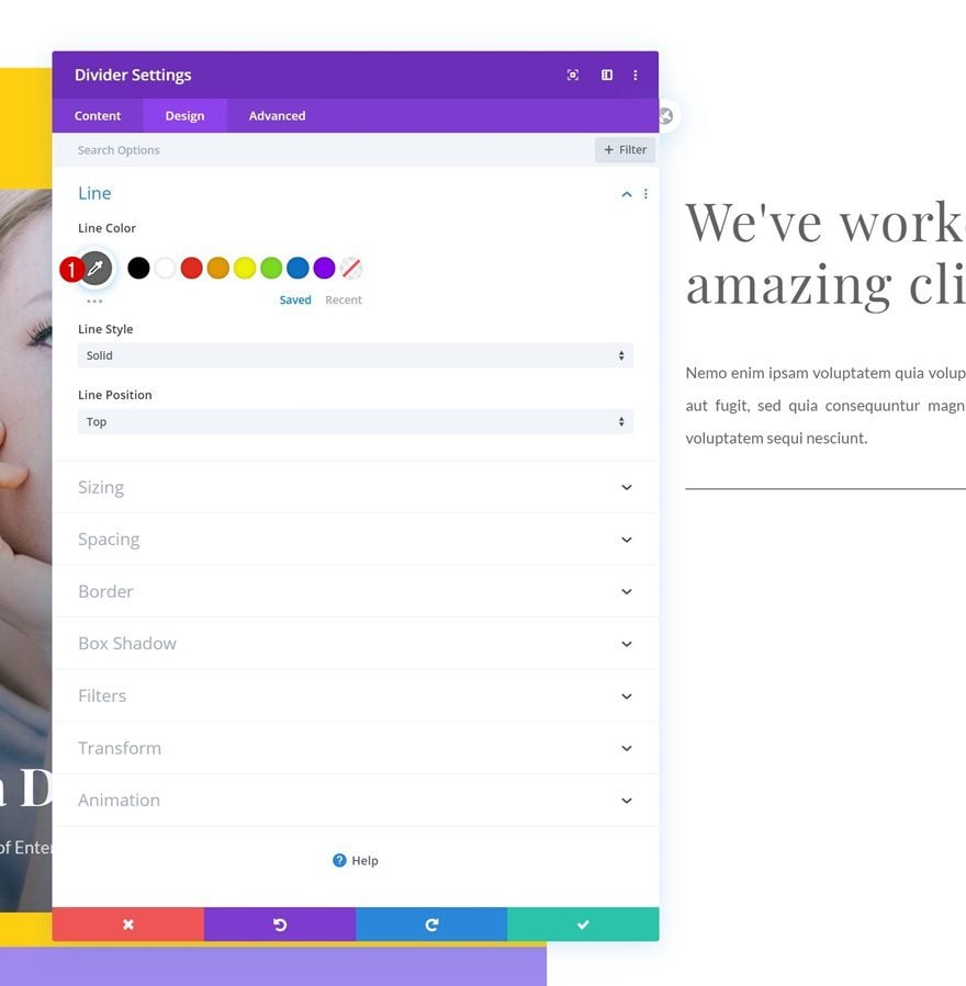
Visibility
On to the next module, which is a Divider Module. Make sure the ‘Show Divider’ option is enabled.
- Show Divider: Yes

Line
Move on to the design tab and change the line color.
- Line Color: #636363
Spacing
Modify the margin values across different screen sizes next.
- Bottom Margin: 7vw
- Left Margin: 14vw (Desktop), 39vw (Tablet), 38vw (Phone)
- Right Margin: 14vw (Desktop), 39vw (Tablet), 38vw (Phone)
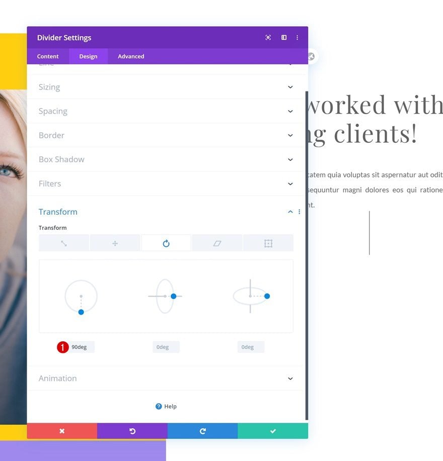
Transform Rotate
Rotate the Divider Module.
- Left: 90deg
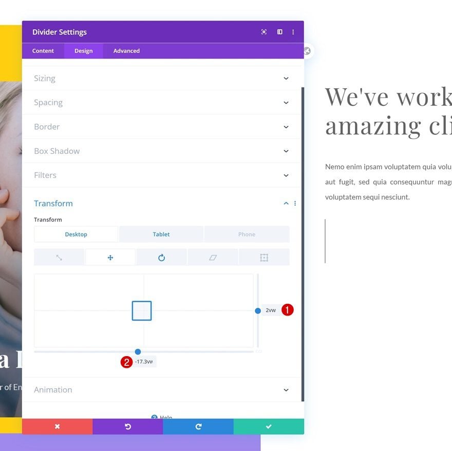
Transform Translate
And reposition it using some custom transform translate values across different screen sizes.
- Right: 2vw (Desktop), 3vw (Tablet & Phone)
- Bottom: -17.3vw (Desktop), -43vw (Tablet & Phone)
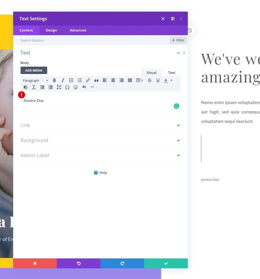
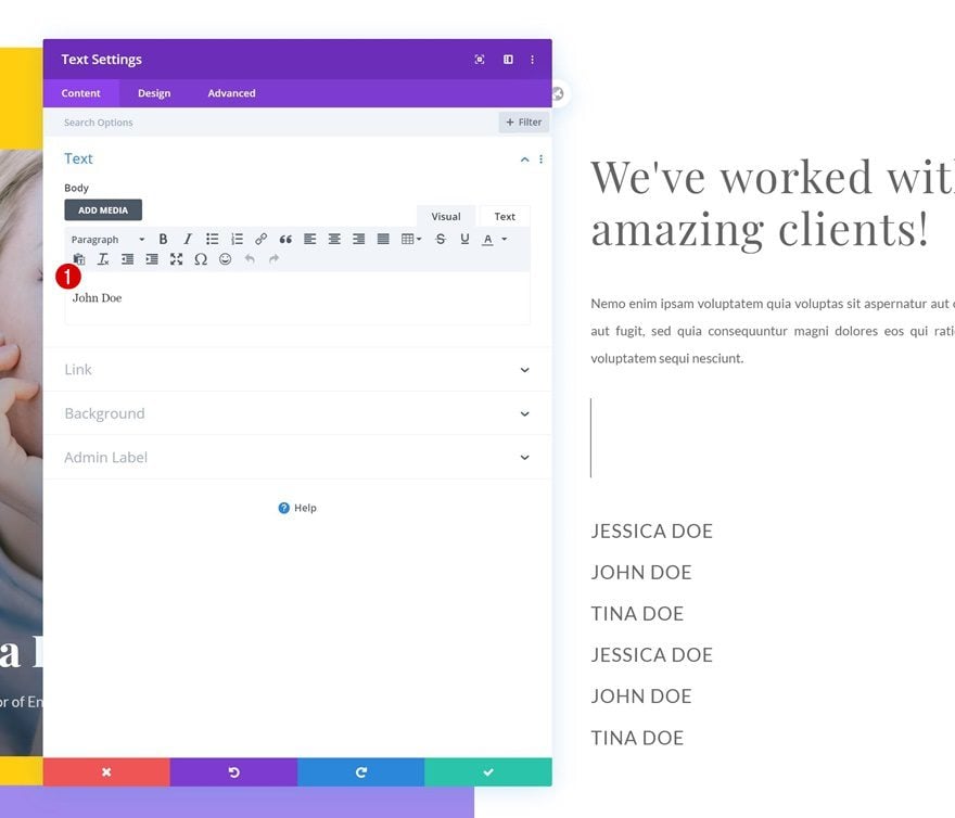
Add Text Module #3 to Column 2
Add Content
The next module we need is another Text Module. Make sure you add the corresponding client name to the content box (match it with the first Text Module in column 1).
Text Settings
Move on to the design tab and modify the text settings accordingly:
- Text Font: Lato
- Text Font Style: Uppercase
- Text Size: 1.3vw (Desktop), 2.5vw (Tablet), 3vw (Phone)
- Text Letter Spacing: 1px
- Text Line Height: 1.2em
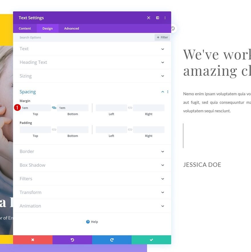
Spacing
Add some custom top and bottom margin next.
- Top Margin: 1em
- Bottom Margin: 1em
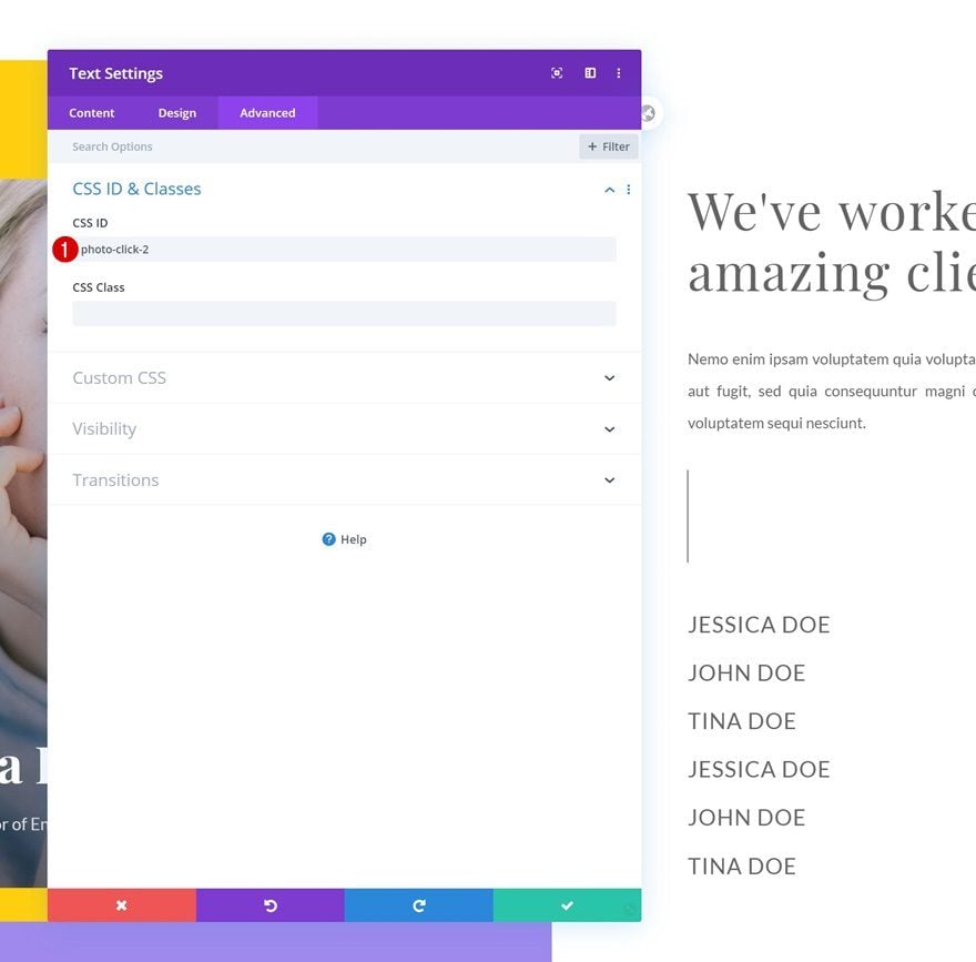
CSS ID
Move on to the design tab and add a CSS ID. Make sure the number is the same as the corresponding Text Module in column 1.
- CSS ID: photo-click-1

Clone Text Module #3 Five Times
Once you’ve completed the first client Text Module, clone it 5 times.

Change Content of Each Duplicate (Match with Text Modules in Column 1)
Change the client name in each duplicate Text Module.
Change CSS ID of Each Duplicate
And match the CSS ID of each duplicate with the Text Module in column 1.
- CSS ID: photo-click-2 (from 2 to 6)
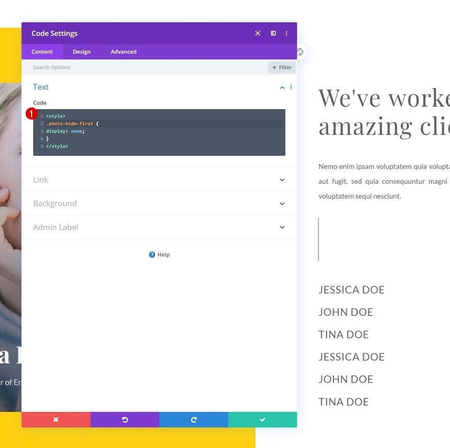
Add Code Module #1 to Column 2
Insert CSS Code
The last part of this tutorial focuses on making the hover functionality work. Add a first Code Module to column 2 and insert the following lines of CSS code:
<style>
.photo-hide-first {
display: none;
}
</style>
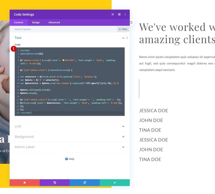
Add Code Module #2 to Column 2
Insert JQuery Code
Add another Code Module right below the previous one and insert the following jQuery code to make the hover function work:
<script>
jQuery(function($){

$('#photo-click-1').css({'color': '#ffcf0f', 'font-weight': 'bold', 'padding-left': '0.5em'});

$('[id*="photo-click"]').hover(function() {

var selector1 = $(this).attr('id').replace('click', 'display');
var $photo = $('#' + selector1);
var $photoColor = $photo.css('box-shadow').replace(/^.*(rgba?([^)]+)).*$/,'$1')

$photo.siblings().hide();
$photo.show();

$('[id*="photo-click"]').css({'color': '', 'font-weight': '', 'padding-left': ''});
$(this).css({'color': $photoColor, 'font-weight': 'bold', 'padding-left': '0.5em'});

});
});
</script>
Preview
Now that we’ve gone through all the steps, let’s take a final look at the outcome across differnt screen sizes.
Desktop
Mobile
Final Thoughts
In this post, we’ve shown you how to create a beautiful client showcase that you can use on any website you create. We’ve combined Divi’s built-in options with some jQuery code to make the approach work. You were able to download the JSON file for free as well! If you have any questions or suggestions, make sure you leave a comment in the comment section below.
If you’re eager to learn more about Divi and get more Divi freebies, make sure you subscribe to our email newsletter and YouTube channel so you’ll always be one of the first people to know and get benefits from this free content.


Thank you that’s exactly what i need for what i’m working on.
I would like to add a third column with some text displayed next to the images and that this text would change with them.
I’ve put the CSS ID on my text modules, but then only the text changes and not the images.
If by chance someone knows how i can make two modules change at once when hovering the text it would be great !
(I suppose i should change something in the jQuery code, but i have no idea what.)
I input the instructions exactly and for some reason all the photo boxes show on my screen when the page first loads. Once I mouse over the first hover item in the list they disappear and the functionality works perfectly, but each time I reload the page all the boxes are back again. I triple checked my code and all these instructions – any suggestions on how to fix that or why it’s happening?
It really looks so nice. I’ve a wordpress food blog i am going to try it out on. Hope it works fine there too. 🙂
Happy to hear that! 🙂
Love this layout. I uploaded it and it looks great. How do you change the images? I changed the first image. I don’t see where to access the other images since this is a two column layout with an image module on the left and the code module on the right.
Happy to hear that, Joan! 🙂
The code automatically hides the other image modules, so there’s two ways to approach it:
– You can remove the code, make your changes and add the code again
– Edit the elements in the Visual Builder’s wireframe mode
Hope that helps! 🙂
That looks amazing. You almost explain each step well. Will download and see how it works on my demo site.
Thank you!
Happy to hear, hope you enjoy it! 🙂
Did you test it? I can’t find the layout in my library after the import.
nice!
Glad to see you’re liking the tutorial, Igor! 🙂
Awesome Share.Thank you so much.
You’re welcome, Rose! 🙂
Another useful and versatile little gem – thanks
You’re welcome, Paul! 🙂