
It’s that time again for our monthly Divi Showcase, where we take a look at ten amazing Divi websites made by our community members. Each month we showcase the best Divi websites that were submitted from our community and today we want to share with you the top ten websites for the month of September. Throughout the post, I’ll point out some of my favorite design features that draw me to each of the websites.
I hope you like them!
Divi Design Showcase: New Submissions from September 2021
1. Komoneed
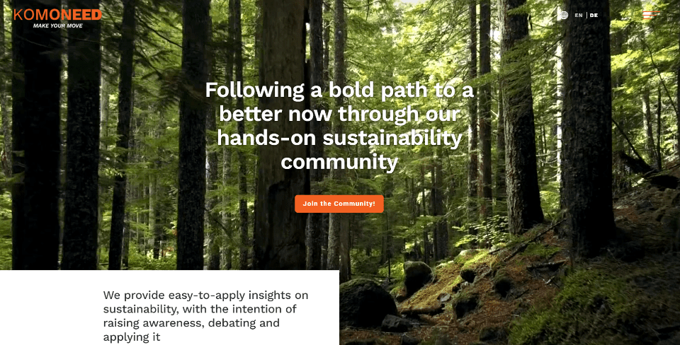
This site was submitted by Sebastian Gersbach. This one makes excellent use of color with large and full-screen images and video. The hero section displays a full-screen video with an overlapping image on one side and large blocks of color with text on the other to provide information. I especially like the section with a full-screen background image in true parallax. Blurbs fade in as you scroll to provide information about the mission and purpose. I also like the blog section. The screen is split into three columns with half going to the latest post and three other posts splitting the other half. They have large images with the title and excerpt over the image. The posts themselves use a clean layout that’s styled to match the site.
2. ProWeb
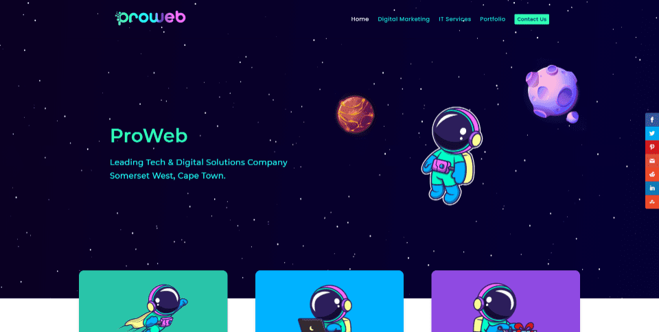
This site was submitted by Johan du Toit. This one makes interesting use of color and graphics. The hero section includes an animated field of stars that react to your mouse cursor. hand-drawn cartoon-quality graphics appear within the hero section and within blurbs to show the various services. Blurbs have different colored backgrounds in bright colors that darken slightly on hover. I also like the social media icons. They’re extra large and have different background shapes for each icon, and they zoom on hover. The graphics used on the digital marketing services page include a gorgeous section divider between the hero and the section that follows it.
3. Masszázs Sziget Cegléd
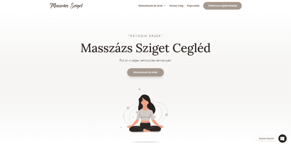
This site was submitted by Fráter Gergő. It uses beige and white to create a relaxing feel that matches the website’s purpose. An animated graphic draws attention to the CTA in the hero section. Another CTA uses an image with an outlined shape. Large blurbs with minimal color and hand-drawn graphics show the services. This site makes good use of elements such as sliders, video, testimonials, buttons, forms, toggles, etc. The scroll bar is also styled to match the site. Many of the sections are divided by styled lines with graphics or text. I also like the About page which creates a timeline with blurbs that match the home page.
4. Fine Face Co.
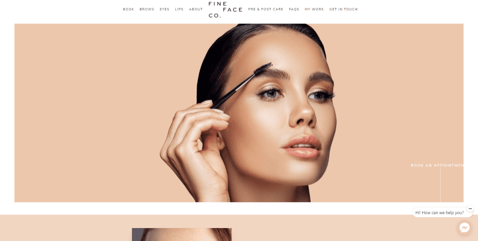
This site was submitted by Nicole Connell. It has a minimal layout design that’s clean and elegant. Some of the backgrounds in the website and images use tan skin tones as brand colors that work perfectly with the target audience. Large photos demonstrate the products and services. The images create an alternating layout with a link to one side. Titles for the images are placed vertically to one edge of the images. Text for the links includes lines that connect them to the images. Pages for the individual services describe each service within a block of text with prices styled to match the site and lines to separate the blocks.
5. Voltcave
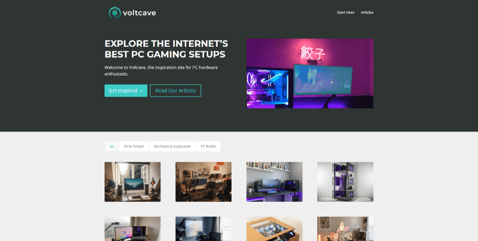
This site was submitted by Thao Tran. This one has a simple design that showcases the products within an animated CTA in the hero section. It also displays them within a filtered portfolio that links to all the details you need about each product with links and a slider. The menu is also minimal with two links to get you started. The Start Here page steps you through the process of making a choice. The blog page uses cards with a clean layout and the posts follow a clean design. I like the way this site uses its brand colors in the logo, links, email signup form, and footer. Many of the images also include elements with the brand colors.
6. TDF
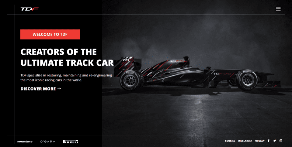
This site was submitted by Peter Hardicker. This one uses black and red brand colors throughout the site. The home page is a single screen with a black column on one side and a large image on the other. A CTA overlaps them while an overlapping white line creates a border on three sides. The border separates the header and footer and ties together on one side. I like the large menu in this one. It slides in from the side and includes a red background that matches the logo and CTA. Other pages display full-screen sections with an image or text. Each matches the colors and style of the site and adds new colors that are only used on one page. I also like the contact form with the title and icons in red.
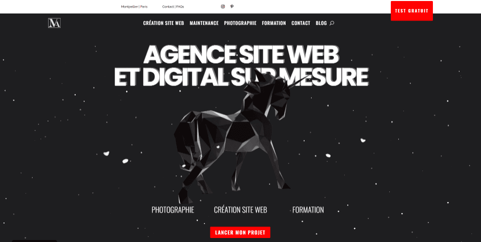
This site was submitted by Maëva Verdu. This one has a unique layout design. Sections are labeled with large blocks with red backgrounds and vertically aligned text. The hero section includes individual elements that react to your mouse. Red and dark gray is used for the brand colors and appear within the text, backgrounds, CTA, buttons, contact form, etc. I especially like the way the content is sectioned as you scroll down the page. The blog page also has an interesting design. The page includes styled filters and the posts are clean cards. The blog post layouts also include overlapping elements.
8. Artech
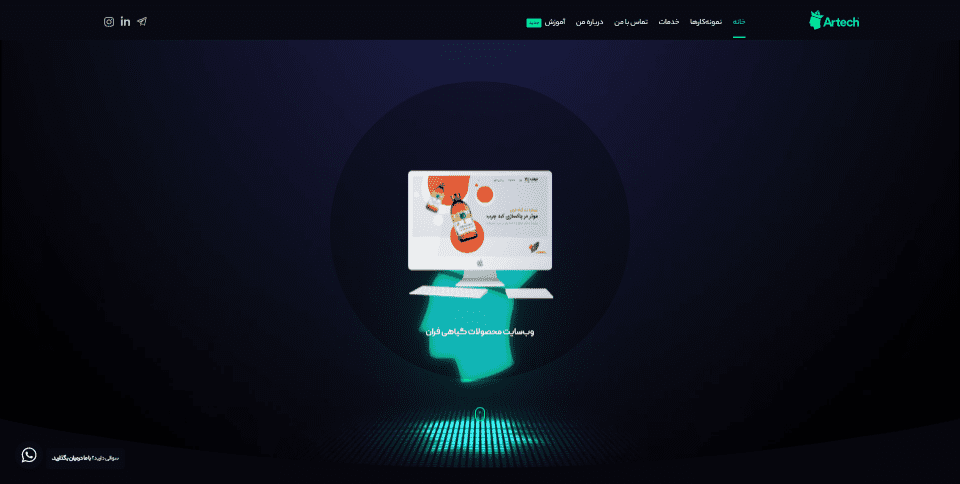
This site was submitted by Artech. Green is used as the brand color throughout the site with lots of dark blue and dark gray backgrounds. This one has lots of animations throughout the website. Your cursor changes to a dot and is followed by a circle as you move around the page. The hero section is particularly interesting. A slider in the center of a circle includes an animation in the background. Elements such as blurbs, line drawings, and green patterns scroll at different speeds. Some of the elements include dark text that just stands out in the background. A green line across the top indicates where you are within the layout. The scroll bar is also styled to match the site.
9. Debra Smidel
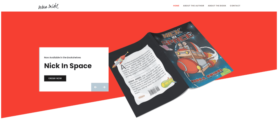
This site was submitted by Hooman Hasani. This one makes excellent use of color and whitespace, along with well-designed CTAs. Red is used as the brand color for backgrounds, text, CTAs, and the menu. This layout includes lots of sections with overlapping graphics. The hero section includes a slider CTA that displays a different image on one side and a link on the other. The page about the book displays images that stagger and overlap. I also like the contact form that includes a large image on one side. The buttons in the CTAs are labeled well, so you’ll know that you’re going to Amazon to make the purchase.
10. Stonehouse Day Spa
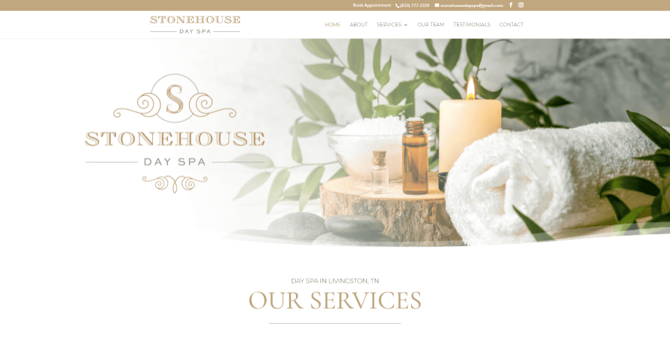
This site was submitted by Abigail Laprad. This one uses tan and gold brand colors for the target audience in the highlights and backgrounds throughout the site. Many of the images use soft overlays that fade away. This especially works well with the logo in the hero section and in the services. The layout has lots of white space, which works well with the design. The full-width images include styled dividers to separate them from the next section. I also like the testimonials page. Testimonials include text and star ratings that overlap an image. The image includes an overlay that appears behind the text, giving the testimonials a unique design.
Conclusion
That’s our 10 best community Divi website submissions for the month of September. These sites look amazing and as always we want to thank everyone for your submissions!
If you’d like your own design considered please feel free to email our editor at nathan at elegant themes dot com. Be sure to make the subject of the email “DIVI SITE SUBMISSION”.
We’d also like to hear from you in the comments! Tell us what you like about these websites and if there is anything they’ve done you want us to teach on the blog.
Featured Image via robuart / shutterstock.com


Looks nice!
Great !
I loved 10. Stonehouse Day Spa, clean and elegant!
I always look forward to seeing what other Divi Users have come up with. These are a great source of inspiration at times.
Curious if we are only considering “design” here. Does performance, accessibility and Core Web Vitals results come into play in the evaluation of these sites? Some of these sites don’t have very good numbers in a Lighthouse report. Lots of nice looking sites though.
I like number 5! Perfect