
It’s that time again! Time for our monthly Divi Showcase, where we take a look at ten amazing Divi websites made by our community members. Each month we showcase the best Divi websites that were submitted from our community and today we want to share with you the top ten websites for the month of October. Throughout the post, I’ll point out some of my favorite design features that draw me to each of the websites.
I hope you like them!
Divi Design Showcase: New Submissions from October 2019
1. Bots vs Cons
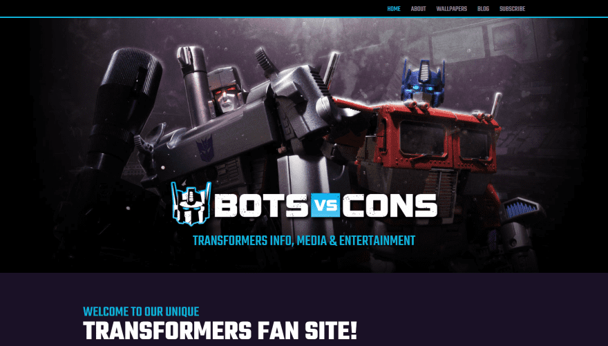
This website was submitted by Wade McMaster. The site uses a dark color palette with white and light blue text and highlights throughout. The menu is slim and is separated from the hero section with a blue line. The hero section displays a background image with the site’s logo and description in large text. An About section shows information in two columns. I like the blog section, which displays in parallax over a background image with a styled overlay. It displays the latest blog post with text to one side as a CTA to see the blog and a blog post on the other in a card design. The Wallpapers and Blog pages display blog posts with a header, background image, and sidebar. The Subscribe page is also interesting. It displays the sign-up form as a CTA with bullets on one side to show the benefits of subscribing. The pages display a different menu design than the homepage.
2. Match Design Media
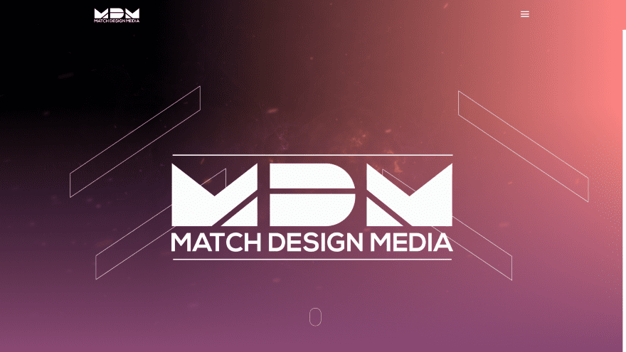
This website was submitted by Sam Nicholson. The site displays a full-screen background video with a gradient overlay. The foreground shows the logo and line designs. The logo zooms on hover and two of the line elements disappear to create an interesting hover effect. The most interesting element is the way the site uses section dividers. It places a background image behind the divider and then places a gradient over that. Number counters or circle counters are placed over them. The site uses lots of gradients and styled text to match. Buttons include the same gradients as the backgrounds. Services are shown with an alternating layout and include images that tilt on hover. The Careers section and the Contact section include the same tilt effect. It has lots of small animations such as lines that tilt into place on load. The site also includes a styled back-to-top button and a styled slider bar, which I’d like to see become a standard practice for web design.
3. Property Pop
This website was submitted by Kaelynn Midgley. It displays a full-width background gradient with a CTA on one side and an image within a mobile device on the other. Scrolling reveals information on one side with a CTA and images of properties on the other with one image placed within a laptop outline. Similar designs continue throughout the site. My favorite is the section about the community. It includes a two-column layout with a background image with a blurb overlapping it that includes an image, text, and a button, and information on the other side. The How it Works page shows each step in full-screen with a different background color for each. I also like the blog page, which includes a hero section, text for information, a divider, and then the blog posts. The posts add a box shadow to the featured image. The menu includes a CTA.
4. Homeland
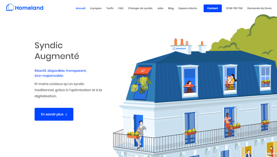
This website was submitted by Jerome Bestel. It includes lots of graphics throughout the site starting with the hero section, which displays a large graphic to one side and a CTA on the other. Scrolling shows a two-column section with a smaller graphic to one side with a clickable call button and information on the other side. This design alternates down the page as you scroll. Other information is provided within blurbs. A slider allows you to move a cursor and select a price. Information about the team is provided with blurbs and includes graphics for images. The site uses a minimal design and lots of blue for the text and backgrounds to appeal to the target audience. Each of the pages follows a similar design but still have something unique. The menu includes a contact CTA and a clickable call link. I especially like the large graphics in the hero sections of each page.
5. ChangeUp for Charity
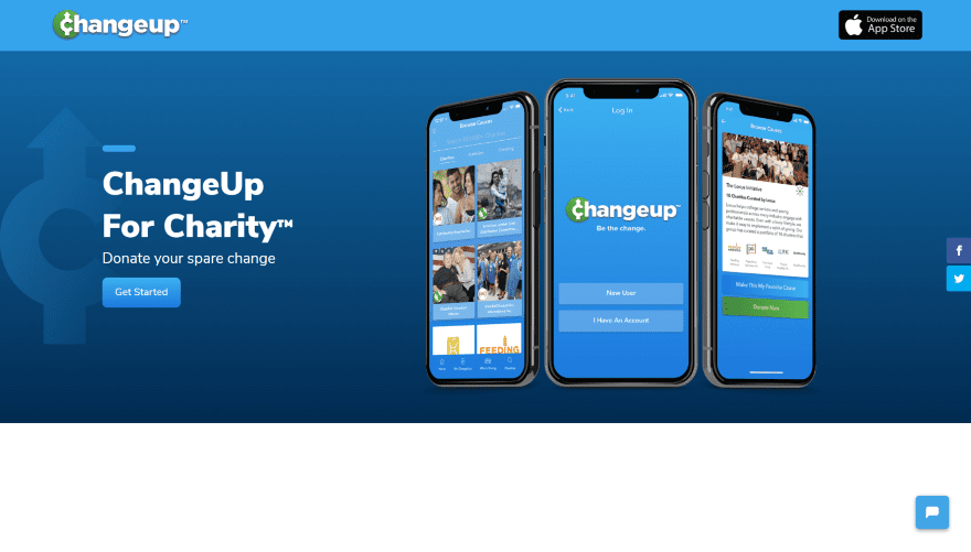
This website was submitted by Dickon Kent. It has a full-width background gradient with a graphic on one side behind a CTA and a set of images on the other side that shows the app on mobile phones. The next few sections show text with a divider and a blue title on the left and a smartphone with an image of the app and surrounding graphics on the right. The text and graphics slide into place as you scroll. A slider displays logos over a patterned background with a gradient. A full-width testimonial slider includes the image, testimonial, and dot and arrow navigation over the blue background that matches the site. Information is provided within blurbs that include circled icons that match the site’s styling. The site makes excellent use of blue and green branded colors and gradients.
6. Rebbl
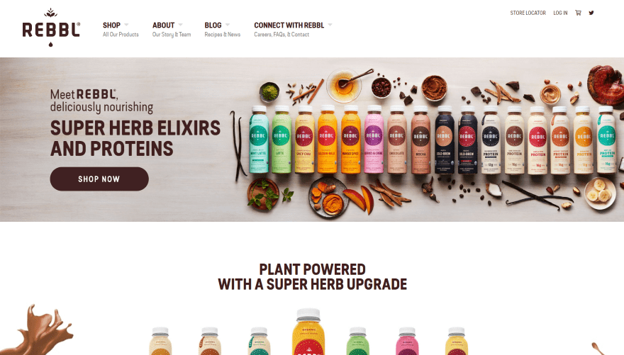
This website was submitted by Dickon Kent. This site uses an interesting mega menu with smaller text under the main text. Hovering over one of the links opens the menu to reveal more links and images. The first section of the homepage shows a full-width image with space on one side for a CTA and the products on the other side. Scrolling reveals a full-width CTA that demonstrates the product and provides a link to the shop. A blog section shows categories as blog cards. Clicking on one opens that blog category’s archive page. The blog posts are presented in large cards with the category centered between the image and excerpt. A slim subscribe form displays the text and form over a background pattern. Information about the company and products are shown in a two-column section with large CTAs. I like the video CTA that displays a background video with a title and button in the overlay. An embedded Instagram slider provides information on hover and opens the information in a modal on click.
7. Youth, Speak Up!
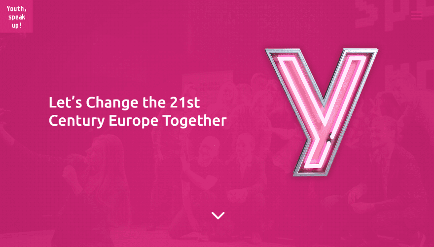
This website was submitted by Michal Teska. It’s a one-page layout that displays a full-screen background image in parallax with a highly opaque overlay. The overlay includes a tagline and a graphic. All of the sections have a two-column layout with text in the background in parallax with a graphic in the foreground and text on the other side. This design alternates as you scroll. One of these sections has toggles that are styled to match the site. Information about the people involved is created with blurbs that have a thumbnail image to the left and their name and location on the right. Partner logos are shown in grayscale and change to color on hover.
8. AWEOS
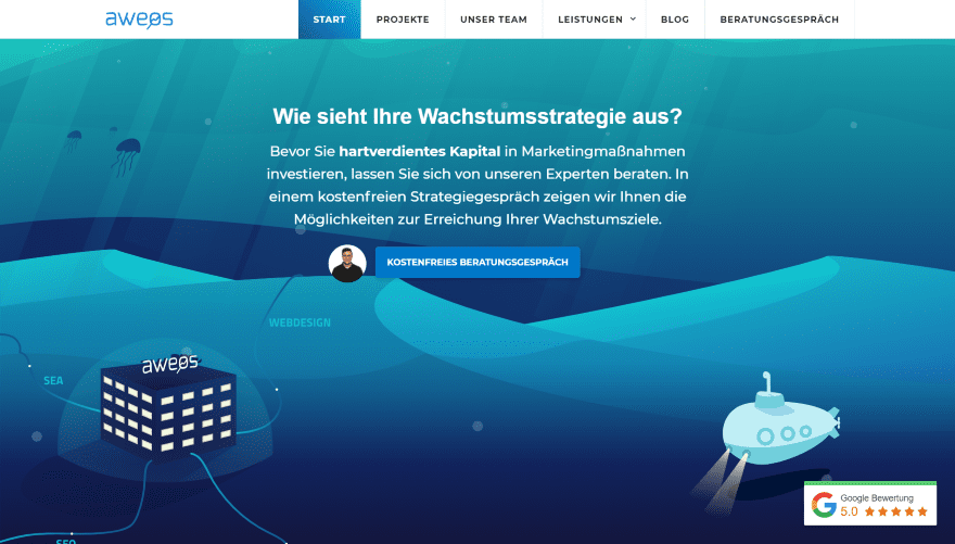
This website was submitted by Christos Papadopoulos. An animated background creates the effect of an undersea setting with cartoon graphics. A CTA with a tagline and an animated image sits over the background. A mega menu reveals three columns of links and images. The next section provides information and includes a clickable call link and a consultation link. Team members are shown with an image, name, title, description, and a button to hear an audio message from that person. Services are displayed within blurbs that include icons under the text. The Project page shows examples within a card that scrolls on hover. Each of the Services pages follows a similar design, which includes a header with a description and link, followed by detailed information. The blog page and posts follow a similar header design.
9. Marci Angeles
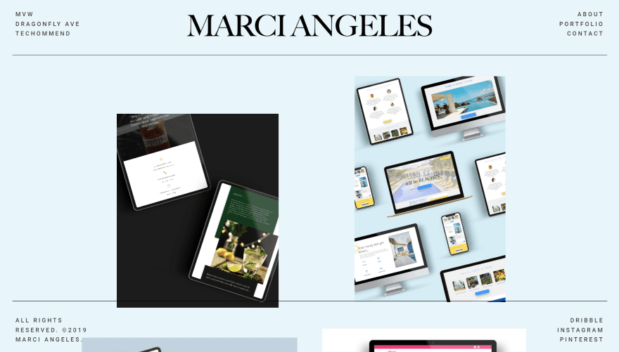
This website was submitted by Marci Angeles. The header and footer remain on the screen as you scroll. They’re transparent, so the layout shows through. The homepage shows a blue background and several images of work samples. Clicking an image opens that project’s page where you can see the details about the project. Each one is shown as a blog post and includes a featured image, description, images, navigation to the previous and next posts, and a contact form. The footer does not remain on-screen on the project pages. The header and footer have a simple and clean design. The header includes links to other sites by the owner, which use similar soft colors like this one. The footer includes links to social media. Both have lines that separate them from the body of the site.
10. ATG Europe
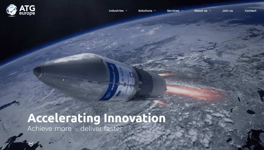
This website was submitted by Camiel Bos. The full-screen header shows a background video with a title and tagline in the bottom left corner of the screen. It has a mega menu and displays links and posts on hover. On scroll you see that the menu turns white and has a curved edge and mirrors the bottom of the video section. Information is provided in the next section and includes a graphic that matches the theme of the site. Industries that are served, solutions, and services are shown within images in parallax. A contact CTA displays the title and button over a background image and includes curved section dividers for the top and bottom to create an interesting design. The site uses lots of styled dividers, background patterns, and overlapping elements that stand out nicely while retaining a clean design. The site makes excellent use of images and colors.
Conclusion
That’s our 10 best community Divi website submissions for the month of October. These sites look amazing and as always we want to thank everyone for your submissions!
If you’d like your own design considered please feel free to email our editor at nathan at elegant themes dot com. Be sure to make the subject of the email “DIVI SITE SUBMISSION”.
We’d also like to hear from you in the comments! Tell us what you like about these websites and if there is anything they’ve done you want us to teach on the blog.
Feature image via ProStockStudio / shutterstock.com


I’ve always been a fan of Divi theme. As a freelancer, I always go through the designs of websites through your monthly post. This october’s designs are something which seems way better than before. I have made a lot of websites for my clients using divi and I can proudly say that I am making a living using Divi along with my creativity.
Wow, great list! Congratulations to everyone who won!
Love the color combo on Match Design Media. I thought I was fairly experimental with my color palette but I need to step it up once more! Rebbl is definitely the best one but I wish the developer went all the way WordPress instead of shopify. I’m looking forward to the next batch of submissions.
I only just found this and saw my website Bots Vs Cons on here! Thanks for sharing guys! Also, thank you for building such a kick ass theme which has helped me run my own successful Web Design business from home. You guys rock 🙂