
It’s that time again for our monthly Divi Showcase where we take a look at ten awesome Divi websites made by our community members. Each month we showcase the best Divi websites that were submitted from our community and today we want to share with you the top ten websites for the month of October. Throughout the post, I’ll point out some of my favorite design features that draw me to each of the websites.
I hope you like them!
Divi Design Showcase: New Submissions from October 2018
1. Orbicon Informatics

This site was submitted by Janus Lock. It has an interesting animation that plays as a background video in the header. The blue on blue matches perfectly with the site’s branding. The large header font works well with the technical theme. As you scroll, vertically aligned text sits in the left side of the screen, providing a link back to the home page. The layout is clean and uses simple graphics to guide you through their process. Each of the pages is numbered. These numbers are reflected in the full-screen menu. I like the design of the archive page, which shows large blue blocks with text that reveal images behind overlays on hover and the modules page that uses relevant icons.
2. Growmodo
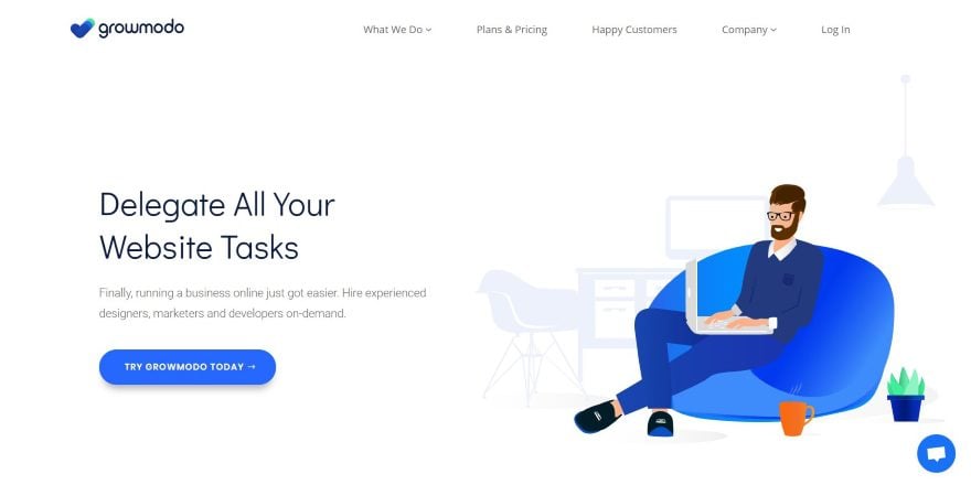
This site was submitted by Paul Preisler. This site uses lots of flat-design graphics and extra white-space to create a clean layout. The how it works section also uses flat graphics. Images use gradient overlays for testimonials in both large images with overlapping text and within the circled image for the testimonial modules. I like the creative talent section with angled dividers for the top and bottom, circled images in multiple sizes with shadow effects, and lines connecting them together. The blog featured images also use the gradient overlays. Services are shown with cards using green bullet-points, hover animations, and shadow effects.
3. Solvid

This site was submitted by Dmytro. This site uses various shades of dark blue to create some interesting gradient backgrounds. The header is unique in how it provides a block with links to services, the blog, and products. Each of the elements within the block includes hover effects. Several of the sections use angles for the dividers, with some going in multiple directions. I like the section where they discuss their reach. It shows company logos within circles, with the logos moving slightly. Services are shown within simple blocks with just an icon and title and hover effects for the border. Similar blocks appear in the mega menu, but they use gradient backgrounds to stand apart. Similar images are used for categories and featured images on the blog page.
4. Cock & Bull Festival
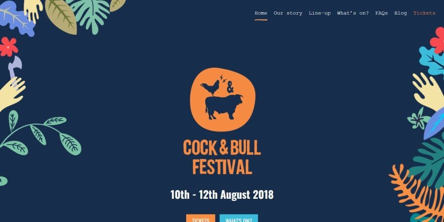
This site was submitted by Ross Pope. This site uses bold colors and flat design throughout. Graphics of shrubbery and hands decorate the edges of the header to help bring the attention to the CTA in the center. Lightning graphics help bring attention to the text in the next section. I like the multi-layout section with images that include thick border and zoom on hover. This section has more shrubbery graphics that overlap the images. The email opt-in use borders that look hand-drawn. I also like the footer that shows people in solid-color silhouettes. The colors in this site really stand out. It’s an excellent example of how color, fonts, and graphics can set the mood of a website.
5. Walking Dog Training
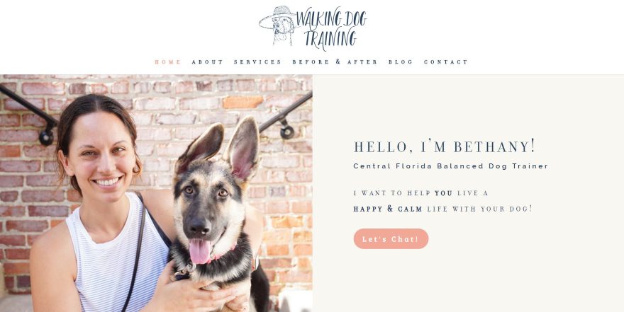
This site was submitted by Jeremiah Lloyd. The hero section shows an image and call to action in a split-screen that sets up the design for the rest of the site. Images use colorful dark peach borders in 3D that match the button styling. Another image uses a blue border, which ties in with the testimonials that use both the blue and the dark peach. I love the background colors that alternate from white to a light tan. The colors work well with the fonts and dividers to create an elegant styling. The blog also follows this styling but adds a thin line border to the blog cards. The blog’s sidebar is one of the cleanest designs I’ve seen, providing information about the blog that doesn’t become distracting or is too easy to ignore.
6. Woods Hole Tile Company
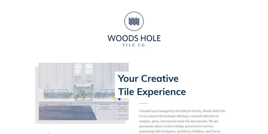
This site was submitted by Nelson Miller. This is a one-page design that uses lots of images with 3D borders on the homepage with overlapping titles, text, and buttons to view the content- creating a blog-card design. The images alternate as you scroll and are tied together with vertical lines that step you through the process and into their contact form in the footer. This is interrupted close to the middle of the page with a dark blue section of blurbs that introduce the services sections that follow it. The services sections also use the same icons as this blue section to tie them together. I love how well the fonts and colors work together in this website.
7. Brinart Design
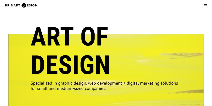
This site was submitted by Sabrina Rowland. A background video of someone painting plays behind the yellow overlay to help show what the site is about. The title overlaps the background and the tagline is placed perfectly within the block of yellow to draw attention. The yellow is used throughout the site for background colors. The services section shows three columns of blurbs with a CTA while the title of the section is printed vertically. I like the simplicity of the contact section, which uses a yellow background with angled divider and a small contact form with shadow effects that overlaps the next section to create the contact info.
8. Happy Digital
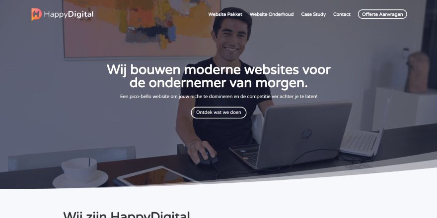
This site was submitted by Djaya De Vries. A CTA sits over a full-screen background image with a multi-shaded rounded section divider. Links to projects and services are placed within dark orange boxes that change to white with shadow effects on hover. This orange is used throughout the site as highlights for buttons and text, in the menu, as backgrounds to show benefits, and as two of the multi-colored icons within the services pages. One of my favorite sections on the homepage is a slider that overlaps two sections. The sections and the slider use solid colors to create an elegant design. The orange and white work great with the dark blue throughout the site.
9. Jeremy Mura
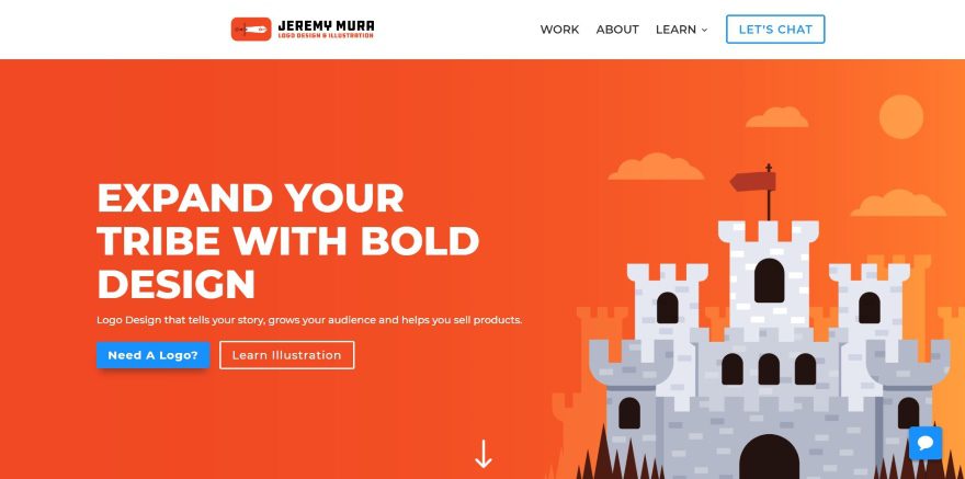
This site was submitted by Jeremy Mura. I am a fan of bold color when it works well and this site uses bold orange perfectly. The header includes a cartoon background of a castle over an orange gradient and a CTA with white text, a blue button with shadow, and an orange button with a white border. The four-column project section shows square images of projects in two rows with no space between them. I like the section about the design process, which numbers the steps and uses large icons for each step. I also like the full-width CTA in bold orange with white text. The blog uses orange titles against a white background.
10. Ad Conseil
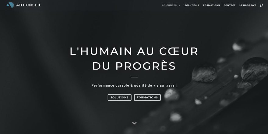
This site was submitted by FJ LAHIANI. This one makes excellent use of dark gray and a grayish-blue text and graphical elements over off-white and light gray backgrounds to create an elegant design. Graphics are used to show expertise and skills with simple titles and vertical bars separating them. The blurbs do not use borders, shadows, or hover effects. The team page follows this same design to show the team members. The reference and training pages also use this blurb style and display text with bullets in toggles. The design focus on this site is on simplicity, and it works well.
Conclusion
That’s our 10 best community Divi website submissions for the month of October. These sites look amazing and as always we want to thank everyone for your submissions!
If you’d like your own design considered please feel free to email our editor at nathan at elegant themes dot com. Be sure to make the subject of the email “DIVI SITE SUBMISSION”.
We’d also like to hear from you in the comments! Tell us what you like about these websites and if there is anything they’ve done you want us to teach on the blog.
Featured image via DRogatnev / shutterstock.com


How does one go about submitting a website for a Divi Design Showcase?
Read the Conclusion of the article. It’s explained there.
Nice selection of sites!
I submitted one of my latest projects a few minutes ago! Hold fingers crossed it‘ll make it into one of these posts.
Its a Divi project with very individual design, woocommerce and woocommerce bookings.
Keep up the great work you put into your blog! Always interesting reads.
Best
Saskia
I got a notification that stats were booming on my client site Woods Hole Tile 🙂 Thanks again for another great list of Divi website designs!
Congratulations! The website looks amazing!
I think this is by far the best collection ever! Congrats, Randy!
Thanks for the feature! All these sites use the divi modules well, so cool.
Dear DIvi nation,
how can we submit divi websites for the showcase ?
Woah, a tutorial on how solvid.co.uk achieved their drop down Services menu would be AWESOME.
Or, ya know, Divi could finally give us some new header/menu options….
I would make it megamenu, images for menu items and some CSS for hover effect. You can figure it out!
This is a nice post. Divi is the best. I will recommend divi to everyone.
Most look good on desktop but bad on mobile. Lots of spilled over text, tiny logos, and more.
I love Brinart design website! How do I go about creating the video in the background of the homepage with the coloured overylay and i loved to know how to do the full black screen menu when clicking on the menu button!
TIA
Anna
Just learning and beginning to understand all that Divi brings to my WordPress. Every time something new comes along I get so excited to try it out. Excellent work by all ten!
Love number 3. Solvid. But how much of that is achievable with Divi and without extensive CCS knowledge?
How do we submit a site for November?
Great showcase! Again showing the flexibility and diversity the Divi theme offers!
Can someone, please, explain to me how Solvid has an arrow on the right side on the blurb. +100 to karma for help:)